Transcripts
1. Welcome!: Hi. My name's Gezer Pick Brenna. I'm a three D goldsmith, artist, and top
teacher on Skillshare. From the earliest
I can remember, I always loved to draw. It was something that
came naturally to me and has been a steady companion
throughout my whole life. Since I went into jewelry and
three D design as a career, this has served me
well and often helped me with gathering and
presenting ideas, as well as to unwind, refresh, and to have fun away
from any computer. In this class, I want you
to find joy with a free, creative sketching flow to tickle out your
imagination and help you bring out some
buried treasures from your inner island of
wonders and vision. To be more precise, we will follow some quick
and easy exercises to sketch our personal and
original jewelry design ideas. Without any pressure, we will follow the pure
enjoyment of bringing out some hidden gems from our
inner creative wonderland. Throughout, I share
many tips and pointers on how I approach this whole fascinating
process in general. We create a map of
meaning to find the things that hold
value for us personally. We then dive into sketching, both from an angle of mindful
self care and relaxation, as well as for
artistic expression. I also share some tips on how to color your favorite results. We will dabble, maybe
with image generation AI, talk about further
steps to prepare for three modeling or options
for handicraft realization. This class is for
anyone who wants to rediscover and ignite
their creativity, learn something about
jewelry design, or just simply likes drawing and illustrating and is excited
to try something new. You don't need specific
drawing expertise. It is absolutely not only
for jewelry designers, but for everyone who wants to uncover their own creativity. Taking this class is also valuable if you want to
design a piece of jewelry for yourself or a love being and search for some guidance
on how to approach this. Join me for this
creative adventure. Let's dive in and
have fun together.
2. Your Project: Thank you so much for
taking this class. I'm excited to have you here. Today, we will be
taking it easy. We will create a sketch
collection of jewelry ideas. Let it flow. This is a mind
freeing blockade unblocking, go for it without
thinking class. We will start with some
thoughts on jewelry in general, an overview of the different
types and shapes to give you inspiration and some
guiding principles on which you might spread
your design wings. Afterwards, we will
continue with finding inspiration through different
guiding prompts and images. We will finish this phase
of searching by settling on some topics that are especially
dear to us right now. Right below that, I've included a short drawing warm up and some quick basic shape exercise. You may absolutely skip
these if you feel ready to tackle a relatively
straightforward drawing project, I want to jump right in. However, I promise you won't
regret bearing with me. And then we will already dive headlong into
the sketching phase. While following along,
you will dive into your own personal
creative wonderland. You will probably end up with one or more sheets full
of different ideas, both written and drawn and
maybe even more than that. But the most important thing is the journey of idea
exploration itself. There might be some surprises
happening along the way. Maybe you will discover some hidden gems you
never knew were there. And, of course, you will find more than one
practical suggestion of what you could do afterwards
with all these new ideas. Absolutely make sure to share your amazing creations in the
project gallery at the end. All parts of the class
can be standalone. This class is meant
to inspire you in every way and on every step, not feel like a bore or a chore.
3. Materials: All we need are some drawing
supplies of your choice. Pencil, paper, any eraser can be helpful and super
straightforward. You may use the back of
a grocery store coupon and any old pencil if you like, or the finest sketching paper. Or if you want, go for your tablet and any
drawing software. Colors are completely optional, like felt tippens, crayons
or even watercolor. Some other helpful things
are some white ink, pen or thick watercolor
for highlights, a divider for circles,
and maybe a ruler. But don't stress about these.
4. Introduction to Jewelry Design: Let's now dive right into
a little introduction about the magic of
jewelry design, jewelry history and meaning
in a human context. When we approach
jewelry sketching, there are a few things that
are helpful to keep in mind. There are a few basic
geometric shapes that come up again and again in jewelry,
square, triangle, circle, spiral, oval, rectangle, and their infinite
variations like stars, rhomboids, or
hearts, for example. In jewelry, symmetry is often used to support the feeling
of beauty and balance. Asymmetry gives a
more unshackled feel and it often invokes
more visual interest. It can also feel more
agitated than calm. Often, symmetric pieces have some small aspects of asymmetry to make them even
more compelling. Just like in nature, there's
no perfect symmetry. Nature in general is
both a great teacher and inspiration for all
kinds of jewelry and art. Often, symmetry evolves around
the body's center line. Pennons, left and
right earrings, and ring tops are also
very often symmetrical. In general, jewelry
is something worn, and so it is good if it at least loosely adheres
to the body shape. A very straightforward
example of this is a ring. Yet, there's also jewelry, which is super
imaginative and can push the boundaries of even
being called jewelry. Strange face masks, apparetti which are coiled
around the body like snakes, nails that appear to
go through your thumb or even a VIP card
hanging around your neck or sunglasses in your hair can all be seen
as adornments of the body, which defines
jewelry at its core. So if you want to push
the boundaries of what could be called
jewelry, go for it. Looking at all these
different pieces can also often be the best
source of inspiration. In general, studying
other people's art can ignite a great spark in us. Think of your favorite visual
artist, a piece of music, a sculptural installation or a certain architectural style. We can find inspiration for our work in the wonderful
work of others. Seeing what's possible
will help us gain a deeper understanding of the possibilities and artistic
language we could employ. It will reveal to us
what's pleasing to the eye or exciting
and astonishing. Never directly copy, but still with the eyes and get inspired. One further aspect that is connected to basic
shapes is negative space. Negative space is
used a lot in art and sculpture and just
as well in jewelry. In graphic design, it is
known as white space. This is referring to the empty area
surrounding the artwork, and it can also
refer to empty space or a background color
between the objects. It gives the observer
visual breathing room and emphasizes the
actual subject. Is a kind of contrast with
the artwork in itself that also helps to create balance and avoids sensual overwhelm. So if you take a look at a piece of art or
jewelry next time, maybe try to pay attention
to the negative space as well if there is any
and how it is used. Other aspect that makes for intriguing jewelry
design is movement, as the body moves,
so does jewelry, simply because of their
physicality, earrings dangle, a pendant sways, a jointed bracelet articulates,
but that's not all. Many designers like to build an intentional but not
strictly necessary element of movement into their pieces. Be it via hinges, jumpings, chains, magnets, soft material, or even small motors. There are many possibilities
on how we can introduce playful movement into
otherwise rigid shapes. Jewelry has a great role to play in communicating
social status, affiliation with a certain
group, expression of style, or zeitgeist,
telling of stories, and so much more. It is, in essence, a way of expression for human creativity,
identity, and mind. It is an integral part
of human culture. By the way, jewelry is one of the oldest types of
archaeological artifacts. There is a specific
type of shell called Nazarius which was supposedly already worn as
jewelry 100,000 years ago. Isn't that totally insane,
if you think about it? So, in doing what
we are doing here, we are part of one of the oldest traditions
of humanity overall. The most timeless jewelry
is often the most simple. Think about wedding rings. They are often only a ring, nothing more or the absolutely iconic
Tiffany engagement ring. Simple and straightforward
often has the most impact. Like with any design, you could try to reduce so much until you can't
reduce anymore. However, if you go for a Bollywood Tiara or
a Thai Queen's crown, disregard what I just said and have fun indulging to the limit. As for types, there
are rings, pennants, brooches, earrings, bangles,
necklaces, tiaras, crowns. There are many more
sub types of jewelry. Yet, these are some of the
most commonly seen and worn. Also, there are multiple
types of materials. Precious metals
like gold, silver, platinum or palladium
are an all time classic. Yet jewelry can also
consist of pearls, all kinds of gemstones, or other less common substances
like glass, feather, hair, cloth, leather, wood, and basically anything
else you can think of. Last but not least, each
human culture had and has its own distinctive
views of design vocabulary, particular patterns,
artistic elements, or specific use of materials. I offered you many examples of very different
epochs and regions, traditions and cultures, ancient
as well as contemporary. It is very worthwhile to
dive into the history of jewelry to enrich your own
comprehension and expression.
5. Map of Meaning: We will now create our very
own personal map of meaning. This will help us to
get the creative juices flowing and also gives us a clear direction
for our designs. I find this little exercise to be so helpful and inspiring, so I hope it will
be for you, too. Inspiration can
be all around us. There are so many
ways to get inspired and to find things that
are meaningful to you. Think of nature, emotions, fashion, animals, architecture, whatever comes to
mind or that has recently kind of
struck your interest. Write down some keywords that
you find interesting and that spark some engagement
into your heart and soul. If there are already
symbols coming to mind like heart or stars or moon or planets
or tree or fish, something like that,
then let's draw them just very abstract, next to the topics
and words, small. Okay? So let's say I had a
great vacation recently. You explored some
beautiful areas, and you are completely enchanted with what
you encountered. You learn so many new
things about this world and about people and
about what exists. And maybe there were some things that stayed in your mind. Maybe there was a
beautiful beach. And there were waves. Or you ate some ice cream. Or you found some
shells sea shells. Or you remember the palm trees. Or you had a very good cocktail with some cool people that
you enjoyed very much. They were very
kind and friendly, and you just had
the best evening, and maybe it was even the
specific brand of beer or maybe you remember this
very night under the big moon, and it was very warm. And you enjoyed it so much, or maybe you remember some architecture when you
went back to the city, and you remember some history of that place with
some landmarks. You know, and all
of these things, they kind of hold
meaning for you, right? I mean, not specifically
those things. Maybe you would have written on something
completely different. So it is a very personal thing. Okay? It holds personal
emotional value for us. And just like that, we find things that hold
meaning for us, okay? Or another example, maybe you or someone you cared
about had a child recently. Right. And it was a wedding, as well. Okay, so there is a connection
between these things, and maybe you think
of those little feet. They are so cute, right? Um, or maybe at the wedding, maybe it was your
sister's wedding or your own or you're
planning your wedding. And you really like Doves. You would like to have doves. And you mentioned
them flying for you and or you really
like white roses, and you would like to have a bunch of them at your wedding, or you would like to drive
in a limousine once, or you would invite all the friends and everyone
who's in your heart. And so you think of a heart where all the
names of your friends are in and these things, right? They are like symbols, little symbols that
are like landmarks for our personal,
emotional landscape. Or you have a hobby, right? So that would be a vacation. And just putting that
here, so people, right? So there can be people
who really touch us and things that people
do or you have a hobby? Maybe you're an athlete. Maybe you'll really like biking. Maybe you like jogging. Maybe you're a ballerina. You know, all these things, maybe you're a musician. There are so many
things that can hold meaning for us or we like
to play chess or whatever. Or maybe when it
comes to people, of course, don't
forget your pet. Right? Dogs, cats, and
everything in between. So this is just a little I
wouldn't call it mind map. I would rather call that
soul map or map of meaning. Okay, so that is
our map of meaning. And it holds specific
points and symbols that are important to us personally that strike
some chord in our soul. Or another option would be Um, if you're already
experienced with designing with
different materials, and you're maybe
more inclined on focusing on a specific
material, yes. So that, too, can be a very exploratory and rewarding
exercise to think about. What kind of materials
do you like? I mean, sure, everyone
likes gold, right? But maybe you like cloth. Maybe you like silk. Or leather. You know, you can do jewelry with all materials
under the sun. People actually have made jewelry out of
animal intestines. Yes. Some contemporary
artists do this, and it is, for some reason,
also called jewelry. So yes, if you're so inclined. But of course, there's
also porcelain. If we go back to the somehow
more conservative materials, you get my point, right? O paper. There are
so many options. And if you feel that you would
like to work with some of these or you already have experience with working
with some of these, then write that down
and take note of it that you would like to explore
some of those materials. So I will next to that
word map of Meaning, I like to call these
our soul topics. Because these make us excited, they inspire us and we have some kind of
emotional connection. So make sure to not
do one thing here, do not censor yourself. If you want to write down
something like intimacy, and you have all kinds of ideas that are
connected to that, like lingerie or high heels or any other topic that might be a little
bit on the fringes, right? Don't hold back. That is your
personal space here, and you should really live
out your inner calling. So, yeah. Let's give it at that for now, and of course, you don't have to share everything with everyone. Maybe you have some
private ideas or maybe you have some that you
want to share with everyone. Then please share them
in the project gallery. Of course, you could do that
in a very elaborate way. You could do that with colors. You could do that with all
kinds of shapes and symbols. That is really just the
baseline version here. But when I sketch, I like to keep things simple
and free flowing, so I won't take
too much time with this and just make sure that
I get all my ideas on paper. Refinement comes later.
6. Settle on a Topic: Start: Hopefully, you had some
fun and maybe even created some very unexpected connections on your little map
of meaning there. Now, let's turn this mind
map into a soul map. Let's find the things that
speak to us the most. This will become the
basis for our design. Alright, so now you
have your soul topics laid out for yourself. And, of course, feel free to decorate this in
any way you like or maybe transfer this on
another piece of paper, which is more suitable
for long term storage. But I really like to just
keep that loose and free and sometimes it's nice to have something that
is not too tight, you know, too important feeling, but important slice
in the meaning. But you'll see I'm already getting ahead of myself here and scribbling on there
with some silver pens. So you'll see I'm already
starting to build on this. But anyways, from all
the different topics, settle on a few that interest
you especially currently. Settle on a few that
you really really like. So I use some gold here to draw. And let's say, I
have found that I really would like to
include my hobby. And one of my dearest
hobbies is singing. Oh. Hello. So I really love singing, and I feel like I
would like to bring that into the into
my soul topics. And I also I think I
really like ice cream. That is something so mundane
but so wonderful, right? So I will mark the ice cream. And I think I would work
with gold here and silver, like the traditional
jewelry materials and gemstones and maybe pearls. A I don't know. I I will be open. And I think yeah, the vacation and the
hobby and the material, those will be enough for now. So don't stress about it. You can always
come back to them, of course, and choose more of them or switch between them. But that is just so that we have something
to start with, you know, so that we settle on, Okay, I want to focus on
the vacation part, and I want to focus
on the hobby part. It's even okay if
you just choose one, so if I just choose one, then maybe Um, it's hard. Ice cream or singing. I'm having a hard
time deciding here. Okay, so if you have
a hard time deciding, I will just say I
like them both. And I would like to
work with them both. Alright? So I really
enjoyed the vacation. I enjoy my hobby, and I want to do something
with both of these. Okay, so for now, let's settle on some that you
want to start with. And it should be something
that speaks to you, not only because it is
an interesting topic, but because you have, obviously, by now, an emotional
connection with it. It should feel warm and fuzzy when you think about this, okay? This is a good sign
that you found the little spark igniter inside you that reacts to certain
things you just connect with. Okay? And it can be something as straightforward and
mundane as ice cream. But, you know, I think
the world would be a worse place if there
was no ice cream. So it has some
meaning, for sure. So try to approach
this very intuitively. Don't think about it too much, but just reach out spontaneously to what you find fascinating. Then draw circle or heart around those that open up
this special connection. And finally, let's
just choose one of those which you'd
like to start with. Again, do not overthink this. We are not in a
competition of any kind. We don't need to have
results of any kind. We're just going for what feels good and
interesting right now. All right. Have you fallen
in love with one of your topics, then
let's continue.
7. Settle on a Topic: Soul Topics: As a plus, you are
absolutely encouraged to use this map of meaning
as a basis for any other personally
meaningful artistic project, like illustration,
painting, three D art, sculpture, lyrical, poetic
exploration, music, any kind. And this map of meaning, it's really worth
exploring from time to time and also really
dig deep, right? Because this is all
it's super nice, right? But at least from
my perspective, there are some nice
things in here. But it can go deeper. It can become philosophical. It can become very personal, and you might find out
that you care about things and that
certain things hold meaning and value for
you that you wouldn't really have expected
so much before. And that might be a basis
for your next project. So if you feel drawn
to this kind of verbal approach to
topics that you like, well, go for it.
8. Get Loose: Drawing Warm Up : Getting warmed up is helpful with loosening
up and becoming more comfortable with
our materials and media. I would rather call it meeting ourselves and the
material today. This can help you to
get to a place of greater ease and improve
all subsequent sketching. Now, let's warm up
our drawing fingers. We will get going with
some easy PZ strokes and dabbles just because
it is always more comfortable and
easier to dive into sketching and drawing when
we start with loosening up. I have some copy
paper ready here. It's just regular paper you
can use for your printer. Nothing fancy at all,
because I don't want to fill the precious pages of my sketchbook with these
warm up exercises. Although sometimes through
them and from them, something interesting
can emerge. However, this time, I will just keep it very
simple with this, and in case there
should be something interesting emerging from
these little exercises, well, then I will
just put some of these papers into my sketchbook. So let's go. Let's start with some
very easy long lines. Try to make them as
straight as possible. And the more you draw, the more you can try to
bring them closer together. Move your whole arm
instead of only the wrist. In this case, you will
get a straighter line if you move your whole forearm. Once you have some lines going, let's continue
with some circles. Here, we will just
take our pencil and we will make a swift, loose circle as if we were
poking some holes into cheese. Just like that. Try to move the pencil
in one swift stroke. Don't worry if you
don't close the circle. Sometimes I hold my
breath while doing this. Like, I breathe in, It's like this kind
of tension helps you to connect to the whole motion. You can also sometimes
prepare the stroke like this and then in
the next instance, you put them down. Sometimes the most spontaneous
ones are the best. This is a very
good concentration and focus exercise as well. For the very small ones, you can only move the fingers, but for the larger ones, you want to have this movement happen a little bit
from the wrist as well. And don't worry if
you get some pears or apples or plums
in between here. It's not about the perfection. It's just about
the loosening up. So next, there's a nice
little exercise which is like a little oh star shining
in the darkness. You start with one center point, and you try to come from there. And with a swift movement, with a flick the
fingers and wrists, you draw this little asterisk. And of course, you can
reverse this exercise by trying to find the center. And this can be a
little bit more tricky. So that they all end in one space in one
particular point. And then for the final
area on this paper, let's do some wiggly lines. And here again, try to
use your whole arm. Mye even starting from the shoulder like the
whole arm is moving. But at least your
forearm should move, and the movement should
be initiated from the forum and try to make them more
expressive as you go along. It will feel more
loose, more easy, and you will generally feel that your arm is
kind of warming up. So these are four
exercises which I really like to just
get going a little bit.
9. Get Loose: Spirals: One other, which can
really complement these exercises is
drawing little spirals. Making them bigger
or smaller and coming from the outside in
or from the inside out. Of course, the aim is to
not overlap these lines. But it doesn't really matter. You can also make them
very, very, very big. And the bigger your shape is, the more your whole
arm should move. Okay. So it's like water drops
on the surface of a pond. Like that. And they overlap
and they become bigger. That alone would be a really nice meditative
drawing experiment. But always keep in mind
the smaller the movement, the more focused your movement. The smaller the shape, the more focused your movement should be. Like, if it's just that small, then only the fingers move, then the hand starts to move, and then the whole arm starts
to come into the motion. So it's always an interplay of your whole body, basically, because when you draw, also you have a kind of tension, but at the same time,
you don't want to be cramped or like, super stiff. You just want some very
nice ease and flow kind of posture so that you can get into a good
mindse here as well, not only warm up your
hands and wrists, but also focus and center
your body to your mind. Okay. So that is the second part of a warm up exercise
which I really enjoy. And, of course, if there are spontaneously
emerging shapes or scribbles or
doodles or whatever, just feel free to incorporate
them in your warm up. And sometimes like, maybe
even with this one, it can become a whole
sketch in itself. This reminds me a lot of water. And I love when rain
falls down on water, and it becomes like this. So, this has set me
into a good mood, and so maybe you find
some stuff while warming yourself up without any
expectation for results, and you might be surprised what can happen in
these exercises.
10. Quick Form Snapshot Intro: Now that we've
loosened up our pens, tablets, arms, and wrists, we'll be covering some
basic shapes which arise again and again in jewelry and any drawing project really. You could say this next
fun step is giving you some basic ingredients
so that you'll then be able to cook many
different recipes from them. If you're just starting out
or need some refreshings, this will be perfect
to get you going. If you're already an
experienced sketcher, it's probably safe to jump ahead directly into the
jewelry sketching part. Since we'll be covering some jewelry specific aspects like faceted or bathtub stones, you might want to stick around for a few or all
of these lessons. We keep it super snappy, no overthinking or too
many technicalities. Also, you'll see a
little indicator on how far in we are
into each lesson. So once you hear
this little ding, we move on, okay? For the quick form snapshots, I'll be working in digital, but I'll be only using
techniques that are synonymous to a pen or a pencil, eraser, and a smudch
tool or your finger. Imagine a little lamp
sitting here at 10:00. This will be our
forever light source throughout all these exercises. Ready? Then let's go.
11. Quick Forms: Sphere: Alright, let's start
with a circle. Really light airy circle. Use your shoulder,
not your fingers. So whole arm is involved. Like that, maybe. Of course, you can do it slower and
go like that, right? That is also possible. So first of all, light
comes from here. So let's indicate a
little highlight here. There is an area where
we won't shade anything. Then we can give it a little
just very light strokes. You don't have to follow
the curvature here. This should just
indicate that this is a little bit darker
than the highlight. And then we will
create the shadow. Okay? So that is
the shadow side, and we can create a little
edge here of the shadow, even though usually the shadow bleeds a little bit
into the light area. It's not always a very clean
cut edge of the shadow. And then we are creating
the core shadow, which is usually the
darkest part of the shadow. And you see I'm following
the sphere here, the shape. Very loose strokes,
nothing fancy. And I'm just
darkening that side, and I'm following
the sphere shape, and I'm just trying
to imagine, okay, if there would be light here, where would my shadow start? Would probably be around here. And then we can create
the cast shadow, which is the shadow
that this sphere casts onto the floor. And because the sphere is round, the shadow will have a little bit of
around shape as well, because the light is
coming from here, the light will come
here and here. On the side of a sphere, so that it is here
is a bright area, here is a bright
area, but this area directly behind the
sphere is dark. And we can just indicate this. This doesn't have to be
super, super detailed. If you have a small drawing
like jewelry sketches, usually this is enough, okay? So that would be
the small version, and you see that
is really quick. And one thing that is
missing here a little bit is this little area where the light from the surrounding
floor and walls and everything is reflected onto
the edge of the sphere, and so we can do a
little crisp eraser edge here to indicate
this little edge. So I invite you to smudge
the dark areas a little bit. But you don't have to. Sometimes the crosshatch
is absolutely enough and it can look really
good just the way it is. Smudging sometimes gives
it a little dirty, I don't know, undefined look, but you can smudge and then crosshtg over it and just make
sure that the cast shadow is darkest directly below
the sphere because there is the lowest amount of light reflected from the rest
of the surroundings. And if you want a really quick
version, that would be it. Just give this a little dark
side of the moon vibe here. Here's the reflected
part, and there you go. You have beads you have any kind of spherical object that
is not translucent. Or of course, this
could be a pearl, even though that is more a reflective material
like gold or silver. You see it as a very
strong coarse shadow. It has a very strong reflection, and pearls are usually
not as reflective, have a softer highlight
and a softer shadow. Often for pearls, something
like this is already enough. And sometimes pearls
are really glossy, then they have a
little highlight. Very soft shading
here for pearl. So a lot of smudging is always good for a little bit more of a rougher material
like mother of pearl compared to a
polished piece of metal. Now, depending on the
color of the pearl, we can increase the depth of the dark areas on the
surface of the pearl. And we can also give the
shape another highlight, depending on where the
light is coming from or a bigger highlight
using the eraser. One important aspect is that
the pearls usually have a lot of reflection on the
outer rim of the shape. So it looks a little
bit as if it was lit up from all
sides on the edge. Amazing. Then let's move
on to the next shape. Just as a side note, I also created the sphere
with a lot more smudging, which you might
also want to try. So there's different ways of arising at a nicely
shaded sphere. Here I also opted for first shading the bright area of
the sphere a little bit, and then erasing where
the highlight should sit. So instead of leaving this little dot free
from the beginning, I opted to erase it afterwards. This can give you a
really crisp edge.
12. Quick Forms: Cylinder: Next, we're going
to draw a cylinder. Remember, our light source
is coming from here. So with two quick flicks of your forearm or the whole arm or the wrist really depends on how big
you're making this. Let's draw a flat oval. And then Whoops. Another half, and
then you connect them with two lines and
then you have a cylinder, the cylinder will be
lit up on this side, right here on that side, you can follow the
rounding of the cylinder. Imagine a can of paint or
something and you can indicate the darkest part of the shadow directly in the center of that. Also you have the darker area directly behind and
below the cylinder. You can indicate a
shadow and the shadow, of course, always has the
shape of the original form. So here these
straight lines would be copied over to the shadow. And then here would be
a little highlight, and we could indicate some
mid range color like that. And this part here is
a little interesting, depending on what
material that is. Let's say we have a
flat surface here, then it would probably
be like this. So this edge would
be darker than that. Don't ask me why, but
it gives a good result for a quick jewelry sketch that is really all
that's needed. So here, I could have
left the crosshatch because it was sufficient. But you can if you like, you can smudge, and if not, you can just leave it like that. And then imagine if we wanted
an opening inside here. We could do the same, but we could just create another let's say that
was an open cylinder, and then we could just
shape the top a little bit, to indicate that it's flat. I know here I made
flat lines as well. Sometimes you can
get away with this, but it's usually good to make the shading
follow the shape. And then because the light
is coming from here, that part will be
darkest, right? So that could be a ring
shank actually seen lying on the side and would
just work the same way. And in the same way, we would have a shadow
cast onto the floor.
13. Quick Forms: Diamond: No, let's go for the diamond. If you are drawing a
diamond from the top, usually you're not doing
it that bag it will be more like a very
small little circle. Just for presentation purposes, I will do it like this. Then you can draw
two squares in here, try to make them
relatively straight. And then you can make some
facets come from the corners. These two squares create. And then in here, you
can make a little star, just like we did in the warm up. This will indicate
the facets which are below the diamond,
you know, like that. To indicate sparkling,
we can alternately shade the facets directly next to each other dark and leave
some of them light. You can also use some dark strokes on the side from where the
light source is coming from to have a little bit of a similar effect as we had
with the bathtub stones. Here, there should
be one facet that is absolutely highlighted
like this one. And we can even try just partially drawing some
dark spots into them. And that already gives, if you are looking
at it from afar, a sense of, Okay,
this is sparkling. Can you see that? And I intentionally
give some darkness around the brightest facet
so that there is a contrast. You see that? And that
contrast helps to reinforce the sense that
there's something sparkling. Now, if you're doing that
with a very small shape, like you would do on a piece
of paper with jewelry, you're just going for that
and this little X in here. So if you're going
for a smaller brush, that's more like a pencil, then it is not so blurred. And I'm intentionally leaving
that very small here, and then you have
your facets on here. And if you now start randomly or at least make them alternate
between dark and bright. And you also give a
contrasting effect to those, you can see, right, that could actually be
a sparkling gem. Okay? So that's the little
trick that you can employ. It doesn't have to be perfect and it doesn't have
to be realistic. It just has to be some kind of alternating values going on, darker and brighter facets. And this will already give
you the impressions if you had some faceted gem here. Well, that already could
be a drawing of a stone. And here is another
example of a gem, which is relatively
small in my image.
14. Quick Forms: Bufftop: Translucent bathtop gems. I will just show you how
to make bathtop gems, which would be translucent. So we had our circle, and that would be something solid. You can't see through it. If you go for a sphere or an
oval that is translucent, it would work a little
bit differently. So you would still have you little light reflection
spot here, your highlight. But then, let me just make my brush again
a little bigger. And you can do that by
holding your pencil flat, and then you will
make a bigger stroke. So now what you would do is you would kind of start
the other way around. You would start with
a very dark spot behind the highlight, okay? So that there is a very
strong contrast between the highlight and the rest of the stone and the
rest of this shape. And then you would kind of
start to slowly fade that out. So that the darkest
part is actually the one that is closest
to the light source. And then you can very
softly fill in the rest and try to keep one
bright outline. That is where that is
called the finel effect. We won't go in here right now, but that is where
the light is kind of bouncing back
towards the viewer. So we have a little
corona around the jam. And then we can kind of
smudge that a little bit. And here, there will be a reflection of the dark part
that's very interesting. So there's a dark part here, and then the light goes
through and fills the jam. And then in the end, you have another part where
kind of this whole color is reflected once more or where this whole color
is seen once more. And, of course,
you can always use your eraser to give
it a bit of depth. I should have a clear
outline like that. And then that is shining through here and lighting up
the back of the gem. Similar here when you're
drawing a sphere. That's also a way to draw
water droplets, by the way, just that they usually have
less color than a gem. But that is very similar. Just make sure that the light that goes through here is kind of bouncing back here
in the back of the gem, and then you get a see through gem rather
than a solid sphere. I like that. And then one
more interesting trick, the shadow this thing casts is more like that
because there is light coming through the translucent
object and only on the edge becomes a little bit more defined a
little bit darker. And you can see
that when you have a balloon and light
shines through it and you kind of see a
translucent shadow, it is a very similar effect. So that would be a more
appropriate shadow for something translucent. Maybe you can already see how this is see through
here, shining through. This one is a little
bit too dark, actually, but you can always smudge
or erase a little bit to give it a little bit more
definition or shine. Yeah, I feel also the shadow
makes a big difference, this one here. All right.
15. Quick Forms: Jump Ring: Alright, let's go
for jump rings. Jump rings are interesting. They are basically
usually like that. Yeah, the inner circle
is absolute garbage. But luckily, we can always erase the lines
that we don't need. So now you have
kind of a Taurus, and that taurus has a side that the light
comes from here. That taurus has a darker
and a brighter side. So just as with the cylinder
and with the sphere, there's a shadow on the far side that is kind of getting darker the further away
this whole thing is. And I'm following the shape of this thing to indicate
the curvature. With my strokes and
feel free to smudge it. But it's not always necessary. Sometimes it looks even better if it's not smudged. All right. So now we have a jump ring, and what you could do is you
could indicate an opening here just indicating that here is basically a cut in the jump ring because
that's a little away from the light, it
would look like this. And now you have a ring
shank and you have um, hoop earrings or
cable bracelets, if you want to make a
little chain link thing, you know, sometimes that's
enough to just indicate that. But if you want to give it a
little bit more definition, there you go, right? Or you could also say, Okay, I want that one more, but I want it with
another profile. So instead of that, we would
maybe have that profile. Okay? And then we would
just create a clean edge where this has also
a clean definition. It there's another cut, and that's basically like a
cylinder that has a hole, like the one that I drew before. But now it is open on both ends and it also
forms a ring shank. Now, that might be a
little bit more complex, but in the end, it's
the same principle. Yeah, you give it light areas
where the light falls on and you shade it where there is no light
coming onto the thing. And the things that are directly pointing towards
us like in this case, this little edge is often good to leave it
relatively bright so that we can see that this is the area that is
closest to us. And
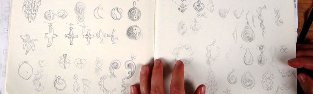
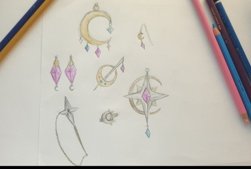
16. Sketching Jewelry: Draw What Draws You!: Finally, let's reap the fruits of all this preparatory work and dive deep into our
sole topic and sketch. Let's bring all of this
preparation together. Let's get into sketching. We want to try to connect our sole topics with
jewelry design. I like to start with simple
shapes which can express the essence of my dream
topics as variable objects. So I'm searching for symbols, simplifications, abstractions. As I've chosen my
vacation in Greece, I ate ice cream, and so maybe there could be a golden ice cream cone and three pearls as
ice cream in gold, you could put a little
pattern that looks like a waffle on the
surface, actually. And then these pearls
could be fastened to it. And then this could make a little pennant or
maybe an earring, right? Like, here's the ear lobe. Here's this inner part of
the ear. Here's the earlobe. And through the ear lobe, there would be this
little pierci thing, and there would be
this little fastener. And then, yep, just like that, we would have an idea.
So this would be flat. Just like that, we would
have an idea for a piece of jewelry that would make sense in the context
of our sole topic. Or if you win
snorkeling, actually, we could go for a pendant that is shaped like
one of those fins, right? Like those swimming fins. And that could be made in silver or copper or
any other material, and then it could become
a little pendant. And you see, I'm not really doing much of
shading here, right? That is just simple shapes. They are not intricate
or anything. It's just like, Okay,
I have an idea, and how can I indicate this
idea with a few strokes, a few cross hatchets to
indicate some shaded area, you know, to indicate
that this might be a recess in those
swimming fins. Or if we continue with
the idea of snorkeling, we could even think of a fish that could wrap itself
around the finger ray. Like a ring. And we could think about how
could we go about that? How could we bring that
kind of style to life? And I mean, I'm
thinking here along those lines that it's
gold or silver, right? But maybe you could
also think of earrings. Let's say, here's my ear lobe. And here's this little hook that goes through the ear aid. And here I want to
have a chubby fish. I just like chubby fish, and I would like to have
this out of laser cut wood. So that would be wood, right? A little rough, flat, or even a three D printed fish. You know, maybe a longer one. You could three G print
this from sketch to model, actually, if you had a very
simple shape like that. So there are so many ways to include your soul topics as
symbols in your designs, and you can go from
pretty figuratively like this fish to more
abstract like this fish. So if you like music,
I've chosen the singing. You could, of course,
you could use a note and make a little
earpin out of it, right? That just sits here on the ear. Or you could go for something
more abstract and you could design a ring that resembles a sound
wave like that. This wraps around the
finger, you know, and it's the sound wave
of your favorite song or your loved human has
said something like, I love you or you
want to marry me, and that is the sound wave
representation of that, right? Of course, it couldn't be
too sharp on the edges. You always have to when you want to design
something wearable, you always have to
keep in mind that you don't want to make
it too uncomfortable, especially if that's something
that they should wear more often and not just for
super special occasions. And to go even more
abstract, let's say, for the vacation, you want to make a pendant
that represents the sun. And that is just one simple golden flat disc, nothing more. And you put a little
jump ring at the back, and then you have a pennon. It's very abstract, but
it's still very symbolic. Of course, then you could
choose to engrave it. Like that. Maybe put a little
diamond in the center. Okay? There's so many options on how you could design a piece of jewelry
resembling the sun. But the most abstract is always
simple geometric shapes. I mean, a fish
could basically be a triangle and a
square rectangle, another triangle, and yet
one more triangle, right? So there are many options to represent things in the world
with very simple shapes. And that is so cool with jewelry because it doesn't have
to be super detailed. Often jewelry is
especially interesting if it is less, like, reduced. You might know the saying
that good design is when you can't subtract
anymore from it, right? And what would you
substract from this? There's just this circle. There's nothing else, so it's hard to subtract anymore
from this design. And that's why very
simple designs, they often have a very,
especially with jewelry, they have a very good impact, but it depends on
personal style, and some they really like
more playful and whimsical, and some they really like
abstract and clear cut shapes. And it all depends on
what you like here. You are doing this
for you, except you're designing this
for a beloved being. But even then it should you
should like it as well. I have seen that
if I try to draw stuff or to think of stuff
purely for other people, only for them to like it
like I want to design something that has to be
liked by someone else, it just doesn't work. I have to be on
board emotionally, and that's why I made this
little mind map together with you because these
are your topics, and these should
be your designs. So, of course, you could also choose to incorporate
typography into your designs. Maybe you want to make a
pendant that says sun. And then we can think, Okay, what would, I don't know. That's not very sunny.
I was thinking of something where some like this. Okay, that looks
rather more punk. Like, okay, I would say punk. Yeah, but Okay,
that's a better Okay, I want you erase. I
will just keep it. Let's say you design
such a pennant, you know, like a speech bubble. And it says power. Let's say that is made out
of super neon green leather. Like there are some kind of these fake fall leather pieces, and there are some
jumpings in there. It looks a little punky, and there is one of those which you can
punch through material, and then you put the
chain in there like that. And if you make that big, like, here's your neck
and this is, like, big, then this is a
statement piece, you know? So there are many ways of incorporating
typography, as well. And I have a YouTube video
where I show you how to design a ring that has a name, or I think I made a
ring that said jewelry. Like this. And it wrapped around the finger, you know, as a ring. And it was three D printable. So, of course,
something like that or something like that or
like that, the pearls, they would have to be extra, but many of these things can be three D printed or made
three D printable. Okay. So another thing, try finding a focal
aspect in each design. Yeah, don't put too much stuff
on their design at first, but use one focal aspect. That's why I focus
on single words here in our sole topics
because often, it is best if you
just as I said, if you focus on one
single aspect and you try to tickle out the
expression in jewelry. Okay? Of course, you could also incorporate
typography as engravings. For example, inside this ring, the thing that was spoken
could be written, you know. So, use a focal thing,
you know, focus. This could be a shape, and one of your words, this could be a specific object. One specific stone. Of course, there are so many designs that incorporate beautiful beautiful stones, and we could also take a
citrine like a citrine stone, and we could put it below a little pennant that you
could put on your ear, and you could hang it, you
know, with a few jump rings, and then you would
have a very yellow, shiny stone that
represents the sun, and then you have a little
tiny stud for your ears, which also represents the sun. Okay. So these two go together, but they represent they
represent one topic, one focal topic, and I like to play on the sun,
as you can see on this. I really love to be in Greece. Another aspect that's
important here is try keeping your strokes
light and loose at first. To easily be able to erase some erroneous strokes and
also to find your shape, like the way that
I draw circles as I first very lightly
indicate them, and then I continue to kind
of set them down, you know? And if one stroke goes ori, you can always go in there and refine the shape with
your eraser, as well. You can work additive,
like positive. You can add strokes, but you can also erase some and
keep the perfect line. But in case you don't
like the design, just as I did with
this punky sun here, which might have been cool. But rather than erasing it, now I'm following my own advice. Rather draw a new
design next to the one, you'd feel the urge
to adjust before you adjust too much because you
have lots of space here. Yes, we can draw
lots, lots of stuff. We don't need to be cringy
skimpy with our paper, right? Because this is for exploring. So stick with the
first thing that comes to mind and draw
it and then jump to the next free spot on
your paper and draw the next thing that is
connected to your soul topic. Don't stress about
finishing every design. Don't stress about
making it perfect. It's about the process of bringing ideas freely
out and on paper, and we absolutely want
to mirror the aimless, spontaneous nature
of creation that we first hinted on with
finding our soul topic. This was also free association. Once you settled in a bit
and you notice some things especially like maybe
you honed in on the sun topic and you
kind of design more, and maybe you combine it
with music and so on. Then you might choose one or a few designs you especially like and where you really feel a connection to, as with the soul
topics, you will find your soul pieces on here. And sketch them once again, or refine the strokes directly. Like really go in there, try
to bring out the details, try to bring out
light and shadow. Also you can draw them
in a bigger scale, to be able to bring out
more details in that way. Make sure to regularly
reference your references, both your soul topics, and also any kind of reference that you
found beforehand that was inspiring to you. It will make for an
even more fun process and you will get inspired
again and again. It will be a kind of
self reinforcing loop, be sure to use everything
that gets your gears turning here and your
juices flowing and Alright.
17. Coloring:Pearls: If you now ask yourself, what can I do with all
these sparkling ideas that I just brought
out into the world? Here's some suggestions for you. Now that we have some interesting ideas
brought or piece of paper, and you feel like you have
maybe exhausted this supply of creativity for now
because the ideas become less and it starts
to slow down a little bit, then it can be
very worthwhile to stop for now and revisit
this at a later time. Times we like to refine some of those ideas
which we brought to paper because we feel they are especially good or
creative or interesting. And for this, there are a
few options, of course. I have been diving into my
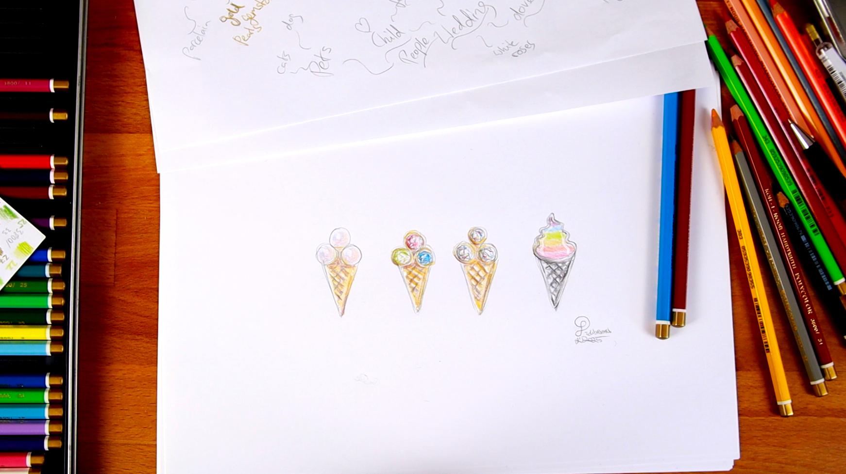
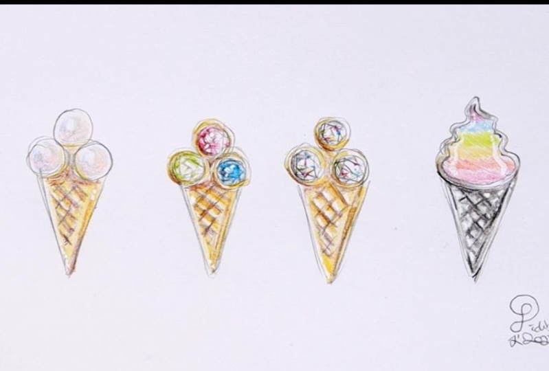
little ice cream cone here, which for some reason,
made me quite happy, and I wanted to explore that
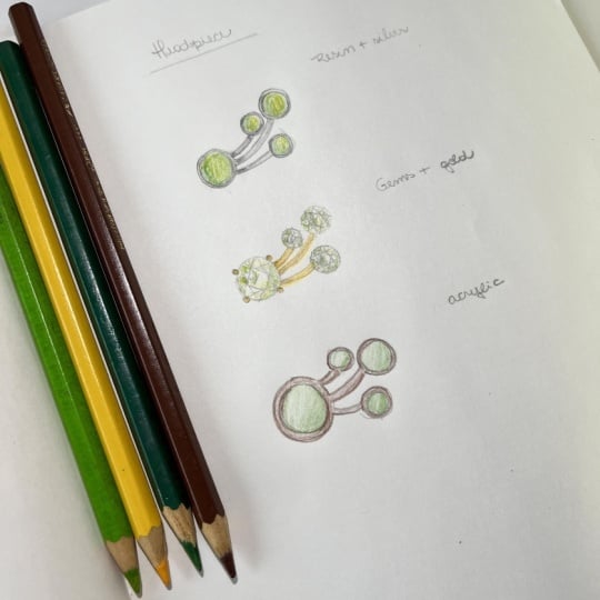
idea further, this one. So I drew that a few times. On a new piece of paper, and
I even made a variation. And I did this so
that I can build on this design so that I can explore this one particular
idea in more depth. And maybe some new ideas
will spring forth from it. And I'm aiming at varying the materials that I use for
these different versions. So I still have a flat piece of gold below fastened
to these pearls. And I indicated this with
a basic colored pencil. I have created a
little sheet for me here where I just drew
some swatches and marked which number makes the particular color so that I know which
one I want to use. And of course, you are
free to use watercolor or acrylics or any other kind
crayons, felt tip pens. And this gold here, I indicated the main
lines with the pencil, and then I put some
yellow in here, and then I use some
brown to indicate the darker areas in this
pattern in this waffle pattern. And then I also used a white
ink pen in case you want to put a little glimmer spot on top of some dark
area like this. This can really be very helpful with all kinds of
jewelry drawings. And then we have the pearls. These are pearls, so I
should probably darken the areas here in between because this would
also still be metal. Pearls, they come in
all kinds of varieties. There are so many
types of pearls. You can see I have one,
which is quite black. But many pearls
come in a kind of grayish white pastel tone. So it's never wrong
to go very soft on the different hues and just indicate that there is a kind
of changing color going on. This is this kind of iridescent
mother of pearl effect, which is so typical for pearls. I just indicate a little bit
of different colors here, and in the center I leave a little bright spot to indicate that the light goes onto there, and the edges, I
might get myself a little bluish
gray and indicate that they're a little
less light is falling. And it's always helpful to keep the edges towards
the edge a little lighter because
pearls always reflect the surrounding light in
a very particular way. So that could indicate pearls.
18. Coloring: Colored Gems: Then the second one I
thought about could be to use gemstones instead of pearls. So I would actually
make a little setting, a little basil around
the stone to hold the stone, a small edge. And then inside, I would
do this little trick on drawing kind of these
faceted looking pieces. And you see it is already enough that I indicate
the facets here, draw this little triangle
coming from the side and the center to somehow make clear that these could be
faceted stones, right? And then I need to
decide on a color, and there are lots and lots
of ice cream variants, right? So I think one of
them would be green. It just makes some green. It could be a peridot like that. And I think another
could be pink. So it's like a
watermelon or something. Like strawberry ice cream
or anything like that. And you see, I just hint at the color coming from one side. You know, leave room
for the reflections. In one side, it is brighter
and there's more light, and that's enough for me. If this is going to
be gold as well, and what would fit well here? So we have green, we have red. Do we want some blue here? Classic, or do we
want some orange? Do we want some orange? Let's first continue
with the gold. So these are just ideas, so I don't really stress about the colors or
anything like that. If you really want to design that for realization in the end, if you want this to become
a real piece of jewelry, then you probably want to check out a few
different materials. You want to check out
some different stones to just understand what
are your options here, and this probably will give you even more insight on how
your piece could look. Here, the white ink pen is really coming in handy
just in some areas. And you can also use
that white ink pen to highlight stones, of course. Yeah, this can be very
helpful for that. So I just indicate the shadow
below the bezels here. So here as well, the gold here. What do we want blue?
I think I want blue. Blue for the sea and everything. Yeah. Yeah, I think that See, and that's why I put the gold in here first so that I could see, okay, I don't need
more orange here. I can just put a blue stone. That would be something like an aquamarine
or probably a topaz. This is very topaz like color. So that would be an
approach to vary a first design idea and
make it a little bit more concrete and come
to life through color. And of course,
this is a perfect, perfect starting point if you at any point in time want
to do a three D design. Okay? So that is
really good material to have as a reference
for three D design.
19. Coloring: Colorless Gems: Now, for the next version, I just did the same
colouring again, only that I now left
the gems colorless. Because diamonds have a lot of dispersion and refraction
and dispersion being the ability to break light apart into the
individual wavelength, just like a prism or a rainbow. And diamonds have a
lot of that ability. And so I like to
give the diamonds because when you look at
diamonds, they have fire. They have different
colors sparkling. I would just give
them a few specks of color here in
between the facets. If you ever have
looked at a diamond on video or in real life, you know that they kind
of sparkle like that. And that's probably all that I'm going to do and
maybe just gray out some facets to make sure that there's some kind of
gradient going on. Well, I know that that
could be much better, but for me, it works. That's probably already
too much color. But it works to know
that this is supposed to be a diamond. Sparkling diamond. You see, I'm not even drawing
all those facets that I described to you earlier. I'm just making a mess. Well, now for this beauty here,
20. Corloring: Rainbow IceCream: Do not make yet
another golden one. I will go for silver
one here just to indulge you and me, as well. I just trying to get
a little gradient in here to indicate, okay? There's slight and
shadow bouncing off different patterns
here like that. And silver has such a
strong reflection ability. It is reflecting so
strongly that with silver, you can basically never go
wrong if you give some really strong as if there was
something very dark reflected, you know, cause that's how
silver is, if you look at it. It has so many
reflective points, and it has really a contrast between the
light and dark part. And also, if you're clear how
your pattern should look, if it goes in or out, I just drew a waffle
pattern here, but I actually I guess
the way I drew it, it would be that those lines here would come out and
these would be indens, those squares in between. And that's why the light
is casting a shadow from here and there's a brighter
spot in the lower part. Yeah, and I didn't do a really good job
on the silver here. It's all practice, and I'm not doing the coloring
part so often because I use so much three D. You know, three D teaches you
not to use so much. But I guess with enough
stumbling around. You can at least imagine
that this looks good, okay? So then the question, what do you do with
this upper part? And I was thinking
of making this also mother of pearl,
but another color. But of course, we
could also make this, for example, with glass. We could use enamel, and then we could
give this any color. So some evil force inside me
wants to make that brown. But I guess a real
ice cream cone would have a white cream
topping, right? So like that, and I would
indicate that this here is kind of a band piece of
metal that holds the enamel. Let's not make that brown.
I have a better idea. Let's make that rainbow colored. Start with red here. So that is rainbow
colored enamel. Whoo. That was a
close call, right? So there we're going
to put some orange. So I'm just drawing, like,
a rainbow colored enamel. So imagine we would
put some glass beads, very small glass beads in here, so small that they
look more like sand. And then once you put
them inside there, yeah, you heat it, and then
the glass melts and then it changes into a fluid. And then it stays that way. Once it cooled down, Okay, so like that, we could make the edge silver colored as well. We could also make
it gold colored, which would be a cool
contrast to the waffle. Shall we make it gold colored? I mean, we could have the
option to draw yet another one. And, I mean, it would
connect to the other side. And I think without this, even this part here,
this upper part would be very interesting
to behold, indeed. Let's keep it silver for now
because just to keep it in one style with the lower part
and also silver is white, of course, so all
the colors will look more natural with
your yellow gold. Of course, they will
always have a kind of hue, special kind of hue, yellow hue. Yeah. So now we have some
rainbow colored poop, ice cream cone here, give it some dark spots where
there are no highlights. Yeah, that looks so nice
that I actually want to give it my little
initials here. That would be how
I would go about refining an idea that comes to me through this whole
process or any other idea. In this way, you
might end up with a real nice piece of work.
21. Further Thoughts on Collection: If this process has
caught fire with you, you could also start thinking
of creating a collection. The process is the same as with the previous brain
and soul storming, we did with all these exercises here with our little
map of meaning. Just that you focus even more on one particular theme throughout multiple pieces and try to connect them in
a coherent way. Basically, that was already
what we were doing here. So this could be the starting
point for a collection. And if I now decided
I would also want to have a pendant
that has an ice cream cone and I want a really big pearl that indicates just
the ice cream. I would put that all together, then I would already
have a collection going or at least the
idea of a collection. Okay? So this could be further next steps that
would probably be very fun to think
about and to actually.
22. Further Thoughts: AI Support: Another thing that
you could do is ask any kind of AI image
generator for help. If you have an idea,
but you feel it's missing a certain
kind of flavor, a certain kind of, I don't know. It's called
DascaVaEtra in German, like a certain something. Use an AI, give it the
description of what you envision, but maybe are not quite able to articulate visually and
then see what comes out. And then don't copy
it straightaway, but think about how what came out could be incorporated
in your idea.
23. Further Thoughts: Handcraft and 3D: How could these
designs be brought into the real world
in any material? Maybe you ask a goldsmith who could work on
such a piece for you. That would be an
amazing experience to design your own piece and
then have it built for you. That alone would be amazing. And the goldsmith would be
very intrigued, probably, if you give him or her such a specific idea and challenge him or her
to make it a reality. This is the perfect
base, as I said, to incorporate into
a three D project. So any of these designs, I could now challenge myself
to build and blender. And maybe you already know
that I have lots and lots of classes available to help
you with doing exactly that. So feel free to dive into other classes of mine
if you want to bring this into three D and maybe even make something
three D printable out of it.
24. Final Thoughts: I hope you had lots
and lots of fun with these promptings and exercises and sketching and everything. You see, this has
become quite messy with all the different
ways we approach this, but I feel coming from just words or maybe symbols
that you feel drawn to, then playing with us to create
something that is uniquely personally yours
and meaningful to you and put that into
a kind of symbol, cast that into an actual object that you could hold
that you could wear, that you could gift to someone. This is such a meaningful
process, you know? And jewelry, if you actually make a piece of
jewelry out of metal, it can survive for
thousands of years, right? That's one of the very
intriguing things about jewelry, because if you use
precious metal, this can become kind
of a time capsule for our specific point in time. I don't know if you ever
looked at it this way, but in a way, you are starting a process here that is a way of immortalizing something
that is uniquely, personally valuable and
important to your soul. And that alone is such an
amazing idea, at least to me. I'm not always thinking
about when I do jewelry, but I certainly think
about the impact that such a design
realized could have on future generations
and even something as playful and mundane
as an ice cream cone, you can see that
there can be lots and lots of variations
of this topic. And I think especially this one symbolizes some kind of
our meme Internet culture. I don't know why
I feel that way, but it just seems
to me so internety. And if that would be a real
piece of jewelry, well, it would bring
those virtual ideas back into the real world. And in a way, the whole
process is like that. The things that are floating in your mind to bring them out, to draw them out of the treasure island of your soul and to make them
into something more tangible. So I hope you enjoyed that
journey together with me.
25. Thank you & Outtake: Hello there. I hope you enjoyed this class as much or even
more as I enjoyed creating it. Should I make a
follow up on this? If yes, what kind? Please share your
soul topics and beautiful sketches in
the project gallery. Write your thoughts and
feelings about them. I'm excited to take a peek and immerse myself in your world, just as you have just honored
me to take part in mine. If you like to, please
leave me a review. This is a perfect way to share your experience and
at the same time, help me greatly as a teacher. You can share what you
think about the class in a constructive way and help me make better classes
in the future. It will also help spread
the word of the class. So if you liked it or
disliked something, why not share it with me? Of course, take me on Instagram
when posting your work. I'll be sure to repost it
if I see it quickly enough. Also, you're welcome
to check out my other classes or my
free content on YouTube. And finally, book a
one on one with me if you want to really dive
into sketching and drawing, as well as three D
and jewelry design. For now, let me wish
you a wonderful day. Thanks for taking the class, and most importantly, keep
igniting that spark inside. See you around. Bye bye. This was also freely
association, free associative. My my goodness. This was a free associate exercise or just something
cool, yeah, yeah.
 Gesa Pickbrenner, 3D Jewelry Artist & Designer