Transcripts
1. About the Class: No. If you've ever felt stuck trying to
mix the right shade or unsure how to combine
colors without making mud, this class is for you. Whether you are just
starting out or looking to deepen your
understanding of color, in this class, you'll get practical skills you can
use in every painting. Hi, my name is Alexandrina. I'm a watercolor artist, and I've put together
all my knowledge about color mixing into this class to help you
understand it better. Throughout our time together, you will learn everything. From color theory and
understanding watercolor labels, to color mixing techniques, and main rules of creating
limited palettes. I will show you a full
process of how I'm making swatch cards and
why it is very helpful. Share my favorite
color mixes with you and explain how to
choose water colours. As a class project, we will create a
color chart together. Grab your brushes, your
favorite watercolors, and let's dive into the world
of color mixing together. See you in the
class and remember every artist started
where you are today.
2. Color Theory: Welcome to this watercolor
class on color mixing. Before we dive into the
hands on techniques, let's take a moment to
understand why color theory is essential and how
mastering color mixing can improve your
painting skills. Whether you are a beginner
or an experienced artist, knowing how colors
interact, blend, and influence one another allows you to create harmonious, vibrant and
intentional artworks. Without a solid grasp
of color mixing, you may struggle
with muddy colors, unbalanced
compositions or a lack of depth in your paintings. So why is color
theory important? Understanding color
mixing helps you to avoid over reliance on premixed
paints and easily mix any color you want
with the ones you have in your palette to expand your range of colors
using a limited palette. Create depth and harmony
in your paintings. Develop a personal and
unique color style. By learning color theory, you gain control
over your palette, making your work more
expressive and dynamic. In the center of color
theory is color wheel. In the next lesson, we
will talk about it more. One of the most influential
color wheels was developed by Johannes
Eaton in the 20th century. Eaton introduced the idea of warm and cool colors which deeply influenced
modern color theory. There are three main color
models RYB, RGB, and SMIC. We will start with RYB, most traditional color
model used by artists. In the center of
this color model are three primary colors, red, yellow, and blue. They are called primary
because they cannot be created by mixing
other colors together. Instead, they serve as the foundational
building blocks from which all other colors
can be derived. By mixing primary colors
in different ratios, artists can create secondary
and tertiary colors, allowing for an
extensive range of hues. RGB represented by red, green, and blue used
in digital screens. This model is not
applicable in art. SMIC model used mostly for printing and graphic design and represented by four colors, Can magenta, yellow and black. This color model creates more vivid and bright
colors which are not very convenient in
realistic painting. As a watercolor artist, you will primarily work
with the RYB color model. Now that we've explored why the color theory
is essential, let's move to the
practical side, starting with the color wheel
and watercolor consistency. In the next lesson, we'll break down primary
and secondary colors and learn how to mix
them effectively. So grab your paints
and let's begin our journey into the
world of color mixing.
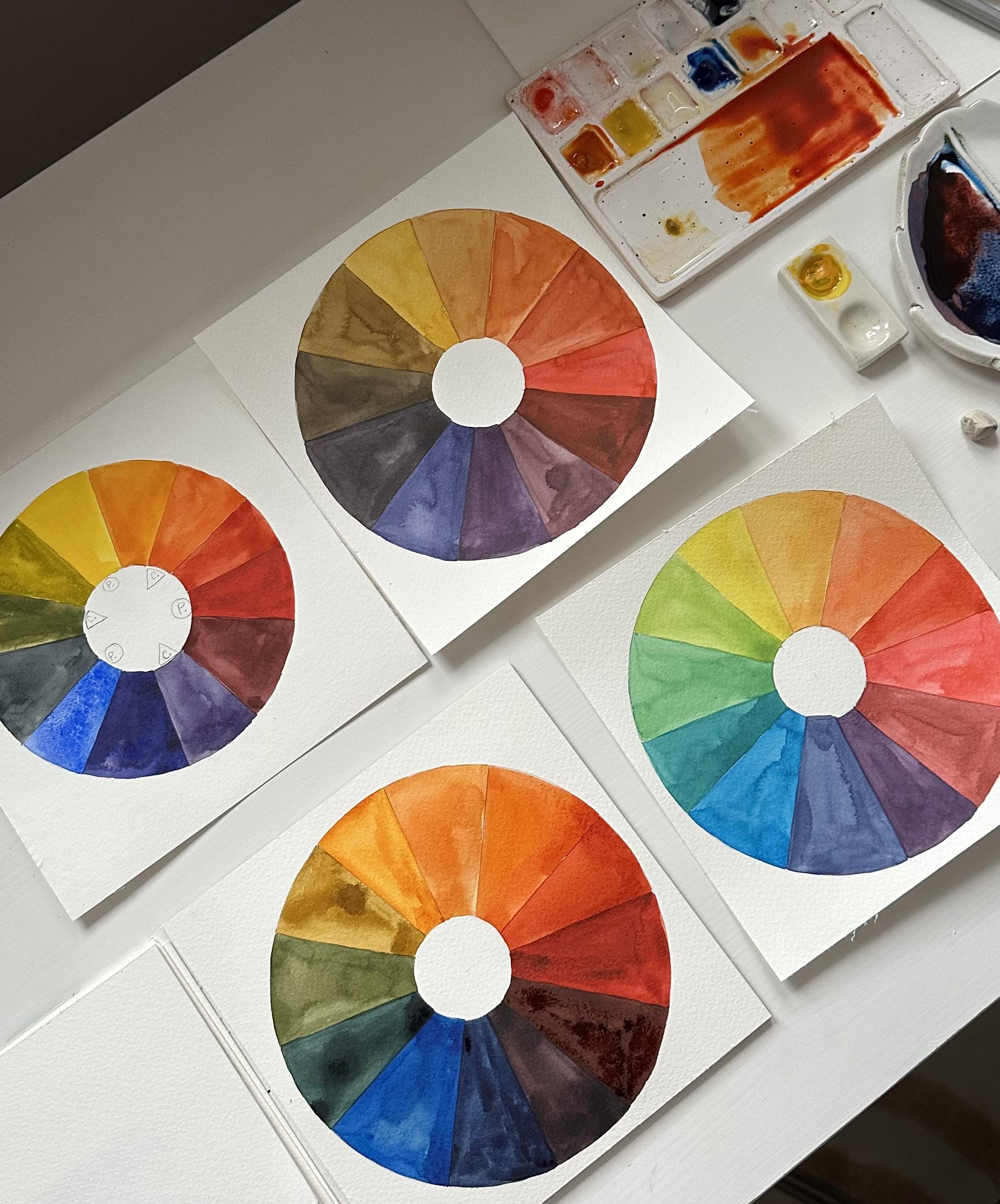
3. Color Wheel and Color Value: In this lesson, I wanted to discuss with you color circle, Ocala wheel and color value. Let's start with color circle. In the color theory, there are only three primary
colors yellow, red and blue. You can get all other shades by mixing primary colors
with each other. In order to create
secondary colors, green, orange, and purple, you
need to mix primary colors. So in order to get orange color, we are mixing 50% of
yellow and 50% of red, and we get our orange color. And we are moving to the
next color green color. It's a mix of yellow and blue. And as you can see, I got
quite warm green colour. This is because I used quite
warm yellow for this mix. And if you, for example,
using lemon yellow, it will be more cold because the lemon yellow is more
cold than Indian yellow. And we're doing absolutely
the same to get purple color by
mixing blue and red. Once we're done mixing
secondary colors, we can move forward and fill our color circle
with other shades. We're still using
mix of two colors, but we add more of one color. For example, the closer
shade to the yellow, I add more yellow than red. So I get this very
warm yellow color. And here, for example, I mix blue and red, but I add more red than blue. And the shade that lies
closer to the blue color, I add more blue and less red. So I get different
shade and so on. Basically, this is how you can paint anything with a
very small palette. For this class, I picked primary colors so you could
test how their mixing works. In the color wheel,
there are also complimentary and
analogous colors. Complimentary are the opposite
colors on the color wheel. Analogous are the colors with a similar temperature,
either warm, red, yellow, orange, or
cold, green, purple, blue. To become more confident
in mixing colors, you have to practice and to mix colors from your
palette with each other. Also, you may paint your own color wheel to
understand how the mixing works. And my question is, which colors do you need to
mix to create a brown color? To explore color value, you will need just
one color and water. By mixing these two ingredients
in different proportions, you will get colors from nearly transparent
to very saturated. Understanding the
watercolor consistency will help you in creating smooth gradients and in general in different watercolor
techniques like glazing. There are three main
watercolor consistencies, which cold tea,
coffee, and butter.
4. Understanding Watercolor Labels: In this lesson, we
will talk about watercolor labels,
forms, and brands. There are several forms, each with different
characteristics, pens, dry solid cakes of paint that
are activated with water, great for portability
and travel, and recommended for beginners
due to their ease of use. Watercolor in
tubes, liquid paint that can be squeezed out
and diluted with water, offers more intense colors and
is ideal for large washes. I normally use watercolor in tubes and place them straight on the palettes or use these
small ceramic palettes. On these little palettes, I place colors I use more often, normally it's primary colors or colors from my
limited palette. You can buy empty pens and fill it with watercolor
from the tubes. Pens are best for beginners and generally the
easiest to start with because they allow for controlled pigment use
and are less messy. Tubes are great for
those who plan to do larger works and need
more pigment intensity. And the last one is
liquid watercolor. I use it for creating
blurry backgrounds, but keep in mind
that most of them have pretty low
light fastness rate, meaning they will fade out over time with the light exposure. Now let's learn how
to read labels. Every professional grade
watercolor tube or pen comes with a label
containing key information. Here's what you
need to look for. First and most important
is pigment code. This indicates the exact
pigment used in the paint. PB stands for pigment blue, PR for pigment red, and so on, followed by a number identifying
the specific pigment. You can see my guide on
art supplies attached to this class where you will find
all names of the pigments. Light fastness rating
determines how resistant the color is to fading over
time when exposed to light. From one, excellent,
extremely resistant to fading and five poor fades quickly not recommended
for professional work. There are also
opacity indicators, staining and not
staining indicator, which is more relevant to
the professional artworks. There are single
pigmented colors which are pure and mixed
predictably and also multi pigmented colors can create muddy mixes if
combined with other paints. You can also recreate the multi pigment colors with
a single pigment colors. There are different
watercolor pen sets, and of course, they
can be pricey. But for beginners,
starting with a 12 color pen set is ideal. This provides a good range of colors without overwhelming
you with choices. You will learn about
color mixing and getting any hues from
a limited palette. These little sets have all necessary colors
for the color mixing. You might find some
cheap and big, no name watercolor sets of
36 colors or even more. Don't buy such sets. The quality of such watercolor
is usually not good, and you will get messy and
confused with all the colors. It is much better to
learn color mixing and use less colors,
but better quality. You can find links to some
of the watercolor sets I recommend in the
Art Supplies guide in the attachments
to this class. I also describe main characteristics
of watercolor paper, watercolor paints and brushes, along with the colors watches
of my limited palette. And finally, let's talk about watercolor brands that I use. It's most affordable an go
and brand by Royal talents. This is quite good
quality of watercolor, and they are quite affordable, but not very huge range of different shades and
colors in the palette. But if you need
some basic palette, this is quite good. Another affordable
student grade watercolor is white Knights. A bit more expensive, but still quite affordable
is Shinhan PVC, and I use some of the colors. I don't have a lot, but I love the ones I use. Also, Windsor and Newton, I have only these two colors, but they are highly
recommended by other artists. I have a few colors
by Migel Mission. And there are two brands of professional grade watercolors
that I use and love. It's Schminke. They have 5 milliliters and 15 milliliters tubes, also pens, but I mostly use watercolor tubes and also
American brand Daniel Smith. I love them particularly for the granulating
series Prima Tech. They have a very big
range of colors, and the quality is great.
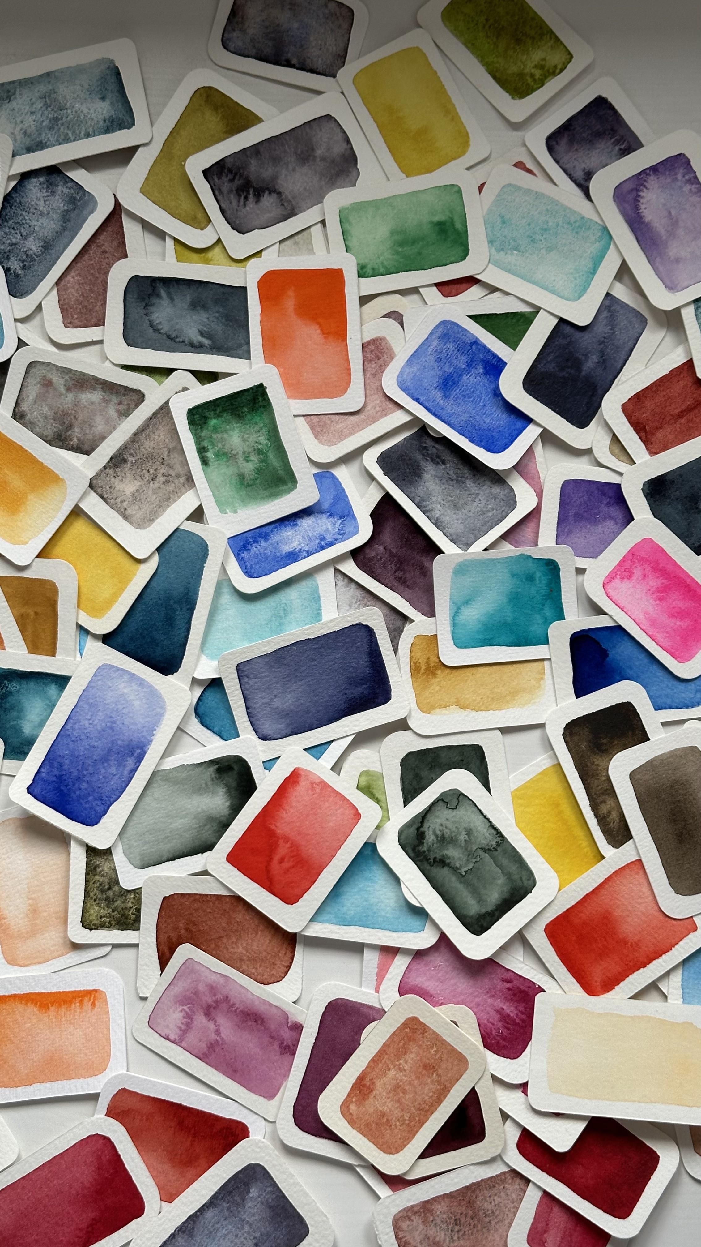
5. Creating Color Swatches: In this lesson, we will
talk about colors watches. Creating colours watches
and colour cards is an essential practice for
any watercolor artist. Not only do they help, you see how colors
appear on paper, but they also prevent unnecessary purchases and confusion when
selecting paints. Different brands often use unique names for the same
pigments and other way around. For example, permanent
yellow Dip by Shinhan PVC and Indian
yellow by vango. Both of these colors have
one pigment inside PY 83, but totally different names. For example, neutral
tin by Penix and vango. They both have the same name, but different pigments inside. I store my color
swatching cards in a metallic box from
the postcards. And I have the cards. On one side, I have the
swatch on the other side. I have the name of
the watercolor, the brand and the
pigment inside. Color swatches help you to understand the true color
representation on paper. It's really important
when you are choosing the palette for your future
painting because color you see in a tube or
pen is often very different from how it looks
when applied to paper. Also, swatching helps you see how light or
dark a color can go, a level of transparency, and whether it has a smooth
or granulated texture. Colors watches also prevent you from buying same colors twice. Or on the other way around, you can buy the same color or same pigment you need
like I did with Olin. Before I had Allen
by white Knights, but now I can't
buy it in Poland. So I bought same
pigment by Schmink. Recently, I bought
two new watercolors. Yellow Oka by Windsor
and Newton Qutman and handsy Yellow
Deep by Daniel Smith. So let's create swatch
cards together. I have here handsy Yellow
Dip by Daniel Smith and Yellow Oka by Windsor
and Newton Quatman Series. For my swatch cards, I'm using leftovers
from my old paintings, and I just cut out these pieces of clean paper
from the painting. The approximate size
of the swatch card is 5.5 centimeters
per 4 centimeters. But of course, you can
make it bigger or smaller. It's up to you and which is
more convenient for you. I'm using my
stationary knife and metallic ruler to cut
out the swatch card. You can search on Pinter
different ideas of swatch cards and swatches to find the
perfect solution for you. To make my swatch cards look
more aesthetic and nice, I use round a punch for
making corneas round. I bought it from Akpres
for something like $5, and it's not necessary. I just looks nice. Now, I will make watches
of my new watercolors, and I will compare yellow
Oka by Windsor and Newton to yellow Oca that I
had before by Shinhan PVC. I'm careful watching the color. And if you have a bigger cut or you are watching
in the sketchbook, you can create a color wash where you will see
the color from the most opaque and a lot of pigment consistency and
to the most transparent, where there is a lot
of water in the color. This Cotman series by Windsor Newton is
pretty affordable and it still has a pretty good
quality of watercolor. I don't usually use it, but I wanted to
try this brand as well because I heard a lot
of good things about it. And what I see on
the yellow Oka, I like this color for sure, and I will use it instead
of the color I had before. There are different
ways of keeping colors watches and swatch
cards is one of them. Some people are storing their color swatches
in the sketchbook, but this way is not very convenient for me
because I don't know how to add a new color
swatch when I already have some page of red
colors, for example. Creating color swatches is a very fun and
relaxing exercise, and I hope you will try it. I will see you in the
next lesson where we'll explore mixing
techniques. But
6. Mixing Techniques: Now let's try and
mix some colors to understand what to
color ratio and how proportions of
different colors affect the final color mix. First of all, I want
to remind you about main watercolor techniques
we can use when painting. Normally, I mix colors
on the palette, but in some cases, we can also mix colors on the
damp surface of the paper, for example, for creating
smooth gradients. There are three main watercolor
techniques wet on wet, wet on dry and glazing. Let's start with wet on wet. This method involves applying wet paint onto a wet surface, so I need to apply a
clean water first. Then I apply colors
and they blend naturally and create
soft fluid transitions. It's very important to use high quality of
watercolor paper, especially for wet on wet
technique and choose paper with density over 300
GSM or 140 pounds. As you can see, the color flows effortlessly across
the damp surface. Pros of this technique
that you can create very nice watercolor effects
and smooth gradients. Cones that you have
to work very fast, and you have a very low amount of control over the
flowing of watercolors. This technique is essential
for painting the sky. Second technique is wet on dry. It's the most common technique
for creating depth of the painting and objects and
also creating sharp edges. For this technique, we
are mixing colors on the palette and then
apply it on the paper. After the first layer
will get fully dry, we can reapply the same shade
to make it more intense and opaque or we can apply
another color on top. Understanding proportions
of the colors is very important
for color mixing. Let me show you adjusting
ratios of the pigments. By blending equal parts
of yellow and red, we achieve a pure orange hue. But we can also create a
gradient from yellow to red by adding little
by little red pigment. This exercise helps you to understand better how
color mixing works and to see the whole range of shades you can create by
mixing just two colors. F. Now, I want to come back to
the glazing technique and lay the red color on
top of the yellow one. Glazing technique
helps to create depth and richness by layering
transparent washes. Because watercolors
are transparent, the colors interact with
the layers underneath, producing beautiful
nuanced effects. This technique is useful
for edding details, painting objects
with sharp edges or layering colors without them
bleeding into each other. Practice in each
of the technique, and you will easily create
sinning landscapes with gradient washes for the skies and different shades
for the background.
7. Muted Colors and Neutrals: Not every painting needs
bright, saturated colors. Sometimes the most
captivating artworks rely on muted tones, neutrals and grace to create
depth, realism, and mood. If you already took
some of my classes, you know that I always
use up to five colors and color mixing to create
harmonious and diverse shades. In this lesson, we'll explore
how to mix neutral colors, create gray using primary colors and tone down colors
for subtle effects. To mix a neutral gray shade, combine all primary colors
blue, yellow and red. Or you can mix
complementary colors, those that sit opposite each other on the color
wheel, for example, purple and yellow, blue and
orange or red and green. The key is to
adjust the ratio of each color to create
the perfect balance. The beauty of using primary
colors and limited palette that you can use
just a few colors for the whole painting. And for example, the
most popular mix for gray shade is mixing
orange with blue. But at the same
time, we know that orange is a mix of
yellow and red. So basically, we can mix all three primary colors
until we get the gray shade. Be careful. Sometimes
premade orange colors mix with blue shades
in an unexpected way, given purple shade
instead of gray. That's why it's
important to explore your color mixes before you choose colors for
your future painting. And now you can see
that mix of parole orange and blue gives
me purple shade. One of my favorite
color mixes for the gray shade is mix of
Berntiena and ultramarine. I often use this color mix
in painting landscapes, and you could already saw
this mix in my other classes. And here is a simple trick. If you add more Bonsiena, you will get a
muted brown shade. If you add more ultramarine, you will get more
cold and gray shade. Try mixing your blue
and orange colors to see the mixes you can get. Color mixes with green help to create diversity of
the green objects in the landscape like cold
shades of the green and mixes with yellow and red
to create more warm shades. Let me show you some
of these mixes. As you know, we can create green from mixing
blue and yellow. But if you need a lot of
green for the landscape, you can use premade color. By adding yellow and red, we can tone down green color, make it more realistic. I use this warm green
shade for the foreground and mix of green and
blue for the background. Dark mix of green and red is perfect for painting shadows. Mastering neutrals grays and muted tones will give you greater control over
your paintings. These subtle colors add depth, mood and balance to your work, helping you bright colors
stand out even more. Take your time to
experiment with different mixtures and most importantly, have fun with it.
8. Recreate a Missing Color: Sometimes you don't have the exact shade you
need in your palette. But if you understand pigments, you can mix it yourself.
Let's see how. Let's recreate, for example, color mouth Byron Pront. First, we need to check
what pigments inside. This color consists
of two pigments, PV 19 and PV 15. So it means that I have to find two single pigments
and mix them. You can check which
color includes particular pigment on the
website, artist pigments.org. Oh. I found out that PV 15 is Talainblue and
PV 19 is Kinecridon Rose. I have both of these colors, and now I can start mixing. First, I want to
make a swatch of the original color
mouth by Ren Brand, so you can see that I will
mix a pretty similar shade. Also, let me show you the watch of Tala blue and Kinecridonose. Start with small amounts
and adjust the ratio. More red makes it warmer, more blue makes it cola. I mix it until the color will look similar to
the original one, and now my shade is done. I think this color
mix looks pretty similar to the
mouth Byron Brand. I can also add more blue index perment on which color I can also
get from this color mix. Understanding pigments
gives you more control over your colors and
expands your palette. Without buying more paints, keep practicing
and experimenting. Try this exercise, pick a multi pigment color
from your palette and mix it using single pigment pins compare
it to the original. I will see you in
the next lesson where we will explore
limited palettes.
9. Exploring Limited Palettes: In this lesson, we'll talk
about the advantages of using a limited palette
and how to create one. I'll also show you my
own limited palette, the one I use for
almost every painting. So what is the limited palette? It's a simply small, carefully chosen set of colors that you can mix to create
a wide range of hues. Instead of having
dozens of paints, you work with just a
few versatile colors, usually primary colors
and a couple of extras. Now let me show you how to
create a limited palette and select a few versatile
colors with a range of hues. There are three
key categories to keep in mind when building
your limited palette. Primary colors, earth tones,
and convenient neutrals. One important thing to remember the colors preferably
should be single pigmented as they create more clean
and predictable mixes compared to multi pigment
colors which can become muddy. As you remember, primary colors
are red, blue and yellow. But there are lots of them how to choose particular color. A good limited
palette should have a warm and cool version
of each primary. Blues, a warm blue
like ultramarine, and cool blue like talablue. Warm red and cool red, some of the good choices
are lazarin crimson, parol scarlet, ruby or carmine. And yellows, a warm yellow, like cadmium yellow dip, or hansa yellow dip, and cool yellow like
lemon yellow or reline. Earthy tones like Bnciena, Rosanna, yellow Oca, burnt Umba. And convenient neutrals
like pains gray, neutral tint or sepia brown. These are great for shadows, darkening colors or adding depth without making
you mixes muddy. Also, you can add some
additional colors. Like, for example, I have
Lavender for the color mixes. Now let me show you
the color swatches of the colors I named before, and we will start
with yellow ones, and my favorite is Allen. Of course, I have a lot of different hues from
yellows, blues and reds. But if I would have to
stay with one color, it would be orlein or lemon
yellow because you can create warm yellow by
mixing cool yellow like orlein or lemon
yellow with a bit of red. It's much harder to create a cool yellow from the warm one. Now let's watch the blue colors. My most favorite ones are
ultramarine and cobalt blue. Normally, these
colors present in any beginner's palette or small palette of
six or 12 colors. My favorite red shade
is a lazarin crimson, because basically you can create any shade with just
a carin crimson. If you add more blue
to lazarine crimson, you will get cool red shade. If you add yellow, you will get a warm red shade. But of course, for
some purposes, I use warm red like cadmium red dip or organic
vermilion, for example. By the way on my
YouTube channel, I have 24 swatches of red colors that I have.
You can check it out. Now let's talk
about earth tones. They give you warm natural
colors for landscapes, skin tones, and
organic subjects. I start by watching Rosena I have two favorite
colors in ear stones. It's yellow Oca
and burnt sienna. They are irreplaceable
in painting landscapes, animals, and still life. Burnt Umba can be an
alternative to burned Siena. Burn Siena and burned
Umba can create amazing mixes with blue shades. Now, let's talk about
convenient neutrals. I have my favorite
color paints gray in almost every painting because I can darken any color with it. Another nice neutral
option is neutral tint. You can also include sepia brown into your limited
palette, but honestly, I think that mix of Bontian and paint gray gives a
gray brown shade. So I don't have sepia
in my limited palette. Also, you might include
some specific colors that help you create your
unique mixes that you like. For me, this color is lavender. I love adding this
color to the skin tone, use it for landscapes and
for some other mixes. And that's it. My limited palette includes
a Line ultramarine, Alizarin crimson,
burn and yellow ca, Paints gray and lavender. But you can also take a
look at the watches of my limited palette in my free guide that I
attached to this class. If you have ever bought
a basic watercolor set, you might have noticed that
it includes these colors. That's because they
truly allow you to mix almost any hue you need. One of the best ways to
explore all the colors you can create with a limited palette is by making a colour chart. This simple but powerful
tool helps you see all the possible hues and combinations your selected
colors can produce. In the next lesson, we will go step by step through
how to create a color chart so you can fully understand the potential
of your limited palette. See you there.
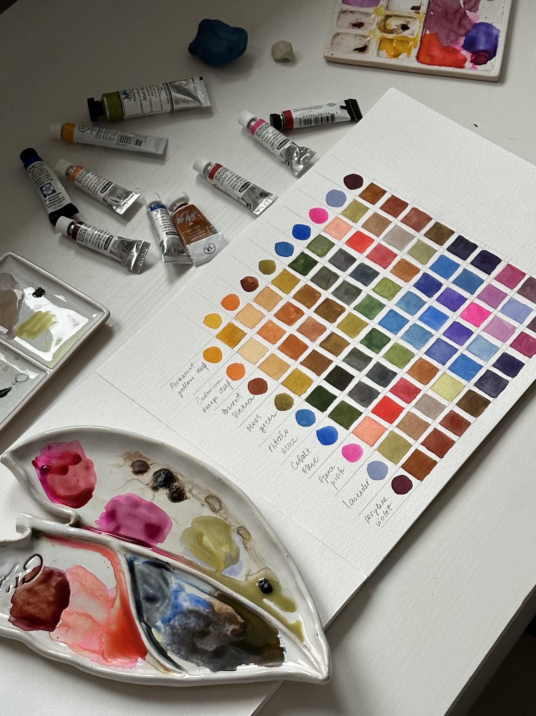
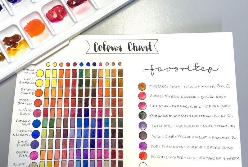
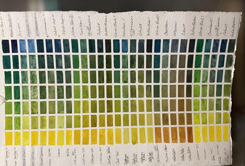
10. Color Chart : He in this lesson, we're going to create
a color chart using a limited palette of
up to ten colors. This is one of the best
exercises to truly understand your paints and see all the beautiful
mixes you can create. A colour chart is simply a table where you
swatch each color individually and then mix them together to
explore different hues. It helps you get familiar
with your paints, avoid unnecessary colors
in your collection, and make better color
choices for your paintings. Let's get started. First of all, prepare your colors that
you are going to mix. I'm going to mix colors
from my limited palette, or a lean, yellow oka, buntiena carmine,
ultramarine, and paint scram. Start by drawing a square table
on your watercolor paper. If you have six colors, you'll need a six on six grid. For ten colors, a
ten on ten grid. Each square is about 1.5 centimeters and
between the squares, I leave about 0.5 centimeters to not blend the colors with each
other when applying. I paint each color on the left
column and on the top row, and also in the diagonal squares where a color meets itself. This will show how each
pigment looks on its own. I start with light
colors like yellow and finish with dark colors
like Pains gray. You can label both
the top row and the left column with the names of your colors
in the same order. I label only left column
because the colors repeat. Now comes the fun part. In each empty square, mix the color from the top row with the color
from the left column. Try to keep a balanced mix. Not too much of one color. This will help you see
all the beautiful hues you can create from
just a few paints. I start with a mix of
Ollin and yellow Oca. Each color mix will be placed in two squares on both
sides from the diagonal. Some artists place an opaque
and more transparent version of each color mix
to avoid repeating. Now, I'm mixing
Bnciana and lein, and you see that
these color mixes can look pretty similar. And, for example, mix of Bnciana and lein looks
a bit like yellow Ocha. It means that you can
reduce some colors from your limited palette and replace them with
the color mixes. This color palette
can be different from the one I showed you in the
previous lesson because, for example, sometimes I use
carmine as a primary red. Sometimes I use A lazarin
Crimson or Ruby, et cetera. Also, you can use ultramarine or Talacinblue or cobbled blue. Most importantly, is to use
single pigmented colors, especially when we are
talking about primary colors. Now I'm mixing yellow and blue, and as we know, from
the color theory, I will get a green shade. Sometimes I use premade colors, even though I know that I
can mix them from primary. I need a premade color when
I work on a big format, or I need a big wash, or I need a consistent color. And when you are mixing colors, you can vary the
proportion of each color, so it's hard to maintain the consistency
of the color mix. From this color chart, I can make a conclusion
that blue gives a beautiful green hue
mixed with yellow shades. Now, I will mix burn
sienna with ultramarine, one of my favorite
shades because it can be very nice brownish shade if
you use more burn sienna, and it can be very nice gray
shade if you mix 50, 50. Now, mix of ultramarine
and carmine creates very nice purple shade that you can use when painting
the sunset sky. And for the dark clouds, I use this mix. Now, we are moving to mixes
with my favorite paints gray, and I will start with Oren. And this mix can
be very good for painting botanicals
because it can be very, like, dark green shade, or if you add more water, it will be like, very nice slight green shade. All mixes with Pence Gray
will give us muted colors. So if you need some
color for the shadow, you can use your main color
and mix it with pens gray. Pains gray with yellow Oca
creates also very nice shade. I used more yellow
Ocha in this mix, so it looks more yellowish. But if you will add
more pains gray, it will look more green. Unfortunately, sometimes
it's hard to maintain the 50 50 ratio of each color, and there is no other advice than just try to mix
until it looks even. Mix with burned Ciena
and pens gray creates very nice brown shade,
almost like sepia. So I think that you
don't need to have brown shade in your
palette because you can mix it with burnt
Ciena and pins gray. Mix of paint gray and Cermin
creates more bright brown. I can use this mix for
painting the roofs in the landscapes or for painting some dark
parts of the flowers. Mix of ultramarine and
paints gray creates a very nice dark blue shade
that I absolutely love, and I can use it in
painting sea or botanicals, or maybe some whales
and some fish. Actually, I used this mix for painting stormy sky
in the landscapes. That's all of my mixes, and I hope that this
video was helpful, and I encourage you to do the color chart with
your colors as well, because it will help you to understand your palette better. Don't forget to share your colour chart in a
class project section. Make a photo of
your colour chart and attach it in the
end of the class. This simple exercise will
help you understand color mixing better and explore
the colors you already have. You can repeat this process not only with a limited palette, but with any colors in your collection to see
how they interact.
11. My Favorite Color Mixes: Now, when you already know everything about
limited palette, I would like to
share with you some of my favorite color mixes. I have over 100 colors,
and after some time, I found some of the mixes I love and using
different paintings. Some of them include colors
from my limited palette, and some of them don't. Some of the color mixes I saw in classes of other artists. So I found by myself. I will start with a mix of
Lavender and moss green, Moss green by Michael Hardin and Lavender by White Knights. This mix gives us a very gentle and
light green shade that you can use in painting
landscapes of the hills, or some foreground where you need to have this
warm green shade. Next one is AsmatinGreen, yellow, vang and
paints gray vang. This one is also a muted, nice warm green shade. In general, this color mix works well for
painting botanicals. If you don't have
azimtin green, yellow, you can also try mix of
yellow and paints gray. Is will also give a
very nice green shade. This color mix looks exactly like moss green
that I used before. Next one is Opera
rose and yellow. You can use any yellow. I use. My favorite one it's Allen, but opera rose with
any yellow shade will give us very nice
bright orange color. Next one is
granulating clar mix, cobble till blue by Daniel
Smith and red shade. I used organic vermilion. You can use any other red
shade, warm red preferably, and you will get an amazing mix that you can use in
painting cityscapes, some background with
interesting texture. The beauty of granulate
in color mixes is that now this color looks
like ordinary gray shade, but once I add more water, it will bring up the
granulation to life, and it will look amazing. Next mix is ultramarine
and paints gray. I use this mix for
painting dark, rainy sky, and in general, this color mix
looks very nice for backgrounds and for
painting cityscapes. You can find scan of
these color mixes with links to the products in the
attachments to the class. Next mix is pretty simple. It's green plus yellow. I use green by white nights, and it's my favorite
green shade. Next one is again, green and lazarin crimson. If you remember
the color circle, green and red will give
us a nice brown shade. So I mix in these
colors until I get a brown shade or a very
warm brownish green color. Depending on which color you use as a majority
in this color mix, you will get either brown
color if you use more red than green and you
will get a very dark, nice green shade, if you
use more green than red. Next, color mix is cobble
turquoise and Olin. Actually, Cobal turquoise has the same pigment as cobble
Tell blue by Daniel Smith. It's PG 50, and I just found out when I decided to
swatch both colors, and I just realized they
look very familiar. So sometimes it happens if
you don't check the pigments, you can buy same color
with different name. And you can already
predict that mix of yellow and blue will
give us green shade. Now, mix of lavender
and cadmium orange deep minke gives us a very
nice brownish top colour. And the last one
that you already have seen in my
previous lessons, it's Berniana and ultramarine. This color mix you can use
in landscape, cityscapes, botanicals in basically
any type of painting. It's irreplaceable. I hope this lesson
will inspire you to explore your paints and
find color mixes you like.
12. Painting With Limited Palette: Look. It can be quite hard
to remember how colors interact with each other and which hues they
create when mixed. There is only one way to improve color mixing skills to
practice and paint. In this lesson, I
will show you how I can mix different
colors by using just limited palette and paint anything from
botanicals to portraits. I will start with painting
these purple tulips. You've already seen
in previous lessons, and I will mix the colors for painting this bouquet from
primary colors yellow, blue and red and paints gray. Here in this ceramic palette, I have primary colors and some colors from
my limited palette. As you know, from
the color theory, purple color is a
mix of blue and red. So I mix an ultramarine
and alizarin crimson until I get this purple
shade closer to Bordeaux. And I think that it's very close to the color that I
need for painting the tulip. Now, I can clean my brush and prepare a color
mix for the lips. I will mix lein and ultramarine and also
rein and paints gray. Both of these mixes will give me a green shade, just
different hues. I add yellow color until I get the green shade that I like, and I need pretty warm shade. So I'm mixing yellow and ultramarine until I
get the sub green color. Am I can also create different hues of green
by mixing this green with a little bit of red shade or purple shade that I will use
for painting the flower. This will also help me to create more harmonious
painting when I'm using same colors and same
shades for different objects. You can also experiment by
adding more and more one of these three primary colors to see what shade you will get. And for example, now I have neutral gray shade
that I can use for shadows on the leaves. And I will also add it to the
watches for this painting. Now I mostly use a mix of yellow and blue to create
some dark green shade, and it doesn't work pretty good. So that's why I always
have paints gray in my palette because it will help me to create some dark color, dark shades for the shadows. Now, I also want to try out some different shades
for the flower itself. So I will add a little bit of this muddy green to the mix
to get more muted color. So for now, I'm
just searching for a perfect shape that I
will use for painting, and I'm just watching
different mixes and note for myself if
I like some of them. I can also new the
mix of lzarin crimson and ultramarine again
on the palette. This time, I decided to add a little bit more
alzarin crimson to the mix to see what
color I will get. I think this one is too red, so I will probably use
the first mix of purple. You can try this exercise and
find different shades for one object you are
going to paint and make swatches on
one piece of paper. This is called color study, and I put the names of the colors I used
for these mixes on the same paper to just keep in mind which colors I need
to use for these mixes. Now using these mixes, I will paint this bouquet of
tulips I have on my table, and I will start with a mix
of yellow and ultramarine, whereas yellow 80% and
ultramarine about 20%, so it's pretty warm green shade, like olive green or
almost subgreen. It will be a very fast
and simple watercolor sketch without even
drawing a pencil sketch, just to show you how I use these color
mixes in a painting. Once I applied the very
light mix of green, I can add a bit darker shade of same yellow and blue
wear a bit more blue. So the color is more
intense and green. Now, I will leave for a while
the green leaves and stems, and I will move to
painting the flowers using mix of azarin
crimson and ultramarine. I can add a little bit of pains gray to this mix to
make it darker and introduce this dark
color at the bottom of the flowers, creating
these shadows. Now I want to renew
the color mix of yellow and pains grey and a little bit of ultramarine
this muddy green shade, and I want to apply it in
between the light stems I can work simultaneously
on the leaves and flowers, adding some areas to highlight the contrast between
dark flowers and the light stems and leaves. Now I add more
ultramarine to this mix, creating a bit different hue, still green shade,
but more colder. And I will use this
shade again to increase some contrast on the leaves
and stems of the tulips. And that's it, my
sketch is done using just three primary
colors and paints gray. Now let me show you
how you can mix skin tone from
these three colors from my limited palette, yellow oka, lazarin
Crimson and ultramarine. Yellow Oka is irreplaceable
color in my limited palette. I can use it in mixes
for the landscapes, for painting, botanicals,
for skin tone, apparently. And if you don't have this
color in your palette, I highly suggest
you to try it out. I will start by mixing yellow
cha and a azarin crimson. It creates a very
warm orange shade and to balance it and to make it more look
like skin tone, we need to add blue shade. You can also add purple
shade or even green shade. You can use some
of these colors to balance this mix of
red and yellow Ocha. For this light shade
of the skin tone, we use quite a lot of water to make this color mix
quite transparent. Now, if we want to mix darker
shade of the skin tone, I add more red, more blue, more yellow ca, basically creating
more intense color with less water
and more pigment. This is just a simple
example of how you can create different
shades and paint different things
using just colors from your limited palette
up to six colors.
13. Class Project: Congratulations on
finishing the class. Now it's your turn to put all the knowledge from
this class into practice. For your class project, paint your own color chart, experiment, explore, and
have fun with mixing. You can use your watercolor set and explore color mixes or just some separate colors you have to make color
chart more bright. Don't forget to use shades
of three primary colors. Remember, the best way
to learn and truly understand color mixing
is to practice a lot. I'm super excited to
see your color charts. Don't forget to submit it as a class project
and drop a review. Thank you for being
part of this class, and I can't wait to see
you in my other classes.
 Aleksandryna Gromyko, Watercolor tutorials for everyone