Transcripts
1. Trailer: When you get served
food at a restaurant, you can tell that
a lot of care and effort was put into
making that food by the chefs from
the preparation to the making to the
plating of that food. This is why a lot of people
call food a culinary art. And what better way to
represent that art than to use a different art form
photography to showcase it. And that's exactly what I'm
going to teach you how to do. And to make this extra fun, I am challenging myself
to teach you how to take really good food photos by only using your phone
in under two days. My name is Benjamin, and I'm a filmmaker and
photographer from Sweden. Besides directing
movies and working commercially for large brands
like Samsung and Amazon, I too like to sometimes
just take my time and photograph or film
something just for my sake. And one of those things is food. Food that I eat at restaurants, that I cook at home with my
wife or bread that I bake, and I like to share that with friends and family
on social media. And having taken a ton of photos in the past in
which you can really savor the taste and capture the flavor of the food that
you see in the picture, I would now like to
step forward and teach you how to
do the same thing. What I will teach you in
this course is how you can take top class
photos of your food, whether it be at home
or in a restaurant. By only using your phone. I'll take you through all
of the prep work and theory required to really master
this type of photography. This includes things
like either using natural light or artificial
light to light your food, composition and angle techniques that are used by
influencers and in cookbooks so that you
can really create some flattering angles in
your food photography. And finally, I'm
going to teach you my own personal special
editing techniques that I use in Lighter mobile. The goal is to create a photo in such a way that
the people looking at the photo can really savor
the tastes of that food. That's when you really know
that you've nailed it. You're essentially
going to go from taking photos like this, to this. In other words, it's not just going to
be Instagram worthy, it's going to be gallery worthy. So if the idea of any of
this piques your interest, it certainly piques my interest, and I would love to
have you on board. So if you're ready for
this, hit that play button, and let's get started with
the first chapter. Okay.
2. Food: A Culinary Art: Food, one of the
few essentials and pleasurable experiences that we share with almost every
other living being. We need it to fuel our bodies, to energize ourselves, and sometimes we indulge in it
for the sake of enjoyment. In addition to that, we humans like to treat our
food a certain way, like a culinary art. We not only cook
and eat our food, but when we cook it, we tend to present it in an
aesthetically pleasing way. Chefs call it plating. You've probably
heard the expression we eat with our eyes. The reason we say that
is because studies have shown that we
as people tend to think that food tastes better simply by the way it's
plated and presented to us. It's an illusion that we
don't mind falling for, like watching a magic show. We know that people don't
actually get sawed in half. We know that magicians
are lying to us. Yet we pay for tickets
to go and watch a show. It's a lie that we're
comfortable with. All the good
experiences in life is something that we gladly want
to share with other people. We no longer only
have food critics. Now we have influencers as well. People who travel the
world just taste food, photograph it, rate
and review it. This elevated form of
indulging in food is what probably separates
us most from the animals. Why wouldn't we
want to share it? I believe that if we are to
share with the world anyway, why not share it in the best
way we possibly can with properly refined photographs
that do the most justice to the food we spend so much time preparing, cooking, and plating. Photographs that are inspiring. Photographs that
you can taste. M
3. What You Will Need: The first thing that
we need to cover before anything is to talk about all the things that
you're going to need to do this course and to
complete this course. First and foremost,
you're going to need a camera on your phone. You can use iPhone,
you can use Android, you can use anything you like as long as that phone has a camera. I will be using my
iPhone together with the inbuilt camera
app of mobile. Second of all,
you're going to need access to good lighting, and by good lighting, I don't mean you
necessarily need a huge studio lamp like
the one I got right here. If you do, that's great. But daylight, anything in the house where
if you have big windows, you got sun coming through,
or without the sun, just diffused natural good
daylight will suffice. And then as a bonus, if you do happen to have some
interesting lamps, candles, small ambiental lights at
home that you would want to experiment with and use
throughout this course, you may absolutely do so, and that's just a bonus. But a main key light
in the form of either an artificial lamp or daylight will be necessary
to do this course, because in the end, lighting is what's going to make
or break your image. And the third and final
thing that you need for this course is going to be
a photo retouching app. You could use the native built in app of your
iPhone or Android, but you will be limited in terms of creating a complex style. Maybe you will
just be able to do a little bit of tweaks
to improve the photo. But if you really
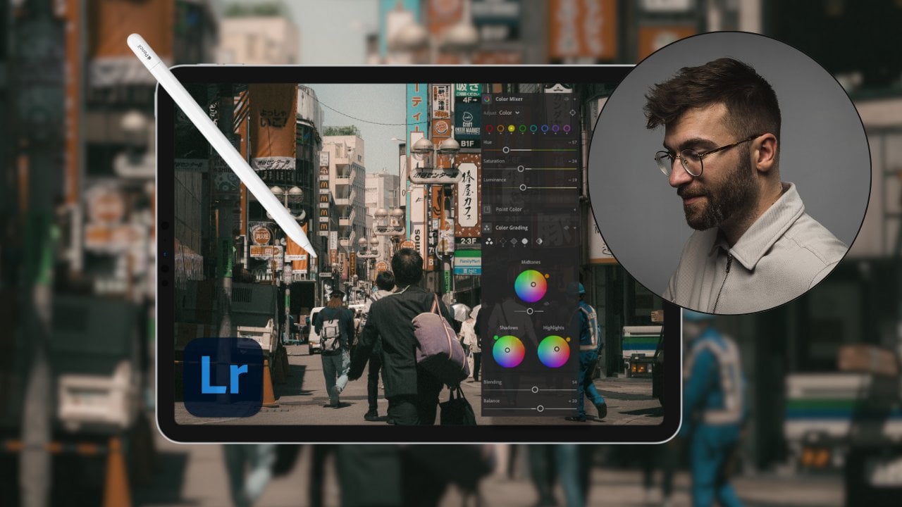
want to go all the way and create a proper style, then I would recommend for you to download Lightroom mobile, which I will be using as we go along in this course and
as I edit the photos. So if you want to tag along with me and do everything
step by step, the way that I do it and
the way that I edit things, then I highly recommend that
you get Lightroom mobile. That's pretty much
it. T hose are the three things that you
need to complete this course. Once you have those three
things checked off, just hop into the next chapter, where I will take you
through the agenda, what we're going
to do in day one, day two, and how we're going to finalize the entire course.
4. Going Over The Agenda: All right, I hope you
are as excited as I am. I'm going to tell you now what exactly is going to go down. This is going to be a
two day long adventure. Now, why am I separating
this into two days? Well, because on day one,
we're shooting at home. On day two, we're going to that special restaurant visit to photograph in a
restaurant setting. Why is this considered to
be two different things? Because at home, we
have full control over lighting composition,
camera settings, angles. We have all the time
in the world to really set up a shot
and make it happen. Whereas when you go
to our restaurant, You don't really have that time. We have to improvise
there. The food gets cold really fast, or people start eating and
when it's eaten, it's gone. So that's why this is
separated into those two days. Theory is very important to
go through as a first point. Now, I need you to bear with
me and really go through that theory because I
photographic was easy, everybody would do
it, and everybody would have access to
really, really good photos. But we already know
that's not the case. There's something special about a photographer's eye versus just a regular
restaurant goer who photographs something on
their phone for social media. So my goal here is to go
through that theory so that you can really master the basics of camera lights, composition, angles, all of that good stuff, so that you can set
yourself up for success time and time again
when you take your photos. After we finish with that and during the time
we talk about theory, my wife will go to the store and she will buy
the ingredients for the meal that we're
going to cook at home so that we
can take a photo. In both of these settings at
home and in the restaurant, I'm first going to take a photo naturally the way
that anybody would, if they were in a restaurant or they had food
in front of them, I'll just take a standard photo. And then I'll start
setting it up properly to take a more
professional looking photo. The reason for this comes at
the very end of this course, and that is because
so that we can later on compare what it
looks like from the point of view or the eye of a regular person taking
a photo and the eye of somebody who's shooting
with intention and who knows the settings and
who understands lighting. Then we can really compare the differences so that you can see that the things that you learn how much
weight they carry. And how powerful it
is once you actually know the theory
and can implement it into your photography. It's sort of like
a progress bar. You're going to be able to
see a before and after, and then I'll
discuss and analyze why these things work
the way they do. And of course, in
between all of that, we're also going to be
doing some editing to really polish those
photos and make them look as good as
possible to bring out all the good parts of that
food into photography. So as you can tell, this course is going to be very,
very practical, but it's also going to
mix in a lot of theory, a lot of heavy information. But in the end, all that information
is going to be really good for you in the future
when you take photos, either of food or
of anything else. So I hope this sounds really fun to you because it certainly
sounds fun to me. So when you're ready, hop into the next chapter and let's start talking some heavy theory.
5. White Balance: Okay. Light is everything, not just in food photography, but in all kinds of photography. So, a good photographer is
not somebody who simply has a better camera or knows how to tweak their
settings better than you. I mean, sure,
settings do matter. But what matters more
than anything is light. And a good photographer
understands not only the behavior of light and the theory
behind light, but also how they can
utilize the light to their advantage to create a really appealing photo
or a certain style. So what I'm going to do now is I'm going to
take you through, let's call it a crash
course in light theory. You can really grasp
these concepts and learn eventually how you can use that light in the photography that we're
going to do later on. Come here for a second.
Let's talk about this. All light carries a certain
temperature with it. This temperature is
measured in Kalvin. Okay. Based on this temperature, your photo might
lean more toward the blue side or
the orange side. You might have noticed
this if you've taken photos in the past and seen that each picture
looks different in color. This is where white
balance comes into play. WB. Now, cameras need a way
to read this temperature. Okay. How the camera interprets the temperature is
what we call white balance. The aim of white balance is
to make sure the settings on the camera are set according to the temperature of the light. If done correctly, the whites in the camera should look
like clean whites. This paper should look
like clean white. If your whites in the
photo look blue or orange, your white balance is off. Now, don't let this
scare you too much. I know this is a lot of
technicalities to take in, but it's easy once you grasp it. See, most cameras,
especially phones have great auto white
balance features. Which means that the camera will automatically try to
balance for the whites in the image to make the image look neither to
orange nor to blue. In most cases, if you are
using an iPhone or an android, you should have a pretty good white balance
feature already built in, you probably don't have
to tweak anything at all. But the thing is it's
not perfect every time. That means that if you take several sets of photos
of say food and you notice that each one of those photos have a
different temperature to it, that means that you're
probably going to have to fix that photo and post. This is where this theory comes in so that if you
understand this, then later on when we
get into the editing, I will start explaining
how you can tweak the white balance to balance out the images
so they look the same. Now, besides temperature
in terms of Kelvin, in white balance, we also
have something called tint. Okay. What tint is is
essentially your photo, whenever you take a photo, this is just the way that
cameras are manufactured, it will lean more toward the magenta side or it will lean slightly more
toward the green side. This will always happen
necessarily because just the way that
the camera sensor takes in information about
temperature and light. You will always have an
image that is slightly more toward the magenta
side or green side. Mind you, this is not the same as with white balance
when the image looks a little bit blue or a
little bit orange with tint, with green and magenta, we're talking about
very slight undertones. It's barely visible
to the naked eye, but this is just the
way a camera works. Now, in order to see whether or not your photo is
leaning more toward the magentas or the greens in the tint is when you open
up the editing software, which again, we're going to go through as we are
editing the photos. This is just a
forward into that. What can help is that you use the tint slider and you start sliding back and
forth back and forth between toward the magentas
toward the greens, that way, you're going
to highlight and see, was it pushing more toward the magentas or was it pushing
more toward the greens? Because the naked eye
can't really take that in unless you have a really
trained eye as a photographer. You can't really see
if it's more toward the tinted magentas
or a tinted greens. What happens is
just that you can just pull the slider in one
or the other direction, and then you can
see more clearly, is it more magenta?
Is it more green? Then the goal of that is to pull the slider
ever so slightly in either or the other
direction so that the image doesn't look
too magenta or too green, so that it's somehow
right in between. So when you balance an image, you're first and foremost
trying to get it right on set by making sure the white
balance is set correctly. In your inbuilt sort of
camera on the iPhone, especially, you can't really
alter the white balance. You're going to have
to do it in post. But what helps is that you can put a white
piece of paper, and put it under the same lighting conditions as the food you're
going to photograph. If I'm planning on taking photos of the food right
here in this table, then I'll first place this
white piece of paper, and I'll take a photo of
this white piece of paper, and then I'll bring in the
food because later on in post, when I white balance according to this
white piece of paper, I can then see what
temperature settings I have and what tint
settings I have, and then I can just apply those settings to the rest
of the photos so that the white balance
and the tint is identical to each and every
one of your food photos. That's a little neat trick
that you can use to really make sure that the white
balance is set correctly. This was just a little bit of a quick rundown of light theory, color theory and white balance. Now that you know the
basics of how light is red, let's now take a
look at the behavior of light as we
light up a subject, and we're going to do
that in the next chapter.
6. Light: A Crash Course: Okay. All right. What we're going
to do now is we're going to take a look
at the behavior of light according to this little
egg holder with a face. We're going to look at the
way the light behaves, and we're going to look at the two different
types of light, namely soft light
versus harsh light. I'll show you
through an example. Right now, this egg
holder is being lit up by a huge studio lamp that
I got going on right here. But what we're going to
do is we're going to use the flash or the built in light of the iPhone to
demonstrate how light behaves. So we can do this by now
looking at the light, but rather looking
at the shadows. This is the way that
we're going to determine the behavior of that
light. And it will matter. Later on, when you
either work with artificial light where you have full control over
the light source, or when you're working
with natural light, whether it be midday, sunrise, sunset, whether
it's coming through the window or through the
curtains or behind clouds. Those are going to
be the differences between soft light
versus harsh light. Let's take a look at
harsh light first. We're not looking at the light itself because it can be hard to determine the light based
on just the light source, but we're rather
looking at the shadows. Let me first turn off this studio lamp so that
we are in the dark. And we're only illuminating this dollar figure
using this flash. Look at that shadow right there. Let's say that
it's morning time, then the sun will be very low in the horizon
like this rising up. As you can see, this
creates very long shadows. Then during midday, typically
the sun is right above us and we can see that the shadows are squished closer
to the subject. Then of course, during sunset, we have the same
thing going on with the low light in the horizon, but it's pointing in a
different direction. So in order for you to determine whether or not you're using soft
or harsh light, you're looking at the feathering of the shape of the shadow. Because when the shadow
has very strong contrast, the edges are very defined. Typically, that means that you're working with
very harsh light. Whereas if I now turn
on the studio lamp and we take a look at the shadows
that are here right now, we can see that the
shadows are feathered out. Meaning that the light
is very, very soft. Now, why is that in comparison
to this lamp right here. Well, that's because
my studio lamp has something called a soft box, and that soft box
is like a filter where the light shines through that filter and then
hits the subject. Goes through an extra step before actually
illuminating the subject. The equivalence of that in
terms of natural light is when the sun is shining through
clouds or through curtains. Because when you have midday
sun and it's very harsh, then you have nothing protecting those sun rays
from hitting the subject. But then if you have clouds
in the way or you have curtains or a soft
box or anything else, then going through
that extra step will cause the shadows
to be very soft. Now, in terms of
food photography, typically, what we're
looking for is soft light. I would really
recommend that you try to aim for working with soft light in at least in the beginning as a beginner
or food photographer, Because with harsh light, you're creating very distinct styles, and styles can be
very difficult to achieve unless you know
exactly what you're doing. We're going to be
working with soft light for the most part. We're going to aim for
first at home photographing with the controlled light
settings with the studio lamps, with additional
lights that we have. Then in the
restaurant, we're just going to be working
with natural light. You get an idea of
how you can take good photos using both natural light
and artificial light. Now, the next question we
have to ask ourselves is, sure, we got the shadows
going on here, right? Let me turn off the
lighter as well. We got the shadows going on, but is that really flattering? Do we really want
shadows in the shot? Wouldn't that sort
of reveal that we are using lights to
eliminate the subject? Won't that sort of break the
illusion of photography? Sure, you could argue that. But at the same time,
even with soft light, even with natural light, you will always necessarily
have some kind of shadows. What we can do though
is amend that by using some sort of bounce
on the opposite side, of where the light source is so that more light is
bouncing off of a white surface to even out the shadows on the other
side ever so slightly, this will make the
shadows not as harsh and the contrast not
as harsh when taking photos. What you can do to do that is either you can get
yourself a bounce card, which is a photography
tool that you can use, which is a card with a white side and a card
with a black side. If you're using a white bounce, And then you're going to
fill in those shadows. If you're using the other side, which is a black bounce, you're going to enhance those
shadows and as a result, enhance the contrast
of the photo. I will demonstrate this, but we don't necessarily need
to use a bounce card. We can just use a
white piece of paper. Let's take this white piece
of paper to demonstrate. First, let's create
a harsh light source like so so that you can really
see what's going on here. Now we see the subject is
very harshly eliminated, and we also see that there's
strong shadows going on back here and a strong
contrast on the other side. This black becomes even blacker and there's a
harsher contrast going on. Now let's take this
white piece of paper, and we're simply
going to put it on the other side of
that light source. You can see nothing much
is going on right now. But if you pay
close attention to the black of the
backside of this doll, the closer we move
with this bound, you can see that it fills in the shadows ever so slightly. The closer I move,
the more illuminated that backside becomes of
the doll. Okay. See that? This is how you use
a bounce card to fill in the shadows and
not make them as harsh. This is where you
can do when you have full control of light, if you're photographing at home. Maybe not as much if
you're in a restaurant, but when you do
have full control, then you can use some bounce
to fill in those shadows. And if we wanted to
do the opposite, we would simply use
something like a black book. We'll take this
book as an example. We'll set up the same
lighting conditions like so. But instead of a white fill, we're going to
have a black fill. What happens then is
that the black color of this book will swallow the
light on the other side rather than bounce it off and you can see that the shadows
on the back of the head of this doll are much more prominent than
they were previously. This is a way to create an even harsher contrast you look if that's
what you're going for. But like I said,
for this purpose, we are going to aim at creating, let me just turn on this slide. We are aiming to create a soft look with the food
photography to make it look as natural as possible
and to hide the fact that we are illuminating it
using artificial lights. Because depending on well your photos or the type of
client they are working with, they might ask you to either do soft light or harsh light
in a particular style. That's why it's good to
go through this theory. So that you can make
those conscious choices and shoot more with intent
in your photography. I hope that this demonstration
with my partner in crime, this lovely little doll helped you understand
the concept of the behavior of light, shadows, and bounce cards. Now let's move on
to the next segment where we're going to be talking
about artificial lights and natural light respectively and how we can use both
of those in our favor.
7. Using Artificial Lights: Okay. Okay. So next up, we're going to be talking
about artificial light versus natural light. We're going to start off
with artificial light. Now, what is artificial light. Artificial light is simply an added light that
is made by humans. Something that
isn't from nature. In this case, we have an
already artificial light going on behind us, and I'm also sitting in
front of the window, which you might think is
already natural light. However, it's not the window
light that I'm using. I'm using a studio lamp
to fill in that light. To show you the difference,
let me turn off this lamp right here
so I can showcase exactly what it looks
like if I were to take in just the natural
light from the window. So I do have windows here. But what I'm doing is I'm
filling in that light from the windows using a studio
lamp. Now, why do I do that? Well, it's preferable that every light source is going
to be somehow motivated. So if you have a window, then place that additional light artificial
light in front of that window to fill in more as motivated by that
window and by that light. That's the difference between somebody who's a beginner
and who's a pro. A P knows how to use
so called practicals, which are those lights
behind me right now. Artificial light
is good in a way because with artificial light, you are essentially
free to control every single setting
with your camera. So you can choose
the temperature, the Kelvin of that light. In this case, the studio lamps, I know are at a
fixed 5,600 kelvin, which is daylight, which for me, that means that I can
just set my camera to 5,600 Kelvin and it's always going to
be white balanced because they're never going
to deviate from that. I go that light, but I also have a back light on this side, illuminating a little bit
on the side of my face, as you can see the shadow right here, if I move my hand here. That's because there's
an additional backlight over there that I'm using. You can see that more clearly
if I turn this off and on, pay attention to my
side here. See that? So you can with
artificial light, have all the creative
freedom that you want, just because you have full
control over the light setup. With the white balance, with where you place the lights, how you rotate them
around the subject, or how you place the subject
around those lights, everything is within
your control. And that's what's good about
using artificial lights. The downsides of using
artificial lights is that, well, if you really want to achieve a particular effect with
a particular quality, you probably need some kind
of budget to achieve that. So for instance, my studio lamp is really large,
but on top of that, I have a really large
soft box because the larger the soft filter
is around that light source, the softer the light
is going to be. So if I were to use
a really cheap lamp, that's like this tiny, I actually have one right
here. I'll show you. If I were to use
this right here, which is just a
small added light, and I turned this on, you can see that the light
source is much, much harsher. That's because the light
source is smaller, and the diffusion on that will also
necessarily be smaller. And therefore, that softness of the light isn't going
to have as much of a good effect as if I used a large light source
with a large soft box. The large light sources
with good quality, with large soft boxes, come at an expensive price. There's ups and downs
to artificial light. The good part is, you
are in full control. The bad part is, it can get expensive,
really, really quick, or you can just improvise
with small lights and do the best of the
situation that you can do. But if you think about
large light sources with good natural diffusers that are bigger than any studio
lamp on the planet, then we have to look beyond our planet and look at the sun. And that's what
we're going to talk about next, natural light.
8. Using Natural Lights: All right. Next up,
we got natural light and all the good sides and downsides of using
natural light. First of all, what
is natural light? Natural light is exactly
what it sounds like. It is light that comes from nature that is
naturally there. This includes, you know, sunlight, up in the
sky, moonlight. It can be fire. It can be anything that just is caused naturally by nature. What are the upsides of this? Well, first and foremost, natural light is a very
strong light source. It is free. And I
can also be used as a diffused soft light if
the sun is behind clouds, or you can use curtains or any
other kind of diffusers by the window to create a softer
light from that harsh sun. Natural light will also give
you a more authentic look to your photos because
you're not using any sort of artificial technology
to light up the subject, but instead you just have
the natural source of light that our eyes are used to
seeing on an everyday basis. Now, there are some downsides
to using natural light, And one of those things is that natural light is
very unpredictable. You might look at the weather
and think that you have it all set and you know exactly
what's going to happen. But the truth is you
don't know exactly when the sun is
going to be shining straight onto that
subject and when you're going to have
clouds suddenly appearing and showing up in the middle of
the frame or have a rogue rainstorm or snow or anything else
show up in that frame, which alters and this
is the bad side of it. It alters the light source and therefore alters the
photo that you're taking. So you can't always
rely on natural light. So that's a bit of a downside. Furthermore, you can't really move that natural light source. Unless you wait a
couple of hours for the natural light source to
move for the sun to move, there's not really
much you can do. You're just going to have
to adapt to the sun. But the good part about
that is that if you're doing things like
food photography and you're working
with small subjects. You're not working with
trying to photograph a building or something very large that you cannot
physically move. With food with small subjects, with people, you can always have the freedom to move the subject around. And therefore, you can adapt to that natural
light source. And like I mentioned,
you can also adapt the light source to be a softer kind of light by
placing curtains by the window, by even using a large soft box. If you have that at home and
putting it by the window. You can always do something to adapt to that natural
light source. There are gives and
takes for this, right Some people
enjoy and really want to have full control
by using artificial light, and other people actually enjoy the process and the
challenge behind adapting to the natural light source
to show up to a set without a plan and just taking a look at the
light and thinking, what can I do creatively
to make this scene work. Another small downside
that people might consider to be a downside
is the temperature. The temperature
will also change, not just the harshness
of the light, but the temp will
change as well, depending on if the
sun is just stably in one place or if there's a cloud in the way or
something else is going on, then the white balance of your photo will change
inevitably as well. This is why when we talked about white balance and
we talked about, you know, temperature in Kelvin
and tint and all of that. That's why we went through
that because when we start taking photos in natural
light at the restaurant, there might be some
changes there. You take one photo and you
might have 5,600 Kelvin. You take the third
and fourth photo. Maybe the clouds moved out of the way. We got harsher light. All of a sudden, the
temperature is different. But we want consistency in that look and we want all of
the photos to look the same, stylistically and
temperature wise. That's when it's
good to know and understand all these things and how natural light will differ depending on
the conditions of it. But as a short conclusion,
that's what we have. We have either artificial
light that we can use to completely
control the setting, or we have to adapt
around the second wave, which is using natural light, and then with the understanding of the placement
of the subjects, diffused versus harsh
light and temperature, then we can control
all those settings to create a consistent look
all throughout our photos. But both these light
sources are legitimate. Some people just
prefer to work with artificial lights
and some people prefer to work with
natural light. It just depends on
what your needs are. If you're not in a
particular hurry and you're photographing
food at home, you might have a dinner
party with friends or family or your partner, then it's not really
necessary for you to buy large studio lamps and tell
them like, hold on, guys. Before you start eating,
let me just set up this large studio lamp
with 5,600 Kelvin, and I'm going to take
this perfect photo. Like you're probably not going to do that, right?
Unless you're me. I do that, and my wife gets
pretty annoyed sometimes. But otherwise, just use natural
light to your advantage. Both ways are legitimate. Light is something that you can talk about forever and ever. I've even read a book about a cinematographer
in Hollywood who at the age of 70 wrote a book and basically just said he's
still learning about light. Light is such an
extensive topic. It's a very complex topic. And this is not a master
course in light particularly. So I'm going to
drop it right here. We've talked about
uncovered white balance, temperature, artificial
light, natural light, soft light, harsh light. I think we can stop
right here and move on to another important
function of photography, which will make your photos
either flattering or bad. And that is how you compose a shot and what
composition really is. So let's talk about that next.
9. Composition Technique: Symmetry. We all
like some symmetry. It's not only just
pleasing to the eye, but it's also a form of organization within the frame
or whatever we're looking at to make sense of
what it is that we see and what the person who created that symmetry
wanted us to see. This, of course, also
applies to photography. In photography, we
call it composition. Similar to symmetry,
composition has the same goals. You see, it's not
just the way to create a certain organization
within the frame. But it is also to serves a
purpose to direct the eyes of our audience where we want the attention to
be in the process, create a very symmetrical, beautiful looking,
appealing image. Because think about
it, in photography, you essentially have one
single frame to tell a story. What do you do with that frame? Because you don't really have
more time or more frames. If you add more frames
on top of each other, then you have something
called motion picture. That's where we get into video. Now, there's plenty of
composition techniques out there. But we're going to be focusing on the main one that they
teach you in school, namely the rule of thirds. Come with me over here and I'll show you in practice
what the rule of thirds is and how we can
utilize it in our photography. Okay. So, ladies and gents, what I've done right now is
I've taken on another actor. This time, we have a suit ball from ima zaki's spirited away. Obviously, not sponsored by
Studio Ghibli in any way. But what this suit ball
will do is it will serve as the subject that I will frame
using the rule of Thirds. Starting off, let's put up the grid line in
front of you right now so you can see what
we're working with. You've probably seen
this on your phone or another camera that
you've used in the past. What the rule of Thirds is is a compositional rule
in which you place the subject somewhere within those three blocks that you can see on the
screen right there. What you do is you
place the subject, depending on where it's looking. In this case, we have eyes. Food obviously
doesn't have eyes, so it's a bit
different, but you can still use the rule of
thirds to compose for that. But I'll show you with this
as not a human subject, but a subject that has eyes. What I'm going to do right
now is I'm going to stand up using the grid system
that we have right here. You can see the three
blocks that should approximately be
here, here and here. You can choose to place the
subject either on one side, in the middle or on the other
side. On the other side. You can also see that
in this grid system, we also have lines going like so I can't do this
properly, hold on. And so we have horizontal lines and we
have vertical lines. Where those lines meet, we have those crossing
points right there, right there, right
there, and right there. That's usually what
we call the eye line. We can place the subject
If it's looking from. If it's looking this way, then we want to
place the subject in this block right here,
looking toward nothingness. Why do we do this?
Well, because if somebody or something is
looking in a certain direction, we want to give the audience the impression that they're looking toward that direction. That's why we leave empty space in the direction that
the subject is looking. Okay. If the subject is
looking straight ahead, then we can compose
for the middle. In that case, it can be
on the bottom middle in the middle middle or in the
top middle above the line. Okay. And same thing applies if the subject is looking this way, then we compose the
subject on this side, leaving empty space here, and the same principle applies. It can be on the bottom side, it can be in the middle, or
it can be above the line. So it differs a little
bit depending on, like I said, what
the subject is. When it's a person,
then you keep your eye level slightly above those lines that we
mentioned right here. If for instance, you're
photographing landscape or you're photographing a bird flying out in the horizon in
the distance somewhere, then you can place that
subject, in this case, a bird, which is going to be
very small on the screen. You can place that bird
right on the crossing point. So like right on here. We'll turn this around
and pretend it's a bird. Right up here on that x line or in the
middle or on the side, you can compose in any
of these three blocks. Typically, it's not as
pleasing if you just place the subject bam straight
in the middle like this. It's rarely ever
interesting unless you're shooting some CV or Linked in portrait photos where the subject is supposed to be looking straight
ahead on the camera. Then you can do that. It's more for like corporate shoots. But typically you want to create the frame in a more
interesting way. So that's why you place it
according to the eye level. And if it doesn't have any
eyes, such as, you know, food photography, then just make sure to compose it in one
of those three blocks. Typically speaking, it's
going to be in the middle, especially if you're doing
food photography where you're photographing with
an overhead shot, then you probably want it to be composed bam straight
in the middle. Now, what I would like
for you to do is pick any suit ball that you have at home, any
subject, anything. It could actually be a person,
if you like, or an object. It might be easier to
work with an object and try these
compositional rules out. Photograph for yourself or
upload it for us to see. But basically, the
rule of thirds, you can choose play around
with composing on one side, on the other side,
in the middle, and on the crossing
points above, here, here, wherever you want. And also experiment with it because sometimes
you can see and notice that rules are
meant to be broken, right? You don't always have to compose mathematically correct the way that they teach you at school. It doesn't matter, really. But this is just a
general guideline for what the human eye, generally speaking,
finds to be pleasing, and especially if you're
working with clients and you're planning on freelancing
and getting paid for this, a client won't necessarily know and tell you that,
oh, wait a minute, you've composed this not
according to the rule of thirds and you placed it a bit on this side or that
side or whatever. A client is not
going to know that, but a client will feel
that something is off. This is because we're
used to watching things this way by
looking at movies, going to galleries, and
seeing photographs. This is just a rule that
has sort of emerged throughout the past 100 years
of photography and film. So in order for you to try to decompose a shot on
purpose because you find that particular shot in that particular
setting with that particular subject
to be pleasing, you first have to know
the rules in order to know exactly why you're
doing what you're doing. Remember, we always go back
to shooting with intent. Once you know the rules, then you can have the intention of breaking those
rules and creating your own style or rule according to which
you want a photograph.
10. Learning Camera Settings: Okay. Like I said, there are three ways of
light intake in a camera, and I'll try and keep this very, very concise just so you
can get the basics of it. These three ways are ISO, shutter speed, and aperture. Now, a camera takes in light through the lens
when using aperture. A camera takes in light using the camera's sensor when using ISO and same with shutter speed. Now what are all
these three things? To keep it very, very concise, if you increase the ISO, you brighten up the image. But mind you, it is not the same as adding
a light source. It's not the same as if you had a lamp and you brighten
up the scene that way. Instead, it's already using the pre existing lighting
conditions and amplifying them. That's why ISO works more like a signal boost rather
than adding actual light. What happens if you try and
force that signal boost and you crank that ISO up to really force the
image to brighten up? That's when everything
else in the image also cranks up and
you get as a result, something that we call noise. Noise always looks bad, and it's basically the image breaking apart because
you're trying to force it to brighten up when you don't have additional
light sources there. In order to combat this, you need to add more light. This is why when I
mentioned earlier in the lighting section,
light is everything. Because you can know
all the settings, you can have the perfect setup, but if you don't light
your image properly, and it's too dark and
you crank up that ISO, you will break that image. The second thing was aperture. With aperture, this is not
going to apply to the iPhone, because the iPhone uses AI to simulate the
effects of aperture, and it's not actual aperture. So what is aperture? With aperture, basically
you measure it in F stops. If you go in lower F stops, then the image will
brighten up because the aperture of the lens is going to open up and
let a ton more light in. However, then in that
case, if you open it up, you're going to get a very
out of focus background, which could be very pleasing, but it also means
that if you want to show what's going on
in the background, then opening up that aperture is probably not a good idea. And similarly, if you
increase that aperture, your image is going
to turn darker, but therefore,
you're also going to have everything else in focus. This is really
good for something like landscape photography. Or if you're photographing,
like I mentioned, overhead shots of food, you probably want all of
that food to be in focus. That's when you have to increase the aperture to make sure that everything else is in focus. But like I said, on the iPhone, I don't know about the
Android, but on the iPhone, It's just simulating
the effects of the blurriness of aperture
being low or high, but it will not actually brighten up or
darken your image. So it doesn't work
like real aperture. Just keep that in mind when you use aperture on the phone. And finally, we
have shutter speed. Shutter speed is essentially measured in fractions,
fractions of a second. And the closer you get
to that second mark, so the smaller the
fractions are, the brighter your image will be, and the more fractions you have, 100th, one, 200,
500th of a second, the darker your image will be. Now, what are the gives
and takes of this? With that, with shutter speed, you're going to
introduce motion blur. If you go all the way down to the 1 second mark
in shutter speed, then when you snap a photo, you'll notice that
anything that moves in the frame is going to
have that motion blur, and the image will
look out of focus. So those are the gifts or takes
with using shutter speed. If you really want to
freeze everything, then you should increase
that shutter speed to really make sure that
everything is frozen. But then you're going
to get a darker image, and you have to compensate for that light intake by
using the other settings. All of these are just
very technical terms that you use essentially
in a real camera. But when it comes
to your iPhone, you don't really have to pay
too much attention to all of this unless you're using
a third party software, which I will be doing, namely the built in camera
of Lightroom mobile, then you can actually control
some of these things fully. But on the iPhone, generally, I think on the Android as well, you're just going to
have something called exposure and you drag that
exposure slider to the left or right to make
the image brighter or darker and you should be
fine just doing that. In case you want to have some kind of blurry
in the background, then you can use the
aperture feature on the built in camera on the iPhone to simulate the
effect of a blurry background. And you already have
this as a preset on your iPhone if you
use portrait mode. So all you're going to
do in that case is press the little F button
in the top corner, and then you can choose the
intensity of the aperture. And as you can see, when
you go lower in numbers, the blurinss in the background
is going to intensify. And when you go up, then most things are going
to be in focus. I know I already said that
this is not something that you really have to think
about when doing iPhone photography with food. But if this does interest
you and you want to read more about ISO
shutter speed and aperture and exactly how it affects your image
so that you can have full control of your
image in case you're photographing using
a real camera, then you can go on
my website with the provided link and download a PDF diagram which shows you exactly the effects of what happens when you
affect the shutter speed, what happens when you affect
the aperture, and the ISO. So in that case, you can
really take a look at it and know how you can set your settings exactly for the type of effect that
you want to achieve when photographing and what
the pros and cons are going to be with each
setting that you meddle with. But if you feel you
don't need any of that, you just want to
shoot with the phone, then keep going because now we're going to be
talking about angles.
11. Flattering Angles: Lighting composition
and settings aside. There's one more thing
you need Angles. Angles are a way for you to
keep things interesting. It is going to be the
perspective that you choose a person to see
or view the frame. Perspective is very important because it makes
us feel something. Imagine you're
photographing a portrait of someone and you're taking a
photo of them from below. In other words, the person is
looking down on the camera. That will give the impression
that the person is very domineering,
very authoritative. However, if you
photograph somebody from above looking up at the camera, they look small and meaningless. We will feel different based
on the perspective that the camera gives us or the
photographer gives us. By viewing everything at a normal angle that you
would expect anybody to see, it becomes boring eventually. When it comes to
food photography, there's only really
about three angles that you need to
really make it work. The first being the
one that you're seeing right now,
an overhead shot. And lucky you for using an iPhone because
you don't have to do a complex rig the way that
I did with this camera. With an iPhone, you can simply
hold up the phone above the food like this and
take an overhead shot. It doesn't have to be any
more difficult than that. Why do we do that? Well, because typically food is
placed on plates, and plates are placed
on the table like this, and we would ideally like to see everything that
the menu has to offer. And we can only capture that
by taking an overhead shot. The second shot that
you might need is a shot from the POV of the
person eating the food. So you're simply placing
the phone from the point of view of somebody sitting at the table and
looking at the food. Now, you can do this either
from a wider perspective and make it really subjective or you can move in a bit closer, but just angle it in such a way that the person
is viewing the food. But you move in closer with
the camera or zoom in with the camera to get a bit of a medium shot or close up shot. That way, the
viewer is observing the food from the
point of view as if they were sitting
in the restaurant having ordered that
food themselves. And the third and
final shot that you might need is details. Any kind of detail shots. So first, you might
have a plateful of food that you wanted to take
a picture of as a whole. But then maybe you
want to move in a bit closer and take a photo of just the drink or
just a piece of tomato or just the
side of the steak. Detail shots that you can move in real close to
so that the viewer senses as if the food
is extremely close to their face almost to the
point that they can smell it. This is when we start moving into photos that you can taste, and we're only going to
accentuate that kind of level of taste later
on in the editing. But everything starts from set. So first, start off with an overhead shot,
practice this at home. Overhead shot, then
as a second shot, move in from the POV
of somebody sitting at the table as you take
a photo of the food, but make sure that there's
no fluff on the sides, make sure that you don't
see maybe too much of the table or too
much of the background. Remember, the food is the focus. So if you have to move a
bit closer or zoom in, but delete everything
else around that is a distraction
and Third shot. The detail shot, and
this is up to you, depending on what you've cooked, depending on where
you're drinking, depending on what
else is on the table, if there's a pre course, main course or dessert, whatever you prefer, but moving close and take a
detail shot as well. Practice this for a little while so you can really get into the habit of photographing
using various angles. This way, when somebody
looks at those three photos, they really experience them as three separate photos because three different things are
happening in those photos, thanks to the angles
that we've chosen. That's how you keep
things interesting.
12. The Power of Styling: So when it comes
to the basics of the camera, you've
nailed everything. You have an understanding of
camera settings of lighting, of composition, and of angles. And remember, keep those things always mixed up to make
things interesting, always change up
the composition, change up the angle, change up the settings depending
on the angle and the composition and change up the lighting and the subject in relation to that lighting. This is the way that you keep photography alive
and continuously make something
interesting so that no two shots look the same. What is there left to do? Well, now you got all
the technicalities down. Now it's time to get a
little bit creative. And this is in terms of creating something that adds a bit of magic to the
shot you're taking. You can do this in several ways, for instance, by adding props. If you're photographing food, let's say you've made a bowl of soup and you're
photographing that food. Well, you could definitely
photograph the bowl with soup and nothing
else around it. But that can get a
little bit boring. Instead, think about what
kind of props you can add to that shot to make
it more interesting. Maybe a wooden spoon. Maybe a napkin, maybe a candle, maybe anything that could just add to the story
that you're telling. However, it should be relevant to the food that
you're photographing. If you're taking a shot of
something and you notice that there's cell phone on the
table, there's car keys. There's other fluff
that just doesn't belong to the story you're
telling in that photo, remove it, get rid of
all the fluff and only add props that you feel can
add something to the photo. However, make sure
that whatever you're adding is not too distracting
because remember, you want the eyes to be on the
subject, the bowl of soup. So props is one way to do it. The second way to do it is
think about the background. The background, either as an overhead shot or on the
side in a normal angle, should be something interesting and complimentary to
the food as well. One way to think about this
is to think about texture. So, as you've seen earlier, the table that I've filmed
most of these things on is a very light sort of wood. That is very pleasing
to the eyes, especially when
it comes to food. It gives you this impression
of late night dinner, and it's very cozy, as opposed to, for some kind of laminated plasticky material
that just doesn't cut it. Like the subject could
still be interesting, but it takes away
from the photo if I photograph using a boring
background or boring texture. But texture can be
found everywhere. It doesn't have to be the
table that you're using. It can be something
placed on the table, and then subsequently, the
food is placed on that. So it could be some
kind of sheet, some kind of a curtain,
some kind of paper. You can even get
backdrops that you buy, like small cheap backdrops from Amazon that you can put on the table to fake that your table is made of
a different material. There's plenty to choose from. I have a set of ten
different backdrops of different wooden kinds. But then you can
also buy backdrops that mimic some kind of
stone, for instance, which can be really cool
if you're for instance, photographing cheese plates
or something like that. So it depends on
what is pleasing to the type of food
that you're making And the third and final
way to add something extra is to think about
complimentary colors. We don't want too many
different colors in one shot. Typically, if we're
photographing food, we would like the
colors to be to work well together and not
be too many of them. So we don't want pink
foods, purple foods, green foods, together with yellow foods and red
foods and blue foods. And it's just going to be a
little bit too much, right? So try to keep it very minimal. But keep the colors
complimentary. You might be wondering,
well, how the hell do I do that? I'm
not a designer. I don't know what is a
complimentary color. Well, thankfully,
there's an easy way to approach this because I'm
not a designer myself. But you can go for
instance and search for adobe color wheel
on the Internet or look at your
editing software in the color grading
section where you see the color wheel, think
about it like this. Complimentary colors
are the equivalent of if you choose one
color, for instance, blue, the complimentary
color to that is going to be on the opposite side
of that color wheel. So if it's blue, then
on the opposite side of that color wheel is going to
be orange or yellow or red. And if you have
magentas and purples, the opposite of that would be some kind of shade of green. And if you don't want to get too technical about it and
don't want to think about complimentary colors, I
guess, mathematically, the way they're supposed to be, just look at any kind of
colors that work for you that you think look pleasing and
use those in your shot. So if your food typically
doesn't include, I don't know, tomatoes, but you feel like you
need something red to add to make it more
interesting, then add tomatoes. Why not? You don't have
to eat it that way. But for the sake of
photographing that food, you can add some more colors, add a little bit of sides. Maybe some greenery with salad, tomatoes for red. Yellows for banana. Whatever seems to work with the color scheme
you're working with of the type of food that you've picked together with
the background, the texture, and all the angles and composition and
all of that together. Because once you put
all of those things, once you nail all the
aspects correctly, then you're going
to get a really, really pleasing photo because it's all in the details
in photography. You can make a
huge difference in just taking a photo
regularly and then applying all
of these things in the little details to make it
really, really interesting. And I'm going to
show you all of this visually as we cook
food at home and photograph it the way that
a Newbie would versus a P and the same thing when
we go to the restaurant. So you can really see how
applicable all these things are and that you should never underestimate the
little details. And now, ladies and gentlemen, we have concluded all of
the theory that we could possibly talk about before
starting to shoot some food. Okay. What we're going to do next is when my wife gets home, she will be making a lunch meal that we will be photographing, and that will be the
conclusion of day one. And then on day two, we're
going to move on and go to the restaurant and
photograph there as well. So I hope you're
as excited as I am because now it's time
to cook some food.
13. Cooking at Home: When we wake. Here the
birds and see the sun. Side aside, our fears are done. All the good time
has just begun. What we have, let's
hold on tight. Found what we're
looking for in life. Call us crazy, but things
are finally right. With you and I the
future is bright. You we garden. We don't need no more. Even in the hotel. So
14. Home Photography: All right, ladies and gents, we now have this summery salad that we're going
to be working with. It looks beautiful
just on its own. But now we're going to
make it a lot better. The first thing we want to
look at right now because this example from
home is an example of what you can do if you have full control over
absolutely everything. Whether you want to just shoot it for your
own sake and for Instagram or if you want to work with this professionally. The first thing we
want to look at is just the type of
food that we have. Right here, we can see that
the food has a lot of greens, yellows, reds, very naturish
kinds of colors going on. So we want to
compliment that with everything around that,
such as background, textures, props, and
then in the end, angles, composition,
and so on and so forth. So before we even take out the camera and take a look
at what we're working with. First, we're going to take
a photo just like this. So let's say we're
sitting at a table. This is the way a
newbie will do it. We get the food served. We're not going to have
a huge studio lamp. So we're going to turn that off And then we're going to
take out the camera. And we'll just take a photo
the way that anybody would. Like, you get the
food at the table, you take a photo of
it, and there you go. This is my food for whatever for Instagram that
you're going to upload. After we've done
that, now we can start prepping the entire setup. We're going to start off
with the light itself. I'm using a huge
studio lamp here, which mimics daylight at 5,600 Kelvin with a soft box that's going to diffuse the
light and make it soft. The reason I'm doing
this is because typically speaking
in food photography, you want to go for a
natural sort of look. So we're pretending as if the light source is
coming from a window. Now, I could have
just placed this food close to a window and
done it that way, but we're not going
to do that because at home we have full control. Later on, when we go
to the restaurant, we're probably going
to have to work with natural setting as much as possible because we're
not going to have as much control
as we do at home. But now that we do
have full control, we're going to start
off with the light source placing it sort of above the food to make sure that everything is
being illuminated evenly. And in an ideal situation, you would probably rig this
light directly overhead. But that's a very
complicated rig that I don't expect
a lot of people to be able to do or want to
put the effort into doing. So instead we're doing this, the second best option. Next up, we're looking
at the background. Now, with the
background, we do have a pretty decent looking
light wooded table. This could work as a
background or as a sort of texture which suits the sort of nature theme that
we're going for here. But if you want to
go the extra mile, you could get and I got
these from a Swedish store, but I'm sure you can get these
from Amazon or something. Simple cheap backdrops. I bought a pack of five, and on each side of these, there is a different design. So in a pack of five, you technically get ten designs. And having looked
at all of these, I've already decided that this is the one that
I want to go for, which also has this sort of
light woodeny feel to it, but it also has
some other textures that could be very interesting. And it will give you
the impression as if we're sitting outside somewhere, maybe by a park bench or
maybe by a cafe outside, and it can really sort of elevate the look
that we're going for. So the first thing
you want to do is just set up the backdrop. And the thing is, these
are very, as you can see, bendy so you would have to
Actually, I prefer this side. So you would have to put some heavy weights on it to make sure that it's
properly stabilized. And for that, I've prepared some random rocks
that I have at home, right here, right here. We're going to push this
up a little further. And on the other side, I have a miniature sewing machine
and a bottle of olive oil. And this way, now we get a
pretty straight backdrop. Now we're going to
place the food on top. Now we have a pretty
good beginning. I'm going to show
you what this looks like through the camera. So now we have added lights, and we have added a backdrop. As you can tell, the image is already looking very, very good. This is very interesting. However, it could
be much better. See what you want to do
with food photography, Is you want to add
relevant props to the food that you're serving. We could just take a
picture like this, right? But it's not that interesting
because we have a lot of empty space on the sides and
it's just a plate of food. Now, what could we add here to elevate this food and make
it even more interesting, especially if you're doing
commercial food photography. If a company hires
you to do something, you wouldn't just take a photo like this and call it quits. Anybody can do that, right? So instead, let's
take a look at this. We have this natural
thing going on. So what I've prepared is first a lemon and I've sliced up
into two pieces like this, and the other half
is a whole lemon. Then we could also add some
chili to really accentuate that flavor and maybe go for a more hot look in terms
of this summery salad. I've also prepared some seeds. The seeds can just be placed sprinkled a
little bit on the side, so maybe we'll add some
on this side as well. Like that. And then
finally as a final touch, I've prepared some sea salt, some raw sea salt, then we can just sprinkle
on the sides here. Because all of this
plays into the part of the food because this is
what we're making food with. This is the sort of ingredients that we're working with
and it suits the purpose. Like you wouldn't really
go for I don't know, a bottle of coke in the
middle of the shot. It's just going to
look like you're doing a sponsored shoot. Instead we're just using
raw materials that the food consists of
to use them as props. Taking a look at the shot now, we can see that this is
much more interesting. Much more. We can just move
things around a little bit so we can make sure that
everything is visible properly. This way, for instance,
by turning the pepper, we can see that it's going in the direction or in
the shape of the plate. These seeds could be moved
around a little bit. The salts could be spread
out a little more. Perhaps we move the
lemon up like so. Doesn't always have to be
straight and symmetrical, as long as it looks good, as long as you're
satisfied with the shot. And these seeds as well, this makes for a really
interesting shot. Now, that was just a reference
look into all of this. I'm now opening up the light room camera app to use this instead
because with this one, we could gain full
control over the shot. We have manual
setting selected on the virtue of pressing
this button right here where it says,
professional or automatic. We could go for
automatic and just sort of let the phone handle
all the settings. But I'm going to go
for professional. And right now on
the letter T here, we can see this is a telephoto. We could change this
to a wide angle, so we get a better look like so. And then we start going
into the settings. First, we have exposure. Now, exposure is
not what you think. You might think that
exposure is just ISO, you're bringing up the brightness
of the image. It's not. This is called exposure
to compensation. It means that after you've already set all
the other settings, you could use exposure
compensation to sort of force the camera to read the light in a stop less or a stop more. I wouldn't even use this unless you're really advanced and
you know what you're doing. So I'm just going to
leave it at that. And then we have shutter speed. Remember with shutter speed, you're introducing motion
blur if you go too low. So right now our shutter
speed is set to auto. I'm going to change this to let's say if it's
one out of 320, that I could pretty
much move my hand around as much as possible, and it's going to be
relatively frozen. But if I take a photo with
a shutter speed of 1/25, and I do this, you can see that the photo turned
out to be blurry. So you want to be careful
with Shutter speed. You want to generally keep it at double the frame rate of
whatever you're shooting. So if your camera is
shooting at 25 FPS, then you want to have it at 50. If it's shooting at 30, then you want to have
it at 60 and so on. And the higher you go, the more stable the
shot it's going to be. So if I want to be
absolutely certain, let's do say one or over 200th of a second because then I can really move around, and
I'll be pretty safe. Then we get ISO, which
right now is on auto, but I could manually
just change this to make sure that I'm exposing this
exactly the way that I want. I'm going to go
all the way up and then work my way down
and see what happens. ISO 250, ISO 160. Let's see what seems to work. In my favor, let's do ISO 200. Now, with white balance, You could keep it at auto. And if you really
want consistency throughout all your shots, then choose one of the presets. We got tungsten, we
got fluorescent, we got daylight, we got cloudy, or we have this pen drop tool, which means all you
have to do is select a blank surface which
has the color white, and then the white balance
will be set correctly according to that white color or that white piece of paper, as long as the white
piece of paper is under the same light source. So I'm not going to
do that. I'm just going to pick one
of the presets. In this case, I'll
just do daylight because this is daylight, and I can tell the
image is slightly warmer than it should be.
But it doesn't matter. I'm just looking for
that consistency. So we're going to have an
easier time in the editing. After that, I'm just going to start with the overhead shot. Remember, we want three shots. It could be more, it could be less,
whatever you feel like. One establishing
shot from above, one shot from the position of where somebody is
sitting and then moving into some detail shots
that could be looking good. We're just going
to improvise this. So let's start with
the overhead shot where we introduce all
the food and everything. This is probably the
most popular type of shot that you've
seen on Instagram. And all you got to do
is just snap the photo. Now that we have
everything prepared. You just got to
snap. There we go. I'll take a few options. Now, I could also change to
the tele lens. The wide. Oh, there's supposed to be a
ultra wide option as well, but maybe it's not
available when using DNG. But with the tele lens, I would have to move
further up like so to really capture that
shot. Like so. Let's take a look at it. Not really satisfied. I'm going to take another one. And if you really have to, you could stand in a
chair, stand on a table, whatever you feel
like, things that we are not going to be able to
do in a restaurant setting. I prefer the white shot, so I'm just going to do
a few more of these. There we go. We're done
with the overhead shot. Now let's move into
a bit of a POV. I'm sort of sitting
on the table, and I just got
served type of shot, which can be right
there. Sort of like so. This could make for an
interesting shot as well, and then we'll move in
and do some close ups. Now, what you could do
with these is you can just simply take a close up
photo of the food like so. You could take another one
just so we can have it. Another close up overhead shot. But what you can do is
you can place objects or relevant subjects
in front of a frame and shoot the food
through something. So have something
in the foreground and take a photo of
the food behind it. So for instance, we could use, for instance, this
bottle of olive oil. Let's see what this looks like. I'm not even sure. We could take a photo of the
food through this. We just have to angle
this properly so the table doesn't show
in the background. This could make for an
interesting shot as well. Or we could use the
corner of a frame, so we could just move in close like this and take a
detailed shot of the peppers, as well as the food
there on the side. Maybe we can do the same on
this side with the lemons. So that only part of
the shot is composed. See, this is why it's good to
know the rule of thirds and compositional rules because now we can break them
with intention. Remember, everything that
you do should be with intention so that you know
why you're doing something. Otherwise, you're
just going to take thousands of photos and then
find one that you like, which could turn out to be good, but what was the point of
taking those thousands of photos if you didn't know
what you were doing, right? So we can do the seeds as
well. You can do this. Let's see if we can get
something interesting off of with the salt up here. All of these are just
added detail shots that could make for some really
interesting photography. So in short, these are sort of the things that
you want to think about. The foundations, as
you can see, are very, very important because then when you have full control
over doing something, you're going to know
exactly like this is sort of the way I
want to angle this, how I want to compose this, what kind of necessary
props I can pick up. Otherwise, every shoot would
take days to complete. If you're just going to
go around and experiment. It's good to experiment, but as long as it's within the framework of
knowing what's up, knowing what you want
to do and why it might work and what might
not be so favorable. Because I could
try and, you know, just put any other
object in front here, but it's not going
to be relevant. Like, I can't put the
sewing machine in the middle of the frame because it doesn't make any sense. Everything from the props, the background, the
texture, the colors, everything that we talked
about in the theory section should complement the food
that you're taking photos of. So if I were to photograph, not this summery salad, but it would be a
very properly, like, medium rare steak
from a steakhouse, then I probably wouldn't
have, you know, lemon and this lighter shade
of wood in the background. Maybe I would want a
darker kind of wood. Maybe I would want to go for
something like this instead, you know, so you have to
just think about what is relevant to the food
that you're shooting? What kind of a
feeling do you want the audience to feel when
they look at that food? Because right now, I'm
thinking I'm looking at this, and I'm looking at the photo,
and I'm just thinking, Oh, God, I would like to have, like, a glass of cider
or some white wine or, like, I want to sit outside
on the beach somewhere. Like, that's the feeling that
this food is selling us. So we have to complement that in conjunction to the food
and all the ingredients. We're going to pause
this right here, and we're going to
start talking about the next section we're
going to go into. Today is now the
completion of day one. And day two is going to consist of going
to the restaurant and having a chef cook us a food so that we
photograph out in public. And what's that going to mean? It means that we
do not have access anymore to fancy lights, fancy backgrounds, raw ingredients that we
can put in the frame. So the difference here is, what can you do when
you have full control, IE at home versus what can you do when you
have to spontaneously take a photo when
you're out with friends and how you can make the
best out of that situation. So get a good night's rest, and then tomorrow we'll come back and we'll go to Ada Zone, a vegan gluten free
restaurant in Stockholm.
15. Special Restaurant Visit: Aida's Zone: Okay. Hello, and
welcome to My zone. My name is Ida,
and I'm the owner of this vegan and
gluten free restaurant. Today we will be making Cheval a traditional Bosnian dish that
is usually made with meat. But today we are making
it vegan and gluten free. So come with me to
the kitchen for an exclusive behind
the scenes experience. But I am done. Yeah, I'm done. Let him go of my head. Nobody's go. To take as a goal
stronger than faded. It's not shade do that. Setting up a goal to
grow from a part. It's all about
domestic who we are. Nobody's go to me a right. Stand up and take a stronger than Sad It's
not a shade but all
16. Restaurant Photography: Okay. And here we go. We have this lovely Bosnian traditional dish that we're
going to be working with. Now, a few things to think about before starting the
photography session, we have to first take a look at the setting that we're in. If it's in your control, ask to be seated close to
a natural source of light. In this case, we
have large windows on my right side and
probably your left side. If you can't be seated
next to a window, then perhaps a seat which has strong overhead
lights or any kind of light source really that is
strong enough that looks pleasing to photographing
this type of food. Now, the next thing you want
to look at is the texture, the background, and like
I talked about earlier, the fluff that exists. In on the table. So right here,
we can see, for instance, we have a wine or a
cocktail kind of glass? I probably won't use that, so I'll take it away. We also have this salt
and pepper thing, which I think is just
a little too clunky and doesn't really contribute
to the shot that much, and it's just white
and kind of boring. So we're going to
remove that too. Then we have a glass. Unless this is filled
with some kind of interesting
cocktail or drink, it's not really necessary, plus the food is the main
focus, and main subject. So I'm going to remove that as well. What are we left with? We have the cutlery, which is placed inside a napkin. This could actually
work. It contributes to the story and doesn't
attract too much attention, and it's flat on the
table next to the food. This might work and
we might use this. Then finally, we have this,
which at first glance, you might think this is a
good idea because look, it's a beautiful flower. It looks aesthetically pleasing. But we have several
problems here. First, we have the problem
of this being very tall in relation to
the food on the table. The second thing is that the flour doesn't really
contribute to the story. I mean, I guess
you could add it a little bit just for
aesthetic effect, but it's not quite
that relevant. I mean, we could
combat the sort of the tallness of
this by taking it out and placing it
next to the food. But again, then all of a sudden, what is the story here? It's sort of it's a distraction
from the food itself. So I'm going to choose
to not use this either. So now that we've removed
all of the fluff. Now we're going
to take a look at how we're planning
to compose this. We're taking a look at the
background, first of all, and we can see that we
have this white cloth, which works perfectly fine with the theme of white
that we have going on here. We have white bread,
we have a white plate, and we have white napkins
and shiny sort of cutlery. So it's all going
in the direction of that bright sort of theme
that's going on here. But you could also take a
look at what's under here, and we can see it's
a wooden table. That could look good as well. Especially if there are
some crevasses like on the actual
tablecloth right here, which I can see, maybe
there's a bit of dirt. This could be distracting, and unless you're prepared
to edit that away later on, then it might be just easier
to use what's under it. So let's check out the
situation here if we just lift this food and we temporarily
remove the table cloth. Now, obviously, think
about what is possible, because if you are
in a restaurant and it is packed with people, and you've got all sorts
of people around you, then you can't really, you know, stand up and start moving
things around too much. So keep it simple, remove a little bit of fluff that
you have right next to you, immediately right next to you
and try and steer clear of attracting too much
attention when you do this because it might be
considered inappropriate. But in our situation,
we have a right now currently empty
closed restaurant just for the purposes
of this course. So I'm going to choose to use this wooden table
as a background. Now, I did say that
the whiteness, the theme of white going
on here works very well. However, we have these
darker brownish, sort of potatoes and the meat, well, not the real
meat, but the meat, the vegan meat going on, and that is leaning more
toward the brown side. So we could actually go for a brown theme here as
well. It could work. So then after you've decided after you've
cleaned the fluff, you've taken a good
look at the background, the light source, the sort of textures going on,
the necessary props. Now it's time to just
place the food in a way where you will
decide how you're going to compose this and prepare
to finally take the shot. Now, I could do this
horizontally with the food or I could do it
vertically with the food. I think I'm going to opt for
the vertical option because the cutlery is also
vertical pointing up, so I'm going to do the
same with this wavy plate, and this could look really cool. I'm just going to place
it right about here. Remember, don't push
the limits if you're not really allowed to or if
you don't feel comfortable, do whatever you can do
to set up the shot. Now that we have it
ready right here. Now it's time to
take a peek and look at the photo through
the lens of a camera. First and foremost, let's
see what it would look like originally with
everything placed back the way it
was. We had this. This is just to imagine what
it would look like if you were somebody
visiting a restaurant and you would take photos, like I said, the way
that a Newbie would, for instance, then you got
the food served like so. You got a bit of
cutlery on the side, and you would probably
just pick up your phone, you're seated right
here, for instance, and you're like, Oh, look
at this, this looks cool. And you take a photo. Then maybe if you're seated over here
and you take a photo, this is the way it
would look like with pretty much anybody uploading
a photo on Instagram. Now let's remove this and now we're doing it the
way that a P would. Now we have removed the fluff,
we're composing correctly. We're going to angle
this properly. And we're going to do it. Let's see how many shots
we're going to be taking, but I'm going to start
with the master shot, which is sort of the
establishing shot presenting this food
in its entirety. So we're going to
place it like so, and then I'll take a look
at the shot like this. We could also try a wider
angle and see if that works. No, no, we see a
little bit too much. See, the thing is about
using wider angles. Is that if you start
moving into closely, you can see that the
image becomes distorted. It could work, but it does change the perspective
of the shot. Can you see the angles or the
corners of the plate here? They're becoming
very distorted and the same thing is going
to happen to the food. If you're going for
something stylistic, you could do that. There's also ultra wide. Now you can really
see the distortion. Look at that and look at the way it looks with a regular shot. Now everything is even
straight and symmetrical. We're going to go for
the regular one and take a photo just like this. Now we're just using
auto settings. We can press the Shutter button. If you were to use
manual settings, then you go into
professional right here, then you have auto white balance or you can change
it to daylight, or you can select a
neutral source right here. Find something white in the
shot to set the white balance correctly so that you can have even white balance throughout
all of your shots. Here, we can see that we have a little bit of yellow coming in on the
table right there. And what you could do
essentially is just to now you can see that
with the lights off, we don't have any sort of distracting colors coming into the frame that are
not welcome here. And this is not always possible. You can't just walk around turning off lights
in a restaurant. But if you have the availability to do that, that will be great. And after this photo, now we're going to
take another one with this updated sort of atmosphere that we
got going on, like so. And we can see that we
have a pretty good photo. I'm just going to compose this
a little bit differently. Try and keep things within all these sort of
the rule of thirds, all of the squares,
if you want a good, proper establishing
overhead shot. Now we have a few options
available to us right there, and thanks to the auto settings, everything is sort
of evenly lit. But you have to remember,
auto settings are good, but they will be
good for as long as all the lighting conditions
around you are good. If we were in the
dark, auto settings, and the reason auto settings are kind of an enemy to you
is because they will use everything ISO shutter speed and aperture to compensate for
the darkness in that image. And what could happen is that in order to compensate for it, the auto settings could choose to meddle with the
shutter speed. And you might notice
that when people take social event photos
like in a bar, dark restaurant or a club, that a lot of the
photos turn out to be blurry and people are just
like all over the place. That's because the
auto settings chose the wrong or not favorable
sheter speed settings. But when you use
manual settings, you have full control
over what you want to sacrifice and what you
want to actively use. All right, so we got
the first shot ready. Now, let's quickly run
through and do all of the other shots.
We have that shot. We could have a shot where we are from a seated
position, like so, and just pretend
like we're looking at this from the chair, so that people, you know, experience this food, like firsthand from a first
POV perspective. And then we can do
some detail shots, perhaps right here of the meat. We could do a bit of a few
shots right here of the sauce. Okay. When talking
about texture, we talked about that you can essentially remove things from the table to create a
different background, but you can also
think about it the opposite way by
adding something. So take a good look around you inside the
restaurant and see if there's anything else if the natural background
is not favorable to you, if there's anything else that
you can add to the shot to make it look or enhance the food that's being
presented to you. So just looking around here, I found this sort of
leafy looking background, which is just part of the
decoration of the restaurant. And we could in theory, just snap a few photos
like this as well. We place it like so,
even though it wasn't part of the original
plan, and in fact, I'm going to remove the
cutlery altogether, because now we have a
green theme going on, which works well with the salad and with the reds as well. We have the browns
and the yellows. All of these are earthy
colors to begin with. And that's why this
background could be very pleasing together with
the wooden table. So taking a look at the new
setup that we have now, with this leaf going on, this
could make for a really, really interesting photo.
Take a look at that. Now we found a way to
enhance what we already had. Because just having a neutral background,
I mean, it works. It looks clinically good. But by adding even more to
the shot in terms of texture, we can make it much more interesting and make it
look really professional. In this case, I would
just lucky to find this piece of decoration
here in the restaurant. If you don't have
any, then just go for the sort of
cleaner look, I guess. But this makes the photo
look much more interesting. So we'll take a few
photos like this again, we're going to have some some
detailed shots going on. So take a few variations. Look at what you can do what already exists at a restaurant, like I said, because when
you are in a public place, we don't have the full
control that we had at home. We can't really do
complicated light setups. We can't really stand on the table and get a
proper overhead shot. We can't do that or behave like that out in public, right? So you just have to improvise, and this is the way that you should approach it in that case. Think about windows,
natural light sources, think about what you
have around you, textures, backgrounds,
whatever works in the favor of the
food that you're going to be taking
photos of. Okay. Now with that being said,
now we're going to go home and we're going to
edit both sets of photos, the ones taken at home, the ones taken in
the restaurant and compare them later on to
the Newbie photos so that you can see the strength
or the impact of the effect of just switching
things around a little bit, using a little bit of details,
thinking consciously. Remember, we're
shooting with intent, thinking consciously
about things like composition and
angles and lighting. So when you're ready for that,
hop into the next chapter, and let's begin editing.
17. Editing Strategy: Okay. All right. So the second day has
finally concluded, we have managed
to shoot at home, in a restaurant in different
kinds of environments, one in which we have full
control and the other one where we had to completely
improvise the entire shot. Now comes the part where this is the second side of
photography, namely editing. In editing, we're going to be we're going to be
using cro mobile and we're going to be looking at
a more naturalistic style. We're not going to
add any kind of crazy effects or
make the food look extremely cinematic
or black and white or Wes Anderson like
nothing like that. We're just going to enhance the photo in the way
that we shot it. Because remember, the other side of photography is editing. But in order for you to edit, you have to first take into account what
you've created on set. So if I'm photographing
somewhere in the forest, and we've got a lot of
greens and we've got a lot of a wooden shed
and a dark environment. It will be very hard to edit that photo to make
it look like barbie. You know what I
mean? So editing has to complement your photography. So now that we've already shot in a naturalistic
type of setting, we used very soft light, either through a soft box
or using natural light, no harsh shadows anywhere. Now we're going to complement that through the
editing process. And we're going to start off
by editing the home photos, and then we're
going to move on to do the restaurant photos. And after that, we're
going to take a look at both comparisons between the
edited photos that we've taken when we used
a pro setup and the Newbie photos that we took without any preparation
whatsoever. Starting off, we're
just going to open up the light room. Okay.
18. Full Edit, Part I: Okay. Now, what I've done is I've already made my selects for the session
for both sessions. This is just to remove
all of the photos that are sort of unwanted
that don't look as good. So I'm starting off with the
overhead shot of the home. The first thing you
want to look at when you edit a photo is just take a good look at
what you have to work with. Right now, we have
this overhead shot and the little tweaks that we can do before we start editing would have to do mostly
with composition. Now, how can we switch this up? I noticed that I
took the shot and you can see that the plate
is lower down in the frame. That's because I wanted to
include the salt up here. By looking at this photo now, it's not as if the
salt is very visible. What I'm going to do
is I'm going to crop this and remove that salt. I'll move this frame. I'll do it like so
we move in a bit closer and delete some of
that empty space up there. What you can do when you crop is that you can unlock right here, unlock the frame so you
can freely frame this. It doesn't have to be within the exact aspect ratio, like so. Then you can auto straighten by pressing this
button right here. We allow the software
to recognize where the straight lines are and place the photo accordingly. Like so. Now we have the
photo straightened and we've removed some of that salt because
the salt is very bright and so is the
table behind it. You don't even see why it's
cropped that way it was. It looked better in real life. These are just some
of the changes that you're going to have
to make as you go along and as you notice
what a photo looks like onset versus actual result
later on in the software. So this is the first photo
we got working with. And going for that
natural style, we first and foremost have
to balance the photo, meaning we first
have to expose it correctly because it
wasn't perfectly exposed. You could see that
it has some very bright areas on the right side, and it's darker on
the other side. So to do that, we go
into the light section. And we start working with the exposure slider
first and foremost. I'm going to start
exposing this, so it's generally I'm looking
at the shadows now just to make sure that that is
my reference point, the left side of the screen. So I'm going to
expose it for that. I'm not going to touch
contrast right now. I'll do that later.
Highlights is only going to affect the
highlights of the photo. A photo consists of blacks, shadows, mitts,
highlights, whites. The blacks are the blackest
point in the image. Then we have the
shadows, which are the shadowy areas that we can see in this photo
of the left side. Then we have the mid
tones, which are neither too bright nor too dark. Then we have the highlights, brighter areas of the image, and then the whites are
the peak peak whites. Right now, I can see that we have to touch the highlights. I'm going to move
as you can see, if I move the highlights
lighter all the way down, the right side of the
frame right here is being affected because that's where
the highlights are. Okay. And we want to bring those
down as much as possible, I think right now to really make sure that the photo looks
a little bit more even, and we can do the opposite
with the shadows and we can lift them because that means that the right
side of the frame, as you can see right there,
is going to brighten up. The point is to make the shadows and the highlights meet
somewhere in the middle, so it's as balanced as possible. Then we go the whites, and let's see if I start moving
the whites around, then we can really
even the frame out. So the highlights are
not overblown and things look relatively
even balanced. By holding in on the photo, you can see the
before and after. This was the before. It's
a bit more contrasty. It's a bit more bright
on the right side and darker on the left,
and here's the after. We've balanced the photo
the way it should be. After you balance the photo, then you can move
in if you wish on the contrast slider
to create a bit of a puncher look so
that you can really see the outlines and the
contours of the food itself. I'm not going to
crank this too much. I'm going to do it at plus
ten, and that's enough. Next up, if we want to create
a certain style with this, we could move into color. However, before we do that, I'm going to go into
the tone curve. Now, the tone curve consists of these areas that
I talked about. On the left side, we have
the blacks and the shadows. In the middle, we
have the mid tones. On the further right side, we have the highlights
and on the very top, we have the whites. Meaning that if I create
points like this, it gives me the freedom to completely control
those specific areas. If I'm moving this around, you see this is only
affecting the blacks, and the next point
would be the shadows, then we got the mid tones, then we got the highlights, and then we got the peak
whites right up there. Okay. Now, I'm going
to just reset this. By double clicking
on the points, you can reset them back
to the original point. And looking at this, I like the look of usually
when you do food photography, you might notice on Instagram
and stuff that they use a very faded look by
adding a bit of a fade, and that means bringing
those blacks up. Just by creating these points, I can now move the
blacks up and you can see that now I'm
creating this faded effect. That's typically what you
do in food photography, and I'm going to go for that
typical look so you can get that Instagram worthy look
to your food photography. If I want to bring the shadows down a little bit, right here, that will create even more of a contrast look in
the shadow area. And then we can move over
to the mid tones to make, as you can see, on the
fruit itself, it's popping. It's creating a
bit of a pop look. And we can do the same
with the highlights, but we're going to bring
those down instead, I think. We're not going to
make it too bright, like and then on the
absolute whites, we're going to bring
them down as well. The reason we're bringing them down is because like I said, on the right side of the frame, the image is a
little too bright, and we have to work around that. I'll press on done, and then we're going to work more on the bright sides
of the image later on. But right now, let's
start working with style. In terms of white balance, as we shot it, it
looks pretty good, but we could change
some of the presets. We can move over to auto, for instance, or daylight. But we can see daylight
gives a warm look. I wouldn't recommend
trying to create a look by changing the white
balance too much. So for instance, if I
want to blue or look, I wouldn't recommend
doing it this way by changing up
the white balance. Instead, we want full control
of degrading ourselves. So make sure you always start with a neutral
white balance, even if you're
deciding to create a warm look or a blue
look or whatever. Start off with a neutral point and then add on the stilor. So we're going to use
the autosetics for that. Then what we're going to
do is we're going to bring down the saturation
ever so slightly. See, saturation takes all
of the colors in the image and simultaneously brings them
down or intensifies them, whereas vibrance is going
to look at the areas that are a little less saturated naturally and
only lift those up. If I bring the saturation
all the way down, everything turns
black and white. But if I take the vibrance
down all the way down, you can see that the reds
are still in the frame. If I bring it up, You'll notice that it's only
going to saturate. The reds are barely touched, but it's only going to saturate the yellows, the
greens, and so on. That's because the
reds in this frame were already
naturally saturated. The vibrancy is
only going to touch those areas that are
not as saturated. What I like to do is first
bring down the saturation. This is typically what I
do in most of my photos and then bring up that
vibrancy so that we can even out the saturation between the areas
that are already saturated and the ones
that are less so. The meet somewhere
in the middle. It's like color
balancing the image, the way that we color
corrected the image. Then we can move over
to the color mixer. In the color mixer,
we have full control of each and every
channel of color. If we pick the reds, we can
move the reds and make them orange or we can move down and make them more toward
the purple sides. We're not going to
touch that because we want in food photography. We want everything to be
the way it is naturally. We don't want to mess
with the colors too much. You don't want to
look at the lemon and see a green lemon, for instance, that
doesn't make any sense. Here we can also individually control the saturation
of all the colors. I'm actually going to make
these reds pop a little more. We can also choose the reds to illuminate if we wanted to pop even more or darken
them if we want that. But I want to go for
the brighter look. I'm going to do a
plus 16 on the reds. Then we move over to the oranges and same
with the oranges. We can change up
the hue if we want. To make it meet in the middle of the red so that the
oranges meets the reds. We could do that by just a slight minus seven huge change. Then we can either saturate
or desaturate the oranges. I'm going to bring them
down ever so slightly, and we can choose if
we want to eliminate this Maybe just a line. I'm going to bring it down
then we have the yellows, which if we change is too much, now we see that the lemon
actually looks like an orange and this
way, it looks green. It doesn't make sense. I'm not going to touch the
hues of the yellows, but let's see what I can
do with the saturation. Maybe they're a bit too poppy. I'm going to bring
them down ever so slightly at minus one, and then with the luminans we can either brighten
or bring them down. I'm going to bring
them down because that side of the frame is
already bright enough. Then we move over to the greens. On the greens, I might increase the
saturation ever so slightly. And I might illuminate
ever so slightly as well. When it comes to the aquas, we don't really have a lot
of aquas in the frame, so I can safely, I believe, desaturate
the aquas entirely. Blues usually you have blues
spilling from the windows, which is natural daylight. That could be a bit
distracting unless you have blues in the image
that you want to use. By removing the blues,
as you can see, the blues are spilling on the right side of
this corner here. See, We can remove those blues to create
a more clean look. Sometimes creating a
look is about removing colors as opposed to adding
or saturating and so on. After that, we can move into the grading section if we
want to create a style. Right now, we have a pretty
natural style going on. I don't want to
touch the shadows too much, but essentially, first we have the
shadows and we can add a color to the shadows, if we want a particular
look in the shadowy areas. I'll see if I'll do that, but I'm not going to
touch it right now. Then we have the mid
tones and highlights. If we want to go for
the summary style, then we should probably move either the mid tones
and highlights to the yellows and
oranges or we just do the highlights or just
do the mid tones. I like the idea
that the highlights are going to be more
yellow and orange because that suggests
that there's some sunlight coming
into the room. What I like to do is move the slider all the
way up to 100%, and then I'll bring it
down to maybe 1920, whatever the photo
requires to just give it ever so slight sunny feel to it. And same with the metons, we can move the mitts
and see if that sort of works in our favor,
maybe. We'll see. I'll move this down ever so slightly to about
the same levels. And see where we end up in. Now, if we look at before
and after, with the grade, now we had a pretty
white even image with a proper white
balance shot, and now we're adding a style. Now we're making it warmer. If we really wanted to, then we could also play
around with the shadows. But I would be careful with this because then we're really pushing the image to
be a particular style. Typically speaking, if we're working with
complimentary colors, you want to work on the opposite
side of the color wheel. So now that we worked
with oranges and yellows, If we want a
complimentary color, we would move back
to the blues or cyan or teal or
something in that style, and then we can ever so slightly bring this down as well if
we want to go for that. But I don't, to be honest, I'm just going to keep it at natural shadows with
a bit of warmth. Now if I choose that I want an overall warmth in the image, then we can move the
temperature slider ever so slightly up if we want an
overall warmth to our image. Remember, we started like
5,600 keeling for the light, but we're going to move
this a little bit lower, a little bit, let's
see what works for us. I'm not going to go too
much in the blue direction, but perhaps we're going
to stop right here. Let's compare this to
the auto settings. Yeah, I'm just going to warm it up ever so slightly, like so. Okay. Now we have a proper
summary feel to this photo. Then if we want, we can use some of the
features like blur, but this is a paved
version of light mobile. I'm not really going to touch. There's nothing to blur
because it's supposed to blur the background, and
I'm not going to do that. But we can move into
effects if we want to add grain and make it
look like old film. We could do that there. We could vignette the image to really focus on the center
part of the image, and that also darkens the corners around
the bright areas, which helps us even that out. In detail, if there's need to do any kind of noise
reduction, we can do that. In this case, we don't have to because we expose
the image correctly. But if you do have
noise as a result of using too high of an
ISO in a dark setting, then you would use noise
reduction to reduce that noise. In Optics, it's always
a good idea to take both chromatic aberration
and enable lens corrections. Because every time you
photograph with any lens, it's going to distort the image. So you want to enable lens
corrections for that, and chromatic aberration
is just color spill that sort of happens in the contrast
the areas of the photo. Typically, you don't see
that unless you zoom in, and I'm not even sure if I had any chromatic aberration
in this photo, but it's always a good idea
to activate that regardless. And finally, we can
move into the masking. And with masking, we
have full control over the exact areas
that we want to affect. So for instance, if I
use a linear gradient, I can move it across these
brighter areas, go into light, and then slightly bring down the highlights of that
area. You see that? Because now we're evening out even more the right side
versus the left side. We get a consistent
look all throughout. Okay. And here's the before and here's the
after with a style. That's the way that you can
grade photos to make them look as natural as possible
with just slight changes, adding a bit of warmth
to really complement the colors of the food
that we're photographing. Then what you can do after
this is you can simply hit the three dots up there
and create a preset. I'll just put them in the
user presets group and just call it food warm as a preset. Because this means
that now that we go back and we start looking
at the other photos, now we can just
apply the preset. After we do that, then
we got to start making changes because now we applied all of the settings in one. Then we can rec this and just change this up for instance, straighten it up a little bit more How we can create a photo like so we can see that the light
is a bit too strong, so we can just
reduce the exposure, bring down the
highlights even more. Then with the mask, we can also bring down
the exposure on this side to make
it all look even. See how quickly once you
edit one photo and you have pretty much the exact same light setting
is all across, you can just reapply
the same preset. And make all of the photos
have a consistent look. With that being said, now we're done with
the home section, and remember, you can switch up those colors in the grading
section exactly as you want. Play around with the colors a little bit, see what you like. But these are just the
general adjustments that I would use when
editing food photos. Now we're going to move over and start editing the
restaurant photos. And after that, we're going
to take a good look at the photos that we've
done in the pro style and compare it to the Newbie
style so that you can see when we apply the
theory that we learned, why it's good to know these things and why
shooting with intent always matters
because no amount of editing is going to
save a bad photo. We'll take a look at
that in the very end. Stick around for that. All right. Let's move over and edit the restaurant photos.
19. Full Edit, Part II: Here we have the
same thing going on. We first have to
look at the way that we want to crop and
straighten the photo, and we'll do that just like so to make sure that
everything is sort of even, and we can see that the
meat and the potatoes are placed exactly in the
middle of that grid. Remember, the rule of thirds. That looks good, and then
we're going to move this over just ever so slightly so
the corners are even. We'll bring this down even
more to make sure that there's an equal amount of
space above and on the sides. There we go. And even though I could
just technically apply the presets from the previous photo, I'm
not going to do that. Instead, we're going to
do this manually for the first photo and
then apply the preset, the new preset to
the other photos. Now, first and foremost,
let's look at the balancing. With exposure, I'm pretty
satisfied the way it is. I might bring down the
highlights ever so slightly. Not the shadows, the
highlights ever so slightly, and then I'll bring
up the shadows. I'll bring down the
whites a little bit because we do have a lot
of bright areas as well, especially when you're photographing something
that's white, then it's very easy to go
overboard with the exposure. But now, let's start
playing around with the exposure overall and see if we want to go for that bit of a brighter
look right off the bat. Yes, I think I like that, and then add a bit of punch
with the contrast slighter. I typically go plus
ten, maximum plus 20. Some people that
want to go for a really rough style
are going to go up to plus 40 plus 50.
I don't really do that. Now, let's go for the
same faded look here. I like the fade like so and add a bit of a punch by bringing
down those shadows. With the mid tones,
we can bring them down because I think
it's a bit too bright, same with the highlights, same with the whites. There we go. Here's the before. Here's the after. Ever
so slight changes to just balance out the photo. Moving into the color, I'm going to use either
as shot or auto. Let's see which
one works better, as shot or auto. And if you really want to do an exact measurement
that you can press this drop tool and select which white
area should be white. That's what the
drop tool is for. You want to highlight
or bring it to a white area
that's illuminated by the same light source and make that the
target white color. Now we can see that
the napkins are very, very white, whereas the plate
is a little bit off white. So if we move this to the plate, we'll notice that it's going
to attempt to make the plate white And now we have
the white plate, but the napkins are turning
a little bit magenta. You got to just pick your shot. If you want to do it here,
if you want to do it here. I think I'm going to go
for the plate and to combat this sort of
magenta is feel to it, you can move the tint slider
in the opposite direction. And you can see here
we introduce greens. Here we introduce
even more magentas. And we want to find a balance
somewhere right in between. Maybe a plus zero actually. Now I'm going to do the
same with the saturation. I'm going to bring it
down because some colors naturally pop more, and I'm going to bring up the other colors by
bringing up the vibrants. We're not going to touch blur, but we are going to go
into the color mixer again and see if I can remove because there's some blue spill going on
here from the daylight, and if I remove that, we're
cleaning up the image. You see that cleaning it up. Same with the qua. I
can remove them because I know there's nothing
qua going on in the shot. And for the rest of them, I'm going to pretty
much leave it as is. And now with the grating,
we're going to move into the grating and going
to start touching upon, let's see if we're going to
use like any of the shadows, maybe we're going to go for
that sort of bluish look. I'm not sure. I'm not a big
fan of touching the shadows, but let's try for the
sake of diversity to add a bit of blue to the shot
and say saturation plus 20. With the midtones, maybe I
won't touch them this time. Let's see if I'm
just going to go for the warmer look in the highlights to
suggest something warm, a warm source coming
from the windows. I don't like this. I don't like the blues whatsoever. I'm
just going to remove them. But we could go for a similar
look that we had last time, like so and then bring down
the midton saturation, so it's not too
exaggerated, like so. This is if we are going for
that same kind of look. Let's play around
with something else. Let's try doing the shadowy
areas a bit warm instead. That way, we're making the
table look really warm. And if you really want to do everything in a warm setting, you could just go to the
global color grading and then all of the things, shadows midtones and highlights are going to move toward
the same direction. That's if you want to. But for the sake of diversity
in this styling, I'll do it just for
the sake of it. I'll go toward the blues in the shadow to make
it kind of pop, and I'll then bring out the highlights and make them
ever so slightly warmer. This is not typically the
style that I would go for, but this is just to show you
the power of color grading. Same with the mid tones,
I'm going to bring them up, but like ever so
slightly, like plus 13. So this is like another
style you could go for to create this sort of teal
and orangish kind of look. It's not really my thing.
I wouldn't really do that. But it is possible. And
with the temp slider now, we could move in a bluer
direction or a warmer direction. I personally like to
go say at plus four, a bit of a warmer feel, and then we can move
into the effects. We can perhaps vignette
this a little bit, so the corners are a bit darker. We could bring down the clarity to create a softer
look in all of this and bring up the texture to really enhance the little bit of texture as you can
see on the meat here. It's going to if I
go all the way up, you can see that you can
really taste the meat by looking at that or by
bringing up the texture. Let's do a plus 20. Whereas clarity is
the overall look. We can bring this down to
make a dreamy look going on or we can go all the way up and create a really
punchy dramatic look. I'm going to go for
the softer one, but I'm combating that by
increasing the texture. And with D haze,
you're either adding haze or removing it and
creating more contrast. If I remove haze,
then you can see we're getting even more of a dreamy look and if I add haze, then we're creating
a punchier look. And there you have it. If you look at the
before and after, we've created at bluer style
in this food photography. And what we can do then is we
can save this as a preset, and call it food cold. And then when we go back, now we can just apply the preset to all of these. Okay.
20. Analyzing Before & After Photos: Okay. All right. Are you ready for
the great revealed? See, this is the photo
that we started out with when we got served
food at the restaurant. So you get the food,
it's placed in front of you and you just pull out your phone
and you take a photo. And it looks like this. Okay. You know what I mean? So you look at the
photo and you can see it's not even
composed correctly. We got a little bit of the
food in the down frame here. We got a random wine glass popping up with random napkins. We see the edge of the table, cutlery is there
somewhere out of place. Nothing about this
photo is appealing. It's just an information photo. You know, I got food. Look I'm in a restaurant. Like, it doesn't do anything. Looking at the next one,
we see the same thing. It's terribly decomposed. We got all of these
random things that I like to call
fluff in the frame. Nothing is balanced. It looks terrible
and compare it to what you can do with
just a little bit of changes and
shooting with intent. Then we turn out to do this. Okay. You know, incredible difference in what you can do and what
you can achieve. Same thing with the home
photos. This is even worse. We got the food. We got that sort of natural
wood behind the food. The white balance is off. So the food looks not
appealing at all. Like I wouldn't
want to eat this. Look at that. It's
all yellowy and orange and too saturated
and just terrible. And this is not
appealing whatsoever. But this is just the way
that any when you're on Facebook or Instagram
and somebody just snaps a random
photo of their food. This is a lot of the times what it looks like,
and it's terrible. And with a bit of control, with a bit of intent
behind everything. We get photos that
just look fantastic. They look properly
like Instagram worthy, properly like gallery
worthy for clients, for whatever you
want to do if it's just for Instagram
or professionally, but like this looks good. This looks incredible.
So this is the difference
between the way that a pro would take a photo
versus the way a Newbie would You can really
tell why that is. When you take a good
look at the photo, you can tell from bad
photos versus good photos. See, anybody could look
at that and say, well, the other photos are better, most people would not
be able to explain why. They might just look
at the obvious and say it's too worried or it's too much this or
too much of that. But you now with this
knowledge of all the theory, could explain everything
from a technical standpoint. The angle is off,
the composition is off, the colors are off. There's too much
fluff on the table. It's not crop properly. There's too many distractions. Like, you have so much lingo, so much rich lingo now
that you can use to explain and to differentiate
a good photo from a bad one. And what can you do with that? That means that when
you take photos, you get to keep all
of these things in your mind and you
will now know and be more conscious about taking your food photos or any kind
of photography, really. Because it's all
going to apply all of the things like
angles and composition, all of those things
are going to apply no matter the type of
photography that you do. But we're now using
food photography as an example of that. But in general, this will make
you a better photographer. So write all of that theory down and keep those
things in mind, all of the points
listed in the theory. And it even helps at start. It definitely helped me in the beginning to keep
that in a piece of paper. So when I want to take a photo, I'm just like, Well, how
do I turn this good? And I just look at the
paper and I'm like, Oh, yeah, I could
switch up the angle. I could compose
this differently. I could remove some distracting
things in the frame. I could, you know, all of
these things are important in the decision making process
of doing good photography. So theory first practice later. And with that being said, now we're going to hop
into the next segment, which is right by the
end now very close where you will be receiving
your student assignments. So if you're excited for that, hop into the next chapter, and let's get started.
21. Your Assignment: Okay. All right, there's been a lot of
information for you. I hope you haven't
been information overloaded and feel like your
brain is turning to mush. If you're not and
if you're ready, we can start the assignment. What I would like you to do is take one photo of any food. It could be breakfast
lunch or dinner, that you have cooked at home, and that you can
demonstrate to me that with full control of
everything at home, what does that photo
turn out like? With editing as well. If you were to shoot for
a client or whatever, show me the final photo
of a home cooked meal. And the second assignment, the second photo would
be going to a restaurant where you have absolutely
no control over everything and you
have to improvise a good shot and show me your improvisation
skills where you can just control the
small things that you can control like
angles and composition and removing distractions
from the frame and show me what that photo turns
out as well with editing. And if you're not
in a position to go to a restaurant and pay
for food or whatever, then it's completely fine
to just do it at home. In that case, take two
sets of photos at home. Maybe it could be a breakfast
and a dinner type of thing. Maybe it could be a lunch and breakfast, whatever you choose, but two sets of photos from
your home cooked setting. And preferably, the second photo should be without any
kind of added lights, only natural sources
so that you have to force yourself to
improvise that second shot. Either option works. I can't wait to see
where you come up with. Good luck with your assignments and I will see you
later on after you post them and I can give you some feedback if you
ask for it. Okay.
22. You Are Ready!: Hello, friends. I hope that
you've enjoyed this course. And if you're interested in
keeping in touch with me, then please make sure to
sign up to my newsletter. It's called R collective, and I share things like how to be a better
photographer or filmmaker, how to be a creator in general, how you can monetize
your art and start a business with
photography of filmmaking. It's an interactive
type of newsletter, which means that
you're not just going to receive articles
in the e mail, but you can also
choose to click on the newsletter and go
in there and like, share, comment, and directly
have contact with me. So if you decide to sign up, I will see you in
the next edition. Thank you for this time and
good luck on your journey.
 Benjamin Dizdarevic, Filmmaker & Photographer