Transcripts
1. Teaser: Lightromobile gives you a vast range of
creative opportunity. Besides color
correcting your images to resemble reality
as much as possible. You can also twist and turn targeted colors to create
any style you like. Imagine being able
to make your photos resemble some of your
favorite movies. Or to create your own style, which you can later on create as presets and reuse with
the click of a button. Well, I'm here to tell you that you can do all of that and much more in just a
few hours from now. I'll start off by teaching you how professional
photographers create a smooth workflow
for themselves and keep themselves organized
for years to come. We will then go through all of the features that
Light R mobile offers, such as color
correction, presets, color grading, masking and
effects, and noise production. I'm a firm believer in
learning by doing so. What I'm going to
do is I'm going to provide you with a
bunch of raw photos and Jpegs so that regardless if you're a premium
user or a free user, you'll be able to sit there and edit together with
me as we go along. This course is designed for the beginner and
intermediate photographer, meaning that as a beginner you will learn everything
you need to learn. And if you're an intermediate, you will get the remainder
of the knowledge that you need to really become an
expert in Litro mobile. So if any of this has piqued your interest and you're
prepared to go on this journey to really master the software and
become a pro editor, enroll in this course today
and let's hop right into it.
2. Disclaimer: Hey guys, a short disclaimer before we get started
with the course. I edited my photos using
light remobile for ipad. The layout is slightly
different from the layout on light remobile for
iphone or Android. Even though the
layout is different, the functions and the features
remain exactly the same. If you're editing using a
different device, don't worry, you'll still get the full
experience because the icons representing the features are
identical on all devices. It's just that the placements of the icons may differ
depending on the device. So if you get confused
about the buttons not being in the same place on
your particular screen, just follow my lead
and look at the icons. They may be on the side of
your screen or on the bottom, but they will be there. Feel free to pause
any of the chapters as you go along if
you need a minute to find the icon and then just
proceed normally, good luck.
3. The Other Side: I like to look at editing as the other side of
photography, in other words, a form of complementary art
to the art of photography. One part of it is
taking the photo, The other part of
it is fixing up, changing, modifying, or
enhancing that photo. Now you can go completely
wild with this. You can create any
styles you like. I can take a photo of the
Sahara Desert and I can make it look like it's in the middle of a blizzard storm on Antarctica. And a lot of people
get excited about that once they start
learning about light room. And they think about all
the various possibilities of the crazy things
that they can do. And all of that is fine.
All of that is good. You can create any
style you like. You can create abstract art. You can create realism. You can create
anything you like. The approach that we're going to have throughout this course is the approach of maybe not
realism in it of itself, but more so the sublime effects that you can achieve with color grading
and color correction. If I'm taking a photo in
a warm setting, If I am, then later on to
edit that photo, I'm going to make
sure to complement that warm atmosphere. I'm going to add a little
bit more yellows and oranges and really make it
in that same style. So then when somebody takes
a look at that photo, they really almost experience the atmosphere as it was in reality for me
as the photographer. But one thing
that's important to keep in mind that this
is some of the lessons that I learned as a beginner photographer
a few years back. Is that some people are opposed, entirely opposed to
the idea of editing. And might criticize you just on the basis of the fact that
you've edited a photo. Or you will meet people
to do the opposite. And they overly edit
everything and they create crazy styles
and whatever. And might think that
your photos look kind of boring because it's impossible
to adhere to all of them. At the same time, you have to approach this course
and your editing and your photography
from the point of view of what it
is that you want. In the end, it's all
about what you want. And you will have a much
better time shutting out all other kinds of voices
that tell you this and that, unless it's
constructive criticism, which adheres to the
style that you want. But with that being said, the knowledge
you're going to get here is the knowledge
you're going to get here. Just because I
will be editing in a certain style doesn't
mean that you have to. I will be providing you
those very same raw photos so that as we sit
together and edit this, you can do what you want
with them. You can go wild. You can move more toward the realistic side of
things, anything you like. I'm just going to be teaching you all of the
basics behind this and the deeper sort of
understanding behind color theory. Understanding color
correction, shadows, midtones, highlights, and how each and every slider affects the photo. So that you can fully
master all of the sliders, the tone curves,
everything that's involved in all of the
features of light room. But enough about that.
I think we're ready to move into the next
step of the process.
4. Overview of Interface: All right, I hope
you're as excited as I am to begin this journey now. We're going to start off
with just going through some of the features
of light remobile. We're going to be comparing
the free versus paid version. And just get a bit of an
overview of the interface so you know what to expect
in the coming modules. If we start off, I assume
you've already downloaded light remobile or have it
available on your device. In my instance, I prefer to
use the ipad for editing. It's the same software.
It's the same app, but you can use it on the
phone or on the ipad. I'm choosing to
use it on the ipad because I prefer
a bigger screen. Let's open up the
app right here. The first thing we're
being faced with are three main interfaces that
all contain sub interfaces. We start off as you can see in the left bottom hand corner, we start off with device, then we move over to light room itself and
then we have Community. In the device section
is essentially just an overview of your albums on your
phone or on your ipad. That means all the
photos that you've taken or imported into your device. From this section, we decide pretty much what kind of photos we're going to be importing. We're going to go through
that in the following module. Then as we import the photos, we move over to the
light room section. That's when we're faced
with the main interface. This is where all
the magic happens. As you can see, we have a
section called Room Albums, and then we have a
section called My Albums. Finally, on the bottom
right hand side, we have something
called Community. Community will be
very useful for you if you want to
get inspiration from other photographers who are taking photos, editing them. And you can see the
before and after. There's plenty of things you
can do in the community. Let's go through some
of the features. We open up an image here and we can see all of the settings that the photographer used to achieve the look on
this particular photo. What you can do with
this is you can first of all just look at the settings
a get inspired by them. You can also click the three
little dots up here and save this particular edit as a preset on your own device
so you can reuse it. And you're also able to click on the little
almost infinity sign up here to remix the same
photo that this person took. You get access to
the original file and then you can get in
here and you can make the changes that
you want to make or create a style
that you want to create based on this photo. Now what's important
to mention in all of this before we get
started with everything, is that there is a free
version of light remobile. And there is a paid version of light remobile called
Light Remobile premium. So let's go through some of the features that are not
available in the free version. The biggest difference of all in not having the
paid version is that you are not able to
edit DSLR, raw photos. This is a big deal, I think, not as a beginner. I don't think that
you should worry about in the learning
process of light room, the difference between
Raw and J Pig and so on. Like you shouldn't
worry about that too much because you're here
to learn after all. So you don't have to
have the perfect photos, but essentially with raw files, most photographers
shoot in raw format. You get access to a
ton more information in that photo that you take. Meaning that when you go
into the editing process, you can really
twist and turn and stretch the photo with exposure, midtones, highlights,
and all of that stuff. To a greater extent than just
using the standard format, which typically is Jpeg. Now when we have
that out of the way, we're going to start talking
about the beginning process. Photographers are
very picky about, especially professional
photographers, about how they
organize their files. We're going to be going through the creation of albums,
the importing process, how you can flag
different photos so you can later on
filter them and have a more extensive search
in the thousands of photos that you're
going to have over the years to find them easier. Staying organized is probably
the first and fundamental, most important thing that
you're going to have to learn when using the software. We're going to hop in and
talk about that next.
5. Staying Organized: You will inevitably have
hundreds, thousands of photos. Maybe not today, but in three
years from now, definitely. And what's going to happen is three years are going to pass. You're going to look back in your light room
and you're going to start looking for a
particular photo you took, you know, this summer of 2023. And it's going to be
impossible to find. There's no way for
you to find it, because you have to
navigate through all those thousands of photos. This will be very stressful,
it will be annoying, and it will demotivate
you to sort of even find that photo or
to continue on with this. Imagine just having a, you know, when you have a
really dirty room, there's clothes everywhere, there's cups everywhere,
there's dishes. And you try and sit
down and focus. You have a really hard time focusing if your room
is not clean, right. Similarly, it doesn't just apply to light room, it
applies to everything. Let's take a look
at the bookshelf in the background
here, for instance. Everything is properly
organized because if I have a large bookshelf with a lot of books and I'm looking for
a particular type of book, how am I even going to
get started doing that? The solution to that has
just been to organize the bookshelf in order
of either category, or color, or both. And this is just so it can be not just
aesthetically pleasing and satisfying to us having
organized it this way, but it's also to find
books in an easier manner. The same thing will
apply to light remobil, the way that you organize your photos by
category, by albums, by folders, by keywords, colors, All of that stuff
is just going to be very helpful to
you in the future. But also on the day of a shoot, let's say you have an event
you're shooting or a wedding. You're shooting, you're going
to be taking 345000 photos. Imagine dumping all of those
in and being disorganized. That editing process
will probably take you weeks as opposed
to three days. You know what I mean? Staying
organized is definitely the very first and
most important step in all of this before
even beginning editing. Now I'm going to show you how to do that in Lightroom mobile. So as you open up the app, we start off in the same section that we did the first
time we opened the app, which is the device section. The device section gives
you the ability to choose the various albums that
you have available to you on your phone After
you select the album, where the photo is that
you want to be editing, you open up the album, you get presented with
the photos you hold. Click it and you
click on Import. After you've done that, you can move over to the
light room section. Here you can see you have
two different sections here. The first one in the
top left corner, you can see it says
light room albums. These are the albums that
light room has created and organized for you in particular categories
or in particular ways. First, we have all photos, meaning that every single
photo that you've imported, you've edited that exists within light room are available to
you in the all photo section. Then you have a separate
album called My Edits. Which means that if
you've ever opened up a photo and you've done a
single little edit on it, it's going to be showing
up on the My edits tab. Which means that if you import 1,000 photos and
you edit one of those, which you think is
really good and you've failed to organize it
properly within light room, then you can find it much, much easier by just clicking on the My Edits tab and it's
going to pop up right there. Then we have the unedited ones which are just the
opposite of that. If you haven't edited the photo, you've just imported
it, it's going to show up in the unedited section. Then we have LR camera photos. Light room comes
with a camera app, so you can photograph
using light room, which I think is a far
more superior camera than any phone camera. It has far more features
and settings and so on. But if you ever use the
lightroom camera app, those photos that you take are automatically going to show up in the LR camera photo album. Then we have imports. These are photos that
you've imported outside of light room photo is not
taken by the LR camera app, but photos that
you've imported from your photos album from
dry from anywhere else. When you've imported
them, they show up in that imports album. Then we have an AI feature
here called people, or at least I think
they're using AI. Essentially what
that does is that it identifies the
people in the frame. If you have somebody
called David, a good friend of
yours, maybe David, you can find David through that. And then we have the
deleted section where just all the photos that
you delete end up there. Then we move over to
the bottom section, which is my albums. This is where all
the organization is going to happen on your end. In the My Album section, what you do is you click
the plus side and you can choose to either create a
new album or a new folder. The difference between these
two is that in an album, you create an album and
you dump in photos, and now that is an
album of photos. But let's say you have several albums of
the same category. Let's say you've done
event photography for five different companies. That's going to require
five separate albums for each and every
one of those shoots. How do you organize
all five of those? Well, in that case
you create a folder, create a folder, for instance,
called event photography. Once you create that, you
can upload or dump in all those five albums of the five companies that you
shot for into that folder. You can categorize them. So in my instance, I have corporate portraits, I have family photos, I have fashion shouts, I have just fun photography,
random photography. I have iphone, I have
something called Lab. I have something
for this course, Street photography and
so on and so forth. So that's the first step
in understanding how you organize yourself
in Lightroom mobile. Now let's take a look at the
photos that I have here. For the light room course, I have one called
color correction, an album within a folder
called color correction, and one is called color grading. Within this, we have another step in
organizing ourselves, because this is when
we actually take a look at the photos that
we've dumped in here. And it can be thousands
of photos that we somehow have to organize.
How do we do that? Well, we click on a
photo, like for instance, this photo that I took of
Hogwarts in Universal Studios. Then you click on
the Little star sign here to begin rating. Now what you can do is either on the bottom section where
you see one to five stars, and then you see two
flags that you can use. These two flags are
essentially the flag with the check mark
means that this is a photo that is called a pink. This is a photo that
you plan on editing. Then you can pick it and
in addition to that, you can also mark it
one to five stars. You can either click the section down there or you
can use a shortcut, meaning you use your two hands on the right hand
side of the photo. You can drag your thumb or any finger to select either pick a photo and then you
drag it down to make it have no flags in a
neutral photo or X, which means the
photo is rejected. That's on the right
hand side of the photo. On the left hand side. We then have the stars. We drag it up and down and
we choose a star rating 1-5 That's how you
choose stars and flags. However, there's an extra
added step to all of this, which is when you press this little looks like
a price tag here. The second to last label right there as you
can see there. You can choose keywords. Keywords that you write. Here's one called smoke,
whatever it may be. What you do with this is that you add relevant keywords to that photo so that in
a few years from now, when you're looking
for a particular photo that you don't remember
exactly where it was taken and what it looked like or which category of
photography it was. Then later on when you filter this and I'll
show you how to do that, you can simply punch in
the keyword for that. If I just punch in G words, then I'm definitely
just going to get the photos that I've
taken of G words. In this case, one photo. Now I'm going to show
you how to filter it. We go back and now we're in
the color corrssion album. And let's say that I
have 5,000 photos here, and I would like to filter those and find
particular photos. Then you click on
the little icon here in the middle here. You decide, do you want to
filter by stars, by flags? Then you also have
things that are built in type camera people, location, all the
metadata and all of that. But you also have a
section called keywords. Let's say I want to filter all the photos with
say, one star. What I do then is I click on the one star right there and you can see
no matching results. That's because all of
the photos that I took there are all rated five. Next to the star rating system, you have the greater, equal, or smaller than
icon right there, something that we
learned in basic math. I guess in this case
we have something that's smaller than when the arrow is pointing
to the left side. We have something that's smaller or equal to one star,
which is nothing. Then we have something
that is equal to one star, meaning that the photos that are specifically one star are being selected, which
is also nothing. Then we have the final one, which is greater than, equal to, or greater than
anything that has one star or above is
going to show up. And that's when we have
all the five star ratings. If we want it just
the equal sign, meaning you just want to take
a look at the four stars. Then you click on
four stars and you click on the equal sign. You only want the five stars. Then you click on five stars. That's how you do it. Selected
based on star ratings. Then we have the
follow up section, which means which are my picks, the check sign flag right
there. That's for picks. Now keep in mind that you have now filtered in two categories. You have only photos
that have five stars but that you also flagged as picked.
You have two categories. Then you have the unpicked
ones together with the picked. In order for you to remove the pick stars or the pick flag, you have to click on it again. Now all of a sudden we don't have any photos because there's not a single photo here that
I've marked in two ways, which is five stars
and also unrated, no flag that doesn't exist. But if I were to remove these stars and then click on these other
sections freely, then we're only going
to get photos based on that one category. Let's take a look at key words
you can add on keywords. The lightrom has already
decided which keywords or categorized the
keywords that I've picked for all the
various photos. So then I can click
on hog words. And then as you can see here
on the top corner here, we have three types of filters. We have the picked one, we have the keyword hog words,
and we have five stars. That's why none of the
other photos show up. So you can filter very, very deeply in various
different categories. It's important to just
remember what you've filtered. And if you just
remember the five star, then just remove all
the other filters so that you can find the photos
with just five stars. This is how you stay
organized in light, remobile. What you can do next is I am providing you
with raw photos, these exact same raw photos
in the resources section. You can click on that
link and you can open up a Google Drive map and get
access to all of these photos. We have four photos in the
color correction section, four photos in the
color grading section. These are all raw files. If you have the free version
of Lightroom mobile, then go into that
same folder and go into the subfolder
called Jpeg. Then you're going to be finding
these exact same photos, but they're not
going to be in raw, they're going to be in Jpeg. For the people using the
free version of light room, you have to download
those Jpegs because you will not be able to
edit the raw files. Once you do that, do
the same thing as here. Open up light room, create an appropriate category folders, and once you've done that, we can finally move on
to the next section.
6. Correct First: The very first step
in editing a photo begins with something called color correction And
then color grading. Color correction
means that you fix up all the things about the photo that are a little
bit technically off. So let's say you take a photo
and it's slightly too dark, then you color correct
by first adjusting the exposure of that photo to make it look as
even as possible. Maybe some shadows are crushed, maybe some areas are too overexposed and you want to
bring down that exposure. We break down the highlights
or increase the mid tones. The point is to create
a base before you get into the actual
styling of that photo. By doing color grading, it's divided in
those two sections, corrections and grading. Now, some people, especially
when they first start off, become so excited about
color grading or creating a style that they instantly go into the
color grading section. And they start twisting colors, adding colors, removing
colors, and so on. And then they realize that
they have to actually do some corrections
to that photo to make it look in the
way it's supposed to. They do the color correction or the correcting aspect
of editing a photo. Last, the problem with this, before we get into the actual process
of color correction, it's important to talk
about why color correction needs to be done
before color grading. For instance, imagine
you're building a house and you start off
with building the roof. Then you build the foundation, you build the groundwork. Now all of a sudden,
you have to bring that roof on top of that
building to finish it off. You can do that,
it's very possible. But then you would
have to bring in large machines that are
all going to have to carry on that roof and put it on top and maybe the
measurements were off. And what happens then?
Then you have to redo the roof or parts of
it redo the foundation and parts of it all to make
that already finished roof fit to the already
finished foundation. Now, to be clear, I am
not a building expert. Okay. I've never built a house. I don't know how this works. Maybe that's the
way people do it. But it just sounds logical to me that if you are
to build a building, or build a house, that you
start from the ground up. You start with the foundation and you slowly work your way up. And that's the same way
that we should approach color grading and color
correction and editing a photo. The reason for this is if
you make some changes, let's say you've
already graded a photo, you've created a style. And then you go
back to the color correction aspect
and you think, well, all I have to do
is just brighten it up a little or
fix up the shadows. It's not a big deal, right? It is a big deal
because what happens when you change when you start
pulling on those sliders? It will actually, some
parts of it will actually affect the colors in the photo. So let's say for instance, you add a ton of
contrast after the fact. When you drag the
contrast slider, you will introduce
more saturation. So you will introduce
more intensity in colors. And then all of a sudden
the gray that you did doesn't look good any,
or it looks altered. Maybe it's not the way
you want it to be. Or for instance, if you've
shot it under exposed, then you have a dark sky and you want to
brighten that up. Then the more you pull
on that exposure slider, the more you
brighten up the sky, the more you lose
color in the sky. The blue that you originally
had in the sky that you've graded for now becomes less
intense and washed out. So the choices that you make in the color
correction aspect will inevitably affect
the coloring of the image of the sliders, some of the features, some of
the tools, not all of them. But that's why if we
color correct first, we will start off with the
best possible foundation before we actually start messing with the colors
and creating a style. Now, with that out of the way, let's hop in and let's start color correcting
our first photo.
7. Color Correction: Starting out from
the base point, right here we have the
same album, same folder, we've got light room course, and we got color correction
album respectively. We're going to hop in and just start editing the
first photo here. This photo has already
been color corrected. As you can see from the bottoms. Here we have a clear view of the trees below
the Hogwarts Castle. We have the Hogwarts
Castle itself, and we also have the sky
that isn't overblown. But if we take a look at the original version
where we started, you can press the
backward clock thing to revert back to any
edit that you've done. That's in the very bottom here. You can list through all the different edits
that have been done, all the way down
to the original. Here's the after photo, and here was the starting
point that we began with. This was straight from camera. This means that when we
take a look at this photo, we can see that the shadows
here are fairly darker. There's still areas here
that could be lit up or that could be viewed that we don't have
access to right now. Sometimes this is because this photo, when I
took this photo, I took it relatively balanced
in terms of exposure. But a lot of the times
when you take photos, you can end up with a photo
that looks like this. You have overblown highlights, You could have crushed shadows, and the photo doesn't look good. We will make mistakes
as we take photos. That's important to
know. The first thing that we do when we
take a look at this is we just see what we
have to work with by pressing on this top
top section right here. That's the edit section. Let's start at the very top. We have the edit section
where it says auto, which essentially just
means Litro Mobile will do the adjustments for you and it's going to
light it up like this. Typically, I don't prefer using the auto function
at all because I'm anyway going to end up doing
a lot of changes to it. I think this might be a
little too overblown. I don't really like this.
I'm just going to reset. And by the way, if you
want to reset something, say you're using a slider, all you have to do is double tap on the slide
or on the circle itself, and it's going to
revert back to zero. This is where we started, and now we're going to start
working on the image itself. There's several
ways of doing this. First, we have the obvious sliders that we see right here, exposure, contrast
highlights, and so on. Then we also have this
little curve icon right here which opens
up the curve section. And you can also color
correct using that. This is more of an
advanced feature. I will touch upon this
a little bit later. Let's start off with
just the sliders and go through what all of
them do for exposure. What's important to know about
exposure, exposure slider, is that it works in the same way as when you take a photo
and you expose using ISO. If you go up a notch here
with the exposure slider, we can see the numbers corresponding right
there on the side. What this essentially
means is that right now if we go up all
the way to one, we have now exposed
for one stop over. It will be as if you
were taking the photo in real life and
exposing one stop over. Then we have two
stops, three stops, and so on until
the image breaks. The exposure slider works in such a way that it will expose the image as taken from
the entirety of the image. It will take all of the areas, the shadows, midtones,
and highlights, and expose them
at the same time. This could be good if you need an overall adjustment to the
brightness of the image. But what's good to keep in
mind is that sometimes if you have overblown
highlights, for instance, and only highlights, and then you want to expose
the entire image, those highlights are going
to be further exposed. Look at this. Now we want to expose for
the castle, right? We have now exposed
for the castle, but we have completely
destroyed our sky. That's because the
exposure slider takes all of it and
just brightens it. The exposure slider
is just usually used as a slight little
bump in brightness. In this case, we could
maybe go a little bit up, just slightly 0.20 or so, but in color correction, we have to start looking for the exact areas that
we want to expose for. As we can see on this image, the sky is relatively okay, the castle is a bit too dark. And especially the
greenery down here, which is very dark, touching all the way upon black where information is lost. This is what we have to work on to even out and
balance the image. We have now slightly
exposed the image. What we can then do is up the contrast lighter or down
with the contrast lighter, depending on what we want
to achieve with this, with the contrast lighter, if you increase it too much, then the contrast between the highlights and the
shadows is so strong that the image just looks very
fabricated, very harsh. And what it also does
is that it introduces, you can't really maybe see
it right now in this image, but if you take a close
look at the sky right here, as you increase the contrast, more color is being introduced. In other words, it's
being saturated. So if we take down the contrast, you can see the sky is
almost kind of gray. And we pull it all
the way to the right. Now you can really see
the blues in the sky. This is good to keep
in mind because sometimes you might not want more colors
being introduced. Just remember that contrast and saturation are related
to each other. They're not the same function, but they do affect each
other in one way or another. I'm going to leave the
contrast lighter for now, considering I see
that to be more of a stylistic part of
color correction. Instead, I just
want to be working on the balancing of the image, which leads us to the next
section, which is highlights. Now, an image, when
you take a photo, a photograph is comprised
of three main areas. We have shadows,
we have midtones, and we have highlights. The highlights are
the brighter parts of the image that are, say, up here with the sky. We have mid tones, which are neither too
dark or too bright, which could be areas right
here around the castle. That could be the mid toes. And then we have shadows which
are way more in the shade. That's of course, the areas
down here by the forest. Those are, generally speaking, the three main areas of
exposure in photography. Then in addition to that, we have the whites
and the blacks. Now the whites are the peak
white areas of the photo, the absolute brightest parts. It's not the same as highlights with highlights as
you can see here, we're touching the entire sky because all of that is
part of the highlights. We're dragging the slider
to the right and you can see the entire sky
is being affected, But with the whites,
it specifically targets the absolute
peak whitest parts. The same thing will apply
to the blacks, which, you guessed it,
it's like shadows, but it's the blackest part. If these are the
shadows in the forest, the blacks are going to be here, the absolute blackest point. What we can do here is we
can increase the blacks. All the absolute darkest
areas are going to be lit up. Or we can darken them
and destroy the image. But that's what the blacks does, that's what
the whites does. But it's good to know
and keep in mind, because this will be related to the tone curve as we start
reading the tone curve, that an image is comprised
of shadows, midtones, highlights, and
those are the areas right here when you
start color correcting, the first thing
you have to do is take a look at the photo and decide which areas
do I want to target. In this case, we
have say shadows. So we're going to hemp
up the shadows a little bit to increase them so we
can reveal more information. Down here as you can see like, So then we have the Blacks that we could play
around with if we don't want to be losing the information as you
see right here on this. Is this somebody's head
or is it a haystack? I don't know which. You can brighten up
as well so you can get a little bit
more information. This is the before
and here's the after. What we've done right
now is that we've increased the darker
parts of the image. Now let's start working a little bit more on
the highlights. I think the sky is
a bit too bright, not in terms of exposure. I think the exposure is fine and we should
have used that slider. But as you expose, you're also taking away a lot of information
from the sky. What we want to do is we
want to bring back some of that information so we can
see the clouds more clearly. And what we can do then is we can target them by using
the high light slider. If I drag down the highlights, you can see that more of the
sky is being introduced. We can see more detail
of the sky itself as opposed to if we go the other way, you can't even see the sky. It's just a white, shiny blob. But if we go down, we are revealing
more of that sky. Then what we can do to
balance this is that we can start exposing
a little bit more and then bringing down the highlights a
little bit more so we don't darken the
image too much. But right now now we can
see the sky clearly. Take a look at the
before and after. Now we have clear view
of the Hogwarts Castle, the sky and the forest area, the shadows and the blacks. This is now a point where we
would reach, where we think. All right, let's start
using a little bit more of that creative
aspect of color correction. Now is the time that I
would personally go back to contrast and maybe add a
little bit of contrast. Because when you balance
an image out too much, it becomes a little bit flat and we want
the image to pop. After all, I will be pulling
the contrast lighter, just ever so slightly, maybe, plus ten, to add a little
bit more of that pop. There we go. This is
now in terms of color, correcting an image
and balancing it. We will also be talking
about the tone curve, but we're going to be
doing that separately. There's one section
here, I forgot, which is right under
Edit at the very top. We also have Profile. These are built in lots or
presets that Adobe has. And it will have the
Adobe color function installed and used
for every photo. But you could change this
according to your preferences, but it will affect the photo. We have Adobe color,
we have monochrome. If we want to go for a
black and white image, we have something
called landscape, which is more applicable to
landscape kind of photos, which I guess this could be it. Let's see the difference
between landscape and color. Here's color, here's
landscape color. Landscape, we can see it does some auto adjustments
in the darker areas. It adds a little
bit of vibrancy. It seems the sky is
a bit more blue. That's pretty much
the difference maker. I like this profile and
I might even use it. We also have portrait,
we have standard, which is more of a flat
profile if you want full control of every single
color that you adjust here. The saturation, the
vibrance, and so on. That maybe go for standard. We have vivid, which is going
to introduce more colors. We have something
called artistic. I typically don't use
most of these settings. I either stick to
color or standard. A lot of the times I go for
standard because I like to introduce and intensify
the colors myself. I'm going to go for standard. But those, they're automatically put in your favorites.
Those are the profiles. And then you can go down and
take a look at all of these. They are more creative, artistic, black and
white profiles. But again, it's up to you if you want to
play around with those. I prefer to just do everything myself.
Let's go for standard. Now we have reached a point
where the photo looks okay, it's balanced, it's fine. Maybe we can add a little
bit more contrast. What's good to know is that
when you edit a photo, in whichever section, whether it's the color correction
or color grading, always revisit the sliders because you will make one change and then you will make
a second change which might affect how you
want the first change, you will be jumping up and down from all of these sliders. Another tip is instead of not just going back
to all the sliders, but when you use them,
don't just simply set it to a number that you've
imagined in your head. If you say, for instance,
play around with highlights. As you can see when I'm
moving that slider, I'm not just going
straight down to 81, but I'm playing, I'm
going back and forth, back and forth, back and forth. And I always like to go too far and then start pulling back. That's probably the
most important piece of advice that I can give you. Go too far, pull back, because our eyes may be good, but they're not that good. And we won't be able to
see the full extent, the full context
of a photo unless we start pulling it left
or right, left or right. We might be satisfied
with it at first glance, but then we finish
the edit and we take a look at the
photo the day after, and we see a lot of changes we want to make. This could happen. I'd like to just pull the
slider back and forth, back and forth, until I find a certain point that
I'm happy with. In this case, I think the
-80 was a good point for me. Now, the photo has been color corrected using the sliders. Next up, we're
going to talk about the tone curve and how you can use the tone curve to achieve the same things and the
differences between what a tone curve is
and using the sliders.
8. Tone Curve Pt 1: Okay, so what we have next
is the so called tone curve. The tone curve is used for both color grading
and color correction. And it can be used instead of the sliders that we've used right now to create this photo, or it can be used in
combination with the sliders. It depends on what
you want to achieve. Now let's take a look at the tone curve itself
by clicking on it. Now, this could look extremely confusing,
especially for beginners. The tone curve is extremely scary because as you start
pulling on the slider, you see that changes are being made to the photo
in various ways, but you might not know
why or what it means. Because it looks like a graph
reminds you of math class. All of a sudden, it's important to understand how to
read the tone curve. The tone curve has
two main points. One is at the bottom right here and one is at
the top right here. Those two points are the two farthest points that we call the blacks
and the whites. Now the tone curve
should always be read from left side to right side. It's divided up into sections. You can see those little
blocks right there, those little squares that
are part of the graph. It's a good way to sort of
illustrate all of this, because on the left side, let's say the first block, the entire sort of
first section with the four squares going all the way down to the black point. We have the blacks
and the shadows. So if I were to drag the
slider by going to the right, we can see that we're darkening the sort of black
areas of the photo. And if I were to do the
opposite and go up, we are brightening those
blackest parts of the image. But you can see that the
sky is not being affected. That's because these are just
the blacks and the shadows. So moving on to the next block, we start moving from shadows into mid tones and
that's the area. Let me create a
point right here. That's these two general areas that I'm marking right now. Those areas will affect the
shadows and the mid tones. So let's begin by pulling, just to illustrate on the second point that
I've made there. I'm pulling it down to
make the shadows darker, or I'm pulling it up to
make the shadows brighter. Now what happens is you can notice that as you're
pulling on a certain point, other areas of the tone curve
are being affected as well. This is why we create
these so called points. We create the points so that
we can lock the curve in place and only affect
specific areas of that photo. Because if we're not
using any points at all, and now I want to affect the blacks and the
shadows and whatever. You can see that the entire tone curve is being
affected by this. Even the highlights, the whites, everything is being
affected at the same time. But let's say I only want
to affect the blacks, the absolute blackest parts. Then I'll create a point, say right here on the shadows. And then I'll start pulling up the slider on the very
bottom to affect the blacks. Only if I see that some parts of the shadows are being affected
more than I would like, then I would create a
point even lower down so that only the absolute
blackest parts will be affected In order to lock up the entirety of the tone curve so the top part doesn't
get affected as well. We just create more
points like so then you can see that the top part of the tone curve is not being
affected now at all. Only the area, pretty much
that I'm touching right now, that's why we create points. As a conclusion to this, we have the brighter
parts of the image or the darker parts of
the image are being affected by the bottom
part of the tone curve. And the brighter up, if you pull to the
right, it's darker. If you go up, it's brighter. We've covered the blacks, we've covered the shadows. Let's start playing around
with the mid tones as well. That's the middle
point right here. If I pull that up,
you can see that. Let's first create
a point up here so we don't affect the
highlights as well. Now we're just touching
the midtone areas. If you take a look at
the castle itself, when I'm moving the
slider up and down, you can see the castle
is becoming clearer. It has a little bit
more of clarity to it. That's because those
are the midtones and those are the
areas we're affecting. If I pull it down, we're losing that contrast to
feel to the castle. The rest is fine. You can see the trees are not
being affected as much, the blacks are not
being affected. It's just the mid tones, that's how we touch
those midtones. And then finally, we have
highlights and whites, similarly to the bottom
part of the tone curve, The first two points,
the first one is blacks, the other one is shadows. Here we have the
last two points, which is the first point up here is going to
be the highlights, then it's going to be the
whites at the very top. If we want to affect
the highlights, then we start affecting, or start pulling on the second
to last pointer up here. If I want to bring
down the highlights, I do so by pulling on that slider right down
toward the darks. And if I want to brighten it, I move it up toward the highlights or toward the brighter areas to
brighten it up. Finally, we have the whites. If I pull down on the whites, only the absolute
brightest parts of the image are
going to be affected. And we can see that
we're pretty much breaking the image
by going all the way down and taking
down the whites. And then we can increase
them even more, and you can see very clearly
where the white areas are. This looks almost magical. It fits the theme here of hog words and
Harry Potter and so on. But this is just, so you can see the strong effects
of the tone curve. That's how you use it in
terms of color correction. Then we can see on
the right side here, we have selected light, but
we also have red channel, green channel, blue channel. And we're going to
talk about those during the color
grading section. We're not going to
talk about that now. Instead, we're just
going to focus on this. If you feel a
little bit insecure about using the curve itself, creating your own points, then you can press on this
icon right here to open up an alternate form of tone curve where everything is
being affected evenly. You don't have to
create any points. Let's say I'm grabbing the shadows and I'm
pulling them up. You can see that there's a
even curve being created. I'm not creating any points,
I'm just pulling on it. And if I pull on the mid tones, you can see everything is being evenly touched and the
highlights like so. And we're creating sort
of a style based on that. You can either use that
for simplicity's sake, or you can create your
own points by using the original tone curve right here when we start color correcting the rest
of the photos. I will then be utilizing
and using the tone curve, the sliders and
everything so you can see this more in practice, but for now all you have to know is that it's red
from left to right. We have from blacks
all the way to whites, and in between we
have those shadows, mid tones and highlights. And the curve affects that
according to where you create points and where
you pull on the curve. Now let's move on to some
of the other features of light room before we go back to color correcting
and color grading. In this case, specifically,
the healing brush.
9. Crop And Straighten: I want to cover the crop
and straighten tool first. The first thing we want to
look at is the aspect ratio. Now the aspect ratio
will affect how the photo is being viewed
on each and every screen. There's a different aspect
ratio used for social media. You've heard of the
perhaps nine by 16 ratio, or if you're watching like
horizontal video or photos, then you have 16 by nine,
which is the opposite of that. So the first thing
we're going to look at is the aspect ratio function. Now the original was
shot in three by two. Three by two is pretty much the standard for photographers. That's typically
how we take photos. If we have the three by two and we start pulling on the image, we can see that all of the
corners of the image are being in relation to that
three by two aspect ratio. If we want to create our own, we can unlock it by using this little lock
icon right there, and then we can create our
own custom aspect ratio. If I pull a corner here, we can see that it's not
aligning with the three by two. We're creating our own look, how wide or narrow we
can go with the image. We can create anything that
we like if we want to make any minor adjustments but we don't want to affect
the entire photo, Then we have all the other ones, one by one, two by
one, and so on. The basic ones are going
to be three by two, and it's going to be either 16 by nine if you're
doing a horizontal image. Or it's going to be nine by 16, which is going to be
the opposite of that. If we click on the
button next to the lock, then we create a nine by 16. Now this would be
perfect for say, Tiktok or other social media where you are viewing
images on your phone. So those are pretty much
the standard aspect ratio. So if you want to change
something for social media, then you can use the nine
by 16 or the 16 by nine. And you can also
zoom in and out of the image so you can
fit into that frame. Besides that, we can also click on the rotate
and flip image. So we can rotate it like
this any direction we want. We can flip it like so to
create a mirror effect on it. Or we can do it up and down like so now comes to the actual
straightening of the image. Now I want to first use
the entirety of the image. So I'm going to go for original. Go back to the starting point, then we have the
straightening tool. With the straightening
tool, you can either click on the straightening
button right there to make Adobe licromobile do
the straightening for you. It's going to straighten
the image for you. What it does is that it
analyzes the image and sees which areas need to
be aligned horizontally, perfectly to the
best of its ability. But what you can
also do is you have the little angle
function down here, which means that you can straighten the image
in whichever way you want, just by pulling on
the slider down here. We are now changing the sort
of perspective of the image, when that is used is
when the software itself hasn't been able to straighten the
image on its own. And you notice that you
want to make a change. Or if you want to make
a creative change, like for instance in this photo, we can take a look at the people and we can straighten the photo according
to the people. Or if we look at the
framing around it, the window of the subway, we can choose to straighten
according to that which the software will
not do on its own. We have to do that then we
can just start pulling on this and adjusting it according to that frame
if we would like that. And if we prefer that, it all depends on what
you want to achieve. Either you want the software to have an automatic control over the straightening by deciding itself where the horizon is and how it
should even it out. Or you can use the
manual feature of straightening to do it
yourself to your liking. And you can choose
to do the crop and straightening in whichever phase of the editing that you like. I personally actually prefer to first before I
even color correct. I prefer to go in and
crop and straighten. So I begin with a
composition that I'm satisfied with and then I
start color correcting, But you can do it in
whichever order you like. I'm just going down the
line of the navigation to take it point by point so it's
easier for you to digest. But typically, I personally
would start with this. Now with that out of
the way, let's go into the healing brush and talk
about what that does.
10. Healing Brush: The healing brush,
you can find right under that crop and
straightened section, which looks like a
patch right there. That's called a healing brush. With the healing brush, you
can achieve various things. The point is to mark a
point or several points in the image that you're
dissatisfied with and you would either like to remove or clone. You can choose the different
features here by clicking on the heal button and you can see that either you can remove, you can heal, or you can clone. Removing and healing are two different sides
of the same coin. Essentially, what you do with the healing is that
if we zoom in right now and let's say we find a point that we want
to remove from the photo. Let's say this like
white area right here. I want that removed. Maybe
it's a bit distracting. I don't know. The first thing we do is we pick the brush size. Let's start with
the very bottom. So we start with the remove. This is pretty much like Photoshops Content
aware removal tool. What it does is
that the software will analyze that
part, which you mark, and it will look at the whole
of the image and try to recreate something in its place
in order to replace that. If we create a brush that's
approximately the size of that thing and then we
simply click on that point. What it's going to do is
it's going to attempt to remove it like so. As we can see right now, it created a very good result. That doesn't always happen. Sometimes when you
remove something, let's remove part
of this pillar. For instance, you can see that
the image starts breaking a little bit and
the results aren't going to be perfect.
Let's bring this back. The second way that you
can remove something is by choosing which
part of the image, that area will be
replaced with you pretty, you're healing that part. So let's say that we have
the same brush size and we want to remove this
white area right here. When we click on it, we are given an option. In order for you to
view that option, you have to click on the
refined section right here. And now you can see
clearly which area the photo has chosen or the software has chosen
to replace that with. Now it has chosen the
corner of a window, which doesn't really
suit our image. What we want is more of
that dark area so it fits with the overall
sort of atmosphere. So we can then drag this
along and you can see that it just copies a different part
of the image onto that. Now we're manually content removing This is in case the automatic
function doesn't work, then you can use this instead. What we can do is then
we can move to one of those darker areas
and we align it. Or we can use the
same area right here. And we align it with the image so that pixel
wise, it looks the same. Now we have successfully manually healed or removed
a part of the image. Now we can see that
both those areas which used to be bright,
now we're just dark. That's how you heal. Where
you can then also do as. The final step is that you can
choose to clone something, which is the opposite
of healing or removal. Which is essentially just you pick an area of the photo that you want something more
of instead of removing, You're adding in this case, let's say we're looking at those windows right here
of the Hogwarts Castle. Let's say I feel the
image feels a little bit empty and I want
to add more windows. What do I do? Well, I pick
the area that I want. I'll select a window right here, and then oh, sorry,
it's the opposite. I pick an empty area that I choose to fill in
with this feature. Then I choose this window, for instance, and I
add another window, and I choose another
area next to it, and I add another
window and so on. It's not going to be
perfect results right now, but this is just to show you that that's what it looks like. Now we're adding
windows or areas to a certain photo by
literally just cloning them. Let's say we want
another one here. We add another window. You can add as many as you want. You can just go wild
and pick and choose any windows, any
areas, whatever. Now, this looks really off, but that was the point. You can even try and make
it with bigger things, but it's not always going
to generate good results. Let's say for instance,
I want to copy, I want this and I want to
copy that tower right there. Now we have two of those towers, but as you can see, the clouds are not
entirely perfect. You can see the
area right there. It looks computer generated. It's not always going to
generate good results. And you always have to refine it and look for better options. But this is where you can
achieve with the healing brush. Another good way as an
extra tip is if you're photographing
portraits of people. Then this healing brush
will be perfect for removing small
little imperfections such as pimples on the face. This is instead of you having to open up Photoshop
and work there. Light room offers a great
variety of AI generated features that you can use for some very basic too
advanced photo editing. Without having to incorporate
as much Photoshops, you don't have to learn a second software unless you want to do some really advanced editing. Now, before we move on to the other effects and features
that light Room offers, I think that we
should go back to the original edit
section and take a look at the entire process
of color grading first. Because I believe
that those other features are going to be in addition to that already sort
of created graded style. So let's go back,
and now finally, talk about color grading and how you can use that to
create your own style.
11. White Balance: Now some people,
some photographers, prefer to do the white balancing during the color
correction segment. Others like to do it
during the color grading. For me, it varies. Sometimes I do it as
I'm color correcting, other times I wait for it
until I start grading. And I do it as the last process of right after color correction. But the way that
you access it is that you go to the edits panel. Up there right at the
beginning in the light panel, we have the color correction
that we've done previously. Then we move over down
to the color section. Now W B, as you see right there, stands for White Balance. Let's talk a little bit
about White balance. What white balance really means. White balance is a
neutral state of color. Which means that the
best way to look at it is to look at the
whites in the image. If you take a photo
of something, you might have noticed
that sometimes the image turns out to be very
orange or very blue. This is because the
white balance is off. And that's why we get to
take a look at the whites right here in the photo and
see what we're working with. We have the white shirts, we have the white signs which already look fairly
white balance. It looks like regular daylight, but we're going to be playing around with this anyway so I can show you how to
do it in this image. It's going to be fairly
easy because we have a lot of white subjects to look at. We have white signs,
we have white shirts, we have white cars,
buildings, and so on. So it's very easy
to take a look at the white balance if you don't have anything
white in the image. What you can do when you take a photo of an image is
that you look for that white in the image
and take a photo of that first under the same
lighting conditions. And then shoot your subject
or whatever so that you can then use the
drop tool right here. If you click on the drop tool, you're basically
telling the software which part of the image it
should identify as white. So if we select the white on this guy's shirt,
for instance, it's going to decide and set the white balance
according to that. If we move it over
to something else, you can see that the white balance is
changing drastically. Because it's trying
to turn the gray in this photo into white. And we don't want that, we want the white to look as white. Now let's say you don't have
anything white in the image. Well then you have to play it around according to
how you see the image. All the colors should
look naturally as is, because everything will change once you set the
white balance wrong. Let's say the white
balance was set like this. You can see that the image
is a little too blue. And now let's pretend we don't have anything
white to play off of. Then we have to set the white
balance according to that. Let's say the image
was like this, and we want to
white balance this. What you can do is, like I said, either use the drop tool for something white or use
some of the presets. Here we have B and right
next to it it says as shot. Which means that the
white balance right now is according to
how it was shot. Then we can do
auto white balance for the software to
figure it out itself, or we can set it
to certain presets or standards daylight. In this case, it was daylight. So I think this
works fairly well. If you shot under
cloudy conditions, you would choose cloudy. But you can see in this
case, that wasn't the case. Now the image is
turning a bit more warm then we have shade and it's
going to be even warmer, then we have tungsten. We definitely don't have
any tungsten lights here. If we do select tungsten, we're going to get a very
blue image fluorescent. We've got the same flash,
we haven't used flash, but it's going to be the same,
the results will be off. You can either choose one of
the presets if you know for a fact under which
conditions you've shot at. But these presets
are, of course, a shortcut and we don't
work in shortcuts. Here I'm going to
show you how to do this without any
use of shortcuts. Let's first set
the white balance completely off like
we did right here. Now the image is blue, which is not supposed to be. You've got to select this
checkmark right here to set it. This is not white. You look at the white shirts, we see that they're blue.
We look at everything. The overall scale of this
is toward the blue side. What we can do in
terms of that is just look at the photo and think we already
notice that it's a bit too blue. What do we do? We use the temperature slider to start pulling it more
toward the warm side. When you pull to the right, you're going in the
warmer direction. Where you're pulling
it to the left, you're going in even
bluer direction. So we started off
somewhere around here. So then what we got to do is just eyeball it and
start moving it around. We have the temperature
slider, and we move it, and we move it until we
sort of feel, like I said, now we're pretending
there are no whites, so I'm not even
looking at the whites. We're just moving it until we're satisfied that the image doesn't look too
warm or too cold. But somewhere right in between, let's say it's somewhere
around here now, it's not too warm or too cold, we can actually pull it down
a little bit more like so. The second part of white
balancing is that you look at the overall tint
of an image. What is tint? Tint is something that pulls in either the side of
magenta or green. Now, whites tint exist. The reason why is because
every camera manufacturer, for instance Sony or
Cannon or whatever, in the way that the
camera is manufactured, in the way that it's created. When you take a photo, it naturally pulls more either toward the
magentas or the greens. Some camera manufacturers,
when you take photos, look slightly more green. And then you take the
exact same photo with a different brand and you might get a little bit more magenta. That's also something
that you have to eyeball and you have to take a real
good look at the image. What can really help here in this instance is
that you pull in the slider of the tint
to see it more clearly. In which direction it's pulling. Right now it's on
plus six magenta. Let's say I'm moving it
more toward the green. Then when you do that, it's easier to see what tint the photo had just by pulling on
the slider up and down, you can see, oh, now
it's a bit too green. And then you move more toward
the magenta and you go, well now it's too magenta, usually just go back and forth, back and forth until you end up where it's neither too
green or too magenta. But it's balanced
right in between. That's how you use the
white balance tool. In light room, you either have, like I said, something white in the image that
you can base it off of. In this case, we
have a white shirt. White balancing would
be very simple. We pick the eye dropper, we move it to the white shirt, and we're going to get
a fairly good result. The eye dropper is
not always perfect. Right now, I was
more satisfied with the way that I manually
white balanced this as opposed to the way that
the eye dropper did because I ended up at 5,450 Kelvin. Now we have 5,850 which is far more than originally the way that we balanced it manually. So it's not going to be perfect. So you can try out
by moving it to different white areas in the image and see if
it makes a difference. Now we're still at 5850, but we see that
the image has been more evened out
in terms of tint. The other one I felt
was a bit too green. Let's move it to
a different sign and see if it makes
a difference. It seems to be pretty consistent
in liking this to be at 5,850 Kelvin, which is fine. I personally don't see
this as being 5850. I prefer it to be the
way that I did it. So I'm going to move
it down just ever so slightly to say five, five, somewhere around here. I think this is just enough. I think the other
one was a bit too warm with the tinting. Like I said, you
have to eyeball it. Sometimes it's more
obvious when you look at image and
you can see that it's really pulling toward the greens or really pulling
toward the magentas. And the point is just to balance those out to the best
of your ability. And it's going to depend on the atmosphere that
you're shooting in. And it's going to definitely depend on the camera
manufacturer. So that's why before
color grading, that's why it's important to first balance out
the image in terms of even playing field like we did with the
color correction, so that we can start
adding a style. Because we don't want to grade a photo when it's already
looking like this. We don't want to go into the grading panel and
start messing with colors when the base of
it already looks off. Right? We want to start off from a neutral point so that
we can selectively choose colors from
the color mixer and the color grading panel
to create a style. So let's take this back to
where it was around five. Five, now we have a
balanced image in terms of temperature
and in terms of tint. And we can move on
to the next section, which will be saturation
and vibrance.
12. Vibrance and Saturation: Now probably at
some point you've used either saturation
or vibrance. You already know that if you
pull the saturation slider, you intensify the colors. Then if you move all
the way to the left, you end up with a
black and white image. But the key question
here now is what is the difference between
saturation and vibrance? Because as you can see, if
I move the vibrant slider, we're also intensifying
the colors, but it looks a little
bit different. Now, what is the difference between saturation and vibrance? Saturation. Let's
begin with that, because that's the
easiest one to work with. Saturation is going to take every single color in the
entirety of the image, and it's going to
evenly intensify them or remove them
and desaturate them. It looks at all of the colors in the image and evenly
intensifies them. But sometimes when you
take a photo of something, some of the colors
might be more intense, the others might not be as much. If you want to intensify those slightly desaturated
colors as they are, when you take the photo and you drag that saturation slider, what's going to happen
is it's going to saturate those colors
that were desaturated, but it's also going to saturate the colors that were
already heavily saturated. There will be an imbalance
between those two colors. And the imbalance will be
much more clear because you're saturating something
that's already saturated. So the saturation function might not be good
for that purpose. This is where the vibrancy
slider comes into play. Instead of doing what
saturation does by looking at all the colors in the photo and intensifying
them equally. What vibrancy does
is that it leaves the already very saturated
colors in the image alone. And it only intensifies the ones that are
slightly desaturated. You can see this visually. Let's pull up the
saturation slider, and you see that every color in the image is being intensified. Now let's just pull up
the vibrancy slider, and we can see that
only the sky and some parts of the blue in the image are being intensified. But you can see that the
reds are barely touched, the oranges are barely touched. Some of the greens here
are barely touched. That's because those areas
are already saturated enough that the vibrancy slider will not touch those colors. That's why the vibrancy
slider is very, very good to use in combination with the
saturation slider. Or by itself, maybe
you just want to add a little bit of vibrancy
to make those blues pop. Then you can add just vibrancy. But if we did the
same and increase this, the saturation slider, then we see that even
the reds are being affected when they
already were saturated. Which will just make the image look a little bit too
intense like this. That's the difference between
saturation and vibrance. Now what I prefer
to do is I like to, as a beginning point, to always take down a little
bit of saturation overall. Let's bring it down
to say, minus ten. I'm specifically looking at the colors that are
overly saturated. I don't want the reds
to be so intense. I take it down to say, minus ten -13 And then I will
counter that by bringing up the vibrancy slider so that the desaturated
colors will match the intensity of the now
desaturated red colors. Then I drag the slider of
the vibrancy to the right. And now we see that in
terms of intensity, in terms of saturation, the blues look very even to the reds and to the greens
and to everything else. In terms of saturation, I always drag down a little bit of that
saturation and then increase the vibrancy so
that I find a good point. You don't have to
do it like this, You can just add vibrancy or you can remove saturation,
do whatever you like. But now I'm just talking
about balancing out the image in terms of
color and intensity. We did that first with
the white balance slider, then I go on and do it with
the saturation and vibrancy. When this is done, right now, I'm satisfied with the image
the way that it looks. Now we can finally go in
and start grading and picking specific colors in the image that we
either want to alter, saturate, or add new colors to.
13. Color Mixer: We're now moving into a feature
called the color mixer, or the color mix section. In light room, what
color mix is doing is that it has the channels of all the colors that
are in this image. And you can choose based
on targeted colors. You can see you can
choose the reds, the oranges, yellows, greens, and so on and so forth to individually alter
only those colors. This is a very powerful tool because essentially what it does is you can either choose to change the hue of
certain colors. That if we, for instance,
pick the reds here, and we change up the hue
toward the right side, we're going to see that those
reds are turning orange. Or if we drag them in
the opposite direction, they slowly go more toward
the magentas and the purples. This is to change up the
hue of only the color red. And then we can change up the saturation of
only the color red. So we can remove the saturation
of just the red color. Or we can intensify
just the red color. If some areas of
the photo that have the reds is dark and we
want to brighten it up. Then we go down to
the Luminant slider. And we drag that either to
the right, as you can see, the reds are only
being affected now by this luminant slider or to
the right to darken them. That's how the color
mixer is divided up. We have the color channels, and then we have hue
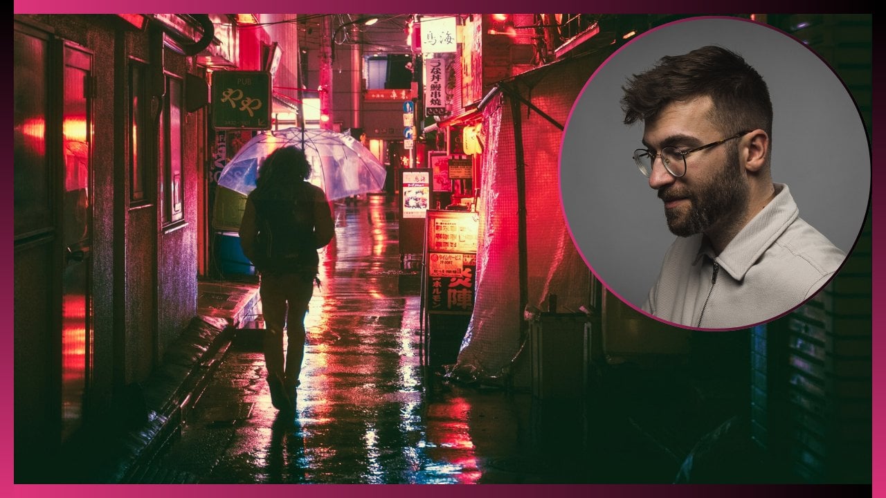
saturation and luminus. Now the question is, what do we do with all this information? I purposely picked this
photo that I took in Tokyo because it has a lot
of colors to work with. So that we can really
demonstrate this powerful tool, which is the color mixer. Let's say that we want to create a particular style
in this photo. And the style being, we want very complimentary
colors to all of this. Because if you take a
look at this photo, right, we have reds,
we have yellows, we have greens, we have oranges, we have blues, we have some
purple, some legentas. We have so many
different colors. I think all the
channels here are being touched like with the amount
of colors that we have here, that could be a
bit overwhelming. Let's say we want to have a more clean look where everything has either complementary
or the same colors. Let's start by doing that. Let's start with
the red channel. Let's say I don't want anything
in this frame to be red. Let's say I want it to be
like this cafe, Cafe Miama. I want everything to
be orange instead. Let's take the reds right there and switch up
the hues so that it matches with the oranges
of that cafe Miama sign. Now we have less
colors to look at. We've deleted or altered a color to make it match
with everything else. Now that that's
done, we can move over to the oranges and see if we can change up the oranges
to make it match even more. Maybe we got to
change up this sign slightly more to make it match
with the rest of the reds. Like now they look more like it. Let's go over to the yellows. That should probably be the
Mcdonalds sign up here. If we drag to the right, we're introducing greens, and to the left we're
introducing oranges. And we want those yellows to match the oranges
that we have as well. That should be around this area, may be hue -40 or so that even the yellows look exactly
as yellowish mustard, yellowish orange that we
have in the rest of it. Then let's take a
look at the greens. What can we do with the
greens? What happens? We pulled to the right, we get more emerald looking
aqua greens. And if we move to the left, now we're introducing a
little bit more orange and warmer hue to the greens.
What can we do with that? Well, either we can
try and make it match. If it can't really match
because it is still green, either we accept that it's green and we want the
greens in the image, or we can choose to
completely desaturate the greens and remove them
from the game entirely. We only work right
now with yellow, mustard, oranges and blues. We have also a bit of magentas, but we're going to get
to that in the end. Then let's move to this Aquas. What happens if we change
up the hue of those? The only thing being affected
is the sign up here. That's what's being affected. Either we can make it match with the blues or we can
introduce a new color. But that's not really
what we want here. We want to play the
elimination game. We're going to move it
all the way to the right, so that that sign matches
the sign right under. If it doesn't match
exactly, well, that's when we move on
to the blue channel. In the blue channel,
we can do the same, we pull the hue so
that it matches a little bit more with that color. Now I can see that the blues on that Kraft cheese
Market sign wasn't really identified
as complete blues. Instead we're just affecting the sky and the sign next to it. But let's see what
we can make happen. If we move to the
right, we get purples. And if we move here, we get
the aqua tilish colors. What do we want?
That's the question. If we move, well, let's make it more deep blue. I like the idea of
having deep blues. Or even perhaps we can create
a bit of a beach feel. Although this is not a beach. We could have created a beach
field by moving more toward the teals and having teal and orange, but I'm not
going to do that. Instead, I'm just going to
go a little bit more at plus ten or 11 plus
maybe around eight. In blues we have deeper blues
and then the warm tones. Now the question is,
what do we do with the magentas and the
purples or the pinks? One thing to keep in
mind is that whenever you change the hue of
a specific channel, you're going to
change all the colors that are of that
color in the frame. What does that
mean? If you change the oranges too far or too much, the skin tones of your subjects, if you have any
clear skin tones, is going to be altered as well. In this case, everybody
has their back turned. This guy has a mask on. But you can see a little
bit on his ear that it's not a completely
natural looking skin tone. So if you're going to play
around with the hue slider, just be mindful of the
fact that you will affect the skin tones as well when
you alter the channels. Orange primarily, but
a little bit of reds, a little bit of yellows, and sometimes parts
of magenta and pinks because we could have some magentas and pinks in
the undertones of our skin. So just be very
careful with that. When editing, always make
sure to zoom in and check out that you haven't really
destroyed a part of an image. But looking at this
image, honestly, I don't feel like I want to use magentas in purples at all. Especially because I don't see any skin tones here that are
going to be too affected. So I can freely play
around with that. So with the magentas, I'm just going to drag
it all the way down. And with the pinks, I'm going to drag them all the way down. So that then we
have some sort of black and white
bag going on right here instead of a off magenta and pink bag that I'm not really interested
in seeing in the frame. What I'm also
noticing right now, because now we've reached
the end and we're taking a good look at the photo to
see what we've affected. Let's take a look at
the before and after. Here we had all different
kinds of colors and now we've created a
complimentary style. Now, I don't quite
like the way that this family mark sign was affected when I
removed the greens. I might reintroduce
some greens like so I don't want them entirely gone because I
think it looks off. Maybe I'm just going to push them more toward
the warmer tones. Now that looks bad as well. Instead, let's move
it more toward the tealish tones so
that at least we have some look which matches with the blues in the
image. We can do that. Instead, we brought
back the greens. Now, looking at this overall, I'm satisfied with it in terms of just creating a visual style. I'm satisfied with the
way that it looks. If we wanted to remove
even the blues, we could play around
with that and completely eradicate the blues. So we get a nearly
black and white image, but we only have sort of the oranges popping.
So we can do that. And then we can remove
the greens as well, so that we pretty much just
have a black and white and orange, mustard
yellow image. You can play run
with this however you like and create
any style you like. But what's good with
the color mixer is that you can then mix
and match colors before moving into the
color grading right here. Because with the color grading, we're going to talk
about that next. You're introducing new
colors in the shadows, in the midtones and
the highlights. But with the color mixer, I'd like to first and foremost, just even out the already
existing colors and make the match to the
best of my ability to the kind of
style that I want. And as you can
see, we can create a whole variety of styles here. But let's say I want to
keep it like this, okay? I want this yellow mustard style and mostly black
and white image. Now we can move on to
the color grading panel, and we can start introducing some colors to finalize the
style that we're going for.
14. Color Grading: Like I mentioned previously
with the color grading panel, we are now introducing
new colors based on the three main features that I talked about in the
color correction section, which is shadows,
midtones, and highlights. We choose what we want to do with all three
of those sections. Similarly as with
the color mixer, we are now deciding
the intensity, the saturation of the colors
that we're introducing, the hue of them, and
the luminance of them. Let's first and foremost go into just the shadow section
and take a look at that. What happens if I start pulling around on
this color wheel? Well, only in the shadow areas. We are now introducing
the color, say magenta or green or blue. You should read the color
wheel in such a way that the more you pull
toward that color, the more intense that
color is going to be. If I pull this from the center
all the way to the blue, we're going to have
a very heavily saturated blue in the shadows. Similarly, if I move
to the yellows, then we're going to get the
yellows or oranges, or reds. You're going to find a
way to balance this, to not have to intense colors so that people
don't look at that and go, this is way too graded. Maybe that's your style, maybe that's the way
you want to go for. But we're going to
play a little bit more with a subtle look here. That's what the shadows,
and now let's take a look at the midtones
and do the same. We pull this and only the
midtones are being affected. You can see that the shadows are not as you can see
on this guy's suit, It's relatively still black. There are still some
areas here that are identified as midtones, but relatively it's black. And then we do the same by
pulling it up and we see the midtones now are yellowish, orangish red and so on. The same thing with highlights, Now only the highlights
are going to be affected. We can make a warmer look, we can make a colder
look, and so on. Now, we've got to use
these in combination. If for whatever reason, I rarely ever do this. But if you ever want to change
everything, the shadows, midtones and highlights
simultaneously to match one color, then you move into the
final section here, which is called global. Then everything in the image is going to be colored that way. The shadows, the midtones, the highlights, I
rarely ever use that. I just use each section separately and then decide on
which colors I want to use. In this case, I like the
fact that we already have the black and
white theme going on. I'm not going to introduce
any colors in the shadows, I'm going to skip that
in terms of mid tones, we see that the
overall theme here, thanks to the step
in the color mixer, we're working with
these warmer tones, the yellows, the
oranges, and so on. Let's play around with that
and see what happens if we add a little bit more yellow
to the overall image. What I do is, similarly to the way that I
use the sliders, is that I pull too far. I go all the way just to
select the exact color I want. And I move the wheel
around until I find the orange that
we're working with. I drop that, take
a good look at it, and see, is this the color
that I want to work with? And then I start pulling it back toward the center so that I can desaturate or de,
intensify the midtones. As you can see here
on the bottom, we see the number
which corresponds to the hue and the number which corresponds
to the saturation. This is as if we're
saturated it by 29 points, which I don't want. I think it's a bit too much. I'm going to move it
down to say plus 11. Now, we've added a
little bit more warmth into this image
in the mid tones, but I want to do the same
with the highlights. Maybe I want to make this
a really warm photo. Then I'm going to add some
more oranges into this, and I'm going to do the same and pull it back until I find a sweet spot that
the highlights are matching a bit more
with the coloring of the oranges and the
yellows of the signs. There we go. Now we have
a before and after. This was what we started with. This is what we
finally ended up. And we've created a
style now let's say, I think the highlights
are a bit too dark. Now that we've colored them
orange and we have the look, we can now decide to illuminate the highlights by pulling
on this aluminum slider. You can see only the
highlights are being affected. If for whatever reason
you don't want to tinker, like let's say this
is saturation 11 in the midtones and you're
not quite satisfied and this is 25 and you're not quite satisfied and
you're trying to find that sweet spot where
you can either do is pull those sliders back and forth until you
find something. Or you go into the blending
and balanced section down here to, to even it out a little
bit with the blending. If we go all the
way to the right, we can see that more of the mit tones are being intensified. And then back they're
being less intensified, so we can maybe
make it a bit less orange like So then
with the balance, we're going to have the
difference between the oranges in the highlights and
the oranges in the midtones match
or come together. We can either balance them
out by making everything a little bit more orange
like, so more intensified. Or we can balance it the
other way by removing some of that and
making it less graded. If we want to go for a
really orange style, then we pull it this way. If we're going to go back,
then we do it that way. But instead, I
think I'm going to stick around and balance
it at about 36, 35. Because I still
want the intensity of the colors that
we've chosen here. But that's pretty
much where I would stop now if we wanted to, just so I don't skip out
on the shadow slider. If we wanted to, we can add a little bit in the
shadows as well. What do we choose to
do with the shadows? If we take a look at the
color wheel here, we always, a lot of the times
we want to work with colors that work well together, so called complimentary colors. Now you might be thinking,
well, I'm not a designer, I don't really know how to think in terms of
complimentary colors. That's not really what I do. One way to look at
it is just to take a look at the color wheel
and think like this. If you choose one side
of the color wheel, the complementary
color that you can use is going to be on the opposite
side of that color wheel. In this case, we've used oranges and yellows for the midtones
and the highlights. The complementary form of
grading would be to pull the slider toward the blues to create a complementary look. It can either be blues very intensified or more
toward the teals. We have a teal and orange look, then you can do that and
then pull it back as well, so that it's not as intense. Because now this is very
dominant in the frame. But then we've got
to pull this back, it's not as crazy, but we can have
say saturation 18. We're introducing a little
bit of those blues. We don't work with just
blacks and oranges. I prefer or the natural black and white look to
it, I wouldn't use that. But this is just to
demonstrate how you can think in terms of complementary
colors and how you can fully utilize the color wheels in the color grading
feature of Licrombile.
15. Tone Curve Part 2: Now there is one final
way that you can alter the colors in an
image and color grade, besides using the color mixer and the color grading panel, which is something
that we mentioned, if you remember very early on in the color
correction section, which is the tone curve. The tone curve is not only used as a form
of color correcting, but it can also be used to alter the channels
red, green, and blue. This is what RGB stands for. When you hear of RGB, it stands for red,
green, and blue, and those are the
three main channels composed of in
every single photo. If we go back to
the light section and we open up the tone curve, here we can see we've
played around earlier with the regular color correction settings using the tone curve, but here we have red, green, blue R, G, B. What happens when
we alter these? First and foremost,
the tone curve in the color section
is supposed to be read in the exact same way the tone curve was read previously when we
talked about it. Which means that on
the very bottom side we have the blacks
and the shadows. And if we move it
to the right side, we make them darker. And if we move it up,
we brighten them. But in this case, if we move the darker
parts on the bottom, toward the right,
we're not making the image darker the way we
would with color correction. Instead, we are removing reds. In this instance, this
is the red channel, and if I move it to the right, you can see that the reds from the image are being removed. Instead, we're being introduced
with a different color, which in this case
is a form of cyan. If we move over to the green
channel and do the same, we remove the greens, we're introducing
purples or magentas. And then we move into the blue channel and we do the same, and we see we're
introducing yellows. What happens in the opposite? We go back to the reds. And instead of moving
them to remove reds, what happens if we move it up is that we
introduce more reds. And the same will apply
to greens and blues. If we move it up, we're
going to introduce more greens or blues
respectively, to their channel. In this instance,
we're taking a look at this photo and we decide what
color we want to introduce. I use the tone curve
very rarely for color grading specifically
because there isn't a lot of
color to work with. We only have the
red, green and blue channel and the opposite
side of the spectrum, which in this case will
be the greens or scans. Maybe I don't want
to work with that, Maybe I want to introduce a specific or different
hue of that color. But for the sake of example, just so we can use
this, let's do it. Let's create those points
that we talked about before, that it's good to create those points so that
the entire curve doesn't just move as
we're moving the sliders. Now let's say that
in the shadows, I think that they're
a bit too warm. I want to remove
some of the warmth in the shadows to
make them colder. What happens then is
that when we introduce that can it will be
the same as when we grade it and we introduced
a little bit of blue and cyan in the shadow section
of the color wheel. What we can do is we can pull
this now toward the right, so that we're removing the reds, but introducing the can, if I'm pulling it too far, just to show you what happens, the curve, if you pull too far, the entire curve here is being affected and we don't want that. Instead we can either do
that or we can create a separate point
bang in the middle so that only those
shadow areas are being affected as we
pull on the curve like. So now we have more of a
blue look in the shadows. Now let's say I want to
introduce some yellows, some even more yellows
like we did in the color, grading in the mid tones,
in the highlights. Then I'll take the blue
channel because I know that the opposite of blue
is going to be yellow, and I'm going to use that
to affect those colors. Let's first create our
points right here, so that only parts of the
image are being affected. I'll create points like that. And then I'll start working
on the mid tones and I'm going to move them more toward the yellows
as you can see. Then we want some of
the highlights as well, and maybe even the whites. So now we can see that we've introduced a lot of
warmth by removing blues. This is the way that you
can go about creating a style using the
tone curve instead. Now, the most basic form of
tone curve usage is that you want to create some contrast
in using the tone curve. What you do by
doing that is that you create a so called S curve. With an S curve, we create
these three points. What we want to do with an S curve is that we want to make it look like the shape of
an S. But ever so slightly, we can take the shadows here. And by bringing those down, we're creating a
bit of contrast. And then we can bring up
the mid tones to have even more contrast between
midtones and highlights. We can decide with
the highlights that maybe we want to
have them a bit brighter. Maybe we want to bring
down the absolute white, so they're not too bright down. And then the absolute
blackest points, maybe we want to increase them a little so we create
a faded effect. As you can see here, we're
creating a fade like, so this is like a
standard S curve. When you take a look
at it, it resembles an S. That's a very general
form of color correcting, which I forgot to mention earlier in the tone
curve section. That's how you can
color correct in a general way so
that you can create contrast and create
an image that pops. And you can do the same
with these channels. But the same rules
don't apply there, because you have to
decide exactly how much of each color
you want to remove. And the results may vary
depending on how much of that color existed in that
photo as you took it. This is the entirety
of the tone curve and how you can use each of
the RGB channels to grade, or you can use the color
correction section. But personally, I rarely ever use the tone
curve for grading. I just go down to the color mixer and color
grader and use that. But play around with this and see what works best for you. Now what happens if
we have an image that is black and white
and we want to grade that? That's a bit confusing
because you might be thinking it's a
black and white image. There are no colors. But
is that really true? Let's explore that
in the next chapter.
16. Black and White: A lot of people seem
to overlook this. You can, it's fully possible
to color grade and use the color mixer when working with a black
and white image. You naturally think that if the photo is monochrome,
it's black and white. There's no point in even
touching color grading and color mixer because
it's a void of color. How would you even
begin doing that? The thing is, though there are colors in a black
and white image, unless you've taken
the photo with a black and white profile so that it's purely
black and white. If you take the photo in
color such as we have here, and you convert it
to black and white, the information of the color
in the image is not lost. It still exists in that photo, which means that you
can alter everything, all of the channels of red greens, blues,
and all the hues. And with the color mixer, even though the image
looks black and white. Let me show
you how to do that. Let's first start by converting this photo into black and white. We can do it in two ways. Either we open up
the profiles here when we create a
monochrome image like so. Or we open up the color section and we just desaturate the entire image until
it's black and white. I'm just going to
choose the profile called Adobe monochrome. Now we've turned this into
a black and white image. Let's now go down and
you can see right here, it says black and white mix, and it says color grading. You have those two options
available to you which you wouldn't have if this
was impossible to do, right? So let's open up the mixer because we already
know which photo we're working with.
The same photo. We remember the colors
that we worked with. Now we can just decide how
can we alter these colors. We have the red channel. As you can see, there's
nothing to saturate or change the hue of because
it's a monochrome image. But we can alter the look of this black and white photo depending on how we
choose to be illuminated. Let's take only the reds. And let's pull that slider up, and you can see that
the black and white, red aspects of this photo
are being illuminated. Or we can darken them to
create a more contrasty, punchy, black and white photo. But let's move it up a bit, then let's touch upon the oranges as well and
maybe lighten those up or go for that more
contrast punchy look. Then we go down and then with
the yellows we do the same. We either go up or we go down. Let's do it something
in between like. So then we have the family
marked sign with the greens. We can bring those up. Then we have the cyan which are going to be with the sign up there at the top that we talked about
earlier, right there. Then we have the blue,
which will affect the sky and a lot of
the clothes here. We can either darken that, as you can see, all the
blues are being affected. Or we can do the magentas
and the oranges. We can darken the bag right
here by just using that. But as you can see,
we can actually affect the color channels
in a black and white photo. That's when you have to
approach it differently. Because you're not creating
a look based on the colors. You're creating a look based on the intensity of those colors. In terms of luminance, you're working more
with a contrast versus less contrast look by altering the channels in
the black and white mixer. That's the way you
have to approach black and white color
grading, or color mixing. Now with color grading, we can definitely
add more color. We can't really
alter the hue and saturation of the already
existing colors in the image. But now we can add
color if we choose to. Let's say we want to play
around with the shadows, but we want a colder
black and white look. Then we can just simply pull
this more toward the blue. As you can see, we are
introducing color, but we're just doing it in the shadows and the image
is still black and white. We can, let's say we want plus 20 in terms of creating a blue or
black and white look. We can then do the same and move more toward
the oranges here. So that when we create
a look like this, let's say it's plus 35 and we do the same
with the highlights here. Now all of a sudden, the previously looking black
and white photo we had, and this one look
way, way different, because now this one
looks very more vintage. This is the way you can create a vintage black and white photo. You can really punch into it even more by adding grain
and stuff like that. But we're going to talk
about the effects and all the other features of
light room right after this. But this would be the
beginning phase of creating a vintage look of a black
and white photo, right? Definitely don't overlook all
of these color functions. If you're working with
black and white photos, you can alter anything you like even though the
photo is black and white, as long as that information was photographed that
way to begin with.
17. Effects: To access the effects, we're going to go
into the edit panel and click on Effects. Once we're in there, we can see that we have various
options here. We have texture clarity,
the haze vignette, and then we have some grade out options that are not available right now until we
apply vignetting. But starting off with the
first one, we have texture. Now what does texture mean? Texture, It's easy to think
about it if you compare it, for instance, to the tool
sharpness or sharpening. It essentially takes all
the little bit of textures, like we can see the
leaves here on the tree, and it's going to
intensify those textures. Whereas when you use sharpening, you're essentially sharpening the entire image with texturing. The software is looking up all those finer
textures in the image and only focuses on
those. Let's try it. For instance, let's look
at all these leaves because we won't be able to see this if we just zoom it out. Let's increase the
texture to the max. Look at the difference it makes. It makes the image
much digitally sharp. And if we go to the left, it removes that
texture and makes the image look dreamy, right? This is where you have to decide creatively what kind of
a look you're going for. Do you want to go for
the more dreamy look, or do you want to add texture? It depends on what kind
of image you're working with and what kind of image
you're working toward. Now with clarity, the
software looks at the entirety of the
image to make it more punchy. What
does this mean? It's easiest to just show it. If we do clarity all the way, you can see that it
reminds you of texture, but it doesn't only
touch the textures. You can see this side
of the screen as well. We've got the clouds,
we've got the buildings. Everything is being affected
by this clarity effect. Now if we zoom this out, we can much clearer see
the effects of clarity, whereas it's less visible if we just use the
texture panel you see, because it only
identifies the textures, the details of the image. But with clarity, we
can go all the way and you can see the
strong effect of it. Or we can go down,
but it does the same. As we go down, we get
this dreamy hazy look. That's what texture does and
that's what clarity does. A lot of times, for instance, if you're shooting
wedding photography, then a lot of the times you're
going for the softer look. In that case, you
might want to bring down the clarity ever so slightly to make it look a
little bit dreamy or hazy. And then if you're losing
a bit too much of it, maybe you can reintroduce
a little bit of texture. We're going to apply this in practice later on when we edit. This is just a quick show of
what these functions can do. Next up we have the haze. Now the haze does pretty much
what it says in the name. It's going to
either add a bit of a hazy effect or remove
and introduce contrast. So let me demonstrate. In this instance, if we
look at anything that is supposedly hazy
in this image, it's going to be the sky, right? That's the area that is going to be affected with the dehazing. If I move the
dehazing slider down, then you can see
that it's almost literally as if haze is
being added into the frame, which can be a really
cool creative effect. But if we go in the
opposite direction, it becomes punchier,
more contrasty. And the more we push, the
more the image breaks. You see that the
more you break it, you can see all the artifacts forming up here and
it's just horrible. Same principles apply here. I think the effect panel is
used mainly for that purpose. Depending on what kind of a feel you want to go for in
showing these photos. With all three of these things, you can apply them to
create a dreamy effect. Let's for instance,
bring down the haste to -15 Bring down the
clarity to -17. Maybe add a little
bit of texture so we don't lose all of the
detail and look at that. Before and after we
started off with this, we ended up with this a
very dreamy looking image. That's just one way
you can use that. Finally, we have vignetting. Now vignetting, what that
means is essentially you have on the
corners of your frame, you can choose whether or not you want to have darker
corners or brighter corners. Now the gives or takes or
the pros and cons of this is that if you have
an image where you really want the
audience to center, focus on something, then
you should probably bring down the vignetting
like so as you can see, the more we go, the more we have this circular shape
forming here. Or this oval shape.
You don't want to go too far because it
just looks too fake. But if you add a little
bit of vignetting like so, then you are essentially making the audience focus
on the center point. Similarly, if we go in
the opposite direction, it's going to do the
same but opposite. It's going to
create white frames around it, you see like. So that too can be used for. I use it sparingly. I don't really use vignetting that much. I prefer to do all
the masking myself, targeted masking, and we're
going to get into that next. But vignetting could be cool
for a quick little fix, a little bit of a small effect where the audience is going to focus on whatever
is in the center. That's what it can be used for. The midpoint
roundness feather and highlights are all going to be in relation to
the vignetting, so let's use the vignetting all the way so we can
see the effects. See with the midpoint,
we're pushing the edge of the mask all
the way to the corner, for instance, so it's not
so obvious with roundness. We're changing up the
shape slightly so it's not too painfully
obviously oval, but we're making it
more of a ball shape. With feathering,
we're deciding how much we're going to
feather out the mask. It might be feathering more
intensely toward the middle, or it might be feathering out. But the more you feather out, the more the edges become clear. And we don't want
that. It's usually good to add a little
bit of feathering. The standard feathering
at 50 works just fine, but you could feather
even more like so. Now if we bring back the
vignetting to a normal level, and then we introduce
a little bit of it, say -15 you see that it's
a very subtle effect. People don't even think about the fact that there
is a vignette there, but they feel it,
it's subliminal. Finally we have with
the highlight slider, we decide how much the highlights are going
to be affected by this. If you take a look at the
highlights in the corner here, what we're doing essentially, is we're deciding how much
of them are going to be covered and how much of them will be affected by this mask. Which can add a little bit more like a feathering
effect to it, to the edges, It's
not so obvious. That's how you use vignetting, dehays, clarity and texture. Now the final point here is
what we talked about when we talked about editing vintage
looks is to add grain. Grain, of course, is the effect which is used
in old film cameras. When you're photographing with film or you're shooting
something with film, that is the way that
movies used to look. That is the way that old
photographs used to look. And it can give the
nostalgic feel to it. Now in order to see this, we have to zoom in a little, especially around
the darker corners, so we can see how much grain
we're actually applying. Let's apply an exaggerated
amount of grain, just so you can see what
we're working with. So like plus 60, you can see the difference
there, like how much it added. What you can then do
is you can adjust the size of those little
grain balls, right? You can make them larger, you can make them
smaller and more fine. And then with the roughness, we're deciding the
intensity of the grain. And this way it's going
to be very, very grainy, like a super old camera
with a rough type of film and all the way down it's
going to be a finer grain. Let's go for a really
grainy look like. So you can see now in the entirety of the image
that it's packed with grain. This is also something that
I like to use sparingly. If I do add grain, I'm
going to use plus 15, maybe up till plus 25, rarely ever more than So. With the sizing and roughness, I just play around to my
liking each and every time, Sometimes I even leave it
on the default setting. These are some really cool
effects that you can use to enhance the image and add a little bit to that look
that you're going for. If it's a vintage field, then you can definitely
go up with the grain. If you want to do
wedding photography, you can go with the soft look. There's plenty of
things that you can do here and use this creatively. Now let's hop into
the next section where we talk about masking.
18. Masking Part 1: Masking is a very powerful tool that you can use within
Adobe Light Room, mobile and the desktop versions. In which you can
essentially create various masks of various shapes, like oval shapes
or gradient masks. Or that you can use to brushen up the image
or particular areas of the image so that
you can typically perhaps relight a certain
area of the photo. I'll show you how
that works right now. To access masking, we
have to press the button which is right under
the healing patch, right there, the round shape. Then here, from
here, we can decide what mask we want to add. You can see that these
areas are grade out. That's because we have
to add a mask first by pressing on the
plus sign right here. And then we decide what it
is that we want to choose. Now I'll show you how selecting subject and Sky works
in a different image. But right now let's go through, for instance, just using
the brush feature. We click on the
brush and we have successfully created a mask
on the very left side. Here we now decide
the size of the mask. Maybe we want to do it
like, so the feathering, now it's more feathered,
now it's less feathered. And it works just like that,
like the vignetting tool. Finally, the flow which essentially chooses the
intensity of that mask, how strongly the effect
is going to show. Maybe we can do it
a little bit more subtly like so like 60. Now that we've created our mask, it's time to actually
select an area. Let's say I want
these rocks down here to be a little
bit more illuminated. What I'll do is I'll simply
add a mask like this. I'm simply just
using my finger and marking the area that
I want to effect. Now finally, we see that the previously grade
out sections have been available to us and in light we have all
the same settings, in light, in color and effects, or at least very similar, not all of the features
are available. What we can do now
is just effect that one part of the image that
we've selected with exposure, we can bring up the exposure, but only on that
part of the image. We can bring up the
shadows a little bit like. So we can bring down the high light, so
it's not as intense. Now, we've
successfully opened up that one area of
the photo without having to affect the
rest of the image. We can do the same with color. We can bring in the
temperature slider like so, and make it really look
like a strong beam of warm sunset light is
hitting this image. We can saturate or desaturate
as much as we want. We can change up the tint. We could even select
our own colors, change up the hue like so to make a match with
the rest of the grass. Or we can do a selective
color under here and just literally choose which color we should
apply to this. And then down to effects, you can see we have the exact same features available to us, so we can affect a particular
area of the image. This is what the masking
tool does universally. The question is just which mask you pick for which situation. Now we've explored the brush, now we can do the
linear gradient. And the linear gradient
works like this. You simply start
dragging your finger onto the screen like so. And you're creating this
sort of radial filter. And when you drop it, you can then grab one or
the other of the corners and just create an even more feathered sort
of look to it. And you can drag the other
corner forward like so. We can do the same
here, if we want to light up that part of the image. We can do so if we
want to darken it to create our own little vignette,
we can do that as well. We can do it to the other side. Linear gradient on
this side as well, to match the look that
we're going for here. Finally, we have
radial gradient. This could have
been used instead of the brush, for instance. We can remove the
brush right here. We can delete that mask and instead create a
radial gradient, which is pretty much the same shape that we were going for, But we have a shape to work
with and we don't have to manually create that shape.
We've got the same thing. We can start exposing, we can add a little bit
of color and so on. I'm not going to redo
the whole thing. Those are those functions. Then we have color range. Now with color range, you will only affect areas in the photo that you
select the color of. Let's choose only
the color green. You can see that this
particular color green is being now masked
all over the image. All the dark areas
that are not green, like the branches and so on are not being affected by this. What happens now is that we
can do that and then we can apply this mask and change the color of say
just the greens. Look at that and
create a little bit of a fantasy look that
we're going for here. And then we can
desaturate a little bit, maybe add a little bit of warmth to really make those colors pop. Look at that, That's selecting
in terms of color range. And then we have luminous range. You pick the area that you want the luminous range
of to be affected. In this case, if we pick
only the darker areas, then only the darker
areas will be passed out. In this case, we
could, for instance, pick the sky and only
have the top part. Let's say we think that that
sky is a bit too bright, then we can bring down the
highlights of that area. If the mask is not
quite doing a good job, what we can then do
is we can refine it. We click on the Edit,
and then we can refine how strong we
want the effect to be. By pulling on this
lighter down here, we can make the absolute
top peak white areas. Or we can select a
wider range as well. We decide where the limit goes. If we do the peak
peak white ones, then it's pretty much
only going to affect that strongest part of the
image, which is the sky. And it's going to deselect the tree which was
selected earlier. Now if that wasn't clear enough, let's do another example. Let's pick the luminance range. And let's do only the blacks, the darkest parts of the image, which should be
somewhere around here. These are the absolute
blackest parts of the image that
we're now selecting. And we can even pull
the slider down, so we really only touch those very deepest
shadows and blacks like. So as we pull this one down, we can see that only those
areas are being affected. And whenever you're
happy with the result, then you can start switching
up whatever you want. Maybe you want to add a
bit of coloring into the, into the shadows, in the
black tones right there. We can change up to hue. And the same principle applies. Maybe we want to brighten
those up a little bit. We expose only those areas. Of course, this doesn't
look good at all. I'm just doing this to
demonstrate something. But as you can see, there's so many ways that you
can use these masks to target specific
particular areas of the photo and then
adjust only those parts. It's a very powerful feature
that when used right, when used creatively, can
really make your image go from good to
absolutely fantastic. And we're going to apply
all of this that we've learned later on when we
edit these photos together.
19. Masking Part 2: Finally, let's take a look at the previous point
that we missed, which is selecting according
to subject or sky. Now with subject, what the
app is going to do is it's going to try and identify automatically what the
subject is in the frame. Typically, it's going to be the very people in the forefront. But a lot of the times
it's also going to select, as you can see, people in the background or objects
in the background. If you're not satisfied
with the result, a lot of the times
the results are good, but sometimes they're
not so satisfactory. Then at the very bottom here, you can see a plus
and minus sign. If you click, you can
subtract or add to the mask. If it hasn't selected
the entire subject, you can add more for it to add the remainder to that
mask, or you can subtract. Let's subtract in this case. Now we can subtract according to the same rules of the mask. Either we can use a brush, linear gradient, radial
gradient, color range, whatever. In this case, let's do the brush because it's the easiest. Let's select the people
all the way in the back here and brush them off by
using this mask you see, now we're deselecting
the people that are irrelevant to the mask
that we want to create. Look at that. We
could even switch up the size of the brush so that we can
just select the guy, the dude in the background. We're not going to
do it perfectly now. This is just to show
you what this can do, but we can also see
that the face of one of the subjects has not
been selected properly. What we can then
do is add to mask. We can also brush it up and paint on her
face just like that. The remainder of the jacket. A little bit of the shoes
on her hand as well, that we literally only
have them selected. It's a bit of a dirty work
here, but you get the point. Then of course, the
same principles apply. I don't have to show you again, but you can use all of
these features again to brighten up that
subject to darken, to add effects, to change up the colors,
whatever you like. Finally, we have select sky. Now in this image we
can't really see the sky. Let's pick a different
picture where we can actually see a sky so you
can see how it works. Let's go back to Hogwarts. I think Hogwarts is
a fantastic example. Let me first remove all of these healing brush changes
that we've made previously. Like so. All right, when we select
masking and we press plus now the software by selecting Sky will attempt
to just select the sky. It may do a good job. It may do a bad job. Let's see, in this instance
it looks fairly okay. But we do see that
it's not just the sky. We're also getting some areas
here of the rocks that are selected and some parts of
Hogwarts Castle itself. Now, we could also do
the same thing here. We can just subtract, pick a brush and just
start brushing away. I'm not going to do
all of this now, but that's essentially
the principle. A lot of the times this
AI does do a good job. But if it does miss a little
bit of an area like now, you can just brush it off
just a little bit like so. And if you're a perfectionist, then you're really
going to spend some good time doing this. We have to approach this
creatively and think, how can we select the sky
without selecting the sky? Because if the select sky
option doesn't work well, well, what we can do is
we can use the Luminants. We can select the sky using
just the aluminum slider. And then we just have
to tweak this around a little bit until we
get the desired result. Now we're selecting
too much of hogwarts. We don't want that, but
now we have pretty, most of the sky
selected, not all of it. That's one way to do it. A different way to do it
is to add another mask. And we can select subject. Now it's going to select
just Hogwarts as we can see. Let's pretend it didn't, let's pretend it also selected
the forest and whatever. But what you can do
is you can select the subject and then you
can press on invert. Then it inverts the masks
and chooses everything. But whatever was
selected in this case, if it was so that it selected the forest
and the rocks under, then in that case this
would only select the sky. Considering these options
have not been very effective, the effective one so far has
been the luminous range. In this case, I
will probably use the luminous range
to select the sky. And we're selecting as
much as possible without actually touching the
building you see. Now pretty much the entire sky has been selected and we can just decrease highlights of the sky and look at
that, make it punch. Maybe add a little bit of
exposure up the shadows. Maybe bring it out
in the whites. Add some effects
with clarity to make a more dramatic sky. Get rid of the haze, and really create the sort of HDR effect of a sky right here. You can do plenty
with these masks. So this was just to show
you the absolute vast range of creative opportunity
that you can have just by using masks. They can be used for
targeted color grading. They can be used to really
add a pop to your image. To really center, focus somebody's attention on
something to relight a scene. You can pretend, for instance, here we go, that there's a
really strong light source. Let's say the sun is coming from a certain direction and we
only want to light that area. We bring up the exposure and we pretend as if the sun is
coming from that direction. And then we might want to add
a bit of coloring as well, so that we see that there's warmth coming
from that corner. And then we can do the
opposite on this side. And we can create a,
a darker look like, so that we really only get
the intention on the castle. Look at the effect
that we created. Now it's insane, like
how much you can actually achieve just by
using the masking feature. Right? And don't worry, like I mentioned previously, we're going to be going
through all of this as we edit all these
photos together. So you can see step by
step how we can use all of this in a creative way
with the color correction, with the color
grade, with masking, with effects, the whole thing. But moving on now we have one final effect to go
through, which is right now, a very new feature in
light room until we move on to the noise reduction and detail
section of everything. And then finally, we
start editing together. Let's hop in and talk
about this next feature.
20. Blur: When you're
photographing something. And you might not have
access to a fast lens. By fast lens I mean lens with a very low aperture so you can create this
blurry background. Well now you can do that
using light re mobile. You access that under the
mask section where you see this little eye drop
or water drop tool. Now what you do is you simply start adding some blur amount. Or you press on circle
bubble blade ring or a eye to get the
various effects. In order to know
what it effects, you can use the blur amount
all the way to the mask max, so that you can see where the effect is if you
want a visual of it, if you want an overlay of it, you click on the focus
icon right here. You can see that right now, this is selecting the subject, which it has already
decided what the subject is in the frame. If you're not happy with that, because like we mentioned, it starts selecting areas that are not really
the ones that we want. What you can do then
is point select. And then you decide
which is going to be the center
focus of the frame. For instance, this woman, she should be in focus, right? And then we can see the
intense blur amount like really exaggerated this, You can't even see the
face of the person behind. But this is just to show
you what it can do. So this is the regular
circle blur effect. Then we have something
called bubble and it adds a little bit of a different variant of that
blur in the background. Then we have five blade, which adds a different effect. We have ring and you can see these circular shapes popping
up in the background. And we have cat I, whichever
one you prefer, you can use, But be careful with this
tool, because as you can see, when the blur amount is 100, this looks entirely fake
and really, really bad. What you might want to do
is just add a little bit of blur if you're into this sort of artificial
way of adding blur, as opposed to just
shooting with a fast lens. If you have one,
maybe you don't. But this could be
useful as well to just focus on what's
important in the image, which might be one area. Or it can be the entire sort
of selection of subject. And you can see the software is detecting the
subject themselves. But be careful when
using this tool, because like I mentioned, it's just going to be too strong and you don't want
to overdo it, right? So that's all in
terms of lens blur. As you can see in
the top right corner there, it says Early access. So this is an
entirely new feature, very fun to play around
with and we'll see, and I'm excited to
see how they're going to update
this in the future. All right, so that
was it in terms of masking and effects. Now we're going to move
on to noise reduction and sort of detail working and
image noise reduction will be very good to use in case you're using a photo
that you've shot with a high ISO and you've
got this grain that you don't really
want or this noise, rather not the grain that you want to remove
from the image. How do you do that? How do
you approach noise reduction? Let's talk about that next.
21. Detail: I hope you're as excited
as I am because now we've reached the final
stage of photo editing, which is detail detail touching, noise reduction, and
color reduction. This is typically
the last step in the editing process before we start exporting and
creating presets. Now we're going to
specifically talk about the three main functions, which is sharpening
and noise reduction. But within that also
color noise reduction, to remove some specs
of color and to reduce noise in case you have
shot with a high ISO, which has caused unwanted
noise in your photographs. Now to access this, you have to open up the
editing panel again. And you have to open
up this section right here called Detail in Detail. We can see several options here. The main ones are going
to be, like I said, sharpening noise reduction,
and color noise reduction. And within those we have
some fine tunement. Now sharpening is a form of to create this digital sharpness that digital
photography typically has and to enhance that in case you think your
photo looks a little bit unsharp or if you
want to bring back the sharpness that was lost
in the editing process. It's important to not
misunderstand this and think that sharpening
is the same thing as focus. So it doesn't mean that
you can bring back focus. If you photograph something
that's out of focus, the sharpening tool will do
nothing to amend for that. So when you photograph, you have to always make
sure that everything is in focus because there's no amount of technology in today's standards
that can fix that. Sharpening is just adding sharpness to an already
existing image, so you will still have
an image that's out of focus if you
photographed it that way. But it will just add sharpness
to that unfocusedness. I guess it's not going
to look very good, but it will not fix your focus. So keep that in mind. Now let's take a look at what
sharpness does. If we take a look at this photo and we just start
adding sharpness, you can't really
see much, right? But if we zoom in on this guy's face and we
exaggerate the sharpness effect, now you can see clearly that we have sharpening
sharpness added to it. And you can see
the more you push, the more broken
it's going to look. Because you can
literally see the square pixels on
this guy's face. But this is like with
the previous examples. I'm exaggerating it just
to show you the effects of it as you take up the sharpness. You can also then
choose to fine tune it by using radius and detail. It's good to just play around
with the setting so you can see for yourself
what it does, but it basically
helps you either mask out or even out the edges
of the sharpening effect. Let's increase the
radius a little to show you that the
more we increase it, then we see the clearer effect of the sharpening going on here. If we reduce the radius,
we get less of that. Now under detail, we've
got the same thing. We increase it and we see that
the effect is intensified. We reduce it, and we see
that the edges are soften out and the sharpness
effect is not as obvious. Of course, you won't
see all these square pixels like this unless you
really push it to the limit. Now we're up at 150,
which is the maximum. You wouldn't really do that if you want to sharpen something. If we go back to the standard, which was about 40 and we
just increase a little bit, let's say by 50, 60. And then we can play around
with the radius as well. Maybe bring it down a notch
so we don't really see these pixelated frames
around it as much. Typically, I don't
really sharpen my images because I believe that
in digital photography, images look overly
sharp to me as is. But it could be used
if you want to sharpen it even more if you're
shooting in a software format. If you're shooting with say, film and you want some of
that digital sharpness, then I guess you can add it, but I typically don't
sharpen my images at all. The final one would be the
masking, which you can see. The more you increase it, really reduces those
pixelated edges and makes it almost invisible. Play around with those
settings to your liking. Essentially, it's
hard to get into the exact science behind the
radius, detail and masking. But you can play around
with it while zoomed in to see what works for you. Next up, we have
noise reduction. Same thing applies here. If you take a look
at this photo as is, you look at it and it
looks completely fine. But where you can really see the noise shine is when you zoom into the
darker areas like so. Then you can see that this was shot under dark conditions
and you can see the digital noise being
caused here as a result of shooting at high ISO
or under dark conditions. As you can see right there, what noise reduction does is
that it helps amend that, it helps remove it. If we start dragging this
noise reduction slider, you can see the more we
drag it, the softer. The image becomes,
so essentially we're removing the noise
caused by the high ISO. And you can do this
as much as you want, but just keep in mind,
as with all things, when we go too far, you can see that the face of the subject
becomes all plasticky. And as a result,
when we zoom out, the entire image
looks plasticky. It looks like a wax doll. This doesn't look
very good, right? So you don't want to exaggerate the noise reduction as well. Typically when I noise reduce, I will go up to say,
20, maximum 30. And if I really have to
push it, then maybe 40. But I rarely have to do that. I will just noise
reduce a little bit, say at 25, to show
you the effects. I'm going to do it all the way. And then we can touch upon
these detail sliders. We have this detail slider
which will bring back some of that detail that is lost
as you Noise reduce. Then we have contrast, which is going to do pretty
much the same thing. It's going to bring back
some of that information. But if you do it at plus say 25, then with the detail we bring it back just a notch like so, maybe a bit of the
contrast as well. Then we get a
pretty clean image. Unless of course, you zoom in really like to the pixels
and you take a look at it. And some people do do that. But you have to keep in mind
that when you take photos, you will always end up
with some level of, this is just the
natural way that you take photos and that the
camera takes in information. You're always going to have
a little bit of noise. The entire point of
photography is just to reduce that noise
as much as possible, onset by shooting with as low of an ISO as
you possibly can. And if you can't, then
you come in here and you compensate for that
in post production. If you're using the desktop
version of light room, then light room has implemented an AI function
and noise reduction so that the AI will analyze
the photo for you and create a perfectly balanced noise
reduction based on that, based on detail, contrast
and noise reduction. But since we don't have
that available to us here, we have to do that manually. Just keep in mind that we're talking about the ranges of say, 20-40 If you push it
further than that, then I think personally
it looks a bit plasticky and I don't
prefer that now, except for noise being
part of an image like so. We also have color noise, which is noise that
appears inside colors, which you can see right here. What happens when we
reduce the color noise? You can see that if
we push this too far, some colors here on the
edges become muted. That's a good thing
to keep in mind. If we go in the
opposite direction, then we can really see the
color noise reduction, which is basically these
artifacts that appear in the transitionary
areas of colors. Take a look at these
corners right here. By doing this, we're evening out the edges so that the colors
blend in more perfectly. But then if you go too far, you're muting some colors that are just naturally saturated. And then you can use
the detail as well to just even out those edges. Smoothness is going to
help with that as well. Here we have, if we
go all the way down, we can see those colors
being brought back. But we're also counteracting the effect of color
noise reduction. And if we go up, it's
muting it even more. So it's just about playing around with these to
get the good result. I wouldn't really recommend
going all the way with the color noise reduction
because we don't want some of those
colors to be muted. You can sometimes see it very clearly in a photo and
it just looks off. As a very final touch to
all of this, of course, we have the detail
that we went through, but under that we have optics. When you take a photo with
a lens, any kind of lens, it's always going to come with some sort of lens distortion. It's not going to be a
perfect sort of even photo. So what enabling lens
correction does, you can see the effect here, is that it's going to fix it up so that it looks
sort of correct. You can see that
the vignetting on the sides is also
getting removed, so the image just looks fresher. And remove CA stands for
removing chromatic aberration. There's basically
some color spill and we can't really
see it on this photo. And I'll be looking through
the other photos as well. I can't really find any chromatic aberration
to show you this, but the effect is very subtle. In case you get some sort
of chromatic aberration, I just enable that to
stay one step ahead. And then finally in geometry, we have various sort of distortions or like ways to change the perspective
of the photo. You can click the
upright and it will be similar to the way
that we straightened it. Using the crop and
straightened tool, you can use it automatically, or you can choose based on
level, based on vertical, and it fixes up the photo for you in terms of perspective. Then we have constraint crop, which will distort
your image if you want to make it look a little bit more like
a fish eye like this. You know, you can
really go far like so. And it looks like
you've taken the photo with a fish eye lens. Of course, don't go too far. And in terms of vertical, you can straighten up,
you know the photo like. So you might be wondering, why would you ever use this? Well, sometimes when
you photograph, say architecture and the line, you haven't been able to shoot the building like at eye level. Then you can sort of
fix it up and make the building look as if
you shout it at eye level, you shot it from really high up. And these are all the tools that you need to edit a photo. So what we're going to do now with all this information out of the way is that finally
we get to the fun part, which is we're going to start
editing photos together. Like I mentioned
in the beginning, all of these photos that
you've seen here in the color correction album and in the color
grading album are going to be available
to you in raw format or Jpec format if you're using the free version
of light room. When you're ready
for that hop into the next chapter and
let's get started.
22. Full Edit Part 1: Let me welcome you
to the fun part. So what I'm going to
do now is simply, I'm going to start editing a
couple of these photos and I'll just apply some
general commentary. So let's check it out.
First and foremost, I think that I would like to it let's do this one.
I like this one. Looking at this photo, I'm being kind of inspired
to go for a bit of an old Kodak look to it, so I'm going to go
ahead and do that. Starting off, I
want to take a look at and see if the photo is
perfectly straightened. We can see that there are
some slight variations, some changes that
have to be made here. I'm going to try it
manually as well, just to check out
the differences. I'm looking at this
guy's ear right now, his left ear, to see if
it's properly balanced. I think this looks better
than. Let me take a look. Yeah. Than the auto
straightened function. I'm going to do that manually. First things first,
look at here. I'm going to take a
look at the profile and see if I want
to work with color. Or perhaps I want to go
for standard or landscape. Let's see, which
one do I prefer? I'm going to go for standard. So I have a bit
more dynamic range, less colors, so that I can
work with the style myself. I'm not entirely happy with the cropping actually,
with the straightening. I think this might look good. I don't think his ear was
a good way to look at it, but this looks better. Yeah, I'm happy with this. First things first
color correction. Now I can either choose to use the sliders or the tone curve. I'm going to start working
with the sliders and see if I have to add something
with the tone. No, actually I'm going to
work with the tone curve. I'm going to create
my points right here in going for the film. Look, I think that
adding a bit of fade like so we'll probably got
to do a lot for the photo, so I'm going to do
that then I'm going to start pulling on this slider
to create a bit of contrast, just ever so slightly like. So in terms of the curve, I'm going to leave
it at that and move over to the sliders. We already have the
fade effect added, which is already pushing toward that filmic look
like old film look. Next up I'm going to
look at the high lights. I want to bring it
down ever so slightly. You don't want them
to be too strong. I'm looking for something where the colors and the light is
going to be slightly muted. We don't want it to
be like this, right? So I'm going to look at
muting a lot of these things, like -20 or so. And I'm going to take a look at the exposure slider as well. Maybe I can reduce
it just ever so slightly like that
with the shadows. I might bring those up so that we don't
crush them entirely. Because if we're going
for that faded look, then the shadow shouldn't
be too crushed, the whites and the
blacks should be fine. But I'm going to pull
on the sliders anyway, just to check out the situation. Actually, Yeah, I would like to increase them maybe
by plus four or so. With the blacks, it's the same. We're not going to go too far. But yeah, maybe a
plus five or so. Looking at the before
and after here, we have a far more contrast. The image that we
started with here, we're working with
that as you can see, like softer look to the image. That's about it. Like in
terms of color correction, I'm pretty satisfied with this. There weren't a lot of
changes that had to be made. Next up, I'm going to move
over to the color section, and starting off I'm going to
look at the white balance. Now the way that I shot it, it ended up being
at 5,550 Kelvin. Typically, for daylight, we
have around those areas, like between 5000505600700,
depending on the conditions. But this is generally
speaking, daylight. I am satisfied with
the white balance. Looking at this
guy's white shirt, it looks fairly white. Looking at all the signs,
they look fairly white. They're just ever
so slightly warmer. Maybe I can push this
down just slightly like so 5,200 now, it looks perfectly
white in my opinion. In terms of the tinting,
like I mentioned, it could be difficult
to see which a tint, like slight tint the image has. It helps to actually
pull on these sliders and see in which
direction it's pulling. If I go to zero,
I can notice that this is a bit more
to the green side. I'm going to move it up
just ever so slightly, maybe, plus eight, plus ten. I'm satisfied with
this, I think. Let me see the before and after. Yeah, this looks good.
Saturation wise, with the film. Look, I don't like things
to be too saturated, so I'm going to bring
it down a notch, say at -15 Then taking
a look at the vibrant. If I start pulling
the vibrants up, we're revealing more
of those colors. But I don't want to
go too far either. In fact, I'm going to bring
it down a notch as well. To say minus six.
I want to go for these like muted colors.
I like the look of that. Now let's see what the color
mixer we can take a look at, let's say the reds right here. And see what we
can do with those. We are lucky in the
sense that there isn't a lot of skin tones
to be visible here. So we can play around
with the oranges, with the yellows if I want to. Let's see, by moving this up, we're going for that same
look that we had before. I'm not sure if I really
want to go for that. I like the more
poppy colors to it. I think the red should move
more toward the purple side. Saturation wise, I want
to bring it down just ever so slightly luminance. Let's see if I want to go for a brighter look or a
slightly darker look. I want to go for a
slightly darker look, just like so with the oranges. Let's take a look
at what's being affected by pulling the slider. We can go in the same
direction as well, or we can keep it where it is. We want to go slightly more for the complementary colors in
the direction of the purples, the magentas, and so on. So I'll bring it down to
say, -50 saturation wise. I'll bring it down like so by
using the luminant slider. By darkening, we can see that the colors here on this sign are becoming more intense and on par with the rest
of the color scheme. I will bring down the
Luminant slider as well. Yellow moving to the left, I think would be the
right choice here, because we get too many yellows by going
in that direction. I'm going to go down to say
-55 57 saturation wise. I'm also going to
bring it down ever so slightly luminus as well. Moving on to the Greens, let's see what we can
do with the greens. With the greens, I do like
going in the warmer direction, but I just think that
this family mark sign becomes really ugly when
I go in that direction. I will go and push a
little bit further toward the emeralds to the right
side like so saturation wise, I think it's a bit too strong, so I'll bring it down as well. With luminens, I'm also
going to bring it down. You can see a general trend
for what I'm going for here. Let's see what exactly
is all the aquas. I think the only thing
that's really aqua here is going to be a
bit of the corners here. As you can see on the
family marked sign. I like it to match like so and
a bit on the sign up here. But I like the look of it, the way that it looks right now. I'm not going to
desaturate this. I might play around with the aluminum slider
just ever so slightly, but this time bring it up
and then we got the blues. I think that when
it comes to film, I don't want to go in the
like purple direction, but I definitely want
to push it more toward the aqua beach feel to it. Not too far, but maybe
say at -30 or so. Then I'll bring down
the saturation. Let's see if I bring it up,
what's going to happen? I prefer to bring it down,
actually I'm going to have it in -27 I might just brighten this up ever so slightly plus four
saturation wise, like magenta and pink wise. Let's see if we have, it's only pretty much the bag
that's being affected. Maybe there's other corners in the image that are
being affected by this. But I'm going to just focus
on the bag right there, because that's our main
topic in this color scheme. In this case, I prefer
to have it at say, -12 Saturation wise, I'll actually bring it up a
little bit at say plus 25. And Luminans wise, I
want to brighten it up ever so slightly
with the pinks. Let's see what is being
affected with the pinks. I can't really see much pinks. It's going to be on
the bag as well, but I'm not going
to change the hue. I'm just going to bring down the saturation and the luminance
just ever so slightly. Here's the before and
here's the after. I'm really going for
those muted, muted looks. What I do want to do now
is move over to the color grading because I think it's
time to add a bit of warmth. I like the way that the, the shadows look, but I'm
going to try a look here. I want to see what happens
if I start going in the green directions
of, of the shadows. I'm going to start bringing
down that saturation. It's not so intense, but ever so slightly
toward the greens, because I think that's
complementary to the film. Look, say at saturation 11. Then I'm going to go in, not exactly the
opposite direction, because that would be the pinks. But I do want to go
in the warmer tones, at least the orange, yellows. I'll bring down those as well. To say 19. And then I'll do the same
with the high lights. Go for that warmer look like. And stop it around. Maybe a higher point, maybe I'll go for like 27 or so. Now let's see what happens
when I start pulling the blending slider to
see what we prefer. When I go to the right, we
get more of the warm tones. When I go down, we're moving
more toward those magentas. I'm going to keep
it not too warm, but say blending at
like 54 balance. We're going to go
for the same and see if we should, yeah, let's definitely go push
for that warmer look, say balance plus 20. Let's see, the before,
let's see the after. Now, we're really touching on those on that film look
that I'm going for. I really like the
way that this looks. Now I'm going to go ahead and add some of the
effects that are going to work in favor of
this texture wise. We could bring it
up just ever so slightly plus 13 clarity. I'm going to go
downwards or upwards. I think that for this look, we should go for a softer look. Say clarity -23 has it would be a good idea to add a bit
of haze to this look. Instead of going in the
contrast direction, I'm going to bring it down
to say -25 vignetting wise. I don't know if I actually want a vignette for this photo, now I'm going to skip
the vignette entirely. Finally, we got the juice of this look, which
will be the grain. Let's go for a rougher look. I'll push it up to
plus 30 size wise. Let's make it slightly
bigger roughness. I want this to be really rough. I'm going to go to say, 56. This looks good.
This looks great. Now this reminds
me of going from before the overly
digitalized photo, which was of course taken with a digital camera to this film. Look with the common
theme of like the greens, the warmer tones, and
a bit of that purple. Typically, you would want
to go for the warmer look, even in the complimentary
colors up here. But since this is Japan, I'm leaning more toward
the colorful look for it, which I don't have to do. I could go back to the
reds and change them up and make them, let's see what that's
going to look like. If I go back and I
start going for the more orange feel to it, I actually do
prefer the oranges. After all, I said I
wasn't going to do it. But looking at this, I do prefer the oranges. They just seem to be working
better with all of this. And I'll do the same
with these ones as well. I'll pull them back up. Yeah, I definitely prefer the orange look over the other
one that I was going for. But either would work like depending on what kind
of feel you want for it. But this way we have
a cleaner image. We have the all of the
complimentary colors added, all of the unnecessary
colors changed or removed, And now we ended up with
a really good result of a Kodak looking
image shot in Japan. I believe this was in Tokyo. Let's see if there's
anything else. I have to do. Color detail, sharpening, I don't like
using sharpening for film. I'm actually going to
bring it all the way down. I don't want this photo
sharpened at all. I don't need to noise reduce. I don't need to
color noise reduce. I'm going to leave it as is. This is something that maybe
I should have done right from the get go to show you why. First we have to remove
chromatic aberrations, which is not going to be so
visible to the naked eye, but with enabling
lens corrections. Sometimes when you do that, the image can become
slightly brighter, which could change
up the way that you want the color
correction to be done. In this case, it didn't
really make a big difference, but I will enable it
anyway just to make the image looking
proper geometry wise. I don't think I have
to do anything here. I'm going to leave it as is. All that's really
left now is to see, are there any things in
the photo that I want to remove using the healing
brush? I don't think so. I like the way that
this naturally looks the way that it is
in terms of masking. Perhaps we can add a
few masks here and see what that does with
the linear gradient. Now we can see that the sunlight is coming or the daylight, the general light is coming
from that direction. I want to use the
corners of the frame. By darkening those, I'm
going to feather this out like by darkening these, then we're really
being brought into, I'm just going to bring
down the shadows, just a little bit of
the exposure as well. Our focus is going to
be on the right point, which is the center
of the image. Let me try the same on this side and see if I'm
satisfied with that. I'll bring down the
exposure ever so slightly. I'm not going to
push it too far. Just like we have our own little personalized vignette
going on here. Here is the before,
here's the after. I'm liking, generally speaking,
the way that this looks. Let me push the limits a little bit and see what happens if I, I'm going to feather
this out very heavily because I don't want
to go too far with this. And I'll bring it down
all the way down here just to ever so slightly
bring down the exposure. I think this works. This definitely works, Yeah. Now let's see if there's
anything else that I want to do. Perhaps I can find some ways
to brighten up the subject. Let's see what happens if
I use a radial gradient. Like so I respect the direction of the light by adding a gradient exactly where it's
supposed to be like. So by brightening this up, we get more focus on
the center part of the frame and especially the back head of this
guy's head like. So I like that. But I do want to bring
down the highlights just a little bit more because those were brighten up too much now. -25 Let's see, do I want to go for a bit
of a warmer look there? Yes, just the slightly
plus 20 is that I like. This looks powerful.
I'm loving this look. I really do think that, with that being said, here's the before, here's the after. I am completely satisfied
with this photo, and I think that we've
managed to create a Kodak look for this
Tokyo Street photo.
23. Full Edit Part 2: All right, next up
we have this sort of natuish architecture
photo like nature in a city profile wise.
I'll do the same. I prefer the standard one
for the dynamic range and for the muted colors that I can then later on
add if I want to. As usual, we're going
to start off with the color correction tab. And this time I'm just
going to work with the sliders to start
exposure wise. We can see that this is
an underexposed photo. Typically, I like
to shoot my photos underexposed so I can
bring it back in post. The reason for doing
this is because when you lose information in the
highlights when you photograph, it's far more difficult to bring those highlights back when the information is lost or nearly impossible
to bring them back. Whereas just the way the
cameras are manufactured, bringing back more crushed
shadows is far more easy. Therefore, I always expose for the highlights as opposed
to for the shadows. Had the image looked like
this when I have taken it, then it would be really
difficult to bring back all of that
information in post. That's the reason you're
going to see most of my photos being dark
when I take them. Let's first, I'm not going
to work with the exposure. Instead I'm going
to start off with the shadow slider to bring back the information in these trees or plants or whatever they are. Then I'm going to now bring up a bit of
that exposure to see. I will have to overexpose
now for the highlights. And I can do that because the
information is not going to be lost to just
brighten up the image. And I'm looking specifically
at like the water and the trees to make sure that everything
there looks correct. Like so. And then
I'll bring down the highlights in the sky so that we can get
that information back. Here's the before, here's
the after, looking good. Now in terms of contrast, let's bring that
contrast slightly up, ever so slightly,
maybe, plus 11. The whites might be
a bit too strong. Let's see if I can bring
them down. The blacks. Well, we can go for a
bit of a punch here. Look here, I guess.
Let's try that. -13 before, after. I'm not going to touch the
tone curve on this one. I'll leave it as it
is. This looks fine. Now moving over to
the color section, let's set the white balance. I think right now it's at 5,150 What happens if I apply
a preset and I do daylight? Daylight is 5,500 but
it is a bit too yellow. I think I'm going
to bring it down. Well, I'm ending up
pretty much where I was, but I like this also. I'm sensing that there's
too much green undertones, even the word tint. Plus ten. I have a
feeling it's a bit. Yeah. I'm going to
bring it up to say plus 15 instead to make the
image look more clear. Like saturation wise, I'll
bring it down like so. But I will bring up the vibrancy because
I'm not going to go for a very old and muted look. I do want a bit of that
color information. I'll bring up the
vibrancy to say plus 36. I'm happy with the
way that this looks. Now I'm moving over
to the color mixer. In terms of reds, there isn't
much reds going on here. I'll leave it as is oranges. It's probably going to be
the building up there. Yes, it is. I do want the oranges. Let's bring up the
saturation all the way so that we can see
what the hue does. The yellows look greenish,
yellow, and really ugly. So I'm not going to
go for that here. We're going too far in the
playful colors directions. I'm going to go
for this instead. Somewhere in between, maybe -31 I do want more
of that color. I will actually bring up that
saturation to say plus 45. I might even brighten it up a little bit to get more
of that information like yellow wise, let's
see what that does. There are yellows in the shot, we have yellows over here, we have yellows over here, and we have yellows
showing up in the details of the
trees or plants. I actually don't like the
look of these yellows at all. I think I can get away with just completely eliminating
yellows from the shot. I think it's a bit distracting
and I don't like it, I'm going to bring
it all the way down. Greens? We definitely
have greens in the frame. Let's saturate this all
the way up and then start looking at the hue to see which direction
we want to go for. I don't want to go for
the dirty yellow look. I think I would prefer the
more emerald approach to this. Not all the way, but we're still going to push it
fairly much like plus 33. Then I'll start working
on that saturation again and maybe
bring it down to. I don't want to to muted. Actually, I might just leave
it at plus ten luminus wise. I want this photo to
pop a little more. I will bring up the luminus
now in terms of the aquas, we have them in the water. As we can see, if we
change up that hue, we want to make it
match the greens. I think rather than
going for the blues, let's leave it at
S -35 But I will bring down that saturation
because I think those colors are a bit actually. Let's take a look at this.
We have the colors there. I might just get away with
removing this as well, because we can see it doesn't
really match perfectly. But if I remove it all the way, then we see the black
and white and all of it. I'm not going to do that, but I will bring down the saturation. Actually I bring it up and then I'll try and match it with the greens right
there of the trees. This is probably the best way to look at it and
try and match it. Then down the saturation, actually I do like the
way that this blends in. I'll keep it plus 58, like, so now when it
comes to the blues, bring the saturation all the way up to see what
we're working with, and then I'll start
switching up those colors. I'm obviously not going to be
going for the purple look, and I'm not going to be going
for this look entirely. But I will go somewhere in between so that we get a
bit of a summer feel to it. Let's say -32 like so now that I've decided to sort of go for those aquas and we
can see them clearly, now I can start bringing
down that saturation. Now the question is just, do I want any of the
blues in the frame, or do I want to go for
a harsher look and remove all of the blues from
the frame? I don't know. You could go in this
direction, I guess, and you can have a fairly
black and white photo and just have the Greens pop. That will be a very stylized look if you want to go for that. But I do like the information in the sky so we can really
see the blues like. So there's two ways
to go about this. Either you can have the
information like so or you can remove it and bring it
in later. Let's try that. I'm going to desaturate
the blues entirely. I'm going to desaturate
the magentas, and I'm going to desaturate the pinks now that
we move over to, let's see if I can do anything luminous wise with the sky. Now that's a bit too contrasty, I do want to add a little
bit of this should be good. Now I will move over to the color grading tab and see if I can add a
look through this. Instead with the shadows, I like it the way
they are currently, but in the sky in the
mid. You can see. Now we can add some of those blues if we
really want the blues, either in the mid tones
or in the highlights, if we want to go for that look. But I'm not quite sure, I do actually prefer a
bit of a warmer look. In all of this, I will
actually move more toward the yellows
in the high lights. I'll see if I even want to either go for a really warm look or maybe we should go in
the opposite direction. Now let's keep it more
in the same range, like in the yellows right there, but I'm not going
to push too far. This is just to complement
the highlights, but I'll keep it at say plus 15 in terms of the
actual shadows, I'll probably keep them as is, or I could go for
another look here. I'm actually satisfied
with the way that it is, this hazy, warm feel. It's not quite a summer feel, but it's definitely
pushing in that direction. But let's see if I go back
to the color mixer and I actually do reintroduce
these blues. What's going to happen? See,
now I've changed my mind. I do like the blues here. I will reintroduce
them ever so slightly, let's say. Plus five saturation. We don't entirely go for
that black and white style. Let's see if I push it even further, what's going to happen? No, I like it like
this. As you can tell, this is the way the
editing process is. You choose a direction you go in and then as you
make those changes, you might get inspired to
start switching things up. You will always have to revisit, or at least I recommend that
you revisit the sliders. You go a bit back
and forth and see if the choices that you made
are entirely satisfactory, or if you want to switch it up a little bit and create
something else. This I'm satisfied with. However I'm looking at this, and I'm still
noticing that there's a bit too much greens
in the tinting process. I do want to push that
more toward the magentas. See what a great
difference this makes? We started off like pretty
much here and you can see the greenish undertones
by pulling on the lighter. But I do like to go more
in the magenta direction. Like it's not wrong of you to want to switch
up the overall warmth, not by just using the
color grading section, but to actually revisit the temperature and
the white balance. If I want to go
for a warmer look, now is the time to go back to the white balance and perhaps
switch that up as well. Let's see if I go warm. Now it looks industry rustic
old and I don't want that. But if I go in the
colder direction, we are complementing
more of that sky. If I do that, I drop it down to 4,800 and then go back
to the color grading, then I could blend or balance the warm tones
that I've introduced in the midtones and highlights to make it
ever so slightly warmer. Just a little bit
like. So let's see. In fact, I could increase the saturation on
this one to say plus 28 and I could increase the saturation on the
midtones as well to say 35. We get a bit of a more
summary look to this. Here's the, before this
is what we started with. Very cold, gray, dark, and now we have an ever
so slightly warmer, finer look to our
image effects wise, do I want to go
for a softer look? I do want to go for a
softer look here as well. But texture wise, I do want to bring back the information, the texture information
in the trees here, let's say plus 11, haze wise, we can do the same and
open up our frame a little bit more by bringing
it down just a minus seven. We don't need more than
that vignetting wise. Let's see what happens
if I do add a vignette. Do I want this or do I want
to go more for the brighter? I do want a slight
vignette, I guess, But what I'm going to
do is I'm going to pull it all the way so
I can play around with the mid section here and see where exactly the
mask is going to end up. And I do want it to be rounder, and I do want to feather
it out even more. Now that we have
that starting point, I can start bringing back
some of that vignetting. Actually, I think, let's see, the highlights should
be a bit saved there. Feathering wise, I want
to bring it out now. I do like the way that it's
being finally feathered. Like so let's see if the
midpoint can be moved even more. Yes it can, the roundness could be pushed a bit in
the opposite direction, like so now with the vignetting, we can bring this down. Just so I have ever so slight
vignette like at minus ten, I'm not going to push
this far at all. That's in terms
of those effects. I'm not going to be
adding any grain. I'm not going to be going
for that kind of look here in terms of detail
sharpening wise, I could leave it as is. Noise reduction is not
entirely necessary, but if I do add up a little bit, it's going to soften up that
image ever so slightly more. Color noise reduction,
I don't need optics. We're going to enable
this as we always do. This is a photo that I'm
pretty satisfied with. This is where we
started, this is where we ended up looking good. All right, let's move on to the final photo,
photo number three.
24. Full Edit Part 3: All right, we've arrived
at the final photo here that we're going to
be editing as usual. I will just take a look at this and honestly I just
prefer the standard. But this time I will actually just work with the
color instead. The photo is, as with most other photos that I
take, pretty damn dark. We're going to start
fixing that up right now. Let's do the exposure first. Push it so that I can then bring down the
highlights when I need to. I'll push up the exposure, I'll bring up the shadows, and then I'll start bringing down the highlights
so they're not so strong contrast wise. I do like the idea of
contrast right here. I'm going to increase
it like that. Whites as well. Increase them just slightly
blacks. There we go. Now we can see that the
white balance here is clearly off. It's good. I wanted to pick a photo
where we have a bit of a challenging feat to us here. Because we could use the eye dropper
tool to use it on this white sign or
this white sign. However, you'll notice that complications will
arise when we do that. The reason is let's do that. We're bringing it up
to the white here, now the image is very green. That's a white sign right now. Let's bring it up to the
other white sign now. It's very warm and off. You might be wondering
why is that. We do have two white signs, but they provide very
different results. The reason for that is,
let me remove this. The reason for that is because
white balance is going to be set according to the light shining onto that white subject. Here we have a very warm
lamp illuminating this sign. However, here we have a lot
of that natural daylight, as well as these lights
shining onto this white sign, which is going to give very different
temperature results. It all depends on
the light source. We can't really rely on setting the white balance according to these white signs because our main subject is not going
to be those white signs. Our main subject is
this guy right here. We have to set the white
balance according to him. And there's nothing
really white that unless we can try and eye drop this thing, let's
see what that does. Oh my God, it
actually worked Well, that's a shame because
I didn't really want to go for the easy
solution in this case. But it did actually
work perfectly. I didn't notice that
before. Let's not use that. Instead, we're just
going to work with the sliders because I wanted to provide us
with a challenge. So we don't just use
the eye dropper tool in every single photo, because obviously you're
not going to have something white in your
photo every single time. And you should be able to set
the white balance yourself. But let's try out the
presets first and see what happens
if we do a auto. Works perfectly fine
as well daylight, but we're not going to do it
the easy way. Screw that. Instead we're just going
to take a look at this guy and think about it in
terms of his skin tones. His skin tones are very
yellowish right now, we don't want that.
What do we need to do? We probably have to move
the temperature slider in the opposite direction
until we end up with skin tones
that look fairly okay. Like say maybe all
the way down to 3,200 Then we have a slight
warmer tone on his face. But it's natural
considering we have the light source coming from
whatever this thing is like. He's cooking some kind of
food, some kind of meal. But this should be
correctly white balanced according to his
skin tones and his face. But what I brought up
earlier in terms of it all depends on the light source that is illuminating
the main subject. You can clearly
see the difference between this guy's face, which is correctly
white balance. But then when the
light source changes, this white sign looks
very blue, right? So the white balance is
going to be really off depending on which light
source is illuminating it. But since our main
focus is this guy, then we should adapt
our white balance to him, the subject. So 3,200 is what
I'm satisfied with. I am sensing that there's a bit too much greenery
going on in the undertones. So let's move this around a bit so we can see
what we end up with. This is approximately
where we were now. You can see that it's
a bit too green. But if we just move this
lighter up and down, up and down until we end
up somewhere that we like, say plus one, Actually I
think this is pretty good. Then we have this guy just
perfectly white balanced, or as close to
perfection as possible. We did forget one step, which is the crop and straight. And let's see what the
automatic tool does. It did a pretty decent job, so we're going to
leave it at that. Do we want to recompose
this somehow? I want the guy to be
perhaps dead center. We also reveal
some of that sign. Let's see what that looks
like. We got it like that. But then we also have
some empty space here, which I'm not really
satisfied with what happens if I
actually do zoom in. But I don't want to
lose that lamp either. I like that light source, let's keep it
somewhere around here. In that case, we're
sacrificing most of the sign up in the corner, but it's not as important. Maybe if I do that.
Instead we get at least some of those
letters and it's not too obvious of a cut out
like that. I like that. Now that we have that
done, let's move over to the color mixer and see what
we're going to go for now. What a look do we want here? We could really go for anything. We can go for a worm look. We can go for a cold Kodak
look that we did earlier. But instead, let's
try a cinematic look. Let's pretend that this is
still frame from a movie. Let's try and make
this look cinematic. How do we do that? Well, let's begin with the color mixer. And this time we can't really
touch too much on say, the oranges, because
as you can see, his face, his skin tones
are going to be affected. I wanted to pick this
photo on purpose so that you don't
think that you have absolute freedom all
the time to push and pull every single color
in the color mixer. We do want some
challenges in this case. Let's see what we're going
to do with the reds. What happens if we oversaturate the reds just so we can
see where they end up? We've got reds in
the corner here. What about his skin tones? How much of his skin tones
are affected by this? Not that much, to be honest.
It's mostly the hat. And then the really
ugly red lines here. This gives me the impression that I could play around with the reds a little bit more freely than I initially thought. Let's see, do we want to go
for orangeish style there? Do we want to go
for the more red? I like the deeper red, so I'm
going to go for the reds. And I'll bring down
the saturation. Because with
cinematic photos and look we do like the
more muted colors. We're going to go for that now because he's in a dark hut, I want to maybe
illuminate this hut. Let's say if I go
all the way down, no, it's not going to look good. I do want to eliminate it so we can see his hat more clearly. It's say plus 32. Now what do we do
with the oranges? We can't really do much. His skin tones are
going to be affected. It's not going to look natural. But is there anything in the skin tones that we need to fix? Let's see if I pushed this a little bit more in
the yellow direction. Yeah, we could fix it up
by plus one literally. I think this is good
saturation wise. I want to leave it as
is luminance wise, we could illuminate because
if we illuminate him, we're also illuminating the
bottom part so that we get a clear directional light coming from the
source in the bottom. You see that? That looks really, really cool because then we
don't have to relight it manually later on plus 21, I think he can really
be illuminated. Yellows. Let's bring
the yellows all the way up so we see
what we're working with. Yellows are, in my opinion, extremely distracting
here. I don't want them. Either he can be
completely or all of the yellows are going
to be turned into oranges. We have those
complimentary colors, or we remove it now. We can't really remove them. We could, but I'm
afraid we're going to get some strange
artifacting going on. If we zoom in, it's not going to grant like,
perfect results. I think we could go
for that, I guess. But also we have the yellows
up here which are going to, it's not going to give
a consistent look. I think I don't like it. Instead, I'm going to use the
hue slider and go all the way to the oranges so that
we just match the oranges. And in fact, I
might just bring up that saturation ever so
slightly to plus three. And I could illuminate a
little bit more here so that he really pops green. Let's see, the greens. I'm moving the
saturation up and down. But interestingly enough, these trees are not being
identified as green. It's probably going to
be in the aqua channel or in the blue channel. Greens are not really being
affected here whatsoever. It looks like I might
just eliminate them or just bring them down
because nothing is really going to happen
there with the aqua. Now maybe this is the trees are not even
in the aqua channel. Maybe they're in
the blue channel. They're not in the
blue channel either. Except for some parts here, I guess I'll bring down those blues because by going
for the cinematic look, I actually want to eliminate
a lot of those blues. And just leave them as is, like black and white, the aquas. I could bring those down
as well, to be honest. Now the question is, what
do we do with the magentas, the purples and the pinks? I think that in this case, I just want to match them. If I bring up the saturation all the way to see what
we're working with, then I can see how
I can match this. We can see that there's a difference between
those two colors. But if I pull this
in this direction, then everything is matching. You see like, so now what
we do after that is we just bring down that
saturation because I don't want them to
be overly saturated. Bring it down a little
bit and I'll bring these down a little bit so that we have a consistent
look in all of this. This looks great in
terms of color mixing. I think I'm pretty satisfied
with color grading. If we want to go for
that cinematic look, we could go for the
very classic look that everybody else is
going for, I guess. But if you want to learn it, this is the place to learn it. Let's go for that
teal and orange look. Let's start off with the
shadows and push them into a teelishort direction. Right here, it
could even be blue, but let's go for the look
maybe around here somewhere. And then bring back
that saturation like. So then we have to go in the opposite direction to create a complimentary look. If we went for the blues, we've got to go for the oranges. We can do that in the midtones. And we can do that in
the highlights as well, because then we are reminding ourselves of that
cinematic look. Let's see if I go
for a deeper blue. If that looks better or maybe, yeah, just maybe slightly
deeper blue like so. Now let's play around
with the blending and balancing to see
where we end up. We can go for a warmer look by going to the left
or a colder look, but I think I should go for a slightly warmer look
and balance wise, we can go for more heat inside
as opposed to more cold. Because I think that works good with the subject
that we have going on here with him cooking and
the flames and all of that. Maybe I'd say plus 21. Now I want to go back and fix
up a little bit in terms of the exposure because I think
it's a bit too dark still, but also bring down
those highlights, there we go in terms of masking. I think that I know I
said I didn't have to, but I do want to add a bit
more shine right there. We really see the light source. We have motivated
lighting right there. I'm going to do that then. I'm going to just
bring up the exposure of that little flame
going on there like that. And bring down the highlights. Then in terms of
everything else, we could darken the
bottom part like, so I'll feather this out
and I'll bring it down. The focus is really on our
subject right there, like so. And then I could also
add a bit of darkening on this area right
here, softening it up. Doing that, bringing down that exposure as well
so that we really, really focus on our
subject right there. However, I don't like the
way that I will do this. What I will do it even though
it looks too contrasty. Then what I'm going to do is I'm going to go back and
I'm going to go to the tone curve and I'm
going to create a fade. There we go, we bring back
some of that information. Ever so slight fade should
be good in this situation. Take a look at the wild
changes that we've made here. We've gone from
this dark, mustard, yellow greenish photo to
this cinematic style. We could even add a final little gradient
onto this side as well, like straighten it
up and push back. Just so we're not distracted by anything else going on
in the photo like so now we've ended up
like this looks like a proper still frame
from a movie or a cinematic documentary where
the story of this guy at the Christmas market working his butt off nine to
five in the cold. This looks really, really good. I'm really satisfied with this, and if we wanted to, we could also use the
healing brush and start removing things like
this sign here. But I don't actually
want to do that. I'll leave it as is. I'm super satisfied with this photo
and with that being said, we are done with
the color grading or the entire process
of color correction, color grading effects masking all of it being shown
to you in practice. And how you can
use each and every one of these tools creatively. Because even if a photo doesn't
have something naturally, there are so many
creative ways that you can use and utilize all these tools to create those effects and create those looks that you
want to be going for. We've had the cinematic look. We've had this old Kodak
look with this photo. We've had this nature look here that I wasn't really
sure what I was going for. Just like a natural look a bit. Summary, I guess,
but that's about it. I wasn't going for
anything in particular. But this is the way that you
could create various styles. Now if you want to
go for a style, because you might be
wondering how did I know which colors to use? How did I know that
I had to go in the tealish way and the oranges way to create a
cinematic look and so on. What you can do is simply
literally download still frames from movies and keep them
next to you as your editing. And then you'll see more clearly what kind of colors are included in that still frame in that
movie and just redo it. Just copy that into your editing and you're
going to get the same style. Now, I've done this so many times before that I
don't really need reference photos for
these classic styles because I've done this so so much that I know it by heart. But if you're just starting out and you want to
create certain looks, download Studio Gibby
movie stills download, Blade Runner stills download like whatever you want and just copy those styles and you're going to get good
at it with time. So I hope that this
has been helpful to you and I think it's time for us to move on to the
next section and talk about presets
and exporting, and finally the assignment.
25. Presets: I hope that you've had
a great experience editing these photos. Feel free to edit all of them one by one if
you feel like it. And use and incorporate
what you've learned into editing
your own photos. Now, what happens when you've
edited a photo and you're really satisfied with
the result and you would like to save
this as a preset. Well, it's fully possible to do it in this integrated
system in mobile. And I'll show you how
you simply open up the photo that you want
to create as a preset. And the preset section is right here in these like
two little lenses, the dark one and
the gray white one. What you do there is that
you open up the presets and you already have a list of recommended presets
from light room here. There's plenty of there
that you can choose from. There's premium presets as well. And there's a section
called yours, which are the presets
that you've created. What you do then is simply as you open up the presets tab, you click on the three dots
in the top right hand corner. You select Create Preset. Now after you do
that, all you have to do is enter a preset name, room, cinematic for instance. Then you can create a so
called user presets group. Or a presets group. What that is, is if you have a selection of presets that you want to save within
the same category, maybe it's a cinematic
pack like I have here. Cinematic Night, black,
cold, warm, clean, black fashion
photography, Kodak, all, all different
kinds of groups. You can just create
your own group right there by pressing on
Create new preset group, name it and then it will
be saved in that group. And then you can access
that preset whenever you want by just opening
up a separate photo, opening up presets right here, and clicking on yours,
but it doesn't end there. You can have a wide range of availability in
terms of presets, not just from light room, but from the community itself. So what you do is, for instance, you select this photo, you click on the Share
button right up here, and then you click on
Post to Community. You give your photo a
title, you describe it. You select which categories
it belongs to and various permissions and whether or not people are
allowed to remix it. Which means that people can use your photo in its raw
format and do a spin audit, their own interpretation of the photo and edit
it themselves, and then you can access all
those remixes later on. What happens when you
share that edit is that then you can go into the
community tab right here. As you can see
everybody who's posted their edits, it
shows up right here. You get the get
inspired section. You have the trending section
featured daily inspiration. And your photo will
turn out to be, for instance, here
in the new section. Your photo will
probably pop up there. You can also follow people, you can check out
various remixes. What happens then is you
open up a photo right here. And if you take a look at this photo and you
feel like you'd like it, you can take a look at the
edits here that were made. You can see the tone curve, you can see all of the
settings that were used to create this
particular look. And if you click on
the Remix tab up here, then you have the
availability to take a look at the
original photo, which you can then
edit in your own way, and the person will be able to see the edits that you made. Besides that, you
can also click on the three dots in the
corner and you can actually save other people's edits as your own presets so that you
can apply them later on. So you don't have to necessarily
do all the manual work, but you can just save other people's presets and
use them like that. Just keep in mind that with presets there's a caveat to it. Presets, a lot of the
times will be perfectly applicable to the type of photo that was taken under
those conditions. Rarely ever will you
find presets that simply match perfectly to your
photo at that time of day. Within those conditions, within that season with white balance, you will always have to make some slight changes to have
that preset work for you. But the big changes such as the color grade and
effects and all of that, will probably apply,
for the most part correctly to whatever photo
you're applying it to. But you will probably have to color correct before
applying the preset. That's probably a good idea to do so that your
photo starts off, like we mentioned, in that even playing field before
applying that preset. But with that being said, when you take a
look at your photo and you click on Create Preset, a lot of the times you
just want to select the creative touches that you've made with, with that photo. Maybe you want to uncheck light because within light
is the color correction. Color correction
is going to look different for each
and every photo, unless you took a pretty
much identical photo and you want to apply
the same preset. But I would recommend
you turn off light, you do not select it, or things like masking, because that might not work
for that particular type of photo optics
you could select, It's the whole chromatic
aberration and all of that that could work
for each and every photo, because you're going
to apply it anyway. But in terms of profile, that's up to you. Color effects, detail optics, all of that is probably
going to work for the upcoming next photo
that you apply it to. But light, in other words, color correction probably won't. So it's not necessarily
a good idea to create a preset based
on the light settings, but more so just the
creative settings, because you will have
to color correct the photos afterwards anyway. And that, ladies and gentlemen, is all you have to know about creating your own
presets, storing them, uploading them to the community, and finding more inspiration and more presets from
other photographers in the community section.
26. Export: We're at the final stage here. You have done everything that you can do in
light room, mobile. All that's really left
is to finally export your photo and upload it to social media or print
it as a poster, and do whatever the
hell you like with it. So how do you do that? Open up the photo that you would like to export and click on that
Share button up there. After you do that, you can either choose Save
Copy to Device, which will be some general
automated settings. That light room will
set for you and it will download that photo
in your photos album. Or if you want to pick
some specific settings, I advise you to press on export. As here, you can choose
very simple options, but various ones you have
either a Jpeg version of that, which is the classic sort of
format, which photos are in. You can press some original, but then you might end up
exporting a raw which can't really be opened by a lot of software outside of light room. So I advise you to use
Jpeg for the most part. Or if you have
specific needs for specific clients or
specific software, then you might have
to change it to Avid J Excel, Tiff or DNG. But Jpeg is the standard format, so typically you
would want to export Jpeg in terms of dimension. This will be how large
the photo will be. In terms of pixels, we have the absolute max quality which will be largest
available dimensions. Then we have small, and
then we have custom. If you want to apply
your own dimensions to the photo, which
one should you pick? Well, in terms of largest
available dimensions, that's going to be a
lot of information. A big photo, which takes up
more space than a small one, do you really need that?
Typically, you don't. If you're going
to use your photo for social media, for a tablet, for a phone, even
on the computer, you don't need the largest
available dimensions. You're perfectly fine
exporting in small. And then in terms of quality, you can choose 90% you
can choose 100% Remember, the higher up you
go in all of these, so largest dimensions
where the top quality, the more space, the more storage it's going to take
on your device. And then if you feel like it, you can include a watermark. Watermark is something that's going to show up on the photo, Somewhere on the corner of the photo where
it has your name, like the photographer's name. So you always have your
credit on that photo. And you can customize
that by either adding your own graphic, choose file. You can select your own graphic like your logo or something. And then you can
choose the size, the opacity of it, or
you simply add a text. In this case, it's my watermark. Let's keep it at a.
And then you can change various fonts
that you want to use. Let's do Academy. Or you can choose the color of it if you want
it to be black. Or if you want it to be white, then you can choose the size of it if you want it
really huge watermark. But typically, we don't want
it to be too distracting, so I'd like to keep
it small then as well the opacity which you
could bring down a little bit, so it's a bit more discrete. And then you can
choose the offset on the horizontal axis and on the vertical axis.
What does that mean? Well, if we push this,
then you can decide the exact sort of positioning
in the corner of the frame. It can be here or in
the vertical one. You can push it all the way
to the top wherever it fits. Sometimes if you have something important
going on in one corner, then you can change
the watermark to be on a different
kind of corner, then you simply
include the watermark. You can also include, if
you want some metadata, camera raw information,
location info, if you want to name the file
something specific or if you want the original name
output sharpening, which is if sharpening
should be applied on export. I typically don't do that, but I do recommend that in terms of color space you keep it to RGB because that's pretty
much the standard. You can also do Display
P three or Adobe RGB, but just remember you might have some differences in the way the color is being interpreted. And your photo might not look
the way that you've edited. Because you might have made
the changes in SRGB as opposed to something else
depending on your screen. But RGB is the common one that
you should just stick to. And then you simply
press check and then your photo will be exported and available to
you on your device. And that's it in terms
of exporting a photo, if you have any
questions about this, make sure to leave a comment or message me and I will
get back to you now. It's time for the
big assignment. So hop into the next chapter and let's get started
with your projects.
27. Assignment: All right, so you've reached
the end of this course. I hope it has been as fun to
you as it has been to me. Now it's time for
your class project, your assignment to demonstrate
what you've learned. To see that you've
really incorporated everything that has been
taught throughout this course. And that you're able to apply that in your
own photography. Now the photos that
I provided to you, we're not just photos
as an example, it was also photos to be used as part of
this class project. So you can choose
one through eight of all of those photos
freely as long as you complete one photo in
which you demonstrate your color correction
abilities by just correcting the image
without creating a style, without adding fancy effects. Or masking. Simply
correcting the photo so that it looks as close to
reality as possible. So with the correct
white balance with the correct exposure, no crushed shadows make it
look not entirely flat but just enough correct for it to pass as a realistic
documentaristic photo. That's assignment number one. Assignment number two is to pick either that same photo or a separate photo from the course curricula so that
you can create a style. And you can then create a style
in any way that you want. It could be what
we've learned here, it could be Kodak
sort of film style. It can be cinematic. It can be your own style.
Your own twist to it. I urge you to create
something of your own, but you can do
anything you like. After you completed the
editing of these two photos, feel free to upload into our Facebook group that
I provided as a link in the resources where
you can get feedback if you ask for it or you can just show off your photography. After you've finished
this assignment, you can freely upload any kinds of photos that
you edit along the way, your own photos to the Facebook group to
get further feedback, further support
from the community. This Facebook group
is not just going to be for this particular
class assignment, it's just going to be a
collection of photographers as a community sharing
photos that they're taking and editing so we
can help each other evolve. And please remember guys, if you did enjoy this course, make sure to leave it a rating. Leave it a rating and a review. Because it really, really helps the algorithm to push
this course forward. And if you want updates on future courses that
I'm going to be making, and if you want
access to some of the free resources that I
have, certain precept packs, certain PDF files with
information about photographing using a camera in all its different settings. Make sure to sign up to my newsletter where I will
be providing you with these free resources
and I will keep you updated on future courses
that are being released. With all of that out of the way, I would just like
to congratulate you for finally
finishing this course. I hope you've found
this information valuable and I hope
to see you next time.
 Benjamin Dizdarevic, Filmmaker & Photographer