Transcripts
1. Unleash Your Muses: Do you really want to make art, but do you find opportunities
to procrastinate or you just keep staring at those blank pages and
you feel paralyzed. Then chances are that you are putting way too
much pressure on yourself. And in this class, I'm going to teach you how to cope with that. So we will create backgrounds that are
easy and fun to make, and then we'll
just play on them. And some of them will
turn out really weird and sometimes we'll get
something really cool and sometimes both
things at the same time. There's no reason making
art should be chore. It's something to explore
and have fun with and laugh at the wonky weirdos
that we will be making. If you don't know me yet, I am Jerney Marisha, an art teacher with an
education in art therapy, and my favorite thing to do
in the whole wide world is to help you to just create
and have fun with it. I will take you on a couple
of adventures where I show you how I find
figures in the paint. And if you don't want
to find figures, you can just work
with the shapes, make it more abstract, or you can collage
on top of it as long as you feel
inspired by your page. And yeah, I think every background can
turn into something. First, we will start off with some warm ups where we get
rid of that white page, and then I'm going to take you
on a couple of adventures. In the first lesson, I'm going to show you how I find my figures in the paint using
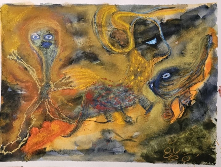
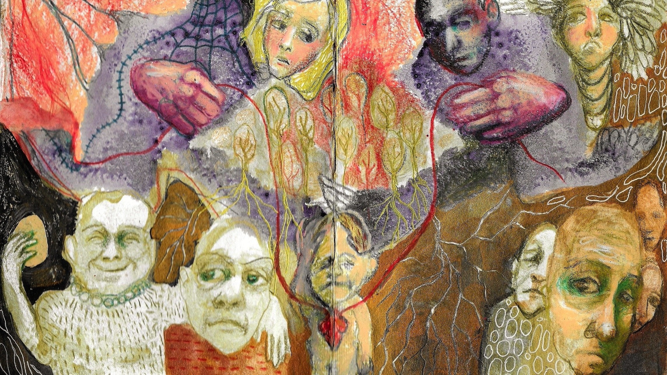
mainly neo coolor cranes. And we're going to get freaky. We'll find wonky weirdos. We'll let go of reality, and just focus on creating
in a relaxing way. And yeah, don't take
it too seriously. And in the bonus lesson, I'm going to teach you how to create an intuitive painting
using acrylic paint. If you're interested in experiencing creativity
in a more intuitive way, you're going to love this class. And I hope you'll dive in with me and we'll play
our hearts out. We will take it step by step, and I will show you that we
don't need all the answers before we can come to our
art table and create. Just listen to your gut.
Are you ready? Let's go.
2. Welcome to Class: Welcome to class.
Before we dive in, let's do some
expectation management. I know that I'm being very
prolific with my examples, but that's just for you to get inspired before you get started. So by no means do
you have to create three or four
finished art projects for your class project? Just make sure that you create multiple backgrounds so that you have something that
inspires you for sure. But then just pick
your favorite one and just play on that
one, see where it goes. If you don't like it, then think about how
you might improve it as opposed to how to make
it perfect or beautiful. Maybe you want to collage
on it or maybe you want to take some acrylic paint and paint over the part
that you don't like. You can do the same
thing with inks or watercolor, you know, and just work with what you got, try out a few things, laugh at yourself when it looks ridiculous and go
with that, you know. My favorite art is
pretty weird and don't let freak accidents stop you to have
fun with your art. Of course, if your muses are unleashed and you
are in the zone, then you can go nuts and create all the
artworks that you want, and you can pick your favorite of them to
upload to the classroom, or you can just
post all of them, whatever you're comfortable with and whatever you want
to share with us. So now that that's
settled, let's dive in.
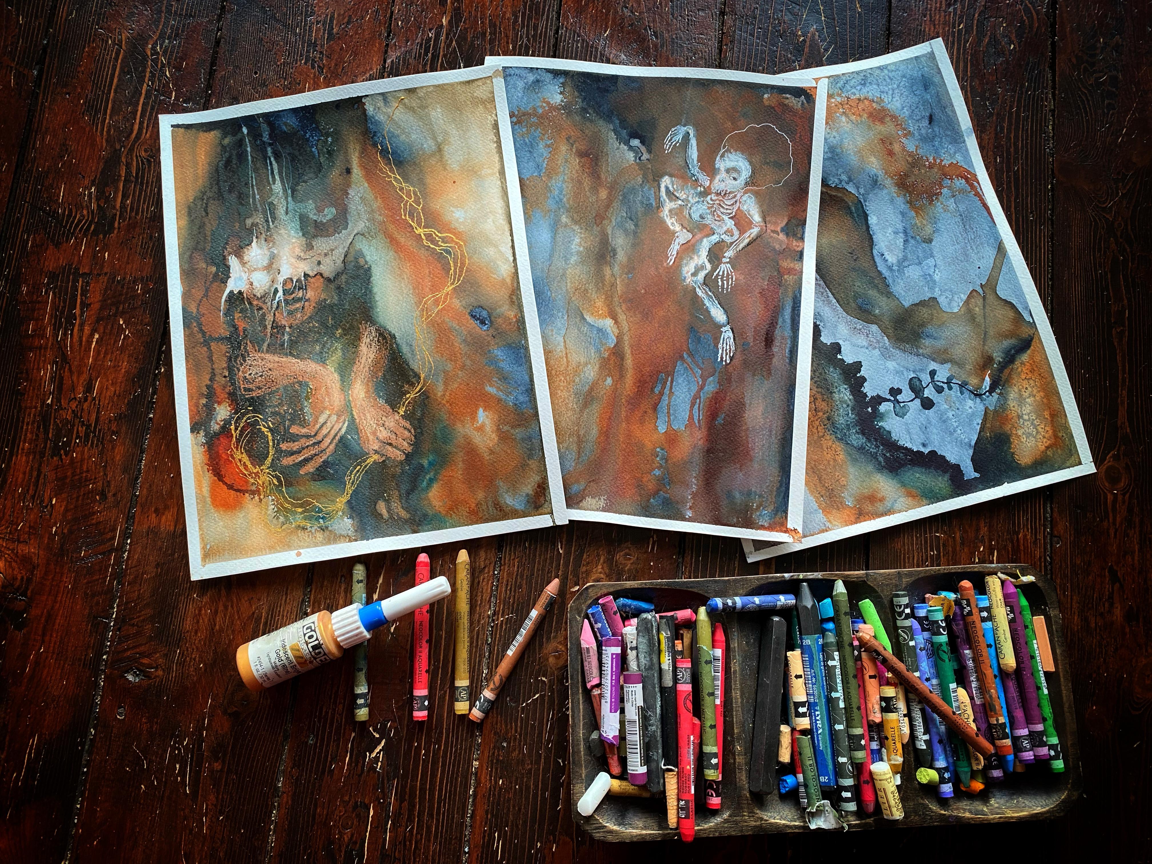
3. Supplies: I would like to start
out by showing you the art supplies that I used
throughout the lessons, but know that you only
need your watercolors and some of your favorite art supplies
that you already own. Anything you like to
work with is fine. But just in case you
would like to try something new or just
wondering what I'm using, I wanted to show you
this collection. First of all, there are my water soluble
pencils and cranes. If you've taken any other of my classes
here on Skillshare, you know that I love
the neo coolor cranes, the two series because
they are water soluble. But I like to use
them dry most of the time because they
are very flexible. They will have a nice coverage, and you can keep on layering with them
without any problem. And they also blend beautifully
as you are drawing. Some other of my
favorite water soils are these ink ten pencils. They work in the same way. You can draw with them
and then take some water and it turns into some
kind of watercolor paint. The difference between these and the neo coolor
crays is these cannot be reactivated once
they are dry, and these can. Then there's my stabilol pencil. This will write on
almost anything. It's very black once you
dilute it with water, and I don't use it that often, but it's one of my
favorite tools as well. I will also bring in some inks. I really love liquitex because they are
rather transparent, especially the
transparent series. You can buy them in this set. They're nice earthy
tones that I'm using. I also like their
paints gray a lot and the muted series
is also amazing. And then I also use
these applicators. These are fine
liner applicators. I will show you there's this needle that will help you to get very thin
and squiggly lines. You can both buy them
with these empty bottles, but they also fit on the golden fluid
acrylics to small bottles. And that's really nice. If you want to put some paint in here, make sure that you add some medium to make
it flow better. Otherwise, the tip
will get clogged. So I will mostly use it
like this for convenience. Hi. I also would
like to show you this dirty MNR pencil sharpener. It has two holes, and the big hole will let you sharpen
your neo coolor cranes. This is pretty
handy when you want to make fine lines to make
some fingers or anything. So I highly recommend
this one as well. And, of course, use your
favorite watercolor paper. Anything is fine. You can even use mixed
media paper as long as it's sturdy enough to take some water,
you're good to go. And I think that's
it. Now, let's move on to the next lesson, and we'll make some
inspiring backgrounds.
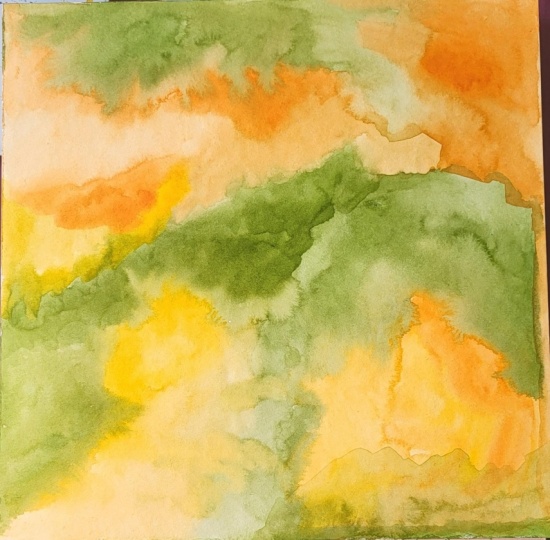
4. Watercolor Warm Ups: Let's play with some watercolor. I'm using the ones by cor in a limited and rather
muted color palette, but use whatever you have on hand and whatever
makes you happy. I'm putting down
some Cacrin gold. So paints gray. Olive green, and
some titan buff. I'm using this paint on mixed media paper
by Clare Fontaine. And you can use whichever
paper you have on hand, mixed media or
watercolor as long as it's on the heavier side so that it won't buckle
on you too much. Okay, let's go. I'm
starting off with a little bit of that
quinacoan gold. Just put your brush
in some water and pick up a little
bit of that paint. But don't be shy. Let's
put some color on there. Now without thinking,
just put your brush to the paper and make a random
shape. It doesn't matter. Just get rid of that white. If the color is a little
bit too intense for you, just take some water and move
that paint around the page. It really doesn't
matter what you do at this point. Just start. Now, let's take
some paints gray, and we're going to put
another shape next to this one. There we go. Because we need some contrast. And since I didn't clean
my brush in between, you at all those subtle
greens that it makes. Paints gray is really a
very dark blue color. So if you mix in some of that yellowish orange,
then this happens. And just have fun with
your brush strokes. And while I'm putting
on the paint, I'm noticing that it
doesn't move around a lot, so I'm taking some water, and I'm going to mix it in there because we
need a little bit of fluidity for our wonky
weirdos to really show up. Do you see those watery
pools of the watercolor? Those are going to turn into
shapes of the wonky weirdos. If we're lucky, maybe not, maybe it will be a
tree or whatever. Whatever you're seeing is fine. Some people tell me, Oh, I can't find figures
and it's so hard, then maybe figures
aren't for you. Maybe you see flowers, maybe you see abstract shapes, and you want to connect those across the page or
something like that, you know? Listen to your own intuition and don't try to
exactly copy me. You can kind of follow
me if you want to, but in the end, it's just
about the technique. See here, I'm adding
lots of water. So it won't be all dark. We need a little
bit of variation. And do you see how I can
reactivate that watercolor, that paints gray underneath with some extra
water on top of it? That's the beauty of
watercolor paints. I really, really
love my acrylic ink. But with that, that's
just not possible because when acrylic ink
dries, it stays put. Work across the page. Sometimes I'm
working on the left, and I'm going to let it
dry for a little bit, and then I go to the right because when it's
all equally wet, it's going to bloom everywhere, and that makes it a little bit harder
to find your figures. Now, let's put that tight
and buff to the test. I'm using lots of paint and a little water because
I want it really opaque. And I'm kind of using it
as acrylics or something like guh because it's really
not transparent anymore. Let's tone down that
very orange shape because there's less paint
in my brush right now, and I'm using a little
bit more water. I can really layer and
it gets more subtle. Just play around
with negative space. Paint around shapes
that you're seeing, even without finding
a specific figure. We're after that contrast, like I said earlier. Let's add a little bit more
warmth to this background. Mix it in with that green. Let's use a little
bit more water again. If you're noticing that you
get stuck in your head, then try putting on some music, music that you really love, that you know the lyrics of, and just sing along
as you're painting. That will distract your
nacritic little bit. And when you see a figure like I am right now,
there on the left, try to isolate them a little bit more from the background, and I'm using the paints
gray with very little water. And I'm going to give
her tiny little legs. Just let your brush
glide across the page. There try not to cover
up spots that you really like and just
keep it organic. Unless you're really into
geometric forms, then go nuts. But to me, organic shapes
are really inspiring. Here I'm warming up my titan buff a little
bit with Cranacodon gold. And I'm going to just miss about a little
bit on this side. Just keep mixing your
colors and keep layering. And here, I'm not after
a specific shape yet. I'm just slowly adding
to that contour. And when you are
working rather slowly, then you have more time to spot a potential figure
while you're working. I will show you. But first, let's play a little bit more. And if it's too harsh for you, then you can just
take a little bit of water and go over the edge, and then it will
start to bloom again. Now, let's say you are going to do something that
you deeply regret. Let's move towards the figure. I'm going to take
a bit more paint. And I'm really going
to mess it up for you. Hang on. I'm taking
a dark color. And I'm going to do something
that I won't enjoy, and I'm going to show
you how to fix it. Here, I'm going over that orange and I'm putting that dark color up against
the arm of my figure, and you really lose
the contrast that way. And yeah, it's not
that great to me. So I'm taking some water. If that happens to you, you just have to wet it. And I'm taking a paper towel. And that will soak up some
of your wet paint and you'll get some of texture as well.
Happy accidents, right? Don't get upset when you do something
that you don't like. Use it as an opportunity
to problem solve. And here I am going to put a little bit of
paint on top of it, but with lots of
water this time. And that's so much better. I'm seeing a rather
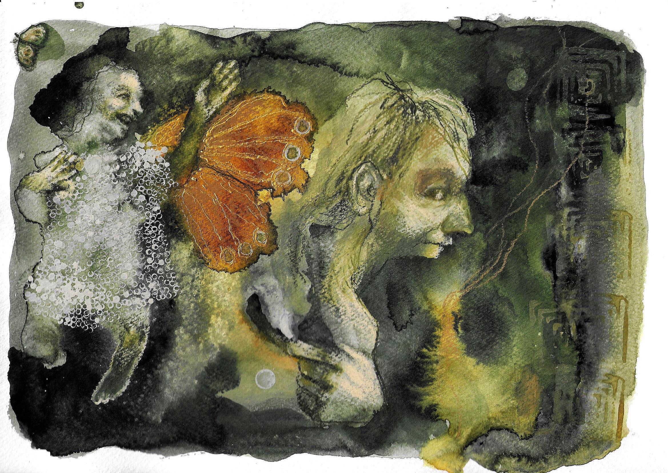
joyful expression, something to work with later on. It's funny because I'm
usually a very gloomy artist. So it's rather nice when I
see a joyful one for once. That's the beauty
of this technique. You will find figures that you won't really
paint normally. Let's give her some hair. Because the paint is still
wet there on the right, it's going to react very
differently than on the left where it's
dry underneath. No, let's take a darker
paint again and try to isolate something on the
right side of the page. At this point, I have no idea. I'm just moving the brush across my page while
I'm rolling it. See, I'm holding the
brush on its side, and I'm just rolling
it over the page. And that is why you
get these marks. And because of those marks, I'm seeing a profile
of a man, I think. So now I'm going to
try and finish that, but in a more mindful way
than when I started out. And because of that
happy accident before, when I did something that I didn't like and I
tried to fix it, now that shape has turned into some kind of butterfly
wing or something. So I'm going to emphasize it again
with a little bit more of that coacordan gold. Just because the color is very close to the green
right next to it. If there was a darker
color next to it, then I could just
leave it as it is. But right now, I just
want to warm it up a little so that it's a
little bit more pronounced. I think I'm happy. I have enough information
on the page to work on it with other media. That's it. It's done. Now let's make a nice dash of background so that we'll
have plenty to choose from. This will make it
easier for you to find one that you really connect
with in the moment. And also, you'll have
some inspiration waiting for you on those days where
you're just not feeling it. Just take one of these
backgrounds and do something that you really enjoy regardless of the end result. But first, sit back and relax and watch a little
bit of extra inspiration.
5. Example 1: Sweet Memories: H. Let's dive in. First, I like to draw a little
dark circle or dark ish, where the eye socket is because that makes it easier
for me to see the face. I hope it will help you as well. But, you know, we all
have a little bit of shadow in that area. And from there, you can
sculpt the eye later on. And when I have that in place, I'm taking a lighter
colored neo coolor crayon to sculpt the face. I'm just putting it on
the cheek, on the nose, on the forehead, you know, places where there would be
a little bit more light. And I'm also covering up some ink stains that
don't need to be there. In this example, I clearly see an expression and a
little mouth and yeah, nose, and I'm covering
up everything that it doesn't
resonate with that. If you don't clearly see
a facial expression yet, then just make up
something on your own. You know, you don't need to find all the answers in the ink. But when we do get
a happy accident, then it's a nice bonus. And don't overthink
this process. Just have some fun and have
faith that it will work out. Not every piece needs to become something that you frame
or sell or whatever. Sometimes it's just
the experience to find the wrong
style along the way and to have a little practice or just to enjoy a bit
of creative time. And over here, I'm
starting out the same way, see with that
scribbly oval shape where the eye will go later on. And here I'm taking
a dirty water brush, and I'm spreading it around. And, you know, I like it. Adds a little bit of
warmth to it because there was brownish color in there, reddish brown or something. And right now I'm starting to see a hint of the expression. So I'm taking my
ink tense pencil, moss green or something, and I'm slowly sculpting
the face that I'm seeing. And I'm working with the shapes that I have because
I like to do that, but you can always
adjust a little bit. If you don't enjoy the
silhouette that you're having, you can just go over it with these neo coolor crayons
and press a little harder, or you can use paint, whatever you like to do. Just experiment and allow yourself to distort
your figures. I think that's very helpful to break through
that fear failure. Just make them weird. It was supposed to look weird, right? And try to observe
how I am creating form using lighter
and darker values, depending on what I want to do. When I want the features to appear to be
sticking out more, I'll use a lighter shade. And when I want them to be deeper in the face
or cast a shadow, I use a darker color, and that's all there is. The color that you're using
doesn't really matter. That's personal
taste, and to me, muted color palette is easier. So I do recommend that. But you can use any
color that you like. Most important thing
is that your values, the darks and the lights are
somewhat in the right place, but there's always room for
creative freedom with that. When it looks weird to you, then mostly you need it to be darker or lighter depending
on your situation. And you can create these in
any way that suits you best. I'm choosing my ink tans, pencils and my neocolor crayons, mainly because the
neo coolor cranes are very easily diluted
with the water, and you can layer in that way. Whenever you mess
up a little bit, you do something that
you didn't like, you can just take your water
brush and spread it around. And it will still be
there a little bit, but you can just layer with
the crayon on top of that, and it will give you
a lot of freedom. And this is the
new color crayon, the golden color, and I really like that as
well as the bronze one. You'll get very emotive figures when you play with
colors like this. Let's leave realism
to the real world. If we want to see
realistic stuff, we can just look up around us in the room
outside and we'll see that. But in our art, let's give ourselves the freedom to create from our soul and that's the
most beautiful thing to me. And also, don't be afraid
to put hands in your art, even when they look
a little bit weird. Let's take a step by step here. I'm creating the thumb, then a couple of
fingers, ideally four. And then I'm scribbling
in the palm of the hand, and there it is. And I'm taking my ink tense
pencil with a darker value, and I'm just separating
these fingers a little bit, putting in some
shadow in the palm of the hand and the
creases in the fingers. You just build it up slowly, and that way, it becomes
less intimidating, I think. And like I said, don't be afraid to just
put them in there. However, they look because hand is so valuable
in telling stories. It's better to have a very weird hand doing
something than being afraid of putting him in there
and feeling bummed out because you weren't
able to tell your story, the one that you're
feeling in this moment. I was looking for
something to stamp with, but I couldn't find anything
in my collection of old caps that I like to
keep for this purpose. So I'm taking my dropper, and I'm just going to dip it in the watercolor, not too thin, not too thick, and I'm
going to make little dots, and it's going to be a very irregular pattern,
and I like that. It's a very mindful exercise. If you have a lot of stress, then doing something like this, this is very repetitive
and slow process, it's going to calm
down your mind. I just wanted you to know
that if you ever need it. And sometimes when you're just
playing and experimenting, you come across something
cool like here. I noticed that when I squeeze
in my dropper a little bit, I can make some kind of bubble. And I can put it on my paper and pop it. Let's
see what happens. There. That's a
cool mark, right? Let's put a couple of
them on those wings. I like that there are some
unpredictability to it. You don't really
have control over your shape or how
thick the paint is, and I think that adds a little bit of
interest to our image. Beautiful things can
happen when we're willing to give up
some of our control. And if you would like to
experiment with this technique, then play around with
the consistency of your watercolor paint
because it needs to be not too thick
and not too thin. So just play around on a
different piece of paper to see if you can make the
bubbles and when you got it, and you can do it
in your painting. And do you notice how I jump around on my
page whenever I'm a little bit fed up with my repetitive
stamping like here? I just move on to
a different part, and then I'll go back to
the dress and that way, you can keep yourself from
getting bored or frustrated or when your hand is
cramping a little bit, just go to a different
part of your art and yeah. Then you'll come back, and it's going to be more pleasant.
That's what I'm saying. Here I'm reshaping
the arm by going over the negative space next to the arm with my
bronze neo color crayon. That way you can fine
tune your figures. And I'm taking my fine
liner tip that fits on the small golden paints, fluid acrylics bottles,
but they also come with a separate bottle that you can fill with
whatever you want. And that is a great way to
create marks that, again, are not so controlled, so they're a little
bit wiggly and quirky. And next I'm taking a little
bit of my watercolor, and I'm going to drop some on those circles
to add a bit of color. The art is in the
details, right? Let's see. What else
can I show you? I don't know if you
have any wooden stamps. They're also very interesting to use with your watercolors. I've mixed up a color
that I rather enjoy, and I'm just brushing
it on there. And because it's watercolor, it's not going to give
you a clear print. That is exactly what I want. Isn't that more interesting
than just taking an inkpad and
putting it on there. I'm sure it will work
with any type of stamp. Just play. I'm just
going over it again. And whenever this happens, then you can just
spread it around. You can remove some of
it with paper towel. There are all kinds of ways to push back something
that you have done, but you can still see a
hint of it and I like that. And sometimes I'm seeing
something in the paint that I don't actually
want to draw. This reminds me of a genie lamp. So I'm making marks there to suggest the
gene coming out of it, but I don't want to
really put in the lamp. But that's a
personal preference. If you like to work very
detailed, then go nuts. I'm just here to give you as much inspiration
as I possibly can. And as you are working, you will start to
see new things. Like here, I'm seeing a
very weird and wonky hand, so I'm putting it in there. And if you want to, you can make the hand
look a little bit more realistic by reshaping
that index finger, but I like it that
it's witchy and weird. So I'm just working with
the shape that I got. And again, I'm
searching for my hand by alternating between a
lighter and a darker color, and you can keep
reshaping it that way. And I hope that it will take
pressure off hands for you. Like, everything
is just practice. Here, I'm trying to create
some kind of knuckles. And I myself don't understand
knuckles as well that much, and I'm too uninterested
in learning them. So I'm just making it up. And when there's
some form in them, then it will turn right.
It will look like a hand. And another thing, I like
to leave my eyes very rudimentary up until
the last moment when I have all my
figures in place, and then I know if I want them to look at each other
or away from each other. See here by filling in
the white of the eye, I'm creating my eyes. It's the other way
around from most people, but I prefer this. And here, I'm just
putting in the eyelid, and it looks okay to me. Allow yourself to be a little
bit lazy or something. You know? Maybe ladycy isn't the best
word, but sloppy expressive. Let's call it expressive
because that's what expressive art often is
a little bit sloppy. See here, I'm just
drawing in some fingers. The middle finger is
always the longest, and from there goes
downhill again. You can color in one of those
fingers or maybe two of them to have the illusion of some shadow and
again, creating form. It doesn't really
matter what you do. You can always adjust it. And again, that's the beauty
of the wonky weirdos. You can make them very gestural. So it's more about
what they are doing than if everything
looks perfect. You know, you can see what
kind of body language she has. And sure she looks weird, but she's believable, right? Let's do the same thing
with her legs there. We're going to win it. There looks like a foot. And I think I'm going to leave the other one
alone, I think. Let's see. Because a leg, it looks like
she's bending it, right? Like she's running or something, and I don't think I can
do anything to really improve it without making
it look cartoonish. So I'm just going to
leave it alone and let the power of
suggestion do its work. You don't need to fill
in all the blanks. If you want to, you can observe some of your
favorite paintings and look for ways
that the artist has simplified his art and you
didn't even notice before. It's really interesting to
take the time to do that. And ears is also very
difficult for a lot of people, but I just create some kind of C shape with a heavy
foot or something. And then I'm taking a darker
color, and I'm making, yeah, a line within there, and then there's ear hole, and it will look like weird ear. Or make the hair go over it if you really
don't want to do it, but I just wanted to let you
know that you don't need to do much to create a believable
ear. Is it beautiful ear? No, but that's okay. There. And that's what matters. Here I'm taking my ink tense
pencil and I'm just making some marks so that the hair
is not just one flat area, but yeah, there's
some character to it. And then at the end,
I'm seeing some kind of moth. I put it in there. There. I have no idea what
a math really looks like, but I'm
putting it in there. And don't be afraid to
get something wrong. Just follow your intuition and draw what you see
with your mind's eye. I used to really struggle with
that as a budding artist, and then I observed some of
the art that I love the most. And I learned that none of them were drawing or painting
things as they really are. Why should I? So I hope you will
allow yourself that same freedom,
create from within. Okay, so now I'm going to
reshape this nose a little bit. You can still do
that. I'm reshaping it by coloring in the negative space around
that nose a little bit. And I like it more now. Bringing that upper lip a little bit more
to the foreground. And that also helps with
her expression, I think. So don't be disappointed if you don't love your figures
right from the start. It's a process. Just
take it step by step and breathe and relax. It's playtime. Let's go
on a little adventure.
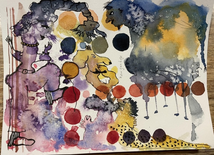
6. Example 2: Forest Creatures: O Let's have some more fun. Here, I'm most excited about the face that I'm seeing
on the left there, so that's where I'm starting. I'm taking my ink tens pencil, and I'm just lightly sketching in the face that I'm seeing. I'm
just finishing it. There are a couple of hints that help me to find this
goofy expression. And I'm using a
very light touch. See, I'm not making
any harsh lines. Scribbling. And slowly,
I'm creating form. And although I usually am very heavy on the neo
coolor crayons for this one, I wanted to keep it more subtle to show you
another way as well, but also because it
fits this figure. I can see an arm right here.
I'm putting it in there. And let's tackle this guy
because I don't want to linger too long in
one spot because that's when my inner
critic starts spiraling. So that's why I'm always
jumping from one spot to the next while I'm
creating my figures. And once I found his expression, I think I'm going to show you a bit more hysterical way
of creating your figures. With the new color cranes, I'm starting out with
the flesh tone and a bluish green one
because this color, I kind of like it, but
it's too dark for me. So that's why I'm mixing
the two as I'm drawing. The beauty of these
new color crayons is that they mix beautifully, and you can keep going back
and forth between them. It's a very forgiving way
of sculpting your figures. And I think I will let you
watch for a little while, so you can concentrate on observing without me
babbling through everything. Okay, let's go back
to this figure. I am going to take my
white neo colour crayon, and I'm very lightly
putting in some highlights, and I am taking my water brush to
it because I want this figure to be a little
bit more translucent. I use this MNR pencil sharpener
to make my life easier, and I continue placing
some highlights. Some of them I will keep as is, but most of them I will
dilute with my water. But on the nose there,
I think it's really nice to have sharper highlights. Right now, I'm going to show you how you can make your figure separate a little bit more from the background and bring
more attention to them. I'm taking my ink tens pencil, and I'm coloring in the area around her
on the left there. Then I take some water
and I move it around. And do you see how much of a difference that
simple step makes? It's like someone directed a
little spotlight onto her. Do here I'm just doodling inside some
watercolor blobs to give the illusion of a kind of dress without putting too
much effort into it. I like to keep it breezy. And creating a kind
of patchwork of different patterns
is a really fun way to make their clothing. Now, a darker patch like this is perfect for your fine liner. Look at those
little golden dots. So satisfying, right? I really like using those
ink tens pencils on top of the neo color crayons
because it's a little bit harder to get
the pigment on there, so you get very thin lines. I like that. Time to
put in some branches. Don't force yourself to work in a direction that's
uncomfortable to you. If it's necessary,
just turn over your paper and makes
it much more relaxed. And you see those concentric
circles that I've created around my
figure in the middle? That's really because I kind of hated the color that
was underneath it, and I'm trying
desperately to fix it. Stuff like that happens
when we're creating. Whether we're creating
intuitively or with more intent, there's always a point in your painting where
you're thinking, Oh, my God, this
totally ruins it, and just try to work with that. So here I'm taking some
of my acritic ink. This is the raw sienna, I think from ictex it's
the transparent one. And I'm just filling
in that big circle. And now I like it way more. The ink works beautifully with the granulated color that
I dislike underneath, and now it has some
texture to it. Here I'm taking some of my
transparent burnt sienna, that is a warmer color, and I'm putting that
on the bottom part of my circle just to have a
bit of dimension in there. I hope you enjoyed this inspiration and I
wish you lots of fun finding your own story just
by observing the paint. And remember, the paint
is not the boss of you. If you want to add
something that can't be found in the paint, then you're the boss. This is your inner world. And it's finished
when you say it is. Yes
7. Example 3: Wishy Washy: He one more for the road. And notice how I'm being
very sketchy and light to the touch until I'm certain that this is
a shape that I like, and then I'm pushing harder
on my neocolor crayon. That's all I wanted to
share for this one. Now, put your feet up and
just watch me for a while.
8. Adding Inks to the Mix: Now, let's mix things up by
adding some acrylic inks. I really love these bi liquitex. These are from the muted
series, muted green, and this is one from
the transparent series. Is the burnt sienna. And we're going to
play with those. First of all, I'm working on this canson watercolor paper. It's very affordable but
heavy and it holds up well. That's a combination that we want because we want our
paper to hold a lot of water, but yeah, we also don't want
to be precious about it. Let's start by taping
off the edges because white edges make everything look more beautiful
for some reason. I'm putting it down on one side, then going to eyeball it, putting it down on
the other side, and then I'll run my finger over it to make sure that
it's really on there. It's not a big deal if
it's not even or straight. Now, let's start off with
a layer of water color. I'm going to take my paints gray and some water,
quite a bit of water. I'm just going to
put down some of it because I would like
a nice cool background. Okay. I'm going to have some variation in value. A little bit of contrast
always makes it more exciting. But mainly we want to
have a little bit of something down here before
we're going in with the inks. When you tap your brush with the watercolor in
it or ink or whatever, you can make these little marks. Now we're going to let this dry and then we're going
to play with inks. Okay, so it's mostly dry. I'm not going to fuss with it. And let's take this
transparent burnt sienna and warm up this image. First, I'm going to show you how it looks
when you just wet the page and then drop
in the acrylic ink. Awesome, right? And the ink is repelled by the water. So that's why you're getting
all these nice textures. And here I will show you
the other way around. More like a cloud now. And if you have something like this and you don't want it to be that sharp, just take some dirty paint
water and get rid of it. You can drag it with
some water as well. You can seduce into going
in a certain direction. Of course, you can
always work in some more watercolor when
you want to up to contrast. Wherever it's wet paint is
going to stay in there. It's also nice to
play around with. But just experiment. If your orange is too somewhere, then you can just put in some
dark blue or some green. Now we really have some
contrast going on. We can make it travel
across the page. It still wants to stay
within those wet spots. Don't be bummed out if you
don't like your shapes. We're just going
to keep playing. Let's take some Pains gray
acrylic ink by Day Rowney. Don't like that green or we
don't want too much of it. We can just add in
some pains gray. Yeah, you can make lines with the dropper
and wherever it's dry, it's going to be sharp and wherever it's wet,
it's going to bloom. Let's add in some more orange. I'm trying to stay
in the wet places. And if I go outside
of those areas, I can always pray it. Maybe just have some
fun playing with your values and your
colors, your shapes. Don't put any
pressure on yourself. We can do the same thing, of
course, with the dropper. Oh, here I don't like it. There. Sometimes I can't
finish my sentences. But it was a very noticeable
drop, just like here. I'm going to make it wet, and then I'm going to pick
it up with paper towel. There's still a little
bit of color there, but it's not as sharp. Let's give the ink some
room to do its thing. And protect your surface
'cause it's going to be messy. Fortunately, this
isn't my actual table. Let's see. I want a
little bit more warmth. Let's drop in some white ink. It's always fun to add in there. See this little drop is
going to spread around, make some textures
here on the sides. Can try to steer it in
a certain direction. But we can also just O. Give it time to settle. And it's best to let
it dry naturally, but it can take awhile because
it's really, really wet. Oh, there's a cat hair. Oh. Let's see. So I'm going to try
and get this out. And it's fine. Don't you
love cats? Now, where was I? Yeah. So while this is drying, you can just move on to another background that you've made and play around on that. And if something inspires you, like This reminds me of a
little plant or something. Can just take a brush and add some more of these
leaves and make a pattern. If that doesn't happen, then it's fine.
Just keep pouring. I play with the transparency
of those leaves. Maybe I want one on
this spot as well. There. See how much of an eye catcher that is on this page because
of that pattern. We can also take that brush
and drag out that white. Make it a little
bit more dynamic. See how thin of a lines
you can get while you drag your brush
through that wet ink. Pretty cool. If you run out of white, then just take a bit more
straight from the bottle. And don't dip as deep as I am. Now you can really drag it. I kind of looks like an owl, right? Right here. I think
it's a barn owl. Just needs it beak.
So you can make some interesting marks
I just playing around. I can inspire you to find
figures or maybe flowers or abstract shapes that you want to explore
with different media, whatever you want to create. Now it's like some
squid or something. These are can change constantly. Also while it's drying. And if the pulls are too
wet for your liking, just take a paper towel and just dab it in there
so it can soak it up. And a nice bonus to that is that it will leave
some textures in there. And the beauty of acrylic inks is that unlike watercolors, they don't reactivate when they are properly dry.
I'm just checking. I think I'm okay now. We'll see. So if I take a little bit of maybe watercolor
paints gray here. And let's say I want to make this a
little bit more subtle. I can just go over it. And you can do the same
thing with the acrylic inks, just depends on what you want, what you're comfortable
with, maybe. But also try to go outside of your
comfort zone sometimes. Not all the time. Baby steps. I just want a little
bit less contrast in my background because
it was very bright for me. I also don't like this. Maybe I'll take my pain scray and put it on there. This whole area was
too bright for me. Nice that there's
some orange in there, but let's tone it down
with some paints gray, watercolor on top of it and we can also
play with texture. Let's do the same thing
here on the right. See, I'm a sucker for dark backgrounds.
There. That's better. Tone down all or
most of that orange. You can paint in negative shapes around
interesting spots. Interesting to you.
So really pops. A I really like the darkness. The layer underneath
is not wasted. If you like it lighter than
by all means, keep it light. I really, really enjoy
dark background with interesting shapes
and some inspiration. What I was going to
say a while ago, if your watercolor or your paint has the right consistency, it can't be too dry and
it can't be too wet, you can put some
salt in there and it will soak up watercolor or the ink while it dries and we'll get
cool textures that way. We'll just put it in some
places that are still shiny and we'll see how it goes. I can tell that this
is a good spot. Here as well. And now that it's dry, you can remove the salt. B. Here's these cool textures. Especially here where there was some orange acrylic
ink underneath. Remember, that's waterproof. And it looks really nice. And when you are removing
the tape from your art, remember to pull
it away from it. So ideally in an angle
of 90 degrees ish, but don't pull it completely backwards
because then you have a risk that you'll
remove some of the paint in your paper
along with the tape, and it's going to suck. And I hope you will
take the time to make a couple of these backgrounds so that you can really
find your groove. Just put on some music or
maybe your favorite podcast, if that's what you're into. And just experiment. There is no right or wrong
with this technique. There's only things that
you'll like more than others, and I wish you lots of fun discovering what
you love to do. And when you have
a nice collection of backgrounds that you enjoy, take a little bit of time and go play on them in any
way that you want. I'm going to show you how
I use my neo color crayons to find my figures in these backgrounds. I
hope you enjoy it. No I hope you enjoyed
this inspiration, and I wish you lots of fun
playing on your backgrounds. Just keep it quirky and maybe you just want to
do 5 minutes today, and maybe tomorrow, you
do another 5 minutes. Just take it at your own pace. Don't feel like you
have to complete something immediately
once you started on it. Keep it low pressure
for yourself. It's better to squeeze
in a little bit of art on a regular basis than do 3 hours of creating and being totally overwhelmed
by it so that you yeah, need a break for the next
couple of weeks, you know? It's way better to commit
to a couple of minutes, let's say, every day
or every other day. And if you get inspired and you end up creating
3 hours anyway, but you're having fun doing so, then that's a win. Happy
creating, everybody.
9. Bonus Project: Create Intuitively in Acrylics: I hope you had fun
with your watercolors. Now, for the bonus lesson, I will show you how to create in an intuitive
way with acrylics. You can just watch this for inspiration and maybe let it settle in your mind
to do in the future, or you can just dive in and
have some additional fun. It's up to you. I
hope you enjoy.
10. Bonus Project: Building Layers in Acrylics: Now, let's do the
same kind of warm up, but in acrylic paint, I like to start from
a dark background, so I'm skipping a step by taking my black
mixed media paper. But if you don't have that, you can just start
with a layer of black gesso and let it dry
completely before you begin. I'm starting with some
white gesso and a wedge, but you can use a credit
card or something like that. I'm just going to scrape the gesso over a
dark background. And basically, I'm going to use black and white layers with some mark making
in different ways. And after each color layer, I am going to dry the page thoroughly because
I don't want them to mix and make gray. If you like grays, then go nuts, but I like the stark contrast. It helps me to find my figures. And during this play session, I'm going to use different
tools to make my marks. I'm using skewers and brayers, fan brush, a palette knife. You get the idea. Just
go around your studio and find all kinds of stuff that you would
like to experiment with. And just layer and layer
until you feel inspired, and you can layer
totally random, or you can every now and then, work on a little spot where you are seeing something
that inspires you. And that way you can steer
it in a certain direction. Try both ways, maybe. And when it feels right, just stop and we'll
go to the next phase.
11. Bonus Project: Acrylic Adventures: Now, let me show you how I
would finish this painting. I'm taking some of
my acrylic ink. This is transparent raw
sienna by liquitex, and I'm going to
warm up this page and get rid of all
that intense white. Ideally, I would have been more patient than I have
been because you can see that gesso is still mixing
in with that acrylic ink. But I'm not really bothered
by stuff like that. This is just the first
tap of many layers. And for those of you who aren't really into
the wonky weirdos, I will not bring out what
I see right now exactly, but I will use the
body language to bring out figure that is a little
bit more traditional. And I'm going to show
you how I paint without spending a lot of time
pre mixing my colors. I'm just going to wing
it and mix on the go. I think it's easier to
just start that way. And I'm a big waster of paint, so it's better for me if I
don't make a whole batch. When I just started
out, I used to be so afraid of mixing my paints, but when you practice, you'll notice that it's
really not that complicated. You just observe the
color that you've mixed, and if you're not satisfied yet, think about which color you can add to it to get your result. And maybe at first,
you're not nailing it, but by just trying it out, you will eventually
understand your colors, and you'll be less intimidated. I'm taking some yellow ochre to start and sculpt the face. I like to start off rather dark, and I will lighten
it up as I go. If intuitive faces
are hard for you, then you can go to my Pintrasbard called
Faces and Expressions, and there are a lot of portraits with high contrast that you can observe and use as
inspiration for your figures. Just scroll for a
while and pick out a portrait that resembles what you see in your
paint the most. Time to add some other
colors to that yellow ochre. I'm mixing in a little bit of that pink and I took a
bit of the red as well, but it was too strong, so I toned it down with a
little bit of that green. Because red and green are on the opposite side
of the color wheel, you can use one to
mute the other. Now that we have a second layer, let's add a bit more variation of colors into the portrait. It doesn't really
matter which colors you use as long as their
values are correct. Usually when your
portrait looks off, it's because there is
a place that is too dark that you need to
lighten up or vice versa. And the beauty of mixing as
you go is that you'll end up with lots and lots of subtle
difference in colors, and that is so much
better than just mixing about four colors
and paint with those. You'll get much more
complex portraits with this method, I think. And let's avoid going
into detail just yet. First, we're going to
focus on creating form. So I'm going to make the parts that are a little bit deeper in the face
like the eye sockets. I'm going to make those darker. And the parts of the face that are sticking out a bit,
like the forehead, the nose, the cheekbnes, those are going to
become lighter. And this is usually
not a process that can be done in
three or four layers. Just go back and forth. Just take your time
to find your figure. And I'm going to show you how to create quite a detailed figure. But you can certainly stop at a way earlier stage and keep it more expressive
and painterly. For example, I really like
where she is right now, but that would be a very
short lesson, wouldn't it? But I do love her like this. It's like she has her
eyes closed or something. I think it's very interesting. Now, let's just watch
for a little while. Mm and try to add some other colors as well, apart from the pink
and yellow tones. And a couple seconds, I'm going to add a
little bit of green into my skin tone color mix, and that really helps to
make it more interesting. Adding a little bit of cool tones with all
those warm colors, it really makes a difference. And whenever you have
the feeling that you've just messed up and
it looks horrible, like here, I don't know why I thought I had
another color on my brush. But I want you to not freak
out and throw in the towel, put on another layer, maybe five new layers, and it will come together again. That's the beauty of acrylics. You can't really mess it up. Just let it dry if you
took something too far and layer until
you're happy again. And did you see how I
created those eyes? Let me show you again
because I wasn't really happy with what I did. So I'm going to darken out those eyes again and let it dry. And again, I'm painting in the white of the eye to
find my expressions. That's how I enjoy doing it. It's easier to me than
the other way around. And I'm not using a
white to do this. This is just a tiny bit lighter than the
skin tone next to it. You can even do it
with the same color. It's better than bright white. It will look freaky. Now, let's create another hand. Again, I'm starting
out rather dark. Doesn't need to
be the same color as we started doing the face. And I'm starting
with the base of the hand or the
back of the hand. And then we'll give
it some fingers. The middle finger
is the longest. Then we'll make it a little bit shorter again and that
pinky is very short. And I'm not really that
satisfied with this thumb, so I'm just taking my
dark blue in a minute, and I'm just going
to paint over it. But I'm stubborn, so I'm just lightening up parts
of the fingers. And that way, it looks like
she's bending them, right? I always think that's cool. Just keep playing
with the lights and darks to bring some
form to your hand. It's the same thing
with the face. It's just that we need to
get comfortable with it. And remember, wonky hands
are better than no hands. That's my motto. And as I'm
working on that little hand, I just can't take it anymore. That thumb has to go there. It's like an eraser, right? You just put on darker
color again, and it's gone. Let's extend that hand
and create an arm When we were filling in
a background with color, often times we're inclined
to take a big brush, so it's done really quickly, but try a smaller
brush like this. Sure, it takes a
little bit longer, but I think it looks
more interesting. Now I will show you how you can add some interest to clothing. I'm mixing up a
green that's only slightly lighter than
the rest of her dress. And I'm just making
a simple pattern. And sometimes when you're creating a pattern and
you're starting out, you think, Oh, this looks
horrible, but just continue. Most of the time,
if you persevere, the repetition will make
it look cool anyway. Et's end the project with a
little bit of storytelling. It doesn't need to
be very literal, add a little something
that is unique to you. I always like the
thread for some reason. And I love to ed it in
different ways each time. And another thing that
I enjoy is roots. So I thought, let's combine
the two in this one. Is there something
that you enjoy doing? If not, then this is
the time to find out. Just follow your
gut and go for it. It could be an existing symbol or something that is
very personal to you. Or maybe you just like to
paint abstract shapes. You can play around by making
them come out of the mouth or you can make them interact
with the hand, you know? Let your imagination roam free. Even though I kind of
like her expression, I will show you how you
can still adjust the eyes. You can open them
a little bit more, give them smoky eyes. For some reason, I
can't do it on my face, but can't do it in my painting. And don't be afraid to
overwork your face. Sure, it can happen, but most of the time it's because
of too much blending. Try to layer loose brush
strokes on top of each other, and that way you
can keep changing your expression without
that overworked look to it. Thing that can
happen is that you lose the looseness that you
had in an earlier stage. Remember when I pointed
out that I really liked this face in
the earlier stage, I still like the face, but it has lost some of that
rawness that I really enjoy. And that is because I
put in all the details. And sometimes when
you're in the moment, you can forget about something
that you need to do. And here after I
remove the tape, I notice a weird eyebrow. So let's fix that. Sometimes that happens. We can only be
concentrated for so long. For me, it's about 40 minutes. Every time when I feel myself getting very
fussy and frustrated, I look at the clock
and without fail, it's 40 minutes that
I'm working on it. So try to find out what your time frame
is and respect it. Get a snack or something or
watch a show in between. We need a break
every now and then. I hope you enjoyed
the inspiration, and I wish you lots of fun
trying it for yourself. I'm so excited to see
what you will find. And whatever it is,
don't censor yourself.
12. Thank You & Farewell For Now: Did it, you finished the
class. I hope you had fun. And if you did, I would really appreciate it if you would
leave me a review. That way, I know what you like, maybe what you missed, and that will really help me to create future classes
that you actually enjoy. If you enjoy intuitive projects, there are a couple other classes on my profile you
could check out. I've got a couple
of classes with inkblots as inspiration.
Those are really fun. And there's also
Frida Clo inspired class that will
help you to create intuitively in baby steps and with a little
bit of cheating and borrowing from the lovely Fedra C. So I think
you will enjoy that. And I will see you
in the next class. It's going to be
another fun one. So give me a follow and I
wish you happy creating.
 Jerney Marisha, Making Art Fun Again