Transcripts
1. Introduction To Watercolor Portraits: Only a handful of
subjects are as feared by beginners as
portraits of people, yet we feel drawn towards them, keep on being
enchanted by them and keep on giving it a try
every now and then. There's just something about the watercolor portrait
that's almost irresistible. Whether it's the
free flow of paint or the spark in
the eyes that make a quick watercolor sketch
capture just enough of the subject to tell a
story about its soul. My name is Jane Beata, and I'm a watercolor
artist based in Slovakia. I exhibit in some artworks
locally and internationally. Occasionally I work
for clients and create illustrations for
web or publications. In my studio, I host workshops and live events on
a regular basis. I love to paint all
kinds of subjects, but portraits of people are my absolute favorite
and have been throughout the past 13 years ever since I started
to learn them. It was a tough journey. My first watercolor portrait
is this one and I cherish this greatly because it shows
the long way I've come. Whenever I feel lost
and frustrated, it reminds me how
much I learned. I'm quite familiar with that headspace when you
feel that this is too hard, that you're never
going to grasp this and I've built this class
with this feeling in mind. In this class, you're
going to learn how to draw a portrait and how to paint a
quick sketching watercolor. We're going to do
a drawing warm up, and learn to simplify human head into its
very basic form, and then how to sketch this
form in multiple angles. We will then learn
proportions and how to place different features
of the face properly. Then we'll go through
every feature individually and learn
how to simplify and sketch them so that
you'll be ready to give your portraits a
more realistic look. I'll also give you lots of tips and show you best
ways to practice sketching portraits on
your own so that you can progress your skill
without wasting time. By the end of the drawing
portion of this class, you'll be ready to
create your own sketch for painting a portrait. In the watercolor
portion of this class, we'll learn how to prepare and apply watercolor paint
properly so that you'll know how to create smooth washes and more expressive watercolor
effects when you need them, and how to blend
watercolor edges. You'll learn how
shading works both in pencil and in watercolor, as our class project we'll
create a sketch together. We'll also draw a
small thumbnail of the portrait and
learn how to do a very useful map of different tonal values to use as your guide
while painting. Finally, we'll paint a
watercolor portrait in one color and only
in three layers. By the end of this class, you'll have a
watercolor portrait in your hand to be proud of. As a bonus, I'll keep on adding bonus lessons
to this class to give you the opportunity to practice your skills regularly. In these lessons we'll go through different
portraits examples, and learn how to
draw and paint them. If you're a beginner and you
want to give portrait a go, this class is
especially for you. I simplified every aspect
of portrait drawing and painting to the essential
bit to get you started, even if you want to skip
to painting right away. For every portrait,
you'll have sketch, download and continue
with the watercolor part. If you already have
some experience, but you want to brush
off your skills a bit, you're also welcome
to join this class. It might give you a
different perspective into what you already know
about portrait painting. I can't wait to
see you in class.
2. Class Orientation: Hi everyone, welcome
to the class. Before we dive into
watercolor portraiture, let me briefly explain how
I organized this class so that you have easier time
to navigate through it. We'll go through the
materials first. Because this is a drawing
and painting class, so you will need some not
a lot art supplies for it. I always try to
minimize the amount of materials that I use in a class. What's important is that
you're always free to use whatever substitute you have at hand for the drawing part, even a graphic tablet if that's how you'd like to
practice your sketching. I even suggest alternatives for all the
traditional materials. I put together a PDF for
you to download that contains names of
the art supplies as well as links
to purchase them. Because students often ask
for that you are of course, not obliged to use those. It's just that some
find it useful if they don't have an
art supply store nearby. This class will contain multiple resources besides
the materials PDF, such as reference
photos, my sketches, scans from my sketchbook, and additional slides, step
by step pictures and so on. All of these can
be downloaded from the tab that's called
projects and resources. You can find it down
below the class. Don't forget to go
there and download all the goodies to
have them ready, as you work
throughout the class. There is also a discussions tab down below and you can post any additional questions
for me or your classmates. This class is organized
into two main parts, the drawing part and
watercolor painting part. If you wish to skip to painting with watercolor right away, you can download my sketches, trace them to your
watercolor paper and start straight from lesson 9. However, the goal of the
drawing part of this class is not only to help you
create your own sketch, but in the long run, teach you how to
effectively create your own sketches
for every portrait that you might want to
create in the future. There is many subjects that
do not require drawing in, order to create a beautiful
watercolor painting, but portraiture does
require drawing. In my experience, there
is just no way around it. That's why I decided to dedicate such a large portion of
this class to the drawing. This part is filled with exercises to introduce the
basic form of human head, a simple and easy
to understand way. Also shows you how to practice effectively
and that's without wasting too much time but still progressing greatly in
your drawing skills. I suggest that you do not
skip the drawing part. It has been created
with the intent to help in the long run and
though in the short run, it might take you a
bit more time to do all the exercises I'm positive that you will find
this part useful. Finally, the watercolor
painting part starting at lesson 9, contains a few
exercises to ease you into using watercolor
medium properly. You will learn how
the wet wash behaves. What happens when you tilt your painting board and
how to proceed if you want more expressive
background or how to decorate your
paintings with effects, splatters and so on. We'll talk about tonal values
and how shading works. There's one very helpful
exercise in lesson 10, showing you how to shade in
both pencil and watercolor. You will learn how to
achieve the same result using two very
different mediums. As your class project,
we will create a flowery watercolor portrait together from scratch to finish. In lesson 11, we will create
a small thumbnail in pencil, and we'll map out all
the highlights and the midtones and darkest
darks in our portrait. This will help us with shading the final watercolor portrait. In the following four lessons we'll create a larger sketch, prepare it on our
watercolor paper, and then paint the portrait in just one color and
in three layers. I would love to see
your class projects. You can always take pictures of your sketches and
finished work and upload it to the projects and resources section of this class. This allows me to
give you feedback, which I always do gladly. Lastly, I added a few bonus
lessons to this class. Each lesson going through all the stages of the
portrait creation, from thumbnailing and sketching, to painting with watercolor. Each portrait I edit as a
bonus lesson will be different and allows me to show you different approaches,
different angles. In order for this class to
keep on challenging you, I'll be adding bonus lessons
on monthly basis so you can come back here and paint a new demo with me
every now and then. Feel free to upload
those new works also in the project's gallery
for me to see and also to inspire
other students. Now we're ready to start.
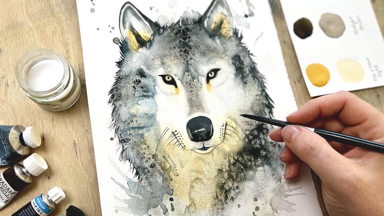
3. Materials: In this lesson, I'm
going to go through all the materials you
might need for this class. I did my best to
minimize the amount of art supplies needed because I do not want you to rush into the art supply store to be
able to take this class. With that being said, I encourage you to grab
any suitable alternatives, you find in your disposal. Let's begin with the paper. For the drawing
portion of this class, feel free to use any spare piece you can find or a sketchbook. I did all the exercises in a cheaper drawing
sketch book that I've been using for
the past year or so. For the thumbnails
of the portraits, I cut copy paper in quarters and those tiny cards were
serving this purpose, then copy paper in size
A4 is suitable for creating rough sketches to later be transferred
to a watercolor paper. You might need that
if you decide not to sketch directly to
a watercolor paper. Here are watercolor
papers I used. For watercolor exercises, I used a mixed media sketchbook. This paper in it is
not exactly 300 GSM, which makes it suitable
for studies and swatches, but I do not use it for
actual paintings much. For final watercolor
portrait paintings, I used student grade
paper by brand Canson. This is Canson XL paper, and it's 300 GSM. It's not the highest
quality watercolor paper because it's not cotton, but for the purposes of painting a monochrome portrait
in three layers, it is very suitable. What I love about it is
how bloom effects show nicely on it and it allows
me to lift paint from. You can use any watercolor
paper that you have at hand as long as it's 300 GSM. Here are some tiny
spare pieces of watercolor paper that
I use to test paint. They come very handy. When I'm using sketchbooks
for watering media, I have this clip that
I use to stretch the paper so that
it doesn't buckle. When I work on a
free sheet of paper, I use a board like this
and I tape the paper on all four sides to the board so that it stays flat
throughout the process. I'll only be using a single type of
pencil in this class, and that is HB pencil. My favorite are Mars
Lumograph by Staedtler. But pick any pencil
that you like. A sharpener is a must, but so is plastic eraser, also called kneaded eraser. This one allows us to
lighten any sketch or get rid of the guidelines without scratching the paper too much. I also use this pen
eraser for details. It's Mono Zero eraser by Tombow. I'll only be using one watercolor in this class as we're going to be painting monochromatic portraits
and focusing only on expression and tonal
values, not on color. I chose Prussian Blue for my monochrome paintings lately because I just loved the shade. But the truth is that you can do monochrome portraits with just about any color that
is dark enough. If you can't get dark tones
with your color of choice, then this is not a good
choice for this class. Brand also doesn't matter. I paint with artist grade paint and whatever brand I choose, whether it's Daniel Smith, Schmincke Horadam, Sennelier
or Winsor and Newton. Artist grade paint will
perform similarly. Since I use tube paint, I need palettes to
work the paint on, and I use white porcelain
plates and tiny bowls. I just love this system, but it's definitely not one that would do me
any good on the go, it's definitely a studio setup. Feel free to use
pen watercolors and whatever setup that you are
using to mix your paint. Do not forget about the
jar with clean water. Paper towels are also essential as they can
save your painting. Because when you get
accidental drips of paint where you
do not want them, there's just no time to
search for paper towels. Here is a tiny spray bottle that helps me keep my paint moist. I'm only using three
brushes in this class, and incidentally, two of
them are flat brushes. This largest brush
is called Princeton Neptune square wash, 3/4 inch. It has soft bristles and
allows me to quickly fill in larger washes and be
expressive in the underpainting. This second brush is, Da Vinci Cosmotop mix B size 10. It's the brush you'll
see me use the most. It has also softer bristles. I love the straight edge. It gives me a
specific brush stroke that I like in my paintings, and so I use it more
frequently than round brushes. Lastly, the tiny brush
for details is Number 4, Silver Black Velvet brush. It has a sharp tip that
allows me to draw, but it's soft enough
to allow me to paint longer floating hair and doesn't run out of
paint too quickly. This brush is very
versatile and you can make all kinds of
brush strokes with it. My brushes are listed in the downloadable PDF along
with other materials. But I want to say that brushes are very
personal preference. You'll see every painter
use different brushes. Many use round brushes
and love them. I bet that you are
most likely to own some round brushes than
flat ones for watercolor, so just use those. The point is to have three sizes that allow
you to cover areas of different sizes and
quality soft bristles assure that your brush
won't run out of paint. Bristles quality can affect
how quickly you paint your wash and how quickly
you overwork the paper also. I'm going to use
printed out references in this class that are also downloadable down below for you to print
out if you wish. I do not always print
out my references. I usually just sketch
from my tablet. I'm also going to be doing
that during drawing exercises. I have this tiny
model of a skull in my studio and it
comes in super handy. I'm listing that as a
handful artifact to own if you're interested in learning portraits
in more depth, but of course that you do
not need it for this class. Lastly, keep a hair
dryer close by to finish your paintings
in a shorter time. In the next lesson, we'll do a few helpful drawing
exercises and learn how to capture
simplified form of the human head.
I'll see you there.
4. Drawing Warmup - The Head: In this lesson, we'll
practice how to capture simplified form
of the human head. We'll go through
different angles and learn how to draw them, discuss some very helpful
guidelines and how they behave as the head turns
in different directions. I will show you how to do a
few very simple exercises to warm up your hand and suggest the best practices
for regular drawing. Let's start with a
drawing warm-up and draw some basic shapes to try and capture simplified human head. I find the easiest
way to draw head from the front view is to draw a circle and then draw its axis. Prolong it a bit and then extend the circle to basically
create an oval shape. This can remind you of an egg. Remember, this is
a simplification in order to get
us started and we will break down the features a little more precisely in
the following lesson. We'll call this parting
line middle line. It will always indicate where the two more or less symmetrical
parts of the face meet. This other horizontal line I'm placing will be called eyeline. Crossing of these two
lines will always indicate which direction
the head is facing. Side view looks a bit more complicated, even
when simplified. It consists of two shapes. The original circle extends into second shape that
looks like a mask. The eyeline is always in the middle of the overall
length of the head. As an exercise, draw these shapes even a
couple of times to get your hand used to the
movement across the page. Now, there are more angles
that you can draw head from. Here is where things get
a little more complex. So I'll use photo references
to help me out with showing different angles as I
try to explain them to you. When the head is turned
to the side but not completely and the other
side still shows a bit, that is what is called
a three-quarters view. I find these portraits to
be the most appealing, but also harder to draw. Here the head of the
girl is turned to our left and so the middle line moves
to the left as well. I added another small circle to this form to indicate
flatter side of the head. Here's the same situation, but the head is
turned to our right. Notice that the
middle line follows the round form of the
mask of the face. While from the front view
it appears straight, from any other view is
always nicely curved. Finally, the crossing
of the midline and eyeline indicates
the direction. So I tend to make it
bolder in my sketches. Here is a situation where
the head is looking up and it's a scary angle to draw
even when simplified. The weird thing
about it is how flat the entire mask of the
face gets from this angle. All the features would
appear very close together. The dominant shape is
the rainbow shaped chin. In this quick sketch, I dared to add a few
extra shapes to indicate features for better
understanding of the angle. However, it is the
one that you'll probably not draw too often. Finally, let's take a
look at a situation where the head is looking down or we're looking
at it from above. I couldn't find a proper
picture of such dramatic angle. Not a lot of photographers
find this one too appealing. But to have this
lesson complete, we must try to draw it also. This angle shows quite a lot of the forehead or the
top of the head, and features of the face get
crowded together below it. The more dramatic the angle is, the less pronounced
our face features, the eyebrows and the
nose will show the most. As your first drawing exercise, draw these six sketches. You can download
the example from the tab Projects and Resources down below to use as your guide. Also, we often think
that we understand what things look like while
observing them with our eyes, but only by drawing
them multiple times, we really achieve a deeper
technical understanding of what they actually look
like and how the form works. I just want to strongly
encourage you to do the exercise and not just watch the lessons
as we progress. Now, what if the head is
in three-quarters view, but it's also facing upwards? In this case, we need to start adjusting the eyeline
to a rainbow shape. I just want to share
this simple visual tool which always helps me out. It's imagining a mushroom and what it looks like from
the point of view of an ant. Let's say that
this is an ant and here is the rainbow shape
that I'm talking about. We will use it every
time we notice that we are observing the head
from below like an ant. This is a photo
example of us looking at the head slightly from below. What is typical for this angle
is the chin appears wider, forehead appears
smaller, and all the features will follow
rainbow shaped guidelines. Another thing to
notice is how wide and open the nostrils appear
from this angle also. Let's see what happens
when we're looking at the three-quarters
view from above. Just like the previous
example showed some bending of the eyeline, here all the guidelines
will have a U shape. To better imagine this, we can use the mushroom
example again, and this time it is observed
by a fly from above. You can see how the round cap of the mushroom shapes as
a U from this angle. As your second drawing exercise, gather some photo references
and try to capture the basic form of
the head and it's proper angle based
on each reference. I created a zip folder
with a bunch of photo references that
you can download from the Projects
and Resources tab down below and use those
for your practice. But I also encourage you to create your own references and have them at the
ready whenever you have few minutes to
spare for drawing. You can download photos, create folders in your
computer or phone. You can also use
Pinterest boards, which I often prefer as the quickest way to practice
basically anywhere. In this exercise we don't
draw anything else, but establish the basic
simplified shape of the head. I almost always start by
drawing a circle and then draw the middle line while focusing on a proper direction. Then I extend the circle to
create mask of the face. I then draw the eyeline. Here for just a minute, I consider the angle, whether we are
looking at the head from below or from above, and then adjust the
guidelines accordingly, either to a rainbow
or to the U-shape. The more examples you
can go through like this and think about the
position of the head, the better for you. This practice can quickly
become the best way to warm up before drawing
a more detailed sketch. Best thing about this
practice is that you can see a significant impact it has on your observation
and drawing skills after only
just a few days, if done even for
10 minutes a day. We'll talk about the
best ways to practice in the following lessons too
because with portraits, regular practice is key
to build the accuracy and also to make your lines look
confident and beautiful. But just hearing the words regular practice
can scare people into thinking they need to spend hours every day in
order to progress. That is just not
true with drawing, effective practice can
last only a few minutes, but when done on daily basis, you'd be surprised just how
quickly you can grasp this. Also, my simplification of the subject has its
obvious limits. Some heads are taller, some are rounder, some
have boxy features. But let's try to stay
loose and not dwell on grasping the shape
perfectly at first. I believe loose approach is very helpful in reducing
fear of the subject. I find it so much fun that I'm actually looking forward
to do the exercise. All the examples that I've drawn here can be
downloaded from the tab Projects and
Resources down below to use as another example on
how to do this exercise. You can also include
your own sketches and exercises in your class
project if you like, I would love to see how
you're doing with it. In the next lesson, we'll break down features of the human face, learn how to place
them proportionally, and also discuss
differences between female and male head.
I'll see you there.
5. Proportions - Female vs. Male Head: In this lesson, we'll take a closer look at the
features of the human face, how to place them
proportionally, and what are the key key
between female and male head. I encourage you to follow along this lesson with a
pencil in your hand using either a sketchbook or any sheets of paper
that you can find. Let's start
constructing the head again by drawing a circle. This time, you'll
see me drawing a bit larger and also on both
sides of the sketchbook simultaneously because I want
to draw a female head to the left and male head
to the right side. They will have the same
proportions more or less and will start to vary a bit only
at some point later on. I divided each circle with
a prolonged middle line and also cut the circles in half
in the other direction. Now, you have each
circle cut in quarters. This horizontal line sitting
approximately in the middle of the starting circle is
where the eyebrows will sit. Now, let's take this
measurement from the middle of the circle to the top
and split it in thirds. This line that lies
in the top third of this measurement is where
the hairline would be. It's that spot
where the forehead meets the hair in ideal case. Now, I'm taking the measurement for the bottom two-thirds. This is basically the distance between eyebrows and hairline. Since those two have
already been established, I will bring this distance
down below the eyebrows line. This is the spot where
the nose will sit. To be more precise, the
bottom of the nose does not go any further
down than this line. Now, let's take the
same measurement. Again, same distance as we have between hairline
and eyebrows, and then between
eyebrows and nose. Let's bring this distance again
down below the nose line. This is where finally
the face ends. This is a spot where chin is. We can now connect the circle with chin to create
the mask of the face. But actually the circle needs to be first adjusted to better represent the shape of the human head that is actually
flattened on the side. I first cut the side
of the circle a little and only then I
connect the sides with chin. Here is where the first
difference between female and male head shows and that's the roundness of
the mask of the face. Female faces tend to have
smoother and rounder shape, while male heads tend to be more boxed, more pronounced jaw. This triangle here is just something that
helps me personally to draw eyebrows and establish
the root of the nose. I'm now going to draw the
brows to both of these phases. Here again, female eyebrows are often differently
shaped than male brows. Female ones are
often slimmer and male might be more
bushy and thick, but it will vary from
person to person. It's just something
to keep in mind and notice every time that
you draw a portrait. I'm now drawing a
rectangle that helps me to establish the space in
which the nose will be. Now, it's also a good time to find where the eye line will be, and we already know that the eye is in the middle
of the entire shape. So we'll just take the top to bottom measurement
and split it in half. Let's also draw both
eyes to the both heads, very simply representing them as an almond shape with a
circle in the middle. Now, we find where mouth seats. Let's take the distance between the nose and the chin
and split it in thirds. The bottom third represents
the area for the chin, and in the top third is
where the mouth splits. This is the most important
line to place the mouth. You can try sketching in the top and the
bottom lip as well. Oftentimes, the pupils of the eyes align with
corners of the mouth, and so I often try to
sketch these two guidelines that help me to establish
the width of the mouth. We can now sketch the actual
hair around the face. This will give our heads
more recognizable look. I use the most common
long hairstyle for the female head and short
hairstyle for the male head. But this is just an example and of course that
will vary greatly. I would not want to
forget about ears. Those will be placed
between the nose line and the eyebrows line on
the sides of the head. I often represent them as two simple ovals in
my quick sketches. We will break down
individual face features including ear in the
following lesson. For now now, a simple shape
will do for every feature. Last feature that we'll
discuss here is the neck. Make sure that you do
not make it too thick or short and always pay
attention to the reference. But in general, female neck will be a little
thinner than male. I spend a little
extra time to make these two sketches look a
bit more polished for you. The scans of both can be
downloaded down below from the projects and resources
tab to use as your guide. One last difference between male and female
head that I noticed during these last part of the process is the
root of the nose, which is always
rather delicate and doesn't show much with
female portraits, but in male subjects, it can be profound
and more angular. By giving this feature
more attention, you can emphasize that your
subject is male character, even when drawing men with more delicate overall features. In the next lesson, we'll take a closer look at individual
features of the face, such as eyes, nose,
mouth and ears. We'll break their basic
shape and how they look at different angles
to help you draw them effectively.
I'll see you there.
6. Features - Eye, Nose, Mouth, Ear: In this lesson we're
going to draw features of the face one-by-one and
take a closer look at them. Each feature has its
typical structure that can look very complex but there is a way to simplify them all, which is exactly what we're
going to do in this lesson. Please follow along
with a pencil in your hand and do these
sketches along with me. This will greatly improve
your drawing and painting them on any portrait that
we're going to work on. Let's start with the
most difficult feature first and for me that eyes. When I was starting out with realistic drawing my
first impulse to draw the eye was these almond
shape with a circle inside. In fact, it's not so
far from the truth but that depiction is
just a little too flat. We have to consider that
the eyeball is round and that the upper and lower
eyelid wrapped around it. The upper lid often
covers part of the iris, which is that colorful circle
with a black in the middle, which is called pupil. Drawing and painting the iris and pupil is often crucial part of the process of creating a convincing and
emotional portrait. What helps me to draw the eye better and more convincing is actually lose the
almond shape and draw four straight
lines instead, this better represents how
the lid wraps around the eye. Actually, whenever you have
to draw a curve somewhere, it can be very helpful to define it as a couple
of straight lines first and then connect them into a more stable looking curve. Here I suggested the edges of the eyeball as this
helps me to imagine the 3D structure of the entire feature and
also added iris and pupil. The tiny little white dot is a light reflection and often makes eyes look more
lively and shiny. There's also a tear duct
in one corner of the eye, and that can be represented
by a small oval. I also added two lines to suggest that both
lids have thickness. Thickness of the upper
lid often doesn't show as much as it's
covered with lashes, but bottom lid shows
thickness very often. That's the part that we
also want to keep lighter, which adds to the overall
convincing look of the eye. Lastly, there can be
folding above and below the eye that
need to be drawn. The upper fold is
usually more prominent. From the side view eye
looks very round and also has this triangular shape. Both lids wrap around
the bowl that's thick in outwards and the lower lid
again shows thickness. One of the most
common mistakes is to draw the eye in
the same length as the front view
but when you compare them you have to make
it much shorter. Remember, this is a
simplification to get us started. Next feature is the nose, a scary looking one that
also can be simplified in quite a funny way by
drawing this pyramid shape. It is symmetrical, has a central line and a
left and a right side. We can even place the
nostrils that have a basic oval shape
to the bottom of both left and right
side of the pyramid. I like to imagine these easy
looking pyramid attaching three cushions
because the top of the nose and the two sides
have a basic round shape. I then connect these shapes and get quiet the
convincing nose. Here is another quick way of simplifying the noise feature. Draw an oval, then drew a circle in it to represent
the tip of the nose. Then below we draw a U-shape attaching both nostrils
to this bridge. Then suggests the sides of the nose and
there you have it. Usually the base of the nose
where the nostrils lie is in shadow and the lightest
point is the tip of the nose. When you observe the
nose from down below, the nostrils will appear very open and you won't see
the tip of the nose. Also sides of the
nose will not be connected with the
nostrils by line. When you observe the
nodes from above, you won't see the nostrils and all three round
parts of the nose appear to be connected
by a single line. Let's take a quick
look at some examples. Here is a photo of a girl taken
in an angle that observes her face from below the horizon and so the
nostrils appear open. Actually that one nostril that
we can clearly see is not connected with that line that
shows the side of the nose. Here is another
example of a nose being observed from
slightly above the horizon. Just notice that we no longer
can see an open nostril, just one curve
connecting the edge of the nostril with
the side of the nose. Let's draw a mouth now. This feature can look so simple that we have
a tendency to, again make it look
flat like this, drawing the entire outline with a straight
line in the middle. It is again, a
three-dimensional feature that consists of
somewhat round parts. And again, I love to draw those quickly as a bunch of circles. Let's position the circles
around the middle line. You can create these two dots to represent corners
of the mouth. The middle line where the
lips meet is not straight. It appears as a
V-shape in its middle. Then below the oval
representing the lower lip, I draw a short line and that
one represents a spot that's usually the darkest as the
lower lip casts shadow there. You can suggest the top
edge of the upper lip but other than that do not connect the edges with
corners of the mouth. You can give some
tone to the upper lip because often it's
darker than lower ones. But outlining the entire mouth takes away the
plasticity instantly. Let's take a quick look at the side view and here
is a photo example. You can simplify this by drawing a triangular shape and
then cut it in half. But when we look a bit closer, we can see that it's
not actual half. The lower lip takes
quite a bit of space and the upper
one is smaller. I'll give a bit of
tone to the lips. The upper one will
again be darker and the lower lip shows
some light reflections. From this angle you can see
more clearly how the shadow forms below the lower
lip, it curves outwards. Also notice that just like
the eye mouth feature looks much shorter from the side view then
from the front view. I decided to include the ear, even though it doesn't
always show too closely in portraits but it has
such a weird shape that it might be useful
for you to show you how I simplify to make it at
least look like in here. We established in the
previous lesson that ears sit between the eyebrow
line and the nose line. When you are looking at
the head from the side, here shows quite a bit
and in this case you can observe a few basic parts
that should not be missing. I always draw this
folder that brands a bit below the upper
edge of the ear, and then there is
this circular shape placed slightly off-center
towards the bottom of the ear. You can connect a tiny
oval to this shape and that will represent the
entry into the ear canal, which is the darkest point of the ear. That's basically it. You don't really have
to draw more than this to make it look like an ear. This is how ear may look from the front view
of the portrait. It is much more flattened
and you don't see the entry to the ear
canal anymore and that fold in the upper part connects with the outline
of the ear from this angle. You can download my sketches
of all these features from the tab projects
and resources down below and use them as your
guide while sketching. There is so much more complexity to the anatomy of
human face that what I covered in these
lessons but the main goal here is to get you started
on drawing portraits. I do hope that my sketches and explanations help to ease
you into this subject, and as you begin to
feel more confident, you are welcome to digging
a little deeper and study anatomy of the face from books and advanced courses. In the next lesson, I will show you how I
practice drawing portraits regularly to progress faster, but also stay interested and not procrastinate my drawing
sessions. I'll meet you there.
7. Tips For Regular Drawing Practice: In this lesson, I will
show you how I practice drawing portraits regularly
in my sketchbook. These are not long practices, rather, how to quickly
sketch your subjects. Focus on the most
important features to get the essence of the portrait in and then move
to the next one. This practice is key to create a solid sketch before painting a portrait
in any technique, and you'll benefit
from it greatly. Remember Lesson 4
in the exercise where we established the
basic shape of the head, maybe it will confuse you, but in my regular practice, I do not always start drawing the circle and
the mask of the face. Instead, I look for simple
large shapes that I can spot to help me establish what I see on the photo quickly. These shapes do not
have to make any sense from the point of view of
construction or anatomy. Here I noticed a rectangle
shape on his cheek. Then I noticed this triangle that the left eye is forming. Then another triangle
for the nose, then another one for the mouth. The light on his chin also
forms another triangle and this cast shadow on the side of the nose also looks
like a triangle. If the portrait has such
strong light like this one, it is very hard to imagine the underlying construction
and it's just more useful to create
your sketch like a puzzle consisting of a
bunch of shapes like this. Maybe these shapes will not be so apparent to you at first, but try this a few times
and they will start to come to you more
and more naturally. Also, when I block
in these shapes, I always check the construction and make adjustments based on the knowledge of
different angles that we discussed in the
previous lessons. This shape method is just to
get me started quickly and be effective while
they're building on what I know about
the human head. I do not think that
only shapes by themselves would bring
you the desired results. But combining these two
approaches will help you quickly sketch a
portrait from any angle. Problem with construction is that you can't see it in photos, you can only imagine it. It's all those guidelines, but also important lies
like a silhouette of the entire face
that can be hidden in shadows on a photo like this, how can you sketch something
that you don't see, especially as a beginner? While trying to imagine and draw the construction of
a face like this, we often get completely lost and then have a panic attack when
after 20 minutes of work, the portrait looks nothing
like on the photo. Let me show you what
I mean by this. In this example, the photo shows quite a straight
view of the face. I started by trying to
construct the face. I sketched the mask
of the face and divided it based on my
knowledge of proportions. I placed everything
on the guidelines like we discussed
and it should fit, but there's barely any
likeness to the photo. It is because as I'm
drawing features, many of the lines that would
define them are made up. I make them up as
I tried to figure out what the height looks like. But when you look
at the reference, you can't really
see half the lines, because it's in a
very deep shadow. Basically, half the face
is missing from your site, yet we are trying to construct it based on our imagination. Here is where the shape
approach gets very useful. There can be lots
of hidden lines in a portrait you're
trying to draw. My tip is not to try to come
up with their position, but simply identified
the shape of the shadow and fill
that area with tone. As you see me add more
tone and try to shape it up in a way I can
clearly see on the photo, the portrait starts to
make much more sense. It adds contexts to the
face and now I have it in front of me just like I
can see it in the photo. The relationship of
different shapes provide me finally with a sketch that
represents my reference. When doing quick sketches of different portraits
in your sketchbook, it is very handy to
place the features in a way that's effective
and helps first to establish where the
feature is going to be and only then worry about the
details and its shape. I'll show you what I
mean on this example. Here I used the shape method to quickly set the
portrait on the page. As I can clearly see, a triangular shape then I
adjusted these shapes so that it contains a larger area
from the nose to the chin. It is still just
the large shape. But now I'm adding guidelines
for the eyebrows and eyes. But before I worry
about the silhouette of the nose and the
line of the profile, I will set the nose
feature as well as the mouth quickly by drawing an oval shape that
will represent them and try to observe
their position first. Serves me quite well to
use the same approach for the chin and often
even for the cheeks. When I now lighten the
preliminary sketch, I can draw a quite
convincing silhouette of the portrait just by
connecting those round shapes. This approach allows me to
be quicker in my sketch. In practice, I positioned
the large shapes first, then I use this
small ovals to place features and at this
stage I can quickly move them or adjust their position
because I can already see if they are off without wasting time to
fully render them. I can then just block in
some shadows or gift tone to the hair and I can be done
with the sketch quite quickly. It's really working quickly, something we want
and [inaudible] more time for practice
produce better results. This is actually a
very controversial tip that I'm giving you about. Here is my reasoning. Of course, the more time you
spend on a craft like this, the more mileage you have, the more confident and
experienced artist you become. Essentially, we all want as much time for
practice as we can get. But when in this stage of learning you spend too
much time on one sketch, chances are that it's because you are trying
to make it look nice. Adding details, adding
different hedging. While all that is really
cool and fun to do, your goal here
should be to train your observation and
practice coordination between what your eyes can
see and your hand and you do that in that moment when you start constructing the face, placing features, adding
a bit of tone to it, then adjusting and
trying to find mistakes in order to give
the sketch likeness. Many sketching practices
besides these, such as adding too much
detail or going for too many values can take up a lot of times that
in my opinion, is better spent trying to
construct another portrait. There is another reason
to bet on practicing quick 5-10 minute
portrait sketches, and that's just the
reality of our lifestyle. You might be one of
those lucky people that have enough time
for their hobbies or developing their skills on regular basis and
if on top of that, you're able to stay
focused and motivated, then you're living the dream. But if you're anything like me having to balance work life, family life, and self-care, you just won't have enough
space and energy for the practice that is
to time demanding. Even if you start strong
after a couple of days, your practice tires you
out and your sketch book gets buried underneath the pile of dust. We don't want that. In this regard, quick
sketches are a win, not just because even when
I don't have an hour, I can always find 10 minutes, and so there's no excuse
not to open my sketch book, but also because that interval of 5-10 minutes
forces you to really get to the point
quickly and only pay attention to the important
parts of the portrait, teaching you to ignore
the details that often don't even benefit the
painting or drawing. It is my personal
experience that sketching quickly makes
you progress faster, maybe not so quickly
as to not give your proportions
a second thought, just try not to
sketch one portrait for an hour in your
daily practice. Another tip is to use
references of proper size. I like to sketch
from my phone when I'm doing a drawing
workout because the display is so small that I can better see the
overall proportions. It doesn't really work out
too well when trying to draw a small sketch from
a very large reference, you can create your
own references also by taking pictures of
your friends or family. Just make sure that you
have their permission. Also, it really helps if the light and shadow shows
well on the reference. Sometimes we use
so many filters on a self-made photo that it makes everything look very flat, then you cannot really
tell how the form looks since you don't really
see any depth on the photo. Lastly, I snapped my photos into the black and white or
grayscale mode that also helps to see the
values better and focus on light and shadow
instead on the color. Few tips on the actual
sketching technique, it is okay to only use one
pencil for me, that's HB, but you might prefer sketching with soft HB pencil or with the harder one use
whatever it makes your line seed
better on the page. Hedging doesn't have to have
a particular direction, but sometimes it helps if you hedge with the form
instead of against it. When I'm blocking
hair, sometimes I just make a flat hedging
that doesn't have any direction because
I'm just not focused emphasizing the form of the hairstyle in
that very sketch. Other times, hairstyle
is something that I want to include in the
overall sketch because the lightened shadow on it
makes the portrait stand out a bit more like in
the case of this sketch. Here when I'm hedging the hair, I hedge in the direction
that the hair would follow horizontal lines at the
top of the head and vertical lines on the
sides of the head. I also work with my erasers to create negative shapes
that represent light, that makes my sketching
process more fun. Lastly, do not be frustrated from sketches that don't turn out so well and take that as an opportunity to
learn from them. In other words, do overs are the best thing you
can do in this sketch, I overdid the hedging and I
really felt like it took too long but the final
statement feels stressed out and
all over the place. It happens to me often that those studies that take the
most time are the worst. I grabbed another piece of
paper trying to see if I could do a better job and arrived at a more simplified statement. It's something to consider
and experiment with. Then if I managed to convince
you to keep a sketchbook, you can in time compare your recent sketches with
your first sketches. You'll see how much
you progressed. [MUSIC
8. Drawing Summary: Since we covered a lot of technical information in the
drawing part of this class, let's do a quick summary. We learned that
the human head can be drawn in a very
simplified way, like a circular shape
that connects to the mask of the face like this. We can use two
guidelines to help us position this shape
into different angles, and that's middle
line and eye line. A very good way to
practice is to draw the simplified form of the human head from
different angles, not from your imagination, but from photos trying
to get to the position of each head on a photo
into your sketch book. We also learned proportions
of the human face. If you follow this
exercise from start to finish with your
pencil in your hand, you have a good
understanding about where all the
features seat by now, but the key takeaway is that when we look at the face
from the front view, the entire mask of the
face can be split into thirds and those contain
important landmarks. Entire top third of the face is the forehead and it
ends with the eyebrows. Then second to third goes
from the eyebrows to the nose and the last
from the nose to chin. If you take the entire
length from the top of the skull to the chin and
split this distance in half, that is where the
eyes would seat. Mouth and chin can
be positioned by splitting the bottom
third in thirds. Again, ears can always be
found in the middle third. From the front view they align with the
eyebrows and nose. There are also some
differences between male and female faces even though proportions are similar, male portraits might have
more angular features, stronger neck, and a bit more pronounced
root of the nose. We now also know how to
simplify features of the face. Eyes are more
complicated than others, as they represent
the round eyeball covered with eyelids, and we cannot draw them like a flat almond shape
with a circle in it. Rather, we notice how the
upper lid covers the iris and suggest roundness by
adding folds around the eye. Nose can be tricky, but can be also simplified and drawn like a pyramid shape. Once you add these
cushioning shapes on it, you'll have a solid nose
structure to draw round. We are now aware that looking at the nose from below
exposes the nostrils, while looking from
above hides them. Mouth can be the easiest
feature to draw, and if we will represent it as an appropriately
curved middle line, emphasize the corners and stronger shadow below
the bottom lip, then we can achieve a
nice depth to them. Also, the upper lip
gets quite dark as that planes usually turns
away from the light, and in that scenario, the bottom lip often
catches some highlights. Ears are also simple enough. I often draw them as ovals adding a darker
fold to the top and represent the entry to the ear canal as a
smaller oval shape. Lastly, we learned how
to practice sketching portraits regularly to
improve our drawing. Best practice doesn't
take much time and focuses on
proportional and mirage, rather than much detail and a beautiful hedging technique. Practice suits you
best if it fits into your daily schedule
and makes you happy, because only if it's fun you'll
be able to stick with it. A great way to keep it interesting is to
build folders with different references and
challenge yourself by doing quick sketches of as
many portraits as you can. Build your sketch by
using the method of blocking shapes rather than
constructing the head, and always try to draw in everything that you see
on the photo that could provide you with contexts like the hair and
the shoulders or the clothes because
this will also help you with comparing your
drawing and reference. You can use hedging
and apply tone to your sketch as this also helps you to see
proportions better. Remember, shape
approach helps you quickly set your
drawing onto your page, then you can continue
adjusting it based on your knowledge
of proportions. Use erasers to play around with negative shapes
and do not be afraid to redo your
drawing or draw it one more time if
it didn't work out. In the next lesson, we'll start the watercolor portion
of this class. We'll learn how watercolor
techniques work, how to create effects
and blend edges, which will be very useful in our portrait painting.
I'll see you there.
9. Watercolor Warmup: In this lesson, we'll do several watercolor exercises to get us better acquainted
with watercolor. We'll learn how the wet paint behaves on dry or
dampen surface. What are layers of
paint and how to create smooth blending or
create special effects. Let's get started. Welcome to the watercolor painting
part of this class. Let's take a look
at how I set up my art materials before
painting with watercolor. I'll be using my mixed
media sketchbook for these exercises
so I will set it up with a metallic clip that keep my paper stretched
and straight. My palettes and jar
with clean water are always set on my right
side as I'm right-handed, I will lay my three
brushes on my left side, but always on a paper towel
because they'll be wet in a moment and I give another
paper towel in my left hand. I set a hairdryer on my
table too within my reach, so I don't have to get up and run around the studio too often. These spare bits of watercolor paper are
also on my table. I'll be testing my paint on
them and now it's time to dampen my paint with
this spray bottle. There's a question you
will often ask yourself, and that's how dark
should my paint be? It's hard to judge the darkness of your watercolor
paint when it's wet. The paint often fades
during drying and here is a comparison of the same paint
in its dry and wet stage. Vapor has also something
to do about this. On some papers, watercolor
might appear even more pale. How do we judge? If unsure, test your
paint beforehand and dry it preferably
on the same paper. But in time, as you get
used to watercolor, you will judge by intuition and won't need to do
this extra step. Let's draw a square
and a circle in it. I'll grab my midsize brush
and paint the first circle. This is called wet on dry, as we're applying the wet
paint on a dry paper. Notice how watery
paint holds inside this circular shape and doesn't just freely run out of it. You'd have to dampen the surrounding area
and until you do, it just stays where placed it. When this paint dries, it will form a sharp
edge around the circle. Let's now dampen
the second square with clean water and then paint a second circle
in this dampened area. What happens is that
the paint bleeds into the dampened area around the circle and forms
a blurry edge, also called a soft edge. We still see the circle. It's just a little larger and isn't sharply defined
like the first one. Let's draw two more squares to demonstrate another
aspect of watercolor. For this exercise
we'll prepare paint in this tiny porcelain bowl
by mixing it with water. I won't paint that's
still transparent, like tea, but also shows
some nice vivid blue color. Before painting the top square, you want to find
something to help you tilt your drawing
board or sketchbook, but do not make the
tilt too steep. In this exercise, I will use the prepared
paint from the bowl and paint the top square from top to bottom one
stroke at a time. You'll see that
thanks to the tilt, the excess paint runs towards
the bottom of the wet area. When you reach the
end of the square, gently leave the rest
of the paint pool with your brush so that
it doesn't sit there while the paint dries. Also keep the sketchbook
tilted until the square dries. What we just painted is called
a smooth watercolor wash. When you use this technique, you're able to achieve
smooth layer of paint without any blooms
or irregularities. Let's paint the second
square without the tilt, but still stroke by stroke. When you leave your
sketchbook line on the table flat like this, the excess water gathers to some spot even if you
don't notice it at first and during drying
process forms blooms and irregularities. You can use this
knowledge during painting and think
beforehand whether you need a smooth
wash or can do with some irregularities that might make the painting
more interesting. Now, we're ready
to understand what layering of the
paint looks like. Let's draw three rectangles and I'll only be using the
same paint as before, mixed in a bowl. Let's paint all three
rectangles with it. Not need to worry about the
smoothness of the wash here. Let's dry them and make sure
that they are completely dry before moving forward
with the exercise. Now we'll paint a square to the second and third rectangle, so the paint overlaps with
the previously painted one. This is called layering, or in some contexts, it can be called
watercolor glazing, meaning that you're adding multiple watercolor
layers on top of each other to
enhance the color. When we dry the second layer, we can add another one to the third rectangle
and observe how the paint intensity multiplies when new layers are
added on top of it. You can also notice the
colored glass effect that those sharp edges
create and that can be quite lovely to use in
your paintings as well. Now, I want to demonstrate one thing and show
you a technique that will directly be useful
in shading your portraits. Draw this almond shape and
let's imagine that they're eyes and apply shadow around
them with a midsize brush. In this example, I'm leaving
the paint dry as it is, leaving hard edges all
around the shadows. This can be visually
very interesting, but let's see what it looks
like if the edges were soft. I'll apply the shadow
again in the same way, but then I dampen my
brush with clean water, dry it just a little bit on
the paper towel first and then gently rub the outside
edge of the shadow. Result is a soft edge and it's a more natural look for
some shadows on the face. This is exactly how I do it. I have to admit this technique
takes some practice, but feel free to
try it a few more times in order to
get the hang of it. Now let's try one more time and let's go for the
combination of both. You can always choose which edges soften and
wish you keep sharp. Another technique I will
sometimes use is called lifting, and I'll demonstrate
it by rubbing a dry paint with clean, dampen brush and then lift the released pigment
with a tissue. This doesn't always work, but works well on some papers. If you didn't yet apply to
many layers to one area, sometimes you can even smoothen already dry sharp edges
with this technique, which allows you to correct
your watercolor painting. Lastly, I'll show you a few
watercolor special effects to decorate your paintings with. First, let's paint a
simple rectangle and wait just about two minutes to let the paint sit on the surface. But we don't want the
wash to dry completely. Before it does,
bring a few drops of clean water into the wash. The effect that happens
between new water drops and the semi-dry wash is often referred to as
watercolor blooming. Blooms look very different
on every type of paper. On some, they can be
more prominent than on others and on my
mixed media paper, the effect didn't
work out so well. These are some of my
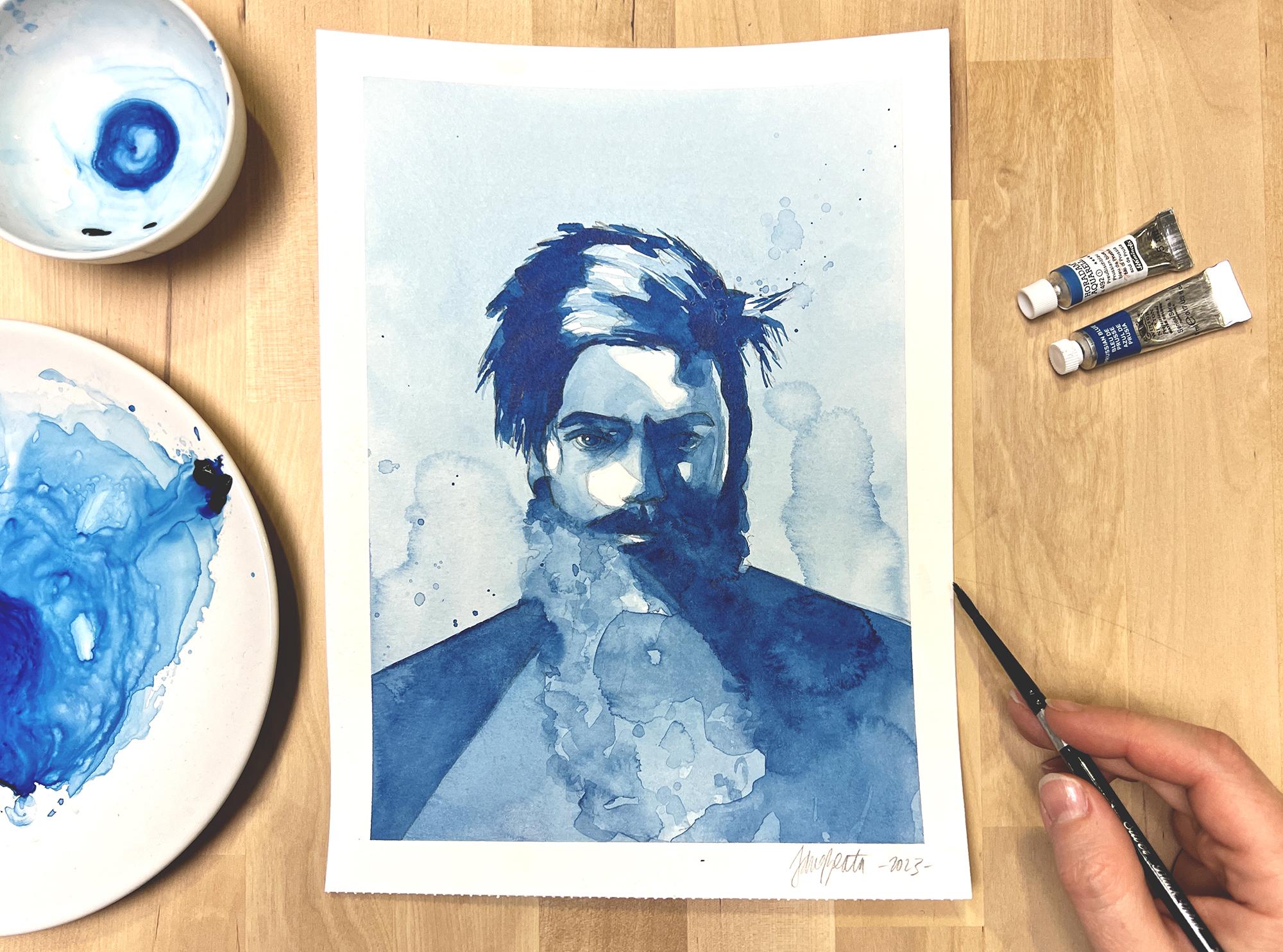
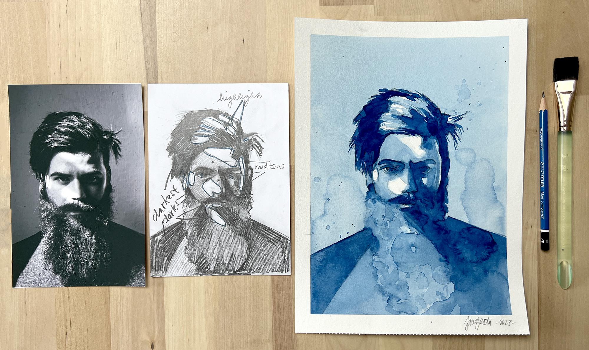
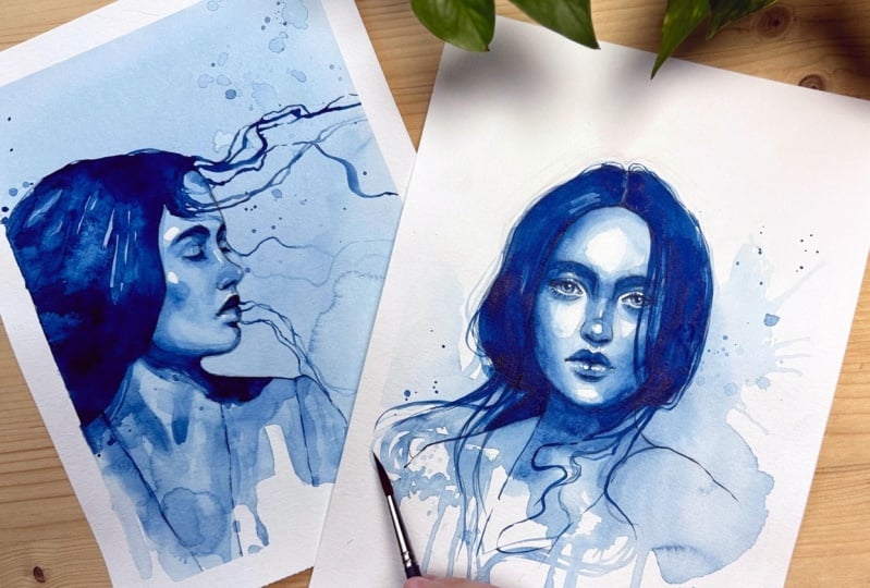
watercolor portraits where I purposely use
blooms so that you can better imagine
what they look like in a final painting and how
the bloom can be used. Often I place the
bloom somewhere around the silhouette
of the portrait. Next effect is dripping paint. How to create drips is
pretty self-explanatory. Just make sure to tilt
your board or sketchbook enough and load enough
watery paint on your brush. Last one is spatters,
and I love this one. Easier to create
freckles or just add a nice abstractions
to the piece. Load watery paint on your
brush and tap on it like this. You can try this with larger and smaller brushes to create smaller and
larger splatters. In the next lesson, we'll take a look at how shading works, both in pencil and in
watercolor. I'll meet you there.
10. How Shading Works: In this lesson, we'll
do a simple exercise both in pencil and in
watercolor to get us acquainted with light
and shadow and how to depict them on a
two-dimensional surface. Let's get started.
I'll keep on using my watercolor sketchbook
for this exercise also and we'll be able
to fit this on one page. First, I'll sketch two
circles and two cubes and sketch a cast shadow
coming out of each shape. You can find a
template sketch for this exercise in the
Projects and Resources tab to use as your guide as well as a scan of final result. The left side I'll work with pencil and on the
right with watercolor. Light and shadow
will be the same no matter the medium you use, but the technique to
depict light and shadow is very different for
watercolor and pencil. Pencil studies help us greatly because we have
total control over the pencil and so shading is all about figuring out
where the shadow lies. But with watercolor, you also have to figure out a strategy, how to apply the paint so that the shadow shows at
the right place. You'll see what I
mean very shortly. Let's say that the
light is coming from the left and heats the sphere. On the spot that's
the closest to the light source there's
going to be a high light, which is basically a
complete white dots. We can represent it
as a small circle. Light will then travel
around the sphere but as the surface of
the sphere gets further away from
the light source, it gets darker and
darker gradually. Here is another circle around the high light that I draw
that will be filled with a slightly darker tone and then another slightly darker
from the previous one. The darkest shadow, that's
called core shadow, is usually on the other side of the sphere that's further
away from the light source, but the darkest shadow doesn't
reach to the very edge of the original circle because
as the sphere is round, some of the light
is reflected by the surrounding
surface and shows a bit on the other side. Cast shadow is this shadow that the sphere
casts to the ground. It will be dark, so you can give it some tone media pencil. The darkest spot of the cast shadow will be
this spot where the sphere meets the cast
shadow because it's a tight space where light
doesn't have much access to. As the cast shadow moves
further away from the sphere, some of the reflected
light is able to show in it so it gets a little
lighter on the right side. Cast shadows can be very sharp or have softened
and blurry edges. It all depends on the
type of light source. We can now try to shade the
cubic pencil and imagine how light that's coming from
the left would affect it. I included cube in this exercise for
contrast with the sphere, but the approach for
shading the sphere will be most useful to you for
painting portraits. You can give the entire
cube a bit of tone because unless light hits
exactly from the top, it just won't show a strong
highlight like sphere did. You can then give more tone
to the side that's facing us, but the darkest side
will be the one that's opposite from
the light source. With cast shadow, it will be pretty much the
same as with the sphere. It gets darkest when close
to the cube and a bit lighter as it moves away
from it and blurs a little. One difference between cube
and sphere will be that the darkest side of the cube directly connects
with the cast shadow, so there's no change in tone. But between the core shadow of the sphere and it's cast shadow, there is a lighter tone because
of the reflected light. Please note that
there is a bit of simplification in my examples. There's lots more to learn about how light and shadow works on different surfaces and as the type of light source varies, there might be gradients
that show on a cube as well. But for our purposes, this will help you understand that we need
to assign darkness and lightness to different
forums in order to create the illusion of a 3D space
on our flat 2D paper. Relative lightness or
darkness of an object or an area is often referred
to as tone or tone value. While in pencil, you can create darker values just by
pressing harder or hatching over the
same area multiple times or even to switch
to a darker pencil. In watercolor, it's
a bit different. Main challenge of watercolor
lies in the fact that we just don't use white
paint to create highlights or lighten
our worksheets. We literally leave white paper behind to show as a highlight. In watercolor, you almost
never paint the light, you only paint shadows. The light is already there. I know it's a bit more to
wrap your head around, but that's exactly where
this exercise gets helpful. Here I create the
highlight on the sphere by painting my first
wash around it. I spread the paint around this entire rest of the circle as well as
the cast shadow because you see on our pencil
study that there is just no other area anywhere that would be lighter
than the highlight. This establishes not
only the highlights, but straightaway defines
the mid tone as well. Cube does not have a highlight, so I will cover the entire shape and the cast shadow with
my mid-tone as well. We painted our first layer
and I'll make sure that it's completely dry before
painting on the second, but we will need more
layers in order to deepen the shadow areas on both
the sphere and the cube. Let's continue adding
shadows to the sphere, but we need to use
the pencil study as our guide and
really pay attention. These new darker shadow should not reach the highlight area. It rather covers about 2/3 of the sphere and
I cast shadow too. Since the sphere is round, it does not have sharp edges around its shadows
like the cube does, and so we need to
use the technique that I showed you in the
previous lesson to soften the edge that would enact these new paint with them more highlighted area
in the top third. Here I will also leave some of the wet paint to show
reflected light on the sphere. We'll do the same
on the right end of the cast shadow
that needs lightening. I also blurred this area here
a little bit my damp brush. In this regard, the second layer of watercolor for the
cube will be pretty straightforward
because everywhere is a sharp edge and beside
the top plane of the cube, everything needs darker tone. I only smudge the cast shadow
a bit in its right end. Lastly, we'll need to add a third layer to create
the darkest darks. You can add more pigment to your paint mixture for this step to create
stronger contrast. First, let's apply the
darkest shadow to the sphere. It will be positioned further
away from the light source. But remember to avoid the reflected light area
at the back of the sphere. Cast shadow needs darkening
as well and where it connects with the
sphere will be hard edge. You can now gently soften the edges both to
create a gradient on the cast shadow and to blend the darkest shadow with the
mid tones on the sphere. Cube will again be very simple. We're going to darken the
plane that's farthest from the light source and the
cast shadow along with it. There is no edge between the cube and the
cast shadow here. I will only soften and lighten the applied paint at the
right end of the cast shadow. This exercise best demonstrates not only where light
and shadow appear, but also the difference in approaches with pencil
and watercolor. It shows you that watercolor requires some planning
in order to not make a mistake and
accidentally cover an area that's supposed
to stay light. In the next lesson, we'll do that kind of planning and create a thumbnail
or a portrait in pencil that will serve us
as a map of the highlights, mid tones, and darkest darks and we'll make it much easier to apply watercolor to
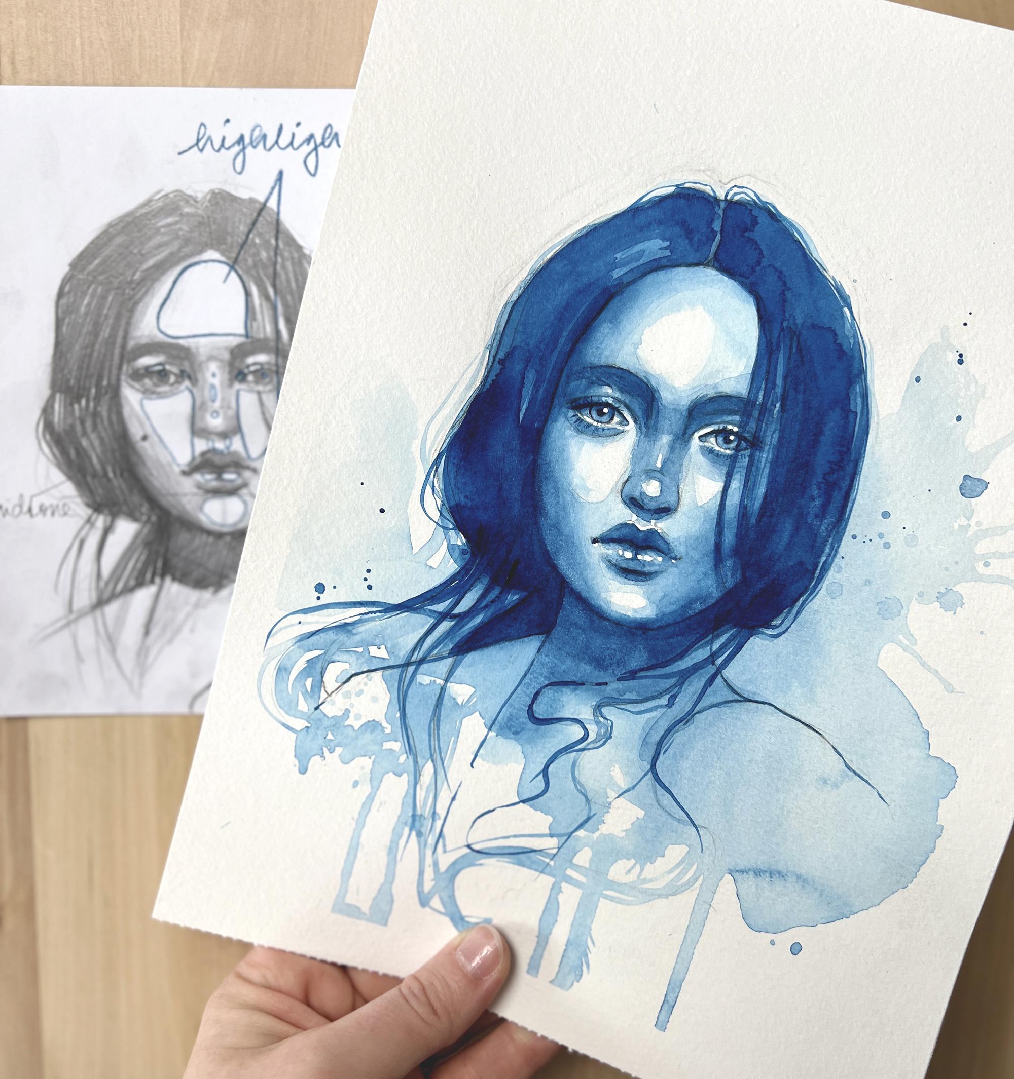
our final painting. I'll see you there.
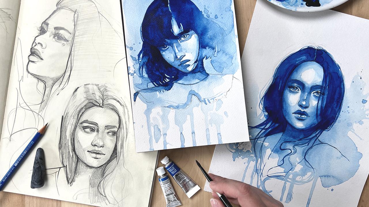
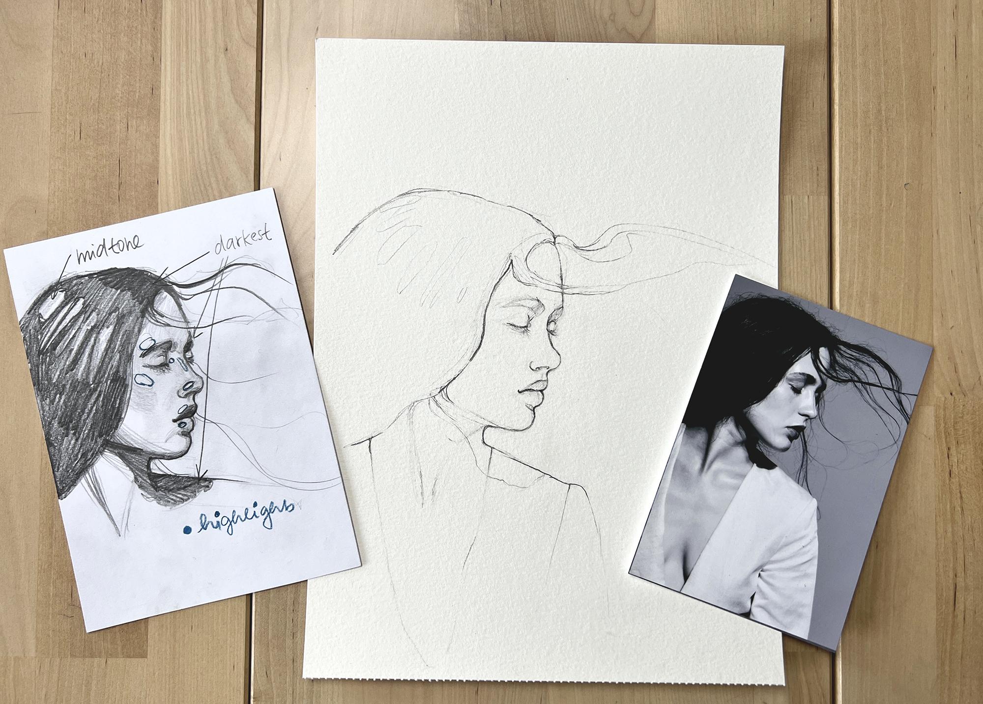
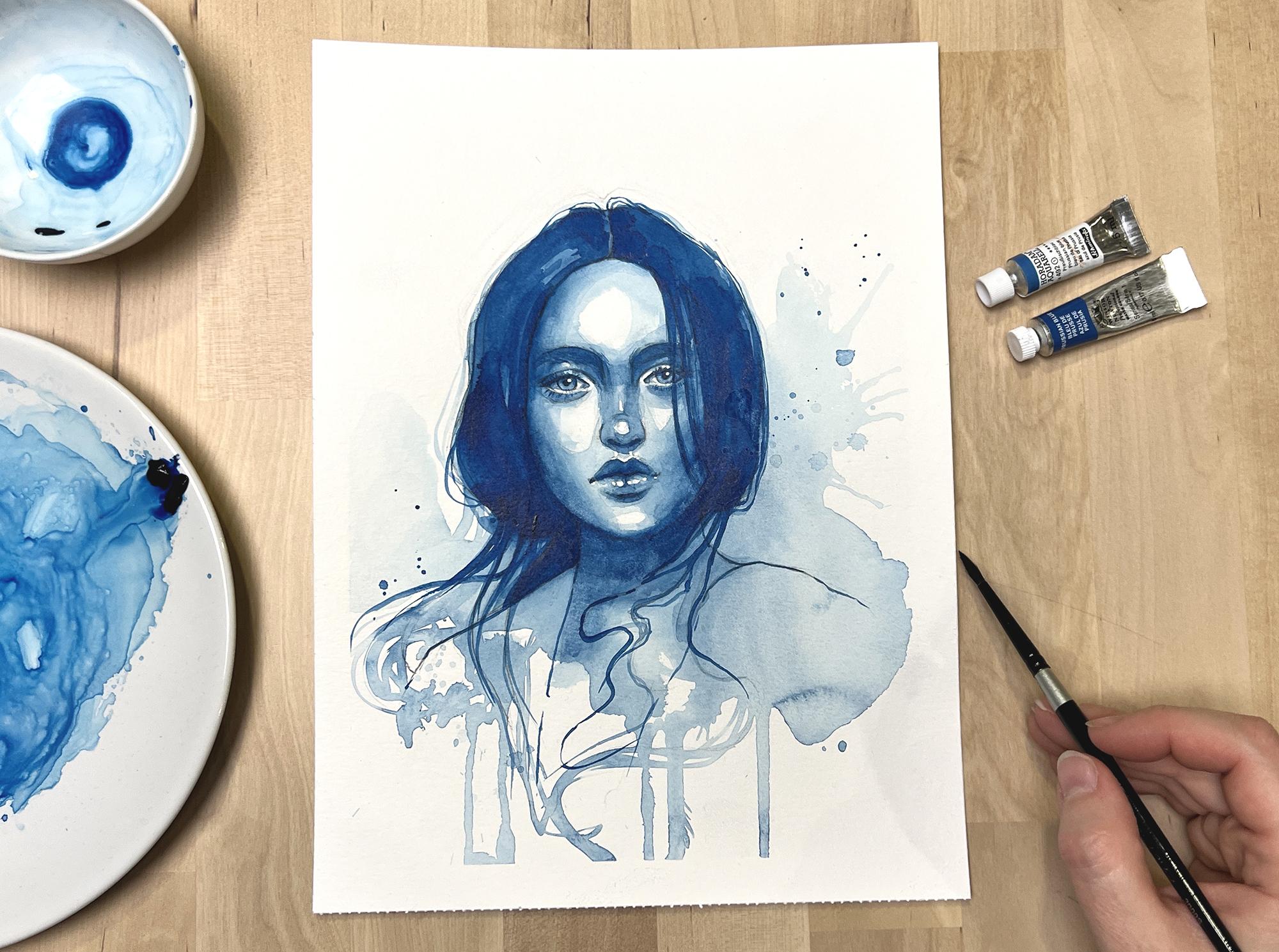
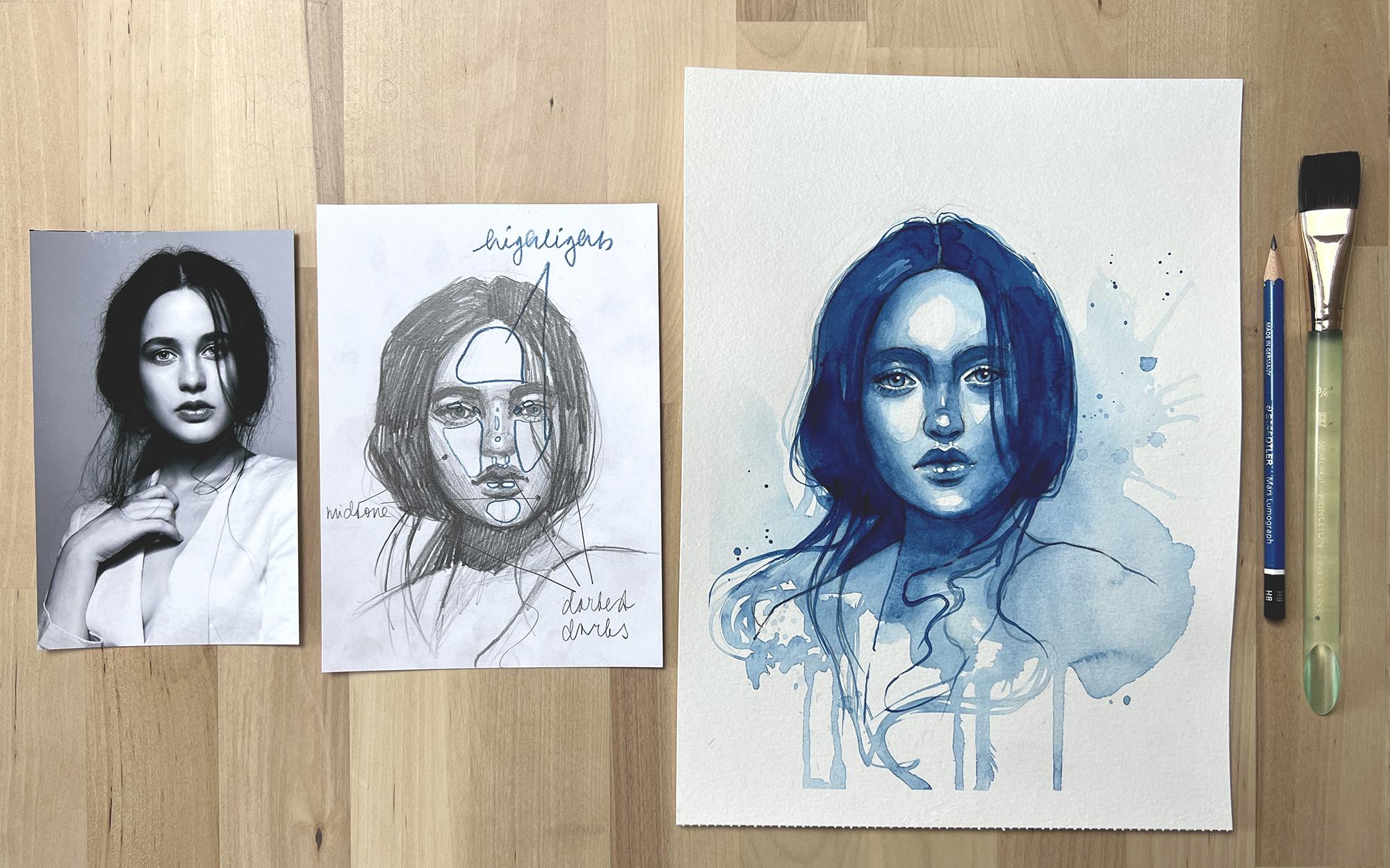
11. Creating a Thumbnail / Value Map: In this lesson, we'll
create a thumbnail of our first
watercolor portrait. This thumbnail
will be in pencil, and we'll use it to map
out all the highlights, mid-tones, and darkest darks. You can download my thumbnail from the projects and
resources section down below this
class and use it as your guide while
creating your own. If you did all the
exercises from the previous lessons
along with me, you're definitely ready to start creating your class project. This will be the first
watercolor portrait we'll paint from
start to finish. Since this class
is for beginners, most of all is extra
step of creating a portrait thumbnail will be
very useful for two reasons. First, drawing the same portrait multiple times makes you draw it with more confidence as you get familiar with it, and second, marking all
the highlights, mid-tones, and darkest darks with your pencil beforehand
forces you to rethink your watercolor strategy and
then minimizes the chance of applying the paint to the
wrong area or losing light. Let's create thumbnails for all the portraits in this class, and I will do that on
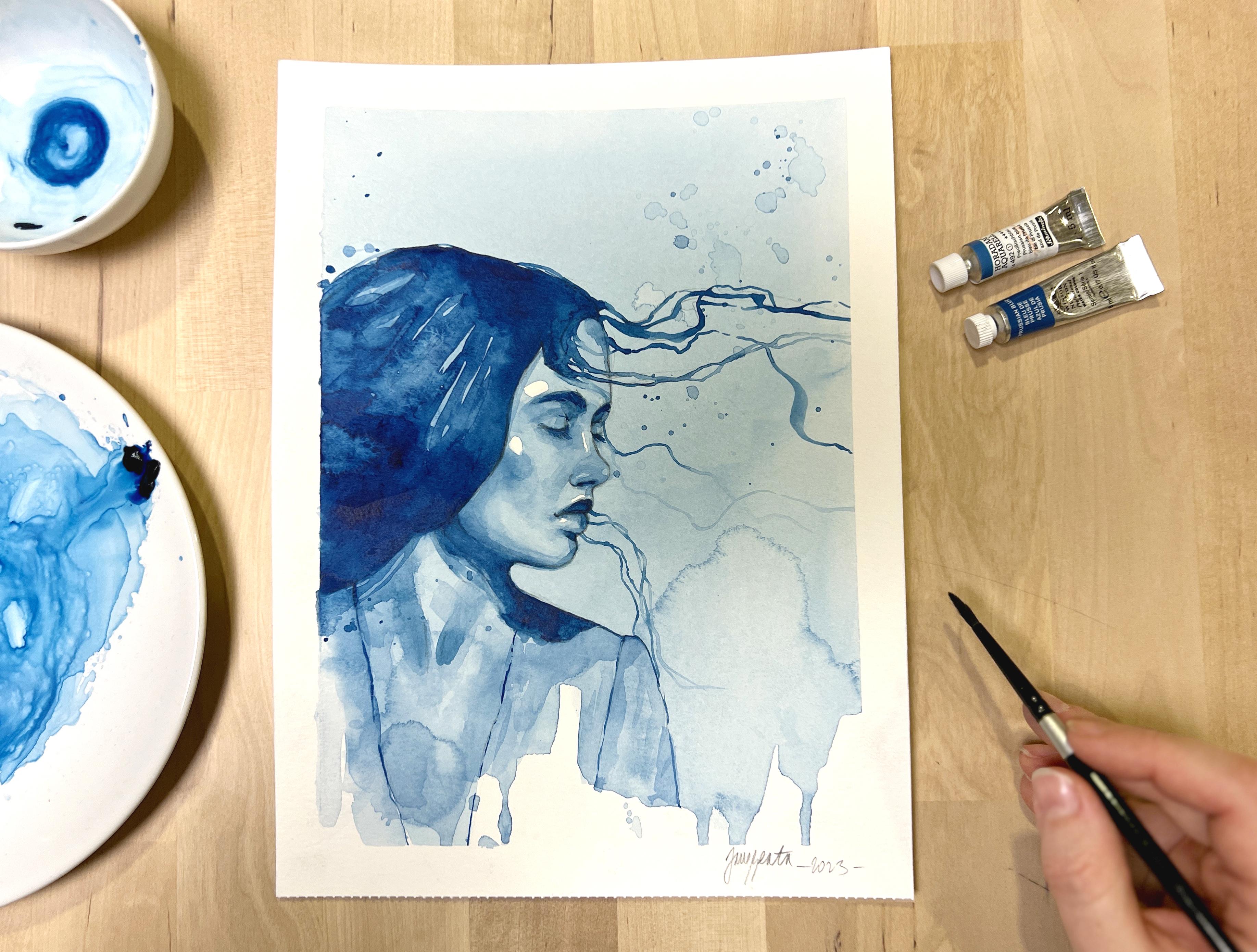
these tiny paper cards. For the class project, I pick the portrait
that's not too challenging to draw or paint. This is a really beautifully
shot profile portrait. I just love the floating
hair around the girl's head. It stirs emotions
and tells a story. Also, you can clearly
see light and shadow, and reference photo
also shows mid-tones although it's not that
visible in the video, but please download
the reference from the projects and resources
section down below, and you will see
them more clearly. I will start by loosely sketching the portrait
to the paper card. You can see that I've blocked all the basic large
shapes first such as a triangular shape
for the face and a few lines to indicate
the hairstyle, silhouette, neck, and shoulder. I'll add smaller
shapes for the nose, mouth, small triangular
shapes for the eyes. I don't mind using
a lot of lines, and the portrait
doesn't have to be 100% accurate at this point, but you should have at least
recognizable silhouette before you start with
the shading map, I am starting to add a tone
to different areas as I notice them on the reference
in no particular order. There are two large,
really dark areas, and that's the hairstyle
and the cast shadow on the neck and shoulder so I'm
adding some hatching there. There are more really dark
areas on this portrait, but you might not
see them at first. What helps me identify
the tonal values better is to squint my eyes
as I look at the reference, it allows you to see only tone and no sharp
lines to confuse you when you are
trying to identify how the value distributes
throughout the face. Smaller areas that are quite
dark are eyebrow area, lashes no stroke the upper lip, and the cast shadow
below the lip. There is also quite
a dark shadow coming down from the hairstyle
towards the chest area. Map all these out
in your thumbnail. As I go, I noticed some highlighted areas and
then need to tone around them. There are clear
highlights on the cheek, about the eyebrow that's
close to us, on the nose, then in the in corner of the
eye and on the bottom lip, usually between darkest darks and highlights there
are our mid-tones, but there are deeper and
lighter values in mid tones as well so some areas
are darkened a bit. These are the cheek
area, for example, the area between
lashes and eyebrows, and the base of the nose, some are on the neck as well. How you're supposed to identify
all these in a portrait? It's your observation that
tells you which is which. But it's not only that, because clearly there can be dozens of different values
between light and shadow, and we are painting in
three layers so how are you supposed to find all
that and paint it in? The key is that you don't. In other words,
we'll work it out by simplifying the
values just like we simplified the sketch and also trying to replicate
all the values, is a [inaudible] and lost
before it even started. If you get yourself
that you turned your thumbnail into a
12 hours long project, then you're missing
the point because every picture can be
mapped out only by three or four values
and this exercise can be incredibly helpful as it
trains your imagination. Not only you have to
make choices sometimes how to shape your
shadows or highlights, but you can actually
design them. You can purposely
choose to increase the contrast or
decrease it or you can even get rid of the
highlight if it makes the wrong side of the
portraits stand out too much. You can basically interpret the reference picture your way, and that is definitely
my favorite part of this entire process. Here's the final thumbnail. It's nothing too pretty, but it serves its purpose. I got acquainted with the
shape of this portrait and have a better understanding
now of how the highlights, mid-tones, and darkest
darks distribute here, it will serve me a great deal when I paint my
watercolor portrait. In the next lesson, we'll create a sketch for the class project. I will show you how I approach sketching this, how to proceed, whether you decide to
sketch directly to a watercolor paper or transfer your sketch to it.
I'll see you there.
12. Creating & Transferring Your Sketch: In this lesson we're
going to create a sketch for our class project. Let's get started. For the class project
I'll be using a free sheet of student
grade watercolor paper, so I will rip it
out of the block first before I start sketching. You can also use watercolor
sketch book of any kind for your class project and painting studies like this one. I'm sketching directly to a watercolor paper and I
usually do that in two steps, so I'll show you the process. But you have a couple
of other options too. If you're unsure and don't want to damage your
watercolor paper by erasing too much on it you can grab a copy paper
and sketch there, that will allow you to
do some heavy editing. By the end of this lesson I
will show you two ways of transferring this sketch
to your watercolor paper. I'm starting blocking shapes, this technique I explained in
greater detail in Lesson 7. But when sketch to
a watercolor paper, I'm keeping in mind that its
structure is a little bit more delicate and I'm using very light lines
because of that, I try not to put too much
pressure on my pencil and I prefer not sharpening
it for this part. I block in the features
pretty much the same way I do when
quick sketching. I represent them
with simple ovals and triangles first
and then try to shape them a little more
precisely only when I'm sure that they
sit at the right place. While in my drawing
practice I use hedging to help me see
the shadows and light. Here I do not hedge at all, so that makes it a little harder which is why I can
really recommend doing the sketch on
a copy paper first where you can hatch
and create contrast to make sure that you have the proportions at
the right place and then trace the line work
to your watercolor paper. Here is where the second
phase of the drawing starts. I now have a preliminary
sketch that has somewhat fine
proportions and so I can use a kneaded eraser to
lighten that sketch. Kneaded eraser doesn't really
take away all the graphite. It just lightens it so
that you can refine your lines but still
allows you to see them. It's incredibly gentle
to the watercolor paper so it is a watercolor
wrist must have. This is basically
what my process of refining line work looks like. It is slow but steady. I do not try to rationally think and try to make my
lines comprehensive. This line work will be
my guide when I paint, so that is why I need to see it. But in many areas
of the artwork, I do not want the
graphite to show too much and I definitely
do not want for sketching lines where some important silhouette
is supposed to be. So while doing your linework, take your sweet time. Make your lines elegant
and precise if possible. Because you are building
on the preliminary sketch, this is quite a relaxing phase. I want to show you
how to transfer your sketch to a
watercolor paper. If you did it on a separate
sheet of paper or if you're using my linework download it from the resources down below. First option is to use the light table or lead
board of some kind. The idea is simple, place your sketch on it, watercolor paper on top and
trace the lines carefully. I usually have to adjust
the lines after I trace the sketch to make sure
that everything looks good. Similarly, if you don't have a lead board you can use
window during daylight or you can place a lamp over some glass table to
get the same result. There is another method. You can turn the
sketch around and cover the other
side with graphite. Your HB pencil
will do just fine. Now, grab a watercolor paper, place your sketch on
top of it and just go over the lines while
applying some pressure. This way your sketch transfers
to the watercolor paper nicely and you can also adjust
the line before painting. So there you have it, no matter
which method you choose, now you have a line where grady
on your watercolor paper. In the next lesson we'll
start developing our painting by applying first layer
of watercolor. Let's go.
13. Painting 1st Layer: In this lesson, we'll start painting our class
project by applying the very first watercolor wash. Before you start applying
watercolor to your sketch, never forget to tape it down to a board
with masking tape. Make sure the tape
holds it in position, this prevents buckling
of the paper. I use spray bottle
to revive my paint. It's a quick way to get
that watery pool ready. I always test the intensity of the paint on a spare piece
of paper to avoid surprises. The entire technique works exactly like when we
were shading the sphere. We are going to
work light to dark. The purpose of the first
wash is to establish the highlights and so the
wash cannot be too dark. I will use a box
again to create tilt because I want this first wash of paint to be rather smooth. Make sure that your
paint is really watery and doesn't create
streaks as you paint. I start by applying paint on top because I want slide
background to show as well. The only space that I intend
to keep completely light is those highlighted areas that we established in our thumbnail. Keep your thumbnail and
your reference close by, and if it helps you, you can even lightly sketch in the highlights to your
watercolor paper. As I apply paint from top to bottom through the
entire painting, I leave behind those
highlighted areas. I will just bypass them
with my brush as I go. But this does not always
work so well for me. Sometimes I accidentally
hide something underneath the paint and that's okay because if this happens, you can just use lifting
technique later on to expose some white
of the paper back. It's not a big deal
to make mistakes. At first, this requires
some practice, and that's why I chose the type of paper that allows me
to make corrections, but do not worry too much. This is basically
just an underpainting and we can tweak mishaps
in the next layer. I just want to add that in
these monochromatic paintings, I do not strive for
perfection, not at all. Just like I suggested, you practice quick portrait
drawings in your sketchbook. I am pro quick
watercolor portraits that do not take too
long and are not too perfect because expecting
them to be flawless when you're first starting out freezes you from expression. You can allow for some
mess in your worksheet. At the bottom of the painting, I even left some drips and random effects work
there, watercolor magic. In my opinion, it makes for a much more interesting
interpretation of a portrait. In the next lesson, we'll add our second watercolor layer. We will deep in
shadows and practice the blending technique a bit
more. I'll meet you there.
14. 2nd Layer - Deepening Shadows: In this lesson, we'll be adding deeper shadows to our
portrait painting. We'll practice applying
paint and blending edges. Let's get started. Before applying second layer, make sure your previous wash is totally dry in your paper flat. I'm preparing my paint on the porcelain plate by adding water into it, creating a pool. This time, it's a little
more saturated than before. I really want to darken some
parts more effectively, which means I do not want to paint more than three
layers in total. I'll start by applying
the paint to the hair as this is quite a large area
that's going to be dark. Then look for some shadow
areas on the face. Use your thumbnail to guide you. We already established where those shadowy areas
on the face will be. Basically, look for all the areas that
need to be a little darker than the first wash of paint and apply new paint there. Here we also have
to think whether the edge of the shadowy
area is smooth or sharp. You can follow my
lead as I paint and make decisions
about every shadow. Cast shadow on the
neck, for example, it doesn't need blending. This one has hard edge other many shadows on the
face and in soft edge, so you will need to blur
those edges with your brush. When creating these
blendings common mistake is to rub your brush too much
and pass in to the paper. This can cause the
paper to break and produce
weird-looking texture. Be gentle and always use soft
brushes for this technique. Another mistake is to smudge the entire newly placed paint. If you do this, then you did not darken anything because you lift and
smudge all the paint. You only want to soften
the edge of the new paint. Do not go further with
your brush than that. I'm just following my
reference and my thumbnail, and patiently adding paint and then blending it if needed. This can be a very
fulfilling process, but you'll also need
your full concentration and some time for this. As you can see, applying all these tiny
shadows takes time. Some shadows are not
as obvious as others, like those around her cheek
gets a little tricky. You cannot apply
dark paint here, so I'm only adding
very light washes and blending them into the
previously painted layer. The deepening of tone
on the cheeks and on any area of her face
that is overall in light needs to be done carefully and lightly while you can add more pigment and sharpness to the obviously darker
shadows around her eyes, lips, and on the neck. I decided to add
a few strokes to define the clothes
on her shoulder, but I'm not sure if that
was the best decision because sometimes paying
too much attention and placing too much detail to
areas away from the face make the viewer's eyes
jump to these places and not to the face where
we obviously wanted. But with every
painting like this, we learn something new and observing our result is
part of the process. As you work on
your second layer, you should see obvious shift
in depth of your portrait. Here is the finished
second layer. Now, I let it dry again until the paper it
flattens completely. In the next lesson, we'll finish our class
project painting by adding darkest darks
details and some decorations. I can't wait to finish
this painting with you. We are really close.
15. 3rd Layer - Darks & Details: In this lesson, we will finish our class project by
adding darkest darks, details and a few decorations to our watercolor study. Let's go. First, I'll make sure that the previous layer
is completely dry, but you already
know by now that, that is always important when
we are adding new layer. I'll be working
with darker colors, so I will make much more paint with water than previously. But when you work
with watercolor, your paint never
can be too thick, so make sure that it is still flowy and a little transparent. I bring out the reference
picture again so that you can better see how I'm judging
where to place this layer. I decided to start with the most obvious part
and that's hair, because it's basically
a giant dark mass that does not have
a complex shape. I'm only leaving behind
some highlighted areas on the hair as we've already established those
on our thumbnail. Here, I'm trying to
make those highlights look a bit more
natural by softening some edges so that
they appear more random and do not form
such large shapes. I'm drawing some flowy
hairs around the face. But if you want, you can
leave this step to the end. These floating hairs
can look intimidating, but with a thin brush, this is really easy thing to do. I noticed that this
works better when you load your brush with
enough watery paint. It doesn't have to
be dark and draw slowly and one
segment at a time, you don't have to draw the
entire hair in one goal. Second obvious,
larger dark area is the cast shadow on the neck and so I'm getting right to it. Here, I'm trying to
soften the transition of the dark shadow
to the face and also one side of the
shadow appears to have more of that
reflected light in it, and so I'm trying to
lighten this area here. I am darkening shadows on her neck and some shadows
on the face as well. This was supposed to be actually finished in the previous layer, but the drying process
showed that the tone was still not sufficient
and the face appeared a little flat still. You can always tweak
the painting like this, and keep on adding
layers to deepen shadows at any point unless there are some
sharp details that are sitting on the area
that you wish to tweak. Which is why I really tried to solve all the final deepening of the larger shadows
before painting in sharper details
with the small brush. Here, I continuously
add small shading, mostly to the nose and the eyes, but I will be done with
it in a minute or so when I'm satisfied with the tone
that I've achieved there. I love adding splatters
to my portraits. I only have a rule of adding very light paint as I splatter. Never too dark, sometimes
it's just the water from the big jar that has a
bit of pigment in it. Here are some final touches. Adding lashes and eyebrows
with tiny brush while using very dark paint is almost like drawing
them with a pencil. This allows you to sharpen
any line that you wish on your portrait and get a
little more defined look. Final stage of this
water coloring process involves tweaking the painting
until you are satisfied. It is a constant checking from the reference to your
painting and back. I already explained in one of the previous lessons that
our references cannot be taken too literally and I never make them a law,
rather an advisor. When I'm lost and I'm
not sure why my painting doesn't quiet contain
the spirit of the photo, I can look for answers
in the reference. Sometimes, I discovered
that I already did the contrast or forgot about an important
shadow somewhere. But often, it is the
other way round. At some point, I need to put the reference aside and think only in terms of the painting needs to
look like I want it. So be mindful when making decisions in the last stages
of your painting process. When you decide that
you're finished, you can dry your
painting and then gently pull off the tape to
reveal the final outcome. It's been an incredible
journey to have you painting alongside me throughout this and all the previous lessons. I really hope that
you'll fall in love with the watercolor
portraits just like I did, and that I'll get to see your class projects in the
project gallery very soon.
16. Final Thoughts: I want to thank you so much for taking this class
and following along. I really do hope that you
found it helpful and maybe even started a new chapter
in your creative efforts. This is not the end, but
the beginning for there is lots more to learn about
portrait drawing and painting. To really set your
newly acquired skills in stone and help you
get that mileage in, I'm adding bonus
lessons in which we'll paint different portraits
together from start to finish. Only by practicing different
scenarios, different angles, and using different references, we can build some
experience with the subject and the
watercolor medium. I'll be adding new bonus lessons to this class every
now and then. So don't forget to
check in next month also and maybe join me
in painting a new demo. If you have questions that
have not been answered, feel free to use the
Discussions tab down below. The object tab called Projects and Resources
is where you can upload your class
projects and also your drawing exercises,
your sketches. I always love to see
how you progress. Please use this opportunity
and share your work with us. You can also tag me on
Instagram if you wish. I can then share your work
with my entire audience. If you follow me
here on Skillshare, then you'll get notified on my new classes and
discussions that I post. I also have a YouTube
channel where I share occasional studio vlogs
and shorter videos on the watercolor portrait
painting subject. This is not a goodbye because I will see you
in the bonus lessons.
17. Bonus lesson n. 1 - Thumbnail & Sketch: Thank you for joining me in
bonus lessons for this class. I want to keep on
adding bonus lessons to provide you with
more examples of different portraits
painted in watercolor as every portrait needs to
be approached differently. You can use these
lessons to practice, and they will help you
understand how to use the process that we learned in the class in
different scenarios. In the first bonus lesson, we'll paint the portrait of
a girl viewed from front. It will be a little
bit more difficult than the profile
view class project. In this lesson, we'll prepare a pencil thumbnail
to map out values in the portrait and
we'll also prepare a sketch for painting
it. Let's get started. I'm beginning to
sketch a thumbnail on a small piece of copy paper. Just a reminder, the purpose of the thumbnail is to map
out all the mid-tones, highlights, darker values, and also get familiar with
sketching this portrait. All these will help us
paint the portrait better and plan our
watercolor approach. I'm trying to block the
entire silhouette of the face with hair by
using shape approach and noticing every
straight line along the silhouette to help me
position this on the page. I'm trying to find
eyebrows line, the nose line, and then mouth. It helps me out a great
deal to represent the features with these
small ovals and circles as I can quickly place
them and then try to compare their position on my
sketch with the reference. Only when I think that they
are at the right place, I'm shaping them a little
more and adding some tone. This saves me lots of time. Sometimes when you
start with details, like eye, for example,
and draw it nicely. Then when you find out
that you need to move it, you rather keep it
in the wrong place than lose all that
work by erasing. It's why I just don't like to
waste my time with details. While sketching,
proportions and tone is my priority here
with these thumbnails. Tone can help you also
with proportions, which is why I start
with some hatching quite early in the
sketching process. This face is so
smooth and perfect, evenly lit with softer light, so it is quite hard to draw. Main challenge of the
frontal view portraits is to make the symmetry work, and central guideline
can help you split the face evenly and to make sure that the
nose and the mouth also are balanced
in their house. I finally arrived at some
resemblance to the photo, enough of what I need
for the thumbnail, and I'm starting to outline the areas that
will be very dark. Hair is the main dark mass, so I will do stronger hatching to reflect
on that in my thumbnail. Another clear dark area is
the shadow on her neck. There are also lighter
areas in the hair. Not very visible from my camera, but when you download
the reference for this portrait,
you'll see them. They're smaller, but I want to include that in my portrait, so I will emphasize
this in my thumbnail. I think that these
larger areas amongst the very dark mass of the hair will help to give the
hair some volume. Let's analyze the photo
reference a bit to learn how the tonal
values are distributed. Remember, we're going to try
and simplify the values in our sketch so that we know where we want the highlights to show, the mid-tones, and the
darkest darks as well. The most obvious are darks. It's the hair, the large
shadow on her neck, and then there are pops of really dark small areas around
the features of the face, such as eyes, under
the nose and mouth. Less obvious are highlights. We'll have to make a
decision whether we choose only to include
the tiniest highlights, like the reflections
in the eyes, on the nose, and on mouth, or we want to select larger light areas as highlights to give the
face more contrast. I went for the other option and mapped out larger
areas on the cheeks, forehead, and chin to try
and reserve as white areas. I think that this helps to give the face more
plasticity in the end. Like the mid-tones, we'll be connecting
the lightest parts with the dark ones. This will help us give the
features some form and show their plasticity a bit more as well as make the
face look round. Remember, this process
is a lot of planning, but then you will know
exactly where to place paint during the actual
painting process. So it pays out to do such
analysis in the long run. I will now draw in
everything that I noticed in the portrait
to my thumbnail. Here's the finished value map, and I will keep it
close by when I paint, along with my reference photo. Let's create sketch now. I draw directly to my watercolor paper but feel
free to use a copy paper and transfer your sketch later to the watercolor paper if you
feel like you erase a lot. I also erase a lot. But for these
monochromatic studies, it doesn't matter much if
the pencil or eraser leaves some marks as we are
only using three layers, so the paper usually
handles this well. But I use very gentle erasers, and you have them
linked down below in the materials PDF in
case you did not notice. For drawing the
sketch, I use pretty much the same approach
as for the thumbnail, especially in the first stages
of the drawing process, but later on, I will try
to be more precise and add more details once
that I'm convinced that I have all the features
at the right place. There is another
difference in drawing into your sketchbook
or thumbnailing from drawing sketches like this as a preparation
for painting process. It's that you can't use tone, which makes it harder. I rarely hatch on
watercolor paper because I noticed
that hatching or blending the graphite
doesn't look very good underneath the
watercolor painting. It makes the paint
look muddy and takes away the transparency
of the watercolors, so I'll have to do without. If you're sketching to
a separate copy paper, the advantage is
that you can use hatching there to help
you with proportions. As you can see, the
portrait still looks very rough as I'm trying
to position everything. I have all the
guidelines here still, but soon I will go through this preliminary sketch
with the kneaded eraser. In the second phase of
the sketching process, I will try to polish
the features, details, and make all the lines
crisper and cleaner. This portrait was a little
bit more difficult to sketch, and it took me quite
some time to arrive at the stage when I was
satisfied with the outlines. Corrections were quite
heavy and frequent. At one moment I was worried if I did not overwork
the paper already, but it was fine in the end. Sometimes when I'm unsure if
the proportions are okay, I will just take a photo of the sketch with
my cell phone and then quickly switch between the photo and the
reference on my phone. That helps me to spot mistakes because the more you
look into your drawing, the harder it is to
notice differences. We all lack fresh point of view. It also can help you to
put the drawing aside, look at it the next morning, and make corrections
then because that also provides you
with a fresh view. Here we have a sketch more or less ready for the
painting process. You can download
it to either view or use for your watercolor work. It is included in the
resources down below. In the next lesson,
we will paint this portrait in
watercolor. Let's go.
18. Bonus lesson n. 1 - Watercolor Painting: In this lesson, we'll paint this watercolor portrait
in three layers. If you did not create
your own sketch using previous
lesson as a guide, you can download my sketch
from resources down below, trace it to your
watercolor paper and start working
on this portrait. You can also download
my thumbnail, but I highly
encourage you create one with your own hand
because that will help you in developing the painting with
watercolor layer-by-layer. Let's start. Let's check the reference and
thumbnail one more time before applying the first
layer to make sure that we know which areas to leave
behind as highlights. We mapped out some larger
areas as highlights, but we also have
those smaller ones to look for as we are
applying the first wash. I'm tilting my board
and it goes like this almost every time that I paint my first layer because I want this thin layer
of paint to be quite smooth with not too many
irregularities if possible. I'm not painting background
this time that will be kept white and we might decorate it with some splatters later on. I'm carefully trying to
lay down my first wash without applying paint to
the highlighted areas. You know that accidents happen, so please don't panic when you accidentally go
over some of these. You can just use the
lifting technique to get rid of the paint before the wash dries or
with a paper like mine, you can lift pigment
even when it's dry. If you are unsure that
you can freestyle these, you can draw those highlights
shapes on your sketch very lightly and that helps
you to better avoid them, but you risk weird looking edges if your mark is too
dark, so be careful. You'll get the hang
of it. Don't worry. I like to add an expressive
element to these portraits and that's where I live watercolor to flow
and do its magic, but these areas
filled with effects can't be on the face
rather behind it. Sometimes it can
affect the hair, so in this portrait
I went for dripping paint below the portrait
and sprangers on the sides. For a spranger like
this one on the right, leave a larger pool of paint on paper and then blow on
it. It is quite fun. Few more corrections
and touch ups, and we'll leave these
two completely dry. Second layer always
takes me the longest. It is the one when we focus on gradually building
depth to our portrait. Always use your thumbnail
in reference to guide you, so I'm bringing
the reference here as well because that is a better source of
information for me while I paint the mid-tones. I try to gradually
add more paint to the areas that contain
darks and mid-tones. Dark areas like hair will obviously get even darker
in the next layer, but I still add these in-between layer to
them as this helps to connect the mid-tones with the darks that transition
is more seamless. To paint the hair silhouette and hair strings is easy enough. More tricky are the tinier
shadows around the eyes, nose and mouth that needs to be blocked with
these paint as well, and as you add them to the
portrait and blend the edges. This slowly creates
depth around them. This particular portrait took a bit more of these additions, bindings and touch ups then what I normally
tend to include in my monochromatic
studies I think it was because of the look
of the reference. It's very smooth, and so that might have confused me into trying to be more precise and careful than it was necessary, so after a while I was just very focused on
trying to observe the reference and then
compare with my portrait and then spot every single
mistake and correct it. This is how I proceed usually when working on larger
scale works that involve more layers and
that's essentially how you achieve even more
realistic look if you want to, but it's also really not necessary for
sketches like this. I'm just mentioning it because I want you to notice
that in this demo, I went a little bit overboard with the amount of touch ups and so you can be a bit
more loose if you want to. Let's add the darkest paint to our portrait and this
is the last layer, so I would want to
emphasize those darks, add more pigment to your brush, but always mix it with
enough water because with watercolor paint
should still be flowy even when working
with darker values. I'm blocking the dark
shape of the hair and leaving some of those
lighter areas behind. We discussed this in the previous lesson while
developing thumbnail. These are not large
areas but help us to give the
hairstyle more volume. Here I'm trying to
block another shape for the eyebrows and parts of
the mouth that are dark, but I'm still using my
mid-sized flood brush. Very soon however,
I'll have to switch to the tiniest brush
because these parts of the portraits they are too
delicate and all the darks that are left to be added
are just very tiny, so we'll have to
be more careful. There's still lots of
areas that my mid tone in the previous layer didn't
make dark enough and I'm judging these just by
looking at the reference constantly and comparing
it with my portrait, great thing that you can
always add more tone to the watercolor paper until
you overwork the paper, so be careful, but it's
possible to keep on adjusting the tone until you are convinced that it's at the right value. Besides the tone, we
have to care for edges. We learned how to blend edges in Lesson 9 of this class
and this technique I use constantly whenever
I need to blend freshly painted area with
the rest of the portrait. Some areas though are
connected with tone and so you don't have to
paint them always separately, like for example the
neck and the hair. They have pretty
much similar tone, and so you can paint
them in one go, but then if you want to make distinction between
hair and neck, you have to paint the hair
darker in the next layer. This will create a hard edge
between the neck and hair. I'm often using
lifting technique to lighten some areas or create even softer blendings if it didn't quite work out
on the first goal. Just make sure that
you don't rely on these too match though
as this can make the painting look overworked and watercolor always looks
best when you lay down your paint carefully and even leave a hard edges
in different areas, but that comes with practice and when you're
first starting out, the lifting and softening with your damp
brush will help you have better control over
these tricky watery medium. Finally, when you feel
like you've achieved enough depth with your
mid-tones and darkest darks, you can start adding floating
hairs and some decorations. This is my favorite
part of the process. It really makes the
portrait stand out. If you pay some attention
to this last bit, you can add a bit
more texture to the eyebrows by drawing some of the individual hairs on top of the darker area
for the eyebrows. Next, pay attention to the
dark details in the eyes, such as iris which
is very dark and also lashes and those
lashes are tricky, but you don't have to
draw them one-by-one, instead think of them
like one line that is a bit more split on the
outward edge of the eye. You cannot observe
individual lashes very well on a portrait that's
viewed from some distance, so always try to think how to simplify the details
accordingly. If any part of the
painting process is pretty much the
same as drawing, is this detailing part. You just draw with tiny brush and dark paint on
it as if it were a pencil adding sharper details on top of what you just painted. I'll add a few more floating
hair and some sprangers to finalize the watercolor
part and I'll let the portrait
to completely dry, and here's a little
trick to make the portrait pop a bit more. It is to use opaque white paint to add some sharp highlights. This is some white
gouache I have lying around in my studio
and I'm going to add it to my tiny
brush and paint in those highlights that I've
lost throughout the process. The goal with watercolor
is not to lose the highlights and if you're
familiar with masking fluid, that also can be a
good alternative to using white gouache, but if you want to see
what your study would look like if you'd had
some sharper whites, this is one option how
you can achieve it. We can now remove the masking tape to reveal
the final portrait. Thank you so much for joining
me for this bonus process, and I will see you in
another bonus lesson soon.
 Jane-Beata Watercolor, Watercolor artist & teacher