Transcripts
1. Introduction: I find watercolor to be a
perfect medium to start with. No matter if you're a
beginner or more experienced, there is so much to gain from learning
watercolor painting. You got to love the
painting process and the final artwork which looks great not only on your roll, but also digitized and printed on products. My
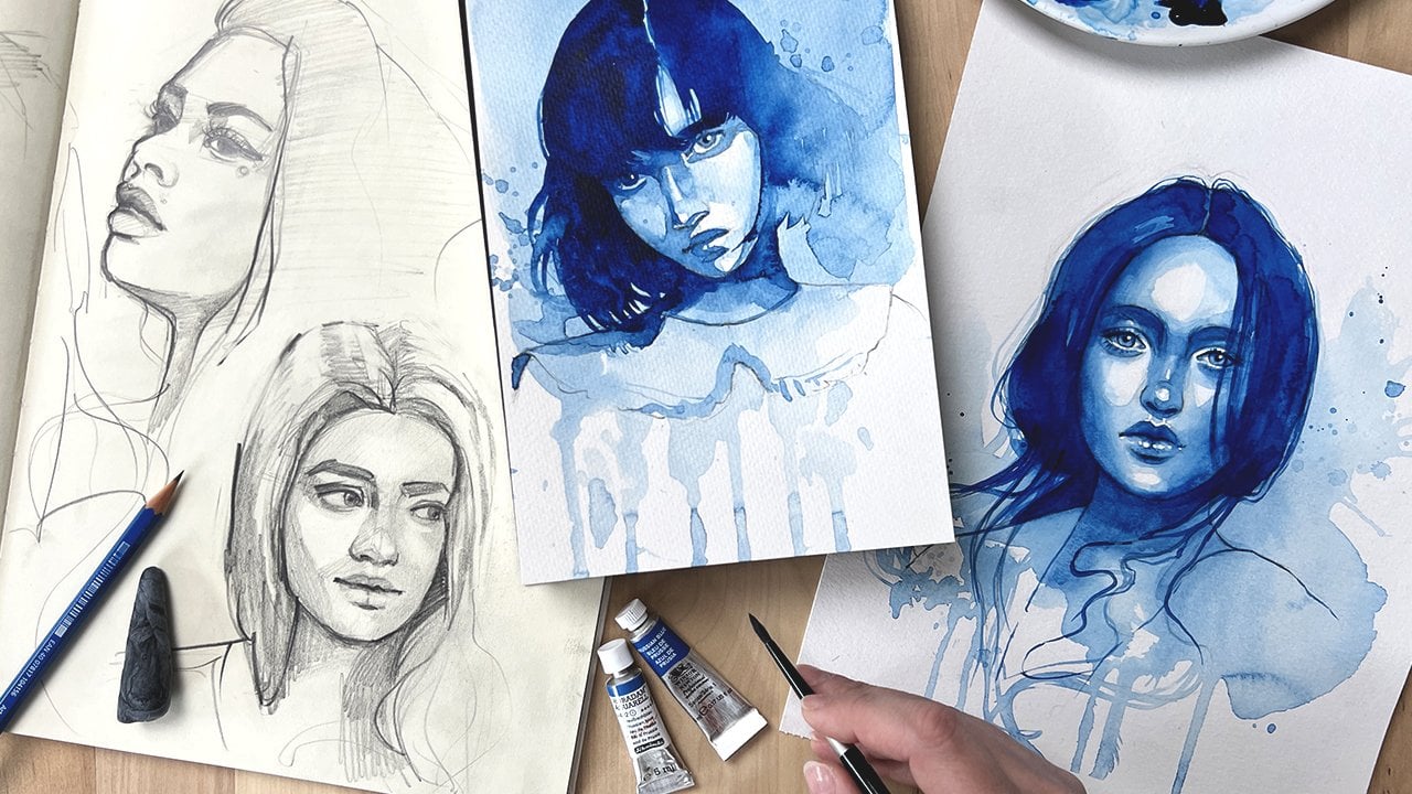
name is Jane Beata. I'm a professional
watercolor artist and a teacher based in Slovakia. Welcome to my studio. I sell and exhibit original
paintings and out prints. Occasionally, I even create
illustrations for clients, do it printed on products
or in publications. I also have a YouTube
channel where I share my painting process and watercolor tutorials
on a weekly basis. I started to experiment
with watercolor about 10 years ago and I instantly fell in
love with the medium. Watercolor allows you to
finish paintings more quickly. Often even takes the wheel
for you and to create these beautiful
abstractions that elevate your painting
without much effort. Compared with other mediums, it does not require a large
or expensive set up to start. The painting process
is just so enjoyable. It's almost
therapeutic in a way. Personally, it helps me distress and get lost in the
process instantly. In my studio, I often run live watercolor workshops
and our greatly enjoy passing my experience and observations about
watercolor to other people. In this class, I walk you through fundamental
watercolor techniques. I'll help you pick
suitable materials for a start and a limited
palette of colors. We'll go through color mixing and I will introduce
basic approaches to painting with
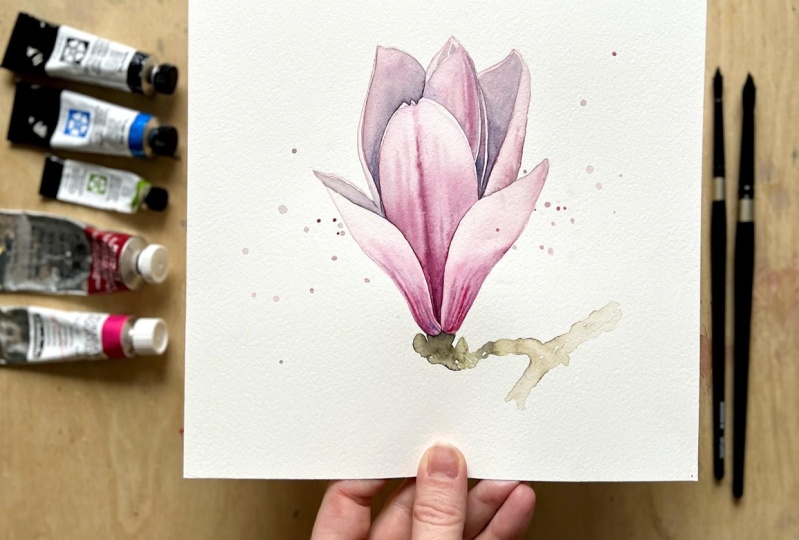
watercolor that you can apply to paint any subject. For the class project
I'll walk you through the entire process of painting a beautiful watercolor magnolia. I'll show you how to create a simple sketch and then
transfer it to watercolor paper. But, I'll also provide
you with my sketch if you wish to skip to
painting right away. We'll paint the magnolia
flower step-by-step from initial washes to
final adjustments and deepening of the color. I will also show
you how I create expressive splatters and
decorate my paintings with them. If you're truly eager to learn, I have two bonus lessons
in the end of this class, where I'll create and
walk you through a step-by-step two more magnolia
watercolor paintings. If painting with watercolor
is something that you'd like to learn and
you're ready to learn, grab your brushes and
join me in this class.
2. Class Orientation: Hi everyone, and welcome to the class. I'm sure you're excited to
start painting right away, but let me first say a few words to get
you acquainted with watercolor and how this
class is organized. Watercolor medium is
sometimes surrounded by a myth that it's very
hard and uneasy, and when you are learning by yourself and by trial and error, that it can feel
exactly like that. Follow proper direction and carefully designed exercises, you can learn very quickly. I find watercolor to be a
perfect medium to start even before under traditional art
techniques such as oils, acrylics, and gouache, it can
give you a great advantage. It is because it requires
minimal setup to start, you can literally start painting with watercolor
on your knee, painting time is very short. Watercolor paintings
look also great, digitalized when
printed on products, that you can always gift or
sell the original painting. And probably the biggest
advantage of watercolor is how great it feels to
paint with watercolor, the process is very
enjoyable, it is distressing, very entertaining, and it's a huge reason to
take it as a hobby. When I first started to
paint with watercolor, I thought it was insanely
hard to control. But when I started to
practice the two approaches, it became clear
that there are ways to control watercolor
and give it boundaries. Only after several tries, I already more or less, knew what I was doing. These beginnings
were what I had in mind when designing this class. Let's starts with
the lesson about the materials so that you
know what to prepare. Make sure to set up your painting space
with all the tools that you need to paint along with me throughout the class. In the following two lessons, I'll explain color mixing and basic watercolor techniques. The color mixing lesson
teaches you how to combine the limited
palette colors that I selected for this
class and how to create lots of options for
you to paint with. The basic watercolor
techniques lesson explains two fundamental
watercolor approaches in detail and I also designed a painting exercise
where I show you how to use these approaches to paint
individual flower petals. I want to really
emphasize the need to paint all the exercises, maybe even a couple
of times if needed. Theoretical knowledge
acquired by watching the videos
without painting is not going to translate into the muscle memory of your
hand moving across the paper, and so the only way to
learn is to paint along. At the same time you are saving so much time by taking
this class because this is a great way to acquire good painting habits
right from the start, and you will most likely
destroy much less paper than average self taught person does at the start of their
watercolor journey. Your class project will be to create watercolor
magnolia painting. My class will take you
throughout the entire process, from creating the
sketch to painting last details and decorating
it with expressive sliders. Make sure to take a
photo or a scan of your final magnolia
painting and then upload it to the
project section of this class so that I can see
it and give you feedback. If you're like me and
want to learn a bit more, I added two bonus
lessons for you, and you can find them as
the end of this class. In each bonus lesson I create an extra watercolor magnolia
study from start to finish, even though in a slightly
quicker way to demonstrate my approach to using
watercolor techniques to paint flower
studies in general, and you are more than
welcome to create those extra studies with me. The class has a section
called Project and Resources, and you can download my sketches and reference
pictures from there. I also added progress
pictures of all three studies to help you with this overview
of the entire process. Now you are ready, so grab your brushes
and let's start.
3. Materials: In this video, we'll go over all the materials
needed for the class. I will show you exactly
what I was using, but also suggest alternatives, since it is not
necessary to have the exact same supplies. You'll need a
watercolor paper first. I'm using canson
Moulin du Roy paper that's made of cotton, but you can use any
watercolor paper that is at least 300 gsm or 140 pounds. This means that your paper is thick enough to withstand water. I recommend that you choose a cold-pressed paper when
starting out with watercolor, which means that your
paper has some texture. This type of surface is
slightly more forgiving than papers that are
either too smooth, or too rough and can really
be a great help at start. Next, you'll need
watercolor brushes. I am using silver black
velvet series 3000 S brushes in sizes six and eight, but you can use any round brush in a larger and a smaller size, either with synthetic
or natural bristles. Just make sure that the
brushes have a sharper tip and larger brush should be
able to hold more water. Watercolor brushes can
be very expensive, so don't buy many. Two brushes are more than
enough for the start. To mix your colors, you will need a palette. I'm using a white
porcelain kitchen plate for that purpose. You'll also need a masking tape and a jar with clean water. Kitchen towels are also very important and a necessary tool, and to speed up the
drying process, I also have a
hair-dryer at hand. We'll also need a drawing
materials to create sketches. I use a cheaper
printer paper for my sketches and a mechanical
pencil for drawing. You can also use an eraser, mine is fabric castle dust-free. To transfer my sketches, I use a graphite stick, but this is an
optional material, a regular pencil will
do the job as well. Lastly, we'll definitely
need watercolor paints. You can use either sets
of paitns in dry paints, or paints in a tube. Either use F9 and
a brand doesn't matter much any
student or artist, range of watercolor
paints will do. I would only avoid paints for kids and low quality supplies, as those might perform
very differently. I use quite a variety of
brands and from those I picked a couple of paints
and colors for this class. You don't have to have
the exact same colors, just pick something that looks similar from what
you already have. First on my list is magenta. I use the one batch mincut, and it is a very
transparent, cool red. When you water it down, it appears like a
striking pink color. Next one is alizarin crimson, this is a slightly
darker, deep red. I always get these in a larger tube from
Winsor and Newton, since this color is very
versatile and I use it often. Most beginner set of watercolor paints
contain these colors, so you shouldn't be having
a problem in getting one. We'll also use green gold, it is a very light green color, and when you water it down, it appears almost yellow, which makes it quite handy for mixing not only green
parts of the flowers, but also creating
orange undertones. My tube paint is
by Daniel Smith. Next one is, cerulean blue, and it is a warmer blue color. We'll use it to mix purples
and creating shadows. This one is by Daniel Smith and it granulates quite a lot, which gives the painting
some extra texture. Lastly, for darkening our mixes, we'll use neutral tint, mine is by Daniel Smith and this color is neither
cool or warm. It will help us to achieve more contrast and
overall comes in quite handy when painting
a wide variety of subjects. That's it. These five paints
are all we need to create a wide range of colors, and once you have
your materials ready, you are all set up to join
me in the next video, where I'll show you
how to mix them. Also, a complete list of the materials can be found
in the class description.
4. Color Mixing: Hello, there. Remember those five colors we talked about in the
previous video? In this one, you'll learn how to mix them to create all kinds of secondary colors and ultimately make your flower
studies really pop. The five colors in our
palette are magenta, alizarin crimson, green gold, cerulean blue, and
a neutral tint. Let's see what happens
if we combine them. For this exercise, grab a spare piece of
watercolor paper. First, let's mix magenta
and alizarin crimson. New color will be slightly
different from both. Something in between
to red and too pink, which is what we'll later use when painting
flower studies. Next combination will be
magenta and neutral tint. Grab a bit of both with your brush and mix
them on your palette. Resulting color will be purple, and depending on which color
dominates the mixture, will the new color
appear either more red or more deep purple. Sort these mixtures
to your paper to see what types of
purple can you get. Now try to mix alizarin
crimson with neutral tint. You will get deep red mixes
that almost appear brown. Try mixing combinations of
these two colors with either red dominating the mixture
or the neutral tint. Once again, the point of
this exercise is to see what colors you have available
and how to get them. Next mixture will be
magenta with cerulean blue. Because my cerulean
blue granulates, the mixture will appear grainy, which doesn't have to be
the case on your paper. This is not a mistake if
your mixtures are smooth, it's just that this
particular pigment that I am using happens to be a granulating color while the specific pigments that
you are using might not be. But granulating or not, the resulting color will
be a bluish purple. Next mixture is alizarin
crimson with cerulean blue. Resulting purple will
be brownish and quite different from when using
magenta in this mix. Now try mixing neutral
tint with cerulean blue to get some
dark and deep blues, which might come in handy
when painting shadows. Here is the first
part of the exercise. Quite a lot of colors,
don't you think? But we are not done yet. Let's see what happens if we invite green gold to the party. Let's mix some magenta
with green gold now. Since green gold is quite close to yellow
when watered down, it creates mixes
that look orange. Similar mixes can
be achieved when mixing alizarin crimson
with green gold, but these will appear even
cooler and a bit brownish. Combination of neutral
tint and green gold gives you quite a range
of darker greens. It is fun to see how
the green changes depending on which of these
two colors dominates. Careful with the amount
of neutral tint here. Since it's very dark, it can overpower this
light green easily. I would rather add it
to the mixture slowly and in small amounts
to see what it does. Now try casually adding a bit of cerulean blue
to this mixture. This creates even more
variety of blueish greens that are really
interesting and you're going to use them
in your paintings. Congratulations, you've finished both parts of
this color mixing exercise. By now you should have a
pretty good idea about what your palette can do and what
colors are available to you, even how to get them exactly. Now when you and color
are no longer strangers, you are ready for the next
lesson where I'll show you two basic watercolor
painting techniques.
5. Basic Watercolor Techniques: In this video, let me explain how
watercolor behaves on paper. If you're new to watercolor, it is crucial to
understand this as it will save you lots of
time and hard feelings. Grab a piece of
watercolor paper and join me in this
warm-up exercise. First, prepare watercolor paint by adding water to it
on your palette. This technique is
water-based which means we paint almost
with tinted water. Paint a circle. Because the paper is dry, water will stay
inside the circle. You can even see
it running inside its wet shape as if
it's trapped inside. This is a principle
called wet-on-dry. If you paint on a dry surface, water with your paint will always stay inside an
area that you dampened. Important note is
that this area will have a hard edge around
it after it dries. Let's wet half of the
paper with clean water, and then try painting
a circle again. Watercolor now spreads
all over the place since there is no dry boundary
to keep it inside. This principle is
called wet-in-wet. Notice how we still can see
a circle that we painted, but instead of a
sharply defined shape, We get one that appears blurry and we call
this a soft edge. Let's paint a circle again, but try to gently get rid
of all the excess water. I always remove it with
the tip of my brush which helps me avoid
patchiness of color. This is how we must
paint if we want to achieve a flat wash of color. Paint one more circle, but this time leave
quite a lot of excess water inside the
circle and let it dry. The result we get
is very different. When painting this way, we often get expressive textures with rough and dark edges. In the next exercise, I will show you how to use both these approaches to paint different parts of the flower. This is how we prepare watercolor paper
for painting on it. Use masking tape to
mount that paper to your table or some board. Masking tape should always cover at least a centimeter of
the paper from all sides, and the rest of it
should be pressed firmly against the board to hold
the paper in position. The purpose of this is
to keep the paper flat. It will always buckle a bit
while you are painting, but if you mounted it properly, it always dries flat enough. Let's sketch a basic
shape of a flower petal. Cover it with a very
transparent wash of paint. We are already familiar with
a wet-on-dry principle, and so we're going to use it to form the edges of this petal. Now, it's time to take the advantage of the
wet-in-wet principle. Flower petals will rarely
appear flooding color. While the wash of
paint is still wet, let's add some more
pigment to the bottom of the petal to
create a gradient. Shade of the new paint can spread in a damp
area uncontrolled, but it cannot leave the
boundaries of the petal. Use your brush gently to push
it back and forth if you feel that the new paint is escaping its position too much. You can even leave some
of the pigment with your brush to create
a soft highlight. Grab your smaller brush and
load it with more pigment. We're going to draw these
veins inside the petal. On a magnolia flower, they appear as a blurred line, so drawing it while the
previous wash is still wet will give us the soft
result we are looking for. My tip is to wait a minute to have the water
calm down a bit, but not too long for the
wash to start drying. Drawing the line a bit lighter will result in a
new paint spreading slightly less than when placed
in a freshly painted wash. However, if you wait too
long and the wash dries, it won't spread at all. You can use your brush to gently push the paint back
and forth again, to help the line
form in your favor. Observe the water and
paint and how it behaves. This experience will be your source when
creating paintings. Let's draw one last petal, this time from the side. In its shape, it will
resemble a canoe. Grab your brush and paint a first transparent wash
just like we did before. You don't have to
use just one color. I often start with one color
and keep adding another into the mix as I go and
this results in a gradient. Let it dry. Look at these lovely
sharp edges that clearly define
these leafy shape. We are now going to
add another layer of paint to one side of the leaf
to shape it even further. By working in layers, you can develop
your subject more, you can sometimes even use a second layer to correct
accidents from the first one. Take your time to finish
this exercise and observe how watercolor
appears when wet, compared to once it dries. There is a slight shift in overall darkness and
saturation of color. The dry finish will always be lighter and less saturated, but how much different exactly? Depends on the type of paints
and paper you are using. You will be able to anticipate these shifts in time as you get more used to your own
watercolor materials. Last thing I want to show
you here is how to correct the veins on the first
petal with a second layer. Slight correction would
be helpful because the first layer didn't dry
quite exactly as I planned. You can always cover the
entire area with clean water, and try painting
them again inside this second wet wash. New paint will overlay
the previous one. Just make sure that the edges of the second wash align
with the first one, otherwise you'll end up with double edges and that
might not look so great. Before carefully removing
the masking tape, make sure everything
is completely dry. Because this lesson covers the fundamentals that are
crucial to this class, I've added a summary
that you can refer back to
throughout the class. There are two ways to
paint with watercolor; you either paint on a dry
surface or to a wet surface. On the dry surface, watercolor will stay inside the wet area and forms
sharp edges after it dries. In a wet surface, watercolor spread
inside the wet area and forms soft edges
after it dries. If you remove the excess
watercolor from a wet area, you will achieve a
flat color look. However, if you want to achieve a more expressive
and textured look, you can leave a lot
of excess water inside the wet area
and let it dry. Always mount watercolor
paper to a board or your table before painting;
this prevents buckling. During the flower
petal exercise, we fill the first petal with a wash of transparent
watercolor, then we added some
more pigment to create a gradient and pushed it back
and forth with the brush. To create veins, we simply
drew lines into the wet wash; lines then appears softer
because of the wet surface. If you want to add more veins or add more color to
the petal later on, simply wet the entire petal with clean water and add more
pigment into the wet area. Second layer overlays
the first one. We also painted a
second flower petal using two layers of paint, but this time using a
wet-on-dry principle. This helped us to
create a sharp, darker side of this petal. Congratulations, you are
now ready to begin working on your first watercolor
magnolia study. In the next video,
we are going to prepare the sketch together. I'll see you there.
6. Creating Your Own Sketch: In this lesson, we'll create a sketch for our class project, Magnolia
watercolor painting. With that being
said, you can focus solely on the painting
process in this lesson, and just download
the sketch from projects and
resources down below. But I highly encourage you
to follow along this lesson, and create your own sketch as drawing will always
empower you and give you lots of freedom to create your own original
artworks later on. Let's grab our sketching paper and your preferred pencil and start drawing some lines to
indicate a very rough shape. Let's bring in the
reference picture. Try to make your first
lines very light and make as many of them as you need to get the shape right. The purpose of this first
draft is to decide where the flower fits on the page
and how big it's going to be. My first draft looks like this. It looks more like a couple of simple geometric
shapes than a flower. This is what I believe anyone can draw no matter
your experience. Some questions I might
ask myself as I work on my first draft are how wide
is this flower overall, if I compare it to its length? How many larger shapes
does the flower contain? Do they run in the
same direction or have different
directions to them? How they compare to one another
in their size, and so on. In the next phase of
my drawing process, I'm starting to slowly refine a larger shapes that represent
individual flower petals. I've already drawn a rough
shape of every petal, but we need to go over
each shape and adjust some lines to bring it closer
to what a pedal looks like. Usually this means
transforming lots of initially straight
lines into curves. I would suggest starting with the
pedals closest to us, since they overlap
the rest of them and appear like a solid base. Take your time, drive slowly and observe your reference
a lot at this point. Some questions I
might ask myself as I work throughout this
refining process are, how wide is the
bottom of the flower overall compared to the
opening at the top? How are the pedals that we can't see attached
to the flower? How sharp is the
tip of every pedal? Does this curve look
natural, and so on? It's okay to correct
mistakes with an eraser and clean your sketch from
previously drawn draft lines. Once you commit to a line, you can make it
slightly thicker and your magnolia flower starts
to appear on a page. Keep your eyes on the
reference picture for as long as possible. Now is the time to address
all the proportion problems, because once we transfer the sketch to the
watercolor paper, it becomes impractical
to correct it anymore. Make sure that you
are happy with your sketch before
you transfer it. Congratulations, you are now ready to transfer your sketch to a
watercolor paper. I'll show you how to do
these in the next video.
7. Transferring the Sketch: In this video, we're going
to learn how to simply transfer your sketch to
the watercolor paper. Once you've finished sketching, turn the paper around. We're going to cover the back of the picture with graphite. You can use regular pencil
or even charcoal for this. I use a graphite stick since it is slightly quicker to cover the entire area with it compared to the regular or
graphite pencil. These marks don't
have to be neat, but they have to
cover the other side of all the lines of your image. Are we done? Good. Let's turn the sketch back and grab a
watercolor paper. My sketching paper and watercolor
paper are always cut to the same size to ensure that the drawing fits on the page
exactly as I planned it. Whilst I can't resize the
flower at this point, I can align it slightly better on the watercolor
paper during transfer, which is another advantage of having a sketch on
a separate paper. When you position your sketch
on a watercolor paper, you can fix it with a bit of masking tape so that
it doesn't move much. Now we'll just trace over the lines with a sharper
pencil or a pen. These lines should now appear
on the watercolor paper. You can lift the sketching
paper slightly and check if the lines are transferring
nicely every now and then. If the lines are
not very visible, it could mean that
the graphite layer isn't thick enough and that you need to go back and add some more graphite to
the back of your sketch. But it can also mean
that you're not pressing firmly enough
with your pencil. On the other hand, you don't
want to press too hard. Either, it' s best to avoid scratches in the
watercolor paper. When you're done, remove the sketch and you
can now use masking tape to mount the watercolor paper
to your board or table. We already learned
how to do that in a previous video about
watercolor techniques. And with that, you are now ready to begin painting
your main project, which is Watercolor
Magnolia Study. Lastly, note that there is not just one method of
transferring your sketches. You can also use a window or a light table and
trace over the sketch. However the method that
we use today helps you to transfer your sketches
to any type of surface, even wood or canvas, which is why I use it often. Now that we mastered a
lot of preparations, let's begin the
painting process. I will see you in
the next video.
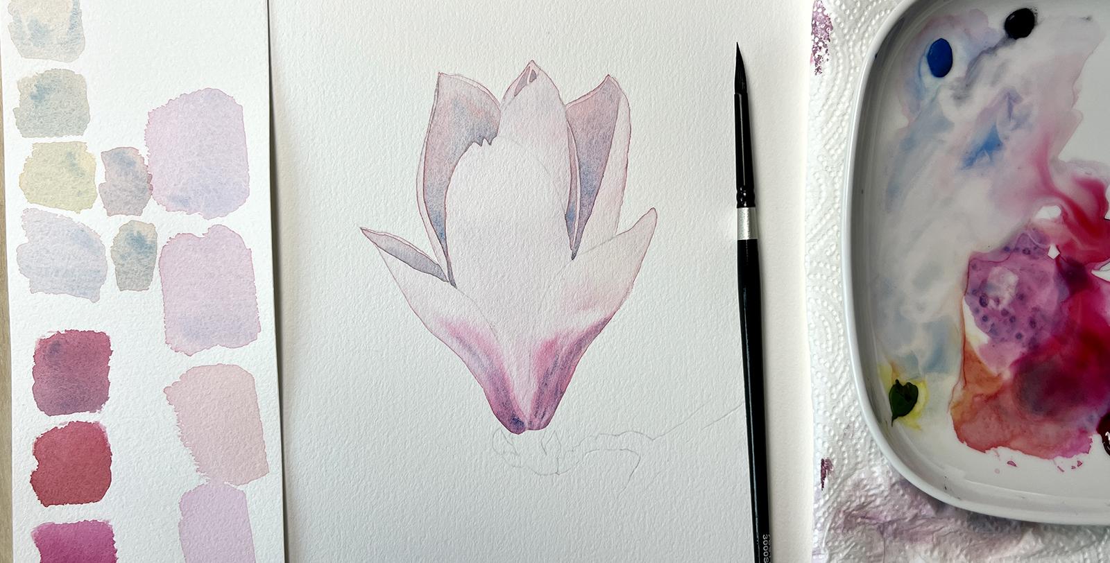
8. First Watercolor Wash: It's time to grab your art supplies
and join me in creating our class project
Watercolor Magnolia Painting. In this lesson,
we're going to paint a first watercolor wash. We'll cover how to set
up for a painting, how to mix and evaluate the
colors of the first wash, where to you use wet in dry
and wet in wet approach. Let's get started. This is how I set up for
painting with watercolor. My watercolor paper is mounted
to the table or board. Palette, paper towels, and jar with clean water
are on my right side slightly higher than where
my hand rests on the table. If you're left-handed,
you might want to keep your tools on
the other side. The purpose of this first
layer of paint is to create harder edges
around the entire flower, which will help us to separate it from the white background. To create a border, we need to use the
wet in dry principle, and so I'm going to make
sure not to accidentally wet anything outside of the
silhouette of the flower. I'm going to mix color now to paint a very first
watercolor wash. I'm adding magenta
and alizarin crimson into quite a pool of clean
water on my palette, and then testing the
paint on a spare piece of watercolor paper to make sure that the mixed color
is what I need. The flower is very
light and delicate, so make sure that
your first wash of paint is transparent and light. I am searching for a
better matching color now. The first mix of reds
didn't look quite right. Adding a bit of green-gold makes the mix a bit more orangey, so that wasn't what
I needed either. Lastly, adding a hint of cerulean blue made
the initial light mix look just right; still pink, but slightly cooler. This is something that you
need to judge visually and make a call whether
the paint matches or not. But with practice, this gets
much easier and intuitive. Let's start painting now. All I'm focused on
right now is to get a clean edge of
the flower silhouette, I no longer worry about the paint that is
prepared on my palette. If you don't premix a sufficient amount
of paint beforehand, it makes you lose time
while painting and creates irregularities in your wash since some parts of
it dry before others. Preparing your paint
and making decisions about its color is a
very beneficial habit. It's a small thing
that makes you paint nicer studies
right from the start. When painting your first wash, make sure you're
leaving a bit of excess water behind
you as you go. A wash that is just about wet
will dry in a few seconds, but a wash that is sufficiently wet will take some time to dry, and this is what we need
to use in our advantage. Now that I've covered
the entire area with transparent paint, I focus on keeping it wet. I'm adding clean water
inside the wet area and also add a hint of
transparent orangey color to a place where those
front petals are since their color base appear warmer to me than the rest
of the flower. I'm also trying to clean up the edges
with the tip of my brush to avoid shaky lines. Your smaller brush will
help you with this. I'm going to use the first wash to already move forward with the pink
texture of the flower. More specific, I
want to paint in the blurred pink veins at the bottom of those
two frontal petals. For this, I'm mixing a more intense combination of magenta and alizarin crimson, and then adding a
hint of green-gold. All the combinations, I swatch beforehand
on a mixing sheet of paper and then visually
compare to my reference. The final combination included a cerulean blue mixed
into those two reds. This shade looked the
most appropriate. My flower silhouette is still wet since I spent a great deal of time
adding water to it. With a smaller brush, I start drawing lines
into the wet wash. If you remember the wet in wet principle from
previous lessons, you know exactly why the
paint spreads outwards. I usually just observe
what the paint does for a few seconds to see how fast it spreads and
which direction, and then use the clean
damp brush to gently leave the pigment that
went in a bad direction. I'm trying to leave the
pigment everywhere where on my reference I see an
almost white area. I'm also erasing lines
between the pink veins with this technique to make
it look a bit more similar to how the texture
appears on the reference. It takes a bit of patience
to push the paint here and there to make it
sit where you need it to, and the goal is not
100 percent precision, rather having it roughly
at the correct place. Also, this stage should not take more than a few
minutes because we run the risk of overworking
the paper when we keep it wet and then
poke on it for too long. Here I'm adding more pigment
to the bottom of the flower. It doesn't show like this
on the reference exactly, but on a white background, I feel the bottom should
stand out a little more, and so me adding color to this area seems like a solution. Now, carefully
evaluating if what I painted into these layer
looks okay and if it does, I let it dry. A layer needs to dry properly, and so do not continue adding
next layer until you make 100 percent sure that there is no more
wetness on your paper. This is what the first layer
looks like when it's dry. Just look at those
nice sharp edges that formed around the
silhouette of the flower. In the next lesson,
we're going to paint the petals in the back.
9. Petals in the Back, PART ONE: In this lesson, we're
going to paint some of the petals in the back
of the flower and so the painting moves up one stage into this. Let's get started. I always start by
preparing the paint first, just like we learned
during painting the first wash. Now
I'm searching for a color that looks close to how those back petals appear
on the reference. At first glance, it
looks gray by the color also reflects hints
of pink and blue. My first instinct was to start
from the violet mix used in a previous layer and add
more cerulean blue into it. You need to water
down your paint a lot to achieve transparency. I also experimented with adding
green gold into the mix, and the result was
a greenish-gray, which wasn't quite right. I kept adding cerulean blue, and magenta until I
achieved the color similar to the one
on the reference. Keeping the wet on dry principle in mind, if I want to paint
a petal that looks sharply defined and
separated from others, I only need to wet
one area at a time. I painted the petal
on the left in the same way than we did
the first wash. Only, now the width area
is much smaller. Make sure to keep the
edges as clean as possible and avoid painting
outside the lines. I'm now trying to add
more pigment into this wash so that the left and the right side appears slightly darker than the middle
of the wet area. That technique is the same, pushing the pigment
back and forth a bit to get it sit at
the proper place. This creates a subtle gradient. Here I'm painting those two very small shadows
at the top of the flower. Then continuing to cover the right side of this
closed flower pupil, and then moving on
to the inner side of the right-back petal as well, using the same approach. None of these areas are
touching, therefore, the paint from one wet area can't bleed into another area. All the areas that
we just painted will get a sharp
edge after they dry. This will actually allow us to recognize them as
a separate petals. This is the last area to paint and we are finished
with this layer. Before we add more
paint anywhere else, we need to dry everything. Congratulations,
you are one step closer to a beautiful
watercolor painting. In the next lesson,
we will paint the rest of the smaller
petals in the back. I'll see you there.
10. Petals in the Back, PART TWO: Let's preview what we're going to paint
in this lesson. It's the rest of the petals
in the back of the flower. Make sure you dry
the entire paper before starting this lesson. I'm going to paint this
larger area first. Is this flower
pupil in the back? The color here is lighter
than the color of the petals in the back that we covered in the previous lesson, so be careful not to
paint these too dark. My mix of paint contains mostly
just a hint of alizarin, crimson, and magenta, with maybe a bit of
cerulean blue to create that slight hint of coldness in the left
corner of this area. This is at least what
I see when I try to compare my painting to
the reference visually. Here is the corner that I view as a slightly
darker than the rest. To darken it up, I'm adding more pigment
into the wet area by gently dabbing
my brush into it. Using the wet-on-wet method that we've
practiced before, I draw the vein that appears on the right
side of this petal. You've seen this
technique before. I already used it
in the first wash, but let's try this again
because only practice will allow you to have more
control over this process. I'm lifting the pigment that went in the
wrong direction with a damp brush and then
adding a hint of clean magenta into the vein to make the colors really pop. It's better to wait
a bit before adding these last touches of
paint until the wash is no longer excessively wet and so that the new paint
doesn't spread too much. Lastly, I'm painting
this petal on the right, or at least its outer side. It is much lighter than the inside of this petal
which we previously painted, so I'm starting with
water down magenta. This is just the tinted water
to keep the petal light. All we want here is
to create a hint of a gradient that appears
rosy at the bottom. I'm also adding just a bit
of cerulean blue because, at the very bottom edge, it appears like the petal
is slightly in shadow. Since I want to keep this edge almost right, I'm lifting the excess pigment around it and I
also tend to drop a bit of clean water to areas
that I want to lighten. We can even keep it
expressive like this and let a water bloom
form here because, in my opinion, it gives the petal a more
organic-looking texture. You know the draw by now. Let's try everything
and in the next lesson, we'll paint the largest and most colorful front petal
of this magnolia. I will meet you there.
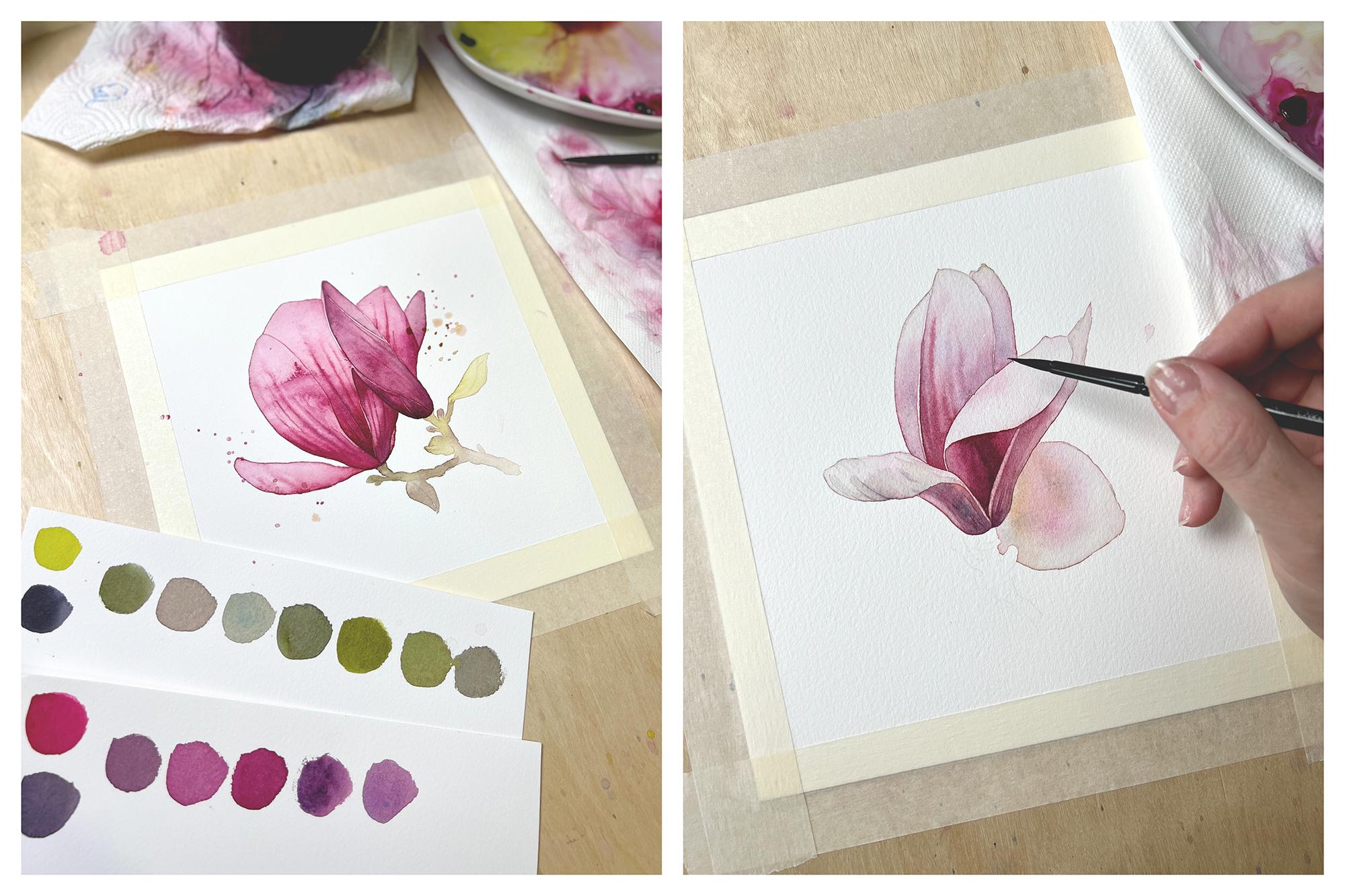
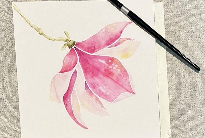
11. Front Petal: We are only going to paint a single petal
in this lesson, and that's the
large petal that's most visible to us
from this angle. This is what we're
working towards, and so let's get to it. It seems that this petal has much more pink veins showing
than the rest of the petals, and the color also gets quite
dark in the bottom area. Let's start with transparent
wash of paint first. I fill the entire area
with almost clean water. I'm starting to
slowly add a mix of magenta and Alizarin
crimson to the wash, trying to create a gradient
from pink to clean water. Here, as I approach the
bottom of this petal, I need to add a darker paint, but also find the correct shade. When in doubt, I always
grab a testing paper, which is just a piece of spare watercolor paper and
try to mix and swatch colors. Here is where our color
mixing class comes in handy. Just remember the
secondary shades that we developed by mixing
magenta with neutral tint. Here they are as a refresher. I've chosen a mix that matched my reference,
the closest, keeping in mind that
the wet watercolor always appears slightly
darker than when dry. I'm being very careful
around the edges. I want to keep them
sharp and clean, not to accidentally wet
anything outside the lines. This is slightly easier
to do when working with darker pigments because the line is more visible right away. As I approach the
top of this petal, I paint with almost clean water. The petal gets very light here. If you accidentally get
pigment in this area, just try to lift it
with the damp brush as soon as possible.
That should help. The hardest part is always
drawing the veins wet in wet, but we already practiced and so this will be
a piece of cake. I prefer my small
brush for this. As usual, after I draw a line, I observe what the human
does and then try to influence the flow of pigment
in a preferred direction. You can even literally erase the line with
the damp brush, if you wish, and that's
thanks to the wet surface. This technique is quite
simple in theory, but it takes me long
minutes to get to a point where I'm satisfied
with how the petal looks. It is just a small area, but I'm trying my best
to place that color as close to where I see it on
the reference as possible. Even though our objective isn't to create a copy of a photo, I want the flower to look
relatively realistic. But at the same time, I don't want to build
any more layers here. So I'm working the paint back and forth while
the surface is still wet until I feel that the petal looks close
to the reference. Here, I want to show
you how the color changes during drying
of the watercolor. When you're ready to stop adding and pushing
the paint around, you can use your
hairdryer and dry the entire pedal. Here it is. Our watercolor Magnolia
emerges nicely. Follow me to the next lesson, where we'll paint in
some finishing touches.
12. Final Deepening and Correcting: In the ideal world, I would be done
painting this magnolia. We went through every
petal already and yet, now that we look at it and
compare it to the reference, some areas are too light, some veins not visible enough. These last stages, what I call a correct everything
that went wrong, and is part of every
painting process. In this lesson, we are going to try to go from this to this. Let's keep the reference
close so that we can visually compare our painting and find the most eye-catching
things to fix. First are the veins at
the bottom of the flower, which gives us some more
intensity of color and texture. I'm going to wet this
area and then try to draw more veins in it
using a rich pigment. Here I'm trying to
create a soft shadow, adding a bit of pigment into the wet area and pushing
the paint around. It's a small
adjustment but makes the petal look a bit rounder. Probably the greatest
adjustment will be the darkening of the
petals in the back. When I first painted them, I didn't use dark-enough
color to make these corners appear as
deep as on the reference, and now the painting lacks
contrast a little bit. Adding third layer to
these areas should help. As a shading color mix of neutral pink and cerulean
blue comes in handy, but I also mixed in
the reds to create a deeper violet mix
for the darkest parts. My strategy was to place the darkest color first
and then continue adding more transparent paint to fill in the entire area with. If I wasn't working this part of the process on autopilot, I would have wet the
entire area with clean water and then edit
the pigment into it. This prevents unwanted
patchiness of color, but it's also slightly
slower and sometimes when I'm in the zone and
space out during painting, this is how I cut corners. I'm trying to get the color
right this time I don't think adding a fourth layer
would benefit the painting. And so my objective is to achieve appropriately
dark paint in the corners of this wall to go against a lighter front petal. Last, adjustment of the same character
gets done over here. I'm making sure that
the upper part of this area remains light enough. Finally, I'm done
with the flower. In the next lesson, I'll
show you how to paint the branch and we
are almost done. I'll see you there.
13. Branch: In this lesson, we'll
paint a branch for the Magnolia flower using
just one layer of paint. The simple approach is rather
decorative than realistic. In my opinion, it
pairs so well with higher detail that we achieved
for the flower itself. I personally do not want the branch to compete
with the flower, just to act as a support. With this in mind, I
also do not want to use a color that would be
too saturated either. I'm searching for
a muted version of an earthy green by mixing
green gold and neutral tint. All I'm going to do now is to paint in the
silhouette of the branch. I also leave out some dry parts of the
paper here and there that will act as highlights and add some texture to
the branch visually. Let's add a darker
green mix of paint to this wet wash here at
the top of the branch. Here is where the flower
would cast a shadow on it, and so it seems
like a good idea. I am [inaudible] the paint
on my brush as I go, painting each segment
of the branch with slightly different
shade of green. Here the paint is more
transparent and almost yellow and this gradient
looks quite nice. Lastly, a few drops
of clean water go into the wet wash
here and there. This pushes the pigment
towards the edges and forms a nice
silhouette of the branch. Last, addition of a dark paint underneath the flower
and we are done. Let's dry these
and then follow me to the next lesson
where I'll show you how to add some
lovely watercolors splatters to decorate
the painting.
14. Splatters and Finish: We are now at the end of
the painting process. In this lesson, within
just a few minutes, we'll add tiny watercolor
splatters to our painting. This stage is optional, if you feel happy about a clean result that
we achieved so far, feel free to skip this step. I personally enjoy
using a lot of these more expressive elements in my watercolor paintings, so I'll go ahead and
show you how I do it. Make sure that you dried everything before
creating splatters, and then mix any
transparent color that we've used so far. I prefer shades of purple, I have them on my
palette anyway, just water them down so that
they appear transparent. Load your larger
brush with the paint, and then tap the brush so that the drops of paint
fall to the paper. It's great to have
a dry paper towel in your hand while doing this, because if a drop lands
where you don't want it, you can just remove it within seconds with the paper towel. What I do is to use
this approach to create larger and
then smaller drops, and some are more
transparent than others. In other words, quite
diversity of drops, best way to dry
this is to leave it on the radiator or
somewhere warm, but maybe skip the hairdryer
for this one as it can blow the drops into a messy shape if one
is not too careful. When everything is dry, you can slowly remove the masking tape from
the watercolor paper. Congratulations, you painted a watercolor
magnolia flower, and I'm so proud of you.
15. Final Thoughts: I really appreciate all of
your hard work and effort. I know that watercolor can be
tricky at times and require some patience and some practice to get through the
initial rough patch. From my experience, if a complete beginner creates about 10 watercolor
studies or paintings, they already feel confident and know what they are doing
most of the time and so this learning curve is
something that I'd like you to consider when you are
tackling this new medium. It doesn't even matter if those first paintings turn out exactly as you imagine them. Just try to stick to
your practice until the 10th piece and you'll
see how much that helps. Luckily, watercolor doesn't
take too long and so those 10 studies are only just a couple of
hours worth of work. I'm here to help you with
this endeavor as well and so I created two
more bonus lessons, where we'll together create two more watercolor,
magnolia paintings. With all the exercises that we took throughout
this entire class, you are halfway
to feeling really confident with
watercolor hopefully. I'm also very excited to
see your class project, so please take a picture or a
scan and then upload it did down below to the project
section so that I can see, comment on it and give
you a thumbs up as well. If you are sharing your
work to social media, you can tag me on Instagram so that I can
repost your work in my stories and don't forget to follow me here on
Skillshare as well. That way you'll get
notified once I publish a new watercolor class and
I hope to see you there.
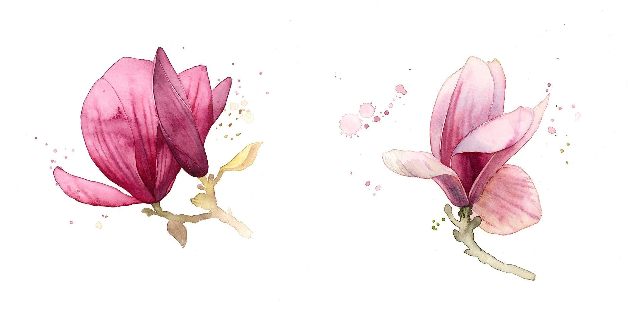
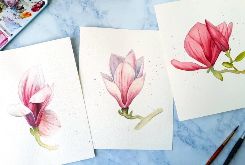
16. BONUS I - Magnolia Study in red: Welcome to a bonus lesson. In this lesson, I
will show you how I painted another magnolia
watercolor study. This one is slightly darker
in color and might even be a little easier than our first study.
Let's get started. First step is to
create a sketch. I always sketch in
the same fashion as explained in the main lesson, but let's recap this. First, I use very light
lines to roughly indicate the basic shape of the flower
and place it on my page. In this step, I make
decisions about how big I want the flower and where
I want to position it. Afterwards, I only refine the
shape using thicker lines. You are welcome to
download my sketch from the resources section
of this class and use it to start painting
right away if you wish. There you can also download
a reference picture as well. Transferring the
finished sketch to a watercolor paper
is quite easy. I use my graphite
stick to create a layer of graphite on the
outer side of my sketch. Then I position my sketch on
top of the watercolor paper, secure it with masking tape, and simply trace over. Now we are ready to paint, but do not forget to mount your watercolor paper to a
board or your table as always. I'm now going to apply
the first wash of paint. If you remember from
the main class, first wash is always on the more transparent
side of things, which means you are diluting your pigment with lots of water. Because this magnolia is darker and there
are no highlights, essentially the entire flower is in mid-tones and darker tones. We are going to use a bit more pigment in the
first wash than usual, I am using a mix of alizarin
crimson with magenta. I'm covering the
entire silhouette of the flower with this
first mix of paint. We will later separate the
main flower from that pupil, but for now let's
treat them as one. After I painted the first wash, I added more pigment inside the wet area and quite a
pool of clean water too. Dispose then align on my
table until it dried, and the excess water formed these two lovely large blooms
that are quite expressive. You don't have to do this if you wish for a smoother result. I personally love
these blooms and let them in my
works quite often. But if you're not a fan, then you can just remove the excess water from the
underpainting and let it dry. That way, the blooms won't form. If you remember from
the main lesson, we also need the
underpainting to form darker hard edges
around the silhouette, and that's what the extra
water helps with as well. Let's now give more depth and structure to some of the petals. I started with the largest
one in the middle and painted the entire area with transparent mix of magenta
and alizarin crimson. Into this wet wash, I added quite intense pigment, but only at the bottom
since that's where I see the color getting dark and
saturated on the reference. While the wash is still wet, it's a very good time
to draw those veins in. Let them slightly bleed, but you can also
use your brush to lift the paint if it runs
in a wrong direction, or redraw the vein until you get the look
that you are looking for. I know wet-in-wet takes
a bit more patience. Sometimes the color behaves in a way that's not to your favor, but be patient with it. Just observe what it does and you'll eventually
get the hang of it. Now, moving on to the petal on the right and using
the same technique, just making sure that
this particular coverage will be more transparent than the one before because that's what I see
on the reference. I'm also drawing some veins
inside the whitewash. I'm now forced to continue with the
petal on the left because there is
no other area on my painting that needs
deepening and does not touch other already
wet areas right now. If you're not careful and start painting the
remaining petals now before these wet
areas are thoroughly dry, the paint will
bleed and you won't achieve the separation
of the petals. We need every petal to dry on its own and the painting side forming that hard edge that
we talked about previously, which will give every
petal its own shape. Be patient or grab a
hairdryer and make sure that everything is dry before moving on to any other area. Now, I dried everything and can continue to paint the
rest of the petals. The larger petal on the left
of the main flower will take a few minutes to
get the gradient dried and then the
veins as well. I'm always trying to not rush myself and keep in mind that if I can manage an area to remain wet for as
long as possible, then I can keep on repairing
and correcting what's happening inside it
until I'm satisfied. If your washes dry too fast, you must add more water
to them right from the start and keep loading your brush with watery
pigment when painting. This is something that
you will get used to as you paint more and
more of these studies. I'm now going to finish painting
the remaining part of the petal that's hidden
below the pupil. Same technique, but I had
to also leave some of the pigment to lighten an area since it was
getting too dark. This few areas on this particular
part of the petal are the darkest or one of
the darkest areas, and so I mixed a bit of
neutral tint into the mix of magenta and alizarin crimson to just slightly
increase the darkness. We'll now be able to
move on to the pupil. The pupil also consists of about four areas that need
to be painted separately. I'm always keeping in mind
gradients if I see an area on my reference that's
slightly darker on one side and lighter
on the other. No matter if it's tiny, I try to create a gradient in
my painting with my brush. A good example is
the triangular shape in the bottom of the pupil. Here I'm slightly adjusting the intensity and
the darkness of this tiny area in the pupil by adding an
extra wash of paint. I'm also adding extra clean
water into the wet wash, and that will form
more of the blooms that I really wanted
to have in this area. Slight adjustment also was required in the very first
petal that we painted, and so I added an
extra wash here as well with a bit of
darker mix of color. Just a few more touch-ups and adjustments on the pupil and we are done with the flower. Now the almost final part is drawing or painting the
silhouette of the branch. You remember the color
mixing from the main class, that stays the same. But also the painting
technique is very simple, so let's recap this. I am not painting any details
to the branch itself, I'm simply creating a gradient that's transitioning from
darker green to lighter green. I always make sure that this wash is very
watery because I also want the silhouette of the branch to form hard edges. My branches, when it
comes to flower studies, are always more decorative
than exhaustingly detailed, and that's how I
like to do them. I think the main focus should remain on the flower itself. Very last finger splatters, which I think that will complement this
composition greatly. Make sure that you are loading your brush with lots
of paint that's very diluted with water and more on the transparent
side of things. Here is your second
magnolia flower study. I am so proud of you. Make sure you include it in your class project pictures
so that I can see it. If you want to dig
even deeper and create one more
flower study with me, then join me in the
second bonus video.
17. BONUS II - Advanced Magnolia Study : Welcome to a second bonus
lesson in which I will show you another example of how I paint flowers studies
with watercolor. The more you paint and exercise your newly acquired skills, the more fearless
and confident you get with the new
technique and soon you'll be able to translate photos into paintings
by yourself. This last study, is slightly
more advanced because of its lightness and
more curved petals, but all the more beautiful
one is finished. Let me show you
how I created it. First step is always a sketch. Remember light lines
and rough shapes first. Careful about the flower size and where it's
placed on your page. After you've got that down, refine the shape and add
the necessary details. You are already a pro at transferring your
sketches I'm sure, just grab your pencil or a graphite stick and covered the back of
the paper with it. Place the sketch on top of your watercolor paper
and trace over it. After you mount the
watercolor paper, clear your table or board, you are ready to begin painting. We are going to create
an underpainting first. This will give us that hard edge around
the entire flower, and now we really needed
because the magnolia is very light at some
areas, almost white. My color base is a light mix of magenta and alizarin crimson. But here I am also adding cerulean blue to it and
a bit of green gold. This initial wash isn't
in just one color. Some areas appear
more orangey and even the bottom of the flower isn't pure red when
you look at it. I am experimenting with these four colors and
trying to add them into the underpainting where I see them on the
reference roughly. Important to note is that you have to lift the pigment and add cleaner water to areas
that are almost white. Those are the petals at the
top and the side petals also. My underpainting looks like this when I'm done with
it and now I let it dry. I'm now trying to get these gray veins in. I watered the area
beforehand and then tried to push the paint back and
forth as you usual. The gray is a mix of neutral
tint with a bit of green, gold, and magenta watered down. This needs to be dried
after you are done. Next, I decided to paint these darker area
of the pedal to get the sharp line that separates one side of the folded
petal from the other, you need to paint it wet-on-dry. You can again play
with color inside this whitewash to get a gradient similar
to the reference. Color, doesn't need
to be exactly right, and mine isn't either. But I try to pay attention
to where the color gets darker and try to add more
pigment to that area. This was a real chase of color, but as long as the
area is still wet, you can add and
remove as you wish. Moving on to the
petal above because it doesn't touch
the wet area below. I'm creating a gradient
because this area has pink at the bottom
and white on top. I'm adding cerulean blue also to indicate that it's
slightly in the shadow, and I really like how
my granule thinks cerulean blue adds
texture to this petal. Here I was correcting
a mistake as I disrupted and edge
of overlain pedal. All you need to do in these case is is to lift the pigment with paper towel and then draw a
new border of the wet area. It works about 95
percent of the time. I'm now going to try and paint all the pedals that
don't touch one another so that they
can try to get together and get those lovely
sharp borders. I always wet the petal with either clean water or
a transparent pigment and then try to
influence gradient inside the wet area
similar to my reference. Clean water plays an
important role in here. Edit everywhere that
needs lightening or lift the pigment
from the wet wash. If I feel that the pink veins bled into one another too much, I add clean water between
them with the tip of my brush and lift
the pigment here. This works very well
to create veins that look similar
to the reference. This particular area is probably the most complicated
part of this study. Problem with this triangular
shape is that you have to try and paint as
clean edges as possible. Because these edges
influence the shape of all the nearby
petals and folds. Also, there is a
very dark gradient here that I'm trying to
get right and the paint is harder to
influence wet and red when it's inside a
small area like this. Luckily, I have enough time and patience and I play
with this area and the color in it until it feels like all the colors
at the right place. Here you see me lifting some of the pigment to lighten the
right side of this area. Also, I had a hard time to
keep the edges clean here and I accidentally dampened the nearby petal on the right. So I made a decision to
treat this area is one for now and extended the
gradient to that petal. I also tried and lift the paint here to get that white border, but it wasn't working well enough while the
paint was still wet. In the end and after
some struggles, I decided to dry everything
with the hairdryer and the paint was so easy to lift with a damp
brush afterwards. I also used a stiffer
synthetic brush for this. In-between the
lifting of the edge, I added one more
layer of paint to the triangular area to increase the saturation since the drying caused some fading of the color. Finally, after one more
drying of this area, I am lifting the white
border on the right petal. This helped me to clean up the center of the
flower really nicely. This technique works miracles. Just emphasizing that I'm
not using any pigment to paint and the entire
paper is completely dry, it's only a wet or damp brush
with clean water on it, not a pool of water. Gently draw a line with a damp brush maybe several
times back and forth. Then use paper towel to get rid of the pigment that
got lifted by this. Here are some final touches
in the bottom of the area. I'm not drawing the veins
inside the wet wash, but rather wet and dry and
then try to smudge them. This area is so tiny that wet-on-wet did not really
work for me I tried, but the wet-on-dry, if you then try to
slightly smudge the line with the damp
brush, that should work. There is just a couple of remaining areas that also need final touches and those are mostly the very light areas and so we need to
cover them up with water beforehand and then draw those tiny veins into the wet area like we
see on the reference. Both of these petals
took a few tries to get at least close to what
I saw on the reference, especially the bottom one
was a bit more complex. I think the challenge
was also the size of it. Working wet-on-wet
on a larger paper gets a bit easier in my opinion. Drawing the silhouette of
the branch with watercolor is almost the last step
that we're going to take. This is a very easy addition as the branch is very simplified. I only add more pigment into the wet area
that's closest to the flower and more water into
it as I paint it outwards, as if it was fading away. Now just a few splatters to give the painting more
expressive watercolor feel. Here it is one more
magnolia flower study. You are such a
trooper for getting it this far in my class
and I'm so grateful, for being able to be
your guide today. Lastly I just want to
encourage you to paint as many studies of different
motifs as possible. Keep it simple and don't
let photographs limit you. There is no need to be a
100 percent precise in your portrayal of natural
things like this. There is always room for
experiments and self-discovery. But also don't be
afraid to throw away something that isn't
working and start over. Always have fun and
put your best works on a wall or a shelf to
keep yourself motivated. I can't wait to see
what you create.
 Jane-Beata Watercolor, Watercolor artist & teacher