Transcripts
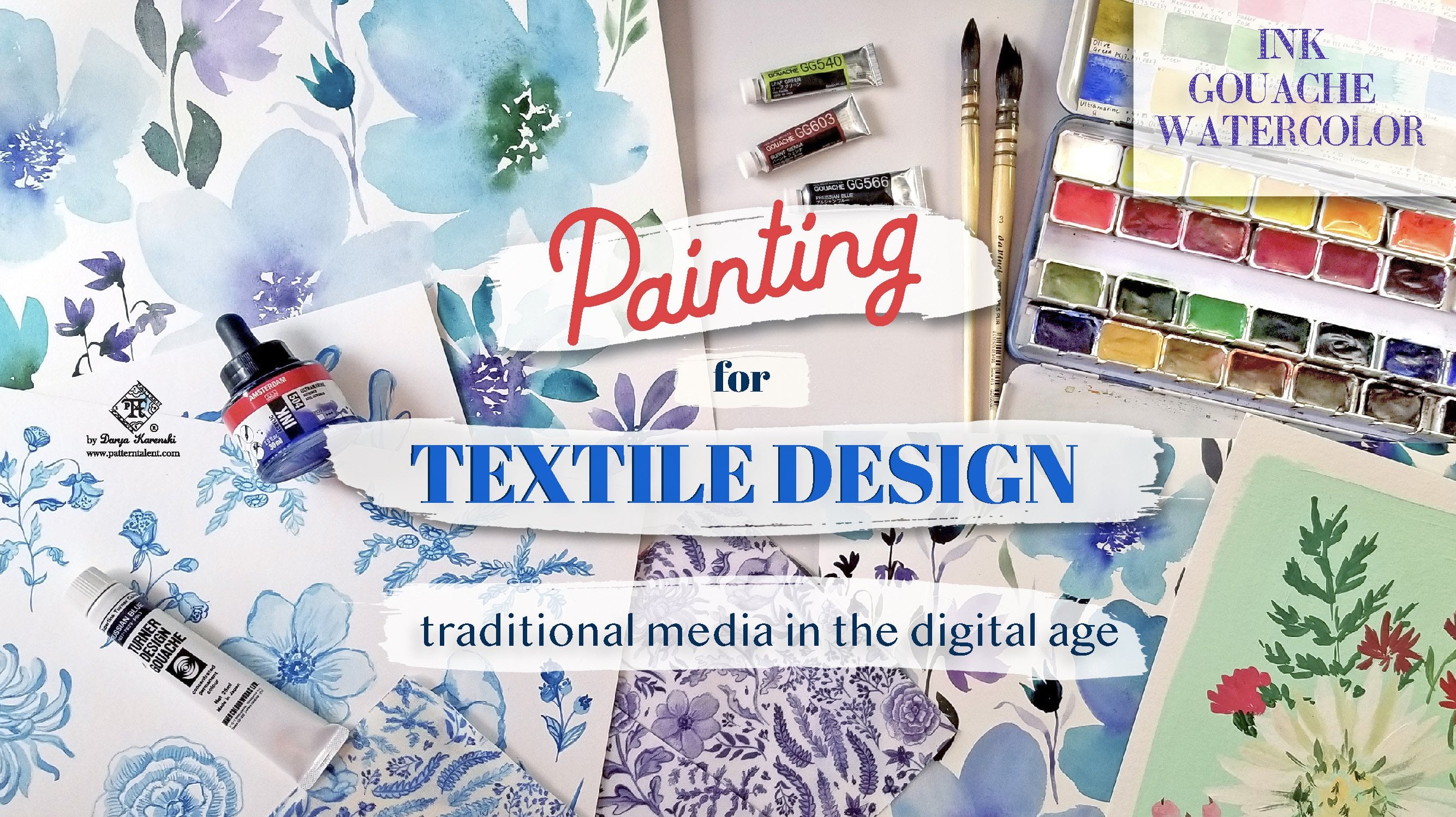
1. Class introduction: I can't do Hi. My name is Daria Krinsky. I'm a United States based professional textile and
surface pattern designer. I turn illustrations like this into fabric and
wallpaper designs like this. I live in the Boston area, Massachusetts where
I graduated from college in textile
design and Fiber arts. And I have over eight years
of combined experience as a full time in house product development designer
for apparel, home decor and stationery, freelance surface
pattern designer and watercolor painter
and illustrator. I have a Youtube channel where I share my passion for textiles, patterns, color and knowledge I've collected over the years. Tips and tricks,
professional insights, laughs, rent, and so much more. In this course, you
will learn about the exciting industry of textile and surface
pattern design. A fun and vibrant subdivision
of graphic design. How repeating
patterns are created, where they can be applied, and how to choose the
right fit for you. Among the many
opportunities we will discuss supplies needed to become a surface
pattern designer. The adjacent industries such
as commercial illustration, textile design
production timeline, where do we start designing
prints and where they can end up software and hardware used to create
repeating patterns. How to choose the
perfect market for you and whether you
need to niche down. We will also discuss
important copyright points and how to protect your
artwork from unauthorized use. Why is this course special? I personally don't like it when I'm given only one option, one path to follow, one software to learn, one technique to use. If you're like me, I
would like to lay out all the possible options
in front of you so you can make a conscious
choice what works best for you and what brings
you the most joy. This class is based on my real life experience in
a bustling design world, on a variety of markets and different sides of the spectrum
of the design process. Important note, this is an
introductory overview and it will not teach you
the technical aspects of how to create repeats. I will be recording
separate classes to dive deeper
into those topics. But don't you worry, this class is packed with valuable industry
knowledge and insights that are absolutely crucial to getting started in
surface pattern design. Sounds exciting. I'll
see you in class.
2. Class project - craft your unique journey: Welcome to the class. I'm so excited that you're joining us. Here is your class project. As a result of this course, you will select a market, or markets you will design
for a style to work in and materials to use at the beginning stages of your
surface design journey. Your interactive sheets are attached in the class
project section. Feel free to look through
the sheets beforehand, but I think you will
most benefit from the activity pack after
watching the class. And please don't
stress out too much, remember to have fun with it. The material also includes a lot of product and
market categories where patterns can be
applied so you can make the best selections
for yourself as a designer. Are you excited?
Let's get started.
3. What is textile design and surface pattern design: What is textile design? In short, it's any design
activity related to fabric. But when we talk textile
design nowadays, we usually think of
repeating pattern design, digital pattern design, or
surface pattern design. All those pre repeating
pictures on fabric and your phone case,
bedding, wallpaper. And this is what this class
will mostly focus on. But textile design is more
than repeating patterns. In the course of this class, I will mention
more fields within textile design that
might appeal to you. It can be things such as
weaving, block printing, screen printing, dying of the yarn and fibers,
kneading and more. Our textile design and surface
pattern design the same. While I wouldn't
fully equate them, because the field
of textile design encapsulates more things
that I've just mentioned. Fiber arts and weaving. Very often we do use the
two terms interchangeably. You can hear terms
like textile design, digital textile design,
fabric and wallpaper design. All these are united by the idea of creating
a single repeat, which we will discuss in the
next lesson very shortly. Now you may have
heard people saying surface pattern design or surface design.
Are they the same? In most cases, they are
used interchangeably again, but if we are being
really picky and proper, the term surface
pattern design first of all goes beyond the
realm of textiles. That is fabrics, right? And also describes solely the
use of repeating patterns, whereas surface design does
not always imply repetition. Compare these two examples. On this product, the
pattern is stepped out and the repeat is
used multiple times. Whereas on this product, the design is merely placed
and cropped on a product. It is not necessarily
a repeating pattern, although it may look so. When does a pattern
have to be in repeat? On larger products like
wallpaper, fabric, and table linens, you absolutely have to use a correct
repeating tile. You can step it out multiple
times on big surfaces, but on smaller products, such as a phone case, a kitchen towel, a plate, or a napkin, it might be enough to use an illusion of
a repeating pattern. If you look at this
not my design, this most likely is not
a repeating pattern. It's just a placed rectangle
with a pretty design. Although having a proper
repeating pattern tile is always helpful for
the manufacturer and makes things so much easier.
4. What is a repeating pattern: What is a repeating pattern? What a textile or
surface pattern designer makes is called a repeat. A repeating unit is the special skills required to make this unit is
what makes the job. A repeat is made out of separate motifs or elements
arranged in a nice layout. These are my motifs that I use to create this
repeating pattern. A repeat is usually a square or rectangle
that is designed so that all elements on all
edges connect seamlessly. I will show you some examples. When you learn surface
pattern design, you will acquire the
necessary skills to arrange your repeat tile using computer software such
as Adobe Photoshop, Illustrator or ipad
software code procreate. When you have a
stepped out repeat and know the repeat dimensions, it does not matter where you place your repeat
bounds or frame. Everything will
line up perfectly. While the magic is
purely mathematic, don't worry, you don't have
to be super gifted at math. The math used in textile
design is very basic. I'm personally not good at math, and I have successfully
created many, many repeating patterns
and so can you. When you learn how to
create repeat units, you can then upload
them to print on demand companies such as
Punflower or Society Six. Or send it to a
manufacturer who will use printing machinery to step
out your designs on fabric, wallpaper, or any other surface. I will talk about how
to make money being a textile designer in one
of the following lessons. Let's talk about the difference between print and pattern. Again, in many cases, what we are creating
is called prints. Especially fashion designers
like to use this term, but it's not 100% correct. The term pattern
reflects the idea more generally because there are a number of ways
repeats can be made. Printing is only one of them. I will show you some examples
where we have patterns, but they are not prints. They're not printed,
they are woven, They are knitted and so on. But nobody will go after you if you call a woven fabric a print.
5. Pattern layouts: Patterns can be arranged
in several layouts. Let's discuss the
most common ones. The first one. The
most common one is the straight repeat is
the most basic layout where the tile
repeats directly in a horizontal line to the left or right of
the original tile. The second most common option
is a half drop repeat. This layout occurs when the tile is repeated
halfway down, vertically from the
original repeat unit. When the same process
happens horizontally, we get a brick repeat. This is way less common
than the first two, but there are other more
exotic repeat options, such as hexagon or
mirrored repeat that you can see in some of the software for textile design. For example, in Adobe
Illustrator pattern making tool, we can see the hexagon repeat. But I suggest that
you stay away from these if you are working with
a commercial manufacturer, which you most likely will be in all my
professional experience, the straight and the
half drop repeat have always been the
two preferred options. The reason is because
they translate well to the manufacturing
process of screen printing, where a roller is used to
print the fabric or wallpaper. It's a good idea for
a surface designer to learn to create both straight
and half drop repeats. Straight repeat is definitely the most beginner friendly
option, in my opinion. When you already feel comfortable
doing straight repeats, you can study tutorials
for half drop. Half drop repeats are very popular in home
decor because they present a nice flow and rhythm and also the repeat
tile can be smaller. I personally prefer working with straight repeats because
they are easy to work with, to step out with
automation tools in Photoshop and Illustrator, particularly in Photoshop,
and harder to screw up. What I mean by that is
when you, for example, upload a half drop to a website like spoonflower
or red bubble, you have to remember to check the box that it's a
half drop repeat, otherwise it will print wrong. I'll show you an example
of how this can happen. So here is a design of mine
which is a half drop repeat. And this is a swatch
of wallpaper. And if you look closer, you will see there
is an error here. See, it doesn't line up. This happened exactly
because I forgot to check that it's a
half drop repeat. I did it on fabric, but you also have to do it
separately on wallpaper. Spoon fall printed it
as a straight repeat, stepping it out side by
side, just like this. Also, when you as a customer purchase
half drop wallpaper, you have to remember to
paste it in a special way, aligning and half
dropping the print. I'm not saying half
drops are bad, They are definitely a
great and necessary skill for a surface parent
designer to have. You just have to remember that little extra
step every time. Besides the way a parent
tile is situated, there are also a few layouts
that we need to discuss. We have all over prints, where the pattern
covers the entire area. We have half drop prints, where a motif is just dropped half the way vertically
or horizontally. A pattern can simultaneously be an all over print
and a straight repeat. We also have one directional,
two directional, and four directional prints, where the fabric can only
be used in one direction. Or two directions can
turn it upside down. Or four directions where
it doesn't matter. It depends on how the pattern designer
place their motifs. These prints are also called directional and nondirectional, Where the four directional
would be non directional. Which means they can be
rotated any which way. The choice depends
on the product you have in mind when
you are designing. I personally normally don't worry about the
direction at all, and my prints are
normally one directional. You can't turn them upside
down or rotate them, but I have heard feedback
from some makers that they prefer to have four directional prints
for certain products. For example, quilts where you also need to have very
small scale, right? For quilted blankets, some
fabric tots or tablecloth. Imagine if a tablecloth
is spread on the table and the motifs are
tossed all the way around. It doesn't matter where you sit, the print makes sense
from any angle. There has recently been a four directional
wallpaper challenge on spoonflower following the popularity rise of
wallpapered ceilings. And I designed this
poppy print for it. It works in any
which way direction. Wherever you rotated, it
still looks the same. While it may seem like four
way prints are the best, I wouldn't necessarily jump
into turning everything nondirectional because
some prints make way more sense when
they are directional. And like I said, it has never been a problem for
me as a designer. It's just something
to keep in mind. Now let's talk a
little bit about panels and engineered designs. In some products,
such as wallpaper, quilts, pillows, the
design is made as a panel. For example, beautiful interior scenes with trees
and birds on them. Where the panel repeats only
horizontally and vertically, the design goes all the
way up to the ceiling. As for engineer designs
or placement graphics, it can be centered
or placed design. That is not a repeating unit. I will include some examples here so you know what I mean.
6. Pattern categories. From polka dot to toile de jouy: This is a really exciting topic. There are many common pattern
categories or topics. I will mention the
most common ones. Knowing the categories helps you pick your niche
as a designer and can also be helpful if you are working at an interior
fabric library. For example, we have florals, the ubiquitous florals, which is a seemingly easy category, but it's not as
easy as it seems. Florals can be done for multiple uses,
right? And apparel. Florals are very different
from quilting florals, for example, or baby florals, or pet florals here we can also include
botanicals and tropicals. You know, these
pattern categories merge together and
flow into one another. And sometimes it's
really hard to put a pattern into one category, just be aware of it. We have botanicals,
which would probably be like vintage botanical style, like some of these paintings. Behind me we have tropicals, which is especially
for swimwear. And hot zone prints, we have novelty or
conversational prints. These are prints
that tell stories. These are animals, these are objects and things
realistically. Holiday designs also belong, usually belong in this category, but holiday designs are
usually put separate. Christmas, Halloween,
Easter, Father's Day, Mother's Day, and so on. You can have a print that is a novelty print
with Santa Claus, but that's also a
Christmas holiday pattern. We have stripes, which
is a giant category, and stripes are super
versatile as well. You can have cabana stripes, you can have ticking
stripes, super thin stripes. We have geometric designs
including dots or polka dots. Multiple uses,
multiple categories. Paisley has quite a history. The original Persian
droplet like motif is called bot or buta. It's a representation of a stylized flower
or a cypress tree, a zorestrian symbol
of life and eternity. The name paisley
itself comes from a town in Scotland
where the pattern was imitated after the
imported silk shawls with a motif took
Europe by storm. We have lattices and trailes. You can explore the difference. I will mention some good
books in the project section. Damask, which is a specific
kind of pattern as well with elaborate scrolling
botanical motifs arranged in a diamond or
lozenge shaped medallion grid. But originally,
damask is a type of woven jacquard fabric which uses really complex
weaving techniques. Medallions are often
mixed with damasks. They can be more of
a truly round shape. We have Ogis which are less
celebrated, less known. Ogi is a pattern with two continuous S shaped curves,
narrowing and widening. We all have seen them, but not many people know the actual word
for the ogi shape. It is a less known
term and they are often combined with medallions. There are ditz designs, particularly dis florals called
also Milli Flores, right? Which is like thousands or
millions of little flowers. We have to or ti de, ti de ju. Patterns feature
bucolic scenes with pastoral landscapes
and village dwellers with strong French
country vibes. These days, in addition
to the classical Twas, artists borrow the monochrome
linework technique to interpret a variety
of modern topics. For example, I made a pattern with swimming pigs
in this technique after visiting the Bahamas and seeing wild pigs
swimming in the ocean. Jacobians, Ar Giles, many of these are
historic patterns that came to us throughout
the world history of craft, not just via printing, but through beautiful weaving
and dying techniques such as a She boy, popularly known as tie, houndstooth, damask
and Arabesque. I put everything together, the weaving patterns, and
the printing patterns. There are a lot of
gorgeous books in textiles where you can see
the examples of prints. You can get inspired, you can borrow them from your local library or purchase if you need
some inspiration. I often buy used books on ebay, Thrift Books.com so I can save a little money
on those purchases. In the project section, I have included some of my
favorite books on prints. Here is one of my
favorite books that I use for educational and
inspiration purposes. I will link it in the
class project as well. And here you can see all sorts of patterns
organized by categories, different kinds of designs. Lots and lots of categories. Checkerboards are back in style. Again, books are sort
of out of style. Now people are like,
we have internet, we don't need books, but
I love books still. Yeah.
7. Where can patterns be used - markets, seasons, products.: Lesson seven. Where
can patterns be used? This is another super
fun lesson, all right? Say you've learned
how to put together a repeating tile that flows
seamlessly when stepped out. But what is next? Where can
you apply this useful skill? Let's put the surface in
surface pattern design and discuss where repeating
patterns can be used. Your patterns can be applied
to fabric for sewing, including quilting fabric, clothes and accessories
such as handbags, scarves and socks, or home decor items such
as bedding sheets, blankets, curtains, table linens, rugs,
upholstery fabric, and so much more, repeat
patterns can be used on paper, wrapping paper for presents. Table napkins have some
here, wallpaper, stationery. Look at this beautiful folder. Cardboard storage boxes,
different sorts of packaging. Phone cases are a
popular category. All sorts of drink were from tea to coffee mugs to water bottles, cooler bags,
computer, mouse mats. Here I have one with
William Morris, unfinished design
kitchen place mats, you name it, pet beds, collars, bows,
bandanas, clothes. And many different
products for dogs, cats and other pets are often covered with
pretty patterns. You can see patterns
on rain, rubber boots, book covers, bus seats, hotel rugs, and the most
unexpected products. I always think about
pattern design. When I go to the doctors
and wait for them, I look at this
boring curtain with the most basic pattern that
gives you some privacy. It is still a repeating
pattern. Right? Your project pack contains a super extensive list of
possible pattern products.
8. Surface design job opportunities: Where can you work as a textile and surface
pattern designer? Perhaps you are wondering what your career options are as
a surface pattern designer. I have good news for you, you have many, many options. Look around all sorts of fabrics and pattern
surfaces surround us. We wake up in the morning
in a bed with cute sheets, wearing coffee,
pajamas with prints. We can probably see curtains or window
blinds with patterns. And we haven't even
left the bedroom yet. So just like there are
many uses of patterns, there are numerous
ways to make money. As a surface pattern designer, I am not saying it's
going to be super easy to find a job
in the field still, it's not the most common
profession in the world. But these days
with the Internet, there are more
options than ever. Let's look at the most
popular career paths as a surface pattern designer. If you want a serious
full time career option, you can work in retail product
development next time. When you go shopping, pay attention to the stores and brands that sell
products with patterns, be it clothing, dinner wear, table clothes, or whatnot. These companies
most likely have in house designers who
work on the art. Product development
is a long cycle and creating patterns is only
one step of the process. As a self employed
pattern designer, you can either freelance working for the above
mentioned companies. Or sell and license your
patterns on your own, be it via print on demand companies such
as Spoonflower Society, Six, Zazzle, Red
Bubble, and so on. Or sell your own products
with your patterns. Then you have to find a vendor
to produce your product. Or perhaps buy
fabric printed with your designs and sew
something like pillow covers, kitchen towels, and
then sell them either through your own store or
to the other retailers. You can also work for
print studios companies working on producing repeating
patterns for the apparel, home decor, and
stationary industries. Or go to print shows,
professional affairs, where manufacturers, artists and licensing agents meet
several times a year. Pattern Bank is another popular online print studio
microstock website. I will make a separate
class on making a living with repeat pattern design,
but in the meantime, I have a great Youtube
video on this topic, which is absolutely free to watch and packed with knowledge.
9. Two ways to approach surface design. Inspiration first or market first?: Lesson 92, Ways to Approach
Surface Pattern Design. Here is how the
technical process works. An artist creates motifs, separate elements
of a future pattern in a preferred medium. The artwork is then scanned, cleaned up in Adobe Photoshop, and put in repeat via Adobe
Photoshop or Illustrator. You have your repeating pattern. In a nutshell,
that's the process, it works for any way of creating motifs, digital or traditional. I like to see the
process this way. As an artist, when I'm painting, I'm not thinking of where
this pattern will be used. I'm enjoying the process. That's the first
out of two ways to approach creating
surface patterns. First, you make your motifs, then you put them in
repeat using the software, then you find usage
for your pattern. The second way to approach
pattern making is from the back end To
first study the market, the trends, learn the specific
tools for specific use. For example, you want to create patterns for baby products. And you have found
lots of designs in very soft colors and with
super simple motifs. If you know what market you want to apply your
knowledge for, it can be very useful. I know it's not easy to make all these selections
on the get go, but you are not required to make your choice
once and forever. It's just something
to think about. I will also include some
medium to market sequences, so this can help
you make choices as a designer for the pattern design direction
you want to go in. It will be included
in lesson 19.
10. Motifs for the future repeat. Traditional and digital art.: Lesson ten, Creating
Motives for the Future. Repeat. You can sometimes hear this opinion that you don't need to know how to draw. To be a textile designer, Yes and no, you need to create some kind
of imagery, right? So you do need to know
how to draw a little bit, but it doesn't have to
be super complicated. Minimalist patterns
can be very cute and attractive, and
extremely versatile. I will show you some examples of those if drawing is not
your strongest suit. For now, you can focus on
creating minimalist patterns. Creating motifs is an easy
and fun beginning stage of making a future pattern. You don't really have to decide straightaway where this
pattern will go and so on, but it's always a good idea to keep marketability in mind. Marketability is key
for us designers. It means that we need to think
if a design can be sold. If a design can be used
somewhere by someone, we cannot create something that is not applied
to a product. If you are an artist, you can turn the art you are already creating into
repeating patterns. Of course, it's usually
something concrete, such as flowers or animals, or geometric shapes, scenes or objects such as
stars, for example. If you are an
abstract artist who creates moody washes
and abstract paintings, there are ways to turn
those into repeats as well. But always think
about marketability. You can paint separate
motifs that you will later on scan
and move around. In Photoshop or Illustrator, you can make the motifs
touch or overlap as well. You can paint in clumps or
fill in an entire sheet. I will show you examples later. You can also pre plan
your repeat right away. It's especially common for half drop repeats made
in procreate on ipad. You can create your motifs digitally or using the
traditional mediums. Digital mediums include
drawing directly on ipad, using software like Procreate
or Affinity Illustrator for ipad or Adobe Fresco, drawing on the computer in Adobe Photoshop or Illustrator. If this method speaks to you, I encourage you to study
digital resources further. I am personally a
traditional artist. First and foremost, I will teach how to
turn traditional art, such as painting into
repeating patterns. But I'm open to discussing digital art later on as I
also use digital tools. From time to time, I
play with procreate on ipad and I make vector
artwork in Adobe Illustrator. Digital art can be
subdivided into two classes, roster artwork and
vector artwork. There is another subclass
of roster artwork, which is called indexed art. I will discuss all of this in further detail in the next
lesson about software. Traditional mediums
include painting with guash watercolor or ink. That's what I mostly do, drawing with all sorts of
tools such as pens, markers, liners, block printing
with a block or a stamp. And you can block print
the paper and then scan it and turn it
into textile motifs. Or you can also block print the fabric and this will
be your final product. Let's look at this fabric
with watercolor tigers. This is the final product
and these are my motifs. I painted six tigers
in different angles. As I'm painting, I'm
thinking of the layout. You have to think, because some of the tigers are
vertical like this, and some are more
horizontally oriented. When you are creating motifs, you have to think about it, how you are going to arrange them. I also included a lot of flowers that I
painted separately. As you see, flowers were
used to fill in the gaps. This was quite an
elaborate pattern, took quite a lot of work. You can see here, that's where
the repeat happens, right? This is the end of the
repeat horizontally. And if we go a little bit down, we'll see the vertical. This is a big repeat tile. Here is another fabric
from the same collection, the watercolor floral animals
collection with kangaroos. And here are motifs I did. 1234 kangaroos. Some flowers, there are also some flowers, you know, not present here. I wanted to have this like packed full layout and
that's what I did. I did some Australian
flora here as well. So a good number of motifs to paint is
usually around five, it's an approximate number
and always do several angles. You know, as you see some
are like front facing, some are more horizontal, so you have a more
interesting layout. This is one of my
personal favorites. I love this warm color scheme and it was created
in a similar way. But see the colors are
completely different. I changed the colors on the computer and you
can definitely do that. So it was painted in
watercolor and then I worked in Photoshop to see change
the color completely. Chiefs can be painted
in clumps like this, as opposed to having separate
elements that you move. You can paint an entire
layout right away like this. And this is my final
product, the wallpaper. The same design in
a different scale and different color way. This is sage and this is blue. A different substrate
of wallpaper as well. I also recently turned
this guy into a repeat. I will include a digital image
somewhere, probably here. Here are some drawn motifs, not painted but drawn. These are the drawings. I just make these little notes for myself and I scan them. I used all the words
and everything. This was about
mythical creatures and here is the fabric again. See that's the original color. There was no color at all. I added color in Photoshop, which is a lot of work
to be honest with you, but I just wasn't sure
what I wanted to do, and I did monochrome first. That's a little bit
easier then adding the color in takes a
little bit longer, but that's always a possibility. I also added this
little asterisk behind. That's also quite a lot of work, but I just want to show you different ways to
work with motifs. There are some pencil
drawn motifs for a change, so you can create motifs
in any which way. That works for you as long as it is marketable and, you know, trend forward or has
a good application. A market application. Some procreate designs. So these were drawn digitally on the ipad using some stipling
and nice texture brushes. Here is another design, I don't use procreate a lot, but it's probably the most
popular program right now. Now let's look at
some vector art. As you can see, crisp
and clean edges. Same design, different
colors all change digitally, different scale as well. Here are some fabrics
with Vector art as well. This was drawn directly
in Adobe Illustrator. See very simple shapes, nothing crazy, no texture. This works best for Vector. These are some Halloween fabrics with Vector designs as well. I drew them directly
in Adobe Illustrator.
11. Software for textile design. Ilustrator vs. Photoshop, vector and raster: Software for textile design. The two main available options to create your
repeat tile out of the pre created motifs are Adobe Photoshop that
produces roster art, and Adobe Illustrator
that produces vector art. What is the difference between
raster and vector artwork? Rasta art is pixelated, made with little squares, and cannot be scaled indefinitely without using
some of the quality. It means whenever you
rescale something, you lose some of the quality and the line work can get
fuzzy and blurred. It does not mean that Rasta
Art and Photoshop are bad, it just means there are some specifics that
you have to know. For example, do not create your art super tiny
when you are painting, paint or draw a decent scale, don't make it super tiny. For example, eight a by ten
or this size is good size. The second point, while scanning your artwork, choose higher DPI. Standard high
quality DPI is 300. But if your motives are
particularly small, scan them at 600 or
even at 1,200 PI. Just be aware that it
will make your files big. I would personally just rather
paint a little bit bigger than paint tiny and
then scan at 1,200 DPI. Vector artwork is handled
by Adobe Illustrator. Its advantages are crisp
lines, indefinite, resizing without
losing the quality, Easy recoloring when
vectorized properly, don't just mindlessly
push the button. There is an oil trace command in Adobe Illustrator which
seems very convenient, but then it produces
some messy results. You still have to put
thought behind vectorizing. Why don't we make everything
vector you might ask. It sounds amazing.
While of course, you as a designer can choose to work only in the whole world, cannot switch just
to vector art. Because Photoshop and
Illustrator Raster and Vector. I used to offer completely different looks and styles of art and it would be boring if all art would just be the same crisp and
clean color separated. Let me show you some examples of my roster and vector art. I'll show you here some of my raster artwork where I
chose to keep the texture. It could have been
vectorized and then the color would have been
reduced, the color number. But I chose to keep the texture because I thought it looks good. I wanted to keep this
beautiful textured look. Whereas in this example to, because I felt like
it's not bringing in enough to the design to
get rid of the texture. The software you will use depend on how your motifs were created. Generally, if you
painted in watercolor, you will end up in Photoshop. If you have used
textured brushes and gradients in procreate
on the ipad, you will also end
up in Photoshop, you could flatten your artwork and make it vector,
but what's the point? Using those textures
was the point and the beauty of the
method of procreate. If you've created
clean shapes where the number of colors
can be easily counted around 12 colors if you drew it with ink
markers or pay garage. So these would be
good candidates for being bacterized
in Adobe Illustrator. If you feel like the texture
is not worth keeping. Sometimes you have the option of taking the same
artwork, scanning it, and deciding whether you want to make it flat and vectorize it, and have, you know, those
awesome possibilities of rescaling things
indefinitely, or keeping it in Photoshop with all the lovely texture effects. It is your choice to make
as an artist and designer, what will make the
design shine the most. And these choices are
made all the time by in house designers and
freelance designers. Are the texture
ingradients worth keeping? Are they really bringing
in something special? I'll show you some
of my examples. I already briefly
mentioned this, but this is how I treated the same artwork
in different ways. So all of these animals
were drawn with markers. I drew them with markers, but some of them I made flat, and some of them I chose
to keep with texture. Do I have to know
both programs you might ask Photoshop
and Illustrator. Definitely not right away. You can only choose to work in one program for your entire
life, if you would like. If it lends well to the market you have
chosen to design for. Stay in Adobe Illustrator
if you'd like. If you are looking to work
as an in house designer, knowing both applications is a huge bonus, Huge advantage. But you can get a job knowing only one program and then learn the other one on the spot. Knowing both applications
is definitely an advantage. It's like having multiple
ways of transport. Yes, you can take the
train to that destination, but going by plane or boat would work better for this
particular location. I hope it makes sense. I want to make an
honorable mention on the index mode in Photoshop. This is the third option
after raster and vector. Although technically
it is still raster, it is less commonly known
on Youtube and skillshare, but very common in professional
textile design circles. The idea of index mode is
that every single pixel of color is controlled via what
is called the color table. It is very convenient
because you know exactly how many colors
your artwork has. It often goes in line
with screen printing where artwork needs to
be separated into color. Screens index mode is not something you need
to be familiar with if you're only
planning to work on print on demand websites
such as Spoonflower. But it's very helpful
in color reducing for manufacturers if you're
working for hire for example, I do use index mode quite a lot. It is my secret weapon in cleaning up and color
reducing artwork. It can be seen as a hybrid
between raster and vector art because you get a
limited number of colors and you can also
keep the textures. But that is already
advanced territory. There is also industry
specific software which can be used by professional textile cat
designers called Net Graphics, Calido Point Care, and Euphoria. I think used to be one more. I don't know if it's
still on the market, but this is definitely already
in house design territory. And you don't need to
know this right away. And if you ever get a job where you need to
know those programs, you will be trained there. I know it's a lot of information and I hope your head
is not spinning yet. In Lesson 19, we will
talk which software to choose depending on your
particular circumstances.
12. Supplies for textile design - from brushes to iPad: Now back to something fun and
easy to digest, supplies. First, I will talk
about supplies for a traditional
artist like me, someone who paints
and then turns the motifs into
repeating patterns. Number one, paper, paint, brushes and drawing mediums. Anything you will use
to paint your motives. Be aware that some mediums are not trend forward
in textile design. For example, oils and colored pencils are not the best choice for
textile design. It is possible to
turn those into repeats and sometimes this
look comes back in style. But I would say stay away
from those generally. Perhaps you already have art
supplies that you can use. Watercolor, guash,
acrylic paint markers, ink used in liquid form like watercolor or as a drawing
medium with a deep pen. Anything goes a couple
of words on paper. You don't have to get the most expensive paper with liquid medium
such as watercolor. Just make sure it's 140
pounds or 300 grams. It can be student grade paper
because you will put it on the scanner and work with your digital files and you don't have to
keep the originals. But of course, you know,
the more expensive, the better the paper, the more satisfying
the results are. But I think if you're
just starting out, play with student grade paper, it's not going to bite you. Also, if paper is a little bit worse quality,
you can use it with. Gas is more forgiving. Number two, ideally, you need a scanner and I highly
recommend getting one. If you choose to get a scanner, think of what size
paper you will be using and make sure it
fits on the scanner. My scanner is Epson
F77 hundred 20. The scanning surface
is 12 17 " and it also prints large format
11 17 tabloid prints. I don't print that much now, but I got the printer
when I was graduating from college and was
printing my portfolio out. I'm not saying I recommend
buying this printer. That's the best scanner
printer in the world. It's been okay for me, it's a great scanner, but the printer has
issues from time to time. Cartridges, turns out get clogged if you
don't print often. You might also want to look into flatbed scanners if you are
going to buy a scanner. I included information about my scanner because
people usually ask like, what do you have, what do you use if you are potentially
planning to sell art prints? You might also consider
that when buying your unit. Alternatively, if you don't
have a scanner for now, you can take pictures
with your phone. Just make sure to do so in good lighting and be
careful with the angle. Do not tilt your camera. I totally understand
that a scanner is an investment and you might
not get one right away. But eventually, I do
recommend getting a scanner. That's the way
professionals do work. Number three, a
computer or a laptop. It can be a Mac or a PC. It's your call and
your preference. Just make sure it
has enough memory. Mine has 40 gigabytes. My husband installed
additional memory on it because graphic programs eat up a lot of processing memory. And at some point, you
might not be able to do anything if your computer
is not powerful enough. I know many designers use
a laptop for designing. I just got a laptop as a
Christmas present very recently. So for now, I like working
on the large screen. And the screen size
is huge for design, because imagine you are
going to be looking at stepped out repeats of a
comforter or wallpaper. Something blown up larger than
you see it on the screen, you might want to see it
as big as it can get. My Mac screen is 23.5 ", and we had the same computers
at my in house job too. Yes, it is an investment, but it's an investment in my future career and probably
the most important one. But when I was starting out, I had a Dell computer that
wasn't as big or powerful. And that was okay too. It's not about being fancy, it's about choosing
what works for you, your purposes, and your budget. If you are unsure when
getting a computer, tell the sales
associate that it will be used for design work. They usually know
that it requires certain characteristics and will help you choose the right one. You can also read forms
and Facebook groups for designers and ask
what people have to say. Number four, welcome,
tablet and computer mouse. I did look up the pronunciation. It's welcome. Sometimes
people say welcome, wacom. So I looked up the
pronunciation. And it's welcome
because it comes from Japanese war, which
means harmony. I think it was a video on Youtube from a former
welcome employee. So it's not wacom,
right? It's welcome. Like walk the dogs
back to serious stuff. Walcum tablet and
computer mouse. Many designers use a walcum
tablet and I do too. But I know some
professional designers who only work with
a computer mouse. I actually use the mouse, probably just as much
as I use the tablet. With the mouse, I
click the buttons, choose menu options,
and commands. It is definitely possible to
do without a wocum tablet, but things get tricky
when you need to actually draw a lot trace or
Lass or something. Welcome tablet can also be
used instead of the mouse, which takes some getting used to you treat it as your
virtual screen. But like I said, I use
both and I like both, so I would never get
rid of the mouse. It comes with a pen that
you can use to draw. As for the computer mouse, you can use any mouse that
you're comfortable with. But be aware that
you are going to be spending a lot
of time designing. Some computer related
problems can arise. For example, carpal tunnel. I do not have carpal, but I have tennis elbow and
neck and shoulder issues. Tennis elbow is when this area hurts because of my
prolonged computer use. So please pay attention to
all your gear ergonomics, including a decent
computer desk and chair. I have a desk that can lift
up so you can work standing. And also an ergonomic
computer mouse that I will show you. But just between us, I often neglect using the mouse. And, you know, just use
this regular apple mouse, which is not the
best for your wrist. Number five, the next
thing necessary is an Adobe Photoshop and or Adobe
Illustrator subscription, even if you are a
traditional artist, because we will be taking
our pre painted motifs, scanning them, and manipulating in one of the two programs. Number six is external
storage drives, Not something you
need straightaway, but as you build up your
portfolio and working files, you are going to need some
additional storage space and also a backup disc. I have three external drives, 15 terabyte disk that I use
as a time machine for my Mac. Another one, I move files to the ones that I
don't use that often, but still need to store
somewhere one more just for photos such as reference
photos of landscapes to paint, or photos from museums and
nature walks and so on. Having cloud space or Dropbox or any other service
subscription for storage can also be helpful. That's all for traditional art. And now let's look at the supplies for the
digital art path. Number one, if you choose to design on the ipad,
then you need one. Make sure it is
the right version that supports Procreate, which is an app that
you buy once for 12 99 as of November 2023. Procreate is a world of its own. It's a super
powerful tool and it completely dominates the commercial art and
illustration world. Right now. That's
the most ndy look, I wonder if it will change. You can use hundreds of brushes that imitate
different materials. You can buy those brushes on
places like Creative Market. You can create your own brushes. The possibilities are endless. Number two, Adobe Photoshop
or Illustrator subscription. Many procreate artists like to finish up their art
created on the ipad, on the computer, or laptop. I also do it whenever
I use procreate, which I do sometimes
to play and have fun and keep up with
the modern trends. But it is possible to do
everything entirely on the ipad. It takes some learning and
figuring out and work around, but it's a possibility. With all the wonderful
possibilities of ipad, I still choose to paint and
draw my art motifs on paper. And I'm letting you know
that it's also an option. You can be a digital artist on the computer without
working on the ipad. Procreate software will not
be available on the computer. It only works on
ipad specifically, not even on Windows
tablets, just Mac ipads. But you can directly create
roster art in Photoshop with a Walk tablet and or vector
art directly in Illustrator. This is my set up as a surface pattern and
textile designer. This is my computer. The monitor, the
large format printer that I mentioned before, some things that are
waiting to get scanned. It has a large scanning
surface and I also put some cardboard on top so the
paper stays really flat. Let's look at the computer. So it's a pretty large monitor. And that's the Walk
tablet that I mentioned. It's a large one,
but previously I had this small guy and it's still
working perfectly fine. I just got a larger one. The tablet has a pen, which I misplaced somewhere. So here's the pen.
Let's remove this one. Like I mentioned, you can
use your tablet as a mouse. And whatever I'll
be doing here is going to be mimicking on
the screen right here, can you see my cursor? And my hand is moving over here, but I do use the
mouse quite a lot. I use both the tablet with
the pen and the mouse. And this is the standard mouse, which is really bad
for your wrist, but I do use it a lot,
and in this case, sometimes I also use
one of these pads. This is the ergonomic
mouse that I mentioned. It is better on your arm because the position is
slightly different, Like this. You're also going to be using
your keyboard quite a lot because you are going to be pressing combinations
with your fingers. So the right hand uses the
pen, you can draw, oh, if your left hand,
it's vice versa, but the left hand presses different combinations
all the time. A good keyboard is
also very important. And I also got this bigger
one with the number pad, because sometimes
you have to key in a color hex code and it's just more convenient
than pressing here. I also have a
little sticker here because I have an
action setup where, where I press five and it
fills things with a pattern. You can set it up in your
Photoshop or Illustrator, whatever works best for you. As you see, my keyboard
is above my pad, and this is the way
it works for me. I have seen other
designers using the welcome tablet
right here on the side, which for me personally,
wasn't convenient. Let me try to show
you how it works. So it would look
something like this. For me personally, it
wasn't comfortable. But I guess it depends
on how much you used the mouse and how much
you used the keyboard. You know, if you are maybe in a more senior
design position, you don't design as much, you don't draw as much, but you need to type away more. But like I said, for
me, it works best when this is placed
below the keyboard, because I use both and I
use the mouse as well. Here I also have my three external drives where
I save, you know, my files and photos, Photos that I need
to store or even, you know, working files
for the business. There is another
important instrument here, and it's the ruler. It's very helpful to keep a ruler on your desk
because for example, you are looking at this
pattern and you see, you know, that's 2 ". And I want to see in real
life how much that is. So you know, I look at
my 2 " and I'm like, oh, okay, that is too smaller. That is too big. So that's that.
13. Beyond patterns. The world of commercial art: Lesson 13. The World
of Commercial Art. Markets, Seasons,
holidays, Beyond Patterns. Now let's look at the big wide world of commercial art that
you are entering. While it's possible to stay entirely in the pattern realm, which I would really love to do, sooner or later you encounter
other adjacent categories. You can probably see your favorite artists
working on greeting cards, children's books,
illustrations, and so on. In addition to cosmetic
cases with patterns, you can offer graphic T shirts in your print on
demand shop and so on. It's great because it offers us more opportunities to
make money with our art, but it can also be
overwhelming at times, especially when we are trying
to do everything at once. I just want you to be aware that some of the skills
can be cross used. For example, in many
elaborate patterns. Each motif is an
illustration of its own. Many art directors look
at our art the same way they might look at your
boy's pattern collection, for example, and think, oh, this dinosaur would make a
really cute placement graphic. Or a particularly chubby and rosy cheeked
Santa Claus can be pulled from a pattern to be the main character on a
gift bag on the front. Think of adjacent skills
that can come in handy. One lettering is always a bonus. It is still very popular
in greeting cards, reusable bags, wall
art, and whatnot. Two illustration
skills have many uses. Books, magazine illustrations,
wall art, and so on. Three, if you're a
painter like me, you can look into
the art print market and make something like this that you can
put on the wall as an original or as an art print. Clay art print four. If you are a quilter, you have special knowledge of what is in demand on that market and so on. Remember at the beginning
of this course, I promise to mention some other textile design kinds beyond the realm of
repeating patterns. If you like a more
hands on experience, you might get interested
in things like weaving on a floor
or table loom. You can then sell
your crafts on Eds, local fares, or your online
shop block printing. When you carve a block from
wood rubber or linoleum and either print the fabric directly or print
the motifs on paper, scan them and put
them in repeat. Here is an example of some block printing
that I did in college. And I included these in some of my brand materials on
my website and so on. So these birds are
block printed. Block printing is a
really exciting kind of craft with roots
going back centuries. As I'm recording this video, there is currently a spoon
flower design challenge happening devoted
to block prints. It is called block
print inspired, so you can emulate the
technique on the ipad. But many artists actually decided to do some
block printing. And I have used my design
that I did in college. I cut the block print
back, then rubber, you can get the rubber in
craft stores for artists. I printed some paper and fabric, and now I have scanned the motif and processed
it in Photoshop, put the repeat together
and made some colis. Next screen printing, it's a process of squeezing
the printing paste through openings
in the screen onto the fabric or paper or
any other material. There are two main kinds
of screen printing. Rotary screen printing
and flat screen printing, or flat bed screen printing. You use a special
cool tool called skuiji to push the die
through the screen. I will include a short video of me screen
printing in college, but on an industrial
scale, of course, it is done much bigger
with giant screens. We also went to a textile factory when we were in college. And I might find some videos to include and show
you guys as well. Some artists screen print their own designs
on fabric totes, T shirts or even paper, and then sell the goods. You can also work at a local screen printing shop
where they do the same on a larger scale or find an overseas vendor if you think big and would like to
start a production line. Screen printing is a very
popular manufacturing method for big box stores. It is now replaced by
digital printing sometimes, which is more environmentally conscious but is more expensive. That's just a side node
on screen printing. The realm of fibers offers a lot of exciting
opportunities too. Dying of yarn and fibers is a cool subdivision
of textile design. There has been a huge interest lately to hand
dyeing techniques. There are a lot of inspiring
Instagram accounts out there where artisans experiment
with dying with plants, herbs, and other natural dyes. Fiber can also be hand spun, and this is a popular
product on Etsy as well. Let's not forget about felting, Needle felting and wet felting, which can be used to produce decorative products
such as felt dolls, Christmas decorations,
felt paintings, as well as installation
art for the museums. Knitting and Crochet is another exciting kind
of textile design. I recently discovered this
local Boston area company called Misha and Puff. Take a look at these
needed masterpieces, embroidery, and embellishment. You can be an embroidery
artist with an Etsy shop where you sell your work or even downloadable
embroidery diagrams. Or you could also be an embroidery and
embellishment artist at an artisan Atelier. Have you ever seen those
breathtaking videos, for example by Or Or Chanel, where they show how
a team of artisans embellish couture gowns
for days or even weeks. And then a celebrity wears
a gown at a movie festival. There is always more to
discover in the world of textile design beyond surface patterns, if
you feel like it. Now let's get back to our primary goal of designing
repeating patterns. Following the calendar
is a great way to start. Whenever I'm out
of design ideas, I just think of what the
next upcoming holiday is. Some holidays such as
Christmas and Halloween are particularly big and offer lots of opportunities
for art making. I worked as a
stationery designer at a global company and we spent nine months in a year
developing Christmas art. Nine months, think about it, and only three months to cram in the rest
of the holidays. It was of course, because we were designing wrapping paper, and Christmas is the biggest gift wrapping
holiday there is. Special and everyday life. Occasions also require
art and patterns. Birthdays, graduations,
weddings, Father's Day, Mother's Day, Teachers
Day to name but a few. Having Christmas art
in your portfolio is absolutely mandatory and
I can't stress it enough. There are lots of subdivisions within Christmas such as kids, elegant Christmas wrapping
paper again, and so on. Check your activity
pack for a larger list. In lesson eight. We have already discussed where patterns
can be applied. Now that we have started looking into the commercial art world, remember once again where
artwork can be needed. Major categories are home,
including bath, bed, kitchen stationery
including cards, notebooks, wrapping paper,
fabric for quilting, for interiors or for clothes. Adult baby Swim,
sporty or teenager. Different kinds of plastics
like phone and ipad cases, wallpaper and so on. These all are often completely different
kinds of patterns. But sometimes a pattern
can be used across multiple categories with
minimal or no changes. Such universal patterns
include stripes, geometrics, polka dots,
plaids, stars and botanicals.
14. Should you niche down as a designer?: Now with all the wonderful
possibilities you might be wondering if you should
settle down on one topic, one product category,
and or one medium. The answer is, you can
do either of the two. It will depend on a few factors. First, on your preference. Second, on the market
your patterns will be for if you have a
specific market in mind. Third, on the way you will be making money with your patterns
if that's your interest. There is a phrase saying
riches are in the niches. If you are strictly business minded and first and foremost are interested in making an income with
repeating patterns, picking a niche might be
the shortest way to go. It is one of the most
common pieces of advice given in different art
and design courses. It is also the shortest
way of creating a recognizable artist
or designer style. But I would also like
to leave some space for people who might not want
to settle on a niche. I'm one of those people. I enjoy making patterns in almost all possible ways
and for different markets, I'd say if you see
yourself happily making patterns in one
style for one market, good for you and
that's the way to go. That's a great venue to
become a licensed artist, to collaborate with
brands who will know exactly what to expect from you by looking at
your portfolio. It also works if you
create more than patterns, for example, card designs
or illustrations. The other scenario
on the other hand, where you make patterns in several different ways
and mediums can work out. If you work for hire, that is, do pattern work for
different businesses, work as an in house designer
or a print studio artist. Because larger companies
acquire artwork from multiple sources and in
all the different styles, you can also upload to microstock websites and
print and demand platforms. This scenario works
in this case as well. If you're going to be making
different kinds of artwork, you need to be mindful of how you present
your work online, on your website
and social media, and also how you pitch
to different companies. Because we don't want to create a hodgepodge of designs
that don't go together. What I'm trying to say in
this lesson is that it really matters what you want
and what you enjoy to do. I like putting artists first. It doesn't always
happen in commerce. I think it's a good idea to give yourself some time
to play, experiment, and try different mediums, and then decide whether you want to settle down in a niche.
15. Print development process: Okay, you are inspired to
create your very first pattern. But where does it all begin? Where is the starting point
of the design process? There can be several
starting points. Once again, we can start with what product you
are designing for. For example, one of my first design jobs was
bedding design for adults. The next thing we do is
we look at the calendar. Designs are often
developed a year ahead. If it's January 2024, now, it means we are designing
for January 2025. January is the time when
we are over the hill with Christmas and we're thinking
about coastal designs. Are you surprised to
learn that I was? January through
March is the time when many people in
countries such as the United States
and the UK go on vacation to hot zones
such as Florida, South American countries, or warmer European countries like
Italy, Greece, and so on. Design responds with an
offering of swimwear, meaning tropical prints for Us pattern designers cover ups, beach accessories, and so on. Many people also buy coastal bedding and home
decor with starfish, sea gulls, seashells, perhaps for their second home
in warmer climate zones. As an independent designer. On the other hand,
your production or design cycle can be
shorter than a year. Large manufacturers,
big box stores, take an entire year because their product is
often made overseas. So they need time to
order samples for quality control, and then order, produce, and ship those
huge quantities of product to their global or
local networks of stores. But if you are selling
designs online by yourself, you can have a
quicker turnaround. But it's still a good idea to design at least
several months ahead. Because imagine you sell
your designs on spoon flour. And your customers are
small businesses who sell products such as dog bandanas
or decorative pillows. When they are planning to update their shop for the season, they need to select,
for example, Halloween products
ahead of time. Order the fabric,
sow their products, and offer them for
sale to the customers. Always design your
prints ahead of time. Some categories of
products are less dependent on seasonality
than others. For example, wallpaper is
not so bound by Christmas. Everyday patterns are way more important in this category. Also, more expensive things
like wallpaper or quilts, any kind of blankets, are an investment for buyers. Hence, there are
stricter requirements to design than, for example, to some disposable or
short lived products like wrapping paper
or greeting cards. The cheaper the product, the faster the turnaround. And you can neglect some little details which cannot be neglected in
designing bedding. For example, let's imagine we are creating a tropical
print collection. We roughly have in mind
that it's going to be used for swimwear or maybe
tropical home decor, such as outdoor
pillows on a villa. Now we need to gather some
inspiration and do trend research. What does it mean? We can go to stores that
sell similar products and see what patterns are on
swimsuits or other products. We can look through online
shops and do similar research. That's why it's helpful
to design a year ahead. Because if you're designing
now for the next year, the product is in stores of the category that
you need to look at. We can also go on Pinterest and search
for tropical prints. You can make
screenshots and make a digital mood or trend board, or even cut photos
out of magazines and clip them together on a
foam cork or felt board, something like this that I
have here that I can clip on. This is made of felt. In large design companies
there are usually form core boards up to the ceiling
where people pin things. It is very important not
to infringe copyright while doing this process and
not copy designs exactly, and we will talk about
it in our next lesson. Moot boards are not mandatory, but are definitely a very
helpful step in designing, especially if you are planning
to create collections. At this step, you can
also contemplate on your color palette and compile some pretty
color palettes, either by using color chips from paint stores or pieces of
fabric if you have any. But of course, these days, things are often done digitally. Having a cohesive
color palette can be very helpful in building
a strong collection. Palettes can also be compiled a little bit later
when you start creating your
motifs using one of the mediums we discussed
in lesson line. After you have settled
on the topic and medium, such as painting or digital art, selected a color palette
of your choice and have a rough or concrete idea of the target market for
your future print. It is time to make art. I will show you some
examples of the motifs that I drew and the final
fabrics and wallpaper. There are different approaches
to creating motifs. You can draw separate ones. You can draw clumps
arrangements. For example, right here, these are the motifs for this
pattern on the silk scarf. Let me show it to you closer. So this is the final design. As you can see, motifs were
painted separately and I arranged them in Photoshop and put them together and
move them around, and that's very common. Sometimes motifs are as
simple as one and you have a simple half draw
pattern like I mentioned. You can paint separate clumps, you can overlap the motifs, like in this floral design. Here, like I said in
the introduction, this course does not cover
putting things in repeat, but I will definitely be making separate classes on different
methods of doing so.
16. Collections, hero print, blenders, placements: While you're working
on your designs. It's a good idea to
think of a collection. You don't necessarily need to
always work in collections, especially in the beginning. As you're learning
all the specifics, it's okay to create
one of designs. I often do it as well. You can always develop a print into a collection later as well. But sometimes as you're
sketching ideas, it might strike you that, oh, this would be a really
great idea to add a little go or a little
stripe and so on. A collection usually
includes a hero pattern, which is the most
intricate and eye catching design And blenders. Stripes, dots, geometrics,
stars and so on. Geos, geometric,
same thing, right? Let's discuss some of the most common pattern
design collections. A quilting fabric
collection is made of very small scale designs that include a
variety of florals, stripes, ditzy
geometric designs. They are not necessarily matchy, matchy, but they work together. A collection might also include several colorways
of the same design. Colorways are different
color palette versions of the same design. For example, these
three fabrics, they are not my designs. They are by keepsake
quilt fabric. Calico design, as you see, they are very small scale. So it's quilting fabric, it can also go even
smaller than this and the same design in
beautiful shades of muted, earthy colors. I bought these at Joan Fabrics, Baby and Kids collections can be similar to quilting
fabrics in these terms, but the scale can be
a little bit bigger. In general, it's a good
idea to think of scale in relation to the product
the design is intended for. If the end product
is a baby outfit, we want the motif
smaller because the baby and vice versa. Take a look at Little
Calico website to explore some really well designed
fabric collections by contemporary designers. I will record a demo
and included here another great website to study is Hawthornsupplycll.com
some really, really well made and thought
out collections out. An interior collection
is something different in terms of
scale and arrangement. We can also have a hero
print here and blenders. But in this case, think of designing interior
decor, for example. Your hero print could be
the gorgeous wallpaper, and the blenders would
be upholstery fabric, curtains, table decor,
rugs, and so on. We can't have all hero
prints all over the place. That would be too much, right? We need some calmer
and simpler designs. Do not neglect your blenders
when you're designing. You can also approach home decor collections
by a specific product. For example, a printed quilt, which is an imitation of a
traditional quilted blanket, has printed front and back, sometimes a cool
trim or a border. You can also have matching
sheets or decorative pillows. So keep that in mind when
designing for beddings, and I will definitely
include examples. As always, designing
collections for bath can mean thinking of the shower
curtain towels, bath mats. Bath is often adjacent
to beach and swim Textile designs can be applied to beach towels and blankets, cool bags, beach
chairs, and so on. Now let's talk about
a collection for licensing or outright
sales at print shows, a artist, agents or directly
to a retail customer. Meaning a big company that
produces retail products. Big or medium company
or small company. If it's a strictly
pattern collection, it will follow the
scheme that I mentioned when talking about quilting
and kids collection. So you will have a hero
print blenders and colorways when the customer produces a variety of products
beyond fabrics. It is very common
though to present a sheet to them where you
have a placement graphic, a hero print, and 23
additional blenders. For example, if you're
pitching to a pet company, you can have acute smiley dog and some lettering
as a placement. Then an elaborate hero pattern with dogs and
flowers for example. And then acute bone or dog
toy toss and a stripe. Apparel prints don't seem to follow the collection
rules that strictly. They are rather
organized by category. For instance, tropical
flowers, plaids, cots, always lots of
flowers and clothing. The scale will
definitely be a bit bigger as we're designing
for a grown person. Now the size is bigger, but this prints can be used
on buttoned down shirts. And we can have really jumbo
scale designs on clothing. For example, me mako prints
are really go big or go home. Pay attention to men's and particularly young men's prints. There can be a lot of
fun in men's socks, Hawaiian and everyday
shirts and underwear. In men's category, there will
be also a lot of stripes, small geometrics of full Ards, checks and plaids, and ginghams. If you're interested in print on demand companies look
at Pattern Bank. They are really focused
on apparel prints, wrapping paper collection
with pattern designs. You might have seen
multi packs of wrapping paper where you can
have a hero Christmas print, a diagonal stripe, and a polka dot wrapping paper
prints in a collection. Don't have to be
matchy, matchy, again, like quilts, but they are
still united by a theme. Always think of marketability
in everything you do, even if it's in the
back of your mind. Learn to look objectively
at the designs. In the beginning, we
have a disconnect of skills and taste,
what we like. We are not capable
of producing yet. Sometimes we like a print, but we don't know how
to get there yet. That's why the activity
sheet that I have included here has a
print scavenger hunt. Look for prints
everywhere you go and try to understand how
they were created. Also, learn to appreciate things that don't
align with your taste. You don't have to love all
the artwork in the world. But if you want to
make an income, you should learn to
appreciate different things. Of course, ideally we should create things that
we absolutely love. But we can't always be guided just by our
own preferences. Artists can be selfish. Designers have to think of
other people quite often. If not always, it is
possible to combine the two, and I think it's one of the
most fun parts of this job. For example, I don't share the overall enthusiasm for
Christmas or Halloween, but as a designer, I often
had to work on those topics. And I have learned to appreciate them and find little things
about them that I like. And if I approach a topic now
as an independent designer, I will infuse my personality in it and create designs
that are my style. When you have a set of motives and maybe some
placement graphics, only if it's applicable
for your intended use. You will scan your art
and manipulate it into a repeating tile using
your software of choice. When you have a
repeating tile or a set of repeating
tiles in a collection, you are ready to venture into the world of
commercial art. I will be making a
class about making money with this wonderful
profession as well, because there are a lot of
little details to explore.
17. Art ownership, inspiration, plagiarism: We have one more important
topic to discuss when we gather inspiration
before starting to make art. It is crucial to understand
that artworks have owners. And as we get inspired and borrow some elements
of the artwork, we don't want to copy
the design too closely, as we don't want anybody else to steal our
designs either. How can you create
original artwork while gathering inspiration and
pinterest in magazines, books, or while shopping and looking at
products out there. A simple rule of thumb to
tell if a design has been plagiarized is by placing
them together side by side, the original and the new design. If you put your reference
photo next to your new design, and you can tell
right away that one stems from the other,
this is not good. Here are some tips
to avoid plagiarism while searching for inspiration
from reference images. Number one, do not take other people's images
and use them as yours. You cannot download pictures from Pinterest.
They are not free. They have owners and
belong to other artists, designers, creators, photographers,
bloggers, and so on. So I know it might seem like everything on
Pinterest is for everybody. It's not exactly like that. Number two, start simply especially if your drawing
skills are not there yet, Draw simple versatile
motifs such as stripes, polka dots, stylized botanicals
or something like that. Behind me, you know that
OG design number three. Do not trace other people's
images in any software. If you need to trace something, if you know your drawing
skills are not there yet, use your own photos. For example, take pictures of flowers and you can
trace them in procreate. But I also encourage you
to practice drawing. And like I said,
do not start with very complicated
subjects right away, such as horses or city scapes. Start small and start
simple number four, combine and alter
your references. Do not copy other people's
designs just as you see them. Make alterations,
change up the colors. For example, if
you like this Ogi, you can make it bigger, you can make it more spaced out. Change up the color
palette number five instead of tracing. Draw from observation, meaning look at the reference photo
and replicate what you see. The old school method
with slight changes. I can guarantee you almost 100% that if you
are using this method, your new design will
look different enough because it's very hard to
copy something exactly. That's great because we do not want to copy something exactly. Number six, learn to
simplify and stylize. There is no need to draw
every single detail. It's especially easier
to draw baby and kids designs because they have
those cute, simple faces. And even more complicated
things like flowers do not have to be botanically
correct all the time. I'll show you some of simple
designs that I've made, which are very easy to draw. Number seven, you can lose
the reference altogether. Don't use a reference. If you know how to draw, just go with the flaw. For example, if I see a pattern with yellow stars on
a black background, I don't need a
reference for that. I will draw yellow
stars and put them on a black background using
software number eight. If you are inspired
by a pattern, specifically change the
layout like I mentioned. For example, the original is
a busy overlapping pattern. Turn it into a half drop or
a spaced out pattern with, you know, maybe
clumps of flowers. Bring in elements that
are not in the original. Bring in more flowers or
stars, little hearts. Maybe take some elements out
and rearrange the layout. Because the easiest
thing to tell if a design has been
stolen is by outlines. Even in lawsuits, if you
search like art theft lawsuit, you will find some
examples of art theft. And you will see that the
outlines are exactly the same. Which amazes me because it usually happens to the
big companies and I'm like they have all the resources to create new art,
To buy new art. Why would they copy
files so directly? I don't get it. Number nine, find inspiration
across categories. Don't just look at fabrics. Look at ready made
clothes, ceramics, woven baskets, floral
arrangements and whatnot. Look at the color of the sky. Learn how to carry over ideas into surface
pattern design. For example, find inspiration in woven baskets or ceramic tiles. Or look at the way bird
feathers are colored. It is very important to respect art ownership and to understand your rights
and obligations. As a designer, art ownership differs according to
the market and usage. If I'm making art and
patterns at home by myself, they belong to me.
I am the owner. But as I start looking
for opportunities to sell my patterns or
make products with them, I need to be very clear
on who is going to own or use my art and under
what circumstances. It is nothing scary, it's just something to know about and
it's an important topic. As a commercial artist, you have three main options. One, license your designs, which essentially means letting companies borrow
your artwork for a set period of time in a certain product
category or categories. The second option is
sell your art outright. It means selling the rights to the art in case you
no longer own it. Number three, you can
work for hire freelance for a company which also
transferred art ownership. For example, I work for hire for a large corporation and
I'm signing a contract. I should read that contract very closely because it is very likely that everything I make for this company will
be owned by them. In many cases, I'm not even allowed to mention
that I'm the artist. It is quite a common scenario, so don't be alarmed, The brand wants all credit and wants no association
to the creator. That's why we have no idea who painted the stunning
Gucci prints and so on. Always read the fine print. It is nothing super
skated, like I mentioned, and it's definitely
a possibility, every artist decides for themselves how they
want to use their art. It would be awesome
if we could just license everything,
but unfortunately, many companies prefer to buy and own artwork and don't
license anything at all. If you are comfortable
in design and prolific selling outright
might be a good option. Many artists do a combination
of selling and licensing. You decide that this artwork
was too painstaking for me. For example, I'm not
ready to sell this one. I only want to license it. But those pieces
on the contrary, have been sitting in my
portfolio and spot flower shop and are not selling at all. So I'm open to selling
them for the right price. You decide as the artist, you just need to be
aware of what rights you are granting to other
people and entities. And selling on
microstock websites and print on demands is also
a kind of licensing. If you are uploading
your artwork to Spoonflower Society,
six Tea Public, and whatnot, read the
licensing agreement very closely as well. You've probably
seen many artists sell their designs through
multiple platforms. It's because those platforms
do not require exclusivity. You can upload the
same art elsewhere if those other platforms do
not require exclusivity. Pattern Bank, for example, is an online print studio that requires exclusivity for
most of their designs. You as an artist cannot
upload the same designs. Artists can choose how they want to make
money with their art, through licensing or lending their artwork for reproduction, or by selling exclusive
designs or taking commissions. Everything is okay as
long as it works for you, because some people are super
quick and prolific and have no problem producing tons
of new exclusive artwork, while others might not
be so prolific and would rather make fewer
designs at a higher cost. I think it's important
to stay flexible and explore all the options
because you might decide, oh, I only want to license my designs and never want
to sell anything outright. I don't want to sell
rights to my art, but it might not be
possible and sustainable and no one might want to buy
or license those designs. For example, your art is really elaborate and painstaking and you're better off taking expensive commissions or
finding an art agent. It's all quite a journey and it will take some
figuring out for sure. Now, you may be
aware that recently a new player has entered
the scene of art, making artificial
intelligence art, AI art, those websites where people can generate art and designs
using text prompts. It is still a very
new tool and it is not currently happily
accepted in the world of commercially licensed art because there are still a lot of open questions regarding the ownership of
this kind of art. At the same time, we need to be aware that AI is
not going anywhere, no matter how we feel about it. And it might be worth
exploring as a new tool. There is still a lot of
controversy on copyright, or rather the absence of it. And if you are going to be using artificial intelligence
for pattern making, please study the
usage terms closely. There is also the
ethical aspect, saying that artificial
intelligence creates images by collecting content
from other creators online. And it cannot even
be called art. It is a debatable point and I am not currently using
AI in my work. There are so many wonderful and satisfying ways to work on patterns and textiles and
they are too good to give up. So I'm staying, you know, in my traditional
lane and I keep doing what I have been doing
this past seven years.
18. How to protect your artwork from being stolen: Let's get back to our traditional
art and design making. First of all, what does unauthorized use,
stealing designs mean? It means offenders
find ways to download your repeating tile or crop it out of a design that
you posted online. Sometimes it can happen
due to the negligence on the side of the platforms where people post their designs. Hackers find a way to grab the design and then
open shops on Amazon, Red Bubble, and so on, where they post products with knockoffs or downright
stolen designs. There have also been cases
of textile factories overseas grabbing spongwower
and Raspberry Creek designs, for example, and selling
them as their own. It might sound very scary, but hear me out, it is
important to take care of this. But as a beginner designer, it should not be your
number one headache. Because very often, when
you start out as a rule, beginner designs are not
commercially viable, they are not up to standard. Please do not get offended. It is still very important
to protect your work. What I'm saying is,
don't stress too much about it and don't
make it your top priority. And here are some tips to
protect your work before posting it online or sending
e mail pictures to clients. Number one, watermark
your art in the center. Not in the corner,
but in the center. So it's not easy to crop out, but it should not take away from the beauty
of the design. So try to incorporate your logo stylistically
and colorwise. Number two, don't show
the entire repeat crop the image you are
posting so that the repeat bounds are
outside the frame. Number three, when
stepping out your repeat, rotate your pattern
slightly a couple degrees. I will record a demo so
you can see how it's done. So this is the file that I
often use for Instagram. This is a four by five template. It's now recommended, the recommended format because it takes so much
space on your phone. As you see, I have this
pattern fill layer here and that's exactly where we are going to rotate
the pattern slightly. I have this premade
template with my logo with a layer underneath so it doesn't ruin the
design aesthetically. In order to create this layer, imagine you don't
have this layer here. We are going to click
on this Ying Yang sign, as my manager called it, and choose pattern here. And see this little
window pops up here. And it's asking you, which
pattern do you want? This is the little tile that I previously created
as a pattern fill. Say I want to use this pattern and see
it's really, really big. Right here, you can, there's a slider here, you can do this, but I like
to just put it in manually. 34 is too much, so I'll do like 25 maybe, maybe even less 22, That's still too big. 19. See now there
is no angle here. If I hit 45, it's going to be crazy, right? We don't want that, but
if I just want to protect my repeat from being
cropped out by hackers, I will do a very small number. You can try doing negative two or just two and
see what looks better. So what it does here, here is my repeat
tile, right, roughly. And it's going to be way, way harder to crop it out now that it is
rotated because they can never know exactly the
angle that it's rotated at. And I often switch
it up, you know, and never use the same
angle everywhere. And yeah, that's how you do it. And see my logo
is in the center. I can pull it these
two layers I created previously and they are
connected by this little sign. So whenever I'm
moving one of them, the other one is moving two. And I just see
visually, you know, where it looks better. And it also has a color
overlay on top of it. So I can change
the colors easily. I usually do this background
color so you can read, you know, the letter is
a little bit easier. And for the text, there is also a color overlay. Let's try green. I think
it looks fine, right? I just look at the shapes and I don't want
anything cropped out. I also don't quite like
this happening here. So I might go back to my layer and maybe do 20% just
slightly bigger. While you're here, you don't have to close this
little window. You can keep moving a pattern. That's what I like
in Photoshopping, doesn't let you do
this in Illustrator, I'm looking at all the edges and seeing if it looks
visually pleasant. So I can post this on
Instagram, for example. So these are some
of the easy ways to protect your patterns. Of course, there
is no guarantee, 100% that hackers
won't figure it out. But I always say if they are really determined to
steal your design, they will. But at least we can do these little things
as for color overlay, for this layer,
for these colors, whenever you have this layer, you go down here, click on the function icon and choose Color
Overlay right here, And then it pops up right there. And as for getting
your pattern inside, That little window
right here, right? So this is done by, you know, this is my repeat tile
that was done before, you know, going to the
rotation and everything. So it is done by clicking Edit, Define Pattern, right here. And this little window pops
up. You can change the name. I never touch anything here, but if you want to, you can, and you click okay. And now it is going to be
in your little pattern box. Let me see where are we here? So this is right
here. The last one. Number four, you might also consider using mock ups
rather than flat art. When a pattern is applied
on a professional mock up, the fabric is warped and
the texture is present. And it is almost impossible
to steal the design that way. Mock up files can be
purchased on Creative Market, Etsy, Graphic, River,
and other resources. Before purchasing, make
sure the files work for your Photoshop version and your computer read the
technical description. Number five tip is to applaud lower resolution or include lows in pitches that you
e mail to the clients. I use 72 to 150 DPI resolution. I make the files smaller too. For example, do a 45 inch file, not 30, 40 ". You might have to play
with different formats in different settings
a little bit, so you see what
works best for you. Number six, consider where
and what you upload. Do not upload valuable art to microstock websites such
as Shutterstock or 123 RF, where the commission
for licensing is $0.10 It is your
decision to make. You might want to stay away from certain
platforms altogether. But just think what files
go where. Number seven. As a community, we
all need to educate people that they cannot
take art from Pinterest. We should explain how it
works whenever we can because sometimes people just don't understand they are
doing something wrong. It is way worse when people do understand what they are doing but still choose
to do it though. Number eight, you can do
an image search and see if your art is used somewhere without licenses and
your permission. The most notorious platforms
for this are Amazon and Ts. People steal artists designs and then open shops where they
sell products with ripoffs. In this case, you can reach out to the platform and report the offender and or send a
cease and desist letter. The number nine,
another option is to look into a password
protected website. I wouldn't recommend doing
it as a beginner designer, but if you are already
confident that your designs are really
valuable and marketable, if you have a really well
put together portfolio, you can look into your
website providers, options for creating some
password protected galleries, many print studios
do this as well. Let me search and
see if I can find an example to show
you. And number ten. Finally, you can
register copyright on some designs and or a
trademark for your business. But unfortunately,
it does not always guarantee that the design
will not get stolen. But it is still another
level of protection.
19. Where do you even start? Approximate paths.: I know I have shared tons
of information with you. It is okay to feel overwhelmed. You are not expected to understand and remember
everything right away. I remember myself being
a beginner designer, graduating from college with my head spinning from all
the classes and data. It might happen
that you will never need some of the info
I've shared here. Or perhaps later on as you start exploring the
world of surface design, something will ring a
bell and you'll think, oh Daria, I was
talking about this. Now I understand what she meant. I've put together
a few scenarios or approaches to begin tapping
into repeat pattern design. These are some
imaginary personas of surface pattern designers. And of course, they
are not precise. It's just an example you
love drawing on your ipad. Procreate is easily
your most used app. You just can't get enough
of all the fun brushes. Plus you appreciate how you can take your ipad
everywhere you go. You often sketch on the
train or at the local cafe. You love drawing cute,
almost kai characters, and you can totally see your designs used on
baby and kids products. Your funny characters would
also make killer stickers. You'll definitely order some for your laptop and also
some for your bestie. In your free time, you
draw motifs on the ipad. And then take the files to your laptop to put them
in repeat in Photoshop. But you have also seen some
cool skillshare classes on how to create the repeat in
procreate right on the ipad. You're definitely
checking them out soon. You like the freedom of uploading your
designs to print on demand platforms such as
Red bubble and Zazzle. You don't just make patterns. You use some of
your cool graphics as T shirt and mug prints. And your style is perfect
for both of these platforms. You are also looking
into society Six, there are tons of great
artists there who you admire. And you've also
heard that brands reach out to artists
for collaboration. The commissions on
PODs are small, but you know once your
portfolio gets bigger, the income's going to grow too. Past number two, you are a classically trained painter and are really into home decor. You could look at pillows and upholstery fabric in your
local design center for hours. You also really enjoy all
the classic patterns. Damasks til scenery,
tropical leaves. Your style leans really
well into interior design. You paint your motifs using scan them and put in
repeat in Adobe Photoshop. You know that home decor is not really about the quickly
changing trends, but rather about standard
categories every day. Geometric prints, interesting
stripes and medallions, gorgeous chinaserie with tree
branches and birds on them. You're also really
into antiques. You've been studying
local interior designers and are ordering some of
your fabric swatches on spoonflower to set up
appointments about potential collaboration with
local interior designers. You are developing
thematic collections to show to your
potential customers. Path number three. Your quilter, visiting fabric stores is
your passion and you have been curious about making
fabric designs for a while now. There are also some categories that you cannot find anywhere. So you're really excited to try and design your own fabrics. Tiny ditzy repeats like Liberty fabrics
are your favorite. You know what makes
a good quilt. A mix of florals, tiny geometrics and stripes. You've taken Adobe
Illustrator classes and are now drawing simple motifs with
a black liner to then scan them and
vectorize in the program. Vector art is the best, clean cut, easily
recolored and resized. You are researching
quilting fabric companies online to send them a pitch
of your designed collections. Designing for holidays is
one of your favorite things. You would really love to license your collections to
quilt fabric companies so you can receive royalties on the fabric yardage
sold in big stores. Pass four. You are an
illustrator and you make intricate illustrated patterns with characters doing things, scenery full of gorgeous detail. You are also good
at hand lettering. You think that working with
an art agent is your jam. Agents love a skilled
illustrator who can make lush
decorative designs that go on a variety of products from greeting cards to all
sorts of packaging, from cosmetic to
chocolate boxes. You have a strong
recognizable style and knowledge of software, such as Procreate on the ipad and Adobe
Illustrator on the computer. The agent will take
your work to print shows such as Surtex
and Print Source, where they can meet
manufacturers and offer your artwork for
licensing or buyout. Whatever works for you, you
are looking at both options. Past number five, you
just like it all. Drawing in only one style
or topic is boring for you. You switch from Water college, to Vector Art,
Exploring new mediums, and getting back to
acrylic painting, block printing,
weaving, and pottery. In between, you have
solid computer skills. Because you love learning and doing what you
haven't done before. You are freelancing for
multiple print studios, creating original artwork that they later sell and license via print shows and their online shop,
enclosed galleries. You also work for hire
for two corporations. In the meantime, performing
computer work on their art, such as cleaning up the scans, putting things in repeat, and creating callas
in free time. You also submit your
personal artwork to micros, stocks and PODs, hoping to build a
passive income path. Number six, you are retired and explore patterns
just for fun. You have no intentions of
making a career out of it. You submit your patterns to spoonflower for others
to buy as fabric, wallpaper, and home decor. And also buy some of your
fabric to sew pillows, tots, and kitchen towels
in your Etsy shop. And also local fairs
and Christmas markets. I hope you understand
that these are not precise scenarios
and you don't have to work with interior
designers if you paint and garage and you
don't have to sell stickers if you do
procreate art and so on. I just wanted to show you
all the different points through which people realize their passion for
pattern designs. Here is an approximate roadmap
for you, but remember, every person is unique and
what works for your friend or for me might not necessarily
work for you and vice versa. So before you even
begin designing, I want you to consider
these things first. What kind of art do you like? What speaks to you as a person? As an artist? Is it watercolor
or anime or comics? Traditional home decor,
tattoo style outline, gory, Halloween cute,
baby stuff, and so on. You need to sort of think of the technique and
the market here. Are you attracted to a
certain technique and then maybe it also leads
to a certain market? For example,
traditional painting works best for home decor. But again, it's
not set in stone. The second thing
to think about is what skills do you already
have that could be useful? Do you have any software
knowledge that is helpful? Any previous art making
experience is a plus. Because remember
we paint or draw motifs and then put
them in repeat. That's the general idea. Or maybe you are really
excited about doing everything on the
ipad, or vice versa, never doing anything digitally, but everything traditionally, ipad art is currently dominant. But there are still
artists like me who would rather
start on the paper, and for me, it's a
matter of principle. The third thing to
think about is how comfortable are you
using technology? Do you already have an ipad or are you a confident
Illustrator user? Adobe Photoshop and
procreate, in my opinion, are easier to learn because they imitate the actual process
of making traditional art. Whereas Adobe Illustrator,
while being a great program, is operating differently, it is a slightly different
thinking process. Which of course, doesn't mean
that it's a bad software. There is no bad software and
there is no bad art making, it just needs to work
for your purposes. The use of the
software will also be dictated by how your
motifs were created. Because some of the artwork should not be turned
into a vector. For example, I do not recommend turning
watercolor into a vector. It's going to really,
really slow down your computer and it's just
not the best thing to do.
20. Project summary - do it your way!: You have learned
so so much about surface pattern design and the adjacent industries
and art categories. Now let's take a look
at your project. I have designed a
questionnaire for you to navigate the new
exciting adventure. Take some time to look through the questionnaire with a cup
of your favorite beverage. Do some fun and easy activities like Prince Scavenger Hunt, sketching and career planning. Share your project in the project section
if you feel like it, and let me know your
thoughts on this class. Like I previously mentioned, I will be making
separate classes on income streams and techniques for textile designers.
Stay tuned. Check out my Youtube channel
where I talk about textiles, patterns, colors, and artwork. Follow me on Instagram
Pattern Underscore talent. This is my surface design
and illustration account, and Daria Karensky is my
new painting account. Thank you so much for
joining this class and I'm so excited for you on
your new design journey. Welcome to the Patterns
are everywhere. I hope this class was helpful. If so, please consider leaving a positive review so that others can benefit
from this too. If you have any questions
or suggestions, please send me a note
via Daria at Pattern Talent.com You can also write me a message
on social media. Thank you so much. I hope
you have a lovely day and I hope you enjoy all the pattern
activities ahead of you. Bye, see you next class.
 Darya Karenski, Textile Designer & Artist