Transcripts
1. Introduction: Are you by any chance, afraid of drawing
with colored pencils? I know that may sound
like a strange question. But there are plenty
of people who don't even dare to make a single colored mark because they think it's much
harder than it really is. If you're one of those
people who just needs a little push to start
drawing with colored pencils, then discuss it for you. Hi, my name is Matus Macedo, and I specialize in
realistic drawing. The goal of this
class is to help you overcome your hesitation
with colored pencils. To do that, I've prepared a very simple exercise that will allow you to learn
and repeatedly practice how to
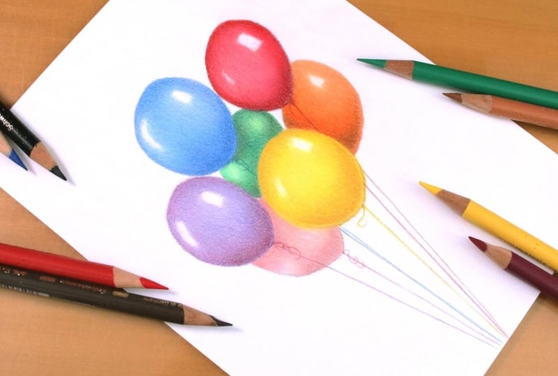
achieve a smooth, refined finish with this median. We'll be drawing a simple
composition of balloons, and along the way, I'll show you the best order for
applying colors, how to build up
layers of pigment, and how to blend those colors, whether it's to adjust
the overall tone or to create a smoother finish. The Androne drawing
will be completed using a palette of just
12 colored pencils. In fact, I won't even end
up using all of them. This is probably one of the most begin friendly
classes you'll find. You can complete the exercise
of this class all at once or work on it little by little,
whichever you prefer. Either way, it's a
drawing that anyone can finish in a relatively
short amount of time. So have you been wanted
to start drawing with colored pencils and just need
an excuse to get started? Then join me, grab your
pencils and let's draw. Um
2. Class project: Hi, and thank you so much
for enrolling in this class. I'm really glad
to have you here. Before we begin, I'd like
to briefly talk about the exercise you'll be working
on throughout this class. As I mentioned in
the introduction, it's a very simple drawing. We'll be drawing these
balloons together with each one featuring a different
color to add some variety. However, you'll notice that the coloring process is exactly the same
for every balloon. In fact, two of the colors I selected will be used
in every single one. I'll show you how to
create this sketch, how to build up multiple
layers of colored pencil, how to blend colors until you
achieve the desired tone, and how to create a
smooth, refined finish. I'm confident you won't have any trouble completing
this exercise. It's really that simple. But before we start drawing, I'd like to talk a little
about the materials we'll be using in this class.
So let's take a look.
3. Materials: In this video, I'd
like to briefly go over the materials we'll
be using in this class. As you see, you can complete the class project with
just a few basic supplies. Let's start with
the colo pencils. As I mentioned in
the introduction, I'll be limiting myself
to just 12 colours. In my case, I will be using the 12 colour fabric
castle polychromos set. Don't need to use the
same set that I do. Just keep in mind
that different brands include different color
selections in their sets, so you may need to make slightly different
color combinations. There's nothing
stopping you from completing the class project
with different colors. In fact, you don't
even have to draw balloons in the same colors
as the reference image. The main goal of this
class is simply to practice layering and achieve
a nice smooth finish. For the sketch, I'll be using a regular graphite
pencil and a roller, the roller will come
in handy at the end of the process when I draw
the balloon strings. When it comes to erasers, I have two recommendations. The first is a needed eraser, which is the soft moldable
eraser you see on the screen. It's excellent for lighting sketch lines without
removing them completely. Simply press it against the
paper and lift it away. Another advantage is
that it doesn't leave behind razor crumbs helping
to keep your drawing clean. Another great option
is an eraser pencil. It's especially useful for
lifting colored pencil. You probably won't be able to remove all the pigment
from the paper, but that's not really
my goal when I use it. I mainly use it for making small corrections or
enhancing highlights. These two types of erasers
are a little less common, but they are inexpensive
and easy to find. That said, a regular eraser
will do the job just fine. Finally, this is the
paper I've chosen for this class concerned
graduate paper. Depending on where you live, you may not be able to find this exact paper in
local art stores. But once again, there is no need to use the same
materials that I do. I simply recommend choosing a slightly heavier
paper with a weight of at least 150 GSM. I don't recommend using standard printer paper because it's thinner and less durable, which makes it
harder to build up multiple layers of
colored pencil. Personally, I prefer papers with a smooth surface and a color that's neither too
yellow nor too blue. As for the paper size, the class project will be
done on an A five sheet, which is half the size
of an A four sheet. Since this paper
comes in A four, I simply cut it in half
using a crafty knife. And that's everything I wanted to say about
the materials. Now that you have
your supplies ready, we can finally move on
to the practical part of this class.
Let's get started.
4. Sketching: Alright, let's start
drawing the balloons. The first step is, of
course, the sketch. For this, I'll be using
a graphite pencil. I chose a pencil that isn't
too light or too hard, so the lines will be
visible on camera, you can use a harder
pencil if you prefer, which is actually what I generally recommend
for sketching. This drawing is
relatively simple, so you don't need to worry too much about achieving
perfect accuracy. However, it's important
to clearly define the space that the drawing will occupy on your sheet of paper. That's why the first thing I
do is draw a large circle. The initial idea is to keep all the balloons
within this area. Notice how I leave
some breathing room between the drawing and
each edge of the paper. This is the composition and
framing that I'm aiming for. Now I'm going to draw
the balloons one by one. There is really no secret here. One recommendation I have is to always try to keep
your lines light. To do that, you can hold the pencil a little
farther back with your thumb and index
finger positioned closer to the middle of the
pencil and away from the tip. This not only helps
create lighter lines, but also gives you
a better view of the drawing since your head won't be blocked in the sketch This third balloon
ended up extending a little beyond the area
I originally outlined, and that was intentional. I felt it was
becoming too small, so I drew it slightly higher to erase the sketch lines
of using a need eraser, which is great for removing
lighter marks without leaving behind those little
eraser crumbs that can make the drawing messy. As you can see, I start by drawing the balloons that are in the foreground and then move on to the ones that
are farther back. You Here I reinforce some of the sketch lines to make the drawing
more defined. I also use the eraser to remove the lines that are no
longer needed, so to speak. Oh now using the needed eraser, I'm going to lighten
the sketch lines. To do this, simply press the eraser against the
paper and lift it away. The graphite will
come off with it. Notice how the drawing
doesn't appear completely, and that's exactly what I want. It's important to remove the excess graphite
from the paper so it doesn't mix with the
color pencil pigments that will be applied next. And with that, I finish this first stage of the
drawing process, the sketch. Now it's time to
start adding color.
5. Yellow Balloon: Now it's time to put our
colored pencils into action. For all the balloons, I'll begin the
shadows with brown. This brown will be
applied very subtly. I don't want it to stat out
so much in the final result. So once again, I will aim for very light pencil strokes just as I did during
the sketching stage. I start with a
very light outline to define this first balloon. Then I begin the shading. Here I'm making small circular
motions with the pencil. Following the curvature
of the balloon. The shadow starts a little
darker at the bottom and gradually becomes
lighter as it moves upward. I add a light layer of
shading at the top, as well. This represents the cast shadow created by the balloons
positioned above. The next color I use is ochre. I chose this color to create a transition between the
brown and the yellow, which is the dominant
color of this balloon. With the ochre, I extend the
shadow a little farther. The goal here is to
give the drawing more depth by developing
the balloon's volume. The pressure remains very light because it is still the
first layer of color. At this stage, I'm
simply mapping the colors indicating where
each one will be placed. The next color is yellow. Since it is a dominant color, it will cover the entire balloon except for the highlight areas. Notice that I've left two highlights defined
on the balloon. The color will be applied
around those areas. Now it's time to begin
the second layer. Since I already have a good idea of where each cover belongs, I can use the pencils
with more confidence. Gradually, I increase the
pressure applied with the pencil aiming for a
more consistent coverage. At this point, I'll mainly
be using ochre and yellow, and I don't intend to
use the brown anymore. The only color left to
introduce here is white. For all the balloons, I'll follow the same approach. I'll always use four colors with brown as the first color
and white as the final one. I'll continue building
one layer over another, trying to find the
right balance between the ochre and the
yellow in this balloon. Using the yellow, once again, I increase the
pressure even further. Now it's time to use
the white pencil. The white pencil from Fabe
castle isn't particularly effective at creating crisp
highlights over the colors. It's somewhat transparent. Its role here is to blend the colors from their
underlying layers. To do that, it needs to be used with a moderate
amount of pressure. There is no need to
press excessively hard, but application should be firm. This will help create a
smoother looking surface. This color blending
technique which relies on pencil pressure
is called burnishing. As here, I finished
the first balloon. I decided to apply one more
heavy layer of yellow in the darken areas to reduce the graininess of
the shaded sections. With that done, let's move
on to the next balloon.
6. Violet Balloon : The yellow balloon is finished, so now I'll move on
to the purple one. The process here is exactly the same as with
the previous balloon. I'll start with the
brown pencil to establish the shadows
using very light strokes. That's the whole idea
behind this class, choosing a very simple
subject so we can focus on the technique without having to worry so much about
the drawing itself. Each new balloon is another opportunity to
practice this technique. The only thing that changes
is the color palette. Now, for this balloon, I will use the Magenta pencil. It will create a transition from the shadows to the
lighter tones, and it's one of the two
base colors used here. Once again, I'll define the highlight
areas which I'll leave white. Notice how lightly I mark them. Avoid drawing strong
outline lines around these highlights. The other color I'll be
using is light blue. This is the second base
color for this balloon. With it, I'll fill
the entire balloon, leaving only the two
highlight areas untouched. Since this is still
the first layer, de application
remains very light. From this point on, I
would alternate between these two colors until I
achieve the desired tone. This technique of
building up color through successive layers
is called layering. Since the magenta
is a darker color, it helps create more
depth in the object. I'll concentrate it mainly along the top and bottom edges, while the light
blue will be more dominant in the middle
of the balloon. Finally, I'll use
the white pencil. Later on, I noticed that this balloon still had a
slightly grainy appearance. When I'm finishing the drawing, I'll come back and apply a few
more layers of color here. So if your drawing
looks the same, you can go ahead
and do that now. With that done, let's move on.
7. Red Balloon: The next balloon is
red, and once again, I'll begin with the brown pencil outlining the balloon and
adding a bit of shading. Now, I'll switch to
the magenta pencil to develop the shadows and give
the balloon more depth. What gives an object its
sense of volume is contrast. So it's important
to pay attention to the shadows and highlights right from the beginning
of the drawing. This was also the criterion I use when choosing the colors. Besides the brown and the white, I selected the balloon's
dominant color, and both its darker and lighter versions from the
pencils I have available. This red will be the dominant
color of the balloon with the magenta serving
as its darker counterpart. Don't forget to leave the
highlight areas untouched. Now I'm going back
to the magenta to continue developing
the balloons volume. This is the second layer, so I'm applying more pressure
with the pencil. The red isn't applied evenly across the
entire balloon either. I concentrate the
strokes more along the upper and lower portions while applying a lighter
layer in the center. This leaves the red a
little softer in that area. When I come in with
the white pencil, we end up with a
pinkish tone here. Notice how the coverage
on this balloon is the most consistent of all the
ones we've done so far, at least in my opinion. That's because I spent a
little more time on it, applying additional
layers of colored pencil. Finally, once again, I'll use the white pencil to
finish the balloon. Since the previous layers
were applied thoroughly, this balloon ends up with a very pleasing
final appearance. You can see even
more clearly how the white pencil blends the colors when it's
applied with firm pressure. And with that, the red
balloon is finished.
8. Rose Balloon: Now, let's move on
to the pink balloon. As I mentioned
before, I don't have a pink pencil among
my available colors, so I have to create it. One important thing to notice
is that this balloon is positioned behind the others farther back in the composition. So it will be slightly darker than the balloons
in the fground. The process is the
same as before, starting with the dark colors. Once again, I will begin
with the brown pencil. Now I'll switch to
the Ochre pencil. This time, I'll rely on it a
bit more because it creates a smooth transition between the brown and the red
that'll be adding next. Ochre is a surprisingly
useful color because of its versatility. You'll notice that I use it quite often throughout
this class. Now it's time for
the red pencil. For now, I'm applying it very lightly just as I did with
the first two colors. We're still working
on the first layer. And here's the ochre again. I'll use it to further develop the transition
between the colors, alternating between
the ochre and the red. To achieve the pink tone, I'll naturally be using the
white pencil afterward. That's why I won't
apply the red too heavily using it more
sparingly instead. In a moment, you'll see
how the white lightings both the red and the ochre, creating the pink color. Now, I've reached
the final layer where I'll use the white pencil. As usual, at this stage, I apply it with firm pressure to blend it with the colors
in the underlying layers.
9. Green Balloon: Now let's move on to
the next balloon. This time, it's green. It's also positioned
behind the other balloons and it's probably the darkest
one in the composition. Because of that, I'll rely a little more heavily
on the brown pencil. In other words, the
brown will play a larger role in
this first layer. Now it's time for the
dark green pencil, creating the transition from the brown to the light green. Keep paying attention to the grading I'm creating
with the pencil, starting with heavier application
in the darker areas and gradually easing up as I move toward the illuminated sections. Now I'm using the
light green pencil, applying it lightly, just as I did with
the first two colors. As I progress, I may notice that some of the shadows need
a little more emphasis. When that happens,
I simply go back to a darker color as I'm doing
here with the dark green. Now I'm switching back to the light green to prepare
for the final layer. And that's it. Now it's
time for the white pencil. As always, I apply it for my pressure to blend
the colors together. The process is the
same as before, right?
10. Orange Balloon: We've reached the last
balloon, the orange one. And guess what? Once again, I'm starting with
the brown pencil. The goal here is
precisely to have you repeat the same
process several times, not to introduce something new. This class is designed
for beginner artists, so I wanted to teach a
very basic technique and reinforce it through repetition until it becomes second nature. Drawing balloons is very
similar to studying a sphere, which is another
exercise I really enjoy. Both are excellent studies
for practicing how to create the illusion of depth
through smooth gradients. This final balloon makes
that especially clear. Now I'm applying the
first layer of ochre. Naturally, this is an
appropriate choice since the balloon is orange. Here, the ochre acts almost like a darker
version of the orange. Don't forget to leave
an empty area for the light reflection on the
surface of the balloon. I mark it very lightly
with the pencil, preparing the drawing
for the colors and layers that will follow. Now it's time for
the orange pencil, the dominant color
of this balloon. Next, I'll go back to the ocher to further refine
the balloon's volume. And now I reinforce the orange, filling the entire balloon except for the highlighted area. Throughout this
intermediate stage, I'll alternate between
the ochre and the orange, gradually increasing the
pressure on the pencil. Finally, I'll
complete this stage with the white
pencil once again. Notice that I don't apply the white across
the entire balloon, but only around the
highlight area. I want to preserve the
darker areas as they are in order to maintain a
strong sense of contrast, and that's essential for giving the object a convincing
sense of depth.
11. Final Touches: Okay, the drawing
is almost finished. The only thing left is
to draw the strings, holding the balloons together. Before doing that, though, I decided to go back
to this purple balloon because I noticed it still
looked quite grainy. So I applied a few
more layers using the same collage as before until the surface
became smoother. I also felt that the blue balloon could use
more consistent coverage. This time, I didn't
reinforce the brown. Instead, I went back with the dark blue and
the light blue, then finished once again
with the white pension. Oh Now, it's finally time to draw
the balloon strings. So I'm picking up my
sketching pencil again. I'll choose an imaginary point outside the paper and with
the help of a roller, connect each balloon
to that point. Use your sketching pencil
very lightly here since the strings are quite thin and require delicate subtle lines. Remember, I don't want
the sketch lines to remain visible only the
colored pencil lines. That's it. Now, all
that's left is to pick the dominant color of each
balloon and draw its string. And here's the final result. I hope you enjoyed this class that you're feeling more
confident about drawing with colored pencils and that you had fun
creating this drawing. Before we say goodbye, I'd like to leave you
with one final thought. I'll see you in the next and
final video of this class.
12. Conclusion: We've reached the
end of this class, and before anything else, I'd like to thank you for watching it all the way through. Before you go, I'd like
to ask you two things. First, I'd love for
you to share your draw with us and pose any
questions you may have. I'll be happy to help
you any way I can. Second, I'd really appreciate if you could leave a
review for this class. It means a great
deal to me and it helps me continue creating even better classes
in the future. Thank you once again
for your support, and I hope to see you again
in another class. Bye.
 Matheus Macedo, Realistic Drawing Artist