Transcripts
2. Intro to Caricature: - Hi, - This is John Casey. - Welcome to the introduction to Caricature Class on skill share dot com, - Along with the help of the Skill Share team. - I've taken everything I've learned in the past 15 years and distilled into bite size chunks - for this class. - Please upload your drawings and sketches along the way in each section so that people can - give you feedback and you can give them feedback as well, - when we can all learn from each other as we develop their skills as caricaturists. - Thank you so much for signing up for the class. - I think you're really gonna enjoy it. - Let's get started. - I thought I would introduce a class by showing you some of my work. - What I've done to make a living as a caricaturist and illustrator over the past few years - is to go and set up at various locations around the United States and abroad to draw people - as they come and sit for me as either entertainment or to increase the marketing or - braiding for the company that's hiring me. - The visibility of their booth at an event or just is entertainment for the people who were - there. - It's a lot of fun for music characterised to go somewhere where people are generally having - fun and give them an opportunity to have a unique handmade artwork done of them. - It's something that rarely happens for people, - and I'm glad to provide it. - The other thing I do in my studio is illustration work for either private corporate - entities for my own enjoyment, - drawing actors, - musicians, - fellow caricaturists and sometimes taking on large projects, - such as drawing various past presidents of the United States for a company's website - project. - If you follow along with the class and take in the lessons as I provide, - I think that you'll be able to achieve similar results. - It's important that you follow along with each lesson and do sketches of the process - stepped, - provided as you'll be building upon information from lesson toe lesson. - Starting off with some simple basic ideas and finishing with barely complex drawings that - you will be able to achieve if you follow along with the class. - Please share all of your work with the fellow students and get feedback as well. - Thank you for signing up for this class, - and I'm really looking for it to seeing your work
3. Overview of Class: are quickly walking through some of the tools of the trade. For the contemporary caricaturist, really, all that you need in order to learn is a pencil insolence of paper. You could do 90% of the jobs brush pins in various sorts. Pencil makes a very good one, along with co picks, which are excellent brush tips. A little bit expensive, but you can buy refills. Prison color art sticks are traditional media tool like colored pencils allowed you to color, which you're working on, and then you get to the digital media. The most inexpensive tool to start with would be a bamboo from wack. Um, Wacko makes 90% of the higher end digital tools available for artists that wants to work digitally. The bamboo starts at about $80. Then you go up to the into us, which are a few $100. But you can sometimes find quite cheap on eBay. IPads. They're a great use. The tools programs were always getting better, and Samsung's are pitched, partnering with welcomes pressure sensitive devices to offer a pressure sensitive tool. Uh, in the phones and tablets that they're creating, they're calling it an S pen. It's not as sensitive is something made by whacko, but you can draw some pretty good drawings on it. You Nova is a new tablet. You can find him on Amazon. They're cheap. There are 500 bucks compared to the scent ekes, which are about $1000 minimum on. There's always new things coming out. The most new thing is the Sinti companion. It's a portable tablet that offers everything that a everything that babe you were into us level would add to your computer. But it's also a computer in itself, so it doesn't require any extraneous hookups. These a really expensive right now at about $2000 for the cheapest one, maybe a little bit less than that. But by the time you're taking, this course will probably be 10 other options out there. There's 100 options that I left off, but these are all things you can research. Look up on the Internet, read reviews about and decide what is the best for you.
4. Constructing the Basic Head Shape, as Taught by Andrew Loomis: - this lesson is about constructing the human skull using the Andrew Loomis method. - There's a book Andrew Loomis did on drawing the face and hands that will teach you this - myth it and have also diagramed it out in the lesson plan step by step, - that you can go and follow. - I'd really urge you to learn this technique. - And if you do, - it's gonna give you a much better understanding of the structure of a face and how to - create it on a two dimensional surface I would have done has taken just a circle to begin - with the overall shape of the skull and I've drawn a center line and across line. - Imagine that this right here is, - uh, - solid tennis ball or, - uh, - an apple or a piece of fruit. - So you know, - any solid structure that is round and three dimensional in real life and what we're gonna - do is create the believability that this is three dimensional on a two dimensional surface - , - and the best way to do that is to draw through the shape, - creating the depth and the roundness that you would see if imagine if you could, - like, - see straight through a circular object. - If you cut an orange in half, - you know you would see the lines on the inside of it. - I've also drawn a second circle to the on the right there, - which allows you to imagine that the shape is flattened like a head is. - If you put your hand on the side of your head, - you'll feel that it's flat there. - Where is the face and the back of the skull are around on the sides of the head or more - flattens. - The line I'm dropping down now is the sensor line that runs right down the middle of a face - . - And I'm marking the brow, - the hairline. - The brow line is that middle of the circle line that runs right through it. - Uh, - then the nose, - um, - the mouth, - um, - and the chin lobby marks along that center line access in the notes. - You'll see that it goes step by step march these out for you. - But you can also watch this to see how it was constructed. - I'd really urge you to make dozens of sketches of this in your notebook. - Um, - the more that you do it, - the better your drawings will get. - It allows you to think of the brain the face rather as a three dimensional shape rather - than a flat. - All right, - a flat just based on a piece of paper. - This will give it depth in reality and will also allow you to understand the space - relationships within a face. - Each of these lines tells you the placement of a future where it's the eyes. - They're meeting up to the brow line the distance between the eyes allowing you to know - where to place the nose. - The space down below the nose, - halfway through to the chin is where the mouth would be. - You get the shape there of the cheek bones, - the side of the face. - This tells you exactly where to place the ear so that it meets the bottom of the nose and - the top of the brow. - But the year shape right in there. - And if you learn the CBO to construct the face from any direction looking up, - down, - you know any tilt and it will also allow you toe memorize where the features are on a face - in the most standard idealized sort of face, - which is what we're using for our model off comparison
5. Constructing the Skull: - this short video goes off. - The last one of the shape of this short video goes off the last video, - and what I've done here is used a reference of a skull, - um, - and base it on the construction of the face if he did in the last video. - And this just goes to show that skull always lies under those features in the face, - and it's a good thing to remember as your drawing that there is a skull and a structure - underneath. - There. - You can learn to exaggerate, - but if you know with the sheeps are, - it will really allow you to make your drawings more believable. - And we'll give you the knowledge that you need in order to learn to exaggerate those shapes - . - This lesson on drawing the head and during the skull are really basic drawing lessons. - Maybe not so much to do with caricature, - but I don't believe you can construct a good caricature if you don't at least know this, - so have it in the back of your mind whenever you're working, - draw enough time so that you don't have to think about it, - and it just becomes a sort of second nature to you. - And if you're ever struggling with the drawing, - usually going back and thinking about these basic elements will give you all the - information that you need toe, - see what's wrong or how you could make the drawing better. - Uh, - it really is the basis for learning to draw the face or learning to draw a caricature of a - face if you don't memorize this. - So these have a reference Andy, - something you can refer to you and just keep it in mind as you go through the rest of the - lessons and learn how to create caricature drawings.
6. Simplifying the Technique to Construct Cartoon Head Shapes: - using the same similar idea of the Loomis Andrew Loomis method for constructing the head. - You can do a much more simplified version just using a ball or an egg shape for the skull. - When with me. - Even more simple, - ball shaped just tradition show as an example here and creating the tilt line and then the - brow line and using that to place the features, - the turn of the head angle of this head. - But if you have a character that you're repeating, - you have multiple characters in a scene. - You can use this very simple technique decree. - Almost any sort of cartoon character here are just doodled in some pretty random faces - whatever popped into my head as I was working on this. - But it's just to give you an example of how useful this technique is for not only animation - but also caricature or character character design. - And if you don't memorize every step off the Loomis method, - if you're not so concerned with getting extremely detailed likenesses, - getting the concept of that's the tilt, - the brow line and the structure that this allows will make your drawings better, - even if you want to keep really cartoony images. - And of course, - if you want toe build from this, - you know, - you just keep flushing it out, - adding the other elements of the design and you can create a much more realistic image. - But this second week is used in almost all animations for characters, - and there is a good book by Preston Blair about how to design characters and to draw them. - Using this technique, - it's a little more simplified, - but based on the same concept as the Loomis method that we already learned.
7. Drawing over Richard: - another really good way to study and to study structure is to take some references. - I've taken this guy here and gone ahead and diagrammed out the same structuring tool by - creating the circle filling in the center line, - laying out the news, - the eyes and the mouth. - And we can do this one year together, - we have the circle, - the basic skull shape and drop our center lying down the chin mark. - Uh, - you see, - the head here is turned almost completely to the side. - So when we create that flattened sheet, - it's gonna be a larger circle within the circle. - This part of his head here is directly next to us, - and we're seeing mostly a flat ship. - Then if we put the brow line and you'll see that it matches right up with the top of the - year, - the I line, - but directly beneath that, - we drop down about middle way. - You see the bottom of the news, - which lines up at the bottom of the year in the mouth. - The expression that he's making is interesting here, - so it's going to alter the skin on top of the skull trait. - But the skull underneath is exactly the same take care chin line the neck create this year - shape. - Uh, - going over tracings like this will allow you to examine the face and show you how much the - structure remains the same throughout most people, - despite the shape of their features. - The skin on top of the skull, - the skull underneath it's still the same. - You can always double check your drawings. - Double check your references by dropping a line down from the center of the eye. - But usually just about meets the mouth. - The inside of the eye, - right on the outside wing of the news. - Yeah, - and the lips and mouth in between the shape here, - like so this is always a really good way to practice. - It's something that Stephen Silver teaches and his design class. - And I found that doing this over the years practicing it again and again has really allowed - me to understand the structure of the face, - understand where the future is live. - If we go to the next one here, - you see, - it started with the circle, - uh, - then drew the center line, - the brow high line, - and you can double check again right here at the center of the eye drops down with the news - . - Uh, - the senator, - the inside of the eye drops sound of the notes. - The center of the people drops down on the outside of the mouth on the space between the - mouth and the tip of the news is about the same spaces, - the now to the chin. - See, - it's kind of pinched up here, - but underneath the teeth are still gonna be about the same space. - It's interesting to do this little practice and then remove the photo references and you'll - see how much of a likeness you really get with those structure. - Seeing the inside of everything, - This will give you a great starting point that you can always exaggerate from and build off - . - And if you learn this, - it'll be really easy to learn to exaggerate.
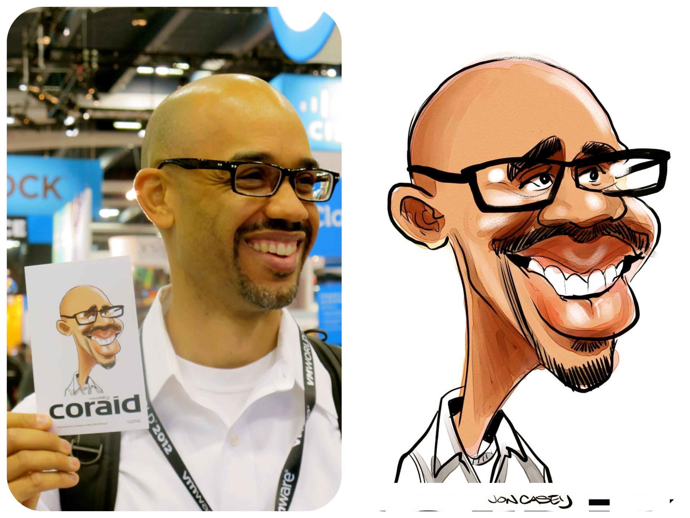
8. Drawing Richards Caricature # 1: - once we diagrammed out this fellows face on saw where the features live and can use that as - a model of reference. - I wanted to show you how you can take that and use it as a to exaggerate in order to draw - the caricature so quickly. - Here I drew the ball in the center line in the brow line trying to get the tilt of his head - . - Um, - this videos about four minutes long or so, - So you can just kind of watch as I go through. - And what I'm doing is just taking the wreck food a reference using the diagrammed out - example of his face and basing it. - Drawing off of that, - Emma is due to the east just to give you, - uh, - something to see how to go about doing this. - Just an example. - Toe watch. - As you can see, - I can go back and make changes is necessary. - I just trying to get the placement of the features and the shapes that I see first. - This is the most important thing. - Once I feel pretty confident about where place the lines, - I might go back in and dark, - and some again this is done digitally only because it's easier to capture the screen - process using this technique. - But there's no reason that you can't do this with a pencil and a piece of paper, - and I would suggest that you do practice it. - There's a few techniques that I'm trying to go over that air kind of basic techniques, - and they will all give you the tools that you need in order to go for it and create - whatever kind of drawings you want, - whether you'd like them to be more exaggerated, - more simplified if you I want to make them really detailed. - The more that you go into the Andrew Loomis technique and looking at the distances between - the features, - the better your likeness is going to get in, - the more precise it's gonna get, - and you can also go back and use it to check your work. - You know, - as as you're working, - it's it's rare that you're gonna get everything right the first time. - Even doing this and as always, - drawing this. - I didn't notice that I had placed his left I a little too low. - It's really easy for me to see now, - looking back at the drawing, - but as I was creating it. - Us looking around at all the different features and we'll see you later on. - Almost didn't use this video is an example, - because that was such an obvious mistake. - But it's you. - Later on, - I draw the center on the brow line again to double check my work and to see if I got thing - this place where I wanted them. - And then I just went back and made a change. - And with different working digitally, - you can cut and paste rearrange a bit. - You know, - I think that if you're using digital tools, - there's no reason Teoh not to use what they have to offer. - You know there's no tracing going on here, - or this drawing is made by my own hand and eye coordination. - My my own understanding and using the digital tools. - Correct mistakes, - I think, - is a good way to work digitally, - not toe. - Rely on digital Teoh help you any, - but just to offer you things that you couldn't otherwise accomplish as easily, - and you'll see him going back and checking my work here based on the diagram to the left. - And I did move that I so make it fit. - If you go back a little bit in the video, - you'll see that it was placed differently and it was throwing off the likeness for me. - OK, - do one more of these.
9. Drawing Richards Caricature # 2: - next I thought I would do the same guy from profile you and I started with the same ball, - created my center lines, - the brow, - this interline, - the tilt of the head, - which there's not really much of a tilt here, - but the angle of it said is off to the side. - So when you do that portion of his drawing of the ball drawing that flattens out the side - of his head, - that will obviously be a much larger portion. - Um, - and looking at the shapes, - the spaces between the eyes in the news and the news in the mouth, - the sheeps in between them, - the most generic shapes that I see and trying. - Teoh three. - A. - Somewhat exaggerated like this of that, - Uh, - I did a quick sketch and then went back in on the layer above to do a little bit more - refined drawing, - working digitally. - You can do that very easily just by drawing on the layer above and lowering the A pass ity - of the layer below, - and you just kind of watches. - I quickly sketch out this drawing. - You know, - this didn't spend a lot of time on this, - but I think that I got some information from diagramming it out that it may be not have - noticed on my own. - And creating are rather, - you know, - not to exaggerate a somewhat exaggerated drawing based upon the reference that I have there - and the information that I've gathered. - I think it's really fun to draw crew files is the You get the news in the mouth in a way - that drawing straight on definitely doesn't allow. - And even 3/4 Doesn't you know it's a very unique wait to see the face and look at it. - So don't try not Teoh. - If you're working live or if you're working from photos, - try to bury the angles that you work at. - A lot of times, - when I'm working live, - I'll have every other every third person turn their head and a totally different way. - Or maybe do a totally a profile or head on because I don't want to get stuck doing the same - . - Drawing the same features in the same places, - even though that the people are different easily pick up that habits that way. - And if you force yourself to look at it from a new angle, - look at it fresh. - You'll see things that you wouldn't have otherwise seen here just to talk a little bit - about choices that you make when you do a character, - is it? - Obviously, - I choose toe exaggerate the mass of his face below the brow line, - even though he does have a very significant cranium size, - the nose and mouth and chin worm. - Or interesting waits for me to focus on for this drawing, - which you might have someone else choose a totally different, - uh, - portion of his face to exaggerate and still get a great likeness. - But I hope that taking the two past previews videos into example this one and the 3/4 - profile, - you can learn something about using the Andrew Lewis method to exaggerate from.
10. Constructing our Idealized Face From a Skull: - Hi. - This video is part one of using a model of comparison technique in order to see where and - how to exaggerate the human face. - Based on the specifics of whoever you choose to drop this year's. - It's just standard skull reference image and I would have done is gone. - And the same similar techniques that you used to construct a face and skull drawing abused - overtop skull here, - creating a circular ball she ate, - flattening it at the edges right there where the sides of the skull, - the temple are drawing. - My brow, - my eye, - my nose, - my mouth, - my chin line. - From that point, - I went and drew in just the most standard, - idealized, - simple face. - It's very cartoony face. - Um, - this obviously doesn't look like anyone, - but it's the most standard face that we can use as a model of comparison for the - caricatures that we're going to draw. - You can take this model of comparison, - and I this idealized face and do the same techniques of mapping out the I line drops right - to the corners of the mouth. - The inside of the eye with knows that I head is five I wits apart. - Also, - the eyes are in the middle of the skull shit. - And if you break down the speech between the eyes and the nose, - the nose and the mouth, - the mouth in the chin is always the eyes to the browse and the top of the skull. - You get a good idea of the most standardized base. - Like I said, - this is this will be our idealized character in which we will use. - This is a model of comparison for any person that we choose to draw. - Let's go ahead and in the next video, - choose a face as a comparison against this.
11. The Shape of the Head: - this lesson is on head shape. - The outside shape of the head is what Steve Brodner, - who is my favorite caricaturist and illustrator said, - is the most important aspect to getting a lightness. - If you have a chance, - definitely look up. - Steve brought owners caricatures. - He takes the head shape to, - Ah, - whole new level of exaggeration and is really an extreme form. - But for our uses about breaking bad would be a great example. - The characters all have really unique at shapes. - Mike Walter, - Aaron Paul's character. - They all have these, - but they're all bald in the show, - And they also have Mike, - especially along with Aaron Paul. - This really large skull shapes. - Um, - so if I'm just looking at the shape of his head, - not any inside features, - he's also got a very like strong chin. - Kind of goes with this tough guy persona, - Um, - and then his ears always stuck out to me in the show so you can get quite a good likeness - of a character just by getting the right head sheep. - What's white? - She has very strong features as well. - Um, - she's very She's a very feminine face, - but it's also the bony structure is much more apparent than it is and some other sometimes - women are hard to draw. - They're just really beautiful. - Have really soft features. - You don't know exactly what to exaggerate. - But her character, - her face has very distinct cheekbones, - a very distinct chin. - And then Gus here I think of his face is more long and slender compared Teoh either of - these other to you. - So that's just paying attention to head shape, - which is a great way of looking at this structure of someone you want to draw without even - having to think about the inside. - Just the outer face, - head shape. - And also a true was breaking bad because it's got my character with the my favorite head - shape and television, - which is solved. - Bodyguard uh, - this guy just has the craziest looking skull. - Um, - if you look at it closely, - you can always see the front off is skull as well as the back. - Um and then this shape of his face is really interesting. - Teoh just goes right into his shoulders like he has no distinct neck or chin, - and so to exaggerate, - that would be fairly easy. - - It's - so there you go. - If you saw that cheap as compared to the other shapes that we've drawn. - You can see automatically that there is a lot of variation that you could have within the - shape of a face, - Uh, - the shape of the outside of the head, - even though you there's the same skull underneath. - So keep this in mind as we look at the rest of our subjects.
12. The T Shape Technique: - along with the guides that we went over. - I wanted to show you another technique that's really helpful for finding the shape off the - inside of the face for exaggeration, - known as the T shape or triangle. - This is how you do that. - I'm doing all these things digitally, - But keep in mind, - you can do this with a piece of tracing paper photograph. - You don't have to work digitally. - It makes it easier for me to record on the screen shot and make these good classes for you - . - But you don't. - You can do this anyway. - You like anywhere. - The T shaped is the shape that goes from the outside of the corner of the eyes to the tip - of the nose, - and it creates a triangle on. - Then the the actual T and the T shape is this shape right here. - And if you compare those with people and you get used Teoh, - the difference is you'll be able to tell a lot from this. - So if we look at this guy here, - obviously he's got a really long T. - The news is quite long, - and the eyes are not so far apart. - So you were getting something along the lines of If you were you exaggerated, - you're getting something like this sort of t shape. - I did a quick sketch from him so that I can show you how I interpreted it. - There you go. - If we draw on top of this, - you're going to see that it's a short distance. - It's across from the eyes and a very long distance to the tipper than those another example - here, - someone who has a very different face shape. - Uh, - if we do the same corner of the eyes tip of the news, - you're gonna get a sheet. - It's much similar, - more similar to this where the this space here is quite long, - whereas this is rather short in comparison. - So we'll see you in my drawing here. - We've got quite a wide speech between the eyes and quite a short space to the length of the - nose. - This method is really useful for comparing younger older faces as well. - See the baby here we were born there. - I seat doesn't change where as their noses changed the most drastically of any feature on - our face, - and our years continue to grow as well as the nose throughout life so it's really - instructive. - Teoh use this model of comparison, - especially when you period with age is he here. - The link to the nose is very short, - whereas the width of the eyes is much longer. - So you get a very short t a very wide triangle in comparison as we age. - Like I said, - the nose and the ears continue to grow. - So this guy here but your little marks, - that's he is quite longer to the tip of the news. - You also noticed that his years I continued to grow throughout his life, - take on a larger sheet. - It's Yeah, - the top is even kind of being pulled down a bit by gravity over time. - So when you are drawing older pieces, - you're gonna have a much longer t in in the length of it there. - This is also known as kind of the marble and string theory. - If you have or, - uh, - baby, - you've got to marbles here in this string just barely dips down where, - as with older people, - you got your marvels and string really dips down, - and you can just kind of think of that as the effects of gravity and age over time. - And I hope that this is will just be one more technique that you can use for examining - faces
13. T-Shape Comparison: - here's to drawings that I did live. - Um and I'm gonna play the East pretty quickly for you and not talked throughout the whole - thing. - But I just want you to pay attention to that T shape that we discussed and the differences - in these two faces based on the correlation between the link between the edges of that, - The brow in the news again, - these are both two drawing some life that I recorded. - And I'm playing back quickly for you. - Uh, - they're two people with very different head shapes. - And the most important element in getting the likeness down, - I believe for these do is that t shape that we looked for in the previous videos, - the one on the left. - The guy had a really great expression on his face as well. - At one point, - when he first came up to me just for a second, - he had a really funny smile. - I think one of his friends was was teasing him about the the hairs that kind of stick out - behind his here. - No, - they were all giving each other a hard time and joking around Just one reason why drawing - live would be really fun. - Everybody's usually having a good time and you're there, - Teoh. - Entertain them. - A swell. - It's one reason I really do enjoy what I do. - And these two people really show how much that even to people who are both males, - probably both in the same age range, - yeah, - and they just look so different. - And by exaggerating those differences, - you can really making interesting drawing that captures their likeness as well as the very - different features they have, - as compared to that idealized face. - This will be over really quickly. - But you see, - the guy on the left has a very shallow, - very wide tee shape, - the guy on the right as a very long and narrow T shape.
14. Comparison #1: - okay. - This year is a fellow that I drew last night at an event and it snapped some photos and - recorded some videos of the drawings that I did. - And I think this will be really instructive and showing how to use the standardized - idealized faces. - A model of comparison for any riel living person with unique, - identifiable features that makes them look different from everyone else on the planet. - We have an amazing ability toe see a face and recognize it toe really see Manu differences - and basis. - And no one knows who people look the same to us. - That part of our brains been developed really well. - And we have the ability toe tap into that and come at it from the angle of Why is that? - How can you analyze the face and see where to exaggerate? - And I urge you to do this if you want to draw someone someone famous and you don't know how - to get started, - are you? - You're not getting an exaggeration. - You're not getting a likeness that you're happy with. - Um, - this is this technique is really gonna help you out. - So what we can do is lower the capacity on that just a bit. - So we can draw over the photograph. - Is that Go ahead and find those anchor points. - And for this guy, - just like we would when sketching out and constructing a face, - Um, - we see his head on sort of a tilt year. - So it's not gonna be exactly that. - It's likely Parallel, - like this base here. - Eyes very obviously looking straight at us with the head straight up. - This is a little different. - So we're gonna go and just map out years aggro line our eyes. - I knows no Ken. - Uh, - now you see right away that this guy has some features that stand out, - such as if you drop the corner of the eye down, - it is touching the wing off the nose. - But rather than being on the outside, - it's on the inside. - So his nose is obviously much larger than a standard idealist face. - If you drop a line down from the center of his people, - you roughly get as the edges of the mountain here. - So he does have that very common feature. - Let's look at that. - The spaces between things. - There's no a lot of space here between his eyebrows and his eyes. - So if we're gonna exaggerate the features that heap has, - particularly to his person, - I would probably shrink that space even more. - Obviously, - the nose here is larger. - It's an obvious character, - sick to exaggerate and nose and Eric Nature. - It's not always the best choice. - Just weeks to make a big nose bigger than actually is you're not gonna get a humorous - likeness. - That's true. - We want to get something that's true to this guy Now. - His years go up just a bit above his eyebrows, - or they come out a little more than usual. - The bottoms of the years roughly fall in line the bottom of his news, - uh, - based on the curvature of his face year. - So that's pretty standard. - The space here between his news in his mouth is much less space than between his mouth and - his chin. - So his bottom lip his chin. - This right here is a space that we can make longer. - Where is this space? - Might be something we would make shorter. - Uh, - you can see that top of his skull here from the broad lines this out the skull is rather - large, - so that's something that we can exaggerate. - If you go and make these comparison models based on this guy and you compare a really life - human being, - you're automatically going to see things that are smaller than a larger. - And this is a more kind of scientific method of looking at a face rather than just looking - at it and kind of guessing you can show yourself concrete things. - Car create space relationships. - That's what we're looking for here. - Space relationships. - What shapes do we see that we can make bigger or smaller? - That will make the drawing look more like him. - And next usher that quick drawing that I did of this guy and we can see if I came up with - the same thing in my drawings that we found by analyzing his face here.
15. Comparison # 2: Here's another guy that I drew recently at an event. I think he's got a pretty interesting face as far as examining for a model of comparison and so sick O sticker. Look at him and see what compared to him to our model shows us you got a brawl line. Our eye line knows now, chin No. His head here is how much larger And it's also much wider save then the bottom portion of this space. Um, when I look at this guy, I'm seeing a sort of triangular sick where it comes down. So if you were to exaggerate that shape, you know, you could come up with something like this almost decisive pizza. Obviously, this is not gonna agree A great likeness, But looking at that shape and seeing that rather than the oval that most faces are we could see something more along the lines of this. But this guy. So that's what I'm gonna look at when I go to draw, you see, is the rest of his features are fairly standard falling in line here. But where is something bigger? That, I think is the length of his nose is pretty much is larger, then the space from his nose to his chin. Um, as the triangular sheep would suggests, the bottom portion of his face here is, uh is actually rather small, much smaller than the shape that we're getting here. So if we compare him to the standard, he's got a lot of unique qualities that will make drawing character sure of him easy to do if you use this model of comparison and look for where you can find distinct parts of his space that make him uniquely himself. The shape of the hair here is also pretty fun. Interesting. You know, this curls, um you can see the skull the size of the skull under this skin there. And now the top of the same kind of flares out. Um, you know, again, if you go over the basic shape, you're getting kind of this almost run it off Pizza triangle. And when I go to draw him, those are gonna be the first shapes that I'm gonna think of. Teoh capture his likeness
16. Comparison #3: for the next couple models of comparison, I thought I would use this plaster cast that I bought online. You can get one of these from a art supply store site online pretty easily. You can go and create these guys just by going into photo shop. And if you go to view and rulers, it'll put up be the rulers at the top, and you can drag guides down or from the sides. So I just did the same thing we had with the others lined up the eyes, nose mouth, the outside of the head, top of the head, the bottom of the chin so that you could start to make comparisons against the same thing that I did for this guy, which I recently drew an event. The first thing that I noticed when looking at him is that he has a lot of pretty strong geometric features. The first thing that I noticed about him is if you make the tea shape yeah, the triangle between his eyes and nose, it's much wider then it is long a good way to test this, but separately, is if we If we copy this line here, the length of this and then we case it. We have the that wit that we can use to see. You know, Is it really longer? Then the width and you'll see here that it is much longer line then then this line here. So we have the late off the nurse versus the wit, and just by doing this you can see that the wit off this sheet is so much more. This Linus is so much greater in length than this one here for a model of comparison the face that that's a really strong feature you can immediately pull out as identifiable for this character. Another thing that I notice is the heaviness of the brows, the eyebrows in the actual brow itself. There's very little space here between the I and the other up, and there's quite a lot of space year and here. So if you want to look at the outer shape of his face, uh, this mustache and the brow lines all served to give this shape, which, if you pull it down, you'll see. Is it very Why square? Whereas someone were typical, the more idealized face Probably me something closer to you. This you get this much wider space here, So just with those few judgments, you have a lot to go off. That's all I'm gonna show for this guy because I think that it's really instructive just to see that you can actually make those comparisons cocky and face the lines. Check the links for yourself, and that will really tell you where to make the judgments as faras exaggeration.
17. Comparison #4: - The great thing about having the plaster caps to work from is that you can photograph it - from multiple angles and draw the draw of the guidelines and Teoh refer back toe the - photograph. - It's funny that I'm doing in this sort of way because I've already doesn't drawing, - then took the photograph of that this person and then went back and and got the cast. - So it's a little bit backwards. - But hopefully it's helpful for the people who want to learn the process of just making - quick on the fly judgments. - I think looking back at the drawing that I made, - I was pretty spot on with this guy. - And I think it's also a good comparison from the last drawing we did. - If the first thing we do is toe check that t shape were the last one. - Waas Uh, - so why and short? - This one is very much skinnier and longer, - so there's an obvious and automatic comparison that I could make when I see him off. - This The length of the news, - uh, - is is a substantial link, - compared Teoh the base and also the the triangle of the news itself. - If we look back over Etter plaster cast model Here, - you'll see the this is somewhat close to the idea Last standard face and you get a triangle - that looks something like that. - Where is if we go back to him? - You get a much greater angle here. - So he the protrusion of his news, - which is a standard caricature element, - you know, - to draw big nose. - But this guy, - it suits him that to have this sort of knows that's not it's not Boldness Lee Large, - you know, - it's not like this sort of knows, - which is somewhat closer to what the last you see from the side is somewhat closer to what - the last guy that we saw with the mustache, - um hiss is pretty narrow here. - The verge of it and even the tip of it, - is pretty pointy. - If you if you just look it this shape here, - it can tell you that the nose itself is quite quite pointy and not circular. - So those that's a lot of information we can gather right there just from the nose. - Another thing that struck out from looking at him is that his year is pretty low on the - side of his head, - um, - compared to the average face. - And it's also smaller than that. - The average here. - If we If we go back to our model here and compare this, - you know that the top of the year, - you know, - run stores that brought the brow near that I line on this one in the bottom of the year, - runs below the nose where it's more standard, - you know, - toe meat about the news, - Lee. - But that's actually about really year and suggest the bottom of the loop. - Anyway, - This length here is much greater than this link Here. - It's zero is fairly small, - his nose protrudes and it's fairly long. - So if they go over all of his his head shape itself this she is fairly standard. - But the shape of his I kind of turns down here. - No, - this was the year in the knows that we went over, - give you a lot of information on how to draw his character
18. Live Drawing #1: - Okay, - here was the first guy that we mapped out the features off. - And this is a drawing that I recorded live on location. - Uh, - drawing was done in about six minutes, - and I've sped it up considerably so that you don't have to just sit here for six minutes - and watch it, - but you should be able to see my process. - I'm starting by getting the overall head sheep, - the basic shape off the outside of his base that I see when I look at him placing in the - eyes brown news mouth years, - a very light quick sketch on one layer. - This is that would be my bottom layer. - And then I immediately moved to drawing on a layer above that layer in black, - looking at his features. - And no, - I've had enough practice that I can see him without having to map it out as we did before. - But I think that if we follow those guidelines by drawing, - would getting most of those on which is, - you know, - it's not easy to do in a live environment. - You gotta work quickly. - And that this particular one there was more than 20 people in line waiting, - so I act, - take my first impressions and keeping in mind all of those things that we've talked about - waits, - the guides, - spaces, - spatial relationships, - the T shape. - I'm trying Teoh. - Use an economy of line it not as many as few lines. - It's possible, - and clean lions with a various thick and thin parts to the lines to make a more dynamic - drawing. - And then I quickly move into color. - This layer is on that sketch layer. - I just give her to that, - clear it and do my color right underneath the line. - Work. - It's more important. - And here that you pay attention, - Teoh the lions and the color. - So it really spent this color portion up. - We're gonna show you a few of these recorded live from actual events. - Drawings done, - sitting six minutes or so. - That is the goal that hopefully will be able to do once this class is over. - And you've given yourself some practice using the techniques that were going over
19. Live Drawing #2: He was the second guy that we mapped out his space using the model of comparison. Uh, so here, I want you to take into consideration the space relationships between his eyes, brows, nose, mouth, years overall head shape, which is again, how I start my sketch. So this is the light sketch on the bottom layer. It's just a doodle to kind of give me an idea where to place my lines. This is a something that you decide for yourself. Whether you need to dio greater artists like Tom Richmond, they don't He doesn't use any sketching before doing his live work. He just does it all right on the top layer other. There's a lot of artists who don't feel that the sketch is necessary, and I for me it's helpful it. I try to do it as quickly as possible and move on so that I can still be these drawings done within six minutes or so. So I'm drawing the nose here, which is pretty long, can see and meet his eyes rather small. His top lip is larger than the most basic face that idealized, basically like that mischance rather small, and I see sort of a triangular pizza slight slice shape when I look at his overall face. So you can just kind of watch my process here, Keeping in mind that these air alive drawings recorded right at the event and that you're making decisions quickly based on the knowledge that have built up over the years of the spatial relationships, the space shapes and the techniques such as using then and thick lines lines of varying wits and, you know, drawing things like hair, eyes, nose you get you learn different techniques for what works best for you. Once I got this strong done of the black lines above the bottom sketch layer, I'll clear that sketch layer and filling the color. And I sped up the color portion of this rather quickly because it's not really what I want to emphasize in this part of the lesson. Um, just show you examples of making those space relationship decisions of how far knows as the mouth are apart from each other and what sorts of shapes make up. There's teachers
20. Live Drawing #3: - Okay, - This guy was another one that we did the model of comparison from the plaster cast, - and I just wanted toe play a few more process videos so that you can see how I work. - The photo on the left was taken after the drawing. - There's the process in the middle and in the final drawing on the right, - thought that it would be instructive to be able to see what the final was like as I was - working towards it. - So the first thing I did was begin on my bottom sketch layer, - using a light blue and the scratch board tool and quarrel, - and I just quickly rocked out the shape of the space and where his feature is live. - This was actually a little more detail than I usually do, - but you can see that Mom going back over it. - Now I've gone to the layer above that sketch layer and using the same scratch board tool - and using the color black. - I am going and using my rough sketch as a guide to draw the final. - And you know, - I'm trying. - You'll see. - Sometimes over you do a line controls the or or I won't follow the sketch exactly, - but I'm using it as a base reference for doing the final. - Hopefully, - I'm getting some buried line work in there, - getting rid of some unnecessary lines and adding in some detail on interest, - where he does have more prominent features. - And then once I'm finished with that black outline, - I go back to the bottom sketch layer. - Clear it, - uh, - just delete everything that's on the layer, - and I'll begin adding in the color, - using the water color, - too. - I like to use a watercolor school because you can add layer. - Cease to see that I put down a whole tune of flesh, - and then I go back over that, - dry it at another layer. - In that way you can have values, - and you see that program doesn't follow in the lines at all. - You have to do that and that you you want Teoh based the colors on the reference that you - have. - You can see the shadows calls VIAS for out under the bottom of his nose. - The inside of his year, - the shadow cast on his shirt from his head and then finally won something. - With that, - I'll go back in and at a few highlights scratch towards will and white or the greeny - watercolor tool. - And then you get the finished drawing there. - And, - um, - you can see the how I got from the reference I'm looking at drew it to the final drawing.
21. Live Drawing #4: - Okay, - Here's the last of the comparisons that we did from the plaster cast. - From more of a profile, - you sightly 3/4 but you know much more closer to a profile than any other drawings. - And I just wanted to let you watch an example of the process that I do you for this again. - It just begins with the blue sketch and you'll see that I resize it of it. - If it is, - head onto the page a little closer, - Teoh a little better. - Give even spacing around the edges. - And I might spend a little bit longer on this skin quick sketch under sketch than I - normally do, - just because it was the one of the few profile drawings that I did that day. - So you want to get to kind of warm up to the angle that you're using, - but it's following the same structure and the same ideals as if it were head on and trying - Teoh exaggerate the nose and get that t shaped down in the way that we saw from the - comparison and trying Teoh get his year shape in. - One thing that beginning Eric interests often do is to just learn to draw of one year and - use it for everyone. - It's not always a feature that stands out, - so sometimes you can get away with that. - But it's interesting you definitely better likeness If you tried to go for greed, - for all of the features that just as or nose or mouth you see that I paid attention to the - shape of his year as I saw it in the sketch and want to put the black line down again and - just clear that bottom layer and then begin coloring, - pick skin, - tune for him and start layering in the colors, - adding pinks on to the cheeks and nose. - So give it a little more life in a little bit more color. - And as I'm working with the color layers, - I'm often drawing them and then adding another layer on top and also sometimes using the - blending tool to smooth out colors in the face that if there's any hard edges that look - funny, - I'm trying to find the right tunes use for shadows in the year, - and things could be a bit tricky and take a bit of practice, - and you don't always get it right. - The first time and you'll see here. - But this is the last one of these that I wanted to show you. - And I hope that you have a good idea of my process after watching these.
22. Introduction to Photoshop: - Hello is quickly. - It's possible here. - I'm gonna get charged to give you an introduction to photo shop. - This is the most recent version of photo shop mostly inversion that you have will probably - follow 90% of the same guidelines. - So E just definitely suggests that you download the trial version of photo Shop and play - with it. - It's a great program. - It's probably the best program altogether, - although I really like to use coral painter for my life. - Work a lot of times in the studio where photo shop is my go to tool. - So getting started with Photoshopped, - the most important thing to realize is the layers the layers are kind of like. - If you have a pad of tracing paper as you go above adding layer, - you can could make the layer normal or multiply. - Those are the only two riel ways that I'll use a layer. - Multiply just multiplies. - Whatever marks you make above normal leaves it on its own layer with the other layers - underneath it when you also have a passy, - which will allow you to change the how much the layer goes into effect. - If I take the A, - pass it on the zero. - It's got nothing halfway on completely. - It's there. - You can bury the A pass ity as you work to make transitions of values within your drawing, - and you want to build the layers in a way that makes sense. - You know, - here is very simple method of beginning of a drawing where you have a sketch or drawing - layer beneath that I would place a mid tune General Midtown, - some darks and lights above now, - anything that you want to show through below, - such as the drawing I'm gonna have on Multiply year so that the darks in the mid tone - showed through. - If you get these basic concepts, - it's not gonna take you long. - Figure out whether you want to set a layer to multiply or set it to normal. - You can use as many layers as you like. - Those simplifying the process as much as possible will make the drawing easier for you to - do. - Um, - and naming your layers will help you keep track off what is on that layer. - If they get out of hand. - Some professional illustrators can use 200 layers in the drawing. - I don't know why you would need that many, - but you have that ability. - Secondly, - after layers, - we're gonna talk about brushes. - Photoshopped comes with some standard brushes for me. - They weren't getting the job done, - allowing me to work the way that I wanted to. - So there's some great brush packs online, - which were either free or you can download. - Um, - see, - the great one that I suggest is Webster's brush back. - I found to be really fun of use that for most of my roast recent paintings, - Cruce Wall is another amazing artist who creates brush franks. - This will let you get around the ability that for a painter gives you are being loaded but - hundreds of great brushes that mimic traditional tools already. - So here, - if you go to the brushes, - if you download the columns a brush back, - it's gonna teach you, - show you how to install it in your program, - and you'll see all the options you have. - Here. - You'll have something that that makes the mark of a brush. - Finn. - You know where you can get from thin to thick marks. - You have passed still looking tools anyway. - I don't need to go through all of them, - but if you play around with them. - You'll find ones that work for you when you're drawing or painting digitally. - It's gonna be really important that you select this tool right here. - This is what allows you're welcome or your pressure sensitive device to interact with the - program so that you get marks that very depending under pressure. - If I turn this off and I make a mark here, - I get that. - If I turn it on, - um, - it really my mark is gonna very depending on how hard or light I press. - Um, - you get it, - get it. - That is the same. - I never took my pen off the surface. - I just buried this the amount of pressure that I used in the stroke. - So that right there, - you're gonna need to turn on. - You can very You're a Passage E. - If you want to make lighter marks, - you can take it down to 20%. - You can use the top keys on the keyboard. - 130 10% to 100 at 20%. - You're going to get a really much lighter mark. - If you jump TT you're gonna get a lot darker. - Mark photo shop. - We've got the brushes here. - Um all the options, - changing the capacity, - turning it on. - We've got our layers changing the capacity to change it from either normal or multiply. - We've got our colors, - air swatches, - andan. - We've got our tools here. - Eraser. - You know, - color picker. - These are the basic elements that you're gonna use, - and you're not gonna need 90% of what Photoshopped will allow you to do in order to make - some nice drawings. - Uh, - now that this drawing here is something that started of my friend Nolan Harris, - another caricaturist. - If I go back to just the drawings, - that's what I started with. - I like to use the cow car. - Webster's He's got happy HB pencil. - You can only work on the layer that you select. - So see, - if I go back to the strong layer, - I can zoom in, - zoom out and make marks. - Cross hatching is the away toe pre drawings just by layering marks. - And there you go. - You can change that. - You can change the brush size that you're using Teoh shadow in an area. - Um, - and you could build upon the layers using the different tools and swatches, - you know, - go to the next layer than the next layer, - adding in color or highlights. - But you can see here with just two or three players four layers. - Here you can start to see how where you can get a drawing that has a lot of depth and - dimension to it, - and photo shop is a really great tool. - Uh, - hopefully you'll pick it up. - The great thing about voter shop is that there's tons of tutorials on YouTube. - There's a question that you need, - such as how to swap in swatches that you like, - put in colors that you want to use. - How Teoh add brushes, - how to work with the layers. - You can look all of that up on YouTube. - Facebook people are also generally pretty helpful if you have questions. - But all in all, - it's ah, - really strong, - powerful program that as a caricaturist, - you only need to use about 10% of to make some really great images. - So that's my quick introduction to photo shop. - If you have never used it before, - it's going to take you a little bit to get used to, - but you only need to use a couple of brushes and a few different tonalities in order to - begin working and drawing, - and I think you'll like the results that you get pretty quickly. - Okay, - hope you enjoy photo shop. - And as I said, - YouTube has a lot of great tutorials more than I can cover in a 10 minute video here. - And I definitely think that you'll have a lot of fun drawing in photo shop if you haven't - done it before.
23. Introduction to Corel Painter : - This is my introduction to coral Painter. - X three is the most recent version at the time of the recording this video and I am pretty - portion of this program. - Not for the least reason, - because they were kind enough to use one of my illustrations as one of the launch windows - this year comes up whenever you open that program, - and it's not something that I use eso you can just click out of it, - though you can find everything that you need right in the menu. - Uh, - much are very similar to photo shop. - This is set up with the exact seem idea. - You've got your tools brush dropper, - color picker, - all the other tools that are necessary for a drawing program. - The brushes are here. - The great thing about Coral Painter is that it becomes pretty loaded with more tools. - And if you ever use some, - this is after the person that I've launched Coral Peter X three on this machine. - So this is what it would be like if you download the trial version some tools that I like - to use for working live, - which is what I use coral painter for If you scroll through the tools here. - So you find a pen and the scratch for a tool. - This is the my drawing tool of choice for working live this Any tool selected that you want - to add. - Teoh separate little list of tools so they want to scroll through all of them. - Each time you just hold down the shift key and you drag and drop the tool. - This is gonna give you a custom tool box that you can go to so that you aren't having to go - in here and grab tools from this giant list. - Now, - I'm gonna put the ones in here right now that I like to use, - I suggest that you definitely go in and experiment as much as possible and find what really - works for you. - I used the for coloring. - I used the digital watercolor tool. - Uh, - just, - uh, - simple water brush is you. - Someone had that's malicious again by holding shift. - I like to use the charcoal dull Kant A something That's my list you need in a research - every now and then. - I don't suggest using it any more than you have to, - but a soft and hard A racer can be useful and also one tool that I'll go over that I really - like to use. - Blender Tool. - And then you will go to that greedy and water blender the stool as a couple of unique uses - that make it useful. - You comes preloaded with a few color set libraries on and pencils great range spectrum. - You can also import color set. - One thing you won't want to do is Teoh. - Make these fellers larger, - makes them easier to see you while you're working and you can drag down the used to give - you more space. - You can see more of the color options that you have. - Just by sudden this you can go up and down there on then the layers just like any other - drawing program. - You have layers. - Now, - if you like to use a sketchbook pro Arte reach. - If you're working on the iPad and you want to use art studio procreate, - all of those programs are gonna be set up with the same functions of having tools, - brushes, - layers and colors. - It starts to get really simple. - I'm not someone who is a master at using digital tools and knowing what every effect - possible does. - I just know enough to get through and to make the drawings that I need to make in the - following videos, - I will take you through a process of how I go about making a live drawing. - But the basic tools that you need are very simple, - and I'd really urge you to go through here. - Pick and choose. - Try the acrylic brushes, - try the charcoal and content of the chalk crowns. - Another tool that I really like to use while we're at it is the dull greeny chalk. - I believe you can just again hold ships and drag it down. - Um, - in the grainy hard chalk I'll sometimes use as well, - so you can build as many or as few tools as you like. - You can get away with doing a drawing with as few as two or three tools on. - The great thing about Coral Painter is that it comes preloaded with all of these effects - that really try to mimic traditional drawing and painting tools. - So the watercolor is gonna look like water color. - The wash is gonna look like wash. - They don't necessarily act the same way that traditional materials would in riel world - applications using paper and brushes, - but they will achieve a similar effects if you just learn how to apply them. - The great thing our painter X three, - is that they have gone, - and they've given you this little brush window down here that will show you the stroke and - what the tools look like. - And they have also implemented this search. - They know that there are way more tools than you know. - So let's say that you are looking for a pencil type of tool. - It's going to give you all the tools that will mimic the effect of different types of - pencils. - If you want to see you, - what new tools are available in the painter X three version, - you can just type in X three appear on. - All of these are new schools that they've implemented into the program beyond the hundreds - and hundreds of tools that air already available in previous versions. - A few other things to go over that you'll need to know at the preferences are you go to - coral painter preferences, - then brush tracking and you'll want to set this up. - Or however you like to use your pressure sensitive stylist for me. - I found that for the type of quick live drawings that ideo I like to have everything full. - That might not be the best for you. - I would play around with it as much as possible. - And so you find something that really feels comfortable for you. - And they have put this tool in here that lets you kind of make a mark like you normally - would painting. - It's gonna make it fit to what you naturally would make as a mark on the tablet or on the - screen that you're drawing on. - So again, - this is all very customizable. - I would say Try out what works for me, - but don't stick with it. - Try out a lot of things find what works for you on the layers of Cassidy is right here. - This slider bar is useful for making. - If you want to you to draw on the light sketchy layer, - you might drop capacity down really low if you I want to change the capacity of the tool - that you're using. - See, - I've got it on simple watercolor. - Now, - if I hit one, - it's gonna go to 10%. - It's a really light. - I got a five and then if I go to zero, - just 100. - You can see that there is a lot of variability. - And then just by burying the pressure, - you're gonna get a change in wit, - dimension depth. - This does have some interesting options that you can choose from the greenness of the - watercolor. - The wet fringe set that to 100. - You can see what kind of affected makes said it was zero. - It gets none. - These are all things that you can play with as you go about. - But if you haven't used painter before, - I'd say, - Just stick with the default to wrap up coral paint. - Sir, - I think that coral painter is kind of like buying an art store on one program. - If you are a traditional artist and you haven't worked digitally, - this program is really intuitive and easier to begin using that something like voter Shop - might be the tools. - Here are all things that someone who has been in an art store before will recognize and - you'll find things that you like to use and finally is to use them that are unique. - Teoh the style that you draw in, - and there's not a lot you need to know in order to get started, - so I would say Go and download the free trial version if you don't have this and play - around with it as much as possible.
24. Loading a Palette in Corel Painter: - here is a quick video on loading color sets into coral painter. - The color set that I use is attached in the project lessons, - so all the only to do is download that file. - Here's the color set. - Libraries will click here on this button import color set, - and wherever you've placed it, - mine is in. - My coral color Sets folder is click on that open boom. - There you go. - There's the colors to set them up the way that I like. - The sort order is each other less. - It'll sort from the darks through the tones of colors. - And then you can go here Teoh view and large. - And that's just the way I prefer. - If you'd like to have them smaller and use more colors, - that's fine. - That's all you need to do in order to load a color set into coral. - If you want to add or remove colors, - simply go to whatever color you want at it. - It shows off right there. - If you have, - there's a few colors in here you might not need. - They're pretty similar, - and maybe they're ones you won't use. - So let's say that this read here is not something that you are using in your artwork. - Simply click the delete color, - and it will remove that color from the color file. - You can go from any reference photo that you like. - I use the eye dropper. - Choose the color that you want, - and then at it, - or remove to build your own specific color set.
25. Loading a Palette in Photoshop: and Photoshopped. You can load this watch that I have provided or create your own in order to lose this watch , provided we'll bring the swatches palette appear. Click on the top right and go to replace swatches. You can just click the John PC Photoshopped pillars and you'll get this set, which is useful for caricature, or you can build your own. There's plenty of tutorials and online guides on how to set up color swatches and photo shop.
26. Preparing to Draw: - and this. - Listen, - I'll show you how I did this drawing step by step. - I wanted to start off with showing you just how I lay out the program and prepare it for a - drawing which I would do before I start a job. - Live were before I begin drawing in the studio I've got for the studio of God by my - reference here. - And I would have just a blank canvas here in order to get that go to file new. - I work with four by six inch drawings, - live at 300 b. - P. - I and so there we got the that the flat, - empty document. - The first thing that I do when I'm preparing for a live job is to set up the layers and the - border ahead of time. - So I'll start off, - have a sketch layer, - a color layer, - alliance layer and a highlights layer. - You only need one of each. - This was just for the purposes on video. - I have more than one. - The tools of that use our right appear that scratch for a tool. - Simple water, - which is a digital watercolor tool. - Dull Kant, - a resource solved result hard of a greeny water tool, - which I use for two different purposes. - I'll show you later. - A little grainy chalk and a greeny heart free on. - So I have my layers of my tools prepared. - These are the tools I might need to work on the drawing. - And then I also have my color palette right here, - ready to go. - And this right here will allow you to change some of the effects. - And your tools say that you are using digital watercolor tool You in Decide how much wet - friends how much green you'd like to have in the tool. - And you can play around with those to find what you like. - So this is the finished wrong. - I'm gonna guide you step by step into out was done. - And this is how I start out the document before I even get started.
27. Vary Line Widths: - When I began drawing caricatures at a theme park, - I was about 16. - And for the first few weeks, - they gave me, - uh, - for a marker. - I think they're called markets, - and they don't make them anymore because they were made with a toxic. - Some sort of toxic chemical was used in their production, - but they gave me one, - and the job for the first few weeks was just to learn to bury the width of the line. - But how you apply the brush tip marker to the page, - and there are tons of markers out there that have brushes for tips. - I appeared working, - sketching. - The pinto pins are smaller, - and they have a tip something like this, - and they'll work. - But if you're really doing a lot of work, - you can try the co picks. - They're much more expensive, - and they have a nice brush tip to them. - Whichever marker you wish to choose, - the most important thing is to learn to a zoo Muchas possible ago, - from a light to a heavy mark. - If you're using a digital tool that one of the scent ekes Ahron into oh so wack, - um, - device, - they have up to 2000 levels of pressure now. - And so this is exactly what the scratch board tool and quarto painter is designed for its - great when drawing eyebrows when trying to get the curvature of a nose. - If you're drawing a year, - the inside of the year is naturally, - the lines are gonna have less wheat, - and you don't want to get as much visual weight to the inside of the year as you would to - the outside of the year seems when drawing a face. - Um, - usually the lions on the outside of the face are going to be much heavier. - Then the lines on the inside of the face and the stroke that this is called and the camera - future world is a dagger stroke. - That's when you cancer, - and you leave the line with nicely greedy ated tip. - It takes practice with whatever tool your using, - but the goal is that whether you're using a digital means or traditional that, - you can get a drawing with more visual interest by varying the wits of your lines as much - as possible. - If you want to just spend days or hours a day doing this sort of thing, - you know, - trying Teoh, - learn exactly how much pressure it might take to you to get a line that's heavy versus one - that's lighter with the same tool. - Okay, - this is something you can practice practice as much as you like, - and it's something that you should think about as you are working on your drawings.
28. A Rough Sketch: - for the sake of speed. - I went ahead and did a rough sketch, - but I'm going to go over the same process and show you what order I did. - That how I did it. - Um, - I would start off, - like with any other drawing, - doing the outline of the head, - the overall head sheet. - See, - not capacity up here. - You could play around Europe. - Asi levels Teoh, - see more or less of your sketch. - Is your working? - Um, - they tried toe Define the shape more towards what I see on the reference here that I'm - using. - It's the brow line that I learned news mouth and that center line that we always want to - use to show where the placement of things are. - No draw the hair kind of as I see the outline of the shape of her hair, - the shoulders. - I want to give it some. - You know, - I'm going to just leave a floating head on any of your drawings. - You can help it in the show's character. - She's always arching her eyebrows. - She's a very expressive face, - so I want to try toe, - get that in the drawing, - - and - just to come and talk about what we see here when we look at her as I see very prominent - cheekbones, - they said her eyebrows are very expressive. - I want drones on her face and ruin a reference that in full lips. - And she has this kind of protruding chin, - kind of. - Ah, - but invitation mark. - But Chin, - which I hint at that in there. - You don't want to make things like that too obvious because it is just a shadow. - It's not a strong shape. - So say the actual year shape. - And, - you know, - I'm not just drawing any year trying to get her year in here and the details that are - particulars of her. - So here we go. - We've got the rough sketch layer complete, - and this would be the first thing that I would do in any live drawing that I'm working on.
29. Line Work: - okay on to step number two. - Now that we have our basic sketch outline, - you see your the capacity you can very that as much or as little as you like, - when even when I'm working live, - I'll knock this way down so that it's on Lee informing my drawing, - and it's not dictating exactly how I'm gonna draw it. - And then I go back to the scratch for tool. - And once I have an idea of what I like, - I would like to start on the inside of the face for the final. - My habit has just been to start with the eyebrows, - and you should do whatever is most comfortable for you. - I'm not sure that it has that it matters very much. - At what point you'd like to start thinking about the inside and the outside of the face is - helpful. - Go the overall shape off the features on the inside of your face versus the outside, - and you want to bury your line wits. - - You - can always it controls the If you do make a mistake, - I wouldn't suggest doing that any more than you have. - Teoh. - It's a good way to draw the inside of the eye and get a shape. - That's correct is to look at the white shape that you see now Her her top eyelid is pretty - heavy, - kind of hangs over and gives her I untangled here, - and I wanna include that. - When drawing eyes, - cartoon eyes, - you put in the highlight and then the people, - uh, - for eyelashes. - You really don't want to go overboard. - You know, - she does have eyelashes, - so I don't want to leave him out, - but the same time they're not, - um so you don't want You don't want to add multiple multiple eyelashes trying to draw each - and everyone. - - But - this shape here is quite large on both. - I, - uh, - space between this kind of triangular shaped between the top eyebrow and the bottom of her - eye, - I think that might have been too much of an angle. - She has very full lips, - and I want to pay attention to the shape of the lips as I see them. - If you have two different caricaturists, - both working from the exact same photo, - you would get to drawings that were very different. - But if there are good caricaturists, - you're going to see it like this in both, - even if they decide, - Teoh exaggerate very different portions of the face. - So if you decide to draw Claire Danes or whoever it is, - you may drop. - Don't feel like there's no one perfect, - correct way to do it. - Getting this outline shape of the face is always something that can take me a couple of - tries that might be a little bit closer. - Also in north females, - you usually want Toe Boy using very sharp lines of the post in males having features that - are are sharper and more hard edged. - She she actually has very strong features for a female space. - You see, - it took me a few tries to get something that's still not quite right. - I'm trying to talk as I draw here, - so excuse the falls is something that you want to avoid to is see, - I just came in just a little bit from that line. - If I came Street from here kind of flattens it. - It's called a tangent, - and if you can just avoid having lines, - meet perfectly, - it corners and give your drawing and more of an idea depth. - And that's something that cartoonists and animators very often use to their benefit. - It's trying to avoid placing candidates and their work. - - It's - I'm drawing here. - You really want Teoh? - Simplify that overall shape, - the EEC. - But when I first started drawing caricatures, - I really had a hard time drawing here. - I would try to draw the each individual hair or trying to pick up. - It's hard to see the shape for what it is. - So someone, - what's while I was working in a theme park said. - You know, - it's just like any other sheep. - Don't, - uh, - don't think of it differently than and iron arm, - even though there it breaks up. - This the overall sheet over the hair is pretty solid snow, - but it's a solid cheap, - with its own defined edges and shapes. - Certainly this is taking you longer than I would have any alive sitting. - But it's a little tougher toe work in the studio with the same haste, - and also to try to give you an idea and describe what it is that I'm doing. - Okay, - so here is our line days
30. Adding Color: - The lips are definitely very full on very red, - so make sure to get that in there. - Her eyes are kind of a strange color. - You can't exactly sell here. - I think they're blue. - So I'm gonna use a dark blue color a lot of times when I'm drawing someone live, - I have to ask them because their eyes were either in shadow are I can't make out the exact - color. - So you will definitely get better like this. - If you get the color right, - then I will take a gray often and kind of she the were the top A little it things over the - I. - That little shadow adds a lot of depth to the I also Teoh her eyelashes there then for the - hair grab a color and just like I did with the face lays down and then build on it so that - get more than one's own. - It's like I - just tried it again, - and I'm gonna go back through and add shadows where see them here. - And this color is not gonna be sufficient itself. - So I'm gonna grab a brown. - If you're not happy with the color and that you have, - there is a great tool and painter called the temporal color palette. - If you press a command option and one that will pop up here and you can go through and - change the color to get the color that you're looking for and if you just click away, - it disappears. - I found this tool is definitely a great one to set up is one of the hot keys on your - welcomes tablet. - But that's what you use. - So the drying digital watercolor and that's temporal color palette. - You. - Can you that set up as one of the 10 functions that most wacky tablets, - anyway, - they the pens that come with them have to function keys on the side of the pen and temporal - color palette is all used for one. - Okay, - and then if you go and use the color picker tool here, - I drop her sort of color picker in Photoshopped, - believing I drop her coral peanut. - You can pick the color of the hair, - then go and lighten it. - So if you want to add in highlights, - you want to switch to the scratch board tool that this is the watercolor tool. - Just build another layer on top of it it's now I want to get the clothing in. - Grab this purple, - but it's a little bit too strong of a purple, - so I'm gonna knock it down so more of a great tone. - And my technique is the same with the head and including this, - and the hair is just laid on a base layer and you can come back on at in some shadows or - change the tune. - Teoh. - Give it depth. - All right. - Now, - here's where I'll often come in and use the greeny water, - too. - The color sketches complete. - The layers or watercolor layers were all dry. - And this I don't like this creation here, - so I can just kind of blend it a little bit on males. - Sometimes I'll leave a lot harder edges than on. - Females like to go back and blend the tones a little bit more most of the time. - I mean, - it depends on the person that you're drawing a force, - okay? - And then this is the second tool for the greeny watercolor school that I really enjoy is - the highlights layer. - I'll pick that greeny watercolor tool, - and if you use it on a later with nothing else, - it doesn't have any color Siplin. - So it just picks up white. - And you can use this to add highlights into your drawing quite quickly. - It works great live for live events because it is a very quick tool to use - If you see something you want to add, - like this, - uh, - shadow in the chin here. - I didn't really put in. - Just jump back down with color layer and you can add to the - shadows after you got the highlights in. - Like I said, - this drawing in the studio is such a different feeling than working live. - And so you're gonna I'm getting a very different level of finish here, - but I'm walking you through the tools and showing you what's available for use. - All right, - signer drawing and we're done.
31. Part 1 : References and Rough Sketching: with photo shop, you can do much more detailed drawings. You can also you do that in coral Painter. Personally, I used photo shop for more illustrative work, more detailed work in something that I'm going to spend longer and rendering and drawing for the tools that photo shop has for transforming the layers and working with blending tones I like to use for more detailed work. So I decided to do a drawing of Walter White from breaking bad for the photo shop lesson. And I'm just gonna play this drawing that I did. Overall, the drawing took me probably about two hours. I think I actually watched two episodes while I was doing the drawing, have spent this up a lot. But I'm gonna try to talk you through the decisions that I made and how I used the program and how I go about designing a carrot picture. But the first thing I did was to gather sample reference photos, multiple shots of him to work from, so hopefully I can come up with something that's not a copy of anyone photographs, and I wanted to get across sort of the demeanor of the top photograph being a characterised . I've seen a lot of art done of his character, and I wanted to create one that Waas original, and I felt like I could get something from his squinted. I kind of worry, look, and I'm going to capture the element of Walter White that's both very menacing, but also very fragile. So hopefully that comes across in the N. Carrick picture, a little bit thes of the things that I was thinking about before I even started trying here . I'm gonna play the beginning sketch for you. This is done using the happy HB tool and Carl Webster's brushed back. And what I'm trying to do is just the same way I would for any other caricaturist design the shape of his face looking for the structural lines, the center line, the brow, the either nose, the mouth line. And I'm basing my drawing mostly at this point on that top left reference, uh, the way that I work in a photo shop personally is that I created earlier. I begin to sketch on, and I will get that composition the way that I want it, how it's laid out on the page and I will then move to a higher layer. Reduce the A pass ity of the last sketch that I did on and pick and choose the elements that I want to keep in change and you'll see that it changes quite a bit from this first drawing toe. What I finally worked with, I wanted a more caricatured look, less, uh, of a portrait, and but it's not extremely exaggerated, either. I wanted to get very much is likeness, and the look and feel off is the expression that he's making. So you'll see here that I go from this layer to the next layer in a minute and reduce reducing the capacity and drawing in the later about that, I try to refine the drawing a little bit more. So if I knock that capacity down to about 25% and jumped to the layer above that, I can begin to more carefully decide what sheeps I want to use. I'm looking at that curvature of his nose where it first pops out in that bone, and it were his. I lease in the reference, which is just above that, and I wanted Teoh Toe have that structure of his face in there. So this is This is what I'm looking at and what I'm thinking about. While I'm sketching this out, I'll make a lot of changes, some small, some more drastic as I'm working, you see, I lowered his ear there just a little bit. It was a little bit too high if I'm going off in the brow line. And while I'm drawing this, I'm also thinking about his character, sort of the angularity of Walter White, the darkness. And, you know, he really is a 1,000,000,000 that the show has turned into the main character and using that idea of the villain I wanted Teoh sharpen the edges more than around them off. So on his nose on this statue, mouth and chin, uh, the brow lines. I'm going with a more angular line. You'll see. Once again, I decided Teoh, move to another layer, continue to refine the sketch. The Heisenberg hat is something that I I wanted to add into the the hair culture, and this is just my feelings about his character. I've really come to think of him as a very, just horrible human being dark person and the Heisenberg hat that he wears. It's sort of a caricature of a villain, the role that he takes on in the show. And that was a part that I wanted to incorporate into my drawing. No, it's It's very much a character that he created for himself by wearing this sort of ridiculous hat. And even for those of you that haven't seen the show, you can just imagine someone who is trying Teoh take take on the role off a billing to assume powers of responsibility and control that are a normal and how that could play into a caricature. I'm just not getting to the point now where although this is a rough sketch, it is along the lines of what I'm going for. It's getting closer to the what I what I wanna build all farm for the Greste of the drawing . So I would consider this just the first rough preliminary sketch. You see how many changes that went through to get there and I continue to refine. This is I go on. But now I'm ready to go onto the next step
32. Drawing Walter White: - This next step in the process of creating my drawing of Walter White is the refined drawing - layer. - What I've done is created a new layer, - and I'm gonna go and using a technique called cross hatching, - I'm going to create a more refined drawing based upon the sketch. - The sketches that I did below and those lawyers will eventually be erased, - the being no trace of them in the final drawing. - And so this layer is a nice, - clean new waken. - Take the information that I have below make new decisions and create more refined drawing. - I'm using just simply the same tool. - That happy HB tool and the technique of cross action to create the idea of values within - the face turned to distinguish between darks and lights and Onley. - Using one tool and the one technique of cross hatching, - I can create more refined and finished drawing in order to based the rest over the image on - . - So you'll see here that this whole process took me about an hour and six minutes and I have - reduced it to just about six minutes. - So hopefully it's goes by quickly enough that you don't get to board, - but You can also learn a little bit about my technique for creating more refined and more - detailed caricature than anything that could possibly done in a live environment or in the - quick sketch. - And if you enjoy caricature, - you know this is the area where you can really continue to push your limits. - You can never you can always get better at doing this. - You know there's tons of people in the world. - Jason Seiler is one. - Uh, - there's Dominique Philibert. - Um, - there's there's lots of people who are pure masters of this art form. - Yann opted Beak is someone who are no well and very much respect his work as a caricaturist - and most of you on up to Beak Strong is are simply cross hatching with a pencil, - and even he creates this complete masterworks in that way. - So this is, - ah, - technique that, - you know, - I could do it, - and I can certainly get a lot better at it, - and I enjoyed doing it. - But there is no limits on how good you can get it doing this. - The more practice the better. - And it so it's a lot of phone, - you know. - You get really cool this strong by the time I finished was one of my favorite drawings of - dawn and quite some time. - So I think, - you know, - taking two hours to do a drawing instead of just spending the 10 minutes or less than I do - on it worked. - And what I'm doing most of my commissions and live drawings is really rewarding and a lot - of fun. - But anyway that if you're trying to see if trying to think about what it is I'm doing here - , - is that I'm thinking about the structure of his face, - the shadows, - the darks and lights were the sun is hitting a space and where it's in shadow and I'm - trying. - Teoh, - you know, - hopefully get a good likeness from the the reference that I'm using. - But I'm also trying Teoh make it unique. - You know, - caricature should always be something a little more than reality can give you and where - whatever that ISS is up to you, - whether it's humor or an exaggeration off the of an expression or a feeling, - whatever you want to make it caricature should be and taking what what's really there. - Turning up the volume on some aspect of it you know, - portrait, - it's not portraiture. - You're not going for 100% accuracy, - and you have all the information that you need in the references. - You know, - Did you gather so you can take that and push? - It is far auras, - little asses you need in order to make great drawings. - There's some people that create just masterworks. - Where they changes that they make to a reference are pretty subtle. - And then there's people that stretch it completely into something completely different. - And so that's all up to you for what you want to do. - And I myself have experimented with lots of different forms of exaggeration or like this, - and I wouldn't say that this drawing is extremely exaggerated anyway. - But it's definitely not a portrait, - and hopefully it's It's getting an expression and, - you know, - turning up the volume a bit on it. - One thing that I've try to do in recent months and years is, - too, - not just to focus on the face but every aspect of the drawing. - You know, - if you're gonna have the shoulders in there, - the hat, - the including, - you know you don't want to just ignore that part of it. - So paying attention to that, - too. - And now you can see him going in with love white at points of it, - where have darkened it a little bit too much. - Or there's more that I want the highlight there, - where something are establishing the line and the glasses, - you'll see that I go and add a little bit of white. - And then here, - finally the finished drawing that I can now base my grayscale image of Walter way off.
33. Greyscale Painting Walter White: Now that the drawing of Walter is complete, I'm gonna create Agree scale, study of it. The process of doing this is a little bit more complicated than anything we've covered so far. So I will pause this drawing at certain points to tell you what I'm doing. What I just did here is created a bottom layer below the drawing. I've gotten rid of all the other layers except for the drawing and just below the drawing, I've created Layer and I put in a middle great own. This is the middle scale. But I'm gonna begin to build darks and values off. Um lightened that up to something that I am happy with. And then I go about filling in areas of darks and lights begin rather slowly, just adding in where I see if you squint your eyes at your reference, you can see where the basic shapes of dark and light come out. And I'm just going back through with a pastel tool. I like kind of the rough edge look that it has to it something they get some texture to the artwork rather than just using the standard Photoshopped brushes which create really smooth very digital looking works. I wanted this to look more like a traditional drawing in some respects. So I'm just going through a year, adding, in my tunes, I decided to use the clothing in the hat from the bottom left sample, and I've got the basic tones of dark in there. And then I'll go about adding and highlights, which just take a white. I get a both that that layer created new layer above the grays and just begin adding in, um, you know, spots of highlights. The rooms of the glasses were the light might ball in the side of this space on his mustache on his ear and the rap sample photo. And what I'm trying to do is take the drawing from just line work into sort of a grayscale painting. Keep going. Keep a lot of the line work in there because I'm not finishing this to the point of being a fully full digital gaining for the purposes of this course. But this is an introduction to using Photoshopped to create more detailed works. I'm only using two tools that Cappie HB in a pastel tool, and I'm only using a few layers and gray tones to make up this drawing. Overall, this took about 27 minutes, and I have sped it up to just under five minutes. So it's going by really quickly. But as I'm working on, I am thinking about the values and the tunes that I see on. I'm building up pretty slowly, you know, if you imagine that this took half an hour, I'm not just knocking out tunes everywhere, kind of trying to choose to pick and choose where I think they should go. And what level on the gray scale between black and white that someone should be. You can use the color picker tool or the eyedropper tool to pick the pick of value and blend one value into the next for the rest of drawing. Zoom in on it so that you can watch for me work a little bit more close up. Yeah, now that I've gotten, uh, the drawing to a point of being mostly finished, going to go in the background and, uh, lighten that to make the drawing stand out more and I'm leaving some some rough edges in the the painting of the background, just give it a little more interesting look, And that's the It sped up so much that your looks like I'm using two tools here, but I'm actually just using one. Bouncing it around. I'm kind of bleeding it into the background. Uh, and here you can see that I've gone and drop all of the drawing on so one layer so that there it's just It's just one layer of all the tones and all the lines that have used, and I'm going through and softening some of the line work and bringing together some of the tones putting in highlights and shadows where I may have missed it before. And here I have a fairly finished degree scale drawing of Walter White. This would be excellent for making up final painting off of, and I decided to just add a bit of tone to it and finish the drawing, and I will leave the attuned drawing up for a minute. Vita, take a look at which I just did by adding and Oakar color Teoh to the overall drawing and in a layer in a multiply layer above the drawing. Okay, this is the introduction to the photo shop drawing of Walter white, and you can take this information and you can use it to make all sorts of more detailed caricature illustration works, and you can really learn a lot from just the basic elements that I've shown you here.
34. Creating your Caricature Drawing in Photoshop: - all right, - You've all made it to the very last video in this class. - I thought that I would show you two of the most recent completed drawings that I've done, - using the techniques to and over the 1st 1 of the more simple cartoon version done in - butter shop. - And for a finer I started off with just a sketch on an airplane flight, - which I finished in coral, - fainter and colored in photo shop. - The next is a more detailed photo shop illustration of Jesse Pinkman from Breaking Bad to - go with the Heisenberg sketch that we did in the last class. - I think that biggest thing you can learn from this is just a practice. - A lot. - Find that something that you like to draw, - whether it's friends or family, - are movie stars or famous people, - musicians and just practice as much as you can. - I'm really looking forward to seeing all of your sketches and work, - please up fluid, - everything that you've done, - even the beginning rough sketches up until the more finish illustrations. - You know, - you can push it a lot farther than I have here even, - and I'm really looking forward to seeing what you come up with? - I think this class is giving you a good introduction. - So the character and the basics of what it takes to get a likeness, - and after that, - it's just lots of practice. - If you can find a theme park retiring near you, - if you want to do this for a living if you're an illustrator and you want to add this to - your skill set, - I think that you could definitely learn what it takes from this class to accomplish that. - And if you just want to doodle around and have fun drawing friends and family, - uh, - in your off time, - this class should give you the basics of what you need in order to learn the art of - caricature definitely shares much of your work as you can on the site here. - It's gonna help other students get excited about it, - to see what people can come up with on. - It's gonna make you excited as well. - See how quickly and you're drawing skit much better and better. - I'm really looking forward to seeing those, - so you can you want me personally. - If you have any questions you can send in drawings, - I'll try to get back to you by email if I have time. - And if, - uh, - otherwise, - I'm just really looking Ford to seeing all of the work that you all do. - Uh, - thank you so much for taking the class for sharing your work with everyone and for being - interested in the art of caricature. - I wish you the best of luck.
 Jon Casey, Illustrator, Founder of Bay Area Caricatures