Transcripts
1. Introduction: Hello and welcome to this
course on Affinity Photo. My name is Ben Nielsen and I'm immediate design educator with over seven years of experience teaching
creative programs. Affinity Photo is a
single purchase program from a company called Sarah. It's very similar
to Adobe Photoshop, but it's a lot less expensive. So it's a great intro
into the world of photo editing and
photo composition. In this course, we're
going to be learning the very basics
of a funny photo. We're going to start for
the complete beginner by learning the interface
of a funny photo, how it works and where different tools and
functions are located. Then we're going to dive
in and start learning how to edit our photos using four key concepts for
concepts that you'll need when you go into an advanced
photo editing program like Affinity Photo, those concepts are layers, adjustment layers,
selections and masks. Don't worry if you don't know what any of that
means right now, because I'm going
to be explaining it all throughout this course. This course is going
to be a lot of fun and you're going
to come out of it knowing a lot more about photo editing than
you do right now. So let's go ahead
and dive in and start learning about
Affinity Photo. And in the next video, we'll talk about the
project for this course.
2. Project: As you probably know, all courses on Skillshare
are based around a project. This allows you to showcase
the skill that you've learned and also get
feedback on your work. This is an essential part
of the creative process, so please don't skip it. The project for this
course is gonna be to edit one of your photos. In Affinity Photo, you'll
want to make sure that you use the core features that we
talked about in this class. So essentially your photo for your projects should be edited using adjustment layers to
change how the photo looks, and then using selections
and masks to apply some of those adjustments to
only the portions of the photos that need them. We'll talk a lot more about that in the course so that
you'll understand everything that you need to do when you've completed
your photo. Makes sure that you export
it as a JPEG and then upload it into the project
section for this course. That is one of the tabs down at the bottom of the video
here on Skillshare. When you go there and
you make your project, make sure that you submit both a before photo and an after photos so that we
can see what you did. And then describe for us in the text the adjustment layers that you used and the places you chose to create selections
and masks so that you could apply some of those adjustments to just part of the image. When you go in to
submit your photo, makes sure that you upload the photo into the
body section of the project and not just the little thumbnail
area at the top. Those thumbnails
tend to get cropped down so we can actually
see the whole image. So make sure that you
are putting them in the body section of the project. If you have any questions
as you're going through the process of
creating your project, please go ahead and ask those in the discussion tab
here on Skillshare. I'm happy to try to clarify
any concepts that are confusing you or answer
any questions that you have as you're working
through this project, I'm really excited to
see what you make. So please make sure that
you're taking the time to actually do the project as
we go through the course, okay, it's time for
us to get started. So in the next video
we're going look at the interface of Affinity Photo.
3. Interface: So here we are in a funny photo. I'm using it on a Mac, but it should look very
similar if you're on a PC. In this video, we're just
going to get familiar with the interface so that
as we go through the course, it will be easier for
you to find things. Let's start at the top
where we have the menu bar. You want to see a
bunch of options here. In fact, most of
the features and if any photo can be
accessed from this menu. Of course, there
are icons to help us use many of the
features quickly, but this menu is
really handy if you can't remember which
icon does what, especially since it has a
help menu right over here where you can search for any feature that you
might be looking for. So that's the menu bar. Next we have this top bar here where we have
the options to, of course, clothes and
resize our window. And a lot of other options
here along the top. But I'm mostly going
to focus in here on these icons right here. These are the persona's. These personas act as
different workspaces. And if any photo, which means that switching persona's can completely change the tools
that are available to you. Some persona's aren't even available depending on what
you have on screen, e.g. if I click this one, it's going to tell me that I can't use the liquify persona
because I don't have a pixel layer or a mask. I just have a blank
document right now. I will need something before
I can even use that one. That's okay because
we're going to focus on this first one,
the photo persona. This is the purple icon that
looks like the app icon. That's where we're
going to be all of the time in this course, the only reason you need to know about these other ones is just if you happen to accidentally get
switched over to them, then you'll just want to
click back on the purple one. So if you ever find that you're missing tools or you're not
seeing what I'm seeing, chances are you
switched persona's. Can you just need
to go back here to the purple one,
the photo persona. The next section I
want to talk about is this toolbar on the left. These are all of
the tools that you find in this persona
of Affinity Photo. We won't use every
tool in this course, not even close to it because
there are so many of them, but we will use some of
them during this course, depending on what tool
you have selected, you will see different options
at the top of the screen. So right now you can see that there's really
nothing here, just says no selection
and preferences. But if I switch tools, I'm going to see a different
set of options up there. Let's go ahead and
switch to the crop tool. And you can see that a bunch
of different options pop up because there's a lot
of different settings you can have with the crop tool. So this is called a
contextual menu and it changes depending on the
context that you're in. In this case, it's
changing depending on what tool we have selected. So if you ever feel like there should be
something there that's not or I'm showing something on screen and
you don't see it up there, chances are you've just selected the wrong tool and you
just need to switch to a different tool
in order to find that option that you
are looking for. That's one of the things
about Affinity Photo and a lot of these advanced
editing applications, a lot of options will change depending on
what you're doing. And so it's important
to know where you're at at any given moment. The last area here
that I want to talk about is this right-hand side. These are the studios
students are where you really get into the details of the work that you're doing. Where you can select a lot
of different options for the different things that
are happening on screen. And that might be a
little confusing at first if you've never worked
in a program like this, but I promise you
will start to get familiar with it as we
dive more into layers, you can already see that layers, which is one of
our core concepts. We have a panel for
that right here. So we're gonna be
dealing with that. These are the studios
and the important thing to know is if you ever say, I accidentally click and
drag one of these out, you might wonder what
you should do then, and you might click X
because that will close it. That does close
it but then gone. And you need that panel in order to be able
to do the work. So you have to go find it
in the view menu up here, and then you're going
go down to studio. So these are all of the
different panels you can have and you see they
do not all have checkmark, so we don't have nearly all
of them open right now. There are a lot of
different things, but we have the ones
open that we're going need for this course, except for layers which
we need to reopen. When you click that,
it's going go back to her where it was before. Well, I need to do instead
of exiting out of it, is just go ahead and drag
this and pop it right here next to these other
studios in this menu. So if you ever
lose anything that should be on the right-hand
side, just remember, go to View and studio and find the studio that
you need to make sure there's a check mark next
to it and you can place it in one of these areas.
So there you have it. That's a brief introduction. Obviously, there are a lot
of options that I didn't cover here because we
aren't going to need them. But there are lots of
different options here. And if any photo, because it
is a very powerful editor. In the next video, we're
going to take a look at how we open up a photo here.
4. Opening a Photo: Alright, now that we
know a little bit about the interface, and if any photo
it's time for us to actually open up a photo so that we can start working on learning about editing it. So let's go ahead and do that. Now. We're just going go up
to File and choose Open. Now, when you first opened if
any photo there may just be the option to open a
photo right from there. But since we already have it
open file open and you can always choose that file
open option from here. I'm going go ahead
and just select a photo that I have
on my computer. I'm going to select this one, the yellow van at
the San Diego Zoo. So I'm just going to go
ahead and click Open. When you do that, it's going
to open up a new document. So you can see up here
we have two tabs. We have our first one, which was just a blank document
we were demoing before, and then we have our second one, which is the yellow van
at the San Diego Zoo. So that's how you can
go about opening it. Now when you open
a file this way, it is going to open it at
that files full resolution. So if we look up here, we have these rulers, right? And these rulers are
currently set to pixels. You can see that in the
top-left corner, px. Now, if you look here, you can see that we go from
zero on the left corner all the way up to 4,200
on the right corner. That has opened up the full
resolution. This document. Now we can see this document at full resolution if we hit
Command one on our keyboard. So that is actually pixel
for pixel the same. So you can see it
zooms in a little bit if we want to see
the entire document, but not necessarily
pixel for pixel, go ahead and hit Command zero. Now it might not always
be the case that you want to open up a
photo like that. You might want to open up a photo in the
document that you're already working in
and be able to size it according to where you
want it in that document. To do that, you're
going come up to file and instead
of choosing open, you're going to choose place. So instead of opening the
file up as a new file, you're going to place it
in the existing file. So let's go ahead and see
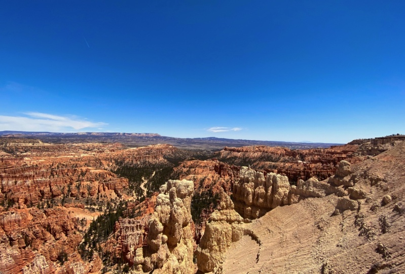
that we'll click File Place, and then we're going
to go ahead and just select this image
of Bryce Canyon. And I'm going to open that up. Now when I do that, you
can see my cursor changes. It's got this little
download type arrow here. And what we can
do then is we can click and drag this one out. So if I click and drag, I can just place
that however I want. Now I want it to completely
cover it. So there we go. Now you can see this is
completely obscuring my image. We're going to talk more
about that in the next video as we talk about layers.
5. Layers: Okay, Now that we've
learned a little bit about the interface
of Affinity Photo and been able to open up our
picture in Affinity Photo, it's time to learn about
the core concept of layers. This is one of those
core concepts that we're learning in this course
that will really carry you through being able to professionally edit photos and create different
types of designs and documents in a program
like Affinity Photo, because it is a
layer based program. So if you've edited
pictures before, maybe on your phone in the photos app or
something like that. You've probably used
to being able to make adjustments to the
way the photo looks, but you're making
them directly on the photo and that's going to
actually change the photo. And you can't
necessarily always get back to what you had before because it's right there on the photo layers allows things
to stack on top of each other so that one layer can be removed without destroying
the other layers. Let me explain this concept by showing you a visual here, e.g. let's say that I had this
picture of the yellow van and then I put this picture
here in front of it. Now, these two things have
stacked on top of each other. This one with the
lighthouse is on top of this one
with the waterfall. So they've stacked on
top of each other. They are layered. But remember the one in
back is still there, It's still there,
it's just behind. And that's the way layers work. In a funny photo,
you're going to stack different pictures and different types of layers that are not pictures on
top of each other. Let me show you that. So if I took something like this sheet of plastic here,
this little cellophane, and I put it in front
of the picture, is going to change what you
can see in the picture. I think it looks like
you probably can't see much because this cellophane is introducing a glare
onto the photo, right? So it is the next
layer in the stack. So you can see these
stack on top of each other first the
waterfall picture, then the lighthouse picture
than the cellophane layer. If I want to remove that kind of effect
that I've introduced, I just take away the
cellophane layer and then it's gone because of
the studio lights. This is still kind
of bright here. Let's think about what
if I took a layer that wasn't as big as the other
layer and I put it on top. So if I took this sticky note, you can see that part of
this is going to be covered. You can't see the man anymore, but you can still see part of the lighthouse and part
of the background. So some layers will not
completely cover other layers, and this is how you can
stack things together. Now, you can stack many, many layers on top
of each other. And indeed in some
Affinity Photo documents, you will see lots and
lots of layers as you create really complex art. We won't be doing that
many layers in here, we'll just have a few. But this is kind of how you get introduced to the
idea of layers. Okay, let's go ahead
and look at how this works in Affinity Photo. Now here on the computer
we can view all of our layers in the document in the layer studio on the right. So make sure that you
have the layer studio open and then you
can see your layers. Right now, we have two layers because we placed
two images here. Remember we had the first one, this one that's called
background here right now. Well, I have the
yellow van on it. That was what we opened. And then we placed this second
one, Bryce Canyon image, which is now on top because these layers are the
same size currently, we can't see one
behind the other. If we use our move
tool over here to resize this image and make
sure you're selected on it. So you can see we
can switch between which layer is selected
and highlighted in blue. So we're going to
select this one. If we move that, you can start to see the
other one can be high. And that's like how when the sticky note
was on the image, you could still see
part of the image. For now, let's just keep
it completely covering it. So that's how layers work. They each stack on
top of the other. I know that might not seem all that useful right
now, but don't worry, we're just going to
cover a few more of the concept with the layer
studio in this video. And then we're going to get into next video where we will see how this will actually
help us edit photos. So a couple of
things to note here. One is that you can change
the order of layers. So I can take this
one and I can drag it below what's called
the background layer. And then that one's going
to be on top and I'll see that one so I can switch
those back and forth. Now a couple of really
important things to note. The first one is this one's
called background right now that might be useful
if I had a background, but it's not super useful because it's not the background. So let's go ahead and click on that and then we click on it again and then we can name it. So I'm just going to
name this one van so I can tell what it is. And then one up here, I'm going to click on that one again and I'm going to
name that one Bryce. I can tell it it is now
you can see tell us what type of layer it
is in parentheses. So the van is a pixel one. That's because we opened
it up on its own. We didn't place it. The
Bryce one is an image one. Now those will act
very similar because they're both pixel
types of layers. But you'll wonder,
just want to note, especially for more
advanced projects, what kind of layer you have. There's a couple of icons here. The first one that we see
is that little check mark. You can see when
I roll over this, it says is visible. This is determining which
layer you can actually see. So if I check off
this Bryce one, then you can see that even
though the vein is behind it, we see it because the Bryce
One is no longer visible, so you can turn
visibility on and off. This other one is a lock icon. Lock icon basically means that
you can't edit that layer. You can't make any
changes on that layer. So if you have a layer looking the way that
you want it to 0, or you have a background, or you have a copy of the layer that you
want to preserve. You want to make sure
that it's locked. If you want to unlock it,
you just click on the lock. And background layers are
normally locked by default. Now, if you want
to lock a layer, makes sure that you
select it and then choose the little lock icon. Lastly, if you want
to delete a layer, say I want to get rid
of this Bryce layer, I don't want it anymore. I highlight it. And then down at the very bottom of this studio, you see the trash can
in the bottom right. We're going to click that and
that will remove the layer. So now that layer is gone, we'll go ahead and bring
that back just by hitting Command Z on my
keyboard, which is undo. Now you've probably
noticed that there are a bunch of other buttons and different things you can click
on in the layers studio. We're not going to worry
about those right now. We've covered what we
need to for this one, but we will talk about a few more of them
throughout the course, but not all of
them, just because this course is focusing
on the basics. So in the next video, we're going to be learning
about adjustment layers.
6. Adjustment Layers: Now that we know about
the concept of layers and how they stack on
top of each other. It is time to talk about a special type of layer
called an adjustment layer. Adjustment layers
are how most of the standard editing is done in a program like Affinity Photo. You remember how in my example
with the printed photos, I put a plastic
sheet in front of the image and that
changed how it looked. Well, that is where
adjustment layers are like. They don't block out the whole image the way
another picture does. Instead, did they adjust the
way the image underneath them looks adjustment
layers are found in this little icon
in the layers studio that looks almost like
a Yin and Yang symbol, half white and half black. Let's take a look at
an example of this. If I think this picture, Bryce Canyon looks too bright, I can add a brightness and contrast adjustment
layer by clicking on the adjustment
layers and scrolling down to brightness and contrast. When I click that,
you're going to see a new layer up here. Up here, it looks
like a white square with the Adjustment
Layer symbol on it. And you can see
it's already named brightness contrast adjustment. Down here in the bottom right, I have the controls for
this adjustment layer. In this case, there's
one slider for brightness and one
slider for contrast. There are some other buttons
around this control panel, but for now we only care about these sliders since this
image is too bright, I'm going to start by trying to drag down the brightness
a little bit. I'm just going to
drag to the left toes to the darker side and you can see that it
gets darker as it goes. This is probably something
that you may have seen before in other
editing programs, but it probably wasn't
done on a separate layer that you could turn on and off. You can see if I
do this checkmark, turn that off, and then
you can turn it back on. Often, especially if you're
new to adjustment layers, which you want to
start out with, is really big adjustments just to see what's
happening to the picture, but you wouldn't want
to leave it that way. So e.g. I. Might drag
this all the way down to see which parts of the image are most being affected by this. And all the way up to kind of
see what's happening there. So obviously that
blows it out and this really, really
tones it down. Now, if you ever want to
just reset on these sliders, you'll just double-click it and that will just drop
it right back there. Then you can make a more
minute adjustments. It would be much better
to just pull this down a little rather
than those extremes. But the extremes really
help you to see what is actually happening because it
can be a little confusing, especially at first
when you're new to some of these layers, specifically for this brightness and contrast adjustment layer, the brightness slider
is actually going to be effective all of the
pixels in the image. So every pixel in the
image is going get darker as we slide
to the dark side. And every pixel will get lighter as we slide
to the white side, it's just doing everything
unilaterally across the board. Whereas when it's in the middle, it's just like it was when
it was first imported. So that is really
affecting everything wears a contrast slider affects things a little bit differently. If you take the contrast slider to the right more
towards the white side, it's going to increase contrast. And that's going to make
pixels that are dark, even darker, and pixels that
are light even lighter. This will help to create an
edge between light and dark spaces and it makes you
very contrast the image. Now, if you slide
it to the left, it actually takes pixels
that are dark and makes them lighter and takes pixels that are light and
makes them darker. And so this will really
flattened out the image. There won't be so much
depth and dimension to it. And that's the way these work. So you always want
to kind of wrap your mind around what's
happening as best you can. Nobody expects you
to know how all of these adjustment layers
work right away. But with a little
bit of practice, you can start to
get the hang of it. Now one of the
really useful things about adjustment layers is that, or what we call a non-destructive
edit because it sits on top here and isn't
on the layer itself. It actually can be removed so we can of course turn
it off and back on. Well, let me actually add
some depth there so that you can see it so we can turn
it off and back on again. We can of course, change the order of it by
dragging it around. And we can also get rid of it entirely without
losing our image. So if I click on this and
I don't want it anymore, I can always hit the delete
button and it will go away. Now, there are many types of
adjustment layers down here. So you can see that there are all kinds of different
things that can happen here. And really the best way to
start learning these is to use them to try
them out and to see what happens with them. For now, I'd like you
to try experimenting with one of these
layers on your own. Choose it, apply
it to your image, and then mess around
with the buttons and sliders to see what happens. Many of them will have sliders, some white just have buttons, and some may have different
types of controls as well. But in the discussion tab, I want you to tell the class
which adjustment layer you chose to try and
whether or not you could understand what he
was doing to the image and whether or not you liked what
it was doing to your image. This is just in the
discussion tab. And don't worry if
you don't understand what's happening with your
adjustment layer at first, that's part of the
learning process. If you comment in
the discussion tab, will all help each other
learn by asking and answering questions later when we get
to completing the project, you will see me use several
different adjustment layers in order to make
the final image. In the next video, we will cover a new core concept,
that of selection.
7. Selections: Alright, now that we
understand layers and we've started working with
some adjustment layers, it's time to start
talking about selections. This is often a difficult
concept to understand, so don't worry if you don't
get it the first time, it will start to make sense when we get to the next video. And don't hesitate to ask questions if you have them
on the discussion tab for this course because I'm
happy to help you as you work on learning these
somewhat difficult concepts. Selections basically
are how we choose just a part of the layer to
work on to make selections, we're going to use
some of these tools on the left-hand side, this brush with the circle Magic Wand Tool and this square rectangle tool
that if you hold down on, you will actually find has a
number of other tools in it. These are all different
types of selection tools which will allow us to select
just a portion of an image. To start off, to just
kinda help us understand, we're going to start with
this rectangle tool. So if you don't have
it, just make sure you hold down on whichever icon is here and then select the
rectangular marquee tool. It's called the mark
key because you'll see that the little lines
will move around, kind of like the lights
on a marquee sign. So let's go ahead and let's just click. It
doesn't matter where. Let's just click and drag. And you can see we sometimes call these
the marching ants, these little white black
dashes that move around. That's the marquee. So basically it's
letting you make that kind of selection there. So the thing is now we can only edit within that selection. And the easiest way
to see that is for us to go ahead and go
to the paintbrush tool, just the regular paintbrush
tool right here, about halfway down on the left. Now the paintbrush tool will allow us to actually
draw something. I'm just making this paintbrush tool bigger so that
you can see it. And that's just using my right bracket key on my keyboard. I want to make sure
I have a color, so I'll go over here to my color and it looks like I'm
drawing in black. So when I draw it in black, you can see I can
make these strokes. And then when I
draw off, it won't. Now, if you saw that little
pop up there on the side, it said that the assistant, which is basically
the artificial intelligence that is here and if any photo turn
this picture layer into a pixel layer so
I could draw on it. That's not super
important for this video, but assistant will pop up if it does something
to help you out. And that just goes back
to this layer type that I talked about
in a previous video. There are now both pixels. So you can see I am drawing
here with my brush, but I can't go outside the
bounds of my selection. The selection is saying, look, you can only work here. Now obviously I don't
necessarily want a bunch of black markings on my picture. So I'm going to just
go ahead and hit Command Z until we
get rid of those. But that just helps you to
see what's going on there. Now there's a couple of other things that
you want to know. One thing that often happens is people who are new to this. We'll switch back to their Move tool and they'll
think that they can get out of their selection by clicking off on the side, because you can do that
in some other ones, but you can see the
selection stays no matter where you click the
selection is still there. And so to get rid of it, you have to do something
called de-select. And de-select command is just going to be Command D. Or you can come up here into the
control panel and you can hit the de-select button. So either Command
D for de-select or the de-select button. Once you do that, the
selection is gone. Now, you want to be
careful with that because some selections you work
really hard to get, which you'll see in a minute
and you don't want to de-select them before
you've used them, or you'll have to do all
that work over again. So just be careful with that. But let's go ahead and I'll
show you in another one. Let's make another
rectangle here. And let's say that it was easy
to select this rectangle, but you actually wanted to select everything outside of it. That's where you want
it to make your edits. Then you want to
invert your selection. And that's gonna be the
next button right here, which is invert selection. We just click that. It looks the same except
now there are marching ants around the border
of the picture. You might be really difficult
for you to see that. So let me go ahead and zoom
in here so that you can see these marching ants going around the
border of the picture. It now means that everything
that was selected is not, and everything that
wasn't selected is it just inverts
the entire thing. You can see that if I grabbed
my brush again and we come back here and we paint, I can't paint inside
of that rectangle now, I can only paint outside of it. Go ahead and hit Command Z a few times to get rid of that. And we'll hit Command D
to de-select our image. So those are the basic
functions of selection. There are more advanced things, but that's what
we're going to deal with mostly right now. There is one thing that I
want to talk about though, because the most
useful selection tool is actually the selection brush. Most of the time, a lot of
times you want to select a specific area of an image
to work on it directly. So say that I wanted to get
this area down here selected. That's really bright
and I wanted to just, just that, well, I would
make a selection for that. Let me get rid of this
layer that was made here. And I'm just going to be on
Bryce, we want select this, but I think it's going to be
easier to select the sky now the selection brush over here, it actually selects things
based on color and contrast. So it tries to select
what it thinks you want based on
color and contrast. So I'm going to
go ahead, just do a click and we'll
see what it gets. Now you can see that it kind
of goes all over the sky. Now that's because
my brush was big. If I go ahead and hit Command
D to de-select that and I make my brush smaller
with my left bracket key, I will get a smaller area. So you can see, because
my brush with small, it's only looking in
a small area and it just gives me that big brush. We'll add in more. We do big brush up here.
I can add anymore. And a big brush like that, we'll select a whole bunch. Now, it's important to note
here is that when I click, it adds to the selection. And if I want to get rid
of part of the selection, I need to hold down Option
and click hold down Option or Alt on the
keyboard if you're on a PC and I'll click in
the areas, I don't want. A lot of times it's good
to zoom in on this. So options scroll
will oscillate, you zoom in and to
make your brush smaller for this detailed work. So left bracket key
to make it smaller, I'm going to hold down option. And this will allow me
to select this area. And basically it's
telling the brush, Hey, you didn't quite
get that right. Take another look at it and see if you can make it better. So we don't want this
mountain areas selected. And the reason that I'm
starting with the sky, because the sky is a much bigger area of
similar color and contrast. So it's much easier
for it to select the sky than it is for me to
select all the foreground. Foreground would
be hard to select. The sky is easy. Then what I want to do here is go ahead and invert
my selection. So I'll just hit my invert
selection button here. And you can't really
tell anything's changed except that
there are marching ants along the bottom here
now, which it's hard to see. And so now what I have
is just a selection of the foreground so that
I can edit just that area. Now this might not all be making a lot of sense right now, but it's about to make
a lot more sense in the next video as we
talk about masking.
8. Masks: Alright, now that we
know about layers, adjustment layers
and selections, masks or the next
critical concept, and basically are where everything we've talked about
starts coming together. The basic idea behind
a mask is that it will apply to a layer
and it will allow part of that layer to show through and hide the other part, think of how when you
put a face mask on, it covers part of your face but allows the rest of
your face to show, say you're wearing
a medical mask. It's going cover your
mouth and nose but allow your eyes and your
forehead to still show. Let's see how this works in
practice in Affinity Photo, you'll remember in
the last video, we made a selection of the sky and then invert that selection. So we had the canyon
down here selected. Now we're going to
use that selection to apply an adjustment
layer and mask. We'll go down to our
adjustment layers and we're going to choose
the brightness and contrast, just like we did before. But now, when we do that and
we adjust our brightness, it's only going to
adjust the Canyon Park because we have applied a
mask with a selection to it. You might wonder what
this that mask look like. We can see that by going up
to the adjustment layer, holding down Alt or Option
and clicking on it. Now you can see the mask. The mask is made up
of black and white. The thing to remember
here is that black conceals and
white reveals. So whichever layer
you are masking, whenever that mask is white,
you will see that layer. So in our case, it's a
brightness adjustment. So where it is white, we can see that
brightness adjustment where it's black, we can't. So black conceals and white reveals wherever
there's black, you can't see that
adjustment layer. Let me go ahead
and just click on another layer to
bring that back. And I'm going to
de-select this de-select. But if I double-click
on my brightness layer, I can still make adjustments to that area just because
there's a mask. So obviously that's extreme
so that you can see it. I can see that area is getting
much, much darker now. The white and black thing
applies if we brush on as well. So let me go ahead and
we'll just close that so you can see better and
select the brush again. And you can see I
have black on top here in my color studio. So I'm going to be
painting black, which means they will be
hiding the brightness layer. That can be a little
bit confusing, but we're going to
come down here. And as I paint over
the dark area, you can see that
it gets lighter. It's not because it
is getting lighter. It's because that brightness
layer that was making everything dark is
getting taken away. So you can see that
applying there. Now, if I Alt click on the mask, you can see it and you can
see where I've painted. If instead I decided to
switch this to white so I can click the
double-headed arrow up here to get white instead, make sure I'm on my brightness
and contrast layer. And I bring this
up into the sky. I'm going to bring
in the darkness of that brightness and contrast
layer up into here. And of course I could reverse
what I had done before by painting back over that area. So you can see, especially when you
Alt click on it, how this mask is working. And different brushes of course, have different levels
of opacity and texture which will
adjust how it looks. So that is basically how
that works in practice. Let's go ahead and get
rid of this brightness and contrast layer here
just by deleting it. And now I'm going to
show you how you could just apply a mask to any layer. So if you just want to
apply a mask without making a selection first and not
using an adjustment layer, you just make sure
you're selected on your layer, in this case price. And then you come down here to this rectangle with
a circle in it. When you click that, it
will apply a mask and you can see the mask is now
underneath this layer. It's underneath, but it's
actually clipped into it. So it is I'm still going to affect it even though it
looks like it's underneath. Let's click on the mask. We want to make sure that
we're on the mask and not on the layer this would
be being on the layer. This has been on
the mask because we want to paint on the mask. So because we have this, you can see if I Alt click that this mask
is completely white. It is showing everything that is on the layer
because it's all white. Now, if I grabbed my brush, switch my color to black
and I start painting, this layer is going
to disappear. And the layer beneath it
is going to show through. So here's the van. You can see and I can
just paint that in there. Now, that doesn't make a
whole lot of sense here, but you can see
what it looks like. And if I turn on my mask
by Alt clicking it, you can see exactly where
I was painting that. Now if you ever don't like that, you can delete this mask by clicking on the mask
and hitting delete, just make sure you aren't on
the layer when you do that. Now, of course, using
this painting method, it can be a little
hard to get things exactly how you want them. And that's why a selection can often be really helpful
because the selection can help you get
exactly what you need selected and make a
mask off of that. So now we've learned how to take our four core
concept layers, adjustment layers,
selections and masks. And now it is time to see it all come together
and practice. In the next video, I'm going
to take you along with me while I actually
edit this photo.
9. Editing: Okay, so here we are and
we are actually now ready. We have all the concepts we
need to edit this photo. So of course,
you're going to try a lot of different things
as you edit this photo. So you're going to see me do
a bunch of different things. Some of them I will keep some of them I will
probably get rid of. I'm going to try different
things in order to get this photo into a
place where I want it. I'm only going to be working
on the bright photo. I'm not going to try and
do a photo composition in this case where I combine
two photos together. So I'm mostly just gonna be working with adjustment layers. Let's go ahead and
start just by going with our move tool
so that we don't accidentally paint on anything. And we're going to look at some adjustment layers
across the entire image. Sometimes will apply
just to part and sometimes will apply
to the entire image. Now, I already know from the work that we've done
previously that I'm going to want to do brightness
and contrast to Jess specific areas because the
sky is already fairly dark, but the foreground is
really bright and I need to work on that, but I want to adjust
the vibrance, kind of the color in this image. So let's go ahead and
start with a vibrant, you can see the vibrance
adjustment layer has vibrance and
saturation here, vibrance and saturation are
a little bit different. They both affect colors, but vibrance tends to have a much more temperate
adjustment. And at saturation tends to go
a little bit over the top. It's because vibrance
specifically targets the mid tones and saturation is going
to target everything. So let's go ahead and just see what the difference is there. A lot of photo editing is just making adjustments and then
trying something over again. So you can see as I
pull up vibrance, that the whole picture is
becoming more vibrant. If I turn off my vibrance layer, it's a little bit
more dull, but it's not super, super in your face. Whereas if I do this with
the saturation slider, it gets very in your face very
quickly because it is just affecting everything
in the entire image and really, really
saturating it. So I tend to like to go
with vibrance myself just to give it more
of a natural feel. And if I can, why do we
want, I want a vibrant, I can just pull up that
saturation just a little bit. I like where the entire image is at wind terms of vibrance. I'm going go ahead
and exit out of that and that's just
sitting on top there. And then I'm gonna go look
for another adjustment layer. I think it's always nice
to just kind of check and see what a photo looks
like in black and white. The black and white
adjustment layer is a little bit complex, but it's worth learning about if you want to do black
and white photos, because you can adjust each of these color channels
individually to determine how light
or dark they are. So there's a lot of
reds in this image. So if I pull down my red
towards my dark side, of course it's going
to get much darker. Of course, this is all
just adjusting the way those channels up here
in black and white. So if I want to
really brighten up my lighter yellow areas, I could bring that up because I can always double-click
to return it. So I think it's always
good just to look and see what your image looks
like in black and white. In this case, I
don't feel like I have a great image for
black and white here. It might be okay, but I
think I'm going to go ahead and delete that black and
white adjustment layer. Okay, let's try another one. White balance can be really, really important to
get right in an image. And often I will do
white balance first. You do have this
picker tool here, which will allow you to then
come out here and select something that should be white
to set the white balance. And let's just try
this cloud here. Say that should be white. We'll click on it and you
can see everything adjusts. Now that cloud was
a little bit blue, so it adjusted our
white balance and temperature up
towards the orange. Now for some reason,
affinity does blue and orange instead of blue and
yellow like most programs do. So that's just a little bit
different in the way that affinity handles
temperature and color. I'll double-click
that to reset it. I am not sure that did
exactly what we want, but we do want those oranges
to come out a little bit. So having it be a little
bit warmer is helpful, but not quite as
much as it went. Whereas the tint adjust the balance between
green and magenta. So if you're ever getting a
little bit of a green cast, you want to pull that
towards magenta. If you're getting kind of a
pinkish cast magenta ish, pull that towards green. In this case, I don't
really feel like we have a particular caste, if anything, might
be a little magenta. So we're just pull that just
slightly to the green side. And that's always good
to turn that off and back on again just to
see what you've done. And different layers will impact each other
in different ways. So I'm actually going to go back into my vibrance
and I'm going to bring down my saturation because
going a little bit more orange did a lot of what
I needed that to do. So I'm just going to
pull saturation down a little bit but leave
vibrance where it is, because there's a lot
of back-and-forth here as you're working
on these images. Now, let's go ahead and deal
with the brightness itself. We need to make our selection
like I did last time. I'm going to go ahead
and select this guy with a very large brush so that
I can get most of the sky. I'm on the wrong layer. This is really important to know is that if you get
on the wrong layer, then it's not going
to work because it's not quite know
what to select, Command D to de-select, and then make sure I'm on price. Always check what
layer you're on. I'm going to click the
sky and it looks like I'm not quite large enough
to get what I want. So I'm going go bigger, try and get the whole
sky in mostly one shot. I'm just going to drag
a little bit, okay, and then remember option to
subtract from selection. So we're just going to bring these guys back a
little bit here. And there we go. I'm not going to worry about
selecting this hill in here because it's pretty bright. So I think I've got a good
enough selection for now. And I'm going to invert it using the invert
selection button. And now I'm going to apply my brightness mask only this time we're going
to do it for real. So let's do a brightness
contrast mask here. And now we're going to pull down our brightness on this
part of the image. I'll just slide the
contrast slider around a little bit just to
see what it looks like. I don't feel like it needs any adjustment
on the contrast. So we just wanted to
bring that brightness down a little bit, kind of a subtle adjustment. I'm actually going
to bring it back just slightly to around 10%. I think that that
is working for us. And I think we can hit
Command D to de-select. So now we've got three different adjustment
layers going on. We've adjusted our white balance for temperature and tint. We've adjusted our vibrance to bring back some of the color. And we've adjusted our
brightness and contrast on just our foreground because the sky was fine the way it was. Okay, let's look back at our adjustments here and see
what else we might need. There are a lot of really
useful different ones here, but some of them
are more advanced. So e.g. there's this
one called curves. Curves is an awesome
adjustment layer, but it definitely is a more
advanced skill and it might not be where you want to
start right away if you don't already have
experienced with curves, There's a lot of different
things that you can do here. I'm just going to look
under Color Balance here just to kind of see
what I might want to do. Their color balance is something that can be done in
the curves panel, but this is one that just Ames just at the
color balance part. So if i think things are
looking a little bit cyan here, this is similar to what we
could do with the tint, but we have more
color options here. I could pull that
over into the red. And of course it gets very red if we go all
the way to the end, you can kinda see that we've got just a little cyan bleeding
in from the sky probably. So I'm just going to
adjust that a little bit. I'm looking at the sky to see if I'm really hurting the sky, in which case I might want to just mask in the canyon here. So let's turn that off
and then back on again. Yes, I'm definitely impacting
the blue of the sky there. So I think I might want to
just go ahead and delete this one and make a new
one with the mask first, go ahead and do our
selection again. And then we'll invert it, and now we'll apply
our color balance. So let's just adjust this
part a little bit to the red, since this is really the
red part of the image. We'll adjust this part to
the red just a little, not in nothing
extreme like this. Just just a little bit and we're looking
a little bit yellow. So I might try and go a little
bit over to the blue side. That's probably because
we're pulling out cyan when we put read in. So we'll just bring that back. Not a lot, but just
a little there. Okay. Let's turn that off
and back on again. And I do think that's
looking better. You might not be able to see it, might not come
through on the video, but there's just a little bit of subtle adjustment there
that helps us out. So at this point,
I can go ahead. I can select all of my
adjustment layers and turn them off so that
I can see what it looked like before her back
on and see what it looks like after I think we've made
significant improvement here, I am feeling like it's just
a tad bit over saturated. So I'm gonna go ahead and
hit Command D to de-select. And then I'm going
to come back to my vibrance adjustment. And I'm probably just going
to reset my saturation there. And that's just because
other things that I've done have made adjustments to it and so
we no longer need that. They're okay. So that is my final image. I've just taken this image and made a subtle adjustments to it to kind of improve the
overall image quality. So in the next video, we're going to look
at how we could export this image
for the project.
10. Export: Alright, now that we have
completed working on the image, it's time for us to export it as a file format
we could use on social media or a website or print out to hang on our walls, but also into a file
format that we can use to actually submit this into the project section
here on Skillshare. So let's go ahead and
learn how to do that. I'm going to go up
to the File menu, and I'm going to choose Export, which is just almost
down at the bottom. So Export, make sure
you don't choose Export. That's for
something else. Just choose Export. And you will see
affinities, export options. There are a lot of
them for this class, what you wanna do is
export it as a JPEG. Now here it shows
you the size in pixels and that is pretty large. And then you have
different options here. Don't worry about anything
here except the quality. If you want your file
to be specific size, look at this estimated file
size at the bottom and just drag this down until you
get to your file size. It'll take a minute
to recalculate at 90, it's about 3.38 mb. So depending on what
you're going to do, depends on you want this to be as good for social
media sharing is 2-5 mb depending on what site you're on and
that kind of thing. So around 3 mb is going to be perfect for what you wanna
do for your Skillshare, anything bigger than that, and
it's just going to take up too much room and we won't even be able
to see that quality. So it's not important,
but if you weren't printed out especially large, you would want this to
be of a higher-quality. So let's go ahead and we don't
need to worry about this. It should just be set
to whole document. And we don't need to worry
about the More button for now. We're just going
to click Export. That's going to take
us into our system. And for now, I'm
just going to go ahead and save this
onto my desktop. And I'm going to call
this Bryce Canyon demo. Alright, and then I'm going to click Save, and that's
all there is to it. Now I have on my desktop in
the Bryce Canyon demo file and I can submit that to
my Skillshare project. Okay, congratulations, you've made it all the way to the end. If you haven't finished
editing your photo, do that, and then go
ahead and export it. Of course, if you have any questions while you were
working on this project, please feel free to put
those in the discussion and I will do my
best to answer them. In the next video, we'll
talk about your next steps.
11. 11 Next Steps: Alright, I really hope that
you've enjoyed this course on Affinity Photo and have
really learned how to use some of the
core features of it. You know, these are core
features that you'll carry with you throughout
your photo editing journey. And you'll find them
in Affinity Photo and many other photo
editing programs. So you might be wondering
what are the next steps for you now that you've learned
the basics of Affinity Photo. Well, there's a couple of
things you can do from here. You can go dive in further
into photo editing. I have several other
courses that explore specific types of projects
using infinity photo. Some people who will be using desktop for those and
some might be using iPad, but the core ideas are the same. So you can go ahead
and check those out. You might also be wanting
to delve further into the affinity suite of funny photos are
great starting point. Affinity Designer to think publisher or awesome
applications as well, that can really help you
on your creative journey. So fortunately, I have courses on both a fashion
designer and Affinity Publisher that can
help you as you're learning more about
design and editing, you can go ahead and
check those out as well. Remember, don't forget to submit your project that
you've completed for this course so that
I can see what you've done and give
you feedback on them. That is really one
of the best ways for you to continue
getting better at your craft is to seek feedback from others that's gonna
do it for this course. Thanks so much for
watching and I will see you in the next course.
 Ben Nielsen, Good design is the beginning of learning