Transcripts
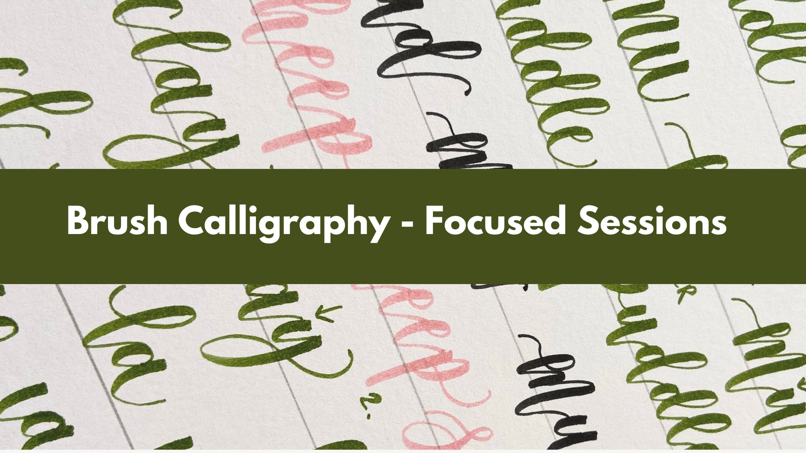
1. Welcome!: Hello, and welcome to my intermediate brush
calligraphy course. This is the perfect
next step if you've completed my beginners
calligraphy course, beginners brush course,
or any similar course. As long as you've got
the understanding of the basic strokes of how to form the lattice and if
you're able to join the lettuce up into
short words and phrases, this is where you'll
level up your skills. We'll cover so many exciting
topics like letter spacing, composition, trying
different stars like bounty calligraphy,
flourishing. I'll show you how to add,
really nice flourishes and drawings to your words. It's going to be a lot of fun. I can't wait to inspire
you and share for my own decade long
calligraphy Jone. If you're feeling ready
and you've got your pen and paper ready,
let's get started.
2. Letter Spacing: Today's lesson, we're going
to focus on letter spacing. What we're going to do today,
we're just going to grab a blank page and
we're going to do a few exercises together, and I'll show you
some techniques. We'll do some practicing together and hopefully
you'll get the ball rolling and you'll just start to understand about
spacing a little bit more. You can always use this
exercise to keep practicing. We're going to name this
lesson letter spacing. There are different types
of spacing in calligraphy. You can have a
very tight spacing or you can have your
letters, very well spaced. You can also have very,
very wide spacing. And all of these are
going to look different and they will also determine
your lettering style. You probably have some
sort of style already. So you can start noticing
whether naturally you tend to space your lettuce or do you tend to position them
very close together, or maybe your spacing
is exaggerated. It's just a certain style and it can look really,
really good as well. So to achieve tight spacing, we want to focus on
the connection stroke. So maybe let's just do lettuce A and B here and just an example. I'll show you what happens
to the connection stroke. When you're finishing
your first letter, you're going to make this
connection stroke to go up and we're not going to
stretch it to the side at all. We're just going to have
it up as straight up as we can before we connect
it to the next letter, which is the letter
B, let's say. Okay. Notice how it's
pretty much the U shape. These two strokes are almost parallel and the space
between them is quite small. If you want to achieve
very nice spacing, like a regular spacing, we can slant this
connection stroke a bit more to the right and we
can stretch it out as well. For example, let's do
the letter A again. But this time, instead of
going up in a straight line, I'm going to stretch the
stroke a little bit more to the right and it creates a nice gap between
these lattice. By lengthening and
stretching it to the side, you can achieve a bigger
gap between your lettuce. If you want to
exaggerate our spacing, all we have to do is follow the same technique where
we're stretching the stroke. But this time, we're
going to try and keep the stroke almost horizontal. We're going to do the letter A, Now this is what I'm doing. I'm going to the side, and then I have a little bit of this horizontal stroke going on here before I connect
it to the letter B. Again, I'm just going to stretch this exit stroke to the side, imagining that there's
another letter to follow. So if you have a look
at all of these gaps, you'll see that they're all
different and all we've done, we're just focused
on the connection stroke to alter the
spacing, to change it. So we're going to
do the word sage. We're going to do it three times and we can start with tight, then do well spaced, and then we're going
to try and practice wide spacing. We're
starting with this one. I'm going to do it about
sage and trying to keep my connection strokes very short and try to guide them
up as much as I can. So very, very tight. I also want you to
try and focus on your entry and exit strokes and just always extending them. It just makes your
word look a bit more professional, a
bit more complete. I highly recommend starting to practice longer entry
and exit strokes. Let's do well spaced. That would be my style, I think. Some people would fall
in this category or this, it doesn't really matter. We're just practicing
different styles. But you can start noticing what feels more natural to you. Let's do it again, starting
with a nice entry stroke. This time I'm going to
stretch it out a bit more, just make it easy to read. Now, this I'm picking up my pen after every
single letter. Try to do it in your own style. Doesn't have to look like mine. Pick up your pen
after every letter. Don't forget to stretch that
exit stroke to the side. With wide spacing, we're just going to exaggerate
it even more. Letter, stretching it this
way, picking up my pen. I'm also making my letters a
bit smaller for this style. However far you
stretch your strokes, do try to make these
gaps fairly similar. Obviously, we're not like
robots and we can't make them 100% the same because we're
just doing hand lecturing. It's not an actual font. Do try your best to
make them consistent, as consistent as you can. If you are going to draw little circles in
between your letters, it would all be fairly
similarly sized. It's easier than
the said, I know, but just thinking about it
will help you to do it. Right and notice how I
naturally made my word a bit bigger here just because I know that if I'm
running out of space, I need to make my
lettering a bit tighter and a bit smaller. I naturally just did
this word a bit smaller. I usually use this tight
technique when, for example, I'm running out of space
on my card and I suddenly need to make my lettering a bit tighter to
make sure it fits, and it's a bit
smaller. Another word. Let's do the word Lilac. I'm going to start here with
a nice entry stroke again. So very tight spacing here. It makes your write
naturally a bit shorter. It takes less room on your page. So Lilac. Also, if you're struggling
with keeping things straight, you can just draw a line just
to help you a little bit. It can be a bit hard just lecturing on a blank
page like this. We're going to space it
a bit better next time. I'm going to stretch these strokes a little
bit more like this. Now it's taking more
room right away. This last one, we're going to stretch even more and
I'm going to keep my lattice shorter and
smaller just to make sure that I fit them in
here. There's not much room. There we go. We could do another word. Let's do the word Nav maybe
starting with the letter N and just stretching
it all the way up, picking up my pen dividing each letter just
like we did before. I trying to space it
a bit better now. My style is very bouncy. Dunbar yours is
looking different. Everyone style is different. That's absolutely normal. Let's stretch those strokes
or debated the side, trying to keep our lattice
fairly small here, but just focusing on
those connection strokes. Well, you can see how they all look a little bit different. This is just a nice
little exercise. You can keep practicing
with different colors, keep lettering different names, do a bit of
practicing with this. It's really, really good to
try and do it differently. Focus on your
connection strokes, focus on the gaps
between your letters. So maybe try to do a few
more words before you carry on with the next
lesson. Well done, everyone.
3. Lettering Size: And just to take this exercise and put it into actual practice and give you a good
real life example where you need to use
these techniques. What are we going to
do? We're going to take a page, any page. We're going to fold it in half. This is just going to be like
a little card mock up idea. Imagine that this
is a greeting card. If you wanted to, you could also fold it in half once more. Maybe you should
actually do that. So let's ford it again so we
get this a six size instead. So it's a bit smaller, make
it a bit more challenging. Yes, like this. That's perfect. So imagine that we are
lettering a birthday card. So we want to let something simple like happy birthday here. And obviously, we have a
limited amount of space. We can't just start very big because we might
just run out of space. You can, of course, use a pencil to kind of draft
your design a little bit. I'm just going to pencil
in my lettering here. And just make sure that it's nicely scented, that I'm happy. If I'm not happy,
I'm just going to raise it and do it again. Happy birthday. Keeping our lettering
fairly small because we don't have that
much room here, do we? My dad little heart
here like this. I think that looks
good. I'm just doing a quick it scribble. I'm not doing any brush
lettering or anything. I'm going to go off with
my brush and that's where we're going to start to see
thick and thin strokes. This is just a
really good example. You can see that lettering
here is fairly small, so I do need to implement that tight to spacing to make
sure it fits on here. I'm going to start my
lettering fairly small. And because I don't
have a lot of room, I have to try and fit this
little phrase on here. So I'm going to
work on my spacing. And just make sure that
I'm not stretching my connection strokes too wide because that's going to make the whole word
look very wide, especially for the
word birthday. It's such a long word. You will never think that,
but it is a very long word, we want to be very
mindful about how long it is because if you
run out of room, the card is not going to
look very good, is it? We're just being very careful positioning all the
letters fairly tightly. M here we go. That's just a very
quick example. That's just a little
example to show you where we would
use tighter spacing, and it's very, very
useful to practice. This is not a real card, it's just a little mockup. If it was a real card,
we would then erase the pencil lines and make sure
you can't really see them. But it is good to use a pencil to draft your design beforehand. I hope this just demonstrates the idea and take
your time to do this, try not to rush it. Maybe you need a
few attempts and that's absolutely
fine, take your time.
4. Bouncy Lettering Style (Individual Letters): This lesson, we're going to practice bouncy lettering style. Bouncing your letters
can be so, so nice. It can make your lettering
look so much more interesting. You can add a lot of character, and to make it easier for you, I'll just share some
very important tips. It's often used in
wedding stationery, when lettering place cards, for example, if you want to
make them a bit more modern, that's quite a popular
style at the moment. For wedding signs as
well, for birthday cards, prints, it just makes your phrases and words
look very different. And interesting to read. Before we start
lecturing actual words, I just want to cover
some little techniques. It's all about just learning
to bound individual letters. For example, some letters are
more popular to bound just because they're made that way and it's just easier
to stretch them. It's easier to bring
them up or down. If someone asked me, what is the most popular
letter to bound, I would definitely
says the letter M. So maybe what
we can do today, if you have a ruler nearby, grab one for yourself
together with a pencil. And we're just going to
draw a straight line, it's just going to make
things a bit easier. So just a quick little line. It's just going to act
as a baseline for us. I'm just going to position my letter M on this line
in a very simple style. Let's do this
together. Let's just letter the letter M. I'm not stretching my
letter below the baseline. I'm just keeping it where it is. When we do a bouncy
lettering style, very often we stretch our
letters below the baseline. If we wanted to bound this
letter M, what we would do, we would stretch usually
the second half of the letter below the
baseline and then bring it back up with a longer
connection stroke. I hope that makes
sense. Now this how I positioned this part of the
letter a bit higher up and then I did the second
part of the letter M even higher before I dropped it down below the baseline and then stretched this
stroke all the way up. To connect to the next letter. So there you go.
You already have one letter to use in your start. So this letter is
very popular as well. It's pretty much in
every other word, so you will definitely make
a big change to your words. And at the letter, which is also very similar to the letter M is the letter N. So we are going
to do it normally again. So positioning it
on the baseline, making sure that our strokes are touching this baseline here, and then do a bounty version where we're going to bound
the last down stroke, all the way down, and then stretch the exit
stroke all the way up. Very simple, classic style, and a bouncy lettering style. Let's try one more letter here, so we're going to do
the letter H. Again, we're going to position it on
the baseline to begin with. So very nice, tidy and neat. And now we're going
to bounce it. So I'm going to stretch
its last downstroke, all the way down, and
again, come back up. So now to the pattern here. What's happening
essentially, we're just taking the last downstroke
of each letter, and we are stretching it down. So you can just think
of it that way. So a bit of a theory there. So it's all about
that last downstroke, and you want to bring it below the baseline
when you go down. That's plenty of
letters already, but we could add a few more. So let's just do another line. We can literally
apply this technique to most of the letters. Let's say the letter A, which maybe doesn't seem like it would be a
letter we could bounce, but let's just try and
do it normally at first. It's very simple style, and we're going to try and take this last downstroke
of the letter and bounce it below this baseline. Let's see what happens. So I'm doing the
downstrg going all the way down and then
I'm coming back up. Imagining there'll be another
letter to connect to. There we go. We could also
do the same thing with the letter R. It's not
that common to bounce, but it's definitely doable. Here days on the baseline, if we wanted to make
it a bit more bouncy, we would go below
the baseline and stretch it back up like this. We can also do that
with the letter D. Here it is on the
baseline to begin with. And we're going to make it
a bit more interesting. Take that last downstroke of the letter and bounce it
down below the baseline. Okay, so I hope
you get the idea. It's all about that
last downstroke. Obviously, they don't really make sense when we do
them on their own. So let's just try and put this together in
the next lesson.
5. Bouncy Lettering Style (Words): So in this lesson,
we're going to practice simple and bouncy
lettering styles just so we have
something to compare to. So we're going to need
about five lines here, let's do five to begin with. So grab your pencil, just draw these
quick lines. Okay. And we're going to
do a simple style on the left and bouncy
style on the right. Let's carry on with
lettering color names. Let's do the ward silver. I think that's quite a
nice w we could bounce. In this first simple style, we're going to try
and position all of the letters on the baseline. Notice how I'm
positioning them all on this baseline and
being very careful and to not go below it. Thinking about
spacing here as well. Take it slowly. There we go. A very
balanced, simple style. Now I'm going to do
the bouncy version and we're going to start with the letter S and straight away, we're going to stylize it and bring it below the baseline, making it fairly big. Then you can pick up your pen
here, have a little pause, and then do your letter I a little bit higher
up so it doesn't actually touch the
baseline at all. It's also a bit smaller. We're going to do the letter L, stretch it up, and I'm going to position
it on the baseline. Then do the letter a
bit higher up again. The letter E may be a bit lower. When we get to the letter, we're going to do a big bound because that's one
of the letters. We can bounce in a very
nice way all the way down and now it is how
different it looks. We change the size and
height of some lettuce, we stretch some of
the letters down. Maybe it's not the best example. So words are harder to bounce. But we did use the
letter R technique where we stretched it below the baseline and we made the letter S quite
stylized as well. Let's do the word marigold. It's quite a long word, so maybe try starting
it fairly small. Again, I'm touching the
baseline with all of my kind of downward strokes. I'm rounding them up
at the bottom here, making them nice and neat. There's no bounce at all here. My spacing was a bit off here, but it
doesn't really matter. So now we're just
going to transform this word into a bouncy style. And this is a really
good example, actually. So we're going to start
with the letter M. When we do the second
part of the letter M, we're going to stretch down that downstroke and
bring it back up. Then we're going to
do a small letter A, and I'm going to make the loop, my letter quite nice and big and then stretch it all the way down again below the baseline. Then do the letter I
a little bit smaller. Followed by the letter G, which naturally stretches down. Doing the letter O, making the letter L maybe a bit bigger, positioning it on the baseline and doing the letter D kind
of up in the air here. But then when doing
its last down stroke, I'm going to stretch it all
the way down like this and then finish with a
nice exit stroke. Okay, so this is a
really good example, and you can see how different
these two styles look. It's quite amazing, I think. Okay, let's do another word. Let's just letter the word
pink, something a bit shorter. Right, so let's do it in a nice and clean
style to begin with. Okay, there we go. Then we're going to do
the bouncy version. I'm starting by stretching the slope of the letter P maybe
a bit below the baseline, just making it a bit bigger, then doing the
letter I and we got the letter N coming up
and we know that we can use this last downstroke to all the lovely
bounds to this word. There we go and do
a nice letter K at the end and maybe bound the last stroke of
the letter K as well. Always remember to stretch the last stroke to the
side as long as you can. Let's do two more words. Let's do the word green. Starting very neat. Do take your time here. It might not work the
first time you do it, or maybe you're struggling
with this simple style. It's quite hard to
do if you're used to bouncing your lettuce.
So do take your time. I don't want you to rush
here or if you feel like it doesn't
look very neat and you want to do these
words a few more times, please, please take your time. But it doesn't have
to look perfect. Just remember that. We're
just practicing here. Right. So doing it
in a bouncy style. We're starting
with the letter G. And then making a nice big
lobe for our letter R, picking up the pen here,
having a little pause, and then stretching the
last down stroke of the letter R. Then
the lettuce E, I'm going to keep fairly
small and above the baseline. And to contrast them, I'm just going to exaggerate this letter N and
bring it all the way down before finishing with a nice exit stroke like this. Well then, everyone,
you're doing a great job. It's not an easy exercise. Let's do the word white just because we have some
nice letters in there. Doing the simple style first. Don't forget to pick your pen up from your page
from time to time. There we go. So I'm going to do the letter W kind of normally
here on the baseline. But then when I do the letter H, I'm not going to position
this stroke on the baseline. I'm going to keep it up here, and then use the bounds method where I stretch
it all the way down, bring it back up to
catch the letter I, again, kind of
above the baseline. Do the letter T and finish with the letter E. That's kind of also
up in the air. So that could be a
nice way of doing it. So I hope you find it useful. I hope you can see the
difference between both styles. But notice if you
like this style, if the kind of suit
your personality, if that's something you want
to keep practicing or maybe you're in between of these both styles,
somewhere in the middle. That's also fine, or maybe you love this
classic looking style. It's also absolutely fine. But this is just a very
productive exercise to try. I hope you enjoyed
it. Well done, everybody, and I'll
see the necklace in.
6. Plan Out Your Phrases In 3 Steps: Now that we've practiced lettering words and
joining up letters, we are ready to start putting a few words together
into longer phrases. So there's a lot to
think about when you're starting to do longer phrases, and I'm going to
share as many tips as I can this week
to equip you with all the knowledge you
need to start lettering beautiful compositions,
making beautiful layouts. And as always, we're going to
start from the very basics. So in today's lesson, I'll show you how to
plan your designs, map out your lettering. So we're going to
call this lesson mapping out your lettering. The first thing to do is to pick a phrase you
would like to letter. We're going to do
something very simple just for the sake of practicing. We're going to start with
a three word phrase. I'm just going to write
it down. The first step, we have our phrase. We can letter
believe in yourself, so it's three words and one
of them is very, very short. I'm just going to
write it down here, just scribble it really in
your normal handwriting. All right. So once
we have the phrase, we can start planning it and
thinking about it in depth. So the second step I
highly recommend taking is to decide how many lines
you will have in your phrase. When I say lines, I mean how
many words you're going to have on one line and how
many lines in total. So we only have three words, and I highly recommend, especially for brush lettering, I highly recommend trying to fit one word on each line
if it's a short phrase. So we could do three lines, each word would be on its own line is the
most effective way because then you can
make your lettering bit bigger rather than
lettering it in one line, and will literally
take the whole page and you'll have a lot of room at the top and at the bottom of the page and it just
won't look as effective, although it has its place and sometimes that
might look nice. But if you're using
a chunky pen, especially, you want it to pop, you want it to look bold. So I highly recommend
whenever you can, try to fit one or two
birds on each line. But if it's a longer phrase, obviously, you might need
to do three or four. That will really depend. So it's a really, really
good place to just think about it and decide how many
lines you're going to do. So we're going to
write it down here. So how many lines and in this case, we
are going to do three. I'm just going to write
it down three lines. The third step is to circle the most important
words in your phrase. We're going to focus on
something that's called hierarchy in graphic
design in particular. That's when we are trying to
make certain words bigger, your attention is drawn to them and make the phrase
a bit more contrasting by making less important
words a bit smaller and the most
important words bigger. Because it's a very,
very short phrase. It's quite hard to do.
But in longer phrases, the rule I go by is
only keep the ones that are necessary to
understand the phrase. So in this case, if I
remove the word in, believe yourself, you know, that's just like a
different phrase, so it doesn't really work. If I remove the word, believe, it just
says in yourself. So in this case, to be honest, all of the words
are very important. However, the word in acts
as a little fill up word, but I like to call
little words like that or a or in or off. Or would always be a
little filler bad, so we don't really want
to make them too big. So in this case, I'm
just going to circle these two bids because I
want to make them bigger. So I would say, even the bird yourself wants to be
the biggest word. So I'm just going to
circle it because it wants to draw attention to the word yourself
because you're trying to motivate yourself
with this phrase. I would say that's the
most important word. So do take a bit of time trying
to pinpoint these things, try to think of hierarchy
in your design. So hierarchy, circle. Important words. Right, so these are three, really, really huge
steps already. So number one, decide
what you want to let up. That can be really
hard in itself. Number two, how
many lines you're planning to have in your
phrase in your design. Number three, think
about hierarchy. Which words need to stand out in your phrase and which words
can be a little bit smaller.
7. Mapping Out Lettering: The reason I called this lesson mapping out your phrases is because I highly recommend drawing a little map, literally, a little map that will act as a little guide and will
just help you to make your lettering look a bit more consistent and you'll have
some guidelines to follow, which is always
always very helpful. If you're lettering a
poster or a greeting card, the next step would be
to find a center line, find the middle of the page. I'm not going to worry
too much right now because I'm not
doing any projects. I just have this
random space, really. We're going to do a proper
project in the next lesson. But for now, just
grab a ruler and a pencil and draw
a vertical line. This would be a good
place to start. Just a straight vertical line. Do try to position it in
the middle of the page, but we're not going to do
any measuring right now. So just a straight
line like this. Ideally, if this was a
greeting card or a poster, we're going to talk
about this very soon. You would measure the width of your page and you would
divide it by two, that number would be the length you need to measure
from the side. To get your center of the page. But for now, we're
just going to do this approximate line and
imagine that this is a center. We can write down
actually number four would be to find the
middle of the page. This is where we're going to
start and draw some lines, which we'll then use as guidelines to position
our brush lettering on. We know that we're going to have three lines in our phrase, and we know that two of these lines are fairly
long and then we have a very short line
here for the word in. So I'm going to
do the fast line. And what I highly recommend doing just to make it
a bit more balanced, try to have the same length of the line on both sides
from your center line. So if you're going to
do 4 centimeters here, you then want to do 4 centimeters on the
other side as well. So just try to make
these lines the same, and then you have
a cross line going right through the
middle of this line. This is 8 centimeters
and we divide it by two. So each side is 4 centimeters. Maybe you're using inches,
which is also fine. Just make sure that both of
these lines are the same. Right. I've done my first line. I'm going to leave a little gap because we know that
when we do lecturing, we need a lot of space
at the top of the line. However, the next word
is very, very short. I just do 1 centimeter
on each side. I left a little gap. You do want to position your
lines fairly close together, but not too tight. But the most important
thing is not to leave huge gaps in between. So closer is better
than further apart. We always want our
phrases to be compact. So it looks like all
the words are merged together instead of having
big gaps in between. You're just going
to make your phrase look a bit more coherent. It definitely helps with making your design aesthetically
pleasing, nice to look at. Right, so we have another
word to divide yourself, and I know that I want
to make it a bit bigger. It's a very similar length
word to divide belief. I think I'm just going to make this next line as long as
this one, as the first one. But I'm going to
leave a bigger gap in between because I
know that I'm going to make this word a
little bit bigger. I'm going to do 8 centimeters
again. There we go. You see that there's
a bigger gap in between. So there we go. We have a little map
for our phrase here, and the next step I highly
recommend doing is just using your pencil to very lightly
scribble your lettering. So just do a little draft
because then you can erase it, you can correct it before you
go over with a brush pen. So I'm going to do the first
word belief on this line. If you want it to
be super precise, and this is not necessary. But if you consider yourself
to be a perfectionist, then you like very neat kind
of perfect looking designs, you want everything to look
super balanced, which again, is not necessary
in brush lecturing because it's a handmade skill. But if you really want it to, you could then count
the letters in your word and find the
middle of your word. In the word believe, we
have one, two, three, four, five, six, seven, Lettue. If I take tree from one side
and tree from another side, then the letter I falls
right in the middle. So I will try and
position my letter I right on the center line. Then I'll do B, E and L. The letter is right in the middle
and the rest so E, E. So we got the word believe. Okay. So it's kind
of fairly scented. We got the word in and we're going to do
one letter on one side, do a connection stroke, and do the second letter on
another side, and again, kind of splitting these
letters so they look scented. And the word yourself, I'm going to do quite big
and we have one, two, three, four, five, six, seven, eight letters in total. I'm going to do four on one side and four on another side. Obviously, just approximately, this is just for
guidance and you don't have to be super super
precise. I'm starting here. And making this word
bigger as planned. So here we go. We have
three words here. I'm fairly happy, I think, with the whole design. I don't think I'm fully
happy with this part. So use your eraser if
you need to correct anything before you go over with the brush
pen, now's the time. I might just make this
connection stroke a bit more natural looking
and and make it this way. I might make this entry
stroke a bit longer. I just balances out
a little bit more. I think this looks fairly good. Again, it doesn't
have to be perfect. The next thing to
do is just to go over with your brush pen, follow the pencil lines. Take your time here. Should
be quite straightforward. It's really nice when you have something to
follow, some guidelines. From here, just try to focus on brush lettering in itself, thinking about the
pressure changes. Adding a bit of bounce
if you want to, you have a nice baseline here
so you can work with it, maybe stretch some
letters below. Now I'm stretching
this connection stroke to make my word
a little bit wider, having a bigger
space in between. Let's do the last word. Try to start each word with a nice entry stroke and finish each word with a
longer stroke at the end. Obviously, you can go over
your guidelines a little bit. It doesn't have
to be ideal here. So here we go and just make sure that this
is completely dry. Sometimes it might
take a few seconds to dry before you get rid
of these guidelines. So just use your eraser
to get rid of them. There are some bad
erasers that might smudge your lettering or
they just might smudge your pencil and
leave a black mark. So do try to invest in
nice erases if you can. I know that some cheap ones
sometimes at the back of your pencil can be
quite harsh on paper. And once the
guidelines are gone, you're going to be left with
a lovely balanced design. It's perfectly aligned. It looks really balanced. This is definitely
a technique you can use just to give you
a bit more confident, give you some guidelines. I hope you enjoy this planning
process that is fairly clear and you can do this
yourself with any phrase. I highly recommend starting
with shorter phrases. Maybe try to pick a phrase,
try doing it again. If you have a bit of
room left on your page, that'll be a really,
really good exercise.
8. Project Mock-Up Example: So in this next lesson,
what are we going to do? We're going to take a
page, that's A four, just like a regular page
and fold it into half. So we just want a smaller page. It's a bit easier to work
with at the beginning. So you can also imagine
that it's a grating card. It kind of looks like an A
five sized grating card. So we had a four. Folded this into half, and we have a five now. Here we go a little card. So we're going to put
what we covered in the previous lesson into practice and imagine that we are lettering a greeting card. So the first thing to do, I'm just going to use
the other side of this page is to pick the
phrase week in letter. And I'm just thinking
something really simple again, something
fairly short. Let's do something like
have a lovely day. So it could be a
nice little card. Have a lovely day. Okay. We're going to think about how many lines we're
going to have here. So what do you think? I think we could easily
break it down into one, two, three, four lines because, you know, we have quite a lot
of room here to work with. So we're going to
have four lines. You can also do
three, of course, but this is just guidance. Four lines, so we've determined how many lines
we're going to have. And in the next step, remember, we're going to circle. The most important words. So I would say that
in this phrase, the most important words
we want to kind of draw attention to are the
words, lovely day. The word A is probably
going to be quite small. Again, it's a
little filler word. The word have I mean, sure, it's probably quite important, but I wouldn't make it
as big as these two, but it's also a very important
word because without it, the car would just
say, a lovely day, so it's not very
personal, is it? So here we go, have lovely day. All right. So next thing we're going to do. Remember we're going to measure
the width of this card. So mine is 14.8 centimeters. So I'm going to
take this number. Divided by two. If
you're using the same, a five card, yours
going to be the same. And we're getting
7.4 centimeters. You can also work in inches
if that's easier for you. So 7.4 is going to
be somewhere here. Okay, so that's my center
line. So that's the one. I'm going to draw here. So very lightly, try to go as lightly as you can
with your pencil because, remember, we will be
erasing these lines. Another really useful thing
to do is to find a center line kind of looking at
the height of your card, so we could also
measure the height. In this case, it's
20 1 centimeter. If I divide it by two, I get 10.5 and I did
it already here. That was very lucky. So I'm just going to draw a
line here that kind of shows me the proper
center of the card. So this is right in
the middle here, okay? So if we have four lines, we would probably try and position two lines
here on the top, and then two lines
here a bit lower down. That would be a thing to do. The thing is, we don't really want to fill
in our card with, like, big, big lettering without
leaving any negative space. In graphic design,
in particular, this is when I did
my BA studies and I really remember this
so well that we were always taught to leave
negative space in the background because
you know that you also want to show
that negative space, which is as important
as your design itself. I would say that I
probably want my lecturing to be this big. Maybe start somewhere here
and end somewhere here. Again, we need to do
a bit more measuring if we want it to
be nicely scented. So what I usually like to do, I like to pick a number, so maybe in this case, we
could do 5 centimeters. And I'm just going to
mark 5 centimeters here, and then 5 centimeters
from the bottom. And then maybe do 3
centimeters from the sides. So I'm just going to get rid
of some of the lines here. Otherwise, it's going to
become a bit overwhelming. So here we go. So I know that I can't
go over these lines. So these will be like
my little borders. You can also just do a really
light square if that's, you know, helping you at all. So my lettering will be
within these guidelines. It might look quite small, but you'll have lovely
space in the background. Also if you ever wanted to
add some drawings there or maybe some watercolor elements or just literally hearts or little stars that could nicely
complement your lettering, you could because you
would have room for that. From here, I'm just
going to draw two lines. So we have the word
half and then A, so it's a very short
word, kind of here. I'm going to write it as I go. I think that's a bit easier. So again, two
letters on one side, two letters on another side, try to make it balanced. The word A is going to be
right in the middle here. Then I'm going to
position the word lovely on this center line
and make it fairly big. And the word A kind of here, see where it fits for you. So for me, it's a
bit lower down here. So I'm going to make
it fairly big again, but because it's
quite a short word, and the letter A is like
in the middle of the word, so I'm going to try to
position the letter A on this center line. Now, it can sound
a bit, confusing. Trust me, once you got
through this a few times, it's going to become
so much easier. I'm adding a bit of bounce. I might add a little
entry stroke. To my letter days, it looks a
bit more balanced this way. You can also use your
eraser, just, you know, correct a few things if
you're not fully happy. I might make this exit
stroke a bit shorter. So, here we are. Let's see what happens when we fill
this in with lettering. Okay, so give it a few
seconds so it dries before you start erasing
your guidelines. Right. So I think I've
gotten rid of all of them. And if we look at this, we can see that we have a
really nicely centered design, which is not overwhelming. It's not like huge. If you wanted to, you can add something
in the background. You can make it slightly
bigger if you wanted to, but just always
remember, I highly, highly recommend always leaving some negative space
in the background. And then if you
want to, of course, you can grab another pen or just some markers
you might have at home, and even adding something
simple to your card like little hearts can
look so lovely, but it can also look
very overwhelming if your lettering is
very big already. So having a lot of
negative space is especially useful if you want to add some
background elements. This really, really
simple heart I'm doing with my Tambo brush pen in this pink color can
be so, so effective. It doesn't really have to be
anything, you know, crazy. You don't have to learn,
have to draw or anything. You can just use some
simple elements like that. I hope this
demonstrates the point. If this feels really
overwhelming, I don't blame you. That's absolutely
fine. You know, it sounds a bit scary
that you need to measure things and
divide things. You know. There's a little
bit of mat involved in here. But trust me, the
more you do it, the more natural you'll
feel, I promise. I just remembering the
simple steps following them. And after a bit of practice, you'll start to do
these things naturally. I would rarely do this, I would rarely measure it out unless it was something
very important. After practicing this way
for even just a few months, I was able to kind of
eyeball it to the point where it would still look fairly scented if I didn't
use any guidelines, but if I just use the pencil to trace my
design and just edit a little bit that
way without doing scent lines and all that or just drawing
individual lines. But that's a really,
really good and proper place to start. So I hope you enjoyed learning a bit of a
theory behind it all, and there are a few little
things I want to cover, so I'll see you in
the next lesson.
9. Different Examples Of Aligning Your Lettering: And there's another important
topic I want to cover this week and they're going to talk about lettering alignment. Aligning your lettering. I'll show you three
different ways and all of them can look really, really nice on your greeting
cards or on your posters. It's really nice, especially
if you want to make your design look a bit more interesting,
a bit more different. I'm just drawing some lines so we have something
to letter on. All right. Let's do
a phrase, thank you. So you could align your
lettering to the left so left aligned left alignment. And that would mean that
we're making sure that the next word would start
where the first one started. So both of these lines would
be aligned to this corner. You could also just draw a line there to make it
a bit more clear. So I'm starting my
next word from here. Like this. This can
look interesting. It doesn't look scented, obviously because it's not, but it definitely has its place. Especially if it's
a longer phrase, it can look very minimalistic if you just have
a short phrase in the middle of the page
and all the words are aligned to one side. We can have lettering nicely
aligned nicely scented. That's something we've
practiced already, so we would position the next word right in the
middle of the first word. So try to align it in such way that both of these wires kind of go through a center line and
they're even on both sides. So try to do it free hand here. Obviously, it's not perfect,
but you get the idea. So in this case, we would have a center
line go through, and both sides would
be aligned that way. And we can also
align to the right. In this case, we will
do the first word and we would align the
second word to this line. We would want to finish it here. That means I need to start
it a bit more to the right. Leaving a little gap
here at the beginning, making sure my exit stroke
is touching this line. Just try to remember there are different ways of
aligning your lettering. It doesn't always
have to be scented. I can actually look really nice when it's
aligned to one side.
10. Lettering On Shapes: The last thing I want to
cover is lettering on shapes. So this could be a very,
very good exercise. So remember how we were drawing lines to position
our lettering on. You can also do little arcs like this or little circles or like a wavy line
or anything else. Just remember, it
doesn't always have to be a straight line. So we could maybe try. Let's just do the word hello. So this is how we do
it on a straight line. So something we're used to. Let's say we wanted to position
it on this arched line. What we would do, we would
try to make sure that each downstroke
touches this line and then it follows
its direction. Notice how I'm
making my lettering. Quite curved here because
I'm following this line, you can also move your page
to make it a bit easier. Idea is to make it look like
it's baseline is curved. That's what we're
going for. So try practicing it. It
can be a lot of fun. We have something extreme
here like this line, what I'm going to do again, just make it sit on this line, which means when I'm finishing my letter or starting
the next one, I'm going to be guided by this line and that
will determine where the base of
my lettering is. Now it is I'm bouncing it to fit this wavy line.
This is quite extreme. We probably rarely use this, but it can be a lot of fun. If you erase these lines, you'll see that your lettering just looks quite interesting. The best thing about
this is that you can use this technique when you're drawing your maps for lecturing. Let's just quickly do
another short phrase. I'm just going to do my center line just
so I have it here. We can do the phrase
Let's Have an adventure. I'm going to do the
word let's here. I'm making this 4 centimeters. And then I'm going to make
the next line 6 centimeters. It's a bit longer, so
that's for the word half. And then a very short, maybe two centimeter
line for the word A. Let's have A, and for
the word adventure, I'm going to do this
little arch line. It's really hard to do free hand and make it look straight. So try your best to kind of Make it as straight
looking as you can. We're not going to do
actual lettering on this. I just want to show
you an example. We could have our
word let's here. Just draw a quick little map so you understand what I mean. Then we would do
the word have and the word and then the word adventure you
could position on here. I would just look a
bit more interesting. You can just practice
with a pencil. It's pretty much as good as
doing it with a brush pen because you're just learning
to align your lecturing. Doing this, even if
you're not using a brush pen can be
very, very beneficial. And I've done my
wild adventure here because I think it was a little bit too far
to the right here, just looked a bit misbalanced. I've added a little entry stroke to kind of balance both
sides out a little bit more, and this is something
you can definitely do. And this is something
we're going to talk about a little bit
more on Sunday, but I thought I would just show you that's a really,
really good example. So you can stretch your entry or exit strokes
to balance out your phrases. Just leave it there. There's
something to think about and I think you've got plenty
to practice this week. It's a bit theoretical, but that's good
because you will learn a proper way and then you
can choose whether you want to use this or not or whether you feel
like just doing it freehand and feeling it or if you want
to do it properly, you will know how and
when it comes to it, when you have an
important project, you can confidently plan out your design before you do
it with an actual pen. I hope this makes
sense. Well done, guys, I'm so proud of you all, and I'll see you all on Sunday.
11. 5 Prompts To Help You Define Your Style: This last lesson,
we're going to talk about your lettering
style in particular. Everybody has a style. There are no two people who
can letter in the same way. Similar to your handwriting. Your style is
unique and special. There are no two styles alike. They can be similar and they can share some similar
characteristics, but it will be
quite hard to copy. Somebody's style. The same
applies to calligraphy. You will see some certain
characteristics in your style. Maybe your letters
are a bit more round, maybe your phrases are
a bit more narrow, your spacing is a
bit more tight. Or is the exact opposite. Maybe your spacing is very wide and your connection
strokes are quite edgy. You do have some style already. But in this lesson, I'm
going to try and guide you some simple questions
that will help you to recognize those
stylistic features, maybe embrace them, maybe
start using them more, or maybe discard some of the stylistic features to clarify your style
a little bit more. We're going to call this
lesson, finding your style. So I'll just give you a few
prompts to think about. The first one is going to be about your crosslines on the letters like the
letter for example, and the ascenda shapes. What I mean by that?
Let's say you're doing the letter You could do
your letter T like this and do the cross line
that's just straight and simple or you could do your crossline in a
very starlized way. That would be one of
the ways of doing it. You can even flourish
it a little bit more. Another example could be
that you do your letter D like this where
you do your ascender stroke without a loop or
you could do it like this where you do add a little
loop on your shape here. This is what we've
practiced before, but some people prefer a very
neat, very simple style. I'll give you the last example. If you do your letter P, for example, you could start with a little
entry stroke like this. Still keeping it
fairly simple or you could add a little loop at
the beginning of your letter. Again, do you like looping your letters or do
you like keeping them simple? I want you to maybe add a
little tick or a little star. Just to mark which style you prefer better off from
these two options. Starting out whether it says something about
your own style. Maybe you're leaning towards a more of a simplistic style, or you actually like adding little loops and stylizing your letters a little bit more. Maybe make a few notes here answering these
two questions. Another thing to think about
is your connection strokes. Notice if you're
connecting your strokes with the U shape which
is fairly round, or if you tend to
do a bit of this where your connection
stroke is a bit more edgy. Just to give you an example, we could do the letter A like this where the connection stroke is very round at the bottom, and then we adding another
letter, for example, here. Or you could do your
connection stroke like this where you do the first part of the
letter A and then you make it very bouncy, very edgy. You definitely see there's a bit of an angle going on here, and then you do your
next letter there. If you do prefer
this edgy style, you will also see that in your C shapes because you can
do your C shape like this, which is very soft,
very round looking, but you can also do
your C shape like this, which is a bit more narrow, a bit thinner in general. The next question I
would like you to answer here is whether you
prefer to round up your C shapes and your connection
strokes or whether you prefer having them
a bit more edgy. Simple or stylized will be the first thing to
think about and here whether you like
it round or edgy, maybe try to circle the
one that applies to you. Maybe that's not something
you actually like, you're noticing a lot
of it in your style. Sometimes those
stylistic features will appear out of
nowhere subconsciously. When you're not
trying to do that, it just happenings
and noticing that and embracing it is
really important. Let's do the third question. Whether you like starting each word with an entry
stroke and the exit stroke. As I mentioned this many
times in the course already, it is quite important to
start your word properly with a nice entry stroke and finish it with a
nice exit stroke, but you can do them
in different ways. Maybe your entry stroke
looks something like this. Or maybe your entry stroke
looks a bit more like this or maybe you'll love
to flourish your lettuce. This is something we're going
to talk about next week, but maybe your entry strokes
are a bit flourished. Or maybe you just don't like entry strokes at all
and you prefer starting your word or lettuce in a
very neat way like this, which is also fine. Try to maybe notice and
describe your entry strokes. Describe entry strokes
to just give you, again, a bit more guidance whether
you're leaning towards a simplistic style or more of a stylized and flourished style. Let's move on to number four. This is going to
be a simple one. In this course so far, we've used a thicker brush
and a thinner brush. I want you to try and
think whether you prefer the thin lettering style or whether you prefer
using the thicker brush. I'm just using a nice
pink color here. Personally, I think I used
to love thicker lettering. But I think these days, I love the thinner style
because I feel like it can be applied to more
projects in a way. I personally use
thinner much more. But do try to decide whether
you prefer thin or thick. Lettering style. Number five, I would encourage you to think about your loops
in your letters, and this is going to apply to the send the letters the most. We could do the letter G like this where we're really
exaggerating that loop, making it very wide, or we can do the letter
G like this where we're keeping the stroke very
narrow and both are correct. This is just one of the things
you can start noticing. Let's maybe try another letter. Let's do the letter. Let's do the letter J.
Again, you can exaggerate that loop or you can keep it
very thin and very narrow. Also look at your letter S because there's also
a loop in there. I love making my letters like
this, nice and stylized. Some people prefer having a very thin letter S. Just think about
the size of the loops, size of the loops and notice whether you like them
to be wide or narrow. These are just a few
prompts you could start using to describe
your lecturing style. After you've answered all
these five questions, I want you to letter the word brave applying these
stylistic features. I'm going to do this
in my own style. Try not to copy, do try to
think about your own style. But just to show you I'm taking into account all of these things we've
talked about here. You can see that
I do love to add little loops on my
Acanda lettuce. That's something we
talked about here. I do loop my lettuce
quite a lot. Although I did not add any loop here on the letter
V and I could have, I could have added
a little loop here. I think mine is
somewhere in the middle, if we consider the fast point. The second point, my
connection strokes are definitely a bit
more edgy than round. Number three, I do
love these type of entry strokes like the
ones that are horizontal. I just love the way they look. Number four, I think
I already answered, I do prefer a thinner
style these days. Number five, I do love
my loops to be bigger. So you can see here
on my letter B, this is quite big and round. Here we go. I hope
this is helpful and maybe you're feeling
a bit more clear about your own style and just know that it will
be forever changing. It doesn't mean that if
this is how it is now, this is going to be
like this forever. My style is constantly
changing and it has evolved so much and it's just nice to check in
with yourself from time to time and maybe go through this points again or add some other points just so you feel confident that you know what your lettering
style looks like. I hope that this
has been helpful and I'll see you in
the next exercise.
12. Style Inspiration: So far in this course, we practiced bouncy
lettering style where we're bouncing our
letters below the baseline. We practice spacing our letters, which just made them
look a bit wider, wads turned into this very
simplistic lettering style. We also practiced
lettering on a baseline. Making our letters
very round and it just achieved this
very soft looking, classic looking lettering style. Whilst we are going to practice some aspect of the
styles a bit more, I wanted to do this session, having a few minutes
to try and inspire you to show you some
easy little techniques. You can art your lettering
to enhance your style. First of all, remember, I know that we've
only been lecturing with black pens in this course. I'm not telling you
that you have to invest a lot into
different color pens. But just know that you
can use different colors. Your color choice could
be something that defines your lecturing
style as well. For example, when I first
started my Etsy shop, I was doing all of
my cards in black, chunky lecturing and
that was my brand. That was my stylistic feature. I know another lecturer who uses pink in all of her designs. At least one word would
be in pink color, and that's just her branding. That's her design. I also had a face when I was just lecturing in tree colors, and it was black, pale
pink, and pale blue. That was my color scheme, and that was defining
my lecturing style. I just want you to know that your color choices can
definitely define your style. It can bring something very special to your
lettering style. I can make it easy to recognize because what is your own style? It's something that
people can look at. Imagine scrolling
through Instagram. As soon as they
see your picture, they know that it's yours, they don't have to see your name to know that it's done by you. And it can show in different ways and color
is one of those ways. Just remember this
point and do a bit of experimenting with
different colors. Even if you just have
one different color pen, just try bringing
in a little bit of color to your designs. Another thing to
think about is using different type of pens
and even fine tip pens. For example, you could
do a phrase like this. I'm just using a fine tip
of my Tambo brush pen, then I'm grabbing my
fine tip pen and just doing brush lettering below it. What I'm doing, I'm just
combining two lettering stars together and it's making my phrase a bit
more interesting. This is such a good technique. You could also do
the word sunshine in yellow, for example, to demonstrate the point of
the phrase a little bit more. You can also maybe add some
golden sun rays around it. Adding these little touches to your lecturing can make
such a huge difference and define you as a lecturing
artist having your own style. Then also do the same phrase in your normal handwriting,
but stylizing it. You could do
something like this. I thought the sally brush like. But it's actually
a really good way to practice your bouncy
lettering style. Using your fine tip pen
can be very helpful. Doing this will also help you with the flow
of your lecturing. I highly recommend
practicing with a fine tip and just maybe
lettering a few phrases. Once you get comfortable
with this style, you could blend in
maybe one or two words in your phrase sometimes. If you wanted to embellish it, if you wanted to make some
certain words look different, this would especially apply to those more important words we already talked about
in previous week. Making those most important
words not only bigger, you can also change their color, you can change the
style of the word. There are a lot of different
things you can do. Some people like combining thick and thin
lettering together. These two pens, it's
not my cup of tea, but if that's something
you want to do, don't feel like you can't could be another
stylistic feature. But if you wanted
to make your phrase look more interesting, I would definitely say
that adding a little bit of color is probably one of
the easiest things you can do to add a bit
more style to it. That's definitely
something to consider. Don't forget you can always add some embellishments
in the background, little snowflakes or hearts. Those things always
look so good. Maybe if you are up to
doing a bit of drawing, this could also define
your style stylistically. I'm just trying a
lot of things here, giving you something to think about and hopefully
inspire you as well. You can also try to think of aligning your lecturing
in a certain way. For example, have this
print on EtS that says, you're capable of amazing
things and it's all just aligned to the left and it's in the
middle of the page. I just looks really
simple and pretty. Remember when we talked
about lettering alignment, maybe you want to align
your phrase to one side and that could also be
a stylistic choice. There are a lot of
things to think about different
lettering styles, using your fine tip to
blend in different styles, even just like block capitals or your natural handwriting, using color and different background
elements and aligning your words in a certain
way can be a game changer. Do try to think of these
little aspects and see if you want to incorporate them into your own designs.
13. Lettering Style Examples & Tips: In this lesson, we're going to practice three different
lettering stars. We're going to letter five
words and we're going to position our paper
horizontally like this. To make it all look
fairly balanced aligned, I'm going to use a ruler and
just draw five lines here, just across my page like this. We got one, two, three, four, five, making sure you leave a little bit of room at the
bottom here below your line. Okay. There we go. We going to name this
lesson lettering styles. And you're going to
do three styles, bouncy is going to go
in the middle here. Simple is going to go
here and well spaced, we might need a bit
more room for this one, is going to go here. On the right. We're going
to use our fine tip pen and I'm just going to
guide you through each style and we're going
to practice them all. Again, try to think what
feels best for you, which star you're
leaning towards to. Maybe it's a combination
of a few of these stars, which is also fine. Just try to notice what is
it that you like or dislike. We're going to do the word
rainbow to begin with. We're starting with
a very simple style. Remember, it means
that we're balancing all of the letters
on this baseline. Trying to make our connection
strokes fairly round. Remember to pick
up your pen often. We've practiced a little
bit of this already, so hopefully it's
fairly familiar. The red rainbow. Let's do
the bouncy version of this. We're going to bounce the
letter below the baseline. Position the letter A a
little bit higher up, then bounce the letter A
again below the baseline. Do the letter I a bit higher up, bounce the letter N. That's
why I picked this word. It's good to bounce. Do the letter B on the baseline. Let O also fairly neutral. Maybe the letter W
slightly higher up. Let's do the well spaced one. We're going to start with
a nice entry stroke. I'm still bouncing my
letters, but here, it's more about just having
longer connection strokes. And stretching those connection
strokes to the side. It's a really lovely style. I know a lot of letters
actually use this style. Also remember that they're practicing flourishing
next week. You can always embellish these three styles
with flourishing. Let's do the word
ginger because again, just because it has
lovely letters in it. We're going to start
this word here on the baseline in a simple style, starting my letter G, balancing it on this baseline. Thinking about my spacing, trying to make my connections
look like little U shapes. Nice and round at the bottom. Still finishing with
a long exit stroke. Now, let's add a bit
of bound to this. Doing the letter G, you're
going to bounce the letter N as our fast letter, going all the way down, then doing the lectuG
a little bit higher. Letter E small and
up in the air, and then the letter,
nice big loop and bouncing it
all the way down. Okay. Then let's do this
well spaced style. Starting with a
nice entry stroke, it's good to practice
these different styles. Of course, there
are more styles. But I think these trick feature some really nice
stylistic elements. Um that you either do or don't apply to
your lettering, I think. It's nice to try all of
these different things. Nice entry and exit stroke, very well spaced, making
some of the letter smaller, still adding a bit of bounds. There we go. Looks
very different. All of these three
look very different. Let's do the word heart. Again, it's a
lovely word letter. We start with the
letter H. There we go. I finished the fast
letter, picked up my pen. Rounding those letters up, try to make them
extra round here. Let's do the bouncy version. Nice big bounce for the
letter H, little letter E. We have the letter coming up, so that's a lovely one
to bounce as well. All the way down, back up. Letter T maybe a bit higher
up and make a good use of this cross line making it nice and big see if you like that. Maybe you like keeping
your cross line fairly just straight across. Let's space it out a bit more. Nice entry stroke. Small letters. Try to think wide here. That's what we're trying to do. Imagine that you're doing
this to your lettering. You're scratching
it from the top and the bottom and you're
stretching it, so it becomes a bit wider. And a nice exit stroke. Finishing my stroke
and then very suddenly I'm doing this horizontal stroke to finish it off like this. Let's do two more words. Let's do the word jumper. Just trying to use different letters and
some random words. The word jumper resting all the letters
on the baseline. I not my best word. I accidentally
made my letter P a bit too high, but that's fine. We can always do it
again to correct. Let's do the bouncy version. We have the letter U, which we can bounce down. It's just a really good
letter to bounce as we already learned of
the previous lessons. Let's do the letter M, which is also a very good letter to apply bouncy style
to and the letter, nice big loop and bouncing
it below the baseline. There we go. And let's to a very
well spaced barging. We've done a very
similar exercise before, but we were thinking about a different aspect of lecturing. This time we're purely
focusing on your own style. Do try to take away as
much as you can from it. And the last why we're
going to letter together is the word sum up just because
there's double M in there. I really want to practice those two letters
together with you. We're going to start
with the letter S. There we go. You can tell that this is
definitely not my style. Sometimes I do struggle to letter in this
simplistic style, but I always think it's
such a good challenge. See what it feels like for you. Next, I'm going to
stylize my letter, start this word
with a nice loop, a noise down stroke
to my letter U as I bounce this letter down and
we have a lovely double M, so I'm going to use both of these letters to add a
bit of bound to my word, followed by a smaller letter E and a very big point
of bouncy letter R. Let's spread it out a bit more and lengthen
those connection strokes. There we go. Always finish this style with
a longer stroke at the end. Here we go. A lot of
practicing here while done. This is just a really good exercise after you finish this, I want you to go around and pinpoint what is it that
you like about it here? It's not only confidence
boosting for you, but also you'll start to
notice some similarities, some repeated things
that you like. So I think just making that
decision can be part of it. So once you decide
that maybe you like long entry strokes
subconsciously, you start doing that more. So it's telling yourself that you prefer this or
you don't like that, and then you'll start
avoiding it or using it more. I hope that makes sense. Try to think about this
exercise a bit in depth, and I'm going to see on
Sunday we're going to do some lovely
practicing together, just covering a few more details about helping you to
find your own style. Well, then everybody
and I season,
14. Warming Up For Flourishing: Flourishing is
definitely something you want to ease into. In this first lesson, that is exactly what
we're going to do. We're going to try and get
our pen into right position, try to relax our grip, try to relax our hand, try to get into that flow, and I'll share one very, very important tip when
it comes to flourishing. As you can see, I'm
holding a pencil, so we're not going to be
using a brush pen just yet. We just want our
hands to get used to these flourishing movements. Grab a blank page,
grab a pencil, and we're going to start with this very lovely
warm up exercise. When you do flourishing, you want to think
about ovals a lot. I'll become a bit
more obvious later on when we actually art
flourishes to lattice. But for now, I just want
you to try and maybe do one oval with your
pencil. It's very lightly. Maybe try to slant it to
the right a little bit. Just do on slowly and carefully, and then try to relax your hand. Do hold your pencil
at the slant, imagining you're holding a
brush pen and relax your hand, so you should feel really heavy. Your elbow should drop down, everything should
feel nicely relaxed. We're just going
to pick a point, let's say here and we're going
to do these circle motions very lightly and just keep moving up pencil
anti clockwise. Let's say I'm starting here, and then I'm going to the left. So you can go very lightly and
eventually you'll start to see that your line is getting darker because you're going over and over it
again and again. This is just an
excellent exercise. If you have a look at my hand, you'll notice that
I'm not really using my wrist to
maneuver my pencil. All I'm doing is I'm gliding my hand up
and down a little bit. I'm not stretching my wrist to get to the higher
point or lower point. All I'm doing if I need
to go higher or lower, I'm just gliding my hand up or down together with my pencil. It's all moving together. I'm not moving my
pencil separately. I hope that makes sense. Do
try to do this a few times, you can make them
as big as you like. Just a nice movement here to
remember for flourishing. Lovely. Let's do another
one, similarly slanted. But this time, we're going to go around in a clockwise direction. So doing the same
thing but clockwise. I don't worry if you are going over the lines a
little bit, it's fine. If you notice that,
just kind of bring yourself back to this
oval shape and do try to follow the first
line as much as you can. So fairly quickly, very
relaxed movements, working with your whole arm
and hand together. Well done. Let's do one that's
maybe straight. So let's do a straight oval. Do try to make it look
as able as you can. I know it's not very easy if you're not used to this shape. And again, let's just kind of try practicing sticking within these guidelines and moving our hand in this very light way, maybe then change
your direction and go clockwise and maybe change halfway through again
and go anticlockwise. Just go to practice
different directions here. Should feel nice and relaxing. You don't have to
worry too much. You're not using a brush pen. Well, then, so let's
level up a little bit and to something like
this, number eight. Again, do try to make these as as you can
both of these loops. So we're going to
start from the center and again, do the same thing, kind of just follow the shape
with the same movement, gliding our hand, trying to
stick within these lines, which can be a bit
of a challenge. Especially the faster you go, you don't necessarily
want to go slowly. So when you flourish, it's actually quite
a fast movement. It's a very fast and
controlled movement. So that's what we're
trying to get here, and then maybe change
direction again. Try going the other way. Try avoiding doing this
where you are really engaging your fingers
and moving your wrist. So now we do want to move our whole hand
kind of together. Well, then we're
going to do one more, and this one might
feel a bit tricky, so I'll show you a few times. So the initial shape
we're going to do is this start here,
that'll be the center. Then we're going to do this
kind of number eight again, but then we're going
to go sideways. And do another one, but in a horizontal way. I'll look like a little flower. Again, we're trying to keep
all of these little petals, if you will, quite oval. If they're not very oval, just correct them a little bit to get them to
the shape you want. And we are going to go from the center and do this
lovely loop motion. Starting from the middle
going up to the left, down back to center. From here, we're going to
go straight to the right. To the left, back to center. When we back here, we're
going to go up again, down, do this shape and
then straight to the right back to the
left, back to center. If you need to watch this a few times, that's absolutely normal. Took me a while at fast as well. So do this very slowly with me. Once again going up, down
to the right to the left, back to center, how we'll pause, go up, down and just continue. Once you get this, just continue going
again in this kind of quick motion. Very good. If you lose your direction, just start again and we can
try going the other way, so we'll start from
the center and then go to the right down. Back up and then to
the left to the right, back to center, and again, up, down, back to center, to the left, to the
right, back to center. Again, just try to
do this a few times. This is such a good exercise. Makes you focus as well, which is good because
you do need to focus when you do flourishing as well. There we go, just a quick little exercise
warming up your hand. If you want to,
you can carry on, use your page and maybe do
some of these a bit pick up. This will also be very good. Sometimes you'll find
that you need to move your hand quite a
lot across the page. You can make some of these ovals like slant it on another side. Now, this which way feels
a bit more natural. Is it going to the right or
is it going to the left kind of so clockwise
or anticlockwise, you'll find that one way
feels a bit more natural. I think for me, it's
definitely antiiclock wise. It's interesting, isn't it? So do try to notice that. You can even do one
that's like horizontal. This will be also very,
very useful to practice. Some flourishes are horizontal. And when you do this
one, maybe try to keep your hand where you would
when you're lettering, maybe don't bring it down here, but just keep it on the side
still because that would be the position you're in when you're doing lettering,
if that makes sense. So do try to keep your hand there and just try doing this a few times
over and over again. There we go. Just a lovely little
exercise to get you warmed up for flourishing before
we dig a bit deeper.
15. Underline Flourish: You've just warmed up your hand, it should feel nice
and warm in this area, which is really, really
good for flourishing. We are going to
grab our brush pen. I'm going to be
using my tumble with a zuki a fine tip brush pen. I feel like mine is running
out of ink already again. So you might need to replace your pens twice or three
times throughout the course. The new pens are just a little
bit easier to work with. I highly recommend
keeping on top of it. I'm going to name this
lesson flourishing lettuce. And just like when we were learning bouncy lettering style, we are going to try and practice individual lettuce first
and try to flourish them. So there are, again, just very similar to
bouncy lettering. There are certain lettuce
that are easier to flourish to have more
opportunity for flourishing, and we're just going to
go through them together. So we're going to practice
a few flourishing types. So these are kind of very,
very beginner flourishes. So the first flourish
we're going to do is the underlying flourish. And those are the ones
that go below the letter. And we'll try and
explore a bit more. So we're going to start with
very simple version and then do a few more
interesting variations. Again, just like in
bouncy lettering style, letters N and M are very, very common in flourishing. So maybe let's try doing
the letter together. And when we do the
last down stroke, I'm still dividing my letter
into two parts as usual. But when I'm going down, I'm going to bring this
last stroke. To the left. I made this little loop
here and I extended this stroke and then
looped it again. What I want you
to try and notice here is that we're actually doing this shape that we practiced with our
pencil, if you remember. It's literally the number eight, a little infinity sign here. That's what we're trying
to do, we're keeping our flourishes nice and
oval, as oval as you can. Okay, so maybe let's
try doing this again. So just do this a few
times to get used to it. Try to keep this line
kind of horizontal. Notice that I'm going
fairly quickly, but kind of with control. You want to control your brush
so you don't go too thick. You want this line
to be super thin, imagining that this
is an abs stroke. So flourishes are always, always thin. Let's try again. So doing the letter M, doing the last downstroke
and then straightaway, bringing it into
a little loop and finishing with a lovely
little half oval shape here. You can grab your
pencil and just check whether you can
fit ovals in here. Wherever you look,
you should be able to fit a little oval shape. Bad here, bead here, so definitely something
to look out for. I'll just show you a very
common mistake that I often see when
beginners to flourish. It's very normal if it's
happening to you as well. Just try to correct it early on. What I see often is that you kind of bring your
stroke a bit too low. So instead of keeping this stroke kind of
vertical or diagonal, we want it to be horizontal, go underneath the letter. In a nice horizontal
way like this, okay? Another thing you might
notice is that your loops are not kind of open. Maybe they're looking
something like this, you know, which is
exaggerating, probably, but you do want to have a nice
loop here and also finish the stroke with a lovely
half oval here at the end. If you find it difficult, you can even extend this last stroke a bit more and maybe
finish it like this. So just to show you could finish it a bit more
by kind of doing this, kind of bringing your stroke a bit more to the
right and down. So you do get this lovely kind of number eight
shape very clearly. So that's not what we're doing. I'm just going to
cross these out. So do try to kind of
fine tune at this point. And then let's try doing
the same thing with the let N so we're just bringing
it to the left. Let's do that with the letter, which is another very
common letter to flourish. If you really wanted to, you could also
flourish the letter A. In the same way. I
do think it kind of makes it look a bit
like if the letter Q. So I never actually
flourish my letters A. So for this type of flourish, I would say letters M, N and R would be the most
popular ones to use. Remember, you can always
go the other way. There are certain letters that will look nice when
you go to the right. For example, you could do a
nice underline flourish with the letter G. And just
take it to the right. You might think that it's
not actually a floris, it's just like an
extended stroke, but we do consider this
as a little flourish, especially if you finish it with a lovely little tail here. You could do this
with a letter J. All the letters that go below
the baseline basically, letter P this might look nice when you're
underlining a word. Imagine I've done the letter
G here and I'm going to letter the rest of the
word on this line. It's a little
underline, literally. This can look quite nice. So we can add a nice
little something, so maybe a little inside loop. So do try this. So when you do your letter J, for example, just kind
of in one moment, I'm not picking up my hand, adding a little loop in
the middle here and then stretch your stroke to the
right and then finish again, like a half oval shape. It's very common to do
with the letter S as well. Probably won't really
work on the letter P, but the letter S would
be another good example. I just want you to try and
practice this underline style flourish for now and try to get used to it before
we take it further. Practicing these
individual letters can be very, very helpful. We want to start easy
and then progress. This is a really, really
good starting point.
16. Stylised Underline Flourishing & Putting Them Into Words: In this lesson, we're
going to continue focusing on the line flourishes, but we're going to
take them further. We're going to name this
lesson underline flourish. What we're going to do, we're
going to fill this page with just three
letters MN and R, and we're going to
explore different ways of using this underline
flourish and maybe experiment a little bit. I want you to try and
maybe write at the end. Not just copy what
I'm doing here, but also take it a
little bit further. Do try to take some new directions with your hand and just try
something on your own. Practice a really, really
basic one where we just go to the left and add
a little half oval. The next thing we're going
to do is take it a bit further and just continue
the line to the right. As I said, we're going to
be doing three letters, MN and R. The reason I've
picked those letters is because they are the
most common letters for this type of flourish. Every time you see this letter in the middle of your word, you can apply this
flourish to your word. Let's just try doing this where we do the letter M. And
we're going to the left. And now we're also going to go to the right and
go to finish here. Let's try again. I'm not
gonna talk this time. We're doing this
in one movement. We're focusing on ovals. We're trying not to
make it too vertical, keeping it nicely horizontal, we can find some nice
loops in here and in here. Everything is nice and oval. Maybe try this one more time, but this time we can maybe
add in something else. So we could the little loop. Add the little loop,
when we do this, got a fast loop. So adding like a
little one again. So this might look very messy
the first time you do it. You know, it's fine.
Don't worry about it. It will take a bit of
time to get there. It might look quite shaky. I might look just unnatural. And that is so so common. I just don't want you to
think that, you know, you can't do it because your first attempt doesn't look good. I promise it just
comes with practice, but we're just pushing ourselves,
trying something else. And this is so so important. These type of exercises is what's going to help
you to push through. Okay, so let's do a similar
thing with the letter N. So we are doing
the underline, flourish to the left, and then just kind of
continuing to the right. And we're still focusing
on just kind of making this shape into
the infinity sign. So it looks like just like
this continuous line. It's nicely kind
of proportional. So it just looks quite nice. What I also love to do, and I call this a little
secret in flourishing. So once you finish
your flourish, or sometimes you
can also do it at the beginning of
your entry stroke, for example, once you've
lifted up your pen, you can add in a tiny
little flourish. For example, you can
just go in here, add an extra loop and just
extend your existing flourish. We could do this, for example, at the beginning and at the end of your word or
letter in this case. I've done it in pencil
just to demonstrate, but all you do you just
point your pen where you've finished and then just in one continuous movement
in a thin stroke, just add on a little
loop followed by again, a little tiny
flourish like this. I also love doing this at
the beginning of the letter. Again, I'm pointing my
pen where I started. My stroke, and I'm just
going to go back in, maybe go over the
stroke a little bit, so it feels a bit more natural. And now, again, kind of
looping it a little bit. Might take a bit of
focus, which is fine. You can also use a pencil to give yourself some
guidelines here. So that's something to add in, and I call that like a
little flourishing secret. Okay, so let's try again, doing this version
where we added in, like, a tiny loop. So we're going to go
down quick and thin. Slow down here, we'll be
doing a loop and just bring the stroke back to the right. Well done, we don't have
too much room here. We can maybe squeeze in
a little flourish here. Maybe do something like this. So I really improvised here. But what I've done,
I've just taken my loop to the left,
did another loop, and finished the stroke
here, picked up my pen, and then added in a little
secret flourish at the end. I just want you to have
that feeling as well. Just maybe give it a go, see where your pen takes you. Maybe this is not the flourish I would use very frequently, but that experimenting will kind of guide you to the
place you want to be at. Okay, let's try
doing the letter R. And maybe let's try just doing this with the letter
R to begin with. We're not even doing
the underline here. A we're doing, we're making
this big loop and then very sharply finishing
with this stroke. If you have a look here,
again, if you connect this, we get a lovely oval, which is what we're
looking for here. Let's maybe try doing just an extended
underline flourish again. This sort of thing. You loops might be a bit more
narrow or wide. I will just depend
on your style. You can try this one again with a little loop on the inside. And now I make it look easy. Just please, please
take your time. It's not an easy technique. It might take a
bit of time to get this stroke nice and thin,
nice and consistent. It's fine if it's
looking a bit thick at the beginning.
Just keep practicing. There are also some worksheets for you which you
can print and trace, and that will
actually help you to build up the muscle
memory a bit more. So definitely make use
of those. So here we go. I think what we can
try and do maybe put some of these letters
into an actual word. I will show you how it
would look when you use the are in the
middle of the word. I'm going to do the word rain
and I'm going to start with the letter R. Because it is
the beginning of the word, I'm not going to do
anything crazy here, so just a little underline
flourish and I might add in a little secret
flourish just to make it a little bit more
interesting like this. What's tricky here? We
want to be very mindful of not leaving a big gap
in between our letters, your previous
flourish letter and your next letter want to
be very close together. In this case is the letter A, and I'm going to
position it here very close to the letter. I'm not starting it here, leaving a huge gap. I'm going to do the letter I. When I get to the letter N, I'm just going to do a
fairly narrow flourish. I don't want to interfere
with this letter R, so my flourish here has
to be fairly small. There we go and maybe dd in a little secret
flourish here as well. Do something like this. Obviously, you can do
whatever you like. After you do your initial
underline flourish, you can then go different
direction, add extra loops. You can add your sec flourishing in different different ways. But this could be one example, and I think it looks quite okay. So maybe let's try
doing this again. So really rarely, your flourishing would look nice the first time you do it. Flourishing does require
planning, and it's very, very normal to do it a few times until you're happy
with your results. So I'm just going to
do it again as well. So do try to kind of get used to that flow and maybe do it the third time if you feel like that will make
you progress more. Right, so we're going
to do another word. Let's do the word mountain. It's a bit of a longer word, and we have the letter M and
N in there to end, actually. So that would be a good example. So I would start with
the letter M, again, because it's the
beginning of the word, I want to make it fairly subtle. This kind of fast flourish. Maybe once I've done this,
I've picked up my pen, and I'm going to odd in a little secret flourish stretching to here, you
can do the same thing. Starting the letter O very
close to the letter M, maybe making it a bit
smaller, which is fine. Right. I've got the letter coming up and I can flourish it, but just know that you
don't necessarily have to flourish both
letters in your word. In this case, I think it
would look quite nice if we just do the beginning of the word and the
end of the word. I'm going to leave the middle
of the word just normal, not going to do
much to the letter, just maybe add a bit of bounce. Because if there are
too many flourishes, that's also not good because it becomes really hard to read, and all these flourishes can
interfere with each other, and it'll just be
really difficult to make sure they don't overlap. So, generally speaking, we don't want our flourishing
lines to overlap. So if I did my flourish for
the letter here, you know, my lines probably would have, um, overlapped a little bit, which is not a huge mistake. Some people actually
do it and they make it look nice. I don't
think I'm a fan. It just makes it look a bit
too messy for my taste. But yeah, that's
just an example. And we still have the letter
end right at the end. So we can use this
flourish at the end, make it quite big. Even add an extra loop in there, and then maybe even add in like a secret flourish.
So there we go. I made room for
bigger flourish at the end rather than flourishing
the letter in the middle. Another thing to
remember is that when you do flourishing at
the bottom of your word, you want to balance out the
top of the word as well. So having your flourish just at the bottom here might
look a bit heavy. So we do have a cross
line over the letter T, and we could do something
interesting with it. I think I'm just going to do a long cross line to begin with. You want to, you can then blend in some secret flourishes. I'm going to go back to the
beginning of the stroke. Maybe just adding little
secret flourishes like this, still
keeping them thin. Now I think it looks a bit
more balanced in a way. There we go. That's
pretty much it. We covered underlying
flourishes in this lesson and practice doing these little secret flourishes
can be a game changer that can literally transform
your existing flourishes. There are a few more tips
I want to share with you, so I'll see you in
the next lesson.
17. Entry & Exit Flourishing: This lesson, we're
going to talk about some different types
of flourishes and we'll mostly be covering entry and exit
stroke flourishes. So this can apply to the
beginning and the end of the letter or word or
your phrase, to be honest. So that will be something
you start your letters and words with and finish
your letters and words. And when you combine that
with underlined flourishes, which is something we
covered in previous lesson, you'll be able to
flourish the beginning, the middle, and the
end of the word. I'm going to call
this lesson entry and exit stroke flourishes. Every time you begin your word, you would usually have some
sort of an entry stroke, and you can use that stroke
and you can flourish it. There are some different
ways. You can flourish it. You can do something very, very simple where you could
just add a few loops. To your entry stroke, there can be different
types of loops. You can even do
something like this. So this is something where
you can really get creative, and this is probably one of the easiest ways to add flourishes to the
beginning of your lattice. So just a very simple example, maybe you could try to get that. Let's let the ward yellow. So, you know, we could start our letter Y with a nice
little entry flourish. And then just do
the ward as normal. When you reach the
end of the word, you could again maybe add
like a tiny little flourish. This is just an
example to show you that entry and exit strokes are probably one of the
most popular ways of starting to flourish
your lettering. Another interesting
flourish you could try and this would
mostly apply to capital letters that start
with this type of stroke, probably the letters M or N, so just to show you an example. So this sort of C shape stroke, you could add a lovely
little entry stroke to that that would
look like this. We do a little C shape and then just go over it
again and do another C shape. And then stretch
our stroke up and notice how I'm adding a
bit of pressure here. I'm making the s shape
a little bit thick. Remember when I said the
flourishes are mostly thin, and that is true for most of them and especially
the underlying ones, the ones we've
practiced already. But when you do this
particular s shape one, don't be afraid to add
a bit of thickness. It just makes it
look a little bit more rich, if that makes sense. That could be
something you add to your uppercase lettus
that start with this. C shaped stroke.
If you are case, let us have some sort of cross
lines, like the letter A, for example, make it a bit
more interesting and try to merge that cross line
into a little flourish. Now it is how it started the letter A from
here and it made this little kind of swush and it just looks like
a lovely little flourish. So there's a lot of room
for experimentation. So capital lettuce
are generally really, really good to flourish. Another really interesting
little flourish you can add at the end of
your word is this. So this applies to
certain lettuce again. So a few of those letters are
the letter Y, for example, you could bring the flourish up above the letter and do
this little infinity sign. This can look really good. Just to show an example, maybe I would let the word try. We could
do this together. I would finish my word with a letter Y and then
bring it up here. And do a lovely little flourish at the top here so that
can look really good. There are so many wars that
finish with a letter Y. I do actually use
this technique quite often because it's just really
convenient and as I said, the letter Y is very common. I also love adding a little half version
of this flourish. For example, if I'm finishing
the war with the letter E, I love doing something
like this so bringing your stroke and then
doing a little loop and then just doing this little
half oval shape here again, so that can look really nice. You can do that through
the letter A, as well. So any letter that would
finish with this stroke, so you can actually stretch it up and add a little flourish or probably the letter I anyway. I just looks like the
letter I, doesn't it? A downstroke or upstroke, part of the letter can be
flourished in this way. That's something you can
definitely definitely try and apply to your letters. The last little
flourish I want to cover is something we would probably do in
the middle of the word, but you could also start
your word with it. So it would be extending
this first stroke. Of the letter. And this will probably apply
to lettuce like L, B, D, so as and the lettuce. The ones that stretch up. Just to show an
example, I might just do the word and, very simple. And when I do my letter D, I would just detoch that stroke that little entry stroke of the letter and just do it above
the word like this. Another good example
would be the letter so we could actually merge
two letters together. Using this entry stroke of the letter H to go
over the letter T, and it will act as a
little cross line. Basically, we put these
two letters together. And this is really,
really popular. You might see this
a lot in lettering. Every time I do my word
there, for example, I would always use
this technique, and it just makes it look
a bit more interesting. So lettuce T and H are
quite common together. So you'll see this a lot. So every time you have
these lettuce together, remember you can use this little technique.
So here we go. I hope this, again, gave you a bit more inspiration, something a bit more
interesting to try. There are some worksheets
you can trace, and I kind of try to blend in some of these flourishes
so you can practice them. But just remember, it's an
ongoing learning process and you'll build
your little library flourishes all the time, and this is just inspiration. I'm sure you'll be picking up many more styles along the way. But this is just a really,
really good starting point if you've never tried flourishing
before. Well, then, guys,
18. Embellished Flourished Composition: The last thing we'll
cover up this week is embellishment flourishes, and that's something you can add around your words and letters, and we're going to do a little final project at the
bottom of the page as well. Let's name this
lesson. Embellishment. Flourishing. So this
can be really pretty. So once you finish your phrase, you might want to
add something on the top or at the
bottom of your page, and it could be
anything, literally, starting from little
swashes like this, you know, to
something a bit more interesting and maybe adding something like this
where you kind of do this sort of flourish
and then you go back in here and take it up a
little bit like that. Then you can add in something
in the middle here. This time, I'm just adding
these little raindrops. This can look really good. Or even doing
something like this. Probably something
you've seen before. I like finishing these with a little dot and also starting
them with a little dot. This is a bit tricky. So
do take your time with it. I am thickening
this down stroke, so you want to go to the side and thicken
at the same time. Another one I really like, you can position
your page like this. I call it like a little
question mark flourish. It looks like this. But you can add on quite a few. And it just looks really,
really nice when you do, like, a few of these. You can even add in, like, a thick line somewhere
along the way. So yeah, these can definitely
look quite pretty. Even just like doing maybe one. Again, doing a little opening. Oh my pen is really
fraying, you can tell. This is going to
look quite nice at the end of the word or at
the beginning of the word. If you really wanted
to, you could even add it to
your entry stroke. Let's say I've done the letter M here and I've had my
very long entry stroke. You could then turn your
page like this and just extend this into
these little Um, question marks, you know, just kind of adding a
bit of detail here. You can even add some
flourish details. Just use the tip of your brush to maybe
add in some leaves. So something very simple. It doesn't have to
be complicated, but it can definitely
look really, really nice. And we're going to do
something lovely as a little final project
for this week. We're going to practice
more words and phrases, kind of putting it
all together at the end of the week
during the live session. I just want you to
process it all for now, practice these individual
elements separately, and then we're going
to try putting them together into some phrases. Now, we're going to
let the word bloom, but we're going to
add some lovely, interesting detail to it. G to remember the first
time we do it might not be the actual final piece. It'll just be the
work in progress, and you can always
do it again on a card or a nicer piece
of paper at the end. So consider this being
just planning process. So we're going to
let the word bloom, but I just want to practice some individual elements
of this word first. So we can do the
letter B like this. Where we just do B and
then we take it to the side and do this
underline flourish like that. Maybe practice this a few times. At the end, we're going
to do the letter M, nice and bouncy and
then bring it up. And to the side like this. If you want to, you can blend
in a secret flourish here. You don't have to, but it
could be another thing. Just take your time maybe practicing these two letters for now until you're happy
with the way they look. The last thing I want you to
practice here is doing this. When you turn your
page horizontally, I want you to practice this little chain of going up and down and
applying pressure, it creates this little
Chain flourish. Do take a bit of time.
And when you're ready, I'm just going to use
another page here. We're going to put these
two into an actual word. So we're going to
start the letter B. Just like we practice, it's a lovely little flourish. Thinking of loops. Keeping them oval. That's what we're
looking for here. Then I'm going to
do my letter L in a very simple style like this
very close to the letter B. It's all going to be a bit
bouncy so we can actually fit these letters here because we already have a big
flourish underneath. We're going to do the letter
M just like we practiced, bounce it down, bring it up, stop here and if you
want to are done. A little secret
flourishing there. So we could do this
one more time. You know, sometimes
things will not go great and you might need to correct some things like my downstroke here just turned
out to be a bit jittery. I'm just going over and
correcting it slightly. Okay, so this is not it. What we're going
to add to this is a few more strokes just to make this design look a
bit more interesting. We're going to use
this long stroke and make it into a little
bouquet of flowers. So what we're going to
do, we're just going to add with a tip of the brush, some extra strokes kind of
coming out of here like this. And we're going to tie
them together with this little chain
flourish, you remember. So that will look like a
little ribbon, if you will. Okay. And now we have this
lovely kind of bunch, and we can do anything, really. So we could add a
little leaf here. We could add, like,
more leaves on top, so use the tip of your brush to draw these very carefully. I'm just doing
this, like, simple leaf shapes, nothing crazy. We could do like one
leaf here at the end. We could do maybe some berries. So just making some
branches here. So you could get
really creative here. You could add on even
more strokes if you like. Maybe color some of these leaves in for a bit more contrast. This is just a lovely
little example, something you can try. Just so you can see that
lettering can be so fun. You can add so many
interesting details. This is just one way
of using flourishing, making it really creative. I really hope you enjoyed that. Give it a go. I would love
to see your progress here. Also if this whole content
about flourishing felt super overwhelming
and you're really struggling to make your
hand not to shake. And just make everything
look nice and neat. Please, please know that
it's very, very normal. And I'm just trying to give
you a lot of information here in one week
because you're here, you're learning, and I just
want you to soak it all up. But it might actually
take much longer than a week to get to the point where you're happy
about your work. So even if you've done
a bit of progress, that's such a huge step already, and I want you to be proud. Well done, everybody, really
well done, I mean it. And I will see you on Sunday for a live session where we're going to
get creative together.
19. Well done!: Well, then for
completing this course, if you're watching this lesson, I just wanted to say
congratulations and well done. You should feel really proud.
You've done a lot of work. You've put in a lot
of time practicing, and I'm sure it's paying off. I'm sure you're seeing progress. And remember that your
journey doesn't end here. You always continue
learning and developing your style and becoming even
more and more confident. So now you have
all the knowledge. You've gone through so
much foundational work. We practice pen
control, repetition. So there's a lot that
we've already done, and it's really up to
you to kind of just refine whatever it is
that needs more work. And that's how we
build confidence, and that's how we become
professional calligraphers. We lay the foundations, we do repetition, we
learn and control. Our muscle memory gets
better time as well, and it just becomes so much more natural and we feel
much more confident. I'm wishing you the best of luck with your calligraphy journey, and remember that
practice makes progress.
 Alina Snepste