Transcripts
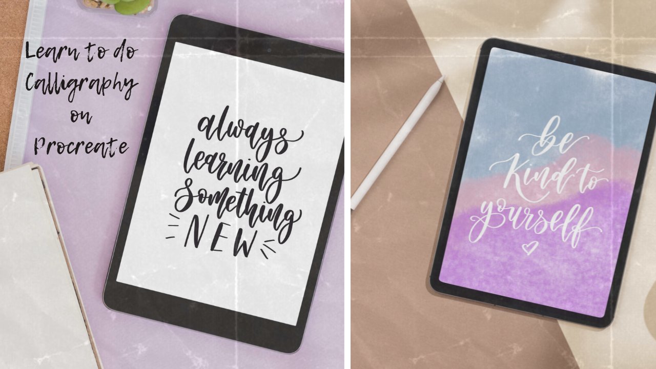
1. Week 1: Schedule: Everybody, and welcome to the
first week of the course. I'm so excited to have you here. I'm so excited for
you for your journey, for where this is
going to take you, I can obey, to be
your cheerleader, to cheer you on and guide
you through every step. It's going to be exciting guys. I hope you are ready. I feel like this
is going to take your creativity to
the next level. You'll be able to
design with ease. You'll create beautiful
files that can be printed, listed online, used
for licensing work, for logo creation,
for so many things. I just love this
possibility that Procreate opened up.
It's like a new door. This so many things
that you can be trying out and I truly hope
you enjoy it all. Now before we begin, just make sure that you have the app, the appropriate app installed, and that you have
an Apple pencil, obviously, have it
all ready to go. I will start from
the very beginning. I'll cover some basics as well. I know some of you
are newbies here. Welcome, and that's absolutely
fine. You'll be fine. I will explain everything, reassure you, encourage you,
it's going to be great. There's one thing I
want to say as you know when you're learning
something new and you're trying it
out for the first time, don't give up if it doesn't
work the first time you try, especially with technical
stuff like this. Sometimes you'll need to do it once or twice before it clicks, but it will click, I promise. If I go learn it all, you can do it 100% as well. I'm really excited to pass everything along
to teach it all to you, so you can start creating
beautiful work confidently. If you're ready, let's dive into the first week. It's
going to be a fun one. We'll be drawing some florals, creating beautiful
color palettes.ploor different types of brushes. It's going to be
fun. Let's dive in.
2. Lesson 2: Essential tools (layers & blend modes): In this lesson, we're going
to talk about layers which are really important and they don't have to
be complicated. Okay, so if you click
these two little squares in a corner at the top, you'll be able to see
all of your layers. Okay? This is your layers panel. You can add new layers by
clicking here at the top, click Plus, see how
many layers there are. And you can also delete
layers by just sliding, so swiping each layer to the left and just
clicking the lead. Okay? You can also duplicate a layer
which is super useful. You can draw something
once and you can just duplicate it.
It's really great. Okay, so if you tap just on
the left with one finger, if you just tap, you'll
open up this little menu, and you can do a lot
of things from here. You can rename your layup. You can just click rename. And then at the
bottom, there'll be a keyboard that you can select and just type
and name your layer. And you can also clear
your layer from here. So you can just click
clay and everything that's in that layer
will disappear, which can be quite
useful as well. Okay, just explore
these a little bit, so that you're familiar with everything with all the options. You can also fill layer. So whatever color you have selected here at the top,
there's a little circle. Then fill your layer
with that color. You can see at the top, I got
this beige color selected. We're going to talk
about colors more. But if you click Fill layer, maybe your color is
white at the moment. But if you click fill layer, it'll fill your layer
with that color. You can then leave it
there or clear it. Now, lastly, I just want to show you how to merge the layers. Let's say you've drawn a flower, but you've done the leaves and the stork and the
petals separately. So maybe you have
six or five layers. You can then pinch
all of those layers together like this. So
just pinch together. You can practice it, and
this will be useful again. So we can combine
everything we've drawn separately into one layer. Okay, and we're going to just explore the color a little bit. So we're going to talk
about color palettes and all that a little bit later. For now, if you just click
that little circle at the top, which might be white
for you right now, you'll see that it opens
up your color panel, and there's a little disk. So this works in
a really fun way. So on the outside of this disc, let's say you se like blue, you can select the hue and
on the inside is going to show all the tints and
shadows of that hue. On the outside, you can select
the hue, let's say purple, and then you can select
a particular shadow or tint hue of that
color on the inside. This is really, really fun. Maybe select one color. And let's say it's purple. Now this is how I'm
dragging that color that will circle into my
document. I love this. You can just drag this into your artwork into
your art space. It is really useful. I've selected another color and I get maybe another one and
just try to practice it. See how that's just doable it's a really,
really good trick. You can do this to
certain element as well. So let's say you have a petal, then you can drag the
color into that petal. Okay, so let's create two layers that are in different colors. So let's say I'm
making a new one here, and this one's going to be in, let's say, this lovely pink. So I'm just dragging
this pink in here. Okay, so I just
want to cover this. On each layer, there's an
option to reduce its opacity. Now we're going
to take these two fingers and we're going to tap, tap your two fingers, and then you find this
little slide or that you can move up and down and you can see that
it'll say opacity. At the moment,
it's just reducing the opacity of the pink layer, so the blue one shows through. There's another fun way to
blend two layers together. On the layer, you'll notice this little letter
N on the right. If you click it, it will open up all of the
blending mode. This is something we
call a blending mode. You can select
screen, color bun, all these different ones because our pink layer is at the top and our blue
ones at the bottom, and so the yeah, so it's just going to
blend them together, depending on the
option you select. And you can just experiment.
You can have a look. Because both of these
colors are quite light. You know, the results
are not dramatic. But if you had, like,
a really dark color and you try to blend it with, like, a lighter one, you know, it'll just
be more visible. But just playing around
with it. It's quite fun. And this can be really useful
if you want to add, like, shadows or highlights
in your flowers, let's say, we'll definitely
cover that a little bit more. You can also show and
hide your layers, so you can select it or de select it like
ticket or on ticket, and it will either show or not. We'll use this technique when we're drawing from a picture. So we'll place the picture
in one layer and then reduce the opacity and then
hide it from time to time so we can see where
we at with our painting. Okay, I hope that makes sense. And lastly, you can
also move your layers. So notice how I'm
just tapping it, holding it, and
moving it up or down. There we go. If you
have big fingers, sometimes it can be a bit hard. So let's say you have a
lot of layers and you want to arrange them
in a specific order, this can be really,
really useful.
3. Lesson 3: Brushes: In this lesson, we are
going to explore brushes. So to open up your brush menu, look for this little brush sign at the top and just click on it. And you'll see this beautiful
brush library that's got so many lovely
inbuilt brushes already. Okay? So we're going to take
our time and just explore. I'll share some of my favorites. So let's see the drawing one, artistic one, calligraphy ones. I am not a fan of, like, in built calligraphy brushes, and I'll definitely
show you how to create your own brush next week. We're not going to focus on
calligraphy much this week. But just explore the artistic
ones, catching ones. You can find so many
different ones. If you ever want to
import your own brushes, click on that little plus
icon and you'll see that there's a little import section at the top that you can click. Let's say you buy some
brushes and let's say, and you want to import them. So that's how you would do it. I've also added some
written instructions below so you can have
a look and also, if you ever want to change
the brush settings, you can play around
a little bit. You can just click on
the brush and it'll open up more settings about it. Okay, so let's begin
and just explore. Maybe let's start with
the drawing section. So in the drawing section, there are definitely some really good ones
that we can try. Maybe you can begin
with the Blackburn, the one that's called Blackburn. You just select it and then go to the little
circle at the top. We're going to change the color. So let's select something nice. You can select any color you like. I'm going to
offer this green. Now, what's really
important here on the left is that you're
going to find two slides. So one is for the brushes size and the one at the bottom
is for the brushes opacity. We are going to use
these quite a lot. So get used to having
them there and just being able to change
from time to time. And let's just try drawing a simple heart and
maybe coloring it in. Maybe I'll change
my brush to 2%. So the size of the
brush to 2% and maybe draw a little heart and I just want to
show you this trick. You can drag the paint
directly into your shape. Sometimes this is not going
to work if your brush is quite translucent because it
won't detect the outline. But normally, if you're
using a brush like this, you can definitely do this. This is a good
example. I've reduced the opacity and you see
there's no clear outline. I can't drag the paint
inside of it, that's fine. You can just color as it is. So this is quite low opacity. So you can see that my bottom slider is towards the middle. And maybe select a
different color. I'm getting off with
this lovely pink, and just maybe make your
brush a bit bigger. I've made it quite opaque again, so the opacity is at
100%, there you go. Just experiment a little bit. So that's one of the
brushes I like for drawing. Now, let's go back into that
brush section at the top and then click on calligraphy and then have a
look at the script. Brush, you'll open it up. So, this one's great.
You can try it out. As I said, I'm not a fan of
using this for calligraphy. It's just a little bit too
translucent. I don't know. I feel like the downstrokes are really dark and the
upstrokes are really faint. So I'm definitely
not a fan of this, but I do love drawing
with it sometimes. My layer is getting
a bit full up. So maybe let's click on those
little squares at the top again and just clear this layer so we can
draw a little bit more. So two squares at the top and
just slide and click Clear. And everything will
disappear, Navier. And we can just try maybe drawing something
with this brush. And I quite like this
brush for drawing. So I'm just drawing a
really simple flower head and just dragging
in the paint again. I love the clean outline. I love that it's got
a pressure change, like a really slight
pressure change. When you press down harder, it can be very, very
useful for sure. Okay, let's have a look at something else on
the calligraphy. I very often use the fine liner, the monoline, the
monoline brush. It's called monoline. So
let's select this one. And again, I just love this one. It's a bit small,
so you probably want to increase the size. I've just picked up
this lovely green color and I'm just doing
a few doodles. My opacity actually was low, so I've just increased it. The second slide at the
bottom, slide all the way up. It's just try doing some of these really simplistic
leaf shapes and maybe dragging the
color into them. Just make sure
that they connect, that all the lines connect. If you don't join up the lines at the top and at the
bottom of the leaf, you be able to drag the color into it because
there's going to be a hole. That's a bit tricky sometimes. Yeah, this one's
good for detail. So if you ever want to maybe
show some more detail, let's say you use a
really kind of, like, natural looking brush like
watercolor or gouache, and you want to show
some more detail that's a bit more contrasting. This brush is really,
really good for that. I highly, highly recommend. Okay, so let's clear
this layer and go back to our brush library, and let's just explore the
brushes under painting. So select painting on the left. I really love this
wet acrylic brush. The one above that's called
acrylic is also good. But let's select the wet
acrylic one and maybe choose a nice color
from the color panel. I've just selected this
lovely red, reddish pink. I'm just doing this quick
up and down movements. My opacity is slightly down and my brush size is quite normal. It's quite low.
It's quite small. You can tweak those as well, let's just do these up and down movements connecting
in the same base. You can also layer them. Notice if you go over them
again, they become darker. Let's maybe reduce the
size of the brush. And maybe do some of
these little stalks, just like in a
straight line, you probably want to press
down quite hard. This brush can be a
little bit translucent, which is sometimes annoying. But it is overall, a really
lovely lovely brush. I use it quite a lot
for flower drawing, and we're actually going to
use this as well this week. So it's a really lovely one. I might do a little base. For each flower head and yeah, just a really quick doodle. We're just trying it out to
maybe do a few scribbles, maybe troy leave for
t little flower head, change in between the colors, try to get used to changing
your brushes, size, and opacity, using those
two slides on the left. We're just experimenting.
It doesn't have to look professional or
good at this point. We're just trying out
different styles. Let's clear this layer again and then go back to painting. What else can we find here? Oil paint is a good one. I quite like it. It's a
little bit different. You'll see how when
you press down harder, you get a darker, more contrasting look,
which is quite fun. Maybe try doing some
shape so just do a little wavy line
just to try it out. I also really like gouache. So it's a bit more fluffy,
so it's quite big. Might want to use, you
might want to reduce your brush size when you use it. And again, it's a
little bit translucent. So this one, again, is
really good for coloring, I would say. Okay. Let's see what else we
can see on the painting. Watercolor one is really nice. So this one is really good
for watercolor washes. So if you want to do a
wash in the background, maybe make it
really big and just do these side to side movements, and you can also overlay them. Notice that if you
press down harder, you get a darker look. And my opacity is actually
slightly down as well, so you can have to experiment with the look,
but it's a really good one. And a really similar one under
painting is called fresco, and this one is also fun. I love this kind of wash. It's a bit more kind
of natural looking and yeah, definitely beautiful. You can try some lovely, light colors and
layer it if you like. I can definitely see how
this could be used for, like, a quilt or
wedding stationery. You can always do,
like a nice pink wash in the background of
the save the date, you know, that could look
really, really beautiful. And it's so simple to do,
you know, to draw this, to paint this would take
so long and let it dry. And it's amazing
that we can just do that by using a brush. Okay, so just explore
all of these brushes. I've got to mention some
of my favorite ones. But I also want to give you
room for experimentation. There are some lovely ones under um inking and drawing as well. You can definitely try them out. We will be trying some soon anyway, so we'll get to those. But just experiment
because I think this is where you'll start
developing your style. That was the case for me, just kind of exploring
different brushes. And that's why I'm
able to share in this course all of
my favorite brushes because I think everybody every artist will use
different brushes. They'll have their favorite. So I just really don't want
to take that away from you. I want you to just
spend time exploring and maybe finding
something what you like. So I'm just using this Larapuna. It's called Larapuna brush. We'll use this one specifically
for some drawing soon. Yeah, we'll get into
all of that very soon.
4. Lesson 4: Quick gestures & shortcuts: So there are a lot of shortcuts and gestures and Procreate that you can use to just
speed up your flow, you know, as you're creating and I've written them all down. So all the important
ones. I've written them down just so you can always
have a look if you need to. And, of course, I'll
also demonstrate as we start drawing. But I just want to
mention these two. So undo and redo. I think these are so important. So to undo something, if you just want
to go step back, just tap two fingers
on the screen, and if you want to redo, um, just tap three fingers. So I'm just drawing two
hearts here and you can just scribble something
using any brush. Now that I'm tapping
two fingers, they just go back. So undo whatever I've done. And if you tap three
fingers, you redo.
5. Lesson 5: Exploring Colour Palettes - Getting started with florals: In this lesson, we're
going to talk about colors and creating
your own color palette. So remember, we talked
about the disc view, which is this where, you know, you can select the colors. There's also a classic view. So if you switch between the
B, you'll see the different. You can select the colors
in a different way. And you can also use the slides you know, to create
different ones. So, yeah, it's really
up to you what you use. But there's also something
interesting here, and you can enter
like custom colors. Sometimes you might
know the color code, and you can enter in there, which can be really helpful. So we're going to jump right
in and start creating. Let's begin by creating
a new document. So we're clicking
this plus icon, and this time, we're going
to select the square option. Okay? So I love using square. It's just quite a nice size. You can always turn this
into a pattern later on. We're going to talk
about it later. Okay, so let's start by
building a new color palette, and I'll show you the
process I like to use. If you open your browser and
then go to unsplash.com, maybe you've heard of
this website before, it's just a really nice
library of photos that you can use for your creations
like royalty free. Some of them, I think, still paid, but you'll
see which ones are free. I just typed flowers. We're going to just
look at some photos. We've got some lovely ones
here and I'll actually upload the photo that I found so you can
use the same one. That's a pretty one.
I'm just looking at all the different colors
and seeing what I could use and I think
that's a good one. I'm not sure this isn't free, so I'm going to focus
on the free ones. So this is really pretty. You can see how
we can definitely get lots of green beautiful
greens from this photo. I'll save this. Maybe
I'll use this later. But I really love this one. This one's got really
nice moody colors. They're quite bright as
well, quite striking. So how about we use this one? I've attached this
photo just below the video so you just
saving your device. And then if you just go into
color and then palette, and you're going to add a new Color palette
just click in plus. And this time we're going
to do it from file. Okay? Because I've
saved this as a file. So just find that photo, load it in and
it'll automatically create this beautiful palette. And look at these colors. These are gorgeous. These are very beautiful. Okay? So we can use this to now maybe draw a
couple of flowers, and I'll show you maybe the
fast one we can try together. So I'm just thinking
about a brush. How about it going to painting
and select wet acrylics? I've really loved this brush. It's quite a nice
one and gentle one. So I've selected it, and let's just change its
size to something smaller, maybe six or even five
or four, to be honest. I'm just trying,
this is a bit thick. So let's go down to four. So changing the brushes size. And I'm just going
to do some petals. So just imagine that
you're drawing on paper. With this brush, you do
want to kind of press down a bit hard because
you'll see them, um it kind of disappears
sometimes, the straw disappears. We've done the outline, so
you can do three petals. You might need to go back
sometimes to correct something, so just tap two fingers. Now we're going to color it in. I've just increased
the brush's size slightly and I've reduced
the opacity a little bit. It really doesn't matter, you
don't have to be precise. Find what works for you
here and I'm just gently starting to color this
in and you do want to be quite gentle as
you're coloring. That would be the
first thing we do. We're just going to repeat this. We're going to try this again
maybe with another color. I'm thinking of selecting
this lovely dark purple. Again, I just need to
reduce my brush to four again and you can leave
your opacity where it is, or you can slide it
all the way back. I'm just going to
do it this way. Again, see how sometimes
I'm drawing and then I'm just going
back because maybe I didn't start in the right way or I don't like maybe
my first petals, so you can definitely just
go back and start again. This one's a little
bit different, so I'm not overlapping them. I'm just kind of
connecting the more to the same base and I'm just doing this really jagged movement. I'm trying to do
the front petal, a bit shorter, got
a wider looking. You can try this a few times, of course, you can always go
back by tapping two fingers. Again, I'm going to
increase my brushes size to let's say 12 and reduce my opacity to somewhere around 70 and we can gently
start coloring in. I really love this brush. It lays in a really
beautiful way. But sometimes you'll
need to again, just go back and start again. If you notice that maybe
you're starting to color in unevenly or you
don't like something. And we still want to
leave it fairly airy, so I'm not over cooloring, so we definitely still want
to see those outlines. Okay, so we do another one. Let's do the pink one. Let's do. You know, you can choose any colors
you like, of course. So have a, we do one above. And notice that I'm doing them more in one layer right now. In the future, you
can also work with, you know, quite a few layers. For now, we're not
going to complicate it. Let's just keep everything here. Again, I'm just
doing three petals and then the front one is a little bit more flat,
if that makes sense. Again, reducing the opacity
of the brush and increasing its size and just gently and
slowly starting to color in. If you want to add
some natural shadows, you can just go over
those areas again, maybe towards the
center of the flower, maybe some parts of the petal
can be a little bit darker. It's really up to you. Okay, now that we've done
all the coloring, we're going to go into
the calligraphy section in brushes and select
the monoline brush. I'm just changing the
color to a nice green. You can choose any
green you like. I really love this muted one. I'm just starting to
add these little stem. I'm really changing
the size of my brush, I'm just keeping it where it is. I'm just doing these really
natural looking curve lines. Now I'm thinking of selecting a nice orange or yellow and
still with the same brush, I'm just starting to add
the center of the flower. I'm just doing lots
of lines that come together and then form
a little like a circle. So you can definitely
get creative here, you can do them as
big as you like, as thick looking as you like. Try to think about where the center of
the flower would be. And then just go from
there. This can be a little bit of rough looking. It doesn't need
to be super neat. Okay. Now, this is
really important. If you ever need an eraser, you might have seen
this in the gestures, document that I've added. But if you ever need an eraser, you can always select it here
and just use it as a brush. It works in the same
way, just like a brush. You can change its size
if you need to Okay, so now I'm just thinking about those flower scents and
I'm thinking of maybe adding some black dots. I'm just testing out. Sometimes you might want
to test something out. Instead of dot, I might
actually do some lines, but I want my brush
to be really, really small so maybe 1%. And I'm just doing
these little lines just to define it
a little bit more, give it a bit more contrast. And then adding lots
of little dots. Okay? So this is something
you can try with me. You can think of poppies
as examples, you know, how they have that really
dark center of the flower. It does look really good. And maybe a lot of dots to kind of fluff it up a
little bit more. Okay, so now I'm just
thinking about this, like, beige looking color. And again, I'm keeping
my brush at one, but I might reduce
the opacity to some like 85 or 80
I'm just testing out. I wanted to use this color, but I think we'll be better
off using a nice white. So if you go into disc in your
color in your color panel, and you select white. And
this is another trick. So to get the purest white, you can just select the
color and then tap twice, and it kind of jumps to the pest purest version
of that color. So you can do that with
any color If you select, let's say, gray or
white or black. It is really useful for black. So if you want to get a pure black and you
just select somewhere in the black section and then double tap and it'll
give you the purest black. Now I just wanted a
really nice bright white. I selected white and I double tapped and gave me this
lovely white color. Okay, so the brush
size is really small and the opacity
is quite low. And we're just adding
these little kind of highlights in each petal. We're just drawing these
really thin lines. And take your time with this. Obviously, we're not, you know, spending a lot of time on this, it's still like a
little experiment. Maybe this is the fastest
thinging you've ever drawn. In Procreate so congratulations. You know, you're doing great. We're just trying things out. And you might also find
that it takes you longer. You might need to
pause the video, and that's very normal. Okay, now that we've
done some highlights, I'm just thinking
about the leaves. Maybe you can select a nice, maybe dark green from
here from this palette. Again, select the color, and I'm just still using
the monoline brush. And again, you probably want
to be quite precise here. You might want to actually
zoom in, that might help. So we're just doing this
really simplistic leaf shape. So just going up and down, trying to keep the sides a bit wider and then going
back to the stalk. Again, I just made
a bit of a mess. In the background. So
I just deleted that so that can happen when
you move your hand. So try to make them quite flowy. I do find that if you move your hand kind of
fairly quickly, it looks a bit more in flow. So remember, you can always
tidy up a little bit. You can always go around
your stalks or where, you know, your leaves
join up the stalk. You can tidy up with an eraser, which is something
we'll do at the end. So I'm not too
worried if some of the lines overlap right now or, you know, if something
isn't too precise. And again, it's
just an experiment. We're just practicing. And let maybe do just like an individual little
branch of leaves. We can keep it quite big. Okay, so what I
also like doing is adding a little
line in each leaf. So let's try this to get
that just a bit more detail. It doesn't have to be straight. It can definitely be
a little bit carved. That can look really nice, so just still using the
same brush, same color, and just adding in some detail into each leaf. Try your best. You're doing great. I can't wait to see your first
effort of droping. You're doing amazing. If you've gotten this far, well done. Okay, so now we're
going to go back. We're going to go back to this wet acrylic brush,
which is underpainting. And I'm just reducing
the opacity to some like 67 and maybe making my brush
a little bit bigger. And I'm just starting
to color in. You can definitely kind of
color in one direction, or you can go up and down.
It's really up to you. With this brush, you
probably want to be quite gentle to begin with, and then build on but I do love. I hope you see the beautiful
effect it creates. I think this was my first
ever brush I tried, and I remember I was drawing something and I was learning and I just really enjoyed it. That's why I always
say it's really nice to explore the
library of brushes, and you might want to buy
some brushes later on. If you search for
procreate brushes on Etsy, you'll find so many. To be honest, I've only
ever bought one brush, which is a fine liner brush, which I actually didn't
really like at the end. So I do believe that
you can actually create a lot with what
you have already. So I'm still coloring
in, but I thought I'd mix it up with
different greens. So I always say, try
to make your greens, your leaves, you
know, quite natural. And you can do that by
mixing different kind of shades of green in
the same composition. So I've just picked up like
a slightly different color of green from the
same color palette, and you can see how it
looks slightly different. And it just creates like
a nice more natural look, and I really love it. I
think it looks great. You can even blend
in another green, or you can even
blend them together, or you can just go over your initial leaves with
another color, like another shade of green, and that can create
a beautiful effect. So that's a nice little trick. But yeah, try all the
greens if you like. You can do each leaf
like in a similar green, it doesn't want to be
a dramatic change, but when it goes from
light into darker, it can look beautiful. Okay, so now I've selected
that eraser so you can see my asors blue at the
top because I clicked on it, and I made it really
small like 1%. I'm just starting to tidy up. So sometimes as you're coloring, you might have had
this happen as well. Maybe you were a bit messy and it went out
of your outlines, which, to be honest, is fine
for this style of drawing. I wouldn't say it has
to be super neat, but we can definitely
tidy up a little bit. So that's what I'm doing. I'm just going around and
seeing what I can do to maybe get rid of some of that fluffiness
around the leaves. If something goes
wrong, just go back, tap two fingers again. And there we go,
you're fast hand drawn or procreate drawn,
digitally drawn flowers. I hope you're
enjoying this and I hope you're finding it quite
nice to learn and try. Maybe you've done
something similar before, but I hope you're
enjoying playing with brushes and I hope you've
picked up a few tips here. Okay, so I'm going to show
you something really useful. You'll see this
little letter S at the top and we're
going to click on it. Now, this is a selection tool so you can select something. If you draw around your
flower, it'll be selected. Now we're going to slide
down three fingers and click Copy and we're
going to slide down three fingers again
and click Paste. You can see how you just
pasted another flower. Now we can grab its corner and we can
move it up and down. We can make it bigger, we can make it smaller, we can drag it, we can reposition it, we can rotate it.
It's very useful. Something to bear in
mind is that it's created in another layer, so it's not the
same layer anymore. You'll see that in
your layers panel. If you select the arrow, and maybe open up your layers, you'll see that it's at the top, so we can pinch them together. We can merge them, so it
becomes one layer again. We just try to fill in the square with maybe
some copied flowers. I'm going to select this one, so just be careful if
yours are quite close. We don't want to chop off
part of another flower. So again, copies sliding
tree fingers down, pasting. Again, we can drag it
around a little bit. We can make it smaller, we can make it
bigger, rotate it, position it somewhere nice. Creating a nice little
composition filled with flowers. This actually will be how we create patterns if you wanted to make lots of little squares
click together like tiles. This is actually really similar. This is something we'll be doing and the process is
really similar to this. We're just filling
in this fast square. I'm just thinking what else I could copy just to
make it quite nice. Maybe the actual little branch. We can select that copy, paste. Oh, see, I forgot that it was on another layer, so
that could happen. Let's just remember
that we need to merge those two together.
Okay, there we go. Now it's one layer and
I can select it again. So copy, slight
ref ring is down, paste, let's move this little
branch somewhere else. You can rotate it. This
is just practicing. It doesn't need to look amazing. So play around, see if you want to copy a few
more elements. If you want to select something
else and copy it over, just to fill in this little
square, a little bit more. I really love the way these
little branches look, so I'm just filling
in the space really. I think it looks quite lovely, especially if you position them in a nice flowy,
natural looking way. I'm just going to
pinch everything together so it
becomes one layer, and there we go, guys. Your fast little composition, and you can also select
something and move it around. Maybe you don't like
where you position your first initial
flowers or your branch. You can definitely
move it around and reposition, which
is really useful. And lastly, I just want to
show you one more trick. If you select something, let's say we select this
little branch. We are then going to
click on this arrow and you can see how we
can move it around. Now, if you have a
look at the bottom, you'll see there are two
little sections that say free form and uniform. So I just want to show
you the difference. So when you select
the uniform one, you can drag and scale
without losing its shape. And if you select freeform, when you drag, it's
going to be stretched. So that's the main
difference, really. So I always try to
select uniform. And if you ever notice that it's dragging and
changing its shape, just check your settings here. So that's just
something to remember. So I just want to say, well
done for getting this far. If you found it difficult, it's worth rewatching and
just trying it again. And trust me, it'll get easier.
6. Lesson 6: Exploring Flower Styles and Brushes: In this lesson, we'll
continue exploring. So let's try some
different brushes, and we'll begin by
creating another document, and let's keep it square. So just click on Plus and then
create a square document, and let's go straight
into brushes. Let's see if we can
find a nice brush. Let's go into sketching
this time and see if we can find the one that
says soft pastel. And we're going to
select a nice color, just go for something
nice and warm. I'll just go for this red one. Okay, so I'm just
testing the brush out, and I quickly
realized that I need to change its size to maybe 2%. And this time, we're
just going to do like a nice flower that's got more outlines rather
than jagged lines. So we're just going to do
a classic looking flower that looks a bit like this. So actually very similar
to leaf drawing. We're just drawing
these leafy shapes, some sea curves
that come together. Okay, so you probably
want to press down quite hard when
you do the outline. And as you're coloring, I'm not actually changing
anything within the brush, but I'm just going
super lightly. You can reduce the
opacity slightly, so just reduce it a little bit. So just color really lightly. We are going for this
lovely airy effect. And once you've coloured
in all the petals, see if you can find
a nice yellow color. I don't think we have a
nice yellow in our palette. So you can also select
it from the disc panel. So select a nice yellow and just start kind of
adding lots of dots. I've just returned
brushes opacity to 100, so it looks a bit more opaque. You can also maybe blend in
a bit of brown in there. I do love layering colours and kind of mixing
them this way. I do find it a little
bit boring if you just use just one colo for
the center of the flower. It depends on the style,
but I think for this style, it's nice to just make
it a bit more natural. So see if you need to
change your brushes size, like a very small size, even like 1% will work
really, really good here. I'm just looking at some
other natural looking colors. And there is this lovely orange. So I just selected it. I'm thinking that
maybe if we reduce the brushes opacity to
somewhere around 50, and then we start kind of
coloring in the petals again. I had a feeling that it might mix nicely, and it really does. Notice how it kind
of blends together. And it definitely just looks so much more
professional already because we have a
nice layer defect that rather than just one color. And you can experiment, you can blend in different colors. You can do this with
your leaves as well. Now I'm going to return
the opacity to 100, so let's do it together
and we're going to draw a little stalk. I'm
going to do it again. You do want to press down
really hard as you do it. I've just noticed that
this brush definitely likes definitely
definitely likes when you press down hard. And I'm just experimenting
here with some leaves. You know, you can make it fun and just do these
really kind of quick, rubbly looking leaves.
They do look really fun. So rather than have a
perfect leaf shape, we could try
something like this. And again, just coloring. If you need to pause the
video, please, please do. You can always cut you
up. And restart it. You know, that's why
it's a course that you can actually
pause and do again. So I've just deleted
the coloring. So again, I'm showing
you the process. So sometimes I would
try something, and I'll just get rid of it
because I didn't like it. So I did realize that
maybe less opacity for the leaves would
work a bit better. So I just reduce it even more. So I just use the slider. I went kind of all
the way down almost, and I do think that
it'll be better. You can layer it still, and I might go over the stalk again because it's a
little bit invisible. And again, I'm just looking
at some other greens, and this is something
you can do as well. Just like we layered the petals, we can definitely layer
the leaves as well. And it's nice to have that
lighter and darker area. So that contrast just
makes it look more natural and I do like
it. So there we go. We're going to
select this flower and just make it a bit smaller. Okay. Let's select this flower with the arrow because
it's just one layer, we can just select it as it is. We don't have to use
the selection tool because there's
nothing else in here. We can make it a bit
smaller and maybe just drag it to the corner of the square. I'm just going to
copy and paste. Remember, three
fingers sliding down, and then sliding three
fingers and pasting. And I might just paste another one and
rotate it slightly, and the cool thing is, I'm going to share this really, really nice thing
that you can do. You can now select a different
color and you can drag. That color into your flower, let's say, flower head. So see how I've selected pink, now I'm selecting purple, and I'm just dragging it
into this flower and notice how we've just drawn one
element or one flower, and now we're copying it over so many times and
we're changing its color. By just dragging
in super simple. You can get creative here. You can do different colors. It's a lovely color palette, so I do love the way all
these colors work together. And notice I'm just copying
over, resizing, arranging, dragging, and it's
just beautiful. Just remember that they all
become separate layers. So we need to join them all up, merge them all in a minute. I'm still copying over
that original fast layer. And as you copy on, you
just need to do paste, paste, paste, obviously,
because you already copied it. So I'm just sliding
three fingers down and selecting paste and just
notice how many we can do, you know, relatively
short amount of time. I think it's just incredible. The opportunities procreate
office is just I love it. I love how everything just
becomes so much quicker. Now it is that I'm just merging, pinching together
all the layers, so everything becomes
as one document. Then you can Zoom that
document in a bit more. So once we get this one image, we can zoom it in, zoom it out. We can make it bigger,
smaller, well done. So we have another
little creation. Well done. I can't
wait to see yours. Okay, so so far, we've done these really kind
of natural looking, real looking, hand
drawn looking flowers. Now, let's try and hide this layer and
create a new layer. So you can see how I've
hid the previous one, and I've just
created a new layer. So just untick that little
square next to the layer. Let's go into
brushes and go into calligraphy and select
the monoline brush. So, this time, we're going to create something a bit
more artificial looking, but it still works
really nicely. It's more like a pattern, a bit more digital looking. I've selected this pink color, and I've just drawn
these five petals. So everything looks
really clean. We're not coloring in.
We're just dragging. We're just dragging
the paint. In two. Just try a few times if
it doesn't work out. So just dragging the paint
into the flower head. So we can do maybe one
that's shaped like this. Now maybe select a
different color. Maybe you can do another one. So lots and lots of these
little shapes that kind of look like flower heads.
Maybe a red one. You can just position
them close together. If you're not happy with
the way you do it once, just do it again. I
do it all the time. There we go. Just another
little experiment. This will be really
good. Lovely. So we've got some flower
heads, which is great. Now, I've just
selected some white, and I'm just drawing
a little white circle inside of these flower heads, so we can leave the ones that
look a bit more like buds. We can do something else there. But like the ones that
have a lot of petals, we can definitely do a
little circle in the middle. I'm going to select
a nice green color. I'm just thinking, maybe
I'll do this lighter green. I love, like, really kind of subtle looking color palettes. And I'm just starting to draw
these really kind of thin, natural looking carved stems. So for every flower, I'm just doing like
a little stork. And we're going to keep
the leaves, again, not necessarily very
natural looking, but more like digitally drawn. So just like really nice,
lovely round leaves. So you know what I mean?
So this is something that would be printed
on a pillowcase. You know, you see
this all the time on notebooks on calendars. So it's just
something that's kind of like digitally drawn. I do definitely prefer more of a natural look like
we did before, but I think it's nice
to try, definitely. So I'm just dragging in,
like, different colors. You can try different greens. And we can actually
add a bit more to it. We can embellish
it a little bit. So maybe we could draw a little
detail inside each leaf. I'm just making sure
that these white sackles are white looking. They were a bit yellowish. So yeah, I'm just
thinking of doing, like, a little line inside the leaf and maybe
doing a couple of, like, veins inside of the leaf. So you might want to zoom
in when you do this, just to make sure that
it's nice and neat. Especially for a
design like this. Everything wants to
be quite clean and look like a nice clean line. There we go. So I think this style
definitely has its place. It's not something
I would go for. But I think a lot of people
will really enjoy this. It's quite simplistic. It kind of consists of
shapes and, you know, just kind of coloring in
those shapes in a clean way. I definitely prefer
a txtured brush, but it's nice to try. Again, you can achieve a lot with a monoline
brush, for sure. And I'm just selecting maybe
a darker color like black, and we can do some lines
here kind of coming out with these little buds and maybe adding little yellow
circles at the top. And it some pollen kind of showing through. So,
I think it's lovely. It's definitely
different, but I hope you enjoyed trying these
two different styles, and I hope it felt like a
nice way to experiment and maybe discover something
new about your own style. So maybe you're
starting to actually think what it is
that you prefer. I think that's
quite important to notice early on. So I
hope you enjoyed it. Well done, everybody. I would love to see some
of these snippets, some of these things
you've created. Please share a
photo of your work. You can message me, email me, upload it in a Facebook group. I would really,
really love to see. Well done, everybody, and I'll see you in the next lesson.
7. Lesson 7: Drawing Roses: Let's go ahead and try
drawing some roses. So let's make a new layer and maybe select a
lovely purple color. I'm going to use this
lovely kind of like a lilac, light purple. I can't decide between
red and purple, but I think purple is going
to look really lovely. There you go. So just select
the color you like to use. And we're going to head
to brushes and we're going to try this really fun
brush that I really like. It's on the artistic section, and it's called Larapuna. Larapuna? Is that how
you pronounce it? It's really lovely. I do use
it actually quite a lot. It's quite realistic looking. So you can try it out a couple
of times before we begin. And to draw a rose, you're going to start
from the center of the flower and just do
these little kind of sea curved shapes that all
connect eventually and get bigger and bigger towards
the outside of the flower. So now I'm building up a
rose out of these shapes. They don't have to be
very precise or neat. You can always go back and delete if you don't
like something. But what we're looking
for is just like a round looking flower head
consisting of these shapes. So that would be the first step. And then we're going to
reduce the opacity of the brush and maybe decrease
the size of it, as well. It's really up to you. Just find a nice comfortable size
that you can color in with. And we're starting
to color in gently. So let's try and be
really gentle here. So the opacity is down, so it shouldn't look
too too colored in. It will still be really
kind of light looking, and just really carefully
kind of going in to those white areas going
over them, coloring in. Very kind of airy and floffy
looking at this point. Okay. So now we're going to
select like a darker purple. And again, I'm just
reducing the brush size. This one's to be quite small. And we're going to do these
kind of like little shadows, so we're just going to define the outlines of
those sea curves. So now that is how they're
starting to kind of form a petal shape. So we're just defining
them a little bit more, kind of go up with them, show a bit more kind of like a darker effect
here and there. And this will just make
it look a bit more. Shaped. So definitely a
really nice little trick. Just going over those
s curves again. Okay, so it starts to
come together though. Take your time here.
You can definitely, experiment and go back if you need to pause
the video as well. Okay. Maybe let's select
some green, any green. I'm going to go for
this darker green. We're just going to
draw these two leaves coming out of the same base. You can do them in one go. You can stop in between. I'm just adding these really
simplistic little veins. They're not really contrasting, so my opacity is
not at 100% still. But again, it's up to
you, just make it yours, but these are the
settings I'm using. I might increase the size
now and just gently color in trying to not go outside the outlines,
just keeping it all in. Lovely. So what we can do now is click on this little arrow at the top and select it
and we can resize it. Let's make it a bit smaller. And we can copy. So
sliding tree fingers down, clicking copy, sliding
tree fingers down, clicking paste, selecting paste. I just rearrange a little bit. We can drag them,
we can rotate them. What I really love about this
again is that we're going to drag another color
into the flower head. How amazing is that? So done
I've made one orange and now I'm selecting some
pink and I'm going to drag some pink into
the flower head, and we just get this beautiful
collection of roses. And this is amazing because we actually only drew it once,
which is just lovely. I'll never get over
how exciting it is. So yeah, just select any colors you like, do
as many as you like. And although we copied them, we can still make them
slightly different. We can go in with a bit
more detail and just make them a bit more original so they don't all look the same. And to do that, we can
select a different brush. So maybe we can go back to the calligraphy section and
select the monoline brush. I'll using Mnolin for
something really clean, something that needs
a lot of contrast. So select the nice green could
be a bit dark if you like. And I'll keep my
brush really small, so it's at 1%, and you can do full opacity
here if you like. And we are just drawing
these little veins, and we can make each
flower slightly different. Obviously, they
won't be the same if you just do each flower. So I think that's a
really nice little trick. Although we did copy
them and although they are all similarly shaped, but now they have
different colors, and now we're going to add
a separate element to each. There we go. You can also define the actual rows a little
bit more if you like. I quite like the fluffy effect, but if you wanted to
add more highlights, you can just select
white and do some lines in the actual rows as
well, and there we go. We just need to merge all of our layers together because
we've copied them over, so we have quite a
few layers there. Ping them together and
it's all finished.
8. Lesson 8: Drawing from a reference: In this lesson,
I'm going to show you how to draw
from a reference. So I've linked this photo below this video so you
can download it. Now, the first step you're
going to do is make two new layers and then select the bottom layer and click on this little kind of like
a tool icon at the top, and then click on Inset file
and just find this file. So for me, it'll be
in my recent file, so hopefully for you as well. And you'll see that
it kind of imported into your canvas,
which is great. You might need to zoom in, so just adjust. You can drag. From the corner and we do want
it to be quite zoomed in, so this is going to be perfect. Oh, they look so beautiful. They will look really
lovely once they're drawn. Okay, so now we're going to make this bottom layer a little
bit more invisible. So again, remember, tap the two fingers and
they're going to slide the opacity to let's say 50
50 is good or just below. Then we're going to
select the top layer because that'll be the layer
where we actually draw. We're drawing on top
of the photos layer. In terms of brushes, we are just going to select this script brush from
the calligraphy section. We haven't used this one before. I'm going to talk about
calligraphy brushes more as we start doing
a bit of calligraphy. We're actually going to
build our own brush. So I am just drawing. So we're going to start with
this where we just draw around slowly each petal. So we really want to get that lovely perspective
of the flower. So we're just taking our
time, drawing carefully. This is such a good technique. You can use this for anything. You can even do this from photos for maybe couples
or if you want to, like, line draw, like a
specific photo of somebody, this can work really beautifully
or like pet portraits. It's really, really fun. Okay, so I'm just
doing another flower. This brush is a bit sensitive. So if you press down hard, it'll get a bit thicker, just
like a calligraphy brush. The reason I said we'll make our own brush because I don't really love lettering with
the pre built brushes. We'll chat about it all later, I guess you've been wondering. I'll definitely teach you how
to create your own brush. There we go. Maybe
let's do another one. You don't have to do them all. I normally just love
to select maybe three or just make my own
composition out of it really. You don't have to do them all. And this is what I love to do. I love to do the outlines and maybe take a
bit of inspiration, just take a few
element out of it, but then also get
very creative with it and just turn this
into my own style. Okay, so I think this will be quite nice
these three flowers. Now we're going to deselect the photo layer so we can
actually see what we've drawn. Okay. And it might look quite basic right now, that's fine. And to make it look nicer, we are going to
start coloring in. So let's go into
our brush panel. And we're going to go into
the painting section. And let's go back to
the wet acrylic brush. Remember, we've used
this one before. It's just really
lovely for coloring. I really love doing outlines and then coloring
with this brush. It's just really lovely. So now, you can always
combine your brushes. Okay, so I'm just
reducing its size. You can also play
with the opacity. And just notice how I'm coloring in the
direction of the petals, and that's just going
to give them like a nicer, smoother finish. So you might need to move
your hand or you can always you can always rotate. The canvas by twisting. And, this brush,
it kind of layers. So sometimes you might need to kind of restart if you don't like a harsher
look here and there. So you can definitely go back
and just play with that. So we're just building
it up slowly. We'll add some
detail, but for now, this will be a really nice
kind of like a base layer. And this will take
a bit of time. So definitely just
take your time. It's quite relaxing,
to be honest. And this color is beautiful. So just keep going,
doing each petal, maybe thinking where you
can press down to be harder to add a bit
of a natural shadow. You can always refer to
the photo as well and just check where there
are darker elements. You can always just take in and tack the photo so you
know where you're at. Sometimes I just love to
kind of check in as well to see what it looks like. But as I said, I think
it's nice to take the outline and
then just turn this into something that's
yours rather than just coping every single
element from the photo. So that's how I work
with references, and I think it's really
effective. So there we go. So some of my petals
here got a bit dark, so I'm just trying to
even everything out. I feel like the smaller
the brush size, the easier it is to control it. You might find that, too. So there we go. That
looks quite nice. See how you're
doing. You can keep. Some of the flowers quite
light. Maybe this one. I'll actually make
this one quite gentle and translucent looking. I think it's a nice effect. Maybe a bit more
darkness here and there. Okay, so that's like a nice base layer and just blend it out even more,
see what you can do. See if you want to go over
some of the petals again, just to really show that variety of shades and
just make it look natural. I'm definitely
taking my time here, so you might want to take a bit of time coloring,
just to make it look. Visually nice. Okay, so I'm just looking at
the photo again. Just observing and seeing if there's anything else I can kind of take away from here, and I really love the
center of the flour. I love that yellow detail. So I'm just trying
to maybe select, like a nice orange color. You can also use yellow
for this, actually. And I'm just trying
to go kind of really roughly over those areas. And once I have a bit
of a reference again, I will just kind of
turn this into my own. So I'll add more detail, but I just really
love the positioning. So I just want to make
it look more natural. And if I go over here
and kind of copy it, I know that it will be natural because it
is a real flower. So now I'm going to hide a photo, and
now I'm just looking. So yeah, that's a good start. And now we can
definitely start making those scenters of the flowers, maybe a bit more contrasting. So it looks. Obviously,
it's a drawing, so we kind of have to
sometimes change things and make them stand out a bit more. So that's
what I'm doing here. Maybe I'm adding, like,
little circles or, like, thinner lines or thicker
lines just to really show that orange kind of
pollen detail in the middle. It does look really lovely. And it starts to come
together slowly. I think it's when we add leaves, it kind of fluffs up nicely,
and that's always the case. See, I'm just playing with
the center of the flower, so I'm just adding in more
more of these little circles. You can always zoom
in and just work with it in a bit more detail
if you find that helpful. I'm just trying to go back and redo a couple
of bits as well. It does look beautiful.
Just two colors here. We haven't done much at all, but it already looks
really lovely. So it's definitely a
really nice technique. Sometimes when I kind
of lack inspiration and I want to do like flowers from different
perspectives. I I'm a bit bored of
my usual drawing, I will definitely
find a nice photo and try to do
something like this. And it always gives
me new ideas as well. So I think it's a really
nice kind of like a training process
in a way, as well. Okay, so now I'm just
going to select like a darker purple from
the same palette, and I'm just going to do
these like,thin lines. And these can be
quite darker looking. They don't have to be
you can definitely press down and be harder.
And even this. So kind of it kind of
brings it to life a bit more gives it
a bit more detail, makes it look a bit more realistic when it's flat
like this on the screen. We do kind of have to
make it look real. And copying over won't always
achieve those results. So we have to think about the techniques we know and the techniques we can implement. I've just selected some
green and I'm just doing these really rough little stems. These really kind of
natural looking leaves. I'm going quite quickly here because I want them to
look quite natural, so I'm not overthinking. So see, I just
wanted to show you. You can't really drag the color. You know how we sometimes do. Sometimes we drag that
sackle into a shape. We can't do it here
because this brush is quite translucent, so
it's not going to wag. But yeah, we just color with a brush like
this and then layer, which is still nice
and I think it's quite special because we can definitely layer it and we can control the light in a way. We can make darker areas
and lighter areas. I do like this technique. I hope you're enjoying it too. Also, if you're finding it all really difficult, trust me, if you try doing it all again, it will feel natural. It
just takes a bit of time. I'll definitely take a bit
of time to maybe click. But once it does, it does click and it just becomes
so much more natural. You pick up all the
things, you remember them. Next time you do something, it becomes a bit more
automatic in a way. But if you're
feeling like this is a real struggle to just keep up and try to talk just
know that it's very normal. I felt like this when I
started out. Trust me. But then once it kind of click, the progress was really, really fast in a way
because it all comes with, you know, just learning
the basics and then practicing and
then obviously, you build the skill and you
experiment and it's just fun. It becomes a bit more fun. See, I spent some time
coloring the leaves. So I'm just using, like,
a smaller brush size here just to be a
bit more detailed. It is a bit hard to do
the leaves and to make them look quite even, so it does take a
bit of time, to see how I'm definitely going
over them quite a few times. Which is fine. Again,
we spent a bit of time doing the petals
in a similar way. So this is probably the
longest part of it all. You can always take it
as far as you like. You know, you can
also blend in, like, a different green if you like. Remember how I said before, that it's nice to
vary your greens, combine a few shades together. But I feel like I
don't want to blend in too many colors here because it just looks really nice
being quite simplistic. So I'm trying to
go with that be, but you could
definitely experiment, even a bit of yellow here and there in a leaf or
a bit of brown. You know, that could look
really, really good. Okay, and I'm just going to
add some highlights now. So I'm just picking up some
white from the color palette. You can also select it
from the disc menu. And I'm just doing
this really quick. I'm being very quick here
because I want them to be quite, lighting,
effortless looking. I'm just doing these
really quick lines in each bad maybe three
or four lines. Just imagine that you're
starting from the base and maybe following the direction
of the actual leaf. So that kind of helps me. And even these highlights, it kind of transforms
the whole look. It definitely looks
quite pretty. Maybe a bit of darkness
in the middle. I'm thinking maybe adding a
bit of black just to again, add a bigger
contrast there so it doesn't blend kind
of blur together. I do find it kind of
disappears a little bit. So adding a bit of darker touch in the middle can look quite nice to see if you want to maybe add a bit of
brown or black, and I'm just doing
some lines and trying to connect it and kind of
join it up with orange. There we go. I think
that looks quite nice. So obviously, now I'm just
showing it's two layers here, so I kind of created a
new layer at one point. So a lot of people prefer drawing each element
on a new layer. That's definitely
something you can do. I'm not a big kind
of fan of that. I always find that I love for something
simplistic like this, I just prefer kind
of doing one layer. But you can definitely
definitely do more than once, so you could do flower heads on one layer, then
leaves on the other. Okay, so now I've just copied that first section over,
just like you did before. So glide three fingers
down, swipe down, copy, swipe down again, paste. And these will become
separate layers again. You can march together,
but I'm just doing four, and I'm trying to
position them in a nice, interesting way. But
this looks lovely. I could see this being a
wallpaper or, you know, something really fun
like that or Um, I don't know. A cushion. This looks really, really
kind of interesting, I think, and we didn't spend
a long time doing it at all. So I think coloring was the
longest part, wasn't it? But it just looks quite
simplistic and so effective. This will on wedding
stationery, as well. So many possibilities. So I hope you enjoyed this. And again, if it didn't work out the first time you tried
it, just try again. Watch slowly, pause
if you need to. And remember, I'm here. We have a lovely supportive
Facebook group. If you're feeling
stuck, just reach out. And I'll do my best to help. But I'm sure you're doing well. I'm sure you're getting there. Well done for being here, for trying, for watching. I'm really excited
for you and I can't wait to see your progress. I would love to see
a snippet of this. If you don't mind sharing in the Facebook group,
please, please do. I would love that. And
I'm sure you would inspire others as
well. Well done.
9. Week 2: Schedule: Hello, love these students, and welcome to the second
week of the course. I am so impressed by
all of your work. I'm so proud of you. If you're
watching this, well done. You got through the first week. You're here, you're
ready to learn more. Now, this is a week where
things get a little bit more interesting because now we've covered all the basics, and we can start being
a bit more creative. This week, I'll be sharing
so many tips and tricks. It's going to be so much fun. I'll show you how to create really beautiful
overlay designs, how to do really nice ombre
effect, background washes. I'll show you how to create your own stamp so you can just stamp the same thing you've
drawn over and over again. It's so much fun. We'll also introduce a bit
more calligraphy. Now, I know that some
of you have done my beginners procreate
course, and if you have, you can skip the
first lesson because that's going to be the
lesson where I teach you how to create your own calligraphy
brush because I don't like to use
the inbuilt ones. But if you've done
this lesson already, you know how to do it again, if you've never done
calligraphy on procreate, you will love that lesson. So yeah, just putting
it out there. So we'll definitely introduce
a bit more calligraphy. We'll do some wa drawing, so it's going to
be a lot of fun. And most importantly, I'll show you how to create a
seamless pattern. We can use something
you've drawn already maybe in week one. So just save everything. Don't get rid of
anything in your canvas. Always start a new document
or always start a new layer. We can take something from
there and we can just create a beautiful tlable pattern
that repeats itself. So you're going to love it. It's such a satisfying process. I'm so excited. I
can't wait to see your progress this week,
so let's get started.
10. Lesson 9: Custom Calligraphy Brush: Thing we're going
to talk about today is brushes because
obviously we want to do some lovely calligraphy
and we need to make sure that we're
using a good brush. You'll find your
brush settings here. So if you just click on brush, all right there, you'll find this little window pop up
that's called Brush Library. Now, in this brush library, you obviously already
have lots and lots of building brushes
and they're so much fun. There's so many. There are
also some calligraphy brushes. If you click here
and let's say you just select script from
here at the bottom, select this and give it a go. Just try. Lettering something
and see what happens. I'm just using this and I wonder if I've tweaked some
settings in there already. I don't remember. I'm
not 100% happy with this because I can see some like it doesn't feel
smooth to begin with, and my lettering just
looks a bit odd. I don't know, maybe
you feel the same. If yours is really
big or really small, you can always refer
to this side slide up and you can change
the size of your brush. This is where we would change
the size really important. You can do this for
any type of brush. So this is really small. While this is really big, you can definitely choose
the size you like. I'm just going to keep mine
so we're here for now. The second slide here is
for opacity of your brush. At 100 obviously is
going to be nice and opaque whilst at zero, it's going to be Wadia, it looks a bit fuzzy almost. It's really strange. You can always play around
with these settings. Of course, I'm just going
to keep mine at 100 here. Again, give it a go. Notice how you can control the pressure
on your thin strokes, look thin and your thick
strokes look thick, but there's just something
not right about it, let me know if you agree. Now, let's say that's
one of the brushes. What else have we got here? We've got a brush pen as well, so I'm going to click onto here. Again, I'm going to
give it a go Again, I have a feeling that I've tweaked some of the
settings already. Yours might look a
little bit different. But I remember seeing
that there was a lot of low opacity on my
connection strokes. Again, this feels fine, but there's just something
about it that I don't like. It doesn't flow properly. Remember the first time
I tried it, I was like, I'm giving up, I'm not going
to do this. I don't like it. But then I discovered
that you can customize brushes and you
can make your own brushes. I'm just going to get
rid of this layer. Are we going to talk about the layers too,
please, I'm worry. I'm going to do
everything step by step. The good news is, as I said, you can customize your brushes, and this is the first thing
we're going to talk about. Again, if you just click on your brush and open
up a brush library, you can then click this
plus icon here at the top. And there'll be
some options here. Let's say you've purchased a brush. That's
something you can do. If you go on Etsy or if you just Google
Procreate brushes, there'll be lots and lots
of calligraphy brushes, watercolor brushes, all sorts
of brushes you can buy. In that case, if you do buy
one, you'll get a file. Make sure that it's not
a ZIP file that you unzip it and you'll
be able to import it. If you just click
on Import here, you'll then be able to
find it wherever it is on your device. I don't have any board
brushes because I prefer to customize them myself and
I'm going to show you how. Instead of buying
a cligrapy brush, we can make our own
and I'm going to show you what settings are used. Now, you'll see that there's
this little drawing pad, and you can you can letter on this and you can
try your brush out as you go. If you want to clear
your drawing pad, you can take three
fingers and just scrub, just scrub it with
three fingers. I love the shortcuts.
There'll be a lot of them. This is the first one, so you
can letter something here, and then you can just scrub it. We're going to go through
all these settings and we're going to just
toggle a few things. We're going to change
some things around. Going to go ahead and
reduce spacing to zero. I'm just going to
do a little doodle here so you can see
what's happening. I'm going to reduce
the spacing to zero. You can see how if
you increase spacing, it just creates a stroke into
these individual stamps. We want it to look
solid like this, we're going to move this
all the way to zero. That's the first setting. We're going to go into stabilization and
we're going to change the streamline amount to 100. You can see how your stroke just becomes a bit more smooth, I would say. Again, I'm
going to scrub it out. We're going to keep the
taper settings as they are, change anything here at all. But we're going to go into shape and we're going to go
into shape source. If you click on this it circle, you will open this up. Now, if you click on Import and if you go
to source library, you will open up
all of these shapes and blotches and marks and
we want to scroll down. I'm using my pencil
to scroll down and we want to open the oval one. It's somewhere here. You need to scroll a little bit. We get this oval and
we're clicking done. Now because you know the calligraphy is all
about ovals, isn't it? Now when we do a bit
of flourishing maybe, it'll be just so much
easier to create those lovely curves that look
a bit more oval naturally. That's a really good
setting to use. Head to Apple pencil
settings and here again, you'll be able to
change pressure or opacity and all of these. We want to change pressure. Let's increase pressure
to somewhere about 50%. You can see how my
stroke changes at zero, all the strokes
are quite similar. As we start increasing pressure, the strokes start to
look a bit different. We're going to keep
it somewhere at, I'd say, 50% and we're going
to reduce the opacity, so we're going to keep
it at 1%, I would say, just keep the color consistent, I think, and it's just quite
nice. That's what we want. There we go, really.
That's our brush, and I'm quite happy with it. You can test it here again. Always test it here
before you click done. But yes, I'm quite
happy with this and if you just click
about this brush, you'll be able to name it. Shall we just call it my brush. I would say my calligraphy brush because I'm using it every day. That'll be the brush I use. That's the one we
created ourselves. There we go, and there it is. Now. So now, should we test it out? I'm going to change my
brushes size to let's say 20 somewhere around 20. Let's just give it a go. We just applying pressure as
we would when we're using a brush pen
or even a dip pen. So you want to go slowly, pick up your pen as
you would normally, when you're doing lettering on paper, just do
it as you do it. Remember to go slowly though. There we go. I'm really
happy with this brush. It feels so different, comparing to the built in one, and it's just nice
that it gives you a bit more flexibility. Now, I just want to
show you, again, a few little shortcuts that you can use if you've
done something wrong. I think that's a good
one to start with. So so let's say I've done this stroke now and I've made a little
mistake there. You can tap your iPad, so with two fingers. Every time you tap
with two fingers, you go back a step. I'm back at the beginning now. Again, let's just try it
out. I'm writing something, so I'm lettering something here, and now I want to go back. I'm just going to tap two
fingers at a time to go back. Let's say I if you
want to go forwards, you tap with three fingers,
something to remember. I go back with two and I go
forward with three fingers. It's fun, isn't it? Now, if we want to just
get rid of all of this, you can click on layers. Your layers are
here hidden behind these two squares and you can click on layer you
have layer one here, we're going to talk
about layers separately. I'm just swiping this to the left and you can
clear your layer. Now the layer is gone. I remember when we use
the scrub gesture. You can also if
you've done something wrong or you just want to
erase the whole thing, again, with three fingers,
you want to scrub. Okay. This will erase
everything on your board, no matter where it is, you
can literally scrub anywhere. So yes, I love those
options. So there we go. That's the first
lesson. This is how we create a costume brush. Super useful. I love this brush so
much, definitely, very different from using a
built in calligraphy brush. It feels so much more natural. Again, just comparing it to
the brush pen I have here. I just does not feel
and look the same. Um so this is definitely
more natural for me. I hope you enjoy
this brush as well, and it's definitely a
good starting point. As I said, you can always
change some settings in it. You can just play around,
use your drawing board, and explore a little bit more. It's a wonderful way to
create your arm brushes. But this could be
your starting point.
11. Lesson 10: Calligraphy Gradient: In this lesson, I'm
going to show you how to create beautiful overlays
over your calligraphy. So let's start by creating
a new custom document. I always love creating my own
custom documents because I just want to make sure that the resolution is set to high. You can choose any size here. You can follow me. I'm
just choosing millimeters. And I want this to be
like an A five size. So I've added all
the measurements, and I've just made sure
that the DPI is set to 300 and I'm also selecting
CMYK color mode, so I'm definitely designing
this as a greeting card. So that would be the
process you follow. If you're designing for print, you can choose any
size, of course. And we're going to
go ahead and select our calligraphy brush now
that we've created it. Let's take it out for a spin. So I'm just choosing
black color. So I'm selecting black
color from the color disc. And remember, if you ever want to get like the purest black, just tap twice
wherever black is. So on the color disc,
if you just tap twice, when you're selecting
black or any other color, it will give you the
purest form of that color. Okay, so when you're ready, I'm just going to
tweaking the brush size. I'm going to go for something
quite chunky looking. So we definitely want
this to be quite thick. So the overlay shows in
a really beautiful way. So I am just lettering the
fast word, which is best. So I'm going to
do best day ever, and I'm going to do
this in three lines. So once you do your fast line, see if you're going to line it. So at the top, there's a little
arrow that we can select and we'll
select the whole word. Now, we can drag the
word to the side, either right or the left to
make it perfectly scented. Let's have a look
here at the bottom. Select, if you go into
this uniform section and then we click
settings on the left, you'll see that
there's an option to deselect or select
magnetics and snapping. If we don't have them selected, I've just deselected them. You'll see that when
you drag your word, there are no lines to
follow. Nothing shows up. And if you have them selected, you'll see that when you
move your word around, it kind of follows some
sort of a path and aligns. So if you only have
snapping selected, it will align your object
to the nearby guide. So it's really good for, like, very precise movement. And if you want to center
something, this is just ideal. So it's really easy to
do. I love this feature. If you only have
magnetic selected, you'll notice the movement of your object is a
little bit smoother. So I love having both
of them selected, and it works really,
really well. Now, let's just remember this
section because when we do pattern designs and whenever we need to move something
in a very particular way, these guides can get in a way, so we will want to
deselect them. Okay. But for now, let's just
keep them on so we can align these words
perfectly to the middle. Okay, so I'm going to
do the second word. I'm keeping these
on the same layer. You can also do a
couple of layers. I just love because
it's a short quote. I'm just going to keep
everything in here. I'm just doing the word today, and you can always you know, sometimes I do one letter
and I decide to go back. So take your time with this. If you ever want to
refine anything, you can because
it's not on paper. We can always go a step back. Okay, so now I'm just selecting this with the selection tool. Remember, we've done this
before with flowers, and then I'm just again
aligning it to the center. So you can do this for
every single word. And then you can do this to the whole phrase to the
whole phrase at the end. Okay, and I'm going
to do the last word, which is the one ever.
Maybe a bit bigger. I'm not quite happy
with the ending here, so I'm just going to
experiment a bit, find a perfect exit stroke. So I really love see how you
can definitely experiment. And I really love
digital lettering because you don't
have to worry about small things like
smudging something or misaliging anything.
So it's really fun. Okay. So now let's just
make it perfectly scented, so you can see how
kind of dragging it up and down when I select it with an arrow to make sure
it snaps to the middle. Okay. Now we're going
to create a new layer. We're going to start
working with the overlay. Okay. So we're going to
work in the new layer. Let's click on brushes and
find the airbrushing section. And in that, we are going
to select the medium brush. So the one for me, it's the second
one from the top. And we want to have its size
somewhere in the middle and the opacity is all
the way up, so 100%. Now notice what I'm doing. I'm just selecting
red to begin with, and I'm painting this
little kind of like a oval on the lattice. It doesn't matter where
your position this. You can definitely just go
over one section of the word, and then I'm just using
the outside of the disc, and I'm starting to move. I'm starting to move towards
yellow on the color wheel, and this is going to create a really beautiful ombre effect because we are using the
cubs are next to each other. And this will just
look really kind of balanced and harmonious.
So keep going. You can start with red as well. Then going into orange,
going to light orange, into yellow, and then
you can go back. You can go back into orange and then back into red and maybe
try like a dark or red. So the idea is that we don't make any sudden huge contrasts, but everything kind of looks fairly fairly together,
fairly harmonious. Lovely. So now at the top, we are going to
select adjustments. So here right at the top, you'll see this little sign, and you'll say adjustments. And we're going to
select gagianblur and we're going to
move our pencil to the right to apply the
blur and you'll see how obviously everything you've painted here starts to blur. And this is good. So we
want to kind of move it to the side until it looks
kind of nice and blurry. And then we're just
going to click on the layer and select clipping mask. And
this is it, really. And it, it creates this
beautiful, beautiful overlay. Okay? So I feel like this is
super simplistic in a way. You can always
experiment with colors. Don't forget to merge your
layers once you do this. And as a last step, I really hope you love
the results. Well done.
12. Lesson 11: Background Washes: In this lesson, we're
going to do something quite similar, but
to the background. So it's going to be like
a nice background wash. Okay, so let's begin by
creating a new layer. I'm using the same document. I just hit the previous layer. Now, see if you can find, like, a nice color, something
beautiful, something you like. I'm just going to
go for this, like, light pink, and we're going to fill in the canvas with it. Okay, so this time,
we're going to select a slightly different brush
so it's from airbrushing. You're going to select
a hard brush this time. So you'll see it is quite big. You'll probably want to reduce its size kind of right away. So I'm just going to reduce
it to somewhere there. So it's still quite
big, but it's fine, maybe 70 or 80. See
what works for you. I'm just starting
with this red color and I've painted one side. Of the canvas with it. The idea is that we do
four circle shapes, covering the whole page, but in different colors,
slightly different colors. I'm trying to keep
within the same color. They're all warm colors. They just slightly vary, some of them are pink,
some of them are red. But don't worry if they
overlap, that's a good thing. We want them to overlap. And I might just select
the fourth color, and I'm just going to go off
for this, like, pink again. It's actually quite similar
to the previous one. Let's do those are
the background one. I'm going to do maybe sometimes hard design,
but just experiment. I'm just going to
do a darker red. I'll look nice. See how filed
in the whole page. Lovely. We're going to go into adjustment again, just
like we did last time. They're going to select Gaussian again and we're going to
drag dragging to the side, making it quite blurry. See where you want to leave it, it can definitely look quite
blurry. Maybe some of that. Okay. And now there's
one more step. So now we're going
to make a new layer above this layer, okay? Just a new layer. Now we're going to go into
adjustment again. And we're going to
select the noise. And we're going to drag the pen to the right again to add
quite a lot of noise, and it can be quite a lot. I'll just look like a
really grainy texture. That's normal. Okay. Now we're going to
select the blending mode. Remember we talked about this and we're going
to do the overlay one to see if you can
find the overlay. So now it still
looks really grainy. So what we've got
to do is reduce the opacity of
that grainy layer. So remember, we're going
to tap two fingeres. We're going to tap the
layer with two fingers, and then we're going
to slide the opacity somewhere to the middle or even a bit lower down,
it's really up to you. So just have a look
at the texture, have a look at the wash and see if this is
something you like. I'm quite happy with this.
It looks really good. It doesn't actually show
properly because it's a video, but it looks really
good in real life. I'm actually really,
really happy with it. And it just makes such a perfect background for your calligraphy, for any text, to be honest. So this is something
we can try doing. So I'm going to merge these two together so they become one. So just pinch those
layers together, and let's create
another layer and maybe do some lovely
white calligraphy. So again, I double tapped
in the disc on white, so it gives me the
purest form of white. I'm going to select my lovely calligraphy brush that
I love very much. And we could let to
something, something simple. Let's just maybe
do happy birthday. So I've reduced the size
of my brush a little bit, so it's not looking very thick, but it's still quite bold, and I think it shows really beautifully on that background. So I'm just do happy I do
a little flourish there, just extend the
stroke, actually. And I'm going to do bath day. So bath days long water. When you drink something long, you can always zoom
in on your canvas, by the way. So remember that. You can always zoom in, if that helps you, if that helps you kind of
focus a bit more. But take your time, do, do this in your own style. I'm sure it's going
to look good. Go back if you need
to correct anything. Then my flourish down. Okay? So I'm just going to
I'm not quite happy with the alignment of
the word birthday. I'm carefully selecting.
Listen again, you could have done
this on another layo. You can do every line
on a separate layer. And it just makes it a bit
easier to move around. But I've just kept it here
for now. And there we go. I really love this little trick. I'm sure you're
going to find this useful for so many more designs. It just makes such a
beautiful background. You can experiment with colors. You can use it for
wedding stationery or greeting cards or post. It's incredible, and it
looks really realistic, as well. Well, then, everybody.
13. Lesson 12: Textured Brushes: And let's just remember
that there are so many lovely textured
brushes that are inbuilt already that we
can use to create beautiful beautiful textured
background effects. So let's make a new layout
in the same document, and we can just
experiment a little bit. Let's go into the textured
section in our library. And let's see where you can find here. Just
try them all, really. So there's this
one that's called Dove lake. It's really pretty. So I've just selected
it nice pink colour. And you can do, like, big
strokes that are horizontal, or you can try vertical strokes. You can make your
brush really big. And just to kind of
quickly show you, so I'm just making my happy
birthday layer visible again. You can see how well it
works even like this. And this took like
2 seconds to do. It's really, really
pretty and effective. So there are lots, lots
of different textures. So just experiment, maybe spend a bit of time trying
those brushes out. This one's called Grit Roll. I'm just selecting
this one, and it's quite it's with a friend dev. I can also see how
this could be used. So just experiment a little bit. It's a lot of fun kind
of exploring the mole. Now I'm just going into
here and looking for, like, a wash one. This is quite blurry looking. I don't think this
will print nicely, although, you know,
it's worth a try. This one's very light, but also it kind of looks quite dreamy in a way, can
look quite nice. Every time I see a pink wash, I think of wedding stationery. So yeah, I think that would
definitely work quite well. This was called rectango and we can also
find some fun ones, maybe under the
spray paint section. So this one's burst.
It's quite fun. Anyway, just try to
experiment a bit, see if you can find
something that you like, but I want to show you
something specific. Let's go into painting and
select the gouache brush. So we used this one before. But if you make it
quite big and if you select a nice light color, so I'm just going
for this pale pink, and you also can make
it a bit less opaque. You can do this,
but you just move your pencil up and down and
just do these big strokes. I actually used this
for print recently. I used this technique to make a really nice light
background layout, and I love doing
this in real life. I love painting, a little
wash in the background. Using gosh, actually. I thought I must try
this in procreate, and it does create
a beautiful look. And we can then maybe create
a new layer and just select our calligraphy brush and letter something on
top so you can see, you know, the beautiful
combination of both, and I hope this inspires you
to use this in the future. So I'm just going to
lettering something short. I'm just going to write. You are brave. And I'm just doing,
again, three lines. I really love positioning
calligraphy on as many lines as possible rather than doing like one long line because this way, the letters look
bigger, more effective, especially if you're doing
them for print and such. So yeah, that's a really
lovely technique. So you are brave, super short, and then because it's
a separate layer, you can scale it, reposition it. I do love having calligraphy
on a separate layer. Now we go, I'm just aligning it, selecting the arrow,
and there we go, super simplistic in a way. But I really love this look. You can always change the color. You can drag a different color into your calligraphy as well, and I really love pink and red. It's such a beautiful
color combination. So give it a go. I
hope you enjoyed this.
14. Lesson 13: Create Your Own Stamp Brush: In this lesson, I'll
show you how to create your own stamp so you can repeat something
over and over again. Creating new square
document and then just select a black color
with your eyedropper. So remember, if you
click on Black twice, it's going to jump to
the purest black color. Okay? Now, we want to
select the syrup brush, see if you're going to inking
and set the syrup brush. You can use any brush,
but he wants to be quite opaque brush. And we're going to
draw something. So it has to be in black color and in a brush that's
quite like monoline or, you know, fairly opaque. And I'm just drawing this
really simplistic branch. So I will do some leaves and I might
actually add in some berries. Draw something, any element. I think this is quite simplistic and it
looks really good. So this can be used on so many things.
You can stamp this. It will always look
really pretty. I'm just doing some quick
quick berries there. So take your time.
You might need to pause video to finish this. So do so if you're
not finished yet. Once you're done, just
go into your snapping, just make sure magnetics
and snapping are on and we're going
to align this. Aligning this to
the page, just like the arrow at the
top and then align. Align this to Santa so
it's nicely scented. Okay. Now we're going to glide three fingers down and
we're going to click Copy A, not just copy, but we're
going to select Copy A. Now this is copied.
Now to create a stamp, we go into Brush Library, and we select plus. We click on this little
plus icon at the top. Okay. Now we are here, so we're going to click
on shape on the left. We'll click on shape,
selecting the shape. Now we're going to go
into the shape source, which is here and you'll
see there's nothing there. That's like a white
circle, click on there. And now's the time
for us to paste, but you copied earlier. So you can click Import at
the top, so click Import. And we are going to there are lots of
different ways import. You can also save it as a JPA, whatever you've painted or
drawn, you can save it. But we've copied it, so we just have to click Paste and you'll
see that it paste. Now, let's click out of that. You just want tap. And
I want you to try this. So if you tap with two fingers, you'll see that it inverts it. So it either becomes like this or it stays the way it was. And we want the
background to be black. Okay? So we tap two
fingers to get this look, and then we click Done. So we're almost done. We're just going to change a few settings. So let's go into the
stroke path section and adjust the spacing to 100. Okay. Then we're
going to go into the Apple pentyl settings, and we're going to
reduce the opacity to zero all the way down. Now you can also go
into properties, and this is where you can
change the brush's size. So at the moment,
it's really small, I do want it to be a bit bigger. Again, this will depend on what it is you
want to use it for. But I'm just going to go
around 200 or even 300. Okay, you can also rename it. So at the bottom, you'll say about
this brush so we can select that
and just name it. I'm just naming the
leaves. There we go. Let's try it out. So let's hide this layer or clear
it, and then just tap. I'll look at that. You've
created your own brush, your own stamp, and
it's so much fun. You can change its color. So
I've just selected green, and it looks really really fun. So you can also click on the arrow at the top
and you can rotate it. You can resize it as usual
as any other element. Okay, I just want to
show you some things. So let's clear this layer and
select the monoline brush. It's under calligraphy. And you can try
drawing some shapes. Now it is how I'm trying
to draw a circle. And obviously, if
you do it freehand, it's really hard to do. But if you hold your
brush at the end, it clicks into place. Then if you tap your finger, it clicks into a
perfect, perfect shape. You can do that with any shapes. As you draw, it might be robbly. Now, if you hold at the end, it'll click into some shape. Then if you tap one finger down, if you touch the screen
with one finger, it thinks a triangle
is a square. If you tap with one finger, oh, it should jump into
a perfect shape that you can resize as well
at the same time. Let's just try this again. Again, I'm doing a triangle
and then tapping my finger. I keep thinking
that it's a square. I'm going to do a circle,
holding at the end, and then tapping
my finger and it becomes a perfect circle. Again, doing a circle,
holding at the end. As I tap the finger, it just snaps into this
perfect perfect circle, it's such a useful feature. You can also do
that with a line, so I did at the beginning,
just draw a line. I'm just testing hard. Oh, no, it's not doing a hard. As you draw a line, it's
going to be quite uneven. But if you hold at the end,
it will become straight, and if you tap one finger, you can then rotate it in
kind of perfect angles. The reason I'm doing that
is because I want to show you how you
can use this stamp, let's say, to draw a
really quick quick wreath. Okay? So here, everything's
a bit more spaced out, so we might need to change some of the settings
for this to look good. So we can always go
into the brushes, into the stamps settings. And we can just
reduce the spacing, so the leaves are
closer together. But you can apply the
same technique, really. So I'm just going into this
stroke properties section. And this way, you can see
how now, change the spacing. I just reduce it a little bit, and and it looks really lovely. So I'm just applying
the same technique. I'm just doing like
a rough circle. And then I'm holding at the end, and then I'm tapping my finger. So this, again, is too big, so just change
your brushes size. This is a good size. And again, I'm just
holding it at the end, and it falls into a nice, perfect circle.
And this is great. You know, you can
definitely use this for quick designs if you ever need to make a nice border around your calligraphy,
for example. This can be, so useful. I love it. You don't have
to draw the same thing, you don't have to
copy your layers. It's super helpful. Let's see if we can
create a new layer. In this new layer, we can select our calligraphy
brush and just do some quick scribbles so we can see what it looks
like together though. I'm just doing a quick
hello. And even this. You know, you can use
it for logo designs that could look
really, really good, just to embellish
some background in quite a nice, simplistic way. So, Yeah, I hope you enjoyed it. It's definitely a
really fun thing to do. And you can get creative here. This can be super useful
for, like, pattern making. And I really love that. You know, you can definitely experiment with
the size of this. So you can make really
really big stamps as well. And this, again, could be really pretty if you want
to, I don't know, create some gift wrap, right, and you just want to do the same element over
and over again. And then you can print your
gift wrap from this file. So I'm just clearing
this and again, I'm imagining how, you know, some bolder designs like
this could look really, really good as well,
especially if maybe you change the background color or maybe
something a bit lighter. You can drag some paint
into the background. See, that stars look really
good and really effective.
15. Lesson 14: Different Styles of Leaves: In this lesson, we are
just going to have a nice relaxing time drawing some leaves and just exploring
different leaf types. So let's begin by
selecting some greens. So maybe you have some colors
in a color palette already. If you don't just use the disc. And we're going to use the
script brush for this. It's on the calligraphy section. I quite like this one
for drawing, actually. Or you can also use your
calligraphy brush, to be honest. I love that it's got a bit of a thick and thin effect here, so it works quite
nice for drawing. And it's also it's got a
really nice clean outline, which I really like,
especially for leaves. Okay, so I am just drawing this really simplistic
kind of looking branch. I've started with a little stork and now I'm just
adding on more leaves. I'm doing the outline
first. I'm trying to keep the leaves
quite natural looking. Then I'm just using
the eye drop pot to drop the color into each leaf like we've
been doing before. Now, let's just expose some
slightly different leaves. I've selected a slightly
different green color, which is a bit more
like eucalyptus, green, so a bit more like
bluish and this time, the leaves are a bit whiter. They're a little
bit more wobbly. You're trying to think of
eucalyptus as you do it, so that's definitely a really
nice way of drawing leaves. Let's see what else we can try. I've selected a lighter green. So I really love using
different greens. I might actually change the
color of the first one. You can always change
the color, of course, by dragging different
color into your branch. Now, we're going to try
this round looking one. So we're just getting
ready to draw a wreath and I just want to cover some different leaf types. You can get creative
here, of course, as well. So here I've done
a little stalk, and then I just kind
of mirrored each leaf. I can actually see how you
could use the symmetry tool for this as well if
you really wanted to. But I really love when
the leaves look quite natural and have a
bit of curve in them. I think it always
looks really good. So see if you want to
change some colors, find some perfect greens
for each of these. Okay. So what else can we try? We can also do one that's
really kind of natural looking. So now, if we think of some summer flowers or
even like wildflowers, or even if you think
of peony leaves, if you can imagine peonies, they have this, like,
really rough edge leaf. And we can show some of that. We can definitely keep some of the leaves really
natural looking, and our composition
is going to thank us for that because
sometimes the movement and the curved lines and that natural kind of flow
in your drawing style can really impact the way your composition kind of
looks, especially wreaths. As we always want to try and show a bit of
movement in them. Okay, so now we can maybe
select a different brush. I've just selected this
syrup brush again. We use this one quite a lot. So it's under inking. And now I'm just doing this
slightly different one. This one's a bit darker. I really love using blue
color as well when I do leaves and blue leaves look especially good
in pattern designs. I don't know what it is, but it always looks really pretty. And this time, I'm
just focusing on extending my stems
so you can see how I'm just adding more lines on the initial
line that I've drawn, and I'm just doing more leaves, and at the end of each line, I'm attaching a little leaf. Now, this just helps to make your little branch a
little bit more full. It definitely kind of flops
it up a little bit more. It's quite nice. I do love sometimes drawing
my leaves this way, especially if I want
to fill in more space. So it's really good leaves in general are really good fillers. Especially when you
do compositions like bouquets or wreaths. So yeah, you'll definitely
come across that. I really helps to
fluff up your design. Okay, I'm just correcting
the tops of the leaves. Now we go so they look
a bit more sharp. And here we are. So remember, you could always
add some extra detail. And normally I would
just select some white, and I would just go
over some of the areas. And I'm just doing this,
natural looking one. Again, maybe trying
a different brush. So it's definitely a bit easier with the syrup brush, I find. This just looks a little
bit more natural. As we do all of these
different branches, just notice how it
all comes together because we've used
quite a few greens here, even a bit of blue. It does look really
beautiful together. There's something about
different shades of green altogether. Love laser. Now, I've just selected white, and I'm just using white with a really small brush size to add a bit more
detail in each leaf. And you can take this
as far as you like. You don't necessarily
have to do it, but I do find that it makes your designs just pop
a little bit more. It kind of gives them
another layer of detail. It just kind of gives
them another layer. It does look a bit more
professional, I think, even if it is just a quick
little line in the middle of each leaf. You can
get creative here. You can always do something
a bit more interesting. Sometimes I like doing this. I just do a little white
outline inside of each leaf. Copying the outline is
not really an outline. Even here, we can add
a bit more movement by adding these inner lines, and I think this eucalyptus
one actually looks really good in particular
in this style. There we go. I hope you can
take something away from this and you can always make
it as detailed as you like. You can also use a
slightly off white color to do this inside the leaves. That could also look really
good. But there we go. So in the next lesson, we are going to use some
of these so maybe make a note of your favorite
ones so we can decorate our wreath
with some really, really beautiful branches and like different shaped leaves. It's going to be really lovely.
16. Lesson 15: Symmetry Guide: So we're going to start focusing on our final project
of the week, which is the wreath design. And let's create a new document. We want this document
to be quite high quality, quite high resolution. So let's click on
this plus icon and then select Custom Canvas size, and let's enter something high, something around 4,000 pixels, or even higher, maybe 4,500. So notice the
higher your pixels, the less layers it will
allow you to create, which is something to remember. Also make sure that the
resolution is set to 300 DPI, so everything looks
nice and clear. Okay. And we're
going to go straight into the actions menu. So this little tool
icon at the top. And then within that, click
on Canvas and you'll see this little drawing
guide section, which you can toggle on. So let's toggle it on. And
then right underneath, you'll see that it says
Edit Drawing Guide, and we're going to
click on there. Okay, so now it just
brings up these guides. So now if we have a
look at the bottom, we can select symmetry from this menu so
it's on the right. So click on symmetry
and then at the bottom, it will give us some options, click on options and we can
select different options. So there are a lot
of different options that you can always
experiment with. But for today, we
are going to select the horizontal symmetry guide. You could do the vertical one, but I think for reads, especially, it'll be better
to have the horizontal one. So click horizontal. Lovely, just click D on the top, and it'll give you this canvas, which has a drawing
guide just like we set up right in the
middle horizontally. Okay, so now we're going to go ahead and
create a new layer, and we're going to select
a nice green color. A green color, actually any
color for this purpose. And in terms of brushes, maybe you can select
the monoline brush. So let's go into coll it
af and click on Monaline. There we go. And we're just
going to draw a circle. So we have something to follow. So when we draw a wreath, so we have a nice
circle shape to follow. And remember, to draw a shape, just draw a rough circle and then hold the pen at the end, and then tap one finger, so it clicks into a nice,
perfect, perfect circle. You can zoom it out, zoom it in, make it as big as you want. So I'm going to try again.
So making a circle, holding our pen at the end, then tapping one finger, so it creates a perfect shape, we're zooming in or zooming out. So think about how big you
want your wreath to be. I think I'm going to
leave mine some of that. Now, it's really important
that we align it. This one's to be
right in the center. So again, click on the arrow, select it and make sure your snapping and
magnetics are on. So it clicks right
into the middle, so it's perfectly scented. That's what we're
looking for. Well done. We're going to continue with the wreath in the next lesson.
17. Lesson 16: Floral Wreath Project: Okay, so we can now start drawing and adding
on all the elements. So to begin with, let's just create another layer so we don't draw on
top of the circle. And maybe let's prepare
our color palette. I've actually attached a photo. Below the video,
you can download the photo to get
this color palette. So you can just load it in
just like we did before, import and import from a photo and then it'll appear at the top of
your color palette. So I love this little palette. It's got a lot of different
greens, which is really nice. It's a lot of pink. So, yeah, I think it's just
really kind of seasonal, spring looking, spring themed, beautiful, beautiful palette. Okay, so I might
just select one of the greens for now and we're
going to go into brushes, and we are going to go into painting section and use
a brush called salamanca. I quite like this brush. We
haven't actually used this. You might have tried this,
but I quite like it. It's nice brush. Okay, so there's one
thing we need to do to this layer because
if we draw now, the symmetry guide
is not active. So to activate it,
we're going to click on the layer and select
drawing assist. Okay? So now, when we draw, we can see that
everything duplicates. So whenever we draw at the
top, happens at the bottom. Well, I just realized my circle
wasn't perfectly scented, so it wasn't
duplicating perfectly. So yeah, just make sure your
circle is scented 100%. Okay, so back to drawing. Just going to get
rid of these lines. So, we're starting in this new layer and we can
start drawing some leaves. So we're just starting
with a couple of leaves here and there, starting to fill in
this circle slowly. I've done the outline, and now I'm just coloring in. It's very similar to the wet
acrylics brush, I think. So you'll see that they
are quite similar, although this one
is a little bit less translucent, I think. So the wet acrylic one's a bit more transparent,
in my opinion. They are slightly different, but I do love this one
quite a lot, actually. Again, you can layer
it if you like, but I'm just going to keep these quiet area
looking for now. Let's maybe do a few
more leaves on the left, so we down the right side. So we are just setting
up the composition, but I do find that having some leaves done already kind of helps you imagine where to put flowers in a more
of a natural way. Well, it helps me. So I always do a few
leaves to begin with. And you can see how
it's all symmetrical. It kind of copied everything. And we are not going to rely on the symmetry guide too much. I do find that it can
make it look unnatural, so we are going to turn
it off at some point. But for now, we can definitely use it for a bit so that
it does kind of fill up. I was circle with
these lovely leaves. And I'm just coloring, maybe layering some
of the leaves. These will be a bit darker. So take your time. I am
trying to be nice and neat. You know, I want this to
look quite nice at the end, so you might want to spend a bit more time on
coloring just to make sure everything looks
good right from the beginning. Okay. All right. Then we can start thinking about some flowers in a minute. I think that we can definitely use some of those beautiful
pinks in the palette. I might just go for this darker, not the lightest
version of pink, but a little bit darker. So this one looks really good. To make our flowers look
nicely balanced and round, we can copy this initial
circle that we've created. So just copy the layer and then I just scale it down and just make sure to toggle
off the magnetics and snapping so you
can move this um, a little bit easier,
and you can scale it, position it somewhere
nicely on the circle. This circle is now a new layer. Let's go back to our other layer where
we were drawing before. You can keep your flowers in your leafy layer or you
can create a new one. If you do create a new layer, just make sure that the
drawing assist is on so that Everything is still
symmetrical as we draw. Okay. I'm just trying to make a
nice round looking flower so you can draw the
center in the middle of the circle and
then start drawing leaves around it in a nice
and kind of balanced way. Come be hard. You can try a few times to just see
what it looks like. And when you're happy,
color in the petals. You can always zoom in to kind
of help you seed properly, especially if your
flowers are quite small. So take your time you
might want to rotate it. Sometimes, it's really
up to you get creative. Remember, you can
move your canvas. Lovely, so you can
see how it copied really nicely at
the bottom as well. It's really helpful. Okay, so now I'm just
selecting that cackle again. So let's go to the circle layer and I'm going to
move it somewhere else because we
are going to draw another flower and you can
select a different colour. I might just go for
a different pink, maybe just like darker
version of pink. You can make your circle a
bit bigger here if you like. I'm just going back
to that new layer that I used to draw flowers. I'm just doing another flower
and this one looks okay. Again, you can try a few times. It can be hard to do just
once and be happy with it. I've decided I'm
going to split and do three petals on one side and
three petals at the bottom. That thinking really helps to make it look balanced, I find. I'm just coloring in
again, being really light. We are going to add
something really nice, like a nice overlay on the flowers to help us
create a nice shadow. I'm not actually
coloring in too much. We are going to work on that. You can definitely keep
this as your fast kind of initial translucent layer. Lovely. Okay. So again, I am going to select the circle and drag
it somewhere else. So think about your composition, see where another flower would fit in nicely and then maybe slightly
different color. I'm going to go for
this brighter pink. Okay. So I'm going back
to my flower layer now, and I am starting to draw. That's quite a big,
so I'm just going to reduce my brush size. I'm thinking of doing
this kind of like a half flower. I think
that looks nice. Coloring it in gently
again. That's lovely. At this point, the
drawing guide is starting to look a little
bit unbalanced, I think. So there's something
we can do in a minute. So I'm just looking at this, and we can always remember
that you can always, always move the flowers around. So I'm going to do
this other one, this kind of a
beige looking one. So again, move the circle. If the circle helps
you, that's great. You might want to not use
it, which is also fine. So again, I've created
another little flower here, just like a really
simplistic, small one. And it does look quite unnatural right now because it
kind of copied it, and, you know, there are like
two flowers together there. So we're going to
move them around. So we're going to make sure
that this layer is selected. And we can use the
selection tool to we've done this before, to kind of select and move
around within the same layer. So I might just
position this kind of Biji one somewhere here. I think that'll look nice. And I'm just looking
at the colors, and maybe I'll just
fill this little gap. With another flower. What we can actually do is
turn off the drawing assist, so it doesn't the symmetry
doesn't work anymore. You can go into our layer, click on it and just se drawing assist and
it will turn it off. Shouldn't be ticked. If it's ticked, it's
on, just click on it and we can just do a
couple more flowers here. I'm just experimenting really. I'm thinking of doing this
a fluffy looking one, although my brush
is a bit too big. Yeah, that's a
little bit too big, see how sometimes experimenting
really really helps. It is necessary, I
think, to experiment. So I'm not editing this out. So this is my thought
process and sometimes I do something that I change my
mind on, and that's fine. Everybody does it, and I just want you to
know that it's normal. Okay, so I might do this
little upside down one here. I think that'll look quite nice. Okay. Lovely. Now we're going
to create another layer, and then we're going to select
something a bit darker, like a darker color,
like dark red. A were going to go into
the airbrushing section. And we're going to select
soft brush from there. Okay. So now we're going to make sure our
brush is not too big and we're going to start kind of coloring
in those shadow areas. Normally, it's near the center of the flower where we want
to add a bit of shadow. You can change the colors. You can do a dark red one, you can do a super dark
red one here and there. Again, I'm focusing
towards the base of this little flower
and I might just do a bit more coloring there. Obviously, this is
going to be an overlay. This is not the end result. You probably want
to exaggerate here, but this is not what it
will look like don't Bret. I'm just selecting
some red again and just coloring in the
center, the flower here. For the Biji one, I'm
just going to do maybe a light pink color
that might look nice. Again, just a bit more
color in the middle. Lovely. Even leaves.
If you want it, you could add a bit of
overlay here and there, although I think it's definitely the flowers
that need it the most. You can always do it
with leaves manually. Okay, so now we are going
to go into adjustment and remember the gaussian blur
that we can select and drag. So we are dragging experiment
with this a little bit. Don't drag it too much. I find that it kind of
blurs out too much. But I'm just thinking
I might keep mine kind of summer here. You can see how it changes,
intensity changes. You can definitely
see. Yeah, drag it up and down
until you're happy. Now in this layer, we're going
to select blending modes, that little N, letter N, and we're going to find the
overlay one. There we go. You instantly create
a nice little shadow. Now, if this is
looking too intense, you can always make this
overlay layer less opaque by tapping the layer and then and then sliding
down the slider. I might do that later, but now I'm going
to leave it there. Okay, so now I am just going
back to my normal brush, the same one we used
before on the painting. And I'm just starting
to add little center to the flower just so that they start to look a
little bit more like flowers. You can use different colors. You can use yellow or you can use brown or
you can use black. I'm not quite sure yet. I think I might actually go for, like, dark, maybe like black. Okay. You can always go back to your flower layer or
your leafy layer or create a new layer so that
this is a separate thing. It's not an overlay anymore. Okay, just experiment
here, make it look pretty. Now that we've done
our main flowers, we can start drawing
some leaves around them. Make sure you create a new layer and click on drawing
assist again, it starts to mirror everything, so the symmetry
guard is activated. We're just drawing some leaves. I chose this really
light green color. I do think it looks quite nice. It's a bit bluish. It does look quite pretty. I'm just drawing a lot of
leaves, filling in the space. I don't mind that it is
mirroring right now, but again, we will turn it off
soon just so it doesn't get to the point where
you just starts to look. Too unnatural because
we do want to make it look pretty and
balanced and sometimes, especially at those
meeting points where the horizontal line is, I'm trying to avoid
that area right now, and I'm just working
with the tops and side because that area is
particularly difficult, I think, because it just
copies everything very close. So now I've actually turned off the drawing assist and I'm just continuing
with the leaves, and it's not copying
it over anymore. And you can see how I can just manually balance
it out and make sure that it looks flowy and in
movement so that it's not just heaver in some places and then and too empty
in other places. Doing it manually, we can
correct a lot of things. I think a balance between both symmetry guide and doing
it manually really works. Keep filling it up
with the leaves, fluff it all up, so it
starts to look quite busy. This will take a bit of time, just, you know, same as
when you're painting. This bad always takes a while, but this is also the step
that will kind of make it look as if it all
comes together though. Okay, so just selected
like a lighter green. And I'm thinking of
doing some of these, like, round looking leaves. Remember, we've practiced these. So especially kind of coming
out of those flowers, I think this is going
to look really good. This lighter green with
pink looks incredible. I really love this combination. And again, see how because we're using different shades of green, it does look really lovely. It looks as if we've put
so much thought into it, not that we have the, but
you know what I mean? It does look much more
professional than if we just use one green It's quite nice. And remember, you can
always blend in, like, another layer into your leaves, maybe using a different green. That's a good idea, as well. Okay. I might just
add a few more here. I could never stop.
If you know me, if you've done my
classes before, you will know that my reads
are always quite full on. You know, your style might be
different, and that's fine. Okay, so I'm just looking
at that overlay layer, and I've double tapped on it, and you can see how that slider appears where you can
reduce its opacity. And again, we've
done this before, so I'm just reducing
the opacity of that overlay so it
doesn't look too harsh. So just reduce it a little bit. Okay. And I'm just
going back to my leaves and just drawing a
little bit more. I really love these, like,
beige looking leaves. So I selected this beige color. It's quite simplistic looking. I quite like this style
where we use, like, really light and pasta
looking colours and all the greens are
like sagi and light. Okay. So now we can do a few either berries
or little fillies. I love calling these
filler elements. So I just selected some brown, reduced my brushes size, and I'm just doing
these little kind of branches here and there, stemming out, stretching into the inside of the wreath or
coming out on the outside. And then you can select a
different color, maybe yellow. We don't have yellow
in this palett, but you can definitely
select some yellow, like a nice bright yellow. And I'm just drawing
these berries or they can be little flowers. You know, it could be
anything, but they do act as a filler, and they look quite nice. Just little cackles
at the top of each of those little lines
that we did in brown. That was quite nice, lovely. And we might actually
want to add, like, a little dot inside each of these yellow circles
just to give them a little bit more detail, just a tiny detail, but it does make a difference,
knowing, little dot. Lovely. At this point, just have a look
at your wreath and think what it is that
you'd like to add. I'm just thinking
maybe I can do some of those lines inside. Inside of the leaves, you can select a
different brush if you're finding it hard to do
detail with this one. You can do the monoline brush. You can do the script
brush on the calligraphy. I'm just sticking with this
one and I'm just doing these really quick movements to show a few highlights
here and there. Maybe even in the flowers. I haven't decided yet. I might do the flowers as well. It's really up to you how far you want to take
it with detail. And just keep going
until you're happy. Then in the next lesson, I'll show you how
we're going to prepare this design for calligraphy. We don't need to
merge all the layers, you can keep them as they are. But I hope you're enjoying this. It is quite a nice process. I do love seeing how
we start with nothing, and then we build up and we use the tools this platform allows. So I really love
the symmetry guide. Again, it can be so helpful. And then we kind of combine it with manual drawing as well. It's definitely a lot of fun. I can't wait to see yours.
18. Lesson 17: Adding Calligraphy: So now we're going to prepare
this design for Calica fee. So let's hide that little circle that we've created
at the beginning. So let's go into layers and
just deselect that layer. We can also get rid of
the drawing guides, just toggle it off just in the same way when we toggled
it on at the beginning. And now we're going to slide
three fingers down and click Copy A and then
create a new document, it can be a square again. And then we're going
to slide three fingers down and paste. Okay? So instead
of merging layers, we just copied it all
and now we've past it. And sometimes I like to
duplicate the layers to help and increase the
design's vibrancy, especially if these
translucent brushes. Sometimes it's nice to
kind of layer that design. You can create lots of layers and just merge them together, and you'll notice that
your design just becomes a little bit more
like solid looking. So especially, you know, if your brushes are quite
translucent, transparent. Okay, so now we can create a new layer and we can select
our calligraphy brush, and we can letter
something in the middle. We can just do something short. We can do a nice thank you, or it's really up to you
what you'd like to hear. So I'm just going
to do thank you. There isn't much
room for me here. I do recommend having your
calligraphy on a new layer. So again, we can align it, we can select it, rotate
it if we need to. So it's really, really helpful. I might make this a
little bit bigger. I think that'll look better. So there you go, and
you can always merge these two layers
together if you like. But as the end result, I hope you enjoy this project. I love the look of this. It looks quite natural, and I would love to see
yours. Please, please share.
19. Lesson 18: Seamless Patterns: In this lesson, I'm going
to teach you how to create a beautiful,
seamless pattern. So see if you can find a square document in
your portfolio so far. So something you've
designed maybe last week or this week that
looks a bit like this. So just some flowers and some floral elements
all around the square. So this is the actual canvas
that I used to design this. And if we click on the arrow
at the top, the select, can you see how it
creates this little frame around our design because it selects it selects
all the flowers, the edge of the flower rather
than the whole canvas, it doesn't select the square, but it selects all the
elements kind of individually. This is why we want to copy all of this into a new document. Slide three fingers down
and click Copy all. Copy all, not just copy.
This is very important. And then paste it
into a new square, preferably the same
size document. Now click on an arrow
and see what happens. Now it selects the
whole square kind of the whole square around the edge, which
is what we need. Okay. So now we're going
to duplicate this layer. And before we go ahead, just make sure you're
happy with the way your elements are
sitting in your squares. If you need to fill any gaps, you can move things
around, of course. And when you're ready,
just make sure that your snapping and
magnetics are on. So these need to be on. And we are going to start moving one of the layers
into the center line. Okay? So we're grabbing
the top layer, selecting it with an arrow. And we're starting to drag from right to the left and
see what happens. Eventually, it clicks
into the middle. You see the yellow
orange kind of line. We want to see
those orange lines. This is really important
because if we don't, we can misalign it by one pixel and that will
just throw off everything. So make sure that you're
doing it slowly thoroughly, and it is snapping
right in the middle. Now, let's select
the bottom layer and we're going to slide this
layer from left to right. So again, selecting
it with an arrow and starting to slide it. And again, looking for that center line for
that perfect alignment. We really want this
align perfectly. Okay, and then just
deselect with an arrow. Now we can merge
these two layers together and look
what's happened. So it kind of created like
a little gap here for me, maybe for you is different. So at this stage, we want to correct our design. We want to make sure that
everything is looking balanced. So I'm just selecting this
little individual branch, and I might rotate
it a little bit just to make it look a
bit more balanced, and I think this looks good. So just work on yours until you're happy with
the way it looks. And just be careful
when you move your elements because obviously, they're all on the same layer right now and see
what can happen, we can easily overlap. So once we select something, we can then easily overlap accidentally with some white
space, something else. So, okay, so once you're happy, we are going to duplicate
this layer as well. So now we have two layers of this and we need
to do something else. Now we're going to slide
our design upwards. From bottom towards
the top, and again, snap it into place
right in the center. Now we're going to
select the second layer, then click on the arrow and
we're going to glide it down. Sliding it down
from top to bottom. Until it clicks into place. Excellent. Okay,
we're nearly done. Snap pinching those
two lays together, it becomes one again. Again, this is the last
kind of step where you want to tweak your design, just maybe move some
elements around. I do find that it's
easier to move things. When you deselect
magnetics and snapping. I definitely makes
it so much easier to move things because
all the movements are a bit more kind of flowy because obviously it
doesn't snap to anything. So see if you want to
deselect magnetics and snapping to correct
fill in the gaps, maybe copy some elements over or rotate them or resize them. Again, just be careful
that you don't hit any other elements with a
little white space around. Once you move things
around. Okay, right. And once you're happy,
we need to create four sets of this. Actually, you can leave one layer as it is and
then create four more. So you just duplicate.
So you have four layers to work with. And we're making sure
that our snapping and magnetics are on for this. This is really important.
They need to be on. And again, we're just going
to be really careful. So select your top layer. You can make other layers
invisible if you like. Select your top layer and start dragging it
from one corner. Into the top corner,
top left corner. And it snaps into place. Look for those orange lines. Now I'm going to select the second layer,
so another layer. And I'm going to drag
from another corner and get it into this kind of top right corner.
I'm just zooming in. We want to make sure that we don't see any kind of seams or any lines at this point where the design kind
of clicks together. He wants to click
together perfectly. If it hasn't must have been a mistake somewhere
along the way. So just redo all the steps. Don't give up. It can happen. Okay, now we've done the third layer and we dragged
it into this little space, so bottom left corner. There's one more layer
to go and we're going to drag select with an arrow, then drag from top corner
into this bottom corner. And again, looking for
those orange lines, so everything aligns perfectly. And I'm looking for the
seams to just making sure I can't see any lines.
And it looks good. Now I'm going to
merge everything, so it becomes one.
And there we go. So there might be another
layer there for you because I wanted you to keep the
original artwork as well. So merge just four layers. You don't have to
merge the actual fifth layer if you
copied it over. Okay, so there we go.
That's our first pattern. Now, if you wanted to make this pattern even smaller,
which is something, you might want to do
for certain things, you can repeat the process. So now you have your pattern,
you have your square, copy it four times, and then we're just going to it's already repeatable
at this point. So we're just kind of
making it smaller. So we copied the
layer four times, and we just repeated
the dragging process into the corners, and you can see how it created
like a smaller version. So this could be like wallpaper, for example, it's a
little bit smaller. You can make it even smaller, even more dainty,
if you wanted to. By coping this layer
four times again. So I hope that makes sense. So and I just want you
to know that if you ever find that you see this sort of a white
line on your pattern, that just makes that
somewhere along the way, things got moved. So even by one pixel, it can make such a big
difference if you move something by one
pixel incorrectly. I, you know, it snaps
into place incorrectly, that can really affect it. But now you have your
repeatable square that you can fill in other shapes with or you can overlay
them like this, you know, depending on what
it is you want to use it for. And they're going
to chat about it more next week. Well,
then, everybody,
20. Week 3: Schedule: Hello, Stevenson. Welcome to the third week of the course. I really hope you've
enjoyed learning with me so far and just know that the
second week was quite packed. There was quite a lot to kind
of learn and go through. If you feel like you
need to revisit, just know that it's very normal and the lessons will
be there for you. But I'm proud of you.
Well done for being here. I've seen some really
beautiful work from you guys. Well done. Keep going. This week, we're going to do something fun. We're going to create a Caligram and I'll also teach you
really fun monogram design. We're definitely focusing a bit more on calligraphy this week. Also I'll just share
from my own experience what you can do with your files, where to print them, how to go about maybe setting up your business
if you wanted to sell your patent and your
digital prints and such. I'll just share a few tips I know that everyone's
journey is very unique. You might be here because
you want to be able to print gift and just have your little portfolio of
work, which is wonderful. Or you might be here
because you want to set up your Etsy shop and
sell digital items. Whatever it is, I'm really
excited for you and you should feel really proud for learning
and progressing with this. I hope you're ready
for this week so grab your iPad
and let's begin.
21. Lesson 19: Creating a Calligram: In this lesson, I'm going
to teach you how to create a beautiful
clogram design, which is a composition
that consists of text. So in this case, calligraphy, and we're trying to form a
shape out of our calligraphy. So it'll make more sense.
Let's just dive in. So let's create a new document and head straight into action. So we want to go into Canvas, find drawing guide,
and toggle it on. So we've done this
many times before. So then we're going to click
on Edit Drawing Guide, and we're going to
find at the bottom, a little section
that says symmetry, and we're just going to
make sure that we get the vertical option selected. So if you're going to options, you'll see there are
different options. I think vertical is by
default, so that's fine. So that's what we need. So
make sure that you have one straight vertical line to your canvas and
just click Done. Lovely. And here we go. So now we have our
symmetry guide set up, and we're going to draw a heart
shape out of two circles. It's a really fun technique. Of course, you can always
just find a photo of a heart, outline, let's say, and, you know, bring it
into your canvas, insert it, import it, and go from there. But this is just a nice way
if you don't have that photo. So let's begin drawing. Select a nice red color. Obviously, we want
our heart to be red, although it doesn't
actually matter because we are not going to be
using the shape, it's just going to be for
the reference for guidance. And I'm going to use
the monoline brush. I'm just looking for monoline
brush on the calligraphy, and it's just a nice brush when you need to do
something really clean. So we are going to
begin by drawing two circles like
we've done before. Remember, when you
draw a circle, if you hold at the end, it's going to snap into place. And if you tap one finger, if you touch your
screen with one finger, it's going to form a perfect
perfect circle, okay? So obviously, it's
symmetrical right now. So everything we draw on the
right happens on the left, gets copied on the left. So just experiment a bit. Obviously, this is going to
be the top of the heart. So just notice how you
want it to be positioned, whether you want your
heart to be, like, quite subtle looking or
quite strongly shaped. So just take a bit of time
positioning these two circles. You can always make
them bigger or smaller by selecting the
arrow and then dragging. And once you are ready, we're then going to
create a new layer. Okay. And then we're
just going to do the bottom part of the heart. Now, because we've
created a new layer, we need to make sure
that the symmetry is on, so we need to click on
the layer and select the drawing assist again. So
I think we've done before. So now I'm just drawing the bottom part
and I've started from the circle and then just gone down back to
the center line, and it's created like
a perfect heart shape. Now, you might see
that there's a bit of um perfection when you
connect to your shapes, you can select the shape with an arrow and then you can find this little
menu at the bottom. There's something that's
called a wb tool. It helps you to stretch and manipulate your strokes.
It's really helpful. You can select your bottom part, this upside down triangle, and you can touch those points that are not intersecting
maybe perfectly, and you can stretch them into
place you want them to go in and then you can correct the bottom part maybe
with with a rubber, you can select the
eraser tool and just erase anything
that's not very neat. But also, don't worry too much because this is
just the outline. We only need the outline. Okay, so now we're going
to pinch these two layers together because we've done
them in separate layers. We're pinching together.
And they go to color it in, so just drop some color into it. It doesn't really matter. Again, it's just for the reference for
the shape reference. My warp tool is still
on. It's a great tool. It really allows you
to kind of stretch your design and manipulate it. But let's just make sure
that our uniform section is on rather than the warp
section here at the bottom. So you'll see this menu when you click on the
arrow at the top. Okay, so with the uniform
section selected, let's just make sure that
our heart is scented. So just position it
where you want it to go. So obviously, we're going to be filling this with calligraphy. So we don't want
it to be very big. It's just going to
take ages to fill in. So just go for something small, like of medium sized. Okay? And when you're ready, we're going to reduce the
opacity of the heart layer. So tap the heart layer with two fingers and then slide
that little slide at the top, all the way to the
left that adware, but so you can still
see it a little bit. Then when you're ready, create a new layer for our calligraphy. This is going to be
strictly calligraphy layer. So just make sure it's in a new layer and select
your calligraphy brush, the one we've created together. I'm using black color. We are going to do a
little color overlay here. So let's just start with black. I'm just warming up here. Maybe I'll select a
different size for my brush, maybe seven or 8%. And notice how I'm starting my calligraphy
from the edge of the heart. So we are going to let you are my favorite person
again and again. Now, if you're a
complete beginner, if you are quite
new to calligraphy, if this feels hard, you
can just do one word like, love, love, love, love, love, like all over again. So, this can be a bit
hard in your hand, and it might take a bit of time, as I said, it's
definitely not easy. I don't want to say
that it's easy. So if you are, you know, a fairly experienced
calligrapher, have a go. This will be fun. But if you are kind
of like a beginner still at the very very
beginning. Just do one word. Otherwise, it might feel
a bit overwhelming, but I also encourage you to try if you feel like doing it. So just see what feels good. Okay, so I'm just lettering
you are my favorite person. So I've done you on my
favorite at the top, and just know how I kind of stuck with the outline so much. I'm trying to hug the
shape with my calligraphy, and you can do that by
bouncing your lettters by making sure that some of the
letters touch the outline, making sure that you are stretching your entry
and exit strokes so that they fill in
the gaps between the words and they fill in
the shape as much as you can. This will mean that
sometimes you'll let to something and then you'll
have to erase it because, you know, go back because it
is quite hard to plan it. You can also kind of plan it. You can spend a bit of time
just maybe planning it out, seeing where you will
actually fit your design. You can scribble a
little bit in just like monoline brush
and then maybe hide that layer or just reduce the opacity again and then
go over with calligraphy. That's another way of doing it. But I'm just kind of
doing it on the go. And again, this will
come with experience. But the idea is that we don't want to have any
big gaps that we want to really try and stay close to the
outline or the shape, and just trying
our best, really. So take your time. You
can pause the video. You can take as
long as you need. We want this to look nice, so definitely take your time. I know this is quite hard. It doesn't feel
easy on your hand, especially if your
heart's quite big. Okay, so notice how
I'm definitely kind of changing the way my lettuce go. So they definitely
stretch higher and lower. Then some of them are
slanted to the right. Some of them are
slanted to the left. So here we are kind of forgetting about a lot of
calligraphy rules, I think. We're just definitely
stretching the lettuce, and we're trying to fit them in in this really kind
of fun stylized way. So there's a lot of stretching
going on, and that's fine. The idea is that we
can still read what it says and that we can
see that it's a heart. And be extra careful
at the bottom here. I've done the word R, so you might finish
on the U or R, hopefully on those two because the word favorite is quite big. Now this I'm trying to really
stretch that letter R into that little pointy
part of the heart. Okay. So when you feel
like you've done it, you can just toggle
your layer off, your shape layer off. You'll see that
hopefully it will look really pretty,
like a little hot. Here now, we can create a new layer when you're
ready and we can go into airbrushing and select one of their airbrushing brushes. I just went for the medium one. And we've done this step before, remember, we colored in. We're just coloring over our colega f in
different colors. You can use any colors you like. I want this to be really bright and I want to make it pop. I'm definitely going for
really bright colors and just overlaying my design, brushing over with some reds and pinks and yellows
and pinks again. So this is going to
be quite bold looking and that's the idea. Okay. So now, once
you've done this part, we're going to go into this
little adjustment section. And we're going to
click on Gargan blur. So we've used this
many times as well, and then there's sliding. To the point where it
kind of blends together. So if you blend your colors,
it'll just look nicer. And then click on this layer
and click on clipping mask. Again, something
we've done before, something we done last week, I notice how it just
looks really pretty. It just overlays your lettering with all of those
beautiful colors. I'll think about
how long would it take to achieve this
effect in real life. So I always feel so grateful when I try something like this, and I hope this also
blows your mind and opens up many ideas for you. I'm sure it does. So there we go. So this is really pretty. You can do it into many shapes. You can work with
different colors. There are so many possibilities. Okay, I'm just merging
those two layers together. So the airbrushing and the
actual calligraphy layer, and then you'll be
able to scale it. So just light it in an
arrow and you can align it. You can make it pick
up. So there we go. I think it looks really lovely. That would make a really
pretty greeting card design. I think. And you can change the background
color if you wanted to. Maybe some lovely pink. That looks really
pretty. You can experiment really, get creative. Lovely. As I said, remember, you can do this to many,
many other shapes. Okay, so the world
is your oyster. Literally. I'll add
actually some IDs below. I'll write them out.
You can have a look. You can do animals, you can
do musical instruments. There are so many lovely
things you can try. Because Easter's
coming up if you're watching this course
in real time, I thought that maybe you can try doing this
little Easter bunny. So this photo is from the
Adobe Adobe stock website. I actually added a link for you. So if you sign up
for a free trial, I think you get like
one month's free trial, and you can download photos. So this is where I got it.
So I'll just add a link. If you wanted to
try this with me, you can just go get the picture, insert it into your canvas, and just follow the steps again. And I'm just going
to write happy Easter over and over again. And notice how
sometimes if you have separate elements like
ease or like bunny legs, in this case, it's nice to position the calligraphy
at a different angle. So see how I've done it
kind of horizontally there. And it'll just separate
your calligraphy. It'll make it look a different
shape, which is fun. I don't always do it, but I think it made sense
to do it in the east. I think it looks
quite good this way. And I'm just writing
happy Easter over and over again in this really
kind of super bouncy style. I'm doing it quite quickly. Again, guys, I
know this is hard. I don't want you to look
at this and think, Oh, my goodness, I definitely need more time, and that's good. You probably should
take more time and do it slowly and
thoroughly plan it out. And as I said, this will
come with experience. The more you do it, the easier
it'll be to use the brush. The more contrast you'll
see between thick and thin. So don't get discouraged. Okay, so I didn't actually
separate the legs here. I just I'm doing it as a
whole just like one body. But I'm using the cross lines
again and the exit strokes to really stretch my lettuce
and fill in any gaps. So if you have a look at the
cross line of the letter you'll see how I stretch that cross line into
the back of the bunny. You can see how it's kind of
filling in that gap nicely. And it's really tricky here at the end, where
there's a little tail. So I'm just taking my time. You can experiment I
try different angles, see where you can
squeeze in another word. So you're probably
finishing the word Easter. And I'm just really kind of thinking how I could
fit it in nicely. Rotate your canvas. That can really help. Okay, so I'm not quite
happy with this. Again, see it does take time. So I'm just showing you. I'm just showing this to
you that it is a process. You will go back many times. You'll definitely be tapping
your screen with two fingers quite a lot to erase the previous step.
And that's normal. That's very normal when you
do something like this, and it'll take a bit of kind
of positioning and planning. And yeah, that's all
good. Just keep going. I think I'm quite
happy with this. Obviously, there are
still some gaps, and you can get creative. You can actually draw something. You can always fill those
gaps with little dots or little flowers or something
else, wherever you like. So I thought I'd just
do these really kind of simplistic flowers to fill
in the gaps a bit more. And this will really help to show the shape a little
bit more, as well. So yeah, I thought I'd do it cause sometimes
it is really hard to stretch your calligraphy into all of those
little corners and, like, all of those places. Especially if you're doing
something like two words. If you're doing one word,
I think it's easier. But if you're doing a
quote, it's even harder. So start with something
simple like one word, then try two words
and three words. And yeah, just keep
going that way. Okay, I just want to show
you the final result. If you're doing this
with B, we can create a we could create
another overlay, maybe some lovely yellow colors. So again, go into airbrushing, select one of the brushes there. Make it quite big. Select some lovely
Easter themed colors, maybe yellow and orange. So beautiful bright colors. I'm just coloring
over on the side. I'm going for
yellow mostly here. Again, we're going
into adjustments, Gasian blurring it,
going into the layer, clicking on clipping mask
and seeing the final result. Mine's really yellow. I might actually correct
it a little bit. You can actually correct
it in real time, so you can go back to your brush and you can just brush over
in any other color. See how I'm brushing over
and it's still it reacts, because I'm doing it
in the overlay layer, so you can edit it that way. But there we go. I think
this is really pretty. That will make a really nice greeting card or a little post. You can person Imagine personizing this
with family names. That's a good idea, isn't it? So that could look
really pretty. So I'm just adding little
white dots inside the flowers, and I am going to then merge the layers to get
there and that's it, really. So this is a finished look. I hope you love yours. I would really love to see
what you've created here.
22. Lesson 20: Floral Monogram Design: In this lesson, I'm going
to teach you how to create a beautiful
monogram design. This can make a beautiful gift, and it just looks
really, really good. Okay, so let's begin by creating a new document and
then going into actions, clicking on AD you'll see there's little
ad section there. So actions. Add, and then we're going to
click on Add Text. So we can click on Add Text, which is something
we haven't done yet. But this is something you can
definitely do in Procreate. You can also just type
and not do calligraphy. So you can always just type. You can do a combination of
both calligraphy and typing. So there are a lot
of different fonts available, so it's a lot of fun. Okay, so I'm going to
select a different color. You can type any letter. I'm going to select
black for now. And then I'm just going
to type a single letter. I'm just going to
do the letter A. By the way, if you don't see
the keyboard option to type, it'll be at the bottom
and you might need to select it and make it visible. Okay, so now we are
going to check the font, see what font we could select. And when we do monograms, we want something
quite elegant looking, and I really love this
Dido font for monograms, especially, it's really pretty. So while you're in here, you can always adjust your size as well, but this is something
you can also do later. You can always scale it. So if you ever struggle to find the text settings or
the fond options, go into your text layer
and click on Edit Text, and you can get access
to it all from there. It can be hard to
find sometimes, but just check at the bottom. You'll see all of those options, explore a little
bit, get used to it. And if you ever click Oof a just remember you can
select the layer, click on Edit Text, and it'll all pop up for you. Okay. So now with
the layer selected, you can click on an arrow and maybe scale it up a little
bit or scale it down, see how big you want it to be. Now, I'll just tell you
what we're going to do. So we're going to draw
some really lovely kind of branches and flowers
around this letter. And at the bottom, we
can letter a name. So this is really
nice. For example, as a gift, you could
do a monogram. So let's say we're doing this for Alia. That's a nice dame. And so I'm doing the letter
A. I'm going to decorate it, but then I'm going to write the actual name at the bottom in Caligapy
and you can also add, if you want to make
it extra special, we could also add maybe
the meaning of the name. We can always look it up like what it is that the
name actually means. And it will just make such a
beautiful personalized gift. So let's start adding these
simplistic drawing elements. So create a new layer so
we get a separate layer. Select a nice green and just do some really simplistic
branches to begin with. With your calligraphy brush, you can use monoline brush. I'm looking for
clean outlines here. I like this I'd like
it to be quite neat. So I'm definitely just using
a clean looking brush. I'm doing some flowers. Again, nothing new. We've done it all before
many, many times, and we are just repeating really and just making
this lovely arrangement. So get creative. I might just do three flowers, so I'm positioning them kind of randomly, to be
honest here and there. Don't forget about
the other side. It's nice to kind of
balance the side out. It's more of a color
play here rather than filling it up too much. So I'm just trying to
find some nice colors. So this green and pink just
looks really pretty together. And I'm also thinking of adding some either brighter
green or maybe even, like, bluish bluish branches. So let's see. I'm just
finishing this flower, and I'll keep it as a little
kind of closed up flower. Okay, I'm going to select. I'm just looking for the colors. Some yellow for the
scent of the flowers. So we'll just do
a little circle. And I'll look lovely. And now I'm just looking
for a different green. I want, like, a different
shade of green. So I've slighted
this lighter one, and actually, we can do
like different type, like, a different type of leaf. So maybe, like, a
round looking leave. Again, I'm kind of
stretching from the letter, and then I'm just doing these petals that are
a bit more round, blending together
different kind of botanical elements and forming this beautiful simplistic
design that kind of makes it look as if the
latter is flourishing. You know, the flowers and
leaves are coming out of it. I think it's really
pretty and meaningful. This would make such a
beautiful christening gift or even a birthday, give a new baby gift
so many occasions. This can be gifted on. So yeah, really beautiful. It's all about that
personalization, isn't it? It's always nice to be able
to give a personalized gift. So yes, I'm just keeping
up with these branches. I'm just doing a
couple here and there, just doing the outline
first and then filling them in with color. I might just add some vender
lavender looking ones, too. You can always make it a
little bit more detail. I actually really love this
technique where you do another outline on the
inside of the leaf in white. So just selected white. I made my brush a bit smaller, and I'm just doing
these simplistic lines inside each individual leaf. I think I want to leave
the flowers as they are. But yeah, yes, I'm definitely adding a bit more extra
to the actual leaves, and I think it looks
really pretty. And I can't resist.
I might just do a little detail around
the center of the flower. So I selected a
darker orange color. And I'm just doing these kind of up and down
lines and creating this little embellishment in the middle around
the original center, and it just makes it look a bit more floffy if that makes sense. I think it just brings
it to life a little bit more. But there we go. I think this is the finish look for me. I'm quite happy with it. I might just add some dots. Dots make everything look
really kind of bright. It brightens they
brighten everything up. And we can marge those layers. If you're ready to marge them, you can just combine them, pinch them together so
you can move this as one. One object, and
then let's center it and we can write
something underneath. So now I'm going to select black and just do a
nice stylized name. I'm going to write Alia. I've looked up its meaning. It means golden, which
is really beautiful. So you can always just
Google it, I'm sure. A name will come up.
With its meaning. So that's pretty
much the last step, adding in calligraphy, adding in the meaning of the
name if you like. So I'm selecting it. So I didn't do this
in a separate layer. I should have so you can always play with the
layers, of course. But I'm just selecting this
for the selection tool, and then I'm aligning it to the middle,
so it's underneath. I think this looks
really pretty. It's like a bigger
monogram and then maybe like a smaller
name underneath. And as I said, if you wanted to, you could add Um, the meaning of the name, you can also change the
background color. And I just like this kind
of off white looking one. I think this looks quite good. Lovely. I'm just lettering the word golden to the
meaning of the name. I just want you to know
that I know I kind of make it look really easy doing calligraphy and I
know it can be really hard and I don't want
you to rush this, so you can definitely
take more time. I'm also very often just doing it once and then starting again. So take your time. You probably want to go
a little bit slower. Again, if you are quite new to calligraphy or if you haven't been
doing it for long, create a new layer or you
can just work here and then select it if you
want to move it around. I'm just positioning
it kind of underneath. But there we go.
That's pretty much it. You can always play a little
bit with the arrangement. So see where you want
to position your text. I might actually make
it a bit smaller, turning on snapping
and magnetics, making sure this is scented. I want it to be right in
the middle. And there. So just finalize by positioning everything wherever you want
it to be, and there you go.
23. Lesson 21: Exporting Your Files: In this lesson,
we're going to talk about exporting our files. So I did write a little
guide about it already, but I just thought I'd show you. So if you go into actions, and if you click on Share, you'll see all of these
different file types, okay, PNG, JPEG, PDF. There are a lot of
different files here. So I normally would export my designs as JPEGs or P&G, it's
really easy to do. Let's say you click on JPAG and it's just going to
give you these options. You can airdrop it to
somebody, you can message, you can email, you can
save it as an image, you can print from here. You can save the files. Normally I would
either airdrop to my laptop or I would
save the files, so it's saved safely. You can also just save image. I'll save your photos. It's a lot of different
options, very easily done. I'm going to talk
about each file type a little bit more in written
extractions for you. Just you have a
text document that you can always refer
to if you need to, I will add it all
in the next lesson.
24. Lesson 22: Design Usage Inspiration: In this lesson, I
want to share how you can use your beautiful files. So this website here
is called PrinFOL and it's a print
on demand website, which means that you can
apply your design onto here and get them printed. You can even get them
shipped for you. So you don't actually
have to ship anything. So you can connect this particular website
to your at T shop. So if you register, you can
explore all the options. But you can connect
it to your at T shop, and you can list
designed on your EtS and this company is just
going to kind of ship all the products for
you when you get orders. So it's a lot of
fun. It's definitely quite popular these days. A lot of creators are using it, and it's worth a try. You never know
what will pick up. So if you do plan to set it up, I would say try to niche down and maybe begin
with one type of product and just think of a specific style
you want to design. All of that really helps. A stronger niche definitely
means less competition. So I just want to show
you maybe an example of how to actually upload
your artwork on here. So under each product, you'll be able to find a guide, like a file guide that
you can download. And this will show you
all the dimensions. And you can also import
this into Procreate. And let's say you want to
print your pattern design, you can lay all the
squares into here. So it's just nice to know
what size document you need. But let's go ahead. I
might actually show you how to do it. You can also just upload, there'll be different products. But sometimes you might just be able to uploud your pattern, your square pattern, and it'll automatically kind of
make it fit like this. So if you want it to
be smaller, obviously, you'll have to make it
smaller and reuploud. But just an example. I've just uploaded this
and clicked on mockup, so we can see what
it would look like when I print on this tumblo. And it looks really fun. Look
at this. I really love it. I will try, actually,
maybe another design, the one we've
created together in our live session.
That'll be fun to see. Let's try that
floral daisy design. I'll just upload
it from my laptop, so you just upload it. And here it is. Found it. So let's have a look at
what this would look like. So again, I'm just
uploading it and it automatically kind of
zooms in on the pattern, and let's just have a
look at the mockup. And this is so much fun. I would love actually having something like this or
gifting to somebody. I think it's wonderful.
So a good thing here is that once you set up your
profile, once you register, you're also able to kind of manually create
orders, which means, let's say, if you have one
customer who would like this, you can just ship it to them. You can enter their details, and you can just
ship it to them, which, you know, can
be really useful. There is actually
another website that I highly recommend, and it's called Ink tredB. I think it's a genius
name, by the way. So this is a UK based website, which means the
shipping times will be quicker, which
is always great. And I think they've also
got some really lovely, organic ranges and the
quality just seems nice. I haven't tried this
website myself. Sometimes with drop shipping, it can be a bit of
a hit and miss. Sometimes your product might
be printed, I don't know, like a bit off to the side or
it won't aligned properly. So I've heard lots of
stories and I actually had quite a bit of an
experience with this myself. So you would always
want to order samples. Okay, so let's just explore
some different options. You could be making income
using your designs. So this here is just Etsy. And I just thought I'd show you. So if you search for
floral patterns, seamless patterns, you'll find lots of sellers selling them. So this is great. You know,
This is something digital. You don't have to ship anything. You can also set
up your own rules about commercial use of
your products, of course. And this could go really well if you get a best
seller product. So you never know
what you do well. It's really nice
experiment and try it out. It can be a slow start. I know you probably want to fill up your shop
with a lot of design. But if you're into it, if you want to make it happen,
it's definitely doable. I think it's a
really nice, again, a passive income stream
that can always be useful. Okay, so you could also
sell clip art on Etsy. You could create individual
flower designs just like we've been drawing or even calligraphy and
flower combinations. So people sell a lot
of these things, as well, you know, it only means that there's
market for it. Obviously, it's
competition, but it also means that people
are buying these things. And it's so true. A
lot of designers, they outsource design
elements like this, and Etsy is very often a very useful
destination for that. You can also think Depot, you can think about
wedding stationery. And these days, a lot of people
sell just like templates. You can create
templates in Canva and you can add some lovely design elements
that you've drawn. There are so many possibilities. Being able to draw digitally
and do clove digitally, opened so many doors for you. It really is a wonderful skill.
25. You Did It!: Well done, everybody,
I just want to say well done for
completing the course. I'm very proud of you all. Look how far you've come. If you're watching
this, well done. You've learned a lot.
I'm sure you've had fun. It's really wonderful
to see your work. So yeah, I'm very proud of you. I'm wishing you the best of luck with your pro cre journey. I'm really excited to
see where it takes you. And also, if you don't mind, I would really appreciate a bit of feedback
about the course. Underneath, there's
a little form another lesson where
you can just type a couple of sentences
about your experience, and this might be something that inspires someone else
to take the course. So I really hope that you
don't mind sharing and thank you so much in advance.
Thanks so much, guys. I really hope to see you
again soon and good luck. You've got this. You did it. Thanks so much, everybody. Bye.
 Alina Snepste