Transcripts
1. Introduction: So you decided to make a
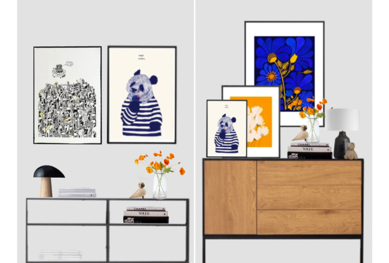
mood board. Great idea. Let's have a look at two
different mood boards. Both of these mood boards have the exact same items on them. In the first mood board, you tend to believe that the predominant color
of your composition is this light brown
from the toys and the orange from the
painting on the right. Then the second one, you tend to believe that the predominant colors
are the wood of the credenza and the
blue. Why is that? Well, what made you judge
these mood boards so differently is scale
of the elements on it. In our predisposition as human beings to focus on big
and bright colored objects, and being able to see a
design in the real scale, which in this case is
mood board Number two, is a very useful tool that
architects use all the time. Because one, it allows you to see a very close approximation
of the real design. Two, it allows you to
prevent design mistakes. Number three, it allows you
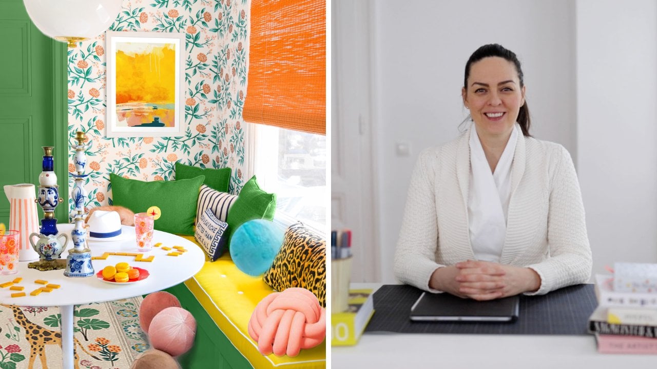
to control the budget of your design and make changes before you ever buy anything. Hi, my name is Ana Marcu and I'm a licensed architect living in the beautiful city
of Vienna, Austria. My background is in architecture and building science
and technology, and have worked
for over a decade, as an in-house architect on various projects
like private homes, office spaces, and hotels. In this class, I'd like
to teach you how to design a wall in your
home and how the concept of scale and proportion can inform your
mood board a little further and help you create beautiful and
cost-effective designs. Architects call this
type of drawing an elevation or a 2D view. I believe that with
the help of pro-create a relatively cheap and
widely available tool, you too can learn a simplified
way of how to do this. First, I'm going to show you how to gather your interior
design elements, whether it's items that you already have or perhaps
you want to buy it. Now I'm going to show you
how to prep them by removing their background and turning
them into 2D elements. Finally, how to group them together into a
beautiful composition. This class is complimentary
to my staff big class, Interior Design Style
Your Home With Wall Art, where I show you
multiple ways to create beautiful compositions with
wall art on a sideboard. This class also comes in response to a review
from Hally Margaret. She wrote, I would love to see Ana creating more
interactive classes, like one that shows
real life examples of problems and how they have been solved working through diagrams, but what's perhaps more detail. Hally, thank you
for the feedback. I hope this class
answers your request. If you guys want me to answer
your questions in a lesson, or perhaps an entire class, make sure to leave a
question or a review and press the Follow button
at the top of the screen. Right there. I hope by now, you are excited to
take this class. Are you ready? Let's
start the class.
2. The Set-up: Let's assume you are
moving or you have an area of your home that
needs your design attention. It's a wall between a door
and an exterior wall. It's not big enough for a
wardrobe and you want to place a credenza and
some wall art on it. For example in the
Pinterest board, decorate with art which
I used in my class, style your home with wall art. Under the section composition, you can see plenty of
inspiration examples. You have a credenza or a side
table with some art above, a lamp, some plants and
some decor elements. But you don't have these
specific decor elements from these exact photos. You have some other
decor elements and you're thinking about
buying some things as well. However, you don't know how all these items
will look like together and you also don't
know how much it will cost. How would you go about visualizing and budgeting
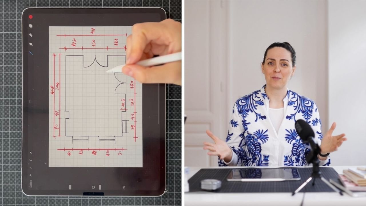
your composition? Let's open our Procreate app and from the upper right corner, press plus and choose
some round pixel number. I chose 3000 by 2000 pixels. This will help with
the grid later on. Now, go to the range on the upper left corner and
press the Add button and insert the photo of the area of your home or future home
that you want to design. For this exercise, I
imported this photo but you can place a photo
of a wall in your home. What do we want to
do with this photo? We want to first straighten
the edges and we want to make sure that the photo
is scaled correctly. How do we do that? We place
a grid over our photo, in the upper left corner, pick the range and then Canvas, and then turn on
the Drawing Guide. Here I invite you to make
the grid size a little smaller and you'll
see later why. You go to Wrench Canvas,
edit, drawing guide and here press 50
and press Done. What I first want to do is straighten the wall we
are going to work on. Photos are taken in
perspective and therefore the straight lines are a
little skewed by nature. Use the grid to
modify your photo and straighten the photography
as much as you can. By going to the select
tool and then going to the lower side of the screen
and selecting Distort. We can slightly pull any
corner of the photo on two grid lines and check how straight the left
vertical line is. It's pretty straight. Here I can see a
little bit of a gap. I'm also going to make that
photo look smaller with uniform just so I can have
a better grip of my photo. Then again, I'm going to place
the upper right corner on a grid intersection
and then press Distort again and pull bit at the lower right
corner of my wall, slightly inside so I can
make the line straighter. I now pull the lower
left corner so I can make the floor straight and
just going to push the door, check this line is
straight, it seems though. I'm just going to select
again the arrow button to de-select my photo. Now
we know it's straight. Now I hope you have
measurements of the area that you
intend to work on. If not, press Pause
and measure it. For me I know that the height of this wall from floor to
ceiling is 2 meter 50. I want to scale the photo
with the uniform tool such that I have 25 squares between the floor
and the ceiling. What this essentially
means is that every square is the
equivalent of 10 centimeters. I'm just going to count my squares now to see
how many they are. I see that actually my
photo is not too bad. It's two squares above 25. I'm just going to
select my photo and with the Uniform Distort Tool, I'm just going to push downwards the upper right
corner of the photo just until the ceiling
becomes two squares smaller. The length of my wall is 175 and the height
is 2 meter 50. Now for me, this wall
length is a little bit too much for the example because
it's an imaginary photo. I can make it a little smaller. Instead of 17 squares
I just want 13 on my right so I will scale free form my photo to my right, so that I have just
starting squares in length. This would be my wall
but I encourage you to have a real wall if you can. Mine is imaginary and I will
make it anywhere I like and because I know most
people have small spaces, I prefer to work with
a length of 1 meter 30 but you can make it as long
as or as wide as you like. I did, as long as the
wall you have is. Now for me, 10 centimeter for one square is still too big. I would like to have my
grid a little smaller such that one square represents
five centimeters not 10. Double the number of
squares on my canvas. We go to Wrench Canvas
edit drawing guide. In here I would like to write
25 pixels instead of 50. Now I have 50 squares
from top to bottom. Each square representing
five centimeters. For the American students, you can have 50 squares each
with a value of two inch. Just make sure to
diminish the pixel of the grid and pull the image with the uniform
button selected such that you have 50 squares
from top to bottom. This is your final drawing. You have your wall
straightened and you also know the exact
scale of your wall. It's 2 meter, 50 in the height, and 1 meter 30 in the width and you have 50 squares
in the length, and you have 26 squares
representing the width. Now you know exactly how
big your surface is. Now, let's have a look at some things we can place
in our composition.
3. Use Your Own Things: Let's assume that
you already have some items that you can
place in your composition. Maybe you already
have the credenza, or maybe you have
some of the art. What I want you to do first, is take a photo of the
items that you have, straighten up the print
as much as you can, and take a photo as close
as you can by making sure that the edges of
the print are straight. Don't worry if they're
not completely straight. I will show you later on
how to straighten them. What you also want to
is to measure them. For me, the large print
is 51 by 71 centimeters, and the smaller print
is 41 by 51 centimeter. The one centimeter
comes from the frame. Now we import the two
prints in my composition. You go to Wrench, and Insert a photo, and you insert the photos
of your personal items. In this case, my two prints. You just make them
a little smaller so you can maneuver them. Now deselect the first
one, press "Wrench" again, Insert a photo, and select the second photo. Again, you make it
a little smaller, so you can manipulate it better. Press the Arrow key
again to de-select. We want to practice items for the composition
a little bit. First by removing
their background, and then we're going
to straighten them, and afterwards we're going
to scale them correctly. Now, let's remove the background
of the first painting. Let's first go to layers, and select the image
we want to change. I'm just going to select my
painting with a little robot. Then we go to the second
button to the left side, and make sure we have Freehand, and Remove on the lower side
of the screen selected. Now, we start selecting
the contour of the painting by zooming in, and first pressing
on the first corner, then lifting the
pen off the screen, and selecting the second corner. Once again, you can use
two fingers to go undo. Now, let's go to
the third corner. Now to the fourth corner, and finally, let's
close this selection. It appears we have
left a little bit out, so I'm just going to
do another selection. Now, with three fingers, swipe from top to bottom, and then copy paste
to toolbar up here, and select "Cut." Now my painting is completely
free of the background. I'm just going to quickly go
through the second print, and do the same thing. We have two prints, but they are a little skewed. If we place them
next to our grid, their edges don't
look very straight. So what we want to
do after removing the background, is
straighten them. So just use the grid, and place the
upper-right corner, but the intersection
of one grid point. Now, by pressing Distort at the lower side of the screen, I'm just going to pull the
edges until they are straight. We said this print is 41 by 51. Select again the Uniform, and make the painting smaller. So if it's 51 in height, it should be 10 squares
by eight squares. I'm just going to
select the Freeform, and push the right side, so that my painting
is eight squares. But because it's 41 by 51, I'm just going to
leave it slightly outside the last corner
in the upper side again. So it's slightly the last
square on the upper side, and on the right side,
because it's 41 by 51. I'm just going to quickly go
through the second print, and do the same thing. Here we have our two
paintings next to each other, in the right scale. Now let's assume for the
sake of this exercise, that you don't have the
credenza, the lamp, and the other core elements that you want to place in
this composition, and you intend to look
through some shops for them. How would you go
about selecting them, and placing them in your
Procreate composition?
4. Finding Products: Now that you have placed
your wall and the things that you already have in
scale in your composition. It's time to look for all the other objects
you want to place in. Here I would recommend to
create a Pinterest board and start saving items that
you think will do well. My Pinterest board is
called Moodboard in scale, and I will place
a link for it in the description if you
want to check it out. I also encourage you to create subsections to help you
find items quicker. I chose inspiration
plans, the core, lamps, books, credenzas, prints, and flower pots. But you can create
subsections by color, by price, or whatever criteria
you will find useful. Personally, I like casting
the net white because this exercise doesn't
cost me anything. I'm going to show
you quickly how to create a board on the iPad. With the iPad
Pinterest app open, go to the plus icon on the right side and
select "Board," then add in the board
name and you will see it immediately in
your list of boards. I'm going to call
this test board, then create and you already
see your test board here. The test board is empty, but Pinterest already suggests
you some ideas that you can place in your current board. Then you want to
open the webpages of your favorite shops and
select the items that you think fit the budget
and the style and add them to your
Pinterest board in the correct section. I have selected a couple of widely known shops that are on the lower mid-range budget, but also couple on
the expensive side. But you select the shops that you feel most comfortable with. Things you might consider when selecting a shop are budget, delivery time of the
items you want to have, and the returning policy. Make sure to check those out
before selecting any shops. I selected here,
Nordic Nests are home, Scandinavian design
house Society6. A lot of other less-known shops, mostly from Scandinavia
because I like Nordic design. But also couple of local
shops from Vienna. We can have a look at
the Pinterest board, which I created already. How do you save a
pin on the iPad? You go to the webshop
of your choosing, let's say Society6, then select "Art Prints." Let's say you want
to have this print. You either press the photo
a little bit longer, or you press the share
button, that says Pinterest. Then Society6 asks you which photo you want to have and I'm just going
to select this one. Then go to your test board or whatever name you want it
to give it and it is saved. Great, let's try another shop. Let's try Scandinavian
design house. If we go to products and
look at lamps, table lamps, I'm just going to take
this one because I love it and just find a
photo that shows the most frontal view
of the product and press the photo while
longer and say share. Then among these apps
here you have Pinterest. Then select "Export,"
and it is saved. This is how you save
photos on the iPad, on your Pinterest board. If you go back to Pinterest and you look at your test board, you find the two items that you want it to have
in your composition. Also makes sure to choose
the product that is closest to a frontal
view and not a 3D view. What do I mean by that? If we go to products and
we look at sideboard. We want to have images that
are frontal like this one. Not 3D like this one. Ideally a figure to sideboards
and select this product. The image we're
looking for is rather this one that it is frontal and we can see
the font very well, rather than this one in 3D. If there is no other photo
and you already have the 3D, select the "3D" and I'll show
you later how to modify it. But if you can make your
life easy and select the photos that reflect the frontal view and now
the 3D view of the product. This is the image
we want to save. Press a while longer,
press "Share." You can see it here in
Pinterest board, test board. If we look at Pinterest, just needs to refresh
a little bit. Here we have it. Always
pick frontal view images. If you don't have frontal views. Pick the 3D and I'll show
you later how to modify. I'm just going to show
you what I have selected for this exercise in
my Pinterest board. In the subsection plants, I have flower
arrangements that I think will look good
on my credenza. Many of them are
fake flower plants. I use them because they
look great in a photo, but I would encourage you
not to buy fake plants. In reality, just buy natural
real plant, if you can. Fake plants usually
gather dust and they start to look really
cage after a while. Just go for real natural plants, even if you use potted plants, just go for the natural ones. In my subsection decor, I selected some well-known and some less-known
Scandinavian products. The monkey, for example, is a well-known piece of Danish
design from Kay Bojesen. I'm not sure if I pronounce
his name correctly but I talked about
him in my class, that he gets home as well. You can also see his birds, but also a couple of other
wooden toys also from Nordic designers
that I think will do great on my credenza. But it also would be great distractions for the
children in the house. What else? Lamps, plenty of design classes. I love the flower pot lamp
from Burner Pantheon. It comes in many
different colors, but mustard yellow is my color. There are a couple of
Zara Home lamps here on the upper left side
for the beige lovers. I don't know yet where I'm
going to go with the style. I picked all kinds of things. But you pick the things that you think are
good for your home. I picked a couple of credenzas, mostly from Society6 because designs are so
beautiful and unique, but also couple from
other shops like this one from the Viennese
shop called Gebruder Thonet. Prints are mostly from
Society6 and Paper Donkey. They're very beautiful and
I love that you can search products by the dominant
color on Society6, it makes the search
so much easier. In the flowerpot subsection, I look for vases
and flower pots. I love these Japanese pots. They look so beautiful. I also selected a
couple from Zara Home, matching the lamps from before. Again, some Danish design
classics like kala Vasa, I picked a couple of items from the Viennese
shop called [inaudible]. I love the pastel
colors that they have. They look very pretty. Now that we have collected
the bulk of things that we think will look
good in our composition. It's time to clean them up and prepare them for procreate.
5. Advanced Background Removal: Now that we selected a
couple of cool objects, we want to prep them
for our composition. The first thing that you
will have to do is download the photos of the products
that you chose to your iPad. Let's go for example
to flower pots. Let's select this
green flower pot, then press the dot icon on the upper right
side of the photo, and then select the
download image, and the image will be
saved in your photos. If you check the photo library
there is to the right. Now let's try to remove the
background of this product. Background removal
in Procreate is simple when the product
is geometrically simple. However, when we have more
complex-looking products, like plants and flowers, detaching them from
the background, is a lot harder with Procreate. Let me show you how
removing the background of this pot in Procreate
would look like. Placing each of the
branches like in lesson 2, would be madness, and it would take you forever. Procreate gives us the
automatic selection tool, which allows you to select multiple pixels from
the same category, by putting your pen on the
area you want removed, and dragging to the right. You see on the upper left
side toggle that shows you the selection threshold by
dragging more to the right, more is selected on your screen, and by dragging to the
left less is selected. What often happens when you
apply this technique to shiny or transparent
objects like our pot, is that either you don't
select just the background, but also some of the
plant and the pot, or if you want to
leave that pot alone, you don't select
all the background. It's quite annoying, the plant is in
cropped very clean, you can still see some
white pixels around. You end up by doing
the removal in pieces, you might also apply
masking in order to restore some of the plant
branches that you deleted, it's a very messy process. I do not recommend it unless you have plenty of
time on your hands. Let me give you a faster and cleaner alternative
to Procreate, is called Canva
background remover. It's super intelligence and
does the job 95% in one go. Now this tool does come
with a premium account, but since Canva helps me with the editing of these
classes and social media, I happily pay for the service. I'm just going to create a standard square
format, 1080 by 1080. Then I'm going to upload my pot. I'm just going to
stretch the pot a little bit so it fits the
entire canvas, and then with the
image selected, you go to Edit image, and press background
removal or beat you remover 1, 2, 3, 4, 5, 6, 7. Seven seconds to remove
the entire background, including the pedestal on
which the pot was placed, and the image is clean. Now imagine you have a lot of photos whose background
you want to remove, because you want to try out many variations of your designs. Look how much time
Canvas saves you. I have roughly 100 photos. It's a very useful tool. When it comes to exploiting your files as PNG with a
transparent background, you want to make sure that
you keep the transparency. Because when you press Download, on the second button
to the right, and you says Save Image, and you go to your photos, then you see that your photo has automatically received
a white background. But you want to have an image with
transparent background. What you want to do
is go back to Canva, select the last button
to the upper right side, and where you see
more save image. Then there is saved
with transparency. If you press this button, it's going to save your image as a PNG file with no background. Save with transparency, select Save Image, and now when you
go to your images, you have this image here that has a transparent background. The other thing you can
do is save to Canva. The last button, save
with transparency, and then select
the Procreate app. Now when you go to Procreate, to the gallery, you see the last image here
is my flower pot, and it has a
transparent background because if I remove
the background color, you can see my image
without any background. Always make sure that you export your PNG
files the right way. Otherwise, you will have
100 photos like me, all with a white background
all over sudden. That's a pretty powerful tool.
6. Working in 2D: I was explaining in
the previous lesson that you should find
frontal photos, photos that show
the product from the front view and not
from the side view, not a 3D view. I want to go a little deeper in this topic and explain as to why and how it is going to support our final
mood boarding scale. For example, I have found this cabinet on a shop
called Nordic Tales. Let's assume that one of your favorite products
only has a photo like this one in 3D and
nothing close to the 2D, which would be on
the page here below. Let's download this
upper right photo and add it to our
composition in Procreate. Just press a little
longer and add to Photos. I'm going to open Procreate, press the Range, insert a photo, and
add my cabinet. As it happens, this
is a PNG file, it already doesn't
have a background. Now, if I look at the
dimension of this cabinet, it says that it is
70 centimeters high, which on my scale, it means 14 squares. I'm going to scale
my cabinet such that its left leg is 14 squares. Let's see how many
squares it is now, 2, 4, 6, 8, 10, 12, 14, more or less. Right now the left
leg is 14 squares. Now what's the problem here? The problem is that we know
that the right leg should also be 14 squares
because in reality, the left side and the right side of my cabinet are equal, but let's see, 2, 4, 6, 8, 10, 12, 14, 16, if I measure my
right leg on my grid, it says that it's 16 squares. My grid now is misleading. It tells me that a leg is bigger than the other
when in fact they aren't. This is why we need
to work in 2D. Only in 2D is the grid
always going to inform us correctly about the size of the product and the distances
that we have available. What I'm going to do
is cut the front side of my cabinet and
then straighten it. With the selection tool, which is on the upper left side, I'm going to press "Freehand" and remove and then go round
and round the cabinet. I'm going to start here. Lift my pen and then click again on the upper
side of the leg, then lift again and
click on the other leg. Lift again the leg below,
then do the contour. What we want to do is have only the front side
of the cabinet available to us and
delete the rest. I'm just going to add a
little bit of that corner. Now, when I go to Layers
and select layer I work in, the cabinet little longer, I'm just going to press "Mask". What I have now is just the
frontal view of my cabinet. With the front part
completely free, we now want to
straighten it such that the top side
of the credenza is horizontal and parallel with the bottom part and the legs
of the credenza are equal. To do that, you go to the upper left side and
select the arrow key. At the bottom of the
screen, press "Distort". This will allow you to
pick each corner of the credenza and pull it
until the shape is straight. Also because the credenza
is 70 centimeter tall by 120 centimeter wide, it means that on my drawing, it will be 14 squares
tall by 24 squares long. Just pull the corners
until you have that shape. I'm also going to show you other challenges that you
might have, for example, if you import vases or pots, usually they're not photographed
from a frontal view, but sometimes
slightly from above. Then I don't exactly know how tall my pot is because I
don't know where it stops. Normally, when you have
a pot from a front view, it looks like this, a straight line below
and straight line above. When you have an
ellipse like this, it means that the object was
photographed from the top. You see another face
of this product that you don't need
and actually is misleading because the distance
from here to here is not the same distance as
from here to here and it's not the same distance
as from here to here. What you want to do is delete the backside of this pot or you simply say,
you know what, I'm not going to be too fussy about the fact
that I'm working with JPEGs and I'm just going to make the distance
from here to here, the distance of the pot, but actually it's
just the one from here to here that matters. You want to give this a try? I'm just going to
go to my pot and I'm just going to select this. Then brush with
three fingers over my drawing and press "Cut". Now the height of my pot
will be calculated from it's bottom to the upper side. All you have to do now is scale the product
in your drawing, keeping in mind the right
height of the physical product. Just keep adding products
in and scale them correctly by checking their
dimensions on their websites. Two things you will run into, one is that you might
find products sold in the imperial system and you use the metric system
or the other way round. Just use an inch to
centimeter converter to find out the right
dimensions of your products. If you happen to fall in
love with products from other countries like
this pot from Japan, you can go to Google Translate and add the website
you want to have translated and your site is in English or whatever
language you want.
7. Grouping Items: You've probably
imported and scaled in the right size a lot of items. Now you need to
sort them in groups a bit to be able to use them. For example, I have this
four lamps that I have finally chosen as potential candidates
for my composition. They have their
background removed and they're in right scale. I would like to have
a group called lamps so I can turn them on
and off as I like. What you do is you go to
Layers and select one of the lamp layers and drag it
over another lamp layer. This is how you create a group. Now you select this New group, select again and select Rename. Then go at the bottom of
the screen and select the Keyboard and type
in lamps, then return. Then drag all the other
lamp layers in this group. This is how you turn
them on and off. This is how I create
my lamp group. In layers, you can also see the other groups I have created. I'm just going to turn
off my lamps layer. I have a group for books just to have some books
to add the composition. They're not actual
products to buy. I would encourage you to
photograph the books you have in your house and add
them to the composition. Generally, I advise against
buying decorated books. If you do buy books, buy books that you love, that you enjoy to
read and that you enjoy looking into frequently. Don't buy decorative books. I have a group for
pots all in scale, a group for prints. Because the prints are sold
in different dimensions, I have multiple copies
of the same print in all the scales that I'm thinking might look good in
my composition. Finally, I have my
credenzas group. I added one from right here, this white one on
the upper left side, then I have a couple
from Zara Home. I found these two
on westwing.de, which is a German online
store for furniture. They're not as cheap as I can, but definitely cheaper than
many things out there, and at least in the credenzas
department, better looking. Before I start adding my
items in the composition, I want to create a second
layer for the wall. First of all, because
I'm working in 2D and my image of the surrounding, it's actually in perspective
and it's distracting. To place 2D icons, we need a 2D wall. Also I'm thinking that
perhaps I could play with the color later on just for fun. I want to separate the wall
there from the surrounding. I'm just going to
create a new layer, then make the surrounding
layer appear. With the selection
tool, freehand and add, just go around your wall on the grid and
create a contour. Here, you can just drag a
color of your choosing, maybe this one,
and then deselect. This is my new wall. If I want to create
another color, I can just use this peachy color and add
this one, anything you like. Then I start to create
my composition. Also, what would be
helpful to understand better the scale is to
import a human being in your composition
just for you to know how tall is a human being in relationship to
this furniture. For example, this female
silhouette is 170. I encourage you to place your own female silhouette
based on your own height, or male silhouette,
whatever that might be. I'm just going to make it
a little bit transparent. This is just going to be
helpful in seeing how tall certain things are in relationship
to a human scale, and in relationship
to your scale. We have grouped our items, we have separated the
wall layer and we have a human figure to help us
orientate with the scale. Now, it's time to create
our desired composition.
8. Placing Items Together: So far we have selected
favorite items. We have prepped, scaled,
and grouped them. Now it's time to place them together and see
their final look. I'm going to first
turn on my credenzas. You can select any
of them and drag them in the composition
and see how they look. For example, I have this
credenza from Sarah home. I find it a little tall, it's actually 80 centimeters. I'm not sure if I
like it that much. I like credenzas to
be a little lower. It's just a personal preference, is not a full pie in any way. I'm probably not going
to pick this credenza, so I'm just going
to put it back. But the one that I actually do like is probably
the one underneath, this one, and I'm going
to work with this. You try any credenzas you like, see what fits right for you. Of course, this is not
an independent exercise. You should also
consider what else is in that room besides
this corner. Do the furniture and the
core pieces that you're picking match anything
else in the room. Just be aware of that. Then I don't have any brief and I don't see
the rest of the room. I'm just trying to show
you a small exercise, how to look at various
corners in Procreate. I'm just going to
select this credenza. I'm going to deselect it. Now I'm going to
turn off the rest of the credenzas except for
mine and close my group. On my credenza, I would like to create a triangular composition. I talked about
compositions at length in my class style your
home with wall art, make sure to check it out. But what that means
is that the items on the credenza should be placed
in a triangle with taller, higher items towards
the middle and smaller items towards
the front and the ends. Now you start dragging
your prints and see what works well with
this new credenza. Try a few combinations. Personally, I like
darker prints to be at the back because they provide a background for lighter
prints to shine. I'm going to use this print with the blue and orange
flowers at the back. It's also really big. This is going to help other paintings and
items stand out, and just place it
a little higher. Then I'm going to bring
a second painting and this one is going to just
lean against the credenza, which is the yellow painting. Do you think it looks lovely? I'm just going to bring
it also to the front so it sits in front
of my blue painting. I think it covers a little bit the first painting but we can still see the blue flowers, and the yellow flowers
are just lovely. I've already thought about this. It looks like I know
what I'm doing, but generally you
just try more items, see what works, bring paintings back and forth
and see what you like. The third item that
I would like to bring is the smaller
teddy bear painting. I'm just going to push
it to the front as well so it can sit in front
of my yellow painting. I don't know if you remember, but actually the
teddy bear painting doesn't have a frame. I just added a frame
to it and this is going to be seen also
in our budget later on. Now I have one side of my triangle and I'd
like to bring a lamp. I'm going to turn off
the rest of my prints, this one, and everything else and I'm going to
turn on the lamps. Personally, I really like the yellow painting and I think maybe the yellow lamp
might look good. Seeing it here it
feels very small. Maybe if I just put it
over books could work, but overall the size, I'm not sure if I
like it so much. Also, I like to keep the yellow because it's so
shiny and bright. I like it, keep it
in a smaller area. Yellow is great, but it
shouldn't be the dominant color. The dominant color should be blue and yellow should
be the accent color. I'm just going to
put my lamp back, maybe the hook lamp. I just call it the hook lamp. I don't think it's
called that way. This is why it's important to create the
real scale because now you see how much smaller or bigger this lamp is in
relationship to everything else. Again, this is very small. I feel like I need
a bigger lamp. I'm just going to put it back. I'm going to take this lamp. This lamps feels right, it's a little bit bigger and I liked that the black
base of my lamp also matches the black frame of my credenza and the black
frames of my paintings, but somehow it feels like
it's part of this group. Now, what do I want to add? I think I also would love
to add some flowers. I turn off my lamps group, then I go to parts. I think many things
could work well here. I'm just going to
try a few things. I think maybe this
might work well. I don't know. Let's
see the blue. This could be interesting. Why not? But what I really
like are these flowers. It's just a simple jar
which I think everybody has at home with
some puppies in it. I find it really
delicate, beautiful, and I feel like they're matching really well with my paintings, so I'm just going to select
this. Where's my lamp? My lamp is gone. I'm just going to push
this slowly chip to the inside and then
push my lamp back. But as you remember, I said I'd love to create this triangular shape
and I don't know, I don't really like how the lamp and the vase
sit next to each other. What I'm going to do
is add some books. For example, these
books over here could look well,
they could work. I could just try and move my vase and see how that looks, and this could be interesting. I like the idea of the
vase over the books. But I think I still like
my puppies flowers. What I'm going to do is
I'm just going to delete these flowers from the
books with the eraser. Just make sure you have
a big enough eraser. I'm just going to delete them. Then I'm going to
move my flowers back. Now, unfortunately you can
see the bottom of the jar. I'm wondering if I can
distort it somehow, warp it, push it down a bit. Now it looks quite pretty and because the flowers are a
little bit higher than my lamp, it's this interesting
triangular shape that I talked about in my class style
your home with wall art. Then I'm going to add a
couple of decor elements. I'm just going to put this somewhere here because you can. Why not? Or somewhere here. My flowers, I would
like to be in front of the lamp and the lamp
slowly to the back. This is how my final
composition would look like. You can also see how this would look like in relationship
to a human figure. The eyeline would be very
much into the main painting. I think this would look nice. I'm happy with this composition. It's playful. It has beautiful
blue-orangey colors. It has a playful
vibe with the toys and the little bear,
with the puppies. I think it's very cute. I like what I did here. I hope whatever you did looks great and I hope you share
it in the class project. In the next lesson, we're
going to calculate how much our composition costs and
see what we can do about it.
9. Calculating the Price: Now that we have the
composition that we want, it's time to round up the
cost and see if we can afford this or we may have to make some changes to our budget. I encourage you to go to your
Pinterest board and make a new section just for the items that ended up
in your composition. I called mine final selection. Now I'm assuming that since
you chose these items, you've already checked if
you can afford each of them. Now you're going to check if you can afford each
of them together. If they fit in the budget that you set yourself for
this composition. Section your screening too. On one side you have Procreate and on the
other it's Pinterest. Go through each of
the items and check the price and add it
to your total cost. I will calculate mine in euros, but you calculate
your composition in whatever local
currency you have. I have changed the prices
that I saw in dollars or pounds from the American and
English shops into euros. As l go through each item, the price is going to
appear on the screen. The teddy bear poster actually
comes without a frame so I selected an Ikea 30
by 40 centimeter frame, which is about £7 or €8.24. I could not find this exact vase as my photo is not
really a product, it's a beautiful image I
found on the Internet. I replaced it with an Ikea
glass of vase at about €2.95. But it can easily be
a glass jar that you have around the house and
doesn't cost anything. I'm just going to go
through my items. The blue and yellow
flower poster, large is 24 inch by 36 inch, or $149.10 or €149.61. Now, it's possible that
my yellow art print is already out of stock or
temporarily out of stock. I can't seem to find it
anymore on the platform. Generally with Society 6, is that all framed art
prints cost the same. I'm just going to check here
at the size for my size, which is 18 by 24, and that's $103.60 or €103.96. If you ever run into products
that are out of stock, you might decide to wait for the product or contact the
artist that is making them, or look for alternatives
on the Internet. l'm just going to
pretend that mine still exists for the sake
of this exercise. The teddy bear poster, the lkea 30 by 40 centimeter
frame is £7 or €8.24. The Etna lamp, which is 36
centimeter high, it's €125. This one is out-of-stock again. I'm just going to put it there anyway for the sake
of the exercise. But always make sure
that the items that you are placing in your composition
are actually available. The vase that I chose
isn't actually a product. You can easily take a jar
that you already have in your home or you can take
this Ikea glass vase, which is £2.50 or €295. You can always look for products
that are similar if you don't find the exact
item that you need. The flowers here are poppies. If you have a garden, you can pick them up
that cost you nothing. I live in the city, so a bouquet of flowers might
cost me something like €10. Ideally, you don't buy any
books for this composition. You have already
sandbox in your home, so this is again zero. The teddy bear, the
teddy oak, €44.50. The bird by Kay Bojesen, which is a design classic, it's on Amazon for €86. The brown sideboard, which I picked this one, it's on Westwing for €399. When I looked at it before
it was 349 and now it's 399, so already €50 more expensive. If you want to have any
other service with it, like putting it together, then this might cost
you an additional €120. I'm going presume
that you don't, so I'm just not going to
put this to the budget, but transportation montage is always an additional cost that you might have to consider. Now let's calculate
this together. Just going to bring in my calculator
€49.61+103.96, 29.60, 8.24,125, 295,10, 44.50, 86 and the
sideboard is 399. That makes our total
price of €958.86. Now, if there is
already a set budget, you want to compare your
composition against this budget. If your current composition
comes at a higher price, you'll need to find ways to make your design
a little cheaper. In the next lesson, we are going to look at some
ways we can reduce the cost.
10. Adapt Your Vision: Now, looking at our composition, you might decide that the
cost is too high and you want to improve it a little bit before you make any purchases. What changes can you make? The first thing is
to ask yourself, Is everything essential or can you live without
some things? Can you purchase some of
the items at a later date? Maybe you already have the vase or maybe you already
have a flower garden. You will not be paying
for the flowers. Maybe the wooden toys can
get a back seat for now. Your budget would be
reduced by 143.45. The second thing you can
do is to swap some of the products for similar
cheaper versions. For example the credenza
that I picked for West Wing is €399 and I would like to swap it with something
cheaper from Ikea. That is only €185. Now I have picked the Ikea
UK for this exercise so that all of you can understand what is written on my screen. But if I look at Ikea Austria, this product is actually
available for €217. If I deduct €217 from 399, then this leaves me with a
budget reduction of €182. If I feel the lamp might
need a budget cut as well. I might just look for
something similar in shops that I know are
more budget friendly. Flea markets are a
great source for a secondhand, very cheap labs. For example I pick
this Ikea lamp, which is only €999, which reduces my lamp
budget with €115. From my total of 958.86, I'm subtracting 143.45, €182 and €115 and
this brings my budget to a total of €518.41, which is about half the price. Now, if you feel you
have some money left, you can also play
with the watercolor. You definitely have
to consider how this is going to look with
the rest of the room. But for this exercise, I can just try out
a number of things. I'm just going to
select my wall. Then I'm just going
to place a number of colors on it and
just drag and drop. Basically, choose anything you want. It looks pretty cute. Alternatively, you might say, you know what, scratchy design. I can recognize my design with these replacements
anymore. I'll start again. Here I have created
another composition for you using the
technique of balance, where symmetry is
highly emphasized. I talked at length about
this in my class style, your home with Walmart. I started with a metal
low board from West Wing, which is even cheaper than the Ikea alternative,
which is €159. Then I use one of the
prints that I already have, an opposite to it. I get the teddy bear print
in the large format, which is 50 by 70 centimeter. That costs €41.10. I add the night our lab, which is €208.70,
because it's a favorite. If I have a bit
of a budget left, I will add the cowboys
and bird, which is €86. I'm going to pretend
that the books, the flowers, device
you already have. Let's calculate
this a little bit. Metal log worth 159, teddy bear poster
without frame 41.10, the Ikea frame 8.24, night our table lamp 208.7, the cowboys and bird 86, vase flower books is zero. That brings us to €503.04. I hope you see how
useful this tool is, not only in visualizing
your overall design, but also in adjusting
your budget. You can use it both of
the items you want to buy and items you already have. A little bit of planning ahead can really save you
a lot of money, as well as making your
home look stylish. I hope you enjoyed this lesson. Let's go into the class project.
11. Class Project: We are at the end of this class. For the class project, you are required to find a
wall of your home that you want to redesign and apply what you learned
in this class. You have to gather
both the items that you have and the ones
you want to buy, prep them, scale them, and place them in a
beautiful composition. If you don't have
a wall you want to redesign at this moment
but still want to practice what you learned in this class you can still create an imaginary composition with the real interior design
products that you find online. All you have to do
is make sure they have the real scale and
proportion on your page. You have to create a
total budget by adding together the prices of all
the items that you use. If by any chance you
want to practice with the products that I worked
with in this class, you can download roughly
100 PNG files with transparent
backgrounds by signing up for my free newsletter. You can find the link in
the class description. If you guys enjoyed this
Procreate class, let me know. I have tons of ideas for
more Procreate classes. If you have any
questions or comments, don't hesitate to let me know. This class is finished. I'll see you in the next class.
 Ana Marcu, Home Wellbeing, Licensed architect