Transcripts
1. Class Introduction: Hi. My name is Aaron. I'm a professional
graphic artist, and I teach digital art at
a pair of junior colleges. In this beginner class, I'm going to show you how to use the fairly new addition
to Adobe Illustrator, the Text to Vector
Graphics AI generated Art. It can help someone who has very little skills
with an art and help you to create something
quite amazing very quickly. I'm going to show
you how to take this beyond just getting
what you get out of the box, and I'm going to
show you how you can add different images into other images and create
something fairly unique. So this class is a good
introduction into Illustrator. To help you just kind of
dip your toe into it, while at the same time
creating something that a few years ago would
have been impossible to create so quickly and easily. This is a course for
beginners, as I said before. But someone who's
never used the text two vector graphics
feature might, you know, get
something out of this. But at the same time, I'm going to be going over
a lot of little things. The class might not be for you, or you might want to, you know, skip ahead and just watch
particular parts if you just want to see how to use
that part of the software. And what we're going to
create is a postcard. I'm going to show you how
to generate a postcard. We're going to create a subject. We're going to create
a background and add little pieces in to
create a travel postcard. Been teaching Adobe
Illustrator for many years. And this is kind of a fun one because it's something
a little bit different. And hopefully, you'll get something out
of this at the very least, you'll get a nice
fresh postcard. And as an experienced artist, I also find this great for when I have a family member that
wants something done, and I just don't
have time to do it. This is a great way to use this new software to create
something very quickly, and for the untrained eye,
it looks professional. So I hope you'll join
me in the class.
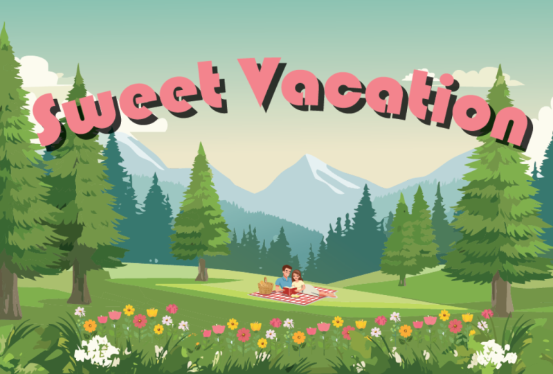
2. The Project/Postcard: The class project
is going to be to create a travel postcard
similar to this. It can be whatever you want. It can be a
Valentine's Day card. It can be a Christmas card, whatever suits your needs. And later on in the course, after we complete the postcard, I'll show you how to upload that file to skill share to
share with the community.
3. Setting Up Your Document: All right, so I have
a document here, and I'll make sure that
this is available to you. You can download this, and you'll be able to just
double click on this. You can see it says.ai, and the AI here that.ai here stands
for Adobe Illustrator. I'm sure that's going to
cause lots of confusion as time progresses as AI
becomes more important. But I'm going to
double click on this, and it's going to open right up. Another way you
can open this is, once you have Adobe
Illustrator open, if you don't want to use this, say you're in another country, and your postcard
sizes are different, I'm just going to show
you how you can fix that. You can go file, new, And from here, where you can see it has recent file sizes. I'm just going to go to print. Okay? And from here, I am going to
choose letter size. You can choose whatever
size you like. If you're in a country
that uses A four, you can click on that, but see the width, right here, it's listed in points, and I can change this to
inches or where we are. There we go. Centimeters
and millimeters. So you can change the size
to whatever size you want. So I'm going to change this since I'm in the US to inches. And we want to make
this six by four. So I'm going to
choose for the width. I'm going to make that 6
". I'll just click there. And then for the height,
I can click and drag across and type
in another number or I can click right
there between, you know, after the one and just delete that
and type in a four. And oops. I made a
little mistake here. As I was building this out, I said that this was 66 by four. I forgot about the bleed area. So it should be 6.25, which is a quarter of an inch, and 4.25, which is an extra quarter of an
inch for that bleed area. So this is how you want to set it up if
you do it manually or just download the file
that I have included, and you should be
perfectly fine. And from here, I'm just
going to hit Create. Okay? And this is the
same thing as this. Only it doesn't have
these extra guides. And I'll explain what
these are later. And I'm going to go to my workspace to make sure
we're all on the same page. So I'm going to go to Window
and then choose workspace. And then yours may look a
little different than this because I have some custom
work spaces in here. But I'm going to come down
here to Essentials Classic. It's a little bit
different than essential. You'll have a few more tools, and the window setup will
be a little different. The main thing is you won't
see this options bar up top. So if I go to a window, workspace essentials, you'll see that option
bar disappears, and you can see there's
fewer tools here. But this is and you're perfectly
fine working with this. I've been working with
Illustrator for so long. I've gotten used to
this classic workspace, so I like to do it. If you're on a small computer on a laptop with a small screen, you might feel more comfortable working with Essentials Classic. The only thing I would
like to point out if you do decide to work
with essentials classic, if I'm using a tool here, There's a lot fewer tools here. If you don't see the
tool I'm talking about, these three buttons down here, these not buttons dots. If you click on that, you can see all of the
tools right here. Again, if I'm in the
Essentials Classic and you decide not to
work in essentials, if you don't see the tool
that I'm looking for, just click on those
three dots right there, and I'm going to click
to close that up. And then I'm going to go
back up to Window workspace, and I'm going to choose
Essentials Classic. Now, you can move these panels around and things like that, by clicking right here, I can close them up. But to make sure we're all
in the same workspace, and everything looks the same. I'm going to go
window workspace. And again, you need to be on the essentials classic
workspace to see this, and I'm going to go down here to reset Essentials Classic. Whatever workspace you're on, you're going to see reset, whatever that workspace is. So I'm going to hit reset
essentials classic, and you can see
everything will go back. So that's how you can get your workspace set up
exactly the same as mine. Yeah. Alright, I just
want to add a quick note. One thing I forgot to mention is here in the properties panel, this is sticky, which means once you change
it, it remembers it. Right here, you can see where it says texto graphics Beta. If I toggle that open, it opens. And this is probably
what you see, okay? But if you toggle it
close, it remains closed. I mean, yeah, it remains closed. And if I quit and come back, it still remains closed. And that was an oversight
on my on my part, because I didn't realize that, but I usually keep this
close when I'm not using it because it eats
up so much real estate. So make sure if you're going, Well, mine doesn't look
like his, this is why.
4. Artboard: Right, so I'm going to click
here on the Layers panel. And you can see, I have this is all the text and things
here for this postcard setup. And this postcard layout
came from a um a website, a printing website,
I believe this might have been insta print, but I can't remember
where I got it. But most of these websites, you'll find a template like
this that you can build on. I can click on that little e, and it will turn off all of, you know, the type and
the boxes and things. What is left is my artboard. So if I print this, only thing you're
going to see is what is inside of this artboard. If I put a photograph in here, and it's very large. Like, this is one of
those things that I'll sometimes have a
student that is new. They'll put a photo,
and you'll see this little bitty box right here in the middle of
this giant photograph, and they'll go, what's that? So that's the artboard. If you print it, what's there, it's the only thing
you're going to see. But I'll demonstrate
that in a second. I'm going to make a new layer. So here, again, Layers
panel is right here. I can click that open. And right here, I've turned
that toggled that off. So now I'm going to
make a new layer. I'm going to click on the
Little plus symbol right here, and it says, Create new layer. And you can see, now it's
made a new layer right here, and we don't have all
this other stuff. But I can again, toggle
that off and on, and you'll see it
because there's nothing blocking you from it. But that's going to keep this a little simple
for right now. All right, so this
is our workspace. If I want to zoom into
this work space, actually, before I do that, I want to bring in a photograph
and show you. I'm going to download the
first face that I see here. And it and hit save.
Again, do not do this. This is just for
demonstration purposes only. And if you're interested
in its pexels, you can see the RLpx es.com. You can get free
photos from there. They're copyright
free. But okay, so what I'm going
to do here is you can see here's the photo
that I downloaded. I'm just going to drag
and drop it right here. And you see it's
gargantuan, okay? So you can see this
little box right here. It's basically almost
only printing it would print half of her lips if I
hit the print button, okay? So I'm going to show you. I'm going to hit print, and you can see this is the
area that it's printing. It's rotated, but you can
see there's the lips. I'm going to hit
cancel, or if I export this out as a digital file, I'm going to hit export
a, use artboards, and it's going to give me
a little preview button, and you can see this is the
area that it's printing. So if you ever have this a photograph out here,
and you're going, what is this little
box right here, that's just you know,
that's the print area. It won't print. So I'm going to scale this
all the way down. And now you can
see this is going to fit in that little
postcard area. Okay? This is just
something to be aware of. It really doesn't have a lot to do with the way
we're working. Alright? So I'm going
to delete that. That was just to
explain what could be a problem for you as you begin working in
Adobe Illustrator. Alright. So the first
thing I want to do is make this fit to
size, this window. I wanted to fill my screen. So I'm going to
mac, and I'm going to hold command
key and tap zero. If you're on a PC, you can hold the control key and tap zero, and it'll zoom in. Right here, you can see
the magnifying glass. I can drag right to zoom in
and drag left to zoom out. Those are just different
ways that you can navigate within
Adobe Illustrator. But for this, I always
like to hit command zero. There are other key commands that will zoom in and zoom out, but I just remember that one because It fits
it to the screen, and if I can't find my screen, I hit command zero, boom in, I'll find it and frame
it up just right. Okay, and I just want to
show you if you navigate, you want to move things
over pan right, pan left, or move, you can
hold the space bar, and you'll get the hand tool. You can also see you get the hand tool. You can
see it right here. You'll also notice right next to that thing
that says hand tool, it has an H. So right now
I'm going to Zoom tool. If I tap H, I go
to the hand tool. Okay? And then from here, I can click and move around. But I like to use the keyboard shortcuts because it just saves a lot more time. So if I'm here on this
black arrow right here, and I hit and I
hold the spacebar, I'm holding my finger
on the spacebar, I can move around,
just like that. Okay, I'm holding the spacebar. All right. So from here,
we're going to get started.
5. Text To Image: Okay, so right here, if I draw a little box, I'm just going to use
the rectangle tool. I'm going to click right
here and I'm going to draw a little box, okay? And this is where we're going
to fill with our image. Okay? So if I come over here, you see this thing
says properties panel. Unless you've played around, you should still see the properties panel,
should be selected. If you see a tab here, you can toggle this
back and forth. There's the library, and
there's the properties panel. But again, if it's out of whack, make sure this is
fitting to screen, you haven't, like, pushed it
off to the side or anything. And if you still
don't see it, I mean, so I can hit that green button, and you'll see it'll
fill this to the screen. Well, let me try this again. I'm going to move this in, and I'm going to click
on that green button and it'll fill it to the screen. If you're on a PC, it should be some xs off to
the opposite side, on the right hand side, you'll see them up
here that will fill, you know, the application
frame to the screen. All right. So now, you see here, there's the properties
panel, as I said, and right here, well, mine is actually closed. This is something I should
have mentioned sooner. Yours probably looks like this. You can toggle this close. I usually keep it closed because it take
unless I'm using it. It takes up so much space, so I can toggle this
open and close. But this is probably what you've seen when you open
things up, okay? Text and it says text
to vector graphics. And it says Beta. So
this will improve. So what I'm teaching you now is using this limited
text to vector graphics, feature within
Adobe Illustrator. But I guarantee you this
will get better, okay? Right now, you can
use its how do I say? It's deficiency to learn you can use that
to your advantage and learn how to use the software a little bit
better to manipulate it, to make your work more original. But eventually, I
don't think it will be totally necessary. All right. So what I'm going to do here, I'm going to show you where
else you can find it. You can see here it is
text to vector graphics, can also find this here
under text to vector Beta. Okay? And Beta just
means that it's new, so maybe big buggy
or not perfect. Alright, so I'm
going to open that, and you can see it's
identical to this. So if you don't see it
in the properties panel, you can always just open it up, and it looks the same. Okay, so I think I'm
just going to go ahead and use this window here. So again, window, text of vector graphics,
and that'll open up. And it's just a little easier to see this
since it's closer. I can keep it closer to the art. Alright, so what we're going to do here is we're
going to make a card, and I'm going to
show you how to do this combining these things. You know, most people will
probably just take it, take what they get
and run with it. And I'm going to
show you how to edit these pieces and combine them. And right here it says type, and that's where you choose the type of image that
you're going to choose, which is subject seen. Icon and pattern. Okay? We're going to be focusing on subject
seen and icon. But at the end of this class, I may throw in a little bit
and explain the pattern. But actually, truth be told, I think the pattern
is the best of these. But I don't usually
need to use patterns. All right, so here we go. So I'm going to put it on
right here it's on subject, and we're just going
to do a practice run. And you can type
whatever you want. Here, I'm going to probably
end up deleting this. So where it says subject, I'm going to select, a subject, or just leave it at subject. And right here, you
see it says prompt. And it says, Describe the vector graphic
you want to generate. So I'm going to
click right there, and I'm going to type in. I mean, again, you can
type in whatever you want. I'm gonna type in Panda,
wearing sunglasses. And I'm going to hit
that inter button. And it's going to take a little bit where it's
using the Internet, so make sure you stay
connected to the Internet, and it's going to
make that image. And there we go. There
is our first image. You can see there's
several you can choose. So if I click the
different images, I can choose the
one that I like. And I think I like this
one in here in the middle. Now, You see here the contextual
task bar has opened up. Okay? That's what this is. If you don't see it, you can go to Window. You can see right here, it
says Contextual task bar. If you don't see it, make
sure that's checked. I usually keep it turned off, but I also if I do keep it on, I'm just going to
click right here, and I'm going to move it
down here out of my way. Otherwise, it will keep popping up wherever my cursor
is at. It won't 100% get in my way, but it can get in your way, and it can cover up
part of your art. So I'm just going to
move it down here, okay? And that is another
way that you can type text to a to create
a vector graphics. Okay. So now I have this little, you know, my Panda
wearing sunglasses. Now, what I'm going to do here is I'm going to create
something else. I'm going to type in Koala wearing sunglasses
and hit the interkey. And I'm just waiting
for this to process. Okay. So now we have a koala wearing sunglasses and I can choose
between the three. If I don't like any of these, I can just hit that generate. You see right here,
it says generate or in the contextual task bar, I can hit that
generate button again, and it will give me
three more versions. The beauty of this is we all should be getting
something different. So if yours does not look
like mine, don't worry. You know, it's just random. The one thing that's
happening is you can see mine are all
kind of black and white. So if you see right here
underneath subject, you can see there's this little button right here, and it says, Match active artboard
style, okay? So I'm going to turn that off. I'm going to click on
that and turn that off, and then I'm going to
hit and generate again. And hopefully this time,
I'll get a brown koala, since that's the
color Koalas are. And I think the reason it did the Black and white
because I did a panda, which is black and white. Okay, well, it's not brown, but it does have a bit
more color in these. Now, if I click away from this, I'm going to click on
over here in my toolbar. I'm going to click
on the black arrow. You can see if I click
away, that's what I got. I can click here, I
can move it over, and then I'll click away. Now, if it generates
something new, As long as that is not selected, it won't replace it, okay? Now, I'm going to show
you something else here. You can see before I started
with this rectangle tool, and whatever size this rectangle is is the size of my art. So I'm going to try, hopefully, I can spell this right, er Raf. Did I spell that right?
Sometimes if you misspell things, it will not. It won't do it right. Alright, so that's interesting. I did misspell it, but it did
make this It did find a gi, make me a giraffe wearing sunglasses. Let me
try this again. I'm going to click right here, generate and see what we get. Okay, so I have several
different versions. If I go to my black
arrow right here, you can see it selects it has this bounding box around it. If I click away,
that's the image. When it's selected, you can see these lines are highlighted.
That's the vector. Those are all that's the
mathematical equations, the way everything is, you know, the way it's put together. It's in a bunch of
different little shapes. And when I click away, you don't see those
shapes highlighted. If I click on this,
well, actually, I'm going to click away, now you see there's two arrows here. There's a black arrow
and a white arrow. I'm going to click
on the white arrow. Now when I click on it
with a white arrow, I'm going to click on
one of these shapes. Now, I'm going to click right
here in this solid area. I'm going to click on
the glasses and boom, and I can drag
that to the right. So that is the difference between the black arrow
and the white arrow. The black arrow will select, see if I click on
that, everything. Okay. And the white
arrow selects specifics. Okay? So you can see right here, this is a selection tool, and then the white arrow is
the direct selection tool. So I want to undo this
to put these back. I could click on the
white arrow, click here, and try to move them
back into place, but that's not going
to be accurate. So what I'm going to do
is go edit Undue move. That's one time and then edit undo move, and that's two times. I believe it will illustrated, will save about 50 undues. You can change those
in the settings, but I'm going to
leave that for now. We have plenty of undues, and you have plenty
of undue by default, so we shouldn't have
to worry about that.
6. Working With Groups: Okay. All right, so here you can see I have
these four squares, and I'm just going to
talk about grouping and the direct selection
tool and the selection tool. All right. First, this
is the selection tool, and that's what I usually
call the black arrow. And this is the direct
selection tool, which is which I usually call the white arrow
for obvious reasons. The direct selection tool
say, I have this square. I'm going to duplicate
this real quick. If I have the direct selection
tool, if I click on this, you see this is the way
this object appears. It has a bounding box. Now, if I click on the white arrow and I click
on this, it looks different. It doesn't have
that bounding box. Okay? And I'll show
you something. I'll do this with a circle. I think seeing that bounding box will will be a bit more obvious. Okay, so this is the black
arrow, the selection tool, and you can see this here
is the bounding box. If I click on this
with the white arrow, you can see that
bounding box disappears, and all you see are
the anchor points. Okay? And if I click on
this with the black arrow, or the selection tool. If I click on one of these anchor points
in the bounding box, I know I just said anchor
points with the other things. So these will be
the anchor points within the bounding box. If I click on that, I
can click on that and drag and stretch it and
scale it up and down. If I move my cursor
to the outside just above that line,
I can rotate it. Now, this will be easier
to show with a square. So if I move that closer here, you can see I can
easily rotate that and just note those the
little curved arrow. Okay? Now, if I come
to the white arrow, the direct selection
tool, that changes. If I click on this, you see that's an anchor point, I'm going to click one time, and then I can change the
shape of individual points. I can move these
points around. Okay? Same thing with the circle. If I click on that,
I can click here. Hang on, missed
it. There you go. And you can see I can
move these anchor points. I have to click to select it, and then click again, and
then I can move it around. All right, so I'm going
to get rid of these. I'm just going to click outside of that drag
all the way across, so I select everything, and then I can delete. All right. Now, here, I'm going to click on
this with a black arrow. You can see each of these
things as individual. All right. What I'm going
to do is group these. So I'm going to
click outside here and I can drag across
to select everything, or I can click on one at a time, and you can see when I
click one at a time, if the other one D selects. But if I hold the shift
key while doing this, it will add each of
these to that selection. Okay. So now you can see if I click to three of
these, holding the shift key, it's a little hard to see,
but this one isn't selected, but the bounding box give the appearance gives the
appearance that it is. But if I click and move, you
can see it's not selected. So I'm going to
hold the shift key. And now you can see that
little.in here appear. There's a little dot.
And now if I move that, you can see it's moving,
but if I deselect it, you don't see the little dot. But again, the bounding
box just gives the appearance because of
the shape of these objects. Okay. Another thing, if I click
out here and drag across, On the black arrow, I can just select just a portion of these, and it will select everything. Okay? If I do that exact same
move with the white arrow, I'm going to click
away to deselect. And if I drag across, it's going to grab those
anchor points, okay? And you can see that
anchor point is white, and that one is blue. So that's selected, selected. These are not. So when I
click on this and drag, you can see it's distorting, ok? So be careful of that.
That's the difference between the black arrow
and the white arrow. Now, what I'm going to do is
I'm going to click out here, drag across, and I
selected all of these, and I'm going to group these. I'm going to group
everything here. Okay? So I'm going
to go object group. Okay? Now, typically,
when we are working with these AI
generated objects, all the pieces are
grouped like this. But if I go to the
white arrow, first of, I need to deselect everything, so I'm going to click away. I click on a white
arrow, I can click, and I can move each
individual piece. Separately. But if I
go to the black arrow, since I was inside of the group, when I click on it, it still moves
everything together. It's still grouped, okay? So I'm going to hit undo
command Z, command Z, or Control Z to put
everything back like this. So you can see I can
move it like that. Now if I want to go
inside of this group, I can just double click. And you see up here, it shows me that I'm
inside of this group. It says Layer one and group, a? So sometimes let me get out of this. I
double click to get out. J, I'm going to duplicate this. I'm going to go edit
copy, edit paste. Now, if I double click to
go inside of this group, you see how that
one's grayed out. I can't click on it. And
this is a beginner mistake. When you click on double click, you go inside of the group
and I can't click on this. It's not clicking. And that's because you're
inside of the group, and the easy way to know that is one, everything
is graded out. And then up here,
you have this bar. But the thing to remember is if you don't have
something else here, it's harder to see
than you notice the gray bar up here is telling you that you're
inside of the group. So I'm going to double
click to get out of this, and I'm going to delete that. Now I'm going to double click
to go inside of the group. So you see there's no
reference telling me that I'm inside of the group
because nothing's grayed out, but I still have
this bar up here, and I can see, you know, that there's layer Layer one and then inside
of this group. So now, since I'm
inside of the group, I can use the black arrow to
select each of these, okay? I'm just hitting command
Z or Control Z to undo that after I do it, okay? And now you can see it so I
can select them individually. But again, with a white
arrow, if I click, it still will move, but if I click on one of
these corner points, I can still distort it. So I have to be careful, okay? And just in case anyone's
clicked on this, you see these little
dots right here in the corner of the squares. Those are they make it. You can make curves
on the corner points. That's what those
little dots are. Sometimes they get in a way
when you don't want them. You don't want to use
them, but each one is I can click on
that and drag it in. Yes, you can do it individually. If I click out here and I
select just that anchor point, you see that's white
on the inside, white, white, and
that one's blue. I can click and drag
and do one at a time. Okay, so that now
to get out of this. One way, if the easiest way or the most secure way to get out is click on the
gray bar right here. It doesn't matter
whether you're doing this with the black
or the white arrow. Just click on that gray
bar, boom, and you're out. Okay? So hopefully that
explains the groups a bit. So now we can continue
with the lesson.
7. Matching Style: Alright, so you can see Black arrow moves
the whole thing, and if I click on
the white arrow, it's well, if I click away, and then you see, it can
start destroying things. If I click on one of these
anchor points, hang on, click on the Anchor
point, click, and then I can drag it
and distort that shape. Okay? So I'm going to
hit edit undo move, undo, and get it back
to the way it was. One more. All right. So I'm going to click
on the Black Arrow, and you can see it's just selected the one that's
still selected do. I'm going to click away, and now I'll click
and get everything. Okay, so if you see if there's
a style that you like, you can select this and add So if there's a
style that you like, you know, or you don't like, just turn this off and on
and play around with it. Another thing that you can do is say this is too
detailed for me. You see this little
gear icon right here. If I click on that, you can see there's detail. There's less detail
and more detail. All right? So I'm going
to click on this. I'm going to draw this. I'm going to see a tall box, and I am going to click on this. I'm going to choose
the least detail here. And then I'm going to
hit generate again, and match active artboard style is off, and let's
see what we get. Hopefully, we'll get
a really long neck since this has it's
fitting in this shape. Or it may give me
the whole body. I'm not sure. It's a to, you know, just experiment
and see what you get. That's interesting. It didn't
give me a longer neck. It just made it shorter. Okay, so there is that. Now, you see right here
where it says subject. We're going to
change this to icon. Okay? Well, actually,
I'm going to click away so that that giraffe
is no longer selected. Okay? So I'm just clicking
in the background. Here, where it says subject, I'm going to click and hold, and I'm going to
choose icon, ok? This is one way that you can
get a very simple image. All right? So I'm going to
click on the rectangle tool, Draw box, and I'm going
to just click again, Generate, and let's
see what we get. It's always you never know
what you're going to get. Okay. It's processing. All right. I clicked on icon, but it seems like it may be
a little bit more simple, actually like the
look of it better, but I'm still not
happy with this. So I'm going to click
away. I'm going to turn off Match Active
Artboard style, and it's on icon,
and hopefully this will give me more of
what I am looking for. So again, you just
have to play around with it, see what works for you. And, you know, there we go. Now, that's more of
what I'm looking for. I don't particularly like it, but that's more of what I'm looking for. Something
more simple. Okay, let's try something
different. All right. Let's see, let's try
monkey eating A, but and see what we get. And that's icon. So this
should be very simple. Well, okay, so this is something I don't
know if you noticed. Think about it.
Can anyone can you guess what happened why
this monkey is giant? Okay. So the reason
this monkey is giant. This is something I
wanted to show you, but I didn't mean
to do it right here is I didn't specify
the size, okay? So this is basically making
it the size of would be on, say, a standard size document, like letter or A four. So if I want to scale this down, I'm on the black arrow. I'll click on the monkey, and I can click here. Hold the shift key,
and you see it if I don't move it properly,
it distorts it. So my finger is still
on the mouse button. I'm going to add the shift key, and I'm going to
drag it in, okay? I'm going to drag it down. Now I'm going to release
the mouse button. I'm going to keep my
finger on the shift key. I'm going to release
the mouse button. Now I can release the shift key. Okay? A lot of times I'll
see students where they try to take both hands
off at the same time. And if this hand comes off a split second
sooner, you know, the hand on the shift key, it may distort the image, okay? So I'm going to move that
monkey back into place. All right. I'm going to zoom in. I'm going to hit command zero. Control zero on a PC, and it will fit to screen. Right. Now, I'll show you you saw that was
the Giant monkey. I'm If I do this
with this monkey, I'm just going to
hit Generate again. And you'll see it's just
going to replace this monkey, and I can choose one
of these that I like. And I like that.
Now I'm going to move that up here. I'm
going to click away. And again, this is just
to demonstrate I'm hitting Generate with
no size selected, so I should get another
giant monkey again. Boom. Okay, I'm just going
to delete that for now. And I'm going to type
in Wing sun glasses. And this time, I'm going to click and I'm going to size it. I'm going to draw a little
box and then hit Generate. And remember, active art
board style is turned off. There's two more little
buttons down here. I want to show you. There's this style picker, Extract style from
reference image. And here, select
a sample prompt. What the hell does it mean? Okay. So just a couple
of things here. So I'm going to
click Style Picker. This thing right here,
this little icon, and it's going to extract the style reference
from an image. Okay? So I'm going
to click on that. And then I'm going to click on this giraffe since
it's detailed, and you can still see
it's on Monkey icon. So I'm just going to hit
generate and see what it does. And hopefully it'll give
me the monkey eating a banana that is a
bit more detailed. So I'm going to click on the
black arrow and click away. And you can see it's
a lot more detailed than these other monkeys, okay? Kind of like that
one. All right. And this right here, this little button just says, select a sample prompt. So I can just click on this, and then I can click one of
these sample prompts if I just want to play around with it and see what it gives me. All right. Although, this is
a great way to get a style. So say I click on this
Fox. I can click on that. And now, oh, okay, it's giant. I'm going to scale
this down again. I'm on the black
arrow. I'm going to click, hold the shift key. Okay? Now, what I'm
going to do here, I'm going to hit command
zero to zoom it back up. Now, what I'm going
to do here is I'm going to hit turn this on. I'm going to click
away, but match art to active art board style. And I'm going to type
in this key monkey. Eating a ban with sunglasses. And hopefully it'll give it
to me in this style here. So, again, match active
artboard style is on, and I'm going to hit generate. And hopefully this
will give us in that nice triangular style. All right. All right.
Let me zoom out. All right. It didn't
quite match the style, but it is a bit more interesting.
It changed the style. But see, this thing
Almost a crapshoot. You never know what
you're going to get. So just play around with it. If you get something you like, or if you see something that
creates a style you like, drag it off to the side. Okay? Like, I often when
I'm working with these, I'll keep my artboard clear. And if I see things that I want, actually, I'm going to
delete some of these. I'm going to move this over. I'm going to click right here,
move it off to the side. And if I see something
that I like or style, I will put those little
images here so that I can sample them
should I choose to. And let me keep that one, and I'm going to delete these. Okay. So now I'm going
to move this up here.
8. Sampling A Style: So, I just showed you how to use the Match Act
of Artboard style. So if you create something here and within Adobe Illustrator, it will match the style. But here is something
really interesting. See, these are some images
that I have uploaded, and I have sampled. I use this button right here. You see it says style picker, extract style from reference
images or artwork. And this can be a
JPEG or whatever. And It just works. Well, it doesn't exactly
work. It kind of works. Whereas you can see here is a digital painting that I did. This is a pixel
based illustration, and you can see it
recreated it in this sort of painter
painterly style. It's not perfect, but it tries. I expect it'll get better in future iterations
of the software, but right now it's not great, but it's still fun to play with. Here is another illustration. This was something that's vector based, but
I sampled this, and you can see it
picks up on the colors, so it has these
blues and browns. And it's a bit, you know, it has a different feel to it. This one, actually this top one has more of a brushy feel. And then here's another
I did this in photoshop. It's a scratchboard style, but you can see it's kind
of dirty looking and lots of scratchy
bits and chunks. So, it does kind of work, you know, So it's
worth playing with. And I'm going to try
this something here. I have no idea what's
going to happen here. So let's just see if we really go simple,
what it will do. Alright? So the
way this works, a, you see it's right here, that little button right there. It says style picker.
I'm gonna click on it. You see it's kind of matching the background matches here.
I'm gonna click on it. Now you see it's gray. Or it has kind of a black background. And now I have an eye dropper. And then I can come over
here and I'll click. Actually, let me make sure
that is no longer selected. Let's try this again. All right, so here is the icon right here. Here is the style picker. And you can say, is
the extract style from a reference image or artwork. And I'm going to
click on that and you see how it went dark
the background. And now I have an eye dropper. And then when I come over here, you see it highlights
the artwork. I'll click. And then down here at
the bottom, it says, your selected style has been
added to the style picker. Now, here we go. I'm just going to hit
this generate Beta. Actually, I'm going
to draw a box here. So this thing isn't too huge. And I'm going to click
this button right here, generate from my prompt here, monkey eating a banana
with sunglasses. I have no idea what this is going to do with
something so simple. I'm really curious. Okay, it worked. So you can see again,
it's not perfect, but it gave me three variations that are very simple,
very stylized. So this is definitely
something worth playing with. I think I'm going to
stick with this one here. All right, so I'll see you in
the next video when we get going on actually
making a postcard.
9. Document Set Up/Template: All right, so the first
thing we're going to do is we're going to
choose a subject, okay? And I want to make
I'm going to make a You know, in the US, you often see these well, back in the old
days, let me think, traditional old fashion
travel, post card. And this is sort of what we are after is one of
these kind of things. Here we go. This kind of thing. Alright? And then usually you would get these
in different states. So we're going to go for
something like this, not necessarily exactly well, definitely not
exactly like this. We're not going to
put the photographs inside of the type like this. But we're going to
go for something. It's sort of, again, a
travel postcard, you know, back in the old days, when you go traveling,
you'd find a postcard, you'd write out, you know, a message and send it to
your friends, you know, back before you instagramed it, and it got there instantly. All right, so here I am back on my original document.
It's six by four. And this is the the
original document where I size it up,
you can download this. You can see if I open up my
layers panel right here. I can toggle that open,
and you get this. So say if I'm going
to print this, And I want to have these
printed professionally. I pulled this off of a website. I believe this came
from Insta print, but you can get them from any, most places if you
need to upload it, and you're going to
create something on your own and send it. And you can see here, it says there's these
different things, safe area, trim
size, bleed size. All right, so
following from here, actually, let me clear
these things out. We don't need all
this stuff here. Okay. So what this is, as you can see this
postcard here is it is going to be 6 " by 4 ". And that's what this
black solid line is the actual size that
the postcard will be. This bleed area is the area
that's going to be trimmed. So you need to make sure your image goes all
the way to the edge, that extra quarter of an
inch all the way around, and it will be trimmed off. And if you're in a country
where you're working with centimeters or millimeters. You may need to, you need to check
with them to find out how many centimeters, or millimeters would be
used as a trim area. So it should be easy to find
if you go to the website, look for a template and you
should be able to find it. But for this, you can just
stick with the inches probably if it makes sense
and bear with me here. Right. So so the trim, so again, just to repeat, the solid black line
is the trim area. That's the actual
size this will be. But the bleed area is where it will be printed a
little bit larger. You'll make the
document a little bit larger and it'll be printed
a little bit larger, and then it gets
trimmed down here. Now, this safe area, because printing
is not perfect and the cutting is not
perfect, things may shift, and you want to make
sure everything is in this extra little
quarter inch right here to make sure that nothing gets clipped or
is touching the edge. So that's why that is
called the safe area. All right. So, here we go. I'm going to turn this off
you can kind of eyeball it. You know basically
where things are. So I'm going to turn that off just to make things
less confusing. And I'm I'm going to lock that, make sure it's locked, turn
it off, the visibility. And right here, you can see I'm going to
select this top layer. I'm going to double
click on that and label that drawing. Okay?
10. The Beach/Text To Image: Here, you can see I'm going
to select this top layer. I'm going to double click on
that and label that drawing. Oops, and hit okay. All right. So So from here, I'm going to use
the rectangle tool, and I'm going to click
right on the edge. So just outside of the edge. You can take it a little
bit past that bleed area, and I'm going to release. So this is the size
that it's going to fit. Actually, I've played
around with it, and sometimes it doesn't get
the proportions just right, so you may have
to adjust things. So I'm going to make this
a beach thing, okay? It's summer, and I want
this to be a beach. So I'm going to click
that layers panel. I'm going to close that
up. And here we go. So I can finally leave this
monkey eating a banana. I'm going to click the X
to delete that. All right. And note. It's on
type is Subject. Actually, I need to change
this to scene, okay? And now I'm just going to type in Bach and see what we get. I might try Sonny Beach or something like that and
see what happens later. Actually, I may go with a
lighthouse just for kicks. Alright, so I'm going to hit
Bach, and see what we get. And it's going. Okay. And as I said, you see, it didn't go
all the way to the edge. I'm not crazy about it,
not going to the edge, but we can stretch
it a little bit or expand it just a little. But let me click to see
what these others are. I don't like that. Hm. I kind of like that. Let me go back here. Yeah, I'm going to go
with this one. All right. And normally, I try to
avoid distorting an image, so I would click on this hole the shift key and make
this enlarge this. But this no one's going to really notice if I distort this just a little bit. But it's one of those things
you have to be careful with. If things look a little
off don't distort. So I'm going to click here,
drag that to the right, get it just on the other
side of that artboard line, and drag on the right side. And as you can see,
it doesn't look distorted or stretched
out or anything. So again, be careful with that. So I'm happy with that.
11. Manually Making Fixes: All right. There's one
thing that I don't like about this is like there's
this line of beach here, and then there is
this pool here. So I'm going to get rid of that. I'm going to click
on the white arrow. And then I can click on these areas here and
then hit the delete key. Okay? So I'm just
going to click on it. Hang on, I need to click away. Oh, that Okay, see what happened is I click
the background. So it looks like the beach, you can see the shape
is going to here, and then the beach
is the background. So that's a problem. It just makes it not as easy, but I'm going to get
rid of some of these. I'm going to click on the ones that You can see I'm clicking. I'm selecting them and then
hitting the delete key. And sometimes when I
hit that delete key, it doesn't get everything. That's because maybe I
have clicked on a line. So see, I clicked on an
anchor point or a line, so it takes two
clicks to get it off. If I can click in the middle, it'll go away with one click, but these lines are so thin, it's taking me two clicks. And I'm just getting rid of
these to clean these up. It's not necessary. But I just like
to have it clean. You see, when I click
on that background, it's just selecting
that background. Hopefully this makes sense. I'll move these pieces
around so it makes sense what we're doing hang on. Almost because basically
this blue is a hole. If I click on that, you can see if I move that out of the way, there's the white background. I'm going to hit
command Z or Control Z. Hang on to do this. There we go. Now hang on. I got to get rid of
this, that little area. What we're going to do is, I'm going to see what
that looks like. So you can see there's
the top right here. And we can go in here and
draw a patch across this. But for now, I'm just going to click on that anchor
point right there, and I can just drag that down. Since these match up, as long as they match up, I
shouldn't have a problem. I'm going to click one time and then click and drag that down. Here, I'm going to go over
here. Click one time. Let me zoom in a little bit. I'm going to click one
time to select it, and then I can click
on the Anchor Point. Click whoops, I missed it. And if you miss it, just
click again. There we go. Got it, and drag it down. And click one time.
Drag it down. Click one time, drag
it down. Oh, good. And it's behind the
that rock or whatever. Click, drag down. The nice thing about
being able to edit it is if you get something
that you really like, you can always you
don't have to lose that if you know enough about the
software in order to repair, make a simple repair. All right, I can
drag these down, but it's going to get a little weird just because click
again, there we go. You can see actually that works, moving that over,
but I'm just going to delete these so you can see, if I come over here
to the Pen tool, I'll click and hold,
and you can see there's a thing here that says
Delete Anchor Point Tool. Okay? And now if I click here, you see it has a little
minus next to it. And if I click on that
point, it just goes away. And now I can just delete
these until it goes away. And I missed the point. So maybe I'll zoom in a little bit more. The thing is, if
you make a mistake, you can always just, I'm going to delete
that one. There you go. You can always, if you
make any mistakes, you can always hit
that undo button. Okay? There's a little
blue right here, but I'm going to
leave that there. I'm not going to
worry about that. All right, so now we have
our beach scene, okay? And what I'm going to do
here is lock this, okay? So I'm going to move that over. I'm clicking right in this
area to move this over. And now I'm going to click right on my layers
panel right here, Toggle that open, and
then I can lock this. Actually, I'm going
to double click on that and call that Bach.
12. Beach Umbrellas/Text To Image: My plan was to put a
lighthouse on this beach, but this isn't exactly
a lighthouse beach. So well, I'm going
to bypass that. I'm going to skip
that. All right? I'm going to close that up. Alright, so now it's deselected. Let me double check. Let me click on the Black arrow. Oh, it's giving
me this you know, I can't draw thing because
I've locked the layer. So I'm gonna open my
layers panel up again, and I'm going to open this up. I'm right here, and I'm gonna click new create a new layer, and I'm gonna call
this umbrella. Hopefully, we can get
a beach umbrella. Okay. All right. All right, so I may play around. I'm not exactly sure because it depends on what
I'm going to get. So I'm going to try
maybe a beach umbrella, maybe a surfer, or a sailboat. We'll just see what
kind of things we get. I'm not married to this exactly. I haven't picked
exactly what I want. And you can see here it says, Match the active style. And I'm ha with that because I'm just hopefully
it'll match this, and it seem like it
belongs together. Alright, so now I'm
going to choose subject right here under
type of, you know, image. It's on scene. I'm
going to click hold and then choose subject. Alright. Now I'm going to
click on the rectangle tool, and I'm going to draw
a little box here, and I'm going to already
have beach here, and I'm going to put umbrella. Hopefully, it will give
me a nice beach umbrella. And let's see what we get. And, I can see the
shadows are pushing, you know, on the back
on the left side. But this kind of works. Let's see what else we get.
We have one, two, three. No, not that one. I'll
go with the first one. Okay. All right. So I'm going to go with that. And let's put a couple here.
I'm going to copy this. I'm going to go edit copy, and then edit paste. All right. And now I can
plop that on the beach. Maybe I'll add another one. And since it's already
copied, edit, paste. Okay. Now, if I want
to rotate this, I can move the cursor here. But the problem is
I'm going to have to go in here and separate this from the from the shadow. Actually, I'm going to go ahead and show you
how to do that. I'm going to hold the space
bar to get the hand tool. I'm going to move
this off to the side. Now I'm going to go edit group. Oh, sorry, object Ungroup. And yeah, this is going
to be interesting because what you're going to be doing is
something different. So you'll have to
take what I'm showing you and make it your own because whatever you generate
with this AI is not going to be the
same as you know, it's not going to be the
same as what I'm getting. Alright. So you'll just have to, you know, maybe you get lucky
and get something close. Or who knows, maybe I'm wrong, and it will actually give you the same thing.
Alright. So here we go. I'm going to object, group, and there we go. So it separated the
umbrella. I'm gonna zoom in. And I can move this.
Let's see. There we go. The only problem here is you see it cut this little
piece out right here. We may have to patch that. So that's good. It ungrouped here. If it ungrouped it in a way
that didn't work for me, I could click here, click
on the Black arrow, and then drag across and select all the bits
so I can click, hold the shift key and
select all the bits, and then group that again. So I would go object
and then group. But it separated them into two pieces,
which is very nice. So now I'm going
to move my cursor. I'm on the black arrow, rotate that a little bit.
And there we go. Now we have a tilted umbrella. But we have a problem with, you know, the sand. The shadows don't work. So I'm going to go
to the white arrow. I'm going to click on it, and then I can click right here, and just like we did with the other one moving them around, I can click and drag this over. Whoops. One problem
that I'm having is you see when I move
this, it shifted. But there's this little handle and I can move that up and down. So I'm gonna hit on D though.
So here's the anchor point. I'll click on the anchor point, move it over, and then
I can move this handle. But oops, I missed it. Click on the Anchor point.
There's that little handle. And I can click on Oops
and missed it again. I can click on it. And then I can get that
handle and click hold, and I can adjust it. But that may be a little too
difficult for some of you. So I'm just going to
show you how you can easily use the Pin
tool to patch it. So, here's the pin tool. Well, I'm going to click, hold, and put it back on that
original pin tool. Okay? Make sure
nothing is selected. And what I'm going to do is click and just build
a little patch. Alright. It's telling me it's gonna subtract. There we go. And you can see I can make the shape when I get to the end, it gives me that little circle telling me it's going
to close the shape. It matched the color, but I'm going to go ahead
and do another one. As long as I don't click on
something that is selected, it should give me a new line. So I'm going to
click right here, and then I can come across here, and then down, and then I'm
going to close this up. The nice thing is I can
sample the color afterwards. If you are having trouble
making these clicks, I can come up here
and click, click, click, click, and just make a little box
here, four shapes. And then I'll come over
to the white arrow, and then I can click on click one time on the Anchor Point, then click and hold, and I can move it in the place. Click one time, to
select it, click, hold, and move it in the
place. Click one time. Click again, grab it, hold, click one time to select it
and click again and hold. And if you are, you don't have to get into
all of these manipulations and changing the thing
up if you don't want to. You can just keep it simple, stick with what
the AI gives you, and be done with it. All right. So here, you
can see this is selected. I'm going to go to
the Eye dropper tool, and we're going to sample. It's still selected, and then here's the
Eye dropper tool, and I'm going to click
right here. All right. Now I'm going to go back I'm going to go up to
the Black arrow, click on this next bit, and then I'm going to go
to the eye dropper tool, and then I'm going to
sample right there. And now everything matches
up. So I'm going to zoom out. It didn't match up perfectly, but I'm not going
to worry about it. I don't think
anyone will see it. And if I really
want to fix that, I can go in and tweak it. So I'm going to click out
here. Nothing is selected. There's nothing behind
it, and now click, Drag across with
the Black arrow, and now I'm going
to go Object Group. I'm going to zoom out again. I'm using the
magnifying tool here. I can click here, and you can right here the
magnifying tool, and I can drag right
drag right and left. You have to go
kind of quickly to get that scrubby zoom, okay? Just click, drag right and left. All right. Now I'm going
to go to the black arrow. Click and move it into place. Now, I want this to fit, so I'm going to go command zero, and it'll fit everything on
the screen, just like that.
13. Surfer/Text To Image: So I can click in
the background. And we're good. Okay. And I noticed a couple of times
I've been moving this around. And if you accidentally, you see how that highlights,
it drops into place. If it drops into place like that, and you
don't want it there. You can just grab it right
there and tear it off, okay? Or if it goes into that spot, you can tear it off
and then click on the little x to close it. And then you have to go
back to window to open it. Alright, so this looks
like this works for me. Now I just need a surfer. Alright. So now I'm going
to draw a little box, take a box, and I'm going
to make it kind of small. They may be out of proportion. They may be a little bit
too tall for the image, but we'll see what happens. And I'm just going to click here on the x to clear
that out and type in sur fur and hit the inter key and see what we get or click
on the Generate button. Okay. Now, let's see. Oh, boy, that's tiny. I'm going to click
on the black arrow. And I'm going to click
here in that corner, and you can see how
it's distorting, so I'm going to hold the shift
key and make that larger. Alright. I'm not crazy about this one because he's in the water and
doing weird things. She's in the water,
and let's see. And he's on the beach. I actually wanted
someone on the beach, but actually, you, he's
in the water. Let's see. I'm going to go with the woman. I think that looks
a little better. I'll put her out in the water, I'll scale her down. Oh, actually I need to hold the shift key so it
doesn't distort. And I'm just going to move move he around in a couple
of different places just to see And I think I'm going to close this
out here, right here. I'm going to click right there so I can see what's going on. I'm going to click away.
And that kind of works. Okay, so now we have
our beach scene, I told you it was super
simple, super fast. And now we're going
to add some words. And I'll see you in the
next video for that one.
14. Point Type/Area Type: Okay, now we're done with the
whole AI portion of this. We're going to get
into some type. I'm going to hit command
zero to fit this to screen. And I'm just going to talk
a little bit about text. All right? Here we go.
Here's the type tool. And if I click and I
just start typing, it's just that text is going
to go on and on forever. It's not going to stop. Well, it may eventually may
hit a wall and stop. But you can see it just
goes on and on forever. And then there is this thing. And that is called point type. And if I use that same type tool and I
click and drag out a box, when I start typing, it's
going to fit within that box. But one thing you'll notice there's this fake text in here, that Laurel ipsum that's
called dummy text. As soon as I start typing, that's going to disappear,
so don't worry about it. Just start typing
and it goes away. All right, now, you'll
see this type here. You'll see that little
plus symbol right here. That just means there's
more type within this box. And this is called area type. And if I click on this,
I'll click on it, and you see it has
a bounding box to four anchor points here on
the sides in the center. But if I click right here
and I drag this down, it will expose the
rest of that type. And again, this is
called area type. It's really at this level, it's really not important, but some of you might actually experience the type behaving
in a different way, so I think it's important
to show you this. So again, I'm going to click. And eventually, you see
that red plus sign, that red plus symbol
disappeared because I expose the end
of the type block. So you can see there it is, and when I click here, I drag down, it's all
exposed, and there we go. So you don't see it anymore. Now, one thing that can happen, the way the type, it may
behave a little differently. Actually, I'm going to
open up a new document. And here, I'm going to
click on the type, okay? I'm going to click and here
up here in my Options bar. Again, if you don't have the Options bar open
because you don't have Essentials Classic open, you can change this over here
in the Properties panel. And one thing I'm
going to do here, you see, I have the
text of graphics. I'm going to toggle that close so I can see this other stuff. All right, so again, I'm going to just go
ahead and work here, but you can work over
here if you like. I'm going to increase
the type size. I'm just going to
hold that because this is going to be a title, a? Just increasing the type size. Now, what's going to
happen? This is point type. I just clicked, release, and now if I click on
this anchor point, it's going to stretch the type, a typically, you want to
avoid distorting your type. If you're working on
your own project and you like the way the distorted
type looks, that's fine. But if you're aspiring to be a designer or something or you want something that
looks professional, try to avoid doing this. You can get away
with it minimally, but don't stretch your type. I worked at a
newspaper for a while, and I remember once I
stretched the text. And my boss was a designer, and he did not like it. Never, ever, ever stretch
your type. Yes, sir. Alright. So anyway,
that's where I learned never to
stretch the type. But again, you can sneak it. A little bit of stretch.
Nobody's gonna notice. Just don't go nuts.
Alright. So the thing is, if this is area type, it's not going to stretch. And I can change this
from point type, which means it's going in a
straight line forever and ever into, point type. Although I do want to
show you one thing. I'm going to double
click on this, and you can see now
the text is active, I I hit a return key, it's going to break it to
a separate line, okay? So that is one, you know, it doesn't go on forever and ever unless you
hit a return key. But the other one, once it
hits the end of that box, it's going to break
automatically. All right, but you can change
it back and forth from point type to area type
by clicking right here. You see that little
paddle right there. If I click on that,
I'm going to double click and you see it
changed to a solid color. Now that means that
this is now area type. And you see the
little icon right there is telling me
this is area type. So now, if I double click here, and I start typing, you see
it's going within that box. But I have that little rit box telling me the
type is, you know, it's fit within the box, but it can't display, so I need to extend this box. Okay? Now, the thing
that's interesting here is if I grab that anchor point right here
and I stretch this, you see the type flows
into that space. Okay. Was remember when it was point type, it
would stretch it. And this is what's important, because at least for this class, is to show you that sometimes that type is going to stretch, and other times it's
going to fill the space. And the way you can change
that is to click on that little paddle right there or double click on that
little paddle right there, and that we'll switch it from
point type to area type. So this is point type. You can see the arrows
going on and on just from that little bitty
icon and when I double click, Now you see the icon, it shows a line underneath it, so it's showing telling me
that it's going to break. Okay? So that is the difference. Anyway, so that is how the point type
and area type works. So now I'm going to
just close this out.
15. Choosing/Adding Font: Get back to my postcard. And I'm going to type this. I'm going to call it
welcome to the Bach. Although this is going to
be a little bit hard to see because of the
art back here. So I'm going to toggle this off. I'm going to click
on my Layers panel. And right here, here's my art. Well, actually, there's
the umbrella as well. I'm going to lock that down. And then I'm going to turn
that off the visibility, so I have a nice
white background, and I can see what's going on. Now I'm going to
make a new layer. Okay. And you see it
appeared right on top. If yours appears in
the wrong layer, you can you know, like, if you were selected down here, you can click at the top. Well, it's probably
easier to just delete it. Click on that top layer, and I just realize I
misspelled umbrella. And you can click on that
top layer and hit plus, and it will appear on top. But you can move it up and down. The only problem with that is sometimes it doesn't
drop in between, I may go into a sub layer. So the easiest way
to get this to work is to just click
on that top layer, and then click
here on this plus. Plus button to make a new layer. And I'm going to call this type. This is just one simple
straightforward line. I'm going to go
ahead and just click one time and make
point type. All right? Now, while that's
still selected, I can come up here and
crank that up in size. I'm just holding my finger on that button on that up arrow. And I think that is a good size. Now, what I'm going to do is
go into my fonts right here, and I can choose a again, you can do this
over here as well. I can go into the
fonts over here in the properties panel and
pick a font that you like. I have a ton of fonts here. You can go to adobe fonts
and load extra fonts. So I'm just going to scroll
through these fonts, and I have a ton of fonts. It's kind of crazy, but
you should see a preview, and then you can just pick
a font that you like. If you don't so I'm going
to go with this font called Fgrell,
Flagrel. All right. If you don't see the font, if you really interested, what you can do is again, you're signed up to adobe, you can go to something
called Adobe Fonts. I'm just going to
type it into Google. And ado the fonts
at the inner key, and you can see
adobe fonts here. And from here, you have access to all sorts of fonts
that you can load up. You'll need to sign
in for it to work. Sometimes when I do this, it automatically signs me in. It doesn't force me to sign in. But It's forcing me
to sign in here. So I'm going to go ahead
and see what I can do right here
without signing in. Is if you see right here
where it says Browse A, I'm going to click right there. And lately, I've been loving
these art deco fonts, and I'm going to go with a
nice art deco font. All right. So right here, you can see there's different
types of fonts here. And I don't see
geometric friendly. There we go. Art Deco. And there's a button here
that says view 12 more, and we have some
more fonts in here. But I'm going to click on
the Art Deco right here. And you can scroll through and pick a nice
font that you like. And you can see right here, there's that Fla gray. Fla gray, I believe
is the pronunciation. There's only one font here. And as long as I'm signed in, you'll see up here,
it says sign in. I can just click on
this button right here, and it will add the font. Actually, you know what? I'm
gonna go ahead and sign in. Um Okay, so I'm all
signed in here, and, so you can see right here
it says, remove the font. That means I've
already loaded it. But I'm going to load
up something new. So I'm going to
go back to brows. And let me go back to our Deco. There was a font
here that I like. There is the Flagre. And I'm going to
go with r Bo tech. All right? It's not loaded. There's one font.
You'll see here. This one has two
fonts, three fonts. And if you see one or two fonts, I'm going to click on
this one this Gill signs. Click to go into it, and you can see once
we get there that you can select Add font. There are different variations
of it that you can add. Okay? You can add them all, or you can just add one or two, so I'm going to go back, and I am going to add this other font. The Arbo tech. And again, I can just hit Add the family, or I can click
here and go in and add a single font at a time. The advantage of adding
just a single font is it becomes you have less
clutter in your font, you know, in the
fonts to choose from. And this may actually
slow down your machine, you know, your computer,
if you add too many fonts. But anyway, I'm going
to hit add family. And it says it has been added. And now I can go right back to Illustrator
and let me make sure I remember which font. This is called Arbotec, so I'm going to close this out, and now I'm going
to just go up here, and I'm going to
type in Arbotec, A, R B, and there it is. Arboec ultra Boom. There it is. All right, so I was that easy.
16. Text Warp: Now, I'm going to going
to call this Bach day, Bach Day. All right. Now, there is my font. And just to see what
this looks like, I'm going to turn these
other layers back on. You see right here in
the visibility column, I can just click hold and drag down rather than
clicking each layer. Okay, so this looks pretty good. I'm going to make this bigger. I can click here
to enlarge that, or I can click here on that corner and I can
scale this up and down, but I'm going to
hold the shift key so it scales proportionately. All right. Okay,
that's a little big. I'll reduce that. Now, I want to add a harmony to this illustration
or this postcard. I'm going to sample the
color from something else. And I like what's happening
here with the umbrellas. So I'm going to go to
the text is selected, and I'm going to go to
the eye dropper tool. I'm going to click on that. And then I'm going to
click right here to sample that color and boom. Okay. So now we've sampled it, and now it's
repeating that color, and we have a bit more
harmony within the piece. A bit of visual harmony. All right. So Now I'm going to get a little
bit funky here, right? I'm going to show you
some kind of cool, funky things that maybe aren't maybe the best design
choices, but they're fun. And remember, what we are styling this after
is an old fashioned, let me see. I'm searching this. Old fashioned postcard. And, you know, things like this. This is the kind of style that
we're kind of after this, kind of funky old
fashioned style. All right? We're not going
to take it that far, but that's where
we're going to go. All right, so I have this here. And you'll see while
it's selected, I need to find the
Warp tool, okay? And I'm going to go to Effect, and then come down here
to find Warp. All right. And you can see there's arc lower, all these
different things. Once I choose one, I'm
just going to go with rc, and it's going to open up a dialogue box that's
going to give me access to all of
these choices here, and I can visually see them. Alright. So, there we go. Now we have a nice
little arc here, and I can reduce the size of that arc by using this slider, this bin slider, okay? And I want to do
that whole sweeping, you know, sweeping
motion that we see here. Okay? So I'm going to choose, I believe it's called flag. And there we go. Flag. Hang on. Rise. Maybe rise is what
we're after. There we go. And if I increase
that vertical motion, there we go, the vertical bin, it will give me that shape. Now I'm going to click and
see what flag gives me. Flag is more a bit more sweepy. So I'm going to go
back to the rise, which has a lot less movement. Visual movement
that is, you know, it's not so so much going on. And I can change the
horizontal, you know, like you see how it pinches on the right side when I increase the horizontal on this side, and I drag it the other way. I'm going to put it back to
zero or And the same thing, vertical, it'll
pinch it at the top. Well, it makes it
bigger at the top, and then I go to the
other direction, and it pinches it at, you know, it'll pinch
it at the top here, and then the vertical, it'll
make it wide at the top. Okay, so I'm going to
put that back to zero. All right. And I like
this, so I'm going to hit. Now, I'm happy with this, but I want to make this stand out because
if you see if I click away, it's getting a little bit lost. So we're going to
add some effects. All right. So I'm
going to select that. And I'm going to come
up here to effects, and And I'm going to
choose stylize, okay? And I'm going to
choose drop shadow. Be careful with the drop shadow. The drop shadow may or may not be something
that you like. But I like to add the drop
shadow just because it makes the image stand off from the background
just a little bit. But you can see it's a
different kind of style. It changes the look
of this postcard. And right here you can
see there's the blur. If I reduce the blur, it becomes more of a hard line. And I'm kind of liking
that hard line. Okay? So here's the blur. You know, see if you go too
much, you just can't see it. So if you crank that
up way too high, you just don't even see
it. It's so thinned out. And as I come down, you can start to see it. And what I would recommend doing rather than
clicking up and down is typing these in manually
because you can see it's jumping right past
anything that looks, Usable. I'm going
to hit the tab key. I change that tab, tab will make this smaller without hitting that button
and closing the dialog box. So let me see zero,
one. I hit the tab. See. Now you can see it it's kind of a
close to hard line, but I'm going to
take this to zero. And I want to move
this inward so that it's a little bit closer. So I'm going to toggle
these buttons here, the y offset and the
x offset on. Okay. And I don't like the
way these are going. They're going in two large of
increments. So that's 1.25. I'm going to go and I'm
going to type in a 75 tab, and you say it's a little
closer, and then here, I'm going to click Delete
this and type in 75 tab. And now you can see it
looks a bit closer. Right here, it says, the opacity is at 75%. I'm gonna crank that
all the way up to 100%. Hmm. I kind of like
the transparency. I'm going to put that
back down to 75. And you can do whatever you like if you want it to
look like a nice, glowing, I mean, a
nice, soft shadow, or if you want it
to look like a, you know, more of a
graphic type of image. So I'm gonna hit okay with this. Alright. So it's still
not standing out enough. So what I'm going to do here
is select that type again. And you'll see over here in
my toolbar at the bottom, here's my color chips. You can see there's
no stroke on this. So I'm going to
click right here, and that will bring
that to the top. Okay, so now I'm going
to click on the stroke, and I'm going to come here, and I have no colors in
my swatches panel here. So what I'm going to
do is show you how to I'm going to click on the
black arrow, click away. Now I'm going to sample this red in from
the umbrella, okay? And I'm going to save
this to my swatches. Okay? So I went to
the eye dropper, I sampled the red, and
nothing is selected. And now I'm going
to come over here. Open up my swatches panel,
which is right here. You see swatches. Open that up. And what I'm going to do is grab this color chip and just
drag it on over here, and you see it drops
right into place. So now, I'm going to
go to the black arrow. I'm going to click on the text. And now, you see right here in my properties
panel where it says stroke. I'm going to click on that
and I can choose that. And I have a nice little
outline around that. Now I can increase the size of this until I get
something that I like, and I think it's
getting a bit too much. There we go. As long
I'm starting to lose that E if I go anything
above two point tight text. Anyway, I think that works. And I can say, it's not the most amazing
work that I've ever done, but I think this works. And you can do all sorts of
things with this, you know, making postcards or a card that you can print out
and give to someone. Valentine's Day card. Actually, I
originally considered doing this and making this like a Valentine's Day lesson.
We would do that. Um, but, you know, you can make your own Christmas
card, like, you know, making images with, you know, Santa Claus and snowy scene and different
things like that. So there's all kinds of things
that you can do with this. And I look forward to
seeing what you do, and I look forward to seeing
the project that you create. And again, it's because
this is AI generated, everyone's work is going
to be different than mine. So I'm really curious to see how this turns out,
how this pans out.
17. Saving Your File: So now that this is done, I'm going to come
up here to file, and I'm going to choose Save As because I don't want to
save on this template. So I'm going to
go file, save as, and I'm going to save
this to my computer. So I'm going to
give this a name. I'm just going to call this
postcard Beach postcard. But you can name it
whatever you like. Now I have a copy of this saved. But the thing to
remember is this is saved as an Adobe
Illustrator file. So if you if you find yourself without a subscription
to Adobe Illustrator, you probably won't
be able to open this or you'll have
difficulty opening it. So what I would recommend is
saving it in two versions. One version, I'm going to say save for your files
in case you want to get in here and keep it as
a vector graphic to edit, and the other is so you can upload it into the project
area here on skill share. So I'm going to go file, save as, or let's
try, save a copy. And I'm going to choose SVG. And SVG stands for
scalable vector graphics, and that means that
it will be editable, and you can still open this up an Illustrator and you can open up something called
Inkscape or something, any vector based software. So actually, I'm going to get rid of that word
copy right there, delete that, and I'm going
to hit the interkey. And we'll get
something like this and just go with the
default settings, and you should be
good and hit Okay. So now we want to
save this so we can upload this to the project area. So I'm going to go
file, and this time, I'm going to choose export and then choose export as, right? And we're going to choose PNG. Make sure you check artboards. That means it will crop
it to fit this size here, and the name is good, and then I'm going to
hit export and just pay attention to
where it's going. I'm going to hit export. And there is a file
file size limitation for within skill share
in that project area. So you'll want to use either the medium or
low resolution version. But I think the
medium version at the resolution of 150
PPI should be good. Right here it says
background color. It's completely filled in, but just to be safe, I'm going to put
white so that it has a nice solid background,
and then I'm going to hit. And that should be good. So now from here, we're going to go
over to skill share in order to upload the file.
18. Uploading Your Project: Okay, so here we are
in at the skill share, and you can see right here down here
underneath the video, you'll see there's about
projects and resources, and that is the area
that you want to select. So here's about,
and then we go to project and resources,
and it looks like this. Actually, let me close that out. All right, so you can see here, right here, it says
Submit Project. I'm going to click on
that button right there, and we'll get something
that looks like this. Now, the way this is
set up is it says, you get a cover image, and the cover image depending on the proportions of your
image, it may crop. So I'm going to upload this twice just to make sure
that doesn't happen. So first, I'm going
to go upload image. So now I'm going to navigate
to where I see the image, and you can see it says
Beach Postcard, PNG, I'm going to select that, and I'm going to hit open. Okay. And you can see it actually, it loads up 100%
perfectly in the preview. So if you follow along with the size that I gave you
that six by four document, it should load up perfectly. But you can see if you
use this slide or you can zoom in and move it
around a little bit. But I'm going to go
ahead and hit Submit. In this situation,
I'm not going to worry about uploading it again. But normally, I would re upload
it if it got cropped off, so pay attention to that if
you use different dimensions. But I'll give this
a project title, and I'll say instruct or demo. And then here, for
project description, you can leave whatever
you want to here. You can describe
the work, Describe any kind of, you know, if you had any problems with it or if you had fun with it, or you know, any questions
you want to put. You can put those right here. And I'm just going to
put blah blah blah. And then if I want to I'm
going to hit a return key. And then if I want to add
the image again, again, I don't think if you
follow this size, you don't need to
upload this again, but in another situation, you would want to upload
this a second time, and you can see it loads
up, and there we go. And then when you're
happy with that, actually, I'm going
to delete that because I don't want
that to upload twice. And then when you're all done, you're going to
just hit publish. And there you go.
19. Wrapping Things Up: Thank you for taking the class. I hope you enjoyed
yourself and came up with something interesting and
learned something new. I look forward to seeing
what you've created, and I hope to see you
in the next class.
 Aaron Porter, Illustrator