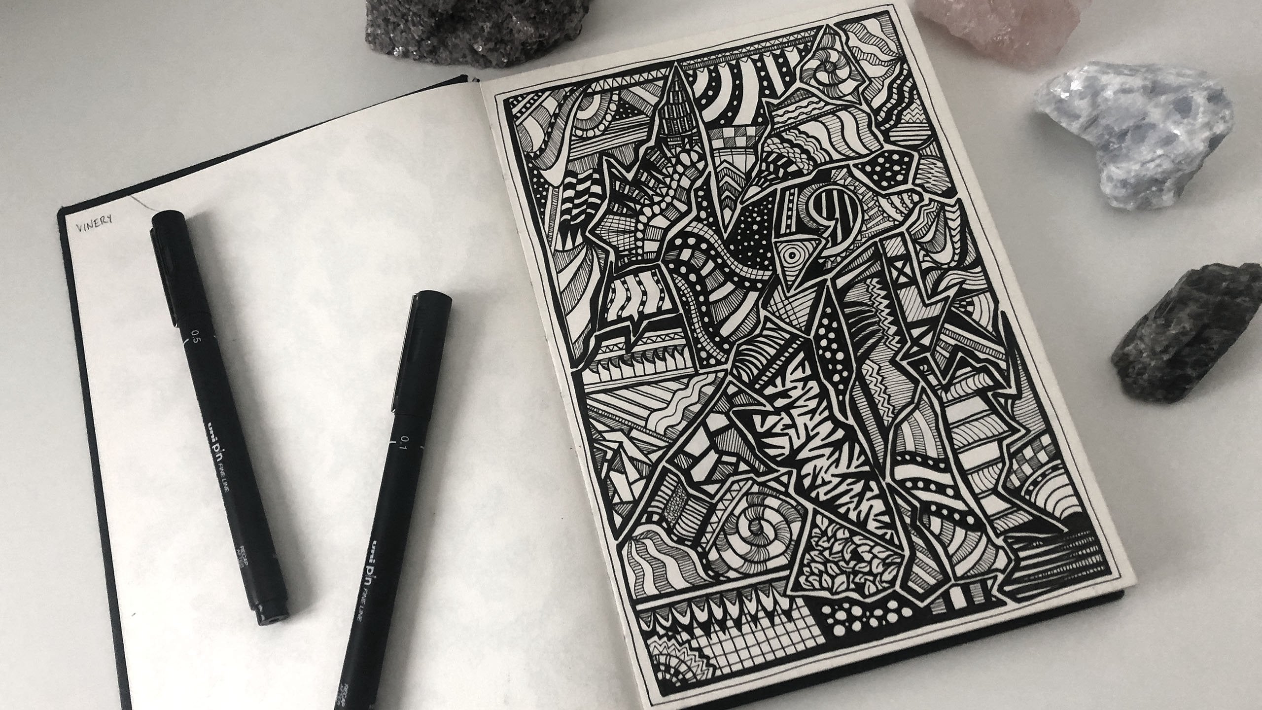
Transcripts
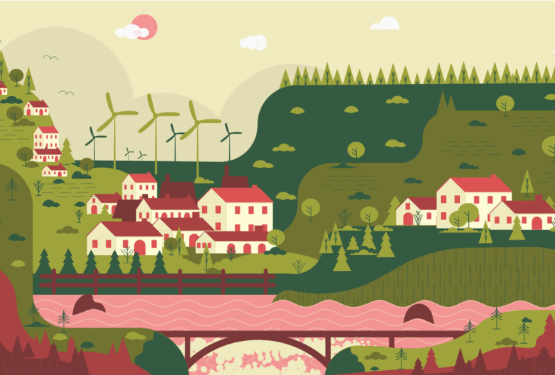
1. INTRODUCTION: Have you ever wanted to master a software application? Hi, my name's Joseph era. Thank you for choosing this course. It is an honor to have you. In this class, we are going to recreate this beautiful piece of artwork in Inkscape. Enscape is a free professional vector graphics editor used by illustrators, graphic designers, and artists. The cause is for people new to Inkscape and graphic design in general. During this course, you will learn how to use tools available in Enscape through a real-world practical project. From the beginning, we will walk our way through step from navigating the interface to Document Setup, creating objects, and composition. The course is structured into two main sections. Basics with the two episodes and practical with 14 episodes. The first two episodes, men for users new to these application. And the rest of the course is on the step-by-step practical process. The inspiration for this project came from my technique I discovered on how to quickly learn and master and new application. Use an application you are interested in to replicate a project. For example, if you are familiar with inks, I want to learn Affinity Designer. Follow this class while using affinity. With commitment, you will find similar tools, new techniques, and possibilities to recreate this artwork. Your ability to learn and master is then highly improved. A similar artwork was designed in Adobe Illustrator by Mr. sassy Kumar, an excellent graphic designer and artist based in Singapore. This upward is perfect for home decor. While our design, poster design, and motion graphics join me as I take these Johnny, to recreate this beautiful artwork in Inkscape. So let's get hi.
2. A. THE INTERFACE.: Hello everyone. I'd like to thank you for taking this class. I am pleased to be teaching you about Enscape as my favorite graphics editor. I believe it is the best free software for graphic designers. To download the application. Go to Inkscape.org and choose to download based on your operating system. Inkscape runs on Mac, Windows, and Linux. The basic principles of using this application as similar to other vector graphic editors. But what makes it stand out from the rest is its simplicity and ease of use. In this episode, I will show you how to customize and navigate the user interface. If you are familiar with Inkscape, you can skip the basics and move straight away to the third video to begin drawing. The first time you open Inkscape, you notice the single window and the bus arranged. As such. The window contains several areas with clickable icons or drop-down menus. You can customize your window to feature preference, to change the arrangement, go to view and choose default for this view are still under View. Select custom. I prefer this arrangement. If your Windows team does not look like mine, go to View, show or hide, and make sure all these options are enabled. Let me begin at the top. Here I have the menu bar. It is the bar across the top, which contains the main pull-down menus. Next, I have the command bar, which contains shortcuts to items located in the menus. The tableau has the snap controls, which contains icons that sets the snapping modes when activated and object will snap to a target. Snapping helps ME precisely placing objects on the Canvas. Next is the tool controls by which contains entry boxes and clickable icons, and is specific to the current active tool. For example, when this task and polygon's tool is activated, all available options for this tool will appear on the tune controls by the circle and ellipse tool. The rectangle tool. Edit path by nodes, tune the select and transform tool. On these are all the available tools. Similar items are grouped and separated by a horizontal bar. This section is called the toolbox bar and has over 20 tools. Here is the pilot bar above the status bar. It displays a full range of colors. Click on the triangle to access more options. Finally, we have the status bar, which is at the very bottom of the interface. It displays the object style attribute, current drawing layer, notification, and other useful tips. In skipped implements lockable dialog. Dialogs. Can we drag from the main window into their window to move our dialogue, left-click and drag in the dialogues titled Man. They can be stacked, placed side-by-side or tapped, depending on where they are placed on the dock. Clicking the small triangle icon will icon eyes the dialogue along the right edge of the main window. Here is my page. It is the print area and restricted by its page borders. On this active area is called a canvas. The page sits inside the Canvas. On the left, top, I have the ruler. On the bottom and right, I have the scroll bar. To edit the Global preference. Click on this icon and go to edit preferences to open the preference dialog box. Under the Tools option, I can change the 2s behavior. I can also change the user interface. Select your preferred theme, click on the triangle to view additional options. You can also change the icons. I prefer to use symbolic icons. Changing the keyboard shortcuts is also possible. Here is my default profile and other contexts option. The Select tool has the shortcut S. As can be confirmed here. I will change this profile to Adobe Illustrator. Now, the shortcuts are similar to those of Adobe Illustrator when using similar tools. Let us look at document properties. Use this icon to open the document properties and go to File and Document Properties. Here, I can make several changes. I will change my units to pixels and page size to 1920 by 1080 pixels. I can also put my page settings manually here. I will get rid of the page border shadow. I prefer to change the background color to something darker. Let's look at this option. The guide settings, the grid properties. Here are some snap options. I will adjust the values to around five pixels. Good. I guess I haven't done here. Next, I will draw some guides. I will give the page a white background. For a bit of contrast. Select the rectangles, tune, click on the white color. And because snapping to page borders is enabled, from this corner, I will left click and drag to draw a rectangle on the page to this point. On the tool controls bar. I can see the dimensions are 1920 by 1080 pixels. Right-click on the rectangle to open the context menu. I will lock this rectangle. Now about the grades. Click and drag from the ruler to create a guide. Corners produce a 45-degree gain. So what are guides? Gains or Ruler Guides and lines that you can place on a document, useful for linking and snapping objects. To rotate a guide, hover over it with the mouse and press the Shift key. The Casa will change to rotate casa. Click and drag the guide to rotate it. Double-click on a guide to bring up the guideline dialogue. You can make more changes here. To delete a guide, hover the mouse cursor over it and press Delete on the keyboard. I will now talk about grids. Instead of using lots of guides, it may be useful to activate grids. Do this by going to View Grid or press hash as a shortcut. Edit the grid in the document properties. Finally, I will save my page settings on the menu bar, go to File, Save template, inputs the required information and set it as the default template. Good, it is now all done. Save and close. In the next episode, I will discuss a few tools and terms used in Enscape. Before I forget, I will frequently switch between these three icons to fit my drawing and page on the window. If at any point you have a question, please do not hesitate to ask me. I will do my best to answer all your questions as soon as possible. Thank you for watching.
3. B. THE BASICS.: Hello, Welcome everyone. I will discuss a few tools and terms used in Inkscape. I have drawn a few objects on my page. Here I have the Select tool. It is used to navigate, select, Transform, and position objects on the canvas with a mouse or any other input device. Left-click on an object to select it. Each object has a bounding box with the direction on handles to select multiple objects. Hold shift and click. Another option is to click and drag around the object. Notice that an object must be fully covered to be selected. Click on an empty area on the Canvas, or use the Escape key to deselect, to deselect an item from multiple selected objects. Hold shift and click. One can also edit, scale or transform an object within a group. Without breaking the group. I will group these objects by clicking on this icon. They are all in a group. Hold control and select an object to isolate it. The object is still part of the group, but I can edit it independently. Another feature is selecting through objects. I will now stack these objects over each other. When I click on it, I can grab the orange object, as you can see below on the status bar, out and left-click to grab the next yellow object below. And finally, Alt and left-click to grab the green rectangle. Another use of the select tool is to transform objects. Let us see how I will duplicate this rectangle and move it aside. Click ones to enable this Scaling handles. Click twice to enable this queuing and rotational handles. This killing handles. I can scale the object using any handle. The rotation center is marked by a cross here. The handles on the corners allow you to rotate an object along this center axis. The side handles are to skew an object. The cross hair may be placed anywhere on the canvas, not just within a bounding box of an object. Constrained rotation to 15 degree increment by holding Control while rotating. Hold Shift and left-click on the crosshair to reset its position. One can also stay fixed on the vertical or horizontal axis. Moving an object while pressing down the Control key. Choosing the select tool activates several settings on the tool controls bar. Use this icon to select on objects are nodes. Use this icon to deselect on objects. Here I have presets, rotation functions, rotate anticlockwise and clockwise, flip horizontally and vertically. Next, I have four position functions which allow you to order objects. Every new object created is placed at a higher level, the z order. To illustrate this, I will stack these objects together. Let me give this rectangle at different color. Okay? When I click on this icon, the object law as by one step, in short, order determines the order in which an object is drawn on a canvas. I can also raise an object by one step, lower to the bottom and raise it to the top. Next, I will navigate the status bar by using the select tool. I will move this object aside, is to test by will indicate object is selected and the attributes of that object. Selecting all these objects. You can see a detailed explanation and actions available for the selected group. Next, I have the x and y position of my kasa, Zoom settings and rotation of my canvas. I can also view the current layer information such as layer name, visibility, and knock status. Here I have the general capacity of the selected object. And finally, the current style attributes of the object. Let's talk about grouping. Multiple objects can be combined into one group. Group selected objects by clicking on the group objects icon, a group behaves like a single object when you drag or transform it. The group now has its bounding box. I can skin skew and rotating it to Ungroup. Click on the ungroup objects icon. Sometimes may be confusing to a new user. Let us get familiar with them. Selecting all these four objects. On the status bar, it reads four objects selected of type rectangle, circle, path in layer one. It is a path Asacol ship, a rectangle ship, and a path. I will expound on it. Object. The term objects refers to any single drawing with attributes visible or non-visible on the canvas. Ship. It is an object that can be modified in ways unique to its ship type, using draggable handles and numeric parameters that determine the ships appearance. Path. It is an arbitrarily shaped object made up of one or more street or curved segments. But unlike a ship, it is modified by freely dragging any of its knobs, not just predefined handles. This cycle created using the Ellipse tool. This rectangle by the rectangles and squares to this segment created using the Bezier pen tool. Finally, this object created using the rectangle tool and converted to a path. To elaborate more on the difference between a shape on a path, I will duplicate this object and move it outside the pitch to an empty area. I need a second copy. I will change the color and converted it to a path by going to Path, Object path. As you can see on the status bar, one rectangle is a path, while the other is a shape. Using the select tool, I can only edit to the object by dragging the handles. With the other rectangle. I can edit the object by dragging the handles muscle. I can arbitrarily change the object using the Edit path by Nodes tool. As single corner point can be moved independently with the resulting shape no longer a rectangle. But for this rectangle, a corner point cannot be moved independently of at least one other point. The result is still a rectangle. Finally, I will discuss this object, which is a path with the path effect. It may also be called a stroke, a segment, or a line. Using the Edit path by Nodes tool. I will try to edit this path. I can move the endnotes, but the handles to not budge. They are somehow restricted. This is because of the B-spline path effect. When a path has an effect applied, it has restrictions on how to edit it. The path can only be modified and a specific settings governed by the party effect. To modify this path freely using the Node tool, I can either delete the effect or finalize it by going to path, object to path. As you know see, I can freely move the handles. This other object, which is a path, has no path effect and thus can be freely modified. I will now talk about another function in Enscape. The conversion of a stroke to a path. An object has attributes such as color and line style. And attribute can apply to the fill or the stroke of an object. The field is a color, pattern or gradient inside an object. As true can be divisible outline of an object. Here on the status bar, it indicates that the object selected has a stroke of 10 pixels. Go to path, stroke to path. It changes the characteristics of the object. The function stroke to path has converted the stroke into our field path. I can now even apply a new stroke on this object. To not worry too much about these terms, you'll get the hang of it after a while. We can now begin designing something beautiful. Thank you. Okay.
4. CHOOSING ARTWORK COLOR.: Welcome guys. Thank you all for joining me. In this video. I will pick the colors that I will use for the artwork. My background that mentions are 1920 by 1080 pixels. To have your page layout similar to mine. Go to view and choose Custom. Also, under View, show or hide. Make sure all these options are enabled. I will enable a few snapping options, snap two paths and snapped to cusp nodes. Finally, here on the command bar, enable the Fill and Stroke Layers and align and distribute dialog boxes. Zoom to fit page in window. Begin by naming your layer. I will name this layer background. Save the Walk by going to find, save. The title artwork will walk for me. Feel free to choose your preferred name. Okay? With the rectangle tool selected, hold down the Control key and drag to make a square. Click on the field section within the status bar. This raises the fill and stroke dialog box to the top. There are six colors that I have chosen. Under the dialog box input the alphanumeric code 31593. F. Duplicate this square to input the second color code. The second is the alphanumeric code, 717330. The tide is f, e, f, c. To duplicate this square. The fourth, F9, F9, F9. The anther is represented by F, F, the fifth, F2, BB, S7. Use Control D to duplicate. And finally, the sixth color code is F2, 9494. Group the squares together and move them out. Take the page. For the new color selection. I will save them as swatches. Go to View swatches. To open the swatches dialogue box. Select a color to add it to the swatch dialogue box. Click on the swatch icon and that the field section. Repeat the same procedure for all the cameras. Lock this panel so as to maintain position. I will now apply color to my background and locked the background. Choose this color from the swatches. Good, it is now done. In the next video, I will create some basic objects for the network. Thank you for watching.
5. CLOUDS & SUN.: Welcome to this video. I will begin by drawing the clouds and the sun. Moved to a blank area on the canvas. With the Ellipse Tool selected, draw a perfect circle, duplicate the sacral, and make two more copies. Vary the sizes of the cycle and align them horizontally. Combine these ships by going to pat union. Select the spiral tool and draw a spiral with the outer end of the stroke at the juncture of the two circles. Set the spiral with 24 pixels. And I'll need to minus the stroke from the Cloud Object. Align the strokes outer section with the Sachen at the H. Selecting the Edit path by Nodes tool. You notice these two end nodes. This indicates that this spiral stroke is a ship notepad. I need to convert the stroke to a path. So while this took is still selected, go to path, stroke to path. This is the result. They are no longer two nodes, but multiple paths along the curve. Select the two front inner most nodes and join them by clicking the Join selected nodes icon on the tools controlled by I will now minus this truck from the joint cycles, select both objects, go to path difference. This is the result. I will place it here. Repeat the same procedure as before. Make three perfect circles and scale them to different sizes and adding them horizontally in an ascending order. Select all the objects and unite by going to PAP union. With the spiral tool selected. Draw a spiral and flip it in the horizontal direction. Zoom in the selection for a clearer view of the object. I need this stroke to align when we the shape. Increase the stroke with 24 pixels. Align the stroke and the cycles. And as before, chin, this trip to a path by going to PAP, stroke to path. And with both objects selected minus the front, by going to path difference. I will know place it next to the fast Cloud object. Okay. It is taped to draw a pad, vary it dru to perfect circles at different sizes and unite them. Select the pen tool and draw a horizontal line along the two joint cycles. When done, click the Enter key to release the 100. To divide the object into to select both the object and the stroke go to Path division. I now have divided the object, deletes the lower part. For the final Cloud variation, make three cycles of varying sizes and place them in ascending order. Align the cycles horizontally and you need them. This time, I will use a different method to delete half of the lowest section of this cloud. Select the rectangle tool. Click on this color to provide the field. Draw a rectangle. On the lower half portion. The joint cycles. Select both objects on the menu option, go to path difference. So I will quickly align the clouds here. Select all four clouds under the align and distribute my new with the last selected, aligned vertically and provide an equal spacing. Finally, I am now done with the clouds. It is time to draw this sudden draw a perfect circle with the dimensions of about 115 pixels. Provide these field from this swatch dialogue window by clicking on eight. Drawing the clouds and the sun is now complete. In the next video, I will create some mountains. Thank you for what she.
6. BACK MOUNTAINS.: Hello, welcome everyone. In this tutorial, I will draw some mountains using mainly the rectangle tool and select the rectangle tool and click on the dark green color in the Swatches dialogue box. Draw a rectangle with the similar dimensions and position as I have done. Draw a second rectangle with the same color at this position. During both rectangles, by going to PAP union, I need to apply rounded corners. To achieve these. On the tuba. Go to path, path effects to open the path effects. Daniel books site for the path effect corners. And apply with the ADT path by nodes to drag the nodes to make rounded corners. After this operation, I need to make the effect permanent. To do so, go to Path, Object Path. The night agreement Carla selected. I will draw three more rectangles. I will use a guide for the next Pat. Grow a guide vertically on the y axis as a reference point. Please note, as I move the Casa to draw the rectangle, looking at the status bar, it indicates what action is taking place on the canvas. One can see the exact x, y position of the Kazaa and available options when drawing a rectangle or any object in general. Select all the three rectangles. Go to PAP, union with the ADT path by Nodes tool selected, go to Path effect and select corners. Now drag the handles to make smooth corners. When done, don't forget to finalize the effect by going to path, objects to path. I will now draw the top mountain. Using the rectangle tool. Draw a rectangle at this position. I think I need to adjust the color of this rectangle. While the object is still selected. Go to the fill and stroke menu. Select the flat color icon. And at the HSV color scheme, increase the value to 68 through two more rectangles with the new color scheme. I will use the same process to make the rest of the mountains select all three and unite. I will now apply rounded corners. There is no particular order of dragging the nodes to make rounded corners. Don't forget to convert the object to a path. And now drew two rectangles with a guide as a base reference point. Join them and provide rounded corners. I have included this file as a resource. Use each to compare with your drawing. The pen and pencil tools have very handy to advanced users. This is the final background mountain. It is the smallest in size. Go to Path Union. The buck mountains are done. I can now place this cloud and his son into the artwork, please, the objects above the mountain on the free area. Finally, I am done here. In the next episode. It will be interesting and fun as I create the lake. Thank you for watching.
7. THE LAKE.: Welcome back guys. In this tutorial, I will draw the lake. Let me begin by creating a new layer on the layers dialog box. Click on the plus sign to create a new layer. I will name the layer lake. Lock the background layer with the rectangle tool selected and this pink color, draw a rectangle at this position. I will now create the waves which are in the form of wavy lines. Begin by enabling the grid. Go to View Page grid. I will adjust the grid settings. Click on this icon to open the document properties. On the grid settings, set the x and y, spacing 250 pixels. I will now adjust the grid color to a purple hue for visibility when grown over the grid, which has a blue-collar, have to get drawn on the x and y-axis. With the busier Pen tool selected. Enable this option on the tool controls back. I will now draw a wavy line. Start at the gate intersection. Draw a diagonal line, 45 degrees covering two squares, followed by a diagonal line down one's covering four grid squares. Finally, draw a diagonal line in the opposite direction, covering two grid squares. It is a complete cycle. I will repeat the same process and make two more cycles. Grid. It's complete. I no longer need these guides. Skip this stroke down. With this stroke selected. Lock the dimensions and scale the height to about 25 pixels. Duplicate a stroke and placing it at this position, make four more copies and align them horizontally. They easily snapped together because napping is enabled. Select all five strokes, 12345, and provide them with this color from the swatch panel. Don't forget to hold the Shift key while selecting a color for the stroke. Change the stroke width to about two pixels of 2.5 pixels. Select the strokes, go to Path, Object, Path. Choose the Edit path by Nodes tool. This is how this truck appears after the conversion from an object to our path. I will join the strokes to form a single stroke. Select all the strokes. Zooming in. Switch to the node tool. As you may not, the nodes along this truck at different from those at the end of the stroke. To join this trucks, select two intersecting endnotes. Go to the tool controls back and select this icon. The two strokes are now one. I will repeat the same process for the rest of the strokes. All right. It is time to place this truck on the main page. But fast. I need its length to be greater than 1920 pixels, which is the correct width of my page. On the tool controls bar, click on the padlock to unlock the proportion. I will first get rid of this grid. Use the hash key to turn it off. Set the width to 950 pixels, and move this stroke into the page over the pink rectangle at this position. Make about five more copies and distribute them. As I am doing. Select all lines and distribute them equally. To align the strokes with the lake. Select the rectangle fast, and then select all the strokes under the Align and Distribute dialogue aligned vertically relative to fast selected. In the next step, I will put some perspective on the lake by varying the stroke length. Draw a guide along the x-axis with the center of rotation aligned in the right bottom corner of the page. I will zoom in, hover over the guide while holding down the Shift key. You will notice that the cursor changes from a 100 kasa to rotate kasa while still holding down the Shift key. Press control and move two steps clockwise. Each step represents 15 degree increments. At this point, I will move each stroke towards the guide and snap eat. I need the width to expand equally at both ends. To achieve these drug, a stroke to the guide while holding down the Shift key. Do this for all these trucks. As you see, the strokes have expanded equally at both ends. Delete the guide. Select this mountain and move it to the lake layer. Under the layers dialog box and lock the background layer. Right-click on this mountain, go to move to layer and select the layer below it a few steps so that it sits between the actual Lake and the waves. The mountain is yet to blend in well with the lake. To resolve this, duplicate the uppermost stroke, and move it to an empty area on the canvas. Using the Bezier pen tool, make a closed rectangular shape of the stroke. Hold down the Shift key and left-click to attach to the end node. Fill it with this color. Move it back to the page at this position above the topmost stroke. I will zoom in, lower the object step-by-step until it sits between the mountain and the waves. You can now delete the stroke, hold down the Shift key and click on the X icon. Finally, to get rid of the excess section of the lake, I will clip this area, draw a rectangle over the area to be retained. With a rectangle still selected. Select all objects below it by dragging over the area. Right-click and set clip. Clipping is a nondestructive process. I am finally through the lake. In the next video. Join me as I create a waterfall. Thank you.
8. THE WATERFALL.: Welcome back guys. In this video, I will draw a waterfall. Choose the rectangle tool, and draw a rectangle at this position, provided with the same color as the lake. I will now use the stroke. Let me zoom in, change the width to 2.5 pixels and give it the Scala. Rotate this truck 90 degrees and place it at this position. I will now make copies and distribute them over this area. Use the shortcut Control D to duplicate it this truck. Now, select all strokes, align and distribute them equally using the Align and Distribute many. I will slightly change the orientation of the strokes to create an illusion of water flowing from the lake to the waterfall. Go to Object Transform. To open the Transform dialog box. Select a few strokes on the right. Under the transform dialogue box. Go to rotate an input five degrees with the clockwise arrow selected. Click Apply. Repeat the same process for the left strokes, but this time around, rotate in an anticlockwise direction and apply. Select all strokes. Align and distribute them equally using the Align and Distribute menu. Now, I need to get rid of this section of a lapping the page. Select all the strokes and combine by going to PAP, combined. Using the busier Pin Tool, draw a horizontal line across the combined objects at this position with the stroke selected. Hold down the Shift key and click on the combined ninth. Now go to Path, Cut CPAP to the way these strokes into, to delete all paths outside the page. Good. I am almost through. Now. Let's add some bubbles to the waterfall. Create a perfect circle on the canvas using the Ellipse tool. Make a copy of the circle. Choose this free tool from the toolbox. Settings on the tool Control. Left-click and drag horizontally. This is okay. I need to divide this object into two. But fast. Select all newly created cycles and unite. Draw a horizontal line along the joint cycles using the Pen Tool. Remember to keep the line perfectly horizontal. Hold down the Control key while drawing the line. Select both objects, go to Path division. I would now scale down slightly, place it on the page at this position. You can also create some variations of the object by skinny and changing their orientation. Select all objects and unite. That's all for now. In the coming video, I will draw a few more mountains. Thanks for watching.
9. FRONT MOUNTAINS.: Welcome back guys. In this video, I will create a few more mountains. Begin by making a new layer. Under the layers dialog box. Lock the leg layer and a new layer. By clicking on the plus icon, I will name this layer front mountains. Using the rectangles and squares tool. Drew three rectangles, partially covering the leg region. Use the same color as I have used. The Bezier pen tool is a great tool that may be used to draw these rectangles. Select all rectangles and unite by going to pad union. Then make rounded corners by choosing corners. And at the path effects, dialog, drag the nodes to apply. Do not forget to finalize by clicking on this icon or going to path. Objects to path. I will adjust some colors slightly and lock the background mountains and select this mountain under the fill and stroke menu on the HSV color scheme, adjust the value to about 64. Finally, added the color to the swatch. I can equally add the color to this group. This but is not necessary. You can skip it. I will create two new shades of pink color with a duplicate of this square. Click on the flat color and adjust the saturation. And increase to about 53 will do at this color to the swatch dialogue box. Now make another copy and follow a similar process. This time, I will have just both the value and saturation, which is V stands for hue, saturation and value. I will delve into this in a later episode. At this color to the swatch group. I have arranged the colors. Well, I will place them at this corner. Good. Back to the front mountains layer. I will create a few more mountains. Switch to the rectangle tool with the lightest shade of green selected. Draw three rectangles on this position. I will place the rectangles in such a way as to cover the green background area, but partially covered the lake and the waterfall. Unite the rectangles and make rounded corners as I had then an year. Finalize the effect by going to Object Path. Create two more mountains, each on both sides of the link. Here, I will speed up the video. Follow the same process as before. Nothing new. Duplicate this mountain and skin each down, hold down Control key while scaling to maintain proportion. Currently, we need to worry too much about the Canada. We will adjust it as we progress. Repeat the same process for the left side of the mountain. Okay. I will add some depth to this part of the throat mountains range area with a rectangle tool and a deck Greenfield drew about four rectangles at this position. It doesn't matter how they stack on each other. Select all the rectangles and unite. Make a duplicate and place it in the opposite side. Flip it horizontally. I will scale it down to fit the page. Good on both objects. I will quickly apply rounded corners, mu2 path effects, and select Kaunas. I need this object to blame in the law mountains. So duplicate the lowest mountain summit to both objects. Good to pop a dissection. This is the result. Sin one level down. Crit. Repeat the same process for the opposite side. Good. That's all for now. In the next episode, I will create two objects, such as trees, wishes on grass. See you then. Thank you.
10. DRAWING OBJECTS.: Hello guys, welcome back. In this tutorial, we will draw objects such as trees, bushes, and bads using various tools and techniques. So let's begin. Start by creating a new temporary layer. Name the layer temp. Move to an empty area on the canvas. I will begin with creating the grass. Using the Ellipse Tool. Draw a perfect circle. On the tool controls bad luck the dimensions and scale it to 72 pixels. I will zoom in place the Casa at this position, grab outside the ellipse to form a segment converted to a path by going to pad objects to Path. Good. I need two more variations. Duplicate the shape. Make another copy and scale each of them. Duplicate these two objects to make it add variation. And a copy of the single segment to this group and scale it down. Combine the two variations to make single ships. I am through with the grass, move them to a free area on the Canvas. Next, let us create a couple of trees. Draw a perfect circle. What I get is not a complete cycle. The tool uses attributes of the previous object. Click this icon to reset. Set the dimensions to 72 pixels. Make a copy and set it aside. I will use it later to make more objects. Select the pen tool and draw a vertical stroke. And the fill and stroke menu set the stroke width to two pixels and the height to 63 pixels. Provide a stroke with a green color. Duplicate this stroke and set it aside for later use. Move this stroke over the cycle. Make another copy of this stroke and rotate it by 90 degrees. Scale the stroke down to a width of about 16 pixels and move it to the base of the vertical stroke. Create two branches from the horizontal stroke and place them as I do. Now. I will provide the strokes with a rounded cup. Spacing these strokes, I will change their orientation slightly. Remember, you need to click twice on an object to activate the rotation handles. I named them to the vertical stroke. I will make a second variation of the tree. Select this task and polygon's tool with similar settings on the tool controls bar, draw a triangle. Provide the same color as the rest. No need for the stroke. So replace it with the Fill. Make a copy of this triangle and set aside. Reduce the width to about 49 pixels. I will also increase the height. To speed things up. I will use some of the objects from the fast tree. Selecting both strokes. I will align them vertically. Group these two, duplicate, put the strokes and place them over the new triangle. Duplicate this triangle. Provide a stroke of this color and remove the fill. Go to path objects to path. With the node tool selected, I will get rid of this lowest segment, elites, the same two NADH. Select these two end nodes and click on this icon. Invert the object and scale it down. It is all just about being creative. Coming up with different ideas on what to add. Remember to hold down the control key when scaling to maintain proportion. I should try one pixel for the stroke instead of two pixels. Good. Duplicate this stroke to make a second copy. Two pairs of these trucks will look just fine. I will group them. Move the second pair somewhere here, just above the first pair. This looks good. It is complete. I will move it aside. Let us move to the third variation. I'll copy this triangle. Make 20 copies, and place them over each other, like this. Scale them so that the bottom triangle is the largest. When done, you can select all three and align them vertically. I will again use a copy of the stroke from the trees. Group the three triangles, and lower the trunk. Once tip. You may use the shortcut Control G to group the objects and the page down to lowest selection. By one step. I need a final variation of a tree. But before that, I will make a shrub. This time, it is straightforward. I will use the same procedure as before. Using this triangle in VAT, it. Replace the field with a stroke, change the object to a path. By going to object to path, I will now remove the upper segment. Following a similar procedure as before. The leads the center node. Select the segment to remove. And on the tool controls. Do not use this option as the meeting selected nodes does not delete the segment. Instead, choose the delete segment icon. I will resize the Stroke, Duplicate the VCE stroke, and make two extra strokes space equally and arrange them in descending order. Finally, make sure they align to the vertical stroke. Perfect. Now the final variation of a tree. I will copy this stroke and place it aside. Create a perfect circle or duplicate one. I only need the stroke. So provide the dark green color to the stroke and the lead to the field. I will now draw an AG at the start point. Drag towards the inside of the cycle to this point, converts the object to a path, duplicate it, and flip horizontally. Placed them together to form a symmetrical shape. I will now move to this position. Group. The strokes, make two more copies underline them along the vertical stroke. I am currently using the up and down arrow keys to move this trucks. The option look like this. I am through with the trees. I will get rid of these. It is time to draw some rocks with the rectangles to selected. Create two rectangles with no stroke, just the field. Resize one rectangle to be smaller than the ABA. Move a copy aside. I will now join the rectangles and give them rounded corners. Good to path union, to join the objects using the Edit path by Nodes tool. Move this node inwards by about four steps. Do the same for this other side. Include this rectangle, fast converted to a path, move the two up and nodes inwards by about four steps. To apply round the corners. Go to the Path effect dialogue box and select corners. Said the corners in no specific order. Finalized the effect by selecting the object to path icon. It does make some bushes. In a similar way in which I drew the clouds, create three cycles, unskilled them to different sizes. I will arrange my in this order. You need the cycles by going to pad union. I would know divide it into two. Using the pen tool, draw a horizontal stroke along this apples. With both objects selected, go to Path TV show. The first Bush is complete. I will scale these down and place it with the rest of the group. Using this other piece, make one more push. Duplicate the fast Bush, and place it here. Join the two ships to form a new variation. I am about to finish. Two more objects left. I will draw a bad silhouette. Create a perfect circle or duplicate one. I only need the stroke. Change the width to two pixels and give it a darker green color. From this point, drag to draw an AC voltage to a path and flip it vertically. Duplicate it and flip horizontally. Placed them together to form a symmetrical shape. I will group them. Finally, I will add a texture in some areas to create variation and the depth. Create a stroke or copy one from allele OR make several copies and arrange them in this manner. This trucks do not have to have the same weight. When Dan group this truck's great. The next step is to place these objects in the artwork. So let us meet in the coming video. Thank you.
11. PLACING OBJECTS.: Hello, Welcome back. In the previous video, I created these objects. Select an object, look at the fill and stroke properties on the status bar. I have a film with no color and a stroke of about two pixels with the color M stands for multiple objects, while L stands for linear gradient. But this tends titres has only m because the object black suffering. I will make a copy of this shrub on the tool controls bar. You may notice this icon. Too good. On the stroke width increases with an increase in size of the object. It behaves like a path. When a toggle it off, the stroke retains its width of two pixels. Here is the result, as can be seen on the status bar. I will now change this stroke to a pad and let us see what happens. Go to path, stroke to path. On the status bar, you can see the changes. Object is now a path with a fill color. I no longer have a stroke color. So by 2 willing on an off this icon on the toolbar controls, but we see no effect on the object as it is no longer as true. Datapath. Convert all the strokes to our path and in group their respective objects. Okay, it is complete and lock the background layer. I will start with this tree, send it to the background mountains with a tree selected. Right-click and add the context menu. Select Move to layer. Choose the background layer or whichever name you assigned to your first layer. Please. The tree. In this area. I will afford some sections to save time. Generally, when doing scenic and landscape at objects that are deemed to be farther away, look smaller in size. In comparison to closer objects. Feel free to pose and replay this video at any time. Vary the sizes of the trees, group and move them behind these mountain. Give this tree is the same field as the background. Next, I will pick these three, move the object to the background layer and also place it as I do. In some areas, you will notice that the object has the same color values as the background. Simply an in-group the object. If it is comprised of more than one path, swap its color for a DACA or lighter shade to provide contrast. Next, I will place this tree in the front mountain layer. Go to Layers and unlock the mountain layer. Right-click moves to layer, place copies in random order. Later on, I will adjust the colors of the front mountains. I am through with the trees. Next, I have the grass. Move a copy to the background layer and distribute as a deep with the trees. Following areas with the same field change the color of the object. For contrast. In the center above the lake, I will place buildings here. There is currently no need for trees in this area. I will also play some grass in the foot mountain layer. Next, I have the bushes. I will start with the background mountains. Try not to place too many objects on a single area unless you want to create emphasis. They should look by lapsed. It is time to place their rocks. Select these two objects, provide this field color and move them to the link layer. Placed him over the lake. Leave some space just above the waterfall as we will let that drop breach. Now to make the rocks blend in well with the lake and look natural, I will make some adjustments. Duplicate this wavy stroke, select both objects, go to Path division. Let me zoom in. Now, I will get rid of this lower Pat and reposition the rock. It's now looks good. Repeat the same process for this other rock. I will also adjust its position. Duplicate this wavy stroke. Select both objects, go to Path division. Delete the unwanted part. It's now blends in while looking at the overall illustration, the position of the water bubbles needs a slight adjustment. I will rotate it slightly in the clockwise direction. Click twice to enable the rotation handles, select a corner handle and drag to adjust. And this object to the center. Move it to the front mountains. Okay, I will now delete all the objects. I no longer need the rest. I will move to the background layer. I can finally please The Bad and shrub. For the bad, make two copies and place them over this region. I will change the fill to this lighter color. Excellent. I hope you enjoyed the session. In becoming video. Join me as I create buildings. Thank you for watching.
12. DRAWING BUILDINGS.: Welcome back. In this video, I will draw some buildings using basic shapes. To begin. Moved to an empty area on the Canvas. Lock all layers except the temporary layer. Switch to the rectangle tool. Let us begin with a townhouse silhouette. Drew two rectangles, one for the roof and the ADA for the base. Select both objects and align them vertically. Convert the objects to our path by clicking this icon on the tool controls bar. Using the Edit path by Nodes tool, I will move the top node inwards. By default, when using the arrow keys to move the nodes, each step represents two pixels. I need to move 25 steps. For efficiency. Change the settings under the global preference, and that behavior steps. Arrow keys, change the value from two pixels, 250 pixels. Select both Top N nodes and move each node inwards by one step. Good. Draw a rectangle at this position to represent the chimney. I will use copies of this house to produce more buildings. Duplicate the house and adjusted copies to form a variation. Place them next to each other to create a silhouette of townhouses. In the background. I will speed up the sexual. When then select all the objects and unite, use the shortcut Control plus. This is a rough sketch, but it gives an idea of multiple houses grouped in an area. I will place it under the main buildings. I just got rid of the bottom portion. You may skip this part and lock the background layer. Provide the silhouette with this red field. Scale the silhouette to a reasonable size in respect to your scene. Move the object of a disposition. I will send it to the background layer. Right-click on the selection to open the context menu. Choose move to layer and select background on the tool controls by using this icon below the selection until it sits directly above the mountains. Here, I figure out the best size and position of this silhouette for the background. I will flip it and get rid of a few overlapping objects. It looks okay. Let us move back to a free area of the canvas and gets to walk back to the temporary layer to draw a house. Begin by drawing a rectangle. Go to Object Transform to open the transform dialogue box and a skew chain the horizontal setting to 45 degrees and apply. Make a duplicate and flip horizontally. Aligned it to such a position. Ensure you're snapping options are enabled. And don't forget to reset this tip parameter back to two pixels. Change the color of the copy to a lighter value. Law the selection one step and snap the edges. Good. Now select this task and polygon's tool from the toolbox bar. Drag to create a triangle. Provide this light field. Use the shortcut Shift Control C to convert the triangle to a path. I need each to fit in this area. Draw diagonal guides from both top edges of the canvas and place them in a similar position. I will use the Edit path by Nodes tool to align the nodes. Select the nodes on the triangle and snap to the guide. Click on each node and drag to zoom in for a better view. If the node does not snap. Snap settings on the snap controls bar. Here is a closer view. Everything looks good. Okay. I will now delete the guides. Look includes the roof, the gap left between the triangle and the light green rectangle is too small. And do the last operation, I would make some adjustments. Made a few pixels, inlets, position the three nods. Looks much better. Deletes the guide. Switch to the rectangle tool. Use the shortcut. Create two rectangles, one for the side and one for the front. To complete the house. I will use a copy of this rectangle for the front face. The corners look okay, but the proportion is not quite right. I will scale the height down slightly and add some depth. Duplicate the rectangle, and scale it down by about 10 percent. Remember to hold down the Control key to maintain proportion when scaling. Now, I will adjust its color to a lighter value. Under the fields section, select flat color. I will reduce the saturation to about 15 and increase the value to 100. And this new color as a swatch. This looks good. Now, let us add some windows, undos, create a rectangle using this color. Make three copies and placed them as I do. Go to the Align and Distribute menu and the line, each pair horizontally. Draw a rectangle for the dough and the line, the top edge with a two adjacent windows. I will then apply rounded corners to the upper edges of the dough. Duplicate the rectangle and skin. They copy down halfway on the original rectangle, drag the circular node vertically to achieve rounded corners. This is the result. Using the rectangles and squares tool. Create a chimney by drawing a rectangle at this position and provide E2E the same color as the roof. If you may recall, this dough has two rectangular shapes. I will innate the objects. Finally, provide a roof with the same red color as the windows. Now, I will create the rest of the buildings using a copy of this house. Begin by making a copy. Change the position of the door and windows. I have just good treat of the two windows and added a DOT where you need to align an equally distributed the objects. Do so. Finish by grouping the objects. Duplicate the reference building. Make another copy. Here, I will place two houses side-by-side to form a single unit law, the house by steps until it aligns with the adjustment you need. Good. I will now group the objects. For the next building. I will skip this side windows down and make one more copy. Align three rectangles at this position. Delete the front windows, duplicate the house, and attach it to the fast. I will raise this by step. Align the two blocks horizontally. Add one more, DO distribute that those two have equal spacing and ungroup the objects. Finally, I will draw a multi dwelling unit with a new copy, delete. These, don't add a new window space equally and a line. I will move this Windows to a central position. Select all of the section and make a copy, move the copy down and attach it to the main house. I am using the down arrow key to keep it vertical. Make sure it is aligned with group the objects. Drawing the buildings is now complete. In the upcoming video, I will replace these buildings in the artwork. I would love to see your WACC. If you have any questions, feel free to ask. Thank you for watching.
13. PLACE THE BUILDINGS.: Hello, welcome back everyone. In this class, I will press this building's created in the previous session into the network. So without further ado, unlock the background layer. Select all the buildings. Right-click and move to Layer Security houses to an appropriate size. It should look realistic. In this scene. Would like to create an idea of a small town. I will place the buildings close to each other. You may place them as I am doing. It doesn't have to look identical to mine. Be creative, or better, be wild. For the next few minutes, I will move more quickly. You are free to post a video or replay whenever you want. I prefer to use the shortcuts page up and page down, home and end to raise and lower objects. Question, What's up, guys? I am now through it looks good. Clear or objects you no longer need on the Canvas. Please share your work. I would love to see what you come up with. Next. I will create a bridge and a few more objects. Thank you.
14. FENCE AND BRIDGE.: Welcome back everyone. I will create a few more objects for this artwork. The fast object is offense. Under the temporary layer. Select the rectangle tool and draw a rectangle at this position. Make a duplicate and place it parallel to the fast. These two rectangles at the rain. Now draw a rectangle crossing both rates. This is the post. Make copies of the post and place them of their aid. Select all the posts and align them horizontally. I would move them so that they add up above the lake. For the lower rail, I will scale it down to about six pixels. Select all the posts using the Align and Distribute dialogue. Space them equally. I will unite the object's drag over the fence to select it. Go to Path union. I will now move defense from the current layer to the background layer and lock the background layer. Right-click on defense. Move to layer and select background. Okay, it looks good. I no longer need the temporary layer. And at the layers dialog box, click on the icon to delete the layer. With the front mountains layer active. Draw a perfect circle at this position. The cycle should lie between the two front mountains with half of the circle hanging outside the page. Remove the fill and replace it with a stroke. Set the stroke width to 10 pixels. It's too small. Tried 20 pixels. Okay? This will do using the pen tool. Draw a horizontal line above the sacral. Increase the width to 20 pixels and provide the same color as the sacral. I will position the stroke to unpack on both mountains. With the pen tool active, draw a vertical line at this position. Set the width of the stroke 215 pixels and provide the same color as the sacral. Duplicate this stroke and paste copies along the horizontal line. They do not have to be equally distributed. We not place any stroke within the cycle. I need a copy here. I will know unite to the objects. Note, the cycle is a ship and the stroke is a path. With a party effect. I first need to convert this stroke to a path with the objects selected. Go to path, stroke to path. Then go to Path union. I now will remove the excess section of the cycle. Draw a rectangle over the soccer. I need a field instead of a stroke. This gray color we'll walk. Select both objects, go to path difference. I will then do this last operation and adjust the position of the rectangle slightly. Again. Select both objects and go to path difference. The bridge looks good. Glow I eat. It sits behind the front mountains. In the coming video. I would like just a canvas for this up to OK. Thank you for watching.
15. RECOLOR ARTWORK.: Hello and welcome back. In this video, I will adjust the colors used in this artwork. Let me begin by defining two common terms used with the catalog. Value and contrast. Value is the relative lightness or darkness of color in an artwork. Contrast is the difference between objects through color and texture. Every column breaks down to three fundamental ingredients, hue, saturation, and value. To figure out how much contrast is available in an artwork. Simply make the image black and white by removing, he'll go to View Display Mode, Grayscale. I can easily see the different values of objects in this artwork. This area, for example, needs collection. Switch back to the normal display mode. I will adjust the values of a few objects and lock the background layer. Begin with the house silhouette. Click this area to raise the field and Stroke window. Under the field section. Select this icon, reduce the value to about 53. But keep the settings for the hue and saturation as they are. When Dan added to the swatches group, I will now apply this color to a number of objects. The rocks in the river, the fence along the river, the bridge. And finally, the two fronts. Mountains. Select this mountain was Tina swatch. I will adjust the color by adjusting any of these parameters on objects with this swatch color are affected. As you can see the artwork. Within this Datalog, there is more information. For this watch. The name is 99 eight, and the number of objects with this color is 239. Okay, adjusting the swatch, set the saturation to 62 and the value to 86. With the front mountain still selected. And the fill and stroke menu window Active. Choose the flood color icon under the field section. This will isolate the color from a swatch to an individual color. I will reduce the value to make the color DACA. Now add the color to the swatch group and provide the same color to the adjusted mountain. I will also try this new color on the roof of the buildings. Here is how it looks. I love the look. Now, select the opposite side of the roof and apply the same color. As I explained earlier, to select an object and admit another object. Hold down the Alt key and click. By adjusting the color. You can confirm that the opposite side of the roof is selected. I will apply this DACA color. Apply the same color to the rest of the buildings. Remember to select an object within that group. Hold the control key when making a selection. I will speed up the next section. Okay, on the right side of the swatch dialogue window, you can see an arrow. Click on it to expand. These are all the available options for color swatches. I will change my default color scheme from Enscape to auto. The colors on my swatch dialogue box and now on my color palette, just above the status bar, switching back to grayscale. This is the result. It looks much better. One more object that meets value adjustment is defense along there is obeyed. This is your assignment. Provide a California offense. I hope you enjoyed this class. In the coming video, I will apply texture to the artwork. Thanks for watching.
16. ADD TEXTURE.: Welcome back everyone. In this video, I will add texture to a few objects for a more distinctive look. In an earlier video, I created these trucks and place them in a group. I will use them as the texture, ungroup these strokes and convert them to a path, go to path, stroke to path to convert the strokes. Let me increase the size and reduce the spacing between the strokes. Using the shortcut Control, D. Duplicate the strokes to make two more copies and join them to form a large piece. You make the strokes using the shortcut Control press. With the stroke selected, rotate by 90 degrees. This size is acceptable. I will know move is to the foot mountain layer. Make sure the layer is not locked. Good. Make a duplicate and place it aside. I will place this copy over this area. It should cover these topmost mountain. This color looks okay. That texture should blend in. Here the opacity down by about 50 percent. To fill this area, I will make two more copies. This should suffice, select all the objects and unite. Next, I will cut this image of the frogs mountain. Duplicate the topmost mountain. Slow it. This could be has multiple grouped objects. It is not possible to perform a Boolean operation with grouped objects and group them using the shortcut Shift Control G. You need the objects to form a single path by going to pad union or use the shortcut Control Plus OK, select what the texture and the duplicate Mountain go to Path intersection. Here is the result. I will again lower the opacity to 25 percent. It looks good. Let us do the same to the adjusted mountain. Duplicate the texture and move it over default mountain. Fill the area with a texture. Select both objects and unite. Following a similar procedure as before. Duplicate the mountain silhouette, ungroup the objects forming the mountain and unite. Provide this Redfield and set the opacity to 25 percent. Select both texture and mounted, go to Path intersection. It is now true. Finally, I will apply texture to this small mountain in the link layer. Move the objects to the link layer, place it over this area. For a clean workspace, hide the rest of the layers by clicking this icon to toggle visibility. In the same manner as I did with the front mountains. Make a copy of this texture to cover this hill. I will scale both objects to fit this area and you need them. Duplicate the hill. Both objects selected go to Path intersection. As you see, the texture covers both the heel and the lake. For this reason, I will lower the texture a few steps down until it sits directly above the heel. I am now through toggle the visibility of the other layers back on. I will also reduce the opacity of this texture to 50 percent. The piece looks stunning. In the final video, I will clean up and add a few more objects. See you then. Thank you.
17. FINALIZE THE ARTWORK.: Welcome back everyone. This is the final tutorial in this class. Give yourself a big thumbs up for coming this far. It takes commitment to do so. In this episode, I will add one more object to create interest and make some minor adjustments. So let's begin and lock the background layer. Zoom in on this area using the rectangle tool and this cream color. Draw a rectangle at this position. Convert the ship to a path by using the shortcut Shift Control C. Move the upper nodes inwards by one-step. Do a perfect circle at this position. Select both objects and align them vertically. Switch to the circle and ellipse tool and draw an ellipse at this position. I will divide this ellipse into to draw a rectangle over the lower half of the ellipse. Select what objects go to path difference. Now, I will create a rounded corner on the semi ellipse. Using the Nodes tool. I will drag this node inwards slightly to disposition. Finalize the effect by clicking on this icon or go to Path, Object to path. Click the object twice to it and Apple the rotation handles and drag the center of rotation to this point. Move the object to this position and ensure that it's crosshair centered to the cycles center of rotation. Now, I need three turbine blades, duplicate the semi ellipse and rotate it by eight steps. There are 360 degrees in one full rotation. It step covers 15 degrees by default. And thus eight steps equals to 120 degrees. Three blades will suffice with this complete group, the three objects. This group now has a new center of rotation moved across here to the center of the three blitz. Finally, move the blades over this small sacral. Make sure the cross hair is centered with that of the soccer. Now, as I drag the rotation handle, the blades rotate along the central axis of the circle. I will group these two and scale the type I'm down slightly. I will create more space by repositioning these two objects. Okay, lubricate the wind turbine and place it in this open area. To provide perspective, I will place some turbines over the mountains and scale them down. Essentially, objects that are farther away from us appear smaller than those that are near. For this buck taglines, I will use this green color. Select the font, type binds, group the objects using the shortcut Control G. Align and distribute them equally. Duplicate the object to add more copies at the back. Be careful not to place too many taglines here. The illustration needs to look realistic and visually clear. Finally, I will also add some missed or shadow behind the back mounted to convey depth. Using the cycles and Ellipse tool, drew about three or four cycles at this position. Good. Now select all the cycles and unite, please. The combined cycles directly behind the background mountains. Okay, I will now adjust the color. Select this light color. Under the free and stroke menu, select flat color and lower the value. I will also slightly adjust the hue. Good. Let's clear the overlapping section. Switch to the rectangle tool and draw a rectangle over this area. It should snap on the page borders. If not, check your snap settings to minus the overlapping area, select both objects. Go to path difference. Here is the final artwork. It is included as a resource. I thank sassy Kumar for this inspiration. I hope you enjoyed yourself while planning Inkscape from basic shapes, we have a beautiful piece. As it is said, consistency is more important than perfection. The more you create and draw, the better you become. This artwork can be created by most graphic design software. Nevertheless, Enscape is more easy and more fun to use. I greatly appreciate your time. Please place your comments and suggestions. I would love to hear from me and I look forward to being with you again. Thank you.
 Joseph I., null