Transcripts
1. PROJECT 02 - (Intro): Hello and welcome to this course. My name is Joseph and I will be your instructor on this second project where we'll learn how to design and illustrate using Inkscape. We will create this beautiful landscape from a 100 drawn Sketch. Inkscape is a free and open source vector graphics editor that offers a rich set of features. It is widely used for both artistic and technical traditions, such as cartoons, clip at logos, topography, diagramming, and flow chatting. Even if you're an absolute beginner, this course is structured for you. It is easy to follow step-by-step documentation guide. We begin by setting up the workspace, landing the available tools and panels, loading and saving files. You will also learn some tips, tricks and techniques that I find extremely useful as an artist. I will do my best to give you as much value as possible. On top of this, I can guarantee you that at the end of this, you'll have the knowledge and confidence to run a project in Enscape. For proof of my skills in Enscape and graphic design in general. You can check my recent videos on my YouTube channel. I have also worked on several projects for some major companies. I am glad to share with you my knowledge and skills. Without further ado. Let us begin.
2. Lesson 01 - Take a tour of Inkscape: Hello and welcome guys to our first lesson. Let us begin by familiarizing ourselves with Inkscape, launch a new instance. This is the window that pops up when you launch the application for the first time. From this window, you have the option to choose your preferred Canvas, keyboard shortcut profile from the list. And appearance team. I find classic symbolic, nice and clean. When done, save your profile. Escape is an open source software. This page invites anyone generous and capable to support through financial donation or in kind. Finally, choose a preferred walk template from the list provided. We have Print, Screen, Video, social, and others. For this project, I recommend a page setting of 1920 by 1080 pixels. Welcome to the workspace. The workspace comprises two main areas. A canvas, which is the area where drawing takes place, and panels, which contains tools and options for creating, editing, and saving files. Let us begin by making a few changes to the workspace to change the panel arrangement, go to view and choose custom. This is my preferred workspace. In case your workspace does not look like mine. Go to View, show or hide, and enable all these options. Good. Let us talk about the panels. Positioned across the top is the menu bar. It provides essential functions of any program. Below the menu bar is the command bar, which contains shortcuts to items located in the menu bar. Next is this knob controls bar, where we sit various napping modes. Finally, in the last row, we have the tool controls, but it displays editing option buttons, numeric values at unit of measure boxes for the currently enabled tool. On the left, we have the toolbox panel containing all available tools. Similar tools are placed as a group and separated by a horizontal line. If this arrow is visible on your toolbox bar, click to expand an access. More tools. On the right are the doc panels. They can be rearranged and moved around the window. To undock a panel, left-click and drag on the dialogues title bar. The dialogues can be stacked, placed side-by-side or tabbed, depending on where they are placed on a dock. At the bottom, we have two panels, the color palette containing saved color swatches, and the status bar, which displays common editors. Dynamic tooltips, messages of the current tool actions on the canvas. On the top and left edges of the canvas, we have our ruler. On the bottom and right edges. We have the horizontal and vertical sliders. When working with different files, we may be required to change the settings of our page. We can do this under the Document Properties. Go to File Document Properties to open the properties window. And this window, you can make several changes, such as preferred units, page size, Page Border, and background color. Here I have my page settings, 1920 by 1080 pixels. As a personal preference, I will keep the page border settings, but adjust the color of my background. On this menu. They are more options available for adjusting your document properties. When then close the window. When you reload your workspace, you will add types. Notice that this knob controls bar and the command bar have interchanged positions. This is no more, no need to be alarmed to have the pitch fit on the window. Zoom the page by going to View Zoom, Zoom page, we can load files to an open workspace in several ways. Now, let us open up practice file from the downloadable assets provided with this class. On the menu bar, go to File Open and choose the file named geometric ship. Define is loaded with its original page properties. We can also load a file by dragging it from our folder directly into the workspace. Here we have a beautiful vector image made of multiple shapes in a group. We will export it as a raster file. Its dimensions are 500 by 500 pixels. With the file selected. Go to the tune controls bar, and click on this icon to look proportion. In the width or height box input a value of 100 pixels. In general, when working with files, will find a scenario where you need to precisely align or distribute objects relative to a page or other objects. For such cases, they align and distribute menu comes in handy. We will now send our image relative to the page. Click on this down arrow and choose pinch. Click these icons to center on the vertical and horizontal axis. We will now export the file as a PNG image. Go to File Export PNG image settings are available in the export dialogue box. For this window, I have four options, which are page, drawing, selection and customer. With the image selected. Choose selection as the export area. Our image says is correctly displayed. Input a filename, and choose allocation. When ready, export. As the last step we add through with the practice file. You can close it by coming up to the menu bar and choose File. Close, Close without saving. You are now familiar with the workspace and how to manage panels. Moving forward, you can easily organize your workspace to compliment your working style.
3. Lesson 02 - Take a tour of Inkscape (Part 2): Welcome to the second part of the introduction series. Being able to navigate your window, create and edit files is essential for any graphic designer. In this lesson, we will learn how to zoom, pan, draw, and edit simple shapes. To follow along. Open the practice file provided with this tutorial. Go to File, Open and navigate to the file named geometric shapes. The vector file is now loaded. Suppose you want to move around the Canvas to access my workspace with the Tab key pressed, left-click, and drag to panda Canvas. The middle mouse button performs a similar function. Select this image and let us zoom in. Go to View, Zoom, Zoom selection. A convenient way to zoom in and out is to use the plus and minus keys. Here we have a pattern of multiple objects placed in a group. Grouping allows objects to be treated as a single unit. You can then move or transform the objects without affecting their attributes or relative position. Groups can also be nested. That is, they can be placed within other objects or groups to form a larger group. Beginning with this artwork, select the object as shown on the Layers and objects panel, and indicated on the status bar. This file comprises 16 objects. There are several ways to group and ungroup objects. The menu bar and the object group and ungroup option. In the context menu, when you right-click or an object and choose group or ungroup. Above convenient method is to use these two icons on the command bar. Watch the layers and objects panel. As I ungroup the objects, we now have 16 objects outside the group. These objects can again be grouped to make individual objects. Let us talk about the selection tool. This is the selection tool, is the main tool in this application. The selection tool is used to navigate the window, select, Transform, and position objects on the canvas with a mouse or other input device. Left click on an object to select it, to select multiple objects, Shift and left-click. When working with a large group of files, May 1 need a more precise method to select specific objects based on their appearance or style attributes. Go to Edit. Select All, to select all objects on the canvas. We can also make a selection based on one of these attributes. As the selection tool is currently active, the tool controls bag has all options associated with this tool. When this icon is disabled, a selection is made by dragging around an object. The object must be fully covered for it to be selected. Enable the icon. Any objects touched when dragging the kasa is selected. To deselect an object, press the Escape key, or click on an empty area on the canvas. When working with multiple selected objects to deselect an item, hold, shift, and click. Let us talk about object properties. And object has attributes such as color and line style. And attribute can apply to the fill or the stroke of an object. A field refers to how the area inside and objects boundary path is painted. It is a color, pattern or gradient inside an object. You can apply field to an open and closed paths and two phases of Live Paint groups. A stroke refers to the part itself. It can be divisible outline of an object, a pad, or the age of a live paint group. You can also control the width and the color of a stroke. When an object is selected, a boundary of dashed lines with handles appear. This is referred to as a bounding box. The handles are for transforming the object. Transforming encompasses moving, scaling, rotating, reflecting, and skewing objects. Multiple selected objects have a shared bounding box. Good. Left-click ones to enable scaling handles. Click twice to enable rotation and skewing handles. Select this group of objects and move to a free area on the canvas. I will now zoom in by going to View. Zoom. Zooms in, lecture. Left-click, select and group to separate the objects. We now have four individual objects. With the help of the toolbox bar and a three doc panels, we can easily recreate these ships. Let us begin with a square. It has a dimension of 125 by 125 pixels. Select the rectangles and squares tool from the toolbox panel on the left, on the far right of the tool controls bar, we have the currently assigned color for this tool. Hold Control. Click and drag to draw a square. Good on the tune controls by changing the width and height to 125 pixels. Switch back to the selection tool. Move to the color palette, hold shift, and click on the X icon to delete this truck. With a new square still selected, select the color picker from the toolbox panel on the left. Click on the first square to assign the color. Good, let us move to the cycle. The cycle has a diameter of 95 pixels. Let us begin may choosing a color. Select the color picker from the toolbox panel, and click on the cycle. We have just assigned a Karla to whichever tool we use. Next. Switch to the Ellipse tool from the toolbox panel. Hold Control. Click and drag to draw a perfect circle on the tool controls bar. Click on this icon to lock. They mentioned input a value of 95 pixels. For the third cycle, we will repeat the same procedure as before. Select the ellipse tool and draw a perfect circle. Now, move to the color palette. Hold shift and click on the Swatch to enable the stroke. We do not need the fill. Click on the X icon to delete the fill swatch. Now go to the Fill and Stroke panel and add a stroke style. Increase the stroke width to about 2.5 pixels. For the circles to be identical, select the color picker from the toolbox parallel shift, and click on the first circle to assign the stroke area. We will now change the appearance attributes of the new cycle. Go to pad, stroke to pat. The circle which had stroke properties, now has filled properties. For the final object, we have a circle with a linear gradient comprised of two colors. Select the gradient tool. These are the two stops on the object as seen on the fill and stroke dialog box. Using the Ellipse Tool, draw a perfect circle on the field. And at the fill and stroke menu, select the linear gradient icon. We now have two stops visible or the object, when we enable the gradient tool. With the original circle selected, copied the alphanumeric values for each stop, and use them in the new object. We can even add a new color, choose the gradient tool and double-click on the gradient annotator to add a new stop. Select a color for this top. We now have an idea of the capability and power of Inkscape. So why not challenge yourself? At the end of this project? Try and recreate the rest of the objects.
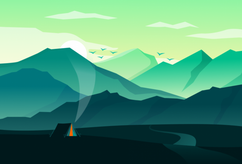
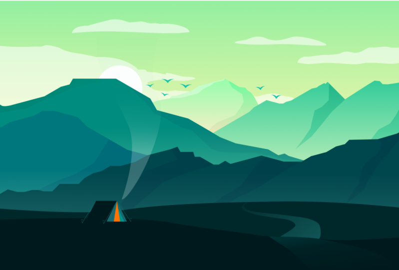
4. Lesson 03 - Workspace Preparation: Hello and welcome back. If you are new to skip, the first two episodes are a prerequisite as we use the knowledge gained in those episodes with Inkscape open, load the sketch from the practice acids provided with this class. From the status bar, we can see all the necessary information about the file. Before we begin. This is the latest development version of Inkscape. I'm always eager to try any new upcoming features provided in the PDF guide are the links to this table and development fashions. Now, let us prepare our workspace. Begin by loading a few dialogue panels. An apple, the fill and stroke menu. They align and distribute menu. And finally, the layers and objects menu. Sinter your page by going to View Zoom Center page. When tracing, the sketch should be placed in a fixed position. Go to the layers and objects panel and lock the object by clicking the lock icon, I will rename my layer landscape. Good. Select the rectangle tool from the toolbox panel on the left, at the far right of the tool controls bar. You can see the currently assigned color. We have a white field, a black stroke with a weight of one pixel. We do not need the stroke on the color palette. Shift and click on the X icon to delete this truck with only a white fill color, click and drag over the sketch to draw a rectangle. Switch back to the selection tool and disable the snap controls, but as we will not use it in this class. Now, on the status bar, reduce the opacity of the rectangle to about 60 percent. Make sure the rectangle fully covers this catch. Good. Under the layers and objects panel, renamed the rectangle to trace and locket. Let us draw a second rectangle to represent the background. This time around, we only need the stroke. Select the rectangle tool on the palette bar, hold shift and click on the blue swatch to apply the stroke color. Click once on the x icon to delete the field. Place the tool at the edge of this sketch, left-click and drag to draw a rectangle on the color palette, reset the Opacity back to 100%. Now, let us fit the page to the window. Go to View, Zoom, Zoom page. I would make a few adjustments to the position of this rectangle. It looks good. Finally, renamed the rectangle to Background, unlock it. We should now be familiar with the layers and objects panel and ways to assign a color to tools. Join me in the next class as we begin to draw.
5. Lesson 04 - Drawing the Clouds and Sun: Welcome. In this lesson, I introduced a handy tool, the Bezier pen tool. We will use this tool to create our artwork. Let us begin with the basics. So what is the Bezier pen tool? The pen tool is a versatile tool. It allows for the direct control of Bayesian parameters as one grows apart. Here is a short introduction to the pen tool. On the toolbox panel on the left, we have the Pen tool. When selected, you'll notice that the pen Casa has a plus sign next to eat. It indicates that the pen is ready to create. Point. Left-click to create a node. As you move to your next point is you'll see the path of your segment. The status bar also provides information of the angle and length of the segment. Click on your next position to finish the path, press the Enter key. There are five growing modes available or the tune controls, but these modes are create bayesian paths, create spiral paths, create B-spline paths, create straight-line segments, create paraxial line segments. On this page, the first three objects of the top row are drawn using the shape tools. Nevertheless, or the above ships can be created using the pen tool style attributes. To use the Bezier pen tool, we first need to assign a fill and stroke color. We also must provide a stroke weight. If you choose not to set the color or style attribute, the default color profile will automatically be assigned. Said they fill stroke and stroke weight in the fill and stroke menu. You can also conveniently choose a fill and stroke swatch from the color palette. Left-click on a swatch to assign the fill color Shift, and left-click on a swatch to assign the stroke color to remove a color, use the no color icon. Let us have a quick example. Here we have a diagram of a house. We will trace the house to follow along, load the file to your workspace, select the Pen tool and choose the mode regular Bezier path. Begin at 0.1, click and release to start a path and make an anchor point hold control and move the pointer over to position to click and release hold control and move the pointer over to the next position. Click and release. Again, hold down the Control key and moved position for click and release. Finally, to complete the path whole control and move back to 0.1. When you see a red box, click to close the path. Good. Let us move to the roof. Stat at this position, click and release. Move to the second. Click and release to the third click and release. Finally, hold control and move the start point over the red box. Click to finish the path. Now, complete during the rest of the house using the same process. Although mode 1 is highly preferred, switch to 14 to draw only straight lines. Back to our workspace. Select the Pen tool from the toolbox panel on the left. Here are my current default settings. Your settings should look like this. Indicated on the tool controls bar. At the far right is my current tool color profile. You may sit your preferred color with the append at this position, let us begin by tracing the clouds. At this point. Click and release to create an anchor point and start apart. Now, keep clicking and releasing as you follow the path of the cloud. To make a straight line, hold down the Control key while drawing the line. Move the pointer to the start point. When you see a red box, click, close the path. Follow the same procedure for the rest of the clouds. Good. We can now draw the sun. Select the ellipse tool from the toolbox on the left. Hold Control, click and drag to draw a perfect circle. Using the selection tool, reposition and scale the circle to match the sketch by dragging a corner of the bounding box while holding down the control key. To treat these objects as a single unit. With the five selected go to Object Group. Rename the group to clouds and son. Lock the group and toggle visibility. Drawing with the Pen tool will take practice to feel comfortable. The more you drew, the better you become.
6. Lesson 05 - Drawing the Mountains: Welcome back. In the last lesson, we learned how to use the pen tool to create a sequence of lines. In this session, we will draw the mountains in the following order. Select the Pen tool from the toolbox on the left. Using the above settings. Grow the mountains. I will speed up this section to save time. Later, apply color to our drawings. Make sure all objects created from a closed path. We will group the mountains. Placing objects within a group helps keep your work organized. When then switch to the selection tool. Select all the mountains by dragging across the drawing group the objects using the group objects icon on the commands back. Finally, named the group mountains. Using the pen tool will do the shadows, keeping our current tool profile. Begin with the front region. Follow the same order used when drawing the mountains. This shaded region presents the mountains shadow. We will trace only the large sections. Feel free to pause or replay this section to identify my choice of shadows. When Dan drawing, switch back to the selection tool, we now need to group our objects. But first, before I select the shadows and at the layers and objects panel, lock the mountains. Select the new objects and place them in a group. And at the layers and objects will remain the group to shadow. The next class would be exciting as we use the pen tool to create calves.
7. Lesson 06 - Drawing the Landscape: In the previous lesson, we learned about drawing lines or segments using the Bezier pen tool. In this session, we move to the foreground to draw the landscape using the pen tool. A quick recap. All paths in Enscape I represented as a series of Bezier paths. And the Bezier tool allows you to control the basic parameters as you draw the path using the Bezier pen tool, let us look at how to draw curved paths. Click and release to create a node, move the pointer over. Next position. Our red light appears to show you the shape of the path. Press and drag to create a cough. The handles coming of both sides of the node are for editing the cuff of the path. Press Enter to finish the drawing. To edit the path. Use the Edit path by Nodes tool. You will find that the more you drag, the more the path calves, the length and shape of the handles determine the shape of the curve. Now let us draw some shapes to make a dome shaped curve. Hold Control. Click and drag the handle vertically up. Next, position the pen tool or the right of the first. Then click and drag the handle on the opposite side of the fast drug. By pulling the handles to dissemble and you will get a perfect dome shaped curve. Now to make our Kev followed by a line, hold control, click and drag the handle up. On the next point, hold Control, click and drag the handle down, releasing the mouse Shift plus n to change from a curve to a corner. Then make your final point and press Enter to finish. To make a straight line followed by a Kev. Make your first, then move to the second without releasing press Shift and drag there a 100 up. Then make the data point and drag the handle in the opposite direction. To finish drawing, press the Enter key. Let us move to archived line. Click and drag the handle diagonally to one side. Then position the pen tool or the next point. Click and drag the handle to the same direction as the first 100. When then press the Enter key. Here is a practice exercise you can do right now. Load the template from the assets provided and drew the wheel. The image template includes guides on where to place nodes and their respective handles. Let us move back to the workspace. Select the Pen tool from the toolbox panel. Click and drag to create a new anchor point and start a bad. Move the pointer over, then press and drag to create a cough drug until the path before the anchor point looks good. Press and drag On this next point. Now hold Shift and L to change from a calf to a line and move to the next position. Two segments to go, click and release. Finally, move to the start point. When I read books appears, click to close the path through the rest of the foreground using the same technique. When you drew the curve may not look right the first time. Don't worry, just do the action and repeat the drawing. Use the anchor point handles to adjust the curve of the path. When Dan, switch back to the selection tool, select the four objects and group. We will name the group foreground. Now you are familiar with the Bezier pen tool and how to edit paths using the Edit path by Nodes tool. In the next lesson, we will draw the camp.
8. Lesson 07 - Drawing the Camp and Birds: Lesson 7. Welcome back. In this lesson, we will use the shape tools to draw the cup. Let us begin with the roof. Select the rectangle tool from the toolbox on the left. Draw a rectangle over this sketch at this position. Let me zoom in. Position the rectangle perfectly over your sketch. Good. Click twice on the rectangle to a rotation and skewing handles. Skew the rectangle until it matches the underlying sketch. Right-click and duplicate the rectangle. Flip the rectangle horizontally by selecting these icon on the tool control, SPA, hold Control, and drag the copy to the right, perform these new ship. We will now unite these objects. Select what objects, go to Path. Union. Next, select this task and polygon's tool from the toolbox panel on the left. The poodle controls by reflects my current tool settings. Click and drag to draw a triangle. The triangle to this position to make the front of the tent. Now, using the handles skill, they travel until it fits on the right age. The ship fits perfectly. We need a few more triangles. Fast. Duplicate this triangle. Choose a corner handle, hold down Control, and Shift scale the copy towards the center. Scared the bottom side and the top edge to align with the larger triangle. Using the pen tool and a small triangle at this position. Switch back to this task and polygon's tool and draw a new triangle for the pigs. Using the pen tool. Draw three lines from the top corners of the tent to represent the guy ropes. At their ends, we will place the pigs, select the new triangle and flip it vertically. Make two copies, and place them at the end of the two other guy ropes. To feed your pitch to the window. Go to View, Zoom, Zoom page. We add through with the comp. Select all the objects and group. Name, the group, come. Let us now draw this MOOC. Select the Bezier pen tool using the drawing techniques we learned earlier, drew this MOOC. We are done here. Renamed the object to smoke. Group both objects and provide a name. The name camp and smoke will suffice. We will now draw the last object. The bads. Select the pen tool and draw a triangle in this ship. Switch to the Edit path by Nodes tool from the toolbox. Slightly adjust the shape of the triangle. Now, make a copy and flip horizontally. Move the copy to the left side and form a symmetrical shape. Select both objects and center. On the horizontal axis. Both objects selected go to Path union to unite them and form a single object. We will scan the bad to size and distribute copies on the upper section. Go to edit copy to make a copy. Then sit your Casa at the position you would like to place the bads and paste using the shortcut Control V. Select all the buds and create a group. Rename this group to buds. We have completed this sketch. Here is the completed drawing of the landscape. During me in the next class as we clean up the network.
9. Lesson 08 - Cleaning the sketch: Welcome. We have traced all the objects for our landscape. In this lesson, we will refine our drawing and make any necessary adjustments before applying color to the artwork. The visibility for all the groups is toggled on. A good example is this area of the mountain. The paths are not perfectly aligned. So let us work on this area. On the layers panel hide the rest of the objects except the mountains and shadow. Before we start, go to the toolbox panel and select the Zoom tool, drag over the area that needs adjustment on your artwork to zoom in. Switch to the Edit path by Nodes tool and hover over the path that needs adjustment. When the path grids out, click to enable the anchor points. Using this tool, click and drag to adjust the anchor point position and align the path. The Edit path by Nodes tool can also be used to add an anchor point, adjust the anchor point handles or transformed the path itself. I will walk on the rest of the artwork in the background. Continue with the OVOC. Let us meet in the next session to talk about color.
10. Lesson 09 - Color: It is time to apply color to the artwork. Here is a clean, glowing. I have made the necessary adjustments. It took me about five minutes or so. I will apply the color in stages, starting with the background objects, moving forward to the foreground. It is in the same order in which we made the drawings. How do we know what color combinations to choose for this artwork? Here is some information on color. This guide will help us in selecting the best thing for our design. Color theory. Color theory is the art and science of using color. It's describes how different colors relate to each other and how they look when they are combined. Harmony in color can be subjective. What works for your eyes may not work for mine. The principles of color theory aim to reduce subjectivity by offering guidelines for grouping and pairing camera colors are divided into three groups, primary, secondary, and tertiary colors. Primary colors are red, yellow, and blue. All other colors are a result of mixing primary colors. Secondary colors are purple, orange, and green. Each color is produced by mixing equal amounts of two primary colors. Blue and red make purple, yellow and red make orange. Finally, blue and yellow mixed green. A tertiary color is made by mixing equal amounts of a primary color and a secondary color. There are six tertiary colors. So what about Brown? Brown does not appear color wheel, but is referred to as a tertiary or neutral color. It is made in a variety of different ways. However, three basic brown colors are made by mixing complimentary colors. Blue and a small amount of orange, red, and a small amount of green, yellow, and a small amount of papillary. Let us talk about hue, saturation and value. Hue. Another word for color is a pure pigment, one without tint or shade. What hue we see is dependent on the wavelength of light being reflected or produced. Saturation is the intensity of a color. How saturated a hue appears also depends to a degree on the colors next to eat. Value describes the relative brightness or darkness of a color. In other words, the relative degree of black or white mixed with a given hugh. Let us look at how to pair and group colors. Analogous colors, also referred to as harmonious colors. They sit beside each other on the color wheel. These colors work well together and create an image that is pleasing to the eye. Here is an example. Similar colors are used to create a sense of harmony. The result is a warm and relaxed composition. A painting by Fuji. She uses colors that are next to each other on the color wheel, creating a harmonious look. Complimentary colors, also referred to as opposite colors. They sit across from each other on the color wheel. Complimentary colors are next to each other. A strong contrast is created. The colors appear more vivid and bright. Here is a painting that uses two complimentary colors, green and red. Neutral tones of brown are used to create balance. In the next painting, the Green Lake complements the bright red of the mushroom, which is quite vivid. The atleast also uses neutral colors. This allows for the viewers eyes to rest. In this picture, we see a strong contrast between the orange building and the blue sky. Triadic colors. Triadic colors, or three colors evenly spaced on the color wheel. This combination creates bold, vibrant color palettes. Here we have a beautiful picture of an orange and purple starfish on a coral reef. A poster of the 2006 superhero film, Superman Returns. Triadic colors stand out on this poster. Blue, red, and yellow. Color temperature. Temperature is the perceived warmth or coolness of a color. Different colors evoke different feelings. The color combinations found on a color wheel have a balance of warm and cool colors. Drew a line through the center of the wheel and you'll separate warm colors from cool colors. Warm colors. Warm colors are the colors from red through to yellow. These colors are saved to bring warmth like this sudden, warm colors tend to advance into the foreground of our composition. They are exciting and energetic and we will catch the viewer's attention by drawing your eyes towards the cool colors. Cool colors are colors from green to purple. These colors assayed to bring coolness like water. Cool colors recede into the background, meaning that they move away from the viewer. They are calming and relaxing. Neutral chaos. These colors do not fall into the warm or cool category, such as black, white. Agree? Like binning the pair well with most other colors. Neutral colors are great for balancing out a color palette and providing negative space in layouts. Attitudes like beige and some browns are also considered to be neutral colors. Color psychology. Health psychology is the study of colors in relation to human behavior. Color influences perceptions and has qualities that can cause certain emotions in people. The way color influences individuals may differ depending on age, gender, and culture. Here are a few colors. Often, when an artist uses color in painting, they are communicating emotion, mood, or atmosphere. They could either be trained to make a viewer feel a certain way or sharing their own feelings. Here is an example. Red is a color associated with danger or caution. This picture of a traffic sign in red once drove us to slow down and come to a complete stop. Teamed shed. Untold. Artists at times use only tint should absorb extended from just a single hue. From the kinda weird. This is known as monochromatic tint. At it is created by adding white to a base hue, lightening the color. It makes a columnist intense and is useful when balancing more vivid color combinations. Should a sheet is created by adding black to a base hue, decorating the color. It creates a deeper, richer color. Sheets can be quite dramatic. Overpowering. Tone. Tone is created by combining gray with a base hue. Like twins. Twins are subtler versions of the original color. Conclusion, how a color of art or design looks and what you feel about it depends on several color choices. And understanding of Karla will help when incorporating it into your own designs and how you interpret other people's walk. It will also allow you to express your own feelings and mood. We can then conclude that color and the relationship between colors has a huge influence on how we perceive at InDesign. With this knowledge, we can now choose a color. So which would you pick? We will use a combination of green and blue as the main color for this artwork. These are colors associated with nature. They are cool colors and bring freshness.
11. Lesson 10 - Color: Background & Clouds: Welcome. Let us begin with the background. Toggle visibility of all the objects except the background. And lock the background. Let us provide a gradient for this rectangle. We will use a blend of two colors. We have a blue rectangle with a stroke and no fill. Fast with the rectangle selected, provide a white field from the color palette. Choose the stroke option under the fill and stroke menu and delete the stroke. Switch to the Fill menu and click on the linear gradient. Select the gradient tool from the toolbox panel on the left. As you may note, we have two stops represented by the two circles on the Fill and Stroke panel. Let us begin with the first stop. Now, input the color values for these top. The assets provided with this class have a detailed PDF gate with an illustration of the color values. Next, who will speak the direction of the gradient by 90 degrees using the gradient tool. Start at this position, click and drag vertically in the downwards direction to form a beautiful blend. We have just created the background for our artwork. Good. No, choose the selection tool. Switch to the layers and objects panel will now apply color to the fast drawings. Toggle visibility for this group, clouds and the sun. And lock the background object. Switch back to the fill and stroke menu. And let us begin with the sun. As these objects are in a group, hold control and click on the circle two isolated. Then on the color palette, click on the white color for the fill and shift. Click on the icon to delete this truck grid. We are done with this sun. We can now move to the clouds. Select the clouds by using Control and Shift to select the remaining objects. Apply a white fill and they lead to the stroke. And the fill and stroke menu reduce the opacity to a value of about 58%. We are done with the background. In the next class, we will cover the mountains.
12. Lesson 11 - Color: Mountains & Shadow: Welcome back. In this class, we will color the mountains. So without further ado, let us begin toggle on the third group, the mountains, and switch back to the fill and stroke menu. On objects are within a group. Hold control and select this mountain. Provide it with a white fill and the stroke. Click on the linear gradient icon and switch to the gradient tool. Click on the gradient stops and apply color as our remainder. The color values for this artwork are in the documents provided with this tutorial. We will now switch the gradient to 90 degrees by dragging this tops. Play around with the position of the gradient stops to get different results. Select the second mountain in order of position and follow the same procedure. This mountain should be behind the fast mounted. Click on this icon to LA selection by one's tip. Follow this procedure for the rest of the mountains. I will speed up. The next section. As you can see, the artwork has come to life. Let us go to the fourth group, this shadow, toll on the group, shadow, group there. Click on this icon to ungroup. Select these three objects. A white field, and remove the stroke. On the Blend Mode. Choose the blend mode overlay. Next, reduce the opacity to about 10 percent by dragging the opacity slider to the left until you get the desired value. Move to the next object. We will repeat the same process. Select the shadow from the second mountain and click on the field. By default, this action will assign to the object the last color I used under this menu. Now switch to the stroke paint and delete the stroke. Click on the File menu and change the blend mode from normal to overlay. Finally, reduce the opacity to about 9%. Move to the next object and repeat the same process. I will speed up this section. Just as a reminder, they kinda values blend mode and opacity indicated in the attached PDF file. We add through with the mountains. Next, we will move to apply color to their camp.
13. Lesson 12 - Color: Foreground & Camp: Hello. In the previous chapter, we learned how to apply the blend mode. We will now walk on the foreground and switch to the layers and objects menu and toggle on the group foreground. Let us apply Kyla using the same process as with the mountains. Hold control and select this object within the group. Apply a white fill and delete the stroke. Under the fill. In the fill and stroke menu input the following color values. The landscape will have a flat color, while the footpath will have a gradient field. Moving to the next object, follow the same process. Apply field and delete the stroke. Here are the color values. Now, this object is not in the right position. We need to lower it by one level. Click on this icon to know a selection by a single-step. Good. We can now move to the footpath. Select this object, provide a white field and delete the stroke. And now what the linear gradient and select the gradient tool. Choose the fast top and apply these values. 182, One, 126. Moving to the second stop. The values are 187, 111. Don't forget to set the Alpha to 100%. Now, adjust the direction of the gradient along the path plus the lighter area towards the mountains. Switch to the selection tool and select the second path. Follow the same process. This time with the darker area towards the mountains. In the next stage, we apply color to the camp, toggle visibility on for the group camp and smoke. Select the Zoom tool from the toolbox panel. Drag over the camp to zoom in. We will apply color to each object while retaining them as a group. Hold control and click to select this triangle. Pick a bright orange color from the color palette and delete the stroke on the fill and stroke menu under the field option, make sure the value saturation and Alpha set to 100%. Provide a white fill and delete the stroke. We need a color that will blend in with the landscape unequally provide contrast when placed next to the orange object. Good. Let us move to the next object. Select this triangle and provide a brighter color. Click on the flat color to provide a solid color. Adjust the hue to about 178, increase the saturation to a 100 percent, and increase the value to 58 percent. It looks good. Switch to the stroke paid option and delete the stroke. Now we move to the roof. We need a solid color with a dark tone. Select the flat color icon and that they feel option. By default. This has applied the previous swatch used. Input the following values. Finally, delete the stroke. We are about to finish. Select the gay ropes and pigs who will apply a single color. We had done with the comp. Let us move to our final object. Select this MOOC, provide a white field and delete this truck. And now both the linear gradient, select the gradient tool and drag vertically up along the object. The point with 0 alpha should be at the top. Double-click on the gradient annotator at about these position to add a new stop, we can now have a blend of three colors. Apply colors starting with the first stop, we will retain the Alpha or the tab stop at 0. Went through and the opacity reduce the objects global opacity to about 22 percent. The artwork looks good, but not complete. Join me in the next class as I share some tips and tricks for enhancing your design.
14. Lesson 13 - Tips, Tricks & Best practices: Hello and welcome. Here is the track. Our progress is good. So how does one know if they kinda values used in an illustration are right? We need to figure out how much contrast is available in our artwork. We can easily achieve this by removing color from our AAC. So switch to grayscale by going to View grayscale, the difference in total values is now visible. To create depth and distance, progressive tone is used. We have gradually changed from a doctor in the foreground to a light tone in the background. This shows a change in the amount of light hitting objects that is related to how far they are from the viewer. We still need to adjust the value of a few objects. Go to View grayscale to revert to the default view mode. Let us begin with the foreground assigned to it the same color as the roof of the tent. Select this object. Switch to the dropper tool from the toolbox panel and click on the roof. The color is now applied. Switch back to the selection tool. Next, we will adjust the tone of this shadow by increasing its value. Under the fill and stroke menu. Rewatch the opacity to 100% and change the blend mode to normal. On the fill option click or the linear gradient icon to switch from a flat color to a gradient. Select the gradient tool and pick the first stop. On the Fill menu, increase the value to 55 percent, saturation to 100%. And hue to 174. We get teal greenish color. For the second stop, increase the value to 96 percent, lower the saturation to 22 percent. Adjust the hue to a value of 92. And finally, set the Alpha 200, 100%. This provides a certain look. Now change the blend mode to multiply and reduce the opacity to 15%. The shadow blends well with the mountain. Next is this path. Using the gradient tool, adjust the gradient to 90 degrees. We need the formula to have an even darker tone, add a new stop, and drag it closer to the top stop. We will also adjust the color of this mountain by increasing the value of the lower area. It should indicate the rays of the sun being reflected. Let us go for a warm Kiara somewhere between red and yellow. This looks good. Switch to the selection tool. Anything else? Yes. For this shadow, as you can see on the status bar, I forgot to delete the stroke. The stroke is clearly visible. Shift and click on this icon to delete the stroke. To reset the view. Go to View, Zoom, Zoom page. We can display artworks so that only its outline or paths are visible. Viewing without color attributes speeds up the time ticket to redraw the screen when working with complex artwork. You can also see hidden objects. Select the Edit path by loads to an edit to the artwork. To return to the default view, go to View, Display mode, normal. Let us talk about groups are blending mode. If you may recall, we are played color to all objects as a group except the group shadow, which we first had to ungroup. So why did we do this? The answer is simple. Blend mode. Blending mode lets you vary the way that colors of objects blend with the colors of underlying objects. When you apply a blending mode to an object, the effect of the blending mode is seen on any object that lie beneath the objects layer or group. Let us see with all the shadow selected on the layers and objects panel, you will notice that the objects are stacked in succession. Click on this icon to create a group. This is the outcome. Objects are now a separate group and no longer directly relate with the mountain. Grouping changes the layering of objects and the stacking order on a given layer. The mountains and shadows, each India separate groups to correct these. And group the shadows by clicking the group icon and the Command button and drag them into the same group as the mountains. You can now explore using the blend mode. Now that you know how to apply and adjust colors, feel free to experiment and find the best colors for your designs.
15. Lesson 14 - Finalize the Artwork: Thank you for coming this far. In this final lesson, we will cover the bads and hide all unwanted parts of the design by creating a clipping mask. Select the bads to have a closer view. Go to View, Zoom. Zoom selection. On the fill and stroke menu under the fields section, click on the flat color an input the following values. Switch to the stroke paint and click on the No paint icon. Good. Now let us reset the page by going to View Zoom, Zoom page. It is time to tidy. The network, will now crop any unwanted objects using a clipping mask. A mask is a vector shape that you use to hide parts of other content. The ship that is to become the mask must be on top of the content that you must. Switch to the layers and objects menu on the right. Hi, the object trees and unlock that background. We have some overlapping objects in this area. Select the rectangle tool and assign a full color. Click and drag over the area you want to be visible. Let me reset my opacity back to 100, a 100 percent. Okay. When clipping, the topmost object defines the outline. Select all the catwalk by dragging across them. Right-click and set clip. This is the final design. It looks great. So this is it. Congratulations, we are finally true. Thank you for your commitment to complete this project. That wraps up the tutorial. I hope you enjoyed the class. I am open to all your questions or suggestions. Do not forget to share your work. Thank you once again and let us meet in another lesson.
 Joseph I., null