Transcripts
1. Intro: Hi. My name is Isabelle Tele. I'm a graphic designer and art director from Austria and I'm based in Vienna, where I'm leading my own design. Practice in this course will show you the fundamentals off in design in our class project will be to create magazine article, so we will focus on using Amazon for print and editorial design. The course is basically structured into two parts for off. The 1st 1 is many theoretical, and the 2nd 1 is more hands on. The second part is also where we will create our class projects. The chorus is designed for absolute beginners, so you don't have to have any prior knowledge if using in design or any other design software for that matter. However, even if you are already well versed in in design, you might benefit from this class as it might help you understand it. Even better, you will need in design installed on your computer in order to participate. I'll be using a dope in design and CC 2018. However, you should also be able to follow with an older version off in design
2. Course Structure and Class Project: So how's the course structured? First off, we will have a close look at in designs interface and its individual components. They should help you find your way around, and it should make you feel comfortable in the work environment. You will get a general understanding off where to find the tools you need, how to use them and how to find out more about, um, it will enable you to control your tools in more detail, and you'll also be able to find out about features that you're not actually familiar with. I'll show you how to set up and customize your own workspace, and then we'll explore a few different ways off navigating through documents and using different screen loads before we then start our with our project will go through the most important tools, and I'll quickly explain them to you. We'll start the second part by creating a new document and setting up our very own grid. We will base are layouts on this Brit. I'll show you the basics of working with shapes and how to arrange in the line objects on your pages, and then we'll get started with the actual layout. Therefore, we'll start working with topography, which will take up the most time. And then we will work with images, colors, paths will create two small illustrations, and at the very end we will export our document as a print. PdF and is a preview. Pdf You are welcome to use the material that I'm supplying to copy exactly what I'm doing. However, I'm actually encouraging you to come up with your very own ideas for your article and create your very own designs. When we start out with something new, like using a design software for very first time, we might feel keen on jumping right into it and not wasting our time with boring details. At least that's how I feel. And we might become quite efficient in using that design software without ever fully understanding the basics. I'm focusing on the theory in first part of this course, so you can actually understand the structure behind in design, and that should help you to use it more intuitively, and that can lead to more natural learning process. So if you're like me and you want to jump right into things and you might feel like skipping the first part I understand. But to be very honest, I would have been happy if someone had explained to me like that at the very beginning. So I hope you enjoy this class. I'm really looking forward to seeing it. Class projects and that same let's get started.
3. Tool Panel: Let's start with the tool panel to the left. Here, you've got your most important tools for creating and editing images, topography, artwork and other page elements. If you're not sure what a symbol stands for, you can move your mouse over it and it will tell you if you want to select a tool, you can just click on it like I'm doing here with the line tool. You'll get to start gray area, and that's how you know that you've got the tools elected. Now you can move to your page, and you can use it. I've just drawn this line here, but I don't actually want it there. So I just hit the delete key. As you may have noticed, some of the icons have a little era pointing down next to it, and that actually tells you that it's a group of tools rather than just one tool, and you can select those tools like any other, just by clicking on it, and then you can use it on your page. Or you can click on it just a little longer, like you would usually, and that will bring up an additional menu where you can choose from additional tools from the same category. Meme. A very interesting thing to know about your tools is that you can use them on your page. But some of them have the option off bringing up additional controls. And, um, one off them is the polygon tool, which is hidden within the shape categories. So I click on a rectangle tool for a little while to bring up my menu. Now I can select a polder gone tool, but clicking on it. And now I can click on my page and this will bring up a panel, and here I could decide about with and hide off the Polygon, or I can put in a number of sites. And now I just clicked in the input window, and I, um, type in the number six on my keyboard because I want to have a polygon with six sides and I click on OK, and now I can draw my six sided polygon on the page again. I hit the delete key because I just wanted to show you how it works and some off the tools . You can even bring up controls by double clicking on the tool itself. like the pencil tool, for example, so we won't go through the individual tools now. But we'll do that later on, and this is just for you to keep in mind. If you think you need additional controls, try a double clicking on the tool itself or click on the page. And this might help you find the controls. You need another very useful thing when working in basically all of the dopes, Um, applications is using shortcuts. I do that quite a bit because it helps you work much more efficient than faster. I'll be using that. I'm throughout my classes, but I'll always let you know which ones I've been using. So you're not surprised about what's happening on screen. They'll thought you haven't seen me clicking on anything, and I'll just demonstrate that very quickly. So in case off the type tool, if I move my mouse over, the tool will not only tell me the name, but also the shortcut in the case of the top towards T, and I'm moving back to the page to make it more obvious. The only thing you have to do now is to hit the T key on your keyboard, and now you've switched the tools. So I encourage you to build that into your breakfast as you get better and better.
4. Control Panel: Let's have a closer look at the control panel at the top. The control panel is like a smart menu, which gives a different kind of controls, depending on which object you've got selected in which tool your using. At the moment, let me show you what I mean. Let's now move down to direct angle tool and selected by clicking on it in the tool Penhall and moved to our page. If you hold down shift key on your keyboard and you drag out your cursor, you can draw a square. And as you can see, our controls in the control panel have changed quite a bit because they're now connected to the square that we've just drawn. If you were to switch back to the selection tool now, and we can do that by pressing the on our keyboards, three Control stay the same because they're still connected to this square that is selected something I recommend doing. Is that you once you've finished with something you always de select, and you can do that by clicking anywhere on your page or your pace board. And now that I've lost the connection or selection off my square, the controls at the top have changed again. As you can see, some of the items are displayed in Bride Gray, and that means that you cannot use them at the moment. In the case of Rotation Tool, that's because you've got nothing selected and you would have to select the object first. So say we select our square here. Now we're able to rotate it. Another reason why we d select in between steps is that if you've got something selected and you think, Oh, I want toe ah, used to type tool and I want to make some changes, but the controls don't change. That's because we've still got the square selected. So he hit Vienna keyboard, click anywhere on apace board, and now we've got nothing selected, and we're free to go on to next step. So if we clicked it onto the title now, we've got our new controls concerning the type tool up here and here. We've got a lot of controls. We could even decide between character for minting or paragraph formatting controls. And as you can imagine, there's so many things you can do within this application that you will never be able to have them all visible in your interface at the same time. But you can customize the interface to your own needs. And in the case off the control panel, you can do that here by clicking on customized control panel. This will bring up a window, and here you can decide which ones off the controls you want to see and say You think you don't need to be able to change your funds or your character styles in your control panel. You just uncheck them here and you click on OK, and then they will be gone. But I will actually bring them back for you because I think that's really useful if you're looking for something which you have never used before and you think that in design definitely has that feature, um, it might be hidden in the panel options here, but you don't always have to look through the whole interface. If you're looking for something, you can either use help up here, or, even better, you use quick apply. You can bring that up by oppressing command. Return on your keyboard, and that will bring up this window where you can stop it. Anything you wanna use anything. You're looking forward. Even if you're not quite sure what a feature is called and it will show you all the options , and then you can use it from right there. But we will do that other later point. So that's basically it for the control panel for now. And I'm gonna delete my square by selecting it and head hitting delete on the keyboard.
5. Setting up your own Workspace: as mentioned before, there's different ways for you to customize your interface and in design. And we've already had a quick look at customized control panel up here. Ah, but there's actually a lot more you can dio. So depending on the project you're working on, you might have different needs and you might want to have different controls here in your panel to the right. And the main difference between those controls and the ones up in the control panel is as we've discussed, that the controls and control panel depend on the object you've got selected and the tool you've got selected from your tool pills but the controls to write a totally up to you so you can decide which ones you want to have their in which order they appear. And this is all part off the workspace you're working in. So let's go to the workspace by moving up to the application bar and clicking on this little arrow. Now we've got a list off workspaces we can choose from, and those come as a reset within design. But you've also got the option off creating your own like a did the skill share, which is the one that's currently selected, so let's switch to the advanced workspace by clicking on it. And as you can see, my controls here have changed. Now let's have a closer look at how that works. My panel's here are arranged in groups, and those are the so called dogs. If I click on pages, for example, my doc will open and I will have my layer Penhall and link Penhall in the form off tabs organized. And if I now go to a different talk and click on stroke, for example, the 1st 1 will close and the new one will open, and that way you've only got visible. You've only got the controls visible that you need at the moment, and that's how I prefer it. But let me show you how else you can do it. So let's close the stock, and we can expend our panels here by clicking on those two arrows. Now you've got all the docks open at the same time, and you can navigate through your links and everything. And if you want to bring it back to a more reduced visual, you can close them again. If you're very familiar with the symbols, and you don't even want to see the tiles next to it. You can reduce it even more by moving your mouse over this line and then dragging it out all the way to write until only the symbols appear. But I think we should bring them back now because at the start, this really helps us find a way around. Let's have a look at how we can reorganize them. That's very easy as well. So if you click on the title off panel, you can drag it and say, I wanted to combine characters 1000 paragraph styles into one Doc. I just move my character styles up until this blue line appears around the other doc, and if I let go of it now, they will be combined. You can see if I open a doctor clicking on paragraph styles. I can also rearrange the order off my taps by just grabbing the tab and sliding it to left . Now the character styles of first in paragraph styles are second. If I wanted to close my doc, I click on those two arrows again. I can also rearrange the order off the talks themselves by clicking on this line here and dragging the lock up. And as soon as a blue line appears in between two other docks, I can let go of it and it'll slide right in. Now let's bring in some new items. Let's move up to the main menu, click on window and now you can see the whole list off available controls. If I think I need more type controls, for example, I can go to type and table. I can click on character and this panel will appear and I can click on it and I can drag it around. So it's just free floating. But if I wanna have it in my dock here at the right, I just click on it. A. Drag it over to the right and I let go of it. As soon as the line appears where I wanna have it and I can do the same for paragraph, I click on it. I dragged over and I drop it. That's good for now, but maybe I want to get rid of something so you don't need the object styles very often and you don't want to have them there, so you just click on them. You drag them out and then you close them by clicking on this little X here and then they are gone. Let me show you a couple of more things. If we moved back up to window in our main menu, click on it. We can access the workspaces from here as well, just as we did in the application bar. And as you can see, you've got to all things with check marks next to it there called Control and Tools. And those are actually the ones that we looked at earlier. So if I uncheck the tools, my tool panel will be gone, and the same applies for the control. And this is good to know, because for some reason you might find yourself working on a different computer or you open up your application on all of a sudden, you're controls and your tools are gone. And that's just a very easy way to bring them back. If you make sure that they're checked here and there's one more thing within the window menu, um, you can see that application frame is checked here, and, um, you'll see what it does if I check it. You can see that you can see the background here in your document window is floating around . You can see your file that I've got lying around on my desktop, and I think that's sometimes a bit confusing, so I prefer the other way. You can even reduce it more by uncheck ing. The application bar, which now at the top, is gone, and this is just to show you why. Sometimes your interface might appear differently, but I'll bring both of them back because I really prefer it. If my interface takes up the whole area, the whole screen, you can do the same thing we did with those panels and docks here with the tool panel in the control panel as well. So if you click on a tool panel and you drag it out, you can have it floating around. If you grab it, you can also try and find new drop zones for it. So if I now let go of it as soon as the blue area pierce, it'll slide in between the two elements. But I think it's better to keep it over here at the left and say, I'm happy with how I've arranged my workspace now and I want to save it as a new workspace . I go up to the application bar again, click on this arrow and I go to new workspace. If I click on that and I can type in the name off my workspace and I hit intern to save it And is it concede now? I've already got my new workspace here, and if I switched to advanced, it will actually look the same because that's the one that I am ended earlier. But you don't have to worry. You can always reset that by clicking on here, going to reset events, and it will go back to how it was before. Now let's quickly delete our test workspace because that was just to show you how it works . So we go to delete workspace. Um, we select name off the workspace, want to delete it, delete. And as you can see now it's gone
6. Indesign Preferences: So far, we've had a look at most parents off our interface and in design. But there's one main part we haven't talked about yet, and that's the top navigation here, so we can set a few preferences. If we click on Indusind CC, we can go to preferences and we can select from a number of items. If we now start by clicking on general, this preference panel will open up, and here we can see all the subjects we can make Changes to. A few of them will concern you more than others, and I think that's actually only a few, which are really important. So those are the ones I will talk about now and then you can browse through the rest and see if there's anything that interests you within general. For example, you can change whether you want to include stroke weight and effects when scaling a object and how that works. It's basically that if you've got a very small illustration made up off lines and line weight is one point for example, then if you've got this box checked and you scale up your object than the line, would will increase with the size of the object. But if you have this box unchecked here, then the line weight will always stay the same. And it will always be one point, even if you scale up your objective very large size. And that's good to know, because depending on what you working on, you might need the one or the other, and the same applies to the effects here. Within interface, you can change the color of interface so you can see it appears quite different here, and I like it. Lights are also like that one, and in units and increments, you can set up the units you want to work with, And that's a very good one to know, because you might feel more comfortable working with interest, for example, or if you're designing for screen. You might want to change those two pixels here, but l just leave them as they are within grits. You can set up your base, linger it, and we will definitely do it at another later class. And you can also decide about the dictionary you wanna work with whether in design should check your spelling and what condition statute work on, you can able AutoCorrect if you want to, but I don't do that because I kind of think that's dangerous. So, um, you can see here's quite a few more things that you can look through, but I'll just click on cancel for now.
7. Top Navigation: Let's have a look at the added items in our top navigation here. Um, they're actually quiet, self explanatory and most of things which you can find in there. We've either already seen somewhere else in the interface or we will come across it. But just to give you an idea, what's in there will just have a quick look through. So I think they can file. For example, you can find anything that's got something to do with creating new files, opening fouls, closing them, saving them, and, ah, once we've set up a new document and we will do that in a later session, Then you can always come back here and double check your settings and even change a few things. So if you click here, this panel will pop up and you can see that we've got only one page so far. The page sizes, a four and a few more things than I think. That's fine for now. So just click on, OK, within edit. You can see that quite a few of the items are gray, and we've seen that before with some of the symbols and a control panel, So that means those are not available at the moment. But there's others which are black, which are available, and some of the items will execute a task directly, like undo. So this will undo my previous action. Some of the items like this one have got this Arab next to it, and that means they will lead on to a new menu where you can choose from a bunch of stuff. And there's yet others, like keyboard shortcuts here with those three dots next to it. And if you click on this, this will open up a new panel. And keyboard shortcuts is also very good one to remember because, as we've discussed earlier, next to most of the titles, you can find a shortcut. And, um, I will tell you which ones I've been using, and I'm working on a max. I will tell you the shortcuts for Mac. And, as you can see here, the symbol a stands for command. The shortcut for finding change, for example, is command F. But if you were working on a different system like a Windows PC, this might not work for you, and in most cases you should be able to exchange command for control on your keyboard, but in case that doesn't work or you forget a shortcut or you even want to change it, you can always come down here to keyboard shortcut and look it up or change it within layout. You can find anything you need to create margin rulers columns Guy. It's You can find number in section options to create page numbers, which we will use later on in our document within type, which is also quite self explanatory, you can find anything that concerns topography. You can find special characters, which you cannot find on your keyboard, for example, and we'll use a lot off this in object. You can find anything to transform and arrange your objects. You can group ungroomed them. You can also find your paths here, which you need when working with Victor administrations, possibly table we won't use for now. In view, you consume in Sioux Mahdi Kim decide which grids and God should be displayed, in which not window we've already had look at, so we know how that works. And if there's anything you're not sure about, you can always come to help and typing anything here and hopefully find a solution
8. Using different View Options: Let's have a look. A different view options will be currently looking at is basically a single blank page. And that's how it could look when you create a new document, you can see that our pages surrounded by this gray area, which is the so called paste board. And on our page, we've got a few caught colorful lines, but they're not actually drawn on the page. But those are guides. Doesn't our margin guides Now let's actually switch to a more complex document so I can show you a few more things. If we click on this tab here, we switched to the other document window, and here you can see a brochure that I created previously, and what we're looking at here is our cover. We've got a few different elements on our cover. We've got images, we've got a vector logo, we've got topography. And then we've got this wavy line here, which is basically a path you can select from different screen molds within in design. And if you move up to the application bar and click on this little arrow here, then you can see you can select from a bunch off presets like normal, for example. So if you click on normal all of a sudden, there is a lot more going on, and we've got all those guys here. So in addition to the margin guides that we've seen in the other document, we have columns here. We've got Rose. If I move a little up, you can see we've got additional guides here, and we won't go into depth with that now. But if you want to bring in additional guides on your page, you can do that, for example, with those rulers here. So if you click on a ruler and you drag out your miles over your pace board or somewhere on your page and let go of it, this will create a guide for you. But I just hit his cape because I don't want to do that now. So in addition to all of those guides, we've got this red line running around or page, and this is the bleed guide. So this shows us our bleed area, and you may have heard the term before because it's very important when designing something for print to know that as soon as you play something right up to the edge off your page. In this case, it's images, but it could also be Justin illustration or color, and then the page will have to be cut after its printed to make sure that we have nice edges and they're not no wide lines running around it or anything like that. So, as you can see, those two images are bleeding off the page, but this one actually is not. And if you're wondering what it is, I just tell you it is because this page authorities a single page in my document. It will actually be printed as a spread because next to it there will be the back cover, so this image actually won't be cut off, but it will run over to the back of our brochure. Now, if all this is a bit much for you, you can, ah, hide some off the guy. It's so if we go to view grids and guys and click on hide guides, our guides will be gone. But you can see that we've still got those blue lines around our objects, and those are the so called frame edges. You can also make them go away by clicking on view extra and hide frame edges. Now all we're left with is our elements on the page. But actually let's bring them back like this and then go to grids and guides and click on show guides like this. What we've done before up here in the application bar, we can also do by using shortcuts. So if you hit W on your keyboard, you can switch to the preview mode. And that's very useful, because just hitting W on your keyboard allows you to switch very quickly between the normal or, as I like to call it, layout mode and preview mode to make sure the page looks like you wanna have it. And then you can get your guides back and everything you need to position stuff. But there's also a presentation mode, which you can also access appear or by hitting command W on your keyboard in presentation mode, you can never get by clicking on your mouths to come to the next spread, or you use your down and up arrows on your keyboard. If you want to go back to your work in mind meant you just hit escape on your keyboard and everything will look like it did before, just to mention it up here Asi may have seen there's also a bleed mold, which we've discussed before, so it shows you're all the bleed area around your page as well. And then we've got a slog mode, which you don't have to worry about for now, because it's more for people who work in the print industry. Slug is basically an area which um goes around your page where you can put down notes for print production, and this will be cut off afterwards as well. So let's switch back to preview mode. And as you may have noticed, my images look different. In my preview mode, they look as if they were compressed orbit pixelated. And if I hit commands over you again, you can see in the presentation what they look really nice and crisp. And that is because we work with a display performance, which I can access up here in view display performance off typical display, and that's the standard. But if you switch to high quality displayed, you can see that all of a sudden you're images look much nicer and you may ask, Why don't work like that all the time. It's basically because your computer will suffer and everything will take much, much longer. So if you just want to lay out your page, you work in typical display mode, and I have personally prefer to switch into presentation mode to see it in full glory and then go back to either normal or preview mode.
9. Navigating through your Document: we're gonna have a look at a few different ways of navigating through our documents. But first, let's have a look at our assume level. If you move up to the application borrow, we can see our current soon level. And in my case that seems like a very odd number because it's 79.7%. But I'll actually show you a little later how we arrived at that number. Now let's click on this arrow and you will get a list off different percentages. And if you click on a percentage like 300 for example, your page will assume in at 300%. Now, if that's a bit too large, you consume out again gradually by hitting command miners on your keyboard just like this, you can find the same command up here in view and assume out. Or you can also assume in or hit command and the equal sign on your keyboard. If you want to change your soon level, you can also click on the number here and then type in any number you like and hit. Enter on your keyboard. A couple of really good shortcuts to remember in that connection is command one because it will bring up your page 100% or which Ah, I use a lot actually command zero, which will make your page fit into your window. And that is how I arrived at this very old number here. Now let's move to the pages at the riot. Click on the tag here, and this will open up the pages panel. Now you can see all the pages in my document and within this panel, I can navigate. But I can also make quite a few a chest men's and rearrange my pages and stuff like that. But for now, we will purely focus on the navigating. If you click once on a page, it doesn't actually do anything because you've only got its elected. But if you double click on the page, you will move to that page, and it will be visible in your document window. And that is how you can navigate through your whole document. Basically, you can do a similar thing down here. If you click on this arrow, you will see a list of all your pages. And as you can see, I've also got two masters. A master and be master, and you might be wondering where they are in the pages Penhall and they're actually up here . So if I click on this line and I drag it out, I can make all my master's visible. And if I double click on this page here, this is my master, which I created as kind of a template for some of my pages. And if I double click on the B master, it actually seems like it's just the blank spread. But if I do what I just showed you earlier, if I hit W on my keyboard, I can see that this is actually the grid. And those are the guys that I set up as a backdrop for most of my pages. So now I know why this pastor appears empty, and I hit W again, and I click on my first page of the document. You can also navigate real document by clicking on those arrow keys. Here, you can go to your next page. You can go to previous page. You can move to first page or even to your last page of a document, but to be marry honest, either unused those a lot because there is mainly two shortcuts, which I used to navigate through my document. And it is old ended down arrow on your keyboard to move to the next spread or old up arrow on your keyboard to move to the previous bread. Now, if you close your panel here by clicking on those two arrows off course, you can also scroll down your document. But that's not very useful most of the time, because you have to make sure you let go off the when you've got your whole spread visible and you don't just cut it off like this. And it's much easier if you hit command zero to make it fit into your window and then navigate by hitting balls down. Ero are up there o on your keyboard.
10. Overview: Most important Tools: Let's move over to the tool panel at the left and have a quick look at some off the tools there. We will use them in that later on, but I'll just explain a few of them. So you get an idea what you can do with, um, the 1st 1 up is the selection tool, and we've seen this one before. So this is a very important tool. Will be using a lot, and it lets his leg entire objects. Or, as we've seen, it's used to decent Lecter. You can move somewhere else in your interface and use different controls. The next one up is the direct selection tool. It looks similar, but it it's white. And with that, you can select points on a path or move objects or images within a frame. You can use that when creating vector illustrations and in design. You can use it to change shapes or change even the shape of the textbooks. Here we have the page tool, which is actually a great achievement because not all all of the previous versions off innocent did have the option to have different size pages in the document, and that is basically what you do with this tool. So if you wanna have a brochure with difference sighs pages, for example, you can use it for that then. Ah, one of the most importance ones off course is a type tool and will use that in a bit. The type tool lets you create text frames. You can, of course, riot. When you've got it selected in, you can select text with it. And as we've seen before, some off the tools have this little arrow here. So if I keep the I can click, an additional menu will come up and hear conceded within the type tool. I also have have the type on a path tool, which is basically what it says. So you can draw a path first, either with your pen or you can draw a shape and, for example, is a circle. Or you condemn raw a wavy line, and then you can click on the line and write on it with this tool. So that's a lot of fun. Actually, if you just want to draw a simple line, you can use the line tool off course and um, has said before to create vector illustration. you can use the pen tool, and that is very similar to what we have. An illustrator as well and hidden underneath a couple more options as well. So we have at Anchor Point and the leader income points, and those are all the tools you need to create, say a little. I can, for example, or small illustration in in design. If you have very complex illustrations, you would probably do that in illustrate and then then place to file in in design. But if it's something small, you can definitely do that in design. Then we have the pencil tool, which is more for free drawing or something like a signature. For example, if you want to try that on screen on Ben, we have to rectangle tools. The 1st 1 is a rectangle frame tool, and it's got this cross in the center. And if I show what's hidden underneath there, I can see there's a couple more shapes, and they are basically like fray like placeholders. So if you, uh, put them on your page, you know that something has to go there, and you can later on feel them with images or text even and um, it's up to you whether you use directing, frame, tool or direct angle tool for that because also, those tools here are actual shapes. They also act as a container so you can do the same thing with them, and you can also feel them with images and texts and stuff. Then we have ah Grady in Swatch Tool in the Grady in Feather Tool, which we will look at when working with color. And the same goes for the eyedropper tool. The eyedropper tool lets you select color from somewhere on the page. So if you've imported a logo and you want to select the color from that logo, or you've drawn a shape before and you like the color off the shape and you want to reuse it or save it, then you used the eyedropper to get it down here. And this is actually your field color and the black one here is the stroke color. But again, we look at those when we're dealing with color
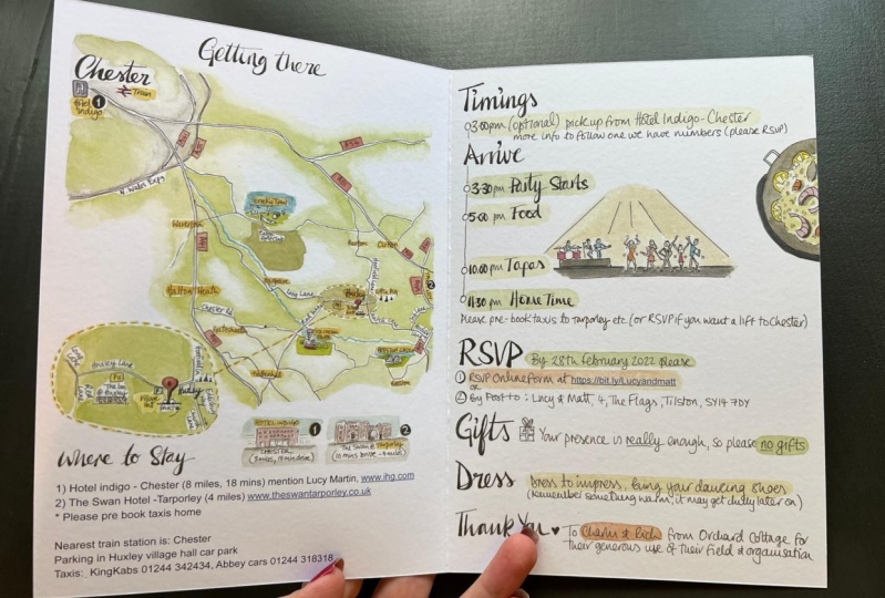
11. Creating a New Document: I hope you're ready to create our very first new document in in design where you need for dead. Is that openness NCC 2018 downloaded and installed on your computer? I've already done that, obviously, and I've already started the application as well. That's why it looks like this. If you have a previous version of in design, that should be fine too, and you should be able to cover or full of most of things that we will cover in this class . Now let's move up to file new and select document here. Or you can do the same if you hit command in on your keyboard and this will bring up this new document window here, you can see Ah, we're on recent and you can see my recent file sizes, which maybe you can see a pattern there. Um, any way you can also select from a number of presets within print WEP or even mobile. But as we will work in print or four prints, we will select print and here we've got a few different kind off documents sizes which we can choose from. We've also got a few templates down here which we actually won't use. But let's click on you all presets so we can see all the standard page sizes which we can select from. So if you wanted to have a document in the size off a five, for example, you can just click on here and you can see that your measurements here will change. But you don't have to stick to those standard sizes. You can also create any document size you like. So say you wanna have a square odd work, for example, which is 300 by 300 millimeters. You can come here to do with click on the number, type in 300 hit the tab key on your keyboard to move to the next field and then you can do the same type in 300. Hit the tacky again, and now you would have a document with with the size of 300 per 300 millimeters. You can also change those miss measurements by clicking on those arrows up and down, and it always will in or decrease it by one millimeter. We're not gonna do that, actually, because we are gonna work with the size of a four and selected preset up here. So let's start by giving our document and name Here you can click on the title, which is currently untitled aid, and you can type in anything you like and alcohol it skill share. Underscore article, underscore one because I like to give my documents names full of by a numbers. And that way I can always save new versions and know which one was the 1st 1 in which one is the most recent one. So that way you can always clean up your files, delete pages you don't need any more, but still be able to access everything that you've done before in a different version of your document. Anyway, you might be wanting with this little I can stands for. And as we've seen before in the interface, as soon as you're not sure what something means, you can just move your mouse over it. And in this case you will get this little yellow tag which tells you that you can save document presets with this. We won't do that now because we will create this as a kind of one off. So we will just confirm our page size, which is standard a 4 210 millimeters by 297 millimeters and our units are set to millimeters, and that's actually fine. But just in case you want to change that, you can click here on this era, and this will bring up a list of increments you can choose from. But we will stick to millimeters soldiers, click on the arrogant and it will close underneath. We have the orientation, which is currently set to portrayed. If I wanted to change that to landscape, I can just click on this. I can, and you can see that my my measurements have switched places basically, and I could just flip my page back up to portrait like this. Here we can put in a number of pages you want to start out with when creating your documents. And just be aware that you don't have to put in the number of pages you want to end up with because you can add pages. You can delete them, and therefore, I personally like to start with less pages than my documents should have in yen, because I will add them throughout process anyway. But you can do however you prefer to do it, I'll just click in there and I type in four because I want to start with four pages and I want to make sure that I have my facing pages selected because facing pages allows you to see the left and the right page off your magazine or your brochure next to each other in your document window. If I was to uncheck this box, I would have a document with single pages. But if I have my facing pages selected, I can actually see the pages which will then, once it's printed, sit next to each other as well. And then here I can decide which number I want to start my page numbering with, which is said to one that's totally fine underneath, I have my columns and the column gutter, which is currently set toe one and 4.233 A standard you might be wondering about some of the numbers, and, um, we'll go into more detail later on. But just so you know, sometimes those come from ah, different increments. So this is actually the equivalent off 12 point, which is relevant to Standard Grid. Although this might seem like an odd number. There is some rational behind it. And if you think you don't actually want any columns and you want to change that to zero and you hit your tap key, you'll see it will actually change back to one, because one is your minimum amount of columns. Basically, you have to have one column. If you wanna have more than this, you can choose it in here or you can choose it in a couple of different places later on. You can also decide about it now and change your mind later on. But we will just leave it as it is for now. And we will create our columns and our guides in the next step. So further down, we have two additional sections here which we can review by clicking on this arrow and first off our our margins. Those are set to 12.7 millimeters as a standard. This is kind of a similar thing, then with the gutter here, and they're all the same because they're linked with this chain link here. We will leave those as they are for now as well, and we will amend them together with our columns in next step just to remind you the margins are kind off guides which apart off the grid that we will create, which helps us to lay out our elements on the page. But they can also function as kind of safety margins because you want to make sure that nothing will be cut off, that your position close to the edge. So minimum margin would be four millimeters for anything that will be printed and cut afterwards. But most of the time your margins will be actually bigger than four millimeters. So don't worry about that underneath, we also have bleed and slog. Um, we've talked about slot, we won't need that and we will definitely need bleed. So we will set this to three militant meters. Therefore, I select the number zero here at the top bleed and that put in number three. And then I hit the tab key on my keyboard, and they will all be the same as I mentioned earlier. If I was to unlock this link here, I could change them individually as well like this. But that's not actually necessary in my case, because I wanna have three millimeter off bleed all around my page, so that's perfect. I can close those tool here and then I can see Yes, that's everything I want. I'll just click on create. And now I have my new documents. We've already given a name before, but we actually haven't saved it yet. And let's do that as a first step, Let's move up to file and save. Or you can also hit. Command s on your keyboard. And, um, no, I'm actually already in the folder where I want to save it to. I've already given it the Coric name, so that's fine. All I have to do is click on safe, and as you can see now, I've got this little addition here and now It's actually safe, doesn't in design file, and that's what I want. It
12. Creating a Grid and Working with Guides: So before we start creating our guys, let's move to the pages panel at the ride and open it. Here. You can see the four pages that re created with this new document, and every time you create a new document, you will have a single page on top. That is basically because if you imagine that you print on a piece of paper which has a landscape format, and then you fold it into when you will end up with is ah, portrait format and you will have a front cover and the back cover, which are basically single pages or they appear a single pages, and then when you open it up, you will have two facing pages, which would be number two and three in this case. So in our case, we know that we wanna lay out six pages which are facing each other, which make up three double spreads. And we know that this will at someone re part of a bigger document. But for now, we don't need single pages, so we will delete them, and you can delete a page by grabbing it in the panel and then dragging it down to your trash can and let go off it. Now I've got it deleted. But what happened, as you can see, is that my second page moved up and took the place off the first page and was still have a single patient top. So even if it was to delete this one, the same would happen again. Therefore, let's hit command set a couple of times to bring back our two pages that were deleted. In order to avoid that, we can go to the Penhall options here and make sure that allow document pages to shuffle is de selected. What that does is basically it preserves the entity off this spread here. So even if I delete the first page, I will have a double spread, and I can actually delete third page as well. And I'll close the page panel. Where you can see here is that we have a couple off guides. We have to bleed guides and the margin guides that we created when setting up this document . What we're going to do now is we're actually gonna change the margins and we're gonna at columns and rows to our grid, and therefore we move up to layout and click on margins and columns. Here we conceded two fold measurements that we agreed to when setting up this document, and we're going on change those, and I don't want to go into too much detail about why those numbers are as they are. But just let me tell you, it's quite a complex thing to grade a grid where you fit in all your different types sizes , you images, all the element on your page. And if you want to do that, you have to start with something. So in this class we're just gonna create some kind of grid that we think we can start working with and in a different class, we can go into much more detail with that. So when you start out of project, you'd never know exactly what kind of grade you need. You might have an idea, and then, while laying out things on your page, you realize how you need to adapt it. So for now, I only know I think I want to make use off the space on my pages, and I don't want margins that are too big. So let's use around number and just set them to 10 millimeters a type in 10 and hit the tab key on my keyboard. And because, um, the link here is locked, it means that I have automatically clear this same margins on all my sides. So I have 10 millimeters at top bottom, inside and outside off every page in my document. Then we can move on to the columns, and in this case, I think it's useful to work with a large number of columns in the beginning because it shows me more options, basically more places where can position things. And I personally like numbers, which I can divide by two end by three. Therefore, I have a lot of flexibility, and I can have different numbers off text columns on my page and I'll show you once we created this grid. What exactly I mean by that. So let's start with 12 columns and hit the tap here in our keyboard. And, as you can see, because I've got this preview box checked here, I can already see my columns on the pages and we will stick to the default gutter here and we'll just click on OK, and then we have our columns created as a next step, riel create our rose, and therefore again we move up to lay out and create guides. And as you can see here, we have the option to create rows and columns as well. Now you might be wondering, why are there two places where I can do that? And there might be a couple of reasons for that. One is that you might want to have a different kind of columns and different colored guides for different things, and also all the guides that I create in this panel. They will be treated the same as the guys that I created with my rules, and we've seen that briefly before. So if you click on your ruler and you drag out a guide, you can let go of it and it will be somewhere on your page, and you can hire those guys. But you can also lock and unlock them, and this will happen at the same time, with all the rows and columns that be creating this panel, unlike the columns that we created before and separating them can be useful somewhere along the way. Now let's just create a few rows in here and again. I think it should be a large number that I can divide by two so I can have to equal size images on my page. That's my requirement. And then I also want to make sure that the gutter is the same as in the columns. And as he's conceived here, we have a different default. And as I mentioned before, the default number for your gutter when you create a page is 4.233 millimeters, which is actually 12 point. And the nice thing about in design is that even if you decide to work with one measurement in this case it's MILLIMETERS. You can type in different measurement as long as in design recognizes it, and it translate the number in the measurement you working with. So in our case, we can type in 12 PT four point and hit the tab key and automatically we have the gutter off 4.233 millimeters. So that's very nice. We don't create any columns in here, and we just want to make sure that we fit our guides to the margins and not the page. If you were gonna fit it to the page. That's how it would look. But we wanna have all our rose within our margins here. So I think, on margins and on. Okay. And now I created my columns and my role guides. As you can see, I can select my rose here and the turn blue, and that means I've got them selected. I can move them around so I can add vertically or inadvertently move them, and that can be a bit annoying. So I just hit command set, and therefore you can actually look your guides on your page, and you can do that by hitting option command and the semi cologne on your keyboard. And as you can see, they just turned turquoise again, and that means there looked and I don't have them selected anymore, and I cannot even select them. You can do the same up here in view grids and guides and lock or unlock your guides, and you can also unlock your columns, which are locked as a default bed. You probably won't need to do that, just so you know it's there and it's possible. Now we're happy with our grid and I'll just hit. Come on s to save my file. And as you can see, the little Asterix here has disappeared. And that means my current status off the document has been saved. What I'm about to do now, you don't have to follow. I'm just quickly gonna grab the rectangle tool and draw a few colorful boxes to visualize how versatile our great is. So if you imagine those or text columns you can see we could have two up on a page or three or even more if you wanted to. With our grid off course, you can also combine them with each other in combined with other elements like imagery. So if you imagine that the pink boxes are images again, you can see we can have two of the same size horizontally, or we can mix them with vertical and smaller horizontal images. And that is really just a starting point. So there is a lot more options for you to explore, and you can always go and break the grid as well. So I'm just going to get rid off those colorful boxes and additional pages and I'll meet you where we left off before
13. Working with Shapes: Now, before we start working on our layout, I want to show you a couple more things, and one of them is the basics of working with shapes that's very important and in design, and it's connected to a lot of things that you will be doing. So let's move to the tool panel at the left and have a look at our shapes here. We've already seen them and currently the Ellipse toys on top. But if I click on it for a while, I get to see my other shapes here, and I can select directing Old Tool. Let's move to the page, click anywhere on a page, and if you drag out your miles now, you can draw a rectangle of any size you like, as you can see down at right bottom corner. You have this great box, which tells you the exact measurements off the shape you're currently drawing. And as you may have noticed, once in a while, a little additional guide pops up, and that is basically every time we're at the exact center off, one off the columns that we've drawn. So this is an additional guided. You may or may not want to use anyway if you want to, strict angle to be the shape off the square. Actually, you can hold down the shift key on your keyboard, and when you move your mouse, it will always stay a square. As soon as you let go of it, it will turn into rectangle again and again if you hold return to being a square. Now, if you're happy with the size of your square, you can let go off your mouse first and then off your shift key, and then you have drawn your square. Now let's it W no keyboards to switch to preview mode to see it better. Now we have drawn this square, which is currently empty so it doesn't have any styling or any properties. And if he wanted Teoh, give it a color. We can come down here to the field color field, double click on it, and you get this color picker where you can select a color from and you can. If you found your color, you can just click on OK, and now we have colored it in and let's switch to the selection tool by hitting beyond our keyboards and clicking anywhere on a page just to de select. Now imagine you want toe. Draw a circle and you already know which color should have in advance. You could also put that in here before, so you double click on your field field and he's like the color, maybe a pride bright pink and click on OK, and then you select your lips tool from the tool panel moved to Rhea Page. Click on your page and the same place here. You can create any kind of Lipsey like, and if you hold down the shift key, it will become an actual circle. So again, if you're happy with the size to let go of your mouth first and then the shift key and your shape will already have the color that you just selected. Of course, you don't have to stick to this color. You can also change it afterwards, and you can find the same controls up here in the control panel so you can double click on the fill here and just change. It may be to a darker blue click on OK, and you can also create a stroke here, so you double click on the stroke color and you just select the color you want for your stroke. Click on. OK, that's very thin. You can see we only have a stroke with one point. And if you want to increase that, you can just select a color type in a different number, hit the tab key on your keyboard, or use your up and down arrows here and at some stroke. So just scroll up a bit and, um, se you happy with that? And you wanna draw a new square, you can switch to the rectangle tool by hitting em on your keyboard. Now we've switched tools, I'm gonna move to the other side, and I'm going to show you how to draw another option off how to draw an object. So instead of dragging out in your mouth, you can just click on your page and you will get this panel here, and you can actually type in the size you want your object to be. So you talked in 60. Hit the tab key type in 60 again. Hit the tacky again until okay is highlighted in blue. And then all you have to do is hit. Enter on your keyboard and in his own will create this shape for you. And no, this shape has the color that I had previously selected before drawing this circle, and that is very important to keep in mind as soon as you select some properties here like color stroke, and the same applies for effects that you might want to add later on. A soon as you said like those without having an object selected, they will be applied to every new object that you draw. So if you don't wanna have this color when you drawn object, what you have to do is you have to get rid of it, but not when you have an object selected. But you use the selection tool by hitting junior keyboard, for example, de select. Make sure no object is selected, and then you can get rid of the color by clicking on this arrow, for example, and selecting not in here. So now I don't have any properties, any stylings selected, and if I now create a new shape, for example, in new lips, which I can do by hitting L on my keyboard, I'm switching to the lips tool and I can draw out in the lips like this. Then again, it's invisible for now because it doesn't have any properties. And then I can come up here and color it in like this. Onda. Of course, a Z can change the colors of your objects afterwards. You can also change shape off your shapes afterwards. So let's, um, use the selection tool here. And so, like the first square that we've drawn. And if he wanted to change the shape of the square, we could use those little boxes here, but just clicking on one of them and dragging it out. You change the side you're currently on, so you always change one side of your object. If you grab one on the boxes on the on the corner, you actually change two sides at the same time. And here applies the same when drawing and object. If I would hold down my shift key now, I would again keep it a square. And if I let go off the shift key, I can turn it into a rectangle by moving around this point accordingly. No, I just increased it a bit, and we can, of course, also at just our measurements up here in the control panels or here we have the exact with and hide off our object. They're currently unlocked. ID we constrain the proportions. If I were to unlock this here, I can change them individually and I can give it with 30 and height of 60 for example. Just type them in and hit Tab Key on my keyboard. And, um, you can do a similar thing here, but only with percentages. So those are still locked. That means that whatever I change here will be applied to this proportion. And if I want this to be just the double in size, I can just change my value to 200. Hit the tab key on my keyboard, and it will be double off what it was before. Off course. You can also rotate and flip your objects. Here. You can add effects and stuff like that, but this is the most important things you need to know. For now, let's also have a look at the third shape we confined in our two panel here. And this is the polygon tool. So if I select a polygon tool, I can do a similar thing, as I did with the others. I can just click on my page and drag it out and draw a random polygon shape, which has currently 10 sides. Or let's just hit escape to not draw this shape and do it the other way. So just click on the page and again, I want to get this panel where I can type in the width and height off my shape and the number of science I wanted to have. So, no, I say, I wanna have eight sides hit the tab key on my keyboard, and actually, I can also make it a star. So it's not just a polygon, but it can also be a star. If I just set the start in set, for example, to 30% hit the tab key and the enter key on my keyboard. And now I can draw a star, hit the whole tone shift key again to make it even on all sides, and now it just created this nice star, which I can see because I haven't colored it in yet. So I'll just give it any color and you can see the star. So those are the basics when working with shapes and in design. Of course, there is much more, but we will find out about that as we go along.
14. Aligning and Arranging Objects: next, I'm going to explain to you how toe a line in the range objects on your page. And never we can actually use what we've just learned about creating shapes. But before that, let's bring the alignment tools into a workspace, and we can do that by going up to window object and layout and clicking on a line. Now, I can grab this panel here and drag it over to the ride and let go of it as soon as the blue area appears and it will sit in line with my other panels. Now I'll open it by clicking on it, and I'm actually going to create a square on my page any size, and I'm gonna color it in so you can see it now. This is Thea object that we want a line, but we need to make sure we know what we're lining it to. And as you can see, I have some alignment tools up here in the control panel is well because I have this object selected, but we're actually gonna work with this panel here because we can see a few more options. So if I want to align my square here I go to align to, and currently I have a line to selection checked. And if I only have one object that is selected, I can click on any of the Aikins, but they won't actually do anything because my selection is purely the object itself. Kind of makes sense. So if you go here and you select a line to page, for example, that's a different thing. If I want to align my objects to my page now, which I have selected, I can align it to my left edge. I can align it to the horse onto center to the right edge, any edge and center basically. So I just click on a line horizontal centers and align vertical centers, and I have my object line to the very center off my page. If I would select a line to margin, I would have the same outcome in this case because I have the same margins on all off the sides of my page at the moment. Ah, but I can also align my object to to spread and I can horse until early. Align it and it's at the center off my entire spread. Now let's create another square, actually, which is bigger, and I'm going to color it in in a different colors that we can see it as well. This okay, now let's like both off the squares. And now we have a selection, which we can align something, too. So if I select a line to selection now and I click on a line horizontal centers, what happens is that my objects kind of meat in the middle. So the selection here is what they are taking into account when they are being aligned. So let's also aligned vertically like this. Now you can see that the biggest square is on top off the smaller square, so it's hiding it. And if you hit W on your keyboard and decent like you can see it even better, I can only see one square. Now. Also, I know there's another one behind it. If we have a quick look in the layer panel here, you can see we have only one layer. But even within this layer, I have the option off placing my objects in different places, basically so it can be further in the front or further in the back. And let's just select this big square here and go to object and the range. And here you can see a few options off moving around your object so you can send it back word, which means it will actually send it one step back. Or you can send to back, which means it will send it all the way to the back. In our case, that wouldn't make much of a difference because we only have two objects on our page, and we have bring to front and bring forward as well, which are not available at the moment, because our selected object is already at the very front off the page and the one layer that we have. It's very useful to remember those shortcuts here because they allow you to very quickly move around your objects on your page. And, if you remember, sent to back and bring to front, you don't always have to remember where exactly one object is in relation to another one. You can just quickly send it all of the way to the back or bring it to the front and work with it. If you want to bring something to the back, you hold down the shift command and left square bracket key on your keyboard. If you want to bring it to the front, you replace the left square bracket with their rights. Grab Reckit. Now I just close my menu, and that's exactly what I'm going to dio I will send my square to the back. This is how it looks now. So, um, let's just separate those two elements and so intellect both of them again. And I'll show you something else. If we come here to align to, you can see you can also align to key Object. Let's select that. And what happened is that automatically in design decides that this square is Mikey object , and I can see it because I have to stick or blue line around it. So if I now horizontally aligned, vertically aligned, my object, my square from the left will move over to deride and be aligned to the smaller square, which is my key. Now let's try that again, but slightly different if I select both off them and I now click on one of the objects just once, it will automatically recognize that I wanna have this object as my key object and I want to align my objects to key object. And I can align horizontal centers and align vertical centers. And now they will be aligned to the objected I have selected as a key object. Of course, you can also do that with three objects or more. So I draw another square. I give it a different color. And I said, like all three of them. Now I want to align to the new square. I click on this one and I want to align my edges so I align right edges and I align bottom edges. So this is what happens. And this is a perfect example for arranging objects as well. So, of course, if I have three objects here, I want all three of them visible. And if I want to send this one back, I just hit command and deride square bracket on my keyboard, and it will be sent back one step. Now let's delete are to bigger squares and move this one over to the first page, make it a bit smaller and actually will copy this square now. So you just click on it, hold down your option and shift key on your keyboard, and you can drag it over, and it will copy your element within the horizontal or vertical line that it lies on so I can just drag it over and I'll do the same again. And I can make an exact copy off my object without changing your original one. Now I have three squares and I want to distribute them. Therefore, I have to select them first, and I can distribute my objects here, even Leem. And again, I have to make sure I know what I'm aligning them, too. So I go to a line to page, for example in and I click on distribute horizontal centers and as you can see, it takes my whole page into account and it will distribute my squares, even leave. In this case, it would actually make sense to align them to margins, for example. So if I said like this and click on distribute horizontal centers again, it will take my margins into account, which we can see if we hit W no keyboards. I could not Onley distribute objects even lame, horizontally and vertically. I can also distribute them with the specifics, basing in mind So if we come down here and we make sure you spacing is checked, then we can type in any spacing that we wanna have in between our objects. Let's stick with the five millimeters in this case and click on distribute horizontal space . What you can see. What happened now is that I have been distributed with five millimeters in between, each off the elements off course. If I hit, Command said, I can do a similar thing, as I did before, with the Align to Key object over. Just click on my center, object here and then use distribute horizontal space. It will actually align it to the central object instead off the left one. And you might be wondering, Why do I have use spacing twice here? What's the difference between distribute objects and distributes, basing its actually already in the names? Or here. If I used this one, it will always take into account the center off my object. And if I use the spacing of five millimeters, um, and click on distribute horizontal centers, they will actually be kind of stacked because it only takes center off the object into account. And if I want to have a similar outcome. Then with distributes basing, I would have to use a much higher number here and align them again. Maybe that's too much, but you understand what I mean. So, um, in this case, we're actually talking about the space in between the objects. So I guess you get the idea and you can play around with this. And this will be useful along the way when we work with text boxes, images in other shapes.
15. Working with Type 1: Creating Text Frames, Importing Text, Formatting Text, Pagination : So now we're ready to start working with type, and I've already deleted all the other objects from a page, and we're going to explore a few different ways of using the type tool in creating text frames through the course of that. We're also going to start laying out the text for our article, which you can find in your project folder. And I'm quickly going to switch to text edit by hitting command and Tab key on my keyboard . And here you can see the sample text that I supplied for you, and you can actually use this or use any other text if you like. And I'm going to switch back to, um in design here, and I'm going to select the type tool. So first we're going to draw a text box on our page by clicking somewhere on our page in dragging out the mouse justice we did when we were drawing a rectangle. And as soon as we let go, we've drawn the tax books, and here you can see this blinking cursor, and this means you can actually type in text here. Of course, there's a few other ways off, bringing in text into the document, which we'll look at also. But of course, you can also just type and that's what I'm going to do now. I'm gonna make this my headline here, so I'm gonna type in. This is my headline. And if I want to change the front off this text, I have to select the text first. I can do that either by clicking and then dragging my mouse over to text. Or I can achieve the same by hitting command A on my keyboard, which is basically select all. And in this case, it will select all the text within my textbooks. Now that I've got the text selected, I can move up to the control panel and change my front here. But clicking on the current fund and typing in the front I'm looking for and I want Helvetica Neue regular, actually, and I'm going to select it from here. So now I've changed my fund. And just so you know, we're gonna use to typefaces in this class which is Helvetica, Neue and times Helvetica Neue you should have If you're working on a Mac in times you should have to. If you don't have times you can also use times New Roman if you want something very similar or instead of Helvetica Neue, you can use Helvetica or if you're on a PC, you will probably have aerial. So we've changed the fun now and now we want to increase the size off our text. We can do that up here. A swell is currently 12 points, as you can see and and I'm going to double click on here and I'm gonna make this 60 actually type in 60 hit the tab key on my keyboard and the field underneath the font size here is the so called letting and letting basically describes the distance off the text lines, and it's always measured from this baseline where my text sits and it's usually set to auto , which we can see if we click on this arrow here. It's currently auto. You can also see that because your number sits in brackets here and now we want to change that because if we create headlines most of the time, the auto setting is a bit too open and we want to close in the text a little, so I'm just gonna double click on here and make that 60 as well. And I hit the tab key on my keyboard again. Ah, but something to keep in mind is that as soon as to change your leading to anything else than auto, this will always stay. And even if I had changed my type size here, which ah, I might want to set to 80 maybe and hit the tab key, my letting will stay the same. And this is a bit narrow. No. So if you change your letting once, you always have to change it accordingly. To your type size. I'm gonna put that back to 16. Yes, that's much better. What I want to do now, actually, is I wanna extend my text frame here. I want this to take over the whole page, so I'm gonna switch to the selection tool, and I'm gonna grab my handle here. We've seen this before. If we grab the handle often object in this case, a text room. We can adjust it like this. Usually your text stays the same. You're just adjusting the size off your text frame here. If you want this text to change accordingly to your text frame, you can hold down command on your keyboard while you drag out your handle off your textbooks. And then your text will change accordingly, so you can distorted. Basically, you probably won't need that. But just so you know, you can do that. And I'm gonna hit command set to bring it back how it was before, and I'm gonna extend my text frame like this. Um, actually, you can see that I got my headline on one line again. And actually a liked Howard was before, and I wanna break it into two lines and you can click in here and hit Enter on your keyboard. And where you can see is that I've got now a line break here. And currently I've got a thing activated, which is called Show Hidden Characters, which you can find down here. And what we've just done is create Ah, hard line break. I'm gonna show you throughout this class what that exactly means and why, in some cases it's better to use soft line break. And this is a case where we re would use a soft line break. And you can create that by hitting shift on your keyboard and enter and you can see that this is a different character now that we put in there. So every time you have a piece of text which belongs to one paragraph in this case, my headline belongs together. Even though it's two lines, then you want to use your soft line break instead off a hardline break, and we are actually going to get rich off this empty space here. Now, I'm happy with the two lines, but I want this to be center aligned to my textbooks. And I can do that up here so you can see currently we have it left airline. And I want this to be center line to text box just like this. Exactly. I'm happy with this text box, and I'm actually gonna hide my hidden characters again. So I don't have too many distracting elements on my page. And I'm ready to create a new text frame, actually, and therefore we are going to use a different method. We're gonna use direct angle tool, so let's like, direct angle, tool and draw a small rectangle at the top of our page here. And if you now switch to the type tool, move your mouse over the rectangle and click on it. You can actually convert it into a textbooks. So again you are free to type in your text If you want, Teoh and I'm gonna make this my running header, which will then appear in the top of every page. Therefore, I call it the Running header. So now again, I'm going to select this and change the typeface here to Helvetica Neue regular. And I'm going to decrease the size to nine point. And I'm not gonna worry about the leading because this will only be just one line. Anyway, I'm gonna set this to center line again within my textbooks, And I also want to align my text box to the page. So I'm going to switch to the selection tool, make sure my text boxes selected, and now I can align to page and click on a line Horizontal centers what we've just done before. So I've got this aligned to my pages Well, and I'm actually gonna assume in so we can see this better. What I actually want to do is I want this to be all capital letters, and there's a few ways of achieving that. So if I just double click on here and select Oma text again, I can come over to the character panel here and go to Penhall Options and select all caps. This will turn this text in tow all capital letters, and I'd suggest that you always type in the text correctly, or even if you're imported from text at it application or something like that, it should be correctly. And then afterwards you could make cosmetic changes to like this one. So I'll just delete this to show you what I mean. If I type in the same text in capital letters and then I selected here, I cannot actually change it. So even if I d select all caps here and selected again, nothing changes because the way a typed it was already by using capital letters. Don't worry. If you have done that, there's something you can do about that as well. You can come up to type change case and then select different case. The currently we're using upper case. But we could also set this to title case so you can always change it here. And there's a few other options you can choose from a swell, but I still recommend always typing or bringing in the text as correctly as possible and then select all caps here or another way of achieving the same effect than all caps here is by selecting your texts and hitting shift command and K on your keyboard, this will turn it in all capital letters like here. Now, I think I'm happy with this and I want to add some tracking here, which means I want to add some space in between all the letters off my text. And I can do that up here, which is currently set to zero. And I'm gonna make this 80 I think. And I'm going to hit the tap came. That's what I want to. That is fine. Just to make sure you don't confuse this with turning, I'm going to explain to you the difference. So tracking describes the space in between every letter off your text, whereas Kern ing, which is happening up here Onley describes the space in between two specific letters and I'm going to show you what I mean. I'm just gonna close this and I'm gonna fit my spread into the window and I'm gonna copy this headline here, and I'm gonna type in one off the words which can be a bit tricky. So here, you can see, um, if you hit W on your keyboard, Helvetica is actually a very well current fund, and there's more modern funds which don't have such great kern ing. But even with the best funds, sometimes you can't avoid to have letter combinations which are critical. And in this case, you can see it looks a bit as if the P wouldn't belong to the rest of the word. And the same happens here with the E. It's a bit further part from the K. Then it should be for your ID. Of course, the more you work with text or more, this will become obvious to you. And that's something we can use current ing four. So if you assume in here like this and then you click in between those two critical letters , you can come up here and just the tracking, which is currently set to auto a swell, and you can change it to one of those numbers here, or you can type it in like this, and I'll set it to minus 10 just to see what happens. So you can see on Lee the distance between those two letters will be affected and I can do the same between the P and A. And actually there's another way off achieving the same. You can just hold down the option key on your keyboard and use your left and right arrows to change the turning and you can see it will in or decrease it by 20 to show you the difference. If I select everything, you can see the turning disappeared. Speak that because that can always just affect a pair off letters. And I can set this tracking to a different number again. Will use 80 to make it very obvious and hit the tab key. And now all my letters will move further apart. Off course. I can do the same here if I have a whole word or a whole section of text selected, and I hold down the option key and use my left and right arrows. We're actually sorry I'm in this field Appears I have to make sure I've only got my word selected and I hold down my option key and used the left or right arrows. So I will change this while you here. And if I do the same in between two letters, I will curren them and I will change this value here. So this was just to show you how it works. I'll fit my spread into the window again, and I'll get rid off this text from here. So far, we've seen a couple of ways to create text frames. And actually, there is a couple of more we're going to look at. And also we are going to create columns off text which are connected, and we're gonna work with placeholder text. So therefore, let's start with hitting W no keyboard so we can see our guides and move over to the tool panel and select a rectangle frame told So now let's draw a box on our page and this will be our next text frame currently is just a placeholder books, and if you selected type tour and you click on your rectangle here again, you converted into a text frame, and now, instead of writing something in our text room, we will use placeholder text, and you can use this so called Lauren Ipsum or a placeholder text. If you want to lay out something and you don't have your final copy it, you can find examples of this on the Internet, but you can also use it within in design and be aware if you wanna fill your textbooks we just created with placeholder text. It will use those type settings up here to do that. So if you already know that you wanna have different type settings than you can change that before you fill it with text. And we know we want to use Helvetica and can actually Helvetica Neue regular. And then we're going to change the size, too. Maybe I want my body copy to be quite a bit smaller, and I want this to be eight points. So I hit the tab key, and now we can go to type and select fill with placeholder text. Now you can see this fills my text box up to the brim with text, and if you wanna maybe change your type size now, you can just click on your text and hit command a selected all and come back up here and maybe change it to nine point. That might be a bit better and hit the tab key. And now you can see. Actually, my text doesn't fit in my textbooks anymore because it needs more space and you can extend your textbooks here. But you can see it's still too much. And you can see this because there is this red plus sign here. So I had command set, and what I can do is I can click on this sign here, and you concede changes now. And I get this loaded cursor and I can draw another text column basically. And now those two are connected, and you can see it through this blue line here. In case you don't see it, you can come up to view extra and make sure show text threats here is selected. You can also influence how the text runs within your text frames, not just by changing your text frame, but also by inserting a break character here. So if I click into my text here and I come to type, insert break character, then you can decide to insert a column or a frame break, which in this case would actually have the same effect, or even a page break. So If I say I insert this column break here after this, my text will run into the next column. Let's see what it does. If I inserted here, the rest of the text will move into this next column, which is also the next frame that's returning to how it waas and it could move this around and it would still be connected. And of course, you can also create another connection. Also, this isn't filled up to the brim with text. You can still click on the same sign here and then creating another textbooks. Some rails. So now those two are connected. And if I just click in here and fill it with placeholder text again, you'll see it will take both off the text boxes into account, and it will actually feel it up until the very end of the last text box here. And of course, you can change your shape, and you can also just create a textbooks like this, which is empty, and then connect both of them. So you go to your last text books that you want to connect it to. You click on the same sign here, and then you get a different symbol. You get those two links and if you now click on the new textbooks, which is still empty, this will be the next textbooks to follow. And I can just show you if I make this smaller, the text will run into our new textbooks here. So this is very random layout, and I'm just gonna delete those. Now, let's find another way of creating text which runs over more than one column and therefore let's just used type toe and draw one big textbooks across the whole width of our page like this. Now I'm gonna change phoned here again to Helvetica Neue regular, and I'm gonna make it nine point hit the tab key. And I'm gonna fill it up with place all the texts like this. So, of course I don't want this small text run over the whole width of my text. I wanna have more columns, and instead of just creating individual text frames, I will use this one text rhyme and I will add columns to this and you can do that up here by deciding on a different number of columns were just currently set to one, and you can just have two or 34 or even more if you like. And you can see it fits in nicely with the grit that we created. And actually, we have the same gutter here as the one that we used when we created our columns. You could change it here, but there's no need to and we will just play around and maybe we wanna have two or three columns. So whatever you like, actually, I'm gonna delete this again a swell, because there's another way off creating a tax box if you want to bring in text from another document and you remember detects document that I briefly showed you before and this is text document that I want to import onto my page here, and I can do that by going to file and place or just hitting. Come on, deal my keyboard and then you need to find your text document and Afghan. It's safe here. It's called Text Italy. I'm just going to click on open, and now I've got this loaded cursor without having drawn any text boxes before. Just by importing this text document, and I can now draw textbooks with this text in mind. This, of course, is a way off importing text into your document, and you can just create a text books for every single part off your text and then have them all connected. But in actual fact, that's sometimes not that useful, so I mainly copy text into my text boxes.
16. Working with Type 2: Formatting Text, Indents, etc.: And if you want to copy text into your in design document, you can switch to another application by a hitting command and the tab key on your keyboard . Like your text that it s we've seen before. And I'm just gonna select those credits here, and I'm gonna hit command, see, to copy them that I'm going to click back into my in design file, used to type tool to create the text frame and then hid Command V to paste the men. Now, of course, I can select them and restyle them. I'll make this into Helvetica Neue regular as well, and I've seen before. That nine point looks like a good type size for my body copy, so I'll make it 99 point and I'll actually assume in because I want to show you something. Therefore, let's bring back our hidden characters, and now we can see all our hidden characters actually concede that there is an empty space , which I'm going to get rid off because it's good to make sure that there are no unnecessary and spaces somewhere in your document, and you can see that we have a hard line break after every line here, not the last wrong. This is where everything ends and what I want to do now is I want to separate those two lines from those other two lines. So if I bring in another line, this is too big off a distance for me. And of course, I could just select this and just letting up here. But there's actually a better way of doing this. So let's select the text and head up to the control panel here. And you. We've got the option to introduce space before and after a paragraph. And as every hard line break treats everything before it has a paragraph, we have four paragraphs here, basically, and, um, I want to introduce some space here, and if I have to think about how much that could be, I have a look at my leading first, so I know that this was too much. So I'll try maybe with half of it, and this would be 5.4 point. So we know that we can type that in here a swell instead, off millimeters, So type in 5.4 PT and hit the tab key, and you can see that I have a distance after every line, which is the distance I just put in here and which in his on automatically converted two millimeters. Now I want those two lines too. Have less distance or just delete the hard line break and I enter a soft line break which I can do by hitting shift and enter on my keyboard. Now you can see those are the two different line breaks that we've seen before when creating our headline and I'll do the same down here. So now I have got one paragraph here which is separated by this number. But this distance up here from the second paragraph and those in between are just soft line breaks which keeps the paragraph together. So this is actually how I wanted it. And I'm gonna fit my spread back into the window. And I want a copy. More tax toy switch back to my text at it. I'll copy this bit here, and this is like my intro text to this fictional article that we are laying out. So just hit command. See, to copy this switch back to in his line, create another text frame, maybe a big one which takes up the whole with. And now I'm gonna change the typeface again to Helvetica nor regular. And I think I want this a bit bigger. So I'll try 18 point and I hit Enter on my keyboard and non back in my text from here and I hit Come on V to paste in my text So this is already pretty good, but maybe a bit too big. So I'll just selected again and make it a bit smaller 16. I think that's more like what I'm looking for. And now I want to change the alignment. So for the running header and the headline, we've chosen a center line text. Here we have left line text and for this one I wanna use justified. So I come up here select left, justify which basically justifies every line you don't need. The last one will be left lined like this, and I'm just going to reduce the size off my text frame. And now I'm realizing I started laying out text up. But I don't have any pagination yet. I don't have any page numbers on my pages, and those are actually quite important for our layout. So before we do anything else, let's create a page number and I'm drawing a box stone here and I'm changing my front again to Helvetica Neue. Let's try a different size, maybe 11 points and make this also center align. So it's in line with my running header and my headline, and now you probably think you don't want to go in every page and type in the number off the page, and you don't have to do that because we have special characters. For that, we can come up here to type insert special character, and it's actually a marker. It is called current page number, So if you use this one, it will always tell you what page number this is your currently on. And then we want this number to sit on our low margin here. And if we reduced text frame. Actually, it's kind of hard to place it exactly where we wanted to go. So let me assume in so we can see it better and show you a different way. If you select the text frame, you can come up here to object and text frame options, or even better, try to remember command be, which will bring up the same panel. And here you can see we have a lot of options. One of them is number of columns and the guttering between those columns which we've already created up here in the control panel first. And what we're gonna use now is the vertical justification. So as a default, your text is a lying to the top off your text frame. You can also set it to center or bottom, and we have to preview here selected and you can see that now my text sits on the very bottom off my text frame, and that's what I wanted. So I click on OK, just reduced the size of my text from here, and I make sure that this text frame sits at the center off my page so it's horizontally aligned off my page like this. Okay, now, I can also reduce the with little because even if I have two digits in here, I won't need the whole with off this box. And you know that if you grab a handle on one side of your text box and you drag it out, you can change the width. But in this case, it only changes one side, and I would have to realign my textbooks to my page, which you can do as well. But instead I'm gonna hit command set, and I'm gonna grab this handle and also hold down my option key on the keyboard when I dragged my text. Right now, I actually adjust both sides, so just maybe make it fit into this column here is bigger than we needed, but it looks very tidy and nice, and I'm gonna fit my page into the window again. And actually we're going to do ah, similar thing what we did down here, up here at the running headers. So let's zoom in here and select this text frame. But there's actually another thing that you can do, which is pretty cool. You can also fit your frame to the content appear By using this, I can and you click on it and you can see number. Text frame has trunk to the exact size off my text in here. In this case, it's fine for the bottom bit, but also my my running header might be a bit longer than those three words. So I do what I just sit down here and just grab this handle, hold down my option key on my keyboard and drag out the sides, and I make it fit into those center columns. Here I fit my spread into the window again, and now I'm realizing that I like how my page numbers sits down here on my margin, and also I want to make sure that I always have some distance above my page number. So therefore, what we're going to do now is we are going to adjust our grid here, and I'll just assume in a little. And I think when I wanna have is I want to have the same distance above my text frame here than I have with my margin. So the easiest way is probably by creating a rectangle and roughly measuring the size off our text here, and we can see the height is approximately three millimeters or just let go of this and deleted again. And now I know I have 10 millimeters margin down here. I have type, which is three millimeters high, so I want to add another 10 millimeters above, and I come up to layout, margin and columns and I adjust my bottom margin here, so I make sure that my margins are not locked. And I changed this to 23 millimeters. Hit the tab key until I arrive at okay and hit. Enter. So let's see how this looks. Now I can see I've adjusted my margins but my guides are actually still wrong. So I have to go back and click on create guides. I have to remove my existing ruler guys. So if you click on here, you can see that actually nothing happens. And that is because my guides are locked. So I just have to cancel this and unlock my guides first, which I have not done. So they're unlocked. Then I can come back to lay out, create guides, click on remove existing guides. You can see all my guys are gonna and I create another 16 rows. And I had as I had before, with a gutter off 12 points and I hit the tab key and click on OK, make sure everything is like I wanna have it and this is fine. So now I've created a brand new grid and I want to reposition this text frame here and I can do the same as I did before I hit command be to enter the text frame options, and I want to align my text to bottom here because I know I want this to sit exactly at the bottom line of my margins, and then I'm gonna move down my credits. Also, I can fit my frame to content here, which will actually bring this box back up. So I have to move it back down. And, um also, I want a position. My text here and it's always nice to work with the same kinds of measurements again. So I know I have 10 millimeters off margins all around my page. I have 10 millimeters in between my page number and my text here, so I wanna have 10 millimeters in between my credits and my text block here. And there's actually a number of ways to achieve this one way, which marked, might seem a bit like cheating. But I think it's actually a very good way is to create ah distance within this text box here so you can enter your text from options again with command B, and you can insert insets basing here. We make sure this is unlocked and at the bottom we entered 10 millimeters and we can see we've got this additional line here, which tells us where we have this buffer off. 10 millimeters. So I click on, OK, I can now fit my friend to content. And this way, I can't just move this down to my textbooks. And I am sure that I have 10 millimeter gap in here just like my margin all around my page . Now I hit w my keyboard to see this, and I think this is actually pretty cold, and I'm make sure that I always safe in between. So I hit. Come on s on my keyboard. As a next step, we're going to copy our running header and our page number here onto the right page. Therefore, let's bring back normal view and then select the running header by clicking on it. Then we're gonna move down to the page number, But before we click on it, we hold down the shift key on your keyboard, and this allows us to select more than one object at the same time. So now I can copy them, and I do the same thing that I did before with my squares. So I hold down, shift an option at the same time. And now I can drag over my items and make an exact copy. You get those additional guides here, which are our smart guides, and in this case, it indicates the except horizontal center of my page. So now I know that I'm in the right place. I can let go off my mouse and then my keys on the keyboard, and I've copied my elements exactly where they have to go. No, we're actually gonna copy this whole spread. So we're moving to the pages panel here, make sure both pages are selected. We click on them and drag them down to this, I can hear. And if I let go, I will have an exact copy off my first spread. Actually, we can delete the texts off off those pages, and we're gonna leave this second page and third page here empty because I already know that I want to place imagery there. Of course, if you start a project from scratch, you might need more time to try out different layouts and things. And I have already tried this out without you watching. So I know what I want to create and therefore will just do that. And, of course, you're free to try out different stuff and do it your way. Now, let's bring in more copy. And we switched to text at it again. I've already got this selected here, and I had command see to copy it and move back to in design here. I use my type tool again to create another text frame, and I want this to take up half off my page again. I'm gonna change the front here. You already know which one is gonna be. I'm gonna make this nine point hit injured on my keyboard, click into my text room and had come on V to paste my text in there. Now, actually, I'm gonna assume in because I want to show you something. You can see that we have a grid here, and I tried to fit my text frame into the grid, but actually, it's not really clean. I kind of miss the actual guides, and it's hard to position it exactly where it has to go. But there's a tool for that. That can help you. And you can go to view grids and guides and select snapped two guides. And now, if I drag out my handle off the textbooks here, you can see it automatically snaps into the right place so it automatically snaps into my guides. So it's very useful to activate this. And you can also see up here we have those smart guys that just appeared before to tell us where the center of our pages, for example. Now, I want to make another adjustment to this text here. I want this to be left justified as well. So I select everything come up here to justify with last line aligned left. And, um also, I'm gonna hit W again on my keyboard to see how the text looks, and I think it might be a bit tired. So every time you work with text, especially if you have body copy like this, you might want to try out different spacing and maybe sometimes even tracking, depending on how larger text is, how much copy you have, how wide your text columns are, and in this case, I think we have to open it up a little. Maybe make it 11.5. Yes, this looks already better. But, um, you're free to try out different things, and I think best is still if you're one of make sure that it's very legible to try a few versions and then print them out and then look at them and compare them is an actual print out. And now I want to also introduce some space here at the beginning, off every first line of a paragraph to make sure it's more of us. Very new paragraph starts, and therefore I'll just copy my paragraphs that are concerned. I won't do this for the 1st 1 because it's not necessary here. And I can come up here and add left in Dende to my first line off the paragraph and I'm gonna work with the same number that I've used for my gutter. So I'm gonna make this 12 point and hit Enter. So we are done with this part of the text, I think, and I'm gonna assume out. Actually, I'm gonna fit my spread into the document window
17. Working with Type 3: Lists, Ragging, etc.: and we're gonna add some more text there for Let's bring back our guides and switch to text that it next up is ah, list, actually, or is to list here. But there they have a different format, and this just to show you how they behave differently. So off course, you cannot always influence the shape off the copy that you will receive. But it's very, very good to make sure that there are no unnecessary hidden characters are in there, and it's not messy, but it should be as plain as possible, Really, because that will make your work in in design a lot easier. It might even pay off to go through the copy in your text, edit and clean it up there for now. We'll just copy this first list here with command, see moved to our page and create another text for him here. Now, let me show you something else. If you want to use this text styling here for your new textbooks, you can go to the eyedropper tool here and you can click on the text where you want to copy the style from. So you click on here and you cannot see that my father and my size here has changed. So I switch back to the type tool, click into mud text frame and hit command V to paste in my text. So now I have the same stylus here. But still, it looks different because I have those weird characters here's here, which are actually taps. So, um, we just have to delete them because we want to make an actual list in in design. Now, let's like all of our list items here and move up to the control panel here. We've got the option off creating a number list or a bullet lists, and we're gonna make this a number list, actually, which will then look like this. Maybe we need some more space in between our lines here so we can in increase the leading maybe make this 13.5. Yes, that's better. And also, I want to decrease this space here before my text starts. And I think I also want to get rid off those dots after the numbers. So a select the whole list and I can come up here to paragraph open this and then go to Penhall options here and here you can find bullets in numbering and I'm going to click on here. This will bring up this panel and you can now see that the Joe's informant, our numbers here, which start with one We could also choose a different format here. And my number is made up off the number itself. This full stop and then this year is the space before our text. And what I want to do is I want to click in here and just delete this full stop. And then I also want to change my left indent here to make this smaller. So maybe we can try the same. We can put in 12 points again and hit the tab key. And you can see this doesn't work because what I actually have to do is I have to change my first line in then first. So I have to make this meat minus 12 points and then I can adjust the in dende itself to the same value I need to make sure delete millimeters hit tab key on my keyboard. And now I've changed this like they can. Okay, And this is actually a lot more like what I want this to be now, I think I will actually get rid of this title and replace this with an illustration later on. But we'll leave it for now on, and we'll look at that in a different session. So I'm gonna assume out, and I'm gonna make my frame fit to content here that I'm actually gonna copy this text books, select everything that's in it, and I'm gonna move to text, edit and select my other lists. But ah won't bother to copy the title here that I'm just going out with everything selected pasted in there instead. So I already have the same formatting for this new text here again, I have a numbered list. Ah, but now I actually want to make a bullet list so I can come up here and switch to a bullet list. And again, if I want to make some adjustments, I can come here in the paragraph panel and go to bullets and numbering, and I think I wanna stick with, um, some kind of shape here. But I want a different shape so you can come up here to Ed and then browse through your fund. Actually, there's a lot off symbols in Helvetica and what I'm looking for is kind of a thicker bullet like this. Just going to select this here. Click on. OK, now make sure I've got it selected here my panel and click on OK, here a swell. And now I've changed my symbol here. So let's also reduce this text frame to content and I will fit our spread into the window again. Let's switch back to text, edit and get the next part of text. So next up is this quote here, which is not really part off the body copy, but it should stand out a little bit. So just move this down here, maybe and put our quote up here, and therefore, I created a new text box with my guy. It's visible and it's just pasted in first and then I want to change my phone. So now we're gonna use our second phone for this class. We're gonna use times, and I'm gonna typed it in up here, and I'm actually gonna use times italic. And then I'm also gonna increase the size and I'll make that 16 as well. Just the same as my intro paragraph on my first page and I had enter on a keyboard, and I think this is running a bit too wide, so I need to just the leading. And maybe, let's try 18. Okay, bring my spread back into the window and now I go into preview mode, and I think that is not bad, but not quite what I want. Maybe I can play around with the column with here a little like this, and, um, this is actually a good way of showing you something, which is quite important as well. So if we look at this paragraph, we see that our ragged lines here at the right and are not very pretty. We want this to be left aligned. But then we have to make sure that this actually looks nice. And there's a few things that you can do. You can play around with your column with or type size or maybe with your tracking a little bit to try and find out in which size or combination your text looks good and you can also come up here to the paragraph panel in your Penhall options. And here you have more controls regarding justification in hyphenation which can influence your line breaks as well. But most likely you will have to go into your text and look at it line by line and make sure that it flows nicely. So therefore, you can activate your paragraph or you're singling Composer, and currently we have the paragraph composer activated, which means every adjustment that I make in my paragraph will influence the rest of it so all the other lines will flow differently. Therefore, if you really go into your paragraph and rag your lines, it sometimes it's best to use a single line composer if you do the work anyway. So I'm using my type tool. I'm going to go in here and ideally, we would have a long line, a short line followed by a long line again. But this is hardly ever possible, so we'll just try our best. And in order to rag our lines again, we use the soft line break, which we can achieve by holding down the shift key and hitting enter on our keyboard like this. So maybe try and get this one over a swell and this one into the last line. So I think this looks a lot better, actually. So I'm just gonna leave it like that and hit Come on s to save and then soon back out. I'm not quite happy with my text down here yet, but we'll leave it like that for now because we'll add some Aikins to those lists and will actually make another copy. Off are spread and delete the text again. Now let's switch back to our tax document. This looks like a lot of text, actually, and we'll just copy all of it. Had command to see switch to in design and make our guides visible. Used to title end, create one big textbooks across the whole width off our left page. And now we will actually make this Helvetica Neue regular again. So now we know we've used nine point in 11.5 and, um, just gonna hit command V to paste my texting. Now we're gonna hit command, be again to bring our text frame options up, and we're gonna make this three columns in here and stick with the gutter click on OK, and that's fine. Now also, I'm going to select all of it in make it justified with my left with my last line to the left. And then I want to bring this title to the center. Actually, so you can see I can also mix and match the alignment methods. And I'm gonna assume in because I want to make this a little bit more special and I'm gonna select it and then make it upper case letters, which we've seen before here in the character Penhall, which we can also do up here, by the way, in a control panel or a hitting shift command and K on or keyboard like this. Exactly. Then we're going to do the same with the other title. And we can do that if we just copy it and then select our eyedropper tool here and then click on our out of title where we want to copy the style from and now we have copied it to this one as well. So I think this is everything, actually, for this bit of text. And, um, let's move to the first page again so I can show you something else. I will not use a highlight method here, and I'm going to start by assuming into our credits here, and I want to underline the text and photography here, so I just selected. And I can come up here and use the underlying option just like this. And I want to use this as my highlighting method throughout the magazine. And I'm going to do a similar thing up here at the headline and therefore I have to change it, actually, because I just realized still says, this is the headline. So we'll go up here and copy the headline from our text document and select this text and paste it in with Command V. I assume our little if I'm being very correct. Oh, also select the punctuation character afterward and style it the same way than the word bed . In this case, I think it doesn't look very nice, actually. So I know the rules so I can break the rules, as they say, and therefore, I won't underline my common here just like this. Now let's see how that looks in total. Maybe the line is a bit too thick here, so actually select a word and I can come up here to character panel options, and here you can see it's underlined, and I can also change that here. If I click on here and I also can bring up underlying options and here can actually decide what type off underlying I have, I want to have a solid line. I could have different ones as well. I can start about the color, so I have chosen the same color. It's a text, but it could be a different one. And here is my weight and my offset. Let's make this one point hit the tab key and using Offset, which is a bit smaller. So maybe four and click on preview. Now I can see how it looks. This is better and I'm just going to save it and I'll see you in the next session.
18. RGB vs CMYK: before we now continue. Let's take a quick detour so I can explain to you the difference between our two B and C M y que are to be is also referred to as the additive color system. And if we're working on a computer, the colors we see on the screen are created with light using this so called additive color system. The same goes for any of the screen, like smartphones, tablets, television screens, etcetera. RGB refers to the primary colors of flight, which are red, green and blue. It starts out with black, and the more color we add, the lighter is the result. The range for those color values is 0 to 255 so the RTB value for black would be Ciro 00 and they are to be value for wide would be 255 255 255 seem like a works the other way around and is also known as thes subtracted color system. It refers to the primary colors of pigment, which are cyan, magenta, yellow and black. Deck is represented by K, which sends for key color the term stems from the black key plate used in printing that the other colors are keyed or aligned to. When we mix color through the printing process, we use the subjective color system, which begins with wide and ends with black. So as we add color, the results get darker and darker. Off course. When using different printing techniques like offset printing or silkscreen printing, for example, we can also make use off so called spot colors. But those are whole different story, and we'll cover those in another class.
19. Working with Images: you may have been wondering back there why I was so keen on having an actual headline, while the rest of the text that we're working with is dummy text anyway. And this is just for us to get a better feeling off what were supposedly dealing with here . So, as you can imagine, this is supposed to be a travel Arctic cold. And that's why I also changed my running header to travel up here. And as I just said, we're dealing with mainly placeholder text. But the photography credits here are actually riel. We're now going to start working with images, and therefore, I found a few free stock images online to work with. And those are the photographers off the images that I could identify. And you can download those images from your course material online, and you can use those. Or you can use your own and you can find a lot of free stock photography actually, on the Internet. Now let's jump right in hit W and R Keyboard and move up to file, and you can go to place or hit command D, as with done with the text before so we can not only import text, but also, of course, images that way. And this is the folder I want to choose my images. From here. You can see those are Photoshopped files, and you can work with a number of different file formats in in design. If you create something for print and image quality is very important. You will probably work with tiff files. Otherwise, also, J pic files can be higher as and they have a smaller files as you to higher compression. But off course. Also, Photoshopped files are fine. I've selected my fight here. I get a little preview here and I can see my dimensions. And I just click on open to place my file in in design. So now I've got this loaded cursor again that we've seen before. And I can just do the same as with a text box or when drawing a shape, I just click and drag, and it will have the actual form of the image that I'm placing. So if I let go, my image will appear here. And, um, I'll just delete this to show you another way, actually. So if we go here and select a rectangle frame tool and we draw a rectangle here. So this is my place holder for my image. Then I can still come up here to place select my image pecan OK, and now my image will be placed in my frame and here you can see I have only a little piece visible. That is because my image is really big because it's placed at 100% and in order to fit it into my frame, I can't come up here and we've seen this before, which is fit frame to content, which we've done with the text. But you can also do it the other way around. You can fit the content to your frame, so if we try this, we can see. Now our image sits within the frame, but it's actually a landscape image, and it's now being distorted to be a portrait image. This is not what we want, but we can use this command here, which is Phil frame proportionally. So now this looks better, and if you want to now double check what the proportion of your images you can just double click onto your frame and then you will automatically select image behind it, and you can see with this brown line here. This is the actual size of your image. And then, of course, you can move it around with your cursor, or you can grab it here. And if you hold down shift, you will scare your image proportionally like this, for example, let's move on to the next page. Now here. I know I wanna have two big images which take up half off my page, and I want to get rid off this running header here that's used the rectangle tool for this so I'll grab their external tool and I'll draw my shape where I want to place my image into onto my page, hold down the shift in option key and drag the frame down. So I have it on my page twice, and I've got two frames here and for the 1st 1 Let's select this and hit command D on our keyboards to place another image. This is the image that I want to place into it, and I click on open here. The same thing happens, and I will now used a short cut to fill my friend proportionately, and this is shift option command and see is it's quite a bit to remember, but it's really, really useful. So now I've placed my image in here and also you nothing. If you use your direct selection tool instead off the selection tool and you just click on your frame, you automatically will select your image within, and you can just move it around or you can scale it and scale it up a little just like this . And I think that's fine. Now I know that that here's a frame, but even without selecting it and just placing an image by hitting command D on my keyboard , I'm going to select this image here. Click on OK, I've got it now loaded in my cursor and I cannot click onto my frame, which I know is there, and it's still places my image into my frame again at 100% which is quite big, and again I will fill my friend proportionately. In this case, I think I'm already happy with how it is. So just hit W to double check, and I think that looks actually quite nice. So let's move on to our last page here. Bring our guide back Now let's place our last image and hit command de selected in here. I've got my loaded cursor and I want to place it somewhere at the center. Maybe this is too small, so I can grab my handle here and hold down shift an option key again to scale and my frame up in the exact proportion that I wanna have it, maybe even a little bit bigger like this. And then I can feel my frame again with shift option command and see now I actually want to align this image to my margin. So I come up here, select a line to margin, and I horse Santilli aligned my image because, vertically it's already aligned. And I think this looks pretty good just to show you, um, something else. I'm gonna copy this image. I'll just put it on the pace board here. So it's out of the way. I'll get rid off this year. And as we've seen before, we have different placeholder shapes. Your so, of course, you can also fit an image into different shape. Now let's select the Ellipse tool and draw on the lips on our page here. And if I now go to the other image. Double click on it. So I have the image selected rather than the frame. And I hit command, see to copy it. And then I select the new shape where I want to paste it into. I can come up here to edit and select Paste into. So this will bring my image into this new shape. And now I can again fit my image to the frame. I'll actually hit command set, though, because I preferred it. In its original form like this, Our images properties can be very important, especially if you want to print our documents at the end. So if you want to double check the properties of your links, you can open links panel. If you can find it here, you can come up to window and click on links here. So in the panel, we can see all the links that we've used in our document. And in our case, that's just the four images that we've just placed. So you can see if I click on this image, it will be highlighted in my panel here, and if I move my mouse over, I will get the exact path off where my file is saved on the system. So this is also where we can re link our files in case you want to exchange this image or it's missing. Then you will get a sign here to tell you that it can't be found and you come down to this linker, and if you click on it, you can select another image instead. And further down here. If I moved us up a little and select my image again, I can see all the important link info. I can see the name. I can see the format, which is photo shop. I can see that it's positioned on page six and I can see the color space, which is are to be so we have learned difference between our two B and c m y que colors. We know that generally, when we create something to be seen on screen, we do that in RGB colors, and when we create something for print, we do that in seem like a colors, I said generally because depending on how you want to print, your documents are to be might be fine, too. If you're using your digital office printer, for example. That might be fine with dealing with RGB colors, but let's say we want to create a seem like a file. Normally in other design software, you have to decide whether you want to work with RGB or seem like a when you create a new document in in design, that's different. So here you can use our to be and see him work a simultaneously and at the end, when you export your pdf, you need to make sure you used the right color space and also the right color profile so you can see down here. In addition to the general color space, a foul has a specific color profile. In this case, it's an S RGB color profile. When a photo is originally created, it is created as an RGB file, and there two ways off. Dealing with images when you want to create seem like a foul at the end. So either you use your RGB images in design and make sure you convert them into correct seem like a profile at the end when you export your pdf or you can convert your images to see him. Why K in photo shop for example, before you bring them into in design, that might seem like the better workflow. However, it can lead to complications along the way because depending on the printer, you working with them. I wanna have different team y que profiles and of course, there's a few standard ones. But if you convert your RGB images into a seem like a profile and then at the end, export your whole document into yet another seem like a profile that might lead to complications. So that's why we don't bother converting our images beforehand. We just use our original RGB images, and at the very end we will take care off, exporting them into the right color profile. Further down here, we get a few more important info as we can see the original dimensions off our image, which are pixel dimensions. So that's not how we've placed it here. But that's its original size, and then we get the PP I on PP I stands for pixels per inch, which is not to be confused with dots per inch, which describes a similar thing in print process. But we don't have to worry about that for now, so we're dealing with P P I and you can save your image with a specific amount of PP I so you can see this image has been saved with 70 p p i, which is the actual PP I. But the effective PP I is 929 which is a lot more. And as a rule of thumb, you can remember if you want an image to be printed nicely, you want to make sure that your effective PP I here is 300 or above because in design again can convert your images at the end when we save it as a PdF. So we don't have to worry about saving this photo with the right amount of PP I we doesn't need to make sure that the effective pay P I hear is high enough. We can bring up another window, actually which is the info here and here. You can see we've got similar info CEO, we've got PP, eye color, space, color, profile. But we can also see the actual size of our image here. And if this page would be printed, our image would have a with off roughly 133 millimeters in the hide off 89 millimeters. Of course, you can see your dimensions appear in the control panel this well and I'll just close this . So we have seen when we placed our images that they have quite high resolution just to make sure that all of them are fine. We will go through them one by one And just make sure the effective PP I is high enough. Yes, so that's all fine. So I'm just closed the links panel here and we're free to go on and work with colors.
20. Working with Color: we're back on our first spread, and we're ready to start working with color. So there's a few places in our interface that we can select color. We've seen a couple before. One is down here in the tool penalty. The left one is up in a control panel, depending on what we've got selected. And then there is the color and the swatches panel. If you don't have those, you can bring them up by going to window color and select them in here. So everywhere where you've got your color in your stroke field, you can just double click on one of them, and this will bring up your color picker. We've used this before as well, and here's a few different methods off selecting your color. You can use your heart to be color space for you here and just browse through the colors and select a color that you like. Or you can use your respective color values and type them in on the right hand side. So here we have our to be L A B C M y que and hexi decimal color values. We're gonna work with C M y que color so If we use a color value, we will work with C M Y que In design also has the option off translating color values into a different color space. But it's always safer to stick to the right color values for your color space. As the name already says. This is the RGB color space view. So if you select some bright color in here, for example, this green, which is very intense, this is an RGB color but would look very different if it was turned into a seem like a color, and you should keep that in mind. So if you've got this color selected here, you can see you would add it as an RTB swatch if you were to add it to your swatches, which will look at in a bit, and if you click on OK, you will select the RGB color. You can see if you click in here. It's our to be. If I click in here, though, it will be C M y que Let's try this out. Let's click into the RGB value and click on OK and draw a shape now refused the RGB color, and we can also see that up here in the color panel, this is my are to be value, which is actually just green 255 And then we've got this here. This is how it would look when it would be seeing more. OK, so this is like a warning. So if I double click on here again and I click into the same work A well, you click on OK, I've changed the color to see him like a color. And if I come back up here to color panel, I can see now my seem like a color on my color value. One thing to keep in mind is that whenever we use a color value, it's best to work with even numbers. That's also very easy to remember. Now, if you want to change this, you could type something else in here, maybe make this 85 and make yellow 95 for example. So now I've changed the color and if you like this color, you can also save it. You can come to the swatches panel here, and first, let's have a quick look at the swatches panel. So here I have my field color maestro color. We have a number off default colors. Watches here. The 1st 1 is none. No color. We've used that before, and we have registration, which is actually not to be confused with black. So we will always use this one if you want something to be black and we have paper, which is basically why it's because you cannot print white with traditional printing methods. Therefore, it will just be left blank. And that's why it's called paper, because if your paper would have any different color than white, it would not actually be wide but the color of the paper. Then we have seen more K cyan, magenta, yellow, red, green and the dark blue, and you can't can see here to write that those r c M y que colors, as mentioned earlier. You can also save colors off other color spaces in here, but we'll just stick to to see him like a colors. So if I now want to save this new color here, I can come down to New Swatch. Just click on here and it will be saved. If I double click on it, I can open my swatch options, and here I can see my Swatch name, which is the color value by default. But if I uncheck this box here, I can actually rename it, and I'm gonna call this travel green. The color type is process, and that's fine. And also, our color mode is correct. So we want to use seem like a we could switch to are to be or a whole lot off other spot colors down here. But we will stick to see him like a and those are our color values, which are correct. So all I've done is change my swatch name here, and I click on OK and you can see that it's changed here. Of course, you can also grab your colors and move them around in your panel like this if you want to. As a next step, I want to give my whole first page a background color, and that background color should be travel green. So just get rid off this shape here, and I select travel green and stuff off this neon green here. And then I said, like, direct angle tool and I draw a rectangle which takes up my whole page, including my bleed. So now I've got my rectangle here and I'll actually switch to the selection tool and go to object, arrange and send it to the back. I had W on my keyboard, and what I want to do now is I also want to change the color off my type here so I can select all the text boxes by selecting one, holding down the shift key and clicking on the next one until I've got all of them selected . And then I can come here and you can see I can decide that my form hitting effects the text so I can click on here on this tea. And I have my tax color in here, which is currently black, and I'll make that paper exactly. Come here and you can see my text is what This is something that I probably wouldn't do if I wanted this to be printed digitally, because big surface of color can be tricky when printed in digital print. But if we print this with offset print, then we should be fine, and that should actually look quite nice. So I'll close this here and I'll move to the next spread. Maybe here we want to color in this quote here. So let's bring up the swatches panel again. And instead of just selecting the textbooks and clicking on a T here, you can also double thick in your textbooks. Hit command A. To select all the text. Then you will have automatically your text color here, and you can make this the travel green again like this. Now let's also bring in some color on the last page. Therefore, maybe we have colored box behind this image here, so let's copy the image by holding down option and shift in our keyboard and dragging out our image in same proportions to the right into the top. Now a double click in here until I have my image selected rather than the frame and hit the delete key on my keyboard. Not deleted the image, and I can select a frame and colored frame in like this. I just hit command set quickly to show you something off course. I have to feel color at the front here. If I was to select a stroke on, bring it to the front by clicking on it and then select a color, I would create a stroke around my object, But I had come on set because I want to make this my field color. I click on here and I'll also bring this to the back. Let's open the color panel again. Here, you can see at the bottom that you have seem like a spectrum. So if you want to choose any of those colors, you just click on it. And up here, the color value will appear. If you come to the panel options, you can also choose from other color spectrums. And in case it looks like this, in your case, you can come up here and show your options. I want to show you something else, and therefore I moved to the first spread of our document. You don't have to copy this, but I want to show you how to pick colors from elements on our pages and files that we bring into a document. Therefore, I bring in a new picture by hitting. Come on, D on my keyboard. I'm going to select this image which is full of flowers, and I'll click on open. I'm gonna place this on my right page, and I don't mind that it covers up my other elements because we're not going to leave it there. This is just to show you something. So is the next step. I'm going to sit like the eyedropper tool, and then I can move it over my image and whichever color I want to settle, I could say I wanna select this purple here. I just click on and then I have the color loaded. You can see it up here in a color and up here and in a tool. Panelists Well, so now I've got this color loaded in my eye dropper in. If I now click on this green rectangle here, then I will give it the color that I've picked from my image. You can also select your rectangle and then use the eyedropper tool to pick a color from your image. If you're not happy with the color you've picked, you can also hit I on your keyboard, which is the shortcut for your eyedropper tool. And it will bring back the empty eyedropper tool so you can select another color. I'm now gonna color this in into my original Calado and delete this image here. You can do the same thing with shapes that you've drawn off course. So if I create a new shape and I use the eye dropper and click on my rectangle, I can color it in the same color. But that also works with shapes that you bring in, for example, a vector low profile. Beware though it doesn't work if you place it as any PS but you have to copy it into your document. So I'm going to switch to Illustrator. I'm going to select my local here. Hit Come on, see Moved back to in design and hit command V to place it. So now I've just placed it here again. I can select my rectangle used the eyedropper click on my color off the logo that I've imported and I will color in my rectangle in that color What you can also see when I open Miss watches is that I have a brand. You see em? Why case watch here And it looks a bit different that where you can see we've actually imported at with our graphic from illustrator And even if I delete my object, my swatch will stay off course. You can also get rid off color swatches. So let's re color our rectangle trouble green and then delayed this color here so we just grab it and then let go of it. Once we're over the little trash can here and with deleted this additional color, let's have a look what happens if we delete color that we're currently using? So if I delete the travel green and I put it on to my trash can and let go of it, you can see that I can remove it and replace it with another color. So let's select another color year. Maybe used dark blue click on OK, and now if we move through our pages, you can see that everything that was traveled green before has now the new color that I selected. Let's have a look at how we can work with Grady ins and therefore, let's use this rectangle and bring it to the front. We can choose Theglobe Etienne tool from the tool panel, and we can click on our object that is selected and just drag out the mouse, and we created Grady and off course. This is just white and black now, and we want to change those colors, so let's go to window color and bring up radiant. Now we've got this panel here and will position it up here. If you don't want to change the colors, you can also open your swatches panel, and you can just click and drag a color into your radiant like this. If you want to get rid of a color, you just click on it and then drag it out of the panel. Now you can slide this one over. For example, you can also replace this one the yellow, for example. Just drag it in, get rid off the white one. Drag this over. Then, of course, you can also reverse your radiant or you can change the type, which is currently linear, but it could also be radio. Reverse it again so you can play around with it, and then you can change the angle. Of course, you can always go back here, click on the object and drag it out and draw out in new version off your radiant and when you happy with it, it just close your panels again and bring your image to the front off course. You can also save your Grady insists, watches. So if we open this watches again and then select our shape here and then creating Use watch . You'll see we have created a radiance watch, but I'm actually going to switch back the color to my plane blue here and I'm going to show you something else. Up here we have to tend, which is set to 100 which is not to be confused with the A pass ity that you can find in effects, which is also set to 100 here. So for every color swatch that you create, you can change the tint. So if I change this to 50 and I hit enter, you see my color changes here. I've still got this watch selected, but it's only displayed at 50% off the tent. I'm going to switch this back to 100 and open the effects. If I hear change the opacity and hit enter on my keyboard. It looks very similar, but I'll just copy this shape to show you. Now I have two shapes with 50% opacity. If I changed your pass ity of the top 1 to 100 though, I go back and change to tint here to 50 and hit Enter. This is what happens. Color looks actually different, and this one is not see through because it's not the capacity that I've been influencing but the tent. So now I'm gonna delete this and set the A pass ity back to 100. Although we're not going into depths with that now, the effects panel is also where you can find different blending options like you might know from photo shop, or you can create drop shadows and other effects. So I encourage you to try out a few of those. If you're interested in creating great ins, you could also try out to Grady and Feather Tool, which allows you to create ingredient, which is translucent on one end. So I'm going to keep my document relatively simple color wise, but you can feel free to try out color with your topography with your backgrounds, drought, radiance, everything you like.
21. Creating Vector Illustrations and Working with Paths: next up, we will have a look at the basics off creating path illustrations in in design and what we're gonna create are too small. Aikins, I can show you in here and we're gonna place them on our page for with the list off fiction Aires sites and fiction every places to eat. So let's start by bringing up the path. Find a panel here. If you haven't got it here and you're right, you know where to find it. You just go to window object and layout. And here's your Pathfinder. Before we actually start drawing paths and creating our Aikins, I want to show you how to influence paths. So therefore, let's actually draw a square on our page and we want to convert it into a triangle. What do we have to do? First we have to rotate it. Therefore, let's use the selection tool. Move to the corner here to the top corner, and we get this symbol which tells us that we can rotate our object. Now If you hold down shift on your keyboard, you can actually rotated by 45 degrees like this and next up. We need to get rid of this bottom anchor point here. Therefore, we hit a on our keyboards to switch to the direct selection tool. You can now select this anchor point here. And if you were to hit the delete key, you would actually get rid off the entire section off the path. This is not what we want. So I hit Command said to show you how we need to do it. Let's move to the pentacle and use one off the hidden tours here. We need to lead anchor point tool. So I select this. And if I now click on this anchor point, I will delete it from the path. But I will still have a closed path. Now we have our triangle. But let me show you something else. If we go a step back again and actually delete this anchor point here, that's still not that much of a problem because we can close those two points again. Therefore, we just select both of them, come to object, paths join, and we again have a closed path here. Now, If we wanted to change the shape of our triangle, for example, we could select the top anchor point here and If you use the up and down errors on your keyboard, you can move an anchor point by one pixel. If you hoped on your shift key, you can actually move it by 10 pixels at a time. But this is not actually the I can we want to create, so it just delete this again. Now let's start by grabbing the pencil tour into a panel, and you can draw a path. But just clicking on your page, moving your mouse and then clicking again wherever you want to, put down your next anchor point and you do the same again. So you've already created this kind of shape. If you now want to change one off the anchor points, you can switch to your direct selection tool. If you click on it and drag it out, you can change its position, for example. But then there's also the so called direction points or direction lines, which we haven't got here yet. But we can create those by coming to the pen troll, and if we click on it to bring up the other tools for a little while, and we can see the convert direction point all and If we still like that and we now click on our anchor point and drag it out, then we create those handles, which our direction lines. If I hold down shift, I stay in the horizontal line and I dragged them out evenly. To this way, I could create an arch, for example. But now let's delete this by hitting the lead on a keyboard and start from scratch. So so, like depend tool again. And you can also combine those two things and two ones one step. So if you click down on your page, then you click down in another place and you keep it clicked and drag out your mouth. You can again by holding down shift. Create two handles off the same length. Don't think onto another place, and again, you've created this arch. As you've seen, it's a bit more difficult to combine those two steps, and whenever you create a new shape, there's a number off ways you can arrive at a certain endpoint, and some of them are easier, and some of them are more complicated. So if you want to draw an eye as we want to do for this, I can hear, then there's a number of ways to reach that goal, and a lot of the time it's actually easiest to start within existing shape. So let's no select and delete this again and use the Ellipse tool down here. Let's click on a page and creating the lips off 60 millimeters with and height click on OK , and this is how wide our Aiken should be Now we need to change this shape here, and if we switch to the direct selection tool by hitting a on our keyboards, we can again click on those individual anchor points, and you can see their handles again. If you click and keep it, click and drag it out. You could change its position, which is not very interesting for us, or you can also just click on one of the handles and then drag it out. And as you can see by default, they are connected so I can change the length of one off the handles. But if I change its direction, the other one changes a swell again. I hit command set to bring it back to how it waas, and what we need to do is we need to basically get rid off those direction lines here. We want this to be a sharp edge, and therefore we can come to the Pathfinder panel and use the plane convert points tool here. So if I took here, it gets rid off my direction, lines and handles. And there's also another way of achieving the same thing. And therefore we want the convert direction Point tool again, and we can get that by holding shift. See down on our keyboards will switch to tool. And if I now click on this anchor point here, it will automatically get rid off my direction lines and points. Next. We need to make this shape a bit more narrow, so it looks more like an eye. Therefore, let's hit a on our keyboards again to switch to direct selection tool. Now I sit like this top anchor point here, and I move it down by 10 pixels by holding down to shift and down arrow my keyboard and then again, five pixels by using the down arrow five times 12345 and I do the same in the other direction. With this bottom anchor point here, the rest will be very easy. We'll just use the Ellipse tool for that. So we know that if you hold down the shift key, we can draw a circle instead of any lips. But if we hold down the shift and option key at the same time, we will draw a shape starting from the center off where our mouths waas So we'll do that. We'll just draw a circle, and now we need to position it at the center off our shape here. So we select both, then click on the other shape once to make it our key object. You concede here than the horizontally and vertically align our circle in the center. Now let's make this a little bit bigger and up here we can also scale are objects, of course, and here you can see what the reference point it's. So if I've got this point selected in the low left here, then I changed the size to six millimeters, for example, it will scale it up from this left point here. That's it. Command set. But what we want, we want to skate it from the center. So I select this central point here and make it six millimeters wide and high. Now actually want to copy this element of hit command, See? And then I want to paste it into the exact same space before I scale it down. Therefore, we can come up to edit paste in place or use this shortcut, which is option shift command and V. Let's try that. So I'm not sure if you've seen it, but we've pasted the same object again into the same place. But you will see if we scale this down. Now, let's make this 3.5 millimeters. So that looks already pretty good. Now we can change the coloring on the inner bid. We can switch thief, fill with the stroke color just by hitting swap, feeling stroke. And now we've got the eye that we wanted to have. Now we can actually select it all and hit command G to group our item. You can also find the same up here in object. Here you can group or on group. So if I am group it now, I will have single elements again. And if I select them again and group them, I can't just click on it and move them as one object. If we're using the selection tool, we're always selecting the whole group. If we're using the direct selection tool instead, we can still access individual anchor points. But I'm happy with this, so I just hit command s to save my file in between steps. Admittedly, this first Aiken that we just created was quite a bit easier than the 2nd 1 that I'm about to draw. But I'm actually encouraging you to come up with your very own Aiken for this second list. So try and think of a symbol that consent for food eating restaurants, something like that, and use the pen tool and the shapes here to created. You can also use the Pathfinder tools, which I'll explain to you in a bit. But first, let's cover one more thing with the pen tool that we haven't done yet. So if I grab it here and I draw any shape and I want to close it now, I don't have to come up to the object menu. But as long as I have my pen tool still selected, I can't move my last anchor point here and you can see you get this circle and that means if you click now, you will actually close your path and you will have one shape here. So that's that. I'm just gonna delete it. And now let's have a look at the Pathfinder. Therefore, let's grab the Ellipse tool and draw a circle on our page with 10 millimeters. That's OK. And I'm now actually going to copy this and paste it in place as we did before. I'm going to grab this handle and hold down shift an option key. And if I now drag it over, I can scale my object to the center like this and just so we can see better what we're doing, we're going to bring up this watches and color those in. So I'm going to switch to fill with the stroke and I'm going to give it any color. Same with the outer one like this. Maybe Dark blue is better. Yeah. Now I'm going to select both of them, bring up the Pathfinder, and here I've got a few different tools that start with the 2nd 1 here, which is subtract so I can subtract the front object off the back objects. So if I click on here, I will cut out the smaller circle off the bigger one and you can see I can actually see through. But I'm going to go back two steps and delete the smaller one. And to show you the next tool, I'm going to copy this circle here, and I'm gonna hold down, shift an option at the same time. I'm going to drag it over. I'm actually gonna color it in. This reminds a bit off the MasterCard logo. Actually, I've selected both of my circles bring up the Pathfinder again, and here it can see I have my Intersect tool, which actually just leaves the intersecting parts and gets rid of everything else. If I click on here, you can see I'm only left with the intersection. I go back one step to show you the next one. This is exclude overlap, which does exactly the opposite. So it gets rid off any intersections but leaves anything else. If I click on here, this is what I get. I had command set again. And then there's only two more left. The last one which will subtract the back object from front objects. So if I click on here minus back will get rid off the left one here and cut it out off the right one and command set one more last time. And there's only one more left, which is the very 1st 1 which is ad. So this combined selected objects into one shape. If a click on here now, I have one shape. And if I used the direct selection tool, you can see this is also just one continuous path here. I'm actually gonna delete this. I think you're equipped to create your own. I can. Now I'm really looking forward to seeing what they will be and I'll draw mine in the Meanwhile, it just occurred to me that I may have referred to the pen tool as pencil tool before, which is actually not correct. So this one here is our pentacle. And underneath we have to pencil tool. I'm just going to select this and show you the difference. So here you just click down on your page once and then you draw whatever you want to draw, so you still get your path with the anchor points that you can influence. But it's more like a hand drawn style. Now we know that as well. I'm just going to select and delete this and save my file before we move on to exporting our document.
22. Exporting PDFs: Our last goal would be to export our documents as PDFs throughout the course of her project , their different stages in which you might want to export your document. For example, if you finished your layout and you're happy with it and you want to show it to your client or your boss, for example, you want to create a preview. PDF. Let's do that. Now that's moved to file export and up here we can name our document. Let's call it preview at the end here. I've already chosen a folder I wanna save it in. And then here I can select the format. Let's open this so it's currently set to a dope pdf print, which is actually what we want. But just so you can see you can also exported as a Che Pack P and she, for example. Then we have in design markup idea Mel, which is actually quite interesting as well, because that format allows you to open an inn design file in an older version off in design , and then we have an interactive under print. Pdf Interactive is, as the name says, for interactive content, but even without interactive content, you can use this method to export your pdf with RGB colors and low resolution, for example. We're going to stick to the print version, though. So like this, and then click on safe. Now we have our export panel here. Here's a lot of options, and it can be kind of intimidating, but we'll just look at the most important ones. For now appear we have our preset, and as you can see, I have high quality print selected and then we have small file size. So let's just select this for our preview. PDF. Then we need to make sure we have all the pages in there, not just the 1st 1 and we want to export. It spreads. That's fine. Then we go to the compression. We can see we have a high compression, so it, our file says, will be relatively low and then we go to market pleads. This is not important for now. We'll use that later, and this will also save your document as an RGB file. So this is really for preview. If you send it via email and you open it on your computer and just click through the pdf, so that's fine and I click on export. And I think I have selected that my document will open automatically in Acrobat. So this is what just happened. I'll just go into full screen mode by hitting command l Now I can browse through and I can see my three spreads here. So that's all fine and say your client comes back to you and says, Well, we're really happy with how that looks. Let's finish it, Let's send it to print and then you would create the artwork, which means you make sure that everything is in order. One thing I have to mention before I go into detail with the outwork is that off course we open the pages panel here. We can see we have three double spreads, and that is just part off a magazine. So if you wanted to bring something like a brochure, you would have to have a number of pages that can be divided by four. So you print the front and the back off a sheet when you have eight pages already. But we're not gonna send Thies to bring individually. We're just gonna imagine their part off a bigger magazine. So let's close to pages panel and have a look at the artwork. Artwork means that you clean up your document and you make sure that everything is as it has to be before you send it out to print. So you make sure your images have to write resolution, their safety in the right color profile if necessary. We've already done that before. Then you make sure that you have plead everywhere you need it. Therefore, let's switch to normal mode, and in our case it's only necessary on this first page, and we've taken a bleak in consideration here, so that's fine. Then we browse throughout spreads and make sure there's no unnecessary elements lying around on our paste boards. But that's not the case here, so that's fine. Then, of course, you also make sure your text is in order. Therefore, you can come up to Adit spelling and select check spelling. In our case, it doesn't make much sense because we mainly use dummy text. But if you have real text, this is where you can check your spelling. Then you can also double check that it's laid out nicely that you have nice line breaks again with this dummy text. There's not so much work to do. For example, this would be something that we make sure off before we send out our document to print, so it looks nice. That's actually all fine. So let's continue with exporting our final print. PdF by hitting Command E on our keyboards here we can decide on the name I've typed it in before, so it's called Print. At the end. We make sure we have print pdf selected here, and we click on safe here. We changed a Pdf presets now, and as you can see, that we have the option to choose between high quality print press quality and a few pdf X versions. Pdf X is for professional printing and has a serious of printing related requirements, which do not apply to standard. Pdf files Things that have to do with embedding funds, image handling and slept ning transparency so they're a bit different. But depending on what your printer needs, you can export your pdf in different ways here, so they will tell you. And if they don't, you should be fine with using high quality print, for example, so you can like this here again you make sure you print all your pages and you you print your spreads. Sometimes they needed in single pages. But again, they will tell you when we come to compression. And here you can see now we have 300 pixels per inch, and that is what we've discussed earlier. So if your image is a lot larger than it can be compressed down to 300 pixels per inch. But it shouldn't have less than that. So that is fine and then become to mark and plates. And here we have quite a few print mark options, and they're ones that are very important on the crop marks, because with those, the printer can see where they have to cut the page. But sometimes we just select all of them to make sure that they have everything they need most of time. You should be fine by just including crop marks, though. And then we also select use document plead settings because we have specified or bleed to three millimeters. When we created this document and now we're actually gonna make use of this. We're not gonna use this lock area, and we come to output. And here we have no color conversion. This would be fine if we had converted our images to the right Seem y que color profile before. But as we haven't done that, we need to take care of it now. So we come here and so, like, convert to destination. And here we have destination color profile, which is faux gras 39. This is an AYSO color profile, which is a standard profile. If your printer needs another one, you can come in here and select another profile here. Now I think I've got everything that I need. I don't need to worry about the rest. I don't just click on export, and again my file will open up in Accra bad once it's done. So here, I've got my print. Pdf. I'll hit command elegant to see it in full screen so you can see I have my bleed and my crop marks here. I have registration marks at the centers off the page. Then I have the colors here for the printer to make sure that they're correct than down here. I have the name of my document. I also have to date and the time off when I saved it and I can have a look through. You can also see the images appear nice in this pdf version because we exported them with high resolution. And thats it basically. I hope you're happy with your end result. And as mentioned in the beginning, I'm really looking forward to seeing it. So please upload your class projects. I hope you can also excuse if I was a bit jumpy here and there, because I'm not really used to talking in front of a camera. And also there's so much I wanted to tell you, which, of course, I couldn't all fit into this course. But there will definitely be another one. And most things that I couldn't covering here will cover in the next class. So I hope you could enjoy the class and take a lot away for yourself. If there's any additional questions, please don't hesitate to post them on the board. It would also be great if you could leave a review, and I'm looking forward to having you again as my students in the next class
 Isabella Thaller, Graphic Designer and Art Director