Transcripts
1. Introduction: Hi there. I'm Christopher Clark, and welcome to my
painting course Impressionism
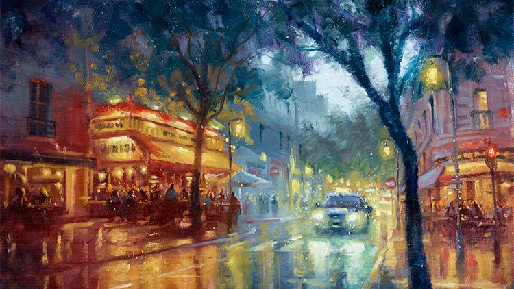
painting with Light. We're together, we'll
paint this beautiful Paris street scene in the Rain. I've been an artist
my entire life ever since I was a
little kid watching Bob Ross on TV and trying to follow along with crayons
on the coffee table. And so I've been doing
this my entire life. I've worked for Lucas film, mainly focusing on Star Wars
and also Marvel and Disney. And a lot of other
large properties, but I really enjoy doing my own work and painting my
own ideas and sharing them with people like you
who also love to paint and express and tell
stories through their artwork. The structure of the
class is very simple. I will be demonstrating
this painting from start to finish and you
follow along with me and together we'll paint the scene and exploring all
the different techniques and concepts that I'm using
so that you can take those ideas and techniques and use them in your own
paintings in the future. We'll do some drawing
studies on paper, which is con crayon pencil. And then we'll do a charcoal drawing to highlight the
values and organize the scene, and then we'll do the
underpainting and paint and then work all the way up all the different elements of the scene in more thick paint. This class is for all levels of painters from beginner, if
you're just starting out, I can help get you off
on the right foot with some really rather
advanced concepts that I can explain in a very
simple way so that it can really form your
painting process in a nice way very early on. A for advanced painters, I've worked with very
advanced students who told me they've never
painted like this before. So it's really for all
levels of painters. The tools you'll need,
I've outlined in a very detailed
PDF materials list that's attached to this course. It's very simple brushes and paint and a palette and an easel and all
that kind of stuff. An apron, if you get paint
all over you like me, so I've included that
in the class as well. And really just a love of
painting is really all that you need because when we're working and studying and
trying to figure things out, as long as you're
just having fun, that's really the key because that will keep
you coming back and back and continuing
this journey later on. So with that, let's get started.
2. Impressionism, 5 Painting Concepts: To my painting course
Impressionism painting with Light, where together we'll paint this beautiful
Parisian street scene based on a rather mediocre
photo that I took in person. It'd be a really good
exercise to be able to take a reference
that has a lot of good ideas in it and was referencing
something really lovely, but the photo itself
isn't perfect. So we either can throw it away and try to find
the perfect reference, which is almost never
going to happen, or you can use what
you've got and learn how to reconstruct the beautiful memory that you
had at this scene, or if you get commissioned
by someone to do a painting and they give you really
mediocre reference. Or if you're painting
on location, and there's a lot of
good things happening, but you can't quite fit it into one painting or it's just
not exactly perfect. Well, you can change
and edit whatever you like using the reference
as just that, a reference. It's just a springboard
to go off of. It's just an idea, and it's really you who's
telling the story. Don't forget that
you're the storyteller, and it's up to you to depict this moving living story with whatever reference
you happen to have. I really love the
Impressionism movement and the style of painting
and their brushwork. Not going to get into the
history lesson this time, more so just exploring the style of brushwork
that I love, leaving brushstrokes
visible and letting them add movement and color and
vibrating things happening. I love that the late 1800s
really started exploring this. The artists stopped polishing their paintings to a
mirror super shiny finish. They let the brush
work speak for itself. Anyway, so we're going
to explore that also, we're going to go through
some specific concepts that you can use for any kind of painting or any
kind of artwork. There's five main concepts. The first one is drawing. Drawing is the construction
of your scene. It's how big is the car, compared to the cafe and these perspective
lines that lead off using linear perspective
and all that kind of stuff. In painting people, it's
painting anatomy and figure drawing or how to paint
hair as an object, how to construct buildings
or anything like that. It's really how things
are constructed. It's not just a drawing with a pen or a pencil with lines. The lines we imagine to help us understand how the thing is built in three
dimensional space, so we can draw it on a flat
two dimensional surface. Our next concept is values. Values are light to dark. Anything light and
dark in the painting. The lightest lights,
for example, here are the headlights, and the darkest darks
might be the tree in the foreground. And
everything in between. We're going to do
a charcoal study of this so we can explore the values and how to group them together using only
black and white, no color yet, which brings us to our next concept,
which is color. That is all the hues that
you know of the yellow, blue and red and all the
mixtures in between, and how those can move across the palette depending on
the direction of your light and how light is bouncing off things and affecting them or um, like light temperature and color temperature, warm things, cool things, like the cafes
are very warm colors. The street and the trees
are very cool colors. So all those kind of concepts that we can explore
through color. The next would be edges, and that is the way color
shapes fit together. Or object shapes fit together. I always use example like my shirt as it hits the end of the shirt
and turns into the wall. There's a decently
sharp edge there, but maybe on the apron, there's lots of soft edges as
the reds and stuff unfolds. Nothing really super sharp. But then maybe the
edge of this painting, super sharp edge like that. Then maybe softer edge as the light gets
closer to the color. So we can use edges to direct our eye
around the painting. Sharp edges bring
your attention to something and soft edges
make your eye gloss over it. So we can use those to
bring focus to an area of a painting or make your eye move through a painting,
really great tool. Last concept is texture, and the texture is going to be either the texture of the
object you're painting, like the texture of a wet, gritty streak or the
texture of leaves. Or the texture can be the surface that you're
working on itself, the canvas with layers
of paint on it, and that can be a way to
use the concept of texture also to imply detail with
textures, things like that. So those are the five
main concepts that I will demonstrate to you and talk
about during this painting. So with that, let's get
our pencil and paper out, and we'll start constructing
this scene based on the pretty mediocre
photo that I've got. So get your pen and paper out. We'll see you
back in your second.
3. 1-1 Drawing Thumbnails: And here we are set
up at the Easel with just a regular old sketch of
a pad of sketching paper. I got a regular old
mechanical pencil here. Now, here's our image, which is really nice but kind of lacking
in a lot of places. So I'm just going to do I'm going to start on the side here, do a couple little thumbnails. This is about the
size of what we want, a three by four or something. I'm going to do an 18 by 24
inch canvas in a minute. Let's say this is easy. There's a one point perspective, the vanishing point where
all the lines converge, the sidewalk, the buildings, these buildings, this sidewalk. They all converge in this spot, which is on the horizon. This is where our eye level
is as far back as we can see. We can't see it because there's lots of
buildings and things, but it's there, it's where
the sky meets the Earth. It's about where it
is in the picture. The car is like here, I'm just going to
make little tiny. This is not a detailed drawing. The little cafe, which is a nice focal point of this
piece, it's really lovely. The tree is way over here. There's a couple trash cans. Okay, no, I don't want
to do the trash cans. There's also a tree here. I'm like, Okay, there's I'm literally just
grouping things together, like, what can I do with this? This is about how
it is right now. I let's say, if you
squint your eyes, let's try to identify the main
players in this painting. There's a group of trees, this group of leaves up here that also becomes part
of this other tree. There's one piece, one
big piece of things. There's another sort of groups of trees in the background, not in the background,
further in the distance. Um, and then I think this cafe and this car are
going to be main players. There's a secondary cafe behind here that
could be pretty. It's hidden by some other
those trash cans and stuff. Okay, what if I rearrange
this a little bit? Let's do another small one
that took just a few minutes. Do these small
little thumbnails, just to try and
move things around. Let's say, what if I keep the vanishing point
about where it is there? Here is there's a line of
buildings that go that way. There's still I'm not going
to the corner of the piece. I'm just the lines these
these converging lines of all these buildings all kind of end up in the same place. And then there's some here. There's a couple over here. I'm just sort of generally like, Okay, this is my perspective. One point perspective,
the vanishing point. It only disappears in one place. Much more complicated
perspective scenes could have three or four. It gets really complicated
really quickly. I kind of like the
car. With the lights reflecting on the ground
that could be really pretty. So what if I put the
car a little bigger? I'm not drawing a car.
I'm just drawing. This is where it's
going to be about. It's a little bigger. What if I bring it
forward a little bit, um, and this sidewalk,
I can move over here. Then this tree, what
if this becomes more of a really close
foreground element, almost like we're
standing behind the tree. It can put a lot of distance between us and the distant
part of this scene. But I put the tree here? There's a second
tree that's here. That way, what if I do this? That way, there's a tree closer
and a tree further away. This cafe, I guess it could
be about where it is. I like that. Maybe I'll
make it a little taller, just to make it a little
more of an interest. Maybe I'll bring it a
little closer to us. And there's people on the
sidewalk and stuff there. Okay, these trees still,
how much of that? Do you want to show
just a little sliver of sky behind those trees? And this is our painting, so we can sort of play with perspective and
objects a little bit. I can push things around. It's more malleable than you think in order to tell my story. Do I want to show
just a little sliver of this sky in the distance? Then maybe instead of definitely not painting
the trash cans. I have a little piece
of sidewalk here. What if I try to indicate a little more this other cafe right here and just some people? When we're doing the painting, be surprised how just
a couple little shapes can indicate people sitting
at a cafe. It's great. Okay, so that works pretty good. I like that composition a
little better because I got space and we have time,
let's do a third one. Play around and do weird
things. You wouldn't. Okay, what if I put the
vanishing point here? What if it's a much lower angle? And what if we're looking at the scene in a different way? What if here's the
cafe here now? We would be make sure your vanishing points,
your perspective lines. So here's the awning
of that cafe. So we're looking I guess we're really close on this
thing now, huh? I mean the car would
be much lower. Let's say this tree
is right here. Maybe this tree is still in
front of the cafe there. Maybe we'll see a little more of that sky
because we're a little lower. So these are really rough. And if somebody else walked
into this, you know, walked into my studio and
looked at this drawing, like, What is this garbage? Like,
No, it's just for me. It's not the finished
painting at all. I wouldn't even show
these to anybody. So this is really
behind the scenes. So this is much, much closer. Would be a much
more compact scene. I'm almost wondering if
it's a little too close. Now, I don't know if I have
room for some of the things. I like this little cafe here, but now we might be missing it. So between these three, I think I like the
middle one best. It's the halfway point because it has a little more
room for some reflections. When I put the reflections on the ground of this
light, it's pretty. I'm going to leave I have a little more room on the ground there to have reflections
on the streak. That can be a surprisingly
beautiful point of interest for
cityscape painting. All right, let's develop
that a little further. Let's take this space here. There's about my size. Let's say the perspective, the vanishing point is here ish. Now I'm looking
there's a sidewalk. There's a main landmarks. There's a sidewalk there.
There's a sidewalk here. I like how it's kind
of going off center. I wouldn't want to have
it directly straight down from that vanishing
point. That gets kind of odd. So it's a little off,
maybe here ish. Let's see. The car maybe push the vanishing point
over a little bit more, and the car can be
here on the street. Maybe about that big. And it's almost like clay. You can push it and pull it, it's just a crummy
little pencil drawing, so it doesn't really doesn't cost you anything
time wise to do it, and it will save you
a lot of time later. Let's say our cafe is here. So it's a little closer. And there's even an umbrella. We'll have room to
paint that later. There's the sidewalk here, and there's another
building here, has another little awning. There's actually another cafe. There's people sitting here. Here's my main cafe
full of people. Okay. This tree will be a
nice four round element. Well, I have room, maybe I can move that over
just a tiny bit. If you need to erase
something, I'll go for it. I have a rubber
needed eraser here. Oh, I'm popular getting texts. Here, I like this other cafe. I'm going to try to
indicate where is that. Maybe it's there. And there's even a window that'd a nice
little thing of interest. Here's these trees. Maybe put this tree right
here, maybe here. Here's the second tree, closer
tree, further away tree. Let's see how much leaves
do I want to show. I like some of these
architectural details, so I don't want to
cover them all up. These two trees are going to combine together into one shape. And I can indicate
that real quick. We'll do a more detailed study in charcoal in a
second here where we can really nail
down these values and group these shapes together. Right now, we're just
talking about the drawing. We're constructing the
scene how we want. Let's see. This car
will be about there. The lights will come
down like this. The reflections off the cafe. Maybe we can do one light
that will be like that. That will be a really nice
point of interest, I think. Even there's a crosswalk
here and we can have some Some elements of
interest on the street. These wet streets look
really pretty in a painting. Here can be the street does turn and it actually
is a turn right there. We can see if you want
to do that or not. Um, here's this other cafe here, let's say, there'll
be an awning or something there with
people sitting there. As long as it lines
up perspective wise, they're not floating in
the air or something, if you want to see horizontally, if things line up horizontally, that means they're about
the same distance from us. These two cafes are
about the same distance, which means this car might be a little closer to us because it's a little further
down horizontally. Um so that's okay. The cars, that'll help us decide the scale of
how big to draw things. The people at this cafe
will be about the same size the people at this cafe because they're about the same
distance away from us. Whereas if we do people
in the distance, do a little horizontal check. If they're further away
toward our vanishingbt, they're going to appear smaller. That's linear perspective. Things that are closer
to us appear larger, things that are further
away, appear smaller. Maybe we can even do, there are some trees in the distance, um, we can design those shapes better when I do the
charcoal drawing. There's some trees
in the distance. There's actually a
couple buildings here. We can do a couple indications,
architectural details. There's some rooftops and
things that could look pretty. A window or two to show
that it's a building. Here's going to be
those headlights and in general, the car there. Really crude, but this is just to place everything,
how I want it. It'll become far more apparent. The next step will be to take this drawing and use
it as a reference, as well as my photo to
do my charcoal study. So that way I can start
ironing out some of these details and group
the shapes together, figure out my values,
all that stuff. Can put a window up here. There's a balcony or something. Lots of really great
ideas in this photo, even though it's a
really mediocre photo. Because if we're traveling, or even if we're
painting on site, we can't always rearrange
the things that we want. Hey, Car, could you back up
and just stop right there, can I move all these trash cans? We don't always have
the liberty to do Um, even as a professional
photographer or as a painter on site, you don't have the liberty
to do that kind of stuff. So what we can do as artists is invent and move things
around as we want. We can idealize the
scene how we need to. That's a super amazing skill for just your life as an artist. You in person, took
this picture and like, Oh, this was so beautiful. And you come back, I'm going
to paint this later and you go through your pictures Wow, that's actually
it's not that good. God, it was way cooler
when I was there. Well, it was and it
still is in your mind. In your mind, it's as
real as it was then. Your pictures, they
say the camera lies. It's a weird way to say
that the camera is just not as accurate as your eyes, your mind, your inspiration. So we're going to add that
stuff back into this scene, and this is the first step,
rearranging it how we want. So let's get a new
piece of paper, and I'm going to do
a charcoal drawing continuing this to
the next level. See you back here in a second.
4. 1-2 Charcoal Study: And we've got a new piece of paper and some charcoal here. This is just vine charcoal. It's basically a burnt twig. It's almost 100% carbon. For this exercise,
it's more important. It's better to use this than a charcoal pencil
with wood around it. That actually has some clay in it and it's harder to erase. So this is a much more
malleable surface and actually behaves
a lot like wet paint. Which is going to be
crucial in this step, this charcoal study. Here we go. Here's about the
size of our surface. What we're doing here is we're
going to be doing values. We're going to divide
this painting up into the three very,
very simple values. Here's the darkest dark we
can get with our medium. Right now it's charcoal
later it'll be paint. Here's about a 50%. About halfway between the two. Then here's the lightest
light we can get, which in this case is our paper. Later, it will be white paint when we're in the
painting stage. So whatever number you want to call them, it
doesn't really matter. Some people divide
up into nine values. That's fine. We can
start with just three. Imagine if you had to cut out if you had black paper and
gray paper and white paper, you need to cut out pieces of paper and make this
scene with just that. That's what we're
going to do. I have a thicker piece
of charcoal here. We're going to
start with starting the whole service is
going to be a 50% value. So I'm holding the charcoal
the overhand grip. This is how you hold
a pencil or pen when you're writing your
name or a paintbrush, or you can hold on top. Basically, if the charcoal is
sitting here on the table, you just reach up and
pick it up like this. And now you can
hold it this way. I can use the flat edge of
this surface right here. In fact, you hold it
and put your finger on it and flat
against the paper, maybe not completely flat. I'm lifting up a tiny bit. It's the edge. You can
use the whole thing. But by doing this and gently, you can cover the whole
surface pretty quickly. It's almost like using a
really large paint brush, which we're going to be
doing when we do this. I always forget I'm drawing
on the wrong side of this. These spiral things
are always in my way. I should put them
on the other side. I'm just going over
the whole thing to get a nice even bit of charcoal. Then I've got a foam brush here where I can
smooth that out. It's a much smoother coverage. There's about halfway between our light and our dark.
There's number two. Now, I can do a little
bit of drawing, a little bit of construction
with my thinner charcoal. This stuff breaks really easy, so you push real hard, it'll
just snap, just a heads up. We said, I like I've
got my drawing right here next to me and I've got
the photo next to me also. I'm going to put the
vanishing part was like here, where all these lines converge. There's some buildings there. There's this sidewalk
that's going to come to there here's this sidewalk here. Again, I'm referencing my uh, the picture and this
drawing that I just did. In the actual photo,
the cafe is maybe here, but I want to make
it a little bigger. I want to make it here and
I want to make it come out a little further,
maybe to there. So these lines don't exist in reality.
Nothing has lines on it. We use lines to help us construct
things and to visualize things where shapes separate
and their edges and stuff. So we're using that as a tool, the line, but it doesn't actually exist in real
life. That's okay. We're using it just
to place things. The car was going to be there
just a little closer to us. And that means that this
street is now narrower. I don't care. It's not
a real street anymore. Now, it's just a
part of the story. So we can invent and change
things around a little bit. This tree, we're moving
to put it right here and it can do fun curvy things. Maybe we can push it over a
little bit more. It can bend. It can be a cool older tree. If you want to push
harder, choke up a little bit so you don't
break the charcoal. You're going to push a
little harder on it. I mean it's sort of leaning in to push us back
into the scene. And then this second tree
was going to be here. So now we have a close tree
and a further away tree. And those leaves, those
groups of leaves, you know, they're going
to be maybe here. I'm inventing these shapes. They're really however I
want to distribute them. There's another tree that's
a little further back. I want to see a little
nice sliver of this sky. It shows us that it's afternoon, so we have a little
daylight. That'll be nice. Then there's going to be
the cafe that's right here. I'm going to get my bigger
piece of charcoal again. Darkest values in
the whole piece. We're going to start
with those first. We're going to go and
literally we're grouping all these things together
into one big piece. Because if you squint your eyes, oh, I'll talk about the squint. The squint is a very
valuable tool for seeing your subject
in a simpler way. If you just maybe lean your head back a
little bit and just close your eyes gently as if you're just going to close
them to go to sleep. Don't squint with your face because you'll
just give yourself a headache and
they'll be tiring. But we just gently close
your eyes that will make everything blur together and you can see things
a lot more simply. It gets rid of a lot of the extraneous detail
that we don't need. And what you see is
all those millions of leaves for right now
become one big shape, and that includes it's
going to blend right in with this trunk and
with this tree as well. Um what's going to
be challenging here, there's a lot of dark
values in this painting. For now, we're
going to keep them. Yeah, that's one of the
biggest shapes that we've got. I'm going to keep them at a 50%, I can darken them up later, but we really need to establish
the darks and the lights. I have a rubber
needed eraser here. You can squash it in
any shape you want, and I'm going to erase
some of this charcoal. And already becoming
clearer that, this isn't as dark as
the closer leaves here. This is a bit of
aerial perspective now. We're working in value. The closer things to
you in a landscape like this, they appear darker. The closer you get, some of the darkest values are sometimes the things that are
the closest to us. As they get further away, they tend to get a little
lighter and less contrast in value because there's more air between
you and this thing. If we can see all the
way in the distance, the same trees
might come lighter almost the same color as the sky as they got
further and further away. This is a cityscape, so
there's lots of things in our way we can't see all
the way to the horizon. But we can help imply
some distance by making this tree a little
bit lighter than this tree. It's the same tree, probably the same species
of tree, whatever, but it's a little further away and the little groups
are going to be smaller. The little undulations, we might not even put
any leaves on here. Here we can actually
put leaves later. Here we probably won't put any because it's
just too far away. So okay, I'm going to just
using this broad edge, I'm going to make a little bit darker some of
these corners here. I think having darker
corners in a scene like this really makes
a glowy quality and makes a nice vignette. Okay. Another really, really
important light source and light value in this
painting is going to be these two headlights
of this car. Not only are we going to see
the headlights themselves, but we're going to see the
reflections on the street. So I love to exaggerate
reflections on streets. It makes the streets
look wet and it just rained and
it's really pretty. And the cityscape adds tons
of interest. It's great. Our lightest values in a
landscape often are the sky. If it's daytime and
you can see the sky, that will often be one of the lightest values
in your painting. Sometimes the lightest,
especially if the sun is out or there's clouds with
rim light and things. So it's a light source. So it is usually going
to be very, very light. Another light source we
have now are headlights. Something that is
emitting light, not just a light
colored surface, but something that is
actually creating light. You know what also
is is this cafe. There's sort of some stuff here going on with
some of these lights. Squint your eyes,
and it's like, Okay, the lightest part of this cafe
is up here on the lights. There's a couple small
ones here, not a ton, but I also I am going to want to show some of these
lights on the ground. That'll be another thing
to figure out now. Charcoal if your eraser gets
full of charcoal and dirty, just smash it around until you find a clean spot
and then go again. We decided there's
going to be another little cafe over here. So maybe there's going to
be a little bit of light there and then maybe a
little bit of a light there. Okay, so we've got our
three main values. I can go in and play now and make some more
subtleties in this. But in this darkest dark is going to be these trees and this trunk that's
closest to us. Even this trunk, this one
will be just a touch lighter. Can even tap it with our finger to take off a little
bit of charcoal. That will imply that it's
a further away tree. It's a touch lighter. I use my smaller one here. There's going to be groups of people sitting and
standing at this cafe. And maybe there'll be some architectural details of
the awning and stuff there. I like this window.
That'll be fun to paint. A little architectural detail
that shows us we're in a city in an old city with an old window,
a little balcony. There's also going to
be some people here sitting little architecture.
Look what I'm doing. I'm making little
rectangles right now because I'm
not super worried about all those details yet and I'm squinting
most of this time. You just do a couple
details and it looks like a cafe with people
all over it or whatever. We're just grouping
things together to decide where things are going to go and we can iron
them more out later. Let's say, the car will actually be a decently dark value itself. So there's sort of the car, and it will eventually
have a light plane on top. You can take your
eraser and squash it into a razor sharp thing
and just come up here and make a little value
on top of that car and even the hood This isn't a
very symmetrical car yet, but it will be when I
have time to paint it, and the whole things
a little bigger. This cafe here, there'll be people sitting in front of it. And right now the people
are just groups of shapes. I'm not drawing shirts and
glasses and, you know, ties and whatever neckties and jackets and I'm really
drawing just shapes. Like a group of shapes. There's going to be
a group balconies, something here that will
be a group of shapes, little lighter than
this tree next to it. This tree here will
be super dark and whatever lighter values behind it will show us this distance. They can't be all the same value or you won't really see it. It won't separate enough. The value contrast is going to help show us that
distance really well. There's also going to be
a couple streetlights. There's street lights
in this picture, but they're not lit. Well, let's light them
up. That really pretty. I guess I can put one here. So I would erase a
little bit of this. I can squeeze my eraser into a point and I can just
erase that. There's one. Maybe I can show one maybe I want to show one a
little further away. I can put one here, maybe. I I put a street
light there, what's great is I can put a
reflection underneath it, which will help a little
more interest there. I don't know if we'll have
room for one over here. There isn't one in the
scene at all here. I'm afraid if I put
a street light here, let's just do it. Let's just try what happens. If I put a light there, I feel like this is my
main focal point. This is my center
of interest here. By adding this
bright object there, I'm I'm throwing off my little vibe of this
little oval of interest. It's like, I don't
really care for it. Well, it's I can experiment now. This is the time to play
and to test things out. You can even do a smaller one of these, do
three or four of them. Every minute you spend doing
a drawing study in pencil or in charcoal will
save you hours in the painting process and you can invent and
try things out. That when you're in the middle of the painting can be very, very complicated, and if you decide you want to
take something back, I don't like that. That gets really
challenging really quickly. So I would recommend using this step to experiment
and do things like that. Let's say we put a street light there, there's a little pole. Maybe there's a pole here. Maybe I can put another one
just next to this tree. Maybe I'll have three
really prominent ones. So it's like one, two, three, and then of course, I can do a little light. And then maybe we can do a couple receding
into the distance. And I really haven't
put many shapes at all. I have the camera behind me so I can look and check my own work, which I recommend doing
if you have a mirror, you can put a mirror behind you. So you can sort of
look behind and check your work and
it'll like, Wow, it looks so much different and you can see things
that you didn't notice until you look at it
from a different perspective. We're going to take
breaks a lot during the painting so that we can step away and look at the painting again
fresh with new eyes. You'll notice things that
you hadn't noticed before. Look at the painting or you're drawing through your phone
or through a camera. That change in perspective will make you see it differently, and
you'll notice things. Oh, I could fix that or, um, you know, that looks great. Los awful. It's really,
really helpful tool. So really try this. I'll
do that periodically. I'll look back in the
camera behind me to see. I'm like, Oh, those
look pretty good. You know what's
missing? It's missing. A little touch of
reflection here. So there'll be some kind
of lights. W's great. This is, you can take
your pinky and just go and sort of it'll take
out a little bit of paint, you know, paint, charcoal. I say paint because watch when we do our
underpainting next, it'll behave just like this, only we'll use a
little bit of color. So now we've done
a nice study based on rearranging this decent
yet mediocre photograph, trying some ideas out,
selecting one that we like. You might select one
that you like that's different than this,
which you're welcome to. This is the whole point. You can design the scene
how you want to. This is what I'm choosing to
do because I just like it. Yours might look
completely different and that's great. Do
it however you want. Then refine it more in
a value study like this where you're really
focusing on grouping the values into
three main values, and then you can do some
subtle divisions later. That'll be great. Experiment, try some different details out. And then from this, we're
going to go to actual paint, do this same value study, but in the bigger format of our painting and by adding
a little bit of color now. We're adding one step at a time. Painting is very complicated. It's really fun, but there's
so many things going on. We want to simplify the
process as much as we can so that we're
making our job easier. We're adding one level
of understanding. I've understood the drawing, I've understood the values. Now I'm going to
understand the color and start to imply some of those color temperatures and decide where those
are going to go. So with that, I'm
going to rearrange, get some paint out,
get my canvas out, and we'll see you back
here in a second.
5. 2-1 Underpainting: And we're back at the
easel with my canvas. This is an 18 by 24. It's a bigger piece
of loose canvas that I just put on a board, and I drew out the lines
for the size that I want. You can use any
surface you want, a wood panel or a stretched one that
you buy at the store. It doesn't matter. I use a glass palette for my paint because I think it's great
to mix on, to clean. You can take any piece of glass actually and paint
the back white, let it dry for a couple of days, and then, you know,
have it on the bottom. So the glass surface is on top
with the white underneath. Great, great painting
surface. I think. I've got three colors here. I'm going to do an underpainting in a minimal color palette. Basically, we went from a charcoal drawing
which was no color. I was just values,
just dark and light. Now we're going to start to
add a little bit of color. I like to do underpainting
in a minimal color palette, just so I can start to establish the main ideas of the color and the temperature
where I want them. I've got a yellow ochre, and I've got a zarine crimson
and a ultramarine blue. I've got one of each of
the three primary colors, a yellow, red, and a blue. I have them arranged later
when we do the real painting, when we do the next stage, we're going to fill in
these spaces with the rest of the rainbows
of the spectrum. So this is where they're
going to end up. So that's why I have
these spaces here. And I do a minimum palette
here with just the colors just to make it as simple as possible so even to not
confuse us during this lesson. So actually, what I
want to do first, oh, paints, regular old brushes, like big fat ones because
we can cover a lot of area. And these can be chip brushes
or just any, cheap brushes. They don't have to be anything really nice, just big ones. Um, and I got a couple
smaller brushes here. These are just any old
brushes that you got. I like to use the crummy
beat up ones for this stage. I can really smoosh around and save those crummy beat up brushes because you'll
use them later. Since we're still going to place we got to figure
out everything goes before I start really
nailing in, um, some value. I'm going to show you we're
going to do different here than what we're
used to doing. I'll just mix these
together and just get a brown, whatever.
It doesn't matter. I want to selecting some places. Usually, we have a grid on the painting that will
tell us where things are. But here we still
have to place things. This was our vanishing point. We got some buildings
coming up here. This is a much
bigger surface now. Wow, I really got to watch this. Maybe I want to move this
over a little bit to there. I can already still
move things around. I'm doing the overhand
grip on this brush again. You know, if you're
going to do this is for fine details when you choke
up on the brush like this. And even then, I still think
you should have it a little open and have a
little more gestural. But right now, we're going
to do the overhand grip. So we can back up and use our whole arm
and our whole body. If you're standing up,
it's really even great. You can do all kinds of gestural work with
your whole body. So this will allow us to
paint in broad strokes. So overhand grip. There's going to be
some buildings there. We're going to paint through
all these lines in a second, but I need to place some things. Here's this. Our car was going to be so I'm looking at
the photo reference, and also I've got my
charcoal drawing here. The car was going to
be somewhere in there. My cafe was going to
be here ish, I think. Somewhere like that. Yeah, I wanted to push it over. The other building was there with the window up
here somewhere. Again, any horizontal lines, you have to trace them
to your vanishing point. This is that little
awning where there's another building there.
Here's the awning here. Really just very
loosely placing. I've got a little jar of
mineral spirits here. If you're using acrylic, you
can use water at this point. The other cafe is going to
be like here, right there. The tree was going to be here and the other tree
was going to be here. Now having that, that's the general placement of the really big shapes
of my painting. For this reason, I'm going
to use a medium brush. I don't know. This is a two inch,
whatever you got. I have a bigger one I'll
use later in a second. Start with some mineral
spirits on the brush. I'm going to use a lot of liquid in this stage of the painting. Very liquidy paint, not very
thick paint, very thin. We'll add more thicker layers as we add more paint on top. But to start with, you
always do a very thin layer. I want to isolate my really
warm parts of the painting. I'm going to go in
some yellow ochre and some crimson here, get some I'm just
going to block in. This is about where
this cafe is, and there's a lot of warm
things happening here. So this is where my warm
colors are going to be. And I want to continue that down where those reflections
are going to be. A little bit more water. You notice if you have a canvas that you're working
on that canvas, the tooth will show
through and it'll suck up that paint and it'll yank it right off the brush
and it'll get dry, just to add a little
more liquid to it. I'm doing big brushstrokes with a big brush to
cover a lot of space. Here's the one cafe. It's going to turn this whole
corner into a warm moment, it's going to be more yellow
here and as it gets away, it's going to get more red. That gradation of color
is going to be really helpful to express our light. Because as light changes, it starts as one color
and it changes into another color as it gets
further from the light source. So we can really
exaggerate that. And have a lot more
yellows here and a lot more reds
here. Same thing. I want to isolate my warm colors with this other cafe
just block the camera. I'm going to switch, I switch hands a lot
when I'm painting. It's very practical
for right now, I can not block the painting, but also you can get different angles that you can't quite get with your other hand. If your hand gets tired, you
can use your other hand. I highly recommend playing around and experimenting with
painting with both hands. It's very, very practical. Here's our other cafe,
super warm colors. Again, more yellows where
these light sources are. These lights are
yellow lights because they're nighttime
incandescent lights, as they get further away, it's
going to be more of a red. So there's that the rest of the paintings going to
be very, very blue. There's some worms
in the distance, but they're so far
in the distance, I think if we start with
blue, it'll still even work. Here's our much bigger brush. I have a different
brush. It's clean. I don't want to use this
one to now put blues on. I'll turn into brown.
I'll turn into mud. I've got a clean brush that I'm going to go
in with some blues. I got the blue
little tiny bit of yellow ochre to make it a touch green and to
soften that blue, so it's not pure, pure blue. Um as I say a lot in
landscapes, blues, especially next to all the
reds tend to look really garish and really
cartoony really quickly. So you don't be careful about how strong your blues
are when you're painting. A, when I get the paint
off the paint pile, I'm getting it off the side of the little pile, not on top. That will keep me
from contaminating my paints with other colors
that are already on my brush. When I get my paints out
of yellow ochre hair, I'm getting it off the side, so I don't put blue all
over my yellow ochre. So I keep my paint piles pure throughout the
whole painting process. Okay. Look at that. Big giant brushstrokes. Squint your eyes
at the painting, and this is all blue. We're doing our 50%
value right now, just like we did in
the charcoal drawing. Only now I'm starting to imply where some of these
colors are going to be. I'm not thinking
about the leaves and the people and the details. This is a really,
really top down view. I like to scrub to push the paint into the
tooth of the surface. Some people like to
leave the white canvas showing through. That's
your preference. I like to have it really all color and I can play
with the texture later. Um so that's a choice
that you can make. Here you go again. Other hand, people always say like,
Wow, you're ambidexterus. You're so lucky. And
I always say, Well, you're ambidexterus, too.
You just don't practice. And they go, it's a good point. So just practice a little bit. Okay, I'm already going to start to go a little darker
around the edges here. This is not my darkest values. I'm just adding a
little bit more dark To push. I love having
darker corners. That adds a little
vignette quality to the painting and adds a lot
of light glow, I think. So just a little
extra tidbit right there. We'll do that more later. Okay, so here's my 50% value. Now when I want to do,
just like we did before, you can see some of those
drawing indications, I'm going to just going
to reinforce those again. The car was about here because
now we're going to start to remove this paint
while it's still wet, which you can do, even
if this is acrylic, it works really, really well in oil paint because it's
wet for a long time. But even in acrylic, you might have to use
a little elbow grease, but you can still
remove that paint. I'm redesigning this
the linear perspective. All these horizontal
lines that are going in the same direction, this is a great scene so there's only one vanishing point. This part of the building
comes here, this awning, they will all meet at this vanishing point B
with linear perspective, the closer things are to you, the more larger they appear. As they get smaller, they
appear further away. As they get further away,
they appear smaller. That's why eventually
it gets so small, it will all converge
in this one spot. Here's this sidewalk. We weren't sure there's going to be another
sidewalk there, but really here's
this other cafe. Remember, horizontal things will appear to be the same
distance away from us. This cafe, maybe it's a little further
away, but not much. I mean, it could be
here for placement. Notice this I'm holding the brush to measure, and
then I just paint with it. You can do a lot of fun things when you hold your brushes
in different directions. You can paint like this. You
can paint straight down, lots of fun varieties. But I'm just checking my
distance of the second cafe. It's going to be about
here will be the ground. Then this car was going to
be just a little closer, which is about right.
That's where it landed. I'm doing a little
more blue for the car. It's going to be there issue. Again, this isn't a car. This is just a placement.
This is just a square. And then the tree was
going to be about here. I feel like the vanishing point is between the car and the tree. That's where I put them. You can put them
wherever you like. Nice fun angles for this tree, and that can break apart later. Then this other tree is
going to be here maybe. It's on the sidewalk and
it's going to be like that. It's going to have some
fun details later. But there's my established
drawing again. I just placed it back in there. Now I can add my super darks. While my darkest
darks are going to be this tree in the foreground
and the leaves in general. Let's come back in
more mineral spirits. Um, I'm going to mix my
two dark colors together. I have my blue and
my zarin crimson. It's Alizarin crimson. It's crimson like the red, and it's Alizarin, the
mineral that it comes from. You can do a line
like this or you can do several horizontal
lines like this. This is for my tree. What was I'm looking at my reference that I made
and also the picture here. I'm sketching in where those
leaves are going to be. Okay. Remember, one big dark
shape for these leaves. I like to do nice big
strokes one at a time. Sometimes the stroke is a scrub. Sometimes the stroke is
a one sort of thing, because some of these
strokes will be visible in the final
stage of the painting. So I like to let those
speak and be visible later. We can add some more darks and more official definitive
brush strokes later. In the corners, a
little bit darker. This tree is a
little further away, so it'll be a little lighter. I can even get softer with
how I push on the canvas. This one, did you notice
I was pushing really hard to push that
paint on there. The paints super wet, so
if I do that too much, I might actually remove the
paint, so it just heads up. Um, so here's this tree
and it'll break apart. Maybe this comes down
just a little more. I can really play and push
with this stuff right now. Then this tree is going
to be about there, not really a super
dark feature in the painting yet. But
it's indicated there. Okay, so those are
my main darks. I did also like I sort of came in with some of
these darks from the side. Here, I'm adding some red
because I like these red. And I'm making a little vignette
that's encroaching into the painting and it adds a
nice glow quality to it. Touch of mineral spirits. And then a little more dark. See, this is now I've got a
ton of blue on this brush. I've just added some red, it's kind of turning into brown. I'm going to go back to
the smaller one where I had had mostly
warm colors on it. I just want to darken
this because this is all going to be pretty
dark, actually. There's only a
couple interruptions of really light spots, but in general, if I could start darker here, that
will be much better. It's a dark warm. Yeah, I'm going super fast, but because I don't
want the painting to be 10 hours long. This actually these will be pretty dark save for a
couple moments of light. Same thing with this
car. It's actually going to be a fairly dark shape. And there's also these
trees touch of blue. I know this is my warm brush. Sometimes they kind of
get mixed together. Um but I just doing a touch of blue and
being really soft with it. Those are going to be
our distant trees. Okay. Now, for the fun part, we're going to take
a paper towel and fold it over our
finger like this and dip it into whatever
your liquid is, mineral spirits or
water and come in here and you can
actually start to erase the paint on the surface. Uh, again, if it's acrylic, you might have to do a
little bit of elbow grease. But if you do it quick enough, if you do this tomorrow, it'll probably be set and
it'll be really cured. So you won't be able
to do this very well. But if you do it now, you can still do this even
with acrylic paint. With oil paint, you have hours to figure this out, so
you have a lot more time. Tiny bit of light there.
So this is our sky. And as it gets dirty, just change to a clean spot, and you can come back in here and pull off more of that paint. There are a couple, you know, I can design where there's a couple little holes
in the tree here. I can design that how I want it. There's not a ton
though, if I squint, maybe as we come away
from even squinting, those trees are pretty dense. But maybe I can design a couple holes in the leaves here and there just to show not too many. I can add those in
later because they're really small and not super significant to what we're doing. I don't want it to be too busy. Another important light source
was this this cafe here. Definitely need a
clean spot for this on your paper towel or a new paper towel
because I want to put blue all over my nice warm
oranges and yellows here. There's four or
there's three lights. Now, this tree is in
a different spots. I've got to negotiate where
those lights are going to go. Find a new spot here
and clean those again. I can even draws a line of
light on that little awning. Then that light hits that plane changes
to angle backward. And then there's another
sort of spot right here. That's light. Squint
your eyes and find the largest light
spots on the painting. And then there's going
to be a few in here. They're not really
important enough to hammer out now. There is one. There's like underneath where this little awning was
somewhere in there. Yeah, there's that building
that's right there. And then just so we can see
them, do a touch of this, find the light spot and go straight down onto
the ground and pull down and it'll start to have the
idea of reflections. Here's this light here. Here's this one here
to straight down. Maybe there's a touch
on the sidewalk. There's a lot of people
and stuff there. A lot of the really
broken things, we don't need to worry
about those too heavy yet. Maybe there'll be one here too. So how's that looking?
I'm looking in my camera to see.
That's looking good. The next important
one was the car. Those lights are going
to be about here. It's a car at a slight
three quarter angle. We'll draw this car
more detail later. A car is basically a rectangle and we'll iron out that
car when we do it. It's going to be not a very
complicated detailed car, but in general, it's a rectangle turned just
away from us, a tiny bit. Lights oops, I got some
red in there somewhere. It's time for a new paper towel. You start to accidentally mix other colors in there
that you didn't want, time for a new paper towel. Then also, there's a
little bit of light on this sidewalk here. Really see those street lights. It's going to be one of our most bright parts of our painting. Already looking like
a car. It's not drawn very well yet, but it's okay. That's generally where I want. I want to remove that paint
so when I add paint later, I'm not adding light paint
on top of dark paint, that's just going
to turn into mud. When I'm adding light paint, I'm painting on top of light paint. There's going to be another
sort of light bit there. We're just about done with
our underpainting here. There's a couple
green lights in here. I'm not sure if I
want to paint those. They're walk signs. Here's some of those
reflections there. Without really doing very much, it suddenly looks like
a wet street painting. What do we say
there's going to be a street light? Maybe here. I can start to carve that
out a little bit now. This is where you
can take chances. This is going to be a
bigger one and that's going to be maybe a light there. I just drew through my tree. The tree maybe will
overlap that reflection. You can add and push
paint as you need to. Maybe What do we say? Another street light
over here somewhere. They'll bounce out,
one, two, three. So they get a little
smaller and a little further away.
Track it down. Here's a little break
in these buildings here that might give
us a touch of light. But in general, that's most of the
underpainting that we need. I could iron out the drawing just a tiny bit more so I can
see what I'm doing. Here's the sidewalk here. When I do the
painting, I might not actually show much
of the sidewalk. I might gloss through it.
That might be an edge I don't need or a
detail I don't need. We're going to do
some people in here. Tiny little bit of
mineral spirits. Again, I'm just
indicating some people. There's also some people
sitting here a lot of this, the more gestural I leave it, the more real it'll
actually look. Here's a window.
There was a window here that maybe it's
lit inside, actually. Maybe it's not a dark
window. Maybe it's lit. We'll leave that I'll
give us some room. There's an awning
on top of that. There's also going
to be some people. Let's check horizontally. Here's my vanishing point again. You can always put
it back if you lost it. It's about there. Horizontally, people are
going to be sitting here. There we go. Without
really doing a lot, that starts to look like a
little nighttime street scene. We haven't really
done very much. It's working for us.
So I can see it, I'm going to put a plane
there and a plane there. So there's the car. That's a little better. It's
a little crooked. And also the camera at a tiny bit of an angle
just to get behind me, so it might look
a little crooked. I'll try to make
sure that that's straight as I can for
the actual painting. And even if I want to, I just I can smudge
out a little bit of this paint in the distance because I want it to get lighter and more faint as I get away, so I will start to add a little bit of that
atmosphere now and just wipe off a little
bit of that paint gently. As it gets more distant, it
gets a little further away and a little less value contrast as it gets further away
into the distance. We're using aerial
perspective to already show the
distance we have there. Okay, that works for underpainting.
I'll clean this off. I'll show you how to clean your palette and your
brushes in a second, and we can work on the next
stage of this painting. Take a break, take a stretch, get some water, hydrate, and we'll see you back
here in a few minutes.
6. 2-2 Cleaning Palette and Brushes: Okay, quick video on how to clean up your palette
and your brushes. Since I've got a glass palette, I can scrape this and
clean it very easily. I've just got a paint scraper. Any old one from the
hardware store will do. I can scrape off, and I got, one of my paper towels
here, I can just scrape that up and put
it on there like that. If I want to clean off
the edge of my paint, I can just take the scraper. This is why I take paint just
from the edge of the pile, so I can just scrape that off and make a fresh
pile of paint again. Otherwise, I got
to throw this away because it'll have
paint all over it. So come off just to the edges
here and just get those. Or you can also use
a palette knife. Any palette knife, if you've got the triangle shaped one,
you can do it that way. If you have the old Bob
Ross shaped one like this, you can come and do it this way. That's another way to
get those other colors off of your paint. Now you've refreshed your paint without having to
waste all that paint. Paints expensive, so let's not waste it. So I'm cleaning up. I'm just going to
keep scraping this. People say this is very
satisfying to watch. I've filmed this a
couple times and posted online because people think it's really cool to
watch. I don't know why. Just the scraping and cleaning. Okay. And then if I
want I can dip this into my mineral spirits or my water and just
clean this off again. I have a nice clean palette, and I might do this once or
twice during the painting if I'm running out of room and I'm trying to mix
colors and it's like, you can't mix colors
on old colors, they'll turn into mud, it won't be the color
that you thought. So make sure you have
some clean space and clean off a spot
if you need to. Now, how to clean your brushes? We start. With just paper towel. I'll say, I'll take this brush, and it's got a lot of paint
in it. I just used it. Rather than just dipping
this into my liquid, that'll turn my liquid
into sludge real quick. I just have a jar of
mineral spirits here. It can be water if
you're using acrylic. But what I can do,
first, I can take this, put it in my paper
towel and just squeeze off some excess paint. So
you got a lot of paint. Now I can just dip this gently in the liquid
and do the same thing, squeeze it again, get
off even more paint. I got a lot of paint coming off of here. I can do
that one more time. Before I wash it in my jar. So I get a lot of the
excess paint out. Now I can come in
here and just dip it. What I'm doing is I'm dipping my paintbrush at an angle
and gently going like this. You don't want to put
it straight and flat and make those
bristles squash out. So I'm going at an
angle and gently just tapping it like this and turn it over and
do the same thing. So I can gently get all that paint out
without being too vigorous. Also you do it too
much it'll splash like it's already doing
splash all over the place. I can hold this and
just do it a few times, really get some
of the paint out. Um, this isn't washing my brush, I will do later in the sink with just some soap and water. I can scrape this off, hold the sides so you don't
tip the thing over, and then I can take a clean part of this and just wipe it off. Now I've got a clean
brush to use again later. Here's one of the small ones
I was using. Same thing. I'll take this and squeeze out the paint and then just dip it in here and
squeeze out the paint again. As I'm going, I like to fold the paper towel and
find a new spot. Um and there we go. I'll take this and gently dip it in there at an angle and sort of push
it up and down a few times. And there I got a clean
brush for next time. So that's how to clean your
brushes and your palette. I was surprised
how many students I used to teach in person. They didn't know
how to do it and they paint all over the place. They'd be painting with
really old dirty brushes. They're like, Why are my
colors so muddy and gross. Like, Oh, 'cause you
got paint everywhere. So let's clean that off. You really have to track in your mind where all the
paint is at all times, where it is on your brush, where it is on your palette,
where it is on the painting, on yourself because
you can get paint everywhere on accident on the painting, on
you, everywhere. So just a good rule of
thumb to keep in hand. So we're going to put the
rest of our paints out here, and then we're going
to jump back into our painting and
start working on adding proper piles of paint and color and detail
and all that stuff right now. So get all your paints out and we'll come
back here in a second.
7. Continuing the Painting, part 1: Okay. And we're back with our full palette
of colors here, and I'm going to
get started with the actual painting part
after the underpainting. I never know what to
call that process. The over painting, we just
did the underpainting. Um, all my colors here, I got just titanium white, some cadmium yellow lemon. I like the lemon,
the cooler version of the yellow because I
have a lot of warm colors. I like the cooler lemon. You can use regular cad
lemon if you want yellow. I've got the same yellow ochre. Now I've got cadmium orange. I've got burnt sienna. I got cadmium red, the same alysarum crimson. Now I've got a dioxyzine purple or you can use a
violet or whatever, a nice dark purple, the same ultramarine blue. I've got a To blue
and a ho green. So you don't need a
whole lot. I've got, you know, the major primaries. Now I've got an official
primary yellow, an official primary red, and my primary blue. I guess either of these
could be a primary blue. This one's more red,
this one's more green. And they're arranged
in this rainbow. Um, basically, yellow. If you mix it with red,
starts to become orange, starts to then it's red. You mix it with blue, becomes
more purple, becomes blue. You mix it with yellow, becomes green, and it wraps around. This is the space
for us to paint. So if you could consider this as a closed circle, that
works quite well. In science, the wave
lengths don't wrap around. They continue in each direction. But in art, it works quite conveniently that it
wraps in a circle. Um, Okay, and I've got
two decently big brushes. What's really fun about a
cityscape is you can really paint a lot of sort of
atmospheric shapes and colors, and then you add a couple
details and it looks like a foggy
atmospheric cityscape. So we're going to
do that. I guess I can start with the sky. I always say, you know, back to front. So we
can continue with that. I'm actually going to use
maybe a smaller brush, it's not a very big space, these little sky areas we made. It's kind of a a bluish,
you know, sunsetty. It's like, you know, evening,
probably after sunset. So I'm trying to see, maybe we want to do a
bluish kind of sky. So it's got some white, a little bit of when you
mix white with Thalo green, actually becomes a
nice hot blue color. Really great for a nice strong
hot blue color for a sky. And when I mix the color,
I grab a little bit, remember from the
side of the paint and the side of your paint. You don't dip it right on top, so you conserve the
purity of that paint. Mix it a little bit, and then
I don't mix it all the way. I like it to be a
little unmixed. I like it to remain still two separate colors,
mostly mixed. That kind of makes for some fun unexpected mixtures
on the surface. You mix it a little
bit. And then I like to scrape it up
with my brush like this, almost like it's
a little shovel. So I've got a little
bead of paint now, and I can just go
nice one brushstroke. I've got a little more on
there. I can do a couple. And I'm doing I'm doing one brushstroke
at a time. Let's see. Here's this brand one
to mix a little more. Mix it a couple times, scrape
it up, and there we go. What I might actually do we
always try to do a gradation, you know, one color
transitioning to another. So I will make it lighter here. I'm pretty sure the
sunset was on the left. So I want to make the left
side lighter than the right. So I will add even
just a little bit more white right there
in some of those. There's a couple
holes in the trees. I'm going to put that
on not super thick. And even kind of
brush through it and make some transparent
sort of marks. And when I get
these trees all in, I might look and
see if I need to add I'm just shooting a couple transparent
little marks there. Um I don't want this
to be too busy. We might add some subtle things and they might not be
the color of the sky. They might be a little
lighter to show layers of leaves and
stuff, but not too much. So how about if I do here, I'll do a little bit I'm going
to move up my palette now, a little bit of do blue. So the blue changes color, maybe a little bit of ultramarin
as it gets further away. Even in this little
section here, if I do a little gradation, so it's like a nice really hot Thalo
green mixture with white, and then a little
bit of thalo blue and a little bit of
ultramarine blue. So even I'm moving
across my palette as I move across even this small
section of the painting, that can add a lot to the
light effect happening here. Maybe there's just
a touch there. And again, I'm going
to look behind me and my camera. Oh,
it looks nice. Already looks like a tree
and some sky behind it. I don't need to do
a whole lot here. I'm going to go back
and do a little more of this green because this is a very small section
of the painting. You know what? What I can do. I'm noticing in the distance, there's a couple
trees, I'm sorry, a couple of small buildings. What I can do is I can carve out negatively those buildings. What if I go like
this and just put a couple marks to carve
out those rooftops. I'm carving around the dark value that I've
already put in there. This value here, it's
darker than the sky. So I can carve out around that. Maybe even this comes down as if there's like two
buildings there. So I'm painting
the negative space around the building for now. And now, it looks like now
I'm looking back here. I'm like, Oh, okay, I'm not sure if I love this shape by itself. I mean, it's a
little too separate. So maybe when I come back, I can put some paint in here
and I can refine that later. But that is one
technique you can do to help me define that
building before I get there. I can use the sky to carve
and cut in around that shape. And suddenly it's a
building of some kind. So anyway, there's our sky. Let's get a bigger couple
of bigger brushes here. I'm going to start with this distant warm area a little bit of when I
look into the distance, there's a lot of warm
lights happening there. I'm going to put
some medium on here. I think a lot of this, I'm
going to add some medium, whatever medium you've got. Let's see if I like that. I don't want it to be too intense of color.
I'll add a couple. Maybe I'll even add
a little bit of green and a little bit of blue to tone down that color. When you move across the
color wheel like this, the colors cancel each other
out and they get more gray. If you want to take an orange
and make it more gray, add a little bit more of one of the blues and
see what happens. The scrape that up
and we're just going to fill in a lot
of this area with, um, with atmospheric color. And I've moved the car. The car, maybe I can carve around the
car just a little bit, like what we just
carved around the sky. I can carve around
the car, a tiny bit. And maybe this warm
will come down. Whatever light you're going
to see here is going to be reflected onto this wet
streak that we've got. That's fun. You can always just continue
that down a little bit. These are really transparent
brushstrokes down here. I'm letting the paint break on the surface. Look
what I just did. I carved out the
tree a little bit. You can use these negative
space ideas to carve into. I haven't painted the tree yet, but I just defined an edge by carving the space behind it. You can use those
negative spaces a lot. Um, okay. Let's now move to you can sort of I'm going
to use the same brush. I'm just going to
kind of smush off. I want to have a keep a
little bit of that color. Let's do sort of I know the trees are green trees
are green in our mind. Are they green necessarily
in this scene? Not necessarily. I think if we keep this most of
the scene more blue, that will work
well, I'm going to kind of fade off
those brushstrokes. I'm softening that edge between
this new green shape and this other warm
light sort of area. I think I want this blue to be a little the trees to be a
little more blue than green. So I'm mixing color a
lot of colors here to get a kind of a
muddy blue color. And it's also not very dark yet. I'm kind of keeping
to the same value as what I've got there already. Scrape up a little bit of paint. Again, I'm carving out
that tree that's there. Now I'm meeting the sky. Maybe I can feather out
some of the edge of this tree by just
using the edge of this brush and then pushing a little less hard with my brush. Let's make a little
more of that color. A little more medium here
because I think this continues. This tree is behind. And it sort of turns
into the building. A lot of things in, like, if you want to make this
atmospheric cityscape, one shape kind of
melds into the other, and it's all just sort
of one continuous shape. And then you look at
the picture and like, Yeah, there's 1 million
things happening there. Well, this is all one shape, like the tree, the buildings. We're going to consider
this one shape, and we add a couple of
details in it and it will suddenly look like
the thing we want. Maybe I want to do this
building back here. It's a little lighter,
not too much. Do I want to separate it from the tree a little bit, maybe? Um I mean, the colors don't
have to be exact as long as the values are there. And I didn't like how
much that was separate, so I'm going to
paint through that. You can paint right through
stuff if you didn't like it. I'm going to make that
just a little higher. There we go. I got to
watch my vertical lines. My vertical lines tend to tilt to the left
strangely, a little bit. I think as you start
to paint more, you'll start to notice
your tendencies. I tend to make vertical lines
lean to the left somehow. I think I want to bring
that up much higher. I don't like how
separate that was. That looks better. Maybe I
want this one's further away, so it's going to be closer
to our vanishing point. So I want this one to be even a little higher. I think
that was the problem. It was just too
low. There we go. And I can even add
a little more if I want that separation
to continue. I can just push that whole
thing up a little bit. Okay, Let's see. I'm very quickly going to run
into where these trees are. So let's do a little more blue. Again, I'm not super worried
about the specific color. It's kind of a bluish,
grayish something. As long as I have the
value pretty close, I'm going to get a
little darker because I'm getting a little
closer to us. I'm painting around those spots where I saved for
those street lights. Because I want to keep
that nice and warm later. I don't want to put blue on
top of it and then try to add a nice glowy orange or
something on top of it. I'm going to keep
keep that available, not put paint on it that I
have to then fight later. Because what happens
if I put blue on here now, I try to add orange. I'm going to get gray, just
like we just did earlier, so keep that in mind. Let's
see, where am I going? When you get to I've discussed this in some
of my landscape classes. When you have something in the distance that is
uncovered by another object, I think I just made
an object here. These buildings are now going
to cover by these trees. Maybe there's another
building here. I'm inventing how I think
the scene could look. If I make a dark value
that gets a little bit lighter before the next really darker
value in front of it, I'm going to exaggerate that
here and say these trees. This is the brush
I used for my sky, so it's already got
a light blue on it. If I do a little bit
there, suddenly, that adds another layer of something in front and
this looks further back. I put some atmosphere
floating there. At the bottom, almost like
there's a layer of mist that separates these two objects and pushes them further
into the distance. That works really
well when you're doing objects that approach
you from the distance. I might do the same thing here. Here I have this darker shape. These can be buildings. It's not exactly the buildings
that I'm seeing. I'm departing from the reference right now because I'm designing
the painting how I want. You have permission to do that.
This is just a reference. You can depart from that and
paint it however you want. Let's do that. I'm
going to make a little bit lighter blue as I get
to the closer to the floor. And I'm going to make it
almost like it's a mist. And then here's this cafe is going to start
happening here somewhere. And see a lot of
these brushtrokes, I'm leaving them
visible. It's great. You're I'm using the brushwork to sort of create this motion. These colors are moving and
fighting against each other. It's really fun. So don't
spend time killing those. Like, be comfortable with seeing an individual
brushstroke. Let's see here. I think I'm going
to come and, this is hard when the city scape.
I just starts to spread. Like where do I go from here? Because I'm all painting
this as one shape. I could keep coming down
in front of the car. I just want to spread
it out and sort of paint these general
colors and shapes. Then I will come and
add a few definitions, and it's really surprising how quickly that comes together. I want to add a little more of a yellow glow in that
distance, not too much. I'm going to mix a little
bit of yellow here. It and I'm not
painting any details. I just wanted it to be
a little more glowy. It was kind of yellow ochre,
it was the same color. Okay, well, in the
center, I'll make it a little hotter intense yellow, but not too much there. So now it's going to
glow a little bit more. I'll put a couple
other cars in there. Cars. I'm going to put
two little specks of light with the reflections
and it'll look like a car. It's amazing how
well that works. I'm looking at my reference, maybe there could be there's a couple sort of
glowy yellow things that could be another cafe. What if I just indicate sometimes I'm literally
just winging it like this. I'm like, Oh, what if I do this? I didn't plan this,
but I'm just noticing, Oh, this could be nice to
have another something. I'll put a glow there, a couple of strokes, and maybe I can continue it on
down just a tiny bit. And I'm feathering that
out to be a little softer. So maybe there's going to be another little
glowy thing there. Look back here and see
what that looks like. Yeah, I like that. Okay. I like that. Let's
continue moving this out. Let's do a little bit over here. See, I've already got my collection of
brushes in this hand. I got two of the big ones
that are the same size. This one had some of
these blues on it. This is going to start turning
a little more red because of this cafe that we've
established has this red glow. I'm going to switch
to this one. I've got two of these that
are the same size. This one I used for the blue sky and this blue atmosphere here. This one I got a warm one
that I used for here, and I got a whole pile of them. These are all clean, so I'll save these. I need these later. But when I need the same size brush with different
colors on it, a drastically different color, I can keep several brushes
with different colors on them. I can switch back and forth and I don't have to wash the
brush every single time. Super handy and practical
and time saving. Then I just keep
them all in my hand. Fist full brushes, the
worst kung fu movie ever. Here I'm going to start to grab a little bit of this red,
make a little purple. Something. Yeah, I'm going to start
to make this building. Here's my street light
that I carved out, so I'm not going
to paint on that. I don't think I want it to Okay, maybe, okay, yeah,
a little purple. But a little bit of brown, also. I don't want it to be
fruit loops purple, you know, I want it to
be a grayish purple. I have this sort of
term that I call, like when a painting gets
too many colors in it, it starts to have what I
call the fruit loops effect, is it just has all the
bright intense colors. And it looks like a
bowl of fruit loops, and I don't think
it looks very good. So when I introduce a new color, I don't really have any
purple purples in here. I want to keep the
purples kind of gray. Like the purples here, they're kind of gray. They're
kind of gray. So be careful about introducing a brand new
color that's not in here. Try to tone it
down a little bit, or put them several places
and make it really intense, like do it on purpose, and then see what
the effect has. This painting is blue
green and orange. Those two colors are
my dominant colors. If I suddenly add a
bright purple also, it could be a little much. So just be aware
of that. If you're going to introduce a new color, make it a little more
gray than you thought, and that could work really well. This is just going to turn, this whole thing is red. Let's add a little bit of red, and it's going to get warmer. Because I have this glowy
cafe happening now. Um, yeah, I'm just kind of
moving around the painting, gradually changing my
color as I come down. And again, I'm not
painting any details. I'm more painting
this area of color. Maybe this now needs to
be a little more yellow. And as I'm changing the color,
I'm gradually moving it. I could maybe put this here now. I'm kind of moving it toward the colors of paint
that are on the canvas. Doing one little
brushstroke at a time here, deliberate one brush
stroke at a time, and I've still got
a pretty big brush. This is going to be a
dark value for some of these people sitting
here, great. Maybe this red
needs to spill out over here because there's
a tree blocking it, but the color really continues behind there. Let's do that. Let's make a little bit of this color spill out
from behind a tree. Maybe I came in a little
too far for that. I can come back later
when I do the dark tree. When I get further
into the foreground, I'll do a little more I can
readjust this shape later. Then here this does get a little darker as it
gets further away from this light source and down
into our corner here. And I'm just literally
adding some of these I'm replacing the underpainting
with some actual paint, same kind of value, but a little more color and
more quantity of paint. Now I'm actually using scooping up paint and putting
it on there instead of just the very thin washes of paint that we were
doing a second ago. Here, what I can do is this,
maybe I'll come back up and start to do I definitely
need more paint now. This is still sort
of my warm brush. I haven't really changed it. I am going to come back up to a little bit warmer
because this is where the general glow of the cafe is coming up on these reflections
from the ground. I'm painting a lot of glowy
sort of colors right now. Then with these glowy
colors in place, I'm establishing the general
setting for my scene, and then I add a few
details and it will just suddenly create a scene. It's really amazing.
Let's use my cool brush. This is pretty light. Since I've got a lot of light blue on here, I was doing these grays here, let's just continue where
I was here. Where was I? Scrape up some paint. It's a little dark
too dark too soon. Coming down to push this
blue down into the street. Maybe I'll feather
that off just a little bit so I can connect the areas. They're going to sort
of blend together. And it gets darker. Okay, great. A little bit of medium,
scrape that up here. Start at the bottom, and I can
come up and feather it up. Et's do that again and I'm going to have to soon add myself some more ultramarine blue. We're coming up to a spot maybe we can take a break
here in a second. This might be a good spot to take a break and look and see what your painting looks like to step back and take a break. I also try not to
keep the videos too long. Try to keep them. I was doing 20. I'm trying to do 30 minutes now to see
what that's like. Let's do a little bit
more dark in this corner. Again, I like having
nice dark corners to round out the painting, and it makes this really
glowy vignette quality to it. So yeah, a lot of really
great individual brushstrokes that you can almost
count, you know? If you had to pay $1 for every brushstroke
you put on your canvas, how would that change
your painting? $1. $2, $3. When you paint like this, That's an expensive painting.
So be aware of that. That's kind of a fun
little tool to help you keep track of your economy of brushstroke, as they call it. So, okay, I can keep
going a little bit. I've got a little warm here. What if I do that same thing? I had this sort of purple, get some more medium in my
little cup here on the side. This is just like a linseed oil or a
transparent painting medium. Maybe a little more red. And it's going to get a little lighter as I get to the top, little lighter and a little
more intense with the color. Light doesn't just change value. I also it moves hue
across the surface. When it gets further away here, it was more purples. Here's purple. As it gets a little closer to
the light source, it's going to get a
little more orange. I'm adding more yellow into it. As it gets even closer, a little more yellow. Let's say right next to it, so I had this gradation
of value and color. Maybe, see, this is a
little too abrupt change. I need to feather
that a little bit. So I add a little more
of this dark here. So it gradually
changes a little bit. Then when I do these
highlighted areas that are much more intense, I can paint through those just to soften those just a tiny bit. That will accentuate
that even further. Let's take a quick break. And
step back and look at this, and we'll come back and
finish this half and see this building is just going to blend right into this tree. I'm connecting all
these millions of shapes into it's one big shape. So yeah, it'll all
come together here. I'll take a break, stand back, look at your painting, stretch, and we'll see you back
here in a second.
8. Continuing the Painting, part 2: And we're going to continue
our little cafe area here. I'm going to bring some darks. I'm going to bring these darks
around to make this edge. I replenished a
couple of my colors. I put in some more ultramarine
blue, some more orange. And some more yellow.
I needed those. Let's switch to my blue
brush so I can get really this dark corner that will help again round out and make a nice vignette
for the whole painting. While I got this dark on here, there's an awning here. Sometimes you can take
if I want to do a shape, I can do a line like
this or I can do several horizontally horizontal or
perpendicular to the shape. The line is going this way, of course, following my vanish, my perspective line to
the vanishing point, which I'm going
to re indicate it was there, somewhere
around there. You can follow the shape with
your brush or you can do contradictory strokes
with a with the brush. Here's this window. I can either go
down like this or I can go across with
several strokes. I like the version
of going across. I think it adds a
thickness to it. That's my usually preferred
method of doing it. This window will probably
be more like this. Again, using my either hand to get this I want the flat
part of this brush here. So instead of doing it this
way or something weird, I can come over and
do it this way. Again, overhand grip, grab your brush like this and
you can put it flat. You can do all kinds
of stuff with it. And if I need to, I can
switch back to this one, but don't choke up on it, back up on the
brush, and you have all this more rhythmic
sort of movement here. Let's get back to it.
Let's paint this sidewalk. Again, putting all
these into one shape. I'm going to combine
this a little bit more. I'm bringing the dark blues purples in from the
edges a little bit more. This starts to get warmer as it gets right
next to our cafe here. I'm just going to use some
ochre. There's our other tree. Here's where this yellow
can meet the blue. I can blend those a
little bit. Let's see. I'm going to do a smaller brush
for some of these people. The people, again, I'm going to reiterate my underpainting. But I'm going to use
a little more paint, getting a little
more medium here. Then these are going to
be warm silhouettes. That's a little too just purple. These warm silhouettes against this lighter background
of the light of the cafe. Me some people here.
It's up to me to know how much I want to
define these people. Sometimes I like them really gestural and they're
literally just shapes. Depends on how abstract
you want your painting. It's like there's almost even some shadows on
the ground of some of the people sitting here
and even maybe this tree. There's sort of A
couple dark shapes back here for what might
be windows, I think. I'm using a brown.
There's this awning. I'm doing a little bit
of specific detail here just to carve out some
of these specific shapes. There's another one of these
sort of dark brownish, greenish something like
sort of window here. Uh, these are real just
suggestive gestural strokes. That could be the background, the inner workings of these
cafes here, windows and such. Back to let's see, up here, it's going to have
I'm going to use this oh, I still have this
nice warm color brush because up here in this area, it gets a lot lighter because there's all those yellow
lights are up here. And always use a lot of paint. You know, if you had to make a rule for your
painting for right now, try use more paint. That's going to be a
good rule for right now. Because as a habit, I think most people tend
to use not enough paint. I'm reminding myself
that all the time. Oh, use more paint. Use more paint. It will always help
your you're painting. Maybe you'll find a comfortable
place where you're like, Okay, that's too much paint.
Wow, that was way too much. Or later on you're trying to work on the
painting and it's just it's a pile of soup because
it's just so much paint. Okay. Maybe that
was too much paint. So you'll adjust and find a comfortable medium for
how much paint you use. Okay. Then we have maybe
I went a little too tall. There's this awning,
and then there's a whole lot of space
here, that's okay. We'll just make it sort
this same light color. A little more medium
there and more paint. Maybe I can define a little bit. Maybe that can be
the awning there, maybe this can be the
edge of the building. With just a couple
crisp strokes, maybe I can start to define
the edges of something. Nothing too specific yet. I've got a red brush. There's a nice red
thing happening here in between a
couple of these lights. This is my tree, so I'm going to paint around it
for a quick second. And and then there's this angle that's
an important sort of angle on the
building at angle. Like this is like I don't know. It's really there's so many weird angles in this building. It's hard to tell
what's going on. Even zooming in, there's a lot of weird angles
happening there. So I'm just going to
sort of invent as if it were a rectangle
comes up like this, and it changes direction, comes up like this and
changes direction. These follow my perspective
lines to the vanishing point. Maybe this seems to
be a little higher. You use your brush. Yeah,
this is not high enough. And sometimes even
if you can continue it just to see what
that looks like. It's okay if there's
a line there. There we go. It's
a little better. You can just smudge
it out if you want. So check your vanishing points. Sorry, check your
perspective lines against the vanishing
point often. And then this could be
this same glowy yellow. And then it's gonna hit. I think this other building
happens about here. And it's catching a
lot of the red light. From the other
building. Red light. Rock sand. You don't have
to put on the red light. Well, here's the
red light. Now we know what Sting was talking
about. Thanks, Sting. I love the police. I love
80s music in general. Uh, Okay. Now we're I could continue up. This is sort of
when it turns into the tree and there's
also this building. This has become a
really dark brush. I want a little bit of light. I have another brush. This is too light. Well, I've
got another one. This one's I think I want
a bigger brush, though. Let's get another one. Sometimes,
here's a crummy brush. This is a really like
trashed brush. I save these. Sometimes when I want
big rough brush strokes, I don't have to baby
the brush at all. I can really just push it
and smush it and it's okay. Um, so I always save my dead old brushes
because they can be really handy for doing stuff where I can be a little more violent with the brush, and I'm
not worried about it. I'm like, I don't
care. It's already ruined, but it's really helpful. It comes in handy for stuff. I'm continuing this building. A little higher.
We're going to see it through the trees
just a tiny bit. I think, same with this one.
There's like we can see a little bit of this building that goes just a little higher. But let's continue this
up just a tiny bit. Then we have a definite
edge for that restaurant. I can't really see where
the building ends. It kind of doesn't just sort of, you know, if it doesn't just can fade
into the next building. It's okay. We don't need to define every single
shape in the painting. We're only defining the
parts that are important. Where does this building
it doesn't really matter. We'll put, you know, put a couple architectural details and it looks like a
bunch of buildings. That's kind of really
all that counts. And it sort of fades into this section of building. Great. I can't tell on the
reference, and honestly, it's not that important,
so I'm not going to worry about it that much, or at all. Let's keep going. My pile of brushes in this
hand is growing. Oop. And you'll get
better at sort of like fanning them out and searching through and
picking that one. When you're done,
you get this one. You know, you kind of just
hold it in your other hand. Let's start working
on this tree here. This is you can do sort of a purple This is
really in the corner, so I'm making it a
little darker than I will for the rest of the tree. I want this dark vignette. Here, maybe I can imply
a couple breaking sort of strokes where there
might be leaves, I guess. I definitely want this
tree to be lighter. We had to find a way to
connect these two trees. It might almost be, you know, darker value here gradually gets sorry, I'm sorry, lighter. It's lighter here,
gradually gets darker. We might not see actual
distinction between the trees. They're just smooshed together. Okay great. I'll do that. A greenish something, scrape
that up, put a few strokes. Again, I'm making a dark
shape of leaves and tree. I'm not doing individual
leaves at all. I'm just doing very
specific strokes, one, two, three, four. I'm going to leave some
holes where there might be holes where we can see through the leaves
to the building behind it. I'm using all these darks. This is why I don't
necessarily use black in my paint palette because I
have so many dark colors, and they make some
really great flavors of dark that I don't
really need a black. Black is a very useful color. Um in fact, one of the great painters in
the 1800s was named Anders Zorn and he
was a Swedish guy. He was very famous for the
Zorn palette, they called it. He would do entire what seemed to be full color
paintings with just black, white, some kind of red, cadmium red, ism
crimson or something, and then yellow ochre. That was all he used. So Black was a very useful
mixing color for him. You mix black with yellow ochre and you get a green
because it's yellow. Black is actually considered
kind of a blue color. It's a very, very
dark dark blue. So it's a very useful color. You mix black with a yellow. You get a green that you won't
get with any other color. So super useful. All right,
these leaves come down. I'm looking at the
reference now. I'm deciding how many? I
wouldn't mind a couple. A couple of these
sort of groups of leaves to come down into to
connect to my tree down here. I can see the
building behind it. And I can define
these better later. And actually, as I'm looking, these leaves kind of
change color because they're catching a lot of
the light from this cafe. So I can add some
more warm colors in there in a bit.
But I'll make it. So a couple of leaves come down, I come back with
a smaller brush. I'll do some city details, and then I can add some
leaves on top of that. So we're kind of moving around. I know a lot of landscapes, I say the rule is back to front. And we sort of started that, but it kind of spreads out. It's kind of turned into
the spiral, really. In general, we still
try to stick to that, especially when it comes
to making precise details. Having a lot of precise leaves
and then trying to paint city details behind that would get difficult very quickly. So we'll try to do
the city details. The distance first. I keep saying background.
It's a bad habit. Background means like, Oh, it's not important.
It's the background. It's still part of our subject. It's the distant city.
It's not a background. It's, I don't like the term
I've heard people say, like, Oh, I painted
my subject now. What am I going to put
in the background? Well, you should have
been painting that the whole time as
well as your subject. It's not just the subject and then something unimportant that fills the rest of the canvas. They're both very important. And you should be
painting them at the same time because there really is no such
thing as a background. It's just as important
as anything else. And then, okay, so here, again, some of these leaves going to these groups of leaves we're going to see through them to see the buildings
and stuff behind. I didn't paint over
these holes that we left, kind of leaving those. We can better
define those later. Maybe now I can do this tree. Maybe I can come down and
start doing this tree here. Again, I'm going to use
these cross form strokes. Instead of just coming straight down and having one
long brush stroke, I like to do these
perpendicular strokes. This is why I like having a flat brush because I
can do strokes like this. If you use a different
shape brush around or a Filbert or something, your version of this might look different
and that's fine. Then this is going to be again, a pretty dark part
of my painting. I'm going to do a little
red right as it passes near all these other
red areas as if the red from here is
going to bleed over and it'll affect the color
of my tree for a second. Then I'll come back to the more blue purples
as it passes that. There we go. There's our tree that
kind of comes off. I can soften this edge. I don't want this hard edge. It's almost like an arrow
pointing off the painting. I might even just blend it. So this edge becomes
part of the ground. We can't even tell
where the tree stops and the ground
begins. That's okay. A cityscape like this, if you want this
atmospheric quality, has just soft edges
everywhere with a few hard ones to indicate architectural details and stuff, um, or, you know, in case this is the tree, this is a very specific
detail of an object. So there's a couple of
hard edges in there. But I haven't done a
lot of hard edges. Yeah, there's a
lot of soft edges that I've deliberately
leaving soft. When you have a
lot of atmosphere and air and rain and things, it blends all those
things together. And then I think it
tends to look more realistic that way. I'm
looking in my painting. Oh, it's looking nice. Okay.
I'm checking my work here. I'm noticing already,
like, oh, look, I might want an extra those
branches separate there. So, when you turn
around and look in the mirror or take a break and come back, you'll
notice things like that. I just made a whole spiral,
started from the back, came into this cafe, worked
my way out on the ground, this cafe up to the tree,
and then come down. I worked my way forward
in this weird way. I've got a nice foundation now. What I can do is,
why don't I start Now instead of working
just back to front again, I'm going to do the
most important things. I'm going to start
working on this car, I think this is an
important detail in our scene that I haven't
really touched yet. Now that I've got this
foundational pile of color and shapes that are
generally where I need them, I'm going to start focusing now on important things
in the painting, not necessarily back to
front, like landscape style. When you're doing a cityscape, sometimes you have
to break some rules. Well, you break rules
all the time when you're painting because you're an artist and you can
do whatever you want. So let's get some
smaller brushes here. These are size two
so this is a good. Sometimes I'll take my brush and hold it next to the
thing and imagine, is this small enough to paint detail yet big enough
to cover some space? Definitely, way
too big, unless I wanted to do the car
in three strokes. But I want to do a little more. This could be good for a
foundation of the car. But I'm good with coming
in here. Let's zoom in. I've moved where the car was
in the scene, that's great. But I can still use the reference
for what the car looked like to help me realize
all those details. Um, that's why we have the photo reference to
help us realize some of those details that I
don't know if I could invent this from memory and have it be a really
accurate looking car. I mean, yeah, I could. You know, but this one looked
nice and it was lit up properly by all
the surrounding lights, so why not take
advantage of that? I'm going to ditch
that green light. I think it was a taxi. I'm going to ditch that.
It's an obnoxious green that doesn't really belong
in my painting, I think. Again, fruit loops effect there. If I wanted to put
a light on there, maybe we'll put a light
as if it was a taxi, but I'll make it
more of a yellow to really go better with
my whole scene here. Right now, I just
did the top planes, the top plane of the roof and the top plane of the hood there. Those are very common lighter
blue colors on a car, especially in an afternoon
daytime scene like this. Even at night,
you'll get a lot of the lights from the city shining and the roof and the hood
are just at the right angle. It'll reflect a lot of
light from the top. That's a good way to define the general space
that this car is in. I'm going to take if you squint, the car is generally
this dark shape. Again, it almost doesn't
matter what color it is as long as you have
the right values. It's a greenish bluish something right here on this windshield. It does get a little
bit lighter at the top. After you've painted
1 million cars, you start to see the
anatomy of a car? It gets a little lighter
right at the top of the windshield
and there's a line, there's a shadow that separates the roof from the top
of the windshield, and the windshield is kind of reflecting things off of it. Um, we don't necessarily
see the person driving. You know, really
look at this shape, squint your eyes and paint
this shape as you see it. I don't see a guy in a
steering wheel and, you know, all this stuff sometimes it's a silhouette you can
barely see back there, but for the most part, it's there's not that much detail
that you can really see. We can almost see sort
of a wheel back here. I'm going to just
continue this onto the ground, this shadow. There's a side view
mirror that comes out. Some of these important anatomy details tell us, that's a car. Oh, I know what a
car looks like. It's almost like putting
ears on a person. Like, Oh, those are ears. Like a car in the front,
it's kind of like a face. It has two eyes, the headlights, the ears are the
side view mirrors, and the nose is like the license plate or the
little insignia of the car. Now, this is going to be interesting painting the
glow around the lights. It's this yellowish,
greenish something. I'm going to come in
from the outside here, painting the glow
around the edges. And the lights are
actually a little higher. I can add a little more
white, a little more color. There's so many colors
in there, there's green, there's yellow, there's
orange, use all of them. If I see those colors,
I'm going to run with it. I need to make sure I place I'm shaping the location of those headlights
with this glow. I'm pushing it over a
little bit and it's here. A little more. I'm slowly approaching where
those lights are. Then I'm going to
wipe off my brush. Get a good amount
of really intense. We'll do a little yellow here. Headlights are a
yellowish green, blue. There's so many colors. But if I get a really
intense color, and I'll do all my intense
bright colors here. Then wipe off my brush
and just get pure white. A big chunk of white and
just go like kablam. Just a couple strokes. Really be careful with this
one because you don't want to disturb all those nice strokes that you made to lead
up to that glow. I know I'm looking at my camera, it looks like it's
crooked, the cameras off to the side a
little bit just so you can see what I'm doing. I could probably raise
this up a little bit. I could push this up just to
correct that a little bit. All we're coming up
on a half an hour, so it's time for a quick break. I'm going to keep
going I'll come back in a minute and I'll
keep going with my car. There's a nose. Now it's
like a little face. And we'll do the lights on
the ground, all that stuff. Take a break and
stretch and look at your painting from a
distance in a mirror, whatever, and we'll revisit this in just a second
and see you back here.
9. Continuing the Painting, part 3: And we're going to continue
with our car here. I'm going to still refine the
placement of those lights. I still think I
could make I'm going to use I did have some
smaller brushes here. See, look at this pile I got in my hand. It's kind of fun. I'm going to make this
one go a little higher. Sometimes it's like I consider
almost like a sculpture. You push and pull, you
add a little slab, you take a little slab away. This hood comes a
little further here. This the side view mirror
I made a little low, make that a little higher. Then blend it with the
rest of the car there. Then I'm going to add take
my lighter brush here, and there's a lot of warm lights that are being
reflected off of the car. There's a plane there. A couple lights coming off just the rest
of the city that we see Yeah, I don't do it. And then I think a little
bit lighter on top. So, here's one of those
really tight I've been really moving around quickly for
most of this painting, and now here's one
spot like, Okay, we really need to calm down. Oh, what did I say? I was
going to try to do change that color green to more of a maybe it's like a
yellow taxicab sign. So I'm just going to put
a little bit of a yellow. What might be the glow there? If I put a bright yellow
white right in the center, so I'm using it has
the glow on it. In the painting, it's
this really intense green I don't think has any
place in my painting. I'm going to change that
to more of a yellow, and it is reflecting
off of the hood also. A car is just this big
metal reflective surface. Here's another clean
brush that I need for sort of a darkish blue cause there's a couple more
details down here. Yeah, this license plate. And there's a
little detail there for a little bit of the
structural details of the car. Maybe that's actually
lighter than I think. Okay. So there's our
car just like that. Maybe there's one reflection
here on I can go back. As I notice things later, I can peck at it and add a few more details here and
there as I think it needs it. With that, I think
that's pretty good. It's a pretty convincing car. It might take me to
back up and look at it. I'm already noticing I think this light is
a little too high, so I can come and push it
down just a little bit. There we go. Yeah. I might have to look at it and let it develop with the rest of the scene to see how I need to adjust it again
later if I need to. Now, these lights are going to be reflected in a very
similar way on the ground. So there's a glowy edge of this yellow that
I'm outlining. There's also some green. See this green. If I just take this hot yellow and addTo green, it's too bright tree leaf green. It's too much green. I want a little more earthy
green just to touch. And here I think I
want a bigger brush for this because it's
a bigger surface area. Let's this as a light brush here and I'm going
to soften that edge. So it's more of a glow. And that yellowish, greenish blue something
comes down a little further. I'm doing the glow
around the light, and it's maybe even I
did some orange here, so I'm going to repeat that Then I'll take some really
almost pure white. See the light comes
straight down. I'm doing my horizontal. I could do this also do one. I'm trying to show that there's a street that's a flat surface here that runs horizontally. Sometimes painting in the
direction of the surface of this object can help
show its surface. Now, I'm softening some of those edges to make that
light a little more glowy, looking back at my reference or looking back at the painting to see how that looks, looks good. So when you're
doing a light glow like that, you have
to approach it. The further out you get, it
gets a little darker and, you know, the color
isn't as intense. As you get closer to
your light source, the color gets a little
intense and a little lighter and sometimes the
color changes a little bit. Is it looks like it's
further away, it's green. When it gets closer into
the light, it's yellow, and right in the
center of the light, it is, you know,
mostly pure white. I mixed a little bit of
yellow in there so it's not like a blatantly
garish white, but it works pretty
well. Um, let's see. I'm going to continue.
Here's another brush that had some
darker stuff on it. I don't want any super
dark or super light. I'm going to just use
it as a medium in between and I'm
going to come back. You go back and forth sometimes and you add a little
more light here. Depends on how far down
you want that light to go. This is a sidewalk thing. I want to zoom back
in my reference here. And sometimes if you want to help show sometimes
details in the ground, lines sidewalk that's going
toward our vanishing point. Well, as it passes right in
front of this headlight, it might pick up a little
bit of that reflection, which could help us
define that surface. I'm going to do the
same thing here as if it's picking up some of this distant city light, which we haven't painted yet. This is a sidewalk now. You can just continue that
off the edge of the painting. And I can add more details to that later,
or I can do it right now. Why not? It actually looks like it has a little bit
of a thickness to it. So I'm going to use
these horizontal strokes following the shape
of that ground. Here's my even the thickness of this line it's going to recede in size because it's moving
further away from us, into the distance toward
our vanishing point. That's a little bit of
linear perspective there. Technically, the street curves. I guess I could do
that if I wanted to. Just add a little bit
as if it curves away. That might eat into
my cafe there. That might logically why is the cafe in the
middle of the street? I don't know. If I don't
like it, I can just smush it away. I put
it there for now. I suppose I can continue that. There's a little
more sidewalk later. If that doesn't work later,
I can just get rid of it. I'll put it there for now
because it is in the scene. It's in my reference photo, which is not
obligatory to paint, of course, as we've discovered. Now let's get on to our second
big player in this scene, which is our other cafe here. Um, where should we start? Don't like, Where do I start? There's so much going on here. I've already got some of
these glows happening. What if I Well, let's try to iron out some of those architectural details. I'm kind of kind of use
some warm colors here. This is a line. I just want to make sure I'm lining up toward my
vanishing point. Um, I also don't like just pure straight
lines in paintings. I like to break them
up a little bit. Rather than doing
lines like that, I prefer making several
strokes to construct the line in a little more I don't
know what the word is. I'm indicating the plane
of this little awning by dragging my brush in the direction of the
surface of the plane. So it's a little upward
facing plane here. I like what the stroke
looks like when I construct the stroke with
perpendicular brush strokes like that, I think it
looks really nice. You can do if you like lines, do a lot of lines.
That's your choice. Um, let's see here. Let's say, I'm going to use
one of these bigger brushes. I hear this is a big warm brush. Um I'm going to
construct this thing. There's lights right here and it turns on our little angle
that we created here. This tree is still I don't want to forget
the tree is there. I won't forget the
tree is there, but I'm just going to remind
myself that it's there. Because some fun
things happening with that light right next
to that tree, as well. Where was I? Oh, yeah. Light on the cafe. There's another little set of
sort of glowy things here. And it almost doesn't matter
what these things are. If they're sort of in the right
place and they're sort of glowing in the right
direction, totally fine. I think there little light bulbs up here that
are shining downward. So they'll be
brighter at the top. And they fade as they go down. And here's these bright lights. Looks like, Okay,
I can see it now. There's sort of a light up here shining down onto
this red surface. So I'll add a little bit of
I think when you do a light, if you add the glow around
the area of the light first in a little bit more of the intense color and
let it sort of fade out. And then you just come
and add a little bit of the color of the
center of the light, which in this case,
could be just white. Sometimes it's not.
Usually a light source like this is going to be a very intense, very light color. Sometimes it's pure yellow, sometimes it's pure
orange, pure red, but it's very often
it's a light source, so it needs to have that
bright intense quality. So I will often pick a pure, very, very bright pigment
for those light sources. Okay, so here's the
sort side of that cafe. There's another one up here. There's a sign on the side
of the thing that says apero which is short
for aperatv in French. It means like
appetizer technically, but also it means like a savory, not sweet part of a meal or it's
accompanied with a drink, and you have friends,
and it's a social thing. Apple is, like, a part of the day where people get
together and have a drink and, like, cheese and sausages and snacks and stuff
before dinner. And it's usually a
social activity. So here I just added some orange around the edges of
these glows on this red, going from a darker red to an orange to a
super light yellow, trying to show the
gradient of this red glow. Maybe I'll add some really intense red right in here also. When you have those steps from the dark toward the light,
the light changes color. So here it's almost a
dark purplish something. Then it's a proper intense red, then it's a lighter orange,
then it's a light yellow. So not only, you don't
just add white to red. You're going to get pink, which is not really what light does. Light actually does change color as it approaches
the light source. So keep that in mind.
Yeah, this awning is so weirdly shaped. I can't make out
the geometry of it, so we're just going
to invent it. We're going to say
that there's, like, a yellow glow on
top of this thing. And we're just going to sort
of make this angled awning, like you might see anywhere. Um This thing is sort of a red. Maybe it's catching some of the reflected light off of
this light here. I don't know. I really can't tell what's
going on even in the picture. That's okay. We're going
to invent how we need to. So let's say, I'm just going to make as if this awning
comes down like that. You can change the
painting how you need to. It doesn't make sense. Okay, well, then
change the geometry of it so that it
does make sense. Maybe it's catching a little
bit of this light there. How does that look? Yeah,
that reads as a as an awning. If we want to, here's I'm
going to grab a dark. This was a blue or something. Well, now it's now
it's a dark brownish. It looks like there's a
little bit of writing. Well, if you want to do
writing, you can write it. I think blur your eyes and sort of make the
shape that it looks like. It's sort of this scattered
rectangle that goes in the direction of your perspective
line perspective line. Everything follows
the perspective line. Even the sign on the
side of the building, So now it looks like a sign. It's written there.
It's kind of cool. The big apero I'm
not sure if I want a big giant word that's legible in the middle
of my painting. I could put that there that
tells you it's in France. What if I make it more abstract? What if we don't
necessarily want the word? What if I want to just do sort of an abstract
shape for a sign? I can just do some sort of
rectangle because, you know, letters are just sort of this
abstract rectangle shape with variations on it. There could be Shelv or, you know, the something cafe or who knows. I'll even
put one up here. I'll add another one up here a rectangle following
this perspective line. Now, technically, I've added another vanishing
point over here, following the edges of
this side of the cafe. There we go. So now I've got a little
bits of writing there. And I'm going to fill
in this line there. Okay, so I've got a couple
architectural details helping me show
structure to this thing. If I want, even there's sort of a corrugated
quality to this. I can do that gently without destroying my constructed
shape there that works. What else can I do?
It looks like there's a little bit of a shape there
and there's a shadow there. I'm just kind of like I'm squinting my eyes and
seeing shadows and shapes. There's this bit of awning
that kind of overlaps. I'm not being super picky
about the construction. I could probably make
this go a little lower. And this is one of
those ones where you'll need to back away and see what it looks
like from a distance to see if you got all
the shapes right. Um, there's a few I have a
red brush here somewhere. Well, this is going to
be a red brush now. Because it's already
brownish, warm. There's sort of some doors
back here, I think, windows. I've already got so many
fun colors and things. I don't need to add a whole lot. Let's take I have a big, this medium size,
rather warm brush. I need a small warm brush. I'm going to do some
of these small lights. So again, I want to do a light. I'll get some of my
medium glow color. This is a yellow colored light. So I'm going to do
sort of an orange, yellow ochre I'm going to
do the glow color first. I'll put one there,
and I'm going to softly indicate the spot where the light is going
to be by making some glow. I'm blending with the
colors around it. There's a few of them. I'm looking at the reference
to see where they are. There's there's
one here, I think. I'm doing this glow. I'm deliberately
blending that paint. I'm going to clean off my brush, come back and put a little more of that intense color
right in the middle. Maybe I can come in here and soften the edges
of those glows. There's a lot of orangy
greenish details back here. There's a sign or something. The menu or whatever.
I'm just looking. There's couple shapes. There's a door
here. I don't know, this is the thing
holding up the awning. There's an umbrella.
We'll squeeze the umbrella in there somehow. Now that that's in there, I'm going to do a really, really bright intense yellow and I'm using the
corner of the brush now to just tap in a little bit of that paint right
in the middle of those glows that I established, getting a little more paint
each time I come back in. Again, taking my paint from
the side of the paint. If you notice, I took
a lot of blue paint. I was taking white with
my blue brush here. But now that I'm using yellow, I'm actually going
to take yellow from the other side or
take this white. I don't I I try to
get my bright white here when I'm doing
this nice yellow glowy, I actually get a mix with the blue that's still
here on the palette. So I'm actually
going to take from the other side and get
some of this paint here. So now I've kind of created this yellow mess that I
can work with and it's not going to ruin
my nice yellow color. If I took it from here,
it would mix with this blue and turn
kind of a muddy green, and it wouldn't be a
very bright yellow. So extra little tip. It's advanced taking your paint from the side of
the pile of paint. You can use the other side to start your little warmer
collection of white. Super helpful. I'm also going to assume there's lights up inside
of this awning thing. So I might add some
lighter shapes and have them get quieter as
they get to the bottom. So some of these shapes
that are like, Oh, it's a lighter
glow or something, I'll have it light, and then it'll get quieter at the bottom. Here's light, and it gets
quieter toward the bottom. That's implying that there's
a glow coming from the top. We say we're going
to do this umbrella. The umbrella is catching some of the light from the sky because it's still late
afternoon dusk, I think. Here's a plane there. There's a slightly darker plane. Umbrellas are basically circles made several different planes. Here's another plane
there. Then it gets to be an orange plane as it starts to catch the light from the cafe. And it hangs down like this. And now it's kind of a there's
another plane change here. You start seeing things
more in plane changes, like picture like a
geometrical object that has plane changes on it. Well, that's what everything is. If you picture
everything like that, Everything has a surface where it suddenly
goes like this, and it changes surface
and it changes surface. Well, a lot of times, we're
just painting the light reflecting off of those
changed surfaces. I'm not actually painting
anything else but that, and a lot of times
that's enough. I'm going to make this plane
a little more evident. Okay. And then there might be a stick coming down or whatever where people are going
to be sitting there. There's a little bit of an umbrella that's
sort of implied. Let's see. I got a little bit more warm. This is where you just kind of like you just go back and forth, you notice a detail.
Okay, I'll put one there. Um, I can sort of squint
my eyes and see, Oh, it needs a mark there and a
mark there, and a mark there. And I can start moving over to this other cafe that I just
noticed as I'm looking in, it says, Happy Days
on the window. So this was somewhere in Paris. I guess you can look that up and see where the Happy
Days cafe is. And you'll see this
exact location. That's where I was when I
took this photo on one of my many trips to Bai, Okay. Yeah, there's people
sitting there. Maybe I can do a couple. We're approaching a
little break time here. I'm going to do a couple
more little glows, getting a nice really
intense warm color, deliberately blending them with some of those surrounding areas. Then I can come back and add a little more intense
color in the center of that. There's several. They're all over the place,
but I don't want to do 1 million, just a few. Then a couple of intense
spots in the middle. I think I don't
want these to be as bright as these
because I want this to be the more focal point
center of attention. I won't make these nearly
as bright or intense. I can mix a little yellow with some ochre and they'll be
brighter in the center. But relative to these, I want the value to not
be as intense as these, the color to not be
as intense as this, and the contrast is
a little quieter. So all those things are going to bring my attention
here and not here. This is a secondary
sort of cafe. I don't know why I
just is. This one not as exciting. I
have no idea why. But visually, maybe their
their sausages aren't as good. Visually, it makes
a little more sense to have a quieter spot here. Eventually we're
going to start to get some of these reflections
on the ground. I think I want to imply some of these people here before I start to get too
into this part here. I want to define where these
people are and then I can continue my way down and paint those reflections on the street. Um I think this is a good
spot to take another break, stretch and step back and
look at your painting, and we'll come back
in just a second.
10. Continuing the Painting, part 4: All right, I'm going to focus in now on some of these people. I'm going to try to
it's kind of fun. I'm going to try to paint people without actually
painting any people. I'd like to keep
this very abstract. For one, I don't have
hours and hours to do this because I'm trying to keep this video from not
being three days long. That's always the struggle. How do I do a nice
demonstration? But not do a super long video. Well, one way I can
do that is I can do some more
abstraction on this. Plus, it's fun. It's a goal. Can we paint a cafe full of people without
actually painting any people? For one, I squint my eyes, it is a dark shape here, even with the tree that's there. And then there's some
people all the way up into this umbrella here. That's a little too dark.
Again, I want the people to slightly get a little less dark as they
get further away. I like the spontaneous quality of the brush work
we have going on now. I'm going to
try to keep that. If I were to put people here, maybe what I could do is
take a now smaller brush. I'm just doing
silhouettes because when I look at this,
that's what I'm seeing. Maybe I see a head and shoulders as it's a little
tiny square stroke, a head and shoulders. Um, and I think that's a lot
of what we see in a cafe is sort of a square shaped head and square shaped shoulders,
square shaped shoulders. S that one. Then here's several of those
that's a little light. It's literally you'd be surprised at how
much that implies the human form, with
a bunch of that. And then there are also
some shadows on the ground, which I think I liked
from this tree as well. It hits this light spot. Clearly, I put a light spot
in the wrong spot. It's okay. We'll paint right
through it. Um, I'll do this tree later
just in a second. Now we'll take my
lighter tiny brush and I'm going to come
in and do maybe a couple planes on the edges of some of these people to
imply that they're getting some light hitting them from above because they have these very bright lights
right above them, and it's going to create a top plane on their
shoulders and on their head. Maybe we see a couple faces
that are just lit up, we can just do a little
square and suddenly, it looks like a whole
room full of people. Maybe a sea orange. In light like this faces can kind of be sort of orangy if you
see the face itself, and you put a couple
little clever brushstrokes in just the right places, and it looks like a
cafe full of people. I have done nothing.
I've done so little. Let's do even maybe
a table or two, a little flat plane here and there to indicate there
could be a table. Then a couple little
specks on that flat plane, and suddenly it's a table
full of drinks or something. People have drinks
in their hands, a couple little sparkles
here and there, and suddenly it looks like I'm going to
soften one of those. It was a little too
hard of an edge there. It looks like a cafe
full of people, magic. That's the magic of brush work and letting the brush
work speak for you. And also understanding that
things that are less detailed can sometimes look more detailed than if you painted every single detail, I think
that would kind of kill it. Oh, also another thing I noticed my perspective line I checked
here is about where it is. I should have on this earlier. It's somewhere here, I think, sometimes a plus sign, like here's the horizontal line, here's the vertical line. That's where those two
matrix meet together. All those lines meet. This is absolute
horizontal vertical. I should have done that earlier. You can smudge that out
very easily anytime later. If I can check that, even with
my brush is a great tool. This is a little high. I
didn't notice this until I took a break just
now and I stood up and walked away
and came back, oh, it was apparent, as soon as I turned around and looked at the
painting again. So that's better.
That one's fine. Maybe go a little higher. Those little checks
now and then, make sure your
perspective is right. This is a pretty
gestural painting, so it doesn't have
to be 100% accurate. But you don't want
it to be awful. You want it to be pretty close. I can do a little more of
that glow there. Okay. I think that's good
for that cafe there. If you want to do, there's
some cool colors in there. Actually, I take
it back. I always say I'm due on something
and then I stop. There are some cool colors,
people wearing white shirts. Maybe I can put some
medium value blues in there because white in shadow very quickly
becomes a blue. Maybe some of these
people are wearing a white shirt, but
it's in shadow. This could add a
little bit of variety. Maybe one of these people
has their back the street. So you'll see a little bit of the blue light
coming from here. Maybe on that table, too,
there's a couple of things. Add a little bit of variety
in some of those shapes. Then even if you
want to do sometimes through their legs or
through the table, through the legs of the
chairs and people and stuff, you see a little bit
of the cafe behind it, so I can indicate a
little bit of that. Maybe there's a
table where there's nobody yet, so it's just there. I'm going to continue with this one over here. Same thing. I have a bigger brush, then I'm going to do some
darker, warm silhouettes. There's just two
people sitting here. Litqua square shoulders, little square.
She's leaned over. These are just really
subtle crude indications. Here's some structural detail
of the building itself. Okay. I like to do just enough of that to indicate that it is a building, in fact. Okay. Maybe that blends
into the bottom there. There shadows. I'm sorry, they're lit planes
will be a little more subtle because it's a
little darker over here. Maybe that's why it's
not as popular of a cafe. They don't
have enough light. But I chose to make this
area darker than this. That's going to
include the planes of these people sitting here. And then I'll do indicate a couple shapes for some
stuff on the table. You see two or
three brushstrokes. And here's a cafe with a few people sitting
there having a drink. Because honestly, if
you were to look at the scene just walking by,
that's what you would see. You would see shapes and
a few sparkles of color. You don't see every
single detail. You don't see every
silverware on the table and every
person's eyelashes. It's like, you just don't see things that way with your mind. Your mind is very, very good at grouping
things together anyway. So it's like, Alright,
if I paint like that, it'll actually look
more realistic. So handy. Maybe we'll do a couple of these
planes on the ground here. Okay. Maybe I'll take
this and I can make it sort of continue this. Let's do some of these
reflections on the ground here. Let me back up my scene
again. I had zoomed in. Again, just to see
the reference, definitely light sources. I think this sky is going to be a pretty
good light source. I'm going to go and go straight down past where the people are. Again, I'm going to use horizontal brushstrokes
to indicate this horizontal plane that
this light is sitting on. In fact, here's my horizon. There's one vanishing point. There's going to be another
vanishing point over here where these two
horizontal lines meet. From this side, they're
going to come down. This isn't a lesson on
linear perspective, that would take a month. But I'm actually
going to have some of these horizontal lines gradually angle this way to show
the angle of the ground. Kind of like I had
these lines here start to angle this way
on this restaurant. They start to angle upward as
they get past the horizon. Well, as they get
below the horizon, they're going to angle downward. So if I start that's too much. If I start doing that
now, just a little bit, I might just do
one to track that. You can take out a ruler. I do that all the time
and actually track those. Maybe we'll do that when
we get more detailed here. Super helpful. So
glows on the ground. Now we'll start doing
some of those glows. There's a light here. We'll
see some of that here. I'm going to start indicating
the whole glow in general. It's more intense at the
top, softer at the bottom. Same thing. We'll pick one. This one here, I don't
know where this came from. It's fine. I already
indicated it. We'll just run with
it a little bit. Maybe this one's a little more. A little more intense there. I don't want it to
be too uniform. Here's one here that I already chose good that's
in the right spot. I'm just doing the glow, the
outer color of this glow. There's one here, go and
track it straight down. This tree actually might present a little bit of
interruption of this light. So what I can do is I can take my dark brush and
track the tree. Well, the tree is
going to have a reflection on the
ground as well. Not nearly as pronounced as the light, but
it'll still be there. That'll help ground
the tree as well. Let's do that a few more places. Here might be one,
a little calmer. In here, we might see that's just a little
bit of a glow there, just a couple small ones here. I find the glow, go straight down through some
horizontal brush strokes. I think those horizontal
brush strokes help to show this flat plane
that is the ground. That's too hard, that little
edge that glow there. There was a street lamp there. We'll do that in a second, because that's going
to start getting into some other colors
mixing with these blues. While I got all these
warms going on, I don't want to get too
much into these blues. Yellow mixing with blue. Right now, I've got
yellow mixing with red. I'm going to stick to
that for a little bit. I can use my same
big old brush here, and get some yellow
and my white, and I come down here and I'm
going to use overhand grip, flat part of this brush, I can just place some of this paint right on top
of the surface there. And I'm going to slowly
angle those down. I'm going pretty horizontal here and I start to
angle it this way. I'm exaggerating
there, but same idea. Put some more paint on here. I'm getting the paint on the general flat
side of this brush. Come to this one, find
it, track it down here. There's people in shadows here. That's why this doesn't
go all the way up because I'm taking account are people
and things happening here. Maybe there's a little bit. Um, and I'm not keeping it to uniform because the
surface of the street is going to be varied as well. Same one here. Maybe there's just one there. I don't
know what happened here. Little bit of a glow, but
okay, I'll run with it. Maybe I'll do one just to
break that up a tiny bit. Sometimes you get some
little plane changes of water or something. Here if you need to check
it, hold your brush. Your brush is a nice
straight object. It's a nice way to
check straight lines. Let's see how does that
look. That looks great. Some of these I can
do much smaller. Maybe there's just a little one here that doesn't go super far. There's one here
that I haven't done yet. Maybe at the top. Again, this has
to be a gradient. Light is always a gradient. It starts when it's closest
to the light source, it's lighter in value and
more intense in color. As it gets further away, it gets darker in value, less intense in color, and also probably
a different color. Here it's closer to the
yellow color of the light, yellowish orange and
it gets further away, it gets a little less yellow, more orange, further away, more red, more
brown, more purple. You don't just add white
and suddenly it's a color. It has to change color. It has to move across your
color palette somehow. So keep that in mind,
that's very important. That's how you
paint light as you track the value change
and the color change. Okay. That's a good
section there. Let's do there's a
window that I liked. Let's zoom in there. It's a
nice architectural detail. What's fun is it's got some red on this underplane of the
inside of the window here. It's catching some
of the red light from all this scene here.
It's got some red there. Again, this is a parallel
line with all these lines, so I'm just going to track
it to my vanishing point. All these lines are super
important to keep track of. Again, if you have to get
out a ruler, totally fine. This house this
building has a lot of red on it because of all the red in
this scene clearly. But on the inside of the
window is more blue. There is an inside
plane in this window. So we're seeing the inside of that. There's kind of a shadow. Do I have a dark
bluish something? Sure. I want a dark color to show the inside
angle of that window. There we go. I think
this even gets a little on this side. We see a little more of that. It's like a gradation
from a light. This an orange pink
red to a purple. There are a couple I can do a little bit
more of a pink here. A couple little shutter
things in here. There's one that
comes like this. Again, I think it's lighter at the top because
it's catching light. It's reflecting off the street and off of these
other buildings. And then there's again
following my perspective line, it's a tiny little line, but it is following
my perspective lines. It's parallel with all
these other lines. There's a little bit
of a ledge here. All these lines add up to make one perspective
idea as a whole. So if any of them are off, you'll notice it and
it will look weird. That's one of those things
about a painting like, Oh, this painting is great, but it looks weird, and
I don't know why. If the perspective isn't right, you'll notice it right away. Kind of a balcony or something. It little little details
there in this balcony thing. Great. Yeah, I like that
window. It's pretty. There's some slats
in the building. If I want to, then you
really have to be on with your perspective because now I'm drawing a whole bunch of perspective lines. Look at that. I'm eyeballing it. If
I need I've already, you know, I messed one there. Let's correct that.
You can correct them. So maybe that was
just a couple extra little architectural
details in that building. Great. I think that could about
do it for this cafe. Of course, you can always play around this as long as you need to to get as many details as you want. I don't
think you need them all. Until it tells the
story that you want. Let's do this trunk of
this tree because right as it passes in front of some
of these lights, actually, some of those
lights are going to affect the color of
the tree there because they bleed around the
edge of the tree there. I might actually see an
orange red right there. Then it goes back into
its darker color. Here I have a dark brush here. This darker reddish
purple as it hits the ground there and I'm losing the edge of
where it hits the ground. I might want an edge for this sidewalk because that's an important ground plane
bit of information. There we go. Now I can maybe bring this
up a little higher. I think in the reference, that side this plane is white. It's much lighter because it's getting light off of this car. So maybe I can do that also. So you just notice these
details as you're going. Painting is really
a lot of observing. So there's halfway getting a little bit of
light from that car, and I'm close to my perspective, I'm
losing it a little bit. This street also turns. Do we want to do that?
I don't know, maybe. Um, we haven't really
gotten to this part yet. This is the part of the city
that's further in the back. I keep trying to make a Maybe that's more distant sidewalk.
I guess I could do that. This street kind of curves. It's another street
that turns left here. We'll see if that works. If
not, we can get rid of it. Okay. Now, let's do I know
some of these leaves. I think this is when having
a really crummy brush, I'm going to just reach
over here and get a couple crummy brushes that I'm going to use to
smash in some leaves. So these are these nice ones just several years older and that are really not very good. But they could work really
good for making leaves. So let's just get
like, you know, right next to this light. They might have some yellow
ochery orange quality. I'm just doing little strokes
to represent groups of leaves I'm using a lot of paint. These are parts of the tree
that are right next to our little cafe here and it gets a little darker as
it gets further away as they're just catching some light from
this little cafe scene. How far do they come down? They don't really overlap
or scene too much. I think you don't want to make a repetitive stroke in the
same angle, same direction. I'm turning the brush a
little bit and changing my direction just
a little to make sure my stroke isn't
too repetitive. I'm not to have the same
shape over and over again. You ever do a sponge texture on a wall or a paper towel or something like
you're painting a wall at home or something? If you do the same thing over
and over and over again, it kind of gets this repetitive pattern that kind of repeats. Well, I think they even tell
you turn the paper towel or the sponge so that it varies the pattern as
you go around the wall. Well, we're doing
the same thing here. I am turning, I'm gradually twisting my hand
as I'm painting, and I'm changing the angle just a little bit so that I don't get the same repetitive shaped brushstroke over and
over and over again. Let's just use this dark color. We might actually, let's
define a little branch here. Maybe there's a branch that
comes off and goes like this, and it blends in with some
of these leaves here. Maybe there's another one
that comes over here. See, I did a couple
of variations. I did one of these branches with some perpendicular bro strokes. I just did another one where
I just followed the shape of the branch
parallel to its form. You can do either. Now we're moving
away from this red. I think I want to
start going back into this blue
color that we have. Maybe we'll only see
a couple more of these branches that
get thinner as they get further away, by the way. I think I need to make this
tree just a little thicker. I'm going to come back
in, do the bottom, do this lit up middle
glowy part again. Maybe right here,
I can go back to our darker maybe even
right next to that light, I almost see some
orange and red. As it passes right in
front of those red lights. We're going to pick up some
of that. That's called diffraction when light
goes around an object. Like if you stand in front of a window and you put your
hand in front of the window, you can see sort of the blue light spill around your hand. That's your hand is
blocking this light, but the light will still
sort of pass around it a little bit. That's
called diffraction. And it's a really great tool to show light when something passes right in front
of a light source, super great way to show that. Not too much. I don't
want that to be confused with the bar itself.
So just a little bit. Okay. So I've got just a
couple of those branches. Maybe I'm actually going
to get a green now. I want it to lean in this way. And the branches do
need to get, as I said, thinner as they get further
away from the tree. I think it was
DaVinci who said that all the branches of the tree collectively are the same
thickness as the trunk. So think about that when
you're making a tree. Do all these branches
collectively sort of make the same
thickness as the trunk? That's why I made the trunk
a little thicker right now. I'm like, Oh, I'm adding some branches that are
maybe a little too thick. So I want to some
room to do branches. I made the trunk
a little thicker. That's all I need. There's only, maybe I do a couple that pass through some of those holes
that we made earlier. Okay, let's do a quick break and step back and look at this, and then we'll continue
with these trees, do this tree section, and then maybe we'll do
the cafe after that. Okay, stand up,
break, come back.
11. Continuing the Painting, part 5: Okay, now we're going
to get into I think I decided we're going to
do this cafe next and fade it back into
these lights before I do this tree and this
leaves these in the front. I'd like to do behind that first so I can do the tree last. So let's do what we did
with the other one. Let me zoom in on my
reference here to the cafe. It's kind of blocked by the edge of the picture
and a bunch of trash cans, which we are not going to paint because that's our choice. Let's see. I'm going
to check horizontally. These people are about here. So I make a little
mark, so I can even without having to
move my brush too much, the bottom of these
people are about here to make them on the same level,
like perspective wise. And the tops of their heads
are going to be about here. So I can check this sort of general scale
of these people. I kind of want them to
be on the same level, same distance from us. So good. That's a
good way to check. Okay. Which means I'll have to just bring those lights
a little higher. Okay, I can't really see
a lot of people here. I'm just going to
have to invent them. And I can see a few
people. Let's just say, again, the silhouette
is a good way to do it. A square. That wasn't
really much of a square. It's kind of a
blob. Maybe that's a person with long
hair or something. A small square for their head
and a sort of a square for their body. There's
a person here. And I guess I've
just drawn enough of these masses of people, and
this will kind of fade. I want this to sort of blend
into the ground anyway. Maybe they'll be
just a touch lighter because they are maybe there's some people here that
are a little further away. Maybe this cafe kind of spills out onto the
street a little bit. Maybe there's somebody
standing here. Really just implying
these shapes. I'm not really drawing people. I'm drawing a cafe that's implied with lots
of brushstrokes and stuff. I'm not really drawing
specifically anything. Let's figure out some of
these details of this cafe. Again, I'm inventing it because I don't have really
a good reference of it. There's an awning
that goes like this. Sort of a red sort of shape. Maybe that can be here and maybe this can be a break
if I want it. This is sort of round. So I guess maybe if I want to keep
that sort of round shape. It's like the end of this corner of these buildings is
kind of a cylinder. There's another little
awning that comes out here. This is the under part of it. You can see a little bit here. I know there's a
plane that's facing upward that's catching
a lot of light. It's still a red awning, but it's going to have
a lot of blue in it. A red that has more blue in it would be my
lizarin crimson here. Mixed with white makes it
even more blue and I can probably even add a little
bit of ultramarine blue. Now I have a very
blue colored red. That's how you can
take a local color like a red awning.
That's the local color. Local color is the
color that we just sort of generally perceive
it as like an apple is red, but is affected by a lot
of things like the color of light that might shine on
it from another direction. I think I'm going to see a
little bit of this blue. It's still it's only
a little too red. This corner is getting
a little something. This is going to have a little more another sort
of layer to this. And again, I don't really know what's
happening with this thing. I can't really see it,
but I'm seeing shapes, and I'm just going to
squint my eyes and replicate some sort of
form of that shape. And this, there's, like, a pole or like the wall
here or something. There's also a green walk sign, which again, I don't
think I really need. It's the wrong
green for what I'm doing in this picture, I
think I might leave it out. These are implied architectural
details at this point. I might continue this,
this should go up to here. That's a little brighter,
a little more blue here. Let's say that
continues like that. This is why I'm doing the
details behind this tree first. That way, I can repaint
the tree on top of some of those planes that I might accidently go through
the tree a little bit, why I can come back
and do that afterward. That's why we do the back
to front idea so that we can paint the details on
top without disturbing, we can cover up the details
that are further away. It's really hard to do
the other way around. It's imagining painting
a bunch of leaves really detailed and then trying to
add a building behind it. It's very, very complicated. So we want to make
our lives easier, not harder, so we don't do that. Let's do some sort of glow here. There's a There is actually
a traffic light there. I don't know if we need to
paint the traffic light. The glowing red might be nice because it might complement the glowing red over here. So that's an idea.
We can save that. Let's say, there's a lot of nice glow here so I can do this without getting in
front of the camera. Hi. Then I've already changed a lot of the detail
of this cafe. It's okay I'm designing
it. This is my own cafe. The Clark cafe. Cafe
Clark, that's better. Maybe we'll do some
of these glowing sort of lights on the top here. They don't have as
many pretty ones as the other one does. I guess I could add
them if I wanted to. I don't want them
to look identical. I don't want this to look
like a cookie cutter. Everything looks
the same, painting. Like, every cafe is gonna
have its own unique features. Like I know there's a lot of Paris street scenes
out there where they kind of have
established the sort of archetypal shape
for everything. People walking with
umbrellas look like this. And the eiffel Tower looks like this, and
trees look like this. And it's almost like
they have the sponge. They just use the same sponge all over the whole
surface of the painting. And it's kind of
boring, I think. So yes, every cafe is going to have its own little
idiosyncrasies. So they won't have the
same kind of lights. This one seems to have
a sort of rim of light. And then some of these little intermittent
lights in there. Maybe they're kind of orange. And they sort of fade
out as it wraps around. These little subtle
variations end up being really helpful to avoid the monotony and the cookie cutter quality that we don't really
want in a painting. This is why the reference
is really great to have, because it can show us these details that otherwise
we'd be inventing and maybe doing kind of a lame archetypal version of
it that's not very accurate. I think I'm going to round
this out. It's a straight. I can't tell if it's
straight or not really. Maybe it is rounded
like the whole thing. I just can't see enough of it. That's okay. We'll just
invent it how we need to. That works. Maybe you'll see a little more of
this cool daylight bouncing off of this
part of the cafe. As it's wrapping around, it's catching some of
this skylight here. I can even put a little more grab some of this light here. This is what I love
about oil paint. It's just wet for hours. This will be wet for
the rest of the day. Tomorrow, it'll be mostly dry. So I can add this
sort of quality of this part of the cafe is catching
this part of the light, even some of these
people sitting here. Maybe there's a table.
That's right there. Let's do some of
those people now. Getting top plane, and
then on their shoulders. Maybe on their back,
here's a person. Maybe this is a table. You do a couple flat planes for a few tables and a couple
little shapes on them, and it looks like people
having dinner or whatever. Because if you squint
your eyes at this scene, that's kind of what
it looks like anyway. Just a bunch of shapes. Here's maybe some people
more in the light. Like, usually a person's face in the light can be anywhere between I'll put the same color over here a couple
of times a pink, red, orange,
brownish, pink, like, a lot of different you can do that and that could
represent a face very easily. Here's some more
people. There we go. There's a little cafe
with people hanging out. Maybe we'll do this. I've got this blue. We'll
do some of this again. So this guy has
got a white shirt. Just a couple shapes here
and there can imply so much. When you stand back,
you look at it, this is cafe and you get
up close, you're like, wait a minute. There's
nothing there. How did you do that? I heard somebody say a
really great quote. I don't remember who it was. I don't remember if he made this up or if he
was quoting somebody, but I always remember it. He said, When you
see this painting a brushstrokes, Impressionism,
whatever painting. There's lots of brush work. When you stand back, you see the subject. When you get up close,
you see the artist. I thought that was pretty cool. When you stand back,
you see the painting. When you get up close,
you see the artist. More or less. There's that cafe. How's that looking? Looks great. Let's just finish this
here on the bottom. We'll repeat what we did earlier with my This whole
thing could be a nice close. I have no idea what
this looks like because those trash cans are in
the way. Well, fine. Paint it how I want it.
Maybe there's a light here. This one right here
can influence that. Maybe this doorway in general. Maybe we can see through
just a little spot there. Maybe this one here, and do a little bit lighter here, I'm going to say this
little light here can be one and then this
doorway as well, using whatever color I
got left on that brush. Yeah, that works pretty good. Soften a couple of
those. Maybe I'll continue some of these
shadows a little taller, just to break up the
monotony of that surface. It was a little too flat, it
was a little too straight. I'll break that up
just a little bit. Now there's a whole group of people eating and having a
drink in the rain in the city. Awesome. Let's move up. Let's just do this
window right here. Again, can't see
much of the window. It looks to be though
lit from the inside. I'm trying to figure out how I want the perspective
to this guy. Maybe it's just kind of facing us because this
building is curved. I don't need to do very much. It already looks like a window. Maybe we're going
to get a little bit of The inner plane there. That's lighter on the bottom
because it's catching some of this daylight
bouncing off the bottom. Some reflected light there. Here's the under plane. Since we're looking
up at this window, we can see this inside plane,
but we can't see this one. This one's going to be
essentially just flat. We don't see the bottom of this inside of the window because we're looking
up at the window, and I can chisel this
off a little bit. Maybe we'll take that.
I've got this red brush. Let's add a little bit of blue to it and I can
make some more of these indications of this
building that's curving. Just a couple. I'm trying to paint
through this tree. I guess I could
even make a line. I can cover those
later. More with my I completely missed
my vandishing point. I wasn't paying
attention. So we'll just smoosh those out. I'll paint over this
later. I do my tree. So I don't mind. Sometimes
you need to paint through an object
to see it properly. Whether literally
or in your mind, sometimes you paint right
through an object in order to connect two shapes that pass behind it,
paint right through it. Where was I? Where
was I was sort of using this as a blue
daylight brush now. Sometimes my brushes kind
of change jobs over time. Maybe I like this. There's
a plane here that goes up. Catching some light off of that. Let's get a little more.
Maybe there's a couple. I'm simplifying
this window a lot. I can do one more
part of it there. It's not super
important in my scene. Oh. And a couple of these. These are very soft edges here. I don't want a ton of
activity right here because I'm trying to imply that
there's architecture here, but not enough to say that
it's really, really important. Hey, look at me filling in this space that clearly
just had nothing on it. There's windows and stuff. Okay, I can take some of these, follow my perspective line. This line here is parallel in three dimensional
space to this line here. They all point at the
same vanishing point. In fact, I can probably
come and correct this one for the
bottom of this awning. There we go. Maybe we'll see another
small window right here. Let's track where that would be. If I go horizontally here,
let's make a window. I'm going to invent
a window here. I do there? I can make the under plane
that we can see here, I can make the underside of that window and a
little cast shadow. Now it's a window on the wall. It's a shorthand for how to paint a
European style window. A little bit of underplane if we're looking
up at the window, which is often the case because it's a building and
we're on the ground. So yeah. There we go. Couple windows and
suddenly that's a building receding
into the distance. How fast and easy
was that, right? Great. Maybe I can do a
couple extra details here. There's a little balcony. We can put that in there. You can play as
much as you want. At this point, we're
just playing with this. Putting a couple
details here and there. Maybe we can put a slight
tiny little light on up here. Little tiny light source. Maybe I want to show
this plane changing. Maybe I'll do this. This is light from the sky hitting this and
reflecting upward. I can do maybe a couple of those and make one
little perspective line there. There we go. Plane change. We might see
that through these trees. Maybe we'll see another one,
little hint of that there. Great. I can step away from
that, look at that later. Let's move on a little
bit into this distance. City here. Now, what
we have is a lot of distant lights and not a lot of detail because it's
farther and farther away. Honestly, we don't
have to do very much. Let's say, I don't want a really intense yellow. I don't want the
same intense yellow as these yellow lights here, add a little bit
of something else. There's a couple of cafes or who knows what
in the distance. There's a lot of yellow
lights happening here. As they converge right
in our vanishing point, they get closer and closer
and smaller and smaller. There's a couple that come
toward us a little bit. Maybe they come toward
us where I need to actually paint a little bit
of their glow around them. And then I'll paint
the light on top of that right in the center. Let's do a couple of headlights that are in this distance here. Let's say there's
maybe one here. Maybe there's another
car right there. Do some nice yellow for a glow, a pair of lights. Or near the ground plane like that will look
like headlights. I can even do the top plane
of what would be the hood, a top plane for what would
be the roof of the car. Then, of course, we
have the reflections on the ground on this rainy day that I when I took this picture, it might have been
raining that day. If it wasn't, you'll
bet I'm going to add the reflections anyway because
it just looks so good. Makes any cityscape look better. The sidewalk, I can add it
right underneath that light, I can add a little bit
of reflection there. There's another car
in the distance. I literally added
two headlights and then the plane on top of the hood and on
top of the window. I could add just a touch of darker value for where
the windshield would be. But that's almost
even necessary. Then I can just
add literally just poke in a bunch of lights
here in the distance. Not too high because
these are all trees right here that I like,
we'll leave those. We'll do some of these street
lights there's one here. I think you know what? That's
what was going to be here. It was a street light. That's
why that space was there. I'm like, Oh, I forgot
to paint this spot. No, I didn't left it
for a street light. Well, there's lots of street lights here
that aren't lit up. Let's light them
up. Where was that? Um where did I say it
was I here somewhere? Just put it there. Even if it's where it wasn't
where I said it is, let's put it there now. That
looks like a good spot. And it's bigger here, little smaller there,
little smaller there, and then this one's smaller. So we're again, trying
to show that distance. Closer in the center, I'm
going to do a little stronger, more intense color, not this one because
it's too far away. I'm going to soften
that one even more. Sometimes those little
scratchy marks when you open like that can look
really cool in a painting. It can be a little
expressive moment. Okay, real quick here before we take a break, street light. There's references here in the picture for what these
particular ones looked like. But it is this weird four
sided tapered rectangle. You can always just find
a reference for one. If you want to add a street
light into your scene, I've painted them a lot, so
I know what they look like. This one's a little smaller. And then this one's even
smaller and will be less bright because
it's further away. That's actually a
little too big. Just cut it in with
another breaststroke. So it's a little
smaller. There we go. And I could probably
make this one a little more intense, actually. Now, just put some white right there. There we go. Same thing for this cafe. There was sort of a secondary cafe we said we
were going to do. There's even like a sign
or something up here. We're getting to the
point where we're going to take a quick break, and I think we might be almost
done with the painting. Just a few more details here and there and a little discussion, and we'll be in a good place. A lot of Sonders
just dabbing dabbing little circles and little lights and more closer
together and smaller. When they're up close to us,
they're a little bigger. It's just a little
guy standing here, I think. Yeah, no he is. Maybe even a this is where we can start
to play and, like, add people just sort of walking sort of like silhouettes
of people and things, which is just like a
weird little rectangle sometimes in the distance. And you put a few of them
together and it can look like people because
you're just drawing shapes and masses of detail. You're not drawing really a person and a head
and their coat. And, you know, you're
thinking it more like the abstract
form of this thing. And some of these people have a more light colored
plane that's cool because they're
standing maybe not under a cafe, but
just on the sidewalk. Okay. Cool. Well, let's
take a quick break then and I can finish the ground stuff and then work on the leaves in the
tree right here. Quick break and we'll come
back hopefully to wrap it up.
12. Continuing the Painting, part 6: Okay, now we're
just getting into adding details here and there where we think
they might be needed. Maybe a couple windows here and some of these
buildings that are receding. You just do a couple
little windows, and it looks like the
side of a building. Doesn't really take much. Maybe up here, even This is a higher floor
in the building, so maybe they'll be
a little smaller. These are much smaller so you
might not see any at all. Maybe those can just be I'll do indications
of some roof detail, but maybe those are
so small and they're so far away that we really
don't see anything. Maybe I'll do a divide here. There we go. So there's just a few distant buildings that we
don't know much about because they're just mysterious. Again, here's vanishing point. I covered up with my car, so make sure we don't lose that. Even on these windows,
I just added. This is about let's say
like here's where it was. I want to make sure I
don't lose that even in these extraneous
little details. Those will be
important to continue to tell the story of
this perspective. Okay, Don, I like some of these people standing
here. Great, works good. Maybe a couple extra little
details in there too, but not much because it
doesn't really need much. It's not as important
and it's further away. Now going to start to be some other little
details about the city. Like, I noticed that these street pools
have a design to them. Well, let's just
do that. It's kind of like this thing here and a little hook that comes
out and it curves down. Well, now we got to
do a straight line. I'm going to just
kind of eyeball it. And honestly, if it's a little
broken line, that's okay. This comes down
through our scene. Maybe it hits, right there. And maybe we don't even see
the bottom edge of that pole. We just need sort of
an overlapping shape. Maybe it turns a little
more red as it goes in front of those red things, the red lights and stuff, the warm colored lights. Maybe even did I have
a light colour yeah. We see a couple reflections off of that little pole thing. Maybe right next to the light, we can see a little
bit of a reflection. Maybe there's a couple
details on the pole itself. Maybe it actually gets
thicker at the bottom. And we don't see the
bottom, it fades off. But maybe what we will see is some daylight reflecting
off of this surface here. The little details at
the bottom of that pole. There we go. Light pole. Now this gives us another clue to help show the distance here. Now that we've got
one light pole, this one looks like this. This one is going to be a little further away, little thinner. Maybe it ends
somewhere over there. We don't know, maybe a little higher because it's a little further away than that. Again, I don't like
perfectly straight lines in my nice expressiony scene
here, so I will break them up. We'll see some
reflective details. Maybe it gets a
little thicker there. Maybe there's one here too
in front of this cafe. We'll make this one
a little more brown. It's going to pass in front
of all these warm things right in front of that guy. And blend that edge
in at the bottom. I think what's really key for
an atmospheric cityscape, you paint precisely a lot of the upward facing
edges and planes, and the bottom edges
you leave out. You don't even paint
them, and it will look like it sort of melts
into the ground, which gives this
illusion of atmosphere. So super fun little trick. Paint a lot of the
upward facing planes on objects and don't paint
much at their bottom. Like, I'm painting the upward facing and plane all these people. I paint nothing at the bottom. It's just fades into the
ground. Same thing here. Light is shining on the top, so we're going to see those
planes more precisely because it's being lit actively
right now by light. But the bottom planes, we're
going to see so much less. That will have things sort
of magically float in this, in this atmosphere. This car, I'm noticing
was bothering me. I was a little too
thick and junky. I'm going to carve in some reflected light from behind it, maybe even on this side too. It was just a little too
thick and junky looking, and I'm going to
soften that edge. That looks better even here. So again, I'm carving the
negative space around the car, which helps me to describe
the shape of the car, the positive space of
this thing, this object. Find yourself doing that a lot. What else do I need here? There's a couple little
red crossing sign things. Do I have a proper red brush it? No. I do have a couple
clean ones though. I like this green, so I don't want to
interrupt it too much, but I want to distribute
some of this red. I can put a little bit of red. I'm going to tint it with
some blue and some white. Here's maybe a sign. Maybe this is part of a building here. Just to distribute some of these reds around a little more, here's a little bit red there. You have to distribute
your colors all around. There's maybe a red light red like a stop sign or something. Maybe written on there, I can not actually
write the word stop, but do my little rectangle trick where it looks like
there's writing on it. A broken up rectangle
can look like writing. Maybe it has just a hint of a little foot
coming down there. Here's another one.
Sometimes you do a couple vertical lines to
indicate poles and things. I painted right through
my little umbrella here. Didn't want to do that.
My umbrella. There we go. I think let's work on
some of these trees here. These distant trees are going to have some indications of leaves on them,
some lighter leaves. Maybe they'll have
a plane like this. We'll see the outer edge of the trees it's curving around. So I've kind of got three
trees now grouped together. If the tree was a
sphere, you know, we don't see a lot
until it gets to the edge and then it's
being lit by light. You know? A lot of
times trees are like a big round sphere where only
one side is really lit up. Here we can have a couple
indications of some leaves. Not too much because it is distant and I like the brushiness that's
happening right now. So that can work for that. Maybe at the bottom, we indicate some leaves that are getting hit from warm
light underneath. Kind of like these ones were. Maybe that's happening here too. And it gives us another reason
for some interest there. And maybe we want to peck
in just a few more details, their little distant lights. How about a distant red light? Just for fun. That might have a little tiny
bit of reflection. Just to break up
the monotony there. It's green with a couple
hints of red in it. That works good. Let's see. I talked about
putting a red light here. I can't see the whole
light and I'm not going to invent a red light.
I guess I could. Let's say if I wanted to
bring some of this red over. Let's put it in my scene, it's like, I'm going to put it, I don't want to
block this window. Maybe I can put it here. Let's say there's a
light right there. I'll put the red glow around it. And then it's going to have red is on top of
traffic light, right? I'm just going to
make it facing us. I just a little part of a traffic light and then maybe
we'll have it come down. Another something to cut through and overlap
this cafe here. Maybe it comes down and
we don't see the bottom, but we can see that
it definitely is there and I did my
little red glow. Now I'm going to take my brush, clean it off a little bit, put some orange in the center because as the light gets lighter,
it changes color. And with my same brush, I'm
going to get some white and put that right in the center and mix it just a little bit. So it takes on a little
bit of that orange. And so now we have a little
red light just there. And then I can take that, and we'll see maybe a little bit of that
on the ground here. So I put a little bit of that red here on this
side of the painting. Even this little red splotch, what have I just put
another one there for no reason. Maybe one there. Like, sometimes it doesn't
even have to have a reason. It's just an expressive
little splotch of color. But it works because I'm imitating another
part of the painting. It almost looks like
it's a reflection of some red light that we don't know where it
is, but it works. I can maybe make this
one a little more. I don't want it too
much because red is a super intense color, attracts a lot of attention. I'll just do it
subtly. There we go. This is a good
solution for that. Now, I would like to put a little bit of ground
detail on here. I'm going to use a ruler
to do some things. This was our horizon. So I'm going to imagine
there's a vanishing point over here and the perspective
lines are going like this. Well, the only perspective
lines we have that hit this vanishing point magic on
the left, wherever this is. I haven't really
measured it at all. I'm eyeballing everything. Are these couple
here on this cafe? See, they sort of incline
as they get higher. When you get to the horizon, now they're going to go down. So what if I just
take any color here. Here's my horizon. As I go down, it's really subtle. I'm not
going to do it too much. I'm exaggerating to show you, but when I do it, it
won't be that much. I'm going to go here
and maybe there. I'm going to do I can hit that better later
with another color. Then I'm going to go further
down and incline it a little more and maybe I'll do as if it's catching
some of this light here. I'm not even going to
go all the way across, but having this slowly
inclined horizontal, I'm going to help
further describe my horizontal plane
on the ground. Maybe I'll come over here
and I'll catch some of this I got paint on the ruler now, so
I'm cleaning it off. Maybe I'll do the
same thing over here. Imagining my horizon, it's
going to be here's this one, here's in between one. Maybe I'll put that right here. Maybe it's a puddle or something that's
catching a little bit of light for some reason
in a different way. That happens. But it's just
tilted horizontally enough. Maybe it can even pass
behind this tree. Now I have a little
bit of overlap that really also brings
the tree forward. That little bit of gradually changing perspective
line on the ground can help really solidify
the ground plane a lot. It doesn't need much. It
can be really subtle. I'm going to eyeball
a couple more of them in there. There's one. I'm kind of using the same
brush because I'm not super concerned about the mega
mega accuracy of the color. This is just I'll do
one more like here. Yeah, that's about
right. This could be a bluish purple or something. Then clean off your brush afterwards so you don't get
paint that dries on it. Your ruler, I'm sorry, you can't use it
as a ruler anymore when you can't read
the letters anymore. The numbers and stuff. Then what I might also do
is do a subtle indication of maybe there's a line on
the floor that maybe is here. Same thing, little bit
of maybe it's close. It's like and as it gets further away, those
lines disappear. A couple lines on the
ground can really go a long way to helping to
show the surface. I can see that already. It has this great expansive
look now because I'm using I introduced a second point of perspective
way off to the left, so watching those
lines gradually turn angle and then I'm
doing the same thing here. These lines gradually angle. Except here I know where the
vanishing point is here. I've measured it.
It's somewhere here. This one, I'm eyeballing it. I could measure
it if I want. If I'm really doing
architectural drawing, I certainly would, but I'm not
so I don't really need to. Not that important. But for this, super helpful. Even just to eyeball
a couple pieces. Okay, now I was going
to do these leaves. I don't think I need to
do very much for this. I'm going to imagine light passing through
some of these leaves. So I'm going to do a
nice maybe a bold green. Not too much because,
again, fruit loops. So maybe tone it down
just a little bit. I'm doing some of
the leaves that we can see in these breaks. I'm not even painting leaves. Again, I'm rotating my brush, getting some varieties
of brush shapes here. I'm doing some of these holes in the tree in this
pile of leaves here. If there's a branch that I think might be there,
I won't do one. There's a branch right here. I'm not going to
do one right here. I might do it a little higher to show that maybe
that branch split. Maybe I can even follow
the branch slope. Now we're painting a landscape. I mean, this always
was a landscape, but it has a lot
of angular lines and architectural details in it, but it's always
been a landscape. Just not a lot of
organic shapes. This is one of the only organic
shapes that we're doing. All right. This part here, maybe if this building
was really high, maybe we wouldn't see
that dark actually. So maybe that's not
really accurate because maybe the
building is behind here. So let's just like, Well, I don't want
that one done. Maybe what we will see is some of the building
behind there instead. I can sort of do this
pink to indicate that we see some of the building behind that tree instead of the sky. I can do a couple
here and there. I'm sort of just
doing little groups. Maybe up here, too, this
building goes real high. So maybe starting from, like, here, we don't see the holes in the tree anymore because there's a
building right behind it. So maybe even here is the
last one that we see. I'm not doing it too
loud or too many, a few to indicate that this
is a tree with leaves. Maybe there's a few more near this little
branch off here. See, here's a branch,
and I put a light there. So I don't think
that's accurate. So let me fix that. I haven't really done any of the
branches on this tree yet. Maybe I can do a couple.
Get some nice darks here. This is a pretty thick brush, so I'm not going
to be able to do very many delicate
branches with this. And I've got a lot of
wet paint there that I'm dragging through,
so I got to be careful. I'm just inventing
this. I'm putting them where I think I need them. Speaking of which, let's
just do this tree, and then we may be done
with the painting here. The tree, I don't need
to do much with it. I just want to cover up
some of those lines that I drew through drew
through the tree. I don't know. Maybe we'll see. I'm looking at my reference now. There is a little bit of a
plane that you can see here, but now it's getting so close
to this color behind it. I don't know if that's
really going to help. Um, It gets thicker here.
Maybe I'll make that a little more
established thickness. Yeah, I don't know if I need
to do much for this tree. And I suppose I could do some sort of
details on it like here, I'm sort of inventing what this front plane might
look like if it was, like, shining a
little light on us. That's a lot. I come back with my darker brush,
and now it's better. Here we go. So now the
tree has a couple of little details, so
we know it's a tree. It's a happy little tree. Right, Bob? Happy little tree. Every tree needs a fran. So this is the tree, and this
is his fran. Thanks, Bob. He paints with me all the time. Okay, you know what's fun.
We got a few minutes. Let's do some little splashies. I keep oh I got paint everywhere here. Dropping my brushes. T one of your brushes.
I got a clean one here. Let's get it in
some sort of white, green yellow something. Put some medium on it
like a liquid medium like your water or mineral
spirits. Get it real liquid. Take your palette knife, and now I'm just going
to go, I'm going to splash paint onto the painting. I'm almost making like
a little airbrush, and I'm just going to go, Boom,
and do a couple of those. Even if I want, I can back up and watch
out and ready to go, and I can just fling
some paint on there. Now it just adds a
splash of color. Literally a splash.
How about some yellow? This is always fun. If this makes you scared, I mean, good. You should do it if
it makes you nervous. But what you can do, if you're cautious, wait
for the painting to dry. And then it. Then if
you don't like it, you can dab up the drops. Or if it ends up exploding, you're like, Oh, my God,
that was way too much. You can wait for the painting to dry
completely and then do it. I'm hitting some yellow around. Sometimes I get carried away.
I'm like, Oh, this is fun. I had a red one.
Where's my red one? I had a Oh, here it
is. I had a red brush. Let's do that with
some red orange. How about some red
orange right there? Suddenly it adds so much
movement onto your painting. I can take I got
my palette knife. Oh, have at it and
see where it lands. Where was my white one? Let me clean that off. Um, and do, maybe some light sort of bluish something
maybe by where these trees, where these leaves are, can
add a little bit of glow. So do something
flicking the brush against the palette knife there. You could use your
finger, but then you get paint all in your nails
and on your finger, and it's it's kind of
hard to clean off. So this is a little more
cleaner way to do it. And I can just fling a
little bit on there. Go to town. It might evaporate
a little bit as it dries. Might get a little
more transparent. And if not, you can just take a paper towel if
you don't like it. Take a paper towel and gently
dab on some of those spots. You might even smosh them
around a little bit. If it's like, Oh, my God,
that really ruined, I think. It's not going to
ruin it. Don't worry. It'll only add to the motion. It's really, really fun.
Let's see what else? I might sort of corner
looking a little empty. Maybe I'll add some leaf details here and I'll curve them around. It's okay if a part of
the painting is silent. It doesn't have to be
screaming all the whole thing. But, yeah, I think we're getting
close to being done here. If not, we could be done.
Nice work on taking a mediocre photo that I took of a beautiful place and transforming it once again
into a beautiful place. The place existed in this
photo as a pretty idea. In my mind, it was amazing. The photo has all the
elements we need, has all the reference
the actual objects and all the detail and the light
and the mood and whatever. It's got all the
things we need. It was just not the perfect photo. I wouldn't make a postcard
out of this photo. I wouldn't share
it with anybody. I wouldn't print it,
but it can be really, really handy to reconstruct this scene in my mind
and the painting. Make the painting as I
remembered it, you know, this beautiful
atmospheric wet streets, cafe, Paris, mystery,
all these things. I can put that back
together again. Thanks to the ability and the fearlessness to rearrange
the scene how I want it, you're not copying a photo. You're painting a story. And so the photo is just
the departure point. It's a place to start from.
It's just the reference. It's to give you the
details when you need them. But it's really this
is your painting. This is your story. This is your voice. Don't be
a slave to the reference. The reference is a
tool, use that to depart from and make your
own story out of it. Anyway, we'll clean up here
and do a little summary. So thanks for painting
along with me and I'll see you back
here in just 1 second.
13. Wrapping Up: And here we are with
our finished painting. That was a very
Parisian adventure. We just went on
wandering the streets of Paris with our fun
little street scene, starting with our
rather mediocre photo, doing a pencil sketch, so exploring the drawing
of the painting, how it's constructed, where
everything's located, the size related to everything, the perspective, removing
items we don't want, like the trash cans, moving
things closer that are more important and more interesting and just sort of reorganizing
how we wanted it. Um, because that's what
we're allowed to do as artists. That's
our job, actually. Next, doing a charcoal drawing so to explore the
values and to learn how to group those together into
big shapes and to organize our painting into
the biggest shapes and the fewest number
of values possible. And then of course, going onto the canvas
with just a few colors, we did a underpainting with only three colors,
the yellow ochre, isum crimson, and ultramarine blue to focus on our
warm areas, cafe, cafe, and then our cool areas, the car and the trees and basically the
rest of the painting, and then just
expanding from there. So you can see how
we were able to use the photo as
a reference when we needed details and just to get more the specifics
of the scene, how their perspective works, some of the details
of the car and the architecture and
things like then we can at a point abandon the
reference and just do our own thing and invent and move things around
how we'd like to. It's a really fun journey, combination of both, learning
how to juggle those two. I encourage you to try
this with your own images. Perhaps you've taken images of something that was
beautiful when you saw it. But when you go back to look
at it and paint it later, you were kind of
disappointed and think, Well, that's really
not very exciting. Maybe at just won't do it, and maybe you're kind
of sad about it. That happens to me all the time. So I hope this can
help you bring back those feelings of joy and beauty when you
saw the scene in person. You captured it on your
phone or whatever. Even on a really,
really nice camera, you come back and look
and it wasn't very good. Well, you can bring
that memory back to life through the painting. You can make it
feel and look and move how it actually did
when you were there. That's a really great skill to have not only in your own work, but if you ever get
commissioned to do work from somebody and they provide you with really
mediocre reference, or if you're on site, painting on location,
and it's like, Well, there's a lot of really
good ideas here, but how do I fit this
into one painting? You know, you can learn how to rearrange things on your own. I encourage you to try that
and see how that comes out. So anyway, thank you so
much for painting along with me. I'm Christopher Clark. This has been my course Impressionism
painting with light. Happy painting, and
I'll see you next time.
 Christopher Clark, Professional fine artist and instructor