Transcripts
1. Introduction: Hi there. I'm Christopher Clark, and welcome to my
painting course, Impressionism
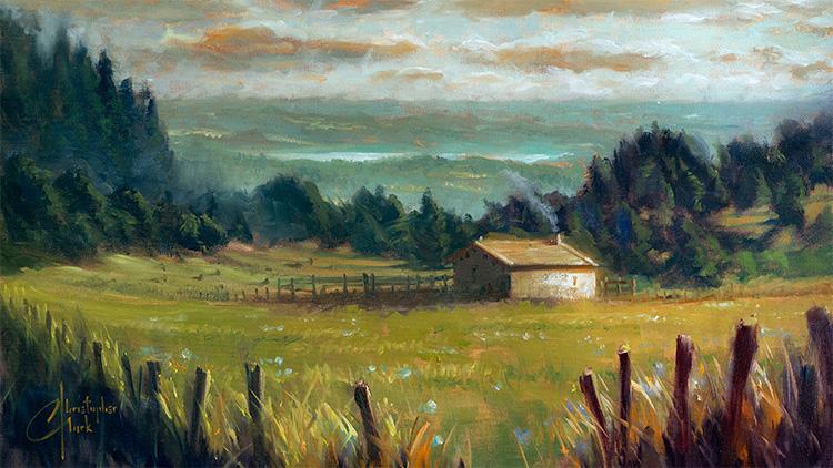
painting with Light. But together, we'll paint this beautiful French
impressionistic landscape. A little bit about me.
I've been an artist my entire life ever
since I was a little kid sitting watching Bob
Ross in the living room with my crayons on the coffeetable trying
to follow along, drawing happy Little trees
with a fist full of crayons. That's how long I've
been doing this. I've worked with Lucas film, focusing mainly on Star Wars. And I've also worked
with Marvel and Disney. And a lot of other big brands. But what I really enjoy
is painting my own work and my own ideas,
telling my own stories, and then sharing them with
you so that you can take those skills and
learn how to tell your own stories as
well through artwork. The structure of this
class is pretty simple. I'm going to be demonstrating this painting from beginning to end and you can follow
along with me and together, we'll make the painting together and you'll take all those skills that I'm using and you can use those for future projects
that you're working on. We will start with a really
mediocre reference photo that I took out of the
window of the car. The lesson in this
course is also, you don't need the absolute perfect reference photo
because no one ever has that. Or maybe the moment
you were there, it was beautiful and you
took a picture and like, I'm going to paint that
later and get home and like, Wow, this reference
photo is not that great. Well, we're going
to learn how to take all the good
ideas from that image, that reference and put
it into a painting, reorganize it, recompose
it how you want it. Instead of being a
slave to the reference, you can change it
into the vision that you actually saw and the feeling you felt
when you were there. We're going to start with
doing some drawing studies of the photo to reorganize
it and recompose it, doing a charcoal study, and then the underpainting, and then the rest of the
painting from back to front, from the sky to the grass. I'll be doing all that with you. And then learning about
the five main concepts of painting which are drawing, values, color,
edges, and texture. I will explain those
further in detail in a bit. This class is created for
all levels of painters. The tools that you'll need are very simple common
basic painting tools, palette and paint and surface, a canvas or a panel and brushes. I outline all those
very specifically in the materials list PDF that
I've included in the class. And otherwise, you just need
really a love of painting. It's cheesy, but if you
just love doing this, then it's fun, even if you're
learning and struggling. It's always just a
really expressive, fulfilling activity. So that's really all that's required is that you
love doing this. Uh, and then yeah,
the goal is to, at the end of this class,
have a finished painting that's beautiful that you can hang up or whatever you like. And then have all those
tools that you can then take and create your own stories with and pursue
your own paintings. So with that, let's get started.
2. 1 0 Impressionism, 5 Painting Concepts: So, the impressionism is kind
of where I find my roots. Rather than getting into too much of the
history, the painting, I think we're going
to explore more what that style of painting means to me and how it can be really
useful to be expressive, um, the original artists were more exploring brushwork
and light and painting times of day and painting
more original everyday sort of ideas instead of painting heroic biblical scenes
and figures and stories. It was more everyday things
that people could relate to. And I really enjoy
and appreciate that movement and that time
period of art in general. So here we're going to explore using light to tell stories instead of polished super
mega smooth brushwork, we're going to use really loose and free and
liberal brushwork that will imply a lot of detail. Instead of painting every
single blade of grass, you can do a handful
of brushstrokes and push and smash the brush
in just the right way, and it will look like a whole lot of detail
because we're going to let the paint and the medium and the surface and the texture be part of what we're
telling, as well. They're telling the story as
much as we are the artists. So with that, there's
four or five quick there four or five major concepts about painting that
I'm going to walk you through through
this whole process. The first concept is drawing and that is the construction
of something, how it is laid out,
how it is built. We think of drawing
as like a drawing with a pencil or
something like that. Lines. Well, lines don't
exist in real life. We put in our mind to help us really understand how things are built and how
they're constructed, like linear perspective. Things are bigger
when they're close to us and they're further
away, when they're smaller. Drawing is also anatomy
and figure drawing. Drawing is a how things
are built in the painting. A painting can have
really good drawing means that it's put
together really well and it's realistic and makes sense in
our logical brains. A painting that has really
bad drawing or is out of drawing can be where the
perspective doesn't line up. Something list looks
off, and you're like, I don't know what
it is, but that painting just looks weird,
and I don't know why. Sometimes it's
because the drawing, the construction isn't really well thought out and educated. So we'll go into that.
Next one would be value. Value means light to dark, lights and darks in a painting. The lightest lights often
are the sky in a painting or a light source or a street lamp or a candle
or something like that. Those are the lightest
values you might see, um, darkest values in a
painting in a landscape, usually are the
ones closest to us. We're going to use
aerial perspective is a concept we're
going to talk about to show distance in a painting. Things that are closer
tend to appear darker. Things that are
further away tend to get maybe a little lighter
and less contrast. We're going to use the
contrasts of different values to attract attention to
certain parts of the painting, and other parts where you
have less value contrast, your eye might gloss
over those parts or move or it looks
further away. So values are really,
really important. Um, part of this and how
to group values together into one piece instead of
millions of little pieces, how to put them together
into one chunk. Um, we'll do a charcoal study of this painting to help nail down the values before
we get into the paint. The next concept would be color, color or all the things that
we know about color like, yellow, blue and red, the primaries, the secondary is how you can mix
those together. But also color temperature. Like this painting,
I chose to do a warm light source that grades to a more cooler
temperature on this side. And we'll talk about how
the colors move around the palette how we can
mix them together, how we can use transitional
colors in between things to help to have a sense
of glow and light, how things as they get
less and less colorful, they recede into the distance as they get more
and more colorful, it makes them appear
closer to us. Color can be a really useful
tool to tell that story. A it's very expressive. You can put any colors
you want in anything. It's probably the most forgiving
element of all painting. You can put any color,
anything you want. If the values in the
drawing are correct, you can put anything,
whatever color you want. It's great. Um, the next
element would be edges. Edges are where two
objects meet together. Let's say the end of this canvas meets this
background, the brick here. There's a nice sharp edge there, where another softer edge
might be, let's say, different gradations
in the apron here, these reds, there's
some softer edges, but then there's
a hard edge right there where it turns
into the shirt. If I want to to have the eye gloss over or not
focus on a sharp edge, I can smooth it out and
make a softer edge. Softer edges tend to not attract attention and eye moves where hard edges attract attention
and the eye stops. Like the hard edges and the angular edges of this
house can attract the eye, and the hard edges of these posts here will attract your eye to bring you
into the painting. But there's softer
edges on the outside where these posts are that
make your eye gloss around. And so you can use
edges to attract attention or to make the eye flow or things like
that. It's a great tool. The last concept is texture, and texture can be the object that you're
painting itself, the texture of grass,
soft and fluffy, the texture of concrete. It's hard and it's rigid. Um, or the texture of the surface that
you're painting on. There's canvas texture
that you can see through these clouds and that adds
a fun element to play with. There's the texture
of the paint itself. Sometimes it's thick and chunky. Sometimes it's soft and flowy. So those two things,
texture can be deployed around to add a variety of surfaces on your painting and
to help tell the story of the object that you're
painting or to give a different sort of feel to whatever you're
working on here, a gritty feel or a soft
and delicate feel. Texture great,
great, great tool. So with that, let's set
up on our easel with just regular drawing
paper and a pencil and we're going to make
some thumbnails of this. You've seen the photo, I've included the reference
photo in this video. Take a look at the
photo. Like, Well, it's beautiful and
also not very good. And we're going to make some
sketches to find out how we can reorganize that
picture to make it better, to make it what we
want as a painting. So going to get our pencil and paper out and be
back here in a second.
3. Drawing study: Okay, we're at the easel and I've got my
drawing pad here. It's just a regular
old drawing paper, I don't know, nine
by 12 or something. And we're going to start
designing this scene. We can start by making an
approximate size of our paper. Maybe I want the horizon
a little higher. It's right in the
middle right now. Maybe I want the house. Right now, the house is right in the middle, kind
of on the bottom. It's like here. What
if we put it here? It doesn't have to be anything super fancy for now.
I just want it there. And see these great swooping
trees that are coming down, swooping trees like that. What if we use that?
Then we also have this nice swooping
land around the house. Pay no attention to the
church bells down the street. This is France, so it
happens all the time. Um and then here can
be some of these. I like this stuff
in the foreground. Maybe we can have this fence. Maybe we can use that and
redesign it and have it be have it be open right
there's barbed wire. So it's not really
very welcoming. So what if we design it where it's a little
more welcoming? So I'm squinting up
my picture also. I do that a lot to really
simplify all the shapes. So there's one way. I can even do a quick
version of that house. And, of course,
I'm drawing super weird because I can't
block the camera, but and here's where there
could be some trees. Here's this horizon. There's one way to look at it. Let's do another one.
What did that taking me 2 minutes. Let's
do another one. Let's say, uh, what if
we love these clouds? What if we want more clouds? Okay, let's put the
horizon way down here. And you've got these
trees that still swoop. Maybe we won't see so much of that blue distant
landscape there. And I don't know. What if we want the house
right in the middle. But we want a little bigger. It's kind of small right now, because this picture
is not great. And that's sometimes
what happens when you just take a picture
of normal life. We'll do these trees
a little more. And we need a little
more of that. See, I can still
push things around. Um and what do we do
with that fence now? It's a nice foreground. So maybe the fence can be still this idea of
something receding, you know, can be a
couple big ones in the really dramatic foreground. And then these clouds, maybe we can put them,
you know, like that. So there's another design. Maybe we'll do a third
one for good measure. Let's put the house over here. And what if we want it tiny? What if it's a small
little house, and then, we have maybe this is just
sort of coming together, sometimes they
just sort of place some things around
and see what happens. Let's move these trees behind. And let's say, well, what if the ground angles
the other direction? Right now, it's
angling to the left. What if we have an
angle to the right? That's dramatically
changing a lot. Now we have this fence. Now, I don't know
where to have I guess I could still have
tried to have an opening. It's nice to have an
opening in a picture because then it invites you
to walk into the scene. So if you have a visual opening, here I have open here. I guess I could try to
have it open there. Kind of a gum eraser
here, take a piece of it. Let's say that could
be like our opening. Now I have to make sure
I don't block the house. This is a really crude
pencil sketch that, you can do several of
these in a few minutes. So, here's another version of this whole thing
and you have the little I kind of lean
toward this one. I like how it sort of
ended up being a third and a third on this scene here. So what if I did Let's do a little bit bigger
version of this. This is the approximate
size of my Canvas. Let's put the horizon here. Um, this is really
your job as an artist. You're rarely gifted
the really great image. That's just wonderful.
I'm not a photographer. Sometimes I take
really great pictures and sometimes I don't. And sometimes I'm given a good picture by a
client or somebody. Sometimes I'm not.
If it's a client, it's almost special Here's this really awful picture I took of this thing.
Can you paint it? I have to, you know, Okay. If I make the ground
go like this, maybe I'll have the clouds doing the opposite and
they'll go like this. Then I like the idea of
having maybe I can put one big maybe we'll put two
there and I have an opening. Then this thing can go
off into the distance, and let's say, here's our house. Um, It's got a little window. I'm not worrying about too
much about details just yet, here can be some of these trees. I like this blue, it's really nice section
of this painting. I like how it's blocked
by the trees here, but then it's available here. And we can see this section. It's this really nice overlap. The house is overlapping
these trees here, and then these trees
are overlapping this, but you can still it's
a nice little viety. It's like a puzzle of things coming together and
those clouds can be here and these trees. We'll do a nice
charcoal study of this whole thing once I get a good idea
down of what I like. And then there's a fence and stuff, but we don't
need to worry about that. These are just like, who are the big players in this piece? Yeah, I think I like
that as a design. That looks much nicer. So here, started with a really lousy picture that I took out of the car
window somewhere. I mean, you can see the window. I didn't even roll the
window all the way down. Just took a picture driving across the
countryside in France. A lot of really great
ideas in this picture, though, and we can take that and do something
great with it. We can take it further. We can edit this very
mediocre picture and make a great
painting out of it. That's what you're going
to find yourself doing far more often in your painting life than having every single time the
perfect photo reference. I see a lot of artists
who they go to great, great lengths to take a really, really nice photo and then
they just copy the photo. Like, Well, you
were already done. You already did your work
with the photo that you did. Why did you bother
painting it and you made it exactly
like the photo? Well, okay, they had a really nice photo that
they took themselves, and I think they should
have just stopped there. Anyway, I like the
idea of being able, having the power to change something that's
not really perfect. Okay, so we're going to
run with this design. And you can pick any of these other ones or whatever
one you want. You don't have to do my version,
you can do your version. You can use this as an example, but feel free to rearrange
the scene however you'd like. You can zoom in and
see the details in the house, make it bigger. If you love anything
else, you can make those bigger
and more prominent. Let's change materials here and I'll do a nice charcoal study using this idea as a reference
for the organization, for the composition,
and then I'll use my actual lousy photo to help guide me with the
values and all that stuff. I'll change and
I'll be right back.
4. Charcoal study: Okay. I've got my same
paper here, next sheet. I'm using my vine charcoal now. I'm going to draw, not even
take up the whole thing. This is about where
I want to be. This is about the
size of my canvas. This is all just different
levels of vine charcoal. I'm going to explain a little
value study right now. What we just did was a drawing study real quick
to rearrange the painting. Um what we want to do
is now refine this further and study
the values which are going to be similar
to the reference photo. I like those values. We've just rearranged the
composition a little bit. We're going to do a drawing
study with three main values, values being light or dark. We have the lightest
that we can get, which is the paper, white paper. We have number two, which is about 50%,
about half gray, and the number three is about as dark as we can get with
this particular medium, which is a vine charcoal. It's a very dark gray. I've made a square, I've got two thicknesses
of this charcoal, super thin ones, these
break really easy, so I'll watch out when you hold them. And then
the thick ones. These don't have
any wood on them. It's literally a burnt twig,
and it's really great. Take your thicker charcoal here and we're going to not
hold it like a pencil, but you're going to put your
hand on top of the charcoal. If you're right handed,
you hold it like this. Basically if you reach down and pick it up off the
table and there it is. We're going to take
it and it's flat. You can hold it like this and
what we're going to do is lightly use the flat
broad surface of this. It's almost like turning
it into a big paintbrush. Now I should have turned
this over. I'm hitting these spiral things I should
have turned this this way. That's okay. I can deal with it. We're going to go over it. Now I'm almost using
the whole thing. This is covering the whole
surface in one little layer. I'm going to use my
little foam brush. If it has some red from another project that
was doing, ignore that. It was some red charcoal from
something else I was doing. I do use both hands
when I'm drawing, especially when I have
encumbrances like that. We start with our 50% value. Now, what do we do? We
decided we're going to draw the horizon about there. And then this swooping part where the house was
going to be was going to be about the other third. We've got two thirds. I ended up being a nice design
probably because of that. Now we're going to
have I'm doing, again, just a little bit of a
line drawing to rough in where I want everything to be I do like the overhand grip. I'm on an easel now.
You can do this on a table and hold it more
like a pencil if you want. I still like this overhand grip. You can prop up your
book on something um, now we had these trees. I'm looking at my
drawing that I just did. The trees are going
to come down. They're going to
pass the horizon. This is the horizon line. This is where the land meets the sky, far away
if you can see. These trees are going to come up and I'm not really doing any
details about trees yet. I'm trying to separate
the large big shapes. There's also going to be it's going to be
more of a smooth softened or edged foreground
thing that's going to be these wispy grasses
and things with the sticks of those fences. Those are our big
shapes and now we've simplified our new
composition even further. Now what I'm going to
do our darkest darks. So this is going to be I like doing some of the
darkest darks first. Usually, things in the
foreground end up being a nice dark in a
landscape like this, it helps to bring things
forward when they're darker. Things look further away when
they're a little lighter. Use the value to
show the distance. Here's our opening might be somewhere over here where
we can walk through. So we're going to use here, I'm going to draw these
trees as one big shape. I can redefine that shape later. In fact, that might actually even encompass
part of the house. Um, Again, I'm using
the flat part of this. You could use the point
I'll take you all day, but this is really just a study. We're not trying to do
anything magnificent here. Well, just to group
our values together. I'm squinting at my reference. Squint is a great tool to
simplify your reference. Makes things look
softer and more blurry and it connects
all the shapes together. What you don't want
to do is scrunch your face up like this,
you'll get a headache. You can even tilt your head back a little bit and just close your eyes like you're almost
going to fall asleep. Your eyes are just
almost closed. It's a very relaxed you can do it for hours and it
doesn't kill your face. You just squint at it, let your eyes almost close, and it blurs everything
and you can see, oh, I can connect all those
trees or one big dark shape. It even connects
through the house. Which I can define
that later if I want. Then I'm going to say that this field of grass in
the front will leave that as a 50% gray.
It's already there. Same with these blue
distant horizon things. Now we got to do is
iron out these clouds. Well, we're going to start
erasing some of this. You can use your finger and then I have a needed eraser here. You can use your
finger if you want, or you can just come in
here with the eraser. I'm not blocking
anything. I'm good. I had thought it would be a
good idea since our valley, whatever this is, might
have this down curve to it. I thought it might be cool if the clouds did
something opposite. I'm just drawing this
to show you the line. That way, it almost has this progressive change in the perspective that
composition might be nice. Very often in a landscape,
you know what it did? Wow, I'm noticing this now. I went way too high
on my trees here. We were going to leave that
exposed so we can see it. See how easy that is to
just change something? I made a mistake and I
just fix that right now. Um, yeah, I wanted
to see part of these blue distant things behind these trees and have
the trees trees block it. So I'm glad I noticed that now. When I'm doing my painting,
I won't make that mistake again because I just made it now when I could fix it real quick. You don't want to do that when
it's covered in oil paint. You just spent hours
on it, you know, let's say there's
really going to be one main cloud guy here. And then the other
guys, you know, those will be easy to put in
with a couple of details. But one main cloud character Um, and then while we're at it, let's pick out if I squint, I see this rooftop is
a very defined shape. And really now that I'm seeing
it, like, you know what? What I would love to
see is a little more of this plane of this house
to help break it out of the We need a value contrast there to help it separate it's almost it's the same value
as those trees behind it. I use a couple of
nice sharp edges. I went a little too far there. And I can cut out that house, and then I can add some
detail as I need to. Then there's a fence and stuff and all those little details
we can figure out later. You can use your finger to
carve in a little here. A fun little play of some
trees and things in there. But essentially,
that's the meat of it. Um so I just changed a plane of this
house to be a lighter, almost as if there's
light shining on it now. I think that's going
to help us really highlight this house
and make it stand out from those trees. A nice sharp edge and the
contrast of the value. Um another fun thing was
going to be this fence. We said we were going
to have I'm going to angle it like this
and then here. Now I'm using this. This will be one of the last
things I paint. When you're doing a landscape, you work back to front. You paint and maybe we'll do an underpainting
where it's similar. We'll throw in big
blocks like this. But then when we're
detailing things out, we'll start with the
clouds in the sky. Then we'll do the
distant things. I'll move forward and forward. These little this fence
or whatever this is, and the grasses and things. This will be the
last thing we draw. And maybe there's a couple
of them right there. I like this extreme. I see
this broken. It's okay. This extreme foreground. Maybe it has a
little fency thing. Now we can walk
through. Hey, look, there's this beautiful
house. That's fun. We can use some
of these grasses. They're all pointing
this direction. I can maybe change a couple of them to go this
way if I want. Um, then if you want to, you can take your eraser and squeeze it into a sharp
little chisel and you can chisel out some of
those little shiny light. That'll be a nice another
value contrast is having those really light colored tips of those grasses zinging
against that field there. While I'm here, I'll
go ahead and iron out a couple little details
of some of these trees. Again, this is all
one big shape. It's your job not to copy the reference, but to interpret. You're not here to just
duplicate the photo. That's super boring and sometimes pointless because
the photo is not very good. This is not a very good photo. This was me in the car driving. Well, it's pretty good.
I took a picture. And when I was looking at it, I'm like, Wow, this
is so beautiful. I come back and look at the
picture and I'm like, God, this picture sucks. I
don't want to paint this. But I'm like, No, that'll be a great study because I
do that all the time. I probably when you're on vacation or something, you
see something beautiful. You take a lovely picture
of it and you're like, Oh, this was so beautiful. It was so inspiring
and all this stuff. You get home, and you're like, man, what a crummy picture. This looked way better
when I was there. What happen? Well, that's just because the camera isn't as
skilled as your eye, it's seeing things, it's
ever going to look as good. You have to learn
how to reinsert back your beautiful
emotional experience that the camera just
doesn't capture. By that, you might have to move things around a little bit, change some colors and some
textures here and there, and before you know it, you'll be back in business with your beautiful memory that
you're trying to recapture. Now I'm just polishing and playing and you can use
this study to do just that. You can play as
much as you want. And try things out because this has taken a little
over 10 minutes. Do a couple of these. You
can do them smaller too. They don't have to be
this big. Um, this is six by nine or
something. I don't know. This is 9 ". I need to measure. This is about six by eight. Measure your hand like this, and it's like you
can go to, you know, the home improvement store and when you're
measuring a painting, this is 9 " for me
or 23 centimeters. It's super, super handy as a little measuring tool
when I have nothing else. I think that could do it for
our little underpainting. It's using our drawing
here as a reference, we do at a couple little
thumbnails, pick this one. Now we can refine
that and do a value study a little more refined
based on our photo reference, which is very mediocre and our new composition reference,
which is getting better. Every stage of this painting, it will get better
and better, and that's a really good exercise. Then we used three main
values to start with. One being the lightest light. This doesn't erase
quite exactly back. If you want, I've
got a white chalk. This doesn't necessarily
sometimes it works, sometimes it doesn't can go and this is a carbothelo pencil, but you can use any white
chalk if you have it. I think actually,
I would only do the sun or the sky rather. This draws on pretty
much anything. It won't draw on the super dark. Well, it does, but it just
smoosh and blends with it. But if you need to draw over a part you've
already erased, a white chalk pencil
works really well. Um, because sometimes
the charcoal doesn't erase all the
way back to the paper. It gets pretty close though. Which is why I like doing
these underpaintings. It's like we're
working with wet paint because it pushes
around and it erases, and I can add more and
do layers and stuff, it behaves a lot like wet paint, so it works really well
for this kind of study. This could be it.
We'll then use this as a reference to help us with our next stage
of the painting, which is going to be
the underpainting on the actual canvas. We'll reorganize and
we'll get our paints out and take a break,
hydrate, all that stuff. We'll see you back
here in a few minutes.
5. Underpainting 1: Okay, we've got our canvas
and paint set up here. I've got a few large brushes. These are just cheap
synthetic brushes. This is an old chip brush. Bigger brushes to start with for this first part, you'll
see in a second here. I've got an assortment of just small I kind of use crummy
brushes for this stage. I don't need anything precise. So save the gross ones. You'll use them later
in your painting stuff. I have a glass palette I quite like painting on glass because
it's really easy to clean, paint scraper and stuff and
to mix paint really nice. You can use any piece of glass. I'd sand the edges a little
bit so they're not so sharp. Just paint the back
white paint it white, let it dry for a couple
of days, turn it over, and you have a nice, great, clean glass palette to paint on. I've got my paints out.
These are oil paint. I've got a yellow ochre, and I've got an lizard crimson, and I've got an
ultramarine blue. You know, there's
some spaces here. This will eventually
be the whole rainbow of all the colors. For now, you know, I don't want to distract you
with paints we don't need. So for right now, I've only got the three
out that I'm going to use because I'm using a
minimal color palette for this exercise. Oh. Here's the charcoal
drawing that we just did. So, um, we established the drawing and the composition
with our pencil earlier, that was to set up the
construction of this piece. Once we studied the drawing, we added some value, so we only used black and
white, darks and lights. No color yet because we're adding things one
step at a time. The next step would
be basically to reproduce this more refined and more composed charcoal drawing as paint with just a few colors. Minimal color palette
to start with. I love this color palette. It has a huge range of color, and we're going to start
just imply the colors and temperatures
and things without getting too specific yet. So I'm going to dip my brush
and my mineral spirits here. You can use water if
you're doing acrylic. You want it nice and watery and very liquid to start with. Um, I'm going to go our light direction is
coming from the right, and this is a warm
afternoon sort of idea. I'm going to start
with warmer colors like some subtle
oranges over here, more to a cooler
green over here. I'm going to do a little bit of yellow ochre and
azar and crimson. And just get right into it. This is where you
need a lot of liquid. We don't want to use
a lot of paint right now because we're just
pushing it around, and we're going to be erasing
a little bit of it later. Notice I don't have
any white yet. We're going to treat it the same way as we did with the charcoal. We're adding our 50%
value to start with. I'm just shoving it into
the tooth of the surface. This is why we use a big brush, big brush to just get
the paint on there. And we can get more precise
with a smaller brush later. You'll actually notice,
isn't this is an 18 by 24 square that I drew onto a piece of loose canvas that
I just clipped onto a board. You can use whatever
surface you like. Um you know, stretch stretched canvas from the store or wood
panel or whatever. This is an easy way, so I can roll it up and ship it
later if I need to. That's what I've gotten
the habit of doing. Now I'm going to
do this gradation. I've started doing
this warm oranges. I'm going to now start
to add a little bit of my blue and a little
bit more liquid here. And it's going to gradually gradate. That's the same word. Little bit more ochre. Ochre is my foundational
color at this point, a little bit more green. I notice I'm moving over. I'm not going back and forth. As I'm changing my color, I'm keeping my area consistent. I'm not revisiting
the first parts where are nice and orange. I've changed the
color on my brush, so now I need to keep moving along the painting to
keep that gradation. I'm not using a ton of paint. It's very liquid right now. As we build up layers of paint, we use more and more paint, but we start with very little. So I can smooth that
out if I want to. It's kind of a nice
texture right now. There's our 50% medium value, just like we did
with our charcoal. And don't mind. You can
see it on the edges here. Ignore that. It's kind
of just the over paint. Now that I've got that, I'm going to take one of my
small little brushes here. And again, this is a regular
brush that's just old and crummy that I don't care
now if I really smush it. Um, so save those. Don't throw them away.
They come in handy. Get a little bit of
mineral spirits on here. Now I'm going to start ironing
out the drawing based on my charcoal drawing
as a reference. And of course, I
still have the image here sort of as an
image reference. Remember, we decided we're
going to put the horizon. You can sort of mix all these
colors turn into a nice, lovely brown, about a third. I'm not really
measuring any of this. In other classes
I have, we'll put a little grid over the image. Because we're really
trying to use the image as a very accurate
reference because usually I provide you guys with a really nice image,
but not this time. Ha. This time, deliberately
really mediocre one. So, okay, there's about so I'm dividing my
picture in thirds, kind of like what I
thought sky you know, the distant hills and stuff. And then the house will be, you know, what did I
say somewhere here? I can even I don't have a
place near me to put this, but I can even have this, you know, have both within sight so that
you can see them. You know, I was like, I'm not really drawing
the house yet. I'm just like, it's
going to go there. That's where it's
going to go. Um, I had this sort of swoopy. I liked the land
going like that. Um, we can do these trees. We're going to be
I like there was this swoopiness for
the trees, also. See that? Really big
shapes to start with. I can then define those
better when I want. There's a little pile of
trees there and whatever. But for now, those
are the big shapes. Before you get into little
leaves and blades of grass, we need to mark out the
large shapes first. And then in the foreground, we had it'll be this mass of grasses there and
some grasses there. A lot of fun curves. There's a curve
here for the land. Maybe we can do a little more straight to make something a
little more stable, maybe. A lot of fun curves, and then
here this is the horizon. This is where the land meets the sky as far away
as we can see. There won't be that
crisp line there later. We can paint over that
as we add more paint. I'm trying to make it
straight. Also, you notice, see how I'm holding the brush. I'm doing this
overhand position. Before, when we did the
charcoal, we did the same thing. It's like if the brush is
sitting there on your table, you just put your hand down and pick it up and there it is. So you can do actually
you can lay it flat. You can do, you know, all
kinds of fun positions. This is another way
to hold the brush. You know, almost like
you're writing a pencil, but you back up a
little bit and you can use your whole arm for stuff. There's also the overhand. So right now I recommend this, especially if you're
using it on an easel, if it's in front of you, this is a great way to do
all kinds of stuff. So try this, the overhand.
And you can hold it. I like longer handle brushes, but if yours are
shorter, you know, wherever the brushes wherever the handle is, so
I can lean back. It's all kinds of gestural
stuff with this overhand grip. So okay, now that I've sort
of marked in very generally, generally, everything, I'm going to take This is
just a chi Ball chip brush. I'm going to start marking in
some of our darkest values, which we said are going to be the trees so I'm going to say, we'll keep with the same
thing, this red to green. I've got my Alizarin crimson.
That's a hard one to say. Practice that one.
Alizarin crimson. It's a crimson like red, but then it comes from some
mineral called Alizarin. A lot of the paints are named after the minerals
they come from. Here's our path to get in, so I'm not going to
do that too heavy. And then I'm going to transition to more of
this green on this side. And then just big strokes. This is still a
decently big brush. This is, I think, a
1 " or something, a three quarter inch from,
like, a hardware store. So nothing really good at all. But for this stage, it's okay. But, don't get your tiny
little brushes out yet. It's too early for that. So
this is a pretty dark value for this foreground
bit that's going to be Remember, in a landscape, the further things
are away from you, then they start to tend to look lighter in value
and less contrast. And the further they get the closer they get to you,
it's going to be more dark. So that will help us create
a distance in our piece. Let's do the same
thing with our trees. I'm going to stick with this
sort of greenish color. I'm adding a little
more yellow ochre now to make it a little
lighter in value. And what did I say? I
was going to do this? So I have my you know,
I'm looking at mine here. You can look at your charcoal
drawing as a reference. Um, and these big
strokes are fun. I like to leave them visible
sometimes you'll see this texture through the
painting until the very end. Here's this house that I
can erase some stuff later. But in general,
maybe we were just doing sort of one dark shape. Here's these trees
that go up like this, and they're going
to come down Okay, this starting to look
like a nice big shape. And this blues, let's squint. These are a little too light. What I can do is just put
a touch of paint on there, make them a little darker. I actually a secret
a fun little secret about having layers of things in a landscape is if it's darker on top and then
lighter at the bottom, and then when you hit
the next layer in front, darker on top, lighter
on the bottom, darker on top, lighter
on the bottom. Like when we have
mountains, in this case, we have these distant
lands and then the trees. So it's going to
be a little darker on top, lighter at the bottom. It almost will add
sort of a layer of atmosphere in between those objects, and it
works really well. Okay, that works well. I think same thing here
with this you want. See now, like I said, usually landscapes, you
paint back to front. I did paint this first, but I didn't detail little grasses that I now have to
paint in between. It's still big chunky
shape, so it's okay. I go back and forth
a little bit. But still, I have this sort
of reddish quality over here, greenish quality over here. That will have a really
nice sense of light. And let's see. Let's try to darken some of these
just a little bit. And when I have all of my
paints at my disposal later, I can make these much
darker, even these. These can be much darker later. I love all the moving
brushstrokes happening there. And just for fun, I'm going to take a touch more don't I you've got a
lot of paint on here, careful how many times and how much piles of
mineral spirits you now add. When you're painting,
the first brush stroke you do will add
paint onto your painting. The subsequent brush
stroke you do in the same place will mix the color of whatever
is underneath there. You do more brush
strokes than that, you're going to start
to remove paint. It goes in that order. So I've already got
a little bit pain. If I just go one
brushstroke at a time, I can add a little bit more on top and they'll mix
together a little bit. If I keep going the same
space over and over again, I have too much way way
dark paint on this. But it'll start to dig
a hole in the paint, and that's not
really what we want. I wanted to make this sky a
little darker on the left. I'm really exaggerating. My light is coming
from the right, so I wanted it to really
be light to dark. I'm not going to
make it look like a stormy sort of thing. But I am really
exaggerating that light to dark because that's really
what we're using here. We're using light to
help tell this story, and that will include color
changes, value changes. That all will help tell
that same story of light moving across
the painting. Okay. So now that we've got our mid values and the
dark values in place, let's start doing we're going to start
removing some paint. Instead of an eraser, I've
got a paper towel and we've got whatever you mineral spirits or water if
you're using acrylic. This will still work if it's acrylic, if you move quickly. Just dip your finger
in the mineral spirits with a little bit of paper towel on it. And what did I say? I wanted to carve out
there's a cloud right here. You might have to
move the paper towel. Once it gets full of paint, just find a clean spot and move. If it chunks up and tears
apart, that's okay. Just move to a different spot. With oil paint, this is easy because it's wet
for a long time. With acrylic, if you get to it soon enough,
you can get it. You might have to do a
little more elbow grease, but it'll still
work. I've tried it. In earlier videos, I hadn't really spent
a lot of time trying this technique
in acrylic. So I was saying, Oh, at this point, you
have to add white. So if you see my earlier
videos, I have said that. But since then,
I've actually spent some time doing this technique in acrylic, and it does work. You just got to do a
little more elbow, please. All right. Now I got to design some
more clouds over here. And this doesn't have to
be super defined yet. I can define this more when
I'm actually painting, but I definitely want you Yeah, the more I scrub at it. The more I will
be removing pain. And bringing it back more
to that white surface. Again, I thought the
clouds would be nice. Since my landscape is
kind of doing this angle, the clouds will do this angle. So it will create this nice sort of perspective gradation. I don't want to do it
too much. I don't want to make the sky look crooked. So I'm evening that
out a little bit. But clouds do tend to like the perspective
curves across the sky because there's still
objects in perspective. And I'm just trying to
remove a little bit. Usually the sky is the
lightest around the horizon. Not always. Sometimes it gets
kind of this foggy miss. Toward the horizon and
it gets not as light, but very often it is. Maybe I can indicate
there's going to be a couple more
clouds down here. I can put a little more paint
back on there if I need to. It's a little too crooked. I'm going to flatten
that out. So okay. I try to keep these videos at about 20 minutes, so we're
getting close to that. You might take a
quick break and then I'll just reset here not too long because this
is still nice and wet. And then I'll start carving in the house with those planes that we added and
then just identifying some of these other planes
on the ground here. Okay, quick break and
we'll come right back.
6. Underpainting 2: Okay, and we're back. I
need a new paper towel. This one's Greg, get a new
one if it's dirty. All right. Now, this house, we had said it was going
to be about here. I'm going to actually carve
out this plane of the roof. And there's a little bit
of angle to this roof. I'm not going to go
too light because this isn't a light source. This is just an object reflecting
a little bit of light. This is really more for me
to establish this shape. And here's the plane of the
house that I said I would do. In fact, I wanted to be a
little longer than that. Usually, in a painting, the lightest objects in the whole painting are
going to be a light source, like the sky or a street light
or the sun or something. Something like those are the
ones in the underpainting, you want to take
the most amount of paint off so that it really
has a nice light to it because the paint
light actually travels through the layers
of paint like lenses on top of a color gel
on top of a light. When it hits the white canvas, it reflects back at you and travels through all
those layers of paint. If you have a nice
bright white surface, and then all the layers on top, the light can reflect off that
light and come back again, um so that's why those
layers of paint are nice. This is why I don't like I see artists painting on
a black surface. And I think, Wow, you're killing all of
your light because the light goes through
those layers of paint and stops dead at the black
surface of paint. So you're really, really killing your glow that comes
from within a painting. So that's why I'm not
a huge fan of painting on a black gesso or
a black surface. You can, if that's your vibe, you know, do whatever you like. I don't for that reason because it makes the painting
just look dead. I'm deciding there's going to be a couple more really
nice lights here. So that means while my
paint is still wet, I'm just going to really
remove some of that. And you'll see when we're
adding paint on top later, when we're adding
these really nice, juicy light parts, I'm
going to design a cloud. Sometimes I just add
in clouds where I need them, do that too. When we're painting lights on top of where we've
removed the paint, the lights get really
juicy and are great. If I was going to start adding light parts right on this dark part of this tree, for example, I'm going to start mixing either actual with paint or visually mixing those layers of color, and it's not going
to be as really engaging with that light. It's going to be a
little more dull. So if you want something really, really to shine
on your painting, have a more lighter color paint underneath and also really nice colorful
things underneath it. You paint a black
thing and you paint a street light on the street
light is going to look dead. It's going to be
yellow paint and orange no on top of
a black surface. But if you paint that
street light on top of a bright white orange surface, it's going to glow really
nicely in the painting. Let's see. The rest of this stuff,
I don't need light wise. This isn't for making light. This is more just for drawing. You can use this to
carve into and say, Oh, there's going to be
a path or something behind this house that
could help that stand out. I'm gonna have to make those
choices at some point. So what if I do it now while I can still push this
wet paint around? Remember, it's just
like the charcoal. So we do the charcoal drawing because it behaves
a lot like this. It's like wet paint
that I can push around. I can make decisions,
I can undo decisions. You can make these
mistakes and experiments now while it's really
not a lot on the line. When you spend hours and you got tons of layers of paint in
detail and you realize, Oh, that doesn't work
for whatever reason, drawing composition, values off, that's really hard
to correct later. So play with those things now, make those experiments,
have those ideas now. Let's say maybe there's
even can be a path here. Um, on this side. There is one over
there. There's like sheep or something on
it. I can't really tell. Probably, this was in France. There's sheep everywhere. I'm going to take
my little brush. And yeah, sometimes
I use my other hand. I'm going to start retouching that drawing just a little bit. I want that roof a little lower. So I'm redefining just a tad. So again, I'd I added a light plane to this house that's not
there in the picture. I don't know when this stops. Is this behind my house or does it come right
up to the house? I don't know yet. Maybe
we'll find that out later. I think that could be it for So you just have to stand and be
still and think about it. I have, there's
going to be lots of light things for those blades of grasses that are
going to come out here. That's like a detail
that's going to be hard I don't need
to carve that out now with my unless there's a group of
them that's going to be especially grouped together because they're just
such shiny details. Unless there's a group of them, you know, which we can do. I can even just
indicate like, Oh, yeah they're going to
be there somewhere. This can be just me for
my own edification. Um, like, Okay, they're going
to be somewhere in there. Oh, look, here's my little
path that I'm making. And those To what do you
call fence post things. You know, maybe I can
experiment placing them now. There's going to be
one there, one there. And then maybe they're
not all straight. Again, these are I'm gonna be painting this
field on top of this, so these are going to maybe get smushed
up a little bit later. Maybe there'll be one there. Maybe there'll be another
one right next to it. Maybe I can do a last one. See, I can experiment
with these angle, no angle, you know. Maybe this one will be a
little more of an angle. Like, I can play with these now. Well, it really doesn't matter. This is why we use
not a lot of paints, very thin layers of paint because I can move it around
and erase it really easily. The thicker your paint is, the harder it is to make
revisions later. Maybe we'll do a small
little thing there. Small little, you know,
fence post or something. So now we have a way into the painting to walk into
this beautiful house and, you know, this beautiful land. Visually and emotionally, it helps guide the
viewer into your piece. Oh, maybe if I want. That's not what
this stage is for, but I can start to, you know, iron out where there's trees. There's going to be a few there. You know, I've got a few minutes before this section can be done. I don't want it to
touch that horizon. Do I want it to go past it? Yeah, I was leaving
it completely open, but I'm like, does
it overlap now? Is it weird to have this? I I could have it to soften,
it's not defined. So we don't really know. Yeah,
I'm not really sure yet. I'll leave that as a maybe, which is totally fine to do. Um, and sometimes it's
fine to get up and walk away for 5 minutes and come back and you'll see the painting
differently again. That's a really good
exercise, actually. Take a break and look
at something else, not at your painting and
come back and look at it again and you'll notice things that you hadn't
noticed before. This is off and this is weird
or looks great or whatever. Um, because you've seen
it build up from nothing. So you've kind of gotten used
to what it looks like now. I've heard it's almost
like, you know, it gets burned
onto your retinas. So there's some weird
optical illusion exercise. You look at something
for 5 minutes straight, and then you look somewhere
else, and you can see that imprint on another
thing, you know? Well, it's kind of like
that with your painting. The image kind of gets
burned into your retinas, maybe more psychologically
than physically, um, and you're not really
seeing it anymore. You walk away and come
back, you're seeing it fresh for the first time
and then you'll notice things or put a
mirror behind you and look at it in the
mirror and you'll go, Oh, wow, and you'll study it
like that or look at it on your phone or through a
camera and through that lens, you'll see a
different perspective that you haven't really
noticed on your painting. That's super helpful. Also, you should stand up and stretch and drink water and
all that stuff. Okay. I think that'll do
it for this underpainting. I'm going to clean
off my palette. I'll have a special little video on how to clean off your
palette because it's important, how to clean your
brushes because I'm amazed how many people
don't know how to do that. I was like, Well, that's
a good skill to learn. Then I'll add all the rest
of my other paints and get some more fancier brushes out with more precision and then we'll keep
going on this. So take a break and we'll come right
back in a few minutes.
7. Cleaning palette and brushes: Now we're just going to
clean up our palette here. If you have a glass palette,
like I highly recommend, I've just got a paint scraper, whatever one you can
get from anywhere. And I just first scrape up you'll run out of
space on your palette. And then when you're
trying to mix a new color, it could turn to mud as you mix all the other colors if you
don't have enough space. So even in the middle
of the painting, sometimes I'll stop and do this, if I'm switching to something
drastically different. So I've just got a
paper towel here. I've filmed some sometimes, and I'll put it online.
I'll film this process. People have said it's strangely satisfying to watch
me clean a palett. Maybe you'll enjoy that. It'll be motivating
for you to do it. Scrape that off. Do it a can. You can hit it with a little bit of mineral spirits
if you want to, or water or Windex or whatever
you're using. Mm hmm. Okay. And then also, if
I really want to, I've got another
palette knife here. If I want to clean my paint off, I got a palette knife
like this or this is all you got the triangle one. I like the Bob Ross
sort of shape one. I can come and clean off the
sides of my piles of paint. That way, I scrape out all the
other contaminating colors if I want to sort
of start fresh. And I don't know if
you noticed so far, when I'm taking paint
from the pile of paint, I will get it from the bottom on the side of the pile here, not right on top, because
then you're going to be adding other paints on
top of those colors, and your colors will
be no longer pure. They're gonna have
other colors in them. So kind of get contaminated
with other colors. So try to take it
from the bottom. And then if you want
to clean it off, you just scrape off the side of that pile and then
clean it off there. And you've got still lots
of fresh clean paint. It'll save you a lot of paint. And then cleaning your brushes. I've just got a
jar. Nothing fancy. This is my mineral spirits. This could be your water.
I've got my little brusher. We'll do the big one
we use this big one. First thing you want to do
is take your paper towel, clean paper towel
and sort of squeeze out all the excess paint. Because as soon as you take this brush and
put it in here, you're going to add that
paint into your medium, and it's going to
turn your medium into sludge if this paint is just like caked
onto this brush. So you squeeze out
the extra paint. Then I can take it here and I just gently tap
it up and down. I'm taking the
bristles and they're sort of going like
this on the bottom. Don't you split
you're being gentle. You want this, so it's sort
of bending to the side, gently like this,
and you're sort of just dabbing it up
and down like that. You're being gentle
with your brushes because it's a
very precise tool. And if you do it too hard,
it'll splash anywhere. So you, then you can
sort scrape it off. To get all the
excess paint off of there or the extra medium, and then you can do this
again and squeeze out. And there you have
a clean brush. I'll do the small
one. Same thing. Take my paper towel, usually a clean one and you
squeeze out the excess paint. And then you come
in here and dab it on the side and
you dab it like that. You're being gentle with
your brushes to keep that chisel shape if it has one. I'm still, you know,
I'm not going to deliberately destroy
my lousy ones. I do like them. You do that with your
brushes now and then. Then, of course, if your jar of mineral spirits or jar
of water ends up sludge, you'll need to change this too. Um because if you keep this and you keep rinsing your brushes
out in the same stuff, this eventually turns
into thin paint. It's no longer even
a cleaning solution. So you're basically cleaning
your brushes in paint. So you have to clean this and replace it with mineral spirits. You can put it in a separate jar and leave it for
a couple of days. The paint will settle
to the bottom, and you can pour the top back into the bottle
of mineral spirits. If it's water, I guess you
just to dump it in the sink. So yeah, so I'll
change this I'll have a nice clean one
for the next time. So quick little how to on how
to clean your palette and your brushes because I was just surprised at how many of my students had
never done that before. Like, Ooh, that's a
good little tidbit to know. Super handy. So okay, I'm going to start adding my other paints
on the palette here, and we'll come back and we'll really start digging
into this painting.
8. Painting 1: sky: Okay, and we're back with
all of our paints out. Let me show you what I've
got here on the palette. Filled in all those
spaces that I had before. I've got a big pile of white. It's one of the most
common colors you use with oil or acrylic paint,
so you need a lot of it. We have cadmium yellow lemon, or you can use regular cad
yellow too if you like. I like the little cooler
side of the lemon. Same yellow ochre. Yes. The words in my
head get mixed up. The colors are right,
but the words are weird. I've got a cadmium orange. I've got a burnt sienna. Or it's one of the brown ones. It is a burnt sienna.
I always forget. Burnt sienna got a cad red, Alizarin crimson, same one. I've now got a dioxazine purple or you can use something
violet, like a dark purple. Same ultramarine blue, got a
palo blue and a halo green. So I don't have a lot of the really specific
fancy colors. A lot of them are mixtures. So look at your paints on the back of a paint
tube, actually. Um, you know, here's one of
the ones I'm using here. It's a Lucas Berlin. If it's a nice quality paint, Sower on the back, it'll
actually say a pigment on there. I'll say P period. And then this is P, which means pigment,
and then B 29, which means blue 29. It only has one pigment
in this whole tube. Sometimes they'll have
P this and P that. I was like, just four pigments
in here, like, Okay, well, I could mix this myself or I could buy the
tube if you use it enough or if you think it's a dark red or a dark something
and it has three colors, like, Oh, this has black in
it, this has white in it. Like what? It's going
to change how the paint reacts to other paints
and mixtures and stuff. I try to use only pure
pigment paints if I can. Anyway, let's get started. Working back to front,
working on the sky first. I got some still pretty
big brushes here. These are bristle
brushes and number ten. I like the rosemary brand. They're long ivory flat. So it's a long flat. It's my favorite
shape because you can get square shapes with it. You can use the point. There's lots of stuff you can
do. You can get a chisel. These are used, that's
okay because we're doing a big woohy section of the painting which
is these clouds. I don't mind using a big brush. I have smaller ones that we can jump to later
for more details. So let's get started if I don't block the
camera too much here. What I want to do
is I'm going to start ironing out these clouds first and then I'll do
the sky behind them. I know it's backwards,
but for some reason, I like to do clouds first
and then add the sky second. There are two layers.
I don't know why. I've got This is much, much warmer than my images. I'll try to go a little more
toward where my images, and the warms and this more cooler gray color that's actually my reference
will mix and it'll be nice. Um, we'll start with some white. Let's see here. I'm
just going to wing it a little bit of orange
and a little bit of blue. Yeah. Good. I'm going to use
a lot more paint. That's one thing I
highly recommend to do is use a lot of paint.
Say I mix the color. I don't mix it too much,
just a little bit. It's nice to have it unmixed. The colors are individual, and then you can just scrape
it up off the palette. Now I've got a little bead
of paint on the yards there's a nice bit of color. Grab a whole bunch on there. Again, I'm grabbing
the color from the side of the
paint, not the top. That way, it stays a
pure pigmented color. I'm doing one stroke at a time. Sometimes the stroke
is one square stroke. Sometimes it's a couple little staggered
strokes like that. But when I'm done, I stop and I can look at it and
see what it looks like. What you don't want
to do is what we call pecking or licking, 8,000 times in the same spot. All that does is destroy
your beautiful brushwork. Again, when you're adding
paint onto a surface, the first stroke in that spot puts the paint
right on the surface. A subsequent stroke in the same spot will mix the paint with
whatever's underneath it. Then a couple of strokes later, now all you're doing
is removing paint. So just a heads up on that. I'm gonna need more
orange real quick. I underestimated how much I'd need. These
are a little dark. These will really sing
when I add that sort of there's this glowy
glow around the edges. You know how I love
the glowy glows. What I'm doing is this
bottom layer of the clouds. Clouds I'm not a meteorologist
or an expert on that, but I just look at them and
I study them in my mind, and they seem to hit they get smashed
against a layer of air, and the bottoms of clouds seem
to have this flat quality. The tops are more poofy
and mashed potatoe, um, so right now I'm doing these bottom flat
surfaces of these clouds. I'm noticing this is a
little more blue than this. This is sending I was going backward here.
Let's revisit this. I'm still going with
my warm to cool idea. There's a couple more
clouds on the bottom here. They're going to be a
little lighter and see this overhand grip that I'm doing on the
brush, super handy. If you do this, you're limited. You got to tweak
over to get these. If I want to just
lay the brush flat against the surface and
do things like this, look how easy it is when I'm
just having my hand over it. I see a lot of newer painters. They almost hold it like they're writing their
name with a pencil. Like, no, you have
this whole giant, beautiful handle you can back up and it becomes
a gestural thing. You know, if I'm doing
this way, back up a little bit and you can have
your whole arm to move. I like this way. S I did that you'll get a ninja. You can like flick your brush around with the ease and
agility of a ninja warrior. I think as I get further away from this warm half
of the painting, I want this to become
a little more blue. It's getting a little too blue. That's okay. The color
variety will be fun. That's Santa Cloud.
That's going to be sky. Well, that's fine. I like the sound. Of the canvas. I've been tempted to, like,
just put a microphone. Like, right next to the
painting and, like, record those and share them
with people. The ASMR thing. People fall asleep to it and
stuff. It's kind of funny. Um Yeah, I'm running
out of orange. Up, it almost fell
off the back there. I rescued him or her. I don't know. We don't know what gender orange
is. Maybe it's them. Okay. Good. That's a nice it
introduction to my Clouds. It's the bottom foundation part. Now, what if I do
some squinting, do the squint all the
time at your piece. I'm going to take another
brush still pretty big. I'm going to start doing,
I changed my mind. I'm going to start
detailing out. I'm going to take
a smaller brush. This is a size six. I'm going to start
doing maybe some of these edges around
the clouds here. It's hard to tell. I'm really
taking some liberties in the color here because color
is very, very interpretive. You can do whatever you
want with the color. I'm kind of going a lot
more warm than in my piece. Maybe I'll do that
just for this side. I'm adding a little bit of
yellow, a little orange. This is very, very gray green. I'm doing this I'm designing
them to really accentuate those rim lights around
all those clouds, like the way this
time of day was, they had a really light glow around all the edges
of all of them. So I'm kind of I'm
playing with that idea. I tend to push things warmer anyway. That's
just what I like. So do whatever you
like. If you like the cooler version,
maybe we'll do that now. We'll go to this side. Now that I'm getting on the cooler side, do a little bit of green and maybe just a touch
of something else. A little bit more green here. Since we're doing this
gradation idea anyway, we'll do cooler on this side. See if I just do
salogreen by itself, it's a little too much
of a hot, punchy green. I think I want to tone
that down a little bit. And see the strokes
that I'm doing, I am moving quickly because I can't have this video
be a 20 hour painting. I'm mixing, mixing,
scrape up a bit of paint. I've got a nice bead
of paint on here, and then I can come
in here and do a stroke that has a movement
to it, and then I leave it. Don't be afraid to leave a piece of paint there
where you put it. Stroke, I'm twisting
and smushing and a brush stroke doesn't
have to be a square. It can be a whole lot of
caligraphic expressive movement. That's why I say back
up on the brush so you can really move
it around, you know. Then maybe what you can do is I'm just going to wipe the tip of that off on a paper towel. I can come in here and with
a decently dry clean brush, smooth out some of these edges in between these
color transitions. Because this paint, if
you're using oil paint, which I quite enjoy and I recommend if you
want, it's still wet. I can come and blend
some of these edges, and then I can just
wipe it off again. I've got a paper
towel over here. I can blend some of these edges together where these two
colors of paint meet. Clouds are really often
a study of edges. There's hard edges
at the edge where the light hits and there's
lots of soft edges inside. There's a lot of edge
things happening. I'm not destroying
my brush work. I'm just going
over once or twice and dragging this
dry brush through those areas to see
what that would do to soften some of those places where I want the colors to blend
a little better. Later, I can add another color in between those to
see what that does. I've got a light
blue on my brush. This is I'm going to start tackling some of
that sky behind. So I want a really warm hot sky. So I want to do a white and actually white and thalo green makes a pretty intense
bright green blue. So I'm actually going to
dumb it down a little bit. It's a little too pure, pretty blue for what I want. I want it a little bit
more a golden green. So I put a little bit of
ochre and just a whisper. I don't want it to be
green green like a tree. I want it to be sort of
a warm green like a sky. I like that, so I'm going to scrape up a little
more than that. I'm going in the spaces. This isn't always
how I do clouds, but this is what it feels
like would work this time. I'm actually mixing a
little bigger pile of the same color that I
like because it works. I'm going to fill in
some of those spaces. Now, the sky gets darker on top and it gets
lighter on the bottom, very commonly, often,
not all the time, but in this case,
yes, that works. So I can go a little further with this same value,
this green here. Also, this is the
first go around. I can come back and refine this later with some
more decision making. This is almost like
the first pass. I'm going to blend a
little bit of those edges sometimes where I have two colors of paint that
are real close together. Sometimes I'll just
take the brush and go across them again and it'll just smoosh
those edges together. If I want. I'm going
to add a little more just white and come down. See, I'm letting a
lot of that orange brown gold underpainting
show through. And it's really I
did that on purpose to have that beautiful color underneath to let those
colors shine through. You can see it through the breaks in the paint as I
scrape it across the canvas. You can see it in places where
I haven't hit paint yet. One stroke, one stroke, one stroke, one
stroke at a time. A good rule. There's
a little sort of method that a friend of mine taught me an old
caricature artist that I knew in the 90s. His name was Don Flaws. Really, really amazing
caricature artist. Sadly, he passed away of
cancer in the early 2000s. But he was a really
brilliant artist. I'm sad we didn't
get to see what he was capable of because
he died in his like, 30s, so way way too young. But he taught me
this great concept of Look decide, execute. So like, here's this space here. I'm going to make this green. A little darker. Okay.
Well, I'll make my green. Make my color that I
want, scrape up a bit. Maybe I'll start to
add a little bit of a different not as hot green, a little more cooler up
here in the purples. So I've looked I
wanted that color, I mix it, decide, I'm going to fill in this space. I have this on my brush.
I'm going to go execute. Boom. Sometimes it
goes that slow. You can go like this, boom, then one more,
and then one more. Then you can evaluate.
Look again, decide. That edge is too
sharp. I want to come soften and soften and soften. Okay. Look again.
Let's look here. There's maybe I want to do a little lighter
bridge between those. I looked, decided,
execute, boom, boom. So I'm doing that
very quickly because I've been doing this
for a long time and it becomes automatic. But sometimes your painting will literally take that long. We'll do a so green Palo
blue is super strong, it's heads up if you use that. I'll tint your whole painting
before you realize it. Okay. I'm going to move
up further along here. I try to mix my colors in the same areas of the palette that they're being found in. I try to move my mixtures
across the palette. So I'll have to maybe
continue this up here. It's hard because there's a
space where my hands are. But anyway, all right, we're hitting about 20 minutes, so we'll just restart the
video here in a second, and I'll continue working
away kind of moving along this gradation of this sky from these warm greens to
these cooler blues, a little darker over here. So quick stretch, and
I'll be right back.
9. Painting 2: sky part 2: Okay, we're back, and
I'm going to continue. Let's move this color over here. I try really hard to mix my colors near the paints
that I got them from. Good practice. Helps you organize your
paints on the palette better. I put them in this
order for that reason. It's the same order as they would appear in
a color spectrum. I'm not a scientist. I don't know how the
science of the colors work. I know it's convenient
for us they wrap around, it goes yellow primary color, and then the oranges
red primary color, and the blues primary color. Then they do actually wrap around for our visual
color spectrum, but scientifically, they don't don't know quite how that works, but I don't care
for what I'm doing. It works just fine. I'm getting to this bottom
part, this horizon, again. If you're using a
canvas like this, you definitely need
to use a lot of paint because those
canvas teeth, the texture really sucks
that paint right off the right off the brush. And you need to use
a lot of paint. If using a wood panel, you can get away with
using a little bit less. Then now that I'm doing
in the middle here, I'm moving toward the cooler, more bluey part of the sky. Now I'm using a little
bit of thalo blue, a little bit of
ultramarine blue, and a little bit of
orange to mix that. Before I was using
the greens and the yellows to make
this more greeny blue. Now I'm moving up toward
these more bluey blues, palo blue, ultraraen blue,
and a little orange. So I was here on the palette
now moving this way. You move across op
and I do that once or twice every 10 minutes, drop my brush in my paint. This is my right
next to the horizon. And I'm going to push
that down a little bit. Sometimes, if my brush doesn't
have a lot of paint in it, I can borrow the paint from
an area that's already there and just grab it and sort of drag it
down a little bit. I can cheat a tiny bit, if I want to just move
something down a little bit or move something in
a different direction. Okay. Let's continue working on I think you have to be careful with blues
in a warm thing like this. It can look really
garish really quickly, really childish and a circus. Be careful with your blues. I rarely use blue mixed with white or
something for a sky. I always mix it a little
bit with something else to soften it and make
it a little more gray. It tends to look a little more sophisticated
when I do that. Scrape that up. It's the rinse and repeat once I get
my rhythm going here. And it's got a lot
of brushy movements here going on,
which is super fun. Because I'm not destroying
my brush work when I lay it down and leaving it there, which is a good practice. Um, I forget who said this, but an artist told me that if you had to pay me $1 for
every brushstroke you made, how would that change
your brush work? We go $1, $2, $3, $4. Five, six, seven,
eight, you know, count when you do this
little licking technique. It destroys your
brush work and it kills the texture you builds up and you
worked so hard to make. And it cost you a lot of money. They actually call it
economy of brushstroke. I want to take this up
a little further there, just to push that
off the edge there. Economy of brushwork. Literally, like how economical are you being? They're not
talking about the money. They're talking about literally how many strokes does it take you to wisely consider every
part of your painting. I'm getting a nice
darker edge here edge, meaning the corner
of this painting. I want to blend into
that cloud underneath. Yeah, that's looking
really nice. I've got to come back
here and fill in this connect these
shapes together. The trees are right
there. I'm going to go past where I think
those trees are. Whenever I've established these shapes on
my underpainting, I'm going to go past where I
put them, past the border. I'm going past it, and
then I'll come back later with the next part
and go past it again. So the edges will smush. I don't want to leave
them separate where there's a gap in between,
that'll happen anyway. You'll see the underpainting coming through and it's nice. I will try to go past that
spot just a little bit. Okay, great. There's a whole lot
of movement going on. It's really nice. My horizon might not be entirely straight. It's okay. This is a
very gestural painting, so that's totally
okay if that happens. Now, I'm going to put this
down what do I want here? I'm going to grab this same
size painting, another six. This is a clean one. I
usually have several. I'll have a fist to all of them by the end
of the painting. I'm keeping this one
for this bluish gray, something color.
I'll use that later. But now I've got another
one that's clean. I have a bunch of
the same size brush. I'm going to go and really add in some of those
zings on that light. I'm just going to bring White and just maybe a whisper of this greenish yellow
to start with. I want it mostly white
and I want a lot of paint on here. I'm
going to come in. I think I even want
it lighter than that. And really add those glowing
outer edges of these clouds. I got a lot of green on there, let's add a lot more white
to make up for that. Scrape up a big, nice
pile of that paint. And sometimes I'll put
the paint on there, and then I can come
back and manipulate this edge a little
bit and blend it. And then that happens a lot. I will put a little
bit of paint on there. And I can then
manipulate it later. I need some more lights. See, there's a lot of
wet paint there now. I'm picking up those other
colors and I want this a pretty pure bright clean white. I'm having you can
brush off the brush on the side and then start again. I'm not cleaning the brush off in the mineral
spirits or my water. I'm just getting rid of the
excess that's piled on there. I've got this bead of
paint on my brush. I scrape it up and I can just gently set it right
where I want it. I'm not even pushing that hard. I mean, I want a really,
really bright light, pure white, right, and just
some really special spots. I'm doing just
those light areas. Those highlights the rim lights that are shining
around those clouds. It's my favorite time of day
when the light does that. Sometimes I can flatten
the brush out and use the whole edge to drag
the paint across. Like that. See I get this really
great moving, breaking, twisting that's only one
brushstroke and it does all these crazy things.
Play with that. Here's one. One. I'm like, I'm writing my name in
Japanese calligraphy. I'm doing all these really
interesting brushy things. Then maybe if you look
along the horizon, there's lots of
little tiny clouds. I'm just going to use maybe some pure white and
just add a couple. They look like really,
really distant clouds. Here I'm just using
the very tip. This is why I like flat
brushes because I can do these very sharp
chiseled strokes or I can do a straight
square stroke. I can do all kinds
of fun things. I like that shape. Use
whatever shape you like. There's the filberts
and the rounds and the pointed ones and the chisel
ones and try all of them. Maybe you'll come up with
a combo that's good for you, that's what counts. Do the one that works for
you. In the photo here, I'm noticing this cloud has some really light stuff
on the edge there. I think I'm going to
leave mine how it is because it makes
a nice corner. It makes a visual
edge for my painting. I like that. I'm going
to leave it like that. Maybe I'll add a little more
color or something later. I have this brush because it gets to be a dull
something or other. What if I add a little more? Maybe a tiny bit of white
and orange in there. There we go. That could work. Well, I got this
This could be handy. Maybe I'll try this
in another cloud. Sure. Sometimes I'm like, Well,
I got the color on brush. What else can I do with
it? Cloud. This was the same brush I was using
for these grays in the sky. I just put some orange
on it and it works. I don't overdo it. I didn't kill all the clouds
with this color. I just put a couple little
marks here and there. I do another one right
here just to make it distribute the colors nicely. That's one thing we're
going to do. We're going to distribute these same colors all around the whole painting. Whatever blues
appear in the sky, we're going to find
a way to put them in the grass and vice versa. Maybe later we can add a little bit of
green into a cloud. You have to distribute the
colors all over to make a nice uniform quality. Harmony, unity. I don't know. I've heard
artists argue which ones, which Can you have
unity without harmony? Can you make harmony
without unity? I don't know. You're getting
a little nerd for me. Um but distributing your colors
will definitely help that. I'm looking behind me because
I can see the camera. I'm looking in the
mirror, so to speak, checking my own work just to
see how it's coming along. I'm noticing This is a big. See, I didn't
notice that until I looked behind me into
my own camera to see this is a big giant cloud
that's got a it's too heavy. I'm going to actually in the reference there
actually is a break here. I didn't add it in. I didn't think I
needed it, but now I'm looking at it
and I think I do. So it's harder for me doing
these videos because I can't check my work in the
same way that I do normally, but it is really important. I just that's helping me
notice something that I can fix now before I move on. So There we go. As a little bit of a break in that really large dense clouds. It's a little too looming. I can play with the shape
there a little bit. Yeah, I think I
like that better. Yeah. Then now it's
like a couple clouds and it's nice. Okay. Let's do a little more. The lighter side of these
clouds is going to be much lighter and more
yellow green color because it's more toward
our light source. If I want to do the same
thing on these clouds. Instead of using my
white and green, I'm going to use
white and let's see. Do I want to do a little bit of this palo blue and
a touch of orange. It's going to be a grayish, but I think really it's the
value that's more important. O Honestly, because I've designed these
clouds myself at this point, I'm looking at my
reference not very much. You tend to do that as the more you start to design
your own painting, you don't need the reference as much. It's just a reference. If I want to see something that could help me to
make a decision, I can check the reference, but it is not dictating
my painting at all. It's just a reference.
It's just a suggestion. That's what it has
been this whole time. Your job is not to
paint the photo. Your job is to tell a story. Right? The photo can help remind you of some of the
details that you saw in this scene that was so
beautiful at the moment. But it is ultimately
you telling the story, not your phone out of
the window of the car. The subject of this story is this beautiful countryside and clouds and this house,
who lives in the house? The subject of my
painting isn't the photo I took from my phone.
Don't copy the photo. Base your story around the ideas that are in
this photo reference. But then eventually it is
you who tells the story, and you make your own choices. I'm going to remember
I said you want to have those objects overlap? Well, I'm going to push this
horizon down a little bit more so that when I add
the land underneath it, I have some sky to
smoosh it against. I didn't really put a
lot down there still. Without destroying all my fun little clouds
that are right there. I want to go a little
further past that horizon. Mm. Great. I want to go a little further past
these trees also. So I can come and
add the trees on top of this layer of paint
that I'm just doing right now. I got a little orange. I like when clouds have
reflections on the bottom. It's fun. If you ever fly in
an airplane, oh, I love sitting by the window so that I can see the
clouds as we fly by. Because I just stare out and
look at it because how often are you going to be in
beautiful glowing clouds? Well, never, because we
can't fly as human beings. But if you fly a lot like I do, then take advantage of
that when it happens. And I've seen some really amazing cloud
formations and stuff. One time we were supposed to be landing and it was landing in Denver we got stuck over the rockies for some reason because the
weather was too bad, so we had to wait for
a while before we could wait for a pattern
or something like that. They just kept flying around
the clouds in the Rockies. I was like, I took videos. I was like, in heaven
like you can do this all day. I was
having a great time. I love painting clouds.
They're so much fun. As Bob Ross said, there's
one of the wait, hang on. Speaking of Bob Ross,
look what I've got. Clouds are one of the
freest things in nature. They love to just
dance and play and have fun and they make them fluff and you lift
them and fluff them and I forget what he says,
you know, so here's Bob. He paints with me. I keep him on my little
table right there. Add a little highlight here. I think we're about
done with these clouds. Again, I might need
to walk away and come back and look at it and see
where we go from there. Let's put the brushes
down for a second. Stand up, take a break. I finished one major section of my painting,
this upper third. Next, we'll start to work on this distant this land as
it moves away from us, and then we'll add the
trees on top of that later. I might need to I'm
going to go ahead and scrape and clean this up because this is a lot of sky colors that now I'm just
taking up space. I need some other
colors for this here, I may clean this
up a little bit. Anyway, see you back
here in a second.
10. Painting 3: distant lands: Okay, and we're back. And I decided I don't think
I'm gonna clean my palette. I'm actually going to use the colors that are
on here already. I want to take advantage of this paint
that I've already got, it's in the same color
palette as what I want. It's almost a nice
shocking bluish, orangish, greenish something right here as this horizons at the left our painting where
our light sources. I'm not doing anything again, too crazy intense blue. Whenever it gets to
blues and greens, I think with skies and things, be careful and get really
garish looking really quickly. I think, um, deciding how soft do I want the edge of
this horizon to be? There are some very
distant mountains there. I think in general, I want
it to be pretty flat, that would imply this wasn't really a
mountain range place. I was driving across France, which is very hilly, very pretty, but it
wasn't a mountain range. I'm not going to put any really
obvious mountains there. Again, I might have those trees and that landscape meet in a blurred section there. I can add a little bit
of paint if I want to keep that. We'll see. It um that up here. Looks like there's a nice not worried about getting
this super super crisp. If I go a little too
far like I did there, I have another brush
here and just come back back in the
other direction. Happens a lot of times
as you pass your mark, you go back and you go back, go back until you end up
at a place you like. It looks like this
really light green part comes and it makes a triangle. At looking at that right. I like that. I can use it. I know I'm taking liberties
and moving things around, but I think that's cool. There's a little bit
of details in there. Sometimes I like to let nature to tell me what
the details look like. I can invent them and
change them if I want. But I can also use this
reference at face value, use it as a reference
and actually what it says. That's allowed as well. Here's this section. This comes down here. I remember I had said to create a distance between
overlapping shapes. It's nice to have it
darker here and then lighter just before the
next overlapping shape, in this case, it's
these trees here. Actually just a little
bit of white there. I'm going to go past
the part that I want so that I can come again past it when
I do the trees. I'll make sure this
has a nice gradient. It'll be it's not going to be dark because
it's the horizon, it's the furthest thing
away, so it'll get lighter. But it'll whatever
value that's here. I'll get lighter just at the bottom before the
trees overlap it. That will get a really, really nice distant
overlapping quality. Now, this does to turn
a low green because these are clean
mountainee things. I don't think I need any
actual green just yet. It's still so far away. The further things away,
this is aerial perspective. The further things are
away in a landscape, they start to take on more of the colors of
the very distant sky. This case is bluish
in some places, lightish, almost a green in others this color here,
whatever you want to call that. Uh so these hills are full of the same trees
that are in this foreground. But they're not green when
you get that far away. They become sort of this
bluish color that looks like it's the same color as
this sky that's back there. As things get closer to us, they're going to
start to resemble more the color of the
ones that are here. As I get closer, it'll
be a little more green, a little more green
until we get to the green of the actual trees. But they're the furthest away. There's this purplish, greenish, orange, something I don't
like putting names on it. Colors We're going
a little more green now here we can see I'm actually
getting there's a nice I'm a bit darker
than this last layer. So I'm adding a darker layer on top of this lighter
layer in the back. It's just a little bit darker because I can
see that it's a layer. There. Maybe even here or two, that's way too dark.
Got to be careful. You have to darken it
gradually, not too quickly. Add a little bit of dark on
top of that lighter layer and it'll look like
another little layer of mountains coming in there. There's also this
lake thing that I guess I I noticed,
but not really. I'm just going to indicate. I could have wiped out when I was doing
that underpainting. That probably would
have been a good idea. If I really want to glow,
which would be nice. I'm going to indicate
that's where I want it. I'm just scrubbing it in there. It's a nice little feature
that I really notice. I noticed it, but I'm like, Oh, this could be really
nice if we do it. Could a nice glinty light
happening somewhere in there. Let's approach that
as we get there. Let's keep going down though. This is too dark. This still
needs to be in general. This whole section needs to be lighter than this
section with the trees. I need to make sure I'm
not getting too dark. It's like this whole section has a bracket of value here and these trees are the
next bracket down. No part of this section
here can be as dark as this because that really shows
us that it's further away thanks to good old
aerial perspective. Aerial meaning I like
to think of it as, there's more air between you and this object
in the distance, not an aerial helicopters
and not an aerial view. It is more like, I think, the idea that there's more air between
you and this thing. There's more atmosphere. Okay. That's nice. Almost looks like a little
distant mountain range there. Let's do I'm going to
grab a third brush. I'm going to pretend
that this is a really bright glinty
light happening here. I'm going to put some
really intense green as if we're seeing
some reflections. This occurred to me
right now, this is going be fun. If I try this. As if I'm going to outline this glow with
this green color, as if it's a really bright
glint of color happening. Now maybe I'll take
a small brush. Just a little indication. You can almost see some
distant shorelines there. Over hand. I want to get the flat part of the
brush to just push. So when I was doing
this, I was kind of scraping the paint off at the same time I
was putting it on. Sometimes that
happens, especially if you have a
really stiff brush. Try to put paint
on with the brush, but you're accidentally scraping
it off at the same time. So be aware that Sometimes you just got to turn
the brush over. I do it this way, I can
just gently set it on. My hand is, like, right next to the canvas and
the brush is parallel. It. So there's a little bit of a river or a lake or something that's
right there. It's fun. Then let's come in here. Maybe I'll grab a little
bit of green finally. In fact, now that I'm
getting more green, I should move down this way. A little too intense
of a color green. I'm going to go right
on top of it and make a little range of green
little hills or something. I can even use this brush to smush in and pretend they
are happy little trees. I'm just applying those
details with this paint. There aren't actually I'm not actually painting any trees. I'm using this gesture
to apply the texture. Nice spars board of
different colors here. Painting the trees
that would be in front of that lake. Nice. There's some little valleys
and little things in there. They come down. I'm grabbing some of the paint
that's already there and I'm pulling it down. Sometimes you can
cheat a little bit. I just want to extend that
paint down a little further. That's cheating. I should mix more paint and paint it
on there. Let's see. I think I could probably bring this down a little further even. In interest of making
this lighter misty thing. I'm going to add a little white to my paint to make
it a little lighter. As I bring this further
down, there we go. Bringing that down a
little more second. I have some room to
overlap the trees. I don't bring this
down far enough. When I paint the
trees on, I have to paint them really high to pass to pass the level that I brought this
paint down last time. I've got to really bring it down to give myself
something to work with. I don't know, maybe
that comes almost to the level of the house there. There's trees separating
the whole thing. I think I like that. I'm going to really
milk this atmosphere. Now I'm just adding some white and mixing with the color I've
already got on there. Sometimes I can do that also. I can add a different
color in my brush and mix it with the paint that's
already on the canvas. I can do a little more of
that here just to make sure that it's the
lightest the bottom there. Let's look at that by me.
Yeah, that looks like suddenly it has this great atmosphere
quality because I'm adding a little more
it gets lighter in value before the next layer
overlaps it from underneath, which is these trees here. If you want to get fancy, let's
add some of those little, little ravines and stuff.
It's a lighter value. It's a greenish,
something or other. I don't want the colors
too intense here either because the further things
are in the distance, their colors also tend to be less saturated because again, the colors start to look more like the color of
the distant sky. That helps show distance that the colors
aren't as strong. These little grassy fields
little distant details? Is there a little grassy fields? That's the same color as the
grass that's right here. It's the same grass. It's
just a mile away or whatever. A kilometer France. So the further away it is
having to paint the same grass, but now I just added
a little more white and blue to it to
make it a little more a little more gray
a little more distant. These little distant
details in the landscape. Will he really show
some distance now. I'm applying a little variety of things as trees
and stuff here. I'm looking at the reference,
but also I can change these to design the shape of this landscape,
however I want. I'm noticing a lot of
angles coming this way. Maybe you'll do some of them, they get flatter as they're getting up
toward the horizon. Then we do that anyway. But I'm going to really
take note of that. A little bit of a linear
perspective there. That's a little too
white in there. Now it suddenly looks like I really haven't
done very much. The details are very implied, but it looks like
distant little specks of trees and fields and things. If I want to get
even more fancy, I can get a little bit
of touches of white and orange and make some very
gentle little specks, like the little towns. I can see some stuff in
there in the picture. But I'm going to exaggerate
that a little bit. A couple little smushes
paint here and there, help them fly those little
villages or something. I can even go just
a little darker, same thing in the same areas as if there's little
buildings or something. Then maybe if I want to detail
a couple of those trees. Not really specific
because again, this is still pretty far away. I got a smaller brush and a little bit darker a
little more intense green. Maybe some of those trees we
can actually see actually some specific areas that might have a tree
there or shape groups. This is still forests, the trees are as much as a
smush of color right now. But all those little tiny pieces really add up the distance, just some varieties of
gentle movements and shapes. Of course, the
further away you get, the more it just
turns into wispiness we don't really see it
anyway, so it's okay. So that looks like a whole
distant countryside, suddenly, and I really
haven't done very much. So it's just cleverly
placed overlapping values as the shapes are
getting closer. Colors are getting more gray
and the color of the gray, blue orange of the sky becoming more green as
they come toward us. The contrast gets a
little more noticeable. You do a little more there. The contrast and the values get a little darker as it
gets closer to us. Except here's a little secret. You add a little bit
of lighter value right before the trees in front to give that sort of
atmospheric quality. So okay. Next step, take a break
and come back and do these next sweeping
trees here in front. I'll see you back
here in a second.
11. Painting 4: trees: I got my bigger brushes back. I want to tackle these
trees with a bigger brush. These are my tens just
because trees are big and fun and they
push all over the place. Okay. I'm trying to think about
the gradient that I want. Red to green. Trees aren't red or are they? Why not? Do whatever you want. Here's not quite as dark as this is going to be because it's a
little further away. So I need a lot of paint here. When I start to get dark paint, I like to introduce a
little bit of medium. I've got a little bit
of linseed oil kind of stuff here because it makes
for more transparent paint. I'm looking at these
trees as a big shape. And look how holding the brush. I'm using the paint and the bristles of the brush
to push this paint around. If I squint my eyes, all these trees are
one big dark shape, all the way up until
the edge of that house. And I can add some shapes later. I'm using this flat part
of the brush to push up and sort of indicate some
tops of trees there. This is just a
shadow of the tree. I can add some more
details, and I will. And again, I'm going to
paint past those marks that I made in my little
atmosphery section there. A little bit of medium. I've got a little tiny cup of stuff here. Cup of stuff that I can
dip my brushes into. See, nice big brush, I can really do some fun
big smushy, brushy things. Then I can come back in with a smaller brush later
and refine that. Let's do this section. It looks like it's going
to go up to here. So now I'm going to
do more of the green, a little bit more of my color
or my little medium here. Painting sort of right through where that
house is going to be. I'll add I'll paint the house back on top of this
layer in a second. But it's great
where you can imply with a good amount of
paint and I can twist, almost like what I was
doing with those clouds. I'm doing this top edge of
this whole shape of trees, and I can do a forest in one brushstroke. How
cool is that, right? I'm noticing there's
another little house way, way off in the distance. Let's see if I have room to paint that. I don't
really need it. If I can fit it in or not.
Just noticing it now. And I'm leaving a lot of that. Don't be afraid to let the
brushwork stand. Leave it. It's okay. I might
push it up a little higher because I didn't really go as high
as I would like. I can see a little too
much of the gap in between the my little forest and my
atmosphere behind there. Yeah, I'll do that in a second. I just had an idea. I'll save that one for a minute. Here's my trees are
starting to come together. This whole shape right up
through the back of that. So carving away, carving the negative space
around the house. Those trees come all
the way down this path. Now I'm smushing and I'm
twisting, with a big brush. Sometimes the brush stroke doesn't have to be
one straight line. I've said that many times, it can be a whole lot
of fun shapes. Let's take one of my medium. Here's another brush I haven't
used yet, clean brush. A little more of a colorful,
slightly colorful. Grassy shape. I need way
more paint than that. Um, it's not too much. It's not the closest thing to
us, but it's getting there. We're finally starting to
see what color things are. Here, I can see in between
some of these trees, and what's going to help
me do that is having a good amount of
paint on the brush. I'm also seeing some shadows. Let's get a small
brush that's clean, and I'm seeing a
little bit of this. Some of these trees, here's this dark that I was
just working with. I'm seeing some of
these trees have a shadow. It's kind of fun. That adds a little
sense of light because now I'm seeing a
cast shadow by something. I can see in between a couple of those and a little area here. A little bit of medium. Looks like there's some
hedges or something here. So my greens are still
kind of staying here. It's like the green here and the browns here, like, you
know, it's still here. I also have all this white here that I don't know if I need yet, but I can't really mix my stuff there, so it's
kind of sitting there. I might use them in a bit, but I didn't clean off
my palette because I might still sort of
borrow that paint. I try not to waste it. Paint's expensive. I
try to use it all. Yeah, I like the intent of a path there, so I'm
going to try to leave that. Here's something that looks
like there's some stuff that goes right up to the house. That can be an overlapping shape that can be really nice. Okay. Nice. Let's do I have this
brush with this color on it. Let's do the edges of these trees have a little
bit of a highlight on them. They're catching some light from the light source on the right. I can
take this brush. It's not really very small, but I can turn it on its side or use the flat edge
and suddenly I can make the outline of
the right side of these trees where it is catching light from our
light source on the right. We see that in a few places. This really, really works with a decent amount
of paint on there. Maybe a touch of medium.
Scrape it up there. And now I've got this
isn't super light. If you squint at it, those
lights almost disappear. So you're not making it
just a really light value. It's in the same bracket
of this dark range here. There's really not a whole lot. Maybe these little specks. If you squint your
eyes at the subject, these little specks of land.
I can see through that. Those are a lighter value
that are noticeable. But if I squint my eyes, those edges of those
trees disappear. So keep them within
that bracket. Don't make them too light. I'm using the brush, the way the brush smashes and smushes against the surface, smash and smush. It's
the same word, right? That helps add a lot of detail
that I don't have to do, but it gives it an organic
quality also. Use that. Use the natural qualities of
the tools and the surface. The canvas is adding similar
fun texture as well. Um, let the paint have a voice in this
whole process as well. It's not just you as an artist. You have a partner.
Your partner is the paint and your
partner is your tools, and your partner is the medium that you're working
with in the surface. These all have a
voice and they can say very interesting things
if you give them the chance. Don't cover it all up and don't try to do it all for them. Don't sit there and
paint every leaf with the tiniest brush
you possibly can. I mean, some people like to do that, and that's
fine if it's fun, if you just meditate and zone out, whatever.
That's great. That's not my favorite
way of painting. I love to let the brush
tell a lot of the story. It makes for a more moving gestural sort
of painting quality. And it does go faster, yes. But that's not the point. The point is, I'm telling
a story with fewer words. I'll leave it that way. Okay. So I just painted all
forest in 10 minutes. Let's try and look at
that. Looks great. Um, There's the next section
of forest that'll be a little darker will be
this section right here. Let's go for it. This is going
to be a lot of this white. I don't need this white anymore. I'm going to get rid of it. I need this space. Getting rid of
that. There. Now I have a nice space
to mix some greens. I added some red
in here, there's a lot of purple
and those shadows. Here it's going to be That's
a little too intense. A little more greenish
blue, little medium. We'll do a whisper
of white in there. Because I don't want it to be
this color, this value yet. These look like they're
pine of pine trees. This isn't the best tool
for painting, actual pines. I'm implying it's
a little bit fat. But I guess I'm manipulating
the edge where I'm manipulating the
head of this brush where I can shape
it into how I want. Now that's a little too even
of a curve. What can I do? I can maybe paint
some of the sky. So I just got rid of my sky
coolors now, I need to again. I'm going to paint this
back down a little bit. 'cause I was finding a
little too even of a curve. Let's keep going there. It's a little too intense. There we go. A little touch of medium. There we go. Nice. I'm really
pushing the paint in there. But see if I push really hard, like, this is still wet for me. I can still scratch that off. So I do have to be careful that I don't accidentally pull off the paint that I've
already put on there. And, you know, these
trees are kind of more blue than they are green. I mean, it's a mixture of both, but it's like colors the most interpretive part of
the whole painting process. Anything can be any
color you want. If you see a color
somewhere in the scene, I run with it, go for it. If you think that
almost kind of looks a little orange. Put
some orange in there. I'm painting the sky behind some of these to touch
up that's okay. You're allowed to do that. Go back and forth
if you need to. But yeah, really, really run with colors that
you think you see. It's very, very interpretive
and it can be very poetic. You can be really adding
a lot of colors that would never really be found
in this natural thing. But it totally works, and it's fun and it adds beauty and story
interpretation, you know. I'm kind of there's sort of
two groups of trees here. So here's this bottom one. And I'm really taking
some liberties on the shape of this sort
of distant thing. I think I'm just going to
have these little hillsides come like that.
Here's a fun thing. I'm going put some white
on the same brush, and I'm going to outline where this second
group of trees is, and I'm going to use this white. Now I'm going to blend it with the paint that I've already put on there to add some distance between those
two layers of trees. This is what the beauty
of oil paint is. It's still wet, so I can
blend and manipulate. If this is acrylic
and it's already dry, you're just going to
layer another layer of paint on top of that,
and that's fine too. I happen to think
it looks really nice when the paints are
still wet and can blend. So now I've added in between. So I keep looking behind me at the camera, that's my mirror. I'm checking my own work
to see what it looks like and I can see like, it
looks so much different. I notice things that
I might not notice. So I really encourage that. That's why you take
breaks, have a mirror behind you if you can, look
at it through your phone, all those things
that'll really help see the painting from a
different perspective. I'm going to actually
connect this layer. See what I did there. I
mix the same greenish, whatever this fog color is, and I'm connecting it as if
somehow they're continuing. Sometimes you can connect
the layers together like that so they connect. Um, painting is a
lot of ways finding ways to group shapes
together into big shapes. It's a big pile of
dark greenish blue. Instead of, Hey, look, it's like 20,000 trees. It's a big shape. It's a big dark shape,
and then you can add details in between
them to separate them, but you have to connect
them all first. This sky was a big shape. I can consider it one shape and then I
can break it up later. These distant lands, that
was one strip of blue. I can, you know, think of it as one shape, then I bracket it
into one value, and I can make the big shapes first and I can add secondary shapes later. That's a lot of
what painting is, is how to group things together, and then how to break
them apart later just enough to tell that story. I'm going to do a little more of these the lighter side of these trees running
out of medium here. Add a little more. This could be a linseed oil or any
kind of painting medium, transparent to mix in
and get your paint a little more fluid These are a little more rounder,
whatever these are. If I want the shapes
to go the other way, you can use your other hand. You have to, I encourage you to practice
with both of them. It will be a little
awkward at first, but it will add such
a dynamic range to your skill level of painting. Because what I can a weirdo
and I can try to do this. And it's like, Yeah,
you can do that or just put the brush in your
other hand and do it. People are like, Are
you ambidextrous? I'm like, Well, you are too.
You just don't practice. So you certainly can be. Just have a little
bit of practice. It doesn't take, you know, your whole life again to learn how to do
that, not at all. It just takes a
couple of years of just playing around and
practicing now and then. Um, I've actually learned how to do calligraphy
with my right hand. I'm left handed naturally, but I've learned how to do calligraphy with my right hand. And now my handwriting with
my right hand is better than my left hand after 20
years of doing it. So you can learn to do whatever you like
with either hand. It can be really handy. Also, if your hand gets tired. We do this for hours and hours, my left shoulder is
always killing me. So sometimes just
to take a break, I'll just change hands
and just to give myself a break and it's really
helpful even for just 5 minutes to give your
body that quick break. I encourage that. Try that out. Um, you'd be surprised at how quickly you can
really get the hang of it. It's awkward, but stick with it and you'll see that
it really works nicely. I'm just polishing up some
of these shapes here. I'm really leaving
it very loose. This is a very
gestural painting. I happen to like
those quite a bit. But we're getting there. I think that's going to be
good for those trees. I'm putting my
brushes back gently. Next, we're going to
come back and do some of these curvy landi things and the house and the fence. It's going to be so much fun. Take a break and stretch out, and we'll be back
here in a second.
12. Painting 5: house: And we're going to start
doing some of our land, little slopy slopes coming
up here. That'll be fun. Now I'm really starting
to see some color here. I like the fact that this has
this slope quality to it, so I'm going to milk that it has this jagged
edge as it reaches those distant trees and
works its way forward. I think it's going to
be a little more green. In keeping with my red to green, this should be a
little more greenish here and it'll be
more red over here. There's one tree that's hanging
out in the middle there. I want to see what I
want to do with him. Not sure yet. N more paint. I think
that's always a good rule. Just use more paint in general. I don't like to use, like,
piles and piles of paint. I'd like transparent paint. But you don't want a
misily amount of paint, you know, to quote
Richard Schmidt. I'm going to have
this sort of wrap around, so it comes like that. It curves down
instead of going up, I want it to curve down and help enclose this part
here a little bit. Maybe I'll do some
lighter bits of light zinging in through here with a little
bit of color on it. Maybe I can even do that in one section to separate
something there. Here's where those posts are. Those are going to get
painted over, pretty much. But I've marked where they
are. Here's something fun. We're going to add
some shadows for some of those trees here. Here's a little
more orangy color I'm starting from here
and going this way. I'm making the light streaks as if the light
is coming through, and I'll take one of
my darker brushes and make some shadows
streaking across. Here we go. That
adds a whole lot of distance suddenly. Nice. Maybe it's curving a little
too much there. There we go. That's some of those trees streaking their shadows
across the ground. I'll fill in some more
details there in a second. I think going with that, I'm going to make these a
little more intense color. That's way way too much. Making them a
little more orange. There we go. Just touch that up
a little bit there. Hey, let's add this guy here. The path that leads up
to the house there or just a break in that field
can be a little lighter. This is the light source
side of the painting. I think things can be a little lighter on this side
anyway just to really push that feeling
of light coming in. The whole painting has
degradation of light to dark, this orange to green. That's going to help a lot. Little spies and stuff. I guess I can put some of
those guys in there later. What can I do about this house? I'm going to zoom
in on my reference. I can see the details of
this architecture here, even though I'm
changing a lot clearly. I would like to see because
the details are nice. Yes, we all know that's
a red terracotta roof, but caught right in
that direct sunlight, it's not super red, is it? It's actually more of this
light orange something. It's quite light in value. I think lighter than
you would think. And I think I want
to do a lot of paint to get that
edge nice and crisp. I'm changing the angle of the roof a little bit
to make it how I want. Mine's a little
flatter. Maybe that's a little too much.
I can adjust that. See, I'm using this
nice flat edge of this brush to make
a nice gisly shape. I can come back in on the
other side with a dark and This is why it's good to be able to use both hands
because I can come out here and push paint on this way. There we go. Now I've got a handful
of brushes going on. I keep the brushes
in my other hand and I can sift through them and pick the one that I want and do a
little color there. I can put it back and sift through and pick
another one that I want. Rather than having to wash
my brushes every time, I've got a whole vocabulary of brushes here that
I can just pick up and use all the time. Super fast. I've got the same size brush
like many times over. Let's do the dark
side of this house. This house is a
greenish, bluish. I don't even know
what color that is. I'll put a little medium in
there because it's dark. Oh, yeah, I was going to do
this side a lighter value. It's too green, maybe we'll
make it a little more Okay. Just a little more
of a dark pink or something because I do want
to blend with the landscape. It does disappear a little bit. I might have to find something because as far as
the color goes, if you just put I want it to be a realistic color
that actually is going to be present
in this scene. But now I'm losing my house. I'm going to make a
little shadow cast there. Maybe what I need. Actually, now that I'm
Zoomed in, I can see, there's a little bit of
some light stuff happening. There's a fence actually.
Well, I'm going to there's right up to
the edge of my house, I'm now adding
some shapes around the edge to cut the house
out of the landscape. Now I can see it better. I can do the shadow
of that rooftop. It is red, but
again, it needs to blend with the colors of the landscape. So it's
not going to be red. Don't describe red. You
need to add a little bit of green in there to make it blend with all these other colors
that you're seeing. And here. Maybe this is my light
side of the house. Here's what we're
going to do. I'm going to do a little bit of orange and go smush some orange there
and smush some orange there. You just ruined your house. It's okay. I know where it is. I'm adding some glows around the house, what
I did with this lake. I added some really
intense green. I'm doing the same thing
I'm doing an orange there. Now when I come back, I'm actually going
to grab some white. And put in there
and pull it across. I'm going to do it so I
can let the paint break. I really want that to be it
might be a little intense. Let's go back and blend that. I can scrape some of that off. That's a little much. But in general, I think
it's the right idea. I want it to be a
really intense glow. Here we might actually see. This is where sometimes you
got to get careful and slow. I've been really slamming
paint around this whole time, but now I want to
slow down and do some nice details
where they count. Out of the abstract of
this whole scene comes just enough form to really tell you a story
that makes sense. I like the game of
abstraction and form. This house has sort of these
slats that go this way. So I'm going to imply Colors. I'm gonna use a smaller brush. I'm just going to
grab that and pull it once or twice across. I'm not going to
paint each slat. We can even do a little chimney. There's a little
chimney right here. I'll do a light on
it, a highlight. Not a highlight the lit
plane of this chimney. There's a couple of just
little features on that house. Look how quickly
that came together as a cute little house. I'm going to add a little
window. Right here. I'm using orange because this is the lit
side of this house. It's getting a lot of sunlight. It is now now that I'm doing it. I didn't in the
original picture, but now that I'm
doing it, this part of this house is getting
a ton of sunlight. Cool. Well, all that sunlight's bouncing
around everywhere. A shadow isn't
going to be black. It might actually be a really
intense warm colored area. It's just a little window
there because that's fun. I like windows just a
window in the house. Yeah, there we go.
Maybe it's got a little tiny ledge
underneath it or something for some reason. Then with this, I'm
going to come back and pull in just so I can describe that roof
just a little better. It was a little too loose. Let's see what that looks like.
That looks really lovely. I'm going to put a
little bit of orange here right at the
edge of this shadow. There we go. A lot of times where
two colors transition, you'll see the most
intense version of that color a color
transitions into a shadow. You'll see the most
intense version of that color where we have
the light of this house, which I just invented a
lightish orange something, and then the shadow, which is
a darkish orange something. Well, right in between those is going to be the most intense
color of that orange. Even here in the dark part, I'm adding a orangish brown. Next time you see something
really bright out in the sun. Look at where the shadow and the light part mix
and you'll see sometimes some
really interesting colors that you didn't notice. I'm going to put
another window here. This one's a little taller. For the window,
I'm actually only putting the inside
edge that I can see. I'm not doing anything
more detail than that. Looks like there's some details like underneath the roof here. Maybe there's some grasses
and stuff underneath here. Yeah. There's going
to be a fence. This shadow pulls away from the house so I can use a
bigger brush for that. It's going to pull away
across the landscape, there we go. Nice. Maybe there will be I don't know if I want
to do that edge. I can grab that. I can make
this just a little taller. I don't want to ruin. I
love the way the paint just broke across that, so
I don't want to ruin that. So let's do a little fence. I got a couple minutes
before change videos here. I'll use my nice
bright orange brush and do there's a
fence on this side. Just a couple of posts. I'm looking at the image
for a reference here, but I'm not sticking
to it too closely. Maybe I have another brush
here that's a lighter color. I will do a lighter plane
on one of those posts. There we go to show some
of those details there. Now with my darker brush here, I can come in and add. This gives me a nice
overlap between the house and I zoom back in my picture here and the land behind it. There's some slats. Get a little medium on there. A little yard. Who doesn't want a fun little yard in the middle of the French countryside. Then, maybe there's
a little path going up here with
some little sticks. I'm going to take
my bigger brush and maybe a little I'm using the very
edge of this and I'm actually going to
scratch it on the side. A little path. You can use the
brush to make all kinds of textures and styles
of brush work. That's why I love
to turn it all over its side and smush it
in every direction. The more you're going
to abuse the brush, use the old crummy
ones for that. The ones that are
nice and crisp, save those for the
nice crisp things. Um, because those are really handy when you need
that super crisp detail. But the brushes that
are old and crummy, save those when you got to smush and do some
fun textuy stuff. It looks like there's some
hay baales and stuff on here. What if I just put some shapes and a little shadow behind it? Like a shape and a shadow. I think they are
little hay baals. But I think a landscape full
of these long cast shadows, add some interest and some detail in a place so otherwise, I didn't
really do very much. It helps us show that light. Because all these objects have the same direction cast
shadow in general. That's one I totally missed. I can come back and carve in the other side of that
little section. There you go. So I keep all the brushes, and they have different colors
on them so I can come in and carve in light on the other side of
that if I need to. Let's add a little
more light in there. Okay. Awesome. Well,
that's looking super good. Great. Well, our
little house is done. Let's move forward now, and there's a little
path here I can do. Then I'll start
doing this field of green that's going
to then lead us into our foreground of
grasses and these posts here. So take a stretch
and be right back.
13. Painting 6: fields: Okay. And we're going to do our little path here on the right that's leading
up to the house. Again, this is more of an
intense light moment here. I'm going to use some intense
colors. Keep leaning in. Hope not blocking
the camera too much. I have a terrible habit
posture of, like, leaning on my arm while I'm
painting with my left hand. I have to remember, you
know, of course, for this, it's bad because I'm
blocking the camera, but it's just not good
posture in general. So I try to, like,
sit up straight and, like, have my head
back, not like, hunch forward, painting for hours and hours that
really catches up to you. So really, really pay
attention to that. Having little sticks and
things that are leading off into this section. I'd like some more of these light colored earth
things happening here. I need a different
brush. This is too much dark paint
in that brush. If suddenly this was
my dark green brush, if I suddenly use this to start adding oranges and
stuff to paint on here, it's going to get
mixed real quick with the paint that's
already on the brush, and my bright oranges
are going to be muddy. I'm like, why is that?
Because the paint that was on the brush
already was kind of orange, so wrong brush to use. A lot of painting I
think is being aware of where your paint
is at all times, on your palette, on your tools. On the surface of the
painting, on your hands. Sometimes suddenly
I'm painting for a while and look my hands
are covered in green. I'm like, Where did that happen? Because there was a spot of green paint somewhere that
ended up all over me. Pay attention to where your
paint is at all times. Of course, especially
on the painting, but that can sneak up on you
in places you didn't notice. So, okay, a couple little sticks and twigs for the critters
to run and hide and play. Thanks, Bob. That's Bob. Got to paint little sticks and twigs for all the critters, and, you know, he talks
to me in my head. I used to watch him when
I was a kid on TV with crayons on the coffee table and try to paint along
with what he was doing. So that's how long
I've been painting. Okay. Now, the painting in the picture here, the
grass is just green. Well, we're kind of thrown
out the window here. I'm going to go again, I'm going to go for more
of an orange to a green. Well, in interest stuff
like our light source, I'm going to really try
to zing some light here. I'm going to add
some bright yellow. I'm painting sort of around. I got my big old honk
and brush again. Maybe a touch, a white scrape of that paint where those fence
posts are going to be. It'd be amazing. Yeah, this is this paint color
is orange, orange. It's not even that orange. It's an orange it's brown,
something or other. But it'd be amazing how as
I gradate it to a green, the whole grass is
going to look green. You're really fooling the eye a lot of times when
you're painting, it's really fun. Let's see. I'm going to have a lot of
I actually want this light this grass to get a little
darker at the bottom so that I have something to reflect all those bright
colored grasses off of. I'm going to break my rule of a light thing fading before
the next dark object. I think I'm going
to do the opposite here and have a
little bit darker. I'm going to use just a
slightly darker brush for that. Maybe I can do a little
bit of green here. So that I have somewhere to go. I want a contrast between this grassy surface and the lights that I'm
going to have really lancing off of it with all those little
grasses that are there. So I'm going to have that go darker in the foreground here. Okay, I'm going to keep
plowing into this. Got my now, I'm going to
add just a touch of green. Let me a little bit of medium. See now this is getting
a little greener. I don't want to be a
solid break in the color, so I'll just put a little bit here to have it
gradually change. This is a grassy field. So I guess it's all one
big shape, first of all. I I'm not taking my small brush and
painting blades of grass, not yet. I will add a few. I can add a few little textures of grasses sticking
up here like that. Like, with the tip
of this brush, I can push up and add
some grasses there. But in general, I'm not
filling in the whole thing. I am letting a little bit of the underpainting show through
because it's cool. It's pretty. It's this
really great orange color. Orange is brown. Paint right
through that post there. And then I'm coming up here. And now I can do, I
think, some real green. To join my distant slopes there. I mean, you got a big brush. It's amazing how much you
can really accomplish in a short amount of time
with a big giant brush. I'm really laying in the
general detail detail, the general idea of this field. And then I can add
some specifics later. Let's do another one of these little zingy slope
things coming down. I can see it in my picture
and it's nice. I like it. It's almost like the slope is curving up and
catching some of this light that I'm seeing from my light
source that is really, really coming from
my right side here. Then let's make this
whatever just dark. I'm just doing a
first pass at this. I can come back in and
add some details later. Again, I'm painting through where I think these
grasses are going to be. I'm painting around in general those fence posts a little bit. I'm leaving them just
so I remember where they were because I liked
where I placed them. But I'm painting through
where that grass is supposed to be to push my object further than the new overlapping shape
that I'm going to add later. Even here, I need to bring
that grass down a little more. And that's a little
too dark there. There's the general big shape
of the field of grass here. Goes from this orangy green to a more green, yellow green. Keeping with our red to green light to dark motif
of the whole painting, which really gives
the whole thing this really great glow. Now one thing we can do, we
can imply some changes in the levels of the of the plane almost adding some little skims
of grass and stuff, by adding a light plane sort of skimming
across the surface. Almost like you'd see on water. These could be also like little groups of flowers or something. I'm kind of adding some lighter value and some color here. And I'm not making
it too regular. It's sort of a line. I
can do a couple of these. Maybe there's one
here. I'm using the blade edge part of
this tool of this brush. Make that happen.
Maybe I can put one. And here, I can almost use
this to show the distance. The further away
they get from us, they're going to be
flatter and less defined. Let's say if I put one here,
let's just make this up. Let's say they're going to
be sort of little grasses. Okay, it's already a little thicker and a little
more well defined. I'm just doing some
little flicky shapes here with a lot of
paint on the brush. H. It'll fade off. Here's a thicker one that's
got some detail in it. I can actually see it,
then it gets further away, it's a little thinner and
it gets further away, it's even thinner
and less detailed. So that even the
space between them, this is linear perspective. The closer something is to you, the larger it appears. The further something away from you, the smaller it appears. It's the same grass as this. I can see some of
the blades here. There, it's so small, I can just see some little hints of it. We're using some
linear perspective even to paint some grass. This is the same concept
you use to paint a city. Or anything trying to show things that are close up versus things
that are distant, especially if it's the same
object, that really helps. I'm describing the grass here and then I'm showing
you the same grass again there and your mind associates them as
the same thing. So it puts it together. As an intelligent human being, you can put that puzzle together very easily because
you've grown up on this earth where
things look like that and your brain knows
how to identify those clues so that's super handy as a tool
that we can use to tell our story of this receding, see the words don't come
to my brain when I'm doing grasses and the receding
plane of grass here. Here's even a bigger. It's going to be overlapped by the foreground grass
stuff they go on. Here's an even bigger one,
more detailed, taller, bigger space, smaller,
a little less detailed. This one even has some colors. There's some oranges in
there and um, that's fun. This one has fewer colors in it. Maybe we'll put two little
orangy whiskies in there so that it replicates
the same idea. And now there's none.
It's just sort of gets more yellow and now
it's almost like gray there. So those couple
little grass details help to show this
distance of this field, really, really helpful tool. I'll do the same thing here with a yellow ochre to
make it more of this yellow color and less This orange has more
red in you know, I got the paints arranged
in the palette this way, primary color, yellow, red, blue, if you were
to mix them in between, you'd get these colors in
between, more or less. You can get purer forms of those pigments by buying
a single pigment color. Or you could mix them
yourself if you want, um, so it's this orange is a mixture of yellow
and red, clearly. You know, these purples
here, is and crimson, the purple, it's a mixture
of the purple and the red. The green, I have to leave
this space open for my hands, so the yellow jumps, but this is the circle
that closes is like that. The green is a mixture of
the yellow and the blues. By having those
three primary colors represented on my palette and
then a couple in between, I have a full range of color with only a handful of colors. You can mix things with white
to make lighter colors. I have all these darks
here so I can make all shades and flavors of darks. I don't necessarily use black paint very much because
I don't really need it. I enjoy having varieties of
darks with my own mixtures. It's a better habit also than, I want to make something
darker, grab black paint. No. Yeah, that will work, but you're also going to be changing the
hue of the color. You're going to move
the color along. It's going to become
more blue, actually. And you're going to make
it darker and you're going to make it less
intense of color. Um, it's a good habit. If you want to make
something darker, mix it with another color. You'll get some more
interesting varieties that way. I'm going to do the same
thing I did before, but with a darker. I was adding some light details to the grass. Let's
do some dark. This isn't a golf course. This is a wild field. Maybe it looks like, you know, they plant
stuff in between seasons. This was planted
with whatever they use in between seasons
to renourish the field. So this isn't like wild herb. This has been planted, but it's not really
being taken care of. They is letting it
grow for the season. So here we go. There's a
beautiful grassy field with not a whole lot
that I had to do to it, fill it in with a major shape, starting with my light,
going to the dark, keeping my color
motif, more reds here, thinking it's green, so I'm adding a little bit
of green and blue here, but it's mostly more
of this red side, and then it gets
more green here. Using yellows and greens
and blues for this side. I have those two motifs going. Then once I get the
major parts of it there, I can Add a few details, and suddenly it's a field
of grass and flowers, and you can go crazy and add
all the flowers you want. If you have specific
flowers you want to do, maybe we'll do that. I've
got a couple minutes here. Let's get. I don't know. We're going to sort of
make white little flowers. Well, in shadow, white often
becomes sort of a blue. So let's do you want a
lot of paint for this. Let's keep. This will
be the green side. I'm doing a couple of
these little fun flowers, a couple close ones. And really, I don't know
what kind of flower this is. I'm just smoohing a
blot of paint there. I'm trying to not keep
them too regular. They're going to get
a little further. I mean, there's a couple there. I'm just sort of you get
a bunch of paint on there and you just do a
little mush twist, and suddenly, it's
a little flower. They get smaller as they
get further away, clearly. And they don't necessarily
stick to my grass ones. Those are different. The flowers hang out
with the flowers, clearly, and the grasses
hang out with the grasses. And then let's make this side. I'm going to do a little purple. Actually. Yeah, there's really
none of this in my painting, and I
didn't even plan this. I just thought of it right now. But I do this a lot. You can add things that aren't in your painting because you're the artist. You can
do whatever you want. So don't be afraid to just take a chance and
add something like this. I'm gonna mix them together
so that the purples and the greens aren't too
much of a drastic change. And then let's take do I
have a light colored brush? Sort of, yeah. Let's do a
couple of these that are actually getting some
direct sunlight. I didn't add any of the
purple ones in the distance, either. Just a couple. And then these ones here. A couple of little petals might actually catch a
full hit of light. Not all of them. The ones
that are in the foreground, I won't do it because I want them to be a little
darker and a little more subdued. There we go. There's a whole look at full fun little chorus of life
plants and stuff. There's a sort of absence here. I'm going to put
something in here. This was missing a
little bit there. I know this is a path, but I
don't want to leave empty. I want to have stuff
there. Okay, great. Let's take a quick break
and we'll come back and finish up with these
foreground grasses and the fence posts. So take a break and stretch
and see you in a second.
14. Painting 7: foreground: Okay, final stretch here. Let's get right
into these grasses. I've renewed a couple of my
colors that we're running out and I'm going to start with, again, more of these reds. I got a nice pig brush, but I'm going to try to gently push up with the blade of the brush to
make this grass texture. I'm using a lot of
paint and some medium. This is the darkest
area of my painting. I'm letting each of those
little brush strokes, leave it alone as if I'm implying lots of little
things of grass. It's going to take us right to our opening or we can
walk into the painting. I'll do that all the way across. This is the first layer. This is almost pure thalo blue, maybe put a little
brown in there. A little medium. Now we have
a lot of movement happening. This is when you really get
to use the brush to talk. The brush is really
having a lot to say here. There's a lot of stuff going on. Um, more silos to a
little bit of green now. As I'm getting into
more more green. Oop, I was probably
blocking. I keep doing that. Um, it's hard to paint off to the side
when I'm doing this. I'll do my best. I'm going to do an overhand painting here. Whoa Look at that.This
advanced level, relaxing in the chair while
you're painting. Okay. I got one layer of grasses here. Now I'm going to do what will probably be what could
be a second layer, sort of the light part. Let's do. I think this is going to need
to be quite colorful. As if we're seeing this
transitional color from those dark shadowy grasses
to what's going to be later the light zingy parts as
the lights coming in. I'm going to clean
the brush off a little bit as they
come back in here with my orange because I'm picking up a lot of
that dark paint. I just put a lot of fresh
thick wet paint on there. I'm getting a lot of that now. And we'll move toward
more of a green, yellow color in
the yellow ochre. Maybe there's a spot where the light comes through
a little further. That's nice. I'll do
the same thing here. Just wipe the brush off
on the paper towel here. Maybe I'll even do
a touch a yellow. This is my third color. Let's see. This isn't just
coming straight across, this is actually going
into the distance. Let's not forget that. This is going up and then
into the distance like that. I don't want to forget
that. I almost did. That's okay. You can always paint over
whatever you don't like. Paint is very flexible, very malleable, and
very forgiving. There we go. This takes us
into the distance on the left. This isn't just a bar of grass on the front here
in the foreground. Let's do a little more of that light shining on
that part of the grass. The grass is Now, maybe I'll come in and do
some of those more lit parts. The post and the grasses are overlapping a lot, so it's hard. Hand to paint one
and paint the other and I go back and
forth a little bit. Let's get a lot of paint
here and some light orange. In this scene, the winds are
clearly blowing to the left. Our light is coming from the right and the wind is
also coming from the right. We can continue that
motif if we want. Get up a lot of paint and sort
of at the very tip there. This is, I don't know, is that wheat, whatever that is. So I know really so
little about plants. I paint them a lot, but
I don't know very much about them. It's kind
of lame, isn't it. I don't want them to
be too repetitive. Some of them are going
out at this angle. I'm cutting through
some of that paint. Again, I love oil paint because it's still wet and
I can cut through. Maybe there's a couple here. I want to frame our
little entrance, but not so obvious that
clearly that's what I'm doing. We're going to
transition to more of a yellow on this side. Maybe there's a whole
slew of them right here. There's a whole big, bright shiny pile of
them right there. And maybe one of them came all
the way down to the front. Maybe here too. Maybe this
one's curving in like that. Because you don't want
them too regular. This is nature. So there's one Rebel grass who
didn't like the wind. He went that way. And you had to make the sound effects.
That's very important. I don't want to look like
it's a super windy blowy day. I want it to be calm. These are supposed to go off
into the distance. I'm going to have them calm down and get a
little smaller here. I'm using just a
tip of my brush and a little bit of my cad
yellow lemon there. I can show a couple foreground
ones that are closer. These things are
just like angling and criss crossing all over. So, now I've got
this light color on my brush and I'm blending it. I'm letting it mix with the
blues that are already there, and it's giving me
a shadow color, which is really kind of nice. I'm going to do that, come back over here
and do the same thing. I'm letting the paint mix with the wet paint
that I just put down. Okay. And how about we put a couple little spots in there just in case
there's little specks, not only the same shape. You don't want
repetitive shapes. Some of these are little specks, little leaves or little chunks, or a little something
blown around. Look how quick that
comes together. When you think of it
as one big shape, this is one big shape of dark that I add a few blades of
grass and suddenly like, Oh, my God, that looks like
a whole pile of grass. How did you do that?
Well, there you go. You group things together
in one big shape, and you add a couple
details and man, it just happened so
fast. It's great. Now I'm going to
come back in with my darker one and cut in
through some of these. I want to add my my posts
before I get too late on that. Let's see. I need a thicker. This is a clean brush.
This is a nice dark. Let's go for some
dark brown here. Dark brown, red, purple,
maybe some medium. So it's this sort
of square shape. I'm going to change
the shape of that one, the angle rather. And it's like, you know, wood. So I don't mind if it's, like,
not super like, beautiful. There's this. I like extreme
foreground in a painting. It adds a lot of depth. There's just a random this guy. He doesn't know what he's doing. Extreme foreground, almost like you're hiding behind something. This guy is leaning in just
to have a variety and also because I want to point
at our little path. Then picking up
where we left off, this guy here, and then they're going to
get a little more blue. Now I'm covering up some of
those grasses that I made, and they lean in
different directions. As they get further away, they're going to be I'm
getting toward green. The green isn't quite working
because it's too green. It's too intense
of a green color, let's add a little
more brown in there. I can add just a couple
in the distance, and it looks like
they're going off the distance because I'm describing the close
ones really well. Then when I add a
more distant one, you recognize it as
the same object. And so I don't need to describe it as well because
you already know, Oh, that's clearly a fence post. I just saw one of those and your brain puts the
details together. You're an intelligent
human being. So are the people looking
at your paintings. You don't need to hold their hand and show
them everything. You only need to show them
a couple important things. Here's a little
bit of a lit plane on this one, on this one. Maybe this one, not all of them. Yeah. Maybe we'll show the lit plane on top
of some of these. Not all of them. Maybe
some of them are leaning toward us. Okay. Then what I can do is
come back and add in a couple grasses in front. More orange here. To have
them overlap each other. Some of the grass is
in front of the post, some of the posts
are in front of the grass, that kind of thing. Not all of them,
but just a couple. And now we have this
interwoven little moment here. I think we're getting
close to the end here. I can do a couple little details on some of these closer plants. Um, you can spend all the time you want detailing
this stuff out or not. What you can do is leave
this not as super defined. I can even come back
and blend some of these edges together because maybe they're a little sharp. Sharp edges attract attention. These edges are sharp. Maybe I'll soften
them a little bit. One little stroke at a time, just like that, you can
blend some of those edges. If you're oil super easy, if you're doing
acrylic, this gets hard because the
paints already dry. Softening edges with acrylic
paint, gets really tough. You might have to find
a workaround for that. Maybe paint in the same color again that you had it
and then blend it. By softening some
of these edges, what that does is
bring attention to other edges like
maybe this house. Maybe this house is the sharpest edge of
the whole painting, and that's what
brings our focus in. So you can use the edges
to help tell that story. Maybe in this foreground here, what if I grab a dry,
soft, clean brush, and I can just brush some of these I'm cleaning off
the brush just doing it on my apron to make
these really blurry on the corners so that it's
almost like out of focus, literally on the painting
and from your mind. Your mind doesn't focus
on that. It focuses here. It focuses into the entrance to bring me into the painting. Sometimes you can take a clean, soft brush like
this and just smush around one brush and clean off the brush
because you're picking up a lot of paint
when you do that too. Sometimes I like to go
through the painting and see, where else can I do that? There's a lot of hard
edges in places. Here's another fun
one. What if I get a nice big soft brush. This is just a synthetic
bristle synthetic brush, whatever. Dry, clean. What if I come in here and gently smoosh some of these
clouds in the distance? And then clean off the brush and then I'll come
over here and do it. I have a lot of paint on there. This is why I don't use a ton of paint because then this
kind of stuff gets hard. What if I come in here and just smooh some of these
clouds a little bit? They get softer and the
edges get a little more quiet and then suddenly it pushes them into the
distance a little more. I do this with clouds a lot. Sometimes I'm like, Oh, the painting isn't
really working, it's because the
clouds are too loud. I'm very, very gently just
brushing along the surface, and then I can off the paint, clean off the brush because I'm picking up a lot of paint. I'm not going to kill all the brushwork because
it's really pretty. What if I just want it
to be a little softer? These edges are there's lots of chunks of
paint, and it's cool. But I'm like, Okay, maybe
it's a little loud. You can make choices like that, especially if you're
using oil paint, which is why I
recommend it highly. Try it if you never
tried it before. Super amazing, very versatile, really worth the effort to try. So there's a fun
little technique to quiet down a whole section of a painting until maybe
you can find one spot or, you know, you can direct
the eye around the painting by having sharp edges
and color contrasts. There's a lot of
stuff happening right here. Okay, well, good. That's where we enter the
painting, so that's okay. We bring that in and
that invites us in. Oh, there's this
section right here. There's a nice hot orange and this light part of the house right next to this dark forest. That's a center of interest.
These two sharp angles. These are the only
architectural angles in the whole painting. The rest of it's
all organic things. So that's very attractive meaning it attracts
your attention. So it's pretty good. You know, I did it on purpose. Tell is part of your story. Maybe the light pushes you
this way and you follow this and you go up into the
trees and see this edge. Okay, what if I want to
soften this edge here to help carry me into the
sky? Who. Look at that. So now the light and
the shadows lead me, and I actually go like this and push the brush and push the paint
up into the sky. Now I'm in the sky, and now
it's leading me around here. Maybe I can do this. I can
soften this here a little bit. Maybe this part here
I was not sure about. Yeah, I want it to
be a little softer. I don't mind taking
these kinds of risks. Every painting is a
very calculated risk. It's kind of this
controlled chaos, maybe that brings me back
down into the painting here. And so it makes my eye travel around the
whole painting and, you know, all these swoopy
lines we were talking about. To help to curve you around the painting and you get to experience
the whole thing. Even the angle of these
posts here and the angle of this grass helps frame this whole thing so that
my eye doesn't leave or, like, get bored or
something like, you know, all those little tools are really,
really helpful. And one last little
bit for funzies, how about some smoke coming
out of this chimney? Because, why not? Now it overlaps. With you can use your finger
to blur stuff too. Little smoke coming out of that chimney because this is Bob Ross' world
now. Let's fix it. This is a Bob Ross
painting. Hey, smoke coming out of the
chimney. Blend it. Not too annoying
and too obvious, but just enough to hint at it that's happening.
It's kind of fun. And I can see when I change one thing, I
have to change something else. Oh, now I got to add
a little more of this tree here to make that
smoke shape makes sense. You change one thing,
it affects everything. So just be aware of that.
There we go. That works good. Awesome. I think this
painting, we can call it done. So we'll turn it around and we'll talk about the whole
process from start to finish. Good work, and we'll see
you back in a second.
15. Wrapping up: And here we have our
finished oil painting. This was quite a fun adventure, going from as we all saw, a really lousy photograph taken out the window of
the car where you can actually still see the window in the picture that didn't even
roll it down all the way. But it had a lot of
really great ideas. And again, seeing it in person, it was very inspiring
and it was very beautiful and really it gave me the desire to
capture that moment so that I can remember it
later to try to paint it. But of course, I go back and
look through the photos, and it's like, wow, this is
really not very exciting. God, I remember this being
so much more beautiful. Well, I guess I
won't paint that one because I have a lousy
photo reference. Well, that's really, kind of sad because it was
a beautiful moment and it could be remembered if we could take that really
mediocre memory, sorry, great memory mediocre photo and bring that back to
what we remember it like. So of course, starting
with just taking a few rough pencil
sketches to try to reorganize the elements
of the photo, um, into something more enjoyable
and more beautiful, maybe how we remembered it, changing the light,
making things bigger, pushing things smaller,
however you want. So that was a nice
little process. And then, of course, taking the next step
and doing a charcoal drawing to further refine
our chosen design. And all that, you could do several of those and, you know, spend an hour doing a few
sketches, a few sketches, a few charcoal sketches, that'll save you hours and
hours in the painting. For every minute you dedicate to doing a
little drawing study, that multiplies by many
times how much time you're going to save in the
painting and how much more you'll like the finished
painting because you've refined a lot of things ahead of time so that when you get
to the painting part, you already know
where you're going and you can just plow through. Then, of course, taking
this charcoal drawing, reproducing it on the canvas with some hints of
color and temperature, starting with the more warm
lights over here moving to more cool greens on this side because it
was an afternoon vibe, so I wanted to keep those
warm lights going on. So that worked out really well. And then moving back to front, starting with the sky and then moving forward into these
distant lands here, fun little techniques to add some separations
in between to sort of show these hills
and things moving forward, even playing with this lake, making it glow a little bit, adding the trees, and again, grouping things
into large shapes. The trees, we didn't paint
each individual tree. We painted a group of trees, and then we can add a
couple little interruptions and details here and there, and it looks like a forest. Moving forward with this house and some of those little
surrounding fields areas, really embellishing
on the house, moving into a different
spot, making it bigger, adding a light plane
on this part of the house to really
make it stand out and to make
it look prettier. Also the whole thing
was in shadow, which means maybe the
sunlight was actually behind the house when
I took the photo. But I decided to you can play
with the light direction. Yeah, here we have shadows
coming from right to left, almost as if the sun is
directly to the right, which even still the house might not be lit
as well as I did. You can re imagine the
light how you need to on certain objects to
better tell your story. I want it really to
feature this pretty little house in the countryside. So okay, this house has
a light that's maybe shining from out here and
not directly this way. So you can play with
the direction of light for certain objects
just to make it work. You're the artist. You can interpret it
however you'd like. Even adding some
glow orange things around there to really
make that house glow. Um, and then moving forward, adding field of grass. Again, thinking of
his one solid shape and then coming back
for a second pass, adding a few details of
grasses and changing planes, using some linear perspective to show larger pieces of
grass that are more detailed to smaller and smaller that helps us
again show this distance. Coming back, adding a few
flowers just for fun. Then lastly, doing
this foreground that is the really darkest
part of our landscape because, of course, as we move forward, things get darker
and more higher contrast and sometimes
more intense color also. So this was a really nice way to make the distance
really, really complete. Um, I think when you do a
landscape and it kind of ends without anything really
dark in the foreground, it doesn't look you can't really tell how far
away anything is. But when you put
something really dark, something in the foreground,
even if it's just the grass. If the grass gets really darker, it makes a nice frame, and it kind of puts
us at a distance. It helps. It's another clue to tell us how far
away things are. Um, so I think having those progressively
darker shapes as you move forward in the landscape helps give us that sense of
distance because, again, this is a two dimensional
surface that we're making this optical illusion to make this look
like this infinite stretch of sky and land. So we have to use all the
little tricks that we can. We deploy all the
little tools to make things look more
distant. Closer is darker. Gets a little lighter,
a little less contrast, a little more muted colors as you get further
and further away. Things look larger. These same blades of grass could be also here by the house, but they're so much tinier because they're
further away from us. These same flowers are tinier because they get
further away from us. So that linear perspective, that's all part of drawing and part of the construction to show us this distance on what is a flat piece of
canvas, whatever. Um, so anyway, I hope
you had a lot of fun. I enjoyed this was a really fun experiment to really invent and to idealize and to make this world look more like what
you want it to look like, not just the lousy photo that we get later
when we get home. So you can bring
that memory back and bring that adventure
back into this piece. So I hope you can
take that skill and pursue that with other
paintings that you'd like to do with other photos that
you were not satisfied with that came out of a
really beautiful memory. So try that and let
me know how it goes. So thank you for
painting along with me. I'm Christopher Clark and
thank you for joining me on my painting course
Impressionism, painting with Light. Happy painting, and I'll see you next time. Thank
 Christopher Clark, Professional fine artist and instructor