Transcripts
1. Introduction: Have you ever looked at
something you drew and felt like something was missing? That certain something
that words can't describe? Or maybe the drawing just felt ever so slightly incomplete. Do you want to take your
art to the next level? Because I have some tips and
tricks up my sleeve that will elevate your art instantly without years
of tedious practice. Hi, my name is Clara. Okay. And I'm an illustrator, a graphic designer,
and a content creator. I graduated in
March of 2020 from a design school here in Germany with a degree in graphic design. And I had a focus
on illustration due to the time that
I graduated in. I mean, we all remember
March 2020, right? I was kind of forced to go
into freelance right away. And I've been working freelance ever since and I've been
really enjoying it. I feel like my background in
design gave me a head start into creating illustrations that are not only kind
of cool to look at. I've been selling my own
physical and digital products for the last three years and I want to show you how you can give your illustrations that
little something extra and take them to the next level using the teachings
of design school. Today I want to
teach you how to get from blank canvas
to finish piece. All while harnessing the
ideas and concepts of design perception and
color psychology to create illustrations that
will leave an impact and can easily be turned into
products for you to sell. I will take you through
the process step by step, and together we'll
make sure you utilize your entire creative
potential to create a fantastic end product. Let's get into what this
class does and doesn't teach. First of all, this
class is for everyone, every skill level
you can think of. You're all welcome
in this class, and I'm sure you can all
take something from it. I focus mostly on digital work, so that's what I'm going
to be referencing, but it really applies
to all kinds of art. So you can also work
traditionally or you can use whatever medium
you feel comfortable with. This class is here
to support you guys through your specific
artistic journey. No matter where it
might lead you, this class can be used to create commercial products or if you're like interested in
that sort of field. But it can also be
used for you to just have fun and draw a little
bit like as your hobby, there's no tons of practice
expected or required, no anatomy knowledge or
anything of that sort, so you can breathe
easy in that regard. But as it is with all advice, just take whatever sticks
and leave the rest. For a class project,
you'll be creating a finished illustration using the tips and tricks we learned
throughout the lessons. I know a blank page
can be intimidating, but together we will be creating something to fill it.
Let's get creative.
2. Class Orientation: Hi, thank you for
taking my class. Let's create something
great together. But first, let's go
over the class project. For our class project,
you will be creating the album cover art for your favorite album of
your favorite band. You can choose which one it is. Additionally to your
finished illustration, you will also be
creating a packet of information showing all of the stuff you learned
throughout the class. But don't worry, I'll
guide you through it. Your finished product can
be used as a product, maybe not for the cover for your favorite album,
but in some other way. So be creative about it. And the class project
will serve as a way to put it to practice what you
learned throughout the class. The tips in this class can
be used for any skill level. So you don't really
have to be at a certain level to
complete the class. But it depends on what kind of stuff you want to do, what
you want to get out of. So hypothetically, you could draw the class project
with Stickman, but I would advise
you to reach a little bit higher than that for your supplies. For
the class project. You have multiple choices. One, you go digital, so
you use your tablet, your drawing tablet and your
drawing program of choice. Mine's going to be my ipad Pro, and I'm going to be
using procreate, but you can really use what
you're comfortable with. This can also work
in a digital medium. So I suggest you take
good quality paper, some pencil, some fine liners, and maybe some Copics if you
want to work with color. But in the end, this
really works with whatever medium you're
comfortable with. So you can also make a
collage, if that's your thing. But I teach the most
about illustration, so that's maybe where you get
the most out of the class. So in the end, we'll end up with a finished illustration
or art project. For the class project,
I will be providing you with my guide for digital
art as a resource. So basically you can
look over that and see my whole process and how
I create digital pieces. So in case you want
to reference that, it's there for you. The
lessons in the Guide to Digital Art will somewhat mirror the lessons that
we're all taking today. So it's really
helpful to have as a resource on the side to scroll through while
you take the class. And finally, I'll leave
you with a reminder. Remember to approach
the art process with as little
judgment as possible. Remember that all art is
valuable and so is yours. So try to not compare your
results to other artists. I don't think it's
really helpful. And you should only compare
yourself to your past self. So whenever you grow, that's
going to be valuable. And if you don't just
want to screw around with art that's also
valuable, you're doing well. Keep it up, I believe in you. We got this. Let's go.
3. Finding an Idea: Hi, welcome back.
In this lesson, you will be learning how
to find inspiration, a concept, and lastly, a tangible idea of what you are trying to achieve
with your illustration. This is also kind
of the fun part. Let's look over some resources I like to use to find
inspiration and a concept, and to give me rough ideas of what I'm going
to be working with. So let's get right into that. First of all, this is your
time to open Pinterest, every artist's favorite pastime, and scroll and try to find something that resonates
with an idea you have in your head that also kind of ties back to your
whole album thing. I would recommend creating a folder if you're
working digitally or like a physical folder and
put everything inside that has to do with
the illustration that kind of inspires you, that tells you something about the direction in which your art piece is going to be going. For a digital mood board, I use the Sref, which is available for
ipad and iphone only. But basically any software
where you can drag and drop pictures into like a frame that works Viz Ref is an option, but you can also use
something different. Another great place
to find resources is the clip studio paint acid
shop for like three D models. If you want to go
really in depth into character illustration
and you're not entirely sure about the position of the character and
stuff like that. You can use three
D models to help your process something
after the process. That I also like to use is Adobe Lightroom for color
correction and color grading. But that's kind of
like for the long run. Just in case you
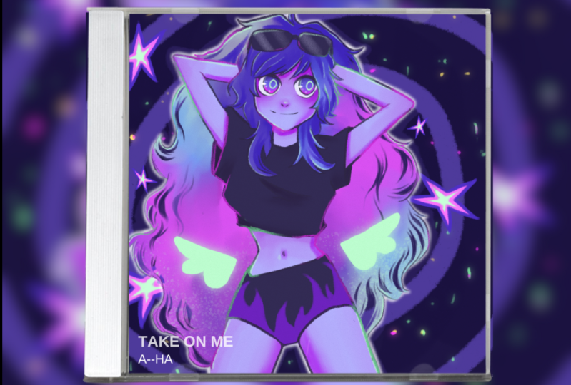
have that ready, make sure you have it download. So for my class project, I wanted to come up
with a new cover for the single
Take On Me by Aha. Because it's really my favorite
song of all time and I really like the '80s vibes
in it to find inspiration. I always love
scrolling, Pinterest. There's many other ways
to find inspiration. Some people just like to Google, other people look
through Tumbler, Twitter, Instagram,
what have you. There's many resources online
for you to take this step, and I'm sure you already
have your favorite platform. But if you don't, let me
suggest Pinterest for you. A tip for finding
inspiration on those sides. Try to like just
follow the flow. Like click on one picture and then like see what
it recommends. Or maybe think about
what you like about that certain picture and then incorporate that into
your next search. Really just go off of like
a vague feeling of appeal in aesthetics and think about
what you want to include. For example, I really like
this like bowling alley, like roller rink floor. Something about it just
told me I wanted this to be part of my illustration.
Take your time with this. You can use as much or as little reference and
inspiration as you like. I would always recommend using more, but it's
really up to you. Then I'm also looking into
poses 'cause I know I want to draw a character 'cause that's what I like
to do the most. But you can draw
anything for this class, I would recommend a character,
but it's really up to you. I found this pose which I
thought was really fun, and then I kind of had my
vis rap board ready to go. So when you have all your acids and tools chosen, you
can really start. My first step in drawing
is always thumbnailing, which is basically the
concept of creating a really small tiny
sketch that's really rough of your finished piece
or like just of your ideas. I would recommend for
you to create like 50 thumbnails or like as many as you
possibly can think of. It's really good if you
want to create good art, to explore your inspiration and like explore your ideas a little bit before
you settle on one, I'm just going on
with like drawing more thumbnails of stuff that I think will look
good or like that I think would be great
for this illustration. And you can be as
rough as you want. No one has to see this.
This is just for you only. You have to understand
what you're drawing here. Another great advantage
of doing thumbnails. As you right away see
the shapes of your art, and you can see how it would
look from very far away. So you kind of have
more of an idea of the whole composition instead of focusing too much on details. Then when you have all of
your thumbnails ready, just look over and see which
one just resonates with you. There's usually that one
thing that you're like, I want to have
this I don't know, I always feel like there's
one that just speaks to you. If that's not the case for
you, don't worry about it. Just just look at them for a little bit longer
and pick one that you really like that you really think could be something great. So here's some tips
that you might not have at the top of your
brain and the process. Make sure your surrounding
factors are all in order. So that means make sure your apple pencil is
charged if you're working digitally or you have a sharpener if you
work with a pencil. So I make sure my ipad and my Apple pencil are charged
and I have some water ready. I make sure I have
some non sticky snacks so that doesn't interfere
with my tablet surface. And I can snag on
them while I work, and I make sure I have a
comfortable seating space where I can work uninterrupted. I personally like to listen to Youtube videos while I work, but some people also have
great success listening to music or watching movies. Like, kind of like just audibly, you really have to find
what works best for you. And some people prefer
complete silence. Do whatever feels best for you. And one quick reminder, please. While you work, please
take it from me. Do your wrist stretches. If you draw a lot or if you're
planning to draw a lot, you really don't
want to end up with carpal tunnel and
being unable to draw. And you can really
affect your wrist health if you don't do
stretches regularly. Let's do some right away. So the first one
is you're going to put your hand up
like this and you're going to pull it back
for a count of 512345, And then the other 112345. And then you're going to go with each individual finger, 12345. And you just keep going. Doesn't have to be an
exact count of five. And don't pull too hard, you don't want to hurt yourself. Just like give the
fingers a good stretch, especially in your
dominant hand. All right? Don't forget the thumb and
the other hand as well. Basically, this prevents
your wrist from cramping up and giving you a
hard time drawing. In the long run, this can
really hurt yourself. I have had my run ins with carpal tunnel, so
take it from me. Don't neglect this step. Next, we're going
to take our wrists and rub them together like this, to kind of like
massage the tendons. It's really helpful, like
kind of like a count or ten. Just do what feels good.
Don't press too hard. You can also use your
fingers for this. If it feels kind of weird to
do it with your other wrist, violently shake
your wrist as well. This promotes blood flow through the fingers and where
you're really need it, it really doesn't
have to be perfect. Just make sure to take your stretches every
once And again, there's great
tutorials online for artists and I highly
recommend you follow them. Ideally, you want to stretch
every hour of drawing, but I really understand
that you can get lost in the process.
Just try to remember it. Every now and again,
take a break, get up from your desk, stretch your back, your
hands, your wrist. And make sure to maintain
the health of your body, because it's really the only one you got and you've
got to keep it safe. In this lesson, for
your class project, you're going to create
a big inspiration board so that you have that
ready to reference. And we also have our thumbnails ready as many as you
like to include. I want you to set up
your pleasing and sustainable art space
where you can draw. You don't need to take
a picture of that, just make sure you include
that in your practice. Then we're already
onto the next step.
4. Nailing Down the Shapes: So let's jump right
into the next step and nail down all of our shapes
for our illustration. You have probably heard
about Kiki and Boba, right? Basically, people
were asked to assign the names Kiki and Boba
to these two shapes. You can see on screen
and almost everyone called the round one Boba
and the sharp one Kiki. That's the power
of shape language. Your brain is constantly
trying to identify shapes in your surroundings and associate certain keywords or
impressions with them. For example, if you
see a rectangle shape, it might remind you
of words like sturdy, strong, or hard to topple. A circle might give
you the impression of gentle, harmonious, or soft. While a triangle looks sharp, angular, and opposing,
yet somehow dynamic. Take a moment to take stock
of what types of words or impressions you associate with shapes in the world of art, we can clearly use
this to advantage. The average poster or ad in the wild gets about 2 seconds
of a person's attention. I assume it's even less. For social media posts to capture our art
consumer's attention, we need strong shapes
that let them know right away what they can
expect from our artwork. Here's an example of
strong shape language versus weak shape language. The weaker the shape language, the less you feel like you know what's going on in a piece. The stronger the shape language, the more striking your artwork. You can test this by looking
at your art silhouette, is it easy to understand? Then you got some great shapes. So here's me creating
my rough sketch. As you can see, I'm
really only focusing on shapes so there's no
detail to be found. Mostly, I just want to make sure that my shapes are strong and I can show clear direction
through shape language. But also I want to get across where everything is so people can look at it and
like understand what's happening in
the drawing naturally. Here are some tips. I
love to work very rough. It's like all blocky shapes
of where I want things to be. And nothing is steadfast, so you can change it
around as needed. This is not the
time for details, so keep it rough and loose. And only you need to
understand this sketch, so it can be messy and ugly. Try to not get
yourself caught up. If this looks like a hot mess, it's really supposed to be just the groundwork
for what's to come. I like to use a large
brush size for this, so I can see the shape
language of the drawing. As a recap for this step, try to focus on gesture,
shape, and flow. And use the opportunity of this very rough stage to
change things around freely. But try to nail down
proportions and composition because that's
kind of hard to change later. Definitely avoid
getting lost in detail at this point because it's
all gonna come later. Don't worry, leave
perfectionism at the doorstep. Avoid trying to get shapes
and lines just right. It's just not productive
for this step, I would recommend avoiding using a thin brush or
really dark colors. But it's really up to
you what you feel the most comfortable with
for a class project. Let's analyze all
of our thumbnails and pick out the best one, the one that kind
of speaks to you. Try to factor in the shape language of
your thumbnails and your compositions and factor
that in for your decision. Then you can go complete your rough sketch
for this project.
5. The Importance of Visual Hierarchy: Now that we have our
groundwork done, it's time for the illustration
to really take shape. When you look at this,
what do you look at first? It's probably the face or
the big letters, right? That is because they ranked the highest in the visual hierarchy. Naturally, this is
a concept you can also use to your
advantage in your art. There's a couple of
things that draw the most attention
to the viewer's eye. Human faces, loud
and bold colors, strong lines, big
letters, or clear shapes. Things that are
lower in the visual hierarchy are, for example, soft colors, weaker shapes, weaker lines, small letters, the background, et cetera. You can use both to
your advantage to guide your art consumer's
eye throughout the piece. What do you want
to emphasize and what do you want to
draw less attention to? Use all of this to your
advantage so people don't look at the stuff you don't
want them to look at, but also see what you really
want to have stand out. So here's me creating the
line work for my project. And like you can
tell in this step, the drawing really takes shape. I create line work and make sure that the visual
hierarchy is clear. For example, the hair is less lined because it's
in the background. And the more I want people
to focus on a certain part, for example the face, the more energy I
put into that part. Here's some tips for this step. First of all, I would
suggest lowering the opacity of the rough
sketch before starting. If you're working digitally or if you're working
traditionally, you can lightly erase
your pencil layer to just have a clearer perspective of what you're doing right now. This is the time where
you really want to nail down the full look
of your illustration. So be detailed. Don't be shy to still change stuff around
until you're happy with it, because making changes after
this step is kind of hard. So right now is really
where you want to perfect everything and have everything
set where it needs to be. Sometimes flipping the
canvas and getting fresh eyes for the piece is
very vital in this face. So sometimes you need
to let it rest for a day or something like that
until you come back to it. Especially if you start to get frustrated or like things aren't working out
as you want it. You might just need fresh eyes until you can see clear again. But don't flip the
canvas constantly. You don't need to do this
like every 5 minutes I would suggest like
after an hour or two, you could maybe see if there's anything
you need to change. I like to use a darker version
of my sketching color, and I also tone down the
saturation a little bit, but still, don't worry
if this looks messy. It's one part of
the finished piece, so it'll all come together. Try to look at your own
drawing at this moment in time and try to pick out what
the visual hierarchy is. And if you might want to
change things around and don't forget to make good
use of your references, they really help you
along the way and you shouldn't let them
leave by the wayside. This phase is where
the illustration really takes its final shape. Kind of reference a lot as much as you can for
our class project. In this lesson, we will create the outlines for a
finished project. You can also test this
on other people by just asking them what they
look at first with fresh eyes. Or you ask the people
in the community tab. Once you're finished
with the line work, let's move on to the next step.
6. All about Colors: This lesson is all about picking color. So
let's get into it. As you probably already know, colors can evoke
feelings and emotions. This phenomenon is called color psychology and it's a powerful tool to
utilize for your art. Generally, you
already know lots of these color mood
correlations instinctively. But let me give you a refresher. Red stands for love,
strength, energy. Blue gives you the feeling
of trust, peace, or calm. Yellow usually correlates with happiness, warmth,
or cheerfulness. Green always stands for
nature healing, or freshness. And pink, for example, gives you the energy of compassion, sweetness,
or sincerity. Here's me picking the
colors for this piece, but you can really see
what works for your piece, what kind of colors inspire you. Maybe check in your
reference board what kind of colors are
repeating themselves a lot. So those are maybe the colors
that you should work with. In this, I like to pick
about three to five colors. And then I vary some saturation and hue and like darkness, lightness, something like
that to get a color palette. But I don't want to
use too many colors because that gets modeled fast. Let me give you some
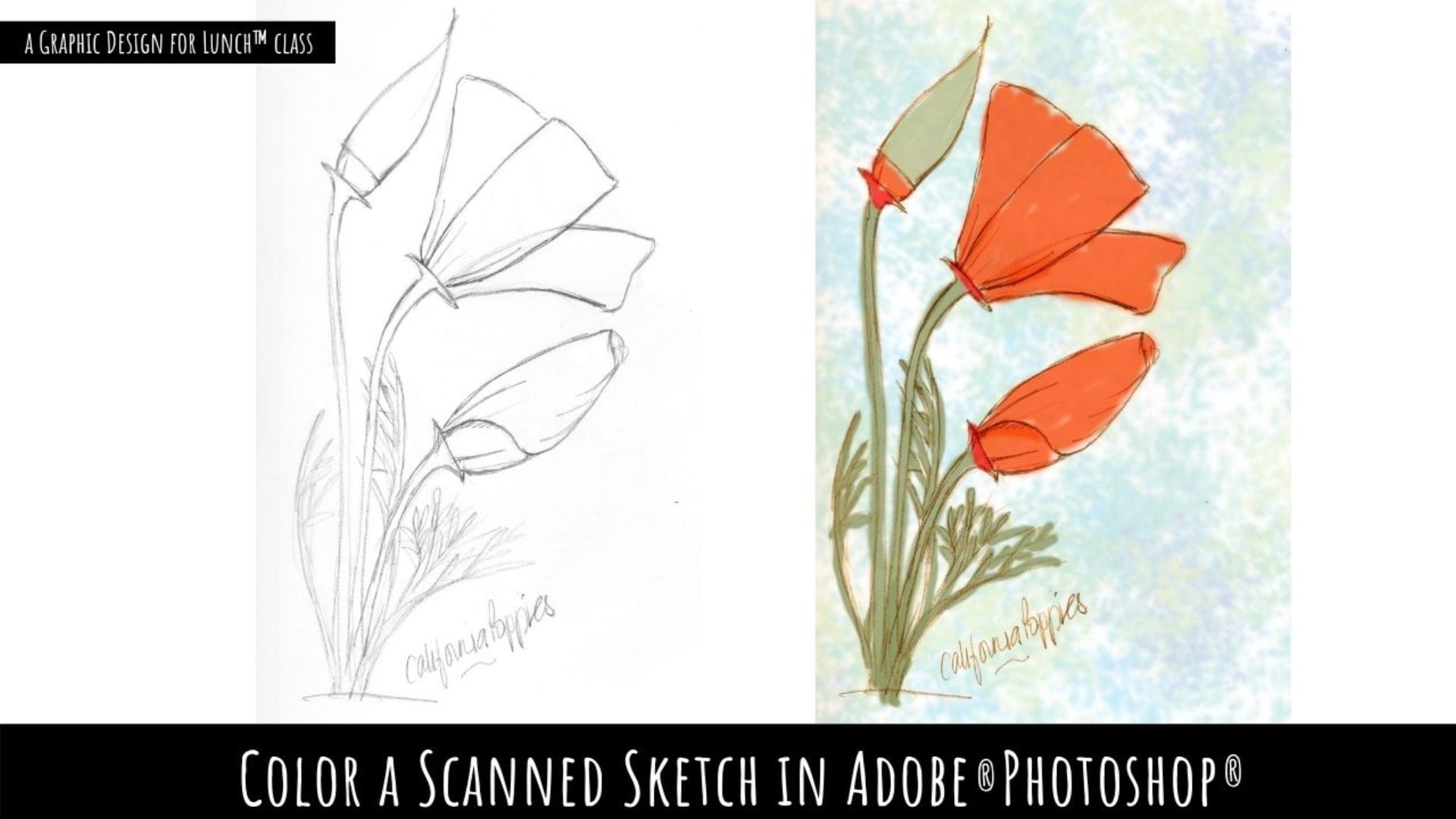
tips for this step. If you're working digitally, color goes beneath the
refined sketch for me. But that's really up to you. Do as you feel most comfortable. There are some
digital tips here, but I'm sure if you chose
a different medium, you know how to work this
within your specific medium. I like to keep my colors
on separate layers so I can use clipping masks to
stay inside the lines. And I also like to
use a brush that colors evenly so I
don't miss any spots. Generally speaking, using
too many different colors on a piece can make
it look garish. So keep in mind that you keep within the three to
five color range. Still make sure to
keep your colors at different values
achieve contrast. As I said, I like to stay within a color palette of three
to five base colors. You can go more than
that, You can go less than that,
whatever you feel like. But don't make it like ten
or 20 colors in one piece. You can vary a lot within
a certain color to vary value and saturation
instead of like the full color. And that can achieve a lot
of difference in your piece. Softer colors don't clash
as much for the eyes. Maybe if you're
feeling like this is an area where you
still need to work on, maybe pick more pastel
colors in there, like one or two pops of color. But if you're staying
within the range of complimentary colors and colors
that work well together, you can also pick more than that that are a bit
more saturated, a bit more bold really
depends on your art style. You can also go full bald. Art is free and you can
do whatever you want. So these are religious
tips to make it look a little bit more harmonious
and like put together, but you can go ham if you want. I like to pick
colors. I love pink, blue, purple, all of that stuff. I think that's
always a good choice because it will naturally be drawn to it and like kind of figure out what works
within what doesn't. But let's recap what
we just learned. Use accent colors to guide
the eye within your piece. This is also calling back
to visual hierarchy. If you remember, if you
want to go the safer route, softer colors don't
clash as easily. Very saturated tones will
always draw attention. So use that to your advantage. And don't go too far
with it. Pretty much, avoid using too
many bright colors. It will just over
saturate your piece. Try to not have all of the colors stay within
the same value. Basically, if there's less
contrast in your work, it will be a less
striking design. I personally would
recommend to not pick more than two accent
colors for your piece. For the class project, let's get our colors done for your
folder for the class project. You can also create a color
palette so we can see what you thought about
and like what kind of colors you were mixing. Well, yeah, let's have fun.
This is my favorite step.
7. Thoughts on Artstyle: Before we finish things up, I want to talk about art
style real quick because it seems to be a very interesting
topic in the art world. I know many people really want a distinctive and
recognizable art style. And I was no different in the earlier parts
of my art journey. In times of social media, having a recognizable art
style is really like a brand. So there's some useful
parts to it for sure. There's some artists
out there that have some really
recognizable art styles and that I really admire. So maybe take a look at all of the artists that
you really admire and kind of like find out what about their style
really speaks to you, so you can incorporate
it into your own. All that being said, I'm a firm believer that
art will always be changing and to like just take the art journey as it
flows and accept it. All the spirit of
art for me lies within creativity
and experimentation. So really you can't
shut yourself off from experimenting with your style and like kind of
treading new path. I think you got to
be open to change. Forcing your art style too
much can in the long run, lock you up in a
branding prison. And you feel like you can only draw in that particular way, especially if you post
your art online naturally. You're also going to
find more resources and more inspirations
along the way. So there's gonna be
artists that you find interesting and that really
shape your art style a lot. And you're gonna have
to let that happen. I think the best way
is to naturally let your art style develop
and evolve with you. That's what I like to do at Lee. But if you really
want to find what makes your art uniquely yours, here are some tips.
First of all, tons and tons and tons of experimentation in
your sketchbook. Your sketchbook is supposed to be your safe space where you can draw whatever you want and it doesn't have to be good. So go ham in that sketchbook. Here are some of my
sketchbook pages. As you can tell, they're not particularly
pretty or anything, but I had tons of fun
experimenting with lots of different styles and lots
of different ways to draw. And I think it's very beneficial
to your artists journey. Really dig into what type of art speaks to you and analyze
what you like about it. Just have patience.
Your art naturally is yours and it's always going to be unique and it's
gonna show itself. Don't worry, just go ham in
your sketchbook and have fun.
8. Conclusion: Thank you so much for making it this far and taking my class. In this class, we learned
all about thumbnailing, shape language, strong
shapes, weak shapes. We learned all of that visual
hierarchy and color theory. And we created a
cool piece of art. In the process, elevating
your art doesn't always have to be doing tons and tons of studies of
the same thing, like of hands or
something like that. And it doesn't need
to be very arduous or requires you to like really sacrifice a lot of time for it. Sometimes it's some easy
tricks that you can learn. Please upload your
class projects and tell me how you felt
throughout the whole journey. Tell me about what
you've learned. Tell me how you feel.
Tell me anything. Try to really show
where the techniques that you use are present
in your artwork. Here's my final project.
Just for consideration, I think it turned
out pretty good. Pat yourself on the back
because this is really a big class and I'm so glad you took it and
spent some time with me. Learning all about design and illustration and how
it all works together. You really did a
great job treading outside of your comfort
zone and trying new things. I really commend
that and it really shows your process
as an artist is going at 1 million paces. Once again, thank you so much
for hanging out with me. Remember to post your
class projects and keep talking to me in
the community tab. I'm ready to see
all of your stuff. I'm really excited to see
what you come up with. Thank you so much for
taking this class. Thank you so much
for hanging out with me and hopefully I'll
see you very soon. Hopefully, I'll
see you around on my social media and hopefully in another class at some point. Thank you so much.
Let me know how you felt taking this class, let me know some critique. I'm open, my ears
are open to receive your opinion and we'll
be talking very soon. All right, thank you so
much and happy creating.
 Clara Leo Kei, Cartoonist & Content Creator