Transcripts
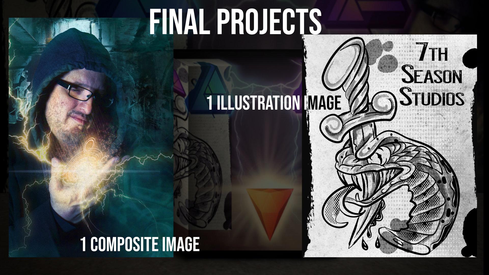
1. Section 1 -Introduction to the Skillshare course: Vara ageing and welcome to skill share. Now, as skill share is a project-based course, I want to start off by sharing with you what you're going to get out of taking this course with us. We're gonna be making a complete set of digital tools which includes textures, overlays, vector brushes, raster brushes, Lutz, lights, and everything in between. Now, not only are you going to be accomplishing these tools which you do not have to upload. But we're going to be applying these tools in these two projects. So these two projects that I'm showing here on the screen, that is the expected deliverable for this skill share class. So not only will you get the tool packs, but you're going to learn how to apply the tool packs value make including say this half tone brush into a project like this. Or taking the lightning brushes that you made here and applying them over to a project like this. Now, some of the downloads for this class are very large, so they wouldn't necessarily fit in the platform. So there are links to the google drive in the description for this class. There are arranged by section. And so go ahead and follow the link in the description to get the downloads because there was no way to zip them in order to put them onto the Skill Share platform. Other than that, I'm very excited about this class and I think we're going to have a great time. We're going to be building all the tools in the affinity suite that you're going to need. Now, the software that's used in this class, full disclosure. You've got Affinity Photo and Affinity Designer. Now, if you have one or the other, you will be able to accomplish 90% of all of the lessons. So you'll still be able to develop all the packs and the tools for your software. Best-case scenario, you have both. And we're going to be introducing HD filled express. So it is a free desktop software for video editing and special effects compositing that I use all the time. So I'm excited to bring that to you. And occasionally through the lessons, if you so choose, we will be utilizing a program called the vector magic, which is a paid program to vectorize. Now, if you're familiar with vectorization, you know that you can utilize the pen tool to vectorize. So I'm gonna show you how I use it. But it is not required for this class. But I wanted to kind of give you all the software that we're going to be working with in this skill share class. So if you're interested in creating a complete set of tools and creating these two projects which you can then upload and I'll definitely critique. Go ahead and continue on. And I hope to see you inside. Let's go ahead and get started.
2. What are digital tools and where do we find them : Alright folks, and welcome to this course on utilizing digital tools. Now, this is really exciting for me. This is quite frankly one of the best courses that I have ever created. And this is really the culmination of three years of working with the affinity sweet in order to develop my methods for creating these tools. So what I wanna do in this lesson is I just want to kind of show you what a digital tool is and what you'd expect. Because even if you just have a cell phone, you don't need a formal camera. You don't even necessarily even need to camera to create many these beautiful tools. So I'm going to be here with you throughout this. I wanna do a little bit of face to face with him, but I also want to show you some places online where you can go to see exactly what all is in this realm. Let's go ahead and get started. Alright folks, and welcome to our course here. This is going to be an introductory lesson on what digital tools are. Now for those that have been around a digital game awhile, you know about digital tools. Digital tools are those things that artists use to create the art that they make. So as an artist, you can always go the hard route and you can recreate affects every single time from scratch. But in order to save time, in order to make your time efficient, and also to bring in some really awesome effects that you may not think about. Digital tools are used and purchased by artists to aid in their workflow. So the first question that I get asked all the time, where to go to find different digital tools and what's out there. Because if you're going to build a toolbox and that's how I'm going to be referring to it through the course is a toolbox. You have to do a certain amount of research. So what I wanted to do, first of all, I wanted to kind of show you some of the tools that were out there. Now, in all fairness, I do not get reimbursed, compensated, or anything for any of the resources that I'm about to show you. This is how I do my research. I get no kickback when anything like this. So it's one of those things. These are sites that I like to use. People that I like to follow. Do your own research. Alright, let's go ahead and just take a look at where to get some of these resources, right? What are they? So a lot of times you'll find these four Photoshop primarily, but there are a lot of affinity ones and there are a lot that are universal. This particular person, Renae Robin, is somebody that I follow. She does a lot of Photoshop style composites, and I really loved the way that she does or fire. So you can get pre-done fire packs from a variety of artists. Now there's also something called the textures. Textures are used as an overlay on to certain images to create a certain color scheme in this area, or to create a certain field that you want. You can also get different digital tools that have background packs. I've used one in this image. So if we were to take this and now I'm gonna Affinity Photo, but it works the same in designer. And I was to clip away everything in here. This photo is just me taken against a green screen. And this is actually from a photo shoot that I did in Chicago underneath the bridge. So digital tools can be used to enhance any type of a photo and there's a ton out there. Don't limit yourself to one thing or two things. But what I would tell you is make something that you like. Now, the same thing is true for illustration artists. Tattoo Smart is a site that I like to use there I'm a tattoo artist or was at least for 20 years. I just took it out a couple years ago. And I use procreate as well as affinity. So I like to use some of their tools in illustrations. So they sell brush packs, stencils, that sort of thing. Now, you can use brushes in a variety ways. As an example, in this course, we're going to be making this half tone texture for the snake. Now, everything that we're going to use in this course, I'm going to show you how to make every single brush that I used is here. So that edge here, that texture that's vectorized. Every one of these ink dots that I'm clicking off is vectorized. Notice the edge that I just took off. Plus we've got this texture. We've got the half-tones screen that we're gonna take off. We've got the paper texture that we're going to take off. And even I've got different groups of dots leaving only this half tone brush and the original illustration. So everything for illustrators will be making to create this image. And for my photo composite layers will be making every single brush atmosphere layer like that. We'll be doing every single Mandela, every single lightening brush. I'll be showing you my entire color grading process to create the light. I'm gonna be showing you how I sharpen. Afterward. We're going to be making this texture to apply over to it, as well as how I go about getting my final color grade. So spend some time looking around at different tools. In a later lesson, we're gonna be showing you how to plan out your toolbox so you don't have to have an idea right now of what you're going to offer. You may find something along the path that lights you up and really gets you excited about it. And so the point of this introductory lesson is to show you the world that you're about to enter and get you excited about the possibilities of what you can create. Alright, let's go ahead and get onto the net.
3. What tools are we going to make and what does the pipeline look like : Alright, so we're going to be talking about workflow. We're going to be talking about pipeline now before I get into the lesson, I just want to cover with you what I consider workflow and pipeline to be. These are the steps that you're going to use and the software that we're going to use is shown here. Now, I'm going to be working primarily in Affinity Designer because with pixel, many of the tools that are available in photo are also in designer. So Designer is the more restrictive. There is no perfect pipeline. So what I want you to do is take my advice as a starting point, but certainly use it to start your own exploration of different tools and different workflows for yourself. Alright, let's go ahead and get started. All right, so let's talk a little bit about the pipeline here when it comes to digital tools. Now, there is no one perfect pipeline for digital tools. And when I say pipeline, it is a series of software and steps you take to create your digital tools. So what I wanna do in this lesson, I want to make it very specific. We can do the same exact things that Affinity Designer. Then we can do an affinity photo. But Affinity Designer deals in vector, Affinity Photo does not. So if you're tuning in for the tools that I make here, go ahead and skip to the Affinity Photo stylus and skip the vector section entirely because they are different workflows. Let me just show you an example of how I would go through and make this lightening brush. So for the lightening brush in this class, we're going to use a free program called Hit Film Express. We will go through and I'll show you all of this in the individual lessons. But I use Hit Film Express to create the lightening. Then I move it over into Affinity Photo or if many designer and I create the PNGs. And it's from these PNGs that I go ahead and create the brush back. So the pipeline is a hit film express over to Affinity Photo or Affinity Designer. Now, on the other hand, when I make textures will go through here and I'll just go to my texture section. And I will create this by hand. I'll do a brush overlay and I will scan it in. From there. I just utilize it in Affinity Designer or Affinity Photo. So the pipeline there is created in the physical world, scan it into there and a high DPI resolution, and then bring it into a program called vector magic. Let's say, where then I can go through and adjust and vectorize some of these textures. So that's my way to do this here. Now, if we're looking at, say, some of these vector projects, if we do the different snake here, let's go ahead and bring up my Affinity Designer. When I do this, I will go through and I will grab an actual physical pencil stroke or a brushstroke. So all of these that we've done are actually made by using physical brushstrokes, which then are brought in as PNGs and then are converted into these brushes. So when you think pipeline, each tool really require a different pipeline. In this class, I will be using primarily Affinity Designer. And why Affinity Designer? Because Affinity Designer has pixel persona, which means all the tools here are present in Affinity Photo. So 99% of the lessons you will be able to do in Affinity Designer. Now, can you do the same ones inifinity Voto, with the exception of a vector brushes? Yes. A 100% Affinity Photo does not like vector brushes. Okay, it doesn't work. We're also going to be using Hit Film Express. I'm going to show you how to use it filled express. It is completely free from FX Home and I love it. And then if you are so inclined, we will be using a tool called vector magic. Now, this is optional. You can always go around and do your own tracing of vector art. This is a vectorization program, not required, but I am going to show you how it fits into my pipeline. So if you like it, use it. If not, you never have to see it again. Alright, so that's a little bit on how the pipeline works. I wanted to make sure that that was covered so that you understood the software we were going to be using and why I did what I did. Alright, let's go ahead and start making some stuff.
4. Making your first digital tool : Fluoride folks and welcome to making digital tools were gonna go out and I want you to have a go and do project. Now. Now this is really early in the class. I want you to grab your smart phone or any camera, doesn't matter which camera. And I want you to go out and I want you to shoot a wall and you're gonna create your first digital texture. Now, I've gone out and I've shot one of my walls outside, right around the corner from my house. And I'm gonna be showing you how to create that in affinity. So I want you to go and do, go ahead and pause this. Go out, should've all, and then follow the steps that I give you here, coming up to create your own tool. First thing right off the bat. Alright, we'll go ahead and flip over and we'll see inside. All right folks, now I am back in Affinity Designer. You're gonna see a common theme throughout the course that I'm going to primarily be working in designer. But if you are in photo, don't worry about it. The reason I chose designer is because designer has the pixel persona, which has limited pixel capability. So if you can do it in designer, you can do it in photo. Every single tool in designer for pixel is in Affinity Photo, every single one of them. Alright, so this is the image that I went out and took just not too far from my house. I literally went around the corner and shot a wall. Not hard. Now, I want to show you how easy this is to make a digital tool. We're going to make a simple texture. You select your background layer. You come over and we're going to throw a black and white adjustment on it. Perfect. Now we're dealing in black and white. We're gonna make a texture right? Then we come over, let's add a Levels Adjustment. And now on mine, I like to have a lot of dynamics in my texture. So I will make this very much black and white right? Now you may choose to do something a little bit different. This is just my texture. So I'm gonna go ahead and I'm gonna make it right about here, I think is pretty good. Now let's bring the levels adjustment in. Alright, now what do you do with this? Well, you export it as a PNG. So let's go ahead and go to File Export. Lets go ahead and make it a PNG will call this texture one. Now this is a quick win here folks, this is getting you up and running immediately. Alright, let's go ahead and pop that in. Now. Grab any old picture that you think will work in affinity. They've got the stock tab up here. So you can certainly use the stock tab and you can go to peck cells on splash and have your favorites. I'm gonna go ahead and I'm gonna use a composite that I did not too long ago. And I'm gonna go to File Place. And now let's just throw texture one on it. Boom, just like this. Alright, now that doesn't look very good, right? Looks like hot trash. What you're gonna wanna do now is you're going to want to adjust the blend mode. I'm going to use an overlay. And you're going to want to adjust the opacity. That is pretty cool. Now, we're going to add a mask layer to this because I don't want it to obscure the face. So I'm going to brushes, I'm going to pick a soft round brush and remember with masks, black conceals. So I personally want to conceal the texture on the face. And I'm not gonna do a great job of this because this is the introduction type lesson. We assume you've got some affinity chops here. So I'm not going to spend 15 minutes going through and making sure that I hit every single finger, right? Right. But this folks is the essence of making a digital tool. This is what you're doing. All right, awesome. So now notice the intricacy and the texture that this thing ads off, on, off on. Nobody told me that I missed the middle ever face as no help at all sometimes. Alright, let's go off on and you can blend textures. If you zoom in to this image here, you'll see that I used a scratched up metal texture before I rasterized to this thing. So I'm adding a scratched up metal texture on top of this texture to get a whole texture salad here. Now, you can change the blend modes, right? We can go ahead and kick this up a notch. You can use other types of blend modes. You can use add if you want to, completely changes the look. So this gives it a completely different look altogether. And you'll see that where that paper was torn, the ad now gives us that area there where the paper was torn up, right on the side here. So that's a little bit on how to create your first digital tool. Congratulations, you've all created your first texture. Let's go ahead and get into the meat of this course so you can see all the wonderful things that Affinity Designer, Affinity Photo, and the world of digital tools has to offer. Alright, we'll see you the next one.
5. How to reverse engineer the tool: All right, let's talk toolbox here now, when you're looking at digital tools, one of my favorite ways to learn how to create new digital tools is to reverse engineer the tools that we've created. So I've created a lot of tools in this course. I'm going to reverse engineer some of mine so that you can see how to take a piece that you may have either purchased or downloaded from a free site and reverse engineered to create your own method. This reverse engineering is key. Once you determine what it is you wanna make, it helps you determine how to make it. All right, let's go ahead and get into the computer and we'll take the next step. All right, folks, welcome back to infinity. Now, I'm gonna be showing you this and designer. It's exactly the same as it is in Affinity Photo. Now we're talking about how to figure out what your toolbox should look like. What is it you're going to sell, right? What is it that you're going to make? What is it that you're going to create? And so one of the ways that I like to do that is I always do my market research and I reverse engineer things. So one of my best pieces of advice, if you are looking at making a tool set, find a good high-quality tool set that's out there. And reverse engineer how they did it. Now notice I say reverse engineer it. Do not copy it. We are not in the business of copying. Now, I'm gonna go ahead and tell on myself first. So we're going to reverse engineer one of my sets. So we're just gonna go ahead and we're just going to create any old size workspace. And again, if you're in Affinity Photo, don't worry about this. Okay. You're just following along. There's nothing you have to do here. Alright, so let's go ahead and I'm just gonna check vector brushes for two seconds and then I'm gonna show you Pixel brushes for my Affinity Photo folks. If we go to the brushes and we bring up the set that I'm currently working on here for the class. And I come down to my wood cut etch, right? So there's my brush. And if I want to know how to create woodcut. So if I wanted to go through here and apply a traditional woodcut to this, i by the brush. I then come into here and I just look at the settings. And I look at the look of it and I look at how they've created it and I say, okay, this is what I need to do. The same thing is true with things like styles. If we're creating some magic styles here. And I come up to this, notice that now if I apply the style to my line, it will tell me the blend mode, the opacity, and the type of layer effects. So what are the best ways to reverse engineer tools? Or I should say one of the best ways to create your own tools is to learn how to reverse engineer them. So if I'm going to go into the pixel persona, let's look at a more complicated brush, shall we? And again, I'll pick on myself. Alright, let's come down here. Let's look at the flame brush. Wu. Actually, let's go ahead and look at my half-tones. Alright, we're gonna go ahead and we're gonna look at half-tones here. I've got all my settings. And then your question might be, well Jeremy, What are you doing with your texture and what are you doing with your brush nozzle. So I've got a soft brush nozzle and then I've got a texture full of these little dots. So you can reverse any brush out there. Even as an example for this, we've got a flame starter pack, right? So if I come over here, I grabbed this brush and I go ahead and I just want to go ahead and lay out a color here. Let's go ahead and just grab this black and pop that into existence, right? How did I make that? Well, let's go ahead and reverse engineer. There's my size and I only have one brush nozzle. There's my texture. Pretty simple actually. So one of the best ways that you can learn to make tools is by reverse engineering others. Let me give you an example of a texture. So we come to the downloadable, which we will get to in this course. And I come over here to say overlays, right? If I come down to section six, actually, let's go ahead and go one step further. And I come down here to atmosphere. There's how I created my atmosphere, right? I've got three bands of light. So if you're looking at what makes a good overlay, that might be a way to do it. If you're looking at doing textures, you can come over here and reverse engineer some of these textures. As an example, this one was just made by folding a sheet of paper, then applying a graphite to it with a pencil. Very simple. So my point here, we're gonna be showing you how to make all of these in the class. What I would encourage you to do, again, once you find out what your niche needs to be and what you really wanna make. Go check out some cheap brushes or some cheap texture packs, or even do some research online and reverse engineer the tools so that you can learn how they're made. And then do not, do not, do not copy, make your own. Alright folks, that's a little bit on how I've learned to do this. And I hope you learned a little bit along the way.
6. How to do your market research and define your value: All right gang, and this is all about market research. Now, once you understand what a digital tool is and you know how to reverse engineer it, and you've had success creating your own, you now have to do your market research to figure out exactly what it is you're gonna make it and how to define your value. So we've included a template for it which will be covered in the video. But this is a strategic business decision. Now, if you are just doing them for yourself and you don't plan on producing packs, you may be able to skip this one. But if you're looking at producing this with the intent to distribute them in some way. This is one of those lessons the chicken want to pay attention to because this is the business side, in addition to the artistic side. Alright, let's go ahead and flip over to the computer and we'll go ahead and get started. All right, so let's go ahead and pop on over here and apply what we learned here. So what we've got here is I've got the same sites, right? So let's say that I'm looking at making some sort of a pixel brush set. One of the templates that you have in your downloads that I'll bring it up. Now this is in there's a PDF is called the builders toolbox strategy planning sheet. Now, when you use this tool, the first question you're gonna ask down below, who is your tool built for? Photographers, illustrators, T-shirt makers, as an example, who are you targeting to use your product? Then you're going to want to look who else is in your space, who makes the tools you use, what do you use? And then what is the distribution strategy? Like I was saying, third party like a design cuts through your website. Maybe you're gonna do gum road. And then how are you going to package it? Isn't going to be a kid to make a thing that bundle of brushes at themed set. What's your plan? We've already gone through that in other lessons. And so this is the sheet that I use. I put down my asset categories, distribution strategies, and then I always do my market research. What's out there for quantity, and what's the price point? Who will use it and what would they be able to make? So as I begin to do my research, I'm interested in say, making a brush set. So what I'm looking at here on design cuts, we've got 25 brushes for realistic portraits. Okay, fair enough. Now I'm gonna switch over to Excel because I'm just an Excel guy. So my first one is 25 brushes. And we're going to look at about $15. That's my first quote, so to speak. Well, let's take a look at what else we get. We've got text riser Pro to, okay, that's cool. With 90 brushes for 799, OK. Slash 799. Alright. Then let's do a third one just for giggles. Let's go ahead and take a look at chunky markers. This one comes from the affinity sites, $17.34 markers. Alright, 34 vector style brushes. Okay. So that one's probably not good because I'm not that interested in vector right now. So let's go ahead and go to the store. Let's go ahead and check out what else they've got. Mario textures intones. There is a good one. Alright, how many we got? 100 and styles 25, vector 92 assets. That one's not quite apples to apples. Alright, let's try. There we go. 80. So we've got 80 for $20. Okay. Now, who's my customer base with these? I might say tattoo artists. And what am I tool's help them do. My tools helped him replicate a real pencil field and give them stencils. As an example, stamp brushes can be used to create stencils. Now, I might choose to do these through my own website. Now, if I'm looking at putting a price point to him, this tells me kind of what's in the market. Here's the thing though. I don't want you to look at price. Only. Think about value. What is it that your product allows somebody to do? And what is the value of that? Now, I'm going to talk honestly and candidly to all of my brush orders out there. You know who you are. Nobody has ever opened up at 200 brush pack and used all 200 brushes. I can tell you that I have three or four out of every pack that I've done, that are my go-to brushes. So if I was to come over to this half-tones pack and there are a 198 brushes. I probably will not get through a 190 of them. I'm going to use the same eight. So when you do this, I want you to apply a little bit of common sense to this, and I want you to think in terms of a value. Now, notice that when we went into, say, the affinity store and we went to some of these packs and let's just go ahead and use this one as an example. Notice they had 100 styles, so they are making styles. They are making vector brushes. They've got 92 assets. They've got samples of design and a user guide PDF. So when you look at this, this is why you fill this template out. Because if you wanted to make a kit, and I think this is a great example of a kit because it's not just when asset you would come in then and you'd say, you know, for texture pack? Yep. For mock-ups? Nope. Asset pack? Yep. Color palettes. Yep. Let's add styles in there. And you then would have to go through and really create something that would tell you you're in the ballpark and something that would tell you that somebody wants what you have to sell. So this is not essential to sell something. Again, the point of this course is not to sell. The point of this course is to define your toolbox and set out what the plan is terms of what you're going to make to make sure that what you make gets you where you want to be. Aright, this helps you define your offer. Hope you learned a little something. Let's go ahead and take the next step.
7. Section 2 Introduction to the section : Alright folks and welcome to this section. Now this section is Affinity Designer specific. Affinity Photo does not recognize vector brushes. For this section, we're going to be making vector brushes. So if you're in Affinity Photo, only, skip to the next one. Alright, if you're still around for Affinity Designer, in this section, we're gonna be showing you how to take hand done brushes and how to create vector brushes. So we're going to be showing you how to create them, how to skin them, how to vectorize them, how to create them and adjust them once you've got the scans inside of Affinity Designer. And then we're going to be applying them over to this illustration of a snake to add in some really cool textures and some really interesting line art into your design. Vector brushes are big business. They're hard to do. A lot of people aren't doing them. A lot more people do pixel raster style brushes, then do vector. So if you like working in vector and you have really good vector brushes, you are definitely in an elite class of people who do it well. So I'm very excited about this portion. As an illustrator, I love using vector brushes, and I'm excited to show you my process here in this section. All right, let's go ahead and get started.
8. What are vector brushes and what are they used for : All right folks, welcome back to Affinity Designer. So in this one we're gonna go through and we're going to do a unit on vector brush building. And so this will not be an introductory tutorial on affinity. We'll assume that you know a certain amount about affinity. This is a master's class on how to do vector brushes. So let's go ahead and start with file new. And let's just create a space. I don't care what space we use. And then let's go ahead and put a rectangle in it so that we have some sort of a color. This is going to be out called our garbage space for lack of a better term. Now, when I do vector brushes, These are the three panels I always have out. I have my styles, my stroke, and my brushes. I always have my layers panel out. I like it to work with it right about here. If you don't have these, makes sure you did under View studio and make sure they're clicked on. And if you want to pull them out, just drag and pull them out into your workspace or read Ockham. Alright? So when we work with vector, vector is based on math and it works only in the designer persona. You cannot use vector brushes in the pixel persona. And these are the three tools that people will use with your vector brushes. The vector brush tool, obviously, the pencil tool and the Pen tool. I'd like to just show you what these three tools do so that you know how people will be utilizing your materials. Let's start with the pen tool. I'm just gonna click, click, click, click, click. And we'll just create some curve. Awesome. Let's bring up the size of this stroke. Just like that. Now let's go to the pencil tool. People who use the pencil tool, you really get some really nice arcs in it. You can't achieve that with the pen tool. But if I'm looking just to do a down and dirty stroke, the pencil tool is far easier for me then creating a bunch nodes with the pen tool. And the last one is the vector brush. So we bring in the vector brush. Notice it operates a lot like the pen. I'm gonna go ahead and bring this up. But there are a couple options on the vector rush that you don't have on the pen. If I click on the vector brush right here. Notice that I have blend modes. So Blend Mode is a big thing for the vector brush, whereas when it comes to pencil, you don't have it. And when it comes to the vector brush, you'll notice that there is no sculpt mode. So the pencil has the sculpt mode, the vector brush has Blend Modes, and that's really the difference. Now everything works a similar way. If I come down and I'm using the default brushes right now in the current version of Affinity Designer, I can come down and select a stroke and apply brush. So this all works the same way, right? The reason I wanted to go through this with you is because different brushes are used for lining and different brushes maybe used for what are called Stamps. Let me give an example. So I'm in the markers brushes that came with this current version of Affinity Designer. And if you double-click on the brush, you'll see that what you have is a body that is designed to be stretched. Now, we have another video on kind of going through all the settings. But as a general rule, anything that has a stretch on it is generally designed to be a stroke style vector. So as an example, if I'm using the vector brush tool, I currently am selecting my marker. And let's bring that up just a little bit. And away we go. Alright. There's my marker stroke. Now I'm using a mouse. I'm now trying to make this sexy. I'm not trying to put taper on it. So this is kind of how this brush operates. Now let me show you how a stamp style vector brush operates. I developed a couple here for flares, let say. And if I come down to this flare, I grabbed my vector brush and I just pop one of these things into existence. Okay? This is more of a stamp. Now why do I do it this way? Notice in this layer, it's a curve. Alright? So a curve now I can manipulate, I can change the size of, I can drag around all of that stuff. Now, when I come into the brush that created it, notice how there's my pattern, and I will show you how to do this in this class. But notice here the body type is set to repeat. Now what does repeat mean? Well, if I take this line and I decided to apply this, now it has repeated this pattern all the way through the line. So the first thing that I need you to get are the three tools that people will use when you think about the brushes that you're gonna make. The second thing is there are those brushes that are used for strokes. And there were those brushes that are designed to be stamp style brushes were going to be working with both here in this class. So I wanted to take just a little bit to kind of inform me on that, make sure you understand what's in, what's out. And now let's go ahead and take the next step.
9. Making Brushes - intensity vs Image brushes and How to export both : All right, folks, welcome back to affinity. So we're making vector brushes today. Now, this is one of the most convoluted pieces that people on the forums have had problems with is the different types of brushes. So what I'd like to do, we're going to leave this garbage space up. And the first thing that I'm going to do is I'm going to come in and go to File New. And I wanna make a 11000 by 100 pixel Workspace. Now, let's make it pixels not millimeters. That would be huge and make it 72 DPI. Okay, oops, change it from pixels. It decided to convert. Alright. So I make all of my brushes square and do yourself a favor. Create a rectangle. And for right now, make your background black. Okay? So for every single vector brush I make in this course, you want a 1000 by 1000 and you want the background to be black. That's a general guide. Ok, so I've got my brush making space, and I've got my brush trialing space. That's it. So now let's go to the brush making space and into the brushes tab. Come over here and you're going to create a new category of brushes. So new category of brushes is like a new group. And the first thing you're gonna do is you're then going to rename the category. I'm going to call this one garbage. Because quite frankly, for trialing stuff, your first brushes are going to be awful, right? So in your downloads for this lesson, I've also included a couple affinity files and some PNGs. So let's go to File Open. And the first thing that I'm gonna do, I'm gonna go ahead and I'm gonna find this smiley face master. Alright, so notice what I've got up. My smiley face Master, my brush building area, and my garbage space. So this smiley face Master, this is an important thing because now when you go to your brushes, when you click down, the first thing you're gonna see is create a new textured intensity brush versus a new textured image brush. Now the thing that people ask on the forums all the time, what is the difference? I'm going to make it super simple or as simple as I can in this video. So I would appreciate it if you grab the smiley face master and follow along because you're going to have to understand this in order to build your brushes. On intensity. Brush only works in black and white. It uses the opacity value of the image, just show texture. So this white smiley face is 100% opaque, right? If I was to take this and drop it down, notice now it's not as intense. That's why they call it intensity. So when you do this, when you make this type of a brush Affinity Photo or Affinity Designer is going to look at the intensity, which is the black and white. So it will count the black. Now, let's go to brushes. And let's make a new textured intensity brush with this smiley face. Okay? Now, if you do that, it's going to ask you where you want to pull it from. And in your downloads, I included the white smiley face with the black background. Now, if you don't want to do it that way and you want to take it from here, you go to File Export. And this part is important. You're gonna export everything as a P and G. Affinity Designer recognizes PNG for brush files. And because you want the black, you need the black. You want to export this selection with the background. Notice the selection with the background will get just the smiley face and won't get this trash out here and hit Export. And we're going to call this z Alt Delete layer. Alright? So that's how you export your image, makes sure that it's a black and white image for intensity. And then what you're gonna do in the brushes, come down, grab a textured intensity brush. And now that's what comes up. Now that doesn't look like this, does it? If you click on it, notice here we go to body. What it's set to is stretch. Well, we don't want to stretch that. We want to repeat it. There we go. Look at that moment, you have your first type of brush. Now, let me show you how this works and why this doesn't work. So you're not going to want to do this. Let's say I go file export and export the PNG. But now I say without background, I just want a transparent background. Okay? Still gonna let me do it. We'll call this y because, well, for reasons, Let's go ahead and export it. Now let's, I'm going to try to build this. Don't waste your time on this. Go to File intensity brush. Now let's grab this. Now you see there's my white smiley face, but it has no background. And now notice what it's gonna do here. It applies a background to it. Why did it do that? Well, because quite frankly, it didn't know how to handle transparency. Remember you made an intensity brush, so we'd needed black and white. You gave it to transparency. So what did they do? It slap the black background on it and said, best luck. So this will absolutely ruin your piece. Let me change it to repeat. And you see that ugly white border. That's because you export it, it with transparency on an intensity brush. Alright, so let's go ahead and now I'm just going to show you this. And just to make it simple, let's change my garbage space. Let's change it to a black garbage space. Let's say. Alright, let's do this. Here's my brush as it sits. Okay, now why can't we see it? We gotta change it over to white. Or we go, there's our brush. Now notice it has direction. If I come over this way, it changes it up. But now let's check this garbage one. Ok, now that doesn't look great. Let's move the size up. Note, and if we zoom in real hard, you can see the hot trash that is created. This is because you exported and intensity brush without any background. So Affinity Designer does not know how to deal with that. Okay, let's go ahead and delete this brush to do this in the brush panel, right-click, Delete brush, and we don't want that anymore. All right, and then let's go ahead and kill out all these lines. You always have a garbage space because you're going to have to trial brushes time and time again. Okay, so now let's take this thing here, right? And now I want to show you how an image brush works because you have to know how to export an image brush. In the next lesson, I'll show you what the differences are. So we still have the smiley face, still on the black background. Now watch this. We're gonna go to File Export. Now here I do want PNG, but now I do want to selection without the background. Here we very clearly, when you go through and create an image intensity broke or an image texture brush, you want without the background. That's the good news is I've already done that right. I did that for a last time. So if I come up here and I go textured image brush, let's grab this one. And now it's going to create an image down here. Boom, just like that. Okay, now notice it's stretched. What are we going to do? We're going to repeat bone just like that. Notice how these are the same. Now, if I did this wrong, so I'm going to now create an image brush. And I'm going to use that one with a black background. Watch what it does. It sees the black as a color. So it creates this black background on it. So this is why hear me very clearly and write this down if you need to. If you are making image intensity brushes or image brushes, I'm sorry. You want transparency? If you're making intensity brushes, no transparency, it must be black and white. Alright, so let me just show you what this does here. Come over to this. Let's change the background so that we can see the black show up because it's going to show up. And let's go ahead and just fill this blue. Awesome. Okay, let's do our good one. Bringing up our brush. A smiley face. There we go. Now let's bring up our bad one. No frowny face. Oh, that one's even stretched. Let's move into repeat. Close. Alright. So I know we don't know what the differences are yet between the image brush and the textured intensity brush. That's going to be the next lesson. In this one, I wanted to show you how to properly export your image for both the intensity brush as well as the image brush in Affinity Designer. Alright, I'm gonna go ahead and delete this brush. Because it turns out I don't want to garbage. And in the next one we're going to show you when to use each. I will see you the next one.
10. When to use Intensity vs image brushes : Alright, getting, Welcome back to affinity designers. So this is going to be the last theoretical lesson on image versus intensity brushes. Before we get into something meaningful, you have to understand this part because if I show you how to make brushes, but you don't know which type to juice. Your brush will never perform the way you expect it to. So let's go ahead and get started. I've got my garbage area here, right? This is where I test out all my brushes. And I've got my 1000 pixel by 1000 pixels workspace. So let's go to the garbage area. And I'm going to come over and I'm gonna undock my brushes tabs so you guys can see it. I'll put it over here on the right-hand side. And we're still working in the garbage. And we're going to go ahead now and we're gonna make a textured intensity brush. Now the question that I want to answer in this video, what is the difference and when do I choose it? So it depends on which type of brush you're making. Let's make a textured intensity brush first. In your downloads for this lesson, I've included two images. Notice the stroke with the black background. Remember that you use a black background for intensity brushes. Let's double-click on that and that'll bring a brush into existence. Now let's go ahead and change this from 64 to 200. Okay, work clothes. And now let's make an image brush, same exact image. But this time I've got the stroke with the transparent background. Let's double-click on this. And now you'll see that it's transparent there. Let's go ahead and bring this up to 200 and close. All right, identical brushes made with identical images. Now let's go ahead and do this. Let's grab our pencil tool. Go We all the way down there. And now I've got this set to green, so you can see this and let's apply this brush. All right, now, we've got to move the width of that line back up to 200. Alright, there we go and look at that. All right, let's go ahead and move this over to 200. If you got it to work for software for a minute. Alright, now this is the intensity brush. Let's zoom in and we'll take a good look at this. Now you see how the brush has some good subtle grades in it. Now this little green line up here, you can see this is something I'll talk about here in just a second. I left that and on purpose. Now, let's go ahead and duplicate this line. So not only do we have the same image, but now we have the exact same line at the exact same width. And now we'll pop this in to 200. Alright, look at how much of a difference there is between one that is done off the color. You see how bright and vibrant That is versus one that is done off the intensity. Here's how you know which one to pick. If the desire is for your brush to be very opaque and pop and be punchy. I use the image brush. If you wanted to really pick up the black and white, the luminosity values and be a little more subtle. I use an intensity brush. That's it folks. That's really the only differentiate or it depends on what behavior you want your brush to have. Notice these were made with the exact same PNGs. All I did was export them so that they worked in the brush type. And you get dramatically different effects in an intensity rush versus an image brush. Okay, now let's talk about this little green line here. When you export these brushes. If you don't make sure that you don't have any sort of these little green lines here. These are leftovers from what you did not erase away. So in reality, when I exported this, there was a subtle outline on this brush and it's very present in the downloads here. Let me go ahead and find wherever I stuck this here. So if I come over here and I look at the black background, what that is. And when we zoom in real tight over here, watch this. I'm going to zoom in. And we're going to move this over. You'll see at home a little line on the outside of this thing here. That is mean not taking care when I did my erasing to make sure that all of the lines were really truly gone. So when you're building brushes, if you see these sorts of lines and the reason I left them in is so that we could talk about this border. You're going to want to go back to your original PNG and makes sure that you have done an adequate job of erasing it. These are leftovers from your export. Alright, so that's a little bit on when to use each of the brush types. So in the first couple of lessons you learned the differences between an intensity brush in individual brush, you'll learn how to export both the types of brushes. You learn when to choose those types of brushes. And you'll learn a little bit about the different types of vector brushes. Let's go ahead and this one, and let's go ahead and create an actual brush. All right, we'll see you the next one.
11. Tools we wil use to create vector brushes : All right folks, so let's go ahead and talk vector brushes. Now, when it comes to vector brushes, I've laid out some of my tools that I use on the daily to create vector brushes. So again, it depends on what type of vector brush should look into make. And again, don't use expensive stuff. As an example, you're gonna need some black paint. Now this is super cheapo black paint. Don't use the expensive stuff. You're just wasting it. So you're going to want, I tend to use acrylic because it's easy to clean up and you can dilute it with water. And if you want a more water-based look to your brushes, I recommend using ink. Now, doesn't matter what type, right? These are super cheap things. But if you plan on colorizing your brushes, you may want to work in a certain color, so sometimes I'll switch it up for a blue ink. Now, the other thing you can use to create some really cool vector brushes is a very simple watercolor set. Take a black mixed some water with it to create your sample. Adjust the head and tail. And while I, you're done. Now, some of the other tools that I'll use as an illustrator, but I like to use, I like to make brushes out of pens. So I'll buy some actual physical marker pens and I'll make lines on my paper for pins also, you can use calligraphy brushes. So don't limit your experience or your imagination by what you think you have, say available to you. Figure out how to use what you have available to create some amazing stuff. Now, if you're gonna go with the paint route, which is what we're gonna do in this class. I have a selection of brushes. Now. Some of them are large, like these bristles style brushes. Some of them are sponges, some of them are the traditional knives, right? Notice this is a cheapo plastic knife, not an expensive one. And I went down and bought a whole bunch of different paintbrushes. Now, you can even get these at a lot of secondhand stores as such, you don't need a perfect brush. You just need something to mark on the paper. And the last thing that I use are these little sponges. These little sponges creates some really cool shapes that you'll seen use to create some really cool vector style shapes, masks, textures, that sort of thing. Now, the last thing that I want to show you is your paper selection. There are three types of paper that I use. The first one is your standard white copy paper. Now this doesn't have any texture on it, so you're gonna get a very good smooth stroke. The second type of paper that I use, I take my old sketchbook pages. So let's say that I sketched on this page here. Technically that's kinda crap, right? And garbage for what you're gonna do later in sketching. But could you draw a vector shape on it, aligned, absolutely so painful and on it. This is a great way to reuse a lot of your old sketch pages that you thought maybe you could never come back to. And my preferred one is watercolour paper. So this watercolor paper here has a very nice texture to it. And so when I run my paint across it, it's going to give me a lot of good grays and blacks. Now, that may not be what you want. If you're working in inking, you don't want a lot of texture on your paper, but if you're looking at painting, you're going to want that. So these are the three types of paper that I use when I create my vector brushes. I use pens, I use paint brushes, I use sponges, I use acrylic paints. Again, these are just some of the things we're going to work with in this class. So let's go ahead and get started making some vector brushes.
12. Making physical strokes on paper : All right, folks, welcome back to the overhead camps. So what I've got is a standard piece of drawing paper down here. Now, there's nothing special about this, right? We're just going to go through, and I'm gonna go ahead and scoot that out of the way so that we don't get those shadows. And now what I'm gonna do over here, I've got a little bit of black paint and I'm just gonna go ahead wet my brush a little bit and I'm going to put a little bit of water in the sideDish here, right? So what I'm gonna do now is I'm going to come in with the black paint. Now, when you make a vector stroke, you've got three parts to a vector stroke, which we'll show you in the next video. You've got the head, the tail, and the body. Now the head is where the stroke starts. The body is the center of the stroke and the tail is the end of the stroke. And so you can choose what happens with these three pieces of the brush. So what I'm gonna do, I'm gonna start off by making a very consistent stroke to start with between the head, the body, and the tail. Okay, there we go. Okay, there's one. Now, let's do one. Let's go ahead and put our black here. Let's put it inside of that water there and kinda wedded up little bit. Looks good. Now this is gonna work wrote real well with the intensity brush. So I'm gonna come down here and we're going to go ahead and just do one up here. And now I'm going to vary the pressure a little bit. Ok. Now I'm going to start with a little pressure. I'm going to go a heavy pressure. And then I'm gonna go with a little pressure. And you'll see how I'm starting to get various degrees of lightness. Now, we're gonna make a couple of stamps as well while we're here. So let's go ahead and take the same brush. And now what I wanna do with the stamps, I wanna go ahead and I want to just do up a stamp. Look in a little bit like this, let's say, okay, I'm going to work on three. And you'll see how I'm moving and shaking the brush a little bit. Okay? And we're gonna go and make a little bit tamer one there. That ought to do it. Okay? And you can do as many as you want. This is gonna give us or different strokes, and this is going to give us potentially four different stamp style brushes to work with. So I'm gonna go ahead and do one more. Now just for giggles while I'm here, might as well do it right now, right? I'm going to grab a lining brush. I'm gonna dip it into the water there. I'm going to dip it into the black paint here. And we're gonna do some lining strokes while we're here. Alright, so let's go ahead and start. Let's give it a good stroke width there. That looks pretty good. You get another one going on here. Now, notice how that one got a little bit light. That's completely vine. Now you want to give yourself some room because you're going to want to isolate each one of these in terms of what you do in the next section. So give yourself some room in between. I'm gonna make a couple of stamps here. Okay, see how that's a little bit different stamp. And what I'm gonna do, I'm gonna go ahead and include this sheet. Now there's a lot of scribbles on this sheet in terms of the pen marks or pencil marks, that's completely fine. So you kind of got the idea here. Now the last thing that I wanted to do, I do want to show you while you can taper your stroke if you're using a pressure sensitive pad. I like to make a couple with a nice tapered stroke. So I'm gonna go ahead and move this over to the side. I'm going to make sure I have very little paint on my brush. And I'm gonna taper. And then I'm gonna go thick. And then I'm going to taper. I'm gonna taper. I'm going to put down some pressure. And I'm gonna taper, I'm gonna taper, pressure, taper. As an illustrator. That's pretty awesome. That's gonna give me a really nice look on some of these. Okay? The main focus here, folks, is variation. So this gives us some really good variation. I'm quite happy with that. And we could keep going all day, but in reality, you want to probably keep the workload minimum. Alright, so let's go ahead and in the next one, we're gonna go ahead and we're going to scan this in. And we'll show you how to adjust here in Affinity Designer.
13. Scanning and adjusting the image : All right, folks, welcome back. So what we did after we went through and we got our physical parts made, Alright, you guys might remember this from the last video. And we're gonna go ahead and we're gonna take it into this scanner. Now, if you don't have a scanner, don't worry about it. It's not required. As I said in the early part of this course, on alternative to a scanner could even be taking a picture with your smartphone. Now, if you don't have a smartphone, you've got a camera. Take a picture with your digital camera. The important thing that you're going to want to remember is you want the highest quality image that you can get. Now, many smart phones today shoot in HDR and the sum of them shoot in RAW. So I, if I'm taking a shot, will want to shoot in RAW. Why? Because there's a lot more data for me to work with in Affinity Photo. However, if you can't shoot in RAW, definitely shoot in your HD. And if you've got a scanner, give it a quick scan. Now, I scan in black and white. I don't scan in color because I'm making intensity brushes. Now, one of the tools that I like to use, totally optional, is if I'm shooting above, I tend to hook what are these up to the ceiling of my studio. Now, why do I do that? Because what you want to avoid, if you're looking downward at a piece of paper like this, you want to avoid the cast shadows which will make the image non consistent. So if you're going to go ahead and shoot me the phone, make sure you shoot some light from the side on either side so that you don't get those overhead shadows because then you'll have life spots and dark spots, which will lead to inconsistency when we take it into affinity. Alright, let's go ahead and scan this thing out and get it into affinity. All right, folks, welcome back to affinity. So what we did is we scanned in our hand drawn vector strokes. Now, if you have a scanner, this just happens to be the epsilon scan software. Every scanner will have their own software. And if you don't have a scanner, then you'll just go right in to the image. So my scanning software, and this goes also for cameras, let's say is DPI matters. So this scanner runs at 1200 dots per inch. Now why is that important? You're gonna take your images and your going to blow them up and scale them down. If you have a low DPI, you're going to have a poor resolution of image, dots per inch is that resolution. So the higher the DPI, the better the resolution I have mindset to the scanner max. This is also key, the type of image. So as an example, I'm going to be saving as a JPEG, a dot JPEG. And there's a certain compression level. You want the highest level of detail that you can get, either out of your camera or on your scanner. And every scanner will be different. But DPI is universal and the compression of the JPEG is also a universal adjustment, let's say. Now, let me show you how this works in the actual scans because I did a couple. These are my two scans right here, 1112. Notice at a higher compression level, which is going to be image 11, it is 9.37 megabytes. Now, add image 12 at the lowest amount of compression, which leads to the highest image. We have 27 megabytes in this sheet. Now this sheet here is what I'm going to be including in your downloads. So you guys are we working with the exact same image scan that I'm working with? So let's go ahead and bring this now into affinity. Alright, we're gonna go to File New. And as I mentioned before, I always do 100 by one hundred, ten hundred. And I'm gonna go 300 dpi. And we're going into pixels right? On 1000. By 1000, you always make your brush files square and create. Now, I always start with a black background. Remember our rules? Alright, perfect. Alright, and I'm bringing in my image. Now. This is one of the things that I like about working in Affinity Designer over Affinity Photo. I'm gonna go ahead and I'm going to grab this image right here. So what I'm gonna do, I'm gonna go ahead and I'm going to turn this until I'm relatively confident that the thing is pretty straight, just like that. And then I'm gonna come down here and I'm going to crop, right? Just like that. All right, and enter. Now with this one. This is the one that I want right here. So what I'm going to do is I'm going to rasterize. Now. We go to our Move tool. We bring this up large and in charge. And the first thing we're gonna do is we're going to right-click and we're going to rasterize now what that's gonna do. That's gonna flatten this thing completely out. Now what I do is I come over with my eraser tool and I erase out everything. That is not the thing that I want. Now notice my brush with super weak. Come over to brushes, come over to basic game. Let's have a good, solid, strong brush. Okay, and scorched earth. Okay. This now becomes our image. Alright, perfect. Now I don't have to get close. I actually don't want to get that close. Let's go Control Z. Now. Why did I just do that? I got a little close up here and I destroyed my image. You don't want to do that. You'd rather have more. And I'll show you why. Alright, now, we're gonna go ahead and we're gonna make this into some sort of an intensity brush. So the first thing we're gonna do, I'm gonna come to layers and we're going to invert. Alright, so there's adjustment layer bone. There is our stroke folks. All right, so once we've got this inversion, now what we have to do, I'm gonna go ahead and I'm gonna pull in a Levels adjustment. Now, there's two things you wanna do with every single vector brush. The first one, slap a black and white adjustment on it. Now that seems repetitive. But I have had brushes that had a tinge of another color like a light, light, light purple, which threw off the entire brush. So anymore Black and White Adjustment is a goto. And the second thing you're going to do, you can either do levels or you can do a curve. I personally like levels for this totally up to you. Alright? And we're going to bring the levels in. And notice how we tied it into the image. All right, now what do we do and what the levels are going to turn the blacks down a little, or the Whites down a little. We're really working at getting a good dynamic image. So it really depends on what I want the brush to look like. I really like that. I think that that is super clean. Now, if you want it a little bit more variation, you could always go somewhere in here. I really like this look, I think that that's going to be relatively super clean. And so that will work for me folks. Alright, now what do you do with this? Well, this is my image. I'm gonna go ahead and I'm going to bring this up just a little bit bigger. Remember, you can always shrink down, but you really can't ever get better. And now what I'm gonna do, I'm gonna come over to File Export. And remember we are doing the luminance style brushes, right? The intensity brushes. So PNG selection with the background and export our alright. So let's go ahead and I'm going to pop this thing in where it needs to be here for right now. I'm just gonna go ahead and put it in pictures. I'm going to call this stroke one. And by the way, folks, this will be available in your downloads. So if you want to pick up from here and follow along, you absolutely can. And save. All right, good deal. Let's go ahead and call this one here. And what we're gonna do in the next one, we'll show you how to adjust the brush and go over some basic stroke settings. All right, we'll see you the next one.
14. Basic Brush settings and troubleshooting : All right folks, welcome back to Affinity Designer. Now, this next section, what we're going to be doing is I'm going to show you how to make the brush with the stroke example that you created in the previous lesson. So what we're gonna do is we're going to come to your brush panel. So I'm going to go ahead and bring this up and you notice I've cleaned off my space. Now, we're going to come over here and I'm gonna create a new category. And I'm gonna go ahead and I'm going to call this, let's rename the category paint stroke. Now I'm going to call this paint stroke too, because I already have paint stroke one. Alright? Alright, and there we go. Now we're gonna make a textured intensity brush. Remember last time we exported the PNG. So we're gonna go to textured intensity brush, and we're going to find wherever it is that you put the final image that we've got. Now, if you're just joining us, I do have it in the downloads here. It's called stroke one. And it looks like this. Remember PNGs are used by Affinity Designer to create brushes. So this brush has now come into existence. Now, I want to show you a special setting when you go through and you do this. Ok, let's go to File New. And I want you to create a, let's do a 1500 by 3 thousand pixel workspace. And just hit okay. Alright, perfect. Now let's go ahead and make a rectangle. And remember we're just kinda making a garbage space. Now, the thing that I want to show you here in the Stroke panel. So let's bring the Stroke panel out. And let's bring the brush panel out. And this number right here dictates the size of your brush in pixels. So let's double-click on this brush. Okay, right now this brush width is 64 pixels. When you slide this over, it will get bigger. So let's go ahead and I'm gonna make this an even 200 pixels, just to illustrate. Now, we're gonna go ahead and we're going to close. All right, so what we've got here once we change this to 200, now, we're just gonna go ahead and I'm gonna show you how to do this. I'll use the pencil tool. Actually, let's use the paintbrush. Alright, now you see the circle that's created. This is 200 pixels. Now in your Stroke panel, you'll notice mine is set to Px and this is 200 pixels, so pixel to pixel. Now if yours has point, if you're says PT, here's the hidden gem. Go to Edit, Preferences, user interface. And right here, right, when it says show lines in points, uncheck that. If you check this, you'll see what just happened. I changed back to points. You'll get a tremendous amount of mismatch and frustration with a 200 pixel brush and a 48 line. Now text, you always wanted points 12 text. That's normally the standard. Alright, so now we got pixels, two pixels. Now what you're gonna do is you're just gonna go ahead and test this brush out. Alright, looks pretty good, right? Alright, let's go ahead and take a look at brushed settings. Let's double-click on it. Now, first thing we're gonna do, I've showed you how to adjust the width. Here's my best piece of advice. I think about the application your people are going to have. Most brushes are somewhere in the 100 pixel range. Rarely will I ever have a brush that by default is 200 pixels. If they want to move it up, they can. Sides variance. Now watch this. There is that taper. Now this is key. If you don't set a size variants and then you try to taper using a pressure curve on your stroke. It won't work folks. It just won't. And if you wanted to mess with opacity, you could go ahead and mess with all the way to 0 opacity. So honest stroke brush like this. I don't want it to go to any opacity. I want this thing to be fully opaque at the end because I'm going to probably line with it. And then here you're going to set the controller. Now the controller, you can set by pressure if you have a Wacom or Hou Yun or any other sort of tablet, this is where the pressure setting comes in. If you're just using a mouse, pressure won't do anything for you. Velocity, the quicker you fling the stroke, the thinner it gets. And if you want it to Flink quicker and get thicker, you'll inverse. I can tell you I don't use the velocity nor the inverse velocity ever. Now, the other setting you're going to need to know there are three types of pieces to a vector brush, this little red area here. You'll see this is what's called the head offset and this is the tail. Now what's going to happen is when I draw a line, just like I drew these here, it will stretch the entire line. Now, if I wanted to repeat the stroke, watch what happens now. It repeats the stroke. This is different and notice it's repeating the entire line. Now, if you're going to make a brush that is a stroke instead of say a stamp, you're definitely going to want to stretch. And the other adjustments you're going to want to do, let me go ahead and clear this out. We'll go ahead and get rid of this and this and this. You're going to want to adjust the head and the tail. Now watch what happens here. And I'm going to use this little hanging down piece as my indicator. What's going to happen is they're going to start with the head of the stroke at a 100 pixels. And then it's going to stretch just between these red lines. Now watch what happens. All right. We're going, we're going to go in and now watch the stretch. Notice that it kept the head up here. Consistent. It did not stretch the head, nor did it stretched the tail. It stretched out all of this area up here. So if you have a really artistic start to your stroke and a really artistic flurry into your stroke. You may want to set the head and the tail to not be stretched. Now, when we do this part, if I change this to repeat, what's going to happen now? Watch how it repeats. Just the middle segment. You see the little hanging down piece. Let's go ahead and zoom in so you can see this. You'll see it repeated 1234567. This is the difference between stretch and repeat when you have the headset. Now, there is a strange behavior that goes on just so you know, I need you to understand this. If you set the head and the tail and then you do a short stroke. Let me show you how this works. I'm going to bump this up to 400 so we can see it real easy. Alright, so I'm going to bump this up to 400. Now watch this. I've got the head and the tail set. Okay, now let's go ahead and zoom this in. You'll see that right here. There's a little bump. What it's doing. It's taking this piece, the head, and it's taking the tail. And these two things are a different levels and it's totally ignoring the body in order to see the entire stroke. Here's, this is a weird thing with affinity. I don't know why does it, it just does. I'm going to have to move the stroke Now watch this little area right there. I'm expanding and expanding and expanding and eventually Boehm false stroke. This is unique to affinities vector brushes. I don't know why it exists. And so it was a brush builder. Here's the rule. If you are planning on using this brush for say, cross hatching and doing short strokes. Do not set the head and the tail. Keep the head and the tail all the way apart. Now watch this. If I move it to 100 pixels, okay? Now see I've moved the size down. Watch this. Notice the head, the tail. I get a really good stroke. Why? Because I don't have that head and the tail offset. Now, there's a magical thing that also happens with brushes. And again, I don't know why. Let's move this thing to 400, just like that. And now notice we have a stretch here. If you go through and we apply a stroke at 400, now see how nothing happened. Because I don't have a long enough stroke. The bigger the brush size, the longer stroke you have to make just like that. So if I have a 100 pixel brush, let's go to 100. Okay, let's scroll down here. And I tap on this. Notice nothings there, but there is a stroke there. Now if I come down here and now with a 100 pixels, now I have a stroke. So the last thing that I want to cover here on the weird behaviors of affinity. You are a brush builder. I would highly recommend you do not offset the head and the tail. If you're going to do short strokes. And if you're going to do short strokes, keep your widths down low. I might even go so far as to go to 64 pixels on something I'm going to use for cross hatching. Now the last behavior that you need to know, this is going to impact how your brush we'll corner. So let me go ahead and I'm just going to draw out a pen 123456. And I'm gonna go ahead and I'm gonna move this up now. We're gonna go ahead and just apply this brush over. Where is my brushes tab? So we're going to come to the pen tool bone. There's no brush. Now notice here the cornering is set to pull. So around the corner, it has pulled around the corner. That looks pretty good. But now what happens if I change this to overlap? It takes each quarter as its own individual stroke. My friends Affinity Designer is woefully unprepared for corner brushes. And so you're better off if quarters as its own stamped brush. And if we now fold, watch this. Now Folding, What is that doing? Let's go ahead and click on it. You'll see here treated it like a piece of paper and cut the corner off. So when you talk about vector brushes, width controls how wide it is. Size variance is going to control how much adjustment you get. Opacity variants control the opacity. The pressure is the controller. The option to stretch versus repeat, you know what that does? And if you're going to do short strokes, make sure you do not offset the head and the tail because one, it won't show up. Secondly, it won't grab the body. And lastly, you decide how the thing corners. Alright, this was a long one. That was a lot of information. And so as a brush builder heres the thing that I'm going to tell you, make sure you understand how you want to use your brush when you set it up and then size appropriately, set the body behavior appropriately, set the ends appropriately. Alright, let's go ahead and get into the next lesson.
15. Where to go to get Vector Brush inspiration : All right folks. So what I wanna do in this lesson is I want to give you some inspiration and some places to go so that you know what's available to you when it comes to vector brushes. So this is not supposed to be where you go do by vector brushes. This is where you go to get inspiration to determine what people have made vector brushes with, and how you can harness that same inspiration, your own creativity. So let's go ahead and pop on over to the computer here. Alright folks, let's talk about where you can get some good design inspiration for vector brushes. Now the first place that I would encourage you to go 100% is around your local town. Let me show you some of the photos that I took at a marketplace next to where I live. Now. I went out with my camera and I took some pictures of what was on the wall, what was in their advertising. And so this is a great example of woodblock. These are all vector brushes right here that are used to create these sorts of images. And they really went all in on their advertising for this. So you'll see that this sort of vector brush, this is a vector brush, that's a vector brush. This is a great opportunity to get a feeling for how other people might be using vector brushes in their artwork. And by the way, because this is on the side of a wall, let say these vector brushes had to be blown up to an extreme size. So this is a primo example of a vector art in action. So just a couple more there that go through there and got a couple of different brushes. You see how these have different spots, different areas. There's a great example of some brushstrokes done through there. The other place you could go look on the walls of the areas around you. This was a mirror at a Mexican restaurant where I was eating. And this gives some really cool examples. Let's go ahead and blow this up of the widths that are present in vector art. Now this very well could have been a physical painting. Turns out, doesn't matter. If this is a style that appeals to you. You can definitely copy this because you see the variations in line width. This is a very, very applicable example of different vector strokes that you can easily make from your own brushes. Because a couple other examples here. I tend to do a lot with band posters and such. And I really like that nostalgia type of look, the classic vintage. So this is another great example of vector art used in a band poster. So we blow those up. Notice how this stroke is a little bit different than what we've been looking at. So the first place that I would go is any area around you look for how they're doing their advertising. The second place that I would look is I would look for things that inspire you. What is it that appeals to you? I personally like lowbrow art. So a lot of my vector brushes and such revolve around inking ED roth style. Now, I also like comic books. So the old EC comic books and that sort of thing. Jack Kirby comic books are totally awesome to get some great idea of how different illustrators or using vector brushes. Now the last place that I would give you our public marketplaces. This is as an example, this is just an example of this is obviously designed cuts. And the thing you want to look at here, what are the vector brushes that people are creating? As an example, this guy created texture based vector brushes. Grave editor from retro supply company. Always a win, right? And the gray vector set, we go ahead and come up with that. It's going to give you a brush count. It's going to give you some images there that you can use. Now notice the different types of images that they've got. These were all vector-based. So they've got multiline in one stroke. So when you lay down one line, you might get four or five. Now, these sorts of marketplaces are really good. The thing that I would mention to you, look at what is selling, not what Justice posted, because it's entirely possible that something could be posted and 100% not be selling. Now, the third and final place that'll give you here in this, because I do want to keep it short. I recently discovered this. This is called design inspiration.com, and this is awesome. This is a great place to go to find art that you might like. So if you're looking for inspiration on vector brushes, you might try things like pop art posters. Let's go ahead and see what comes up. They got some really awesome stuff here on pop art posters. Notice you've got some really good solid lines. You've got some pop culture type of stuff. You've even got that sexy half tone Look that's going on there. So we're going to talk, have no brushes in another area of this class. But there's a lot of really good inspiration in terms of vector art that you can use. So my parting shot to you with all of these inspirations is make sure that whatever you're creating is one, either gonna sell if you're interested in selling it. But more importantly, is something that lights you up because nothing is worse than making a brush set for an artistic style that you have absolutely 0 interest in. Alright, I hope you learned a little bit about where to go to get some inspiration for vector brushes. Let's go ahead and show you how to make some more.
16. Making vector brushes in Affinity Designer : Alright again, we'll come back to Affinity Designer. So human Victor brush category, I just showed you in one of the earlier lessons, how to work with a complete sort of spray, let's say a stroke brush. Now what I'm gonna do, I'm gonna show you how to make a lining or inking brush out of what I would call a stamp pattern. So let's go ahead and go to File New. And we're gonna make a 1500 by 1500 workspace. And you can move this down to 72 if you want and create. All right, this is not new to you. Now, I'm going to start here. This is my brush building space, of course. So the Fill, make sure it's completely white. And we want no stroke on this. Alright, perfect. Now what we're gonna do, we're gonna switch gears here. And before your member, what I showed you how to make strokes from physical assets. Now we're gonna make strokes from the actual affinity programs. So we're going to use a brush to build a brush. I know it's kind of an abomination. So let's go ahead and go to pixel persona. Now. Now the trick here, I'm going to stick to the brushes that come in the affinity suite. And I'm gonna go ahead and start with, let's go with inking brushes. Ok. Now, make sure opacity and the flow are up and the hardness is fine. Now it doesn't matter which one you choose. I'm going to go ahead and I'm gonna start with, oh, I don't know, maybe this low absorption in gray here. And actually let's try this one at 36 pixels. Let's go ahead and bring this up. Now. I'm gonna go ahead and I'm going to use my Wacom tablet. You can certainly do this with a mouse. Now, the trick here, I like to start in the upper corner. You see where that brushes moving around. And now I'm just going to create some strokes. Okay? And then we're gonna go up here. We're gonna go down here. Alright, perfect. So I'm going from this corner down to that corner, and it really doesn't matter what you do with it. Now let's go ahead and go to layers. And what we're gonna do now we're going to add what's called an adjustment. We're going to create an invert adjustment. Now, by default, it will attach it to the pixel layer. You want to bring it down and then bring it up. Because remember, we're gonna make an intensity brush. And now we're gonna go to File Export, PNG. And we're going to do the whole document. Now, you could do it. Let's do it this way. Let's go ahead and just grab our selection tool, grab that just like that. And now let's go ahead and go File Export. That'll make it cleaner. Remember PNG, Now remember it's selection with the background and export it. Now I'm going to put it into downloadable files. I'm going to call this brush one. Now we're going to make a total of three. And save. Now I'm gonna go File Save As, and I'm going to save this as brush1. So you guys have not only the exported PNG, but the image that it comes with. Now, what I'm gonna do here, I'm going to grab my eraser and I'm going to just scorched earth. Now remember which layer I'm erasing. It's the pixel there, right? I kept my inversion, I kept my pixel layer. I'm good to go. Let's change up the brush now. Let's go ahead and grab, save this one. All right, I'm going to come up here, and now you'll notice this one has some grace. Alright, I'm gonna use my Wacom again. And now would it be pressing? Ok, yeah, this one's going to be nice. Okay, and I'm going from the top to the bottom. And now notice here that I'm going to double-tap on some areas here to give them a little bit more opacity than others. Now you can do this with any type of brush. I wanted to do this one because this one has some really cool texture to it. Now we're going to come up to our selection tool. We're going to come to file. We're going to export, We're going to P and G, and we're going to select but the background. I'm going to call this brush to. Alright, perfect. So now we're gonna go ahead and file save as, let's call this brush too. So you have this one. Alright. Now we're gonna make kind of a woodcut brush similar to those gray vet your brushes that we saw in the sets. So to do that, I'm going to come over to my eraser and I'm going to erase this out again. And the reason I erase it out is that just keeps my pixel layer, my inversion consistent is just being lazy. Now for this one, I'm going to come up to my brush and I'm going to go straight up basic, Let's say, OK. I'm just going to grab a basical brush. And notice all I did is I changed over the Size Jitter on it. Ok. Now, here's what I'm gonna do. I'm gonna make sure that my controller on this one is going to be set to the pressure. Now how do I do that? Well, double-click. Makes sure the dynamic is set and makes sure that pressure is set. Alright, cool. Now, here we go. I'm gonna start up here. And we're going to go and we're going to vary the pressure. And we're going to go in a very pressured does dot-dot. Looks pretty darn good. Okay, let's go ahead and increase it a little bit. And again, this is just the style that I like. You don't have to use this style. You can do whatever it is that makes sense to you. And I'm just varying out the pressure a little bit so that I get some good differentiation. Again, you don't need a tablet to do a great brush. It just helps. Alright, grab your Move Tool. Grab your image. That looks pretty darn good. Now what I'm going to do is I'm going to come in and what do you think we're going to do? File export, PNG, selection with the background. And export it will call this brush three. And save Awesome. Let's go file. Save As, and you folks have this now. It'll be in your downloads. Perfect. Alright, let's go ahead and create a new file. And you can make this as big and bold as you want to make it. This is our garbage area, right? Alright, now I'm gonna go ahead and I had previously called this brush set garbage. You could create a new brush set if you want. You could call it paint stroke. So we're going to come in. I'm going to just go ahead and I'm gonna create a new one, create new category. And I'm going to call them, let's call it inking. Because that's my primary goal with this. Okay, fair enough. Done. Alright. Now, what we're going to do now, we're going to make some brushes would come over here. We're going to do to the little hamburger menu. We're going to go make a textured intensity brush. And I wanna start with brush1. Now that doesn't look great, right? Watch this. We're going to turn the brush width up to about 100 pixels. That's a good default. Now, if you want the stroke to be able to be varied, you want to turn in the variance. Look at that, that is a sexy brush right there. And notice my head and my tail areas. And I'm even going to put a little bit of opacity variants on it because I don't want it to go fully opaque, or I don't want it to go fully transparent. That looks pretty good. Let's do another texture density brush. Grab your brush to now how does this change? Let's make this one also 100 pixels. And let's throw some size variants on this. That looks pretty good. And I'm going to try what happens if I mess with this part over here. I'm going to bring this tale in just a little. I'll try it if it works out. Awesome. If not, doesn't change anything. And close. And lastly here we're gonna do this one, textured intensity, brush and brush three. That one is pretty cool. Now I'm gonna keep that at 64 pixels, I think. And I'm not going to put a size variants on it, but I might put a little bit of opacity variants to it. All right, now I could take the tail and the head in on this one, but I don't think I want to. If you have some really artistic tail and head there on this side. Sometimes this makes sense. I personally don't like to do that very often for the reasons I mentioned earlier in this course. Alright. Let's add a little bit of size variance to it, right about there. Alright? So the good news is, we're gonna come down here. I'm going to export these brushes and you're going to have them, I'm gonna call this inking brush set. You're going to have this one so that you can import. And by the way, to import coming into here and import the brushes. And now you have my set. Now, I want to take this stroke off my workspace. And the way that I usually check these is I start with a pen stroke like this. And we see what happens. Alright. Now you'll notice that these are tapering. Well why? Because when you work with the pen and I'm using the mouse, you're not going to get a good pressure based temper. So what you're going to have to do is you're going to have to use the Stroke panel. So we're gonna go to View studio. Let's find the Stroke panel. And now with the line selected, let's go ahead and double-click the stroke profile. And let's turn that thing down. All that is sexy. That is nice. Now, you could turn that down a little bit here. Yep, that looks pretty darn good. Now, how do you do this right, and make it look like it's supposed to show up. If you come down to the vector brush, what's going to happen now? I'm gonna switch over to my Wacom. I've got this brush selected. Now, light pressure. Alright, that's looking pretty darn good. Go ahead and delete that out. Alright, now, why isn't that working? Why isn't it tapering? This is something you have to pay attention to. When you work in the vector brush persona, you're going to want to change a controller to the brush default. Now, notice here I get really good thickness, so I'm barely pressing, pressing heavy, pressing light. You would be shocked how many vector artists do not know how to set up their brush. So if you're not getting the results you want with your brush right here, make sure you go to Brush defaults. Now. Let's go ahead and check this one. Now what I'm gonna do, I'm just going to use that. I'm going to plop that in just like that coming here. That is a nice looking inking brush right there. And then I'm gonna check this. Now. Why didn't this taper? Because even though I have it set to brush default, notice that there's no size variants in the default. So if you want to be able to taper the stroke with pressure or velocity, makes sure that that is selected. Because you see here, as I pull this over, even though I'm pressing various areas, it's not changing any of the stroke parameters y because the brush default is set to the controller. And I don't have any real size variants set. So that's why. Alright, so that's a little bit on how to make brushes now from stagnant patterns. And you have all of the brushes that we created in this lesson. So the good news is you're well on your way. Let's go ahead and apply these things over in an actual project. I'm gonna use this brush said by the way, in the next project. So definitely download it. Alright, we'll see you the next one.
17. Applying your vector brushes in a real life project : Already folks and welcome back to affinity. Now it is ink October here, Fink October, whatever type of art tube or you want to call it, everybody has done some sort of thing here in October. Now, if this finds you in January, if this finds you and June, Awesome, same rules still apply, right? I am traditionally in Illustrator. And one of the things that I like more than anything when it comes to Affinity Designer is inking. I use inking for say, procreate. I like doing it in Affinity Photo and vector for Affinity Designer is one of the things that it does really well for me. I love making these types of brushes. So what you've got in front of you here is a file that I did from about a year ago. And this folks is what a vector piece of art looks like before you apply brushes. So you might not like it, but this is what peak performance looks like. Now, the thing that people get held up with is they think that the vector art has to be perfect and it comes out perfect. No, a lot of times you will do these little squiggly lines and then adjust based on your brushes. So I've included my brushes here. They're called inking. You've got them in your downloads. So if you want to follow along with mine, you are more than welcome to. If you want to do your own, you are also more than welcome to. Now, I don't have time in a class like this to go through every single line. So my traditional way that I ink is I lay out all of my rough lines, right? So you see that there's one of my vector lines. There's another one of my vector lines. And so I really lay down the basic fundamental shapes. And then after I'm done with this sort of fundamental shape, I go through and I add in the different brushes. So what I'm gonna do, I'm gonna use the brushes that we created. I'll make some modifications to my line widths and such. So you get an idea of how to use the tools that you actually made. So become down to layers. I've divided this into two layers, cross bones and skulls. Alright? So if we come down to the skull, alright, you had all sorts of curves, right? All the curves. So what I'm gonna do, I'm going to create a general overall rule for my Skoll Group. I'm going to come over to my school group. I'm going to come over to the brushes, pop those into existence. Now, notice that this just went absolutely haywire, right? That's because I'm running a 100 pixel stroke width. So the way that we're gonna do this, once we get all these strokes in here, we're going to bring this down until we get it kind of where we want it. Alright, now you'll notice that while I do have some issue here with the brush where I've gotten a little bit of taper. Remember we did set the size variance. It didn't transfer over to here. That's because we've gotta set the pressure curve because all we did is apply it over to some lines. So let's go ahead, set the pressure curve. And now that the pressure curve is said, let's go ahead and kick this up a notch. Okay, now, this is where it gets a little bit weird. There are lines that you're going to want to make a little more pronounced than some others. So what I will do now I'll come over to my move tool. And I want this line on the outside to be bigger than the rest. So I'll come over here. And I will adjust based on this line. Now you'll see where we have some overlap, where the change in the pen created some issues with my design. So what I might have to do, and this is just a fact of life, is I might have to come over and make some subtle adjustments to the way that my line is behaving. Now again, I don't have time in this class to go through and do every single line. But I wanted to show you how your brushes will impact your art. And I wanted to give everybody a uniform way to make this happen. Now if you don't like this brush, you can obviously change over to one of your brushes. You can obviously change over to another brush. And for this outside line you see how on the end here it gets kinda tapering. I'm going to come down here. And for this line and this line only ongoing to bring back some of the thickness. Yeah, that one's kind of cool. Alright, so that looks pretty cool actually. Now you see where the nose is, I'd obviously make some more adjustments. And over here in the eye sockets, you get the idea. Now let's go to the cross bones and let's do another type of brush. And you can very different brushes. I have no issue with that. Let's go ahead and go to cross bones. Let's go ahead and with a cross bones group selected, let's grab this brush. Now it's gonna do the same thing. The behavior is exactly the same. Let's go ahead and bring that down. Now you see I, that gives it a little bit more painterly swipe to it. And I'm going to do the same thing here with my taper. Alright, looks pretty good. Now, if I wanted to, I could do certain types of shading here in the skull for this one, it may not make much sense, but I did want to give you a couple just examples of how you might augment with this third and final type of brush. Alright, who? It's not move that around a. Alright, there we go. Now, what I'll probably do, let's go ahead and zoom in here. This is a great opportunity to use this woodcut. I'm gonna come down to my vector brush and the woodcut I'm going to turn down a little bit. I want to make sure that I'm in the cross bones layer. And there's my woodcut. Now, what am I gonna do with this now? Let me go and I'm going to move it. And then I might come down here. And I might adjust it ever so slightly. I like my woodcut to follow the curvature of the bone. Alright, let's try that. Folks. Vector art is not the most organic type of art. It's definitely not as free flowing as raster. So you may have to adjust and do what you need to do. Now with this, let's go ahead and I want to show you this one more time because I don't want you to be frustrated with this. Kinda down to the curve. I'm bringing it into the cross bones. But now watch this because I'm using my vector brush. It does not matter how much I change the stroke profile. It will not work. Why? Because in the brush we do not have the size variants applied. See how the size variants is very, very minimal. So you're going to have a little bit of problems with that. You can of course come in and change your size variants. And now from here, if we reapply the brush, this should work. Now if I come in, here we go. Alright, just like butter folks. Alright, now, why did I do this for him? Why did this for you? Because I want you to have one set of known brushes. Secondly, I want you to have a known image so that you can test your brushes in a way that doesn't add the art in as a variable when you're trying to learn brush creation, I'm gonna go ahead and send this up a little bit better. So let's go ahead and call this one here. Understand what I'm trying to do. I'm not teaching you how to draw vector. I'm teaching you how to apply your brushes to an existing piece of vector art in an attempt to get you comfortable with the brushes that you're creating. Alright folks, let's go ahead and call this one.
18. Applying your vector brushes in a real life project : All right folks, welcome back to Affinity Designer. Now, I wanted to give you a project to kind of step through as we go through the first part of this Illustrator style course. So I wanted to kind of give you the raw line art for an original design here. And this is the very traditional snake head with a dagger, very traditional American tattoo style stuff. So I thought that this was a good one. And now let's go ahead and explore the Layers panel for just a second. What we've got, we've got a rogue curve. It looks like. Let's go through it and throw that in. We've got the snake here. And so we've just got a common line structure, right? It's just a series of curves. Now, the way that I tend to work when it comes to vector, I stretch out my design, I sketch it out, I stretch it out. I a lot of times don't use anything but the pen tool. And two points, because I find that a lot of times the pencil tool creates too many nodes. That's just my preference. You have your own way of working. So once I've got the basic sketch out, what I tend to do then is I will go to my brush and i'll try different line weights. Now for those that have taken other classes of mine when it comes to illustration, as a tattoo artist, the line weight is going to tell the story of what is important in the photo. So if I'm working in this illustration, let's say, and I'll just show you how this works. I've included my seventh season studios inking starter pack, and I'm going to be using this brush at 79 pixels. So if I come here, let's go ahead and grab my move tool. And I click on the outer area and I pop this thing into existence. You'll see how this line is a lot thicker than the other lines around it and it's really telling the story. So a lot of times what I'll do is I'll pick the lines that I want to be present in my piece and i will explode them out and make them thicker. Now that's a little bit crazy, right? Let me show you what I usually do. Alright, so I go through and I pick the sides of the image here that I want. But now I know 79 pixels is a little bit too big, so I'll come up here and I might want to shrink it down to, let's do 50. Ok. Now, you try and mix them with a slider. I'm just going to type it in the box. I think 50 is the right answer. So before I go too far, I'll change all of these over to 50. Now, I certainly don't want to be doing this with every single line that I'm working with. So what I'm gonna do after I get these first couple of 50, I'm gonna go ahead and switch over my brush with to 50. And I'm gonna do all of my outside lines. So let's go ahead and do that. Clicking here, go to 50. And enclose. Alright, so now let's grab some of those other outside lines. There's good outside line and pop. There's a good outside line along the jaw. Pop that in. There's a good outside line on the dagger. Pop that in. And there's no right or wrong answer to which lines you do. I might do some that aren't on the outside. As an example, I want this brow to be present and really something they pay attention to. So I'm gonna put that inside of a dagger. I'll probably put that in there. Throw a couple outside lines. Now, I've tried this before just to make sure that I could do it in this video, let's say. And what I really liked about the dagger handle. I really liked all of the way that I drew these lines with this brush. So I'm gonna go ahead and do this. If you hate it, you don't have to do it. But I really liked how the backside went thick and the front side went thin. Alright, so I think that overall, I'm pretty happy with that. Let's go ahead and grab this outside here. Alright, now, just like we did with the outside, let's grab the fangs too. You're going to want to do the same thing to the inside. Now that's a little bit heavy. Why didn't that work out? Wrong brush and we go. All right. I'm happy with that. Now, you see that these have no line weight, no character know anything. So you can change your brush style if you want. I've included some different style markers. I'm going to keep with the same one, but I'm going to take the inside down to 27. Now what I'm going to do, I'm going to come in here and I'm going to choose these. And oh, I didn't change the brush size. You guys didn't tell me. Alright, close that out. Alright, so now we're going to come in here. I'm going to change all of these overdue 27. Now I know this takes a little bit, but the reason that I do it this way, when you start using these brushes, the way that these brushes might work, you really have to pay attention to where your overlaps are going to be. Because you see here, I might want to change that line ever so slightly. I wanna change this line ever so slightly. So what are the reasons I sketch out my vector first and then I go line by line is because it gives me a chance to check each one of my lines. Make sure they're going to work once the brushstroke is applied. Alright, you don't want to see me do this for 20 minutes. I don't want to watch for 20 minutes. So what I'm gonna do, I'm gonna have the editor go ahead and pause it. We're gonna go ahead and end this one here. And when I come back after the pause, I'm gonna show you the finished piece. Alright folks. So what I'm gonna do here, I'm gonna go ahead and go File, Save As. And what I'm gonna do, I'm gonna go ahead and put this in your downloads for the lined copy. Yep. Alright folks, let's go ahead and get into the next section. We're going to come up with some really cool brushes to do some half tone in this traditional illustration style. All right, we'll see you the next one.
19. Section 3 Introduction to the section : R again and welcome to this section to the course. Now, the last section of the course was vector brushes. In this one we're going to be talking about pixel brushes. So for my Affinity Photo and my Affinity Designer folks, this is where you shine because affinity designer has a pixel persona and Affinity Photo. Well, it's all raster. I'm gonna be showing you how to create pixel style brushes, one from physical media. And we're going to be doing actual physical raster style brushes in this course. Then we're going to be showing you how did you half-tones. We're going to be showing you how to work with different sub brushes were going to be walking me through every aspect to get your brushes up and running. So whether you are in illustration or whether you're a photo capacitor. This is applicable to both areas. Now, later in this course, I do have a section on special effects style brushes for lightening, fog and that kinda thing. So this section is not necessarily for that. This is about how to create some really cool texture brushes and how to work through and create what are called as seamless textures. So whether you're a designer, whether you're in photo, this section is applicable to everybody and this is how to make raster or pixel based precious. Alright folks, that being said, let's go ahead and make some pixel based brushes are at sea you inside.
20. What is a raster based brush and what is it used for : All right, again and welcome to this unit on a raster brushed creation. Now, this is for affinity products in general. Now, in all fairness, I'm going to be using Affinity Designer, but for my photo folks don't tune out yet. Notice I'm in Affinity Designer. And affinity designer has something called the pixel persona. Now the pixel persona is very, very similar to what we find in Affinity Photo. The reason I'm using Affinity Designer is Affinity Designer right here on the pixel persona has less tools. So the way that I want you to think about this, if I can do this in designer with pixel U, inifinity photo, with all the new tools and all of the important tools can do this in photo. So every tool that I'm going to use in this section is directly applicable and 100% correct to Affinity Designer. So for my photo folks and let me just do a real quick comparison here. I'm in the Affinity Designer interface and I've got a brush tool. I'm in the Affinity Photo interface. There's my brush tool. We're also worried easing the shapes tool. Here it is in Affinity Photo. Here is the Shapes tool in Affinity Designer, actually in the vector persona or the draw persona. So we've got Dodge and Burn into the pixel persona. We've got Dodge and Burn here in the Affinity Photo. So weren't pretty good shape. Every tool that I'm going to use is in Affinity Photo. So I am going to be using Affinity Designer though for this tutorial. Now, let's talk about raster brushes. Raster brushes are similar to pixel based brushes. They're not vector. So in Affinity Designer, in the brush tab, all the brushes, our raster. In Affinity Photo, all the brushes are raster. So raster equals pixel. Raster brushes are only in the pixel persona of Affinity Designer. And they're the only brushes in Affinity Photo. Dao. How are they different from vector brushes? To have this discussion, we're going to be working in designer just to show you this, when you think about vector brushes, you think about lines, you think about math, right? So think about this like a string. I'm pulling a string through space, that is a vector brush. And if we click on it and we click on the nodes, you've got nodes. Now how is that different from raster? The way that I want you to think about raster is I want you to think of raster brushes like a cake decorating bag tip, okay? Now I understand that that's going to be a foreign concept. To do this, we're going to pull out the brushes tab. I'm going to go to my, let's go to the inks tab and let's pick on this ink that Dr. bristle. Okay. Now, raster brushes have two distinct things. There is texture and there is nozzle. So the way that I want you to think about the nozzle, the nozzles shape here is the shape of the brush. And one good way that I've found to think about it, if you are familiar with cake decorating, realize the cake tips when it comes to frosting, have different shapes. So this shape, if you were to look down the barrel of it, produces this sort of design, this shape, because it's got all those different iterations, produces a different type of design. So a raster brush, instead of being like a shoelace, is more like a cake decorating tip. And they're all composed of a brush, nozzles and textures. So to get a good brush, you always want to be thinking, what is my nozzle shape and what is my texture? Now sometimes brushes are made just by nozzle shape. As an example, we can come over here to the markers. And when we open this up, we've got just this nozzle shape. There's no texture. But sometimes you will have texture. Now, when we do this, the thing that I want you to do to kind of get comfortable with this, we're going to start right off the bat by making a brush, okay? Now, it's essential when you make a raster brush that you make it similar to the area which you're going to use it. So let's go to New. Let's go ahead and change our documents size over the pixels. And we're going to make a 1500 by 1500 pixel workspace. And I'm going to turn this down to 72 DPI and create, Remember this is our standard brush size, right? And let's go to the pixel persona in the Affinity Designer. And now we're going to make an intensity brush. Now remember the intensity brush. I'm gonna come over, we're going to grab our square. And what does an intensity brush to? An intensity brush works off black and white. We, you remember that from our previous section. Now in your downloads for this section, I've included some standard brush tips. Now these are brushed shapes. I've included this six-pointed star. I've included a circle brush. I've included the diamond brush, and I also gave you a fuzzy circle. What I wanted to do to illustrate the difference between the tip or brushed shape and the texture. I want to work with shape first. So let's do this six-pointed star. So the first thing that I'm gonna do is go to File, Place six-pointed star. Ok, cool. And now let's go ahead and make a brush. We're going to come over here. We're gonna create a new category. Remember, we are in the pixel persona. Or if you're an Affinity Photo, that's the only persona you got really. And then we're going to rename this. And I'm going to call this junk because we are not going to save any of these. Let's come up and let's create a new intensity brush. And let's grab the six-pointed star. Now what just happened? Whoa, Notice that as opposed to vector, it now put the white on the outside. Will what's happening when you do a raster brush, even though its intensity, it is flipped. So what you're going to want to do, and the reason I pulled the six-pointed star out is you want to come over to layers. You want to come over to your inversion, and you invert it. When you do raster brushes here me very carefully on this. Whatever is black will show through. So you gotta go to File export, PNG still. And what we're going to do now, we're going to come down here. And we're going to go to File Export. And we're going to export the entire document. And we're gonna call this six pointed star for raster. Ok, and save. Now let's go back to our brush tab because before this was trash, right? We're gonna right-click. We're going to delete that brush because it's garbage. And what we're gonna do now, we're going to create a new brush, new intensity still. But the six-pointed star for raster. Now look at what just happened there. Alright, now let's double-click on the brush. And let's go to texture. And you'll see the brush nozzle. Ok, looks pretty good. Now, here's the trick. Let's create a new document. Doesn't matter what size. I don't really care. And let's go ahead and draw out a rectangle. And let's fill it red just so we can see this. Well, that is an annoying color right there. Alright. Now, I mean my pixel persona, right? I now grabbed my brush tool. I come over and I click on my Brush and I've got black as my color. Now watch what happens. Bone. You remember when I said it was like a cake decorating tip. This is what happens. Now. Notice, if you were to drag this across the type of line that would be created. This is the line that's created by the tip. So the shape dictates the tip shape that comes out as a stamp in isolation. And it's through putting the stamps together that you get a line. Now let's do another brush and I've included some weird textures. Okay, now I'm gonna go ahead and delete this. Let's make another brush. Come over to brush. Create a new intensity brush. I want you to use the six-pointed star for raster. But now double-click, go to texture. And I want you to hit on set texture. Now I've included a bold texture. Let's go ahead and do that. Alright, ONE just like that. All right, you see what that begins to do to your line? Now let's go ahead and close it. Let's grab the brush. And now we come up with the brush. Remember we haven't changed our color, nothing's changed. And now notice the difference in texture. My friends, this is the difference between your brush shape and texture. Now, we can change texture. Let's go to texture. Let's remove that and let's set a new one. Now this is not designed to be used, right? Other than illustration, this bold bar, it open. All right, and if the bold bars there, what do you think is gonna happen? Well, if we come over to the brush, we bring it up and we thump it down. Now notice what's happening. Remember the bold brush texture here. It's got the white bars, it's got the black bars. And so it's working off black and white also. So where the black is, nothing going on, where the white is shown through. Alright, so let's go ahead and do one more. Go to texture, remove. Let's set a texture, and this time let's do the subtle texture. Close it out. And I know we're not changing scale a texture or any of that jazz. Okay, we're going to move our brush up in size and bone. There's our subtle texture. So this lesson was about showing you what the difference is in tip geometry, tip shape, as we'll call it, and texture. So at raster, brush is only usable in the pixel persona of Affinity Designer. And it is the only type of brush that's available in Affinity Photo and it works separately. So the brush P&G that you would have in vector, you have to invert in order to make it a raster based brush. Alright, let's go ahead and call it on this one. This was a good lesson. I don't want to run this one too long. And in the next one we'll take the next step on raster brushes. See you the next one.
21. Basic Brush settings Part 1 : Now again, now we know what a rest or brush is. We're now going to take a look at the basic brush settings. Now again, this is exactly the same as it is for Affinity Designer in pixel persona as it is for my photo users. So it's all going to be the same. I'm going to be working in Affinity Designer for the pixel persona. Now, we're gonna come over here and we're going to create a new intensity brush. And in your downloads for this lesson, I've put in an oval for brush. Alright, now, you will never make a brush that it's just an oval, but it is a nice way to practice the settings without having to be so committed to the brush. So this is a nice way to explore. This is not a forever brush. Alright, let's go ahead and double-click on it. Alright. Now notice we have here, we've got our trial space. Size is exactly what you think it is, right? Size is the thickness of the brush. So I'm going to set it to say 60 pixels. Okay? Now accumulation, I'm gonna set this to 20%. Now watch what happens down here. We're at 20% and it goes gray. Now the easiest way for me to explain this is to show you. I'm going to grab the brush. I'm gonna raise it up a little bit and I'm just gonna tap it once. Okay. Now you see that that went a little gray but not solid black. Now watch what happens when we tap it again and again and again and again. And much like DJ cathode there and another one. Until you get the black. How many clicks to that take like ten. So if you turn the accumulation all the way up, now you get directly opaque right off the bat. So accumulation is how much darkness or color, let's say if you're using a color laid down every time you click the button. So that's when accumulation does. Now I'm gonna keep that up at a 100%. Now when it comes to hardness, let's just go ahead and delete those out. I'm gonna come down here now we're going to grab the brush and we're going to turn the hardness up to a 100%. Now this is going to be hard to see. You're gonna have to trust me on this. Notice how crisp and this edges here. When you turn down the hardness, now I'm gonna go to 0. Well that's what happens with this edge. Alright. Now I'm going to zoom this in. You can see this at home. This edge where there is hardness turned to 0, is a little more soft. Then is this edge where the hardness is set to a 100%. Hardness has to do with how abruptly the brush stops. If you're doing a painting style brush, you really don't want hardness to be there. You want to very, very low hardness. Now, the thing that I use all the time is spacing. Remember when I said that these were stamps, so each one of these ovals is a stamp. Now, if I come over here and I click and drag. You'll see how it's just connecting these in a line. Now let's move this spacing closer. And now let's move the spacing right on top of one another. And you see there's little reaches right here. See that? Watch this. So if you want your raster brush to focus as kind of a line, let's say you're doing texture arising and you really wanted to kind of work as a texture arise line. Turn your spacing to 0. At 0, this becomes solid. Alright, so now let's take a look at flow. I'm going to double-click this flow is right here at a 100%. And if you click on the pen or I should say the brush tool, notice flow is up here also at a 100%. Flow is different than opacity. Flow is the amount of ink that is put down each time. So if I drop this to 50%, watch what's going to happen. Notice it adjusted the brush. Now I'm gonna close this and we're gonna do this and 50%. So 50% flow, if I add in a couple more strokes, I get a good solid capacity in the middle there. But now, if I move flow up to a 100%, I can also adjust flow from here. So there it is at 50. Now I'm going to close. Notice I get the same sort of situation. Now let's switch brushes and come back. Switch brushes, come back. What's happening to flow right here? 150. You can control flow individually through the context toolbar in the brush menu. Or you can set it in your brush. I by default, if I'm doing photo retouched brushes and such, I'll usually defaulted to around 20%. Very rarely do I ever won 100% flow when I worked with brushes. Now, the other thing we talk about is shape. You can rotate the shapes around in such just like this. So you can change the shape of the brush or you can change the rotation of the brush. Notice because it's an oval, the shape never changes, but rotation because it's an oval, changes substantially. So what happens if I move the shape 23 degrees? Now I have a very different style brush. I rarely mess with the shape at all. My rotation though frequently changes, especially if I'm doing like a calligraphy brush. And then there's a weird thing here, blend mode. We didn't talk about blend modes when we talked about vector brushes. But if you want to set a blend mode for a brush, this is where you do it and the blend mode will come up here in the context toolbar. It, it will be driven by the brush. So if you want that to be the reality, feel free to do that. Now, the last thing here that I personally never use is wet edges. If you're making a painting brush, wet edges allow the paint to build up alongside of the edge. Don't set this in my brushes because I don't know what I'm going to use them for. But if you decide to do that, this is where you can set them to on. Alright, let's go ahead and call it on the General tab here. This oval brush was enough to kinda show this. In the next lesson, we're gonna go through the dynamics. So I didn't want to make a part one and part two to this. This is part one with the general. In the next one, we're gonna go to the dynamics. Alright, see you the next one.
22. Basic Brush settings part 2 : Direct getting, Welcome back to raster brushes. So we're going to come up here and we're just going to delete out what we were working with. We are still working with our oval brush example. So let's go to the brushes and let's turn this flow up to 100% now. Alright, and let's go ahead and change our color to blue. So the first thing we're going to do, when I come over here, I'm gonna make this blue. Alright? Now I'm gonna change my rectangle color also. So I'm gonna come over here to my Layers panel of coming over to the rectangle. And we're gonna make this blue. Let's go ahead and flood fill that. Actually, let's make it black. Alright, good deal. Alright, so we've got our oval we've got the blue paint out. We're ready to go. Yep, that is blue. Now, why is it shown up so bad? Well, we've gotta turn the flow backup. Perfect example of flow. Alright. Now notice this, if I hit my paintbrush tool and I have this brush set to 19% opacity, or I should say flow, what's going to happen? Right? Turn that thing back up there. Alright, let's go ahead and come back into here. Now. We're going to go into the dynamics tab. Now, the dynamics tab is thought of when the brush is in motion. So there's something called the jitter. Jitter is how they described the motion of the brush. So Size Jitter. As an example, this is similar to taper in the vector brushes. So if I have a brush and I'm going to swap over to my Wacom for just a second because I need to explain this to you. If I have a pressure sensitive device, like a Wacom, the jitter is how much variation there is. So if I come in here and I press, notice this press, no pressure, pressure, that Size Jitter. If I crank that to 0, it doesn't really matter. I can press all day long in different various degrees and it's never going to change. Now, there's also accumulation jitter. Now by default, the controller is going to be important here. Notice my sides was set by pressure. Accumulation, right now is random. So watch this. Sometimes it's good, sometimes it's not. You see those areas there where there's low accumulation. I changed that to pressure. Watch what happens. Little pressure, light accumulation, a lot of pressure, really opaque. Little pressure, little accumulation. So you have two pieces. There's the amount of accumulation. Because if I crank this up to Andrea and I don't put a lot of pressure on it. I'm not gonna get a lot of accumulation. I'll go all the way to 0. So this is the amount of accumulation variance. Think of the jitter is variance, and think of the controller as the thing that controls the variance. Now I'm gonna come back up here. Let's take a look at flow. Flow, same thing. Now random and will put pressure down. Now again, if you're not using a pressure sensitivity device, you will get no flow changes. And then there's rotation. Now this is gonna do some weird stuff. Notice that it just changes the rotation arbitrarily, crazily. So if I want a little rotation, I can keep it small. If I want a lot of rotation, I keep it big. So if you want these things to only shift a little bit, you might turn your rotation down. I'll tell you the only time I use rotation is when I'm making like light brushes, because sometimes it is really cool to have that light come off in different ways. And then you've got scattering. This is used for what are called particle brushes. Like if you wanna do bouquet. So let's do a bouquet brush. We're gonna go ahead and we're gonna make that rotation jitter random. We're gonna make the Size Jitter random. And then we're going to scattering the X and the Y. Okay, you see how this looks like grains of rice thrown around everywhere. All right, watch this. Now I'm going to crank this up, big change up my yellows. Okay, now notice there I've got the accumulation jitter up, but I want the food. Oh, way down there we go. The textbook case of too much flow. Alright, so let's do this now. I'm on my Wacom again. You see how now I can press a little harder. Now, of course, the oval shape is not ideal for the book A, but you get the idea of how this can be used for bouquets style brush. You can then change the blend mode and you've got one you can Riley du, right over top of that image. Alright, so we got the hardness, got the shape. Now the interesting one here, this is one I rarely use because I don't tend to work a lot in color. But if you're gonna paint, this one might be interesting for him. This is called the huge inner. So when you turn up the huge inner, let's crank it up to a 100. And let's make this a light-blue. Okay, now watch this. If I now come in and I changed the huge iter and see how it changes to every conceivable colour. It's changing. The color. Hue is synonymous with color. So even if I click on it a couple times, I get random color. You can also change the saturation. So there are times or to be more saturated than others. And lastly, you can change the luminosity. So there are times where it will be brighter. All of these will come together to create different brushes. The reason why I wanted you to work with just the same over that I was you should not be trying to troubleshoot tip and texture at the same time is getting to know these brush settings. But all brush settings have jitter. And jitter is synonymous with movement. And these things control the movement. The last thing that I want to show you, let's say you want to control size by pressure. You can click here and you can change the pressure curve. So you can change if you apply a little pressure, does that become a maximum size? Or if you apply little pressure, does it become minimum size? So every setting has a curve. Every setting has a list of controllers. It's up to you to decide which you want to use. We've already covered things like texture and nozzle shape. We'll talk about these settings a little bit more as we go in. And then I've got an entirely separate session here later in the raster brush piece on sub brushes because that is a completely different beast. Alright folks, I think we're good on this one. This is the part to, let's go ahead and get into creating some of these really cool textures and rushes for Illustrators are, I'll see you the next one.
23. Where to go to get images for raster based brushes : Alright folks, let's go ahead and get back after it. Now. We're gonna go ahead and I'm gonna show you a couple different places you can go to get textures for your raster based brushes. So first and foremost, the place that I would recommend you go is a free site similar to Pixabay, peck cells on splash. All of these places have textures. So when you go up here, go ahead and just type in texture. And you'll see there are 41 thousand free images of textures. So whichever texture you want to use is very, very possibly on one of these styles sites. Now, there were some that work better than others. For raster based brushes. I wouldn't do the brick walls or the wood right now if I'm doing compositing and I'm doing mockups. Absolutely. This one here with the textile is an interesting one, adds is this old paper texture. So you can go through and you can find some really cool textures to use in your brushes. Now the trick is, many of these are not necessarily seamless. So you're going to have some issue with the seamless piece. But for the purposes of a raster textile Brush, you're not going to need to do that. Now, when we go through and we look at some other sites, I'm just going to show you an example of one. This isn't one that I endorse. This isn't one that I necessarily use all the time. While the textures has some really cool, seamless textures that you can download. So you can find dedicated texture based sites. And here's a spoiler alert. Seamless textures are used in the digital 3D world. And so if you typing seamless texture, you're gonna find a lot on 3D sites that will already have the seamless built and baked in. Now. One, you can use the free sites. Secondly, you can use the paid sites, let's say, or those that have the free downloads. But one of the most important things that I use to differentiate my work is I use my camera. So these are pictures that I took when we went through Chicago and Milwaukee. And as I go through downtown Chicago, downtown Milwaukee, I'm always taking a picture of different walls, different textures, and my wife absolutely hates it, right? So we went through and we went to downtown Milwaukee. And what are the things that was interesting to me was this wall. If you can find a good, evenly lit wall, you can make texture. So they're textures like this that we'll use later in the course. But the textures that I would use for say, texture arised style brush our textures similar to this. If you grabbed this piece here, this piece is really well evenly lit. There's not a lot of these chips through it and you'll get a really good style texture. So just about the time you think that you're never gonna find any textures. Take your camera, even your cell phone camera, go out and shoot some malls, I guarantee you, you will find textures that will work. This texture is really, really cool. I would actually use this as an overlay. So this is going to be a shorter one. And the reason that I wanted to have this discussion, textures are everywhere, even in your own hallway, in your home. I'll bet you that wall has some sort of a texture. Evenly light it so that you get some good dynamic contrast and then snap it. And then we're going to show you how to bring it in. Now the last thing that I'm going to show you here, you can make textures on your own. So now when you make a texture file, do yourself a favor. Work big. I'm gonna go ahead and I'm going to work 3 thousand by 3 thousand pixels. And I'm going to make it to 300 DPI. Alright? Now, when you make a texture, Remember that when it comes to raster, right? White reveals, black conceals. So when you do this part, what we're going to want to do is we're going to want to make the fill white. And of course, whatever shows up a black then is the thing that is going to be seen. Now, let's double-check that. You remember we're in the pixel persona right here. Let's go to our junk file. And I just wanted to show you how this works. Remember that the white is the background and the black is what we're going to see. So if you come over to brushes and let's use the default brushes to make this. I'm gonna go to sprays and spatters. And I'm going to mix some layers. So I'm coming up to my brush. I'm gonna make it bigger than it's gotta be. And I'm going to paint this thing in. I, alright, looks pretty good there. Let's go ahead and swap it out here. And let's change the size of some of this. Now, here's a trick, folks. You can come in and drop the opacity of certain layers or you can work in different grace. Now, coming in here, let's grab this. And what I'm gonna do, I'm gonna swap out my layers. Come down here, and I'm going to work in black just to show you how this works. Okay. Go, Alright. Let's get those sides just like that. Okay, give it a second to catch up. You see how we're building out a really cool texture here on the sides. Now obviously my computer does not like this one bit. And we want to get the corners. Alright, now if that's a little bit dark for you, which it could be, watch this. You can always come down and lighten that out just a little bit. Or the alternative to lighten the entire thing, put a Levels adjustment on top of it. Okay? And when you're good, file export PNG. And make sure you export the whole document. And we'll call this texture. Let's call this one, because that's the first one we made. Alright, so you now know how to make your textures from the brushes inifinity photo. You know how to shoot your own textures around your house, around your city, around your street. In the next lesson, we are going to make a concrete texture out of a piece of concrete that's right in my backyard. And you know where to go to find these sorts of textures online. Alright folks, let's go ahead and call this one. We'll see you the next one.
24. Making a shadier set from Concrete : Alright folks, Bogota's shooting textures. Now we're going to show you how to make it texture rise brush utilizing concrete. Now, that concrete that we're going to use is an AO concrete. I went out to my front porch there and I shot the concrete that was within probably six yards of my house. So you don't have to go far to look for textures. What you really want to look for, as it's going to say in the video, are those textures that are relatively uniform. We are not making it seamless texture in this video, we're making a texture riser brush. So the texture riser brush is going to need a certain amount of dynamic and it's going to need a certain amount of consistency so you don't want wild swings in your texture. This is going to be evident in the concrete here that were being shown. This is what we are going to be working with. So enough about me blather, and along, all I wanted to do was touched in with you for just a second and tell you that you don't have to go far to find textures. Just go out your front door. Alright, let's go ahead and get into it. Alright, getting, Welcome back to Affinity Photo and Affinity Designer. Now, it doesn't matter which affinity product you're using. I'm using Designer. But the exact same tools that are present in designer are also present in photo. So these lessons can be used in either. Alright, let's go ahead and move at a pixel persona in Affinity Designer. And of course in Affinity Photo, right? You've got all the same tools here. So let's go ahead and create a new workspace. We're gonna come in here, we're gonna go new. And let's make this 3 thousand by 3,300 dpi. Alright, bring that up. Now let's go File Place. And in your downloads for this lesson, I've included this file. This is concrete that was shot in my driveway. So this is a perfect example of a texture. Now, what makes it a good texture? Overall, it's pretty evenly lit. Now, you'll see that down along this side here it may not be as evenly lit. What we can do is we can come over layers and we can create an adjustment layer. Now we're gonna go brightness and contrast. And what we're gonna do is we're going to drop the brightness until this side was roughly as much as this side. Now watch this. We're going to mask this thing out. Or to come over to our pixel brushes. And we're going to grab a brush. We're going to grab a soft brush out of our basic category. And we're going to expand the brush size out. And now we're going to go ahead and conceal the brightness adjustment where it doesn't make sense. So that is awesome. Now, notice what the mask looks like. Now we've got a pretty good kind of standard look to it. Alright, so we're pretty happy with that. Let's go ahead and go file. And now let's make sure it's a black and white. Were gonna come over here to go and add a black and white adjustment. And now it's adding it to the brightness. We wanted to add it across the top there. Alright. And I think that overall I'm pretty good if you wanted to and you want a little more dynamics, you could easily add a Levels adjustment. So we can adjust the blacks down a little bit. We can adjust the whites a little bit. And remember, we're gonna make this for a shading brush for our pixel art. So I think that I'm pretty good here. Let's go ahead and go to File, Save As. And what I'm gonna do, I'm gonna save this for you. We're going to go ahead and we're going to call this the texture file. And we're going to call this concrete. That way you have mine. And we're gonna go ahead and go File Export. And we're going to export the P and G. I write, perfect. Now, there's a special thing that I put in the downloads for this lesson and what I wanna do, I want to show you how this works. So stay with me in the pixel persona and it doesn't matter whether or not you're in photo or designer, where it come to brushes. And what I'd like to do, I'd like to create a new category. And then let's rename it. Lets call this texture brushes. Alright. Now, when we do this, let's go ahead and create a new intensity brush. I want you to grab this fuzzy circle. Now, notice what we have to do here. You remember when you do a raster brush, we have to go through and we have to change this. So what I'm gonna do, I'm gonna go to File New. I'm going to put together a 1500 by 1500 workspace. Alice close that out. And I did this on purpose because I want you to practice this by 1500 and create. And now I want you to bring that in. Let's place. Alright, fuzzy circle bone. Alright. Now let's go ahead and bring that up a little bit and center it out. Right about there. I think it's good. Alright, now, let's throw an inversion layer on it. There we go. Alright, that looks pretty good. And file export, PNG, whole document exports. We'll call this fuzzy for raster. Alright, perfect. Now let's go ahead and go back to our original here. Brushes, texture, brushes, intensity, brush. Now when would you use the fuzzy circle as opposed to a firm circle? When you're working with the texture riser. And I'll show you how this works. Okay, I'm going to bring this in. You'll see that the shape of this brush is fuzzy, which means there's not going to be a hard edge. So when we apply a texture to it. Like this. We can go through and now when we apply this, it won't have a hard edge to, it will be very, very soft. Now if I scale this thing up, notice how the scale is going. Now you see a line right here. That's a problem. What that means is I've reached the end of my texture. Now what I'm gonna do, I'm going to set this as my scale. Now. I'm also going to come over here. I'm going to increase the size to probably 100 pixels. And I want to drop the hardness to zippo. And I want to set the flow by default to 20%. Now you see what that's doing. This thing is going to be sexy. Now, I plan on doing this with a Wacom. So I want a little bit of Size Jitter. I want to be able to change that. I don't want any more accumulation dinner. I don't want it to do anything. Let's go ahead and close this now, how would you ever use this? If we came to file new? Let's go ahead and create a sphere. Now you don't have to follow along and just want to show you what this does. And by the way, you can absolutely do this in Affinity Photo. Affinity Photo has the same shapes. Alright. Alright, let's go ahead and make this thing blew. Okay. So we're going to come over, we're going to make this thing blew. Alright, perfect. Maybe something right about here. Now watch this. I'm gonna throw pixel layer inside of the shape it again, you can do this in Affinity Photo. I'm not showing you anything new. And now I come to my pixel persona. I grabbed the paintbrush and the brush that I'm going to choose is my texture riser. Now, what I wanna do, I wanna grab kind of a little darker blue. Let's go ahead and grab something about here, lets say. And now I'm gonna go ahead and switch to my Wacom. You do not have to have a Wacom to do this, but because i enacted pressure, I want to do this. Ok. Now I'm testing out my brushes, folks, this is not affinity 101. This is affinity to oh, one, right? You remember now we made a clipping mask and we have the flow down to 20%. I might drop that even closer. I'm, I drop that down ten. Oops. Okay, there we go. Now we're getting a good shadow on this side of our ball. And then we can build that up a little bit. Now, this is why we try out brushes. I want the dynamics. I want to shrink the size down to just a little bit so that if I'm not pressing hard. Now, why am I getting such a gradual or such a hard edge on this thing? This is what I wanted to show you when you come up to your tip size. So let's go to texture. This is way too heavy a tip. If I was to do this in reality, let me show you one more thing before we end this file. New, make it the same size. Now watch this. I personally, if I had to do it over again, I would come to shift. I would make my super small circle. I'd make it black. And now watch this affects Gaussian blur. Now, with that selected, blur it to death. Now it only goes up to a 100, so I'll probably move it up to 150. Now, you see how soft this brushes now as opposed to this one. Now what are we going to do if I was to take this and let me show you, we're going to just go ahead and do this. Why not? Alright, come on over to Phil. Come on over to the white putting down below the ellipse, just like always. Let's go File Wu. Remember we have to file export. And we're going to PNG the whole document export. Call this soft circle. Okay, now, with our brush selected, remember we come down to our texture brushes. I'm in the pixel persona. Coming over to this brush, I'm gonna change out the nozzle. And I'll make this the soft circle and I'm going to remove the hard circle. Okay. What do you think that's going to do now when I come over to start shading my sphere. Let's go to layers. Let's erase that pixel there. And then let's create a new one. And again, create your clipping mask. Come over to your pencil or your brush. Let's go to ten. Okay? All right, and let's bring it out. Alright. Look at how nice and gradient that is. That's a good look. I really like that brush. This is the kind of brush that you want. So when we start building these, your texture risers are going to be a matter of which tip you're using, how soft the circle is and how consistent your affects are. So that's a little bit on how you're going to do what you need to do. That's a little bit on how you can work with texture. And then once you get that texture layer where you want it, and watch this, you can come in and then you adjust the Blend Modes. Alright, let's go ahead and call it on this one. This was how to take a concrete image and created texture riser rush for your use in Affinity Designer or Affinity Photo. Alright, we'll see you the next one.
25. Making a seamess texture in Affinity Designer : All right, folks, welcome back to affinity. Now, what I'm going to show you is the hard way to do a seamless texture. And why am I showing you seamless textures? Because when you do raster based brushes, it's best to use a seamless texture for text arising and that sort of thing. So what I'm going to show you is the workaround in Affinity Designer only for this. Now there's gonna be another lesson for how to do this in Affinity Photo, and it's a lot easier. But let's go ahead and take the hard route here in this lesson. So we're going to come up here and we're gonna go to File Place. Now in your downloads from the last time we had this texture file concrete. Let's go ahead and open this up. Now, I have a 3 thousand by 3 thousand pixel workspace, a square workspace is key. And what I'm going to do, I'm going to start in the upper corner and I'm going to bring it to 1500. Ok, now, this is going to be my marker. You see this little imperfection right here. So what we're gonna do here, we're going to come in, we're going to go ahead and we're gonna crop this. And we're going to hold Shift just like that. And that will take that imperfection out. Now, we're going to bring that back to the corner. We hold shift until we get the 1500. Now the trick here, let me add in two markers so you can see what's going on. You don't have to do this part. I'm gonna put in a yellow marker at the bottom side here, about halfway. And now you see where this crop is there. I'm gonna go ahead. And with this layer, I'm gonna go ahead and I'm going to put the effect inside of it. Alright, you see how the ellipse now is half in, half out. Let's duplicate it. And now let's make this one red. Okay? And now what we're gonna do, we're gonna put the red on the outside, just like this. Alright, now with the seamless texture, what we're gonna do, we're gonna go from over here, we're going to then duplicate the entire thing. Now watch this. When we do this, what we want is we want to be able to join the two halves of this red circle. So in order to do that, we're going to have to now flip this just like that. Now, why did we do this? Now these two halves are mirrored. Now the challenges watch this. You see there's a little bit of a line here. And when I say that it's not perfect, we're gonna just move this a little bit this way. And we're going to shift that just a little bit that way. Notice how we now eliminated the line. There's about two pixels worth a move in there. So if you can catch that, you better than I am visually. Alright, so now once we've got these two, we're going to select them both. And we're going to group them. And then we're going to duplicate the group. Ok. Now, notice here that we have the edge up above. And if we just move this down below, the edge that matches this edge is literally in the middle of the thing. So what we have to do to this bottom, we have to flip it, but we're going to flip it vertically. Alright, perfect. Now the same little edge exists, right? It's always a challenge. Alright? So shifted by a couple of pixels, you can see it's tricky, it's crafty. Alright, I'm going to come home. And when the old one to just a couple pixels of overlap, not even enough to write home about. Okay? And then I'm going to come in and I'm gonna stretch it just this little bit down. Just as Scotia. Alright, so what we have now we've got these dots. We no longer want the dots. So now you want to go in and you want to just delete out all your alignment dots from each one of your groups. I use the alignment dots to make sure that I've got my tiling right. Because now if we come into here, I swipe this altogether and I join them as a group. Now watch this. We're going to now shift this down just like that. And now we're gonna go to 1500 pixels. And if we did this right, copy paste. And if we did this right copy paste, so if we did our texture correctly, we should be able to just tile this thing out to infinity and beyond. Alright, so what we really have here, folks, let's go ahead and control this out. And then what we're going to do one last thing. We want to take this group and we want to rasterize it. Alright, now notice that got away with all of the little intricacies in terms of the movement and that. Alright, so that is a good, seamless texture. Let's go ahead and export that. And we will call this seamless concrete texture. Alright, perfect. Let's go ahead while we're here and update our brush. So I'm gonna go over to my pixel persona because after all we were building a pixel brush. I'm gonna come over to my brushes. I'm gonna come to my texture brushes. And now I'm gonna switch out the texture from this one which was not tiled into this seamless concrete texture. All right, perfect. Alright folks, that's how to do a seamless texture in Affinity Designer. It's not quite as clean as it is in Affinity Photo, but it is a solution for seamless textures in Affinity Designer. Alright, let's go ahead and call it.
26. Making a seamless texture in Affinity Photo : All right, again, welcome to Affinity Photo. So this is an Affinity Photo exclusive lesson. There is no filter for this in Affinity Designer. So if you're gonna make seamless textures, this filter will make your life a lot easier. However, it's not available than infinity designer to do it this way. Alright, so you've got this new downloads. This is the affine template one. Okay? So just in case I'm gonna go ahead and save this just in case I don't that way if I mess it up. Now, what find does, you're going to select the image. You're going to want to go to Filters, distort a fine. That's where you'll find this. Let's click on it. Now, what a fine it does. And think of it like rolling an image. When you make a seamless texture, you want this light yellow to be identical and match up to the orange, right? So to do this, let's offset this in the x. Now remember, a fine, we'll take the orange and match it to the yellow. And I'm gonna put an offset in x to 50%. But I'm gonna do it with the slider so that she, I see it roll. Here we go. Roland Roman rule in and bone. Now you say I overshot a little bit. Let's make that exactly 50. Now notice that the edge of what was that quadrant is now in the center and the edge on the right-hand side is now at the center. You can now clone stamp these two things together to make them match. That's what makes the filter seamless or the texture seamless. And notice before the red star was over here and the blue circle was over here. Now if you want to check that, scroll back to 0, there they are, like that. And now 50% here they go. Be in buddies. I'm gonna just make that specific. Alright, now the same thing works with the y offset. You'll see that the yellow or orange triangle and the green Diamond are at the bottom and the blue circle and the red star at the top. Watch what happens when I make this 50%? Now, just in case you wonder how that worked. Watch this. I'm going back to 0. Ok, so there's 0, right? Rule in positive 50. It's now put the bottom edge against the top edge. Now, why is this important? Because whatever was on the bottom edge now, you can match with the top edge that way when you put it back to write, it all matches. So if I was to come in and clone stamp everything around these intersections. And then I come back and I set this to 0. And I said this to 0 to bring it back the way it was, I should have exactly matching, matching edges around the outside and the inside that was already matching, matching. Why? Because it was part of the image. All right folks, welcome back to affinity photos. So let's go ahead and practice what we learned about this affine filter here to create a seamless texture off from something that seemingly is not seamless. Now what I'm gonna do, I'm gonna make a subtle adjustment to this thing here. I'm gonna go over to the clone stamp. I'm gonna hold x. And I'm going to raise that up a little bit and we're gonna put that just like that. Alright, perfect, that was driving me nuts. Alright, so you'll see that this is a pixel image. We're going to uncheck it. And then we're going to come over and we're going to crop it now remember, seamless textures only work when you have a square crop. So we're going to crop it. We're gonna come over to the COG. We're going to hit the one-to-one. And we're going to find a spot to that. We kind of like, OK. So I'm going to pick something that maybe as some value right about in here. And we're going to hit enter. Now in order to do this, right-click, rasterize and trim, makes sure you do that. When you click your bounding box, you want it to be snug. You don't want areas out there, you must commit the crop. Now what we're gonna do, we're gonna come over to the filter and we're going to go to the distort. And we're gonna go to a fine. And we're going to go 50. And we're going to go 50. Alright? Now what we just did here is we just took the edges and we move them to the inside. So what we want now is those edges to matching, matching. In order to do that, we're probably going to do a lot with the clone brush. So let's go ahead and you see kind of what I'm doing here. Now. It doesn't have to be specific. Like if I liked this area, I could easily come in and I can make that Maggi, Maggi this. That's actually pretty darn cool. So don't be afraid to mess with it because what you're doing, you're setting up success on your edges. And remember these centers. Now on the outside, they've got their stuff figured out right? You ain't gonna hurt them. Now I'm gonna go ahead and use a little bit larger brush here. And I really like this side of the texture. So I'm going to come up and we're going to pop in some of those. Alright, let's go ahead and grab this area two here. I kinda like that. Okay, now let's go ahead and zoom out, see how it looks. I want to add just a little bit more. Right about in here. That actually looks pretty darn good though. I missed one there. Let's not do that. Here we go. Perfect. Alright. Alright, now, what do we do with this? Now we come back, we'll filter and we're going to apply another example of the distort a fine. But this time we're gonna go negative 50 in each direction. Right? So we just went negative 50 in each direction. Whoops, forgot to apply it. My bad. Distort a fine. You're gonna be done, you'd better be tough, right? Ok, and Apply air. We go awry. Problem solved problem, stay unsolved. Now let's do our acid-test here. I'm gonna go File Export, and I'm gonna save this then as a PNG, I am wearing, call this steel one, actually concrete one, sorry. Concrete too. And I chose an example with some extreme differences. If you were gonna do this for a textural rising brush, you would just keep it very, very similar in texture and it really wouldn't show up, but I wanted to do something a little bit extreme. Alright, let's go ahead and file. Save as we'll call this concrete too. Now if we pass this test, here's the thing we should be able to. And I say should. We should be able to duplicate this. Edit, copy, edit, paste. And now let's see how it lines up. Now, notice what's happening here. This is good. Notice these two marks are even. That is a sign of a good texture. Alright, that looks good. Now if we did this, let's try this. Duplicate. I'll just copy it. Alright? And now what should happen in this area? That now comes together? That is perfect, right? That my friends is a good example of how to do a repeating seamless texture. Now, this image is not the best example of it for a texture riser brush, but I wanted you to have an extreme example of how you can take an image and use the clone stamp tool very quickly in order to make it happen. Honestly, if I had more time, I would have spent more time with it. Alright, folks, let's go ahead and call it a day.
27. Workng in half tones with Affinity Designer : All right folks, welcome back to Affinity Designer. Now, we're going to be making some half tone brushes in this course. And you do this differently for Affinity Designer than you do for Affinity Photo. In Affinity Photo, there's a really cool filter called half-tones, and we do have tutorials on how to do that later in this class. But for this one, I want to show you how to create a half tone texture. Now the reason that I have this in this area is because if we didn't have the discussion on texture, you wouldn't know how to do this. So in reality, a half tone brush is a brush shape with a half tone and texture. Now, what is half don't have tone is a series of circles and they used to use it in print, let's say, to create an image, but it uses much less ink. Nowadays, it's used to shade and to kinda get that retro look. And there's a 100 different ways to do it. But in reality, all half tone comes down to three things. The size of the dot, the intensity of the dot, and the angle of the pattern. So if you understand these three things, dot size, the intensity of the dot, and the pattern, you will be able to make a variety of different brushes as an illustrator. Now, Affinity Designer, this is going to be a very complex tutorial. So we're going to take about 10-15 minutes and you may have to watch it more than once. I've gotta tell you I had to do it more than once. So let's go ahead and bring out these panels. We're going to start with the symbols panel. We're going to bring out the Transform panel. And then because I always, always use it, we're always going to keep the Layers panel out. So let's go ahead and plot that out. I'm gonna put the Stroke panel back and such. We're not going to need that. I'm not going to need styles. Alright, let's see, move the color background now. So these are the panels I'm going to be using. Now. I've got a 1500 by 1500 pixel workspace. And it's important that it's square and you want it big enough to be usable. That's why I'm going 1500. Now. This is going to work on something called a symbol. Now again, I'm going to assume you have some Affinity Designer chops because this is an advanced tutorial. So symbols, of course, as you know, when you create something and modify it as a symbol, everything you duplicated does this. So we're gonna start with the dot. So I'm going to come up here. I'm going to hold shift and will make a little black dot. And I'm going to fill it with black RI. Now with this dot, we're going to come to our Transform panel and we're gonna make it ten pixels. So ten by ten, notice that I have the aspect ratio locked. Now I'm going to zoom on in here. And what I want to do with the Transform panel, I want to make it five pixels away from the edge of everything. So I have one pixel, one dot, I shouldn't say over here. Now what I'm gonna do, this is essential. I'm going to create a symbol. Bone. Now, this is our origin. In this tutorial, this upper left-hand portion will always be the origin. Now, we're gonna take advantage of the power duplicate function of Affinity Designer. So with this selected, these three keys are going to be really important. Control Alt Shift. And I want you to pull this over until you get to 20 pixels. Okay, now notice that I'm at 20.6. I'm going to go ahead and release everything. Now. Don't touch anything. And you're going to click and you're gonna go 20. Enter. Now watch this. We're not touching anything yet. Control j is going to be duplicate 1234. You're going to duplicate this thing all the way across now, how do I know when to stop? You see that a workspace was 1500 and where it's 6-20, you keep on hitting that control Tj until you get past 1500. I would like you to go to 1800. I'm personally going to go to 1800 pixels. You want this thing, 1910 is good. You want this thing to be bigger than your workspace. Alright, now, why did we do this? Notice you have a ton of symbols down here near Layers panel. Okay, if we go all the way to the bottom, let's slide this out. Watch this. The ellipse that started it. All right here. If I commit and make this 12, watch the dots bone. If I come in and make this eight watched the dots, the reason we use the symbol is now I can adjust the dot size plus, let's go ahead and I'm just going to show you how this works with color. If I wanted to make this read, notice here I can make these dots bright red. I can do anything. I wanted this symbol. So what I'm gonna do here, I'm going to make this back to black. And this is why we do what we do. Now. Why did I overshoot the workspace? Because I'm going to shift the entire thing. Now, this ellipse, let's call this origin and make sure you are changing the ellipse, not the symbol. And then twirl this open. Now grab all of these, these things are now going to move. Hold, Shift, right-click and group. This is now a line. Alright, now, we're gonna take advantage of the power duplicate again. Let's go ahead and hit Control Alt Shift. And now what this is gonna do, it's gonna duplicate it. And we're going to drop it down. And now remember how these things were five pixels down and there were ten pixels across. What you're gonna wanna do is you're going to want to go to about 12.5. Okay, now see how they're overlapping. I'm going to release my mouse, I'm going to release my keys. And I'm gonna go 12.5. Now that doesn't look great. And what I'm gonna do now is I'm gonna go to 2.5. Ok. Now that's still doesn't look great. Let's go ahead and go to 0. Ok, that's still doesn't look right, negative 2.5. now we're good. Now we're good. Alright, Notice how now negative 2.512.5 and the y, we've now got good differentiation and goods spread on these dots. Alright, now here's the trick. Let's go ahead and let's zoom out. Now, let's check our work real quick. If I go to this group, which is still the top group, and I go down to the bottom of this group, my symbol should remain intact, right? Origin dot. Let's go ahead and make this nine pixels. Yeah, it looks pretty good. Weren't making it happen. Alright, now, why did I do it this way? You're always going to want to offset these rows. Now, let's go ahead and now combine these groups. Watch this group, the groups, group. Now, what do you think we're gonna do? We're now going to go Control Alt Shift, which will allow us to power duplicate. And we're going to swing down here. Okay, now, we're paid attention to this, right? What do we want to offset here now? Well, we had a negative 12 offset. So what I'm looking for now, Let's try the why 17. Let's try 2020 is the magic number. Notice how, if we zoom in here now, we've got good differentiation between here and here, and here and here. Now watch this because we held Alt Control J. Oh, okay, that's bad. Controls ED. Alright, let's delete that other group now. Alright, let's try it again. Control Alt Shift. Make sure you're on the group. Pull it directly down, and then change this over to 20. Okay, notice we have a group I, unfortunately I grabbed the rectangle the first time. Now control j, watch this. And away we go. By the way, this might choke your computer, so give it time. And you're going to hit this until you go all the way through books. So once you get that done, what you're gonna do is you're going to put all the groups in one massive group and be kind to your computer. This one is going to tax it a lot. Now, notice once I went to the group. I have dots outside of here and I have dots under here. Now this is why we now want to make this seamless watch this. We want to be able to come to here. And we're gonna shift it over until we get half of those circles on the side. And then what are we gonna do to the top here? We're going to shift it up until we get half those circles on the side. This is what makes the dots seamless. If you get this part wrong, it's going to be pretty jacked up. Alright, Let's move it. And I'm just touching my computer key here. And now, where is the origin point in all of this, the origin point isn't a lowest most Group, in the lowest most group. And it is right here. So the origin point is here. So whatever you do now to the origin point is going to be done to, to everything. So if you shift this size, it will shift the size of the origin point. Now I can back that up, right? If I come to here, go to that origin point, and I decide to make that something different. Let's go ahead and go to the transform. And I decided to make that nine. Now notice I didn't have the ratio set, so I gotta go nine by nine. And what happens to all of the rest? They shrink. Alright, so now you've got your pattern. Now what do you do with it? Here's what you're gonna do with it. Once you've got it seamless where you want it, you go to file. And let's go ahead and just grab the entire group. And you're gonna go to File Export, PNG, export. And let's call this half tone ready for adjustment. Okay, and let's put it in the course folder. That way we've got it. All right. Now what do you do with this? Let's go to File New. Bring up a new. And now let's go to File Place. Bringing the half tone. Bring it up. And now you remember what I said, dot size matters. You know how to change the size. Dot intensity matters. You know how to change the intensity. Now we can change the rotation and this is why you wanted it a little bit larger than what you plan on using. Because when you turn it to be 37 degrees, it's going to get a little bit jacked up. Alright, let's go 30 degree offset. Alright. And we go file, we go export, and we can go half tone, 30 degree offset. Alright, now, how do we make a brush out of this? This is your texture. So let's go to here. And let's go ahead and then come up to brushes, create a new category. Now, I've already done that because obviously conceive and playing with it, come up. Let's make a new intensity brush. And you have a soft circle from an earlier lesson. So let's go ahead and create that soft circle. That's your tip shape, right? Your nozzle shape. And then let's set the texture. And we're gonna go ahead and we're gonna set it as half tone 30 degree offset. Alright, now I'm going to keep the scale at a 100. I don't want to bring that scale terribly down because then it starts pixelated a little bit. I'm going to keep it at about a 100, maybe a 103. I want to set the size jitter to be about 72. And I think that size of about 64 is where I want to start. So now let's go ahead and try it. I'm just gonna go ahead and bring up a brand new sheet. Let's go ahead and throw on a rectangle so that we can see it work. Come over here, grab this brush, grab my brush. Let's bring it up a little bit. Now I'm not using my Wacom. That looks pretty darn sexy, right? I really like that. I think that we've got a good half tone. Now, where are you going to use this? Honestly, you could change the blend mode on it. You can do different intensities of it. I will make a pattern that is say, 50% intense, 70% intense, 90% intents with the same pattern so that I can create layered affects. Alright folks, that's a little bit on how to create half tone in Affinity Designer. That one was a tough one, but you now have a fully modifiable sheet that you can use. And remember, it stems 100% from this origin symbol. So any adjustment you are gonna make change the origin. Everything else comes into play. Alright folks, let's go ahead and take the next step.
28. Workign with half tones in Affinity Photo : All right folks, welcome back to Affinity Photo. Now. We're gonna talk half tone. Now, this technique is only available in infinity photo because there's no half to un-filter in designer. I've got a completely different tutorial on how to do this and designer. So if you're only using designer, definitely check this one out. You get to the same place is just how you get there. Alright, so for my Affinity Photo people, let's go ahead and get started. Kind of File New. And we go 2 thousand by 2 thousand. We're gonna make this 300 dpi and create. All right, remember that Textures have to be square. Now, what is half tone? Half tone is an old printing method in which they would save some ink by printing different channels together, just different enough so that your eye couldn't tell the difference. It could make out the picture. But yet they didn't have to go through and print three complete layers of ink. So it's subtly offsetting circles. We're actually going to be making a piece with the brushes we use here later. So you'll get a chance to experience that. Alright, let's go ahead and start with the Layers panel. Now, half tone works on three distinct controllers. The size of the dots, the intensity of the dots, the rotation of the dots. So let's go ahead and start with a pixel there. And I'm going to come over to color. And I'm going to start with 50% gray. Now notice I'm in my HSL wheel and lightness of 50%. Now we come over to the flood fill and we pop that on. Now do yourself a favor. Expand this layer out just a little bit. Okay, so we're coming up here. Now we're going to come over to layer filters, to come over to the color. And we're going to have tone it. Now. There it is, Boehm half tone. Now let's take a look at this filter here. There are a lot of adjustments. The screen that I like to use, I'm going to be using monochrome. Now, if you were doing say line for say cross hatching, you could adjust over the line. And now you can make some really cool crosshatching patterns. We on the other hand, are going to be doing monochrome and I'm going to be working in round dots. Now cell size kinda gives you an idea of how big the pattern is. You see as I increase the cell size, the pattern gets a lot bigger. As I decrease the cell size, the pattern gets a lot smaller. Now, once I hit on round, I don't have any control over contrast or any of that. But what I do have control over is the angle. This is going to be a little bit of an eye chart. So I'll bring this up a little bit. Notice that this dot and this dot are offset by this dot and this dot. If I shift it to 90, which is 0. Notice now these things fall right in line. So this is what I was talking about, rotation in the pattern. If I take the rope pattern and rotate it to 45, we get a different effect. If I rotated to 30, we get a different effect. So if you do a lot of research, there are some best practices, let's say at about 35 degrees a 160 degrees, that people find with half-tones To be a pleasant type of rotation. So what we're gonna do now is I'm going to keep this at 0. For the purposes of this tutorial, we're gonna shrink the cell size down and think seamless, right? If I start right here, you see how this dot and this dot, or half in, half out. This is going to give me a really good seamless patterns. So I'm at about 55 on my cell size. Alright, so if you were to switch this over to cosine, we just get a little bit to different distribution. And we can change based on contrast. We can make it more so stagnant and you see we get diamonds. I'm going to keep it around because for the purposes of what I'm going to build, this is what I want. Now, whence you get here, we're gonna go to File Export because what you're making is a texture. So export it. Lets call this 55 pixels, 0 rotation texture. Ok, and save. Now let me show you how to increase or decrease the size of the dots. And this is a pro move. Now, we go to the pixel layer. We grab our flood fill, we come to the color. Now watch what happens when I go up in darkness. So I'm at about 20 on my lightness, I'm actually 21. Watch what happens when I fill this layer. Notice the dot, it's got a lot bigger. They started touching one another. That's because as you approach total black, you're dots get bigger. Now, let's go ahead and do this now with a lighter color. Let's go to the opposite end of the spectrum where I'm at 80 on lightness, makes sure I flood fills there. And make sure you're on the pixel air bone. Now look at how spaced out those dots are. That's going to give you a much more dispersed half tone. Then the 50% we were working with. Now me personally, I like the 50%. So I'm gonna go ahead and I'm going to swap my color back the 50-50. And now we're back to my dots. Now, how do you make a brush out of this? That's the $1 million question. So let's go to the brushes and I have a half tone trial that I've already created. And I'm going to go ahead and make a new intensity brush. Now, earlier in the class, we had a couple different brushes. The tips, remember that it's nozzles shape. I've got fuzzy for raster. You could use the soft circle totally up to you. I'm gonna go fuzzy for raster. And this comes up, but that's not a half. Don't brush right? Double-click. And now let's go to texture. Let's set the texture. And now let's bring it in 55 pixel 0 rotation. Bone, just like that. And notice the scale. Okay, now we're gonna make some adjustments. I'm going to change the dynamics because I am planning on making this tape rubble. And I do want to drop the flow out a little bit. About 80% maybe let's go to 50 just to make it noticeable. Okay, and close. Now let's try a new workspace. Doesn't really matter what the size is. And what I'm gonna do here. I'm just gonna make this white trial this. Alright, so what are we gonna do with this? Now? Let's try this thing. Ok. Now notice how I'm not getting a lot of really cool half tone there. We're going to have to make an adjustment. My cell sizes too big. So I'm gonna come down to texture now you can try this. And I'm going to increase the texture to say 326%. Now, why is this working for me? You remember we made this seamless. If you're texture isn't seamless, This is not going to work. If I had had a line, I would not be able to move the texture up the way that I'm doing. But because I made it seamless, This is pretty awesome. So we can turn the flow down on the brush even further. And now we can create some really cool intensity type of looks to it. Now what do you do with this? Just on a side note, I really like this brush by the way, I think that this one, this one's a winner, winner chicken dinner. Let me show you how this works. If I have a circle, let's say an ellipse. And what is that? That is not an ellipse. Alright, and I fill it, let's do a blue circle. Now if I wanted to create a layer, let's say, and nested inside, I could take my half tone brushes and I could create some really cool retro style shading on this thing. So that's kinda what you do with it. Now, notice here this was an interesting thing. Notice that I have my flow down right here, and I have my flow up here. That's because I made multiple passes. Now this isn't going to be, you know, this isn't gonna be a great shading job and I want you to see, notice how light that brushes. Now watch what happens when I make a second pass and then a third pass. You see how over on the side I'm getting a lot darker versus my single-pass going on over here. So this is one of the reasons why you worked with flow. So half tone is all about getting a really cool retro look to infer shading. Now, let me show you how this works. You can do some things with this. You can come in and just the blend modes. This thing is really cool, right? You got some color. If we come down here, we do some stuff with hard light. It depends on which color you're using. If I wanted to change up my colors, say I wanted to do this and say a dark blue. I could just do this over in dark blue and now I get a completely different look. And now when I change over the blend modes, it behaves differently. So that's really what you do with it. I'm going to go through, we're going to do a very simple design here to kind of wrap up this illustration side. But now you know how to create your texture, how to adjust for the brush, how to choose the tip, nozzle shape, and how to make a half don't brush from here. The possibilities are endless. Alright folks, that this was a good one. What's go ahead and take the next step.
29. Making a spray brush using multiple nozzle tips : Now, right folks, and welcome back to affinity. Now, I've got this file that is in your downloads and the purpose of this lesson is to show you how to make a brush with more than one nozzle. Thus far in here, we've been working with brushes that only have like one nozzle. So what this is, I've got an affinity file. Now. You can do this in Affinity Photo. I'm doing it in a PDD designer. And if I'm InDesign or I'm in the pixel persona, turns out it's all raster, so you still work with Affinity Photo, it's fine. Now, let's look at how this thing is arranged. What I've got here is a very simple raster style brush for a spray paint. Now, what we've got is three individual layers. So what we're gonna do, we're gonna create a brush, but instead of creating one nozzle, we're going to create three nozzles. So let's go ahead and open the affinity file. And we're going to go ahead and I'm going to click off all three of these, leaving only the blank canvas. Now notice you've got one nozzle here, one nozzle here, and one nozzle here. And notice the overall shape is round. So how would you make a brush like this using three different nozzles? Well, what you're gonna do is you're going to just click off those two. You're going to right-click here. And with this layer selected, you're gonna go to File Export. And you will only export this layer. So the selection with the background as a PNG. Now, what I've done in your downloads, just to show you, I've gone ahead and I've downloaded each of these three. So what I'm gonna do, I'm gonna go ahead and I'm gonna create a brush with nozzle three, nozzle to and nozzle one. So this is how it appears in your downloads. Now, why would you ever do this? In reality, if you've got two different nozzle shapes, you can mix and match it by nozzle shapes to create an infinite number of brushes. So maybe you like the rough grainy texture of one nozzle. But you want to mix it up with something that's got a different shape in a finer grain. You can then mix and match. So professional brush builders a lot, we'll generate some certain nozzle tips that are their favorites. And then they'll recombine them to create additional brushes. And by the way, those 200 brush packs that you normally buy, most of those are just a re-creation and a real jostling, let's say, of the same 15 different nozzle tips, so they're not unique. Now, one thing you could do for bonus points, if you so choose. When you go into here, you can adjust the opacity of some of these nozzles. So if you wanted to, the one to be a little bit less opaque than the others, you see how that turned down the darkness. You could easily do that. I've left them all at a 100% for you because that's not my choice to make for you. The thing you're going to want to keep in mind though, make sure none of your brushes touches the outside of this square. You'll see down here how the far south areas only touched here. If your brush hits this square, it will make an awkward style brush. Now, to create a brush, very simple. I've just created a category. You know how to do this by now. And what I'm gonna do, I'm just going to come up and I'm gonna create a new intensity brush. And we're gonna go ahead and we're going to find in our downloads here, we're gonna go ahead and find all of these magical, mystical spray paint. And we're just going to bring on this nozzle. Alright, bone. Now let's open it up. Now let's go ahead and go to the texture. And you'll see there's the brush nozzle. Let's add one nozzle to, let's add one, nozzle, three. Alright. So we've got all three nozzles in there. Now, we can go ahead and change up the spacing a little bit. Let me go ahead and change the spacing up little bit. And for dynamics and put a little bit of jitter and a little bit of scattering on the X and the Y, make it look a little cool. And I might increase the size of a little bit. And I'm definitely going to go ahead and turn up my size gender. Now, why do I want to turn up my size, Jenner? Because if you are using spray paint, right? When you use an actual rattle can, it's the velocity of your hand coupled with the pressure that you're applying to the can. So I went a little bit of scatter because it's never perfect. And I want a little bit of that size jitter so that that works. All right. I think that this is pretty good. I'm pretty happy with that. All right. It looks pretty good. Well, I might just go ahead and crank that size up a little bit more. Let's go ahead and connect to a 175. And let's try kicking up the dynamics a little bit with little more jitter and a little more scatter. Alright, let's change up the rotation. Just a little R2. Yea. Let's change the rotation here just a little on this brush as well there. I'd like that. Okay, there we go. Alright, let's try that. That's a nice-looking brush. Yep, very happy with that. Alright folks, that's a little bit on how to make a multi nozzle brush. You have all three of these in your downloads there. So you've got all three of the layers, go and play with them. And I'm interested to see what you bake. So if you go ahead and make some of the different, go ahead and drop it in the comments. All right, we'll see you the next one.
30. Making a flame brush using sub brushes : All right folks, welcome back to infinity. Now, this is going to be kind of the final brush. We're going to put everything together. In the newer version of affinity, they've created something called the sub brush. Now, this only works on pixel brushes. So again, we're pixels being out over here in the pixel persona. And in Affinity Photo, all you have is pixel. So if you click on any brush, so we come up here, there's a new tab called sub brushes. Now I'm going to be working and designer again because designer has less tools. So if you can do it in designer, you can do it in photo. Now, we're going to reuse some of the tip shapes that we've done here. And what is Seba brushed does, is it allows you to create totally different behaviors for two different brushes and merge them together. So let's go ahead and I've got a junk category set out here. I'm just going to come up and I'm going to create a new intensity brush. Now, I'm going to be working with the soft circle that we've done a 101 times. Now let's go ahead and bring this up. And now what we're going to end up doing, we're going to be making a flame, a brush, one that you can use for flames. So in here I am going to set a blend mode. So this is one of the few times where based on the intent of the brush, I am going to set a blend mode. And now I'm gonna come over to my sub brush category. And it's gonna ask me to add a bitmap. So what I can do is I can come over here and I'm going to use the nozzles that we used from last time. And I'm going to choose nozzle to right. Now. Notice here it took nozzle to, it, put it around the circle from my texture. Now you're saying jeremy, why didn't you just create another brush nozzle, right? That's simple, easy to do. But the cool thing about suburb brushes is you can set entirely separate behaviors for this brush. Now let me show you what I mean. When you have a sub brush, it's tied to the other brush so you can draw it, the current nozzle or behind it. Maybe you want the current nozzle to be behind it. So you can put this behind in my example. It really doesn't matter to me. And you can have a choose to blend or you can choose to have it erase. So this is kind of interesting. Let's say that your sub brush is a very different pattern. You could have it erase. Let me show you how the erase function works here. I'm going to remove this for right now. And I'm going to add a bitmap. And one of the bitmaps might be stars. When you add it, right, you get those stars around it. But when you go to erase it, now you're going to get a very different behavior from it. So if I come up here and I change this, notice how the stars are erasing from it and not adding to it. So that's kind of the difference between erasing and adding. I rarely use erase, I usually use bled. Alright, so let's go ahead and remove this, bring back our original nozzle. Now, one of the benefits of this is you can sink the size of the spacing with your parent brush. And if you click on the sub, check this out, you can edit the sub brush to do whatever it is you want to do. So let's say I want to give this one a big old BV size, right? I want to make this one big. Now notice it's not changing for me. Watch this. If I put out sink size. Now, I come back in, now I can shift the size around. Alright, so I can give this thing a big ol BV, a 150 pixel size, which is what I'm gonna do. I want this thing to be a 150 pixels. So let's go ahead and bring that in. And I want to set the blend mode even on the sub brush to screen. Alright, let's close that and now look at that. That thing is looking sexy. Alright, now let's go to dynamics. And on my main brush, I want to control it because I am going to be working with my Wacom. And I want to shrink this thing down. Now notice here because I chose not to sync with the size of the brush, this thing is still going to be around a 150 pixels. So I'm pretty good there. What I really wanted, I wanted this to be very, very big in relationship to the size of my primary brush. Now, I want to crank down the flow of this. So I'm going to go ahead and crank down the flow and the rotation because it's circular, really doesn't matter. So what I am going to look for them in my sub brush. Let's go ahead and click into here. Go to dynamics. And let's scatter this out just a little bit. And let's add in some rotation jitter to so that it doesn't look extremely set. That's going to be sexy. So here are my settings. And I'm thinking about the act of creating a lighting flame style brush. So we just have the one texture on the sub awesome. It's set at the current nozzle and you see how it's enveloping that nozzle. What I'm probably going to do with the sub brush is I'm probably going to just crank it up so that we go all the way to size jeer. Alright. And I don't really want to sync the spacing with the parent brush. I think I'm pretty said. Alright, let's try this. Now. This one is going to take a little bit of time to dial in. Now, I'll be working in orange now. So you're going to be want to be in this kind of orange. That's pretty cool. Now the way that I work with this thing here right? Now, watch this as you put multiple strokes down because you set it to Screen, you're gonna get a lightening of that flame. This thing is cool as can be. Okay, now, what I wanna do, I want even more. So I'm going to come in to my sub brush. I'm gonna come into here. I'm going to crank this thing about 250. Alright, perfect, close that, close that. Now. Notice that as I adjust now, alright, how big is my brush right now? My brush right now is huge. And you see how the little area in between is not growing with it. Because I told it not to. What happens now if I say, you know what, some brush sink to size and sync to spacing of my parent. Okay. Now watch this. Notice the size right now. It's about a 115155 as a gross. Now, my sub brush is growing with it. This is the difference in sinking. So if you do not turn on sinking as your main brush grows, your support brush will not grow along with it. Now this thing is awesome. Alright. This is one of my favorite type of brushes to do. I use this for rockets, I used this for Phoenix, I use this for constellations. This thing is even cool as a space brush. So if I go ahead and I just start clicking this thing in here, I can create some really awesome style spacings utilizing different colors, utilizing different techniques. Let's go ahead and throw this in. Bad school. Alright, so that's what sub brushes are all about. Let's recap real quick. A sub Brush allows you to create a primary brush and a secondary brush. It is different than texture because the sub brush has all of its own settings. My best piece of advice when dealing with sub brushes, sync your size, sink, your spacing. I always blended. I don't erase it. And every time I use these, it's at the current nozzle, never behind our eye. And if you're doing a lightening style brushes screen as a default, blend mode is always a winner, winner chicken dinner. Alright, let's go ahead and call it on this one. I think that that is the last setting that I have the show. You will see the next one.
31. Shading the snake : R again and welcome back to Affinity Designer. Now, the piece I'm gonna show you now we're gonna take those half tone brushes that we used. And we're now going to add some shading to this. Now, let's go ahead and pop over to the pixel persona. Alright, so we're in pixel persona, we're going to go over the brushes. And I've included my seven seasons studios half-tones starter pack for you. Now, let's go through these for just a second. I included three brushes. Now, let's go ahead and take a look at them because you're super smart and you know what's going on behind the scenes. Now, when I select this one and we go to texture, we've got the brush nozzle is just a sort of firm black circle. And we've got the texture already included at a 105%. Now, when we go to the second one, you see that I've increased the pattern. So it's got the same nozzle, but I've decreased the pattern size so that I've increased the number of dots, or I should say the size of the dots. So this is going to give you a very different dot pattern than this. Now these are both done at 0 degrees. Notice right there, the zero-degree large pattern firms circle. Bring that back up. So it does it again. That's how I named the brushes. So over here, zero-degree medium dot hired nozzle. And over here I included one brush that has a 135 degree medium dot. So this pattern is distinctly different. You can see the difference in the pattern as opposed to say, This pattern. So you've got three brushes. I would recommend that you stagger the types of textures that you're going to use, the types of half tone. So I would use some areas, I'd use the a 135 degree. Some areas I would use the zero-degree medium and some areas I would use the zero-degree large. That's what I'm gonna do because I think it adds some really interesting context to the illustration, even if it's not traditional, let say. Now the other thing that's interesting on these brushes, notice I've turned down the flow to about 31% as well as the accumulation. So as you build up a stroke, this is what's going to happen. Just, I'm going to show you this. You're gonna come to layers. You're going to add a new pixel layer obviously. And now watch this. I'm going to bring this up so you guys can see it large. Okay? So if I make one stroke right here and now I start bringing this and I overlap. Launch this. See how when I overlap it gets darker. Now if I remove my pen and I bring it back across, I overlap, it gets darker still. This is how you're going to build up texture in your half-tones is through overlapping strokes. So if you run a stroke like this, you unclick your mouse and you bring it back. Now you can make it darker. Can make it darker. You can make it darker until you get up to a 100%. So that's kinda how this is going to work. I'm going to go ahead and remove that pixel there now. Now I do this a little bit differently. You can do it however you want. I'm just teaching you my method. I always make sure that my pixel layer for shading is down below my line art. And when I do this part. I like to overshoot. And when I say overshoot, I like to overshoot my line a little bit. So you'll see me put in this half tone, but you see how the brush right there is halfway above that. I'm going to erase out the way that I like to do this to get a consistent sculpt. And I use that word very specifically, Skulpt is I like to overshoot and then I like to erase. So I'm gonna go ahead and I'm gonna start here. I'm going to drop this down. Now. I'm gonna make my brush right about here. And that's going to be pretty cool. Okay, now if I go over, watch this, this is what I was talking about. Ok. Notice how I went over. Now, I want to make this a little more robust, so I'm going to now strengthen and darken the shadows on the underside of the eye. Alright, you see how this is darker than this. All right, now here's what I do and this is just my method and this is why I really like to put it under my lines. I will then go against my line here. And I will sculpt out the areas that I don't want. Ok. That is clean. Okay. That is just my method. If you like it, steal it. If not, you never have to see it again. So we're gonna go ahead and we're gonna scope that part in there. Okay. Now I see how I'm going up to the edge. Now what I'm gonna do, I'm gonna come in with my eraser. I'm going to shrink that edge down. And right through there. That's how I get it. Okay, now I want to sculpt to kind of shape there. So let's go ahead and do that. Perfect. And let's go through a patrol Zed. I went a little bit far on that one. And I'm going to sculpt to right there. Alright, now, what am I gonna do with the rest of this here? Well, now I just go through and I start positioning. Oops, everything kind of where it goes. Now I showed you how to sculpt out those lines on this one. If you want to do that, awesome. If you don't do yourself a favor, make sure the eraser is set to basic round. Play with it. Change it if you want to change up the pressure settings, do it. What I'm gonna do now is I'm just gonna show you how with a 135 degree one works a little differently. And then I'm gonna go ahead and I'm going to do my piece. Alright, let's come over here, will go to brushes. Let's go ahead and do the a 135. Now this is going to be a little bit different. Now it's going to be the same type of thing. I really wanted to come along the side of this snake here. And I wanted to do something a little bit different on this side. Now notice I'm not removing my Wacom Pen yet, so it's just working this same structure. And now time through. Bring up my eraser a little bit. And I sculpt out the areas where I don't want that to be. Now if you wanted to if you wanted to add some darks, you can always come back and make sure that you use the same pattern when you come back. And you see how this area now is becoming a little bit darker than the others. I hope you can see that at home there. It's subtle, but it's there. Alright, let's go ahead and throw in a little bit of interests there. Yeah, alright, that thing is super sexy. Alright, let's go ahead and do this. Alright, I really like that. Alright, let's go ahead and pause this here. What I'm gonna do, I'm gonna go ahead and do my own. So we're going to ramp speed this up here quite a bit. This will probably take me about 1015 minutes if it wasn't ramps bed. So you're getting the abridged version of this. Alright, let's go ahead and get started. Yeah. Alright, let's do one quick thing to finish this up here. I'm still going to work on the pixel there, but I'm gonna go ahead and I'm gonna blur Media Well, because I can do whatever I want pretty much as can you. So I'm gonna go ahead and I'm just gonna go with my basic old brush here. I'm gonna go old-school pen and ink here for two seconds. So let's grab just a basic brush. And what I want more than anything here, want to go with straight black. And I'm just gonna put in just a little bit on the blood here. Let's go ahead and zip this down. Now I know I'm ruining the line on this side. I get that. I might created executive decision here, which will change this, which I probably will. This has a really cool old school hand feel to it that I really dig. Now, let's go ahead and use the eraser. I tend to use the eraser probably a little more than I should there. Right? That is cool. Alright, now let's go ahead and throw in a little bit more here I did a little bit a half tone to kind of mix it up there. Let's throw in a couple dots here. That's awesome. Throwing some highlights right there. Yes, yes, yes. I really am digging that now I'm gonna go ahead and make another subtle adjustment here on this area. Let's go ahead and grab my black. Now, I can do whatever I pretty much one as can you write. So definitely don't be afraid to mix media here again, this isn't a really traditional piece. It was inspired by tradition. But don't be afraid to put your own spin on it. You get a little bit close to the back there. That looks good. And seek out the half tone that came through here, just like then put in a little bit more of that black. Alright, perfect. Now let's go ahead and do this number. And it'll be free to get to the edge. You can always erase it away, which is what I'm going to do. And drawing with a Wacom tablet as opposed to drawing with an actual display tablet is a little more challenging. It's a lot easier to draw on the iPad and such. When you can see the strokes you're making and what they're actually doing. So you'll probably have to erase away quite a bit. Now what I'm gonna do just because I can, is I'm gonna put in a couple dark spots. The traditional snakes have a coupled dark spots in them. And I'm going to put a dark spot on the middle of each of these just like that. Right? Now, where else do I want to put this? Alright, now let's do a little. Someone with the I. Now I'm gonna go ahead and we're going to zip this down here just like that. Alright? And we're going to put this in right about here. And you know what, I'm gonna do something different. Our, alright, cool folks, I think that we're pretty well done with this. Let's go ahead and call it on this one. I'm gonna go ahead and do a File Save As. And we're gonna call this shaded line. Aright. Let's go ahead and take the next step.
32. Section 4 Introduction to the section : All right, gang, and this section is all about textures. Now we're going to be pulling textures from a variety of places. I'm going to take you on a little tour of my outsides so that we can grab some textures off the summit. We're also going to be showing you how to make handed done at textures and overlays. This is really exciting, so we're going to break out the physical materials. It's going to be a good time. And we're also going to show you how to create them in Affinity Designer or Affinity Photo using the pixel persona and existing stock brushes. So you have no physical materials. If for some reason you don't even have a cell phone camera or you're trapped under a rock or something and you just can't get outside. There is a way in Affinity Photo and affinity designer to create some really cool grunge textures from brushes. So we're going to show you that as the third and final option. We're also going to show you how to do half tone in Affinity Photo. So there's an Affinity Photo specific lesson. So I am going to include our half-tones screens in this lesson in your downloads. So enough, me blather binom. Let's go ahead and get into textures.
33. What is a texture vs an overlay : All right folks, welcome back to affinity. Now, we're going to be talking about something that is applicable both designer and photo. Now, it doesn't matter whether you use and designer or photo because again, I'm going to use Designer because the photo tools are a little more restrictive so that you can do it in designer. You can definitely do it in photo. Now, we're going to be talking about textures versus overlays. Now what is the difference? This is going to be a short video because I am going to differentiate these two. I consider a texture to be something that you will put over your piece, either add visual interest or to unify it. As an example, in a photo composite. This is one for my duality composite. And you'll see here all of these little white speckles are part of a texture. So what we've got is a couple of different figures. We've got some smoke, we've gotta flare. But we also have this unifying layer. Now, how is this different from an overlay? So in your downloads for this section, I just wanted to give you two. I'm going to show you how to make them in this section. Let's go to File Place. And now if I come over here to, let's go ahead. Go to your downloads and we'll find them. Let's start with the overlay. Now, this overlay here, this is in black and white. We are going to show you how to make this type of overlay. And what you're going to do with this type of overlay is you're gonna put it over here. And then you're going to change the blend modes, right? You change the blend modes out so that there are certain areas that are revealed and there are certain areas that are concealed. So an overlay really affects what is shown and what is not shown. So that's kinda how this thing works here. Let's go ahead and delete that. Now. On the other hand, what is a texture? Let's go ahead and place. And I've given you the texture file. What we've got here is just some simple concrete. And again, I blew this one out and up so I can show you the difference. And what you're going to do here is you're going to then change the blend modes to give it a nice unified feel. As an example, multiply screen overlay. These are all very, very common blend modes. And so what a texture does is it allows you to just create a little more visual interest. You'll see how it's not defining necessarily all of what's shown. It's just unifying the piece that's there in compositing. And this is a completely separate subject from illustration. You are going to want to use your textures to unify your piece because you might have used ten or 12 different photos. Now, how is this used unnecessarily an illustration. This is just a real quick sketch I did. So we go to File Place. And I would use texture here to add in a little bit of visual interest to this piece. Now you can use grunge textures. You can take photo textures. There's a ton of things you can necessarily do. You'll see how something like that, I really like that Color Burn look. That's a really cool texture to add a little bit of visual interest on top of whatever it is I might do from an illustration side. So both textures and overlays work in luminance. So you're talking black and white. It is possible to colorize a texture. We'll be talking about that. But that's a little bit more advanced topic. And if you do shoot a texture, I'll just show you how this affects. We come over here, we go File Place. And now let's grab the blue texture. Now this has the native blue to it, right? That was there when I shot it. Notice how changing the blend mode now, we'll add its color to it as well. So you've now got color added into the mix. So if you like that linear burned, you can drop that down and it will add a certain amount of color to your image. So some of them create color, some of them only do black and white. And then some of them define what will be shown and what won't be shown and are used as what are called masks. Alright, let's go ahead and get into how to make these things.
34. 3 places to find textures : Alright folks, and welcome to textures. Now, this is going to be a really short lesson. We've got an entire unit here for textures and overlays. But I wanted to give you three places that I go personally to look for textures. And it's important that when you start out looking for textures, you decide what you're trying to do with the texture. As an example, if I'm looking for a half tone texture, let's say for an illustration project, I won't necessarily look at something subtle like a wall. But if you're looking for a brick style texture because you're looking at doing a displacement in a photo, then you're going to have a completely different I4. And so the three places that I go looking for textures, one, I hit my stock photo sites. Now, this implies that I'm not using for commercial purposes, right? Never, ever, ever use a even free stock photo and include it in your pack. That is not good practice whatsoever. So if I'm looking to use it in a project and I'm not going to be selling the texture adds a texture. I will definitely hit up my free stock sites such as peck cells on splash, all those that all of us photographers routinely use on a daily basis. Now, the other place that I will go, I will actually go around my home and around my neighborhood. You've seen this before. You're going to see again the concrete on the sidewalk. It's a great texture. The dry wall on your walls is a great texture. Everywhere in your home there different textures. I've used textures from scratched Metal, two stainless steel, to wood to stone, everything in between. Even some of this class in my promo materials, I took from literally grabbing the floor, shooting downward onto the floor. And it was a great texture. So the first one is your stock free sites, which have a lot of good textures, just put in texture into the search. The second one is look around your home. And the third one that I like to use a lot because I do a lot of T-Shirt art. I like to go to different T-shirt sites and I like to see what other t-shirt manufacturers and t-shirt designers are doing with textures. So are they using overlays? Are they using plastics, all textures. Plastics all is used into T-shirt making for silk screening. And so when plants to Saul gets old and gets brittle, it kind of cracks. So there are people that very successfully, if put cracked plastics, all textures in there packs and they sell really well for those old vintage style t-shirts. So if you're looking for that third and final spot, go to people's whose work you admire or in the industry that you're in. Let's say you're in T-Shirt manufacturing and look at the types of textures that are being used. That's my third place now, you of course have to make near own. So don't copy. Never, ever, ever copy. But it's a good place to go to kind of start because texture is all around you think about color being the hue of something, but the texture that you overlay gives it the feeling. So if you were to run your hand over it, easiest, Shiny, is it rough? Is it bumpy, is a gelatinous. Think of texture as that third layer that makes something tangible and real. Alright folks, let's go ahead and get into the next one.
35. Making hand drawn textures : All right, again and welcome back to infinity designers. So in this one we're going to show you how to create textures using these types of bristles style brushes and black. Now remember, black conceals, white reveals when it comes to texture. So if it's black, you're not going to be able to see it. If it's white, you'll see it. Now, I like to use watercolor paper for this because I like the insane texture that he creates. And when I dip, I'm just going to use a dry brush and I don't want to put a lot on it. Now there's very little on here, right? You see that I'm not using any water and I just start back and forth. In my world, a consistent texture is a good texture. So you don't want a lot of hotspots. You want some variation, but you don't want a lot of hotspots. Okay? Now it's totally up to you artistically, which you decide to do with it. I'm gonna go ahead and dip a little more. And now I'm going to make an pass kinda going through on the side here because I do want some variance. Okay, there we go. Alright. Now, this is what I want this texture for. If you wanted something a little bolder, a little bit more dramatic, you absolutely could. Now the other thing you could do if you wanted, you could take your brush. And you could dot, dot, dot, dot. I'm gonna go ahead and I'm going to include this texture file for you. So you know what I did here. Alright, that one is pretty cool. We're gonna call that one done. Now, let's do one with the roller, shall we? Now the roller is a lot of fun. I've just got your average paint roller here, right? And that's got a little bit of a anneal to it there. Now, you could do this a couple of different ways. But I'm going to do to get the paint onto the roller because I don't wanna make a mess, is I'm going to just paint directly onto the roller. Now, are there easier ways to do this? Absolutely. This is just my way and what it does, it also keeps me from having a roller that's full black. Alright, so we're on that watercolor paper. Where do you use consistent even pressure? And now in terms of how you roll, so totally up to you, I'm gonna go all the way to the edges and I'm off the table, so I'm not painting on my desk. I have no desire to do that. And you'll see how in a not filling up the entire roller, I'm not having these insane black heavy areas. So this is going to give me a really nice texture to take in and digitize k. That is good, very happy with that. All right, let's do one more style. I want to give you three here. Now, this is just one way to do textures, right? Let's go ahead and peel this thing back. Alright, so we got this one. That one looks really good. Alright. Now what we're gonna do, we're gonna get a little bit crazy. I'm gonna take my paint directly onto the roller. And now this is going to be messy. Ok. Now notice that is directly on the roller here to take my brush. And I'm just gonna kind of smear it around the roller. Now that thing is going to be messy. If you've gotta paint pan, you can certainly do it that way. Now. That will get us started. Now, right? Check this out now, heavy pressure. Boehm. Now I'm going to push on one side of the roller over another. Yeah. Now let's go ahead and crank this thing up even further. Okay, and the vision that I have for this, by the way, this is going to be one where this area is going to be a lot more intense than the area over to the left of it. So I want a majority of my black over on one side. Think of this like a manual gradient. Ohm. Alright, now, take this air we go. Now we're seeing this, this thing is going to be a cool type of frame here. Alright, see how I'm kinda switching up my hand position on this. Gonna get a little bit more. Now I'm not going all the way to the edge by design because I want this thing to be kind of black in the center. This thing is going to be a really awesome style frame. Alright, that thing is super cool. Now, you can do this a ton of different ways, totally up to you. Don't be afraid to make mistakes. Don't be afraid to get crazy and try new things. Alright, let's go ahead and take these three in and we're going to digitize them. I'm going to show you what's up.
36. Scanning and adjusting Textures : Alright folks and welcome back to affinity. Now we've got this texture. And this texture was made by me physically taking this piece of paper out into the backyard, routing it around in the dirt to get the grunge. And what you're going to end up doing is you're gonna take it and we're going to place it into a scanner. Now, you don't have to have a flatbed scanner like this. If you don't, the alternative is take a picture, but make sure the lighting is right. If you're going to take a photo to get it into Affinity Photo or Affinity Designer makes sure that the lighting is even. And when you lean over top of it, makes sure that your camera is perpendicular to it, right, so that you're shooting actual down to it. That way you don't get skew and that you don't obstruct the light. So you might have to put a light off to the side of one side or the other to overcome the shadow. If you have an overhead light like I do here. Alright, let's go ahead and get into it. Our IT folks. So we've got our image scanned on in here. Now what we're going do is we're going to adjust. Now, what I've done is I've taken my images into my scanner. Now the scanner, of course, is the highest resolution. You can remember the textures make them large as you can, and the highest resolution to Qin. Now my scanner and again, I'm using the absent perfection V6 100 photo, again, not required. And if you don't have a scanner, just take a picture, just make sure that your pictures are evenly lit. And if you can, if your camera shoots rock, which most of them do, don't be afraid to use the raw photo. Alright, now, obviously RA is not going to work here at Affinity Designer. So I'm going to be using the scanned in images. Now just to show you the relative size here, what I've included here for you in your downloads here. I've included my scan to textures and there are four of them. So one I did in color, this is the one where I took it and rubbed it into the dirt. These others you watched me do with the black roller. Now let's look at the overall size. Notice this 1.95 megabyte, this 124 meg, this one coming up a 100 meg. So a lot of times you want them to be large, but it's entirely possible that this JPEG file here at 1.95, this is adequate. And when I say adequate, doesn't mean it's perfect, it means it's passable. Let's go ahead and take a look at how this works. Now to do this, we're just gonna go to File Open. And the first thing we're gonna do, we're gonna find wherever we did one. Now let's do a black and white one to start. And I'll work off your files. Let's go ahead and do this one because this one has a lot of grays in it. Alright, so this one is pretty good as is what I would recommend. You always do. Come over here to the adjustment tabs and make sure you click on black and white. This eliminates any sort of colors that might be there, which may be not for a perceived by your eye. But maybe in there. And the second thing that you can do, you can either do a Levels adjustment here or a Curves Adjustment. I personally am going to go with a Curves Adjustment. I'm fairly comfortable working in curves. And the way that you work with curves is this dot down here is the blacks. And as you push him this way, they get a lot blacker. You see how this darkens the blacks. This up here is the lights. So the lights, if you push him this way, you get a lot lighter. And if you push him this way, you get much more toward the gray, the lights get darker. So the thing that I always do when I work with textures like this, I always do what's called a contrast curve. So I come down here, I pick a dot, and i dark in the black. So just a little. And I lighten the lights just a little. Now think about it this way. Whatever is going to be here is going to be almost blacked out. So what I might do, I might do what's called crushing the blacks, which is bringing the blacks up here. So that I get more grays. You see how this area of deep black now isn't quite as black? Let's go ahead and delete that point. Okay? So I think overall because I'm looking at this as a texture, I'm actually quite happy with this. Now, the last thing that I might do, I might come over here and let's go ahead and close this out. And now I might come over here and I might crop this. And i might crop it to right about here. Alright. Let's go ahead and apply that again, that one did not apply. Sure, we're on the background, not the curves layer on. That always helps. Okay? And hit enter. Now what we're gonna do, come over here and we're going to rasterize. And then I want to bring this up now so that we get the same sort of look. Alright, that looks pretty good to me. I'm actually quite happy with that. Let's go ahead and go File Export. Now, you can do these as PNGs, high dynamic range, you could do them. But you want something where you've got a lot of sighs. So let's go ahead and do PNG. It's going to calculate the whole document. And we're gonna go texture one. Alright, let's go ahead and put that in here. Save RI. Now, how do you use this thing, right? We've shown this a couple different times. Let it finish exporting here, give it its time. Editor backup This exporting their compress it down. Alright, let's go ahead and go to file open. I'm just going to show you how this works. We've got this piece of line art that we've been using in this course here I'm just going to show you how this works. Go to File Place. And then let's grab texture one. And let's place it. Now. This has a way of let's go ahead now and change the blend mode. Adding in some really cool texture here to my piece. So what I'll probably do, I'll just change the blend mode on it a little bit. Come on down. And now that thing is pretty cool. Alright, so let's do one that maybe isn't as obvious. So let's go ahead and go File Open. And let's bring up this one. This is R square image. Now, this one works around the same area. You're going to come in here, you're going to throw a black and white adjustment on it. Now because they were Brown's, you've got some reds and you've got some yellow so you can adjust to the darkness of the color right from here. And then if you wanted to, I'll use a Levels adjustment this time. You can come over here, crush the blacks a little bit. Over here, work with the whites. And the thing that I wanted to show you here, you can adjust the overall darkness or lightness to this piece by using the gamma slider. So while you could adjust the black and the white levels, the gamma is going to be just the overall. And if you wanted it a little less contrasty, you could crush the blacks a little bit. And if you wanted it to be not so bright, you could crush the brights. Now what's going to happen in gray? If you apply this with the right blend mode, you're gonna get a whole lot of middle ground, which may be your desired effect. Let's go ahead and go to File. Let's just export this one has a PNG and away it goes, will call this texture too. And save. And now let's apply this one over to this. And this is a nice way that I checked my textures. I always use them in a piece where I want to see whether or not what I'm doing is right. So I'll pick a piece that I know that I had in mind when I did the texture. And I'll say, does this make sense? So let's go ahead and do kind of a multiply. Yep. Alright, that looks pretty good. I'm over all happy with that. Now let's do one more just for giggles. Let's do one of the ones that we're planning on using as a frame. Now again, same thing. We come over here at a black and white shouldn't really need a lot of adjustments. Certainly we don't need any that. Now let's go ahead and file export, PNG, export, and call this texture three. Alright, save. Perfect. Now let me show you how this works because when I created this black area, right, I want whatever is not black to show through. So let's go ahead and pull up duality again. Alright. Now I'm going to show you how to do this because now watch this. If I came over here, I placed this texture that's a lot bigger than my piece, but okay. Watch what happens. What do you think's going to happen when I put the black over the main part of this. If I come over here and now I rasterized to a mask, we get that it just took out everything that was duality. But now watch this. If I come over here and I invert. Now, notice that it didn't do anything, right? What's going to have to happen here? You come down here. And we're gonna control zed, edit, undo, edit, undo, edit, undo, edit, Undo. Okay, we're back to this being an image. Now let's invert K. Now notice how all the colors were inverted. Now we go ahead and rasterize. And now we can rasterize it to a mask. And now we have come up. If you are working in black, you must, must, must invert it. And I would say you'll even invert it when it is in this form. So whether or not you invert it in this form, whether or not you wait until it's on the workpiece, totally up to you, but you are going to have to invert it. Remember, black conceals, white reveals. Alright folks, let's go ahead and the next one we're going to talk about vectorizing some of these because the cool thing is you can vectorize textures which makes them scalable. Alright, I'll see you in the next one.
37. Vectorizing textures : All right folks, welcome back to Affinity Designer. Now, we've been working with textures and it's easy to do textures in a raster based format. We've already done that. I've showed you how to scan. I mean, at a high DPI, we don't need to cover that again. What I am going to show you now is how to vectorize these textures. Because if you're working in Affinity Designer, you might want to vectorize the texture. Plus this gives us the opportunity to go through and adjust it to the right size. So we're really takes to scalability up a notch. So the tool that I'm going to use, and in all fairness, this is a third party software. In my opinion, it's extremely affordable every month. And I am not affiliated with this particular software. This is what I personally use. And so this is the one I trust to teach Chu. This is a program called vector magic. Now vector magic, it converts the JPEGS, PNGs, gifts, JIF, whatever you wanna call it PDFs, SVG or EPS into vectors. Now I use this a lot as a T-shirt designer. And the way this works, it really couldn't be simpler. You come into here. Oops, let's go ahead and bring that back up. And let's go ahead and throw our image in there. Drag and drop. Now what it does. It uploads it, it thinks about it for a minute and it analyzes it, and then it will trace around it. So it will vectorize the image. What I'm gonna do now is because this could take a little bit, given the complexity of the image, I'm going to have the editor go ahead and pause this one here, and I'm gonna come back to you once this thing is done. So editor, why don't we go ahead and pause, and then I'll have you come back when the thing is done. All right, folks, welcome back to Affinity Designer. So vector magic, it's finished to do and what it does here. And so we now have a vectorized texture. Now, let's go ahead and take a look at this. This is one of those things that you probably need to understand about how vector magic works. It creates different groups of things. And so if you have your Move Tool and you click here, this group right here is this area. So it tries to create different sizes of groups. Okay? So that's kinda how it works. Now the thing that is always present and that then you can decide what you wanna do. You remember that masks, textures and that sort of thing work in black and white. So this group here that has the white box at the end of the day, somewhere down here and the thousands of layers that there is. Let's go ahead and see if I can drag this down. There is a curve and this curve, when we turn it off, is magical. Now, Why did anything happen? You want to come up to layer and you want to then go to oh, I'm sorry. And you wanna go to document setup, my bad. And you want to hit transparent background. Now what this will do, this will show you all of where the white was. So a good way to represent this. I'm just gonna do this for illustration purposes. You, you don't have to do this. Alright, let's go ahead and take the rectangle down to the bottom. And I'm going to change this to red so you can just see where everything is. So when you turn off this rectangle, let's go ahead and zip to the bottom. That's gonna take out all the white. Now there is still obviously white in here. So my advice to you, if you're dealing with a texture, just leave it on, keep it like this, and go from there. Now, why would you possibly want to do this? If you're gonna take this texture into a billboard size, you're going to want to vectorize it. Then when you get into the size you want, you can then rasterize it. Alright, this is just a real simple three-minute thing on how vector magic works. We're going to be using this when we create assets in the next section of the course. But I wanted to introduce you to the tool because many people think that there's no easy way to do it. And this is a software that is God, the distance for me. Alright folks, let's go ahead and get into the next one.
38. Making half tone overlays in Affinity PHOTO : All right folks, welcome back to affinity. Now this is an Affinity Photo exclusive tutorial. Now, when we get to the project part of this section, I did save this half tone is a PNG for you, but this method is not available in Affinity Designer. Now, can you create circles and then power duplicate reducing the circles that every so often, Absolutely. But this half don't screen is going to be how to do it in Affinity Photo. So this is an Affinity Photo exclusive. Now you want to create a workspace. It really doesn't matter what the workspace sizes. So mind hears about 16 by 20 inches, we can go by pixels. The same method is clear. Let's go ahead and grab a rectangle out. And now you're going to go ahead and create a gradient fill. And you're going to want on the side of the Gradient Fill to go black and white, nod green. Alright, just happen to be green because that was the last one that I did. Alright, now this half tone where you get graze, your gonna get very, very small dots where there is white, there'll be no dots. So you see this will make it a very long gradient and wears black. You get big dots. I'm gonna go and I'm gonna place this right about here. Alright? Now, once you're done there, you go to Filters. You go to colors. Oh, let's see here. And we're going to look for the half tone. Now let's just do it this way. It's been a long day here. Alright, let's go to colors and let's just go ahead and do a live filter. Bone. Just like that. Alright, now, if you increase the cell size, what happens? I'm going to go ahead and I'm gonna go round as my method. And there you go, folks, that is a full on half tone filter right there. Alright. That out this up. We go that way. We don't get half tones and half. Perfect. Go to File, Export and export it as a PNG called this half don't screen two. Now, if you follow it along this far in Affinity Designer, you'll notice there is not a way for that filter to exist in affinity designer, you will have to take each one of these dots and then power duplicated out, reducing it every single step. It is a huge pain in the backside. Alright, we're gonna go ahead and call it on this one. I hope you learned a little something. Have a good one.
39. Shooting and making textures in Affinity : Alright, getting, let's have a discussion about shooting textures with your camera and how to make them in Affinity Designer, in the pixel persona. And by default then we're able to do it in photo as well. So these go for both my illustrators and my photographers. Because if you follow these principles, you're going to be able to do this a 100%. So what I'm about to show you is applicable whether you're a photographer doing retouching and depositing, or whether you're an illustrator who's doing inking or illustration. So I've got some examples here of different textures that I've shot now, I used my scanner in this class. But if you don't have anything other than your cell phone camera, you can still do this. Now. This is an example of a good one. Now this was taken at a local mall. And the most important thing when it comes to shooting textures, be even and perpendicular with your subject, right? You don't want the texture to be skewed and angled because your relationship to that texture was angled. So if it's on the floor, make sure you are above it, but make sure that there is no direct light coming down and you're not casting a shadow on it. And if it's vertical, let say, say it's a wall, makes sure you are level with the wall, right? Your phone is parallel with that surface because any sort of parallax error that's caused by the phone's relationship to the texture will show in your texture being skewed. Now, I really liked this one. I'm gonna go ahead and include all four of these in the downloads for this lesson. So you can see that you can take it to extra from anywhere. Now the other thing that's key in this is good, consistent light. Notice that the top of this thing and the bottom of this thing are consistent. Now if that's a good one and let me show you a garbage one. This is one in which the floor was taken and I broke every single rule that I had in terms of keeping the camera parallel or perpendicular to the space. No, not happening. And notice here there's four overhead lights. So if you are using Affinity Designer, this would be a tough one for you to undo. But if you are using Affinity Photo, you would have to clone stamp this thing throughout all four of those lights to get it consistent. So not only is the angle of this thing bad, but it's inconsistently lit. Now, this is an example again of a good one. Notice the striations in the concrete going up and down. We've got good angle on it and consistent lighting. Now, there's a couple pockmarks here. You see this one I'm looking at right here. You could easily heal clone stamp those out with Affinity Photo, or if you kept him in, it wouldn't be the end of the world, right? And if I was going to crop this thing square, I would go through, and I would crop it right about here to get all of those pockmarks out of the way. Now, the last one that I want to show you here, this is one that you may not have thought of. This was actually taken with a phone and then I used a Levels Adjustment and desaturated out all the color of it. This was just a simple piece of white paper that was folded over. And then I took graphite and charcoal and rubbed it into the folds. So this was a nice one I used actually in the poster design for the mockups class that I do. And so this is another example of using your phone to shoot textures when you don't have a scanner. The only reason you should not be able to shoot and create a texture pack is simply if you live under a rock, that's it. And if you live under a rock, take a picture of the underside of the rock. Turns out there's a lot of textures in that rock. Now, let me show you how to do this with Affinity Designer. So let's say you're totally out of ideas. You just can't get there. Alright, what I've done here, I've created an 11 by 14 inch sheet. And remember this is going to be pixel. So if you're gonna do this, remembers you shrink it down and rise it up because it's not vector. It will change a little bit. Now we're gonna go through and I'm just going to throw on a rectangle. And the easiest thing for me to do to create texture. Think about the texture that you want to create. If you're doing photo manipulation, you want a good unifying texture. If you're doing something like illustration, you might want it ripped, jaggedy, art nouveau type stuff. Think about the texture that you've got. Think about the project, you're applying it to. Come over to your pixel persona. And if you're an Affinity Photo, you're already there. Alright, so let's go to our sprays and spatters. And let's find something that's going to allow us this size. So I'm going to use this soft brush right here. Now that's way too hard. So I'm going to come in and I'm gonna find just that right sized brush here. Alright, that looks pretty good. Now I'm going to turn the flow down. Because again, he rarely work at a 100% flow. And now notice how I'm just consistently and evenly distributing these particles and I'm using the default brush here, folks. And the reason why I keep the flow down. Watch what happens if I click on this a couple other times, we start getting a little more pronounced. And here I'm going to add in some darker specs. Okay? Now, that's a good start to kinda grainy, grungy texture. Now let's add a couple more. And again, you can mix and match brushes however you wanna do it, right? I might grab this brush. Let's go ahead and correct that up just a little bit. Now that's way too much. Take that down 12%. And you see how I'm alternating the opacity. I'm alternating the pattern. You want to get something that's going to be random. Now, you can use a ton of it. I'm gonna go ahead. I'm gonna save this texture that I'm working on. But what I'm going to show you later in the class here when it comes to the illustrator time, I'm gonna go through and we're going to be using some of the particle brushes that we use. So I don't include them here. I'm going to use only the text ones that we were working with. One of the things you could also do is you can look at certain texture risers. So there's texture riser brushes that are also in affinity. So let's go ahead and throw some of those in here. Alright, That's looking really good. Remember, randomization is key unless you're trying to make it seamless. Alright, that looks pretty good. Let's go ahead and go to File. Save As I'm gonna go ahead and save this, I'm going to call this texture made in affinity. And we're going to use this texture in our upcoming projects. So let's go ahead and file export. Bring it in as a PNG, you get a higher resolution that way as opposed to JPEG and export it. And we're gonna go ahead and we're gonna call this one. Put it in there for you. Texture main infinity. Alright folks, that's a little bit on how to make textures using affinity. What makes a good texture if you're going to shoot it with your camera. And remember if you're going to shoot it with your camera. Even basic cellphone cameras have raw capability if you are using Affinity Photo, ra is a more preferred choice. However, if you're not using Affinity Photo, definitely get the highest resolution jpeg. You can. Alright folks go and call it.
40. Section 5 Introduction to this section: Alright folks, this is for my Affinity Designer folks. Now, if you're in Affinity Photo, we are going to be covering things such as styles and pallets inifinity. But this is primarily going to be geared toward illustrators. We're also going to be covering something called assets. Now, Assets are unique to Affinity Designer. And you could think of those as premade things that you will recall then to assist in your designs. So what we're going to be showing you is how to create asset packs, kinda create styles, how to create all of these types of pallets. Plus we're also going to be showing you something called public domain images. Public domain images are a great way to find those images that are in the public domain. And create asset packs through vectorization that you can then use in your packs to either sell or in your own designs. So there's a lot in this section. If you are in Affinity Photo only the only thing that will not work is the asset section, vectorization and everything still in play. So if you can get past the fact you don't have an asset's tab and you just want to grab the images. Go ahead, check it out. I think it'll be well worth your time. All right, let's go ahead and get with learning.
41. What is an asset pack : All right folks, welcome back to Affinity Designer. Now, this is going to be an Affinity Designer exclusive. So assets are only available in Affinity Designer. Now, what is an asset? In your view studio? You'll see the assets tab. Now what an asset pack is. It's a collection of pre drawn things. Now, Affinity Designer comes with some as an example. When you look under the assets tab, depending on which version you have. If you don't have this version and you don't have the iOS assets. Turns out you're going to have assets for some type. It's got IS sets that a UX designer might use an iOS 12. So if you're mocking up screenshots, it's got commonly used buttons that allow the designer to just pull them into the design. So if I go to File New and I just bring up any old size, doesn't really matter. Let's go ahead and put a white background on it just for giggles. And I decide that I want to do an interface. I can bring in the button and I can bring it up, I can rotate it, I can do whatever I want to do. I know I messed up the aspect ratio. Now why isn't that showing? Notice each one of these assets, when you open up the layers, has all of the layers inside it. So think about assets as nested images. So if I wanted to change Apple Pay, I could easily turned the entire asset to black. This is important when you're building asset packs. You want to think about how the person is going to interact with them. If the designer had created this as a raster image, we would have had a hard time converting it over. Plus you'll notice if I turn off this rectangle there, that the assets have transparent backgrounds, so they were exported as PNGs. Now, within an asset, you also have subcategories. You'll see here we've got assets up top, but we have a subcategory of controls, of keyboard, of alerts, of messages, context, and the list goes on and on. So when you create asset packs, asset packs are just collections of pre identified images, usually vector. You will put inside of an asset back. Now, as a designer, as somebody that makes asset backs, it's very important that you understand how they're created, what they are, and how their export it. Now, if you choose to buy an asset pack because designers selfies all the time, you can go to import. And let's go ahead and grab one here. I've included my 2D robot asset back. So let's go ahead and bring that in. Alright, now where did that go? It shows up right here. Now. Let's go ahead and apply what I just taught you about assets over to the pack that we just imported. Alright, so what I've got here is I've got my subdivisions, bodies, heads, mouths, eyes, hands, feet, arms, leg accessories, some decals. Now, these are all the parts of the robot. And what I went through and I did thinking about my end user is I said, you know what, what are four colors that people would like to use. So I actually grabbed a color palette and I created bodies in red. And then you can get a corresponding head in red. And then you can get mouse noses, all that jazz, and you can get those in red. So this is one way to approach it. Now of course, if you didn't like read and you didn't want read, you could easily go through and change this from red. Now let's explore how I did the leering here for just two seconds. And I'm going to stop drawn robots here because you get the idea. Now, each one of these has the curve, has a re-color adjustment. And this one to the heart is inside of the red polygon. This one had a stroke on it for some reason we pull that off. There we go. Now, each one of these curves highly adjustable. Now notice here, each one of these, I put a re-color adjustment in. So you wanted to change it from red to some other color. You easily could. Now, that's just how I chose to do this asset pack and things like decals. Let's go ahead and grab a decals here. Plop that down now that doesn't look great, right? Gray, Why'd you choose gray, jeremy? Why did you use great for the d count? It's because the De Cao, once you change the blend mode, can be used to blend with the image. So let's say you wanted to do a light-colored Dekalb, you can easily do that. So that's what an asset pack is. Now, there are a ton of asset packs out there. And some of the ones that I like. And again, these are not ones I'm affiliated with. These are ones that I personally have used and personally bond. Franken tune creates texture assets. So as an illustrator, as an anchor, I really like the texture assets. And in the text or assets, he's got a couple of different inks, platters. Plus he's got some that are really cool with the mad scientists look that really help augment, say the robot pack. But again, totally up to you, right? But notice each one of these, if we look at the gamma ray, is composed of all of the things below it. So that's what an asset Pack does, is it really allows you to go through and pull pre, images that you would use all the time into your designs. Alright, let's go ahead and call this on this one. And in the next one we're going to show you how to take some of the images that we've been working with and how to create your own assets cured Affinity Designer. Alright, we'll see you the next one.
42. Isolating and vectorizing assets part 1 : All right folks, welcome back to Affinity Designer. So we're gonna go through here in, in your downloads, I've included a master sheet of all sorts of ink assets because the project we've been working on has been an illustration done in ink. So I did this for two reasons. One, I wanted to give you a way to isolate these. Secondly, I wanted to give you some of the assets that we're going to be using later in the course. Now, this is already been through one scan and you'll see that I've got black and white, pretty much. So all the shades of gray are kind of gone on it. Now what I'm gonna do is I'm going to tuck this in just a little bit. And I'll tell you why here in a second. I need to be able to get to the edge. So I'm going to be taking this piece of the image right here. Alright, so let's go ahead and throw Levels adjustment on. Now, this is my best practice. I don't want a lot of gray in this. So what I'm going to do, I'm gonna push the blacks. And I'm going to push the whites until these two things are right about even with one another. I personally like this. Look, you don't have to do this, but for my asset pack, this is what I'm gonna do. Now there's two ways to do this. The first way to do this is to swing in with the magnifying glass. And if you're following along at infinity photo, you can use the selection. I'm gonna go ahead and use the tools in Affinity Designer. And I'm going to use the selection tool right here, the free-hand selection tool. Now I'm going to come in on the side here. And I'm gonna grab this section. Ok. What we're doing, we're isolating this particular asset. Okay? Alright, perfect. Now we're going to come over here and we're just gonna go ahead and refine it. And we're gonna go ahead and apply. And that will just about do it. Alright, so I got this selection. Now all I'm going to do him kinda come over the Move tool. And now I'm going to right-click and I'm going to cut it. And boom, there it goes. Now let's go ahead and paste it. Okay, now, why did they go ahead and do it this way? You'll notice here I have a new layer. Now with this selection, this is important. I'm gonna go to File and I'm gonna go to export. Now PNG, you want the selection without the background. Okay? And you're going to Export. Now lets call this, we'll put it in your downloads. We'll call this edge tear one. Okay, perfect. And save. Now what we're gonna do. We're gonna use everything that we learned here before. We're going to now come in to our vector magic. And we're gonna go ahead and drag this image into vector magic. Okay, now this is why we wanted levels. It's analyzing it. Now. I have a artwork with non blended edges. I want it to be high. And I want to use custom colors, and I want to use black and white. And away it goes, I do not want shades of gray in this ink texture. Alright, perfect. Now let's go ahead and download. And we're going to do a fill only result as EPS. And let's put this in is vectorized ink edge. Alright, and you folks have it. Now let's go ahead and open this bad boy. Alright, now, what do we have to do, right? Vector magic. You've got a lot of curves. Okay? So here's what we're going to want to do. We want to be able to grab all the white curves. So I'm gonna go ahead and I'm going to come up through and I'm going to hold control. All right, folks, welcome back. So we've got all of our white areas. I'm going to right-click and I'm gonna group. Okay, now where did that group go? It's right here. Dip, that's got all the white areas. Let's go ahead and move this guy into the group. Ok, now, notice the black disappeared. Why? Because I moved the White in. No problem. Let's go ahead and move the few of black elements we have up above here. Now I'm going to grab all of my black elements now this one, because we isolated the whites already. We can come over here and group. Perfect. Now what I'm gonna do, I'm just gonna go ahead and delete this curve in general. Now notice that my image didn't change. Why? Because I gotta go to document setup, color, transparent background. Alright, now here's what I'm gonna do. This part's important. Grabbed the group, move it up above so that the white stuff comes back. Because you'll notice if you don't have that, notice how bland this texture gets. Alright, now this part is important. We're going to grab these two groups, 12. Alright, so we got the white layer. Let's go ahead and call it the white layer on top of the black layer. And that's just for illustration purposes. Ok, now this next part is very important. We're gonna go into the white layer. We're going to grab all of the group. And we're gonna come up and we're gonna do a operation. We're going to add. Now what just happened to all those little curves? It just became one big curve. Now let's pull it out of the group and delete the group. Now we're gonna do the same thing to the black layer. We're gonna go to the top. We're going to hold Shift. We go to the bottom, just like that. And we're going to perform an operation. Perfect. Now we no longer have groups, we have curves. Now take the top curve, select the bottom curve, and now come up to the subtraction operation. You see where my cursor is? Bone. Now, there's a magic thing that happens in affinity. I don't understand why, but I understand how. Notice when we selected it, you clearly have curves that are now white, that have been subtracted from the other, but there's still black. You see these little blue areas right here in your layer. Every time you do a subtraction between these types of vectors, go to fill mode, alternate. This is important. Mom, now, all of a sudden they come back. I don't understand why it does it, it just does. Now we have a perfectly vectorized asset. Let's go to File Export. And let's do the selection without the background export. And let's call this edge vectorized. And finished. Alright folks is go ahead and call it on this one. This was a lot between isolating it, vectorizing it, grouping it, removing the vectors. This was a huge lesson. So take your time with this one. It's all downhill from here when it comes to asset packs. Alright, we'll see in the next one.
43. Manually creating assets and making categories : Are again, welcome back to Affinity Designer. Now, if you choose not to use a program like vector magic or you don't have a scanner. There are ways around this. So I wanted to give you two ways. If you didn't have either of those pieces of equipment, that you could actually do this. Now this is going to be the time consuming and in one way, this is going to be the non Pro way, right? So let's go ahead and I'm going to work off the same sheet here. And let's go ahead and we're just going to come in here and I'm gonna pick on these nine dots here. Now, one way you could potentially do this is you could make a mask, let's say, or an asset that's similar. So we're gonna go ahead and I'm just gonna go ahead and grab the lasso tool. And let's say I wanted to grab these nine dots. Okay? Now what I could do with those nine dots selected, I can go to edit cut. Now. Oh, make sure we're on the right layer. There we go. Okay, now we cut file and let's go ahead and edit, paste. Mom, now it's on its own layer right? Now what we could do, we could go to File Export and we could always save it as a PNG the whole document without the background export. And we can call this nine dots. Just for giggles, that will you know where to go to find it. Now, if you wanted to, you could always come in. And let's say then we've got the whole, let's do the line art real quick. And let's say we wanted to bring that in. You can go to File Place, grab your nine dots, and you can bring them in. Now you see how that is grossly different than the other. You can't get by through changing the blend mode. So it's the non Pro way to do it because you're just changing the blend mode. It's more like a photo overlay, but it can be done. Then if you wanted to, you could bring that into to your asset pack. Let's go ahead and create a new category. Might as well show you this now here. And let's go ahead and with that selection bone, let's go ahead and go through add from selection. Alright, and there it is. So that is one way you can do it now, the other way you can do it. Let's go ahead and bring this up. Alright, we're going to select, de-select. Now, here's the trick. This one's going to take a minute so the editor might want to fast forward this when I get started. You can zoom in here to a crazy amount. Now what I'm gonna do is I'm going to come down here. I'm going to grab my brush. I'm gonna grab my basic brush. And I'm going to grab my deepest Black. And I'm just going to fill this in because you don't want to trace out those little specks one, it wouldn't work well Secondly, it doesn't look real good. Okay, there you go. Close enough. Alright, now once you get this part, I'm just gonna go ahead and take that out. Once you get this part, we come in with the pen tool, resume in and you guys know where this is going. We can even use the pencil tool for this. You can come in and you can trace your shape. Now, pencil tool will do the job. I personally don't prefer that. I would prefer to use the pen tool. So you pick a spot. Alright, folks, and we're back. I alright. So once you did that, you can come up here and now you've got a perfectly good curve. All you got to do now is fill said curve. Alright? Now with that, we have a perfectly good curve. Looks a little bit like this. And now if we wanted to, we could come over to our assets and we could add from selection. And that's one way that we could create an asset. Now when we come up here and we decide to plop that in there and come up here and cut and paste. There you go. So that's one way you can create Ink Spots through tracing each one of these and filling them with a color totally doable. I personally just used the program because it saves them you my sanity. But you can do the other. Now, if you wanted to create a subcategory, right? Because this is called Assets, we can rename, we can call this ink. So there's the same hamburger menu that's present their ad from selection. And under assets, we can go ahead and create a new category of assets. So if you wanted to create another one, awesome, you wanted to call it paint, you wanted to call it whatever. Or you create a new Sub-Category. Let's go ahead and call this edges. And let's go ahead and put in the new one that we did. Let's go ahead and bring in file. We'll place, let's go ahead. Edge vectorized and finished. Boom, just like that. And add from selection. There it is. Now we just click and drag and there it is ready to rock. It's important that you scan and save at 300 DPI to make sure that if you move these up, down left, right, that they have the resolution to be expanded. It for vectorizing doesn't matter. But if you're asked arising, gotta matter. Rn folks, let's go ahead and call it on this one and the next one, we're gonna show you how to work with palettes and such.
44. Public domain and Vectoring assets for packs : All right gang and welcome back to infinity. Now, this is primarily going to be an Affinity Designer tutorial. Now for my photo folks, you can do this, but if you are trying to do vector in Affinity Photo, you're facing an uphill battle and there is no asset category in Affinity Photo. So what I'm going to be doing after this is I'm going to be placing them into an asset file. You won't be able to do the asset file, you'll just have the finished affinity file. So knowing what we were up against, let's go ahead and get started. Now, I want to kind of introduce you folks to the public domain. There is a creative license out there called public domain. And what public domain is, is after a certain number of years of the author's death or a 120 years since the book was published, things enter the public domain. And at that point, really in all reality, it's a free for all. So as an example, there are sites out there like reusable art, where they scour the Internet for books that have exceeded their a 120 years and you can download certain images. Now these are great for banners and such. Also, artists that are alive can donate their works to the public domain. And places like say, public domain pictures has some. Now, buyer beware. And I always check my public domain there and I always modify it a little bit. I never want to just be copying from the public domain, one that's not artistic. And secondly, I think it's a little bit disrespectful. So conduct yourself accordingly. But public domain is a great place to get inspiration and baselines to do things. Now, I've got an image here that I took from the public domain. And we're gonna go ahead and we're going to bring that into vector magic because you can make vectors from public domain images. So let's go ahead and I'm gonna go ahead and down the download this. And in your downloads you have this. So if you want to use it, awesome. It's called Public Domain One. And away it goes. Now we're going to have the editor go ahead and pause this if it takes too long, but I think that we're moving along pretty quick. Pretty good clip, so to speak. Look at all this great texture down here and all the woodcut and that sort of thing. This is the kind of illustration that I really like to do. And a lot of your public domain is older. So this is a great opportunity to get some good vintage stuff and vectorize it. Remember, vectorizing it allows us to scale it in such. Alright, we are just about there. So what it did, it factored it. We've got widened black, which is perfect. Let's go ahead and download. And let's call this downloadable EPS will call this banner EPAS1. Well, call it the PS2. Alright, and save. Just like that. Now, let's go ahead and open it up. Alright, there's our banner. Now, let's double-check how this looks. Notice what you have here. We have a lot of black area and it's taken every DOT and its vectorized it and we have a lot of white area. So the first thing I'm going to do just for giggles, I always come down to the bottom and I turn off the background layer. Now I'm gonna do something. This is why I do it. I'm going to come down to here and I'm gonna go ahead and I'm going to fill it with kind of a bright, annoying red. Alright, now, why do I do the bright annoying red? You'll see as soon as i turned off this curve that I lost part of this image. So what I have to do, I have to come back in. Let's go ahead and turn it back on. Bring it back up. And now I want to come in with my vector tool. And I just want to replace that little piece of that image. Now, alright, this is Qi. This keeps you from doing really weird stuff, right? Perfect. And you see how much of it was there. All right? Now, I know that everything here is theoretically good. Now watch this. Notice I got a little bit right there. Alright, bring that in. Bring that in. Putting a really annoying background color on it allows you to make sure that you get it all. Alright, so other than that, I'm quite happy. You see, I've got a really nice manner. Now here's what I'm gonna do. I'm gonna go ahead and drag this curve up above. That curves gotta stay below. Alright. And now I'm going to grab all the white areas. All right folks. So what I've done is I've grabbed all of the white areas on going to a right-click and I'm going to group them all. Alright, now where did they go? Right? Notice all the black areas are above the white area group. Now what I'm gonna do, I'm gonna take all my black areas, which is simple. We're just going to hold Shift, right-click group. So now let's practice good naming lines. Fill. Line to fill too. The way that the vector Magic did it, you're going to need to keep these underneath the other. Alright, Now, this looks really good. Now what I'm gonna do now, I'm going to go ahead and take this rectangle and I'm the deleted out. Now, you want to make certain on a 100% that you've selected the layer here. Now I'm going to come down to assets. And you'll see I've already created an assets category. You know how to do that. I've added an asset subcategory and let's add from selection own. Alright, I'm gonna delete this one. Alright, so if I did my job, right, this should work. Let's go ahead and try it. File New. Let's go ahead and any old Seidel do. And this is always something you wanna do before you prepare your assets for sale or packaging or anything. I'm gonna go ahead and grab a little bit of a pink color here, so it's not so hard on the eyes. And then I'm going to go pop. Alright, that looks really good. Now, here's the trick. This is what makes the modifiable your customer, or you are going to want to be able to fill the fill and the line differently. So let's go ahead and try to change the color on the fill. The color on the fill, henceforth shall be yellow, as will the color of this phil. Alright, now if we really wanted to, we could go through and grab and color match and all that jazz. Alright, cool. So you're, what you're looking for is, is all the color good? Then what you're gonna do is you're going to come down to the line. And what you're gonna do at this point where the line is, you're going to try to change the color of that. So let's go ahead and make that blue. All right, looks pretty good there. But now let's go to this line and let's make that blue also. Alright? So if your asset is good, all of the blacks should it turn blue, and all of the yellow should it turn blue or yellow, I should say. And none of the red should be showing through. If that is true, this thing is ready to go. Now I did promise you modification. So when we do modification and let me show you kind of how I do that. If I'm going to modify it, let's say I want to tear this banner apart a little bit further. I'm going to come down to my node tool. I'm going to grab my node right through here. And maybe I want to put some stress fractures as such inside of this thing here. So what I'll probably do, let's go ahead and add something over here by chance. You bring it down. That looks pretty good. And if I wanted to make another adjustment here, you can add in some aging to this. You could add in some additional lines, whatever it is you decide to do. So what I'm gonna do here, I'm going to add in a node. I'm gonna make this one a square node. And we're going to bring that in just like cell. And because I have that background, I don't have to do anything with the blue. All I really have to do is manage how this RIP and tear looks. If I so wanted to, I could come in now with my pen tool and I could create an additional line. So let's go ahead and stroke this thing now, where did it end up? We would have to then put it into the lime category. We would then come in and stroke this thing so we get a finished stroke there. So you guys know how to modify this. I don't have to go through and do this with yet. And lastly for color, just pop that thing just like that. Alright folks, there's a little bit on how to adjust this thing. Now it's up to you to go through and make your adjustments to your public domain images. Alright, have a good one and we'll see you the next one.
45. Creating Pallets in Affinity Designer : All right folks, welcome back to affinity now to round out all of the makerspace in terms of affinity, there are two things that I want to call your attention to. I'm going to be handling this from a design perspective. In this one, there's going to be a separate lesson down for the photo composites in photo editors on how to do this from a more photo type of perspective. So the thing that I want to show you as an illustrator, I want you to bring out the swatches panel. And I'd like you to bring out the Styles Panel. Now, these are two things. I'm just going to go ahead and open up any old workspace. And I want to start with the swatches panel. Now, the swatches panel, what you're going to have is you're going to create what are called pallets. Now, pallets allow you to save and distribute your colors. Now these can be gradients, they can be solid. So the thing that I want you to pay attention to your go to swatches. We're gonna go ahead and we're going to add a new palette. But there are two types. There's an application palette and the document ballot. We're gonna go ahead and just add a document palette. What that is, it's only available in this document. But if you have a color scheme that you use all the time, you can easily go through and add an application palette from your own machine. And when you go through and imported palette, you'd have the option to do either. So for the purposes of my machine, I'm just going to add a document palette. And now it comes in is an unnamed. So we're gonna rename and we're just going to call this test. Alright, cool. So you gotta test palette here. And so what this allows you to do, let's say that you have a color of red and you wanna go ahead and do this. You can go through and add a current filled of the palate and the red comes up. Now if you want to, you can right-click and you can always delete it. And it's not in the doable operation. Yeah, I want to do it anyway. So this is how you can create colors to pass onto the people that buy your asset Packs. Now, there's a lot of really cool things you can do with pallets. So notice you have what are called global colors. Global colors, if you change that color and it's used in more than one place, it will change all colors. And when you come up to the swatches, you can create a palette from a document or from an image. So let's go ahead and select an image. Now, a lot of times all look at inspiration, let's say from a desktop and I have an actual folder called Inspiration images. Now I'm not going to provide mine obviously because I don't have intellectual property rights to distribute other people's images. But let's say that I liked this palette. I can come in and I can open this. And it will pull the colors that are used. So the five colors that are used. Awesome, and I can save it as an application palette or a document palette. I'm gonna go ahead and save it as a document palette. And if I wanted to, I could go all crazy here and go 55 colors, 22 colors. Turns out there are only five colors in here. So not going to be the end of the world. But you could sub-divide them in if you had a very complex palette, I don't know why you would want 20-some colors, but just in case you do. For the purposes of what I do, I'm just gonna go ahead and preview with eight. Maybe I'll go a little bit more because I'm looking at kind of those purplish colors. And we can create, now notice it named it after the image. So we're going to have to come up here. We're gonna have to rename the palette and we'll call it a monster hand. I know terribly inventive. Alright? Alright, perfect. And now if you wanted to, you could then export the palette right here. And this is where you do that. So you can go to Monster hand and save. And I'm just gonna put it in inspiration images. And now somebody can take this and they can go through and they can import the palette. This is key if you're a tool builder because maybe your color theory and the Conway youth literary colors is essential to what makes your, let's say Kit important. So if you've got a project kit and those colors are important, make sure that you put down the color palette so that the people can follow along. Now, the other thing that's kinda cool here, go to swatches. You can also create a palette from a document. So let's go file new. Oh, sorry, File Open. And let's go ahead and go back to my inspiration image. And let's grab this one because I really loved the pop art thing. Now, we're gonna go to swatches, are gonna come in here and we're gonna create a palette from a document as a document palette. And there it is folks. There's all the different colors that are available in this particular image. Now you see the use of half tone, you see the use of vector brushes, you see the bold colors. This thing is super sexy. Alright, so that's how to create a document palette, or I should say a palette from a document. That's how to create a palette from an image. And the last thing that I want to show you here on the subject of this, let's bring out the color panel. Now over here. Notice that we can add a chord. Now, there's something called a color chord. Now I'm not gonna go through all of these again, I assume you have some affinity chops here, some design chops. So when we do this part, if we have a pallet, we can create a complimentary color chord. Now what is complimentary? Well, let's just do this here real quick. We're gonna go ahead and we're gonna come over here to go ahead and go to the wheel. A color chord complimentary. Let's say that I have blue here, right? Across 180 degrees in hue is yellow. So if I have this blue and I decide to create a chord that's complimentary. Now notice here because I was set on blue, I now have yellow. Now, why did it add it to this palette? Well, because that's what was in the swatches. If you want to do this right, you're going to create a new document palette. You're going to bring it in. And now in the color tab, you're able to add swatches. Now let's go ahead and add in a triadic. Now a triadic, if I'm still stuck on blue, you see where these corners of the triangle touch red and green. What should happen when I go to a color chord? Headquarters swatch, triadic bone, red, green and blue are now on my palate. So I don't wanna go into color theory. This isn't designed to teach color theory. Again, I assume that you have some color theory background. This is the tool builders class. The reason that I wanted to put this lesson in. If you are putting together an asset pack with the intent to have them create a project or your colors are key to what you're doing. You're going to want to include the palette as well. In addition to what I just showed you, it is possible in a palette. Let's say, let's go ahead and go to here. Go to here. Let's go ahead and create a gradient. So I come over here and I pull a gradient and let's make it red on one side. And I don't know, purple on the other. Alright, looks good. Alright, so once you have the gradient set, make sure you're off your tool. Now we come in, we create a new palette. We'll just make it a document. And because this is now the color of the current square, plop it right on in there. Now, you can easily create different types of pallets. You can easily create gradient pallets. You can easily creates watches from documents or from images. And you can, even using the color tab Create color chords. Alright folks, that's a little bit on how to create palettes. This is essential if you're going to be a builder. So let's go ahead and get in to styles. See you in the next one.
46. Creating styles in Affinity Designer : Alrighty folks. Now let's go ahead and talk styles. Now, I brought up the raw image that I've been working with. Now this is the genesis point of it, right? This is just the first. And so I wanted to kind of give you an idea of how to work with Styles. So let's go ahead and move our swatches tab back. We might come up with this again, but I wanted to show you kind of how this works. So if you have a raw image, usually I start my vector art definitely from just working with the pen tool or the pencil tool. I rarely apply stroke during the act of drawing. Now, if I decide to, let's go ahead and open the group. I'm gonna go ahead and I'm gonna grab this back area of the snake. Now, I wanna talk to you a little bit about line width. I did talk to you about this while we were developing it. You want to use your lines to tell the story. So if I have a line like this and I want to crank it up, make it a little bolder, make it a little better, right? And let's say that I even want to apply a stroke to it. I can come over to brush. I can grab one of our Russia's. Let's go with one of my inking brushes here. And we're gonna go ahead and apply that over. Alright, now, let's say that I liked the brush and I like the thickness. What I'm gonna do now, I'm going to come over to my style. And I've created a category called garbage. And I'm going to add from the selection. Ok. Now that looks like hot trash right? Now I'm going to rename it and I'm going to call it outer line. Alright, perfect, just like that. Now what's gonna happen? Let's say that I want this line on the tongue to be similar. I can now come to the outer line and boom, just like that, I can apply this same technique are the same style, let's say to each line. So usually when I'm doing illustration, I'll do an outer line for the dagger and say, and then I will also do an inner line. So if there's an inner line, let's say inside of the snake that I wanted to be a little thinner, I will create an outer line and an inner line. Now, why does this come up in a tool builders class? If you are creating a kit for a project so people can follow along. You're going to want to include your styles. Now, styles can be anything from the line width to the line taper to the line brush. Also, you can add in effects. So let's say that. And I'm not saying you should do this. And let's grab this line right here. Let's go to layer. Let's add an effect. So now we're going to come down. Sorry, Lynn effect, not an Adjustment Layer, My bad. Let's go ahead and add an outer shadows so we can see it. This is not an actual effect. This is just one to show you kind of how this works. Okay? And let's make it pretty intense. Alright? And then let's throw an outer glow on it. Now this is going to be horrible. I understand this. Let's throw the radius up there so we can see it. Alright, so let's say this is two effects that we wanted to put on a line. Now with the selection, I would come over to my style. I would then say grab the style from the selection. And there it is. Now if I come down here, bone, I come down here, mown. So you can add in layer effects as well to style. So everything from color to stroke profile to brush preference is all in your styles menu. So the reason I bring it up from a brush building perspective and from a kit building perspective. When we get into how to put together your kit, especially for an illustrator. If you have a project people are following along with. You're going to need to export your pallets. You're going to want to export your styles. Let me show you how to export style, export style category right there. And then you're also going to want to export your brushes. You're gonna want to give them the full package. So that's what a style is. That's why it's important that we use these. And that's how it kind of fits into the grand scheme of everything that you're doing. So as you start creating, you want to prepopulate your styles because people in addition to the brush, we'll need to know the brush adjustments, the sizes so that they can replicate the same style of art that you're doing. Alright folks, this was a short one, but they're kind of rounds out the whole discussion on how to create asset packs. Alright, see you the next one.
47. Finishing the snake : Alright folks, and welcome back to affinity. So we're gonna go ahead and combine the last couple of sections into this piece. Now, we're gonna go ahead and start by going to File Place. And the first thing that I'm gonna do is I'm going to come up to the downloadable files that we made in let's go ahead and section four, I believe. And let's grab a texture. Now. You can use an overlay type texture, right? Because I gave you a couple of those. You can use the one that you made there for affinity. You can use the one that I included made in paper, totally up to whatever you want to do, right? Or you could use even some of the scanned textures that are in here. So we've adjusted some of these. So whichever one you want to use, just grab a couple and give it a shot. I'm gonna go ahead and use this texture too. And I'm going to actually combine two of them. Now, where did that get placed? Bring it down above the rectangle. Looks pretty good there you can move it where you want it. I'm going to go for double here and I'm gonna go ahead and use to File Place. And I really liked the one that I used that I made in affinity. So that's gonna be the one that I'm going to use. Their showed you how to do that. Alright, you can definitely combine textures up. And what I'm gonna do, I'm gonna change the blend mode. So this is going to overlay. Let's go ahead and check that versus average. C, average. Maybe. Let's go ahead and check overlay. Definitely. Alright, overlay is the winner, I think screen and make it a little bit too crazy. Now I'm gonna go ahead and I'm going to drop this down to maybe 30%. And on this texture, I'm going to try for screen. Nope, that lightened it way too much. Alright, let's try overlay. Let's go ahead and drop it down to an average. I think that the average across the board is good for me. All right, so we've got a pretty nice texture there. I'm overall happy with that. Why am I getting two different sizes here? Alright, let's try that. The rectangle has a stroke. Let's not do that. Ok, perfect. Alright, cool. So we've got that figured out now if you wanted to, you could combine these two up, moving up above the snake. For the purposes of this tutorial. I'm gonna keep them down below. You know what I might do though? I might move one texture above. Yeah, I like that. Okay, let's go on texture above, one texture below and correct this texture up a little bit more. Alright, that's looking good. Alright, now I'm gonna go ahead. I'm going to add in some of the assets that we've been using in this class. So I'm gonna go to File. Actually, we've got them in the assets tab. So let's find assets. And again, you made this. So we're pretty good here. Let's go ahead and grab this edge. And let's drag it in. Alright, now, kinda want that right there on the snake, but I wanted to be just a little bit subtle. Looks pretty good there. Let's stretch sotto. Alright, that looks cool. Now let's go ahead and grab this little ink one here. And let's plot this in. And let's go ahead and duplicate this layer a couple times. Duplicate, duplicate, duplicate. Alright, let's go three times. Now let's shift them a little bit here. And let's go ahead and move these. I'm going to do something with this, so stay with me here. Oops. There we go. Alright, I don't want the individual, I just want the macro. Alright? And let's shift this guy just like this. Alright, what I'm thinking, we can take individual assets here and we can shift them into something that looks kind of cool here, something similar to that. And then let's go ahead and group them. Group. Alright, perfect. Now let's go ahead and what I'm gonna do, I'm gonna shift them down below the snake Wu down below the texture looks pretty cool. Let's go ahead and do that. Alright, that's pretty cool. Alright, I like that. Let's copy that group. Oops. Duplicate. Now shifted down, which shifted around. And let's see if we can't get it where we need to be there. And let's put it right down there. That's kinda cool. Alright, now, there's a new asset in here that we made earlier that I want to add Now let's go ahead and go to File Place. It's not really an asset. It's something I created there that we created in this course. So I'm going to curve down to the half-tones screen. Now what I've done, I've also included a vectorized image for you of the half-tones screen. I'm going to be using the PNG file that's here. I don't want to mess around with the vectorized image. Alright, so let's go ahead and bring this down. Now, I'm going to use this partially as a mask. So what I'm going to be doing here is I'm going to come down and we're going to change the blend mode here. All right, let's find the right blend mode. I'll add, it's really cool. Alright, let's go ahead and try it with the Multiply. And let's go ahead and dark in this out, just ever so slightly. Alright, I like that one. Alright, now let's try this. Let's go ahead and drop that down below the snake. And let's try upping the contrast a little. Yeah. Alright, just adds a little bit of texture, a little bit of visual interest. And overall, I'm quite happy with that. And now, last thing that I wanna do here, let's go ahead and see if we can't duplicate this group again. I don't want to use it too often here, but I do want to take advantage of some of those dots. Let's go ahead and Ungroup all of these. And now because we've got the edges around some of this done, let's go ahead and shrink the edges. Add in a little bit to the edges of this. I already folks, so I think that we're pretty much done here. The last thing I would do to kind of make this spot is I would fill this space. So I would put in some sort of a text. And then I would choose a font that really works with it. I'm gonna go ahead and I'm just going to pick one of my favorites here. And let's go ahead and do that. Bring that in. Alright, perfect. Bring that in. Alright. So I think that this project is pretty well done. I think you've got a really good skill set. I think you've got a fair amount of assets. And I think you'll learn a little bit about working in Affinity Designer through building these textures, assets, brushes, and half-tones, all of that. Alright folks, let's go ahead and call it on this one and get to the next section.
48. Section 6 Introduction the section : R Again, you have reached the favorite part of this entire course for me as an illustrator, I loved drawing buttons, compositor. There's nothing I love more than making a magical special effects in Affinity Photo and Affinity Designer. So this course combines two passions of mine, the video side and the FDI side. So we're going to be working in hit film Express, which is 100% free. And I want to show you how you can customize hit film Express to create some really cool special effects brushes. So I am doing something that nobody else really has done yet on showing you how to take a 3D style software. And I'm showing you how to create 2D assets with it. So this is going to be accommodation. This is applicable in both Affinity Designer and Affinity Photo. And I hope you get as much out of it as I got out of it. This is something because here's a secret. I'm an awful photographer. I'm atrocious at photography. That's why I got into photo editing. And so in order to create and capture lightning, I couldn't capture that on my best day with a camera. So instead, I just create the lightning using this type of software. So let's go ahead and this is one of my favorite sections in the course, and I hope you enjoy it as much as I did fill in it. All right. Let's go ahead and do it.
49. Making Flare brushes in Hitfilm Express : All right gang and welcome back to affinity. Now, this doesn't look a lot like affinity, right? This lesson and actually this section has a lot to do with using other software in order to create raster style brushes. So this is intersection of special effects brushes for composite layers. And so this is all about how you can use other software that you may not think about to create some really awesome effects for your photos. So I'm on a site called FX Home, and this is the wonderful group that brings you hit film. Now if you've never heard of hit film, this is a compositor and an editor. So think of this like Adobe Premier versus, or meets after-effects all wrapped up into one. Now the cool thing about this, I happen to be hit film pro user. But because this tutorial is easy and it's free, you can use a program called Hit Film express. Now keep them expresses currently on version 15. So I don't know where you're going to find us. So if it's not on version 15, you may have to do a little bit of adjustment. So I'm gonna go ahead and I'm going to download hit filled Express version 15. And we're going to use this to create some awesome brushes in affinity. So I'm gonna come down here. I'm going to find this on my desktop. And I'm going to find wherever it is I downloaded hit film express right here and boom. All right, this thing is going to come up. And we're gonna wait a second. Now, in this lesson, I'm only going to show you the basic interface and how to create a very simple flare brush. Now, if you've never been exposed to video, the first thing you're gonna do is you're going to come over here to new. You're going to start a new project. Now, video comes in a couple of different varieties and we're not gonna do video. You don't have to worry about the video setting. What you're gonna do, you're gonna come down here to editor. You're gonna do a 1080 P. Now what that means is it's 1080 wide, or it should say tall by 1920 tall. So 1920 by 1080 is a standard size, let's say, for a desktop screensaver or wallpaper. So make sure this is 1920 by 1080 and just hit OK. You don't have to worry about anything else. You're not going to do video, don't sweat it. Alright, now this interface seems very, very intimidating. Don't be intimidated. I'm going to show you, you need about four button clicks, okay? The first button click, you're gonna come over to the Media tab and you'll see the green plus this is new. You're going to click on composite shot. Now again, the only thing you need to worry about 1920 by 1080 and hit OK. Now you'll see the interface changed and you have composite shot. Okay? Now, the only thing you're going to have to worry about that was one button click, right, the composite shot. Now you're going to go ahead and you're gonna add a new layer. And you're going to add a plane. Now the plane, I want you to come in and choose the black color and hit OK. This is new plane, one right here in the editor timeline or in the composite timeline. So there's the second click, new composite shot and then new plane. Okay? Now the way this works in hit film, you pull effects onto the plane. So the only affects your gonna need, which at the time of this recording are a 100% free. I'm gonna go ahead and I'm gonna come to lights and flares. Now, this is under the effects tab. It's lights and flares. And you see anything that says add on. We're not going to use add-on packs. I want you to use the light flares affect click and drag. Boom, just like that. Okay, now we're up to three button clicks, right? Nothing crazy. The way that I want you to think about this, I have now drug the light flare effect on, to the new plane. Now, think of this like a dropdown. This has in it flair types. So you can choose all sorts of really awesome flare types folks, these are amazing. So I really like that one. Now, once you find a flare type, right, that's really cool for like special effects. What I'd like you to do, we're going to make a intensity brush out of this. So to do this, you'll see each one of these little carrots. You can twirl them down and change the effects. So I'm just going to do an easy one here. You can change the hotspot position. I'm going to drop the hotspot position down and I'm just clicking and dragging to the left or to the right so that I sent her this thing up. Make it look cool. You can increase the intensity. You can decrease the intensity. I'm going to up it a little bit. You can increase the scale, you can decrease the scale. You do anything you want to this thing. Then you can make some global adjustments. The one that I'm going to ask you to do that will save you some time. Let's drop the saturation. Now if you're following along at home, what does this look a lot like? Does that look a lot like an intensity brush? Now we can change the gamma on it. We can make this thing, anything we want it to be. We can change the brightness of the hotspot. Once you have this the way you like it. By the way, you can also change the race. I'm not gonna go through and do all of these with you. You'll get to do that yourself. Change the rotation up all that jazz. Once you get this the way you like it, here's what I wanna do with you. We're going to go to options right here. You're going to export the frame right there. And we're gonna call this flare brush one. Okay, Let's go ahead and save it. Now I'm going to save this in the same place where I saved the rest of the stuff. So you're going to have this in the download. Let's go ahead and stop the video right here. I understand hit film is not affinity. I understand that this is a step above. But in this video I wanted to show you how you can use additional programs that you may not think about to create some awesome effects in your brush builder library. Alright? If you decide now you want to change the light flare, you can always come up and you can change into different light flares. So if I decide I like that, I can now make my center adjustments, right? I can do what I wanna do. That's kinda cool for sort of like a god Re type of thing. And I can come in options, export frame, and we can call this flare to. Alright, let's go ahead and call it on this one. In the next lesson, I'm going to pull these PNG's into affinity and I'm going to show you how to treat them so that you can make intensity brushes. All right, we'll see it in affinity in the next one.
50. Finishing the flare brush in Affinity : All right folks, welcome back to affinity. Now I'm going to be working in Affinity Designer. However, the same tools that I'm gonna be using a designer are 100% applicable in Affinity Photo, the reason that I'm choosing to use Designer is if I can do it in designer, you can easily do it in photo. Alright, let's go ahead and go to File New. And I want you to create a 1500 by 1500 pixel Workspace. Now I'm gonna go ahead and change the pixels so it doesn't get crazy. Alright? And we're going to create, now, we're gonna go to File Place. And let's go ahead and find that flare brush. Let's go ahead and call it flair brush1. And now let's go ahead and bring it in here. Now, why did I choose the 1500 pixel workspace? Quite frankly, because then it's square and I can place my image inside. So once my images in here, I'm gonna go ahead and I'm gonna place this kind of somewhat in the center. That looks pretty good. Now, we're gonna make sure we are in the pixel persona. We're then going to come to layers, were to come to this flare brush. And I'm going to invert it. Why do I invert it? Remember when it comes to raster brushes, what's black will be shown and the white is part of that intensity. So I'll just go to File Export PNG. And let's call this flare brush1, inverted. Perfect bone, just like that. Now, here we go, folks. We're gonna come down to brushes. Now I am in the pixel persona. Brushes. Click here, new intensity brush. Let's find flare brush1 inverted. Let's go ahead, come on in here. Let's crank the size up on this thing to 200. Enter. And let's crank the spacing all the way up. This is not designed to be used as a lining brush. This is a special effects brush. And I like to set my blend modes to screen when it comes to flares. All right, now let's go ahead and do this. I've got a workspace already set up here, right? This was just another document, doesn't matter. Come over here, grab your brush. Let's go ahead and choose a color. Now I'm gonna go ahead and choose this light pinkish color. I'm gonna choose my brush. I'm gonna come down here. Boom. Just like that. Now watch what happens with multiple strokes. Because it's set to screen. Look at that. That is an awesome brush. That thing is going to be really cool with the right photo. This thing will pop like mad. Now, if you're on the fence about this from my Affinity Designer folks, you've seen the show. If you're on the fence about this, let's go ahead and do this with my Affinity Photo folks. Come over to file. Let's go to New, make it 1500 by 1500. Same exact thing. And then let's go File Place. Find your flare brush. And all I'm doing here is I'm just showing you that if you can do it in designer, you can do it and photo. If it requires a photo plugin, I'll be sure to do it in photo, trust me. Okay. That looks pretty darn good right? Now we throw on the inversion layer. So it's right here and little half circle bone. And then file export it as a jpeg folks. And then come up to brushes, create a new category. That's right, getting it done. Come over to intensity brush. There's my flair brush1 inverted. And just like butter. Or you go to a 100 pixels spacing cranked all the way up because I don't want it lined out. And I'm going to set a blend mode for screened. That's it. And close. All right, now let's go ahead and try this. I just got a random old photo up here. Let's go ahead and choose a really nice color here. Let's choose something in a kind of a light ish, light ish blue. Okay. Bone, bone. Bone. If three taps, three taps right there. Alright, let's do this. Let's do this. Let's do a new layer. Alright, now I'm just playing, now I'm just showing off, right? Alright, come up here. 123, that is awesome. All right, and let's change the blend mode into this thing. I really like, ooh, that ad is pretty sexy. Alright, there we go folks. We have a good special effects brush that you can use. Alright, so I did it in designer and I get it inifinity photo. So whichever software you're looking at, one tool to rule them all. And this is why I went through and I did it in designer. Because if I can do it in the pixel persona, you have every tool to do it in Affinity Photo. Alright folks, that's how to make these brushes work. Let's go ahead and take the next step. All right, we'll see you the next one. Let's make some have been.
51. Making smoke and Fog brushes : Alright, again, welcome back to infinity. And again, this doesn't look like affinity. This is another one of the lessons on how you can use Hit Film Express to create some awesome special effects style brushes. And today we're gonna be showing you how to make fog brushes in Affinity Designer with Hit Film express. Now, this also works for Affinity Photo. So if you're a photo user, it's the same process. But in the next lesson, immediately following this, I'm going to show you how to do this with affinities filters. So if you want to learn this method, awesome, I really like this method. If you want to learn how to do it with Affinity Photo, there's definitely a lesson below that. We'll show you how to do this with Affinity Photo. So let's go ahead and get started for my designer folks and those that want to learn how to use the school third-party software. Alright, you're going to start by creating a new project. And what you're going to do here, you're gonna go ahead and create another 1080 by 1920. So let's go ahead and go. Okay. And again, you can skip the interface here because you're not really going to use it. Remember I promised you for button clicks, go to GNU, Make a new composite shot. Now the composite shots should be 1920 by 1080. And you're going to come up to New Layer and create a new plane and make it black. Alright. Now, this new effect, this time, remember we're up to three button clicks. And I promised before you're gonna go to effects and you're going to type in fractal noise. So I put fractal in the search bar and fractal noise comes up. Now let's go ahead and bring this down bone. Now, this is called fractal noise. It's got a ton of uses in special effects. Remember, you've drugged this effect onto this plane. Now, you can create all sorts of really cool presets, right? You can't have watery fractal noise, TV static fractal noise. We'll use that later. Star field fractal noise. We're gonna go ahead and we're gonna just use atmospheric fog. Or we can use any sort of preset we want. Now, you can come in here and you can adjust the seed. Now what is the seed? It's the origin, right? So, and then when you come in here, you can change the type of noise. So maybe I want clouds, and then you can change into the interpolation. So feel free to play with this. Feel free to find some really cool things that make your particular fog work. I'm going to go ahead and I'm going to use something right about cloud, let's say. And I'm gonna go ahead and transform this. I'm going to scale these clouds down a little bit, maybe something right in here. And I'm gonna change the seed up just a little bit. Now you're never gonna get the exact same image IM, right, because seed is going to randomize it. And then you can come to this carrot. And you can change the number of sub-levels. You can change the amount of influence on it. I'm gonna go ahead and get a little crisper. You see how that's really showing some good fog. You can increase or decrease the scale of the fog. I'm gonna go ahead and turn that back to 0. And then you can change up the appearance if you so wanted. One of the things I like to do is I like to crank up the exposure. Now apparently I've messed that up a little bit, so I'm going to come back down into here. Alright, so I'm going to scale it back down. Now the exposure gets you a little bit more dynamic and you'll see what I'm doing here. I'm creating this image. So you can play with these until you get it the way you want it. And then what you're gonna do, you're gonna come into options. Export the frame just like you did. I'm going to call this fog to save. Alright, we're done. Let's go to Affinity Designer. And again, photo works the same way. Let's go to New 1500. By 1800 dpi is where I like to work just in case I want to print it. And then I'm gonna come down here, File Place. And I'm going to find fog to fog to boom. And now I'm going to go ahead and move this up. Now here's the trick. You want to zoom this out a little bit because you want to find a spot in this noise that's going to work for you. I really like this area right in here. I think that that's pretty dynamic. I don't really like this spot. So I'm gonna go ahead, I'm gonna choose this spot. Alright, now watch this. We're going to come in and we're going to rasterize. Alright, so now what we have to do, we have to rasterize and trim. So we're going to come over here. We're going to rasterize and trim. Boom, now we're good. Alright, now remember if we make intensity brushes, we have to come to adjustment. We're going to invert. Now. Stay with me here because this one's gonna be a little complicated. I want to come up right now to document setup, and I want to make it transparent. So I come to color transparent background, make sure that's checked. Now, here's the trick. I want to move that inversion, I want to rasterize it. Let's go ahead and do that. Let's not do that on. Alright, there we go. Rasterize it so the inversions permanent. And then what I wanna do, I want to come in and I want to crank up the levels. Why? I want more contrast? Look at that. That is going to be some sexy fog right there. Yes, sir. Problem solved problem. Stay unsolved. Alright, that looks good. Now I want to rasterize it again. And all I'm doing, I'm applying the adjustments. Now, what I'm gonna do at this point. I'm going to come over to my pixel persona. I'm gonna grab my eraser and I want a soft brush eraser. So I go to basic soft, soft edge eraser. And then I want to move the flow to 100. Now why did I want a transparent background? You want to be able to work this away from the edge, okay? So you want to be able to see the checker. If you don't work at away from the edge, you will get a hard edge in your brush and it will look super-duper wierd. Alright, just like that, kinda looks like a doughnut, right? That's kinda cool. Alright, now, remember that you're dealing in intensity. And so the last thing that I want to do, remember intensity brushes, what's black will be shown, what's white will not. I'm going to move a pure white background right there. Boom. Alright, now we're going to shift that down a little bit to center it out. That's pretty awesome. Let's go to File, Export, the whole document. Export it. Let's call it fog to fixed. Alright, save. Now let's come over to brushes. Remember we want to be in pixel persona. Go to brushes. I've already created my category here. I'm just going to go brush. I'm gonna create a new intensity brush. You guys are pros at this by now. Well, let's call this fog to fixed, just like button. Now what do we do? Let's crank up the size to 300. Let's kick the spacing out. Right now. You'll see this area right here. I'm glad this came up. You see how it doesn't look clean. I didn't fully erase it. So when I have to do I still have this open. Let's check this out. I you see my white you see how it's not quite down to the tip. Bring it to the tip. Okay. Export. That's a great awareness. I'm glad that happened. Because if you're not a 100% white on that background, it will jack your brush up. Let's delete the brush. Now let's come down again. Brushes, new intensity brush, find that fog too. I fixed it. And now look at that no background. Make sure it is a 100% white on that background. Crank the sizing up. That sexy. Alright, perfect. Now what are we gonna do with this? This has untold potentials when it comes time for Halloween because it is that October time frame. If I grab a little bit of this green right here, boom, look at that. We now have some eerie smoke to go in front of a haunted house. That thing is awesome. And we did it using Hit Film express in a non-conventional way. Affinity Designer does not have this capability. And for those that are used in photo, File, New 15 by 15300, perfect File. Place. Exactly the same thing. I'm going to go to fog to drag it in, pick your spot, rasterize it to trim it. Throw in an inversion layer, just like we did. Then come in, throw in a Levels adjustment. Just like we did crank those blacks down a little bit. That actually looks pretty good right there. Love that. And once you got this selected, all group it, rasterize it. Boom, now we have to erase. And again, come up with the brush. Come up with your basic brush. Grabbed your soft brush, makes sure your flow is Up. And then erase it away from the edges. Ok, you don't want it around the edges. You don't want your brush to touch the edges, right? Perfect. Alright. Now much like we did last time, we come in here, we pop in a rectangle and we move it to the back. File, export, PNG for the whole document export it will call it fog three. Perfect. Let's go to brushes. Let's go down to our magic category here. Come in and import. Let's make a new intensity, bringing it into fog three. And folks, just like butter. If you understand the concept, this works in both designer and photo. I know I'm blown through the photo because you've seen it done in designer. Now let's pick on this wacky tiger here. We're going to come down here. This time I'm going to grab a little bit of fog rolling in. And we're going to throw some atmospheric fog in front of the tiger. All right, that'll do it, folks. Thank you so much for taking a look at this tutorial. I hope you learned a little something about how to use some unconventional software to create some really awesome brushes here and affinity. Alright, let's go ahead and call it on this one and take the next step.
52. Making fog brushes in Affinity Photo : All right, folks, welcome back to Affinity Photo. Now, we're going to show you how to use affinity photos filters in order to create smoke and fog brushes. Now, this is not possible in Affinity Designer, there's a tutorial above that will tell you how to use a third party software like hit film express to do the same thing and designer. So this is only for my Affinity Photo people. Alright, let's go ahead and go to File New. And let's go ahead and make a 1500 by 1500 pixel workspace and make it 300 dpi case. You want to print it. All right, now the first thing you're gonna do is you're to come into filters and you're going to look for a noise filter. Now, notice here, we don't have Perlin noise selectable. That's what we're gonna be looking for. So what we're going to have to do is we're going to have to create a new pixel layer. And I'm walking you through this step-by-step because when it goes sideways and it will, you're going to want to know what you did wrong. Now notice that once we have a pixel layer selected, I can add Perlin noise. And boom, there it goes. Now, this filter has octaves. So octaves changed the size, the zoom changes the resolution. So you can mess with this quite a bit to get the look that you want. I'm going to go ahead and zoom in a little bit there. And I think that this is pretty good. So I'm pretty happy with that. Now. I'm gonna go ahead and I'm going to kick it up a notch because it's what I do. And I'm going to move the levels up so that I can get a much better, more dynamic look to it. Alright, this brush is going to be a little bit more dynamic than some of the other ones we built. And I'm really targeting this sweet spot right here. Yours will look a little bit different than mine because quite frankly, it's gonna use a random generator to create that noise. Now, once you got this, remember now you have to invert. Invert, boom. Now what did we do before? In the other lessons, we grabbed all three of these right-click group, Right-click, rasterize. It's now one rasterized image. Come over to your brush. And remember we're using a soft brush. So a basic brush, something right around here, but I want to flow up to a 100%. And the goal here now is to get your brush away from the edges. You do not want it to touch an edge you will look for. It'll look really weird at that point. Okay? Alright. Now I'm gonna do something a little bit different for you here. In the past, we had made round brushes. I'm gonna go ahead and I'm going to make something that's a little bit more, say flat, let's say something like this. Now there's an application for a brush like this, believe it or not. I'll show you what that is. When I now come into here. I grabbed my background because remember we're making an intensity brush. And remember you want to make sure that white is all the way down in the corner like white, white, white. Alright, let's go ahead and center this brush up right about here, just like that. And let's go ahead and export it. Right PNG away we go call this fog three. Alright, perfect, new. We'll call it fog for, alright, fog for Save. All right, so let's go to brushes. Go down to our category when doing the rest of the brushes. Let's go ahead and create a new intensity brush. And let's find fog for where you put it. And just like that, it's money. De click here, 300. Kick the spacing up and close. Now, when I said there was an application for this, right? One of the reasons I like these sorts of brushes is because sometimes I wanna do a rolling fog in front of a house. I'll give an example here. Let's go ahead and take the tiger here. Let's go home. And I'm just going to look for a house. Alright. We're gonna go ahead and we're going to find some sort of a house here. Don't care what it is. Let's go ahead and just grab this one. Alright. Sometimes you want to go through and you want to create like a rolling fog. So I'll use these sorts of brushes just like this. Let's go ahead and grab that brush. And you'll see how this has shaped a little bit different so that I can grab certain colors. And then I don't want the smush it. Sometimes if you grab a brush like this and you did this, you'd have to take it. You have to take the layer and you'd have to smash the layer down. Oops, let's do this. Let's put it on its own layer. Broke my own rule. Layers, new layer habit that brush. Now watch this. If I grab this and I wanted to do the same rolling fog, I'd have to take the layer and smush it. That to me create some distortion that I'm not a big fan of. So sometimes in my birth sets I will create some rectangular brushes totally up to you. Whatever it is you decide to do. Just make sure whatever it is you decide to do matches what you're trying to do. Alright, folks, let's go ahead and call it on this one, and we'll see you in the next one.
53. Making a lightning pack : All right folks, welcome back to affinity. Now, we're gonna do one more of these where we're working with hip film express in this brush area. Now, this is going to be how to make lightening effects. So again, if you've been following along, I'm going to tell you the same thing. Then good designer is what I'm going to be using. Because if you can do it in designer, you cannot do it in photo. So let's go ahead and do what we've done a 100 times. We've now for button clicks, 1920 by 1080. Okay. And up it comes. Then second button click new composite shot. I'm gonna make a course here soon on his films. So I'll be able to go through with the, if you're interested in learning how to use Hit Film. Now, when you get in here, remember you create a new layer, let's call it a plane and make it black. Alright, now, this is going to be interesting in the effects area, right? This tab here, click on lightening, type it in. Lightning and electricity is a free add-on. Mom, just like that. Now, this is what comes up. So you can move this point and this point to make your arc. So you can move it around where you want it. And, uh, much like before, remember this effect is attached to this plane, bring it down. You can affect the seed. Now remember the seed is the origin. So your seed maybe very different than mine there like that seed number seven. So you can find this shape that you like. I'm gonna go with that. That's actually pretty rockin. Alright. Now, the way that I usually do it is I go through and I turn them to the side because I'll rotate the image after I'm done. And because it's 1920 this way, it gives me a little bit more to work with. Now, you can adjust the number of trunks, click and drag up to 0. You can make a complete lightening storm if you wanted to. I don't know why you would, but I have I used it when it was coming out of a villains hand. You can adjust the wave scale. Now what that's gonna do is it's going to make it a little more compact, or it's going to make it a little more straight. You can adjust the twitch scale now this is going to make it a lot more jaggedy. See that, that would be cool in front of like two different Frankenstein style electrodes. So this controls a lot of that. Now there's a lot of stuff here. Notice you've got started in points. I'd tell you, just go ahead and play with each one of these. You can change your radii up. You can change the growth mode. So if you didn't want it to start from a certain point, I like to mess with the width a little bit, but here's the caveat. If you mess with the width too much and it goes like this, it just becomes a white line. So be cautious. In same thing, branches. Now you can create all sorts of branches. You can branch this thing out, right? I'm going to keep it at five. You can change the branch rotation. You can change the min and the max scale. So I'm going to let you play with each of these. I'm not going to go through each one of them. And then you can adjust the core. So you can adjust the opacity of the core. I'm going to leave the opacity a 100 because I want that white line for my brush. And then you can change how much it Feathers. I keep the feather at 0 because I want that differentiation in my intensity brush. Now, what I do with the glow, I don't want the color of the globe. Instead, I wanted the opacity of the globe. So I would crank that up to probably 0.8. I would increase the radii of the glowed Just a little. Now why just a little? You want to glow a little bit. But when you apply an effect to this brush later, it will take care of the glow for you. So I put a little glow on it and I put a little feather on it. That's it. And we don't want it to animate. Now once you're done, go to Options, export frame. Call this lightening one. Ok, what do you think we're going to do with this now? Thank you. Hit film. We're now moving into Affinity Designer. And I'm gonna go to File New. Remember square always for brushes, always square. And let's go File Place. And let's find lightening one. Okay. This is where I need to turn it. Okay. Now, I don't worry about this part. I bring it up until I fill the frame. That's awesome. And then I centered this part up and tell him pretty square with the centerpiece. Now, to match this much, this is all you gotta do. Bringing a square, fill it black, bring it to the back. And now your square. Alright. So let's go ahead and move this over just a little. Now remember that intensity brushes work in black and white only. So we're gonna join these group. We're going to add a black and white adjustment layer. Just like that. Alright, perfect. Now we're going to invert. Boom, just like that, that looks good. Alright, bring that down inside. Alright, perfect. That looks really good. Alright, let's go ahead and rasterize this. Alright, so that's going to be a good PNG. Let's go ahead and export File. Export. Now go PNG. And we're gonna go lightning one. And remember folks, if you are using Affinity Photo, you got the exact same woo, let's call this lightning one. Finished. You got the exact same images and the exact same filters in your program. All right, what I'm about to show you is a little bit complex. We're gonna make the brush, that's the easy part. New intensity brush. Lightening one finished. Let's go ahead and size that up to be 300. Let's crank up the spacing. Now, this is the part that's a little complex. You want to come to the paintbrush tool. You're going to grab this. And now you're gonna be tempted then to grab a color. Let's go ahead and grab this color and plop it down. Now, that looks pretty cool, right? But it's lacking that pop. When you do electricity brushes were gonna cover this in a later lesson. You're going to want to create certain styles. So in the styles, you might have some different brush styles here. So as an example, you could come up here. I'm going to give you my unofficial one. This is just off the cuff. You go to effects. You're going to crank up that inner shadow a little bit. You're going to crank up the radius just ever so slightly. And the outer glow, you're going to crank the bejesus out of right, their bone. Alright, that looks pretty good now. That colors a little bit rich for me. So I'm gonna go ahead and bring it in here. Drop the opacity down ever so slightly. Alright, and then I'm going to throw up the inner glow a little. I'm going to crank this up just a little bit here. Alright. Now, that's going to be a good start. So that's gonna give you a really nice type of glow on your intensity brush. Now, let me show you a trick. I'm going to show you this later when we do this. Whenever I do a brush like this, I duplicate the layer. I come down to this layer and I add a Gaussian blur or a Gaussian Blur behind it to really pop it. And then usually I will try to change this and see if I can get this to be a little bit more crazy. Alright, so there's a little bit more to it than this. We are going to make dedicated styles for these brushes. So stay with me, stay with me through this class and we will get you the styles to accompany your lightning pack. Alright folks, let's go ahead and call this one.
54. Making particle brushes : All right, folks will come to a 3D photo, so we're going to be making Particle brushes now. Particle brushes are one of my favorite things to make because you can use them in an infinite variety of ways. I use it in todo snow, magical affects, embers, inflame. And if you understand the basic technique, you can make large ones, small ones, you can make ones for texture. So once you understand the technique, there's really no limit to what you can make with them and the types of brushes you can make. So let's go ahead and get started. I've got a 2 thousand pixel by 2 thousand pixel workspace. And the first thing that I'm going to want to do is I'm gonna create a pixel err. I'm going to come up and I'm going to fill it black. Alright, we got one of those. Now, right-click, duplicate. And now this is where all the magic is going to happen. Now, let me heal, gonna help you out here. You're going to want to zoom in a little bit here. Just a little bit. I'm going to keep zoomed out so you see what happened, but you're gonna want to zoom in eventually. And we're gonna go to Filters, noise per lean and noise. Now this is where all the magic happens. Bad didn't look like magic, does it? Now you'll notice nothing has happened here. Because when you come over to the color in order to see the Perlin noise, you have to have noise that's not black. So you want to now drop that down to white. So what you're doing, you're putting white noise on top of a black layer. That's why we had to fill it in black. Now the way this works, if you zoom in, you're going to lose the noise here for a second. So notice here if I zoom in, you're not going to be able to adjust the noise. But if you come back up, you are going to be able then to come back into noise, go to Perlin noise, and you're right back where you started. Now, here's the difference between big particles and small particles is the amount of zoom. Zoom gives you little, little particles. Higher zoom gives you bigger particles. So if you wanted to create something like a really gritty, rough snow, you would probably want some bigger particles. If you wanted fine, fine texture, you probably want low zoom. I'm going to create something here in the middle. I'm gonna keep it about 19 pixels. My octaves are down to two, and my persistence is 78. And when you're ready, apply. Alright, now you've just applied the destructive filter to the layer. But now we have to apply a Levels adjustment. Now the Levels adjustment is applied so that we can separate out the widest parts of the noise so you see the flakes if you're making a snow brush, begin to appear. So shift the levels until you get it where you want it. Right? Now. If you ever want to, you can come in, zoom in. That actually looks pretty good to me. I might go a little bit further. And I might crunch this just a little bit further. Aright. So to me, that's a good one. This is going to give me a large chunky type of snow. Alright, so close the levels done. And now we need to invert it. Because remember on an intensity brush, black is going to reveal. So we don't want the light to show, we want the black. So let's go ahead and let's invert it. Alright, there is our snow. Alright, looks pretty darn good. So now what we have to do is we have to come in and we have to create a brush in a way. Now there's a lot of ways to do this. I'm going to show you the easiest way that I've found. Take all three of these layers, group them together into a group, right? And now let's go ahead and turn this off. We don't need that anymore. And now come over and use a brush. Let's use a round brush, basic old round brush. And let's go ahead and delete. Now. Notice the flow. We want the flow up to a 100%. And I just want to knock all of this 100% out from around this thing here. Okay, so there should be nothing left on the sides. Okay? Make sure you get everything out of the sides because you really don't want to square brush. Alright, once all this is done, go to File Export. Now make sure you're on PNG export. And let's call this rough snow brush. Because that's kinda what we made it four. Alright, cool. Now let's try it. I'm gonna come in, I'm going to File New. And all I'm gonna do, I'm just going to create a test patch for us. And now I like to test my brushes on black. You can test them however you want. And let's make the brush. Now. Let's come over here. I'm going to create a category called Snow brushes, and I've already got a couple. So let's go ahead and let's create a new intensity brush. Find the rough snow brush that you created. Open it up. I like my size to be about 1000. That's just where I like to do my default brushes. And I increase my spacings so that they get good spacing in between here. And we go ahead and we close. Now if I come over, now, why can't I see that? We now have a pretty good snow brush, but you see over on the corners, I did miss some erasing. So we're going to bring this back. We're in a comeback. I'm gonna grab another hard brush, grab my eraser. And I'm gonna make sure I do the job I was supposed to do before I missed a couple. Alright, we're gonna go ahead. We're going to hit those corners again. Alright, let's go to File Export. Lets try it again. Let's call it refs no, brush1. Alright, yes, I want to replace it. And now let's go ahead and create a new snow brush and still hit delete that. Right-click, Delete the brush. And let's build a new intensity brush. Find that rough snow brush again at looks a lot cleaner. Yup. Now are in the business. Yep. You see all those corners are gone now. Alright, now how does this work? Let's take an image like this young lady here. Let's go ahead and dock the Layers panel because I don't need it. Let's dock the brush panel because I don't need it. And now what I'm gonna do, I'm going to come up with white selected. I'm going to add a pixel there. And now I'm just going to add some snow. Alright, Now that doesn't quite look like snow. Now watch what happens. Come up to layer live filter, layer, blur it. Motion blur this. Let's go ahead and motion blurred a little bit. There we go. And let's do this. Let's have the snow coming down at about 90 degrees. That looks pretty good. And now let's add another layer. And now I'm going to go into the brushes. I did include all of these snow brushes for you. I'm going to use my small snow brush. Now notice the settings on this. I've got the size, I've got the spacing download, and I've got some texture involved here. And I'm just gonna go ahead and pop that over. I'm gonna put that down below the rough. And now I'm going to come up to layer. Oops. No, not fade, layer, live Adjustment, Layer, blur, motion blur. And let's go ahead and drop this down. Now, we're gonna go ahead and we're going to drop the opacity of it too. And that'll work. Let's go ahead and drop this opacity down just a little bit. Alright, cool. So that is one application for the snow brushes. Now. Brushes are very powerful when combined with styles. So I've included my snow brushes. You've got a large snow. You've gotta find snow. And then we've got the snow that we just made. And remember if you ever wanted to modify this, all you have to do when you create the noise layer is just reduced the Zoom To get a smaller size. Because what you can also do, I have a particle brush said here that has a variety of particles. And I've used them to make say these particles for this warrior image. And what I do usually is I'll come over here and I'll just do this roughly. This is not going to be a whole thing. I'll create this area here. And I'll just use this particle here. And I'll create maybe use yellow, let's say. And then I'll come over and I've got a pre-done style for fire and smoke, in which I add embers. There we go, look at that. Maybe another lesson I'll be showing you how to make styles. Maybe, probably, definitely, that might be the next one coming up. Alright folks, let's go ahead and call it on this one. Now you have a particle brush. There is no limit to the particle brushes you can make. And what I'm gonna do because I care about you guys. I'm going to export my particle brush set here, plus my snow brush said here so that you guys can download them and use them in your own art. Alright, we'll see you the next one.
55. Making debris brushes : All right folks, welcome back to affinity. Now, one of the things that I'm gonna cover here, this is just one way to do it. I'm going to call this a brush. You could call it an asset. I don't care what you want to call it. But when you make different sets, there are certain things that you may grab that I'm going to call this a loose particle brush, so to speak. Now, what I've done is I've gone through and I've shot a lot of different leaves from outside my house. In, in autumn type photography, you may want to add some blowing leaves into your subject to create that autumn feel. So we'd already gone through how to grab the color palette. What I'm going to do is I'm going to show you how to create some of these assets. So in your downloads you've got six individual leaves. And now the important thing is I've got some here in an Affinity Designer file. So I'm going to do this and designer, obviously you can do it in photo. And what you've got is each one of these was shot on a tripod. So I brought them in, I put them on a background, and I made sure that I always shot them at the same perspective. So if you're gonna do your own shoots, that's a key. Make sure you always shoot from the same perspective. Don't do one way up weird and then one way down low. It'll look a little weird. Now, what we're gonna do now is I'm going to grab this image. This is leaf image three if you wanted to follow along. And I'm just going to come in and I'm going to right-click. I'm going to rasterize. And now I'm coming in with my pixel persona and I'm going to go ahead and just select. Now I'm using the selection brush tool. Again, you have this in Affinity Photo. And I'm just clicking along the sides here, right? And what I'm trying to do is I'm just grabbing the leaf from the background. So it's best practice to use a background that is contrasting to your subjects. So you don't want to use a red background or anything that's yellow. That's one of the reasons why I went with the grayish. Now, I'm just using my mouse here. You can certainly use a Wacom if you so choose. And I'm just going through and I'm grabbing the edges. Now. I know people that swear by the Pen tool. There's people out there that will make a pen tool selection of this. I'm not that person. If you are awesome, that works for you. Now once you get a pretty close, you refine by clicking the button up there. And the thing I like to do first is I like to clearly tell affinity where the background is. So I let it do what it's supposed to do. Okay. So I'm just going to come in there and we're going to grab some background. Alright. Now I'm also going to come in and I'm going to tell it where some of the foreground is. So you see that little piece right there. I kinda want that now this is being really nitpicky, right? So I come back to there, I've refined. And now I say, you know what affinity this my friend is foreground. Okay? Just like that. Now what affinity is gonna do is it's going to include it now, when you do this, this is just my method. I now come over to the preview and I'd go black and white. And I check how successful my selection was. That looks pretty good. If I need to change it, I can add in some more foregrounded here. So I can bring it in here. And I just want to make sure we've got a pretty solid mask around it. Okay. I don't get terribly crazy about that. And then when I come in, I'll go ahead and always export as a new layer. Now, if I'm forced to either select inside or outside, I will always put more on the outside. Because now let's say that I have some of that background there. I'm just going to show you that you don't have to do anything right now. Let's say that I come in here and I throw a square behind this and this is gonna show me everywhere my selection sucks. Alright, let's go black. Bring it down here and you'll see it really apparent like right there. All right. I like to do this with it. I don't mind going in, taking the side of my brush and coming into this pixel air and just slicing the side of it. That does not bother me at all. Now some people hate doing that. Some people consider it the less technical way to do it. They're like, Well, you should do append selection and you should, I don't care. Alright, I'm pretty good with that. Alright, so let's go ahead and kill this rectangle. And now the reason that we're gonna do this, I'm gonna go ahead and I'm going to bring my pixel layer down below. I'm going to lock it down. And so what I really have now are three leaves because I did 123 4i. Let's call this leaf three isolated. When we do leave three isolated, watch this. The reason why this is a loose type of brush. Now you can come in and you can then position these any way you want to place these into an image. So if you like these, you can take these assets now is overlays and combine them as brush. You can combine them is however you want. And now you can replicate them. You can come in and you can move them. Whatever it is you choose you wanna do. I do this with decimation. A lot of times I have some dedicated brushes that are stone, that have small stone, large stone and everywhere then that I'm destroying a house or a building or anything like that. I bring them in as a decimation pack. So that's the kind of thing to do with this. Hope you got a little bit out of that. These are all augmentations to place inside of your packages for your field. Alright folks, let's go ahead and get into the next one.
56. Making flame brushes : All right folks, welcome. Do affinity. Now we're going to be making smoke brushes. Here's the thing for my designer folks. I'm going to spend the first two minutes or so talking to my photo folks, because in your downloads I gave you the raw file as well as the JPEG. So what I'm going to do if you're in Affinity Designer pick up on the raw file, or I should say the jpeg file. If you're in photo and you want to see how to develop it in wrong. There's the raw file. All right, I'm going to right-click and I'm gonna open with Affinity Photo. And again, if you're in designer, you won't have this functionality. You'll pick up right with the JPEG here in about two minutes. Alright, so this was shot with a speed light and a camera against a poster board background. And you can see some of the damage to the poster board and such. And we just lit up some incense and fanned the flames. That's kinda how it works. So let's go to Studio. Let's go to tone. And I'm going to use the curves now, why am I doing this in rah? Rah has more data for me. So I can come down here and I can drop these blacks quite a ways. And I can raise up the whites quite a ways. That looks really good. Alright, so I think that I'm pretty happy with that. What you want is good differentiation here. Now, I'm going to add a black and white to this. And then I think I'm pretty well good to Gil. I might try the blemish removal actually two, let's go ahead and try to blemish removal this. Alright. Alright, had that workout. Let's go ahead and develop it. Overall. Very happy with that. Now I'm gonna go ahead and do a File, Save As. And I'm going to call this modified smoke. So that way, if you are coming into Affinity Designer, you have this. And I'm gonna do you favor here, and I'm going to export this as a.jpeg. And I'm going to call this smoke brush for mod. Alright, now you've got this. Alright, let's go ahead and modify this now. So now we're going to pick up in Affinity Designer RID folks. Now, I went ahead after we saved the JPEG, I came back into Affinity Designer to prove to you that this can be done in Affinity Designer. So I'm gonna be working only in Affinity Designer here to finish up this smoke brush. So Affinity Photo, you have all the same tools. Alright, so we got this. Let's go ahead and I'm gonna unlock it so that we can modify it. And the first thing that I like to do is honestly I come in with a Hard round brush. So I'm going to come into the pixel persona. I'm gonna grab my brush and I'm going to grab just any old hard bend around rush. And I want to get read of some of these white flecks. So this is something that my selection will inevitably pick up. So do it now, do it later. And I'm also going to remove the incense. Now. It's also with this time that when I create this, I go through and I then sculpt out my brush. Because you see the hard edge right here where my eraser is. That's gonna show up on your brush and it's gonna look like garbage. So I'm going to come in with a soft brush now and I'm gonna take my flow down about 25% or so. And I'm gonna make sure that I'm on this background layer. I'm gonna raise this up. And now I'm going to sculpt out the areas where I don't want the brush to be. And this is why you see why I'm using the soft brush. I don't want a really hard edge on this smoke brush. I wanna make this a very gradual type gradient edge. Now this thing is looking good so far. I want to take some of this away. I think that that's really convoluted right there. And the same thing is true here. I'm gonna go ahead and just take a little bit of that away. Now I'm gonna come down like that. Looks good. And overall, I'm pretty darn happy with how this looks. Now notice I'm keeping everything away from the edge. And before I go to select, I'm going to come up with a 100% flow. And I'm just gonna make sure that nothing is touching my edges. Ok, you see I'm not getting into the soft gradations that I made. I'm just making sure that my edges are jacked up. I really like this Swoosh on it. So this is gonna be an awesome brush. Alright, once you got that. So now once I've got this second background, I come over here, I'm going to select the sample color and I want to make it black, so I click on black. And now, here's the trick. You're never gonna see this. Well, I'm gonna move this up to about 39 pixels or so, 39%, I should say and apply. And the reason why I wanna do that, watch what happens when I go to refine this. So I now come to select and I refine the edge. Okay, now watch this center area right here. Notice how much dynamic we have in there. Watch what happens when we refine this edge. That looks pretty good right now. But watch this. We come over here and we put the black and white mat on it. Ooh, red doesn't look good. Look at how much it just kind of eliminated that. So I'm going to come over here, I'm going to tell it to do a little bit better job. Okay? There we go. Problem-solve problem stay unsolved. Now, we're going to ask gets to remove everything but the white. Remember we selected the black. So once we've refined this, let's just hit delete. Alright, now we gotta do some work here. Were overall not bad, but we're not great. I'm gonna come in here now I'm going to select, I'm going to deselect. And now I'm going to come in with my soft brush again. And this is the part that takes awhile. I'm going to go ahead and remove some of these areas from my brush. Now it's always a balancing act where you want to stop because I could have gone through and I could have continued to crank up the difference on the color selection, that tonal selection. But then I would have lost more my brush. So this is where as a tool creator, you've gotta decide where you're willing to put in the work and where you're willing to just kinda let it roll. Okay? I think overall, I'm quite happy with that. Now, what we're gonna do with this, this is now a thing, right? Watch this. We're gonna go ahead and we're going to come over here and we're going to rasterize and trim. Let's bring it over here. Rasterize and trim. Now we've gotten in the center. And now let's go ahead and go file export, PNG. Export the PNG. And let's call it smoke PNG. Alright, perfect, this will be in your downloads and I know this one is going on a little long. Alright, let's go to brushes. Let's go ahead and just create a basic old category. So create new category, I'm going to call it brushes to. Yours can be whatever you wanna call it. Let's make a new intensity brush. And let's find the smoke PNG. There we are. And bone. Just like that. Let's go ahead and crank the size up. Let's make it to 50. Let's go ahead and crank the spacing up. Now here's what I've learned after making a ton of smoke brushes, you will always have to go back and fix your PNG. So just accept that that is a thing. And I'll show you why here in a second. Okay, now, this is the way I always check mine. I make a black rectangle. I come over in the pixel persona. I grabbed my smoke brush and I make it white. And now when I do this, oh, why didn't it print there? We didn't put a pixel layer down and they look at that. Now, when I say you'll have to make an adjustment. You see the two little weird corners in the upper right, in the lower left. Those are remnants from your PNG. So you're going to have to go back in and fix it. Alright, that is a sexy, sexy smoke brush. Alright folks, hope you'll learn a little bit about how to make a smoke brush in Affinity Designer and Affinity Photo. Alright, let's go ahead and take the next step.
57. Making Paper tear brushes : All right folks, welcome back to Affinity Designer. So we're going to show you how to make paper tear brushes. Now, what would you ever do with a paper tear brush? This is an example of a fictitious movie poster that I did using these brushes and using this technique. So it really is good when you want to take two layers, rip them apart, and make it look like they're coming apart. And so this is a really cool thing that you can do with a very simple paper and a black background. Now, I'm going to be working in Affinity Designer. But every tool that I'm gonna be using in the pixel persona is again available in Affinity Photo. So for my Affinity Photo folks, you can easily do this. I'm going to work and designer because again, design risen more restrictive on the Tools. Alright, let's make a 1500 by 1500 workspace. And then what I'd like to do, I'd like to place in the image. Now, in this image I've gone through and in your course material, let's just go ahead and go to downloads. Into the Section six downloads, there are paper tear brushes. Now I have my adjusted in my rod. I'm going to work in the raw image. I didn't include the adjusted image just in case you folks wanted to use them. Now, what I'm gonna do, I'm gonna grab this text tear three. Now I included four brushes. I'm only gonna do this one. Alright, now, you see where I ripped the paper off. The first thing that I want to do is I want to bring this thing up so that I get the tear brush front and center. So what I'm gonna do, I'm gonna go just like this and I think that's going to be good. I'm going to bring a clean white black, or I should say white background. Now makes sure it is white, not kinda white. Make sure you're down in the tip of that color and bring it to the back. Now what we're going to do, we're going to come through and the part of the brush we want is the black part. That is why I shot it on a black background. So to treat this image, notice it, it is an image layer. Right-click rasterize, and now it becomes a pixel layer. Now it's searchable, It's selectable. So let's go ahead and add an adjustment. Let's add a Levels adjustment to the brush and crank this bad boy up. I want black and white air. We go look at that now I got a little bird mark right there, right where we've got some aliasing. That's going to be a hot dumpster fire for me. So I'm gonna come up here and I'm going to throw a black and white adjustment on it as well. Now I have a straight up black and white type of look. Alright, Now, this looks pretty good, but we still have a lot to go. So let's go ahead and come over to our pixel persona. And I want to take out this part. So I'm gonna just gonna come over with my brush. And I'm just gonna go ahead and going to rasterize and trim this image now to this layer. Now I don't have anything else hanging out. I'm going to grab a hard brush because I don't want a soft edge on this one. And I'm going to strike away everything that's not a tear. Ri. Now, here's the trick. We need to bring this into just ever so slightly on each side. And what I'm gonna do here is I think I'm gonna try to crop it. So let's go ahead and crop this down. Get the selection a little bit closer here, just like that. Alright, now let's go ahead and rasterize. And let's go ahead and trim. Boom. Just like that, looks good. Problem-solve problem, stay unsolved. Alright. Now, once we've got this selection now why did I select it like this? Because when I do the PNG, I only want the border. I really don't want all of this extra space. Now let's go ahead and come over here one more time. Now, I'm going to go ahead and I'm gonna grab let's go ahead and grab the sprays and spatters here. And I'm gonna go ahead and grab the sprays and spatters. And I'm going to just kinda create a rough size. Now make sure you're on the layer for Tier three. Now, notice how it's pulling some of it. We're gonna go ahead and we're just going to do that now. That's not giving you what you want. Let's try another brush. I'm gonna come over here. We're going to grab this. And we're going to just crank that open. I think that that's going to be good. Eye. That looks pretty darn good to me. Alright, so we pretty much got an image. So let's go ahead. Now, if this is the way you want it to look, we'd go to File Export, P&G. Now remember the selection with the background and Export. Now I'm going to put this in and I'm going to call this done in class. I gave you some adjusted files. I'm going to put this in the adjusted images and you'll see I gave you some adjusted images already. Now you just know which one was done in class. Alright, so now let's go ahead and come to brushes. Let's create a new category. And we're gonna go ahead and we're going to call it tear brush. Now again, I gave you these brushes already as a set. So this is not going to be in there, it's just going to be destroyed. You have this brush now. Alright, and let's create a new intensity brush. Let's do done in class. Bang that out. Now bring it out. Let's increase the size. Let's make it an even 250. Let's increase the spacing because again, this is going to be a stamped brush. And let's close. Alright, now let me show you the application to this. So this is not in your downloads, I'm just pulling the stock tab and let's grab a dog image. Okay. There we go. Let's go ahead and grab just this blue dog right here. Alright, looks super key, right? Everybody loves a fringy. Alright, now let's go ahead and let's grab a cat. Just for giggles. I know this is not scientific. Alright, let's go ahead and do this. Now we're going to come out. We're gonna grab the cat picture. We're going to shrink it down. And we're going to put the cat on one. We're gonna put the dog on one just like that. And now, what would you ever do with this sort of a tear brush? Well, it's actually pretty simple. You're going to come in, you're going to come over to the layer with a cat on it. You're going to add a mask just like this. And now remember with a mask, black conceals, white reveals. You're gonna come up. You're going to come in with your brush. Makes sure the terror brushes there. Make sure the color is set to black. So find your color. Make sure it's set to black. Now watch this bone. There we go. Notice how we're using the tear brushes as a mask. So we're able now if we wanted to adjust this layer, we could move the layer wherever we want. And we could give the cat a friendship face. Yeah, boy, there's a whole bunch of cat people right now. That could be me hate mail. Alright, so that's a little bit on how you use these brushes. There are a lot of fun to reveal the image behind to make sure that you actually can't get that nice to Tony image. Alright, we're gonna go ahead and call it on this one. I hope you learned a little something. You have the terror brushes in your downloads. Have a good one.
58. Working with styles in Affinity Photo: The RI votes will come back to infinity photo. So in this lesson, we're going to combine the particle brushes that we made with what are called styles. Now styles allow you to save images, or I should say, save certain presets for use and application in a variety of brushes. So let me show you how this works. You guys should have the brushes from my particle brushes. And there are four different styles of particle. Each particle is little bit different. I'm going to be using the rough particle and I'll probably be using the medium particle. And then you should have the styles Pat. Now, in order to create a new category, come up to the little hamburger thing and add styles category. Now notice it put in an unnamed category. Now you're gonna rename the category. Let's call this fire for affinity. Ok. And this will be available as a download because you can always export your styles right here. Now at this stage of the game, you guys are pros at exporting and importing styles. So I'm not going to have to really worry about it. And what I'd like to do, I'd like to grab a brush. I'd like to come up to the brushes. And I'd like to add since I'm runs and find particles just so you kind of see how this works. Alright, so now I'm ready to go ahead and put some paint into here. Now how do I choose which colour to use? Come over to the color tab, pick a color that's pretty close, and then click on it. All right, now you see I, we got a pretty good color match. Now on the layers, make sure you add a new layer. This doesn't work if you paint on the layer and you'll see how I'm adding in just some different particles. So that's the particle brush in action, but that doesn't look really great as it is. I have to do now I have to add some effects. So let's come over here. Let's start by adding a little Outer Glow, because all particles have a little bit Outer Glow. And let's kick up the radius a little bit. And let's go ahead and change the color. Or write, I kinda like that color. That looks pretty good. Now I'm going to go ahead and see if I can lighten this up a little bit. Crank up the radius a little. I'm gonna drop down the intensity ci, the glow is changing. And I'm also going to crank down the opacity of this. Now, you can change the blend mode up. Notice how the blend mode here will change substantially. Notice that it's lighter, so the darkens won't really change it. When you lighten and you screen, you'd get some different effects. Notice how when I overlay it drops down. I'm gonna go ahead. I think I'm going to keep the lighten. I think that I'm going to keep the light and now let's just keep screen. Alright, now let's grab interlope. Oops. Let's now put another one on there. Now Inner Glow. And we're going to crank that up. And you see how that looks like hot garbage. Now you want to come in and you want to grab the particles. And I'm gonna choose maybe a red. I'm going to grab some of this inner red here, and I'm gonna go ahead and change the look here. Overlay, let's do with soft light. Kinda like the soft light. Let's go ahead and change this up just a little. Yep. Alright, that looks pretty good. And now let's grab a little bit of an inner shadow. Now we're gonna go ahead and we're gonna make this radius a little bit crazy. We're not offset it, just disco, SHE would bring the intensity up. And now I want to find just that right shadow. Look. Alright, that's pretty good. Lets go ahead and just change this up to normal. Alright, now, that's a little bit crazy. We can always come into the inner glow and we can always go a little bit lighter. Alright, so let's say that we liked this, right? I think we're pretty solid there. And I want to save this. Make sure this is selected. Make sure now you come over to styles. Come up to the hamburger. And let's go ahead and add style from selection. Now let's right-click in name, rename it, and let's call this member one. Ok. Now watch what happens here. Alright, now, let's go ahead and add a few more. Let's go ahead and add in a new layer. Let's come and grab some of the lighter stuff here. Right about here. Click on it. Now let's go ahead and add this end. Now you notice it's on its own layer. All right, so once we've done that, now watch this, come over to Styles. Boom, there you go. Added in the Ember style. Just to double-check, let me show you what's up. Notice there you've got the Ember style. So now if you ever wanted to adjust the effect, you could always come over here. And you can adjust the intensities of it. You can adjust the offsets of it. You can adjust the Blend Modes of it. If you want to crank up a little bit more that inner glow. So that's how you use styles. I've included this style. Let's go ahead and export it in your downloads for this lesson. I'll let's go ahead and do this. Courses that are under construction about a boom bada bing, working with styles, download, Ember style. And now you haven't worked with alright, styles can work in a variety of ways. Certainly if you've found an effect that you like, that I've saved that are different and I've got some that I purchased. Alright, folks will go ahead and see in the next one.
59. Making magic effect styles in Affinity : The RI gang and welcome back to affinity. Now, I grew up on Doctor Strange. I loved the comic books, who was my favorite superhero. And so I was super gate when they made the Marvel live action movie. So what I'm going to be showing you in this lesson is how to create some really cool magic power presets. Now, these are going to be called styles. And I'm gonna be using Affinity Designer, but you can use every tool in here in Affinity Photo. The tools I'm going to be using are the effects panel in the layer tab. And I'm going to be using the shapes. So if you're following along and Affinity Photo, your shapes are right here. And your layer tab with your effects is right here. So the same thing is true and designer, he's absolutely true and photo. So let's go ahead and get started. I'm gonna go ahead and I'm gonna work with a circle. And it doesn't matter which size your document is, it's really irrelevant for this. Let's hold shift to get a concentric, even uniform circle. In. I like to work with white. I like the black background with the white Center. And the reason I like to white circle, that allows me to figure out my colors more effectively. Because if you look at all of these magical effects, they all have a hot white center in them so that you can see kind of where the energy's coming from. So let's go ahead and open our effects panel. This is where all the magic is going to happen. And the first place I'm going to go is the Outer Glow. All of these effects are held together by the Outer Glow. Now what I want you to do, I'm gonna go ahead and change from screen to add. I like add as a blend mode for this, you could probably use screen and don't be afraid of experiment. Keep the opacity at a 100 and crank then intensity up. I'd say 50. Now if you want to click on the box, you can go and even 50. Alright, and then I'm gonna go ahead and crank the intensity up to about, say, 70, right about here. And we've got this really cool type of ring here, right? Okay? Alright. So we come over here and let's go ahead and change it to blue. Now somewhere right in here I think is pretty good. So about halfway in. Alright, that looks pretty good. Now I'm going to make preliminary adjustments to Outer Glow, Inner Glow and inner shadow. You'll have to play with them, adjust them to your liking. These are not going to be perfect settings right off the bat. I'm going to come back for a second round and make an adjustment. So let's now go to the inner globe. Make sure you're on the ellipse. Let's not make the same mistake I did keep the screen is the blend mode, keep the opacity up. And I'm gonna go ahead and change my radius up to about 76, right in there. And then I want to change the intensity here. Ok. Now you notice not much is happening and don't want to change it to center. Now I want to come in here and I want to change in some of the colors. And not a lot is happening with this thing here, but it's not supposed to stay with me. Let's add in now the inner shadow, the inner shadow in the interval o are going to fight. That's what's going to happen on this. So I'm gonna go ahead and change the inner shadow. I'm gonna keep it on multiply. Let me change the radius to about 31. Now, just notice what happened with the inner shadow. I'm bringing this up. You see how this knocked down the White quite a bit. So I'm gonna bring it up to about 31. But a kick the offset up a little bit. And now we're getting somewhere to about 37. And I'm going to bring the intensity up to around an 80, somewhere around here. Now. That looks like hot trash, right? But watch this. We're gonna come in here. We're going to change this over from black to a dark blue. Now I just want a little bit of dark blue. Not a lot. Alright, just enough to make it interesting. Alright, now if we zoom in real close, notice you have a little bit of dark blue there. If you don't like that, if you don't like that purple style look, you can come up and you can adjust the colour again. So you can select your piece. You can come in with a color and you can modify the way that you want. Alright, that looks pretty good. Now, if you so want, you can change the blend mode to this. There are different blend modes you can choose here. Vivid Light is another one that I like, but you see in choosing Vivid Light, you're now going to have to adjust some of the values in that inner shadow. So I'm gonna go ahead and I'm gonna keep with my multiply. That looks pretty good. Alright, so overall, pretty happy with that. And let's go ahead and zoom out, see how that looks. That is looking really good. Now, what I'm gonna do, I'm gonna come over to styles and come over here, makes sure that the ellipse is the thing that is selected. And create a style from the selection bone. And let's rename this style. Let's call this magic style one row key n-type today. Alright, perfect. Now, here's the trick. I'm going to show you how to work with this brush later. We're gonna do a photo composite with this. But let's go ahead and grab a whole lot of other shapes. Let's say right now. This is again possible in designer, possible in photo. So I'm going to go ahead and do this to replicate. Going to swing this around. And what I'm doing, I'm kinda making a geometric shape, Doctor Strange style here. I'm gonna show you how this works. Alright? So let's say you've got these things, right. Grab it, grab it, grab it. Apply the style. That looks pretty awesome. Now watch this for bonus points. So I'll show you this when we do the photo composition. Group them, right-click, duplicate the group on the bottom group. Add a Gaussian Blur, Gaussian Blur, whatever you wanna call it. And then let's crank down the opacity of that layer. Alright folks, that we're gonna use later in our photo composition there where I showed you how to use this particular style in an actual composition. Hope you learned a little bit. Go ahead and play with it. Hope you learned a little bit about how to work with Affinity Designer and Affinity Photo to create some interesting magic styles. I will see you the next one.
60. Section 7 Introduction to the section : Alright again, this one is for my designers and for my Affinity Photo people. So this is applicable in both. We're going to work with studio lights. Now again, I might've mentioned at the beginning one that I have an awful photographer. And so I can barely get by with a camera in my hand. So even with my lighting, I had to come up with a way to fake it post. So what we're gonna do, we're gonna be showing you how to create atmospheric overlays using fake lighting and the smoke and fog brushes that we made in the previous lesson. So there's a lot on the plate here. And I want to make sure that you guys understand exactly what's going to happen. Because this is one of my favorite sections. The section on compositing with special effects was obviously my favorite. But this is where we add atmosphere and lighting. And aside from special effects, the lighting portion is something that I spent a lot of time with them, I composites and in my illustrations. So I hope you get as much out of it as I did when I put stuff into it. And I hope you then have a pretty good appreciation for lighting coming out of it. Let's go ahead and create some studio lights here. And affinity.
61. What is a gradients for use in photos : All right folks, welcome back to affinity. Now I'm going to be working in Affinity Designer. This also works in Affinity Photo and what we're going to be showing you today is how to make predetermined ingredients as part of a pack. So gradients are one of those things you can use to completely change the feel of an image. And I want to step out to some non-traditional sources. I grew up on fantasy art. Lewis Roy has a huge influence in mind, played a lot of Dungeons and Dragons learned to draw, learned to paint using images like this. So I wanted to kinda pay some homage to those influences. And so I use a lot of these style images in my color work. So I don't have permission to include Louis royal stuff is download here in my course. So I would encourage you to find three artists that you like who's colors you enjoy to make the palettes that you want to make. So I've got to loose royal images here. And you'll notice these are drastically different. And I've got one from a photographer that I follow named Dylan first. So there's three images I'm going to be showing you how to create pallets using the colors from their work to create some awesome gradients in your work. And then what I have over here is just an image from peck cells. This is what I'm going to call my test image. So we've got some reds and the skin tones, I've got some grays, I've got some blacks. This is very indicative of the types of images that I work with. So this is going to be the image that I test things on. Alright, now, this is going to require the Swatches palette and the gradient tool. You have both of these, inifinity designer and Affinity Photo. Let's get started. Alright, now I'm going to bring up the first image. You bring up your first image. And the first thing I'm gonna do, I'm gonna come over to the options menu. And I'm gonna say create palette from a document. And I'm going to make it an application palette. Now what's the difference? An application palette is universally accessible in all documents for affinity, if you make it a document palette, you won't be able to use it outside of this document, so won't help him. Let's go ahead and add an application palette. And boom, look at all the colors that he created. Now, when you create gradients, you have to decide, and this is a choice for you personally as an artist, whether you're going to create a gradient that changes the luminosity value. Let's say where would we go from a dark thing to a lightning? Or whether it just changes some color. I personally am going to make one of each for you so that you see kind of the difference. Alright, now let's go ahead and I want you to create a new application palette. And now it's unnamed right here. Let's rename it. And let's call it gradients. I made. Wow, can't type today. Alright, perfect. Now we're coming back to this. Let's go to our test image. Everything starts with a pixel layer, so create a new pixel there. And the first thing you're gonna do is we're going to grab the fill tool. Now you have to decide whether you want a linear gradient or you want to make radial. I. For the purposes of this tutorial, I'm going to be making a radial gradient. So I come up here and I come down to elliptical and make sure your aspect ratio is off. Now, this is going to be our gradient right here. Click on this little gray and white area. And what you're going to do if the white circle is selected, that's the color that you're currently choosing. So the white circle here is the center. Click on Color, dropped down to swatches. And find the panel l R1 is the panel that has all my cool colors on it. Now, let's choose two colors that are a little bit darker and one's a little bit lighter. I'm gonna go ahead and choose the light one to be the center. And now I'm going to click on the gray. And I come down to color. And the swatches tab is still up here and l R1 is still my swatch. And I'm going to bring in a dark type of red. That's pretty cool. Okay, so once you have this, let's go ahead and click out. Click off. And now this is where we're going to check it. We're going to come in, we're going to change the blend mode up. However you want to do it, find the blend mode that you like as a photographer. I really like this blend mode, the overlay. And I think that this gives me a really cool type of red look to her. So that would be a gradient that I would absolutely use. So now how do I get this gradient into my swatch patent? Watch this click here. Go to gradients I made. Click on recent. And you'll see how that gradient now comes up. Pop that bad boy into the current palette, just like that. Okay? That's how you get a gradient onto your own palette from a larger image. Now let's do another one here. Okay, we did one. Let's do another. Let's try this l2. Ok, straight up. Go to your image. In the swatches. Go to create a palette from a document, make it an application palette. And you'll see we got l2 and there's all the colors. Now come to your palette here. Go to your pixel here. Go to your gradient tool, polar gradient. Now remember you're putting a gradient on the pixel here, make it a elliptical. And now we're going to come down to the color. And instead of l R1, you're going to drop down. You're gonna find LR to. Now, this is one where I just want to change the color. So I'm gonna put a blue, let's say in the center. And then I'm going to come up to the gray. And this color of blue isn't dark blue, it's kind of a light neutral style blue. So I'm gonna find a green that's very similar. I think that that's a nice transition. And moon just like that. Now, once you got it, you come over here. Now how do you add it to your gradient palette? Gradients I made, select the recent. Add the current field of the palette. Just like that. Now you see that this gradient doesn't quite work in the overlay mode with the opacity that I used on the other. So I'm going to want to come in and change up the blend modes. Blend modes are totally adjustable for all sorts of layer, so it doesn't really matter. You can change the blend mode up, that's completely fine. And the blend mode is not attached to the gradient. Whoo, I really like that. Alright, let's do that. Let's do a Vivid Light. Completely different feel that image. So this is how you create gradients. Now the last thing that I would mention is that affinity, both designer and a photo do recognize whether it is a radial gradient or whether it is linear. So you save it as a radial. Watch this. Let's go ahead and just kill this pixel air out because you just need to be aware of it. Bringing a new pixel layer. And let's create a linear gradient just like that. And now watch this. If I apply my style or I should say my palate. Boom, it applies it as a radial. Now, can you come over here and move it to the middle? Absolutely. Kenya, fake it out kind of so that if you put it all the way over here, it's kind of linear. Yeah. So if you wanted to be linear and you are going to use it from side to side. You're going to want to save it as that. If not, you're going to want to change it up to a linear or a radial gradients. So the way you save it makes a difference. Alright folks hope you'll learn a little bit about how to take some images, how to grab the palette for those images, and how to use them to create some really cool graphics and some really cool gradients, inifinity. Alright, we'll see you the next one.
62. Making color pallets from physical objects: All right, folks, welcome back to affinity. So one of the things that I like to do is for each season, let's say that you're looking at a photo and you're looking to make it a lot, a little more. How do I say polish, right? A little more autonomy, if that's even a word. One of the things I like to do is I like to pull the colors of autumn through actually creating pallets to create some really cool gradients. And so as it is, fall time here when I shot this, now, where you find it if it's summer, you could do the same thing with summer, right? You did the same thing with Winner. We're going to take some of the elements of fall and I'm gonna show you how to create some pallets so that we can create some really cool gradients from these colors. Because if you put this together, this could be an autumn palette. You can do the same thing for a winter pack added to some particle brushes and make a really nice pack for your photography. So let's go ahead and go over to swatches. Let's go ahead and add a new application palette. And let's go ahead and rename that palette and let's call it fall. All right, now in your downloads, I've included this image. And what you have to do first, this is really where I use the histogram a lot. You'll see with the histogram palette on this image. I shot it a little bit underexposed. This is one of those areas where you want to come up to the layer and you want to move your histogram over so you can see it. And what you're gonna do, you're gonna add an Adjustment Layer. And I'm going to just go ahead and add an exposure of adjustment. And I'm just going to kick this up a little bit until I get a better even distribution here. So somewhere in here I want these colors to really pop. And then if I've got a histogram that's a little bit cut off saying I need a little bit more dark. I'll come over to the Levels adjustment as well. And I'll go ahead and I'll kick the blacks down a little bit there to get more into this area where okay, we've cut off a lot of those. Overall. Pretty happy with that. Okay. So let's go ahead and bring that up, close that out. Now what I'm gonna do is I'm going to come back to my swatches panel with fall. And I'm just gonna color pick. Now, I could do this a couple of different ways. I'm just gonna go ahead and I'm just going to color picket right here. So add current filled at the palette. Kinda like that there. Add the current filter, the palette. And you kinda get the idea of what is going on. Add the color at the current filled to the pallet. So this is a nice way to go through and pull some of your autumn colors into your work. So I'm going to pull some of these browns like that. Alright, let's go ahead and grab a couple of more. Now, let me show you another way to do that here. So this is my first palette. Alright, let's go ahead and I'm gonna show you another way to do it. Now, this works the same in Affinity Designer. So if you're a designer, go ahead and keep on trucking. Let's go ahead and go in, create a clip here. Let's go ahead and just take this down. And now we don't want the ratio. We don't care about the ratio. We're good. Hit enter. Alright, now let's go to File Export. And now let's just go ahead and export it as a jpeg. Alright, call it cropped image, did go. All right, now let's go ahead and go file, create palette from image. Mom. Select the image. Let's grab the cropped image. And there we go. Let's go ahead and give us ten colors and create. Alright. So it gave us a lot of the red's, a lot of the Browns, a lot of the goals. But he also gave us the blocks. I'm going to go ahead and I'm going to just kind of eliminate those. I'm going to right-click on that and I'm gonna delete that. And delete that. I'm gonna delete that. Alright, that kind of leaves me another way to do it. So you've really got two different ways in order to create this palette. And then of course you can always augment, right? So see you like that one. You can always come in and you can put some more into it. All right, now let's go ahead and let's make a gradient on this. So I'm gonna go to File New. Doesn't really matter. Create. Let's go ahead and just throw out a rectangle. And let's make a gradient. Let's go ahead and let's make a radial gradient. I'm gonna come over here to the phile. I'm gonna click in here. I'm gonna go to gradient, and I'm gonna make a radial style gradient with it. And the first color I'm gonna use, I'm gonna come over to color. I'm going to slide down here. I'm gonna go to swatches. And I'm gonna go ahead. I'm gonna pull in that color. That's pretty nice there. And then I'm gonna come over here. I'm going to come over to color, and I'm gonna grab that color. That color is pretty nice there. And would that colour there. Watch this. We're gonna now add that to our palate bone. Now, what do we do with this? If we come over to the stock tab and I just put in path inwards and I'm using on splash, right? You can come over here. Let's go ahead and grab this image. Nope, let's not do it that way. Alright, let's go ahead and grab it and we'll bring it in just like that. Hey click and drag. Get that problem solved. Problems stay unsolved. Oops. And let's go ahead and bring this guy. And now I'm going to distort it a little bit. In reality, I would never distorted, I would bring it in and then I'd apply the gradient over it. But we're playing. All right, bring it up. Boom. Change the blend mode. Kinda like the multiply. Now, you can change the blend mode to whatever you want it to be, right? If you wanna do an overlay, that's actually really cool. So that's a nice way to bring in the fall colors using leaves as your color palette reference. So it's one more way to do it as a creator. It's not the only way to do it. And if you don't like it, you never have to see it again. Alright, let's go ahead and call this one. And we'll see in the next one.
63. Making Luts in Affinity : All right, folks, welcome back to infinity photos. So we're going to show you one of my favorite things to do here. We're gonna make what are called Lutz, and let is spelled LUT, and it stands for look-up table. Now what a lot is, is it will look at an image and then it will create a lookup table that says save for this skin tone here. We want you to take that skin tone and converted into another color. So the lookup table says for these particular values in this image, we're going to offset them to a preset. So a lot is like a tonal preset. That's kind of the explanation. Let me show you how this works. This image is in your downloads if you want to follow along. And we're going to be working into the adjustment layer. So let's click here. Then we're going to come up and we're going to work in the channel mixer. Now, I'm gonna make a cool blue lot. So I'm gonna go to the channel of blue. I'm going to kick up the green a little bit. I'm going to kick up the blue little bit. And then I'm going to go ahead and reverse out some of the reds aright until I get this cool kind of electric neon blue. That's pretty cool. All right, so there's my settings that mixes the blue channel in with the red, the green, and the blue. And now the alpha channel, if you wanted to, you could adjust the strength of this thing. We can make it pretty much a cool, steely blue. I actually kinda like that by kicking the alpha up a little bit. And then you can adjust the offset. Let's go ahead and adjust that offset just a little bit. That gives me that John Wick kind of neon Blade Runner type vibe. I like it. All right, so we've got this channel mixer done. Now we're going to come in and I'm going to create a Curves Adjustment. So I'm just going to create a standard S curve to give my picture a little bit more contrast. That is going to be cool. You see how now we got the Aeon Flux type of vibe with that contrast. This is turning out to be pretty awesome. Okay, so now we can play with some other adjustments. Let's go ahead and see what else we can really push. I'm gonna go ahead and I'm going to push a Levels adjustment just a little bit in there. And then I'm going to back the blacks off just a little bit and the white, so really we got this really cool pink blue vibe going on. This is going to be pretty cool. Now the last thing that I'm gonna do, I'm gonna try to maybe use some sort of a lens filter. Let's try that. Now. You can tried to couple different styles lens filter. I like that and I'm going to drop that down a little bit for the optical density. You see when we go up, we get a little bit too much green. All right, so let's say that we really like this. Ok. Now we want to apply this to other images. Go to File, go to export a lot. And now it will give you this picture of a kitten. And it will show you what that blood does to this picture. Always bump your quality up to the top. And let's call this steely neon blue. Okay, can spell the day, I promise, and hit export. Alright, now that's going to save it as what is called a cube file. Cool, done. Problem solved problem. Stay unsolved. Alright, now let's bring up a photo that has no law applied to it. So this is just a straight up model photo here. And now to apply to let you made, come over to your adjustment layer, add a lot right here, load the lot. And let's find the steely neon blue lot file. And it'll take a second because it is a high-quality file. Let's look at it. Every one of those colors. And boom, steely neon blue applied to this image. That is actually pretty cool. Now you can adjust these Lutz using the different blend modes. Again, every let will act a little bit differently. That kinda reminds me of like 19 eighties hair metal. And you can also adjust the opacity from within here so you can green, graded out a little bit. That's pretty cool. I'm gonna go ahead and just make a normal because that's really what I wanted to do. And then I'm gonna go ahead and make all of my adjustments down here in the opacity. So let's allow you to save presets. And if you ever wanted to readjusted, you come over here and loaded up. And I've got a couple other ones, right? I've got this dark and moody one. That's pretty cool. That gives it a completely different look. What I'm gonna do in the downloads for this lesson. I'm going to include a couple LUT packs that you can use to give your photos some really cool edge here and Affinity Photo. Alright, let's go ahead and get into the next lesson.
64. Making studio lights in Affinity : All right folks, welcome back to infinity. Now, this is going to be one of the most exciting things in terms of what I'm excited about for makers. When I started out with photography, one of the challenging things for me was my lighting. I gotta tell you I am still not great at lighting my photography. So instead of figuring out how to light it when I shoot it, I've figured out how to light it when it was imposed. So I'm inifinity designer, but everything that I'm going to show you that is applicable to Affinity Photo. And I'm going to show you how to fake out studio lights so that you can put together a nice pack of difference type studio lights for use in your photography or if you so chose for your illustration projects. The reason I am in Affinity Designer, Affinity Designer has far less tools for photo then does Affinity Photo. So if I can do it in a designer, you can do it in photo. Alright, I'm going to start out and designer. And the tool that we're gonna use is the Pen tool, the effects tab down here. And I'm going to bring out my Styles panel. Now, you can create any old workspace. The size does not matter. And if you're following along and Affinity Photo, the Pen tool, you will find right down here. So you have everything here. There's the effects tab and you also have the exact same Styles tab. So everything I'm doing in designer, you can do in photo. Alright, let's start with the three elements of a light. The shape of the light, the intensity of the light, and the color of the light. These are the three things that you need to control. So the layer naught here is going to be essential. That's the important part. Let's start with the shape. I'm going to make a custom shape. I'm going to make a spotlight. So I come down with the pen tool and I go 1234. So literally I just made a little triangular style vector curve. Notice it says curve. I want you to change this to shape. Okay, shaping the light, done problem solved problem. Stay unsolved. Now. Do not, do not, do not color this thing in. Put no stroke and no fill on it. Okay. No stroke know Phil, do not cover it in. To achieve the color of the light. We're going to add a pixel layer and we're gonna nested inside of the shape. So notice the little carrot there, pixel becomes color. Perfect. And now let's go ahead and fill it with color. Let's go to the pixel persona in designer. And let's grab the flood fill tool. If you are following along and photo, your flood fill tool is right here. Okay. Now let's grab a color. I'm gonna use the yellow and I'm gonna make a kind of a whitish yellow, kind of a bright light and I'm a pop it in there. Alright, boom, there it is. Now notice our structure. All right, shape and color. Alright, so we're gonna go ahead and we're going to add a mask layer. And now remember when it comes to mass colors, black conceals, white reveals. So we're going to create a transparency almost. So you could use the transparency. I'm gonna use a mask layer just because and remember black conceals. So we come down to the gray and now see what's happening with that light, how it's allowing it to kind of filter out. And the reason for this is adjustable watch what happens when you turn the middle? Alright? So let's rename the mask layer. Let's call it intensity. Alright, so what we have color intensity in shape. Alright, now this is the trick. These things are all nested under the light. Now we're going to change the blend mode in order to check the blend mode. Here's what I do. I use it on an image. So what I'm gonna do, I'm gonna go ahead and copy this over. I've got this image here and I'm gonna paste. Now you can use any old image, doesn't really matter. Oops. I did that not work for me. Now, grab the rectangle about that. Copy. Edit, paste. Yeah, it helps them grab the right layer. Doesn't have folks. Alright. Now, when you apply it over to a photograph, this will allow you to tell which blend mode you really like. I personally go for say, screen or lighten. It just depends on what I'm trying to do with it. You could even use it as a multiplication to darken it up a little bit. So totally up to you and what you wanna do with it. I kinda like that. Let's try that. Let's try Linear Burn right now. All right. Now, we're also going to do something to the Shapes. I'll make sure you are on the Shape Layer. Come down to your adjustment. Sorry, come down to your effects. Grabbed Gaussian Blur, Gaussian Blur or whatever you wanna call it. And blur that bad boy. Now, if you can't see the blur, change the blend mode. Okay. If you needed changes to lighten, changed a lightened. Now, I like to over blur my lights. So with my shape, I will type in usually like 150. I want a really nice diffused light. Ok? Now, once you're happy with this, right? This thing is totally modifiable. You can shrink it down, you can move it around, you can do what you want. But wait, there's more. We're going to now with the lights selected, we're going to come down to style. And I've already created a category called studio light presets. Now, if I like the way this light is looking ongoing to go add a style from selection. Now notice it looks blank. That's because I did not transfer over the color information. If you would colored the curve, the style would have taken the color information with it. We don't want that. We want to be able to customize the color. So I'm going to rename the style. And the way that I renamed them. I go large blur, lightened mode. Okay, that tells me that this one has a very large blur and a lightened mode. So now the cool thing is let's say I want to change this because it's a vector. You can come in with your pen tool and you can change the size of it. You can change the position of it. And because it's fully customizable, in the light, you can come in and you want to adjust the color. No problem. Just change the Fill. Let's make it a little orangeish bone. Little orangeish, or make it a little bluish. Boom, little bit bluish. So this is really cool. This is a fully customizable light. Now, you can do lights in circles, you can do lights and stars. You can make Lights Out of God, raise whatever you decide to do. This method works a 100% of the time. Now, let me prove this to you. You don't have to do anything, just hang out. I'm going to redo this one more time, real fast. Take my curve. Bop, bop, bop, bop. Four little dots. I'm going to bring this up as a brand new shape. And then I'm going to come in and I'm gonna throw in my pixel air, just like I asked you guys to do pixel layer going inside the curve, just like that. Now let's call the curved shape. Let's call the pixel layer color so that we're consistent. And let's make it a really annoying color. Let's make it's like super green. Ok. Come down to the color, pop the green in there. There's my shape, there's my green. Now I need intensity. Make sure you're on your shape. Mask that bad boy. Grab your gradient tool. Lipid in my case, because I want that to be there and I wanted to taper to nothing. There we go. Perfect. Now, if I did my job right. Oops. If I did my job right, and a grab this shape and I come over to this style, what should happen? This shape should take on the blur and the Blend Mode. Lets check it. Fx. Yeah, we got some Gaussian blur. Awesome. And what blend mode do we have lightened. Alright, perfect. Now we can come in. Now let's say we wanted to make this different. Let's say here we wanted to Color Dodge this. Let's say, let's go ahead and move this over. Now if we wanted to Color Dodge it, or we wanted to make it say difference or we wanted to make it a Color Burn, right? Whenever we want to do. You can then come in and if you like this light, you can come in and we can change this light to another preset, add style from selection. And now you will have a color burned wide, blurred image. Now we can bring it down. Let's say you just want a little bit of blur. Boom, 12.8. So that's how this works. I'm gonna go ahead and I'm going to include my studio light presets and the download for you. And they have the shape, they have the mask layer, they have the color layer. And if you're going to make a set of lights, remember you have to create the presets in addition to creating these types of curvature assets. Alright folks, that's a little bit on how to work with studio lights and how to fake it out inifinity. Alright, we'll see you the next one.
65. What is an overlay as I define it : All right folks, welcome back to affinity. Now this lesson, much like the others, can be done in both Affinity Designer and Affinity Photo. And this is an introductory lesson two. What is an overlay? Now? This is an overlay as I define it. An overlay is a layer or an image that you put over everything. You are not trying to unify it through texture. You are not using as a brush. You are using it to add an element. So the types of atmospheric overlays that we're gonna make are going to be entire images that you can use. And we're going to show you how to make asset-based overlays. So let me show you the difference between the two. This is going to be a really short video, nothing you really have to do. Alright? In your downloads, I've included two. You don't have to download them. In order to follow along here. I just want to show you what's up and I wanted to give you a download. So you'd have a flare with trans. You pick an image, you bang it out, and there you go. Boom, flare with a transparent background. Now, this is an overlay because you're taking the entire image and you're using it to augment your piece of art. So I'm not using as a brush and it's not designed to unify, it's an element. So when I use the term overlay, we're gonna show you how to make these types of overlays to add some really good artistic effects to your images. Now the other type of overlay that we're going to use, this is what is called, what I would consider to be what's called an atmospheric overlay. And so these are overlays that are done in a grayscale. And these were all built using the types of flame and smoke brushes along with the lighting techniques we're going to be showing you in the next lessons. So remember this one is just introductory. So we go to File Place. And here is an atmospheric overlay. So this is done with the smoke brushes, with some dust particles, this sort of thing. And so you can blow this up. You kind of get it to where you want it. And then what you're going to do, you change the blend mode on it. So I'm gonna go ahead and I'm just going to use this as lighten. So now this is adjustable as an entire unit, right? Because if you want to move it around, you certainly can. You wanna keep it there? You certainly can. And it goes above everything so that you can mask it. As an example, we could mask this using a very simple brush. We can mask out pieces of the foreground that we don't want the overlay applied to very simply. And now this is a trick that I learned from record Rhodin who runs nuclei. This is a gray image. Now this one, This is really cool. I'm gonna show you how to colorized gray. So I'd love to take credit for this technique. I didn't know it until he showed it to me. So we're gonna go ahead and we're going to add a Curves Adjustment. Now, this looks like a gray image, but gray remember, is made up of red, blues, and greens. So if you change the color channels, look at that. You can change these gray type of images with the effect. Now that is awesome. Now if I drop the reds down, let's see and increase the green. I'll get more green and we drop it down, I get a little more blue. So you can go through and do some really awesome stuff with these overlays to add in some really awesome type of look. Now, traditionally when I worked with overlays, will change the blend modes. We will definitely also work with the opacities. And usually we will then mask out some of it. Now you could also use a Levels adjustment. So if you wanted it to be a little bit more opaque, let's say maybe not show quite as much through you could do that. You could adjust the whites, you could just the blacks just like you would any other thing. So it's totally up to you how you want to work with these things. I really like that. I think that that is extremely cool. And you'll see kinda how if you change the different blend modes, you get some relatively different effects with this. Alright, so I'm going to leave this with you then. You've got this one. We're going to show you how to make something very similar to this and the next episode here. So I just wanted to cover what an overly was, how to use it and the two types that we're going to be dealing with in this next couple lessons. All right, we'll see you the next one.
66. Making Overlays in Hitfilm Express : All right gang and welcome back to affinity. Now, obviously this is not affinity. We're going to do another one in hit film Express. And we want to customize the hit film express options to create these really cool overlays. So the goal is not to just go through and grab it filled express assets. That's not what we're talking about. We're going through and we're connecting them so that we can use them in our composites to make them awesome. Because I think many times people don't look at the world of motion graphics to figure out what they can do in their photos. So let's go ahead and start. We're just gonna go ahead and make an 18-25 1080. And it becomes again for clicks, right composite shot. Enter. We covered this earlier. Go to effects and type in flair life layers. Now we can't import it right until we do a plane. We have to be able to put it on the plane. And this time folks, I want to make the plane transparent. Okay, this is important. So now it comes down to light flares. And boom, light flare is on the plane. Now, why didn't I colored the plane? Because what I'm going to want to do, I want to export this as a PNG where the black is not present because I'm not making a brush this time. So I'm gonna go down to light flare. I'm gonna go ahead and I'm gonna create, let's pick one we haven't done yet before. I kinda like that one. That one's pretty awesome. Let's go ahead and change the size of this here. Actually rotate it, rotation group. Just bring it like that, looks good. And then let's move it into position. And then I want to scale this up. I wanted to be a little bit larger. That's cool. All right, now, if you were to export this frame like we did in the past, you would have a problem. So you wanna go to options and you want to go to background color, and you want to select checkerboard background. Now, this right here is going to give you the transparency that you want. So I'm going to shrink that back down now I see was cutting off the ends. And I'm gonna go over here and let's go ahead and scale that up just a little bit. There. There we go. And we're going to reposition that flare. So I think that that's going to be much better. Alright, now we come over options. We're then going to export the frame only. And we're going to call this flare one. Alright. Now when we come in, let's just go ahead and throw it on one of these tigers here. File Place. What do we want to call this flare one? Boom, there we go. And so I had the tiger stuff going on there. Alright, from there, you can go through and we can add in HSL adjustment layers. We can do a lot of other stuff. So if you're looking at building assets and such for your composites, This is a great place to go. I loved the folks at FX Home, and I'm glad that I can bring affects home and hit film express into Affinity Photo and Affinity Designer. To give you a little bit more look at what's available. Alright folks, let's go ahead and call it on this one, and we'll see you in the next one.
67. Making Atmospheric overlays : All right gang and welcome back to affinity. Now we're going to show you how to make an atmospheric style texture using smoke brushes, the lights we made. But there's gonna be a little twist because Affinity Designer is not as good at working in smoke brushes as Affinity Photo. I didn't feel it was fair to do the tutorial only in Affinity Photo. So what I did is in your downloads for this lesson, I've included my brush sets for the for the fire that we're going to do. So if you go ahead and import them, you'll see you have Seventh season flame brush starter pack. There's six of them. So these are done for various different reasons. Some are full-on flames, summer smoke, we did cover in an earlier lesson how to do smoke precious. So you've got your own, feel free to use your own. I wanted to include this so that everybody, whether it was designer or Frodo, had the same opportunity. Now also in the downloads is the spotlight master file and the master style for the lights that we've been working with, right, that large blur light. Because I wanted to show you how we're going to do this. So if you've got all three of those things, Let's go ahead and go new. Let's go 1920 by 1080. Now when you make presets, or I should say when you make overlays, doesn't really matter. I'm gonna go ahead and make a 72 dpi because if you go to print this, you'll need to redo it anyway, let's say, right and lead to resize it and Rhea remake it. So if we go through here, we go to layers. I'd like to start all of mine with straight up black background. Now, you can use shades of grey. Everything we're gonna do here is going to be a shade of gray. And the way that I want you to think about this is It's got to be different opacities. It's gotta be different luminance values. You want some dynamics. Think like eerie, spooky movie, right? So if I go over here, let's go ahead and put my styles away for now. Let's bring out my Layers panel because well, I've always got it. And let's go ahead and start with some spatters. So we're now going to go to pixel persona. And we're gonna come in here. We're gonna go to brushes and you should have sprays and spatters. Looks a lot like this. And we're just gonna put some Dustin. Now, how big does it have to be? That depends. Now to see how we got various build-up to this. This is similar to Lenzen hurt. Now, this is a default brush, right? I didn't pull out anything new. Alright, so on this pixel layer, I'm going to crank this down a little bit and look at that. That's going to be really subtle. Alright? Now what I'm gonna do, I'm gonna come in and I'm gonna think about what I would use this atmosphere for. I kinda want smoke rising up and then I want a really hard light come and diagonal. So if this layer is already at 31%, I want a new layer. You want your stuff on separate layers. You're gonna come to brushes and now you're going to use those flame brushes. Alright, now, just pick one and bring it up. And now let's go ahead and let's choose this one. Okay, that's a good one. All right, a couple there. And let's go ahead and choose this one. Okay, that's a good one right there. Alright, now, what are we gonna do with this? Let's go ahead and drop this down a little bit. Yeah, that's a good one. All right, and now let's do a third pixel there. And let's grab some brushes. And you see I'm kind of alternating the brush types. I really like the second one down here. I think I'm going to use that one. And I think that that will probably work. All right. Now, let's go ahead and throw that over here and throw that one like that. Alright, so now let's go ahead and drop this down. Right, that's looking good. All right, now, here's what I'm gonna do across the board. I'm now going to add a new layer. Actually, let's take that pixel out. And now here's where I bribe, grabbed my spotlight copy. And let's bring this into our layer here. And let's go ahead and edit paste. Alright, now, let's go ahead and bring this in just like so. Yep, that looks good. And remember these are highly modifiable now. And for color, I'm just going to want a plain old white. So let's go ahead and bop that in with white. Remember I'm working only in black and white. And now here's where we put the style in bone. All right, so that will work right here. Now. I'm gonna go ahead and I'm gonna change that style up just slightly. I'm gonna go ahead and I'm going to come in and adjust the effects on it. Let's go ahead and go 110. Yeah, I think that that's going to be good. And we'll bring that in. And now let's go ahead and choose new level for it here. Alright? Now, just to make sure that we don't have any weird stuff going on here. Let's go ahead. I always do this anyway. I learned my lesson long ago at a black and white adjustment. And also add a Levels. Two separate ones do not add the levels to the black and white. Because you see how this is now influencing. I'm gonna go ahead and correct gamma down a little bit on this. Look at that, that is sexy. Alright, let's go ahead and duplicate this. Duplicate. Boehm. Now let's go ahead and move this guy up just like that. Now because this is fully modifiable, check this out. I'm gonna come down to here and I want to shrink down my beam. Yep, just like that. And then what I wanna do is I want to come in and let's go ahead and duplicate that one more time. And then we're gonna take this down just like that. Alright. That is pretty awesome. Now, if you wanted to, you could come down and you could width the pixel layers underneath the rectangle, make continued modification. You could come in to each one of these lights. Let's take the big one and you could shrink that down ever so slightly. I think that that one is pretty darn good. Let's go ahead and export that. Export. Lets call this atmosphere awesome. Okay, atmosphere to perfect. Let's go File Save As. And let's call this atmosphere. Perfect. Alright folks, let's go ahead and let's check it on an image, our IT folks. So what I did here is we want to have we posited through the magic of editing. And I just grabbed an image off from and splash there. I just typed in gun. And so what I wanna do is I really just want to kind of show you how I built this. And again, we're not doing a color gradient tutorial. But I wanted to show you how we could take something that was stuck like this. Now why did I choose this? I really liked the light over here, and I liked the dark over here. So the first thing that I did is I created an atmosphere overlay, which is exactly the one that we just did here, right? So it's the exact same one. And now all I did is I masked out the person so that the atmosphere did not interfere with the individual. And I really love to, the rays were coming in from the right hand side, you know, white. But I wanted to contrast. So what I did is I said, you know what, let's throw in a light. So remember when we made studio lights, MOM, There's my light. And just in case you guys need to see it here in vector. Let's go ahead and see if I can't selected here. Let's grab the shape right there. There's my studio light. And so I've got my color adjustment, my intensity, so you've already made it. So I have this nice backlight with the white and I have this really cool red light here. Now notice I changed the shape over to Vivid Light. So I did change the blend mode of my light. And now what I did to accompany this, you see how the atmosphere stands out like a sore thumb. What I did here is I did a Curves Adjustment and I want to open that up for you. You'll see I took the red channel and I bumped it up. I took the blue channel and I pulled it down. So the way you most effectively do overlays is you go through you put them on, you adjust them the way you want them, then you color them and they are ideally done, I'll tell you in my perspective, before the color adjustments. So before any color grading, you'll see I put a selective color adjustment on. And that changed the game. Now, this is not a color grading tutorial, but if you must know the selective color adjustments that I used, I usually change the neutrals. I didn't mess with dance. I up the magentas and the yellows. And I think I missed with the yellow's a little bit. Yep. I dropped the magenta, isn't the yellows quite a bit. So that gave me a really awesome kind of smoky haze to augment the smoke coming in, that really cool light coming on. And the last thing that I kind of did here with this is I put down a gradient because I really loved the light and the dark. So I just made it a little bit more punchy. So this is just a pixel layer applied with the simple gradient. So there's a little bit on how to use atmosphere and you see what this adds to it. Before, after, before, after. This thing is super sexy. Alright folks, that's a little bit on how to make an atmosphere. I know this one went a little long, but I think you'll appreciate the quality of what that atmosphere brings to you. Alright, we'll see you the next one.
68. Section 8 Introduction to this section: Our eye gang and welcome back to the ultimate affinity tool makers class. Here we are in mockups now mock-ups are a beast unto themselves. I've got ten hour classes on mockups in Affinity Photo there, which are a whole other subject for another time. But what I've done is I've taken some of those classes and I've put some of those lessons into giving the bare bones that you're gonna need to do mockups in Affinity Photo. Now, in all fairness to my Affinity Designer folks, Affinity Photo is the premier primary tool that I will be using for one very important reason. It has the perspective warp. So you don't have a perspective Warp tool in Affinity Designer that is exclusive to Affinity Photo. So you can follow along and Affinity Designer. But when it comes to warping the perspective of some of those imbedded layers, you're gonna have a problem. So if you're interested, check it out as an Affinity Designer user. If not, go ahead and just move right on to the next one. If you're still sticking around and you want to learn how to make mockups inifinity photo. Let's go ahead and get started.
69. Setting up and shooting poster mock up: All right folks, welcome back. So this part of the course is about getting you the type of boot camp activities and getting, get familiar with the basics you need to work in any mock-up. I'm going to show you at the beginning of each mockup how to shoot it, because well, you can't use pre-done assets. I'm going to show you for most stuff, how you can choose your own. So if this interests, you watch it. If not, go ahead and skip to the lesson where we already have the photo. So the first portion here, we're gonna take these clips. I provided the poster mock-up, but I'm gonna show you how to shoot declared. All I have here on the table is a very simple sheet of white paper. Put said clip on the table. Place the light down into direction, makes sure it's evenly lit and it's going to tell the story you want for the clip and then shoot it directly from above. That's really it on shooting the clip. Now, I've included my shot of the clip, and that's what we're going to use in the tutorial. However, the texture we haven't talked about, I'm going to show you how to make your own texture. So to do this and replicate a nice kind of a vintage type of grungy texture. I've taken a piece of paper and I folded it like this, and then I folded it into quarters. And then I've got this bag of old charcoal because I do a lot of charcoal illustration. And I know that I am doing this in a white hoodie. And what I'm going to do here is I'm just going to take some styles here. And I'm going to just do a little bit of work here around the edges and around the folds. What I'm trying to do here is just get a little bit of that look. Now, you can do a certain amount with this type of technique. You see how this is now starting to become something that you can texture arise. But if you really wanna take it to the next level, here's what I would recommend. Dig down deep in this bag. It's your hands good and charcoal Lee. And rub your hands down or round this piece. Now, if you don't have charcoal, you can go outside and you can grab whatever happens to be around. Now, I've got some charcoal here. We're just gonna do this. And then I'm going to bring it in. What we're doing is we're just adapting and adjusting this charcoal around so that we can create this vintage style look. There's no perfect answer. And once you're here, even with your cell phone camera, you can do one of two things. You can either take a picture and a picture will absolutely work. But what I'm going to do, I'm going to use this mammoth obsolete printer right here to go ahead and scan this in black and white. No printer, no problem. Go ahead and just take a picture. So I'm gonna go ahead. I'm gonna finish up this texture so that it's something you guys want to use. And when I'm done, we'll go ahead and pop on over to Affinity Photo.
70. Layering the poster mock-up: All right folks, welcome to Affinity Photo. So we're going to show you the basic tools that you're going to need to know in order to do mock-ups. So this tutorial is not about how to make the mockup from start to finish. We're going to show you some of the tools that you're going to need in order to pull off the later mock-ups that we have. So this mock-up is specifically designed to get you familiar with one thing, how to layer your images, how to apply shadow and think about light. So let's go ahead and get started. I'm in the File New, and I've got the preset tab open right here. See where it's blue. It's 72 DPI and let's make this 1200 wide by 2 thousand tall. Now notice it's in inches. We don't want inches, we want pixels. Ooh, there we go. Make sure you're in pixels. All right, 1200 by 2072 DPI pixels. Alright, and create. Perfect. Now we're gonna do a rock Bowser. So the first thing that I'm gonna do is I'm gonna go to File Place. And I'm going to start from the bare-bones minimum. And I'm gonna put the brick wall down as my texture. Alright, so this is an actual brick wall that I shot. So we're in pretty good shape there. You can go ahead and stretch it out a little bit. It's not going to hurt it. Alright, so there's our background. Let's go ahead and rename this background to rename, double-click on the layer. Now, what we're gonna do now is we're going to add into the clips in your file for this lesson. I've included these clips and I've already isolated them because I don't want to show you how to select. We assume you know how to select. And we're gonna go ahead and we're gonna place in two of these clips. So go to clip PNG isolated one, two, alright, and paste another. Alright, cool. We got some clips. Now what we have to do is we have to put in our poster. Now, when it comes to mockups, I'm going to show you this later. I just want you to click and drag a rectangle, okay? Okay, just like so, bring the eclipse to the top of the rectangle. Perfect. And now we're going to bring the clips up to look like they're clipping onto this rectangular unit. Alright, just like that now let's zoom out and make sure we didn't do anything really to super crazy. Now that looks good. Now we've got to create some string, right? Because the clips can't just hanging in Oblivion. So what I'm gonna do is I'm going to use my pen tool. I'm going to click here. I'm gonna hold shift. And I'm going to create what's called the line. Okay? And then I'm going to turn up the stroke. Now I'm going to try 15. This is going to be a little Guess and Check because my line is directly under that. So when I'm good, move back to your moved to and let's see how that line looks. Alright, now that's supposed to look like some strings. So let's go ahead and. Make it white. And let's go ahead and move it underneath here. Just like that now it's a little bit aggressive. Let's go ahead and turn it down to ten. Now, right? That looks better. Alright. Now notice the layer. Right-click, duplicate. Move it in. Now, right? Just like that. Now, if we zoom in the zoom tools right here, this looks a little bit funny here because you'll see how the clip doesn't quite work. I'm going to show you how to do a mask layer. Select the curve that corresponds to that line. So as an example, I'm going to try to clip into this thing here. That's the other one. Okay? We're going to call this left curve. Alright? And we're going to call this rate curve. Okay? Now, could I picked an easier one to start you with? Sure. Should I? Nope, because you gotta learn how to do this. Now, we're going to use what's called a mask layer. The mask layer, when you click on this button right here, attaches to the curve. And we're going to use a brush. We're going to choose from our brushes menu, just a regular hard brush. And you're going to choose black as the color. Okay, notice I brought out my tabs. Now what I'm going to do is I'm going to try to paint. Now, why is that masking the curve? Well, because you don't want the mask along the curve, we want to mask out the clip. So let's delete the mask. This is by design. I want to teach you how to work with layers and masks. And we're going to apply a mask to both clips now see what just happened when I paint with black. Notice what just happened. Bone. Now let's do the same thing to the left side. Ok, I'm moving over to the left side by using this bar. I'm grabbing the Mask button again right here, and I've applied a mask to the clip. I've got my brush selected. It's a hard brush and I'm using black. Remember black conceals, white reveals, and I've just masked out that image. So now it looks like those things are between those two clip Ears. Alright. So this is going to give us the basis of our mockup. Now it's far from done. Next lesson, we're going to show you how to add in shadows because we want this layer of the poster to look like it's sitting up above the layer of the brick. We need to add some shadows to the eclipse to make it look like it's going to the poster. And we need to adjust some shadows on the string. So let's go ahead and save this one here. And then we'll see you in the next one.
71. Adding Shadows and masking the poster mock up: All right, folks, welcome back to Affinity Photo. So we're gonna go ahead and we're gonna take one more shot here on this thing. We're going to add shadow. Now, layers when it comes to mockups, could not be more important. So what I'm gonna do here, we're going to practice some really good layering habits. And you'll find for a majority of the tutorial, my Layers panel is going to be out and front and center. Alright, so what I'm gonna do here now is I'm gonna go ahead. I'm gonna move the right curve up above or right underneath the clip, let's say. And let's go ahead and we're gonna go ahead and group those. Okay, now why did I do that? Notice now this moves as a group. Okay, we're gonna do the same thing here, left curve underneath the clip. Let's group them out. Okay. Now, both of these groups, we'll call this left clip. And we'll call this right clip. Okay? Now, there's a couple of different ways you're going to do it. I'm going to show you in this tutorial how to do a very simple shadow with a drawn in look, you can use an effect for this. I personally don't like it. So I tend to handed draw my shadows. And we're gonna pretend that the light is going to come largely from this direction over here from the left. And it's going to be pretty close to Centered. So we're not going to have long shadows. We're going to have some very short shadows, but they're going to be quite intense. Alright, let's go ahead and do this. The easiest way to do a shadow like this is go to the rectangle tool. Actually, no, let's just do it this way. Create a pixel layer. Put it down below the right and left clip. Now, let's go ahead and do this. I'm gonna go to my brush. And before we were working in black with a very solid brush, let's go ahead and bring my brush paddle out. Slide down to the light brushes. I'm talk in these fuzzy ones here, right? And I want you to turn this flow down super low. Ok. Now I'm sitting at about 8%. So what we're gonna do now, we're gonna go and we're gonna put half of the brush down behind this layer. And we're just going to brush this area down. Okay? Just like that, don't go overly crazy. Makes several passes. Keep your opacity down. And if you want to, and you want to expand out a little bit, take the flow down to even 4% or less. Okay, flow is the secret to this. Okay. And you'll see because we're behind those areas, now it doesn't show up on the strings. Now, what about these clips here? Watch this same process flow download. And now, just take that down a notch. Now, notice that we've got a little bit of Halo there on the white. That's okay. Because we're the clip contacts the white. Wouldn't you want a little bit of Halo? I know I would. So let's go ahead and put a little bit of shadow where that clip contacts. That's going to be important when we start looking at the poster. Okay, now if you go a little bit crazy, don't worry. You can always come in with your eraser. Keep your eraser flow low as well. And then you can erase out a little bit of your shadow. Alright, now let's go ahead and do another pixel layer. And let's drag it down behind the rectangle. And let's call this rectangle shadow. We'll call this one clip shadow. You will find I am very anal retentive about naming my layers. Because when you're doing a mock-up and you get 30 layers deep, you're gonna wish you did honestly. Alright, let's do the same thing. Brush, low-flow. Make sure the color is black. I'm gonna raise my brush up a little bit. And now if the light is coming from this side here, a majority of the shadow is going to be on this side here on the top. You can have a little bit of dark and you're going to have a lot more dark on this side. Now if that's a little bit too slow for you, you can always come in. I would not recommend you move the flow past 11 and you're going to want them to put flow right about there. Ok, I always add a little bit to the bottom, not a lot. It seems to make sense to me. Ok. Now, let's check that out. That looks pretty good. Oops, let's zoom out the right direction on. Alright, that's looking pretty darn good. So the thing that I need to do to connect with here is you put the shadows below the layers that you want to shadow. You think about your light composition in this one because we want it to be just a straight online. There's not going to be a tremendous amount of shadow. And then you want to name your layers. Now the last thing you wanna do, you see how the black is fairly opaque on the brick. Change the blend mode of all your shadow layers right now. To multiply. As a general rule, shadows are best on a multiply layer. Now I know I have some exceptions for every rule. And if they're a little bit too pronounced for you, go ahead and just the opacity until you get them the way you want them. Now, I'll show you a trick while I'm here. You'll see how the white strings maybe don't look too terribly round. Watch this. Go to the string. I'm on the left-hand clip and I'm looking at that lift curve. Let's go ahead and zoom in. And now let's go to effects. Let's add an inner shadow to this string right here. Clip up the radius, click the offset. Click up the intensity a little bit. And then you can change the angle of the shadow to match the way that it's going to go look at that, that is pretty cool. And you get it until you just want it just the way you want it. Alright, let's do that to this over here, we go to the right clip. We grabbed the right curve. Become to the effect. We grab inner shadow. Click on the checkbox. And now let's do the same thing. Up the radius, change the offset a little bit. So we've got some solid whites, increase the intensity to taste. And then we're going to change out the direction. Just the offset, just a little bit. Radius, changing intensity just slightly. Alright, so now let's zoom out. Aright. That is looking pretty mock-up worthy. Alright, in the next lesson, we're gonna go through, and I'm just going to place an image in this mock-up. I'm not going to show you imbedded layers in this mock-up because that's a little bit more advanced if a technique, we'll get there. This one was all about light and shadow. Alright, let's go ahead and call this lesson. And the next one we're going to show you how to add an image and put in textures. Alright, we'll see you the next one.
72. Adding images to the poster mock up: All right folks, welcome to infinity. So for this mock-up, we're going to use the rectangle that we've got here. And I'm just going to show you how to place an image inside of the rectangle, will show you imbedded documents later in another lesson. But for right now, we're just gonna do it very simply for this mock-up. We're gonna go ahead and we're gonna go to File Place. Pop that bad boy in there. Rebut. Now let's go ahead and stretch it so that it fits. And we're gonna go ahead and nested inside the rectangle. Okay? Now if it doesn't quite feel the Rectangle, go ahead and push it up a little bit there. Alright, and now, why don't we fill the rectangle. Let's find out where is our deviation because I'm looking right up here. So why do we have a deviation? Let's go ahead and move it up. Perfect. Alright, now I'm gonna go ahead and turn snapping on. If you turn snapping on, it will snap to the size of the rectangle. Alright? Perfect. Alright, loci mock-up right here. All right. Now let's go ahead and zoom out. That looks pretty good. Now I'm going to show you how to add a texture, because in mock-ups you can add texture. So we're gonna go to File Place. And there's a texture here that I've got. We're gonna take this and we're going to drag it down. Now with the texture. You can take it, you can drag it, you can adjust it. This is just a texture that I made on a plain white sheet of paper. Looks pretty good like this. I'm gonna go ahead and rotate it just disco shear. Alright. Now what do you do with this? Let's go and rename it and call this texture. Alright, perfect. Now, with the texture, we can go ahead now and change the type of blend mode. So it depends on what you want your post to look like. I really like linear burn. I really like the overlay look when it comes to textures. I do a lot of overlay. And then you can actually improve this by putting in a Levels adjustment. Now watch this, attach it to the texture. Now, as you start messing with the texture properties, it changes substantially. Now if you don't like that, you can always come in and kill that out. So you're gonna play blend mode hockey a little bit. You're going to find the texture that really works for you. I actually like the reflect. Let's go ahead and break that down a little bit. That's actually pretty awesome. I like the effect that that's giving. Now, notice here we've got a little bit of blow out. That's fine. Maybe this isn't for me then. See what else we got. Yeah. Let's go ahead and just go with the standard overlay. Alright, let's kick it up. I could add a mass to it. I could do a bunch of stuff to it, but then we would lose the simplicity of it. So when you do this part, that's a nice way to do it. And then you can adjust the amount and you can adjust the opacity as you want. Now you could add gradient masks to it and do some other stuff. We're not gonna do that in this lesson. So we've got our poster on. That looks pretty good. What I'd like to do now is I'd like to go through lighting. This is kinda going to be the last area that I wanna do. We're gonna go ahead now and we're going to come over to the layer. We're going to go to a live filter layer and we're gonna put on a lighting layer. I want to use a point light. I'm going to increase the size of this. I'm going to move it over to kinda where I want it. And then I'm gonna go ahead and I'm going to drop the amount of ambient light. Might change up the shininess. And then I might even change up the ambient light color. Now, you see how it is only affecting the poster. Why is that? Because that's where it is in the layer. If you wanted to change it and you wanted to affect everything, you can come in, move it to the top. And this is what I do a lot of time in mockups. I go ahead and I change up the light. I always include a lighting lair. Every mockup that I make with you in this class, I will have a lighting layer and this allows me to unify the colours. Alright? And then if I wanted to change the color of the light, I could even do that. So if I wanted to change it up a little bit and make it a little bit more dynamic. I can certainly change the color of the light. Okay? This is one of those things that makes it highly customizable. And it's one of those things that will set your mock-ups apart. So once you get a kinda where you like it, go ahead, call it a day. And then you can even play with the blend mode of the lighting layer to get just that type of look that you're looking for. Alright, I'm gonna go ahead and go with the lighter color. I think that that's pretty cool. And I'm going to drop the opacity down just ever so slightly. And I think that will just about do it. Alright, so notice the modifiable layers. If somebody were to use your mockup, let's go ahead and change this. Let's say place image here. Boom, just like that. Now the textures in there, the clips are in there. The modifiable layers are in there, the background's in there. You're good to go. What I might do, I'm looking at one more thing here. I might add a brightness and contrast adjustment into the background to drop the brightness on the background and just a little bit across the board. Alright. Alright, let's go ahead and do that. Alright, hope you'll learn a little bit about mockups. This gave you three or four lessons to get comfortable with it. Let's go ahead and take the next step in the bootcamp.
73. Shooting and Laying out the window lit mock up: All right, folks, welcome back to them. Ok, of course. So as part of boot camp we're gonna go through and we're going to show you how to now add artificial light. Now, we're not going to cover how to make the mockup. We're just going to show you the basics of the techniques you're going to need. So I'm gonna make the mock-up and then we're going to add the artificial light. That's the intent. And my neighbor is moment as long so good times. Now, in order to shoot this, I just took a very standard piece of white poster board. And the reason that I chose the white poster board is because of the shiny side here. The shiny side is really going to reflect that light. So when we apply artificial light over it, we're going to have a good type of look to it as opposed to a matte finish. Alright, now, one of the things you'll notice when I set it down, let's go ahead and show you the image that we're going to be working with is I have the wood of the floor running one way and I had the poster board running contrary, that's by design so that we get that match up. So let's go ahead and get into it. And I'll show you how to use artificial light in your mockup. All right, folks, welcome back to the bootcamp lessons for this mock-up course. Now, these go a little bit faster. We're not using extremely professional techniques in here. So what we're trying to do is we're going to teach you how a mock-up is constructed in these bootcamp lessons. And we're trying to get you the bare bones basic for the software functionality. So in your downloads for this lesson, here's this mock-up. And so what we're going to be doing, we're going to be creating artificial light that's going to run through here like it's through a window. And so I've created some layers. This is a very simplified mock-up. I want you to see the layers that I've created. First of all, I've created a curve. Now let's go ahead and turn that on. And I see nothing's happening with it, right? I'm clicking it. Click the pixel layer bone. Now, watch what happens with the node tool. All I did is I quarter pinned the corners of the curve to match the white. So nothing special there, nothing crazy going on. And then I just threw in a blue placeholder. That's it. But now I knew that I wanted the light coming across the way here. So I created a gradient layer inside of it because I want the light to sweep through here. And I created an HSL adjustment so that I could adjust the hue, saturation and lightness. So this is how I usually construct my mockups. And the last thing I did because I wanted this slightly off the floor, I created a hand drawn shadow layer, which is just a pixel layer. And I really paid attention to where my lighting was gonna go. So let's go ahead and I'm going to teach you about the perspective warp when it comes to Affinity Photo. Let's go to File Place. Now. Before we do that, I'm going to make sure I'm just above the pixel layer. So go ahead and be here. Let's go to File Place. Let's grab this visualized poster and let's draw it out. Now, notice that is getting clipped. Why? Because I'm inside of this curve. So it's actually coming into existence, but it's inside the curve. If I was to bring it outside, we'd see the whole thing. Okay. Now, watch this. When you do perspective, you don't want to rotate it because common sense would be, let me just rotate this thing and I'm just going to shove it on in there. Let's not do that. Okay, I'm gonna Control Z. Watch this, and we're going to come down to the perspective. I'm going to grab the perspective tool. Now watch you got four quarters and it's gonna be single plane. Now, I'm gonna go ahead and I'm going to just stretch those corners to be the four corners here. Okay? And here's a piece of advice. Always go a little bit past there a little bit. Because what's going to happen? Watch this. Make sure you hit apply. If you don't hit apply, this'll get jacked up. You see the little blue halo that exist there. You're going to want to pull this guy down just ever so slightly to cover that. Makes sure you don't destroy your image, but makes sure that you cover it because you don't want that blue show. And that's another reason why I use that blue. Because if I zoom in, I still see a little bit of it. Let's go ahead and come down here. And let's try to corner pin that a little bit more effectively. You see how I came and I added another perspective. We're alright, let's check there. I think I'm pretty good there. Alright, I'm a little bit jacked up on that corner. That's fine. We're gonna take care of that. Alright, there we go. Look at that pro tip. I use an a noxious Lee bright color as my base so that if my image is skewed, I know. Alright, and make sure you apply. I cannot tell you how many times I've gone through and applied or created it and not applied it. Alright, so that's the perspective warp. Now, this is going to be relatively destructive later on in the course when we do the major projects will show you how to work with Life filter layers for perspective work. But thing that I need you to connect with on this lesson, you do not try to rotate it and then try to apply the perspective warp. Apply it with thing in the upright position. Now if you want to, we're going to do this later when we finish. But you can adjust the hue, saturation and lightness for this and even at this point. So let's go ahead and call it on this lesson. And in the next one we're gonna go ahead and I'm gonna show you how to create a makeshift window. Alright, we'll see you the next one.
74. Adding window light and finishing the mock up: All right folks, welcome back to affinity. So in this lecture we're going to show you how to make a really simple volume metric light. And again, we're going to practice perspective. Alright, let's go ahead and get started. So what I'm gonna do here, we're gonna create a window, ok, now you see how that drew inside of the mask. Pull that thing out, bring it up large and in charge. It doesn't really matter, just something around this size. Alright, so this is the rectangle shape, right? We're going to come in now and I'm going to create another skinny rectangle. Alright, and we're going to move it right about here. Let's go ahead and increase that just a little bit. All right, move it to the center of this thing roughly. Now, notice the rectangle and the rectangle. I want you to hold Shift, select them both, and let's perform a subtraction operation. Boom, just like that. Now, let's go ahead and do that one more time. Now. This time we're going to create this rectangle. We're gonna right-click and we're going to duplicate. Helps control zed. Make sure you got the rectangle in the Move tool. That helps. Okay? And you're just gonna place these two rectangles roughly here. Now watch this rectangle above the curve. Select the rectangle first. Hold control. Subtract. Rectangle first. Hold control, subtract. All right, just like that. Now let's go ahead and go select the Select. I don't know why we got selection in there. Alright, so what this is gonna do, it's gonna create the window. Now to do this, we're going to right-click and we're going to rasterize it. So it's going to cease to be a curve. Notice it just changed to a pixel layer. Now, let's go ahead and right-click. Let's duplicate this. Ok. So the way that we're gonna do the volumetric light, we're going to select them both. I'm going to hold control. I'm going to shrink them down there. Alright, now this lower one, let's add a Gaussian blur filter. So Filter Blur and call it Ghazi him Lira Gaussian blur, don't really care. All right, and we're going to expand that out quite a ways. And the reason that we made this smaller is because if it touches the side of this pixel, it'll cut it off. We don't want that. Let's see if we can't click in there and go up to 130. Alright, that looks pretty good. Now let's go to this one. Come on. Alright, and apply. Alright, make sure you apply it. I didn't apply it my bed. Now let's do the same thing, Filter Blur, Gaussian Blur. But we're going to turn this one down. You see how that creates that effect there. Alright, we want it to be blurred, but just not as crazy as the other one. Okay, I think we're pretty good at about 25 pixels and apply. Alright, now what we're gonna do, we're gonna select them both. We're going to group them and watch this. We're gonna go ahead and rasterize it. Bone. We now have window light because we're doing mockups. Let's call it window light. Alright. Now with window light, let's go ahead and rotate it. Something like this. Now, it depends. It's totally up to you where you want to put this. I'm gonna go ahead and I'm going to place it to where it's rotated right around the center of this thing. And remember we have this pixel area. So you really want to kind of align it with that because you want the lightest piece to be over the poster. Alright, so I'm gonna go ahead and I'm going to bring it up a little bit here. And I'm going to rotate it a little. Now, remember what we're trying to do with this mock-up. I'm trying to teach your perspective warp. So what I'm gonna do is I'm going to stretch that out. And now I'm going to add in perspective. Ok. Now notice what I'm doing here. I'm going to shrink that thing down a little bit. And I'm going to blow this a little bit up and you see how I'm using that side to kinda do it. I'm following roughly the perspective of this image. So we're actually didn't do a pretty darn close job here. And I kinda like that. Okay. That's actually going to be pretty cool. So you see how I'm lining up with this pixel layer by turn that off and turn this on. I'm dark, dark. I'm like, okay, cool. So that's a start. Let's go ahead and close that out. Now, this looks like hot trash, right? So let's go ahead and make it maybe soft light. Now, it's totally up to you what blend mode you really like, right? You can go ahead and shop it around there. The one that I'm gonna use, the one that I have a lot of success using. I really like doing the soft light. Now if you really wanted to kick the intensity up a little bit on this, watch this right-click. And let's go ahead and duplicate. You can always bring it up again. And now watch what we can do here. We can take this one down a little notch there if it's a little bit too bright. So I think that that's actually pretty awesome. So on good duplicating that I really like the look that, that gives. Alright, so the last thing that I would probably do, I'm gonna go ahead and I'm going to throw in a little vignette. Now this is not part of mock-up, right? But you can come through with the HSL adjustment and you can go through and adjust it however you want to adjust it to make it look the way that you wanted to look. I'm gonna go ahead and I'm gonna crank that down a little bit here. Somewhere right about in here. I think that that's pretty cool. Let's go ahead and not make it so saturate. That'll work. And let's go ahead and go layer live filter layer color vignette. Now I'm just gonna go ahead and bring that overall. And now we're just gonna go ahead and drop this. This is not part of the mock-ups, so to speak, but I really like it for the effect that it gives there. Alright, that is pretty cool. So let's go ahead and call this one here. What you learn in just the two lessons that we were able to do, we actually created a volumetric style reflection that came out of the window, let's say. And we taught you about perspective in two different ways. So hope you'll learn a little bit about this. Hope you learned a little bit about how to do a simple mockup and call it on this one. And let's get into the next one.
75. Embedded images lesson 1: Ra folks, welcome to Affinity Photo. Now, in Affinity Photo it uses something called embedded documents. Okay. So I'm going to show you how this works. I'd like you to create a 11000 pixel by 100 pixel workspace. And I'd like you to go ahead and fill it with any color type of rectangle, right? We're gonna go ahead and I'm going to use black. Now. We're gonna go ahead and we're going to now go to File New. Okay. Stay with me. Let's make a 500 wide by 750 tall document. Okay. Looks like that. What I'd like you to do now, bring out the stock window, go to any sort of image, right? So let's go ahead and go to on splash. And let's go ahead and look for any sort of picture of a woman, let's say, Okay, now that's going to be terribly large, right? And let's go ahead and zoom that down. That we made that super big. Let's go ahead and zoom down here. And I know it's going to be pixelated. That's okay. That's not what we're dealing with here. And then I want you to grab one of a cat. Okay, one animal, one human, and bring that down there. Alright. So you've got a human and an animal. That's all they really needed to do. Ri. So we're gonna go ahead and zoom this up. I know that they're a little bit pixelated, that's fine. Alright, we're gonna make it the same size here. And then the last thing that I'd like you to do, I want you to make a rectangle, this size of the workspace. So three things. And I want you to paint this an annoying color of blue. That'll work. Okay, so let's look at Layers, panel, rectangle, cat, woman, go to File, go to Save As, and this is important. I want you to save it anywhere on your desktop. I want you to call it imbedded. Filed for mock-up. Okay. Just like that. And saved. Just remember where you saved it. Okay. Saving. Now we're back on the screen that we did before. If I want 1000 by 1000, now watch this. I'm gonna go to File Place. And I'm going to embed the Affinity Photo file. Go ahead and open. Ok. So what it's doing, it's now going out and it's looking for that affinity file photo. And now let's click and drag. Now notice what just happened here. Usually you're probably most likely use do Importing images. Now it says imbedded file. Now watch this. You remember how we used to have the embedded file for mock-up. I'm gonna close that and go ahead and close everything except for this. Now watch what happens here. When I double-click on this embedded file. Notice another window opens right here. And now what happens if I eliminate the rectangle and come back to my original file? The cat is there. Now, notice here, if I come back to my original file again and I delete the cat so to speak. I take the check mark off the cat. The woman is there. This is the power of the imbedded file. And the cool thing is now the reason this is important, let's double-click the embedded file. Click on the woman and add an Adjustment Layer. Let's recolor her red. Okay. So now what do you think's going to happen in the original file? She's now read. And now if you go to File Save As so we're gonna call this composite mock-up. Okay? And let's go ahead and close this all out. Let's go ahead and close it totally out. Everything's going away here. Save. Close, close. Okay, everybody's gone right? File, open, recent composite mockup. And now what happens if you click the embedded file? The three images are back. Folks, embedded images. I'm gonna close that out now you see I'm back on the composite mockup file are the reason that mockups work here me very clearly on this. At a pro level, you want to put an embedded image in every surface that you expect your participants to modify. Okay, so if I had one file here, let's say, let's go ahead and do another one. Go to File New. Let's just make a new one. And this time let's put in a dog and a building. There's my dog. And again, it's going to be terribly large. I got to zoom out by now. There's my dog and where's my building? Okay. But the building in beautiful buildings going on. Ok, and now let's make an awful, awful rectangle. Let's go ahead and make this one red. And by the way, you know, I choose really annoying colors for this. Because then I know where my limitless by edges are when I go ahead and add these into my mock-up, let's call this red invented. Notice how it's an indifferent embedded file. Okay, I'm going to close it. Don't want away Boehm File Place. Let's try doing the read imbedded right here. Just like that. Now notice red imbedded. Double-click. Let's take off the red. We should have the building. What do you think's gonna happen? I've got the building. Let's go to the blue double-click. Let's make it about the cat. Bone building cat. This is the trick folks. Embedded images are the power behind mock-ups because you can add adjustment layers. You can put them inside of curves. You can put live filter layers on them. You can do a lot with them. So all of the differences between what we've done in the bootcamp and into the next sections where we go into the live mockups where we build the whole things. We're gonna go from simply placing the image, which is what you did here, into creating these embedded documents. Because that's the difference between having a modifiable image and really truly a solid mock-up. Alright, we'll see you the next one.
76. Utilizing embedded images in the poster from the course: All right, folks, welcome back to Affinity Photo. So we went through imbedded in documents in the last lesson. And now I want to show you how you could use the embedded document in a project that you've already done to Do It Pro, okay, so the way this works in the old version which you've already been through for those lessons, we just grabbed this visualized poster and we just inserted it, right? So what we're gonna do now is we're actually going to create a imbedded layer so that we don't have to do this. So let's go ahead and delete that. I'm gonna keep everything else, right? So we're gonna go through, we're gonna go to File Place. And I want you to find wherever it is. You went through and you hid that embedded file for mock-up last time. Okay, we're going to bring that out. And now what we're gonna do here, now you remember what happens when you double-click. We've got the cat, we delete. We got the woman we delete, leaving only the rectangle. Let's go to File Place. Let's go ahead and grab the visualised poster. And let's go ahead and bring this full circle here. We're gonna go ahead and snap at a little bit. Yeah. Okay, just like that. Now, if we have an embedded layer, what should happen over here? Now, why is that cut off? You're going to want to come up just like that. And now here's the way that you must, must do the perspective layer, ok. When you use a live filter layer like perspective. So distort perspective. You want to apply it to the embedded layer, not the curve. The curve already has a distortion right? Now. Let's go ahead and just grab that perspective layer. And let's quarter Pinot like we did 1234. Now you could leave it just like that if you want, right? But we don't then get the benefit of the HSL or the pixel layer. So what I will probably do is I will take this embedded layer and I will then drop it inside of the curve, just like that. So where's my embedded layer? Right there? Let's go ahead and drop it down to here. Alright, that looks pretty darn good. Now the cool thing is, let's try this. If I come back to the embedded layer, I grabbed my building again. Let's zoom out. Actually, that'll work right there. What do you think I should see here? My building? And it's in perspective. So we have a now perfectly functioning embedded layer in my image. So let's go ahead and let's just grab the building here. And let's zoom it down so that you guys can see what I'm talking about here. Alright, well more. Boom. Just like that. Now let's say the light is a little bit jacked up. You may want to go into the pixel layer then and you see, oh, it's a multiply. You may want to go through and adjust the pixel layer a little bit to kinda get it to where you want it to be. So now if I was to save this file, I now have a fully customizable embedded layer in that finished mock-up. That's the application. And the general consensus I'll give you folks is that you need a imbedded layer for every surface that you plan on having your person modify during mock-up. Alright, let's go ahead and get into the next one.
77. Section 9 Introduction to the section : Getting it all comes down to this. Now we are going to take all the brushes, all the styles, all the textures that we used. And we're going to create a photo composite. Now, this is not going to be a normal photo composite for me. Usually I would go a lot slower and have it start from the beginning. However, because this is about the tools and not about compositing, I'm gonna go ahead and I'm going to use some premade assets that we've got and I've taken the image all the way through to at least get a base in Rob. So let's go ahead and get started in using all of the tools that we've created in the last half of this course in Affinity Photo. Now, if you're following along and Affinity Designer, every tool that I use, you can do with the exception of two, you will not have the ability to warp them and Bhalla, that'll make a lot more sense if, if all along. And you will not have the ability to motion, blur the sparks, everything else. You do have an affinity designer. Alright, let's go ahead and get after it.
78. Setting up the atmosphere and inserting the mandala : Alright, getting Welcome to the applications part. Now, this photo was snapped by me in my basement using Affinity Photo then to edit the raw. So I've already done the raw editing and I placed in here and the image from downtown Chicago underneath one of the trains. So this is almost a composite in and of itself. Now when I shot this, I made sure that I had enough light coming from this hand and I wanted to make it really dark along this side. So a lot of the pre-work was done in order to make this tutorial the link to that it is. All right, so let's go ahead and get started. Now, in your downloads, you should find this for adjustment in Download. And you should also find that the doctor strange image. So this would just made in Affinity Designer. It's certainly just a bunch of shapes. So we're gonna be using this in Affinity Photo. So let's go ahead and get started. The first thing that I'm gonna do is I'm going to come in and I'm gonna show how to work with your atmospheric textures. So let's go ahead and let's place you showed in your downloads, you made this in the course atmosphere too. And if you're just joining us and you didn't make it turns that we've got all the downloads here for you to follow along. So I'm just gonna go ahead and I'm gonna move over and I'm going to rotate it now where we want this, think about composition. I'm gonna move this often side for a second. See how this area is largely open, but this area where I am is going to have a lot of the action. You're going to want to put a lot of this atmospheric action in that area. So feel free to flip it so that you get a good look. I'm gonna put this area with this little circle right there, down along this side. Now, you're gonna move this. So this is not, it's forever home. And you see how this is an image layer, very important with atmosphere. Right-click and I want you to rasterize it. Now it's a pixel layer, it's no longer an image. And then what I'd like you to do, I'd like you to come over and I'd like you to add a Curves Adjustment. Now, we're going to attach the curves adjustment by clicking and dragging until it's inside. And now let's talk colors for just a second. I like to work a lot of my composites in complimentary colors. So what's a complimentary color? Well, let's say that I wanted to do this up in blue. And when I go to Layers, notice that I have on kind of a whitish blue look. And so we really want to stick with the blues. I'm going to be working in teal. When you go to this bluish teal area, a complimentary color is a 180 degrees across the color wheel from the color that your primary. So if I'm working in blue, it would be yellow. And if I'm working in greens, it would be pinks. If I'm lurking in reds, it would be kind of the parish teal. So for the purposes of this tutorial, I'm going to be working right around here. So it's gonna be teal and orange. Those are gonna be the colors that I'm going for. All right, back to my layer. Now, again, as you learned earlier, you can change the color of this atmosphere. So with the atmosphere selected, we're going to double-click on the curve. And I'm going to change the blend mode. The blend mode I am going to choose is hard light. Now that will darken this substantially, Don't worry, it will get lighter. And I'm going to come over here. No. Oh, sorry. Don't change the blend mode of the curve layer. Change the blend mode to the atmosphere layer. I did that. Alright, so you see how that darkens it up substantially. Let's double-check back into the curve. Now. Let's click here. And if we want this smoke to be hellish, we want to drop the reds down. Boom, just like that looks pretty good. Still dark, right? But what we're gonna do, we're gonna kick the greens up. And we're going to kick the blues up. Okay, right about there looks pretty good. And then we're gonna take the master up. This is going to allow us to really get that atmosphere kinda the way we want it. So you see, I took all three of those up and now I'm gonna drop my opacity on the layer. Ok. Now, that's looking pretty good, but we need to make some adjustments. Let's zoom out and let's position this atmosphere so it consumes more of the image. Are I kinda like that? I like how that's down there. I like how that's there. This is good. Alright. Now, you can make other adjustments, right? If you wanted to, you could make the curves adjustments a little weirder, right? We can drop some of this in. I might take this overall and I might just change it up just slightly. If you don't like that, you can always change this up to be more or less. I'm going to keep it right about here. Okay? And it's because we are going to be throwing a lot of light through it. So I'm not too worried about it. Now. I don't want the atmosphere on my face. So what I'm gonna do is with the atmosphere selected, I'm going to come into my mask and I'm going to use a soft brush. I'm going to use a big brush. So I'm just gonna choose any old brush. I'm gonna crank the flow down to about 14%. But I'm going to crank the size up to a crazy amount. And now remember with color, black conceals, white reveals. Let's go ahead and take some of this out. Ok. Notice I didn't take it all out. Right. I just kind of grabbed some of it. And if you ever go to far, right, let's say that we take out too much. You can always come back with light and put a little more in. So I'm going to add in a little more. That looks pretty darn good. Alright, so we've just used the atmosphere that we did. Now what I wanna do is I'm going to add in the Mandela. Notice how we're working non-destructively. We're gonna go to this doctor strange image. I'm grabbing the group. I'm going to copy this image. I'm gonna come over here. I'm gonna go to edit, paste. Boom, just like that. Now we're going to work on the perspective, but we can't really work on the group. I'm going to right-click and I'm going to rasterize it. Now you do want to leave preserved layer effects on. Let's go ahead and rasterize. Alright, now you can position this any way you want. I'm going to show you a couple options. It's up to you, so don't do anything to your picture yet. Let's go to perspective. And when I've got the hand here, You can warp it any way you want. So you could have it coming out to where this thing looks a little bit like this right now that ruins the geometry on it. You can't really see it real nice. So if you've got something that you've got the maybe doesn't, serves, isn't so geometric. You could, and if you blow this out, you could really do some cool things there. Now, I'm going to take a different approach. I'm still going to use the perspective Warp. But what I'm going to do, I'm gonna go ahead and I'm going to move these two areas in and move these two areas out. Like I'm looking at it in my hand. That is pretty cool. Now you see how I'm going over top of my thumb a little bit. We're going to x that out so that it looks like the thing is coming through. Okay. I'm going to stretch that corner just like so. That is pretty darn good. And then we'll position it where we want it. Alright. Now to mask this out, we're not going to mask it. I'm just going to come in with the eraser. I know it's destructive, but turns out my picture, I can do whatever I want. And away it goes. That's pretty cool. You see how now the I line looks like it's actually coming in with this. Now the last thing that I wanna do here, because this is gonna get a bit long. I want to create a new layer. I want to come over to my brushes. And in your downloads, if you've just joined us, you have the pixel brush set. Let's call particle brushes too. I want you to grab this rough particle. I want you to bring this down. And I want you to paint in a similar orangeish whitish color so you see where my pain is right there. Okay. I'm going to bring that up a little bit and we want to be pretty close to this Mandela here. Okay. Let's go ahead and pause it here because the next lesson is all about working in light and I don't wanna take too long on this. So in this lesson we've gotten to the atmosphere straight. We got them in dollar warped over and we got the particles in place. Alright, we'll see you the next one.
79. Working with glow, adding sparks and lightning : All right, folks, let's go ahead and keep on trucking here. Now in the last lesson, we added this Mandela. We went through and then a raised to the parts in the nella that we're going to be covered by my hand. And we rasterized this Mendelian. So what I would probably do now is I want to come up to this and I really want to start setting up for the layer effects. So we're gonna go ahead and we're going to set on here. We're gonna go to Outer Glow. And I want to crank this radius up ever so slightly now this maximum and go to, going to, going to go to a 100. I'm gonna go even to o. How is this gonna go 150. But OK, if they want to get crazy like that. And we're gonna go ahead and raise up the intensity a little bit. Alright, that looks pretty good. Now, when we do the pixels, we're gonna do two layers of pixels. You remember in the last lesson we did the rough pixels. This was by design. Now, once this pixel layers created, you're going to get a set of styles from seventh season studios. And so you've got some dark embers, some light Ember, some lightening, and what we're going to call style for. So I want you to go ahead and grab light embers. And what we're gonna do now is we're going to apply a filter. So let's go to Filter. Now let's go to blur. I'm using a destructive filter. I am not using a live. I'm gonna go to blur and I'm gonna go to motion blur. Now, when we do this, this little box is going to come up. I'm going to just go ahead and point at the middle of them. And dollar here, I'm gonna click and drag. And then I'm going to go in here. And I'm going to go and tell the motion blur changes up just a little bit. That is actually just about what I want. Now, I'm gonna go ahead. I'm gonna change the blend mode over this to screen. And the reason that I'm gonna do this now, look at that. That is going to give us some really nice light flex, some light streaks. So that when I put this on my face here, we actually see some of it there. So this is all about, we're going to call this blurred pixels. Okay? Now we're gonna go ahead and now everything is going to be screened, right? Pixel layer is going to be screened. The blurred pixels are going to be screened. Then we're gonna come up, we're going to add another one. And we're going to grab our brush. We're gonna go to brushes and Raul, We're going to choose a more of the rough pixels, but we're gonna change the color of a little bit. I'm gonna go ahead and make him kinda this orangeish, whitish color. I'm gonna come down here. And I'm just going to tap in a little bit here and there. That's pretty good. Don't go too far. Now, we're going to try out some styles here. I'm going to try that. Try that. We're going to see what I really like. I kinda like the dark embers style. So let's go ahead, let's check layer effect. And now I'm gonna go ahead and I'm gonna go to this outer glow. And I might change that Outer Glow just a little bit here. My crank of that radius a little far. See how far I can get away with. As well as the intensity. Yeah, I think that's going to be good. So afterglow screen looks good. Now what I'm gonna do, I'm gonna go over my brushes and I'm gonna pick the medium particle. Now I'm going to come up a little bit. And again, I'm using just a standard old mouse. I haven't broke out my Wacom yet. And on this color, I wanna make them kind of a yellowish and kind of a whitish. Okay, now let's make sure we're on the right layer. Something valid. It tells me we weren't on the right layer. There we go. Alright, now, let's go ahead and bang those out. All right, now that's a little bit too pronounced, right? That's okay. Let's go ahead and drop those down to screen. Let's drop those out just a little bit. I don't like this part here on the hand. So I'm gonna come up here with my eraser. I'm gonna go to the brush. And you know what I'm gonna do? I'm gonna use the particle brush to erase it. Here we go. Alright, that looks pretty darn good. Now, the last thing that I wanna do here, notice we've got everything on screen. I want to go in and I want to add. And let's go to brushes. And in your downloads for this lesson, we've included the flair for O pack from seventh season. So what I'm gonna do, I'm gonna grab for layer six, which is a flare brush. I'm gonna come over here. I'm going to grab a color and let's go ahead and grab again something that's a lot wider here. Come on, flair brush six. There we go. Alright, and let's go ahead and move this up just like that. Now that's pretty awesome, but the color is still off. That will just about work. I really like that. Now I'm going to shrink my brush a little bit. I'm gonna stay on the same layer. And I'll pop that in. That is looking pretty cool. Now, let's go ahead and screen. It. Looks good, but it's a little bit big. Let's go ahead and drop that down. Just a hair. Yeah. Alright, well gotta Genesis point. Now notice all the layers are built on their own. They've all got layer effects. They've all got pixels. They've all got the Screen blend mode. Alright, so now let's go ahead and we're still not done yet. Let's go ahead and add a couple layers here. And the first thing I'm gonna do, I'm gonna come up here. And because we're part of the tool masters kid here, I'm gonna go ahead. I'm gonna give you access to my pro lightening pack. So we're gonna go ahead and go to seven season studios lightening pack pro. And I'm gonna go ahead and I'm gonna add just this single thin strike. Okay, like, let's try this. Here. We can do better. Yeah, I kinda like that. R i. Now we're going to come up to color. And I kind of want this to be the same yellowish because I wanted to look like it's coming off here. And now make sure it's on its same layer and just pop that into existence. Ok. Now notice how thin and wispy This is. This is pretty fricking, cool. Alright, now we need a lightening style. So let's go ahead and try out what we got here. None of those seemed to work. Well, I kinda like that. Alright, let's try that. Start there. So inner shadow, Outer Glow. Let's go ahead and crank that up a little. Yup. And let's crank the intensity up and let's create the radius up. Let's go to a 100. Alright, perfect. Now, still a little bit weird, right? We can do better. We're going to do better. Let's go ahead and duplicate this now. Okay? Now let's go ahead and flip it. And the trick with this is you want to flip it so that it doesn't look like each one of these came off the same a brush. Okay, so alternates your size, figure out what works for you. That is extremely cool, very, very happy with that. Now, let's go over again here. Lets go to the Outer Glow. Let's go to the Inner Glow. Kick up the radius, kick up the intensity, and let's even kick up the opacity. We go, looks good. Now notice the screen is at 50%. Yeah, look at that. Boom, we are gonna do better. I told you, stick with me, you'll be just fine. Alright, let's go ahead and go ahead and throw in one more here. Before we end this one, let's go add a new layer. Let's bring it up. Now I'm going to add it to accidentally. Alright, now let's go into our brushes and now let's pull another one. Let's try something a little bit weirder. That one's not as dynamic as I would like. I went a little too straight. That's a lightening storm there. I like that one. Ok. Let's go ahead and pop that one into existence. Now, I want this to run along this side of my face here. So I'm gonna go and I'm gonna change, turn that over just like that. That's perfect. Now I don't want it to obscure my face, so I'm gonna pull and pull it down there. And I wanted to kinda run off, that's cool. Rri. Now let's go ahead and pop this one with a style. Let's go ahead and grab that style. Now notice what just happened. We went to 50% screen. Let's go ahead and bring that up. Yeah, see how that's a lot more dynamic coming off there. You can do as many of these as you want to do. We can certainly even do one more. Let's go ahead and do one more just for giggles. You never know how far you can go until you've gone too far. All right, let's pick another one. Let's try that guy right there and throw that style on it. Come over to layers. And the reason why I always put my styles if 50% is because I want to be able to adjust it, flip it horizontally, just like that. Alright, so let's go ahead and go to Filters. Let's go to distort. And let's go ahead and choose maybe a tutorial. That is cool. Okay, look at that, that, that's that sexy right there. That is, that is absolute money all day long. Alright, cool. So that looked really good. Alright, in the next one, what we're gonna do is we're gonna go ahead and take this cast light. And I'm gonna show you how to put this into the hand, into the face. So we're gonna take the next step to add in some really cool lighting effects into this image. Alright folks, we'll see you the next one.
80. Adding light and texture : All right folks, welcome back to our image. So we're working on this particular image here, and we just got done putting all of the lightning here. Now, this is another technique you can use. I'm going to try this. I don't know if this is going to work. Let's go ahead and group. Sometimes when you group them all, it changes the blend mode. So the good news is that worked. Now I'm gonna go ahead and I'm going to duplicate the entire group, which will of course blow it out. And then to this lower group, here's what I'm gonna do. I'm going to add a layer effect to the group as an aggregate. And I'm going to blur it. Okay? So that's going to create some of that type of look to it, which is fricking awesome. Then I'm going to go ahead and reduce it down. Okay, so somewhere right about here. Let's go ahead and crank this up. I'm going to make this a 100 pixels and you'll probably have to override the natural setting there because it does not like that. And then you might want to just play with some of the Blend Modes CV and get a better look to it. I'm gonna go ahead and I'm gonna good sco with a lighten. Now if you don't like this, you don't have to do it, right? And as a matter of fact, what I might do, because this center is so bright, I might take this group and I might mask out. So I'll go to brushes. I'll just grab a basical round brush. And once my bicycle round brushes here, black conceals on a mask layer, right? Let's go ahead and conceal that. There we go. Alright, now, if this were real, we'd be casting some light, some yellow onto the hand. Alright, so now on this layer, let's go ahead and create a pixel layer. Because if we did this in reality, we would have the light on the hands and on the face. Where to come up with the pixel layer. I'm gonna grab my flood fill tool. Then I'm gonna come down here and I'm gonna choose a color. Now, the color that I'm going to choose, I'm going to choose from some of the oranges that are going on here. Somewhere right around in there will be just fine. And we'll choose that. And I'm gonna just gonna Craig it down just a little bit closer. And now watch this bone. Now we need to check this. Let's go to layer. Let's go to screen. And what do we do when we're shop and blend modes? Alright, I like the overlay. Let's go with the overlay look. Okay, so we've got a pixel width, some sort of a yellowish tinge in overlay. Now what I'm gonna do is I'm going to add a mask. So go to the mask, grab your flood fill tool, grab the color and make it black. Now when I click on this, it's going to blackout everything. There it goes. Now to bring it back, I come over to my brush. I grab a soft brush and I'm gonna cure Craig my flow down to maybe 10%, around 13. I'm gonna make sure I'm only on the mask layer. Let's go ahead and bring this up. Now watch this. Why isn't it working? Because I was still in black, I need to be on white to reveal. Alright, now that we got that figured out, now, quick pro tip here. Do not make your brush so small that this looks super weird. Notice how I'm bringing my brush up and I'm tapping in certain areas. And now right on the side of the hood here, bring it up. And the closer we get to this thing, the more of the face to do. Alright, that looks pretty good. Now let's grab the base of the hand here. Now, big brush. All right, now that might be a little bit intense, but that's okay. Watch this. Can always crank it down to be a certain amount. Now, we would have a certain amount of glow also off the glasses. So I'm gonna come down on my color and I'll make sure I'm on the mask layer. And I'm going to put a certain amount of reflection into the glasses and on the nose. Alright, that looks pretty darn good. Alright, now let's throw some light in here. I'm going to show you a different way to do it, but it's the same light we were using before. I'm now going to grab my trapezoid, which is right here. And you remember how I made it with the pen to a last time, you could do the same thing with the trap as await. Watch this. Create a trapezoid. Let's move it to the center. And now notice how we're down below the Mandela group. We're then going to come in to fill and it's already white. Now we're going to come in and we're going to create a mask, just like we've done a 100 times before. This is again faking out that studio light. Okay. Now why did I do it that way? Sorry, I forgot to put the mask on my bad. Alright, there we go. Look at that. If you're gonna be dumb, you better be tough, right? Alright, changed the gray over to black just like we did before. And now we have a perfectly functioning studio light for a light source. Alright, let's move that up. Let's move that over. And let's rotate that a little bit. Let's bring it off. Book there, just like that. I think that that's pretty good. Now, what do we get to do? We got to take it in and we've got to blur it. So we come over here. Gaussian blur. Let's go to 150. Okay, that looks pretty darn good. Now let's go ahead and drop it down a little bit. And let's change the blend mode here just a little. Let's try overlay. Yeah, I like that. Alright, now what I am noticing here, let's come back here. Let's go to 200. We've got too much too much of a solid line on it. And we can come back into our shape here. We wanted to grab our trapezoid and we could change it up. Alright, now if you wanted to make it even weirder, you could go to this trapezoid, right-click. Actually go to layer, sorry. And let's convert it to a curve. Now, you can come in with your node tool and change it any way you want. Alright, that's looking pretty good. Overall happy with that. Let's add some texture. Let's go to File Place. Now the texture that I'm going to use, this is when we've used before. Let's go to the downloadable. And you remember we made this texture and affinity. Though this is going to unify everything, right? This is going to unify it. And like the multiply, like that around 20%. I think that's pretty dynamic. And what I'm going to do now, I'm going to go ahead and I'm going to add a Curves Adjustment. Now why am I adding curves? I'm going to come down below the background because when we added that texture layer, it's dark Into the entire piece. And I want to lighten the face a little bit. So I'm gonna come down to curves. And I'm gonna go ahead and then a nested only in this background layer. And I'm going to kick up my lights a little. Dropped my darks a little. Alright. Actually I didn't drop my darks. Ecologists kicked up the lights a little. Now, I'm gonna come in with my flood fill. I'm gonna black this out. In now that I have a mask layer on this curve, I'm going to come in with my soft brush one more time. And now whatever you think, I'm going to light up, lightened up only the face, right? See how that changes the game here a little bit. Now if I want to, I can always come in and add in a little more yellow into the face here. So I can always come in with a little bit more yellow to get a little bit more interest. Alright, so what we did here is we highlighted the face using a curves adjustment. We added in the texture, we added in a light. Overall, I think I'm pretty happy. One of the things that I will do at this point now that I kind of see how everything is shaping up, I will either add or subtract to my atmosphere to make it kind of what I want. And if needed, we will make curves adjustments into the atmosphere now. So if you wanted to make a Curves Adjustment, now is a good time if you so wanted to see how that's shaping up on the side there. Okay. All right. Overall, quite happy with that. All right. Let's go ahead and take the last one. We're gonna go ahead and finish this up and color grade that thing. All right. We'll see you next week.
81. Color grading : All right, gang, welcome back. So we're gonna go ahead and we're going to kind of wrap this thing up here. Now the first thing that I like to do is like the sharpen this. So I'm gonna go to layer live filter layer sharpen. And I liked the greediness of the unsharp mask. If you don't, you don't have to use this. So what I like to do, I'd like to crank the radius and I like to really take advantage of that factor. So if you like this, definitely steal it. Now, what the unsharp mask does is it really looks at the pixels and you see it can crank at this radius to a crazy amount. I really liked the radius to be right around here at about 1.5 pixels. And the factor is the amount. So you can get really nuts with this. I'm gonna go ahead and I'm going to just move it over to about 1.2. So I think that that's pretty good for where I like to run it. Now the threshold I leave down, the higher the threshold, the less it affects, the higher the pixel has to be. So I leave the threshold alone. And then what I'd like to do is I'd just like to run through my blend modes to see what I can get away with. Because every so often there's a really cool blend mode that gets you somewhere here like that. That's actually pretty awesome. Wanna try this. Let's go ahead and crank that down a little bit. Mhc, I lost a lot of that. So I'm gonna go ahead and just keep blend mode shopping. And if there's nothing else that floats your boat, whoo, I really like that Color Burn. Alright, let's do that. Let's do a little bit of that and know, a little bit goes a long way. There we go. That's pretty awesome. Very happy with how that one turned out. Now let's do some color grading. Color grading in my book goes above all. So the one that I'm going to show you here, I loved to do selective color. I know people like gradient masks or I should say gradients. We're gonna do Selective Color. Now the way selective color works, all of your colors are here. I like to adjust my neutrals first so I can crank up my site dance. And I can then am I neutrals, adjust my agenda. Magenta is if I so want, so I can give it a really cool kind of colour grade here. I'm gonna go ahead and kick those up a little bit. I can add in or subtract the yellows C i, that gives me a different effect. Whoo, I really kinda like that. And I can even affect the amount of blacks that are in my piece. From there you can go through and you can adjust anything in detail, right? So let's say that I want to in fact just my cyan. I can add in more of it. I can add some magenta into my cyan. So this is a great way to finish. I really like to mess with this kind of stuff. Because you never know what magic combination gets you to where you want to be. Sometimes like this right here. It really does change the image substantially in the thought. So what I'd like to do at this point, I will always then usually apply a curves because it's not uncommon then that you made either have to increase the blacks in certain areas. Let's go ahead and bring up our black point a little bit. Or increase the lights in certain areas. The F, that is extremely cool. I love what's going on there. I'm actually quite happy with that. Now, we can go through and we can adjust a lot of different things. We can now come in and we can make this same image a little bit grittier, literally Grenier If we want by increasing the amount of texture that we put onto it. I'm actually gonna kick that up a little bit here. And another color adjustment layer that I am going to try. Again, you don't have to use it if you don't want to, is a color balance. So sometimes it makes sense for say, the brights, let's say, which are the highlights. Let's go ahead and kick up a little bit of yellow with them. And if there's not many highlights, you're not gonna see much of an effect. Yep, there we go. A little bit of magenta goes a long way in that RI, that thing is pretty darn awesome. Nor I getting. So the last thing that I'm gonna do here, once you get an idea for how this composition is all shaken out. The last thing that I would probably do is I want to come back up to this atmosphere and I want to change it a little bit. Now, this is true because if you look at the composition, you may make subtle changes throughout. I think that the atmosphere was a little bit heavy in that corner. So what I'm gonna do here, I'm just gonna go ahead and shrink that down a little bit. Make it look a little bit better. Yep, I'm much happier with that. It's not that big glob over there in the other corner. Now that's going to mess up my mask, right? So what do we do with the mask? We come over here, we grab our white color, we refill the mask. Oops, let's make sure we get the mask, not the. And with the mask selected, we come over here with our brush color, add white. Put it in all over again here. I know there's better ways to do it. And now we come in with the color black it out. And now we go ahead and remove it out where we want it. Alright? Alright folks, I think that will just about do it. There'll be a learned a little something we used every tool in our toolbox, from styles to textures to overlays to brushes. You got a couple of new Pro brush sets. Hope you learned a little bit about affinity and how to work with the tools in compositing. Alright folks, we'll see you in the next one.
82. Section 10 -Outro: All right, so if you like this one and you want more, don't forget to check out all of our other courses on skill share where we have courses on the affinity Suite, as well as procreate for illustrators, photo composite layers. And on behalf of seven seen studios, Thank you so much for taking the journey with us and we look forward to seeing you in another course right here on skill chef. Alright, have a good one.
 Jeremy Hazel, Education Through Creation