Transcripts
1. 1. Intro: Hello. My name is Ming. I am a Chinese illustrator and a comic artist based in Belgium. I create illustrations
for books, magazines and newspapers, teach
students for art classes, and I also make comic books. My hometown is Beijing, but I studied and worked in
Tokyo Japan for many years, and I made some
exhibitions there as well. As an Asian, I love
food culture a lot and I also love to create food
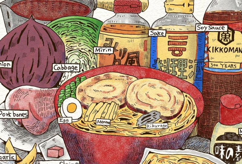
and recipe illustrations. This is a series of recipe
illustrations I drew. So far, I made mapo tofu, spaghetti, Japanese
gildon, pizza, and so on. I like to draw the lines
by hand and then fill them in with color on the computer
or with an ipad pro. I incorporate visual
storytelling approach such as comic style panels to highlight key moments
in the cooking process and let the illustrations
tell the culinary story. So today, I will teach you how to use this
line drawing style, combined with graphic
narrative approach to create this recipe, Japanese am and Illustration. You will see my process
step by step from research and sketching the
draft to adding color. Be sure to check out the downloadable
project resources which add all the necessary
materials to download. It will help you finish
your own illustrations. Okay, let's start.
2. 2. Tools: Before we get started, I want to introduce the
tools we will be using. I will use an IPad Pro,
printer, technical pen, paper, LED copybard, scanner, laptop, and my drawing tablet. Of course, if you don't have an iPad Pro or a printer,
that's totally fine. I like to use my iPad
Pro to skage and then print it out on a
printer to copy the lines. But if you don't have an
iPad Pro and the printer, you can also draw
a rough tuft by hand and then copy
it on a lightboard. Okay, I'm going to
show you what kind of pen or what kind of
paper we will be using. So this is the technical
pen I'm using. This is Stalla 0.2. I also use 0.5. They are very easy to use
very smooth on the paper. So yeah, especially
when you draw something it's
very, very smooth. And also they are waterproof. So if you want to draw
watercolor on it, it is perfect. Well, at the same time,
I also use a brush pen, which is unipen brush. And this brush pen, you can see the brush. They are very thin here, and you can draw
a line like this, or you also can draw
a line some line like this to give a
little bit texture. So I really like this brush. It's very interesting. About paper, I usually use artist drawing paper
or even just copy and printing paper because
sometimes artists drawing paper can be too thick
to make light copies. So when I choose this
kind of paper to draw, I usually choose like 160 grams per metamere
to 200 grams. This is my LED copybard. You can turn on the
light. You can change it. You can change the light. And this is A four size. They also have A three size, I think, and I get
this from Amazon. So when I draw A four size, I use this site, and when I draw A three size, I just turn like this site. So and I move the paper. My drawing tablet, it's alco. In tools, it's very old, but it's still very durable. I love it. I will use it
in this class as well. And about the printer, I use Brother black
and white printer. At the scanner, I
use Epson scanner. Okay, these are tools we'll be using in our
class. Let's start.
3. 3. Research: Important step to start drawing a new topic is doing some
research on the subject, looking at photos, checking
cookbooks and so on. For example, I always watch how this dish is
made on YouTube or social media and I will select the moments that I find
interesting and draw them down. Of course, if you are very
familiar with your dish, you already have some
pictures in your mind. You can try and draw them
directly from thought. When you are doing
your research, you can write down what ingredients are there
and find photos of them. You can also save
some pictures of ingredients for references
for later drawing, or if you have the ingredient, you can just take a photo of it. Here's a list of all the
ingredients for making ramen. Make sure to write down their
names and amounts as well. It will make drawing
them easier later. Also when you review these
cooking photos and materials, choose three of your favorite cooking moments and sketch them. We will draw them into comics. Usually, when I
choose the moments, I tend to choose
dynamic pictures. For example, in the
making of ramen, I like the picture of
draining the noodles. The water was shaken
out of the sieve, so I will draw it. I will also draw the
picture of mixing soup. The steaming soup blending
together is very exciting. I also think the
moment of cutting cha she at the end
is very dynamic. I like to choose pictures where there are hands in action. For example, in my
illustration of pizza recipe, I chose some moments
of kneading dough, which I think is very cute. Also, when making pizza, sometimes people
stretch the pizza dough on the edge of the table
to keep it evenly round. It is also interesting for me. Sometimes I like to sketch
out the seasonings for sauce in circles and not
the grams underneath. For example, this is a Japanese Gilden recipe
illustration I made. I drew each sauce
ingredient next to the pot, and this is a spaghetti
illustration I made. I placed the sauce ingredients
at the top of the picture. If there are too many
elements in your drawing, you can group similar looking ingredients
into one circle. For instance, when drawing
spaghetti ingredients, I combine count chopped
tomatoes and tomato puree into a single circle using a red count sauce to
represent them together. I also use a spoon like this to hold powdered ingredients
like brown sugar, salt, and black pepper together. So pick the cooking moment that speaks to you and bring it
to life in your drawing. Okay, here I drew a draft of three cooking moments
that I find interesting, and I would like to express
it in comic panels. The first one is
mixing the soup. The second one is
draining the noodles, and the third one is
cutting the tissue. Now we can move on to sketch.
4. 4. Sketch Step 1: Okay, let's start with a rough draft to determine the layout
of this illustration. I think we can use the top
to place the comic panels, the cooking moments panels here. And the lower left corner
here is for the title. And then in the
lower middle, here, we can draw the main dish, which is a ramen and vg
ingredients around the dish. So let's draw a ramen
bowl here and try to arrange the layout of all the ingredients
around the bowl. Okay, now this dish and
ingredient sketch is done. In this step, we are just
laying out the picture. We don't need to do
a detailed draft. It is mainly to determine the position and shape
of all the ingredients. So now we finish the dish
and the ingredients, we can start drawing the
cooking moments part. So the reason why I
like to draw drafts on iPad Pro is that it's very convenient to
adjust various elements, and it is also very easy
to draw comic panels. You can use the drawing
guide to do it. Here is the owing guide. We click here and the caverns, and then we can see
the drawing guide here and we can turn it on.
We can turn it off. We also can edit joining guide. We click Edit joining Guide, and you can edit opacity, the sickness, and
the grade sites. I usually go for 50 pixels. I think it's enough for A
four size or as size poster. You can type 50 pixel here. You also can just use the bar, but type it, it will
be more certain. You also can change the
color of the drawing guide. We use deep blue. Now we have the grades, and then we can draw
the comic panels. We click here and
build another layer. I see each this
grade as one unit. I use ten units to
draw the comic panels. So we give a dot here, and then we connect. And then we hold here. And then we can see
there is a square. And we can just digest
it a little bit. Okay, now we have a panel, and then we click this
layer to duplicate, and then we duplicate
three times. And then we put them
in a same group. It's easy to move them together. And when you are moving them, you can turn on snap here so you can move the
objects in alignment. So each of them, we make the distance. It's two grades. And then we move them
together to move them in the middle of the picture. Then we can copy the sketch through cooking moments such
now we already made it. We click the gallery
and we go to click the research
we did such now, and then click the layer here, and this is the drawing
such now we made. And we hold this layer to move it and click Gallery and
click our sketch again, click layers and then
move it to here. And then you can
see we have them. Now, the comic panels are
at the top of this picture. Of course, you also can put
them at the bottom like this, and then you can move this here, and maybe you can write
the Roman title here. You can also have one
comic panel covering the main illustration and
the ingredients and so on. You can try a lot
of different ways to lay out this illustration. So in my project resources, I've included some
comic panels like this. You can download them and use them to complete
your drawing. Also, if you don't
have an iPad Pro, at recommend another tool, the great type sheet, place it on an LED
copylight board, and you will be able
to see the great underneath where you
draw your comic panels. In the last video, I mentioned that you
can draw ingredients in little circles and write the
name and amount underneath. Since we still have
some space here, I added a telepod and the telesoce recipe
using this approach. There are quite a
few ingredients, so I grouped them into four categories and
made four circles. This is just a very
rough sketch for now. We will refine it
in the next video.
5. 5. Sketch Step 2: Okay, let's continue sketching. We can create another
layer on top of this layer and we can change
the opacity of this layer, and then we can working on
this layer for the sketch. Now I'm going to
draw a rainbow here. At this stage, we don't need to draw too many details yet, such as the details
of the noodles. We will perfect it in the
ink line drawing afterwards. Next, we can refer to our
sketch to draw the details of all the ingredients
and remember to make a different layer to the
ingredients to separate them, then it's easy to arrange
them in the picture. Okay, now you can see the main part of the
illustration is done. I like to surround the dish with seasonings and various veggies. It makes it look so good. Create visually
rich presentation. I also arranged some
bottles position to make the whole picture seems a
little bit balanced and also because if we
have the tale sauce, this recipe, the soy sauce bottle is better to put it a little bit right. Okay, let's continue. About the title,
you can also use this grade as a guide
when drawing it. I try to keep each letter within four to five units grade. I drew a rectangle
and write the name of ingredients inside the rectangle for each of the ingredients. Then we adjust the
overall picture and the distance between the elements about the talazos because sake and medine
are very similar in color, so I only use a small
cup to represent them together and write the two
ingredients under the circle. The shapes of ship powder
and MSG also very similar. I also used this kind of powder to represent
them together. For the comic panels, you also can give a sentence to describe what is happening
in these comic panels. So what I wrote down
is mix the soup, drain the noodles,
and cut the chassi. Okay, this draft
is finished now. Let's print this draft and move to the line drawing
on the copyboard.
6. 6. Line Drawing & Inking: Okay, now we print
out this draft, we can start copy the
line on another paper. So will you copy it, remember to draw
all the titles and all the small words and all the ingredients on another
paper to separate them, then it's easy for you to change it to adjust it in
the Photoshop afterwards. Okay, let's do it.
And we're using the Sta 0.2 to start it. When drawing the line art, I always randomly draw some black shades to
represent shadows. Like this ramen, I
used Sil 0.5 to add some black shadow randomly to enhance details and add
depths with dark tones. You can feel free to
use this skill to achieve similar effects
in your painting as well. I added some shadows on the
cabbage with the brush. I also added some shades on the seasoning bottles and
packaging with parallel lines. Also, I like to use
hatching techniques, add some texture and
shadows as well. You can use parallel lines
to fill an area with tone. The amount of lines as
well as the thickness and darkness of the lines determine how dark
that area will be. So for example,
on the soy sauce, I can create shade of the black
liquid by patch hatching. This technique is very vast and creates a dynamic and
interesting texture. Create small sets of interlocking lines
varying the angle of each set and then darken areas
by adding cross hatching. In my project resources, I put a few examples of this hatching techniques you can reference for your drawing. Okay, now, I think we finished this copyline
drawing work, and you can see we make
two different works. Afterwards, we can scan it into the Photoshop and
it's easier for us to change the position
of all the words. And also when I
make this drawing, I noticed that I forgot one ingredient which is
large for making the soup. So I just made a circle for it, and then we can try to put
it in this illustration, maybe on the corner or
on the side of this box. Now we can scan them.
7. 7. Line Cleaning: Okay, now I scunt
my illustration. And usually when I
scan my illustration, I use 600 DPI to scan it. So even this illustration
finish on A four size paper, but we still can put it on a bigger paper such like
a size to work on it. So now we can put this
illustration to a new file. So we make a new file. It's a size file. And it's 297. This is 420, and
this should be 300. And then we go back
to our illustration. We select it Koman
DV and then Koman dot to digest the sides. Okay. And then we can adjust
the comic panels a little bit because I see they
are a little bit crocok. So we use the mouse
to click here to make a guideline on the paper. And then we select the commando t tour
it a little bit. And this one as well, we can use last or
two to select it. Sometimes I use this rectangular
marking tool to select rectangle and feel the color in a new layer to see
if the distance between the age of the page and the comic
panels is the same. We can see still there a little bit need to be adjusted. Okay. I think now it's fine. And then we can delete
all of those guidelines. Okay, now we can
clean the lines. Then use the magic
wont to to select all the blank area as much
as possible and delete them. So in this step, I use the magic wand
tool to select and remove as many blank
area as possible, since I will later use the color range tool to select
and feel the line color. It's important to clean up
the image at this stage. Otherwise, the color
range tool may pick up unwanted white and gray tones causing the entire image
to appear slightly gray. Additionally, if there are any unwanted marks in the image, I will erase them as well. This step may be a bit tedious, but I think it is important for maintaining the hand draw
quality of the lines. Okay, I think now is fine, even though there are still some very small gray
blanks still remain here, but I think it's fine because
it's not a very big area, so it won't give the grey
tone for this picture. Can we just delay it. So a place like this, you really don't
need to clean that clean. It's very hard. Now we choose Select color range and we just choose
the darkest place, and then we click Okay, and we build a new layer. Usually I don't
really want to use pure black to fill my line. I would like to use maybe dark blue or dark brown or gray, then it makes this line less stands out and I like
that kind of effect. This time I choose dark brown. And then we just fell it and we turn this
layer invisible. Now you can see the line
still kind of very light. It feels like the pen
is short of the ink, so we can do this
step one more time. To select color range
and the dark place. But this time we can
use a mid tones, and then click Okay,
build another layer, turn this layer invisible, and then we still choose
the bran and we fill it. And we turn this layer
visible and multiply. Now you can see the line is much better and it gives a little
bit bron lines filling. Then you can combine these
two layers together, use it. We type the name here. Okay. Then we can build
another layer to put the information
layer on here. And we also repeat the
steps such now we did. We clean all the
blank area first. Then you can see here has many dots that actually
some dots on the paper, and we can just select them
to delete them all together. I actually wrote
something wrong. I will do it later. Now you can see I built
two layers of this file. One is the line layer, is our main drawing, and another one is our
information layer, which is all the information including the titles
and the ingredients, the rectangles,
all at this layer. Then we still can
digest them separately. And then I wanted to fill
the rectangle with white. Then we can use this
magic font tool and to select this layer. We do select inverse, and then we use the lasso to select those things that we don't really need
to fill the color with And we built a layer under this layer to fill
it with white. And then we combine
them together. Okay, now I think this
line cleaning work, we are done, and
then we can move to the next step, adding color.
8. 8. Color Palette & Adobe Brushes: I make my own color palette before adding color to my
illustration each time. This time, I only use
five colors blue, red, light yellow, grass
green, and the gray. I think it's very
important to decide you color palette every time
because this can avoid, for example, you use too many colors and
those kind of colors, they are not matching
with each other. I think you decided what kind
of color you want to use it's very important before you adding color to
your illustration. And I also think try to not use too many color
in your color palette. I think maximum five
colors is the best. And after you decided
your color palette, you can make a color
test. I made one. Try to see what's the result of this illustration
with those colors. And W I making my color test, you can, for example, make three different layers. One layer is 100% of opacity. And another one is
70% of opacity, and this one is multiply
on the first layer. And then we have a
third layer is 50% of opacity and it's also
multiply on the layers. So by the layer, they multiply to each other. Then actually, you see we
can have different colors. We can have more colors
than the color palette. We decided, for example, this onion at 7% of the
opacity, this layer, the onion it's light
kind of light red, which is the red of 70% of opacity and at the 50%
of opacity, at the blue. You can see they become
a little bit purple. And in the 100 opacity, this layer in the 100 layer, the soy sauce is yellow. And the 70, I add a
little bit red and 50, add a little bit blue, then it become brown. So I use this kind of
way to add in colors that I decided in my color
palette to create new colors. And I will explain this a little bit more in
the next video. And before that, we are going to see what kind of
brushes I'm using. This is the Adobe Brushes. I think it's from Illustrator. His name is Cal Webster. I really like his brushes. It's very easy to use
and very good effect. And all of those brushes is free download as long as
you bought Adobe software. I usually use spatter, which is a brush that
can have spray effect. And also manga, it has half
ton brushes, and also copier. This can have rental textures
of the printing press. I think it's very interesting. I will show you in the software. This is the copier. And you can see it has a little bit printing
press filling. It's like the so
printing effect. This is the spread one. I usually use it
to draw shadows. This is the brush I'm using, and now we can start coloring.
9. 9. Adding Color & Final Thoughts: I have two basic working
methods when coloring. First one I had mentioned
in my last video, which is I add colors on different layers with
different opacities. So when choosing colors, I only use the colors on
the palette and let them overlap with different opacities in different layer to
become deeper colors. For example, I
have three layers, which is 100% of opacity. This is 70% of opacity. This is 50% of opacity. And the 50% and 70%, both of them are multiply,
at the same time, I have another layer
which is still 100 of opacity, but
this is normal. It's on the top of
all the other layers, and this one is for highlights
and others was for colors. Now, I paint this bottle yellow. Then I have red in the
palette I have decided, I can overlay this red
to make it orange. I can also add the 50 layer, add another layer of
blue to make it brown. If you feel it's
not deeper enough, you also can add more 50
layers to make it more deeper. This bowl is red and I can overlay blue on the shadow
part to make it purple. In fact, this is based on the principle of mixing
three primary colors. Yellow and blue
will make it green. Blue and red make purple and
red and yellow make orange. Another point to note
that, for example, it is difficult to get clear green when mixing the blue
I chose with the yellow. So yellow needs to be
multiplied with more layers. So when you are
actually coloring, you can add new layers of
different opacities as needed or just include the color like this grain you want
in your palette. So in this way, you will actually
have more colors than you have on your palette, but you can avoid using too many different
colors and mismatch. Second, when I coloring, first, I usually use a normal brush to paint the parts that
need to be colored. Then I use the magic wand
to to select this area and then use the Adobe brushes that I mentioned before to
add some textures. Sometimes I mix different
brushes like this. I use the copier brush to
paint the shadows first and then the spatter brush to make the spatter in fact so
that they blend together. Now we can look at
the example where I actually colored in
this illustration. On this bottle, I
field color first. I use different brushes on the same object to make
it richer in touching. I used the copier brush to
paint the shadow first, and then use the spatter brush to create a splash filling. Finally, I added some
highlights here. I use the same method to color the Japanese
instant ramen. First, fill the ramen
with light yellow, then use the grey copier brush to paint the packaging bag. Then at pasity of 70 layer, I use yellow to draw shadows. Also in the layer of 50 opacity, I use red to add some shadows. They become orange. Fell this spring onion
with green color, then use the same grain
and spatter brush to paint the shadow. Then select bright
yellow in a layer with 100 opacity to
add some brightness. So in short, I color by
filling with one color, then overlaying the
same color with different opacities
and brush textures to create different effects. Now I finish this Ram recipe Illustrian and you can see
I have five layers here, and this one is 100% of opacity and others was in
different opacities here. I also have 100 for
the highlights. And this 50% of opacity, it was because in some place I wanted to have a
little bit deeper color. So I just add extra
50% of opacity here. And also, I add another
watercolor paper texture layer on here because I wanted to have a little bit hand djaw
filling in this illustration. So I add texture here. And this texture I actually
bought from at C store. So if you search in at C, watercolor digital texture, you can find many different results. And also if you just
want some special one, maybe you can scan your own watercolor paper is also a way to get
this kind of texture. Okay, then we can
save this file. We can save it as a PSD file or we can save it
as a GPAC file. But remember, always
save it as a PSD file. Will you working on it because you never
know what will happen. So save as a PSD file in case it's always
what you should do. That's it, we've finished our
Raman recipe illustration. I really enjoyed the
process of drawing. In this course, we
learned how to use graphic storytelling to
create a recipe illustration. I hope this comic
panels approach, hatching techniques, lines, and coloring techniques can
give you a lot of ideas. As you work on this project, be sure to download the required materials from
the project resources. However, you don't
have to really follow my instructions exactly. Just feel free to
adapt the process to your own skill level
and the creative style. I want to see it. My
main hope is that you incorporate image
storytelling techniques into your recipe illustrations. After all, bringing
stories to life through vigils makes the
process even more exciting. So if you complete
any projects from these classes or if you
want to share any ideas, just feel free to share your
work in the project gallery. I'd love to see them. For more inspirations and
updates on my new work, please check my Instagram. I will also continue sharing
courses and exercise on image storytelling here on skill share. Thanks
for watching.
 Ming Yue, Illustrator/Comic artist