Transcripts
1. Welcome: Hi. My name is Gustavo. I'm a digital artist. Any discourse? I'm gonna teach you an easy way to make portrait from the sketch to the final piece for these cars. I will be using a night but pro on an apple pencil. But the tips health show you can be applied in any medium or software. I will speed up the BDS in some parts. So posit as you need, take your time to catch up. With that in mind, let's begin.
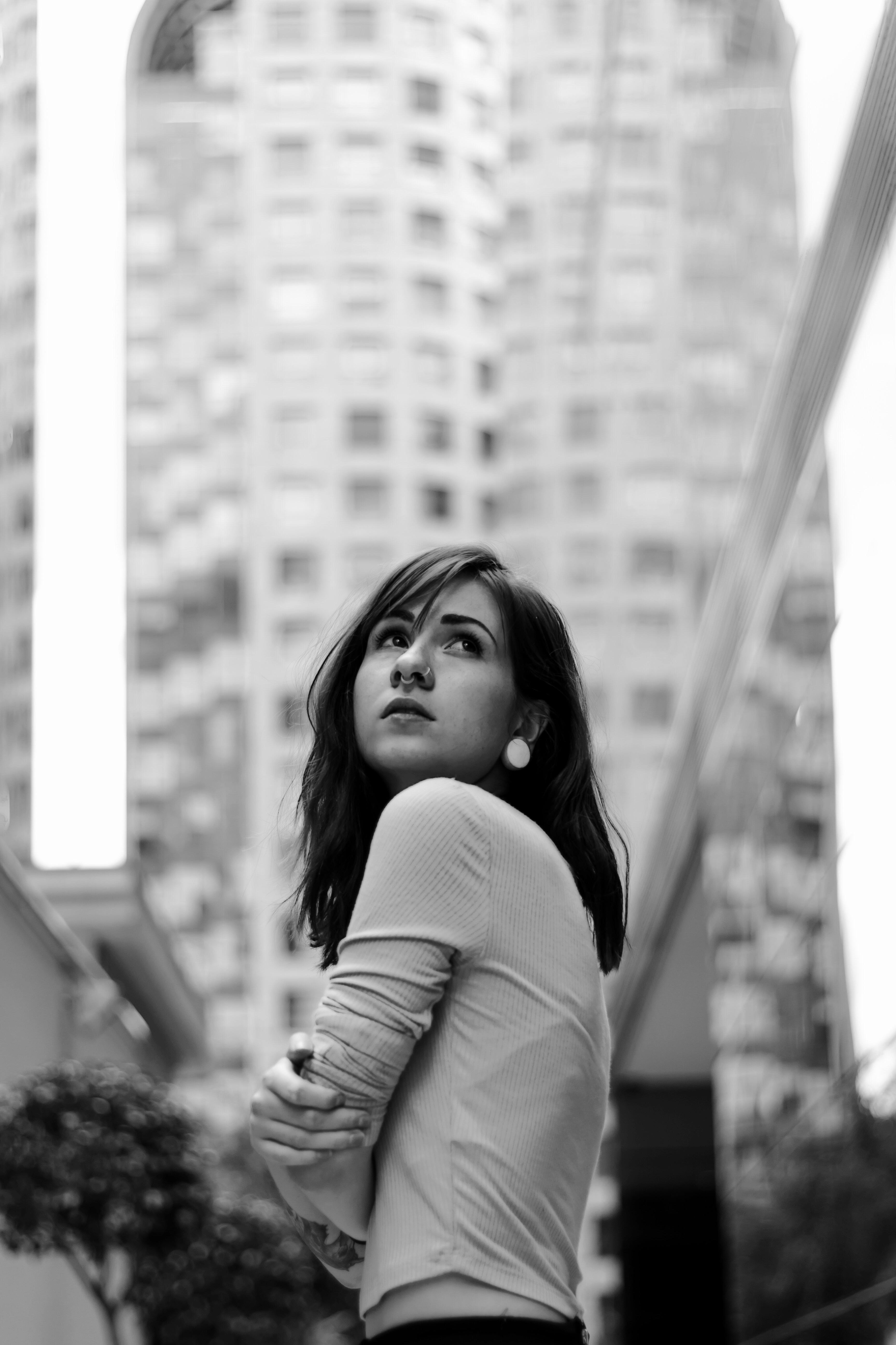
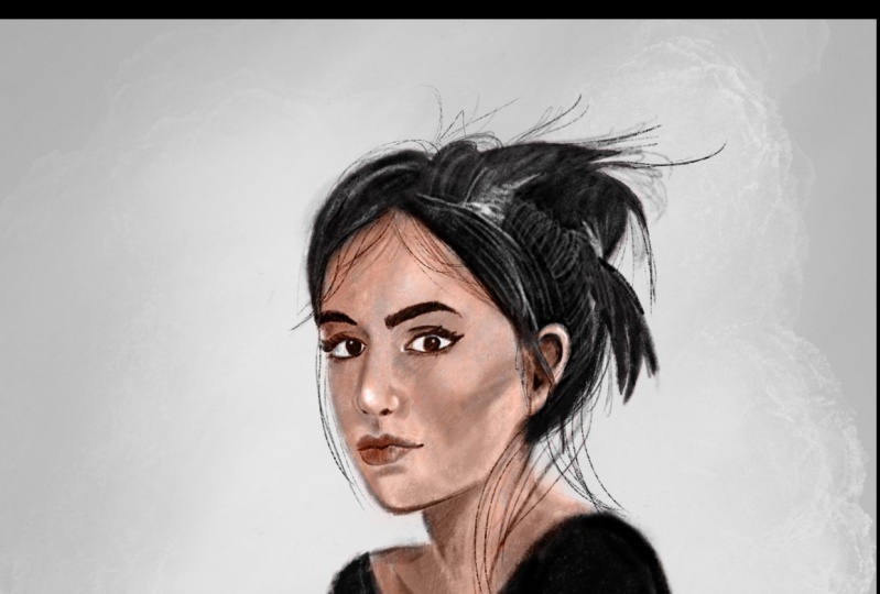
2. Finding a Reference: so the first thing we're going to do is find a reference for these. I'm going to use this website called Texans. You don't have a particular program you want to work with. You can use Google images or interest. Also for these exercise. Already found a picture I want to use. I like it because she has an interesting post and you can identify easily the light. Sirs, Let's any of the reference of procreate so we can see better. The values were going to paint. I'm going to the saturated photograph so we only see black and white values on play with the Kurds a little bit so we can make the white areas brighter on the black. Hair is darker. Uh, by doing these things will help us see better than futures. Don't make the footwear up, have volume, save the Beamish, create a square campus on touch and drag photos up to the side so you can see the reference as you draw. So with all these it up, let's start growing
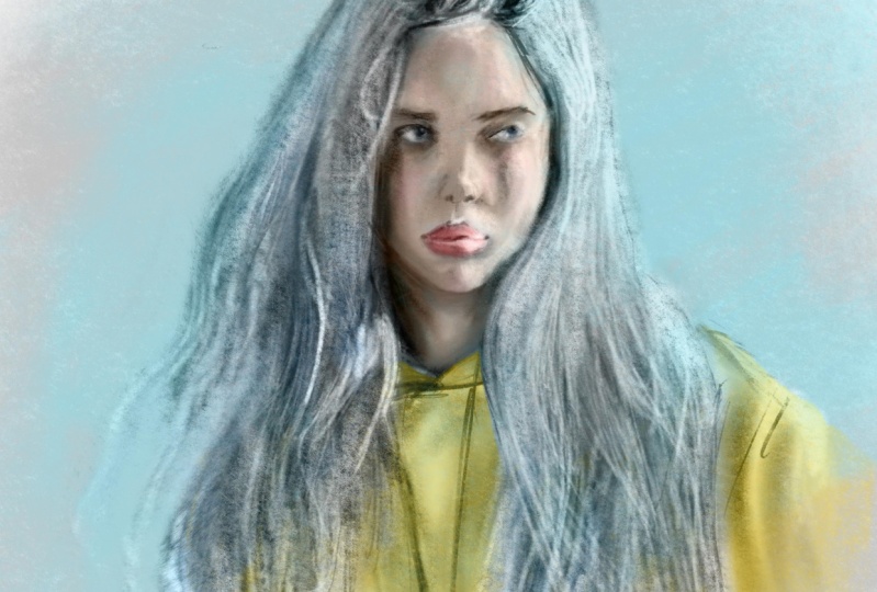
3. Sketch: so they started brushes we're gonna be using. I'm gonna use the sketch pencil with red color. You can use any color you like, but I just like to the lemon red. So every time I start a portrayed I started with a circle, you don't have to be perfect. We just wanted to be there to help us play the futures off the pace. Um, next I draw middle vertical light and then a line for the ice. Let's make the shape of the year starting at the end of the line on, Let's make the shape of machine again scenes. It's a sketch. It can be rough. Don't try to be exactly what you see. Try to capture the overlook on proportions. Draw the big shapes on. Don't go into any details yet Don't spend much time in one area. Trying to capture the big shapes on the portrait. Uses many lines Says you need on Don't worry about making mistakes. You saw low opacity on the brush so you can come back and try a line again. If you don't like it, I'm going to place the ice on top of a reference line on trying to shape them the way they are. In the reference you see, her head is tilted upwards, so you see they lower eyelid bends upwards a bit, too. From this angle, one of the best tips you can use is instead of drawing the details you see, draw the darker areas first. For example, the shadow on the portion of the knows that faces down is always darker. The line between the leaves is one of the darker areas to, especially on the corners of the mouth. On the upper lip is currently darker. Two scenes is facing away from the light also, As you can see, we haven't soon in so far. This is important because keeping the whole campus beautiful gives you the chance to see the picture from far away and concentrate on the big shapes. So don't spend too much time on the sketch. If you have something like this so far is good enough to keep going in the next video, we're going to start bringing
4. Flat Colors: so know that we Horace kitsch. We want to have a base off black values before we start shaving. Create a new layer I'm putting below. The sketch now is the willow charcoal rush. We want to select a middle great in the color wheel. Let's use this color to peel the shape of the face on every place where the skin is visible . Don't worry too much about making it look nice and clean. Now you saw darker rate for the hair. Don't go pure black it you can change the site of the brushes you need to help you reach small areas. Now let's use our later right for the closest. It's a big rush to peel big areas. This is gonna be the base of her for our shading, for our values. Create another layer for the background, unfeeling with middle middle great tone. So so far we have three layers sketch flood cold or somebody grown just for the sake of keeping everything black and white. I'm going out to saturate the sketch layer, but these are the only three layers you should have so far. So the next lesson we're gonna do shadows
5. Shadows: Before we start with the shadows, I'm gonna use the selection tool to reposition the face better. You can use this tool if you feel some of the proportions of your portrayed are not working well, you get enough practice to do better sketches. Don't be afraid to use this tool to correct mistakes. Be very critical with your sketch and tried to judge if there's anything wrong with it. Let's go to the flat color layer on Pick up. Great. To stop being darker than a face grade. Use low opacity. Don't go too dark. Try to have little contrast so you have more control. Pain. All the shadows you see on the reference. Usually faces have shadows under the sheikhs on the site of the forehead, on the bottom half of machine under the eyebrow between the inner portions of the ice under the nose, under the neck under machine. It doesn't have to be perfect. At this stage. You can be rough. Do the same for closes on the hair. Notice how we haven't some injured. We haven't got into march, Tito. You can use black to outline the ice a bit better. Usually the corners of the leaps out of the dark already. It's on the move. Notice how we are starting to build some volume to our sketch by just placing some shadows . Don't spend too much time in in the same area or you will get lost into details. So this is how you're drawing should look so far. So this is how you're drawing should look so far on Let's do some highlights in the next lesson.
6. Highlights: Now that we have our shadows, we're gonna do the same, but with lighter rate owes, So the brighter areas will be the ones facing directly to the light source. So in this case, the area on top of the upper lip, the top of the chine are off the forehead on the bridge of the nose again, Be really rough on. Didn't spend too much time into details. I'm gonna use our barrett color to change the values on the on the ice which heart to heart you some white to do the highlights on the hair, make big shapes and don't draw too much hair strands. Notice how I'm not detailing too much on the hair. Uh, I'm just putting enough white to suggest the shape lay some highlights on the wrinkles, especially on the parts that faces up where the places towards, like on take your time. Try toe, push your drawing until something like this on. Uh, I'll see you in next lesson
7. Detailing with Black: so far, you should have a sketch layer of values layer on a background layer. I'm going to combine the sketch layer on the values later. You seeing the willow charcoal brush. Pick up your black on. Let's outline the darker areas. Let's try to make the contrast between the face on the hair, everything us in the reference, uh, this will help us clean the edge of the face. You can make some hair strengths, but don't stop too much in one area, but go around working each part, making the portrayed as a hold instant Look at your reference and find the darker places and try to place those inter drawing. So let's start detailing the face. The nostrils are there are one of the darker areas in the face. Honey between the lips. The upper lip is often darker than the one below because it's not always facing the lighters. Also notice how we haven't soon India go around and find areas of the drawing that needs so massaging, like the wrinkles off the sweater. If you find difficult to recognize what are the darker areas? Try to simplify your vision off the reference bias, squinting your eyes doing this will lower the details a lot, so you can only see the relevant shapes. In the next lesson, we're gonna be the tailing with white.
8. Detailing with white: So let's started tailing with pure wife. So we're gonna use a small brush size and plays a reflection of the corneas. Also, the highlights from the lower lip around the tear duct. There's usually a collection of oil and water, so that area is usually more reflected because it catches more light. The tip of the nose on the top of the I Rose. He's usually writer, too. Even when we are detailing, you can still be better rough of this point with those details. So remember thing in bigger shapes. First, before going into smaller details, the highlights on the hair will help define the hair, the hair style a lot. So look at your reverence and be very patient on this Holy should look so far on See you in next lesson.
9. Breaking the rules: So in this video we can finally start swimming in and out on using the other tools, like liquefy on this much brush. So let's start detailing and cleaning some edges with more freedom. Soon a nun rotate as you need. Use this much brush to blend the areas that have nasty transitions like this one. You seen this much brush will help the painting look softer and cleaner where you need it. Don't stop in one area for too long, but go at your own pace. Don't try to catch up with me, but try to understand what you're doing. Use. You're going to use the liquefy tool to change the expression on her face if you need to. You can use it to shame the size of the ice or the mouth, but be really subtle about it. Don't overuse it if you think something is really off at this point, is better that you picks it on the sketch on the values instead of using liquefied. Using liquefied too much can ruin that wrong before we start coloring. Let's polish the painting a bit more, so I'm gonna use the smaller sites on the brush to make some hair strands on play away. Here's to get more life to it. Also, to outline some of the futures off the face more. I'm going to basically clean some of the area. So the face that I think are not well done so uh, used the's time to go around and flying the areas that does he have. But he will define edges or that still need some was much ing. So in the next video, we're gonna talk about the background.
10. Background: So now we're gonna take care of the background. I usually like to use a brush with texture. Procreate has a good library of Russia that you can experiment with. I really like the damp brush because it has, ah, crunchy texture that I used to that I want to use. So the character is not in front of a black background. So this part is really up to you. You can be very creative on this and experiment with a different, uh, type of brush or different textures. So before we finish this video, I'm just gonna give the face a little bit more volume using the soft brush on white to accentuate the brighter areas. Uh, yeah, just a little bit. We are ready to put color on it. So see you in next lesson.
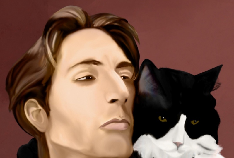
11. Adding Color: So now that we have our values, let's close a reference. Create a new layer. I'm put it on the color limo. I think color is gonna be really see your values are correct. So let's use our this saturated orange reddish color to start painting on top of the skin. I usually use, uh, really pale color for the skin, so I'm going to saturate the color of it. Uh, now I'm gonna use some red purple color for the lips. Let's use our the saturated red in low positive to give some flush to the sheikhs. One thing you need to know is that shadows on the skin are not just black. The skin reflects some lights from the inside, so try to give a war in red color to the shadow are areas this effect is cold sub surface scattering. I usually use Liukin's whatever the skin is thinner, so skin is not made by just one flat car, but made off a mix of different shoe ships caused by your veins and fat under the skin. Try not to go too saturated on the colors, so it doesn't look like makeup. You can color the hair in any time you like. I'm going to use thes dark red, and I'm gonna do the same with clothes. I'm going to create a new layer to give some color to the bathroom. Use the same blending mode on Seussical. I'll use our color complementary to the red. So when I use this green to integrate the portrait with the battle a little bit, I'm going to duplicate my background color and put it on top on with a sub brush. I'm gonna erase the inner parts, the portrait living all the ah so edge around the character. So that's it. Let's get ready to finish our ports right in the next lesson.
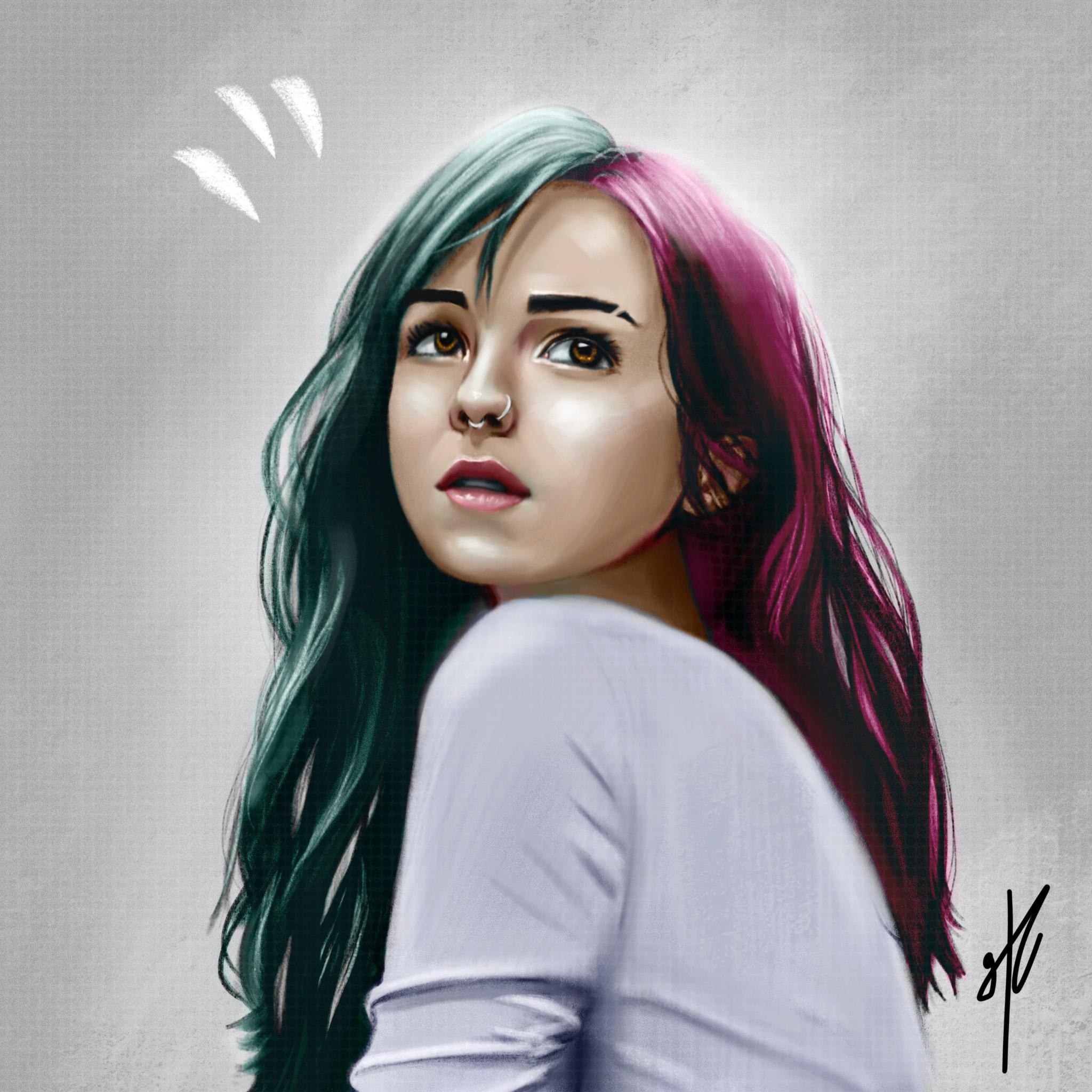
12. Finishing Part 1: Let's merge the cold earlier, so we have just one color layer and the value there. I'm going to go to the value layer and play a little bit with a curse to see if I can give it more contrast. But you have to do it. If you feel jurors is good, I'm going to merge all layers and that some noise to help unify the color of the painting a little bit more, so I'm gonna use around 50%. Basically, what Moyes gives you is some brain that will help make the color some values. Blend more, go around your portrayed and see if you can improve the illustration. Adding tiny highlights and sharper shutters can help the find of features of the face more . At this stage, you should have something similar to this. The next video is going to be about my progress off how it took this image to the final result. If you want to stop here, realized that you already learned some basic notions about the process of making an illustration about values about light and shadow and cooler, and since this is a really short curse about illustration, they must wait to process everything you need is repeating the steps with more references so you can understand more what you just learn. If you think your right to keep polishing your portrait, please watch the next last video. I hope to see you there.
13. Finishing Part 2: So congratulations on making it this far. This video is only going to be a fast forward off on one hour video. So basically, I just saturated the whole picture again so I could work with values. I basically spend more time going closer to the portrait on opening the reference again trying to replicate the details that I like if you feel something is wrong with the portrait, but you can put your finger on it, show it to someone usually after seeing a piece off illustration for too long can make me off leave usedto very evident mistakes and usually other people can see them. If you don't have anyone around, just rest for it well, and do other stuff. Take a shower. Maybe the game sore. When you come back, you will see exactly what self Uh, I used liquefied to correct some of the areas that I still didn't like And basically, just have fun detailing what you like, since you should have good values foundation. At this point, any detail that you make will fall into place, experiment a lot, create new layers and do crazy stuff and delete them if you're not convinced. Used any colors you like and more important, have fun doing it. Please. A blow your progress or finishing pieces. I would love to see what you did in this class and give you feedback. If you need, enjoy the rest of the video.
14. 14 Thanks for watching: Congratulations for finishing the course. I hope you had some fun. I learned your skills. So you're pretty If you want. I feel free to follow my work with the links in the description. Thanks for watching.
 Gustavo Espinel, 3D Modeler and Digital Artist