Transcripts
1. Introduction: Hello, and welcome
to a new class. This class is all about
storytelling and composition. So you can think about it like composition and scene based
storytelling workout. And this practice, we
also have a clear goal, which is our theme of creating dream
artists studio space. And along the way, you can pack the room with your favorite
details and objects. So the scene will feel
more alive and more you. And before we start, if you need a refresher
about composition, you can watch the
composition class and I will link it
in the description. We will start a process with
generating ideas to help you decide on things that
you can add to your scene, to create the story and the
mood and feel that you want. Then we will move on and
start creating studio layout, and I will share with you different ideas for
compositions and layout. So you can decide which
type of layout and composition works best
for your dream studio. Then I will show you how
you can quickly explore your favorite colors on the
quick composition thumbnails. You can follow along with
the same layout as I will be using or just use
it as a springboard. And then from this springboard, you can customize your scene with different character pose, different outfit or
hair for the character. You can adjust the window view to your dream view
from the room. Maybe you want to add your favorite book titles or book covers on
the bookshelves, or you can illustrate your favorite mug maybe
with spots or it has specific theme or add objects and props that add
a special meaning to you. Or you can also add your pet to the illustration
or your dream pad that you would like to
have in the future. Because every object or a
character that you can add to the scene can create better storytelling
for your illustration. Along the way, we will
cover how to balance busy areas with breathing
room and negative space, and we will work
with value tones on every element to build a
convincing depth in your scene. Then we will tweak the
edges and just the details until the composition and the colors work well
together in the scene. So by the end of the class, you can have a finished
illustration that feels personal to you and also tells
your story at a glance. All right, so let's dive in.
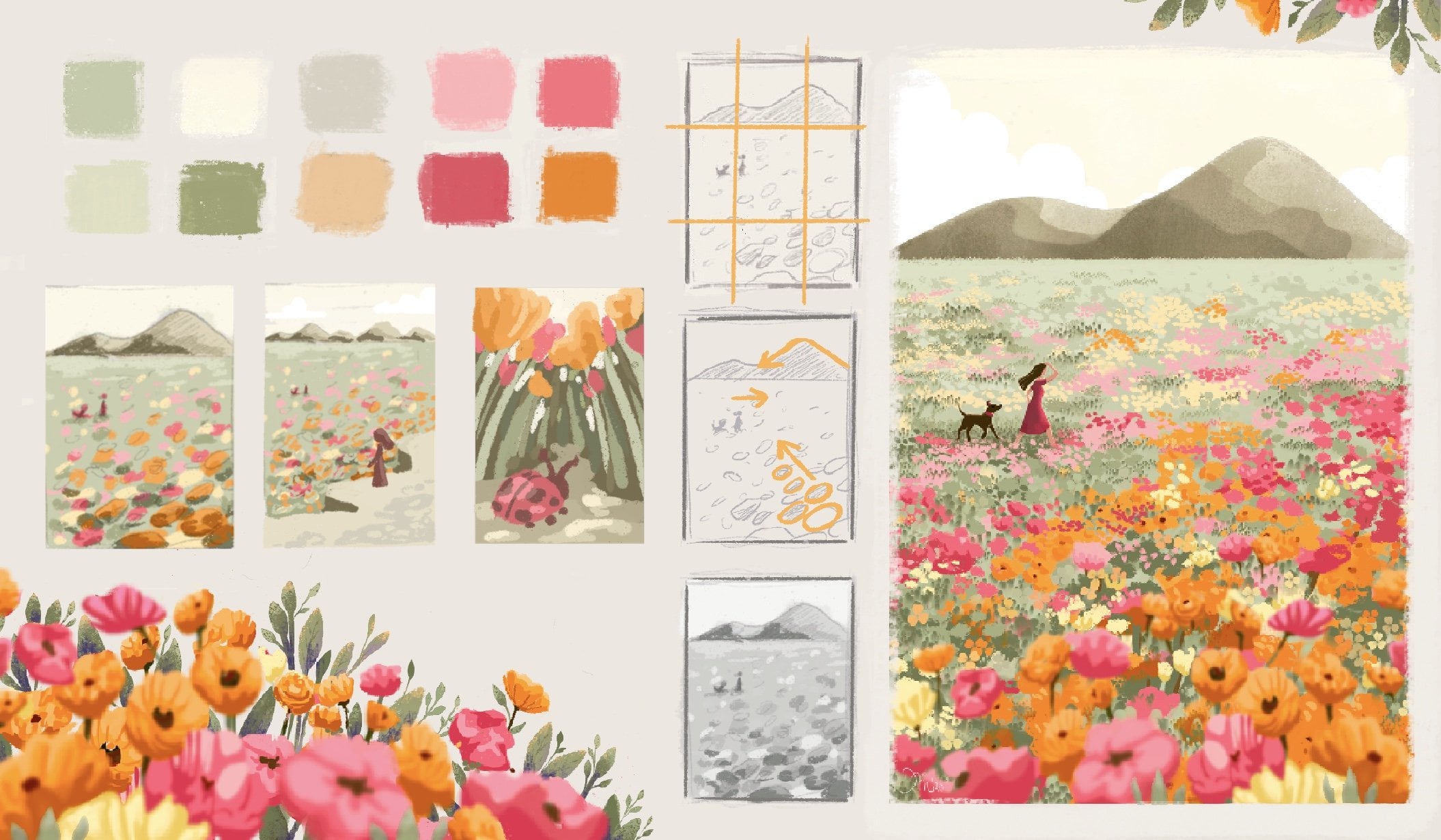
2. Bucket list: So try to write down some
of the ideas that you imagine in your dream
studio in the future. So give your list a title and
then write down some ideas. I'll just start with dream art studio bucket
list as a title. So first, I'm thinking
about maybe light and air and probably big window would be nice to
add in the studio. Then also maybe a balcony or
a sliding door might be nice and maybe a light wall with some photos or
something like that. So maybe you are thinking, do you want photos or lots of artworks on the wall or maybe they are kind
of on the ground, or where do you imagine kind
of storing your artwork? So maybe I'll just add shelves
for the finished artworks. And then maybe we
can add something about furniture or what type of tables would
you like to have? For example, I like to
have clean work table, maybe for the computer stuff, and then messy worktable to experiment with
the art tools. So you can add what type of tables you imagine
in your studio. Then after looking
at the photos here, maybe something more
with inspiration. So maybe inspiration art
wall can be interesting. And then of course, lots of different art supplies, and I'm thinking what else
can be super nice there? Maybe different
color palettes and different storage options for the art supplies that can be pretty interesting
also to illustrate. And then maybe also
lots of plans. I think that would make
the space look very nice. Then when you review your list, maybe you get some
new ideas from this, for example, what do you see from the window
or the balcony? Here I'm thinking
that we can see maybe a sea or a garden. Or maybe old cute Village. Then when you review it again, maybe something
else comes to mind, maybe your current pet or maybe a pet you want
to have in the future. Let's add cat and a dog. Then snakes would be
probably nice to have as well on the table because when you are
sitting on a balcony, maybe you want to have
a coffee and some nice snack to munch on when
you are sitting there. All right. I think
that's it for my list. Try to think about
what would you add to your list before
you start sketching and illustrating
and maybe you get new inspiration by looking
at the references. And before we move
on to the next part, if you are wondering for
this sketching and writing, I was using this
a sketching brush which I often use for sketching loose soft sketches and you
can adjust the opacity of this brush when you want to sketch very loosely and softly, or you can even use
it for writing text, which is quite nice and I think it has that nice flowy feel. If you want to explore
some new brushes, this brush is part
of my sketching set. But of course, you can use any of your favorite brushes
that you currently have. Now let's move on
to the next part.
3. Exploring compositions: All right. So now let's start sketching some first
ideas and kind of these small composition
thumbnails before we look at references because references
can influence you a lot, and now you can think
about how would you actually imagine
yourself within the studio. So these sketches don't
have to be perfect. This is just an idea, and then we can
adjust and fix later. And also, this is great
as a warm up exercise. For this exercise,
I will be using this brush number one
from my sketching set, but you can use
any brush that you like for this warm up exercise. All I have bigger canvas and the size of the canvas
is actually quite huge, so I can fit more thumbnails
into the one layout. But you can use smaller
canvas settings. You don't have to have
such a huge canvas. If you don't have enough space, or you can create multiple
files for multiple sketches. I just wanted to share
with you that I'm working with quiet big canvas. So the size of the brush will look different depending on the brush that you
are using. All right. So I can start in the corner, not in the middle in case I want to continue from left to right, so you can plan out the amount of thumbnails
that you want to do. For the first idea, I will start sketching with
this bigger brush size. So the lines are quite thick, so I don't go too
much into detail. So first of all, I'm thinking it would
be nice to have a kind of window on the side, and then there is this kind
of like a maybe easel. And me as a character. So for a character, you can just kind
of create this type of upside down exclamation mark. So it's a kind of
triangle with the head, not to go too much to
details, as I said. And here, maybe we can add
some other details like the shelves and maybe some
other decoration later on. And maybe this is the floor. And this is kind of like
this top down window view. So this could be
like a first idea. But I'm not sure if I want
to kind of face the wall. So maybe the table
can be like this. And basically, now the character is
sitting. This is the chair. So as you see, I'm still
using that exclamation point, exclamation mark
kind of character. And then maybe the window
can be kind of on the side here and there can be another window actually
kind of in front. So I just need to
add a wall here, but don't worry about
perspective just yet. So just approximately. So we see this wall here. We would need to move the
character lower and so on. But as a first idea, I think that's kind
of good enough. Then I can move on here. And maybe I can see the
character kind of from the back. So that's kind of me. And I'm sitting in
front of the window, and the table is kind of here. And then I would have two walls. Right here. Then you can have one table here and
another table here. And then there will be
decorations on the wall. This is a window, so you can have this
super nice view. But this type of composition can feel boring because
it's very symmetrical. Maybe if we want to do
that type of composition, we can change the
layout a little bit. If the window is in the middle, you can think about
the rule of thirds, as I talked about in
the composition class, if you want to
refresh your memory, you can watch the
composition class. But basically, we can move
the character in two thirds. So we are talking
about these lines, so we can place the
character here, and then we can maybe add easel and then the table
can be here off center. And then the other
wall would be here. So we are already
creating kind of, like, more interest
in the composition. So here we would add some
of those paintings, right? So these would be some
of the first ideas that either the character is standing with the easel
in front of the window, so we have the view or it's
kind of in the middle. But we can change
this composition and then just change
the tables, actually. And we can try to change the
window, so it's different. So maybe you have a very nice window at your parents' house or
in your house, you know? So, kind of some of these older
houses had these type of, like, beautiful
decorated windows. So maybe even in grandma's
house or something like that. So then the table might
be still in the middle. The character is still
sitting in the middle and we would change the objects
which are around. There will be
another table here, maybe with the easel, then maybe with some paintings, and then here, we can maybe
add shelves with paintings. And then maybe some plans, how we wrote in some of
those exploration and notes. And then you can add plants
also in the shelves here. Yeah, we already changed the
composition a little bit, and I quite like
this round window, which I think adds quite
a lot of character. And if we have already
quite a lot of desks, maybe we can add the kind
of cozy area corner. So we would have
maybe two desks, and then we might
add actually a sofa because we have a lot
of angular shapes here. So if you're thinking about
the composition here, we have some small
objects, some big objects. So they are kind of balancing
in the rule of dirt. And now we can add
another round object. So here we already have
one rounded object, which is kind of adding to
that variety of shapes. So if we create
another composition, so let's try to think how we can create new composition without changing too much
of a perspective. So we can maybe create the room that we are
still looking forward. So this is like a simple
perspective looking this way. So we can add a sofa right here. So the perspective is
not accurate just yet. And here we can add
some paintings and kind of like a cozy corner,
maybe with shelves. Then here there will
be some nice desk, maybe even like a stand
up desk, if you want. Then there will be easel here. And then there is another
desk on this side, and then some art materials and some other
details. All right. These can be very
nice simple ideas, how you want your dream studio
to look like. All right. Now let's move on to
the next part where we will look at photo references
and more composition, and then we can compare
with our initial ideas and maybe improve these thumbnails or create completely new ones. Perfect. So let's move
on to the next part.
4. Inspiration from references: All right. So as you can see, I imported some references
in the reference window. If you are not sure how to
open the reference window, you go through Canvas and
activate the reference, and then you can just tap
here to import reference, and you can download this
Moodboard if you want, or you can just look at
the screen while we are sketching because I will
zoom in on the references. And after this warm up exercise, you can look up more
studio references. For example, on Pinterest, watch out not to
spend too much time or basically hours
down the rabbit hole on Pinterest because that can take more time
than sketching. So try to time yourself, maybe, and set aside the time to just research interest and
then get back to sketching or open more references and do these quick thumbnails before
you define all the details. And first, we'll focus on more simplified angles like
this one, for example, and then we will move on to more complex angles and different perspectives and
different points of view. All right, so let's just sketch with this one because
I think here, it can be very nice to implement
some interesting view. So maybe this view and
this overall room is not as interesting or
aspiring artist studio, but I think the
composition of the room can be quite interesting
and has a lot of potential. So you don't have to be
expert on perspective. But you can use these type of references just to
kind of note down your ideas of the layout in the room and how
the table looks like. For example, this table
is angled towards us, so you can pay attention
to the edges of the table. And naturally I drew this
table here with this angle. But when you look
at the reference, actually the table it's
pointing this way. So just to improve
the perspective, if you want this
type of semi alism, you can adjust the table. And here can be another table following
the shape of this bench. And then here you can add maybe shelves later or
something like that. And here we can add the
detail of the wall. I think this is good
enough for this sketch, then we can move
on to another one. This one is a little
bit more zoomed out, so we have more space, so we see a little bit
more of that ceiling. This could be actually quite interesting composition
because you can add a lot here to the floor and this huge window is
also quite interesting. And here you can see
the perspective how these lines kind of
go from the middle of the room and are kind of diagonal following
the perspective. So if you want to add maybe
some nice decorations, like interesting lamp in the room or you want to have
more space for that sofa, what we sketched in one of
the examples which was here. You can maybe find the reference for the sofa and then edit here and basically have so much space for
tables and so on. This could be another idea. Let's move on to this reference, this reference can
feel very busy, but let's try to keep
it quite simple. Try to focus on big
objects here. All right. What is nice here,
it's this long table, but it's not in the
middle of the room. It's in the two thirds,
as we talked about. I'll just add the table. Then the character,
let's just keep it as the exclamation mark
as we did before. I can just make the
character stand straight and then you can add the hands so the character is doing
something on the table. And then all of these
in the left part, you can first look at the windows and then some
of these other surfaces. So let's just sketch
the window first. Then there is another window. So I'm not trying to be
perfect with perspective. And then there is
this back wall. We don't see how it ends. But here we have
lots of shelves. So that kind of breaks the layout in an
interesting way, I think. So here you can add lots
of art tools later on. And then there are lots of shelves in the
background as well. So you can vary the shapes here because if
you just add lots of lines, it might not look as interesting in the
illustration as it looks here. So maybe you can change the
back wall and add pictures, or your finish paintings. But what I think it's nice, we have the big green tree or kind of the
greenery in the room. So it's kind of nicely
behind the character. And here you will have
so much space to add lots of art tools and materials. And here, maybe you
add another table or boxes with art tools
and paint brushes. So this is interesting layout. Then this one, I think it's quite nice, cozy looking room. So let's try to sketch
the main elements again. All right, so if we start
maybe with a table, let's add a table right here. We'll make the reference
a little bit bigger. Okay, so the table can be
kind of like a main part. Then we have the window. The window is quite
interesting because this old frame of the window makes the whole
room also more cozy, not only some of these
wooden elements, I think, and some
of the decorations. Then we also have that
curtain, which is quite nice, so we can just put
it here on the side, so it doesn't have
to be in the middle. Then there is this other table, which is quite small, maybe you can adjust that later on if you are going for
this type of composition. Then we have the chair, and then we have all of these nice shelves
with the plant here. And then if you notice the
bottom part of the room, so kind of where the
wall meets the floor. This goes somewhere here. And then the shelves are more or less following the floor. And here you will have space
for more maybe paintings. You can just place
there or more art tool. So here you can add your accessories when
you are customizing. And here, let's add the other side of the
wall to meet the point. And then here there
can be this part, which actually, I'm
not sure what it is. Hmm. Maybe you can let me know. So let me know if you
know what this light box. No, it's not a light
box. Never mind. So you can change this
to a painting and add more details
and more art here, and then you can add
a beautiful view, whatever you feel like. So we will move to that part
in the upcoming lessons. Alright, so here is
another reference, which is quite interesting. So this type of
composition kind of adds that visual interest because we are looking through
something here. It doesn't have to be easel, maybe it's a plant. Maybe you can add plant here in the foreground,
maybe also here. That can be quite interesting. Here we have this big table. I think that's pretty cool. You can add lots of art tools, maybe unfinished
paintings, and so on. Then there is that easel and the artist
sitting on the chair. And yeah. That could work quite well. And then we have
these huge windows, so you can really
focus on the view. So it really depends
what you prefer. You can create a smaller
window and a cozy room, or you can have a big
window and kind of envision your kind of dream
view from the studio. And here, actually, we
don't have to create this kind of like a wall corner, but this lamp is
actually quite nice. So I will just sketch the lamp shape
because that's pretty cool. We will look at the
accessories later on as well. But you can have this
kind of round lamp there. So what I wanted
to mention here is that you can keep the
wall straight and maybe just add some paintings here to simplify this corner, it doesn't have to have
all these details. Although this brick wall can be a nice detail to add in the
future, if you want to. So kind of maybe write it
down in your notes if you like the type of look or maybe detail like this type
of old radiator. That's pretty cool
way to heat up or some of these plans
here. All right. So let's move on to the next
composition idea. All right. So this one has a
different layout, so it doesn't have to
be landscape only, as you can imagine, but landscape can fit more
objects in the room, I think. So this one, it's pretty nice
because you can just focus on one table if you want
to simplify your scene, and then you can just add the easel here as
you can see it. And then the character can be just standing
here on the side. Either you put the character
sitting behind the desk or standing by the
easel and painting. So this feels that it's
too much to the edge, so I can just move it slightly here and then just add
the corner of the room. And here, you can add
some other details. And what I like on
this one is that we also have the view and the window and you will have space here to maybe add a
carpet or something nice. All right, perfect. We have quite a few ideas already
how you can layout the room. And in the next part,
we will look at more extreme angles just to get a different kind of
viewpoint on the room. All right, so let's
move to the next part.
5. Changing views: I Alright, so now let's
continue with more sketches. And now let's explore a little bit of a
different point of view. So for example, in
this reference, we have this top down
view where you can add a huge layout into
your illustration. So if you want to include a lot in your room
and the illustration, especially the view or lots
of tables and lots of plants, this type of viewpoint can be
kind of your go to option. So let me make more space here. First, I will sketch the frame. And obviously, these
sketches are very rough, not to be tempted to
go too much in detail and not to feel also too
precious about your sketches, so you can just scrape them so we don't have to
make them perfect. So first, I will
look at the walls. So the corner of the wall is somewhere here and it's
a little bit angled. Okay, maybe not as much. So we still have the top view, and we see the top view because
we see that table there. All right. So that one, we can make actually
even longer. So that can be this
gigantic table. And then we have
all those chairs, and here you can
put so much stuff from your art tools or whatever. And here I actually like
some of these plants. I think that's pretty
cool because it makes it very green. So I'll just add these pots. And some of these plants are
taller than the other ones. So I'll just delete the
middle part of the pot. Okay. So I'm already going
too much to the details, so this is what we
don't want. All right. So here, there is
this big easel, and the character is
kind of standing here. And there is another character. So maybe you are thinking
that in your dream studio, you are with more artists. So you are sharing a space. So maybe you want to
actually add more tables. So we can add more artists working together and everyone is doing
something different. So that can be quite
interesting idea as well. So it depends if you want to be by yourself in the studio, maybe with your pets or it's
just a room in your house. Or sharing a studio
with other people. And there is this big
plant right here, which is also pretty cool. And there are more plants here. So you can add other details. And actually, these window
seals are quite cute. So you can think about
the window seal. So you can add some stuff
on that area later on. That's quite nice area
to put some details on. So if you have big
room like this, Alright, so let's
move to the next one. And after looking at
this from the top and talking about the small maybe
studio room in your house, you can create a top down view. So you as a character,
would be here. Then you would see the
table kind of from the top. So you would add like
arms or something. And then the art works. I mean, okay, these arms
look quite strange. So let's just keep it simple. So here we would add maybe some art art supplies or a computer depending if you want to work digital
or traditional. Here you can add
maybe a computer with a reference if you want, or just keep it simple
with art supplies. So you can add that later. And here you can add some nice window view
with your favorite view. Or you can keep this just with walls and maybe
some decorations. And now, if we look at another idea where you
can still see the table, more or less from the top, not as much as in
this reference, this kind of reference
is more elongated. So we can see a lot
from the table. I think that's pretty nice. So this whole part
is just a table. So here you can really
play around with adding details at art
supplies and so on. Here you can either add that computer or you
can add something else, maybe even a sleeping
cat, if you want. And here, what is
quite nice, I think, and cozy is this interestingly
shaped window in the back. And here's another
table right there. And then you can add
more art supplies and add maybe this chair, which is right here. And here you can either add those shelves or maybe a sea
view or something like that, which can be pretty cool. All right. And now I can try to combine
these two references. So if I take this one and just make
it a little bit smaller, so we have a little
bit more space. So I can sketch this layout
with this elongated room. So we have these big
windows in the back, which is pretty cool. And then I can add the
table just on this side. So we'll have still all those
art tools and objects here. And then we can add
the easel right here. So that's pretty cool. You have this bigger room with this crown molding
here on the top. Even though this looks
more like an office, I think it's still pretty cool because here
you can just add some shelves and other
decorations in this room, and you can have these
two gigantic windows here in the back. So you can kind of combine different sketches without
going too much in detail. All right. So you can explore more ideas for the
studio space and compositions and
try to think about which one is your favorite
and maybe write down notes, how you can combine
these studies. What do you like about each or maybe which one
is your favorite? And why do you want to
see the top of the table? What type of view do
you want to have? Or do you want to have
the view at all and maybe focus on the wall
accessories and so on? And in the next part,
we will explore how to implement the
character in the scene. Is it standing? Is it
sitting and so on? Perfect. So let's just move
to the next part.
6. Sketching character: So after sketching all of these different thumbnails and maybe even more if you did that, try to think about
where the character in your illustration would have the best placement or what
would you like the most. So for me, I really like the
character from the back, so I can draw the whole studio. I kind of like this idea. Or where the character is sitting by the easel
or by the table. And when you decide which type
of pose you like the most, you can find different
references on different platforms,
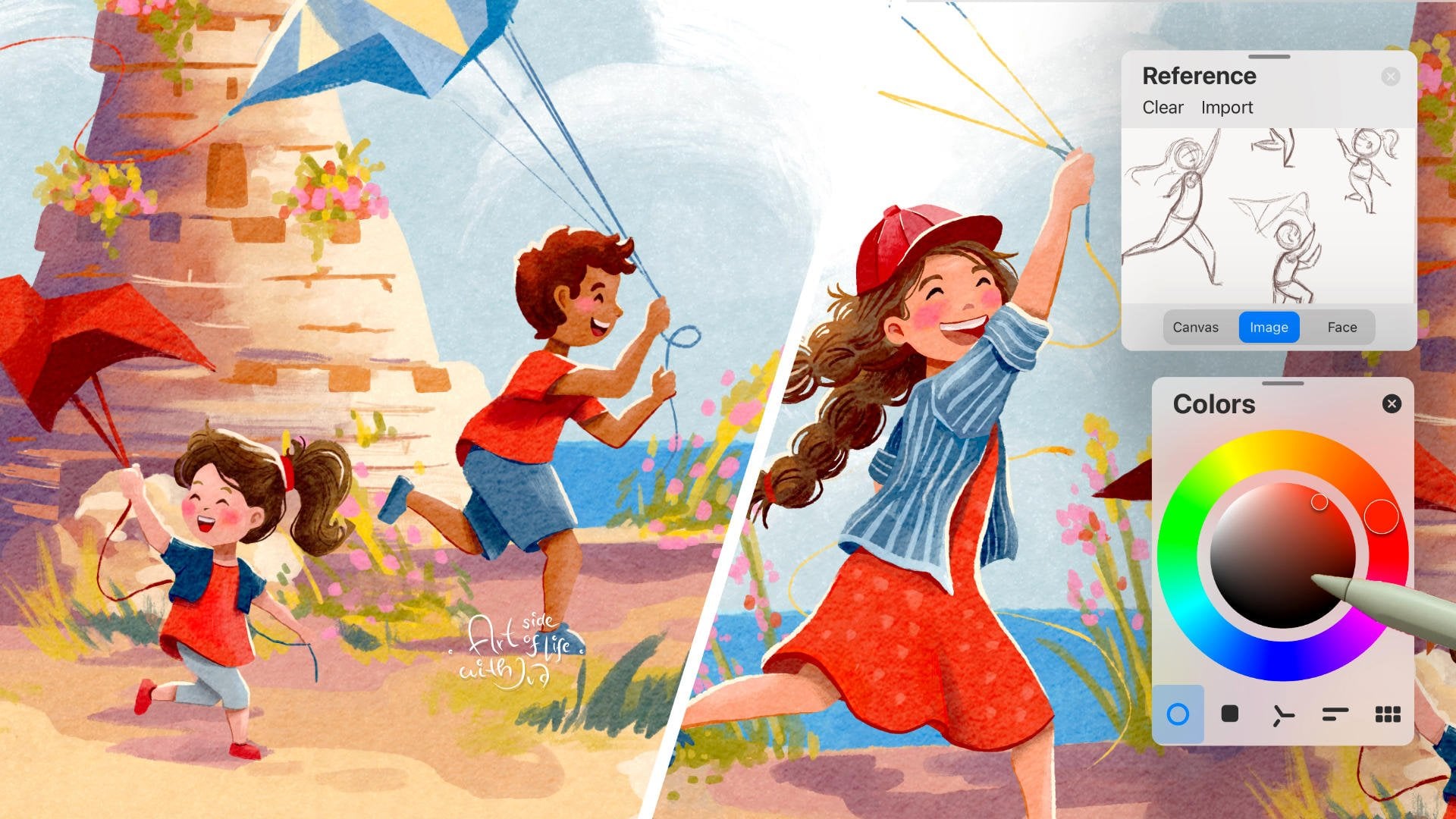
for example, on psplash or Envato Elements, or you can go to Pinterest. First, I will, um
swap here to image. This is one of the
references that I found on Envato elements because
I quite like the pose, which is mostly
kind of sideways, but it's also kind of
three quarter view, so we don't see the
character's face. So it would fit in this type of layout as well as maybe here. So I will create new layer, and as I already did that, as you can see here,
I can just hide this layer and sketch
on a new layer. So you would create a new
layer here with the plus sign. And from sketching brushes, I will continue using the soft sketching
brush and I will reduce the opacity of this brush to start creating a loose
character sketch. We will practice sketching
some of the poses. These don't have to
be your final poses. So first, I will start with kind of a
flow of the character, what I want to achieve. So not necessarily action line, which kind of goes through action poses if you are sketching
action pose characters, but this will be in the flow of the character that
I want to achieve. Then I will add a head
of the character. So I will think if the proportions are right
compared to the body, then I can sketch the kind of rounded
triangle for the torso, even though we don't
see that well. And then I can sketch the legs and thinking where is the
pelvis of the character, where would be the
knee and the foot. And I have other character
sketching classes if you want to
refresh your memory. So here I need to move the
knee a little bit higher. Because I want to keep
the same proportions, and then we can sketch
the arm and the hands. So the hands are somewhere near the ar tools and the easel. Then we can add the chair, we have the character
sitting on something. Now I will reduce the opacity of this sketch and I will start defining the shapes
more on this separate layer. So I can make the brush a little bit smaller and higher up the opacity and adjust
some shapes if I need to. This feels right. Then the shoulders. I can also think
about that outfit, which is nice for
this practice sketch, and then you can add
a different outfit if you want to customize
your character. So to look more like you. So maybe if you like spots
or something like that, or stripes, or you want to create a sweater
on this character. So you can draw it on top
of the sketch later on. So now I'm mostly focusing on the proportions
of the character, and we will create another layer just to define this sketch more. So this chair doesn't look like the most comfortable chair, so probably you
would want to change the chair based on a
different reference if you want to be very precise and kind of
create your dream studio. So maybe you'll find a reference based on some kind of
like a gaming chair, which are usually
quite comfortable. So here I can make the legs of the table straight
just to simplify it. And here you can also
customize the hair. So maybe you have short hair or you want to keep the long hair
of the character, which is quite nice, I think, in this case. Here we can just see the side
of the face and then we can just emphasize the hair so there is a little
bit more volume, we have the semi realism. I need to swap the eraser to the brush that
I'm currently using, which is here in the sketch set. So I cleaned up the
sketch slightly. Then I will reduce the
opacity of this one even more and I create
a new layer and swap the brush to a brush
which has more definition and I like to use for more
detailed and defined sketches. So now I can start noticing
some folds on the outfits, and there is also a class
about drawing outfits, if you haven't seen it yet. So here, I'm just noticing where the fabric is folding
on the character and where also the shadows in the hair and on
the outfit itself. So there is also a
class on drawing hair, if you want to refresher on drawing hair after
this class as well. So here, I'm just using a lighter and harder pressure just to create different lines. You can also reduce the size of the brush if I want
to be more precise. And our character
will be quite far in the illustration if you
want to create the whole room. So I don't have to really
define the face that much here, so you can just add a little bit here and then just addhir. If you want to be more precise, you can zoom in and try to notice what do you see on
the face of the character? So we see partially the eye and the eyebrow and
just a little bit of nose. And here we can make the
hair a little bit bigger, so slightly more volume. Perfect. I think that's good. And now we can add
some of these fold. As I was mentioning, paying attention how
the sleeve is curved. So it's this way in
this perspective. Then the arm is on the table. So I'm not creating
elbow like this. This would look curved if the arm is kind
of off the table. And if we want to create
the same look and feel, we can just add a straight line. Then we have a little bit of foreshortening when this part of the arm looks a
little bit shorter, and I think it's enough to have one hand right here and
just to simplify it. I can just create this simple shape for the hand because we can
see the fingers here. So kind of this simple
shape for the hand, I think works in this
case, quite well. So here it's already
a little bit blurred, so you don't see that
much detail anyway, and from the distance, it
should work quite well. And of course, I also created a class
about drawing hands. If you want to
explore that as well. So here is another fold. And then we can also
add a little bit of these kind of lines for the checkered flannel
shirt pattern. And then we have that chair. Using quite simple shapes
to sketch the chair. Here we don't see the
rest of the chair, but I can just follow
the angle here. Now, let's create these legs. I think I can move the
leg a little bit lower. That's why we are sketching
on a separate layer. The whole leg can
be just shifted. Me. Keeping the same proportions. Here, I'm paying attention to this line if it is curved
this way or this way because that will help you
define the perspective and the shape of those areas
and that part of the leg. Now I can add a little bit
of detail here and then we can just add simple foot. You can just draw shape like this and then you can add
the shoe to that shape. And I think it works quite
well in this simplified form. Then just to add another
leg, which is behind, and this one kind of goes straight and this foot is
more flat on the ground. And for the easel, you can just follow the lines, how you see them angled
in the reference. Okay. So basically,
this easel is kind of like table easel in my drawing. And then we can just add
these legs of the table. Now to emphasize some of the lines to finish
off this sketch, I can just make some of the
lines a little bit thicker. Here, make sure that the legs of the chair are in
the same height. So kind of everything
feels more balanced. Perfect. And on a separate layer, you can add a little bit
more definition with a slightly grainy brush just to add a little
bit of shadows. So you can maybe make the hair different color just
for this sketch. And then I see
there is this fold. So this part can be a little
bit darker and the leg just kind of here and part of the drawing and then you can reduce the opacity
of this sketch. All right. So I would
call this sketch as done for this
step of the process. And the next step would be to collect maybe more references. So for example, you can
look at Pinterest and collect all kinds of photo references for
your character poses. So I created a whole
board for myself to explore different
character poses. Or you can collect
more references in a mood board where you explore your favorite
poses that you found, so you don't spend too much time on Pinterest, for example. I collected a lot of different character
references and I practice sketching more. So let me quickly show
you so here you can see a preview of more of
my practice sketches. Based on the
collected references, I practice drawing more
character poses just to explore the right pose for the upcoming
project illustration. So more practice always
helps you to get more comfortable with certain
poses and certain details. And I also recorded this process
of practice and drawing, and I will link that
in the description. And now we can move to the next lesson where we
will start customizing our illustration and preparing the whole layout and the concept for the final
project illustration. All right, so let's move
to the next lesson.
7. Make it your own #1: Alright, so after we
practice sketching the thumbnails and creating
different compositions, now we can start sketching
our dream studio. So whether it's
layout facing window with walls covered with art and the table on the
side or the top view, whatever you prefer, and I will be sharing
with you my process. I will show you a few
different layouts if you want to follow
along step by step, and you can still customize
and I will show you how to adjust different things to make the illustration more your own. We will start with
basic room layouts, and then we will start customizing the
elements in the room. For the sketching, I will be using the same brush as before. I created the frame
on a separate layer. Now I can duplicate
this frame so I have more of them on the same
page for this first layout. Now I can merge them and
duplicate them again. Now I can start sketching
on a separate layer, so I will keep these
just as frames. So I will start with the
front window facing layout. And because we talked
about rule of thirds, I will not put the
window in the middle, but a little bit of center on that crossing of one
third of the image. So here, as you can see, I also move the window
a little bit higher, and we see less of the ceiling
and more of the floor. I kept the door kind
of closed on one side, and I'm creating
this kind of, like, French balcony kind of window look or open
to maybe a terrace, and the other door will be
kind of partially open. So here we have
the first layout, and I will copy the same
layout to these other two. So we can customize that later. Now I can merge them. And now we will create
another room layout idea, and then we will start
customizing the other part. All right. So now let's create
more zoomed in version. So I will start creating a wall. And then we will see a
little bit of the ceiling. And here we will place the
window just here on the side. So it's a smaller window. And then we will still have
some space on the wall, and we will have space for
the table and other things. This will be the other
idea for the layout, like very zoomed in version. So here we can add the
bottom of the room as well. So we don't see
much of the floor or much of the
ceiling. All right. So this is the
zoomed in version. I will copy this one
and duplicate it. And now we will create
similar layout to this, but even more angled. So that means I will
move the window here, more to the corner. So the window is
smaller than here. So it's kind of
wider window frame. Then it's even closer
to the left wall. We can see more of
this right wall. Let's move it even more. We will not see this
left wall that much, and then we will see bigger
part of the room here. This window can be this wide window which is similar to this one
and you can also customize it with different
look if you prefer. So I will open
this part as well. So we kind of see bigger part. Perfect. So we have
some basic layouts, and now we can test out
different details and placements on top of this
layout in the next part.
8. Make it your own #2: I All right. And now let's start adding some elements to explore
these layouts further. So I will continue sketching
on the same layer, but if you don't want
to lose your layout, you can just duplicate and then hide the previous
layer as a backup. So if we start with this sketch, we can start with
placing the table. So I'm thinking that
the table would be very nice if it's placed right
in front of the window, but maybe not fully, so it's not blocking the view. And in that case, we can just add the
legs of the table, and the character would
be kind of sitting here. Which I think would
work quite nicely. This would be the first idea for the table, and of course, our character needs a chair, not to float in the air. If we move on to this one, we are still in the same layout. So in this one, let's place the table that the table
is touching the wall. So here we can add the
legs of the table, and then the character will
be either somewhere here. I think here could be
a nice placement with a chair and kind of
sitting like this. Perfect. I think that works,
and then you can imagine that we can add the table to this
other wall as well, or we can actually add the
table kind of closer to us. And then the character is
kind of bigger in the frame. So it's sitting somewhere here. So we see more of this
table kind of right here. So maybe the table
is even longer. So it's not aligned here
with the door to go outside. And you can sketch on a
separate layer if you prefer. So you can move around the table and other
elements as well. But I think this is kind
of like faster way to explore how you want the placement of your
studio to look like. So now, if we move
to this layout, so this is kind of further out, so we can see more
of the studio. So we can add the table
kind of closer to us here. And then the character will be sitting here on the edge
of the illustration. So the character
is not really in focus of the illustration because it's kind of
here in the corner. And then you can add
another table here. So you can have
these two tables and you can leave the space
maybe for a easel. So here, we can move the table. So let's put it somewhere here. So it's kind of
touching the wall. And then you can add the
character kind of sitting here. So the character needs to
be a little bit bigger. I think this is also quite nice. And let's figure out a
different layout for this one. So to this one, let's add the table, but maybe this time to
the other side. So something like this, then you will add the character
kind of sitting here. In this part, Perfect. Now we can add a character
also to this layout. So here we can add a
table kind of right under the window and aligned
with the other wall. So we see more of
the table here. You can add more art
tools and supplies. And then the character
will be sitting here. And then here you can
add some nice view. So we can kind of swap this. If you don't want to kind of
look outside of the window, you can add a table here. So the character is
maybe sitting here. And then here you can
have the other object. So that can be pretty nice. Or we can create this full on just really focused on having very long table and the character is sitting
similar to this one, just to see how it
fits the layout. So I think like that, and now you can add other
elements to your layout. For example, do you
want another table or would you like to add
a sofa to your layout? Let's say here, I would
add another table. Which could be pretty cool. Here, I can add a sofa, which you can sketch
pretty easily with using simplified
shapes like the rectangle, and you are following
the shape of the room, kind of this perspective. So it's not hyper realistic, but it's kind of believable. So maybe here we
don't need to add a sofa because there is
not that much space, but we can add that here because we have more space on this wall. And in the next
part, we can start adding the painting easel, paintings on the walls, and shelves and plants and other decorative elements that you would like to add to your room. And of course, you can
already select just one, and you can continue
customizing that one. So you don't need to continue
with all of these layouts if you were following along
with exploring all of these. Until now. Alright, so now let's
move to the next part.
9. Make it your own #3: Alright, so at this stage, really try to think about what layout kind of
speaks to you, you know? Like, where would you feel
the most comfortable? Would you feel the best when you are looking at
your own artworks, maybe facing the wall, and then the window is
kind of next to you, or do you prefer sitting
really close to the window? Or do you prefer to sit
kind of in the back of the room with a wall behind your back kind
of to feel more cozy. And then you have kind of
the whole view to the room, or you kind of like
to sit in more like, smaller and enclosed room. So really try to
reflect what you like, and then you can look around in your house and try to
fill the room with the objects that kind of have some kind
of special meaning to or has a special memory
or favorite artworks. So now it's the time to add some of these
type of elements, and you can still mark maybe three layouts
that you like the most. So for example, I quite like this one because it has that kind of cozy
feel of small room. Then I also really like this one because we can have still a lot of space to explore. But me personally, I don't
like to sit against the wall, so I wouldn't be
finalizing this one. And then I really like this layout where you can
kind of see the whole room, and then you can still
have this cozy sofa. So if I select maybe
this type of layouts, so if I start with this one, I think it would be actually
nice if this whole thing, let me take the
freehand selection tool would be more in a top view. So I can actually stretch the table so we can see a
little bit more from the top. Then I can take the
distorted selection tool and see how this can work. I can also take the
warp and make sure that the lines are still
straight when you are adjusting, so it doesn't become too warped. Then I can just delete
these leftover parts. Because now I can
just be still messy. These are not perfect sketches. And now I can just fix
some of these lines. So we see the table
more from the top. So there will be a chair. And here you can
start customizing. So here I can put some shelves, maybe with my favorite objects. So you can put like
picture frames, maybe with your
friends or family. Then maybe some
favorite art tools. Then maybe some
open sketchbooks. So whatever you can
think of what you have around kind of on your desk. So you can add, like,
more holders for pencils and maybe other kind of material kind of organizer
art supply things. I created a whole video about practicing some of these art
tool elements if you want more inspiration and
I will link that also in the description
if you want to explore that part
more or you can just draw from references. What do you see around
you or search on Pinterest for references
on the art materials. So here you can maybe put
your favorite painting. Balancing some of these smaller elements
with bigger elements. Here you can add
maybe more shelves. Here we can put maybe
your favorite plant, or you can add more photos kind of to add more memories
to your illustration. This can be maybe
big flower painting. And here we can add maybe
some planted flowers in pot. You can have more of
them and here you can either add your pet. Here we can have maybe a dog. This looks more like a fox, but you get the idea for now. Maybe we can change the ears, it looks a little
bit more like a dog. All right. So this
is kind of like that sketch of what you
can put in your room. And then if I feel this one. So as I said, I really like that the character is
sitting with a view. So here, probably I
would put a lot of shelves because I kind of like
shelves with maybe plants. So kind of balancing different plant shapes
and plant design, maybe with lots of art
books and references. I can put also more
plants here on the top, so they have more light. Really think about how would you like your studio to
kind of look like. So reflect what are
your favorite things. Maybe you saved before, kind of types of decorations. Maybe you like to have a pottery and bowls
and these type of things or maybe some
souvenirs from your trips. Maybe those are
some small statues, from your travels or
something you did in a pottery class
with your friends or kids or other family members. So really think like,
what can you put here? Which kind of reflects
your personality or your quirks and
these kind of things that you really
love in your house. And then on the table, you can put more art
materials and other ideas. So you can put
favorite tools here. I can also add, like, a clock, which
can be quite nice. Maybe here, we can
have some cool lamp. Because after living in
Denmark for so long, I was so influenced by all those beautiful designs
you can have in the interior. So I really like
some of those shapes that you can get furniture
and other objects. So I really like Scandinavian interior
design, all the textures, they add to the interiors
are beautiful and a balance of clean shapes with textures and
you can of course, add more colors to it. We will talk about colors
in the upcoming lessons. Perfect. Here, maybe I
would add a colorful rug, so we can add a rug here, not concerned so much about
the perfect perspective here, just putting down ideas. Maybe here, we can add a ket another potted
plant would be nice. And here, maybe we can
actually instead of the lamb, which we can add maybe to the other side, or on the table. So I can put the lamp kind
of here or let's see. Maybe here? Do we need a lamp? Yeah, I think this
would be nice. So maybe a lamp here, and here we can add an easel. So it depends if
you would like to paint with the easel
or not really. So that's up to you. So you can add that here, maybe in the corner. And then maybe you can make the sofa a little bit smaller. And here we can kind of add another table with
art materials. So some art tools. And here we can add some
paintings on the wall. I think that would be very nice. And here, maybe we can add
some plants in the foreground, just to create that cozy feeling of lots of plants
in the interior. I think that would
be super cute. So here you can add another plant or just
maybe add that bigger rug. Or you can actually
make this table longer so you can add more
art tools if you want to. So you can just
move it like this. Depending how long do
you want to have it. And here we can just
have more art materials. Whichever would
you like to have. Now you can customize the
view from the window. So what would you
like to see when you are looking out of your studio? Is it maybe seaside or it's a seaside town
or is it a village? So you can also add
kind of like a porch. So it doesn't have
to be right there, so it doesn't have
to be the view kind of from the top floor. So I can add a small
porch with like a fence. And here, you can have more like potted plants or
something like that. And then I can add maybe
more greenery up there. And then I would like
to have a sea view. So that would be nice maybe with a little bit of kind of
mountain range in the back, and then we can add
some birds right there. So here I can just fix
the carpet a little bit. Maybe actually I'll
make the carpet longer. Yeah, maybe like
that. Let's see. We'll see you when we
test out the colors. And then in this one,
I was thinking here, you can kind of
make a bigger tree, maybe some like
Mediterranean tree, like those beautiful pine trees. Which you have in some areas, so not necessarily a palm, but in some drier areas, you have also pine trees. And then you can add horizon. So make sure that the
horizon is straight. So you can add some waves. You can maybe watch people surf if that's something
you want to look at. And then here, you can even
add maybe some cute houses if you want to see maybe a
village from your window. So now you can finalize your favorite layout with the details based on
your favorite items. So you can clean up the sketch with sharp pencil brush
or maybe ink brush, but we will paint over with color so it doesn't
have to be perfect. I will clean up the sketch with sharper pencil flat brush, and I will reduce the
opacity of these sketches, and I will clean
up that sketch on a separate layer with
that selected brush, so you can select different
brush if you prefer. And then you can define
the character based on the previous lesson
where we looked at how you can translate the
sketch from the reference. So I think I will continue
and clean up this layout. So if you want to, you can continue with this
layout with me, and then you can just
customize the smaller objects on the table and on the shelves and maybe
the window view. So you don't have to
do a different layout for this exercise. All right, so I will
clean up the sketch, and then I will meet up
with you in the next video. See you there.
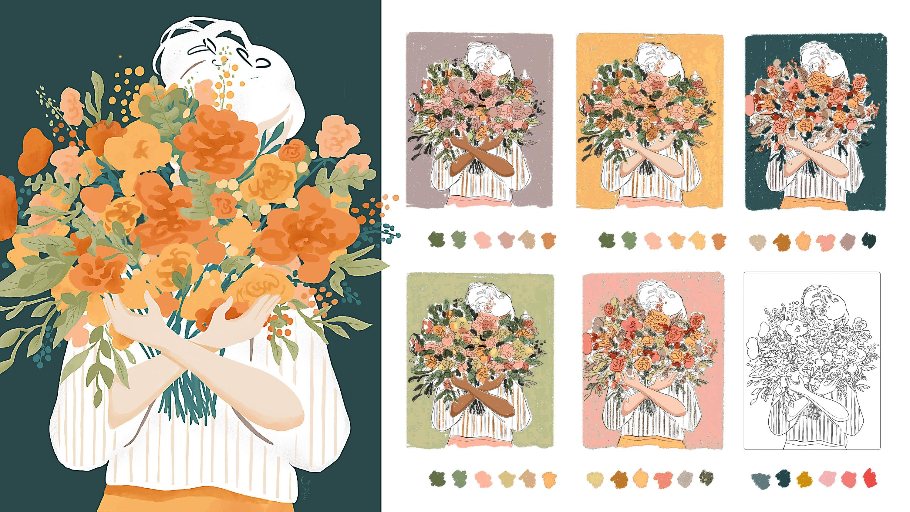
11. Testing colors: All right. So when you are done customizing your scene by
adding maybe books, plans, your favorite art supplies, now you can go to the layers and you can group all of these. So we can test out
the thumbnails. You can also copy the file, the canvas if you don't
have enough layers. But now I can just duplicate
it hide the original group, then I will flatten this one
and I will make it smaller. So we can test out
the colors quite quickly without going
too much in detail. I will duplicate the
scene three times, so we can test out
different colors so you can find the color which
fits you the best. Let's move these
two to the side and then I can actually merge these and duplicate
this one as well, but I don't want to move
all of them, so just one. Now I can merge them
again and I can set this layer to multiply so I can sketch behind this concept. And if you don't want to see
some of these darker parts, you can merge the layers
without this one. Right now, we will create
a new layer and try to think about the color
that speaks to you the most. For example, I really like
the warm yellow color, try to choose one color which really speaks to you or
your favorite color. And let me show you the color
wheel how you can create a limited color palette
with your favorite colors. All right. So if I choose this main color to
be this warm yellow, I can then select some of
the colors which are nearby, for example, this orange
yellow color as well. And then maybe a little
bit of this darker orange, so I know that they
would go together, and then I can go to the other
side of the wheel and then I can use the colors
which are kind of here, which is thredic color scheme. So we would create this
kind of like a triangle. But if I don't want to have
these colors super saturated, I can go to the less
saturated colors, and I can use less
saturated pink. Which should work quite nicely with these
orange color tones. And then I would go to this
part of the color wheel, as I said, and I will use
some of the blue color tones. So I think some less
saturated blue color tones because we want to have
a sea and the sky there, and then I have some flowers. So again, I will use some green tones from this
less saturated green. So you can work with some of these colors which are on the triangle on the color wheel. But try to choose one of
your main colors right here, and then you can
work with opacity. So for example, if I feel like this green is still too
bright or too saturated, I can move the slider and
make it less saturated. So it works with my overall
color palette quite well. So for example, if you would
like to have the main color, purple color, then
you can work with some of the orangy
and greenish tones. So try to mix and match and try to create this
limited color wheel. And I have also class on creating a limited
color palette, so you can watch that one as well if you want to
refresh your memory. So now I will test out some of these colors in my
thumbnail scene. So I can make the brush bigger, and then I can add the color mostly to the
floor, for example. Which I think it's super nice, or I can decide to add
that yellow color on the walls and maybe also
on this opposite wall, and maybe also the sofa. So I think that
would be quite nice. So try to plan different areas. So let's say if the floor
in this one is yellow, then maybe where else can
I add these yellow color, maybe on the planter pods, on the lamp, and then
you can flip it. So you can try to add the yellow maybe as a
sunset if you want, maybe the floor on the
balcony is yellow, and then the table is yellow, and as well the sofa. So where can you put
your main colors? So you can add them to some of your paintings,
some of your books. Enough art materials, then
you can take the green color and test it out on the plants if it works
with this yellow. I think here, it
would be actually nice to have a darker green. I would go to the
color wheel and I will change the green
to a darker green. Yeah, and I think
that works better. So I'll just add that
to the color palette, and then I can just add these green color tones to
the plants on the thumbnails. And for this colour blocking, I'm using just painterly brush to quickly color
block the areas. But you can use any other
brush that you prefer. For the outside, I
will use lighter green and maybe even lighter because I want to have all the
bright colors inside. So as you can see, I
have lots of green because I like to paint
plants and flowers and so on. So you can think about what really is your favorite color. And now I would like to balance
it with some pink color. So maybe I can add the pink to the books outfit of the character or maybe
the chair is pink. So you can test that out, then pink on the painting. So maybe some of
these paintings. Here, the sofa can be pink. So you can test out what
kind of look you like more. Maybe here the rug is pink. Here you can even make the
table pink if you like that. So balance those
favorite colors. So maybe you are going
for a yellow and brown if you want the brown
kind of wooden desk. And you can also adjust this pink to be a
little bit more brown. So it's kind of
like similar color, and then you can add it
to your color wheel. So maybe even more brown. And then the desk can
be this brownish, pinkish orange or something
in between these two. You need to always test out the colors next
to each other. I also tested this light
pink on the wall and maybe I can make the pink
a little bit more purple, this purple blue
but less saturated. I should work well with
these other colors. Because I want to
have the main focus to be on this yellow floor, I think that will be very nice. So this can be very subtle, almost kind of graton. So I'm just balancing
out the other details. And here, I'm thinking
there would be nice to have light from the
balcony so something. Maybe like this. Yeah,
that can work well. And then I can have these darker green tones
on all of the plants, just to have that nice
contrast and I can add that yellow to all the
books and planter pods. Most of the color distributed
around will be that yellow. Here I want to make sure that
this is different enough, not the same yellow, but it can be still
this orange yellow. Or I can make also the
as kind of closer yeah, that can work or this
light is less saturated. And then the table can be
kind of this warmer color. So we can add more of that yellow here on
the table as well. So it's kind of not fighting
with that floor here. And then I can have more of this light blue also
on the windows, maybe here on the ceiling. Then I can make the sofa, actually this lighter purple. The whole floor stands out
more and then I can just add some of these
cushions in yellow. Try to balance out. The colors here. So you basically add the most of the colors that
you really enjoy. And here, I will add brown hair to the
character because I think, you know, I can make the
character look more like me. So try to customize the character and see
what works for you. For example, if you feel like
there are too many colors, you can always
move the slider to less saturated tones and
maybe you can make the walls. More gray, and then add most of the colors to
the accessories. All right, so I will keep
this thumbnails a reference, and then I will use the bigger version of the
illustration in the new canvas, and then I will
start adding colors. See you in the next part.
12. Coloring #1: And now, when you are happy with your selected base colors, we will import this image into a bigger canvas unless you are already working in
a bigger canvas, so you can work on
all the details. So I will select the layers, the sketch layer,
and the color layer, so we can work
directly from that. Then I will drag the layers, tap on gallery, and tap on the new canvas,
which is bigger. And I am working in my paper texture template so
I can have extra texture, and you don't need to use this type of template
if you don't want to. Now, I will go to the layers and I will
select both of them. I will zoom out, and I will make the sketch bigger
the one I selected. So it kind of fills almost the whole canvas.
Something like that. Perfect. I will now reduce the
opacity of the sketch even more because I want
to redefine some of the edges and basically
paint with the brushes, and I don't want to
keep the line art. But if you want to
keep the line art, you can keep it on multiply the blending
mode on multiply, and then you can
redefine everything just under the lines so you don't
have to be so precise. Now you can take
your favorite brush, and we can work from this rough layer because
you already did some work, so you don't have
to redo everything. So from the brushes, I will be using my painterly brush set just
to get that painterly feel. But again, you don't have
to use the same brushes. You can use your favorite
brush for this base colors. And you can use something
which behaves more like watercolor or guoche and
maybe has some rough edge. So I love this brush because
it has the rough edge, but also it's more painterly. So I like to mix and match, sometimes use
watercolor brushes, sometimes gouache and then add some textures with
sketching or pastel. So it really depends on the look that you
want to achieve. Now I will just
fill in the shape based on the sketch just to
be a little bit more neat. I will be working
mostly on one layer because I don't plan to move around some
of these elements, but if you want to move
around the element, that the element should
be on a separate layer. So it's easier to
paint the background on a separate layer and
the element on top. But because I already
have all of that, I will just keep it as it is. So from the layers, I'm still painting on
this one, as I said, and I will start
with this yellow and I will go around the
shapes to fill the space. I will speed up some of
these painterly part because you can
see that I'm just filling in some of these shapes. Now I am really going for
just filling the shapes and be more precise with
coloring this illustration. If I still want to, I can
redefine some of the elements like the pots or the character
on a separate layer. Y. So what is nice about working from this type of
thumbnail is that you already have few colors
kind of here on the canvas. So you can kind of play around with adding
more colors here, so it doesn't have to
be just one color. And especially if you want to add more textures
to the elements, it's easier to have them
on a separate layer. So we will do that. So I can show you how you can
add some of the textures. So now let's be a little bit more rough with
the background colors, and then we can add the elements with more defined brush strokes. All right, so now as I have the rough base colors
kind of defined more, I will create a new layer, and then I will draw some of these detailed elements
in more precise way. So I can just finish off the background more roughly and quickly behind
those elements. So having them on a separate
layer definitely helps you to be faster with the
background if you want that. All right, so see you
in the next video.
13. Coloring #2: I and now you can start defining some of
the objects in your room, whether you edit
books to the shelves, plants in pots or
paintings on the wall. You can create a new
layer and you can use the same brush as you were using until now for these base colors. And when you are
painting the object, you can already start
adding some shadows. So you can imagine that the light is coming
from the window. So when we have the plant, the shadow will be
under the plant. And then the plant will
have a lighter edge. So we will have a lighter
color here and darker here. So I will do the same
on all the objects, add lighter color
closer to the window. And then if there is a shadow, I will add a darker
color under there. So I will start coloring
and I will speed up this process because
it's a lot of repetition. So you will know what to do
already after this one plant. So make sure you are
on a separate layer, and I will define this
plant with the same colors. More precisely. So this is inspired
by the pancake plant. All right, so let's
just continue filling in the shapes based on the sketch
that you created. All right, so now I
am overall happy with the rough definition
of all the objects. For example, here, I edit
few ideas of the painting. So maybe this is a painting
of the landscape of outside. I still need to add
some houses here, but that could be
quite nice thing that basically this character is
drawing the scenes outside. Maybe there are butterflies
around in this area and some flowers in the ways or some other
geometrical element. Maybe this one looks too much like not smiley
face, but sad face. I would need to change that. And here we have new ideas for the paintings and
some sketchbook. And then here I edit a dog, and then here you
can maybe customize a favorite mug or
some other elements. So I might add
something more here. And here, I edit kind of this geometrical
illustrative cat. But this one is quite dark. So either I will make this cat dark or maybe I'll add another cat kind of
sitting on a balcony, which would reflect
this illustration. And then I did more landscapes because I
like to paint landscapes. Now I will just add more colors to the background
on a separate layer. So the elements will
be on one layer, and then the
background definition will be still on this layer. And I want to add a little
bit of kind of shadow, so a little bit
darker areas here in these parts further
away from the window. And then I will define the outside space a little
bit more with the houses, as I said, and the boats. So now I can paint more
behind these books. So you can play around
with adding more details. For example, you can also add more flowers to these plants. And maybe you can add flowers to some of these
other pots as well. So we have more colors
in the illustration. All right, so let's continue
adding more details. And again, I will speed up this part because it's
more repetitive as well, so you don't have to
watch it on a real speed, you can watch it
kind of sped up. But if you want to
have it slower, you can always
adjust the speed to a little bit slower if
you want that. All right. So I'll just continue
on this layer. Before we move on
to the next step, which would be adding more textures at the end
as an optional step. To see the preview
of your canvas, you can always activate
the reference, so it's easier for you to
see where you still need to add maybe some colors
and some contrast. I will just continue
on this layer by adding more
shadows in this area. I will also define this light coming from the
window a little bit more. All right. I think it
looks good so far. And then in the next step, we will add some nice texture
detail like reflection on the glass or some nice
details on the water and some flowers to some
of these plants and some nice crisp edges to define some parts more
and add a little bit of texture and blend
some of these areas. All right, so I will see
you in the next video.
14. Final illustration: So the illustration
already looks pretty good, and you can always
take a break and step back and come
to the illustration the next day with
fresh eyes to kind of see what would you like to
adjust and define more. So for example, here, I think we can add some nice flowers to
some of the plants. So maybe also here
in the corner. And on this one and this one. We can also add a
cat in this part, and if you want some
colorful carpet would look nice and you can also
add some nice background to the computer or maybe keys to the car or more items which are specific to you
and your story. Now first, let me show you
how you can add some flowers. And for that, I will
create the flowers on a separate layer so I can move them around and
adjust quite easily. From the brushes,
you can change to a brush which is more
rough and for the flowers. From this set, I would use the bristly brush,
which is number 20. And of course, you can
use a different brush for this part if you don't have the same brushes as I'm using. So from the colors, I would go for a pink color
because I think that would work quite nicely on
some of these plants. So I can show you just here
so you can see it there. With this type of brush, you can just kind of
like tap and create this fluffy flower,
which is pretty cool. I will make sure that I'm on a separate layer
because as I tapped, I went back to create a new
layer, so it disappeared. I can add some of these
flowers to this plant. And I think actually would be cool if the plant
is hanging here. I'll just add more flowers here. And then I will add some green with the same brush as
I was using before. So kind of to keep
that consistency. Now, I will go back to
the flower layer and I will swap to the brush
for the flowers. I need to make sure I'm on a separate layer,
always double check. And then I can add kind of these flowers to
more of the pots. And you can change the size of the brush because you want to have a small flowers kind of in the distance and bigger
flowers closer to you. And of course, you can change the color slightly so
you have more variety. So let's add some flowers here, even though this was more
inspired by fiddle leaf fig, but we can add maybe kind of another plant here
in the foreground. So we can add some of these kind of bigger flowers with these
type of brush strokes. So we kind of indicate, like, open flower,
which could be nice. So I will add, like, lighter color on top. And then we have some of these smaller ones and
darker at the bottom. And we can also add maybe
some orangy red flowers. So we have some
variety in colors. We can maybe make them brighter, so you can kind of decide how saturated you want
those flowers to be. So I think here, they can be pretty
saturated because there is, like, lots of light. So that's pretty cool. And we can add some
flowers also here. And why not to add some nice
yellow flowers also outside? Perfect. Now I will go to a
different brush, something which has
more sharper edge. You can select your
favorite brush that you can create more
sharper edges with. For that, I quiet like this
brush or brush number one, and now I will add
some details to the edges of the window and
some window reflections. So if you are happy
with your flowers, you can either leave them
on a separate layer or you can merge them with
the other layer. And for those windows
and other details, I will continue working on this layer with the
smaller elements. I need to swap to
very light color. So I think very light blue, so kind of like white, but you can make it a
little bit more blue. And now I will just draw kind
of these diagonal lines on the window so we can indicate the reflections
of the window. So kind of we are saying
that there is glass, right? And we can do the
same on this one. And here we can reduce the opacity of that
white little bit, so it's not so bright against
this dark background. So just make it a
little bit more blue. All right. I think that works quite well. And now I will add a little bit more shadows
around the windows, so there is more
definition in this part. And for that, again, I will swap to different brush which is quite similar with the defined edge
with a little bit of sharpness to it at the edge. So you can continue working with your favorite brush that
you can use for the edges. So here I will use darker blue. And I will add a little bit of shadow here behind the door. And you can make the brush smaller so you are able to kind of define
the edges easier. And I will do the
same here so we can kind of add a step in the transition from
the living room or the studio to the terrace. Here we can make it even
darker in one part, just to make sure there is that distinction between
outside and inside. We can add this darker part
also next to the railing. To have a little
bit of shadow here because we have it already
on more elements that we always have lighter and
darker color as well. So we are kind of keeping the consistency on all
of these elements. So here, I'm just adding
sharper edge on this canvas. And I will add also that kind of shadow on the edge
of that canvas. So it's a little
bit more defined. But and I can do the same
also here on the edge of the door and also
on the top here. And we can add a little bit
of that shadow also under the picture frames on
the edge of the table. Basically, we are defining some of the edges
a little bit more. Yes. All right. Now we can also add a cat or a dog in this part, or you can add a carpet if you feel like it's quite empty. So I will add the dog
and a cat in this part. So we have something to lead our eye towards
the character as well, and there is something
happening here. The character is
framed nicely with this computer because we have these shelves and the
computer and pictures. So there is something happening
around the character. And then we also have the lamp kind of leading
towards the character. And there is more examples in the composition class if
you haven't seen it yet. So you can watch
that class as well if you want a refresher
on composition. Now let me just
add these animals, and I will speed up
that part because I will be using the same
technique as before. So I will draw it on a separate layer in case
I want to move them. All right. And now I will move this cat below this object, so she's kind of
behind the table. So I think that
works quite well. And I think adding a dog here would be pretty
nice as well. And you can watch the class about drawing cats
as well if you want. I have a class about
observing the shapes, silhouettes and how you can draw different cats
in different poses. So I will draw a
dog here as well, and then we can kind of cover up this kit because we
don't need it anymore. So I will go back to this part, and I will just
paint over this kit. And you can add another pot
with the plant as well here, which I think would
be pretty nice. And you can also kind
of design the pot. So let's double check. This one should be
on a separate layer, so we added like
some shadows here. So I can paint the new pot
on the layer with flowers, so we can add actually some stems to these flowers as well. So let's do that. So here you can add
a different plant. So you can use different
brush to create the leaves. For example, scratchy
brush like that. So we kind of create that
type of plant as well. Now we can add the stems for these flowers on
the separate layer. I quite like this scratchy look. So it really depends
if you prefer more neat brush strokes or more kind of the textured
scratchy looking ones. And I think it adds
quite a nice variety to the overall illustration. So here we can add maybe more contrast because
here we don't see the leaf. So I will just move the
slider to darker tones, and I will also make them a
little bit more green blue. Perfect. And when
we have this brush, we can add some textures
to some of the greenery. So if you are happy with
the flowers and plants, you can move to the layer with the background because we
had those green parts there. And now I can just add more
kind of these dark parts, and I can just play
more with textures. So there is more variety, so I can create more of these scratchy
textures in that part. Okay. And these type of
scratchy textures you can create also with
pastel brushes, which I love to use
very often as well. So this kind of like
pastelly textures. So imitating the bristle brush you can have in
traditional media. So I will do that also
here on the tree. And you can play around with different hand movements
to add these textures. And I think it's always
nice to add more textures. So as well as I said, so it's nice to explore
what look you prefer. And then you can add
some soft textures, for example, on the sofa, and you can take
maybe something like oily brush or something which is even more flowy
and painterly. So I will take this brush, and then I will add a little bit more of that kind of
brush stroke right here, just to smudge these
colors a little bit more. And I can do the same
here on the floor. I'll swap to that area, and I will just add
kind of more of this darker yellow in these
smudgy brush strokes. Perfect. So like this, you can add some textures
to the interior. And you can also add a texture on a separate
layer on the sea. So you can create a
new layer for that. And for that, I usually like to use some of the
green brushes, but you can draw some white dots if you want to if you don't
want to get more brushes, but this is kind of like
a fast way how to do it. But you can add detail like
this on the ocean just to little bit more of that
sparkle to some area. So that's something I like to add as one of the
details on water, even though it's quite far away. Now I will add a dog and
maybe a carpet here, as I mentioned, and maybe one more planter here
just to fill the space. So like that, you can
play around with adding more elements with
the same technique, and I will speed up this part, but you can still
watch it if you are interested in
that part as well. All right, so I edit the carpet a little
bit more plants here, and you can decide if you
want to add a pot or a plant, but I think just plants here
in the corner are just fine, and the carpet is not following the
perspective like 100%. But I kind of like the wonkiness which kind
of is going on here. So it's not super accurate
in terms of perspective, but kind of more believable. And then I edit a dog
and we have the cat. And I think now I can also
hide the sketch layer. So it depends if you want
to keep the sketch or not. And here in the background, we can make this yellow part, a little bit darker to create
more contrast in this part. So I will keep this brush
and I will just use this darker yellow tone and make everything a little
bit darker in this part. And we can also stretch
the shadow from the cat, so it doesn't have
to be so precise because everything is kind
of like these long shadows, even though it's still
kind of middle of the day, but we can pretend it's kind
of later in the evening. And we can also make these
shadows a little bit darker. So let's just take
darker blue and add more shadow here around these plants just
to add more contrast. Perfect. And now you can group everything
together if you're happy or copy the canvas. So we can just select
everything and group. I will also duplicate the whole layer if you
have enough space. And when you
duplicate the layer, everything becomes even more saturated because we have more layers with these
blended brushes. I can flatten this group if
you're happy with everything, and then you can also go to curves and adjust the curves
if you want more contrast. So you can also look at the smaller thumbnail view and adjust the image
to your liking. If you want to have
more pastel look or very light colors, you can move the slider
there or you can move it more towards
the darker tones, and then you can create that
kind of curve on the curves. So that helps you kind
of to adjust more area. So you can play
around with this one and see what look do you prefer. So I kind of like this
contrast look in this image as it is now because I think it's quite nice to have
more contrast, even if you are maybe not kind of super happy with the colors
that you started with, you can always adjust things. And you can also go to color balance and adjust if you want everything
more purple, so you can push the
slider towards magenta. Or if you want
everything a little bit more yellow or
in the blue tones. It depends on that mood as
we talked about previously. I have other video
with more references about inspiration on
the mood in the scene, and it will be linked
in the description if you want to check that out as well as video of
practicing some of the elements which are in the image like the props
you can add to the studio. If you want even more practice, you can check out those videos. And you can also adjust the
saturation a little bit here. You have to be a
little bit careful, so the greens and yellows
don't become too strong. So here, you can just
move it slightly, and you can also
adjust a full hue if you want to play
around with other colors. But I'm pretty happy how
this looks as it is now. So I will call this done, and you can adjust and define
more shadows if you want, and you can add more
definition to the edges, and you can play around with the whole illustration
even more. But I quite like this painterly
look as it looks now. So I would call
this D, as I said, and I hope that you enjoy
creating your dream studio, whether it's just part of
the studio or this full room maybe with your favorite
pets and other details. If you decide to share
on social media, please tag me so I can reshare
your illustration as well. Or you can upload
it here so others can get inspiration as
well and see your project. So thank you so much
for watching and I can't wait to see your
illustrations. Bye.
 Iva Mikles, Illustrator | Top Teacher | Art Side of Life