Transcripts
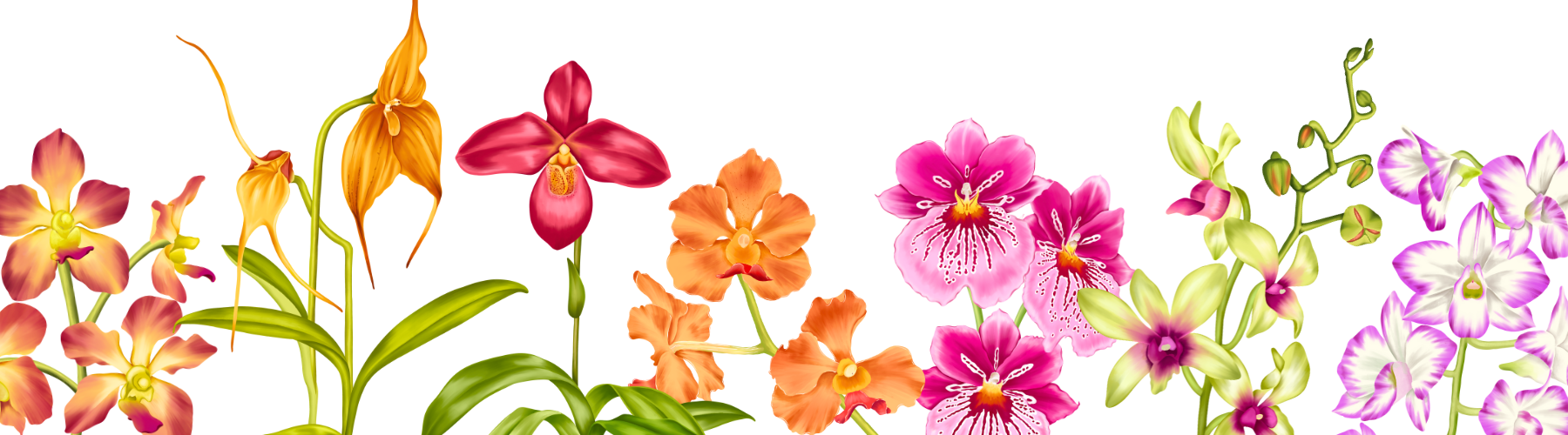
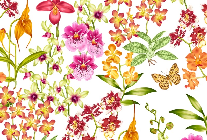
1. Introduction & What You'll Learn: I recently did this collection
of Orchid illustration, and I want to start
this class by showing you some of the examples
of these illustrations. These beautiful
illustrations can be turned into art prints. And if you wish to
illustrate a collection of them that can be turned
into a seamless pattern, and these seamless
patterns can go on various types of products
like stationery, home decor, or any
fashion accessory to. There are plenty of ways to add them to your next project. Hi, I'm Benita, an illustrator and a
designer based in Singapore. This is a beginner
friendly class for someone who wants to learn the basics of illustrating
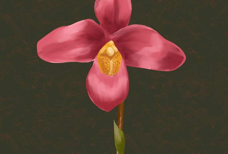
any flower in procreate. We will be illustrating this beautiful orchid
in the class today. We will start our
illustration by adding a base color and the first layer of
shadow and highlights. In the second part of the class, we will add the center, stem, and the leaf. Followed by more details and
finalizing our illustration. If you wish to follow
the same orchid I am illustrating
in the class today, I have attached the sketches, color palette, and the brushes
in the resource section. There are plenty of
examples where I am explaining you the process I
followed to illustrate them. I have also attached some additional sketches and reference images for
you to practice. So let's dive into the world of this beautiful tropical flow. Okay.
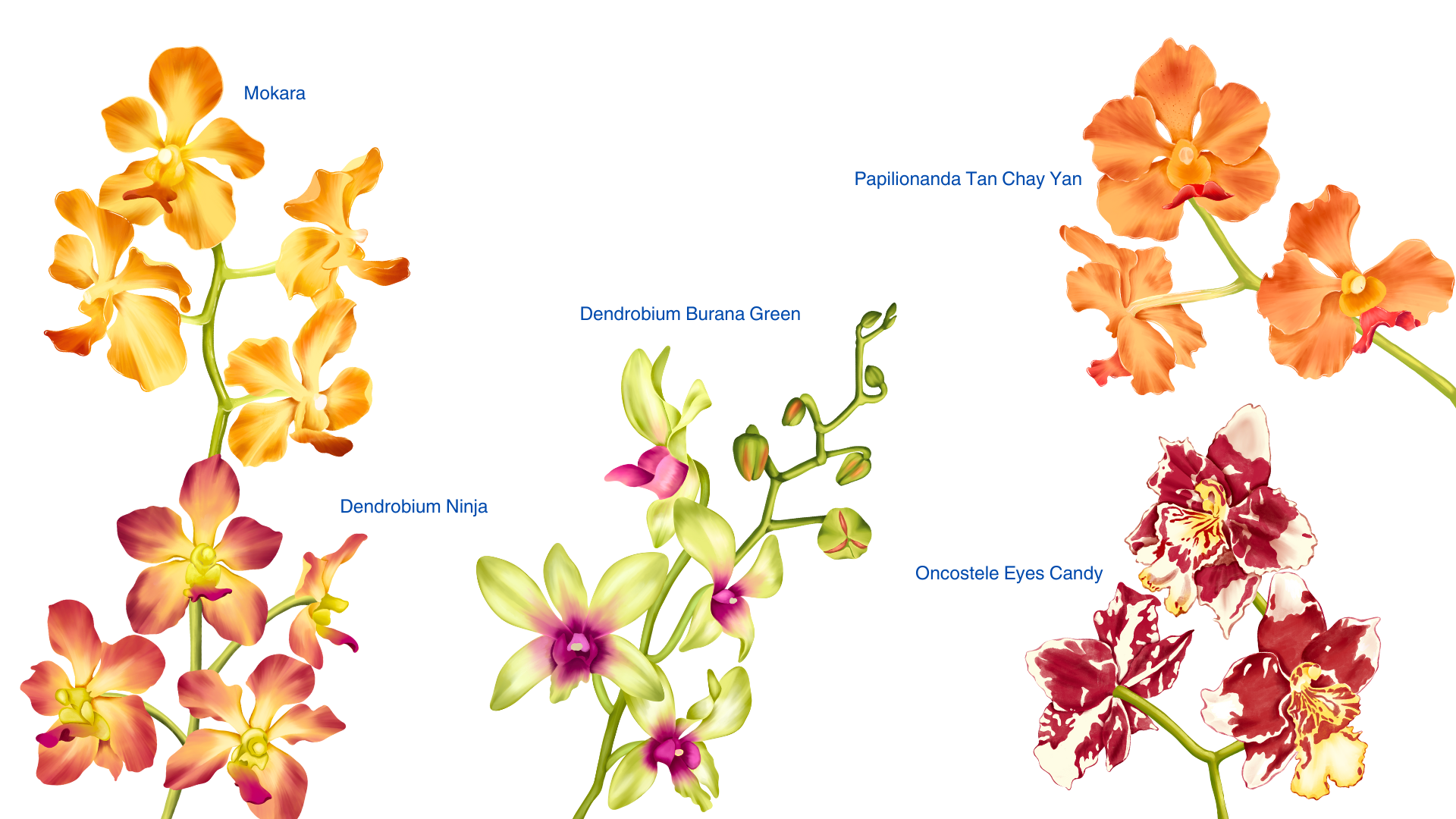
2. Examples & Project: Let's see some examples of
these orchid illustrations. This orchid is commonly
known as a flag orchid. I will zoom in and show you all the details for each flower. Let's see the process I follow
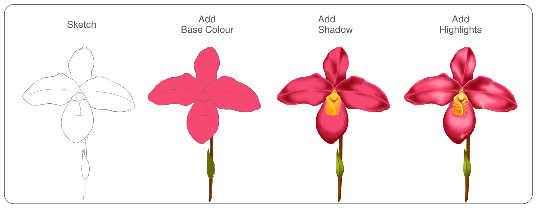
to illustrate this orchid. There are three steps that
I follow for each flower. Step one is research
and reference images. Once you're ready with all
your reference images, step two is to sketch and
plan your composition. Once you finalize your sketch, step three is the
illustration process. We start by adding a base
color to our sketch, followed by shadow
and highlights. For most of the illustration, you need to have a base
color with a mid tone. Then add shadow with
the darker tone of the same color and highlights with the lighter
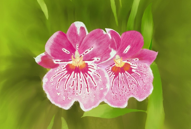
color of the same color. Let's move on to the next one, commonly known as pansy orchid. I have the sketch
for this flower in the resource section. You can download and illustrate following the same step
shown in the class. For this flower,
two, I have followed the same three steps
like the first one. The time required to
illustrate these flowers can depend on the composition
and the number of flowers. The higher the number of
flowers, it takes more time. Example for a flower like this, it can take around
three to 4 hours. If you have less
than three flowers, it can take around
two to 3 hours. This can also depend
on the type of flower. If the petals are too detail
and has a pattern on it, that can consume more time. If you have a flower like
this with a white base color, you can have the base color in the shades of grays or beige. Shadow can be darker
of the same color, and the highlights can be
more towards the white color. For the reference images, I was very lucky to have access to the orchid garden
in Singapore here. I have also attached few
in the resource section. Another way to find
these images are from the royalty free websites
like Unsplash or Pixabay. While collecting these
reference images, if you are clicking them, make sure to have pictures from different angle of
the same flower. If you're planning to add
the roots and the leaves, make sure you have a clear
picture of them too. Every orchid has its own
different characteristics. I hope these examples
inspire you and helps you decide on the
project for this class too. I even have sketches,
color palette, and brushes in the
resource section of this class that can help you
kick start your project. I will eagerly wait for your beautiful
orchid illustration in the project section
of this class.
3. Canvas & Brush Setup: Let's start with our
Canvas and brush setup. This is how my Procreate
gallery looks like. Now, to create a new canvas, I'll tap on this tiny plus sign. Again, on this tiny plus sign. Now, the size of your canvas can depend on the project
you're working on. A standard size that I follow is 3,000 by 3,000
pixel with 300 DPI. 300 DPI is standard
for printing. If I have a bigger
composition of flower like more
than one flower, then I keep my canvas size
as $4,000 by 4,000 pixel. Tap create to create the canvas. Let's see the brushes we'll
be using in this class today. I'll go to the brush library. And there's a brush
set at the top here. I have this brush set in
the resource section. You can download these brushes, and when you open in
the Procreate app, you'll find this brush
set here at the top. These are default brushes from the Procreate library itself. I've just edited them
depending on my preference. For example, I've changed their stabilization and
the spacing a little. The first brush
is for sketching. You can find this brush
under the section sketching. The second is a studio pen
that you can find in inking. And the third one
you can find in the artistic section
at the bottom here. We'll be using the first
brush for sketching. I'll use a gray color and also to add small
details to the flower. The second brush is
for the base color. We'll be using this brush to add base color
to the orchids. And the third brush is to add shadow and highlights
to our flower. This is how the
brush looks like. It is pressure based brush. So when you have
slight pressure, it looks like this and
with more pressure, it becomes darker, like that. Now for the color palette, you can find two color palette
in the resource section. One is for the orange orchid and the second is
for the pink orchid. When you install this
and open in procreate, you'll either find
at the top here or at the extremeom at
the extreme bottom. Sure. Now, when you're working
on a particular orchid, you can set the color palette
as default for that I'll tap on this three dots here
and select set as default, and that becomes your default color pallete and it shows here. Now we are done with our
canvas and brush setup. Let's move on to our
sketching process.
4. Sketching Process: So there are a couple
of ways that you can follow to sketch
in procreate. The first one that we can see
is a free hand sketching, where you can refer to a reference image and start
sketching on a blank canvas. Our first step is to insert
our reference image. For that, we'll tap on
this wrench icon menu. Here, tap on Canvas. Under Canvas, you'll find
this option called reference, Togal on this option that will open a tiny
little box on your canvas. You can hold here
and you can move around and place it wherever
you're comfortable with. Tap on the second
option, that is image. You'll find this option
called Import image. Tap on this option, and it will open
your photo gallery, and you can select your
reference image from here. Now you can see your reference
image on the canvas. You can hold here on the right corner and you can adjust the size
of the square. You can even zoom in or zoom
out your reference image. Also can select and pick up colors from the reference
image directly. Another great feature is this little square will not move when you're
moving your canvas. Next step is to select
any sketching brush and color of your choice and start sketching
on the blank canvas. This is one of the
technique you can follow to sketch in procreate. Another way of getting
the reference image is with the split screen. I'll cancel this
reference option first. Tap on this and you can cancel. So if you don't have your
reference image in the gallery, and you want to refer
directly from the Internet. Either you want to select
chrome or from the Pinterest, you can just hold this app and drop it on the
left or the right side. Now, you can search
or open any image of your choice and start sketching on your canvas
on the right side. So free hand sketching is one of the way you can follow
to sketch in Procreate. Now, let's move on
to the second one. That is tracing your
reference image. Our first step here is to get the reference image
on the Canvas. For that, I'll go back
to Wrench Cin menu, tap on add Under Insert a photo, swipe left, and tap on
Insert a private photo. This will open your
photo gallery, and you can tap and
select your image. Now you have your reference
image on the Canvas. You can resize and adjust
the position of your image. Whatever part of the image is going out of the Canvas
will be cropped. Next, we'll go to layers and reduce the opacity
of this image, tap on this tiny N, and you can reduce the
opacity of your image. I'll keep mine at around
50%, add a new layer. Now, following the
reference image, you can start sketching
on the new layer. You can use this reference
image as your guideline. And while sketching, you
can add your own changes. For this process, you have to be careful with your
reference image. These images should
be either owned by you or should
be royalty free. Now, let's move on to the
third technique that is a combination of freehand
sketching and tracing. I will start by importing all the images I
need on the canvas. For that, I'll go
to action, add. I left on Insert a photo
and insert a private photo. I'll repeat these
steps until I have all the images I
need on the canvas. So I need a couple of
flowers for my sketching. I like the way the position and the way it
looks in the image. I will select the flower I
need and cut and paste them. I am selecting this flower
with the free hand selection. Swipe with three
finger and you'll get this option
called cut and paste. This will paste the selected
flower on a new layer. You can delete the extra
layer that you don't need. I will repeat the same steps
with the second flower too. I need the second flower where I can see the
back of the flower. For example, here. I will select this flower with the free hand
selection tool. Swipe down with three finger, cut and paste, I'll
delete the extra layer. Now we can plan the
composition two. I'll resize and move around these images until I'm
happy with the composition. Once you're done
placing your flowers, I'll go to the layers. Pinch and merge them
into one layer. Next, we can reduce the
opacity of this layer so that we can start
sketching, add a new layer. So I have my flowers ready here. But for the leaf and the stem, I'll keep my reference image
on the left side here. I'll go to Canvas, switch on my reference. Now, to clear this image, just tap clear and
import a new image. I will import the image where I can see the stem and
the leaf clearly. For example, here, I can
see the leaf clearly, and for the stem, I
will follow this area. Also, in the image, you can
see this little tiny root. We can even add that
to our illustration. So we are all ready with
the reference images. Let's move on to the sketching. Now to start sketching, make sure you're on a new layer. I'll start tracing
my flowers first. This can also be done
by free hand sketching. But sometimes tracing
can help you achieve these natural folds and shape
of a particular flower. This is also very
helpful when you're a beginner because it
builds your muscle memory. So I'm done with
my flowers here. Let's move on to the stem. Now for the stem, I'll be
sketching it free hand. I'll be following the
reference image on the left. You can even have them
all on a different layer. So if you change your
mind and you want to change a position of
a particular flower, it is easy to make changes when they are on
different layers. Now let's move on to the leaves. And I'll add this
tiny little root that I can see in
the reference image. So here we are done
with our sketching and planning our composition
for this flower. This is also one of
the processes that I love to follow for most
of my illustration. Now let's move on
to our next lesson.
5. Pink Orchid - Part 1: In this section, we will
be adding a base layer to our sketch and the first layer
of shadow and highlights. Let's start with the first
half of our illustration. When you download my sketches
from the resource section, you'll see them here at the top. I'll tap and open this
first canvas here. This is how my
sketch looks like. When you go two layers, you'll see there's just one
layer with the sketch on it. Now, when you go to
the color panel, to get your color
here set as default, tap on this option
called palette here. Tap on these three dots, and you'll find this option
called set as default. So you will need the one
with the pink orchid, and you can see your
palette here as default. Now, our next step is to get the reference image
on the Canvas. For that, I'll tap on
this Swing icon menu. Here under Canvas, you'll find this option
called reference, Tgal on this option. You can place this tiny box wherever you're
comfortable with. Here when you're on the canvas, it will show what is
happening on the Canvas, but we need to be on the
second option call image, tap on this option. Tap on Import image. And you can import your reference image from
your photo gallery. Okay. Now we have our
reference image on the canvas. You can hold on this right
corner and resize this box. You can even zoom in or zoom out and even pick colors
from this reference image. Next, we can reduce the
opacity of our sketch layer. For that, we'll go to layers, tap on this tiny, and we can reduce the
opacity to around 50%. Now we can add a new layer. Pull this layer below
our sketch layer. All our working layers will
be below our sketch layer. Okay. I'll tap on this layer and rename this as base
color or base layer. Next, we need to select brush
to add this base color. For that, I'll go to
the brush library and select my studio pen brush. Next, we can go to
the color panel and select a mid tone
of this pink color. You can select this second
color from my color palette. This is one tone darker. And now we can add an outline to this flower and fill it
with the same color. Make sure you're on
the correct layer. Now you can follow
the sketch line and add an outline
to this flower. While you're adding
this outline, you can even make
your own changes. You can use my sketch
as a guideline. For example, like the
reference image on the left, you can make your
petal slightly more pointy or have more curves. Once you've done
adding the outline, you can hold the same
color and drop it into this outline. Okay. Now to add another
layer of color on this. We'll go to layers.
We'll add a new layer. Tap on this layer and
tap clipping mask. Next, we can select R brash. For that, we'll go
to the brush library and select our third brush. Go to the color panel, and we'll select our
third color from here, which is two to darker
than R base color. We can start with the
first petal here. I'll zoom in my reference image, so I can see it clearly. I'll keep my brush
size to around 20%. I'll start with this center line that I can see in
the image here. I'm going to add this color
to all the areas where I feel it is slightly
shadow or darker. Whenever you're adding
any of these colors, you have to make sure you're following the shape
of your object. That is the shape
of the petal here. I will add this little dark
area on the left side too. This I'm adding with
very light pressure. Now, let's move on
to our second petal. That's the right one here. I will start with
this dark area here. And also, we can see
a center line two. Now, while we are
adding this dark color, we need to make sure this is
not going on the edge here. This area has to be
lighter so we can create a depth for
our first petal. Now, let's move on
to our third petal that is at the bottom here. I'll adjust the reference image so that we can see the petal. Now here we need to create this roundish effect
at the bottom here. I'll keep my brush
size to around 26%. Now, let's move on
to our fourth petal. Now, here two, we'll add this dark color like we can see in the reference image here. Now, here again, I'm not
making the edges darker here because this petal is overlapping and it should
look like it is at the top. And the first one like this one like it is under these petals. Now, for this petal, again, this area has to be too. So we are done with the
first layer of shadow here. Now, our next step is to add a layer with
the lighter color. That will add a layer
of highlight to our. We will be doing
that on a new layer. Tap on layers, add a new layer, on the layer, and mask. Now, we need to select a lighter
shade from the mid tone. Select the first pink
from my color palette, and my brush size is around 12%. We will be adding this
two or four petals. Let's start with
the first one here. Now, one tip you can
follow while adding this highlight layer is to not fully cover
the base layer. That is the midtone layer, and also avoid overlapping
your shadow layer. Your brush stroke should
follow the shape of the petal. Now, our next step is
to blend these colors. We'll be using the
smudge tool to do that. I will start with my
darker color first. I'll go back and select
my darker layer. Select your smudge tool. Make sure under Smudge tool, the same brush is selected. Now, from here, we can increase or decrease the size
of our smudge tool. With the opacity panel, you can increase or decrease
the intensity of the smudge. So whenever you're
smudging or blending, you have to make sure you're following the shape
of the petal. If you feel the smudge is too strong and the colors
are moving too much, you have to reduce the opacity. So I will keep adjusting
the size of the brash and the opacity depending on the area of the flower
I'm working on. I will increase the speed
of this smudging process. But this smudging process
can take some time and practice to understand
what pressure and brush size
works best for you. I'll continue blending for
the other petals, too. M. Next, we'll go to the layer
with the lighter shade and we'll blend and
repeat the same steps. While you're blending make sure you're following the
shape of the petal. Now, for the next
step, we'll create another layer with a
much darker shade. And this will have
more defined lines around this area in the center. For that, we'll go to layers, unhide my sketch layer
and add a new layer. Tap on this layer and
tap clipping mask. Next to the color panel, we'll select this
darkest tone of pink. I'll reduce the size of my brush because we
need a smaller brush. Make sure your third
brush is selected. And I'll be adding this color to the areas where you can see
in the reference image. Where these petals are
overlapped by other petals, this will help us create
this depth to our flower. Next, we can smudge
these lines so that it can blend well with
the base color. For that, we can select
the smudge tool. Make sure the same
brush is selected. I'll reduce the size
of my brush because the area we're going to
smudge is quite small. Now, following the
shape of the petal, we can these lines. So here we are done with
the petals for this flower. Now when you go to layers
and hide your sketch layer, you can still see all
the petals clearly. You can see the difference
by hiding this layer. It helps your illustration with this depth and three D effect. I will unhide my sketch layer, and let's move on to our next step of adding the
center for this flower.
6. Pink Orchid - Part 2: After adding the first layer
of shadow and highlights, we'll move on to add the
details in the center, stem and leaf and later finalizing by adding
more depth and details. Okay. Now, let's move
on to our next step. That is the center
for this flower. I will zoom in my
reference image, so we can see the
center clearly. Now we need a new layer
above all our layers, tap on this layer and
tap clipping mask. So we'll be adding this
yellow area in the center. We'll start by
selecting our brush, go to the brush library and
select your third brush. Go to the color panel, and I'll select this second
yellow from my color palette. And with this mid
tone of yellow color, I'll create this
base for the center. Next to add detail
to the center. I'll add another new layer, tap on this layer and
tap clipping mask, and I'll select two to darker
shade of the same yellow. With a smaller brush size, I'll add this color to
the areas where I feel is and that can create depth. Next, we can start blending this color for that I'll
select my smudge tool. Make sure under Smudge tool, the same brush is selected. Once we're done blending, we'll go back to our
lighter yellow color. I'll tap on layers
and go back to our first yellow color layer. Here, I want the yellow part of the flower to blend in
with our lower petal. Now, let's add some highlight
to this yellow area. For that, we will
need a new layer. Tap on layers and we'll
add a new layer on top of our darker shade of yellow layer and add
clipping mass to this layer. Now for the highlight,
we will need a lighter shade of this yellow. And I'll add this
to the area where I feel it might reflect
light or shine. For some areas, I don't exactly follow the
reference image. Now, blending this
with the smudge tool. I'll hide my sketch layer. I want to add another layer of shadow with the darker
shade of yellow. For that, I'll add
another new layer and add clipping
mass to this layer. From my color palette, you can find this
darker shade of yellow. That's the fourth one. Blending with the smudge too. This will help us create this more depth and detailed
finish to the center. Now, let's add these tiny
spots in the yellow area. We need a new layer for that. I'll add a new layer
under our sketch layer, and I'll be adding this
with my six p pencil brush. For this, I'll pick up a darker shade of
pink from the petal. This can be slightly
time consuming. You can pause the video
and take your own time. I've increased the
speed and edited some part of it so that
the video is not too long. So we are done adding our spots in the center of this flower. Now, let's move on to
our next step that is adding highlights and
shine to our petals. Now, if you see in the center, I'll hide my sketch layer. We can add some
highlight to this area. And like you see in the reference image
on the petals here, I will add a new layer
below our yellow layers. It will already have a
clipping mask on it. Now, from the
brushes, I will have the same six p pencil
brush selected. And from my color palette, I'll select this lightest pink. And I'll add these light
brush strokes on the edges. Some on this petal, too. You can even try this brash by slightly tilting
your apple pencil. It gives this very
nice shaded effect. Moving on to the next petal. You can even go for a more
lighter shade of thing. Next to the bottom petal here. Now, there is a
tip that I want to add here is if you feel your illustration
is looking slightly flat and you need to
add more contrast. We'll go to layers,
tap on layers, go to our first shadow layer, swipe left and duplicate. This will multiply
the layers and add more contrast to
your illustration. You can even adjust the opacity
of your duplicate layer. This can also be done with
your high light layer, the one with the
lighter shade of pink, and you can adjust the opacity depending on the
contrast you need. Now let's move on
to our next step of adding a stem and a
leaf to this flower. For that, tap on the base
layer of your flower, add a new layer, and pull this layer below
your base layer. Tap on this layer and
I'll rename this as stem. Now I can unhide
my sketch layer. Make sure you're on
your stem layer. We'll tap on the brushes, select our studio pen brush. Next, we can go to the
color panel and you can select the second brown
from my color palette, and we can add a base
layer to the stem. I'm going to add an outline to the stem and fill it
with the same color. Now, to add some
detail to the stem, we'll add a new layer on
top of this base layer. Make sure it is on top of your stem layer and tap on this layer and
tap clipping mask. Now we can go to the brushes, make sure your third
brush is selected, go to the color panel, and I'll select this
lighter shade of brown. With a smaller brush size, I'll add this brush stroke
in the center of the stem. Now, on the same layer, I'm going to add another layer
of this dark brown color. Select the darker
shade of brown, and I'll add this on
one side of the stem. That is on the right side. Next to blend these colors, I'll select my smudge tool, make sure the same
brush is selected, and I'll start blending
following the shape of the stem. Now let's move on
to the tiny leaf. I'll unhide my sketch layer, add a new layer, and this layer should be
above our stem layer. Select your studio pen brush. Next, from the color palette, I'll select this
mid tone of green, and we can a base
layer for our leaf. Next, we can add
another new layer to add highlights and
shadow to this leaf. This layer should be
above our base layer, tap on the layer and
tap clipping mask. Select your third brush
from the brush library. Go to the color palette, and I'll select the lighter
shade of the same green. I will add this on both
sides of the leaf and leave a gap in the center that will help you give
this in effect. Now, on the same layer, I'm going to add
the darker shade to from the color palette, I'll select the darker
shade of the same color, and I'll add this on the
top and the bottom edges. Now we can blend with
the smudge tool. While blending, I'm following
the shape of the leaf. I am keeping this
simple for this class, but you can add some
more details too. So we are done with
our flour here. But now after completing, I feel I want to add more
depth to this flour. I want to add another
layer of shadow. That will add depth and add more botanical finish
to your flour. So let's move on to adding another layer of
this darker shade. I'll add another new layer. This layer has to be below
our highlight layer. Now, from the brush library, I'll make sure my third
brush is selected. From the color palette, I'll select the darkest red. I'll be adding this
few brush strokes around the darker
area of the flower. While you're adding this color, you have to make sure you're not fully covering the base color. These should be shorter strokes compared to what we did
for the other layers. And we'll follow
the same steps and we'll blend them
with the same brush. And now we are done
with our flower here. You can even duplicate
this layer and experiment with the swipe
left and duplicate. Another way is to tap on this tiny N and try all of
these different effects here. And if you feel it is too dark, you can even play with
the opacity here. And this is how our final
illustration looks like.
7. Final Thoughts: Congratulation for
completing this class. To recap, we learned how to research your
reference images, how to sketch and plan
your composition. And finally to illustrate
Orchid in Procreate. I hope this class has been
beneficial to you and has contributed value to
your illustration journey. If you have any
question or doubt regarding the class or
the illustration process, please feel free to share your question in the discussion
section of this class. I am always here to assist you. I will eagerly wait for your beautiful
orchid illustration in the project section
of this class. You can follow me on
Skillshare to get notified when I
publish a new class. To get behind the scenes
and more tips and tricks, you can follow me
on Instagram two. Thank you for taking
this class with me. See you in the next class.
 Vinita Upadhya, Illustrator & Pattern Designer