Transcripts
1. Introduction: What if I told you that? It doesn't matter what your title says, Experience or web designer, or you just started dabbling in vector graphics. You can make illustrations and it can do it swayed in Figma. Hi, my name's load us. I'm a product designer, but I love initiation. And today I'm gonna be showing you how to create illustrations from scratch. We're going to use Figma, a free vector tool available both for Windows and Mac. This class is meant for complete beginners and those who have some experience in Adobe Illustrator and want to try an alternative. I'll introduce it to Figma basics for illustration. And then we're going to make three simple but beautiful pieces for real-life scenarios. Hope you're excited to learn, and I'll see you in the next video.
2. Why use Figma for illustration: First of all, thank you for joining this course. It's a pleasure to have you here in this course, I'll introduce it to thickness interface and teach you how to manipulate shapes in order to achieve the desired results. We're also going to make three illustrations. Each would increasing difficulty. But still very, very simple. After each lesson, I'm going to give you an assignment to make an illustration of your own using the techniques you learned before we start, let me begin with answering a few common questions. What is Figma? Figma is one of the most popular interface design tools. It's browser-based, which means that not only you can use it on Windows or Mac as an application, but also straight in your browser. You can download Figma for free and even in mind your friends and colleagues to collaborate and your illustrations. Figma is vector-based, which means that we are going to be able to scale our illustrations without losing any quality and saved the files for the most popular digital formats. Now, I'd like to ask you to register an account if you haven't already and down Figma as an application, since the performance, at least for me, seems to be slightly better than that on the browser. Why would you use Figma for illustration? Well, first of all, it's free. Sure, they're a bit bland so you get more from them. But what we're doing here, we're totally fine to use the free version. It's got most of the commonly used tools as say, Adobe Illustrator. I've used Illustrator for more than five years, almost on a daily basis. And I can totally say that I'm not missing out on the 10% of extra stuff that Illustrator has. Figma also has an innovative feature called vector networks. Essentially, you're able to manipulate shapes in a powerful, intuitive, and non-destructive way, which we're going to cover. And finally, Figma as super small, I've had my fair share of performance issues and crashes with bigger projects on Illustrator. And I can say that sigma is where the alternative, when we talk about vector graphics, what kinda results can you achieve in Figma and following quite a few illustrators on social media. And seems like quite a few of them already have moved to Figma and are using it as their main illustration tool. Here's a few examples of which we're able to achieve using this tool. What Figma can't do. It's important to cover what Figma cannot do. Or at least it's not as simple as using other software. First of all, print design, anything that goes to the printer since there's no CMYK mode, texture is also quite difficult to achieve. Your strokes and Matt are going to have varying width or texture. Some advanced level illustration might also be difficult to achieve. However, Figma offers a solution to nearly every one of those problems. And that is plug-ins. Seems like there's a plug-in for every single Illustrator feature. But in this tutorial, we're not going to be covering those. Anyway. That's it for the questions. Let's get into Figma basics.
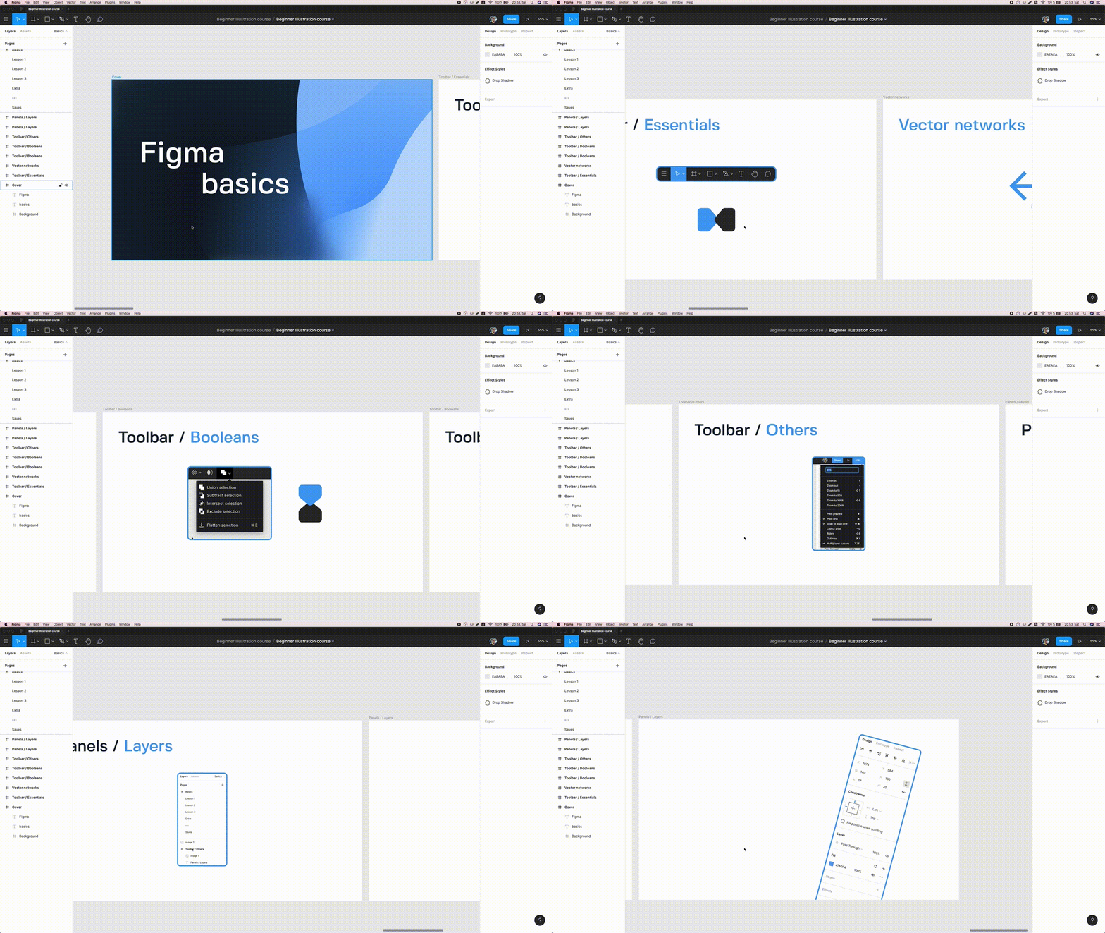
3. Figma basics for illustration: If you ever use Figma before, you're probably pretty familiar with interface already, but I might show you a trigger to that we'll use in further lessons. So you might want to stick around. I will focus on tools that would be useful for creating illustrations while skipping some of the other functionality mostly used for Interface Design. Welcome to Figma, everyone going to start with the basics. This is the Canvas screen. You can have multiple projects open at the same time and navigate them using the tabs at the top. For now, we're going to focus on the essential toolbar, as I like to call it, starting from left to right, we have a burger menu. This is all your Figma options in one place. A quick search to find any function that you might need. And while you're at it in the Preferences tab, select oldest snapping if it's not already, this is just going to make your life easier. Next on the list, then move tool. You can select a tool in the toolbar or press V on the keyboard, select the shape on the canvas and move it while dragging the mouse, you can move multiple objects by selecting shapes using shift or by dragging over them with the mouse. You can also press Option on a Mac or Alt and VC to the select an object in the same job down, there is also a scale tool. Now let's take a look at these two shapes and make them bigger without using the scale tool. As you can see, I'm changing the size, but not the corner radius. Now if I scale the shapes using the scale tool, all the properties of the shapes and change proportionally. The shortcut for this tool is k, the frame tool. If you're coming from illustrator background, you know these as art words. We can create multiple frames on one Canvas. The shortcut for the Frame Tool is f. And if we click once on the canvas, you get a 100 by 100 pixel frame. You can also drag the mouse and get a custom size frame. But also you can select what are the pre-made shapes on the right side panel. Slice tool is used for exporting. If you select a tool or press S on the keyboard, you can drag a section on the frame. Anything that's contained within this section will be exported as a single piece. If I select the same shapes without using the slice tool, the same ungrouped shapes are going to be exported as three different images. While pressing R on the keyboard, you get the Rectangle Tool. We can press once to get a 100 by 100 pixels square. We can also drag the mouse and get a rectangle. We can hold Option or shift or Alt and Shift to scale the shape proportionally from the center. There's also a line tool. The shortcut for that is you can great lines of any angle, but if you hold Shift, you can draw lines in 45 degree increments up next, the ellipse tool. To activate that press O on the keyboard, you can draw a perfect circle by holding Shift while just pressing and dragging the mouse will get you on the lips. What's interesting with this shape and Figma is that you have a couple of interesting tools, bake them. First of all, Sweep Tool. It allows you to make the quickest pie charts in the world. You can also change angle as well as the ratio. If you want a specific shape, you can adjust the numbers in the design panel on the right. Polygon tool for sadness, it's a triangle. But if you select and drag the countable, you will increase and decrease the amount of vertices. You can also round up the corners straight on the Canvas. Same deal with the Star tool. You can change three properties here. The ratio, the amount of vertices, as well as the corner radius. There's also the seventh dual in this drop-down. The Place Image Tool, you can upload multiple images and placed them not only on the canvas, but also within shapes. Up next, the pen tool. You can quickly select the tool by pressing P on the keyboard. You can draw straight lines or make them current by clicking and dragging the mouse. You can also add additional points to the shape. Now, if you double-click the shape or press Enter, you're going to enter the vector edit mode. In this mode, you get a couple of extra tools. The pen tool allows you to Ben certain points or lines. Holding Option on Mac or Oldham BC lets you interact with just one of the handles. You can also select points and lines and delete them. If you hold Shift and the breast delete, the point is going to be deleted, but also healed. There's a paint bucket tool which you can use to quickly fill in and close paths within the shape. And by pressing Option or Alt, you can remove the fill. In the same dropdown. You can find the pencil tool. There's not many options there. You can only change the options of the lines you drew only after you selected the shape. But you can still collaborate in with the paint bucket tool, just like with the pen tool. There's also a text tool for text, a hand tool for moving around the canvas and comments so that you will leave some notes for yourself or your colleagues. Vector networks. This is not a tool within Figma. It's a lifestyle. Essentially what it does is that you're able to create the vector shapes and connect them together really, really easily. Let's look at an example. In order to draw the arrow shape in Adobe Illustrator, you would have to use two shapes. One for the straight line, the other for the angle. Well, Figma allows you to add additional points and add them to an already existing back the bath. We can grab this point and drag it around to see how the lines interact. Boolean functions, there's four of them. Union, subtract, Intersect, and exclude. To see them in action. Let's duplicate these two shapes three times. To explain these simply, it's the interactions between two or more shapes. Union makes a single shape, subtract, makes the cut with the shape on top, the shape on the bottom intersect keeps the intersecting pairs between the shapes and exclude leaves that part out. What's interesting about Figma is that this is a non-destructive action. You can still change your mind, move the shapes around and change the final result really quickly. We can also apply different properties to the result that shape, say we're adding a corner radius. If we move the shapes around, we get to see an interesting effect of that corner radius property. Now, there is a fifth option is called flattened selection. In order to interact with the points in our newly created shape, we have to use a destructive action called flatten. You can mask a number of shapes with another shape behind them. Whichever shape is on the bottom, it will act as the mask. You can use the Mask button up top or right-click and select use as mask. Keep in mind that you're also losing the background color. So if you want to keep it, makes sure to duplicate it first. In the top right corner, there is a drop-down with all sorts of useful functions. You can adjust the zoom levels, change previews or snapping. But also there's an outline mode. By pressing command Y on a Mac or Control Y on a PC, you can access this short of a wireframe mode. They'll helps you see how certain shapes interact with each other really easily. Let's take a look at the layers panel on the left-hand side. You can have multiple workspaces on a single project file called pages. You can move these pages around and change the order or even create a new one by pressing the plus icon. On the lower side, we've got the layers. We can see that we have multiple frames on the canvas and layers within those frames. What's interesting is that you can have multiple frames within frames, within frames within frames. You can also clip the content so that it either extends outside the frame border or is contained within within the layers. We can move them to the top or bottom, or you shortcuts to do that quicker. Finally, there's a design panel. The content of this panel highly depends on what you currently have selected on the canvas. If you have nothing selected, you can pretty much only changed the background color of the canvas. If you have a shape selected, we get a lot more properties like width, height, position, border-radius, and so and so forth. We can also change the Blending Options. Now, what's interesting about the fill is that you can have multiple fills with multiple blending modes or opacity levels without creating additional shapes. Same with the stroke, multiple strokes, multiple properties. If we have a line, we can also change the enzyme it in the advanced stroke properties panel. We can also change the ends independently from one another by selecting the points first and then choosing the property. There's also four types of effects you can add to the Shapes. Drop shadow in a shadow, layer blur and background blur. And finally, choose a format and export. And that is going to be it for the basics. Let's get illustrating.
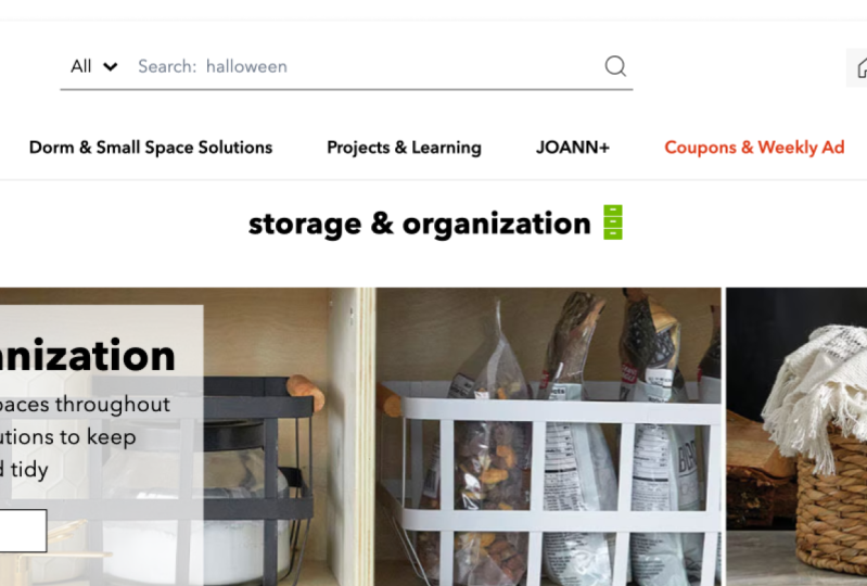
4. Example 1: Icon-like illustration: Welcome to the verse example illustration lesson. In this lesson, we'll make a simple illustration using basic shapes. We'll use some of the tools and techniques you learned in the previous chapter. Whenever I'm practicing illustration, I usually do it with a real-life example. What I mean by that is that I usually take a product that I like and make an extension to an already established illustration system. Obviously, it's not necessary to do so. Illustration can be for fun just as well, or just to show it to your friends. But in our case, we'll use open-door as an example. Opendoor is a US based company where you can easily sell or buy a house. They have a pretty extensive website and in a lot of its pages they use illustration to support the content. I went through the page and it looked like the user consistent illustration system throughout. But one of them caught my eye as a little different. So we're going to fix that to create a new project, click the plus icon in the top-right corner. Since I already have a couple of projects, I'm going to open the first one by double-clicking it to import this sketch and a screenshot I took from open doors website, we're going to simply select both of them and track them on the Canvas. But a sketch, I quickly came up with a few ideas of how to translate the message of receive expert tips in your email individuals. After putting the keywords on the paper, I used a really useful website called the Noun Project To help me come up with ideas which said later becomes sketches. Next, we're going to go back to Figma and press O on the keyboard to select the ellipse tool and create a cycle. We can hold Option on Mac or Alt on PC and drag the shape to make the copy of it. Then by pressing Command D on Mac or Control D on PC, three times I created than max three shapes. I use shapes in order to quickly color pick the existing color palette. I can press I on both Mac and b, C, or Control C to get the color picker tool with multiple shapes are selected, we can rearrange or switched places by dragging the circle that appears on top of the shapes. Now, I needed a frame to create an illustration arm. I'm pressing F for the frame tool and click once to get the frame on the canvas. I'm also reducing the size of the frame to 64 by 64 pixels. Knowing the size of the illustration is really useful since we know exactly how much detail we can put in. The smaller the size, the less detail we can cram a checked open those websites using the Inspect Element tool on the browser to learn the original size of the image. Now, back in Figma, we're going to start by creating the illustration shape by shape. First, we're going to make the back of the envelope. The shape of that kind reminds me that of a house. I selected the rectangle tool by pressing R on the keyboard and drew a shape to start with. There's obviously multiple ways to create the same shape. But in this case, we can double-click the shape and press enter to access vector edit mode. Figma makes it really easy to great additional anchor points in the middle of the other two points are moving the point up by 20 pixels by pressing shift and the up arrow, pressing arrow keys to move the point by one pixel while holding Shift and pressing the arrow keys smooths it by 10 pixels. I'm applying three pixel corner radius to the entire shape in order to give it a softer look. Next, we're going to create the front of the envelope. I'm copying the shape by holding Option on Mac or Alt on PC and dragging the mouse, I change the color as well, just so we're able to see the two shapes better. In order to create the angle of the front side of the envelope, we want to flip the shape vertically. We could just wrote dated. But there's also an option to flip the shape vertically, which works really well in this case. Now, I want to align the angle of the shapes. We can turn down the outline mode by pressing command Y on a Mac or Control Y on a PC to make our lives easier. And then I'm copying and pasting the shape that we previously created. I selected one of the initial shapes that we made as well as the flip version and cut them using subtract Boolean. Let's see the result in a different color. That looks pretty good. Let's create the document next. I'm going to draw another rectangle and change the color. We want to nudge it in between the two shapes that we already have. In order to do that, we could manually drag the layer down in the layer panel. But using a shortcut command was square bracket on Mac or Control plus square bracket on PC makes their job a lot faster. Next, we'll make a light bulb, a shape like this might be a little daunting, but with the right tools will make it in no time bringing the shape down. A light bulb is essentially a circle and a square at the bottom of the circle. We'll use another Boolean to unite these shapes into one. And we'll round the corners of this shape to, we want to make sure that the shape of the light bulb is big enough so that it's easily recognizable on smaller scale, still gets enough breathing room on the document will add a small detail at the bottom of the light bulb just to give it a more universal shape, will dye called lightening bolt. Next, again, there's multiple ways to make a shape like that, but in our case, we'll use a pen tool. Holding Shift helps me get 45 degree angles while placing the points with the pen tool, I set the stroke width for the bolt at four pixels, since that was the width for the bottom of the light bulb detail, we want to keep that consistent throughout the piece and make an a lightening bolt at a small scale is pretty difficult. That's why you'll see me move these points around. We want to make sure that the bolt is also recognizable using keyboard arrows dimension these points pixel by pixel, allows for quick iteration. Same quick iteration can be done with adjusting the width and the height of the entire shape. For this particular illustration, there's a detail, a notice in open those style. I mean the rectangle on the left side of the document and use the Boolean subtract to make a cut in the original back of the envelope that gives the document more breathing room. It's also a nice way to style the elements. Now, for the final detail, I selected the front of the envelope and shows one of the two shapes that made the initial cut. Pressing Enter once again allows me to see the points of this particular shape. I selected both of them and press command C and command V to copy and paste that in place. Not only did we copy the points, but the line that these points created as well, to make the line go all the way across the envelope, I once again turned on the outline mode at extended the line. We can add a few more points to the line and delete the ones that we don't need by selecting the point and hitting delete on the keyboard will also round up the gaps of the stroke. I duplicated the detail and move both of them around, match the angle and give more breathing room. And we're done. I copy the final illustration and outline the strokes. You don't have to do this, but sometimes stroke don't scale well, when you implement them on the web. We can finally export a lovely illustration by pressing plus in the export panel, selecting the format and hitting export. We also want to make sure that our illustration looks good in context. So I took a screenshot from the website and put the final piece N. Quick recap. We use basic shapes, combine them into one to achieve more complex shapes. We put all the keywords into a simple, small-scale illustration to support the content and match the color and style of icons for Opendoor.
5. Student project 1: And now it's your time to create for the first assignment grade something really, really small and not very detailed. Final product that you like, or maybe choose the one that you're currently working on. Great illustration using some basic shapes. You can also make up a product that doesn't currently exist or just make one for fun. Make sure to also share your work in the student project section down below.
6. Example 2: Product feature: In the second lesson, we'll take a look at another example. We'll use some of the same techniques that we used in the previous lesson, but we'll also incorporate clipping masks and other tricks. This company is called seven days. It's a time tracker tool to help developers track their time spent on a certain task. Now, I'm going to be honest, I've never used any of their tools, so I don't know much about what's going on in them. But what I can see is their marketing website. So if I scroll to this section, we can see these three tiles featuring some nice illustrations. Here's the thing I noticed. While these two tiles with direct me to the pages that are describing their main tool more. This last one called seven base kitten is a completely separate tool. We're going to update the third tile so that it's also referring to the main tool. Here we are in Figma. As you can see, there's already quite a bit of stuff on the Canvas. Let me give you a quick breakdown. We have a frame, a color palette has screenshot from seven bank's website as well as another sketch. Let's go through them one by one, starting with the screenshot. I took the screenshot directly from seven peaks website in order to have a guide of what kind of stumbled trying to achieve. We're also going to use this to update the third tile with our new illustration. The color palette was also they can straight from the screenshot. Next, we have another frame for the illustration. I use the same method using the Inspect Element tool as I showed in the first lesson. And finally, we have another sketch that I quickly made with the inspiration from the Noun Project. I sketched out all the shapes that seven base illustrations feature and came up with some keywords. I wanted to communicate, save time using data analytics as the main message. I said along a simple dashboard layout and a stopwatch to represent data and time. Before we start with the illustration, Let's save these colors in our styles panel. We can do that by selecting a color on the canvas, pressing the four dots button that says style, and then pressing the plus icon, we can leave the color names as default, but for quick a reference, we can give them custom names. Why is this useful? Well, say we have multiple illustrations already made and we decide to change one of the colors on all of them. We can quickly do that by selecting a particular color in the Styles panel and altering the color. All right, let's start with the illustration. First, we're going to cover all the shapes that we can use in the background. I created the rectangle and rotated and minus 30 degrees. Looks like in match the angle of the other illustrations. I extended the rectangles so that it went beyond the frame and cut the top and bottom off by using two other rectangles. Once again, I use a subtract Boolean. We also need a similar shape, but without the fill. I copied the initial shape and breast Shift X to swap the fill with the stroke, leaving us with just a stroke. I also increase the stroke width to four pixels to make the shape a little smaller, we can press Enter and move the other two shapes up or increase their size. We can also make the shape a little more narrow. For an X shape will use a polygon tool. By pressing ones on the gammas will get a triangle which is perfect, or it would be, but we have to make it smaller and flip it first. We can round up the corners and change the color of it. Now it's perfect. We also need a rhombus. We can simply copy the triangle and increase the amount of points straight on the Canvas. Now will match the angle of the shape by increasing the height. Let's move the shapes out of our way to make space for the main attraction, the dashboard. I quickly made two rectangles. One for the main plane, the other for the side panel. Here's where we add three low fidelity icons. That's the circles, by the way. Let's leave the dashboard for now. We'll focus on the details later. I created another rectangle and made it a little smaller. I added a dark blue fill and a six pixel white outline. To complete our stopwatch, we needed a little button on top. Make an inside six pixels help to keep the illustration consistent. I wanted the stopwatch to represent the timeframe. I copied the initial cycle in place, remove the stroke, change the color to yellow, and made the circle smaller. Using the Arc tool allow me to create 1 fourth of the circle in no time. Let's get back to the dashboard. We want to collaborate in. We can reuse the angled shape that we made at the very beginning. I copied both the angled shape and the main plane. By selecting both of them, we can mask the shape that's on top with the shape that's on the bottom among the sheep back to the artboard and change the color to green. Make sure you select the mask shape, otherwise the colors won't change. I'm of the stopwatch to the top by selecting all the shapes and pressing Command and close bracket on Mac or Control and close bracket on PC. We're missing a few more colors on the dashboard. The fixed that I selected, the green shape inside the mask, copied it, and flip it horizontally. We now have the exact same angle, which is going the other way. I change the color to a lighter blue and move it behind the green shape. I made another copy of the green shape movie the grass and colored it white. We want to match as many angles as we can so that the illustration is more satisfying to look at. And remember, we can still go in any of the shapes and adjust their properties to our liking. Let's move the main illustration to the middle and reintroduce the background shapes we made in the beginning. First, the biggest shape, then the smaller outline one. And then finally, what are the other two shapes? I think the rhomboid works better in this situation. So we're going to keep it this way. If you remember from the previous lesson, 70s uses the same treatment as open-door does. That is the outline, some of the shapes to separate it from the background elements. I made another rectangle the same size as the dashboard and increase the stroke width to six pixels. We might want to adjust the composition a little bit to adjust to the labors change. And that is it. I made a copy of the illustration and outline the stroke. I also removed the background color of the frame since I want to keep the original size. A grabbed another screenshot from seven days website with the adjusted title and place the illustration on the third tile. I think it matches their accompany style pretty well. One last thing, Let's see how changing our Color Presets affect our illustrations. Quick recap. We introduced a couple of powerful techniques to our arsenal, clipping masks and color styles. We use those techniques to create a larger illustration that still uses basic shapes, but as more depth to it.
7. Student project 2: As for your second assignment, once again, you can take up any product that you like, but this time, create an illustration that is a little bit bigger, say for a feature of that particular product, use more complex shapes. Save your color palette in the Styles panel and see how that changes stuff really quickly. And don't forget the shares with the other students.
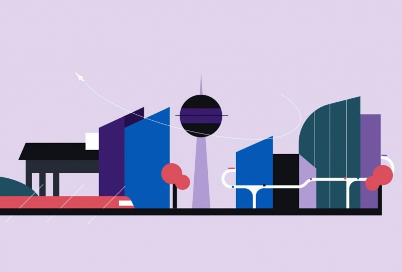
8. Example 3: Blog: In the third and last lesson, we'll take on a bit of a challenge. We'll create an illustration for a blog post will use techniques we learned in the previous lessons while adding vector networks into the mix. This company is called UFO. There are technology company that sells their API as a product to traveling companies, mainly flight related. There's a blog where they post articles about their technology and travel. In this three in general, we're going to create an illustration for an upcoming blog post with the main message that the company is opening a new office in Berlin, Germany. Once again, I already have a few things going on in Figma. You've got a frame for the blog post, the colors that I picked from a couple of existing blog post illustrations. And finally, the sketches. The idea here was to incorporate a flight and travel theme, while including Berlin's most famous attractions and other noticeable landmarks. Along with the few skyscrapers, I decided to include Berlin's TV tower as well as Brandenburg Gate. I tried a few compositions and finally settled on TV tower being in the center brigade on the left side, and the skyscrapers on the right. Before we start. Even though the size of the frame is 2000 by 736 pixels, there is a safe area since there's two ways that this illustration is displayed in two fiddles blog. One is almost a square in the blog page itself, and one where the full illustration is visible on the particular blog post. We're gonna make the safe zone around the same size as the other illustrations. We're going to make it runs and lock the layer so that it doesn't get in our way while we create the rest. Let's start with the basic shapes. We're going to make the TV tower right in the center. In our case, it's as simple as a circle and a triangle behind it. I plugged in the shape just so we have a nice box around the triangle. Next, we'll make a few buildings. I mean the rectangle and lowered one side of the roof so that we have a nice angle. I'm copying the shapes so that we have two of them. And I also made a shaded side for the first one by using subtract Boolean. Moving one building behind the other helps us create some depth. I'll move those aside because we need to make room for our next attraction, Brandenburg Gate. I created a couple of rectangles while giving the top shape as slight slope. Next, we'll add a few billers to hold our structure. Well, having shapes equal distance to each other, I can grab this vertical handle and increase or decrease the space in between them. I copied the builders for the other side of the structure and added a white rectangle on top of this structure. This is supposed to represent the sculptures that are on top of the real gate, but we can't really get that detail for this type of illustration. Let's make a few adjustments to the roof. And that is the second attraction done. Let's focus on the business district. I copied one of the buildings shapes and change the size of it. For the building next to it, we can try and make an it's using vector shapes. I'll make the front and then the sidewall maintaining a single vector object. Now, it's a bit of a shame that the paint bucket tool does not allow you to use multiple colors for a single vector object. Otherwise, it'd be great to counter that will copy the shape and delete some of the anchor points from each shape. I'll make some adjustments to the shapes to adjust the height and width of the buildings. For the tall, the building will do something different. I'll grab the corner of the roof, Brown the corners, but also I'll move the corner down so that we get more organic shape. For the side of the building will copy one or the other rectangles that we already had and increase the height will make the train track. Next, one rectangle for the track and other for the train itself. To make the train have a sense of speed and movement will move the top to the left and round the corner. We'll add a small window for the conductor using intersect boolean. We'll also add a small hill on the left side of the composition. I use another cycle, expanded its width and removed three fourths of the shape using the Arc tool. Let's bring the other two buildings that we made in the beginning. Moving those buildings to the middle while keeping the train in front and the gate and the back created a nice flow for the eyes and a sense of depth. But men has quite a few parks. So let's not leave the trees out. I'll make one tree from two cycles and that rectangle, make a copy and flip it vertically to have some variety. I place the trees so that the overlay the other shapes at least a little bit maxed will make highway that surrounds the business district. We can use the pen tool and by holding Shift, I get 45 and 90 degree angles while placing the points, I made sure that both ends of the highway and right with the building start, it creates an illusion that the highway goes behind the city. To make the highway curb around the city, we can grab the points in brown the corners as much as we can. I installed a few support beams for the highway. By drawing lines. We can easily copy and paste one shapes property in terms of color, shape, corner, radius, another shape by pressing Option Command C and option command V. I outline the strokes, use the United Boolean and flatten the shape. Flattening the shape removes the ability to make any live edits on Boolean shapes, but it also allows you to have more control over the points of the new shape. Selected appoints next to the top of the support beams. And brown than the corners are. Highway feels pretty empty, so we'll populate it with a few cars and trucks. And when I say cars and trucks, I mean colorful rectangles and circles. Of course. Going back to the main attraction, the TV tower, Berlin tower has two stories. So I added a rectangle in the middle and the line to separate the floors will also add a few lines to the tallest building in the business district. It's nice way to add variation without adding too much detail. We'll also introduce a few lines for the train to make an illusion of speed. Now if you remember, default focuses on travel and the flight industry. A thing query missing a plane. To keep the consistency between the blog post, I simply use the blend tool and trace the plane from one of the previous illustrations. We also want to create a trace that the plane leaves behind. I experimented with the placing of both plane and the circle that I created. We can simply use the Arc tool to achieve a curb of our liking that simply remove the middle points and we are good. I removed the red stroke around the illustration and outline the shapes. Of course, same as the other lessons. We have to see how this illustration will look like in context. If you remember, there's two different ways that this image is displayed within the false block. One is the cover for the post, and the other is the full size image. Quick recap. We use all the techniques that we learned from the previous lessons and created aesthetically pleasing composition of Berlin. Let's not forget what we added to our tool arsenal. Vector networks. How to quickly change space between the shapes, what flattening and the shapes does, as well as a fast way to copy and paste styles.
9. Student project 3: And a final assignment is once again to create an illustration. This time, however, do it for a blog that you like reading. Or again, for a product that you like. Usually tech companies have blocks to increase the return of customers as well as better Google search them results. Make an illustration, play around with the composition of objects. Try out vector networks and share your final work with the other students.
10. BONUS: Animation: I've got a quick bonus lesson for you. We can create simple animations writing Figma using the smart enemy feature. Let's see what we can do in the last illustration that we made, it seems like the obvious thing is to make the train moves. So that's exactly what we're going to do. Now. It's not as simple as pressing Animate button. We have to prepare the fire first, ethics the hill so that it goes all the way to the ground. Then I group the train layers and move them aside. Since we didn't have the full train, we need to adjust the backup. It will match the angle of the roof as well as the brown that corner. I wanted to train to disappear behind the business district. In order to do that, I moved all the district to the top. Since the train is pretty long, it wouldn't completely hide behind the buildings. So I created a rectangle and move it on top of the train layer. I also match the background color. And finally, I did the same with the other side. Now, the way smart animate works in Figma is pretty simple. First of all, we have to have at least two frames. Imagine the first one being you start with the animation and the other one is the end. Figma automatically animates the layers with identical names and transitions them from one state to another. That's why I have the train on the very left of the first frame and on the right of the second frame. Make the animation. Click the Prototype tab in the top right corner. Select the first frame and drag the plus 3 ending frame. I want this animation to start automatically. So I added a function called after delay. Now, here's where the magic happens. Under the animation drop-down. I select the Smart Animate feature, added some easing and increase the animation timer to 100 milliseconds. Now, if we click the Play button, we can see the train going from left to right. A change some settings and in some sound effects boast. And here's the final result.
11. Final thoughts: Thank you for completing the course. If you would be interested in a course similar to this, but covering more advanced techniques and tips. Let me know in the discussion section down below. Anyway, I hope you have fun. And why did it was such a pleasure to grade this course for you guys. I hope you learned something new about illustration and about Figma. Remember, keep sketching, keep illustrating, and keep creating. Till next time.
 Liudvikas Dicevičius, Product design (UI/UX), illustration