Transcripts
1. Class Intro + Project: Hello and welcome
to my new class. I'm Ana of Busy My studio, and today I'm inviting you to join me to a very
berry tea party. In this class, we'll have fun drawing Tice berries
and their leaves. We learn to arrange them
into a nice composition. And we'll even create a
tea set decorated with fruits perfect for
a summer tea party. And perhaps you could take
your creations even further. They can become you
customize stationery or stickers or a piece of wall art you'll proudly
hang in your house. Please make sure that you share your artwork
here on Skillshare. Or if you're on social media,
especially on Instagram, please make sure that you
follow me at my undiscoe Busy underscoe May and make sure
you upload your artworks. You tag me, and you use the
hashtag very, very June. And that's how I will see all
your lovely masterpieces. So grab your iPad, grab your Apple pencil, and, of course, a nice cup
of tea, and some berries. And let's start our
very barry class. S.
2. Tools & Materials: All right, friends, let's go through tools and materials
you will need for this class. As always, because it's
a procreate class, you will need an iPad
Pro and an Apple pencil. You will also need
procreatee installed on this iPad with
the default brush. Now about the brushes
I'm going to use. In the resource area
for this class, you can find the group that
is called Very Berry brushes, which I specially
created for this class to paint our juicy
berries and the leaves. And let me quickly explain to
you what brushes are there. So there is a filler brush. We'll be using it as the main brush to fill the areas and for smaller details
with reduced size. There is a shader brush, which we will be
using for adding texture and darker areas
to our berries and leaves. There is a few texturisers. So this one is
vintage texturizer. You can create additional
texture effect for your berries. There is texturizer cloth,
which I quite like. Seeds candle laying, brush, which I hope you
will like as well. There is salt texturizer adding
a little bit of scratch. There is cloth details
brush can reduce the size of it and create
lovely details with a cloth. Texture, there are also two of the procreate
default brushes, monoline and technical pencils, which I'll be using
for sketching. They are not my brushes. As I mentioned, they
are procreate brushes. Monoline, you find in the calligraphy section of
procreate default brushes, and technical pencils you
find in the sketching area. But I've copied them
and added them to Veri Berry for your convenience so you don't have to
go and look for them. The techniques I'm
going to show you, I'll be using my
brushes from Veri Berry which you're welcome to download and keep and use for
your own projects. However, you are free to use your own texture brushes
because there will not be much difference in what kind of texture or
fillers you'll be using. So if you prefer
using on your own, go ahead and do so. Colors. I'm also attaching for you the color palette
called Veri Berry. But again, you are welcome
to use your own palette. I've used my favorite colors
for these types of fruits, but you don't have to use them. But if you want to follow
this class step by step, the palette is available for
you. That's all you need.
3. Inspirations & References: The very first source
of inspiration I always recommend to my students
is the wed photography. If you have a chance
to take a quick photo, during your walk
in the park or on your way home from work,
use this opportunity. Not only it's great not to worry about royalties
and copyright, but also taking your own photos gives you the chance to slow down and start noticing lots of beautiful
things around you, even the smallest ones. Or if you are lucky to
have your own garden, there are so many
wonderful things to draw inspiration from. Alternatively, if the subject of your art is something
like a strawberry, go ahead and snap a photo of your supermarket of
farm shop bought fruit. Perhaps the plate you
put on is very special, and the light that morning
is particularly good. You might be amazed
how beautiful and professional your
photography turns out. Another reference option is royalty free websites
with tons of references. I recommend unsplash.com
and pixabay.com. It's not as beneficial
as your own photography, but it gives you a quick, straightforward reference for
your stylized illustration. I've created a simple
reference file with some photos which you can
find among the resources. And another reference option
is scientific illustrations. They're particularly
helpful when your subject is botanical, a plant, a herb, a flower, or a fruit. The huge value of
such illustrations is no copyright as they'd mostly been created during the Victorian times
of the late 19th, early 20th century, and there is so much inspiration in them in terms of details and stylizing. I personally prefer books with various museum
illustrations. I've got quite a
collection of them. But Pinterest will also do. I've created a small
board for you, which you can access through
the link in the description.
4. Whole Strawberry: So let's start with
sketching our strawberry. Let's have a quick
look at our reference. What makes a strawberry
recognizable in my opinion, is its shape, its
leaves, and its seeds. I've created a
screen size canvas. I'm going to use the
technical pencil brush from the very be set. And with any color, let's take some darker color. Purplish. And let's create the
strawberry shape. I think the shape
I'm going to go for, is going to be
something like this. You see, I've sketched one side. I'm going to duplicate it, and I'm going to select select
it and flip horizontally, and I'm going to drag drug
it on the opposite side, I'm going to flatten
those layers, and I'm just going to
grab the eraser too, and I'm going to erase the
lines that I don't need. Here is basically our
main strawberry shape. Let's sketch the leaves
because as we know, every berry is got
leaves on top. That's how they grow. With the same technical
pencil brush, I'm just going to freely
sketch some leaves. I'm quite happy with my berry
shape. That's our sketch. I can flatten it and we will use the sketch for both wholeberry
and the half cut berry. Let's paint the
whole strawberry. I'm going to create
a new layer and I'm going to start
with the leaves. With the feller brush, I'm going to choose the
sort of olive green color. And I'm just going
to start filling. Going to reduce the size, the opacity I will
probably keep to 100%, and I'm just going to
start filling the leaves. And let's switch
our sketch off to see if everything looks good. Now I'm going to show you a little trick that
I sometimes use. I'm going to pick
the select too, keeping it on the
free hand option. And I'm going to freely without
any particular pattern, I'm just going to select
a part of my leaves, and I'm going to open feather. And I'm just going to
increase the amount to about maybe 12% if we go to adjustments and we select hue
saturation brightness. I think I'm just
going to slightly change the hue and I'm
quite happy with this. Adjust it a little bit. We'll work on the
leaves more, of course. Next thing, let's
create a new layer, and let's clip it as a mask. And let's change the
blending mode to multiply because now we're going to color darker
parts of the leaves. I'm going to use
the shader brush probably with the
same green color I've just used for
painting the leaves. I'm going to add
with gentle strokes, some darker areas
here and there. I'm quite happy with that.
And for an interest, you can always add a
little bit more details. I would use it as a
clipping mask as well, and I would change the
blending mode to multiply. I'm going to grab the
filler brush again. Let's reduce opacity
to around maybe 60%, let's reduce the
size to maybe 6%. Let's see. Maybe even smaller. Maybe let's increase
the opacity. I think we'll
increase the opacity. And what I'm gonna
do, I'm just gonna add just a little bit of weight That's it. I'm happy with my leaves and I'm going to happily
flatten them. Let's duplicate them because
one of the copies will be using for the whole
berry and the other of the copy will be
using for half cut beerry. Now let's switch the sketch back on and let's create a new layer, and now we're going to
paint the whole strawberry. For that, I'm going to
grab the filler brush, and the color I'm going to
use is this happy red color, which is in the
middle of the top row of our color palette. Let's see. I'm probably going to reduce the size to
around maybe 25%. Yes. And I'm going to manually fill my berry with this nice red color. All right. That's my strawberry filled with the red color. It obviously doesn't look
like a strawberry now it looks like some strange themato. But let's make it a
proper strawberry. I'm going to create a
new layer and clip it as a mask on top of my
strawberry layer. I'm changing the blending
mode to multiply. I'm going to grab
the shader brush. And I'm going to add
some darker areas. Don't try too hard
to give a volume. However, the obvious choice of adding darker areas would be probably the
bottom of the berry. See, not only mix
some darker areas, but it also gives our
strawberry a nice texture. I will probably make it slightly
darker on the one side. Still a little bit
on the other side, but mostly on the right side, and just to create the
variety and texture, I'm going to grab darker red, which is the third red
one on the top row, and I'm going to reduce maybe the size of the brush a
little bit and opacity, and I'm going to just
gently add some of the darker areas here
and there around the edges in the bottom
and on top. That's it. Quite happy with
that. And finally, as we discussed previously, what makes a
strawberry strawberry. It's got this
distinct texture with the seeds on the
surface of the fruit. So for that, I'm going to add a new layer and I'm going to change the
blending to multiply. But you'll see what
I'm going to do next. I'm going to grab
the feller brush. I'm going to reduce the opacity. The size a little bit. I'm going to paint the seeds on the surface
of my strawberry, again, guys, it's a reminder we are not trying to create
realistic strawberry, we are just creating a
stylized illustration. So no meat, you try
and make it realist. With this sort of oval
squished circle shapes, I'm just adding
the seed texture. And basically, that's it. But there is a little note here. When I was preparing
for the class, I tried different blending
mode and instead of multiply, I tried screen, and
I thought it worked better with a screen mode with a slighter seeds on
the darker areas. And if you want to
go even longer way, you can create a layer
underneath this seeds layer, you can clip it as a mask
and I'm going to change the blending to multiply
with the shade of brush, darker red color with reduced size and opacity,
what I'm going to do? I'm just going to gently paint the squished
circles around the seeds. Because we know that in reality, they are dipped
inside the surface. So we're just creating this tiny illusion of depth
with our shader brush. Of course, you can always
create a new layer on top of everything and add
a little bit of highlight. I would keep the
blending mode on normal, and I would grab probably the texturized salt and
with pinkier color, I'm just going to
add a little bit of but that's up to you, whether you want
to add it or not. Decide yourself. You can use the shader as well to add some
highlight as well. I wonder if it would work
a little bit better. Yeah, I think underneath
the seeds and if we change the blending mode to add, I think it looks better. Maybe reduce the opacity a little bit if
it's too intense. Yeah, that's our whole
strawberry ready.
5. Half-Cut Strawberry: Now let's paint the
other strawberry, but this time it's
going to be half cut. As I said to you in the
introduction to this class, we're going to be
using and re using the illustrations or parts of illustrations we've
already created, so we're not going to start every single thing from scratch. Let's combine the
group together, and that's our whole strawberry. We're not going to
flatten it just yet. We're going to duplicate it. We're going to switch
one strawberry off. You see that will be
our whose strawberry, and this one will
be our half one, and we're just going to delete. The seeds layer and delete
these darker areas. Let's switch one of the leaves copy off and switch the other one on and drag it
underneath our strawberry. Now, let's go back
to the group of the half cup strawberry where
we deleted the seeds layer, and let's paint the
middle of the strawberry. But first, let's have a look
at the half strawberry. You see there is this red area, there is a lighter
area in the middle, and there is this
heart shaped center. I'm going to create
a new layer and I'm going to keep it in
a normal blending mode. And with a filler brush
with a slighter pink shade, I'm going to paint the middle
area of my strawberry. I might grab a little bit of the lighter color
with the shader brush. I'm just going to take
the slighter pink, which is on the second row, the fourth swatch,
and I'm just going to add a little bit
of whiter patches. That's it. And now let's
on the same layer, let's draw the little, like, the way the seeds grow, the little lines
around the strawberry. So let's try. So I'm going to
reduce the opacity of the brush to maybe 60%, and I'm going to reduce the
size to probably 5% or so. And let's just draw
these little paths. And the final part. Let's
create a new layer. I would change the blending mod. I'll try to use linear burn. However, I might change my mind later with the feller brush, we're going to paint the
heart of our strawberry. I like to call the heart of it because it's like heart shape. So I'm going to just
grab this darker. Cool. I'm going to increase
the size of my brush, increase the opacity
to around maybe 80%. And with a very
loose heart shape, I'm just going to paint this sort of like
elongated heart. Not going to cover precisely all the areas maybe
going to grab the of toe and I'm just going
to place it. In the middle. Let's play around
a little bit with the blending molds and
see which one works best. At the moment it's linear burn. Let's try color burn. That's very bright. I like it. I'll remember. Darkness too dark,
multiplies too dull, lighten screen, C dodge a
color, overlap visible. Hard light is quite nice.
You know what, guys? I'm going to keep it on
hard light. Let's see. Let's switch the sketch off. I might create a new layer, use it as a clipping mask
and just add a little bit of texture with the
salt texturizer. Let's see if it's going to work. Maybe with a bright red color. Let's change the
painting to color part. Yeah. And let's add a little bit of the
scratches here and there. But that's just optional. So that's our half
strawberry ready. So what I would recommend, I would recommend grouping the half strawberry,
renaming it. Et's switch it off, and let's
switch on whole strawberry. Let's group it together as well. And let's name it. Strawberry. So we don't get
lost and confused. You can go ahead
and flatten them if you know that you're not going to reuse these
layers anymore. So that's what we've got. Let's have a look. Perfect.
6. Raspberry: Now, let's paint a raspberry. So the principles
are going to be mostly the same as
painting strawberries. However, there will be
slightly slight variations, and I'm going to show
you some tricks how to make a stylized raspberry. But first, let's have a look
at raspberry and Blackberry. The distinct features of these
berries are their shape, their leaves, and the
structure of the surface. Let's start with a sketch. I've already created
a screen size canvas, and I'm going to grab my
technical pencil brush, default from procrete
and I'm going to grab this color and let's sketch
shape of the raspry. I'm going to sketch one side. I'm going to duplicate it, and I'm going to flip
it horizontally. And I'm just going to drag
it on the other side, and I'm going to
pinch it together. We can erase the unwanted lines. Let's just make it
slightly bigger. I'm going to create a new
layer and I'm going to paint sorry, sketch some leaves. Same principle as with
the strawberries. Let's just maybe keep in mind that raspberry
leaves they are more thinner on top,
they've got sharper. This part is sharper and narrow in the contrast
of this middle part. So I'm quite happy with that. Now, the difference between a raspberry and strawberry
sketching this time, I'm going to divide my
raspberry into four sections. I'm just going to maybe
divide it like that in half and I'm going to divide
the upper part in half, maybe making the very top
part just slightly narrower, and I'm going to divide
the bottom part in half, too, making the very bottom
part slightly narrower. Ways create a new layer and I'm just going to sketch
these details. I'm going to start with the
very top For the sketch, it doesn't really matter. But when we start coloring
and adding darker and lighter areas that will add this little detail of
realism to our berry. Quite happy with that now. Let's just the
shape of, why not? You can clearly see it's a raspberry or blackberry
or that type of a berry. And that's pretty much it. That's our sketch ready
for both berries. And let's start
with the raspberry. I'm going to flatten
the sketch layers. Let's look it so we don't
throw it accidentally. Let's start painting the
base of our raspberry. We're going to start
with the leaves same way as we did
with the strawberry. We're going to grab
the filler brush. We're going to increase
the opacity to 100%, and the size probably around
maybe 15%, but let's see. We use greener color for
the strawberry leaves, I suggest that we use a little bit slightly colder
colors for the raspberries, colder shades of green. I suggest that maybe we
use maybe these two. I'm going to grab the
lighter tu color and I'm going to just start filling
the leaves with this color. We can do the same thing as
we did with the strawberry leaves for the sake of
color transitioning, adding a little bit more hue. So I'm going to take
the select tool, choose the free hand option, and this time I'm going
to select not the middle, but one of these areas, I'm going to open feather, and I'm just going to increase the amount of feather
to around 10%, and I'm going to go to
the adjustments area, open hue saturation, and I'm just going to slide the hue options and see
what works best for me, I quite like this brownish color might just reduce the opacity, not opacity saturation a little bit maybe greener
probably works better. Just to marry it
a little bit with a strawberry because
they will be all in our canvas together. That's it. I'm quite happy with that. I'm going to create a new
layer, clip it as a mask, change the blending mold to multiply with the shader brush, using this darker teal color, which is right above the lighter one that
we've just used, which is the very right
color on the top row. I'm just gonna add some
darker areas here and there. And maybe let's add a little
bit of veins details, and I'm going to create a
new war, clipping mask. But this time, I'm going to use the th brush with
very small size, and I'm going to
make lighter color. So for that, I'm
just going to grab this minty green color which is onto the left of
the darker seal, and I'm going to paint. That's a leaves radium. We can flatten them, and let's duplicate them
because we will need them for both blueberry
and raspberry. So let's switch one
group of leaves off. And let's create a new layer, and let's paint the
raspberry base. For that, I'm going to use the same filler brush
for the colors, I'm going to use this
little group of colors. I'm going to choose
this pink red one, and I'm just going to increase the size a little
bit of the brush and I forgot to paint the
leaf one of the leaves. Let's just quickly
correct this mistake. Right, so everything
is painted now. So we've created a new layer underneath our copy of
the group of leaves, and I'm going to use the
feller brush, as I said, and the pink red color, and I'm going to paint
the base of my raspberry. I wonder if I should add
a couple of details here. I think that's what
I'm going to do. Yeah, so here is our raspbery. Now I'm going to
add darker areas. I'm going to create a new
layer, clip it as a mask, and I'm going to change the
blending mode to multiply. With a shader brush with this
darker deeper red color, I'm going to add a
little bit of volume. And now I'm going
to reduce opacity a little bit and
maybe even the size, and I'm going to add some
darker areas like on top of which row of the sort of like little bol details
of my raspberry, just to separate a little
bit the rows from each other to give myries my berry
like slightly more details. I would also like to maybe experiment with other textures. I'm going to grab this
texturizer vintage, and I'm going to select
this darkest color. And let's see how this
one is going to work. I might actually
reduce the opacity a little bit and just add a little bit of texture to
my raspberry here and there. I'm going to experiment a
different size of this brush. I find it the more you use
colors, color variations, close and tone and shade, the more interesting
your illustration looks. What I'm going to do next, I would like these bold details
to be even more visible. For that, I'm going to
create a new layer. I'm going to take
the filler brush. I'm going to reduce the size
to maybe 6%. Let's see. But the point is the color
I'm going to try and use is this pink
color in the middle. Let's see, yes. They might change blending mode
to something lighter. But first of all, let's
do the technical part. So maybe 5% and what
I'm going to do, I'm going to outline each
ball details separately. You can use a trick of
creating drawing a circle and holding the pencil down
to create a perfect circle. You can do that. I prefer my illustration to
be more organic, more relaxed, painted
in a more relaxed way. That's why I'm not
going to do that. I think this sort of method, it adds sort of it removes the seriousness and the realistic attempt
from our illustration, makes it more playful. Makes it more stylized. Especially if you illustrate
for children's books, that definitely adds
this childish element. Let's check different
blending modes. At the moment, I've
got it on normal mode. Let's try Lighten, you
can see it, screen. I can see it on screen. Color doge is a little
bit too bright, so it add the color of
interesting soft light, hard light in your light. I think I might leave
it as linear light. And I'm going to
create a new layer and with a shed of brush with the slightest sheade of pink in the very
middle of our palette, I'm just going to
add a little bit of highlights by gently
painting in each circle. And just like that, this
is our raspberry radian.
7. Blackberry: And now, again, back to re
using our illustration. So I'm going to show you
how to turn the raspberry into a blackberry without painting the blackberry
from scratch. So for that, let's add all the raspberry
layers into the group. Let's duplicate the group. So these leaves,
let's just add them. And now we're going to
work with this group, so let's switch the duplicate the other copy of leaves on. And we're going to
do it really simple. So this is our raspberries base. As you remember,
we made it pink. We just gonna use this purple as a base by dragging
and dropping it. A vola, our raspberry almost
turned into the blackberry. So shades we still have
shades in sort of red. If you wish, you can change
the shades into blue. The deep blue, deep blue color, petrol type color
next to the purple, I find it complementing purple really nice in
this blending mood. So I've just dropped
the blue into the red. I think that brings the
purple up a little bit more. Now, these circles, they're
obviously too pink now. Let's turn them into
something else. Let's select the slight
blue color and see. Boom, see, now it's
more like blueberry. And you can even change the
highlights to blue ones. But the highlights I think
they are good as they are. So now we have a
raspberry and Blackberry. Let's group them together. You can rename them if you want. But essentially, here's what
we've got to work with. We've got the raspberry and the blackberry without having to paint the blackberry
from scratch.
8. Black & Red Currants: I've already created
a screen size canvas, and let's sketch our currents. But first, let's look
again at our references. So you can see that the
distinct features of the barry is its size and the structure
of the way it grows, which is like a cluster
of berries on the twig. Let's grab the technical
pencil brush, darker color. And basically keeping in mind what our food
black currents are. It's basically a
cluster of berries on the main twig.
Let's just sketch it. So I'm going to sketch like reversed C. That
will be our main twig, and I'm going to sketch maybe
and even ner finer twig. And let's put some
berries on it, which are essentially
the circles. So let's vary them in sizes for the interest of
our illustration. So let's just maybe split
this into two like this. And I would start
with larger ones. So that's essentially that's our current sketches gradient. Let's start coloring. So I'm going to locate
a sketch in here. I'm going to create a new one. And in a normal blending mode, I'm going to grab
the feller brush. And the color I'm going to use, I'm going to start
with the mean twig. So I'm going to use
this soft brown color. Let's see. Taking.
W reduced size, I'm gonna let's actually
reduce the opacity of this sketch so it doesn't
interfere with my coloring. I'm just going to
start gently coloring the Don't limit yourself. Don't create the perfect
arch or anything. You can add a little
bit of, like, nodes here and there
that will only make your illustration
more interesting. And again, for the interest, I'm going to paint the rest in different shades of green,
the rest of the twigs. I'm going to create a
new layer and this time, I'm going to grab this sort of very first dark green color. And that will be my twigs, like the main ones holding the biggest berries and the clusters basically
of the berries. I'm just going to
carefully color them in joining these twigs together, joining this twig
with the brown one. See, it's already variations of colors create a little bit
more interesting effect. And now let's add
the finest twigs. I might create a new layer in case I want to
move them around. And the color I'm going to use is this olive light olive green, which is almost in the
middle of the top robe. I'm going to with
the same principle, I'm going to make them even. Enough. That's our twig painted, and I'm going to go
ahead and flatten them, and I'm going to duplicate
it because I will obviously need it for both sets of
blackberries of blackberry, sorry, black currents
and red currents. So I'm going to
switch that one off, and I'm going to
draw my berries, paint my berries on
top of the twigs. I'm creating a new layer
on top of my twig layer. And with a filler brush
with increased size, but with the same 100% capacity, I'm going to paint
my black cards. For that, I'm going to
use this bluish color. I'm going to select
it, and I'm just going to literally paint
with the circles. Remember, with this brush, if you want less texture, just reduce the size, and this will give
you less texture and the less fluffier edge
chapter edge also the trick that you probably
all know if you create a circle and hold the pencil down without
taking a off paper, open the Ellipse menu on
top and choose circle. That will create a
perfect circle for you. You'll be able to colour it. I usually paint my
berries just by hand without using this
perfect circle option. That's how berries ready. Let's add some darker
areas for that. I'm going to create a new layer. I'm going to clip it as a mask, and I'm going to change the
blending mult to multiply. And I'm going to use
the shader brush, and I'll probably use the
darkest deepest inky blue. Yeah, it's going to
be barely visible, but I like how it
gives my berries this texture that goes
throughout our whole thin. That's what unites
them together. So a little bit of darker areas. And let's add a little
bit of highlights. I'm going to create
a clipping mask with the normal blending mode. I'm going to choose
this light blue colour. I'm going to bring the
opacity right up to 100%. I'm going to reduce the size, and I'm just going to add a little bit of highlights
here and there. Again, that's optional,
but I think we should add a little bit
of these little noses. I'm going to use the
slighter beige color. Switch the sketchbck one. And let's just add this little nose details
so each berry has a nose. And now we can switch
the sketch off. We don't need it anymore. So that's our black currents. So I suggest that you group these berries together
with the twig probably. And let's duplicate this group. Let's put it on top
of our other copy. Of the twig and exactly same way as we turned raspberry into blackberry
in the previous lesson. Let's turn black current
into red current. I'm sure you can do it
already without my help, but I'm going to show you again. Let's use the strawberry
breads, if you don't mind. I think we'll use. Let's try this darker color. See, I'm going to drop this red color on each
berry one by one. Already looking
good, but I would also change the shading. Let's choose this
darker straight color. And instead of this
blue highlight, let's use pink highlight. Let's try this first. Yeah, I think that's
quite nice already. And let's see what we've got. You can rename them, of course, for convenience if you
want. But let's see. So we've got we've
got red currents. And we've got black currents.
9. Black Currant Leaf: I've created a
screen size canvas. And let's catch the
black current leaf. First, let's have a
look at our reference and what's special about
the black current leaf. So you can see it's its
shape and the toothed edge. So I'm going to grab
my technical pencil, maybe reduce the opacity
a little bit on the size. And let's catch the leaf. So I'm going to start
with the central vein. That's pretty much the sketch of the black current
leaf is ready. I'm going to create a new layer, and now I'm going to show you a different way you can
paint your objects, different from the
way we painted our berries in the
previous lessons, and you can choose which one you prefer because I personally, my illustrations I
alternate depending on what effect I want to
achieve or for quickness. This time, I'm going to
grab this monoline brush. So I'm going to use probably this color,
this lighter green. And what I'm going to do.
I'm going to first of all create the
outline of this leaf. As we determined, the edge
of the leaf is toothed. And that's the
reason I'm not using our filler brush because it's going to be it would take absolute edges to
paint each tooth, which is doable,
but for quickness. With a mon align brush, I'm going to outline
the edge of my leaf, making the teeth, like literally
drawing them manually. Make sure you don't leave even tiniest gaps between your strokes because
while filling the color, you don't really want to
fill the entire canvas. So there are ways around it, but just to make sure. So before filling with color, I usually another tip for you, I usually duplicate the
outline and pinch it together just to make sure that even the tiniest gaps are not going to affect filling
with the color. And I'm just going to
drop the green coloring. Let's see if it's all covered. A vola that's the base
of our leaf ready. But obviously, when you use a monoline brush
for calligraphy, dropping the color, it's
obviously going to be really flat and
we don't want it. We like texture and
we want it to be cohesive with the rest of our
elements with our berries. I'm just going to manually add some texture on
top of this leaf. So I'm going to
create a new layer. I'm going to clip it as a
mask and I'm going to change the blending mold to
multiply because I want the texture to be
darker than the leaf. I'm going to try and use
Shinto with the same color. I'm gonna increase the size, maybe reduce opacity so
it's not too intense. And I'm just gonna add
some texture to my leaf. You can try different shades there is vintage texture you can try or you can use a combination of
different brushes to create a more
interesting effect. That's pretty much it. I'm not going to overdo it. To me, it looks good already. It looks textured
enough like vintage. I'm going to pinch it together and that's the base of my leaf. That's how we quickly
filled it with the color. You can obviously
take an eraser too. You can mix some of the
teeth a little bit. Sharper. However, remember,
for the purpose, we're going to use
the sleeve for the pattern and to use
in the composition. The tiny details are not going to be necessarily
noticeable. I wouldn't sweat
too much over it. Now the next thing, I'm going to create
the central vein. On the new layer, I'm not going
to clip it as a mask just yet because it's going
to go beyond the leaf. I'm going to immediately
change it to multiply and I'm going to
grab the filler crush. I'm going to reduce
the size a little bit, and I'm just going
to create this arch. Whatever works best for you, you can start from
left to right, or you can start from
right to left depending on which way you
hand feels steadier. I'm going to do that.
Essentially, I've created the central vein. I'm also going to create this in the secondary veins
for each leaf. See, from the tip of the leaf, it goes right here. And let's see if we duplicate
no that's too intense. And I think we can
flatten it together. And I'm going to grab
even darker green, which is the very first
one on the top row. And I'm going to just paint the sport a little bit darker, maybe make it a little
just a tiny bit thicker. And that's it. And now I'm
going to create a new layer, and this time, I'm gonna
clip it as a mask. I'm going to change
it again to multiply. I'm going to change the
color to this screen. She's the fourth from
the left on the top row. And maybe reduce
opacity a little bit. And I'm just gonna create the veins coming from the central vein to
the edge of my leaf. Now let's add some darker
areas, some shading. I think I'm going to
create a new layer between the veins and
the base of the leaf. I'm going to change the
blending mode to multiply. And let's use the shader. Just for a change, I'm going to use
this bluer green like colder shade of green. I'm just going to add some darker areas around the
edges around the center. Let's add a little bit of red. So I'm just going to grab this
darker red on the top row, not a dark, medium dark. I'm just going to
add just a tiny bit of red just to make it a little bit and I would also maybe take the
lighter shade of green. I'm gonna reduce the apa size, and I'm just going to
emphasize this sort of, like, auxiliary veins a little
bit more with darker color. Just not thinking too
much, guys, not dwelling. I've I've drawn so many
leaves in my life. So I think that I can paint
them with my eyes closed. With a medium, by the
way, digital tradition. So that's basically just to add a little bit of
yeah, I guess that's it. And now let's add a little
bit of a highlight. I've created a new layer on
top of the darker areas. I keep the blending
mode on normal for now, and with the same shed of brush, I'm just going to grab. So let's grab this
lighter till green color and just add a little bit of
highlights, lighter areas. In the middle or
between each vein. I wouldn't I wouldn't do it too intense just
with lighter touch, maybe reduce the
opacity, even more, but literally with this line falling the shape of the leaf. We are creating this. So that's our black
currently, Freddy. Let's switch there.
10. Raspberry Leaves: Alright. I've created
a screen size canvas like I did with the
previous illustrations, and let's start with a sketch. So let's have a look at the
leaf and notice its shape, its structure, and
its tooth edge. Using my technical pencils,
some darker color. I'm going to create the
leaves, sketched leaf, which is very similar to the one that we created
in the previous lesson, which is the black current leaf. However, it's
slightly different. Unlike the black current leaf, raspberry leaf consists
of separate segments, despite the fact that it's
got the palmate shape. It consists of different
separated lobes, while the black current
leaf is one solid shape. Um, so if I create the central vein like that,
I'm going to sketch it. And I'm gonna again, sketch the central veins of the sort of like
secondary lobes. Um, I'm gonna sketch
the first lobe. It's a very simple
triangular shape. And these two lobes, they are not the part
of the solid shape. They are separate lobes. Let's sketch them triangular. It's go out with edge as well. Same as a black current, but we will be using
our monoline brush to create those teeth
while coloring it. And in this particular exercise, I'm going to show you, again, how to utilize the previously
created illustrations, how to use and reuse and how to shorten the time you spend
on certain illustrations. Now I'm going to
start coloring it. So I'm going to
create a new layer. I'm going to take
my monoline brush. The color I'm going
to choose this color, and I'm going to
create the outline of this mean leaf
emphasizing the teeth. Et's duplicate it to
make sure there are no accidental gaps in our line. Let's drop the color
in the middle. I'm going to create a new layer. I'm going to add
this clipping mask, and that layer will
be our texture. I'm going to change the
blending mode to multiply, and I'm going to grab the
venta texturizer let's see if the same color I think it works fine with the same color
that I used for the leaf, but because it's the
multiply blending mode. But again, feel free to
grab maybe the shade the brush and see how it's going to work just to add a little bit more texture. And I'm going to
flatten both layers just to get the stuck
out of the way. Now, let's create a new layer, and let's clip it to our leaf, and that will be
our central vein. Let's change the blending
mode to multiply again. And with the filler brush with reduced size with
the same color, let's draw a central vein, see, we sketched this one. Basically, we're going
to repeat this curve. We can start this invisible and bring it to the
tip of the leaf. Let's make maybe
even smaller size. Let's make this secondary veins. If you feel that the vein
are not bright enough, they don't stand out enough, feel free to
duplicate this layer and maybe play around
with the opacity or just leave both
with 100% opacity. And now let's work on this leaf, similar to what we did in the previous lesson
with a black current leaf. For that, I create a new layer right above our base
layer with a color. I'm going to change the
blending mode to linear burn. Might change my mind later. I'm going to see
how it turns out, with a shade of brush, I'm going to grab
this dark teal color, which is the very right
color swatch on the top row. And I'm going to reduce
the size a little bit, keep the opacity
somewhere about 50%, and, that's too intense. Let's keep the opacity even
lower. Yeah, probably that. And I'm going to add some
darker areas here and there. See, I already can tell that this blending mode is not
working for me on this leaf because it gives my
lovely tell color. There's unnecessary muddiness. Sometimes muddiness is nice, but not in this case, it just gives us
darker colorless areas and I don't quite like it. That's not the look
I'm going for. I'm just going to
try and experiment with other blending modes. Let's see, color burn,
not much difference, darken disappears,
multiply barely visible. And let's see what can help. I think linear light is probably the closest to the
look I'm aiming for. You can see it actually
gives the leave some color. Let's add a little bit
of maybe brownish color. Let's see how it works. Yeah, quite like
that. Just a hint, a tiny bit here and there, just give it just
a hint of variety. And let's grab the
darker color again. It can be this dark
teal or you can use some warm shade
of cream I'm just going to emphasize
the darker areas around the veins
with gentle strokes, similar to what we did with the black current
leaf can switch back to this teal color, same as with the same as
with the black current leaf, I would like to create
some highlights. So I'm going to clip
the layer as a mask, and at the moment,
I'm going to keep it on normal blending mode. And with a shader, with the reduced size
maybe to around 3%, the color I'm going to use
is this minty green color, and I'm going to add just a
little bit of highlights. And that said, I'm quite
happy with my leaf. Now, next step of this group
the leaf layers into one. And what I'm going to do, I'm going to use
the leaf that we created to make the
secondary leaves. And at the same
time, I'm going to keep it as a backup and an
option of the single leaf. Let me show you what I mean. So I'm going to duplicate
the group once, twice. And one more time.
So as a result, you will have four groups
of the raspberry leaf. I'm going to switch
this group off because that will
be my single leaf, which you'll find very
handy when you create a pattern or when you create a composition
in the next lessons. But now I'm just
going to work with these three leaves.
Let's flatten them. And let's rearrange them, so we actually create this palmate shape
of a raspberry leaf. So we'll leave this
group as it is. That will be our main one. Let's switch the other one on, and I'm going to switch the magnesic and snapping
off because I don't need really this sort
of assistance and making sure that I'm
on the uniform option. I'm just going to
reduce the size of the leaf and see I'm
going to add it there. So from here, a
couple of options, I'm going to show you
what you can do next. You can duplicate this
left hand size leaf and going on the move, you can flip horizontally and you can arrange it
symmetrically on the other side. You can do that, or you can take our third
copy of the leaf. You can flip it
horizontally in case you want just slightly
bigger size or whatever, and you can just arrange it
the way you like as well. It doesn't have to
be symmetrical. But something like
that. And that's it. That's our triple leaf is ready. The only thing we need to
create is this little stem coming out of the leaf just to enhance a little bit of volume. See this bigger leaf, I'm going to create a new layer. I'm going to add
this clipping mask and changing the
blending multi multiply. I'm just going to add a little bit of shade
with a shade or brush. Using darker teal color, just a little bit to emphasize that there is
some overlapping going on, so those leaves don't
merge together, so you can still see the edge, the nice edge of here. That's why I'm just
adding a little bit of darker area to
the bigger leaf. That's our raspberry
leaf is ready, and I'm going to go
ahead and flatten it. As a result, we've got one single leaf and
one triple leaf. Let's create a stem
for both of them. I'm going to create
a new layer and I'll probably move it
underneath both types of leaves and using
the fill up brush with probably the same darker
color with reduced size. I'm just going to draw
with the motions. It's actually debatable whether you will need it or not and depends on the pattern and the composition you're going to create in the next few lessons. But I will also show you how to remove the unwanted elements, how to reuse them, et cetera. We're going to switch the sketch off and let's see
what we've got. Let's duplicate
this little stem. Let's merge this together. We've got one leaf. And I'm going to flatten this
one as well over the stem, and we've got a single leaf. So there you go. Our raspberry leaves are ready.
11. Strawberry Leaves: The technique I'm
going to use for the strawberry leaf is exactly the same as for
the raspberry leaf, which is going to be
creating one single one and using it as
smaller elements. And if you look
at our reference, you will clearly see
that these leaves have a very distinct shape
and serrated edge. So I'm going to grab the
technical pencils for sketching, and I'm going to sketch
my strawberry leaf. That's my central vein. And because of the shape
of strawberry leaves, I'm going to create this type
that will be my main leaf. And this always will add to
the edge while coloring. And the technique is
exactly the same. I've created a new layer, and with my mon line brush, I'm going to add some color. But unlike the raspberry leaf, instead of cold the shades
of green, almost still, I'm going to use warmer
shades of green, and I think I'm just
going to use this one. It's the swatch in the
middle of the second pro and I'm going to
create the toothy edge. And I'm going to duplicate it, flatten it, and I'm just going to drop the
color in the middle. Let's add some texture, clipping mask, changing the
blending on to multiply. And let's use the
combination of texturisers. Let's start with a
texturizer vintage using the same color
with a reduced opacity. I'm just going to add a
little bit of texture. And let's use
texturizer cloth with the reduced opacity
just for some variety. Let's try maybe slightly
different shade of green. Let's use this one, the swatch in the middle of the top row, just to give a little bit
more color variation, let's flatten it together to get the stock out of the way. And now let's create
the central vein, New layer, clipping
mask, multiply. With the filler brush
with a reduced size, I would bring the
opacity to 100%, starting with the bottom, I'm going to drag this
line to the top of my leaf and I'm going to
create secondary veins. Now let's add some color
variations and darker areas. I'm going to create a new layer between the base layer
and the veins layer. I'm going to change the
blending mode to linear light and with a
shader brush, that. And let's add a little bit of highlight on the new layer
with normal blending mode. Let's use this
minty green color, which is the second swatch from the right on
the very top row. I'm going to increase the
opacity a little bit, so it's kind of more
visible. That's it. That's our main leaf ready, and we're going
to do exactly the same as we did with
the raspberry leaf. I'm going to duplicate it. This one will be our single one and this one will be
part of our triple one. I'm going to
duplicate each group we have three copies
of the group for this leaf and let's
flatten them, and let's arrange them. Around our main leaf. Anyway you prefer, and let's add a little bit of darker
area to show the overlap, clipping mask, multiply,
and with a shader brush, let's use some darker color. Maybe this dark teal, and I'm just going to
gently go around the edge. Not around the edge,
but underneath those two secondary leaves, lobes to create the emphasis. Of the overlap. I think
that looks good to me, and I'm going to just
merge it together, flatten it. And here we go. As a result, we've got one single leaf and
one treble leaf. And let's add the little foot, which let's place
underneath, both leaves. And with the filler brush, the color I'm going to use is this fourth color from
the left on the top row. I'm just gonna draw and let's duplicate it because one will be for the triple leaf, and the other will be
for the single one. And let's switch the sketch off. There, we've got two strawberry leaves ready to take part in some fun activities
in the next lessons.
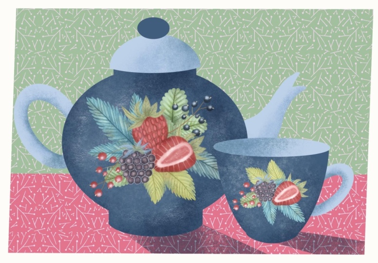
12. Teapot & Tea Cup: Now, let's create our teapot, which we will be decorating with our Berries for your
creative project, whatever you decide to be. I'm just going to grab
the technical pencil, and I'm going to
sketch my teapot here. So the shape I've chosen
is very standard, classic shape of a teapot
just to keep it simple. But you, obviously, depending
on what shape you prefer, you use the number and the size of your ellipses
to connect them together, and I'm going to show
you what I mean. I'm going to create
three ellipses and I'm going to create connecting with the
curve on one side. Now what I'm going
to do, I'm going to duplicate this layer
with a sketch. I'm going to choose Select
and I'm going to flip it. It's not select
sorry to move to, and I'm going to flip
it horizontally. I'm just going to
push it a little bit. That's you see like
we've played the pot. But what makes it the teapot, the anatomy of the teapot, we will need a lid, a
handle, and a spout. Let's create a new layer and
let's continue sketching. The lid, you can create exactly same using the same
technique as the body. You can create a
curve on one side, you can create the lips with the same perspective as
our three previous ones, unless duplicate it, and let's flip it horizontally and let's drag it on this side, and let's flatten it. Let's put a little
decorative element. On top. Let's flatten it to
get it out of the way. Let's create a new layer and
I'm just going to sketch a spout Let's flatten it and let's create a new layer and let's sketch the
handle on the other side. And then flattening it, you can go ahead and grab the eraser tool and erase
the lines that you do need, but in my opinion,
it's not really. It doesn't really
affect anything. And here is the sketch of
our teapot, ready to colour. Maybe you know I'll
make the spout just a tiny bit more refined. And it's all flat and all good, and I'm going to
create a new layer. I'm going to take monoline brush again and the color
I'm going to use for my teapot is this
dark blue color. Because I find it working really nice and maybe I'll increase
the size of the brush. And what I'm going to do. The idea is the body
of the teapot will be one color and maybe the
very top of the lid. But the lid, the spout
and the handle will be of a different color
just to give it a little bit more interest
and make it less flat. Let's create a curve. In terms of coloring,
you can use exactly same technique as you used we used
for the sketching. And that's it. I filled it with this dark navy blue color, which I very much like. Let's on the same layer. Let's create this
decorative spot. You can just colour
it in just like that. And let's create a new layer above the body because
that's going to be our lead. And the color I'm
going to use for it is this light blue colour. And let's use the
same technique. To make sure the line
is solid and I'm filling it with a
light blue color. Now, I'm going to create a new layer underneath
the teapot, and let's make the handle. With the same color
with a monoline brush, I'm going to create
this kind of curve. You know probably yourself that if you hold
it down like that, it will create a smoother curve. I'm just going to If
you hold it down, if you hold the pencil down
on the surface of your iPad, it will create smoother cove. And let's fill it with a color. And let's make a
spout on a new layer. Let's drop the color. The very last thing
that we need to do in terms of
layering the colors, let's make this parts because they represent
the top view. Let's make them slightly darker. By the way, I'd go
ahead and flatten merge together the spot and the handle because we can apply the
same effect to them. I'm going to create a new layer and I'm going to grab
this darkest navy blue, which is the fourth swatch from the right on
the very bottom row. Switch the sketch off, and that's the base
of our teapot. And now let's add some
details on our teapot. Let's start with the
handle and the spout. So I'm going to
create a new layer. I'm going to clip it as a mask, and I'm going to change
the blending mode to multiply and with a shader brush with the
same sky blue color. I'm just going to
add a little bit of darker areas and now I'm going to take the maybe
this bright tell color. It's another trick for you. Adding the colors that you've
used for leaves and berries is going to help you
bring these elements, design elements
together as a group. So I'm just going to
add a little bit. I'm just trying to
keep it very simple. I'm not going to worry
too much about anything. And the lid, let's do
the same with the lid. I'm going to clip a
new layer as a mask. Change the blending
mode to multiply, and I'm just going to add a little bit of texture
here and there. And that's it, I'm quite happy. And now let's work with the
darker part with the body. On top of this
darker blue layer, I'm going to create
a clipping mask, and I'm going to keep the
layer blending mode on normal. And with the texture vintage, I'm going to grab this
lighter blue color. So I'm going to add
texture on the contrary, lighter on the
darker background. So I'm going to reduce
increase the size, keep the opacity relatively low. I'm just going to add lighter
areas here and there. Let's grab the shadow. And let's see maybe we'll add a little bit of darker
area in the bottom. I'm going to create
a clipping mask. I'm going to change the
blending mode to multiply. And with a shader brush, I'm going to grab the
same dark blue color as I used for the teapots body. And I'm just going to
add a little bit of darker areas. Here and there. And that's it, guys,
that's my teapot ready, and that's as simple
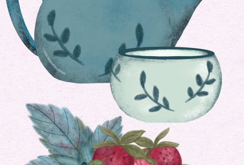
as it's going to get. Now I'm going to make a tea cup as a part of the
set with my teapot, which we're going to decorate
with the same design. Oh, different one if you wish. The principle of creating the teacup is exactly
the same as the teapot. I'm just going to speed it up. But again, keep in mind what shape what type of cup,
whether it's a mug, whether it's a cup
and the saucer, you're going to create and
that will determine the number of ellipses you create and the way you connect
them with the curve. I'm opting this time for
exactly the simplest shape possible of my cup without a
saucer to match my teapot. And there you go. Our teacup is ready. So here's what we have Teapot. Teacup. Nice combo. We can obviously
play around with adjusting the scale of them
in relation to each other. But I would say that our crockery is ready to decorate for our
summer tea party.
13. Creating a Composition: Right, so now it's time
to create a composition of our elements that we've illustrated in
the previous lessons. So first of all, we need to
copy them all to new canvas. Here I've created the screen
size canvas for simplicity, so make sure that you flatten all your berries
and the elements. So here I've got
two strawberries, whole 1.5 cut one, and I'm going to copy
them to the new canvas. And the way I prefer doing it, I'm going to swipe
select both of them. When you are on one layer and swipe to the right
with the other one, you can select two
layers at the same time. And when you press it down with your Apple pencil,
it grabs them. Keep holding it, don't let go. You see once this plus
two sign turns green, you can let go and
they successfully copied on your new layer. Let's do the same with
the rest of them. Right, I've copied them all
and let's check together. What elements have we got? We've got all on
separate layers. We've got half cut strawberry, whose strawberry, Blackberry,
raspberry, black current, red current, black current,
black current leaf, raspberry leaf triple,
raspberry leaf, single, strawberry
leaves triple, and strawberry leaf single. All these elements are
on separate layers, and now we're going to try and arrange them
in a composition. Here, there is definitely
no rules applied, but I can give you
some recommendations in terms of the composition. Like in any composition, they should be the main
element because we're decorating we're
making a decoration for our teapot and the teacup. You can imagine it
probably should be central type composition. There will be something like
main hero in the center and there'll be secondary and tertiary elements around it. So in the composition I
keep in mind right now, I think I'm going to make my two strawberries
as the main hero. So for convenience, I'm going
to switch all the layers off and I'm going to start playing around
with my strawberries. Because they are so big, I'm going to reduce
their size right away, maybe like this. And they will be in the
center of my composition. So I think I'll put the whole
one at an angle like that, and the cut one I'm
going to arrange just slightly lower and they will be in the
center of my composition. I'm going to add I think the blackberry to complement
them because Blackberry, you can make it actually a central part of the
composition as well, but because blackberry tends to be a little bit
smaller than strawberry, I think I'm going to
reduce the size of it in comparison with
the strawberries and I'm just going to
place it like this. You got a cluster of berries. Let's add some leaves
on the background. I suggest that you group this
part of your composition, the central one and put
it on the very top, the other layers are automatically on the
background of it. Let's see what we can do. I'm just going to play
around with positioning the leaves and deciding
what works best. You can see that I'm playing
around with the positioning, with the angle with the
scale of my elements and the more variety you've
got of all these aspects, the scale, the positioning, the better it will look, the more interesting it will
look as your composition. And at the moment, I'm quite happy with
the leaves positioning, and I'm just going to add the smaller elements
of black current. I think I'm going to bring
them on top of the leaves. Leaves create the background
of my composition, and the red currents
will go on this side, just to create horizontal. And that's pretty
much what I kept in mind when I decided to create
a composition for our tipo. Also, what I was
going to show you. You can always adjust
your composition. For example, if you need
additional elements, I'm just going to show you
a couple of tricks that I sometimes use when I
create compositions. One of the tricks is coping and pasting parts
of the illustrations. For example, I really like this leaf on top
of the strawberry, so I'm going to go ahead. This is my whole strawberry. I'm going to grab
the selection tool. I'm going to stay on
the free hand mode, and I'm going to carefully outline this part
of my strawberry, and I'm going to
copy and paste it. There is this function, copy and paste, you press it. Now you have these two or
three rather separate leaves, which you can place somewhere else as a part
of the composition, which you can
reduce the size of. Maybe some leaves will be
sticking out from here. That's one way, exactly
the same way you can copy one berry going to quickly show you what I do sometimes
or a couple of berries. Free hand selection,
copy and paste, and you just drag them around, maybe reduce the size. I wouldn't worry too much
that it looks too busy. I think it looks good. And because there are obviously endless options you can design with your elements, I would group the elements of
your composition together. Because obviously you can
see that I've not used all the elements and I'm
going to duplicate it, switch this group off as a backup because I might
just rearrange and reuse it and I will
flatten this composition, and now it's ready to be added to my teapot
and the teacup. Let's see how it's
going to look. For that, I'm going to swipe and copy and I'm going to go back to my
teapot and the teacup. You can create
backups, of course, in case you would like to
try some other colors, for example, instead of blue, you might want to try dark red, and that's why it's important
to keep the separate layers in case you want to
change something. I'm going to duplicate, switch the backup copy off, and I'm going to flatten my teapot and I'm going
to flatten my tea cup. Just don't flatten
them together. I think I'm going
to reduce the size of the cup so it looks more in combination of the teapot and what
I'm going to do, I'm going to place my
newly created composition on my teapot and I think I'm going to create a
simpler composition for the teacup just so
we don't repeat itself, but using the elements
from my main composition. Bear with me. You'll
see what I mean. What I'm going to
do I'm going to go back to my composition that I've just created
and flattened. I'm going to swipe
three fingers. I'm going to select Copy. Then I'm going to go back to
my canvas with the teapots. And I'm going to create a layer. However, I think it would
drop off anyway properly. I'm going to swipe three fingers and I'm going to click paste. Let's switch the teacup
off to make sure that our composition sits
nicely on the teapot. Let's just adjust this
composition teapot. I think it looks
great the way it is, but you can always try and experiment with different
blending modes. See I'm changing the blending
modes, and actually, some of them look
very, very nice. So I'll leave it up to you to decide which one you
would like to use. Wow. Uh, Oh, that's quite
nice, isn't it? Look at that. Why not? But I would like to keep it
nice bright and summary, and I'm just going to keep
it on normal blending modes, and there you go. The teapot is ready. Now let's create a simpler
composition for our teacup. Let's go back to our document where we've
created the main composition. This one is flattened, so we're going to switch it off. And let's create a new one
using the same elements. So because strawberries
are the heroes of our pig of our design,
I would keep them. And so that's our strawberries. And let's switch the rest
off and see what we can do. I'll just keep half
catch strawberry, and I'm just going to
maybe add some leaves. And maybe a little bit of black current just to
add this extra color. Keep in mind the
shape of our cup. So it's more sort of like
elongated a little bit. And I'm just going to play
around maybe with a sleeve. And that's just as
simple as that. I'm not going to
overcomplicate it. I'm going to group
these elements. I'm going to duplicate them, switch the backup copy off, and I'm just going
to flatten it. Swipe with two fingers. Copy. And let's go back
to our teapot and teacup, switch the teacup on, swipe three fingers
and paste it, and let's adjust the size the size of it. And there it is. Now we've got teapot and the teacup composition that you can use for
your illustrations, designs, stickers, and
many other things.
14. Final Words: First of all, let me
thank you so much for staying till the very end
throughout the whole class. And especially I think
those who created illustrations and who are about to upload
them on Skillshare. It is always so rewarding to see the result of your beautiful
work and your effort. I would also like to thank
all of you for your support, for following me, for
creating art with me, for tagging me on Instagram. You have no idea how much you inspire me and how much
the soul keeps me going. And making me create more and more lovely
classes for you in procreate and hopefully
in mixed media, too. I hope you enjoy. Please make sure to follow me on Instagram. Please use the hash tag very, very June, and see
you next time. Bye.
 Irina Young, Busy May Studio