Transcripts
1. Course Intro and Welcome: Hey everyone, and
welcome to the course on data visualization
using Google Sheets. This course, you will
learn the basics and the fundamentals
of how to visually depict and describe
your data using the free software
tool, Google Sheets. Now, this is a beginner
friendly course, so we won't do any crazy
mathematics or statistics. Rather, the focus is on showing you how to use charts, graphs, and plots to visually
describe your data and understand the story that the data is
trying to tell you. I've worked with
spreadsheets and plots and charts and graphs
for a number of years now. And I hope that I can share
some of my experiences with these tools with you so that you can use them
for your own research. If you're interested
in learning more about data visualization
with Google sheets, then this might be
the course for you and I'd like to welcome
you to the class.
2. Importing and Loading Data: Welcome to your first
lesson in the course on data analysis with
Google Sheets. Now, as the name implies, if we want to do data
analysis with Google Sheets, we're going to need
at least two things. We're gonna need a
Google Sheets and we're going to need some
data to work with. So in this first lesson, we'll be talking about
getting setup with a Google Sheets account as
well as importing that data, getting some data to work with. If you've already
got Google Sheets, if you already know
how to import data, feel free to go ahead
and skip this lesson, but I thought it was
important to include it for people that are
complete beginners. So first off, if you want
to get Google Sheets, the good news is that you
probably already have it. If you go to google.com
forward slash sheets, what you will see is
that you can sign in with your Gmail with
your Google account. If you don't have a Gmail, if you don't have
a Google account, you can create that for free
simply by going to sign in. Now, once we've
got Google Sheets, we want to open up
a blank workbook. Now, when we open up
a blank workbook, we're not gonna have
any data to work with. So if you're doing a project, one of the simplest ways that probably comes to
your mind getting data to work with is simply typing it into this spreadsheet. And that is certainly an option, but it might not always be
the most practical option. Let's suppose that
you're in class and your professor gives you a spreadsheet of data
that he wants you to analyze for research
or for your homework. You could try typing
all of that data from one spreadsheet
into your Google Sheets. But you're going to waste time. You're probably going
to make mistakes. So it's easy to import
data that already exists. All you've got to go is File Import and then you
can import from your drive. You can upload files. So if you're a professor
emails you something, you can save it
to your computer. You can select that file
and you can upload it. Another cool thing about
google Sheets is that you can import data that has
been shared with you. So Let's suppose that I
live in the United States. I've got a colleague that lives in Ireland and we're doing a joint project and
they've uploaded some of their data to
their Google Drive, but they want to give me access. I can import that data directly in it to my
Google Sheets as well, so we don't have to
email it to each other. We can just directly
work with that data. And then obviously if you have files stored in your drive, you can import them as well. Now, sometimes we
don't need to do that. Maybe we're just doing
something really quick, really easy, and we just
want to enter some data. Obviously we have that. Let's suppose for this
example that we own a very simple business
that we do on the side. Maybe it's cutting grass, maybe it's clearing people's
driveways and when it snows. So we could have the month we can have
the income per month. And what we can do with this is we can just make a
simple spreadsheet. So when we're working
with Google Sheets, we always want to
keep our labels easy to understand and help us
understand what's going on. Because if we enter
some data and then we come back to it a
month or a year later. We might not remember
what we were thinking or if we're sharing
it with someone else, they're going to
need an explanation of what's going
on with the data. First thing I would
suggest is we want to label our workbook. You can change the
label simply by clicking on it and naming
it whatever you want. So let's call this income. We can also label the the sheet
that we are currently on. So income is our
entire workbook. This is everything
that's in this workbook. But if you think about it, we can have different things. We could have year one
income, year to income, and in order to change the actual sheet that
we're working with, we can again rename this. So let's rename this to
year one eye and COM. Let's put year one income
and now we know exactly what we're looking at when we
open up this document. And again, we can start
typing some things. So let's do January, February, March, April, APR. We could type all of those out or we could simply select them. And Google knows that we are trying to enter
some months here, let's go ahead and
enter December as well. And let's suppose we made twenty-five dollars
at that month. So that's how to enter basic, basic data, how to import data. In the next lesson, we're actually going to
get to the fun part which is visualizing that
data with some charts, some graphs showing you
different things that you can do to visually
depict your data. So I hope that you'll
join me in that lesson.
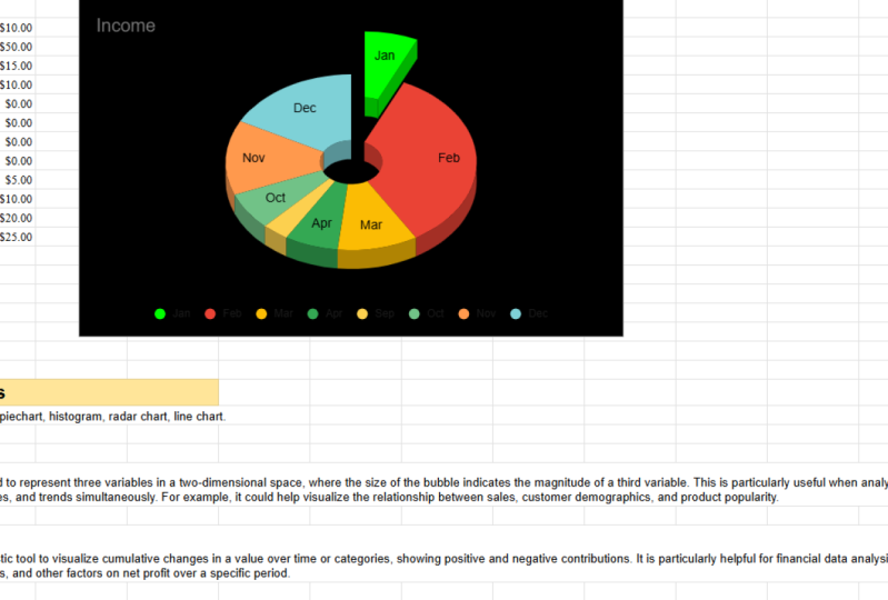
3. Pie Charts: Welcome back to the course on data analysis with
Google Sheets. And I have got to tell you, I am excited for this lesson because we actually
get to jump in and start working with our data. So if you remember in
the previous lesson and I said that I've got
some part-time business. And just for an example, let's suppose that
every time it snows, I get my shovel and
I go sweep snow off my neighbor's driveway
so that they can go to work. And what I've done is
I've created a list with each month that I do this and the amount of
money that I make. And that's pretty cool. It allows us to keep track, but it's not very insightful. We can't really see any
trends or patterns. So data visualization is the
way of quickly looking at our data in a graphical way and drawing insights
from that data. We're not really conducting
statistical analysis, but we're getting
a general overview of what the data is telling us. And once you see how easy
Google Sheets makes this, you're gonna be amazed. All we've got to do
is select the data, go to Insert and Chart. And just like that,
it is going to pull up a chart of the data. Now, a couple of things that
I want you to be aware of. Number one, it's
going to just give you the first chart that
it wants to give you. That doesn't matter
because we can easily change this using the setup menu and
choosing a pie chart. Now, in the next lesson we'll talk about different
kinds of charts, why you might want to use one
chart versus another chart. But the general idea
here is that you can easily change those charts. Another thing I want to show
you before we get started. By default, Google Sheets is going to assume that
we are using headers. So this first row here,
month and income, those are not being included in the chart because
those are headers. It's not using month and income. If we had deleted that, we would want to uncheck the box for headers
because we would want January and
$50 to be included. So as long as
you've got headers, make sure that box is checked. Now, we've got our pie chart. And the cool thing I like about google Sheets is that
took us probably ten seconds and we've already got a decent looking chart now, it's not the flashiest
in the world, but if you were to use
that in a research paper, it would still get your point across and it would
be effective. It will be quick, but we can
really make this a lot more informative as well as just making the chart look a
little bit better as well. So what we're gonna do is I'm gonna take
you through all of the different
customizations that we can do to this chart. The first thing is that we
can change the chart style. We can change the
background color to black. We can change it to really
any color that we want. But here's things
that I really like. We can make it a 3D chart. Boom, just like that, we've already made our chart
a little bit more appealing. Still not the best in the world, but it looks like we've actually
put some effort into it instead of just taking the first thing
that it gets to us. So let's keep a 3D chart. Let's go to the next part, which is the pie chart. And one thing that I always like doing is putting a doughnut
hole in the chart. If you look at this chart, it looks like something from the eighties or
nineties when computers are just getting started and I don't have a lot of
processing power. It just looks like
a wheel of colors. When you put a doughnut
hole in the chart, it puts a little bit
of space in there. It makes it less
cluttered in my opinion. And that's something
that I always like doing with these pie charts.
We can do that. Now, one thing that I
do want to point out is that with these slices, pie charts are really good for showing us proportions
of a whole. So in January we made
27% of our sales. That's cool. But is that 27% of
a million dollars, twenty seven percent of $1. What we can do is we can
actually put labels on the slices themselves
by slice label. And then we want to put value, and that's going to put the
value from this column. So you see in February, $50, we've got $50 here as well. And then the cool thing
is if we change this is going to dynamically
adjust as well. So it's automatically
going to change as we make updates to the
underlying data itself. So we're still customizing this. We are still on the pie chart. We have made our doughnut hole. We've put the labels in there. What we're going to want to
do now is change the slices. So we've got all these
different months, we've got all this income
that we're making. Let's suppose we want to show all of the winter
months in blue. Well, we've just got to
click on the winter months. We can go to February, we can change that to blue. If we didn't want to do it
that way, we could just boom, click on this slice and
change that to blue as well. This is one of the reasons
why I'm teaching this course with Google Sheets because I had thought about
using Python. It's very powerful, open source, it's really great software, but just doing something like changing the title
requires us to actually write code which I think
Google Sheets is a lot more intuitive.
It's effective. There's really a lot of
time-saving involved with Google Sheets to where
Python just wasn't really justified in
this specific scenario. So we've got all of these change to blue to show
the winter months. Now, let's suppose we
had one month that was either really
good or really bad. And we wanted to draw
someone's attention to that. What we could do is
click on that slice and we want to pull it
out from the center. So let's pull that
out from the center. Let's show someone that, hey, there's something really
going on here with this month that we want
to pay attention to. So it's going to pull that out. It's going to show us, hey, pay attention to this month. We can also change
the title again, I don't really just
like this income. Let's go income by month. And you could you could
change that more. You could say income by month
for part-time business. It's off to the left. I don't know why it's
off to the left, but it doesn't
look professional. It looks off off center. We can simply move that
title to the center. And then the last
thing that we can do is change the legend. So right now the
legends on the bottom, and generally I think
that's a good place for it, but if we wanted
to, we can move it to the right-hand side, the left-hand side,
wherever it fits. But in this scenario, I think the bottom is
actually pretty good. I'm not really liking this white background,
so let's go back. Let's, let's put in some
different colors here. Just so everything's a different color because I wanted to, I wanted to have a little bit
of a visual appeal as well. Let's go ahead and
change some of these. And let's change the
background color now. So let's make this black. And what we're gonna have to do, we're going to have to
double-click on this. And what I'm doing is
I'm just going back and everything that I showed you
in this customized menu. We've already covered this, but I'm just showing you
that I can do it just as easily by clicking
on the chart itself. So to change the
title, I double-click. I want that to be white. For the legend again,
double-clicking on that. I want the text
to be white so it contrasts and then width. Let's see, with
these slice labels, let's go ahead and
make them white as well so that they stand out. So let me just go
to my pie chart. Let's go to white here. And now we can see
all of those labels. Everything looks a
lot more appealing. Contrast in this short
to the one on the right. Obviously it looks a little
bit more professional and I'm not by any stretch,
a graphic designer, you can make yours look
absolutely fantastic and customized to your
specific situation. What do we do once we've
actually got this chart? Well, all we have to do is we're going to
click on the chart. And I'll show you on
this white one because it's a little bit easier to see. There's going to be these
dots and we click on the dots and we can then
download that as a PNG, a PDF, or an SVG. So that's the basic way of making a pie chart
and customizing it. Now, in the next
lesson, as I said, we'll talk about different
kinds of charts. But just already you
should be able to see how powerful Google sheets can be for quickly making
effective charts. And I hope you
learned something in this lesson and I look forward to seeing
you in the next one.
4. Correlation and Scatter Plots: Hey everyone and welcome
back to the course on data analysis using
Google Sheets. In this lesson, we're
gonna be talking about visualizing our data, specifically highlighting
relationships between variables using a scatterplot. We'll talk about correlation. I'll show you how
to calculate it super quick in Google Sheets. But before we start this lesson, I actually want to jump back to the previous lesson
because if you remember, we were talking about our snow shoveling
business and we said that in some months
we make more money and we came up with
a great pie chart. I mean, we had a really
good-looking pie chart, but as good as we did
on that pie chart, it didn't really tell us
a lot of information. If we're a business owner, we probably already know which months we make the most money. So what we really want
is something that shows the relationship
between variables. If it's warmer, do
we make more money? If we hire more employees? Do we make more money? One of the great
ways to depict that is through a scatter plot. Scatter plots in at Google
Sheets are super-duper easy. All we've got to do is
select our variables. Now, one pro tip
I will give you, if you've got a 1000
rows of variables, you don't need to go through
and select them all. You simply hold down
your mouse clicker, go from column B to column C. And we're going to
go to Insert Chart. And again, it doesn't matter what chart type it
suggests to you. We actually want to go
down and click on scatter. And what you will see with
this is it will bring up a chart that plots each point. So we can see here this income is $50 when
the temperature is, I guess that would be 25. So it plots each of
these data points and we can see a following
relationship. We can see that as
temperature goes up, income tends to go down. Now, that's the basic
interpretation, but I want to get a little bit more into this because
if you're doing a research paper or you're
trying to explain something, it's helpful to know a
little bit more about the actual names and terms
of what's going on here. So on the bottom of
our chart we have this average temperature
and in mathematics, statistics, we call
this the x-axis. We also call it the
independent variable. In other words, we can't control
what the temperature is. The weather is going to do whatever the weather
is gonna do. It is the independent variable. Now, this, the income
that goes up and down, that is the dependent variable. What's going on here is that as the average
temperature is changing, we're noticing the
income is changing and it's not
necessarily to save it, the temperature is causing
the income change, but rather we're noticing some
kind of a relationship and this graph is depicting
that relationships. So when you are
doing these charts, what I'll tell you is that
the column on the left, that is going to be your x-axis, that is going to be your
dependent variable, that is going to be the variable that goes on the bottom here. So if we pull up the chart, what you can see is it says the x-axis is going to
be average temperature. Now you can flip this around. If you get your
charts messed up. If you get your
columns out of place, you can totally move that
around if you want to. But we want the x-axis to
be our average temperature. That's a very simple graph. Now of course, you
can go through, you can customize this, you can make it look all fancy just as we did
with the pie chart. By this point, you
understand how to make the chart look
more appealing. I really want to focus now on the interpretation
of these charts. So it's showing us correlation. And just looking at this, we can see that there does
appear to be a relationship, but we want to be a little
bit more accurate than just kind of eyeballing
things. Good for us. There's actually a
statistical measurement that shows the relationship between two variables
and that is known as the correlation
coefficient. The correlation coefficient
is designed to fall somewhere between
one and minus one. Let's start with 0. A correlation of 0 means there's absolutely no relationship
between the variables. It's completely random. Positive one means that there is a perfect relationship
between the variables. If one goes up by one, the other goes up by one. If it goes up by two, the other goes up by two. Minus one is a perfectly
inverse relationship. So if one goes up by one, the other one goes down by one. If one goes up by two, the other one goes down by two. And in reality,
you're very, very, very unlikely to ever see a perfect one or a perfect
minus one or a perfect 0. In reality, it's going to
fall somewhere in-between. How do we calculate this
correlation coefficient? Well, the good news is that Google Sheets makes
it incredibly easy. We just go down to
our functions tab, statistical and we
are looking for the one that says CORREL. It's going to bring up a
little function for us. We click the first column
that we want to go in, and then we click
the second column, make sure you put a comma. So sometimes when I did that, I wasn't putting a comma
and it wasn't working. You want to make sure you
put a comma to separate them and it's going to generate the correlation
coefficient for you. So in this case we
are a minus 0.81. In other words, that is a very strong inverse
relationship. So that confirms what
we're seeing on the graph as temperature goes
up, income goes down. And just to wrap this lesson up, the scatterplot combined with the
correlation coefficient, is used to depict the relationship
between two variables. Do they move together
in the same direction? Do they move in
opposite directions? If they do move in
the same direction, is that a strong relationship
or a weak relationship? When you're doing this research, you want to offer a
little bit of insights. So this here is a very
strong inverse correlation. Does that make sense
to us as a researcher? Of course it does. Our business is
shoveling snow and snow only comes when
it's really cold. So it makes intuitive sense why there would be a
strong correlation. On the flip side, maybe if we spent more money
on advertising, maybe that wouldn't be as
strong of a correlation because it doesn't explain
everything that's going on. Maybe the weather is a
stronger correlation and you could do correlation with any number of
different things. How many employees do you have? How much did you invest
in new equipment? But the key takeaway
here, just to wrap it up, is that scatterplots
are a great way of depicting correlation that
you can use in your research.
5. Creating Histograms: Hey everyone, and welcome
back to the course on a data analysis
with Google Sheets. And if you remember from
the past few lessons, we've been creating some
really useful charts, pie charts, scatter plots
to describe our data. But when we've been doing that, we've been using
really small datasets 12 months in a year for our snow shoveling
business, for example. But what if we've got 3 thousand data points or
a million data points? Well, as you can see here, creating a pie chart with 300 data points
gets really messy, really fast, and doesn't really give us any usable information. So what we need is
a chart that takes a huge dataset and breaks
it into a meaningful, usable chunks, and
that is exactly what a histogram
is designed to do. So in Google Sheets we create a histogram just the same way
we create any other chart. We select our columns, we go to Insert, we select the chart and
then the difference is that we select the histogram. And what you can see is the histogram
condenses that data. But I want to explain what's
really going on here. Because we went from all
of these data points to just 15 different columns. What a histogram
does is it divides your data into bins
or buckets or chunks. You'll hear different
terms used depending on what kind of statistics
textbook you are using. But it means the same thing. Basically what it's doing
is it's saying, okay, any data point between 50.4453, you're not getting
plotted individually. We're just adding
you to this bucket and we're going to plot
all of you together. That's exactly what it's doing. If you are between a 53.4456.88, we're putting you altogether. What this does is it
condenses the data, it makes it easier to read. It has additional uses for showing the distribution
of your data. And as you get more
into statistics, you'll know that various
statistical techniques require the assumption
of normality. And basically that
means that your data approximates the
normal distribution. A histogram doesn't prove that, but it can give you a
quick estimate whether or not your data is indeed normal. So obviously this
dataset here would not be a normally
distributed dataset. But again, that's something
for in the future right now, we're just looking
at the histogram and I've shown you in the past
how to change the title, change the colors, do some various things to
make it appear nicer. But there's some
things we can do with a histogram that
we can't do with the pie chart or
a scatter chart. And not only do they change
the appearance of the data, but they changed
the interpretation. So I do want to
cover those points and I'll try to skip over the things that we've
already covered. So Chart style, you already
know how to adjust that. The histogram under
this tab we have the ability to change
the bucket size. So by default, it automatically calculates
the buckets for us. And there's a whole formula that determines how many
buckets you should have, how big each bucket should be. But what we can see
here is that it's giving us some
weird odd numbers. 63.7570.63. That's not very intuitive. That doesn't look,
doesn't look very sharp. So let's change the
bucket size to five. What this is doing now is it's saying every five we're
gonna make a new bucket. So if you're between 5055, you go in this bucket. If you're between 5560,
you go into this bucket. It makes it a little bit
easier to interpret that data. Now, you can change the
buckets to whatever you want. You can go up to
a bucket size of 50 or a bucket size of one. But here's what you notice. As you go up to a
huge bucket size, you lose so much
information because that is a huge range
within your chart. On the flip side, if you go
to a bucket size of one, you get a little
bit more insight. But again, you're dealing
with more data points. So within reason you
can adjust this, you can change it personally. For this example, I think five
seems to be a really good. We can change the bucket size. Now another thing that's gonna be really helpful for us is not chart and access titles because you
know how to do that, you know how to
adjust the series. What we want to adjust
is this horizontal axis. So what we can do with
this horizontal axis is what we can see is that
there's minimums and maximums. So just for an example, let's say that we know that any arrow that we
shot less than 50 meters, we don't even want
to count that that was we probably did
something wrong. We probably messed it up. So we're going to go
ahead and let's put a minimum of 55 in here. It's going to cut off
any of that data. Or let me give you
another example. Let's suppose that
We're a professor, we are grading exams
and we know that we never give a grade that
is higher than a 100. We don't do bonus points, we don't do anything like that. So if we've got a value that is higher than a 100 and we want
to get rid of that. We can set the max
value to 100 and it's going to cut that
portion of the data off. So if you've got lots
of data and you're only wanting to show a
specific portion of that. You can adjust that through
the horizontal axis. Now, just as we can adjust
the horizontal axis, we can also adjust the
vertical axis as well. So the vertical axis, we can see here that
there's some of these that don't really have a
lot of data in them. So between one hundred
and one hundred and five, we don't really have a lot of data points and we might think, do we really need a whole
been just for that? Well, what we can do is we
can set a minimum to ten. And what that's gonna do is it's only going to show
us those bins that have more or ten or
more data points that are inside them. So you can adjust a whole
lot of different things with the histogram to make
it more visually appealing. But the big ones, the impact the interpretation of the data
itself are those bin sizes, your number of bins, and
then your Min and max. So I hope at the end of
this lesson you are able to understand how histograms
can be so important. A lot of the ways that
they can describe data when a pie chart or a scatter
plot wouldn't exactly work. As always, I like to thank
you for joining me in this lesson and I look forward to seeing you in an excellent
6. Depicting Multiple Variables: Hey everyone, and welcome
back to the course on data analysis
with Google Sheets. In today's lesson, we're
gonna be looking a little bit more at charting and
data visualization, specifically in terms of
comparing two different groups. So let's suppose
that we're doing a very basic experiment and we have a plant that
we're trying to grow. And we've been growing this
plant for several months. And in month one it
doesn't grow at all. Month two, it
doesn't grow at all. And then it starts growing
a little bit at a time. Well, we can see that it's very helpful to show this progression over time so we can show our plant growing
and as you remember, we can easily customize things. We can change the title
just as we learned how to do in the first
charting lesson. Now, this is pretty cool, but it's just one variable. If we're doing some kind of an experiment or a comparison, we probably want to show
more than one category. So maybe one plant, we just use water and sunlight, that's all it yets. Then maybe we've got
plant to plant two. We use water, we have sunlight, and then we also give fertilizer at the very start of when
we begin growing it. So how can we show the
difference between the growth rate of
plant one, plant two? Well, what do you know? Google Sheets makes this incredibly easy because
all we've got to do is enter a second
column for plant too. Let's go ahead and make
sure we put the two there. And we're just going to
make up some data here. Of course, let's pretend
that it grows at a significantly higher rate because it has that
additional fertilizer. So all we have to do if we want to show the
difference between these, again, super easy, we just
select all of these columns. Remember what we want this far left column that
is going to be our x-axis. So this is the time in months. This is how much each
plant has grown per month. We're gonna go to Insert Chart. And it automatically suggests the chart that it thinks
is most appropriate. So you can see it's
color-coded here and we see that plant to significantly
outperformed plant one. So we can show that in
terms of a line chart. Another way that
we can do this is through this column chart here. So you can see it
during month, one, month to plant, to grow, plant one that did
not grow at all. So that's just a useful
tool for comparing. And again, you can think of multiple situations where
this might be useful. You might be trying to
compare salaries of different groups that went to college versus
didn't go to college. You might be trying to compare
any number of variables. But the cool thing is that
Google Sheets makes it incredibly easy to
quickly visualize this. And I hope this is a technique that you can use in
your own research. I'd like to thank you
for joining me in this video and I look forward to seeing you in the next one.
7. Line Graphs: Hey everyone and welcome
back to the course in data analysis with
Google Sheets. In today's lesson, we've
got an awesome tool for showing the changes
in a variable over time, or for showing how
one variable changes in relation to another variable. And that tool is a line graph. Now, the line graph
is really good for showing how things
change over time. And just to use an example, remember, at the
start of the course, we had this business
where we were basically shoveling snow out of our neighbor's driveway and we did a pie chart
and we could see that the months that we made the most income was
January and February. But what if we
didn't want to know just the months that we
made the most income, but is there some
kind of a pattern? Is there something that can help us maybe plan
our business better? Well, the line graph is a perfect tool for seeing
wind patterns happen. So we're going to basically
select all of our data. We're going to insert a
chart and Google Sheets is really cool because it
automatically knows, hey, you should probably try a line chart now if it
didn't give us a line chart, we could easily select that
from the drop-down menu, but it's already selected
line at chart for us. And this is why line
charts are so awesome. Because we can see
here a pattern. It looks like the letter W. And we see that in
January and February we make a lot of money the
summer we make nothing. January, February, we make a lot of money the
summer we make nothing. So it's really good
for showing patterns. Now, obviously this is a
simple business example. We know we're gonna
make more in the winter because the winner is the
only time that it snows. But maybe you're in
some kind of a business where it's not that
straightforward. Maybe you have a restaurant and you don't know what days
you get the most customers. But by plotting
this, you see that, wow, every Friday and Saturday, we get the most
customers that can help you for planning
your business. Now, what we see here, Google Sheets does
an awesome job just giving us a pretty
good graph to start with. But there's one thing that
I really want to show you that can really help out. And what we're seeing here. We can see there's a pattern, but we don't really
have any values. We don't know how much we're
making in March or February. We're kind of having to guess. What we can do is we go to this customized and then Series tab, and we scroll down and we
check the data labels. And this puts an actual value on each of these data points. And there's one other tool
that I do want to show you, but it's better that we do
that with the next example. In this example, forget about the snow
shoveling business. Now we are studying and let's suppose we're
doing it by month, every month that we study. We do a little experiment. So one month we study one hour a week and we get a GPA of 2.5. The next we do two hours of study and we
get a GPA of 2.6. And what we want to do, we want to see what's the optimal amount
of time to study? And this is why I
want to show you how a line graphs
can be so important. So if we were to just do a
correlation coefficient, remember from the Scatter,
scatter plot example, the correlation
coefficient shows us that if one thing goes up, the other thing goes
up, or it goes down, it shows the relationship
between two variables, but it just gives us
a numerical value. So what we wanna do
here is let's go to statistical and let's go to the correlation
coefficient here. What we're gonna do is we're
gonna do hours of study. We're going to do the
correlation coefficient for that against GPA. What we're seeing is there is a 0.915 correlation coefficients. So if you're looking at
this, you're saying, Wow, every additional
hour that I study, my GPA is gonna go up. So I should just study a 100 million zillion
hours and I'll have the highest
GPA in the world. But if you were just
looking at the numbers, you would miss something
very important, which is what I want
to show you when you visualize your data, you can see things that simple numerical
analysis can miss. So we're going to
go ahead and we're going to insert a chart here. And it is going to give
us the line graph. Now, with this line graph, I want to show you something
really interesting. First, we're going to add
in as I showed you in the previous example,
the data labels. And we also want to add in a trend line and it
shows us that yes, the overall trend is up, the more we study, the higher our GPA gets. However, this is
what you would miss with a simple
correlation coefficient. We noticed that there's
kind of a breakpoint. There is a situation in which additional study actually
decreases our GPA. Maybe we study for nine
hours were feeling great. But then by time we get
to ten hours of study. Brain just can't handle it
anymore and doesn't want to study its tired of
looking at the material. So our GPA actually
begins to go down. And that is something that
we would miss if we were simply looking at the
correlation coefficient. So as you get more
advanced in statistics, you will learn the power of statistical tests and analyses. And they're really good. But you always want to
double-check and do a simple data visualization because it can
show you patterns, it can show you things that number crunching might
miss from time to time. So the line graph is great for
showing changes over time, as well as the changes in one variable in relationship
to another variable. So hopefully this
is something you can use in your own research. It's been a pleasure
having you join me in this class and I look forward to seeing you in the next one.
8. Radar Chart: Hey everyone, and welcome
back to the course on data analysis using
Google Sheets. And I've got to tell you, I'm excited for
this lesson because we're talking about
a radar chart. And a radar chart is a
fantastic way for showing the relative importance or relative weight among
multiple different variables. And I know that probably
sounds confusing. So let's go with an example. Let's suppose that you
are considering starting a brand new restaurant and you want this restaurant
to be amazing. You want this to be the
best restaurant ever. And as you think about it, you start to ask yourself, well, what would make this
the best restaurant ever? And you say, well,
low cost customers don't want to spend
a lot of money, and that's probably true. But then you ask some of your assistance and
they say, Well, customer service is probably
the most important. And then you think about
it and you say, well, a big menu selection
that's also important. I don't want to just
have one or two choices. I want everyone
to find something on the menu that they can enjoy. You could come up
with any number of characteristics
such as the hours that your restaurant is open, how much you spend
on advertising. But you want to find out
which of these you want to focus on improving because there's only so many
hours in a day, there's only so much money. So you can't improve all of
these 100% at the same time. So you've got to
make some choices. So which of these is
the most important? Well, to answer this question, what you do is you come up with a survey and you
simply ask customers, you tell them you've
got a 100 points. Allocate those 100 points among these different categories based on which is most important. And after you do this study, you get the following data. In order to visualize that, we're going to go with
Insert and Chart. And again, Google
Sheets is going to give us what it
thinks we need, but we're really looking
here for a radar chart. So we're going to scroll down. And what you can see with
this radar chart is it does a great job of plotting
these different categories. So it's got ads, It's got costs, customer
service selection and hours. And the thing that I
liked so much about this, because it really shows us where we should
focus our efforts, cost, and customer service. We can tell that those
are most important to our customers now adds,
they're definitely important. But if we only had limited
time, limited money, this shows us that we would be better off focusing on cost, customer service and possibly selection down there
in third place. Now, one thing that I do
want to show you with this, and it's totally a
personal preference, but I do not like how it
rounds at these edges on this, you can see how it kind of, um, has an RP to this. I
don't really like that. I like unchecking that
smooth box because it shows the data being
connected a lot more smooth, lot more realistic
in my opinion. Now, let's suppose that we have a situation in
which we're comparing. Maybe we've done two
different studies and we have two different restaurants in different parts of the city. And we want to see the
difference between customer preferences for the
survey one and survey too. Again, it's just the
same as when we were adding multiple charts
for the line graph. I think it was that
we were doing. We're gonna go ahead
and delete this. We're gonna select all
of these columns and remember this first column here, that is always going to be
basically our index column, that's gonna be our
dependent variables. So we've selected all of these, we're going to insert a chart. And again, we're going to
scroll down to the radar chart. And what you're gonna see is it's basically
just going to plot these charts on the same graph. And what we can see is
that in the first study, we have the cost being most important and
customer service. And we see that we
have similar results with the second study. But we see in the
second study that ours actually takes on a
little bit more important. So the cool thing about
radar charts is it shows us an easy way of visualizing
the importance or the relative weight
of different variables. But it also allows us to compare that between different studies. Radar charts,
probably not one of the most important charts. You'll see a lot
of line graphs and scatter plots, histograms split, although it's not
the most used chart, it's still very useful
in the right situation. And hopefully you
can use this chart in some of your
research as well. So as always, thanks
for joining me in this lesson and I
look forward to seeing you in the next one.
9. Conclusion: Hey everyone, and welcome
back to the course on a data visualization
using Google Sheets. This is the final
lesson in this course. What I wanted to do was wrap up all the concepts that
we have talked about. If you remember in
the very first video, we said that the goal
of this course was to describe and
understand the story that our data was
trying to tell us without doing a whole
bunch of crazy statistics. And in order to
accomplish that goal, we introduced several
different types of charts. Now, you've learned throughout this course that Google Sheets makes it super easy to
create these charts. So creating the charts is easy. What we really need to focus on is when to use one chart versus another chart and interpreting those charts and what they mean. In this final lesson, I
just wanted to go through a really quick refresher
of the different kinds of charts that we've covered
and when they are used. So first off, we
have the pie chart. And the pie chart
is best for showing parts of a whole when
the dataset is small. So if we've got 12 months
in a year and we want to show the months that have the most sales
for our business. A pie chart could be a
great idea for that. Now, if we've got 300
or a 1000 data points, we might not necessarily
want to use the pie chart. So when you think
of a pie chart, I want you to think
that we are showing the parts of a whole. A scatterplot is great for showing the relationship
between variables. For example, how does
our grade point average change as we study more
or as we studied last? So whenever we're trying to show an association
between two variables, that scatter plot
should be one of the first charts
that we think of. A line graph is
great for showing the change in value over time. Or it can also
show the change in one variable related to the
change in another variable. So for example, one of the first things that comes
to my mind is if we are doing some kind of an
agricultural experiment and we measure how tall our crops are growing in
every single month. We can show that change over time by using the line graph. But what do we do if
we've got a huge dataset, 300 or 3 million data points, we can't fit them all
on a scatter chart. We can't fit them
all on a pie chart. What we can do is we can
place them in a histogram. And what the histogram
does is it breaks our dataset into usable,
manageable chunks. Histograms are great for showing the distribution of our data, especially when we've
got a huge dataset. Also, we have the radar graph. And the radar graph
is great for showing multiple variables on one graph. So if we wanted to show
a new restaurant and we wanted to show how
customers value different attributes
of that restaurant. We could easily depict
this on a radar graph. So at the end of the day, the key to data visualization is using the right chart
for the right job, but also being able
to interpret and describe what that
chart is showing. So that's a quick review of what we've learned
in the course. But now I'd like to take just a brief minute to give
you a sense here. Thank you for taking
part in this course. I hope you found it useful and I wish you the best as you
continue your learning journey.
 Robert Reed