Transcripts
1. Class Introduction: Hi, and welcome to the class. My name is Amber quadrats. I am a Design Director and I work in Los Angeles, California. Give yourself a pat on the back for taking this class and investing in yourself. I started my career as a print designer. So that meant doing a lot of multi-page layouts. I did annual reports, I've done book design. So for those types of projects, grids are essential. I really don't know how I would get through a 450 page book without having a grid structure to keep my layout consistent. However, you can use grids if you're not doing a huge book project, they really are for every design project. And I think once you start using grids, you're going to wonder how you ever designed without them. For this class, we're going to be creating a gallery style poster. This is going to allow you to explore the freedom and flexibility that grids provide. Thank you again for taking this class. I'm really excited to share some of my InDesign tips and tricks, how to set up. And we're going to have lots of fun doing it. So thank you so much and let's get started.
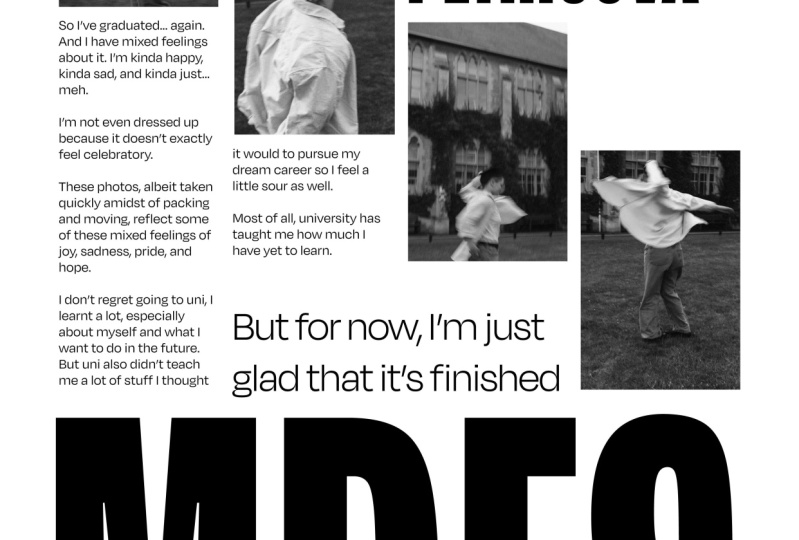
2. Class Project Description: Let's have a chat about why I chose to do a gallery style poster for this project. First of all, I coined into galleries or poster because I want us to use images or graphic shapes. The reason I'm doing this is I want to take out the element of typography just for now because that is such a huge subject in and of itself. So I want to eliminate that design element so that we can just focus on proportion and the rhythm of our designs using basic shapes. Also, a poster is simply one page, so you don't have to worry about a multi-page layout. That is something that you can practice on and work your way up to. Once you get comfortable using both horizontal and vertical grids. And a poster is a great portfolio piece. So if you create something that you really love and you're proud of, feel free to use it in your portfolio. You could even print out and hang it in your house if you want to. So those are the reasons that I decided to use this gallery style poster as our project. And I'm going to be doing in this project along with you. So not only have I created the class, but I'm also completing the project. And to see step-by-step how to approach this. And the things that I would do, my designs.
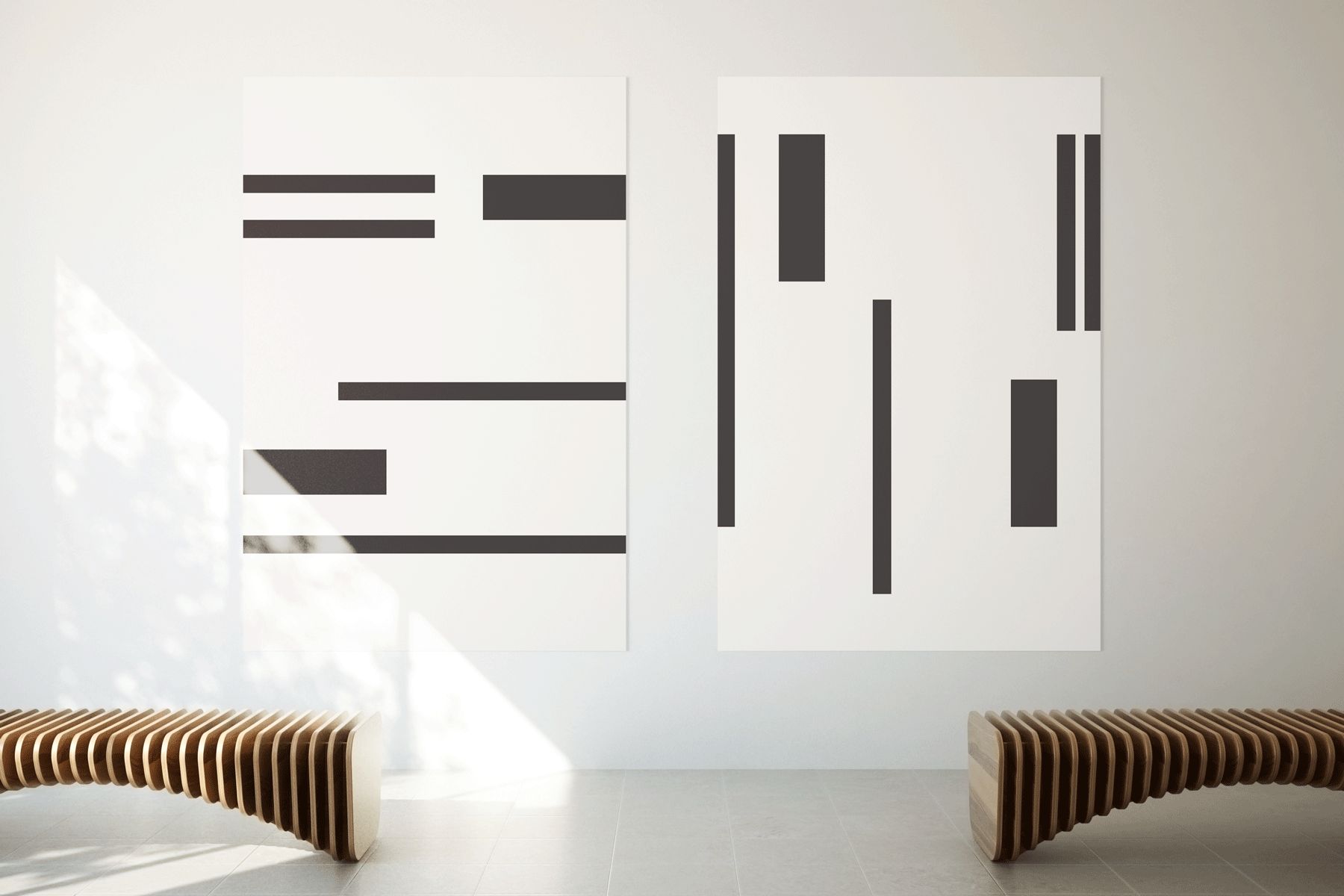
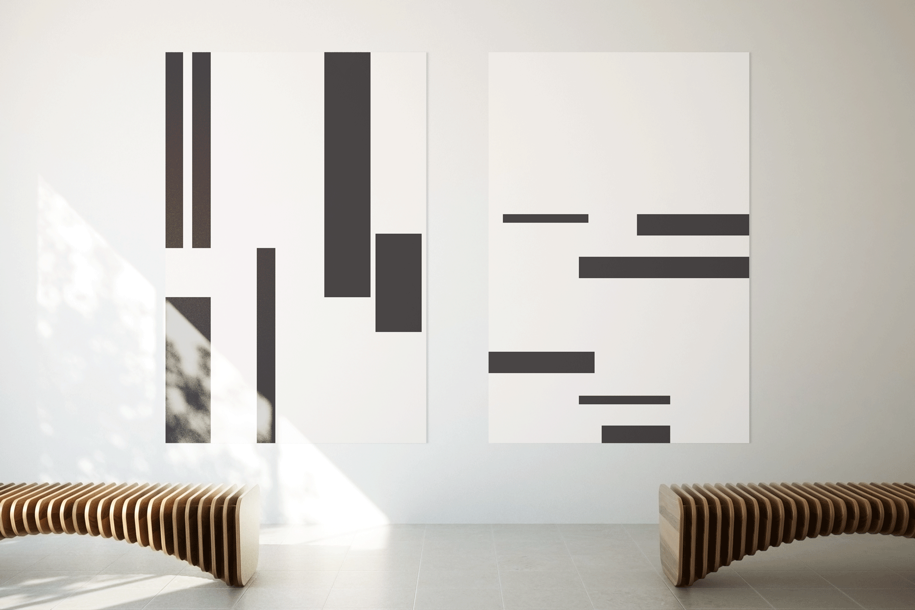
3. Why Use Grids: So now it's time to talk about why you should be using grids and why they're so important in your designs. I need this class how to use grids. Designing with intention. Designing with intention means we thoughtfully consider each design element before occluding it. Hard designs, we are simply not just throwing things on a page, moving them around and hoping that things will work out and hoping that the layout is good. Designing with intention means that we're approaching design as a craft. And we are using the tools at our disposal. Grids are a tool that helps us approach design with intentionality. So besides, grids being a tool that helps us to design with intention and place things on a page based on rhythm and structure. Are there any other reasons why you should be using a grid? Simply put, grants provide a starting point to organize your thoughts and find a functional and aesthetically pleasing design solution. I think the key here is grants providing a starting point. There are many times that we start projects with a blank page and simply stare at it and don't know where to begin. A grid immediately gives you a place to start. But don't just take my word for it. There's an excellent book about grids by Joseph Muller-Brockmann. He says, a grid creates a sense of planning, intelligibility. Clery suggests orderliness of design. Disorderliness adds credibility to the information and induces competence. So to recap, using a grid gives your work organization, gives her work Clery, intelligence, orderliness. Here's a credibility. Gives your work competence, precision, and timelessness. Because of these reasons. This is why you should be using a grid. These keywords are the reason grids are so important to your design. Also, using a grid creates more aesthetically pleasing designs. So why are grids not use more often? I have worked in a lot of different places and worked with a lot of different designers. And I'll tell you, a majority do not use credits. Or if they do, they're not using them to their full potential. I think there is this misconception that grid or restrictive. And they place too many constraints on creative freedom. In my opinion, that is wrong. Grids are incredibly flexible, customizable, and provide multiple solutions to a design problem. They free you to explore. Now, here are a few examples of some posters that I have pulled that use a grid structure I could clearly identified. And this is the type of project that we are going to be creating. These are great examples of what I call a gallery style poster. Here is another page with designs. These are a little bit more complex because they feature a lot of typography. But you can still see that there is a clear current structure in this work.
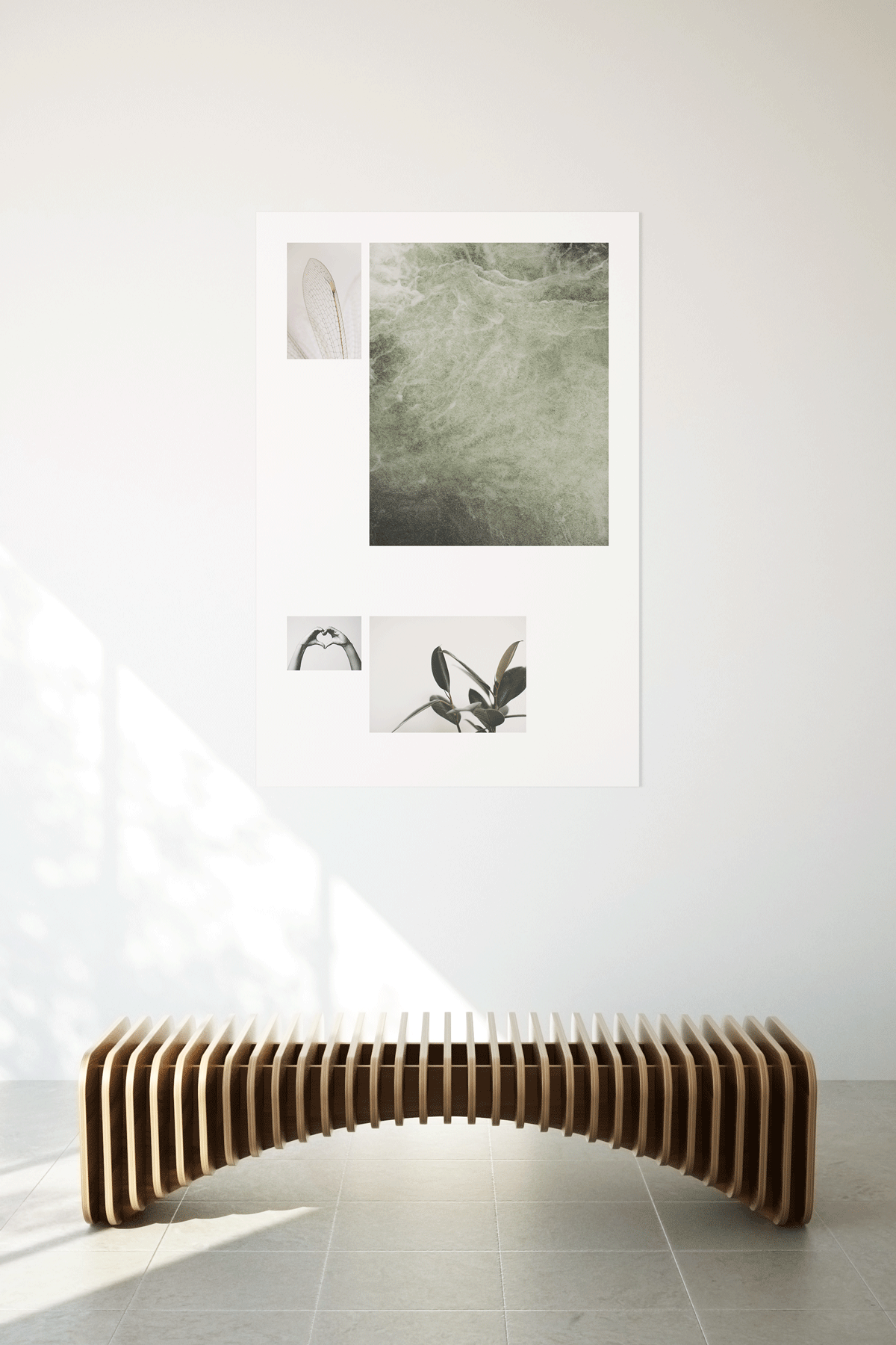
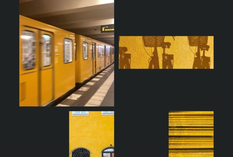
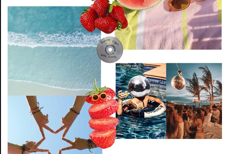
4. Project Prep: There are a few things that you can do to prep for this project. If you do these things in advance, I think it really set you up for success. And you know, the process is just as important as the end product. Ok, so first choose to design a gallery style poster or a graphic style poster. Of course, you can change your mind, but it's a good idea to have a sense of what you're gonna do before you dive in. Now if you choose a galleries tau poster, it's a good idea to find five images that tell stories share a common theme. Similar color palette. This way, your work will feel consistent. And perhaps there is a narrative that can come into a concept and tie your poster together. So for example, these are some of the images that I am choosing to work with. I'm basing this more on a color palette and the feeling. As you can see, green tones, muted tones are prevalent. Okay? I highly encourage you to do some sketches and set you up for success and help you to get familiar with using credit structures. So first, keep in mind the size that your final posts will be and sketch to that proportion. So this right here represents a 2.2.3 proportion, which is what my poster is going to be. I then determined that I wanted to have a lot of grid cells, which are these individual cells here. So I decided to do for this gives me a lot of design options. And I wasn't mathematically precise measuring these out. And I simply eyeballed it. Again, kept the proportion of the same. So at least that would be consistent. So sketch out your grid structure on plain paper. And then what I like to do is take a piece of tracing paper and lay it over your grid structure. This way you're able to sketch out multiple layout options on tracing paper. And you don't have to draw your grid structure over and over again. You know, if you do want to try, say, three columns, five columns down, things like that, you're definitely experiment with that and sketch out several options for that. But really the key here is sketching these layout options. I think this will help you in the long run. And it's a really quick way to see how the rhythm is flowing, how the proportions work together. If it's balanced, how the whitespace interacts with your object or your imagery. Please feel free to post any questions you might have on sketching or process.
5. Setting Up Your Grid: Okay, we're going to get started setting up our poster and our grid structure in InDesign. So go ahead and get a new document started. There are a few things I'm gonna go over in the preset details. First of all, I want to be working in inches as the US measurement. Please feel free to work and whatever unit you're most comfortable in. I'm also setting up my poster to 12 inches by 18 inches. This is a two to three ratio. So it scales up nicely to a 24 by 36 poster. If I wanted to enlarge this. And it's a common frame size. So if you create something beautiful that you love and you want to print it out and frame it. It's perfect for that. Ok. I have facing pages turned off because we are only doing a one-page layout. Now I could go ahead and set up my columns and margins in this area. However, I like to visually see the proportions when I'm doing this. So I tend to leave this as the preset, 12th, 18. I'm going to show you a little preset that I like to do, which gives a lot of windows open. I like seeing a lot of tools in my documents. So right up here, there's a little drop-down menu, and typically it's just set essentials. Now you can see when I set it to the essentials, it brings my windows down to just pages, links, and layers. Truly not a lot over here for me to work with. So I set it to typography. This is the one study that I find gives me the most tools and windows that I use on a day-to-day basis. Okay, we are going to start to set up our grid using the master pages up here as opposed to the pages down in this area. Now the reason that we're using master pages is because a master page is basically like a template. So whenever you put on your master page will automatically apply to the pages below. You know, you're working pages. I already have my a master setup. So I'm gonna do B Master just so I can show you my process of setting up my credit. First thing, I want to change the margins and the columns. So margins and columns doesn't sound super exciting. However, you can actually start to put some of your concepts relate to your photography here. So for example, my photography that I've chosen is very minimal and feels light, airy, feels a bit more sophisticated. So I want ample whitespace because to me, whitespace skills, berries, luxurious, it feels very spacious. And those are the towns that I want to convey. So think about what can you convey with your margins and columns? Do you want it to be expansive? Zhuan, it made me feel a little tighter. Join it, symmetrical, asymmetrical. These are all things that I already have my a master setup. So I'm gonna do B Master just so I can show you. My process of setting up my credit. First thing, I want to change the margins and the columns. So margins and columns doesn't sound super exciting. However, you can actually start to put some of your concepts that relate to your photography here. So for example, my photography that I've chosen is very minimal and feels light, airy, feels a bit more sophisticated. So I want ample whitespace because to me, whitespace skills, barrier, luxurious. It feels very spacious. And the towns that I want to convey. So think about what can you convey with your margins and columns? Do you want it to be expansive? You wanted me to feel a little tighter. Joint. It's symmetrical, asymmetrical. These are all things that can start to speak to your concept. So for me, I'm gonna do an inch on the top. I want to do an inch left and right as well. For the bottom, I'm going to add a bit more space and add three-quarters to manage so many won three quarters. The reason I'm doing that is because I want things to sit just slightly higher than it might sound super odd, but when things are mathematically centered, visually, they feel lower to us. So I add a bit more on the bottom to bump things up slightly. So that optically things are blind that way to center as opposed to mathematically aligned. I have decided that I would like 32 grape fields in my page. Now this is a lot, this gives me a lot of options and a wide range of solutions for my layout. So I'm gonna do four columns. I like this because it's symmetrical and it can also be divide it down to two columns. It can also be subdivided out to 816, giving you limitless possibilities. So keep on keeping up for I would like my gutter to be a bit wider than what I would normally do for a typographic layout as want to fit more space between my images. So I'm going to set it to a quarter of an inch. So we have our vertical grids, which I think most people are probably familiar with. You've probably worked with them at some point. However, we are going to add horizontal grids where things get interesting and to me more exciting, because it really starts to add rhythm to your design. Again, giving you more layout options. And given you a great place to start, you can really start to visualize your designs Once you start subdividing horizontally and vertically. So go back up to layout. What you're gonna wanna do is go to Create Guides. So this will come up. Like I said, I want 32 grid fields. So my number of rows is going to be eight. I want my gutter to match the gutter for mine vertical grid. So I'm setting that at a quarter-inch. For this option, fit guides to I'm fitting it to my margins because I do not want to work outside of those. You could also set it to the page. But as you can see, it starts to set the division from the very top of the page down. Send it to the margins. It starts to Division at the top of your margins. So that's what I typically set this to. Ok, so here is my page with my 32 grid cells. This area is the grid cell here. And I think you can already start. And to see how by using this horizontal and vertical grid structure, you have a lot of options for placement of your images and graphics.
6. Poster Layout: Computer glasses are on, it is time to start designing. I'm going to show you options that I've done based on my sketches, simply using images to create that galleries style poster. This is one, this is another. So you can already start to see variety of layout options that using a grid gives you. When I was starting to lay this out, I first put my little sketches, suicide here. I'm really hoping that you took the time to do some of these sketches. It really is a quick way to see how your compositions are working to get ideas out. Alright, so I've laid out basically this layout and layout. And you can see actually that I decided to break the grid a little bit here and have this image lead off of the edge. So breaking the grid is totally fine as long as you have the grid established, I like the same. You know, you have to know the rules before you can break them. So set your grid up first and then start to play around with how you might break it. This layout here was based on foods. And I think this sketch here, I decided to add another image up here. And I liked the play of the whitespace. Whitespaces, so important, the space around objects define it as much as the inside of the objects. So keep that in mind when you're laying things out, I'm going to start to create a whole layout. I think what I'm gonna do, I'm gonna try to the large image here on the bottom. Let's see how this clock image is going to work down here. So I'm going to pull down Shift Option Command, pull out the corner. So proportionally scale inside of my dream, I feel like that's not going to work very well as an image at the bottom of the paper. Just because clocks tend to be higher up or at eye level, feels odd to me to have it down here. So I'm gonna go ahead and move it to the top of my poster. And already I think that feels a lot better to quickly create multiple frames like this. It's actually really easy. So what you're gonna do is go to the frame tool. I'm going to go ahead and leave my grid off at the moment. It's easier to see dried out of frame as you normally would, click the arrow over key. And you can see that it automatically creates multiple boxes for you. This also works vertically. If you push the arrow up, it starts to add the boxes vertically. You push the arrow down, takes him away. Push the arrow left. Again, it takes more. So arrows right, left, up and down. Use that when you're driving out your training tool. And it automatically creates multiple frames for you, which is a big time-saver. Let's go ahead and see what images here will look like. That one a little bit bigger than that one, a little bit more narrow. My hands image here. Suppose like it's fitting nicely within the frame and like that color story too, roughly the same size. Actually think that dynamic is really nice how they're both lee, needed to each other like that. You can really see how many Atlas options are available to you using a grid. We already have three layouts that are completely different. Let's talk super fast about how to create a graphic style poster instead of one that just uses photography. Here's my grid. I'm gonna go ahead and do rectangle. Little trick I told you about where you drag out your bounding box. Push the arrow, right? I'm gonna push for here. I'm going to leave them. Great. So it's easy to see. And I'm simply just please boxes in my grid structure. And that is a really quick way to search created graphic poster. Again, you have Emma's options of how this could play out. But since you do of the grid structure and you do have that starting point, so you're not aimlessly placing your objects. So I hope you've enjoyed this demo on creating all these wonderful different layouts using either photography or simple graphic shapes.
7. Wrap Up: Alright, we have come to the end of our time together in this class on how to use grids, designing a detention. I really hope that you've learned a lot about using grids and maybe a way you hadn't thought of before using them in both horizontal and vertical format. I really hope that you remember some of the things that I went over about why grids are so important in your work, that they give your work credibility. They give you a work organization, and they induce competence in your design work. I think you'll find that if you use grids in contract, you will start to see your designs elevate and become more sophisticated. I also really hope that you've loved the poster that you created for this class. And I hope that you will join me again in another one of my classes. Thank you so much. Bye.
8. Bloopers: So let's get started. So you moved onto the next alright. The glass.
 Amber Podratz, Design Director