Transcripts
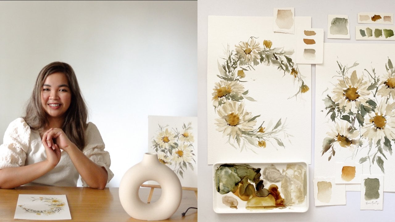
1. Welcome to our class!: Hi, everyone. My name is Jenny. I'm a watercolor and calligraphy artist based
in the Philippines. Today I'm going to
share with you how to take and edit an aesthetic
Instagram photo. For today, I will be sharing
all the materials that I am using when taking
Instagram photos, all the apps that I'm
using in order to edit and glam up my
Instagram photos. Also, I'm going
to share with you the reasons why you should consider taking your Instagram
photo into the next level. What are we waiting
for? Let's go.
2. Why it's important to post aesthetic photos?: Now, the number 1 question
that my students ask me is, how do we really
take good photos of our creation for
Instagram purposes? Taking good photos is not as complicated as people
thought it is. Sometimes we, the
creators are the ones that make it a little
bit complicated. I don't know why we do that, but it's easy, it's simple, and we should not
complicate things. Now, before we dive into how, I'll discuss the why
and the what for this. Why is it important to have
a good photo on Instagram? Number 1, because people on
Instagram are very visual. The first thing that people will really see and the first thing that
will really catch their attention is not the
number of likes or the number of comments or who posted it, the first thing is
always the photo. The second reason
is it's your bait. Like Clickbait,
it's your bait for people to check on your profile. Now, I'll discuss more
about that later. Number 3, your photo is your hook for people to
stop and read your caption. When people read your caption, it's a chance for an engagement and a chance for people to
follow your call to action. Basically your photo is actually the king of your
Instagram account. It's the starting
point of everything. That's the reason why
it's very important.
3. What are the tools needed / suggested?: What are the things that we
need to take good photos? Before that, please note
that all links related to the materials that I will
suggest on this part, will be available under
description of this class. You don't have to ask me because everything is
under description. Now first is camera. You need your camera or phone camera to take
good photos of course. For a camera, I am
using the Sony ZV-1, and it's I think the newest
vlogging camera from Sony. I got it last month, but it was released last 2020. I love this camera. It's very reliable
and it's very handy. It's so lightweight and it produces high-quality
photos and videos, but I usually use it for videos. In fact, it's one of the best vlogging cams
released in 2020. But again, I usually
use my phone camera, so for phone, I
use my iPhone 11. It's very reliable, and it's so easy to carry
and so easy to use. I personally prefer a phone
camera because it's handy, and I don't have to
transfer my photos to my laptop or another place
where I can edit it. I love my phone because it's my one-stop tool for everything. Next thing you need is light. Of course, natural
light is the best, but if natural light is unavailable you can
use studio lights. For studio lights, you can use lightbox but
lightbox are too bulky, so what I'm using is a
LED light from Godox. Again, the link on this item or this product
is on the description. It's more expensive
than lightbox, but it's a space saver. It's very thin, and what they love
about this is I can adjust the brightness
and the warmth. I can adjust whether I want it on the warm side
or on the cool side. That's what I love about that. Again, when natural
light isn't available, studio lights are the option. But I want to warn you that it won't reduce the same beauty, it won't reduce
the same light as the sun because it's
artificial and it's smaller. If natural light is available, always choose natural light. Even if it's a bit dim, I still love natural light, and I still prefer it
over artificial lights. Next thing you need is backdrop. For backdrops, if you've
chosen the minimalists team, this won't be a
challenge for you. You just need to pick
one or two types of backdrop and you're good. But for those who chose
mixed or detailed theme, this will be a little bit challenging because
you have to give your audience a little
bit more variety. You have to pick
additional backdrops. For backdrops, you can
choose the plain white. This is the safest and easiest. For plain white, it could
be a plain white cloth. It could also be a plain background specially
made for photography. You can buy these on Amazon
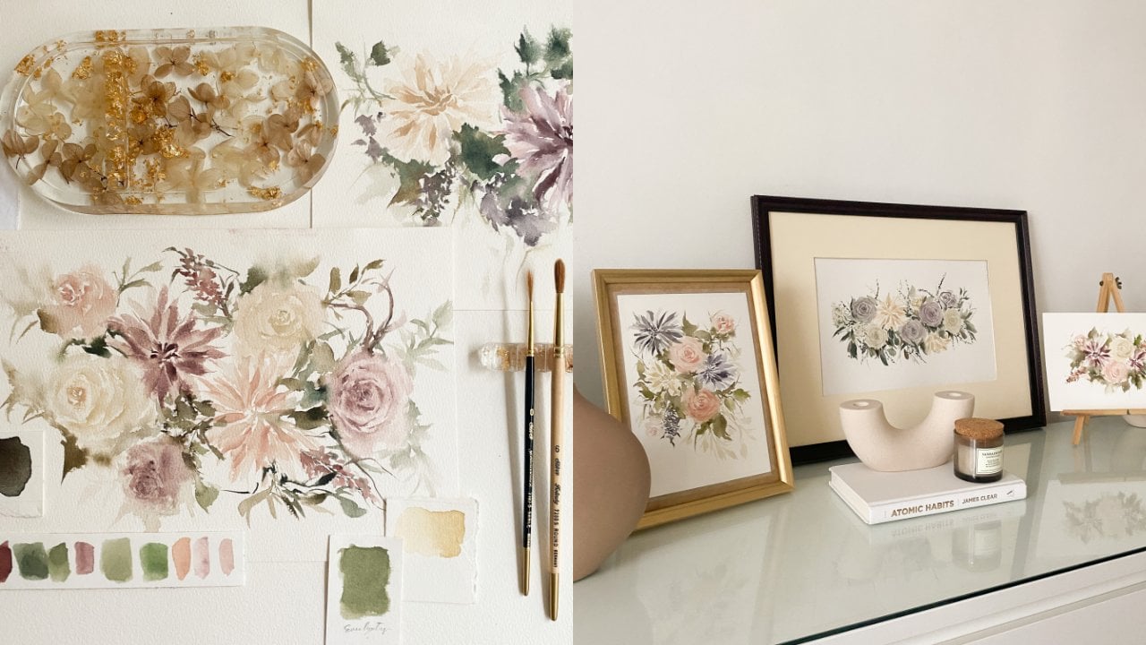
or Lazada or Shopee. I will also link this one. You can also use a big sheet of watercolor paper
or berkely board. What I always use is
the watercolor paper. I think 90% of my
photos on Instagram are taken with a backdrop
of watercolor paper. I really love it
because it's matte, so the light doesn't
bounce back, and it's easy to carry anywhere. It's lightweight, it's thin, I can roll it. I love watercolor
paper for my backdrop. Another option is
textured backdrops. You don't always have
to buy backgrounds. You just have to be
extra resourceful. For textured backgrounds, you may use your
couch, your carpet, or anything textured
that would fit your feed's theme and color. I usually use our carpet and our couch for my
textured backgrounds. I am lucky because our house got items that really fit the colors of my
Instagram account, and so it's not
hard for me to find texture backgrounds like
our couch, like our carpet. But if you don't
have these items, you can use your dress or
big cloths, your towel. When you use this
as backgrounds, it won't be obvious and it will actually give
beauty to your account. Be resourceful. Next is black background. It's the same as
white background, you can use a black cloth, a black background specially
made for photography, or an illustration board. For Nico Ng, who made this one, I think he uses illustration
boards for his backdrop. Next is wooden. Wooden backgrounds are
not really hard to find. It's the same as
textured backgrounds, you just have to be resourceful. For me, I usually take photos on our floor because it's
a wooden feels tiles. I use that, and they
also use my table. You just have to be
extra resourceful. Remember on wooden backgrounds
and wooden backdrops, it should be matte so the
light won't bounce back. Number 2, the more
textured it is the better. Number 3 colored backgrounds. For a colored background, you just have to buy this
from Amazon or Lazada, and you can also use catalina or colored paper
if you don't want to buy clothes or backdrops
especially need for photography. Remember matte and always matte. If you are looking
for a backdrop for your artwork or your creation, always choose a matte backdrop, because you don't want
the light to bounce back from your backdrop. This would give a very nice
effect on your art work or your photography if the light is striking on your backdrop. Always pick matte background. Now for behind the scenes
or self portrait photos. As much as you can try to make
your backgrounds minimal, so that you the artist, or whatever you want to say, or whatever you want to show
will be shown even more. You will not be eaten
by the background. Always just minimal background, and you should try to make the background
connected to your niche. Example, better to use
your office space or your studio as background for your self portrait
than your kitchen. Of course you're an artist. The fourth thing
you need is props. For props you don't need so much of it if you pick the
minimalist theme. But if you pick the
mixed or detail, there's only one rule. Make sure the props are
relevant to your niche. Gone are the days that when
you want to take a flatly, you will just get
anything that is related or that has the
same color as your artwork. As for me here, I've pick this
Winnie-the-Pooh stuffed toy, because my calligraphy
says, honey. You don't do that anymore. Don't do that. Don't make the same mistakes that
I did in the past. Make sure you only
put props that are relevant or related
to your work. But of course, there's always
an exception to the rule. Exception is you're
allowed to add non-related props if this props is from a brand partnership. Like here on my posts,
as you can see, I used my watch as my props and that is because this
is a paid partnerships, so that's one
exception to our rule. Another exception is if your theme permanently
includes that props. Like here on theme [inaudible], she always use dried
flowers for her flatly, and so that's okay even if it's not totally
related to her painting. Because that's already
part of her branding. Remember those two and
remember not to include non-related props on
your Instagram photo.
4. How to take an aesthetic Instagram photo?: So much for the other topics. We are now going to the how, so how do we really take
good Instagram photos? In taking Instagram photos, always remember these items. Number 1, it should be well lit. Number 2, always play
with the shadows. Number 3, don't overexpose. Number 4, turn on the grid. Number 5, shoot in
different angles. Number 6, play with props. Now I'm going to demo how to really take
good Instagram photos. Before we proceed with
a photography class, I just wanted to share
with you the two areas where I
usually take photos. Like most people, I don't have unlimited
access to sunlight, so I really make a
way to catch it. I only take photos on
this portable table near our window and
here by the door. It's not really glamorous
as you can see. I use this table and our floor or wooden
floor as my background, and I also use this watercolor
paper from Bao Home. This is a full sheet
watercolor paper, which is 100 percent cotton. As you can see, it's really big and it covers a lot of space. Now let's try using
it as my backdrop. Let's try shooting this
artwork on my [inaudible]. First thing you need to
remember is the light. Make sure that the
place is well lit. Now, I'm going to add some props and set up
the flat lay area. one of the common issues when
doing flat lays are rolling props and here's my solution
for that. Stick it back. You can buy this
on any bookstore and you can always
reuse it after. Just stick it at the
back of your prop, like this and then stick
it on your backdrop. What I love about this is it doesn't really damage
anything at all. But of course it serves
its purpose very well. Now let's try taking some shots. Reminder number 2 is
turn on the grid. I think on every phone, whether you're using
iPhone or Android phones, there's a grid on your camera, so make sure to turn that on. That will be your
guide in taking photos to ensure that your
subject is aligned. I got few shots in different angles and
just with one artwork, I was able to
secure five photos. That's five days of
content already. Now let's try and
shooting this planner. Since it's a lifestyle product, I can use any lifestyle
item as my props. Let's try shooting it
when my pen first. So here are the
shots I was able to take with my pen and now let's try shooting it with some other props like my
laptop and my AirPods. Tip number 3 is
lowered exposure. You can do this on
phone by tapping the screen and pulling
down the sun icon. The reason why you have
to lower the exposure is for your subject to
be more noticeable. Sometimes the light is too much that your subject
isn't visible enough. Also, you can edit your photos easier if it's not overexposed. Here are the shots that
I was able to take. Now let's try taking photos
of minimalist theme. All you have to do
is pick an artwork and pick one prop that you like. It could be a brush or a paint, or you can remove all
the props actually. Tip number 4, make sure to
make use of the shadows. So as you can see here, there are a lot of
real shadows on my area and they give a
nice effect on my photos. If your place doesn't
have shadows, that's okay because
you have fixed art. Later I'll discuss that. Here are the photos
that I was able to take and here are
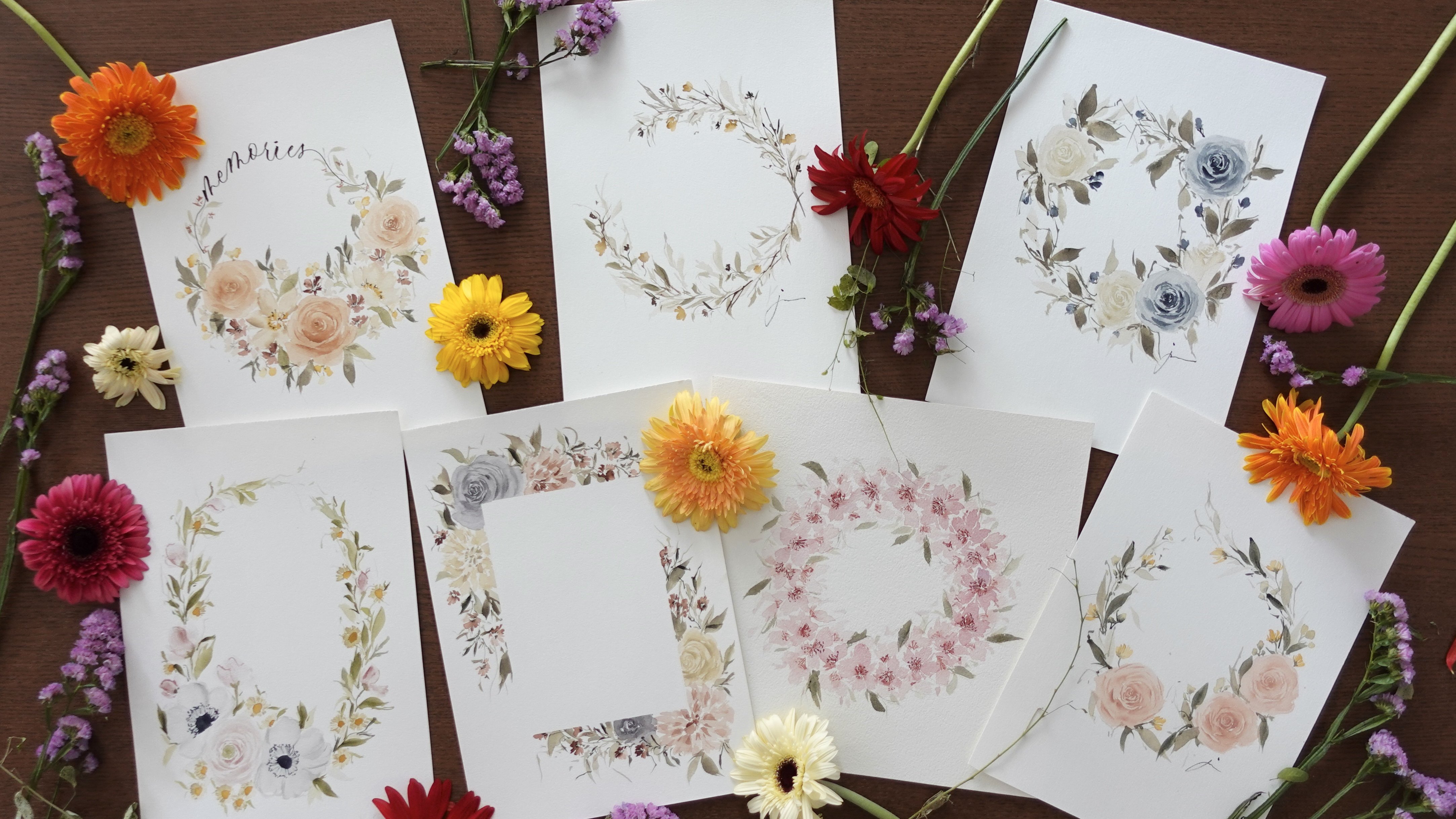
the edited version. Now on taking needed flatness, remember to use different
but relevant props. Use props with different
textures, different colors, but make sure they look nice
when gathered together. Here's a sample of
another flatly. But in here, you can use, I'm going to use my
mess as an artist. Yes, you can use your
mess as an artist. If you're a florist, you can use the petals. If you're a baker, you
can use the flower and any prettiness that
your creation can make. I am using my old swatches here. Again, just make sure that
your mess looks pretty. If it doesn't, don't use it anymore. It'll just ruin your work. Let's take photos
and another tip, if you're creating a big
flat lay space like this, you can take photos
of different areas. It will give you more content
options in the future. Here are the photos
I was able to take. Another idea on taking
photo is by making it appear as if it's
a work in progress. You can include your hand
in the process like this. If you're like me whose
hands are not too gorgeous, don't feel sad because I got a solution for you and
I'll discuss it later. Here are the photos
I was able to take. Now another way is by
doing art on art photo. All you have to do is
gather your artworks or your creations and
take a photo of them. Just make sure one of them will stand out and can
be the subject. Last, if you're taking
photos of your supplies, just be carefree,
create beautiful mess. Before I end this, here's the recap
of the reminders. Number 1, it should be well lit. Number 2, always play
with the shadows. Number 3, don't overexpose. Number 4, turn on the grid, and number 5, shoot on different angles. It could be aerial view, to left or right area view, details, and last reminder
is play with your props. Now let's go to editing photos. But before that, here's
another tip for you. If you want your
photos to look classy, remember to ditch the
usual props and backdrops. What are those? Number 1, the furry background. Number 2 the super
green thick grass, and some other backdrops that are not really
classy and doesn't really give your artwork or your photography
some special look. If you're struggling,
stay minimal. Minimal is classy yet easy. If you don't know what
background to use, stick to minimal background. Now let's go to
editing your photos.
5. How to edit an aesthetic Instagram photo?: Now let's go on editing. How do you edit your
Instagram photos? I will also share
with you the apps that I use for editing. In editing, I only
use three apps. Number 1, Snapseed from Google, Number 2, Adobe Lightroom, Number 3, PicsArt. But I rarely use PicsArt. I only use Snapseed
and Lightroom. Now, here's how I use
these three apps. Let's first discuss Snapseed. Actually, Snapseed is a one-stop pool already,
but personally, I only use it for
editing specific area, because this feature is a
big feature for Lightroom. Thank goodness, it's
free on Snapseed. What are we talking about here? Okay pals, open your Snapseed app and select the photo that
you want to edit. For me, it's this
photo with my hand. Then click the tools
and click 'Selective", and then this this letter B
will show on your screen, and you can adjust the brightness
of that specific area. You can add another
one if you want. You can also do it on other areas of your
photo, like here. Once you're done, you
can hard press in the screen and you will see the before and after of your photo. If you're already
satisfied, save it. Here's another one, selective
and then select the area. Then you can add another one. If you want to add the
whole photo altogether, we can also select the tools, select "Tools" and
then "Tune image", and then select brightness. You can also add warmth. Just do the same thing, tools, tune image
and then warmth. As you can see,
Snapseed doesn't edit your photo too much,
it's just minimally. When you're done, save it. Save, and then modify. Its on your camera roll already. The next app that we're going
to discuss, is Lightroom. Actually, Lightroom
is the app that I usually use for all
the editing stuff. Here's actually how I use it. Of course, we're going
to open the app, and then select the photo
that you want to edit. I'm going to select this one, and then first is the crop part. In here, you're going to select the areas that you
want for your photo, so you can remove all of the other things that you don't want to be in your
photo in here. But I always use square or one-by-one just so it
will fit my Instagram. Next is light. The first thing is exposure. In exposure it is actually
the brightness of your photo. You can actually adjust it
based on your preference. Then the next is contrast. Contrast, actually gives
the strength on your photo. It can actually make your
photo look fade or vibrant. It's up to you and
it's a clear theme, what do you want for your photo. Next, on contrast is highlights. On the next part, I don't
actually adjust more on these. For the highlight
shadows, white and black. I don't move it that much. I just check if it is
nice to adjust them, but I don't usually
use these tools. Now next is color. For the color, the first part is the temp or the
temperature. In here. it is actually the
warmth of your photo. You can adjust it if you want
your photos to be a little more on the yellow side
or on the bluish side. It's up to you and
it's up to your theme. Now, after editing
the temperature, sometimes you have to
readjust your exposure. You have to go back and adjust a little of your
exposure and contrast, but not too much because of
course you're already safe. After that, go back
to your color, and if you want to
adjust the temp, what makes your photo a
bit pinkish or greenish, it's up to you if you
want to adjust it, but I don't personally
adjust it anymore. After that, go to mix. Mix is actually what adjusts your photo on a per color level. If you want to adjust just
the red on your photo, you can actually do that. If you want to adjust
just the orange, you can actually do that. I usually do this if I accidentally created an artwork
with a very bright green. I select grains
and turn it down. Let's try it here on orange. If you're not sure what
your photo will look like, you just have to move it. As you can see here, on this part, for
example, the hue, if you pull it on the left side, it will be darker, and if you pull it on the
right side, it will lighted. Same with saturation, if you put on the left, it will be grayish, and if you pull it on the right, it will be too orange. On the luminance, if you put it on the right, it will be too light, and if you pull it on the left, it will be too dark. Just minimal adjustment is okay. Now, if you are done with that, the next thing is effects. I don't actually adjust
effects except for the grain because I wanted to have this
vintage effect on my photo. It's up to you if you
want to just that because some people
don't like that. For me, I love to have
some grains on my photo, so I adjust the grain and
adjust the size of the grain. If you're done with those parts, you can now save your photo. This is the before and after. If you're done, you can save, export to camera roll
and you're good. Now, here's the best part. If you're happy with the
effect that you have created, you can actually create
a Preset for that. Here I'm going to
name it portrait. For every portrait
that I will create, I'm just going to
use this Preset. Let's try it on my other photo. In here. Instead of editing and going to
a lot of process, I am just going to go to Preset and click the portrait
preset that I created, and of course, I still have to adjust the crop if I want to, but if I don't, I'm good to go. Okay, so that's it. Save it to camera roll and done. The next app that we're
going to discuss is PicsArt. For PicsArt, I only use it
to add shadows on my photos. Here is how I do it. For this, of course,
you got to open the app and then click
the plus button, and select the photo
that you want to edit. From there, go to add photos and then select the
Proceed button, and then select the shadow
that you want to add. This one is from Pinterest. Put it on your photo, crop it or do whatever you want. Just put it on your photo
and then adjust the opacity. After you adjust the opacity, go to blend and then
select overlay. You can further adjust
it from the overlay. But if you're fine
with it already, you can save it already. You're good to go. So that is it on editing your
Instagram photos.
6. Final Thoughts + Class Project: Thank you so much for
attending my Skillshare class. I hope you guys learned and
enjoyed as much as I did. For our final project, I want you guys to take a
photo of your artwork and edit it using either Snapseed,
Lightroom or Pixar. Then upload the
before and after of your work on the project
section of this class. Thank you so much guys, and I'll see you on
our next class. Bye.
 Jenny Flores Art, Top Teacher | Watercolor & Gouache