Transcripts
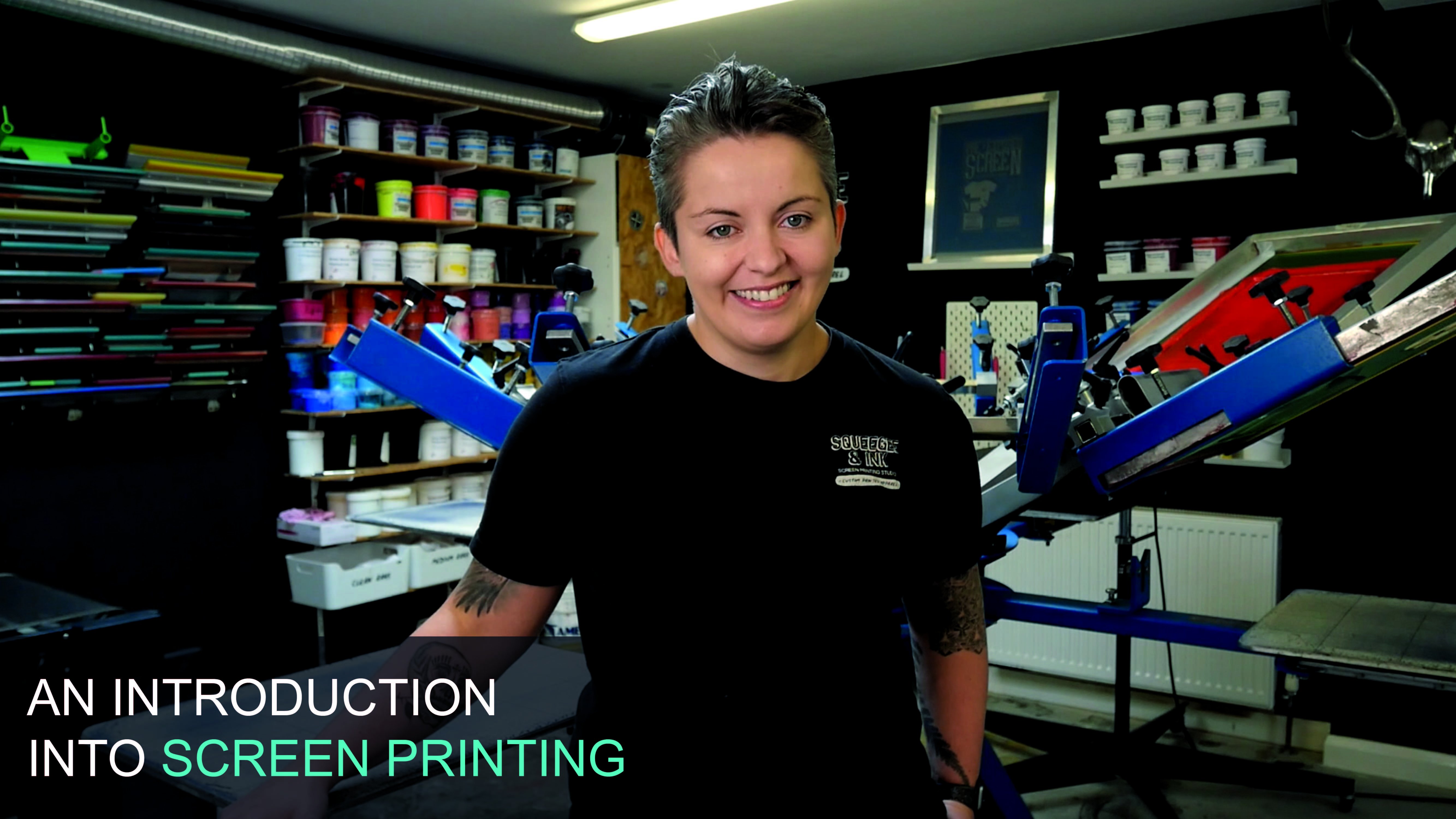
1. Introduction: Hey, it's Chessie
from Squeegee & Ink. And in this course we're
going to show you how to screen print t-shirts
for your own brand. In this course, I'm
going to show you all the steps needed to screen print this three
coloured design onto a t-shirt. Additionally, I'll show you how to add personalised branding to your t-shirts and to create custom packaging that will make your t-shirt
brand stand out. In this course, we will
cover garment choices, artwork sizing
and preparation, screen coating and exposing, registering multi-colour
designs, ink options, screen printing
t-shirts, printing inside neck labels,
screen cleanup. And lastly, branding
and packaging. When taking this course, you have full access to our 'Screen Registration Template' and our
'Printable Area Template', both of which will be fully
demonstrated in this course.
2. Garment choices: Things to look for
when you're picking a garment for your
T-Shirt Printing. Things like whether the
share is organic cotton. This just means
that it's probably a higher-quality shed and it's going to be nice
and smooth to print on, which will make
your print appear smoother and crisper when
you come to print it. Another consideration is
that it has sightings. So on some of the shirts
they're actually tubular. They didn't have a sightseeing. And that means that
when you wash them, they can twist and be a little bit
deformed on the person. So a side seam on a share is a really good indication that
it's a high-quality shirts. Another thing to consider is we would like these
types of things. So small the hillside labels. And if you notice they're kind
of offset from the center. That means that when we're doing our branding on the neck, we don't have to include
the size every single time. That just means that
you're actually setting up less screens
when it comes to printing, because you can print
the same Lego and all the shirts and people can still
reference the size label. Just another thing is that your shirt includes
wash care instructions. So in some countries that's a legal requirement when
you're reselling the fats. And it's just a very nice thing to have already
included in there. And it's also probably tear away if you're going for
these types of shirts, It's just something to consider. Another thing is that you
can get good stock of these. You don't want to
find your best shot and then run out of stock. So these kind of
shots are held in large quantities and
wholesalers around the country. So we pretty much never
going to run out of a piece. Hopefully. And other considerations
are that the unbranded to start off with is very discreet,
low size label. So we can go ahead and decorate that fully and make it look
like and branded shut. The shared the weekend to be printing on for this course is the Creator shot by
Stanley and stellar. So there's a few
reasons why we've, we've gone for this choice. So we've gone for
the off-white color because we didn't want a
very bleach shirt color. Because we feel like that's
going to work really well with our
particular artwork. We also love the ICA credentials
of studying stellar. This is an organic cotton
and it's also like VGG and accredited and it can't get any more green
in our opinion. So we love that
thing is very easily brand a ball with the size label that I talked about before. It's very nice and
smooth surface, so it's going to hold up
and make it look really vibrant and freshly printed. So that's some of
the considerations that we make for our own brand. And I hope that that can guide you to making good choices too.
3. Artwork sizing and preparation: When your screen
printing your shirts, the most important
thing is probably the image size and the
print location on the ship. So I've created a template here and it's called
the principle area. And they are dimensions that we've worked out
that are gonna be great guides for you to
do your designs against. This is the principle
area template, and I've opened it up
within Illustrator just to show you around
a little bit clearer, we've actually used
the unisex create a t-shirt as the base for our
t-shirts and this template. And then we've used the cruiser, which is one of the
Stanley stellar police as the example for
the hoodie side. So we're just printing
a t-shirt today. So I'm going to show
you what we've done. We basically went and
measured all the dimensions of the creator shirt
from top to bottom, across the chest and
what the arm length was. And this is based on
the smallest size, small of the creator shirts. From there we distinguished
what the principle area would be for our largest Print
Area in us, in our setup. In order to get the
biggest print area for the front chest, the Internet variable,
and the sleeves. We've also done that for
their back print as well. That's just based on a couple of considerations in the studio, like how big are flattened
sizes on our prayers. As long as we make
sure our images fit within these
red boundary boxes, we should be good
to go when it comes to printing them in real life. As a quick estimation
of how large I want my particular design
to be on the shirts. I will just quickly
paste in my image. And I'll just bring it over here towards the back
of this t-shirt. If I zoom in, I can
see that if the image is 35 centimeters wide
by 50 centimeters tall, that's going to take up a large
proportion of that shirt, especially when it's wrapped
around somebody's body. I want it to be large, but I don't want it to be
an enormous or oversized. So I'm thinking I'm
going to go for around the 30 centimeter mark. And just looking at the
proportions of my image, it's not gonna be too, too tall either, and it should still fit within
that boundary box, which I estimate it to be
around the 40 centimeters tall. So there the rough
estimations of how large I'm going to make
my image from my shirt. Now we know what size the image is going to be on our shirts. We can start figuring out what the film positives are
going to look like. So we need to have
film positives printed onto acetate sheet that register
line up with each other. These are gonna be used
to expose our screens. And i'm I'm just going to
walk you through how to add the registration
marks and separate the layers onto their
own film positives. I'm going to open up my
platinum template from within Illustrator so
that I can edit it. So if I find it, which
is in my downloads, I'm going to say File Open. It's my platinum template there. Let me just quickly talk you through what you're going
to see on the registration. When we can see our layers, I've distinguished a few
different things here. The first one is
the artwork layer. This is where you're going
to place your artwork and it also contains some
registration marks. And the most important
part of this, this template is this box here. So this is the pattern size. So we can't print anything
that's particularly on that button size on a
particular carousel. With distinguish
that our pattern, which is the board that
you print the t-shirts on, is 16 by 22 inches. So we don't want to go right
up to the edges of that. So I figured out sizing and we want to stay
within that constraint. Let's talk about
these other layers. We've got the small screen. If I bring that up, just
toggle this on and off. The small screen is like quite a common screen that we use. So we're going to
use these screens for small chest locations. For example, I've mocked up that outside screen dimensions
20 by 24 inches. So that means that it can, can print in an area
around this location. So we can go right up to
the edges if we're using a small screen because it's
not quite tall enough. So that's just something
to bear in mind. By toggle that one off again. And I put on the large screen. So the last screen, when I turn that one
on, you can see it's much larger than
the button size. So that's gonna be great for printing a large back
piece, for example, because I can use a lot more of that Play button and it'll be really comfortable
printing that concise. Then if I toggle on
the placements layer, this is just a guide, but it's just quite handy. Just so you can determine some standard sizes for
things like left chest, front, chest, and
back print sizes. And it also gives you an
estimation of where to locate those images
on the screen. So you'd want a
left chest to be in this area just so that
you can reach that. Left chest location when
you come sprinting inertia. And again, you want
the background in the middle so that when
you have it on the shirt, you're not printing out the
edges or anything like that. You're printing in the easiest
location on the screen. I can turn this up quickly so
I can find my artwork now, I'm going to make sure
I'm on the artwork layer so that I can place
onto that layer. And I say File Place. We're going to find
it on the desktop as this KUR work right here
so I can place it in. I need to also make sure
that it's embedded. So once it's already
highlighted here, I'm just going to press embed. And it's a few
artworks together. So it might even have
this bounding box. So I can get rid of that
by just highlighting this little box, deleting that. And that just makes sure that I can manipulate these
images on their own. So if I grab my back design, I'm just going to make sure that it's the right dimensions. If I just go off the top of it, I'm going to just double-check
here on the width that is 300 millimeters,
which is perfect. That's going to hit on
my flattened and on my shirt and easily
fill my layer. And it's not too tall either. So keeping the same proportions, it's only four centimeters tall. So that's all very doable. I'm going to bring up my design. And I think what I'm gonna
do is I want to be able to locate these registration
marks on the platens though. I'm just going to track
them down a little bit. So I've got room to
make a nice big print. Contract these up. So now I'm ready to drag in my artwork and I
can start separating it. I'm ready to start
separating this design. So I'm going to make
sure I'm grabbing all of the registration
marks and the design. And I'm just going to bring
it to the left-hand side. I know that I've got three
different colors in my design. The t-shirts actually going
to show up in this area. So I don't need to
think about that. I can just make three copies
right next to each other. So I'm just going to
copy and paste modulus. And this is just a
super quick method, but I'm going to label
which color I want on each of the layers as well. So this is going to be a black screen experience being
the yellow kind of color. This is going to be red. With my design I've already
kind of needs into up. So I've made sure that all
the layers are just busting up next to each other and
there is an overlapping. I also figured out that every
time you see any red color, that that's the same read
throughout all the image. So we're not getting
lots of different variations on those colors. Quick method for separating
these would be to lock some of the layers
and delete out anything that isn't relevant. For this layer. I'm
going to lock the black. Again, select with the
direct selection tool an area with black. I'm going to say select same,
fill, color and stroke. And then I can go
come on to Object. Lock. Selection shows you
that it's command to. The more I can do is just highlight
anywhere on this image. And it should just select
the other two layers and leave out the locked
ones. Selected it. I can press Delete
and it's deleted. The other two layers, me. Why can then do is say
Object, Unlock All. I can select this back again. I don't want to select anything on the page because it might manipulate the other images that I've already got on this, on the whole artwork. So I'm just going
to do that again. I'm going to say pick a
little bit of the black, say select same, fill,
color and stroke. And I'm going to make sure
that it's all the way black, one of the zeros. And that's going to
print a nice thick dark rich going past me. Press Okay, and that
layer is complete. I can go to the yellow
and then again, I'm going to lock this down, delete all the irrelevant
layers and colors. So I can just go into my direct selection tool
and select area of yellow. Come up on this swatch when it's definitely the right color. And I can say select same, fill color and stroke and say
come on to or go to Object. Lock Selection. Again, I can highlight
all the way around here, making sure I don't pick up any registration marks
on the way around. And I can delete that. I can say objects unlawful. I can take another
bit of yellow. Then I can make sure
that it's pure black. Again. I can go
into the red one. I can select some red,
select same ******* chicken. And I can look at Drucker whom the other
columns to meet them. I'm just going through that is quite a lengthy process, but once you go through
it, then you're really, then you really know
that you've got an isolated each of the colors
and separates them out. So I want to actually
build in a little bit of overlapping of my colors
when I come to print them. If I unlock everything
which is on my design, I would like a little
bit of stroke, which is an outline which
is going to fill up sits underneath the other layers
on my yellow and on my bed. So if I actually go
into this layer, make sure there aren't
any little messy bits. So if I select that, you can see there's an extra bit of design that I don't
want it to be that stuff. I just go in and delete that, make sure it's not
interrupting me. I can select this area
and I can add a stroke. So I'm going to add a one-point,
strengthened my point. And I can double-check that the black and the stroke
is all the way into the zeros are just dragging this down into the color
right into the corner. So that one has a stroke on it. I might even just write that
on here just so I know. I remember yellow and then
I'll say one PT stroke. And then I could do
the same for the red. Just highlight it
and make sure there aren't any weird extra bits
that are being highlighted. I don't think there are. I can add my one-point
stroke on that bit. Double-check It's the perfect
black which isn't zeros. And that one is also good to go. It's good to
reference and right, if you've added strokes
on just because it might manipulate
the layer order. So what I'm gonna do is print
the red than the yellow. And then the black
layer is going to go over the top of them. And it's going to block out
any of this stroke whites, but I've added onto those, so it's just something
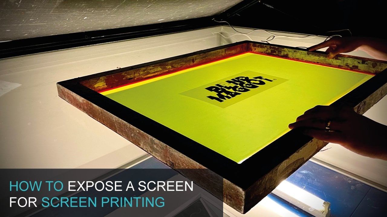
that's good to know. These layers are now ready to be printed onto my phone positives. I've printed my
phone positives onto inkjet film using my
epsilon inkjet printer. And a RIP software. Rip software means that
my printer lays down lots of thick black ink
on top of each other. And this one is really nice and dense and this is how your
film positive should be. So what they're going
to do is block out the UV light from
reaching your emotion, which is light sensitive. Then we're gonna be able to rinse out any uncovered emotion. And that's gonna give us our
stencil for our printing. If this isn't something
you can do it in house. Rstudio's which printout
film posters for you and send them to you so you
can express your own screen. If you are asking somebody else to print your positive for you, please make sure
that your first row, making sure that your image and your artwork is pure black. It's in the CMYK color mode on your computer
that they're using inkjet film and
an inkjet printer to create your
dense film posters.
4. Screen preparation: The next step is to
coat your screens. We've already determined
the screen size. Say this is a 23
by 31 inch screen, and that's the outside
screens I mentioned before already
figured out the image fits in nicely there. And I've gone for a 43 t mesh, which in America is a 110. This is perfect for screen
printing plus assault. And like nice bulky
graphics on to our set. So this is a perfect
match choice for us. The next thing to consider is
the mesh is nice and clean. So what we do with all of our
screens before we code them is we use degreaser on them. So you decrease you
as a kind of soap, but it's basically going to
get rid of any grime and dust and grease on
this screen surface. And going to allow
our emotion to a deer nicely to the
surface of the mesh. So I spray this on and
then I PowerShell off. And then I let my screen dry in a nice still dust free room, and then it's ready
for me to cope. Another key piece of kit
is your scoop coater. This is going to hold your
emulsion and this gallery to apply a thin layer of motion to each
side of your screen. So some considerations
for these. We just like this
one because it's got this extended edges which kind of collect any
excess emulsion on the edges. You also need to make sure
that your scoop coater can very easily run
all the way along the inside of your screen and on the back and cover as much
of the screen is possible. But you don't want
your scoop coater and knocking into the edges. So this particular one fits
into my screen perfectly. That's the one we're
going to choose for creating our screens. The next thing to consider
is your emulsion. In our studio, we permit
lots of different types of ink and we also coat screens for lots of
different people. So we need a really
high-quality one. This is a joker d'Azur emotion. This is the choice that we
are going to be using today. And it's gonna give us
really nice, clean, sharp lines and it's going to be resistant to R plus so link. Make sure you've also
got a clean rack handy just for any low drips
and things like that. And also we use these
all the time and they're just silicon
spatulas from the kitchen department online. And that is for getting all
of the excess emotion out of the scoop coater and making sure you don't have drips
on your emulsion top. You might have noticed that I'm standing outside my dark room. So when I've got
my screens coated, I want them to dry in a
dark space that's light and UV isn't exposing them prematurely before I come
to express them myself. So I like to keep that nice and dark and clean and dust free. And it does have
lights on in there. However, they have UV blockers
on them to prevent them from leaking UV light onto my screens when
they're just drawing. Let's go into the dark criminal, Chez how we create our screens. When you start
cutting your screen, you want to coat
the flat side fast. Say this is the flat side
is exposed to me now. And I also have it propped up
against the wall and again, some batons on a rubber mat. That just means there's
quiet study and it's still going to slip when I started coating my screen. We need to now fell scoop
coater, output some emotion. So I'm going to
take the lid off. I'm going to pour it in. I want to go for
maybe just over a 0.5 from my scoop coater. So that definitely got enough to create a nice even
coat on my screens. I can just take off
any excess drips. And the labor content learning. And we're going to use
the sharper side of the scoop coater to k1 screens. I can just let that level out and let any air bubbles pop. Before I've kept my screen, I'm ready to cook my screen. I'm going to use that sharp
edge, like I just said. And I've got a quite
filled up with the motion that not so much
that when I tip it over, it's going to pour up the edge. I've got this screen
propped up against that. So I can just start
by holding the edge against the match so
it's in contact with it. And then I'm making sure that my motion is level
and migrating trough. I'm going to tip the Kaiser
probably about 45 degrees. Or really it's just
when the emotion starts to make contact
with the actual mesh. When it's made contact with
the mesh all the way across, I can now slowly push the
character on the screen. And then when I get to the top, I can just let the emulsion
pull back into the trough. I can push against the mesh
slightly and then I can lift straight back and
hopefully there'll be no drips. Now I'm ready to 10 screen
over encode the other side. I can do exactly the
same on the other side. And I'm going to hold
it up against the mesh. But I think that's been
no real quick applicants. There's a bit of
lip to get over. So I've got a level
quickly put it in, wave the emulsion to
hit all the way across. And I can slowly bring
up again overreact. And when it gets to the top, I can just pull the tip, the coats it back on
itself says level. And then I can push into
the mesh slightly and then straight back on myself and hopefully they'll
be no drips again. We're looking for is
a nice shiny even. And if you've missed anything, you can potentially go
over it again and you can scrape off any drips
with silicone spatula. But really you're trying to go for just one code on each side. It's important to
try your screens with the flat side
down, facing down. I'm going to put it
in my drawing maps. This is going to be
left overnight in a dark, dust free environment. And this will allow
the motion to fold the undecided the screen and
it will be nice and level. And when I come in and
wanting to express this is going to be dry and experts
really nice and crisp. After getting my screen, I can put all the
excess back in the tub. And the silicone
spatula really helps get into all the crevices and gets all of my motion back
in men than in seconds. I'm going to wash
this up in the sink with just some water. Get a drawing and it will be
ready for my next coating. Once your screens are
a 100 percent dry. So for example, if they'd
been driving all night, then they're ready
to be exposed. So I'm going to lay them
on my explosion in. My exposure unit has a metal halide bulb
and a vacuum blanket. There's lots of different
options for exposure and units. For example, there's
overlying involves, which will also make EV
and exposure emulsion. Just an important
thing to note is that your registration marks on the same distance
away from the edge of the screen on oath, all of your layers. So it's quite handy to
have a set of screens. They're all the same size. So I'm going to measure
this a little bit more accurately and then it would be times put my vacuum on
and expose my screens. I measured to the
registration marks from the edge of the screen
for all three screens. And the old exactly the same. So I'm ready to go my exposure, your exposure times are
going to be different to mine because you will have a
completely different setup. You have different emotions and maybe even different mesh types. When you're ready to
wash out your screen, you want to lightly
rents it on this side, and then you rinse the
other side as well. Leave for about 30
seconds and then you're able to fully wash
out your screen. I can even leave
that to soak for about 23 seconds and then all the emulsion
should just fall off. If you're noticing that
your emotion is very slimy, it's probably that it
hasn't had enough UV to, to actually care properly. And if you're not being able
to wash out your image, it's most likely that your film positives
aren't dense enough. At this point, you want to just quickly inspect your screen and make sure that all the emulsion
is washed out from the, from the image areas, especially on the
registration marks which can sometimes be missed. And then this is
just ready to dry.
5. Registering multi-colour designs: Today we're going to be
using the M and L Creusa. This is six color for
station carousel. So some things to look
at with this particular machine of a scope for
Pat pellets but move. So these are the platens
where you put your shirts. And then it can
hold six screens, which means it can hold up to
six layers and six colors. You're going to find
there's lots of choice on the market for
picking your machine. And it might be a case of
just starting out with a cinco cinco station
press to get you going. We can now go ahead and start
registering our screens. The most, the easiest
way that I can explain this is by putting your film
positives onto your flatten. And then you can just make sure the registration marks
centered on to your pattern. And then we can basically
mascot down all the way around, so it's nice and
secure in place. We're also making sure
that Platon is tightened, so it's not moving when we align office green to
the film positive. At this point, I can take my first layer and I'm
going to pop it in one of the arms and Stop lining up to the
registration marks. Where you're looking for
is the registration marks in your screen that
being exposed. They want to line up with the registration marks that
are on your film positive. So it might take a
little bit of time, but it's definitely worth
putting the time in. Now, you'll find that
the emulsion is a little bit transparent to help
you line those up. So I'm going to start making little micro
adjustments on my screen and then tightening as
I get very close to that screen being
registered to the film. Once you're happy with all
for registration marks, make sure everything is
tight or love your press. And if you left your screen up and put
it back down again, you can make sure
that it's going to be hitting in the
same place again, and that your registration is
good for that first screen. We're now going to
repeat that step for the next two layers
of this design. Registering to the same piece of film positive on the button. The next thing today is to
make sure that your snap, which is the distance between the Latin and the
underside of the screen, is even all the way across. You're looking for about
a pound coins height. And you won't this
screen to snap back from the flatten in the same kind of distance all the way around. So you kind of want it
like hovering over there quite evenly all
across the screen. So my dress, I have to adjust the snap with just the logo. Just hit. So I'm gonna
go ahead and do that and make sure it's level
on all three screens. And my patterns. Go to the new lesson
on this one because I must be doing
some canvas bucks. As you've made some adjustments. If you've changed the snap at o, you do need to go back
and make sure that your screens that Olmsted and register with the film positive. And then the next
thing today is to make sure that the Platon is an
exactly the same place, is the same distance
out from the press. So if this measurement
on my pressed, and that will make
sure that you're printing the shirts
and exactly the same location on each of your nature of your shots
when you're going around.
6. Ink options: When it comes to screen
printing T-Shirts, there are three main
categories of ink, water-based plus desal
and discharging. Water-based things
for screen printing, t-shirts and textiles can
be a really good option for beginners because they
are cheap to get into. You don't need much equipment. So you might just
need to heat press. And when you're printing, you may just need
a hair dryer in order to partly driver layers. As you can see, they're
nice and vibrant. They will show sink into the fabric so they're
nice and soft to touch. So there's a lot of
advantages to water-based. Disadvantage might be that they dry in the screen's
a little bit quickly. So you do need to be quick and prepared
when you're printing, because that could just
be something that gets in the way of printing and
consistent print run. One other disadvantage
to using water-based thinks might be that the
queuing times were quite long. So ideally you'd have a really long conveyor dryer with four-step drying the ink. However, most studios
answer up like that. So you'd probably more likely
be using a heat press, which means that
your heat pressing every single shot for about
45 seconds to a minute. So it's okay for small runs, but if you get
into the hundreds, that's going to take
up a lot of your time. Plus the solving
is really widely used in the industry by lots
of different professionals. This is because
it's quick to use. It's very easy. It's not drying in the screens. It's vibrant, and it's got these consistent
colors and we can make some really vibrant
colors on our shirts. And you can also print on
a wide range of shirts. And when we're curing them, we can do it really
quickly with a time dryer, and we can also flash
being in-between layers. The only disadvantage to the processor is
probably that you need some quite expensive
kit to get up and running because you need a flash dryer secure
in between layers, and even a small tunnel dryer, which is used to
do the final key is relatively expensive. One other disadvantage
might be that it's got like a slightly plasticky fill and the ink sits on
top of the shirt, ones that have really
absorbing into it like water-based
and discharging. Discharging. This can be a
really cool way of printing because save your printing
lots of dark colored garments. You can actually use the
discharging to kind of strip the dyes from the
Garmin and just leave a very, very thin layer of
pigment in there. And it just feel so soft. And the longevity of that print is going to last very long time. And it's just an
optimum print method. There's some disadvantages. So you're going to need a nice big tunnel
drives be able to force the area in
really clear that design and get the
chemical reaction to strip the ink pigment
from the initial shares. So that probably suits larger studios a
little bit better. And there can be some fumes
if you're not going for the best discharging that are now formaldehyde,
formaldehyde free. So there's the soft
field, which is great. But then there's just a little
bit more complex equipment needed for printing discharging. There are another couple of low disadvantages to
using the discharging nx. For example, you're
going to have to really draw attention
to what garners you're printing onto to make sure
that they haven't been dyed multiple times so that the cheaper garments can
often have that problem. The other thing is that
once you've mixed up being expanded very
short shelf life. So you can't come back to in the next column days because
the chemical reaction in the inks would have
already happened and they won't strip the dye
from your garments. And another one, unfortunately, is that they are going to be
drawing into your screens a bit because the
water is going to be evaporating up the inks. So they are very, very cool and I want you
to experiment with them, but just pay attention that
you need some expertise. And I wouldn't go straight
into discharging printing, maybe start with water-based and then advance into
that kind of area. I was suggesting an ink to go for when you're starting
out in screen printing? Probably be plus the solid ink. There is that equipment
that you need. But if you get going that you
can just print really nice, rapid, vibrant designs
that are consistent. And you can also get
the inks that mix Apple two different pantone colors
if you are printing for other people and their face
specific on their colors. So I think Paso is
the easiest one to use for the t-shirt design that we're going to
be printing state, we're going to choose
plus this all link.
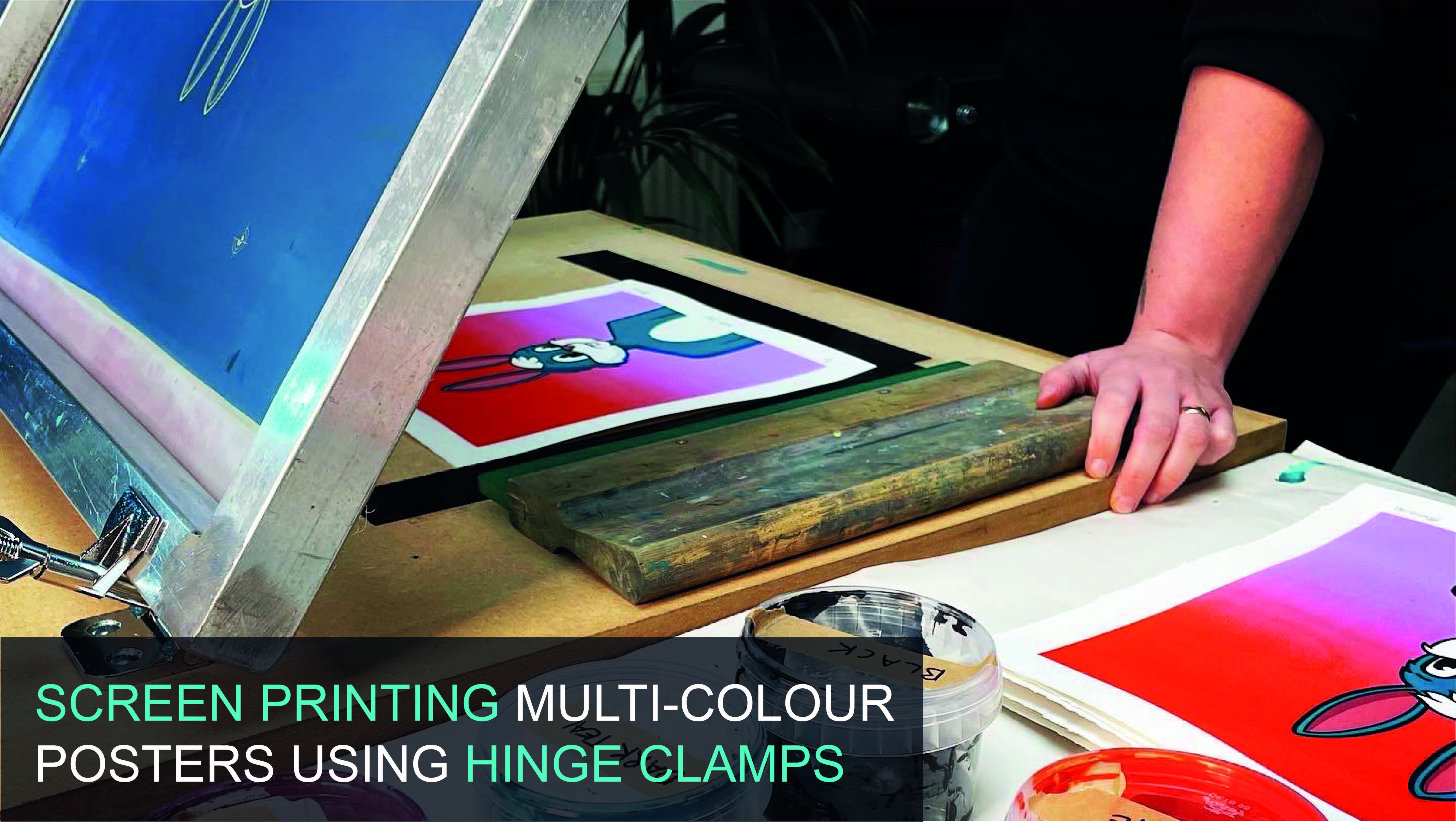
7. Screen printing t-shirts: When you screen
printing your shots, It's important to keep the shaft in place as you do your prints, especially for
multi-colored prints. So what we do is we have some kind of tucking
this and are plotted. So that might be a spray
adhesive or even this, which is Joe sided pallet tape, is basically like double-sided
masking tape and it holds the screen that T-shape in
place while we're from zinc. So we don't want
to happen is for when you do one print and
then the fabric jumps, falls into a slightly
different position. When you come to print the
next one there, our register. So you won't be tacked down. So if this is
perfect, for example, with the double-sided tape, it's going to hold it in place. And then as I print, it's not going to come up, lift and fall back
into another area. So that's perfect. I'll show you the two
options that we use. We used to use a spray adhesive like a light mist or
wherever the plasmon. However, this just go a little
bit messy and no studio, so we've kind of moved
away from that one. And then this is the big
double-sided Maschine tables, I'm going to describe it. And you basically
roller on the flatten. And you can just keep
activating it by taking off any excess length
and it becomes tacky again and holds you in place
for the whole treatment. If you have moving multiple
platforms like us, it's really useful to keep
your film positive in place until after you've
done your test print. So you would do a test print
on a different flatten. And then if there
were any problems, you've still got
your original one to register up against. We now need to
Moscow file screens that anywhere where we
don't want ache to go. So in that case, it's around the edges just in case where it's
restful squeegee at the bottom and in my personal
ink out into this area. And for this, I'm actually going to Moscow
off my registration marks as I don't want those to print on my
original test prints. So I can get it in Moscow for around the edges
using some screen tape. It's really worthwhile getting some high-quality screen take. Just because packing tape leaves residue and it takes a
lot longer to clean up. I just put it against
the mesh and then I squeeze it into the the frame. Just put it all we route. I'd like to do my registration
and take the covers, these registration marks
from the undecided. That's just because
the squeegee is going to be running
over the image area. And I don't want to excite
you if the tape off. I'm going to
continue Maschine of my screens by doing
the other two as well. I'm ready to stop printing. This particular design is going on the back of my T-shirt. So I can leave my shadows
onto the flatten. Make sure it's
nice and straight. If you do have side
seems that actually makes it easier because you can keep them parallel
with Coursera. And I'm actually going to
load it right the way up to the seams and make sure it's nice and
smooth and increases in, then I'm going to load up my income to each my screens so
I can do that math. A couple of important
things to consider when you are loading
your ink is that you, you load it into a wall that's
wider than the image area. You also want to
have your squeegee, some kind of a medium
geometry blades here, and they're also acquired and then my image area
of both sides, but not so wide that they're hitting into the
edges of the screen. I'm going to print
my first color, which is this kind of
creamy yellow color. My shirts or stuck down. Everything's tight. So I'm going to get my
squeegee blade covered in ink. And I guess you
might flood stroke. So the flood stroke is essentially filling
up the ink them, the mesh with ink
ready to print with. So it's not very hard stroke. It's just kinda like a
skimming over the surface. So I'm just going to build a wall and then
I'm just going to lightly push my ink all
the way of the image. And then all that mesh is
filled up with a nasty. And then you can push in poll, it's a debate in the
screenplay community. Whichever one you feel is
going to allow you to push that ink down onto the surface in the
cleanest way possible. So these are quite
large open areas. So I'm actually going to push. So we're going to push down
until I can fill the board. And I'm going to
keep the angle of the squeegee at 45 degrees. I'm going to stop
before the image and I'm going to follow
it all the way through. And I'm going to keep my body
weight over the whole time. There's a couple of
visual things that you can do to see if you
print it out nicely. First is you can see
if the mesh looks like it's all one color so that all the ink is transferred
onto the shell. You can just lift the screen
up and have a little look. Make sure you haven't
missed any sections. This is down to practice and I'm sure you
will get better, but just take your
time Chrysler and make sure your force is even
the whole way across. This is plus to solving. So there's a couple of
ways I can do this. The way I'm going to
partly dry this anchor, this point is by
using a flash drive. So the flash dryer is basically like a
grill and it will go over the surface and no heat
the surface of the ink. The it's just touched dry. That's not the same
as the ink being kid, which I'll do later
in the tunnel dryer. So I'm going to
flash this color, make sure it's touched
dry in all four corners. And then I'm ready
for my second car. After printing the first layer, I've gone unchecked or for extremes and it's not
coming off from my finger. That just means that
it's not going to stamp onto the underside of the
next screen I'm printing. So I'm ready to print
my second color. Again, I'm going to get my whole squeegee length covered in ink, so it glides across the surface of the screen and
doesn't Bumble across. We're going to go
with my wall of ink and I'm just going to lightly whilst holding
the screen above. So I'm not printing to adding. We're going to lightly
push the ink, sir, rolls over the surface of
the image. Then I can. It's actually quite good idea to have a little bit, I think, for your squeegee
so that the ink rose again and it's just
quite smooth print. So I'm going to push
down on the plaza and again until I fill the
board underneath me. And I'm just going to slowly share the A31 to the
surface of the tongue, say PABA, our way proofs. And at this point I can't do
my flood for my next one, but I'll say that when I get
into the actual printing. So a visual, by
quick visual check, I can see that the
mesh looks very clear. And then I can lift the screen up and have another little look. At this point, I can check
the registration and it looks like a pretty
decent job because There's two areas here
which should be butting up against each other and they
looked at on often cope, be able to figure
that out fully in the next layer when I come
to printing the black color, this is now ready for a quick flash and it just
needs to be touched. Try again until I
can do the block. I'm ready for my final lab, which will bring it all
together. This is quite plus u. Again, give us greedy
covered in the ink. This is particularly the case. You can stay, you're
included Louisa, or even add some
curable which Easter P1 that the viscosities
be a little bit more. So I'm just going
to do my floods. Sure. I got my ongoing and go the whole way across and shading
through on Skillshare. I'm really excited about
that looks really nice. Let me get it off the press and I'll have thorough inspection. But it looks like we did a
good job on it. At this point. You don't need to put
it onto the flash again unless you're worried about it touching
itself when you pull it off. So this can go onto my
conveyor dryer for focus. When we're ready to put
this in the conveyor dryer, it's important that it's flat. And we're actually trying
to get the surface of the ink temperature to
about a 165 degrees. It'll tell you in your classes solving what temperature and how long to have it queuing
for and eating for. This, a handy little thing. That just infrared guns and
they're relatively cheap. And what it does is if
you're quite close up, you can point the laser
at the surface of the ink and you can see that
it gets up to temperature. So when that when my dryer has been on for
quite a little well, or be able to lean down queen at the ink surface as it goes onto the tunnel dry and make
sure it hits that crucial. A 165 degrees for up to about
a minute would be perfect. Then we can do a couple of little test to see
if our ink his kid. Fortunately, at this point we're very happy with
our registration, which is to do with the layers lining up and
covering each other. However, it might be the
case that your name is on measuring up and lining up
perfectly with each other. So at this point, you would actually need
to remove the ink from certain parts of your screen wherever this
registration marks. And you'd have to look
through the screen again onto the registration that's actually been printed onto
the film poster. Hopefully that's still
in place on your Platon. And you can refer to that, make adjustments and then
print a new t-shirt. As we don't need to do any further adjustments
on our registration. These tight. So then we can just remove this film
positive affair. And we could actually load up
all for plotting this with shafts because we're
going to be able to move our classmates
underneath the flash. Let that we're going
to print each color, flash each color, and
then build up the colors until we've got four
complete shirts to fence in a combat Dre. We're really happy with how
the back zines come out. So we're thinking about doing
a front design as well now. And we'll get ies
exactly the same method. Hello. Okay.
8. Printing inside neck labels: Now I have my back design
printed and also my left chest. So I think we'll finish
this show off is having an NEC labor with my brand
name and the insight. So I'm actually going to use a slightly different pattern. So I'm just going
to put that on now. I'm going to use
the sleep Latin and then screen print directly
into my Insert mac. This is the slave button and it just slides
onto my press. And then I'm literally
just going to rest my tee shot on that
as I print it. When I've got that tape tough, it will be ready in a second. But just to show you, I'm going to just pop my t-shirt on there and let it
hang underneath. And that just gives
me the perfect amount of area to be able to screen print directly
my inside next time. On my particular shell, I have quite a thick hand, so I actually don't want to be pulling across that hammer, want to be pushing the print up towards it so that I'm
not like fumbling over it. I've also distinguished
how high I want to be placing the
share onto the pluses. And after that all the lines as a guide so that when
I put my Sheraton, are going to line up
against the top hem. And I've got just the right
mouth area here to be able to push my design and
screen print that in place. I'm also, I like to use
different colors on my prints. So oh my goodness. Inside net cable,
I'm going to be using the yellow from inside the eye because I don't think it's going to show
through on the other side. And I think it's like quite
a cool design feature that I like to work
into all of my shots. So this is how my inside
neck label came out, even managed to get the
low registered sign. So that's pretty cool.
She can get lots of DSL and NAL if you're
precise about it. And I'm happy with that not being too much show
through on the other side. So this is ready to go in the tunnel dry like
all the others. And as long as I lay it flat, it should be able to
still QA under the heat. Again, I'm still trying to
get this to a 165 degrees for around a minute in order
for that to kids nicely. So I'm going to pop it in the
tunnel dry and get a kid.
9. Clean up: Now we've finished
our print graph. It's really important to get the screen nice and clean
and ready for storage. This particular image is
going to be used for all of our designs as
the neck label, logo that we've printed
the inside neck. So I simply just need to remove this link and get
it into storage. As this is past the solving the method that we're going
to use a space simple. We're first going to take
the accessing cough. Then we're going to
remove the tape. And then we're going to
use easily solve 701, which cuts through
the process oleic. And we're going to put some
of that on a rack and clean off all of the cross-selling
ready for storage. If you're using water-based ink, you'd simply just
need to use a sponge and some water to remove
the water-based ink. And it is important to
clean it thoroughly. So next time you come to print, It's really nice and clear. Okay? The answer is no.
10. Branding and packaging: A professional way to
finish off your branding. Vot sheets might be to include swing tickets
like this one. And then we've also got storage backs which
a screen printed. We also include sweetie bags. These have stickers and
also sweeten them as key. We also have mailers, which a screen printed too. Let me show you how we go about
making offspring tickets. In order to add
offspring tickets. We actually started when
we picked our share. So with this kind of share, we have the size label and
it's like a local heap. So we're going to
actually attach the swing ticket to that label. We had business cards
printed and these are lux, a 100 GSM cards
that really thick. And we even took the time
to print a low topper. And that will show us
where to create a whole, to be able to
attach from string, to be able to put
it on our shirt. Say, I'm using an islet machine. You can get these
from DIY shops. And then I'm going to
create the whole first just in the top where
that doc told me to. And then I'm going
to put the Iowa and this just creates really
nice professional finish. And then I can stop the
islet to secure it. And then I use a little
bit of black thread, loops through this size ticket. And then that will hang my swing ticket then
read professional. All of our shots are printed
in limited editions, so we'd like to show that off by adding a holographic sticker to the swing ticket so I
can add my one on that. And then if this was a shop, you've even got room for
a blockade on the back. So that looks really good and
is a professional Finish. And now the easy part of
branding that you can implement your brand is screen
printing, your packaging. These are actually
just free bikes that we use for our
t-shirts to store them in. And we screen print. Nice, very much like how
we did our T-Shirts. So I'm going to show you
how we do that on press. You can use your carousel in much the same way as printing t-shirts to print
simple paper and card. So here I have my back
on my sticky Platon. And then I'm simply using
a different style screen. So this one has a 1980 mesh, which just means that it's got fine holes and it's going to
be OK to hold the detail. But nullcline too much ink onto our paper because
paper isn't as, as absorbing as T-Shirts. Again, he is exactly the
same type of squeegee. And then the income using is actually especially made
for paper and card, and it's a water-based ink. So it's really easy to clean
up with water afterwards. And we even only just
needed to air dry. We don't need to put it under a conveyor dryer or Flash
or anything like that. So I can go ahead and use
the same technique that I used to print the T-Shirts
to print these bags. Once I have that printed, I want to let it air dry. So I'm going to put
it on my little rack, but you could lay them around the room if you
haven't gone rack. So when they're touched dry, they'll be ready to use. We've used this
exact same technique to print both of our backs. So a male is and
all sweaty backs. And we've also even
put stickies to seal our bags for when
they're getting in the post. All these things together
are going to make your brand look so professional.
11. Outro: Thank you so much for
taking this course. I hope you found it really
useful and we would love to see what t-shirts you
print for your brand. Make sure to think about how many colors you
have in your design, what finishing touches you
might add to your brand, and even what type of
t-shirt your printing onto. Let us know how you got
on and contact us with any questions you might have so we can put you in
the right direction.
 Chessie Rosier-Parker, Squeegee & Ink Screen Printing Studio