Transcripts
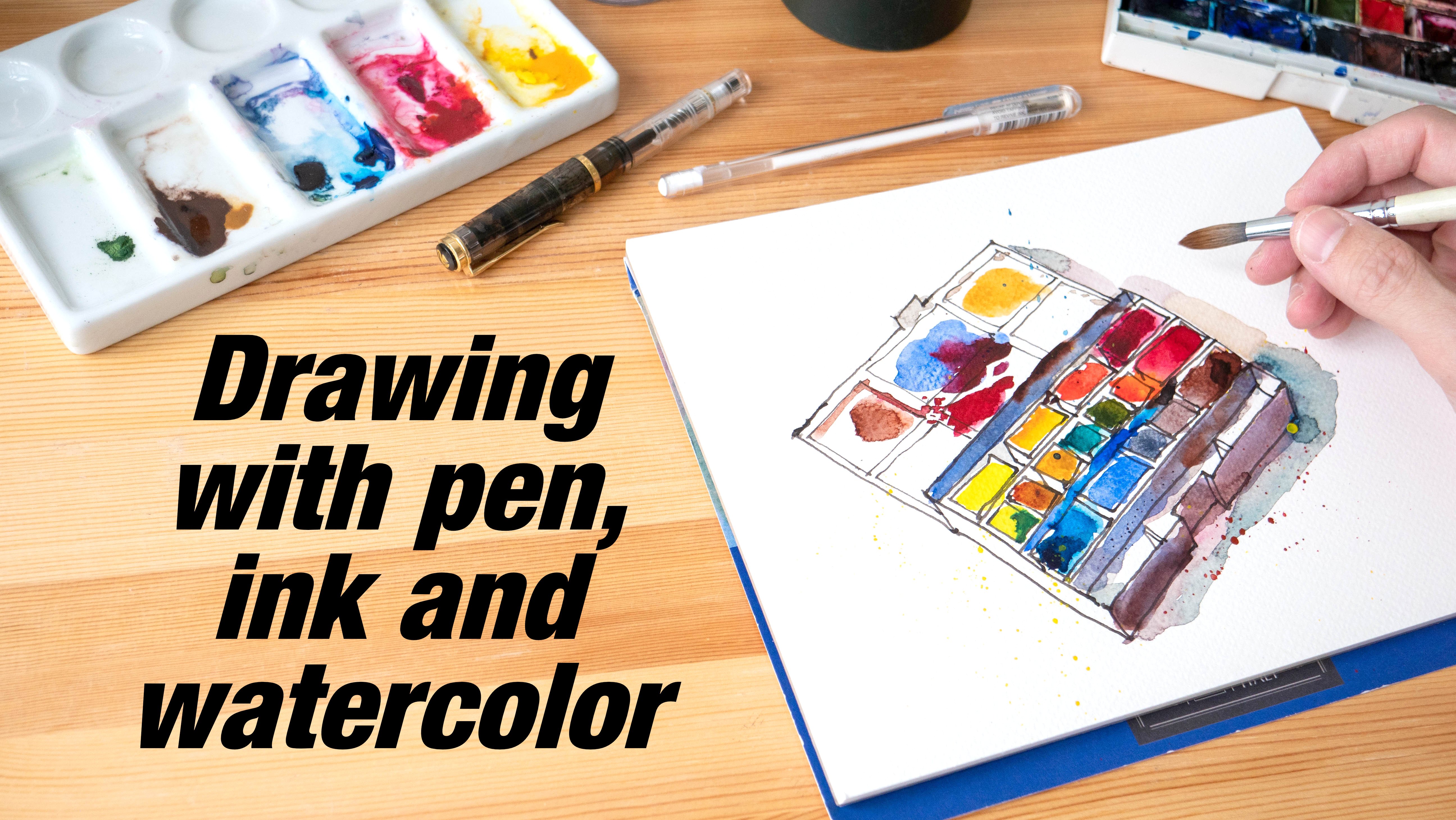
1. Intro: And welcome to this urban sketching course where
I will show you how to sketch in a cafe using
pen, ink and watercolor. I'm an artist and graphic
designer based in Singapore, and I picked up urban
sketching in 2009. I use both digital as well as traditional media
for sketching. Enjoy sketching outdoors,
but sometimes it can be too hot to sketch
outdoors here in Singapore. Sometimes I will head into
a cafe just to escape from the heat and just
to have a quick sketch. Sometimes I will be sketching
with my friends as well. In a cafe, you can
take your time, you can relax while you sketch. Let me show you the scene
that we will sketch for this course and we will
sketch from this view. I will walk you through my sketching and painting process. This is an intermediate
urban sketching course, so you will need some
basic knowledge on urban sketching in order to
follow along more easily. If you are a beginner, I highly recommend you check
out my beginner urban sketching courses first and I would recommend
this particular one, how to sketch on location
and urban sketching course. This cafe sketching
course will have a sketch demo where I show
you how to compose the scene, how to get perspective and
proportion to look right, and I will show you a timelapse of how I actually created
the sketch on location. Reference photos will
be provided of course. As for tools and supplies, we'll be using waterproof
ink and watercolor, and of course, you will
need watercolor brushes and watercolor sketchbook
or watercolor paper. There are many interesting
cafes in Singapore, and I have planned to
visit and sketch some of these cafes to create
a series of courses, and I have planned digital
sketching courses as well. So I hope you will enjoy this course and do share with me the
sketches that you have created by following the
reference photo provided or share with me the
sketches that you have created in your favorite cafes. Now before we head over
to the first lesson, I have a favor to ask from you. Making this course is not easy, so do share a review and share with me how I
can improve my courses, and also you can
help other students discover this course and know whether this course is any good. Alright, let's head over
to the first lesson.
2. My cafe sketches: Let me show you some of
the sketches that are drawn in cafes and restaurants. These were drawn
with pen ink and watercolor and these
were drawn digitally. I can use my watercolor
sketchbooks or my tablets depending on what
I have when I'm outside. I don't really
enjoy drawing food, but I like to draw food. The reason why I don't enjoy drawing food is because it takes time to draw and after I've
drawn and painted the food, the food will become cold so the food doesn't taste
as nice anymore. But one thing that I
found out with sketching food is if you use
a small sketchbook, you can actually draw faster because you don't have to
draw that much detail. You can draw digitally. In this case, you
don't have to wait for the ink or watercolor to dry. You can paint instantly. For this sketch, my
friends and I were having dim sum dinner for lunch at
this coffee shop in Penang, Malaysia, and this was sketched inside a
hotel restaurant. I didn't have much
time to sketch, so I simplified as
much as possible, coloring only the red chairs
and the hair for the people. Was sketched inside
a donut cafe, but I only ordered coffee. The nice thing about sketching
inside cafes is you can sit there for a long time as long as it's
not that crowded. If you have enough time,
you can take your time to draw all the details. Sketching digitally can be quite convenient because you
just power on a tablet, launch the app and you
can start drawing and you don't have to clean
up your watercolor. So this was drawn
in a cafe where there is this artificial
tree in the middle. And I really took my
time to sketch this, so I try to add as much
detail as possible. I try to look for
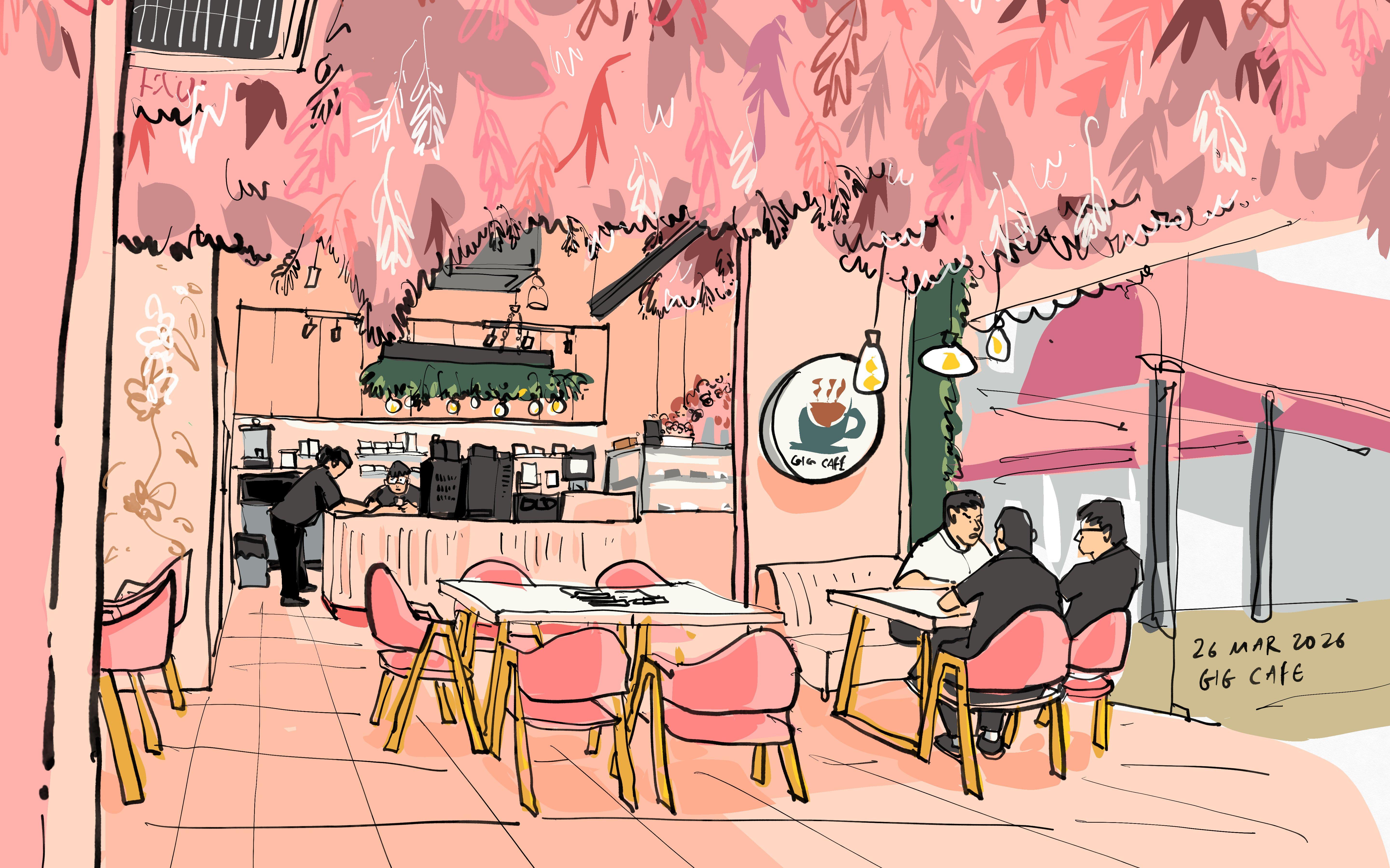
interesting cafes to sketch. So this cafe has
this pink theme, and on the ceiling are all the artificial
leaves and plants, and this design or interior
design is quite unique. Sometimes I like to draw people and maybe add
some speech bubbles. And this was me sketching at an event with all my
urban sketcher friends. All these people that
you see at the table, they are all sketching. Once you have collected
many sketches, it's actually quite
satisfying to look at them,
especially years later. Instead of doom scrolling while waiting for
my food to come, I find that it's just
way more productive to sketch something even if it's
something really simple. Sometimes I would
draw on my phone as well if I don't
have my schedule or tablet with me and
this was drawn with my finger and
the app is concepts. This sketch was also drawn
on location and I use pencil lines to create perspective
lines and composition. I probably spend 30
minutes to sketch this, but I didn't have
time to paint this, so I'm going to paint this
sometime in the future. Anyway, as much as possible, I would like to draw
and paint everything, have to complete sketch
created on location because sometimes I may be too
lazy to finish up at home. Regardless of whether
you are sketching with traditional media
or digital tools, it's just fun to sketch. In this lesson, I'm
going to teach you some basic but important
drawing techniques to help you draw more accurately
when you're in a cafe, a restaurant, or in an
indoor environment. Cafes usually have
different layouts and the furniture
placement is different and sometimes the furniture
can be in this case, the table can be circular. Sometimes the tables are
rectangular or square, the chairs can be circular or squares or there can be sofas. The techniques that I
will teach you should apply regardless of how the
interior of the cafe looks.
3. Basic drawing techniques to know: Lesson, I'm going to teach you some basic but important
drawing techniques to help you draw more accurately
when you are in a cafe, a restaurant, or in an
indoor environment. Cafes usually have
different layouts and the furniture
placement is different and sometimes the
furniture in this case, the table can be circular, sometimes the tables are
rectangular or square, the chairs can be circular or squares or there can be sofas. The techniques that I
will teach you should apply regardless of how the
interior of the cafe looks. These are the two
techniques that are important, perspective
and alignment. When you are indoors, depending on how
the room is laid out and what you are looking at, you may be sketching with a one point perspective or
a two point perspective. Let's say you are sketching
with a one point perspective, first thing to know is to
look for the vanishing point. So usually on my sketchbook, I will mark the vanishing
point with a pencil. And when I draw tables, I will have the
diagonal lines go to the vanishing
point like this. If there is another
table by the side, which is let's say
one table away here, the diagonal line
will also go to divention point like this. It is possible to measure the angle of the table manually. But if you know where
the vanishing point is, you don't have to
measure the angle. You can just draw
the diagonal line to the vanishing point
and this is going to help you draw faster
and more accurate. Oops, this lick is wrong. I'm going to teach you
how to draw the lik later or the feet later. The next technique is alignment. Let's say there is another table here and the corner is here. I'm going to draw the
horizontal line here and the diagonal will go to same thing, the
vanishing point. And this diagonal line. This is a very difficult
angle to draw accurately, but if you have the
vanishing point, you can just draw it to
the vanishing point. For the tables in front,
I have the thickness. For the tables that are further away because they
are further away, everything is smaller, so I may not draw the thickness
of the table. So how does alignment work? When drawing this table, you can place this point, the corner of the table above
the corner of this table. What I'm doing here is using alignment to place this table. I know the corner of this table
is above this point here, so I place this
here and I can use alignment to draw
this point as well by looking at where
this point is, comparing that to
the table beta. Now that I have two points,
I can just draw this. This point here, I can
use it to compare it to this table if this table
has already been drawn. But if this table
wasn't drawn yet, I can draw this table
now by comparing this corner here to
this point here. That's alignment.
The vanishing point is usually at the eye level. When you are seated
down in the cafe, your eye level will be lower and if all the other customers
are also seated down, the eye level will
match your eye level. Eye level just means you should draw the eyes on the eye level. In this case, I can draw a hat here and have the e
on the eye level. This. Another way to draw the person here is to use alignment
technique as well. See where the head is when
aligned to the table beside. Let's say there
is another person who is seated here further away. Same thing, draw the
eyes on the eye level. Like this. And the
proportion will look arrect. This is a very basic one
point perspective scene. Now I'm drawing another table. I'm aligning the bottom edge of the table to this table here. The bottom edge of this
table is aligned to this table here
because the tables are placed very neatly. They are parallel and I'm drawing the diagonal
line to the action point. Okay. Now, if you're
drawing a very white scene, chances are there are going
to be two vanishing points. So in this case, there is
one vanishing point here. And usually if the
vanishing point is directly in the
middle of your page, the other vanishing
point is usually going to be outside
of the pitch. But when you are
drawing, those elements, in this case, the
tables will still be affected by the vanishing
points outside. So here you can see this line
is perfectly horizontal. But for the tables that are at the edges away from the center, they are going to be affected
by the finishing point somewhere at the far
left or far right. You don't have to
worry about this because you can start your
sketch in the center, and as you move progressively to the edges of the page
or your sketchbook, if you use alignment
techniques properly, diagonal lines,
those angled lines will appear on their
own as you draw them. You don't really have to think about marking out the vanion
point on the left or right and then draw just mark out
the vanion point that's on the table and draw with
the help of that and move progressively to
the left or right edges. And the perspective for the
left or right edges will just appear on their own if you are using proper
alignment techniques. When drawing chairs, chairs are also affected
by perspective. So let's draw a very
simple rectangular chair. This is the top of the chair. It goes all the way down, and this is the
feet of the chair. Have some thickness
for the chair. This diagonal line for the chair will also go to the same
vanishing point as the table because the chair is
actually aligned to the table and this
is a square chair. This chair will look like this. Some chairs are circular and those are a bit
more difficult to draw. For this particular cafe, they even have the
hexagonal tables. This table is very short. When you're drawing this table, depending on what
you draw first, if you draw the chair
first, the table should just be slightly
taller than the chair. If you draw the table first, the chair should be
shorter than the table. If you draw the table
first, use the table as the reference to
draw your chair. If you draw the chair first, use the chair as the reference
to draw your table. Let's see how we can use
alignment techniques to place the tables and
chairs for this scene. I'm going to start by
drawing this table first. And you can practice along. You don't have to draw
something that detail. I'm just going to draw
the table top first, which is a squashed
oval. Like this. If you look at the
table from the top, it's perfectly circular, but when you look at
it from this view, the circle is squashed. I'm going to draw the table, the stand of the table, which comes out like this and the bottom part
is actually circular. When you draw the bottom, have it appears circular. I'm going to place
one chair here, which is at the mid point of this table here.
This is the midpoint. One chair will be here. Another chair will be here, another chair overlaps the table here slightly above this chair. Another chair here
behind the table. We have another
table at the back. The table top is slightly above. So once I've drawn this, I can use the table here as a reference to
draw the next table, which is slightly above here, and the stand will
go down like this. And there is a chair here, another chair here, and
there is another chair here. So this chair is lower
than this chair. So I'm going to place this chair here, another chair here, which is one chair sit
away from this chair, and here I can draw the
hexagonal table if I want to. So I'm just using alignment
drawing techniques. There is no perspective
for this area here. I'm just placing the chairs
using alignment techniques. When drawing the
legs of the chair, one easy way is to know where the feet are relative
to one another, relative to the top. So the bottom of the feed
for this leg is here. The feed for this leg is here, so you can see it's here
relative to this place, and this fit is here
relative to here. There's a triangle here. This fit is here. To draw
the legs of the chair, I find that it's easier to know where the feet is
relative to where the top is. For example, the feet
for this leg is here, this ft is here here and here. And for this chair, we can
only see two feet because the other two legs are
so it's here and here. I'm going to use
alignment techniques again to place the feet. I'm going to place
one of the feet here. Another fee will be here. One of the feet will be here and one of the
feet will be here. Now that you have the fit place, you can actually just
draw them to the top. Just join like that. Same applies to this chair here. Know where the fit is,
and you can just join the top and how should
I say, the bottom. Have the chairs overlap
the table so that you can get some foreground and
background thing going on. Chairs are probably one of the more difficult things to draw because there
are so many of them, and if there are
customers in the cafe, they are sitting on the chair, their legs may block the chair, which sometimes can be
a good thing because when the customer blocks
the view of the chair, you don't have to
draw the chair. Some of the chairs have
very irregular shapes, so those are really challenging. The main thing that
you need when it comes to drawing is
actually patience. You can apply perspective and alignment drawing techniques
to almost any scene. For example, with
this cafe scene, the vanishing point
is actually here. The side of the countertop, will go to the function
point which is here. There is a table here and this diagonal line goes to the unition point which is here. Now, sometimes the line may not coincide with
the vanishing point, but as long as the line goes in the general direction
of the vanishing point, the subject is going
to look accurate. There's this tray here,
this diagonal line also goes to the
vanishing point. And for the chairs here, I use alignment
techniques to draw or find out where the bottom
is and just draw them. Generally speaking, when you are sketching outdoors or indoors, there usually is just
one vanishing point and the other vanishing point is usually outside of the page. For this scene, the
vanishing point is here and the other vanishing
point is actually at the far left you can see the
countertop is actually affected by that vanishing point which is at the far left. Advertising or the menu
board here at the top, is also affected by
that vanishing point. So even though you cannot
see the vanishing point, you should know where that vanishing point is
so that you can draw the angles of these
lines more accurately. Even this chair, top of this chair is affected
by that vanishing point.
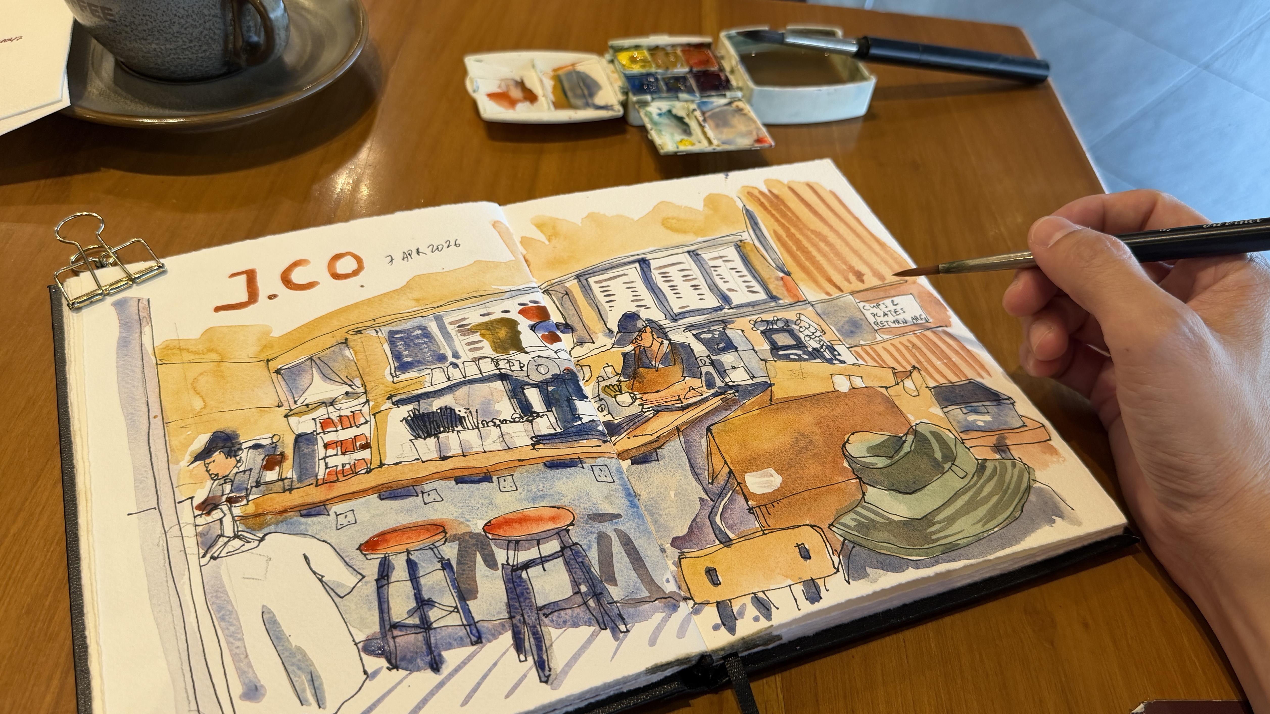
4. Sketch demo: This lesson, I'm
going to show you my thought process when
it comes to drawing this scene and you can
download the reference photo provided to draw the same
scene in your own style. Let me go through
the tools you'll need for this lesson
very quickly. You will need watercolor paper
or watercolor sketchbook. You need a pen with
waterproof ink. Having a pencil will be useful for creating
drafting lines. For watercolor, I'm
just using six colors, azel yellow ochre, andro
quint slot, a cool red. I can't actually remember what color this is.
This is CBO Blue. But you can use
French ultramarine and this is cerulean blue, but you can use allow blue. Welcome to another
sketching tutorial, and this is a cafe scene. I was having coffee
after lunch at this cafe specifically so
that I can sketch this cafe. It's always fun to sketch in a cafe because it's comfortable. There are many things to sketch. You can sketch the countertop. You can sketch the
people chatting and you can really spend
your time and not rush. It's a comfortable
environment for sketching. Now I'm going to talk about
how I actually compose this scene and show you
the timelapse later. So usually for a
complicated scene where the perspective
can be challenging, I will start with pencil first, and I'm going to show
you how I do it with pen instead of pencil because the inking, it
will be easier to see. This is the reference photo, which you can download from the video description below
or from the attachment. This is actually a one point or actually a two point
perspective scene. There is one
vanishing point here, and it's always good to find out where that vanishing point is. Let's use this piece of paper to see where the
vanishing point is. Just follow the diagonal lines. Okay, I may need two
pieces of paper. So if I'm trying to find out where the vanishing
point is on location, I'll just use my
pencil or pen and just try and do this and see where the
vanishing point is. So in this case, based on this photo
that I've taken, the vanishing point is
actually at the corner. Corner of this piece
of paper here. For my sketch, I'm actually
drawing this view. It's a more zoomed
in view so that you can get close
to the action so that you can see all the
details more easily. If you draw this, you will get more
of the surrounding. But in this case, I
want to focus more on the countertop because
there are many things here. At this cafe, I actually
walked around to find the best seat and this view
is actually all right. Okay, so we know the
vanishing point is here. Another thing to note is this vanishing
point will also be our horizon and our eye level. So all the lines that are at the horizon here
will be horizontal. Okay. So let me just block
out the perspective. And later when you
watch the timelapse, you will see my actual process. The watercolor sketch
actually took me about 30 to 45
minutes to complete, which is actually
faster compared to drawing digitally because I feel like if I draw digitally, I can afford to spend more time. Sometimes I will be
too distracted and spend more time to
draw all the details. But with pen and ink, sometimes you just cannot fit
all the details because there is no space and the space on
paper is limited. Okay, so I'm going
to actually sorry, I'm going to just draw the sketchbook page first because this vertical
page is distracting me. This is the sketchbook page. And I will want to
frame the scene first with this thing on the set on
the side on the left side, and this on the right side. And once I have this in, and this in, I will know I
will have space for this. So usually this stage
will be done by pencil. So this will be the first line, and this will be
the second line. Remember where the
vanishing point is, you may want to mark
this out with a cross. This will be in
pencil of course, and now we can draw
this down here. I think there you can see this little the line actually goes in slightly because
of the shelving. Okay, I can draw this first. I can draw the paper
first. If the valion point is not precise, it's okay. Later when you draw
the diagonal lines, just make sure the diagonal
lines go to the vaing point. You can see some boxes here. You can draw the
boxes as accurately as possible and there are
card bods inside the boxes. That's nice because
we get some overlap, which will create
some dimension. There is my head
here on my back. So I'm drawing this
very quickly just to lay out the scene. That's my water bottle. I can draw my back here and
we have the second box. Try not to draw the details
at this stage first. I'm just getting
too carried away. Next, we find where
the counter is. We have one big line here. This is a very long line. Try to draw the
longest line first, and we have, let's
say, the countertop. Yeah, we need the countertop.
The vanion point is here. In this counter is actually tilted down at
this angle because there is another vaning point
on the left side and the vanton point is actually
at the same horizon. When you draw the countertop, you should draw it at an angle. In this case, I can actually
use the line here of the box to help me
draw that countertop at the same angle
because it seems like it seems like
these two lines are parallel the side of the countertop actually goes
to the vanishing point. If you want to
measure this angle, it's going to be
quite challenging. But if you know where
the vanishing point is, you just draw it to
the finishing point. And in this case, you
can see my line here, it's actually it's too steep
compared to this line here, which is more gentle, but it's okay because it still follows the rule
of perspective because the diagonal lines will go
to the vanishing point. Of course, if you are able to mark out the vanishing
point more accurately, your sketch will
look more accurate. Now we have this big line here. We can maybe draw this
bottom of the counter, and there is a chair here, we want to have the seat here. And we have a table here. Now notice the corner
of the table is here, just below the countertop
here and there's a test here. So the corner of the table is
actually quite close here. Yeah, here, this diagonal line will go to the function point, so you don't have to
measure that the angle and this line will go to the venture point
on the left side, which is outside of the pitch. In this case, you will have to measure this using observation. But I'm going to use
I'm going to draw this line parallel to this chair here because they look
like they are parallel. But in reality, they
are not exactly parallel because the non sorry, the horizon is here.
The horizon is here. So the lines will
move down like this. You can see the angle for
this line, this line, this line, and this line, they will all be different. But when you're
drawing like this, with a closeup like this, sometimes it's okay to
have some adjustment. We have the chair, Okay. Notice there are some uh, how should I say,
unfortunate intersections. There is this line the support for the counter is
a vertical line. There is this handlebar for the trolley that is
holding the card box. This line intersects
with the vertical line. This is this is going to affect clarity because we have two lines going into
the same spot here. And also this line goes down
and now we have line, sorry, one block here for the chair, one line here for the trolley,
and a few more lines. All that is going to add
to some visual confusion. Sometimes you can use your artistic license
to move the lines away. So in this case, for example, I may just draw the
handle bar here, away from the
vertical countertop. Yep, so let's draw here away from the vertical
countertop and have the trolley go down this yeah. You may also want to draw
the there's a shirt here, so we want to draw
that because shirt the T shirt merchandise actually overlaps the countertop,
we draw that first. We can draw the bottom
of the countertop, and it will start here at
the middle of the T shirt, go to the bottom
of the seat here. Start here and here. Once you know the starting
point and the ending point, you just join the
lines together. There is some thickness
to the countertop. And for all these
little items above, you will have to spend some time to draw them because
there are so many. But the most important
thing here is to maybe block out the areas where
those objects will be. There is a tray here, so the
tray will be somewhere here. We have some cups
here for the straws, there are actually five cups. There is this triangular
display board here with three levels of items Okay. By the way, when you
are sketching all the little things
at the countertop, please align them with
the paper on the side. So here you can see I
actually made a mistake. I've just drawn this much
smaller, much, much smaller. Now, the top of display here is actually
taller than the paper. When in actual, when
you look at the photo, you can see that
this top here is actually lower or at the
midpoint of this paper. That's the mistake here.
But this is still okay. You just in this case, maybe this is a huge display. But for the other items, let's try and draw
them much smaller. This is the payment center,
the payment machine. Now that I know I made a
mistake here with pencil. All this is going to
be drawn with pencil. I can draw this much smaller. Actually, for this part here, I may actually when I'm using pencil to draw all this out, I'm actually just drawing
like this, like this. This is the coffee
machine behind like this. There is this coffee
machine here like this. Yeah. Just a few shapes like this to remind you of
all these items here. Next, we have the
coffee machine here. We have a circular thing here, so let's put it here. Now I want to make
sure that this is sized correctly
relative to the paper. So I'm going to place it here. This and just block out
the scene part by part. Now, the back here
is also important. This whole wall at the
back. We need to draw. Actually, we should
probably draw this earlier, but it doesn't matter. This is the side wall and
this is the back wall. The sidewall actually
goes down at this angle, and this will actually go
to the vanishing point. When you draw this, just have it go to the
vanishing point. The line will stop here, which is above the T shirt. I think this is okay, still above the T shirt. This line will go up like this. Because we don't know where the vanishing point
on the left side is, we will have to measure this angle as accurately
as possible like this. This will come down.
This is the door to the kitchen and we have
some, what's that? Display boards here.
There's one big, small, small, small big. Okay. Notice I draw this
big shape first, and now that we
have this, we can actually divide this into
smaller and smaller parts. Now, in my actual sketch, I actually did not
get the dimensions for all this accurately. Okay. There is also
this lighted sign here, which is actually the
logo of the what's that? The shop cafe, which is here. So all this is still drawn
with pencil, by the way. After this is done, you don't have to draw all the machines coffee making machines in the
background and you can see there are so much
details in the background. So what we want to do is we
will just draw the front and just draw however
much detail we need, and if we do not have
space to draw the details, we can just leave them out. You know what? Since I am
almost done with this sketch, I might as well
just continue here. I'm drawing the side of the box. Note that the side
of the box is light because the light
source is coming from this side and this side is dark. Here you can see the countertop here is dark and here is light. We can see some
shadows or reflections from the chair for the chair, just align them to the things that are on the countertop so that you
can get proper alignment. Yeah, these chairs are actually quite difficult to sketch. The thing that is most difficult to sketch in
a cafe, in my opinion, would be chairs
because you have to make sure the perspective
of the legs are correct. When you are drawing chairs, especially chairs
with four legs, know where the legs will end. We have one point here,
here, here and here. When you are drawing a chair, for example, we
draw the top here, here as you are
drawing this chat, know that if you
draw the lik here, go all the way up here. The other leg will be here, place the bottom at the
correct place, have it go up, place this leg place the bottom of this next leg at the correct place
and have it go up, this at the correct
place and go up. So now the chair will look sort of accurate with
the correct perspective, and I can join the ls together with the
metal beam as well. In my reference photo, there is no person here, but there is actually a
person serving coffee. So based on what I see in
my actual sketch here, you can see the head overlaps
the the signboard behind. When you're thinking
about drawing people, find out where the head is relative to the scene that
you have already drawn. In this case, it's nice
for the person to overlap the advertising board behind because you get that sense of
foreground and background. You know that this
person is behind the counter but in
front of the board. So that is actually good in creating help making your
sketch look more three D. Okay, so in this case, I'm just going to
draw the lady here, whereas a cap, heat. She has a ponytail. She is working on the coffee and when you are drawing her
working on the coffee, draw where the hands are first. Don't draw the arm.
Don't draw other parts, draw where the hand is,
draw the coffee cup, draw the hand posture. Because the hands will
move very quickly. The arm posture, the elbows
will move very quickly. So once you draw
where the hand is, you can then connect the hand to the elbow to the shoulder. That is one way to
draw very fast. Okay, now that we have
all this setup in pencil, you can actually
start inking it. Any mistake that you make
during the penciling stage, you can try and remember them and avoid those mistakes again. When drawing things
in the background, well, draw the
biggest shape first, draw the biggest shape first, and once you do not have
space to draw the details, just skip those details. Just draw the
biggest shape first. Draw the little details, and if you are thinking of
whether or not to add details, usually you can avoid
adding those details. If you are thinking
of whether or not there is enough space to add details or whether by
adding more details, it will actually
make the sketch look more busy, unnecessarily busy. That is the point where we
can actually stop the sketch.
5. Sketch timelapse: Here is a five
minute time lapse of the actual sketch that
was drawn on location. Now, the line art took me
around 20 minutes to complete, which was considered quite fast. Here you can see me use pencil to draft out the composition first and the
sketching process is the same as what I have mentioned
in the previous lesson. The main difference
here is I have a larger drawing surface so I can afford to
add more details. Here you see me draw the
left boundary first. And I usually try to draw the boundary to create an
enclosed shape so that I can draw everything within the enclosed boundary so that I can fit everything
onto the page. And now I'm drawing
the countertop. And usually for my sketches, I try to draw the
longest line first. So for example,
the left boundary is a very long vertical line. The countertop is
an angled line. It's also very long. And there is another
very long line for the menu boards at the back and also a vertical line for
the wall on the right side. Now that I have these
two long lines, the left line and
the countertop, I'm drawing the details
on the countertop. Since I have already laid out the composition with pencil, I have a good sense of how big I should draw the objects on the countertop so as
to fit everything. Of course, when drawing
all the little items, I'm actually still using alignment techniques to
place those elements. Now, sometimes you may draw something and you realize that you have
run out of space. Running out of space
just means you won't be able to
draw everything. For all the things
that you cannot draw, you can just leave them out. And now I'm drawing the
foreground element, which is the box
on the right side. I have my head which
overlaps the box behind. And as I am drawing the head, I'm just using contour
drawing techniques, just trying to observe how the lines move,
how they overlap. I'm drawing the chair,
the top of the chair, and the diagonal line points to the vanishing point outside
of the page on the far left. And now I'm drawing
the two chairs in front of the countertop. I have only drawn the top, but I'll draw the legs later. Now one thing you have
to note about drawing chairs is the top of the chair, the seat will be flattened depending on
the perspective and how flat the seat is will depend on your eye elevation,
your eye level. Try to make sure the seat
looks flattened enough because that will give you the look, the
correct perspective. And try to add
people in the scene. If you are not comfortable, if you think you're not
good at drawing people, try to have more
practice and draw people more because
the more you draw the more you will build
up your visual vocabulary and soon you will know how
big a person should be, how big the head is
compared to the body, how long the arms will be, how the elbows bend. Once you have all
that knowledge, you can use that to draw people. Quickly and more accurately. Adding people in
your scene will make your sketch look
way more lively. In this case, you
can see there are two staff in this
scene, two employees, one at the far left and one who is making coffee at
the middle of the page. Now I'm drawing the background, which is the menu behind. Adding a little bit more details to create the
rectangular frames. You may notice the menu board in the photo is actually black. So on hindsight, I probably
should have painted the menu boards black and
added the text with white, but later on, you'll see that
I actually did not do that. Sometimes it's good to use
or paint think in reverse. Thinking in reverse, having a lighter value over darker
value can make your sketches, your painting look
more interesting, way more interesting
compared to just having darker or light values. This sketch is almost done and it's a
pretty quick sketch.
6. Painting with watercolour: Now let's talk about
the painting process. Now, to make color mixing easy and to achieve color
harmony more easily, go with a limited color palette. Shown on the left is the list of possible
colors you can use, and the first color that's mentioned is the color that
I have in the palette. In this palette, I have
Azo yellow, yellow ochre, traquint scarlet,
quin crytal magenta, Cboblue tip, and
cerulean blue chromium. So what I have in my
palette is basically a warm and cool version
of yellow, red and blue. And with only six colors, you will be able to
mix many more colors. There will be some limitations
with a six color palette. With that limitation, it
will set you free from choice paralysis
because if you have too many colors in
your watercolor box, sometimes it can get
confusing when it comes to choosing what colors
to use for mixing. So here you can see
me start by painting the bottom of the countertop, and I have used Cobalt
Blue deep here, which is one of my
favorite blues. But you can use ultramarine, which is a very popular
warm blue color. Ultramarine is actually more vibrant compared to cobot deep. I'm using this
color because I see the bottom of the
countertop is gray. To mix gray with this
blue or with ultramarine, you just add the cool
red, magenta or rose, and add slight yellow
and just tweak the proportion for the
paint to get gray. And if you want to make the mix more blue, you just
add more blue. If you want to make it more
yellow, just add more yellow. If you want to make it more
purple, just add more purple. And that is the beauty of
using a limited color palette. There isn't much choice. So when it comes to mixing
the color you want, you can only use the existing colors that
you already have. And once you are very familiar with the six colors
that you have, you will be able to work
and paint much faster. So I'm trying to paint all the things that I see
with the blue shade first, and I'm adding slide
agenda to get the purple, you don't always have to follow the colors that you
see from the scene. Sometimes you can use
your own artistic license to change things up, which is what I usually do. Earlier I mentioned that
I should have painted the menu boards
behind the employee. Black. You can see me only
paint the darker frame, but I didn't paint
the menu black. I should have done that so
that later on I can use white jaw pen to write the
words on the black board. So when painting, it would
be good to plan in advance, where the darker values should be and where you will want
to use your negative shapes. Here, I didn't have
much time to think. This is the first layer. Whenever you mix paint, try to use the
paint that you have to paint everything that
requires that color. Because if you miss
out something, and later on you
realize that, oh, this should have
been painted with the first color and you try
to mix the first color again, um, you won't be able to get you won't be able to mix the precise color
that you used earlier. So it would be good to paint everything
using the color that you have at whichever point in time so that you don't have
to mix those colors again. Now I'm painting
the wooden areas. Walls, the cardboard
box with yellow ochre. Again, I'm just trying to
paint the biggest areas first. I try not to paint
the little details. Paint the biggest areas first and work on
the details later. Because once you have
painted the biggest areas, you can very quickly
start to see your sketch will come to life. While the wash is still wet, you may want to charge
in some extra color so that the flat color
doesn't look that flat. And you can only charge in
extra color if you are using good watercolor paper or if you have a lot of water
on the paper. Try to use good watercolor paper because with good
watercolor paper, the water will remain
on the surface of the paper rather than being
absorbed into the paper. When the water in the
paint is on the paper, they will have the time to blend softly and smoothly
and beautifully. If you are using paper where water is absorbed
into the paper, the paint will be absorbed
into the paper and the paint will be stuck and won't be
able to blend beautifully. And after adding
the yellow ochre, you can see me use the red to paint the top of the chairs. The photo actually doesn't show the red seats that clearly, actually, I can't even see
whether that's the red seat. Anyway, I'm painting the sets red because I wanted
something to be eye catching. I also painted some of the merchandise on the
countertop with red. Now you can see me use or
mix black again to paint the darker areas just to go over the darker
areas a second time. At this point in time, you can see the
wash or the paint. Everything looks flat
because it's mid value. What you need to do now is
to create more contrast. To create more contrast, you
just paint a second layer, you can paint shadows, you can make certain
areas darker. Try to have light, mid value, and dark
values in your scene. That will make your scene
look more interesting. If your scene only has
light value, for example, the white of the paper and
mid value taken up by paint. If it's just light
and mid values, it's going to look very flat. It's not going to look
very dimensional. Try to paint some darker areas as well and make it
noticeably dark. Don't be afraid to add values. Make certain areas darker. What you really want is
a good balance of light, meat, and dark values so that
you can create contrast. Creating contrast is actually very important and something that I always think about we painting because
with contrast, you will be able to guide the viewer to whatever
you want them to see. Also with contrast, it
just makes your sketch, your art looks better. Can create contrast with
values, light versus dark, or you can create
contrast with colors, desaturated colors
versus saturated colors. You can see the red seats for the chairs in
front of the counter, they look quite striking. That's because of
color contrast. We have very vibrant red against the dull gray background
and those really stand out. This sketch is almost
complete and now I'm just adding finishing touches and painting areas that
I have left out. And you can see me
paint some pictures on the menu boards. I could draw the
pictures with ink, but I chose to paint them
with watercolor instead because I don't want the black
lines to catch attention. So without the black lines, you don't have that
much contrast, and that's something
to think about. You don't always have to draw everything with black lines, especially for things that do
not contribute to the form. For example, there are actually some white stickers
on the cardboard box. So you may not need to draw the white stickers on the box. You can actually just
leave those areas white. Instead of marking out those
stickers with black lines. Now I'm adding some perspective
lines on the ground to show the perspective of
the floor, the tiles. Adding those perspective
lines will also give you a sense of space, sense of perspective for
this particular scene. Now you can see me add
additional shade to the head. The light source is actually
coming from the right, so I'm painting the
left side of the head. And knowing where
the light source is coming from is important because it's the light source
and the shade that will make your sketch
look dimensional. Now, when sketching
in a cafe like this, the light source is coming from everywhere from all
the lights around. So sometimes it can be difficult to paint the light
in the darker areas. So sometimes you may have to use line art to make your
sketch stand out more. There is a lot of white
space at the top, instead of drawing
additional details, I've decided to just
paint the name of the shop at the top and always remember to write the date, time and place because you can refer to
this in the future. This is the completed
sketch with me just adding the final
finishing touches.
7. Paint commentary: So this is the completed sketch. This is ultramarine with some
cool red to get this color. This color is actually much darker in the photo
in real life. So perhaps I could
have made this darker, but it's okay, I guess. At least the black line is
here to help frame the scene. So we the line here and the line here to help
focus the scene. This is yellow ochre and you can see this line here that happens because some parts of the paint will dry faster
to create the heart ache. There is another lady here. I would actually prefer to have the pace into the scene
rather than face up, but I guess it's okay here. This is the display
that I told you about. This is the coffee
making machine. There is this piece
of paper here, which you can see it is blank, but it's actually not blank. There are actually
some menu items here, so I may want to add
some menu items there. Yeah. Sometimes my paint
will just overflow. You can see overlaps the paper. The paint of the wall overlaps
the paper, and it's fine. It's a sketch. These are the
cups that holds the straws, the spoon, and the sugar, cream, coffee cups at the top. Now for the display here, You can see I draw the black
lines to draw the displays, but for the actual menus, I actually use paint. For physical objects, I
try to draw with ink. But for objects that
are on the surface, I will try to draw with
paint instead of using ink. This is the black coffee machine which is not as black here. Probably should have painted
this whole thing black. But I'm just going to
leave this as it is. And you can see all
the menu items. This is light against dark and
this is light again sorry, dark against light, and
this is light against dark. Now in the photo
reference photo, it's actually all
light against dark. So I'm using my own
artistic license to change things around. If you do want to use
light against dark, make sure you print, not print. Paint the background much
darker as darker as this, so that when you use
the white jaw pen, you can actually create more contrast which will make your sketch look
better like this. Make sure the background
is much darker so that the white can stand out more
and give you that contrast. These are the coffee making
machines in the background. These are cups. And as I mentioned earlier, if you don't have space to draw the details, just skip them. You don't have to
draw everything. It's impossible to draw
everything as well. This is the lady
working on the coffee. I actually did not draw
the hand properly here. If you look close, I do see the index finger go into
the handle of the cup here. This is supposed to be
the finger as well, but I probably should have
placed the hand here. Now, it looks like
she's trying to add something into the cup. This is yellow ochre. This is also yellow ochre, for the darker sheets
as shown earlier, I just added some red
and some ultramarin. Just a little bit
of ultramarine. When you add ultramarine
or CBA blue dip, you will see
granulation like this. Based on what I can see here, there isn't much
ultramarine because I don't see much granulation.
There is some here. So here, just a bit just
to make this area darker, just to make this
whole area darker so that we can see
the light source coming from the right side, hitting this box here, this is also lighter because
light source is coming from the top this is my head and the light source
is coming from the right. And we can see there is this tray here for keeping
the cups and plates, the dirty cups and plates. I use this yellow ochre and the red mix to draw the lines
and the chairs are red. Now for this particular
palette that I have, it is not possible for me to
mix a color that is black, something that's very dark. Uh, so this is probably
the darkest I can get. And even if I add more paint, um, this is the darkest
that I can get. Some colors are just
not able to give you that extra dark value. So you need to know what
colors you have and what colors you can mix
from your existing colors.
8. Outro: Alright. This is the
end of the course. Thank you for taking
up this course. I hope you are now more familiar
with using perspective, how you can compose the scene, how you can use alignment
and propulsion techniques to create a more
accurate sketch. Do share with me the
sketches that you have created because I would love
to see what you have drawn. And if you want to learn
more about urban sketching, do check out the many other
urban sketching courses that I have created
over the years. Thanks again for following me. See you guys in the
next course. Bye.
 Teoh Yi Chie, Sketcher, watercolour lover