Transcripts
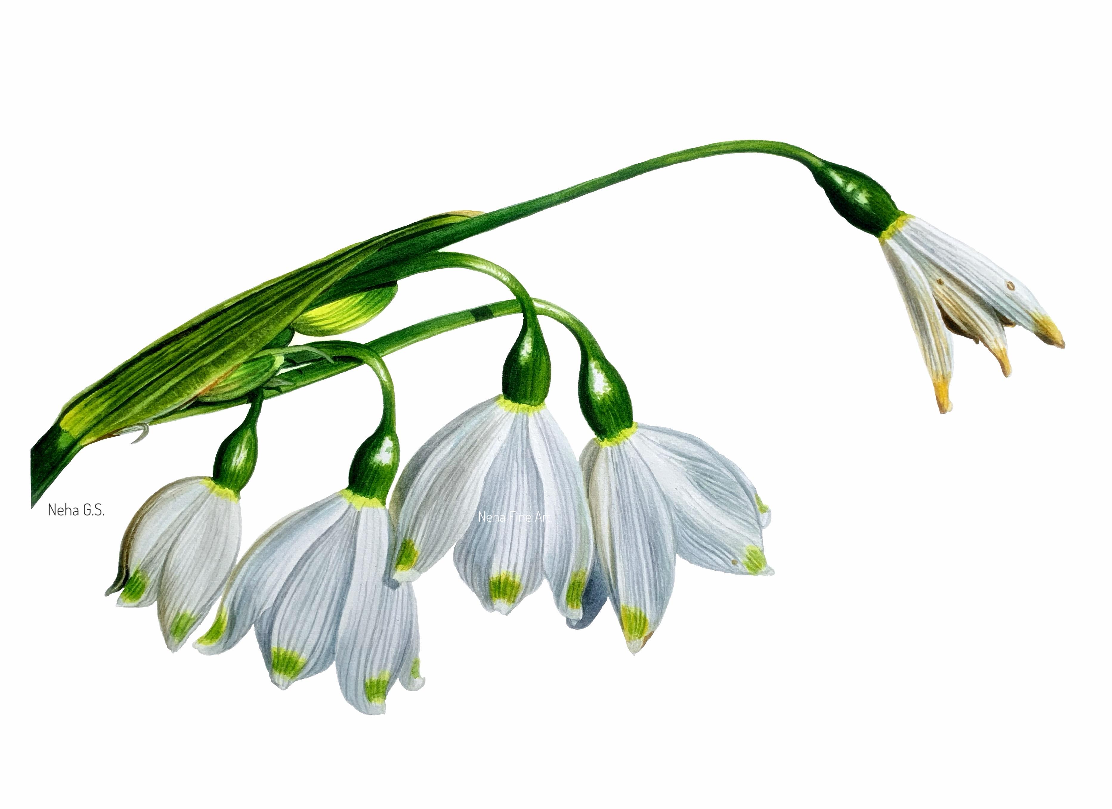
1. Introduction: Hey, everyone, welcome to
a new watercolor tutorial. And this time, I bring you
these snowy white snow drops. Painting white flowers
with watercolors on a white paper is
always a challenge, especially since we don't use
white color in this medium. As watercolor is a
transparent medium, we have to leave white
of the paper to show the brightest highlights
in our painting. So proper planning is required before we put brush
onto the paper. To keep the painting
process simple, I have used direct gray color, which is neutral tint
from Windsor and Newton, instead of mixing my usual blend of three primaries
for this tutorial. But if you would like to mix your own grays, then please do. As always, I'll be using all the usual watercolor
techniques for this such as wet on wet for
the foundation layer, and then wet on dry and dry brushing for
the subsequent layers. When painting white flowers, the focus is entirely on painting the shadows and
the reflected lights. As white color reflects
light from its surroundings, this gives us an
opportunity to introduce some beautiful vivid colors
to the shadows as well. The key to paint
white flowers with confidence is to work in layers. Keep on adding transparent
light layers so as not to make mistake by
making anything very dark. In the second layer,
I directly jump in to paint the darkest
veins and shadows. This way, I'll be able
to gauge how light or how much dark I can
go with the mid tones. After the darkest
tones are done, I start adjusting the mid tones. I follow the same process
for the green areas also, and then in the end, I bring the whole
painting together by adjusting all the tones
on the entire painting. I have broken down
this painting into simple easy to follow
steps so that you'll be able to follow along
at whatever level you are in your watercolor
painting techniques. I would love if you
give this painting a try and share it here or
on social media with me, which will also encourage
others as well. So watch the whole
tutorial first and then pick up your
brushes and paints, and let's start painting.
2. Materials: Hey, everyone. So before
we start the painting, let me quickly go through all the materials that I
have used for this tutorial. So for the paper, I have used arch hot pressed
watercolor paper. This is 300 GSM, 140 pounds paper of size A four. And since this is
a 300 GSM paper, I have stretched my
watercolor paper to a board. You will find how to stretch watercolor paper video
along with this tutorial. So kindly go through that video if you don't know how to stretch
a watercolor paper. So the other materials I'll
be using are a normal eraser, a needed eraser, and a pencil. And these are the
brushes I'll be using size four, size six. These are all round brushes
from Princeton velvet touch, and a size three by zero
and a cheese blender brush, and this is a mixing brush. Let's see what pigments
I'm going to use. This is lemon yellow,
cenar yellow, deep. These are all from
cenar, Talcine, blue, and then permanent sap
green from incin newton, actin gold, and the neutral tint
again from incrin Newton. And this is my usual
ceramic palette and my usual set of colors along with two sections of
water in a bowl and a towel.
3. Color Mixing: Let's begin by first
mixing colors. The first color I'll
take is lemon yellow. This is from senalar
Use your mixing brush. Whenever you're
removing colors from the palette or your mixing
colors on the palette. This way, your good brushes
will not lose its point. And to this, I have
added a little bit of sap green to just make it
more brighter and cooler. So this yellow now will go
on the tip of the flowers. And along with this,
I'm also going to use some warm yellow like
cenar yellow deep. I can also see some warm yellow in some of the flowers on
the tip of the flowers. Now, the main color is the gray, which we'll be using
as shadow color on all our white flowers. So to keep our mixes and
color mixing very simple, I'm going to use a
direct gray color, which is neutral tint
from Winsor and Newton. This is a beautiful
color on its own. So this is how it looks. Normally, I mix all the
three primary colors to get a gray color. But for this flower, I've
kept it very simple. And now to make it more cooler, I'm going to mix some palo
blue to this neutral tint, just to get a cool gray tone. See the difference. Now, for the warm gray tone, I'll be using some uncon gold. So I'll take some nogron
gold over here and add neutral tint again
to this color, and this will give me
a warm gray color. So you need to have a cool
gray and a warm gray. Keep on adjusting
both the colors. A little bit more of gold. And you can see how this
warm gray looks like. Because I can see a lot of
warm grays also on the flower. And let's keep some acorn
gold on its own as well. And a little bit of tailor
blue on its own as well. So that we can keep on adding wherever we see more blue or
wherever we see more yellow, we can just keep
on adding those. Now, on the tip of the flower, I can also see some green. So let's mix lemon yellow
plus permanent sap green. Let's see how this looks. I'll be adding a bit more
of permanent sap green. Again, this will go on
the tip of the flowers. These mixes are only for
the flowers for the moment, and we'll come back again
when we are going to do the green leaves
and the stem. That time we'll be
mixing more greens. So let's begin.
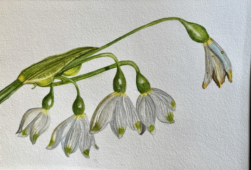
4. Flowers-First Wash-Part 1: I. So let's start with applying the first
wash on all the flowers. But before doing
that, I'll be just lightening up the sketch
with my needed eraser. Just roll over your
needed eraser on the line drawing to just absorb
some excess graphite. I'm working with
grays and greens, so graphite should
not be a problem. We can easily erase them off. So I'm just going to work
on the flowers first, so I'm just lightening
that part of the sketch. So let's start by applying all the lightest yellow parts on the tips of the
flowers that we can see. So here, I'm using lemon
yellow just on its own. It has a little bit of
sap green mixed with it, and I'm going to use
size two brush and a size four brush to soften
the edges around it. So take a milky
consistency milky to creamy consistency of lemon yellow because it's
a very light color. If you use very
watery consistency, then it will become very
light after it dries. And after you apply color
with another brush, I just soften the
edges so that I don't have to keep on washing
my active brush. Now, in some areas, I can also see some warm yellow. So here, I'm dropping in some cenilar yellow
deep as well. Just observe your
reference picture and look at the tones
of different colors. Similarly, here also, I'm
dropping in some cen yellow. So this way, I finished all
the tips of all the flowers. Now, let's give some lemon yellow at the base
of this green calyx. The same way, I'm
just going to apply color and then with
another brush, just soften the edge. So finish all these four
flowers in a similar way. Now, for this flower, I can see more of warm
yellow than lemon yellow. Let's take sly yellow. And again, soften that edge with a damp brush just to leave all the edges very
soft and blurry. I Securing your lightest areas will ensure that we don't
miss out on these areas, because once we start doing
all the darker grays, I don't want gras to seep
into these lighter areas, and then we'll not be able to restore all these
lightest areas. Now, here, I can also
see some lemon yellow. So just applying
lemon yellow first. And then I'll drop some
cena yellow on top of it. So in this way, we have finished all the first part
of this flowers. Now let's move on
to the gray areas. So I'll start with
my size four brush, and we're going to
work petal by petal, and I'll start with wet on wet. Usually, I like to
do wet on wet as my base as my foundation layer. This way, I get a very
soft start to my painting. Now, one thing you
have to remember when doing wet on wet
for these flowers, that first of all,
they are white, and we are just going to
concentrate on all the shadows because as we don't use
white color in watercolors, so the only thing white will
be the white of the paper. So when you're giving
a wash that time, see to it that your
paper is not too wet. And just check how much
when you're applying color, just check how much the
color is spreading. It should not spread too
much because we really need a very controlled kind of flow for this
particular project. So please practice in your sketchbook if you're
not very sure about this. So I started with a bluish gray, and here, I'm just dropping
in some unacdn gold also. And we'll be doing very
light layers initially, and we'll be building
up all the layers, all the colors, with
different multiple layers. And I'm also going to add
some of our warm gray, which is neutral tin
plus unacud and gold. So as you can see here, I'm going very slowly
because right now we are only comparing this color with the surrounding white areas, and at this stage, this will look very scary and very dark. So just build up your
layers gradually. So the rest of the petal, I've left it white. And now, again, I start with
second petal over here, and I'm immediately starting the next petal because I'm using very little water on
the wet on wet first. I mean, the wash. And just take the color with
the tip of your brush. Don't take too much color also. And again, I'm
just concentrating on all the shadow areas. And I'm going to add some
of that tallow blue. And when I was giving
at the water glaze, I also went over the lemon yellow color so that I don't leave any hard edges. And here with a
clean damp brush, I'm just going to lift off
some of the lightest areas. And taking a warm gray. Again, I'll just apply some
of the veins, if possible. At this stage, in
your very first wash, just concentrate on
giving the shadow areas. All the veins, those will be
done in our second layer. I have broken down this
tutorial and kept it very simple so that you can follow
with very simple steps. Similarly, let's continue with the third petal on this flower. So again, I'm going in
with a water glaze. So give an even layer of
water and see to it that it's not too wet or any dry
patches are there. Just give a nice even glaze, and then just take
very little color on the tip of your brush
and check first whether the color is not
flowing to too much. Taking some unacud and gold. And then with a
clean damp brush, I'm just going to soften
it into the paper. So wherever you see a
little bit warm gray, a little bit of dirty gray, your warm gray color, and whereever you see
some bluish gray, use your cool gray color. The squint your eyes
and just look out for all the dark patches
on your flower. So that way, you will be
blurring out all the details, and you'll be only
seeing colors. So very slowly, step by step, and if you are in doubt, then just lighten up all your colors and
you can always come back and give increase the
tones with more layers. And here, with a
clean damp brush, I'm just going to lift off the light in
between the veins. Before starting this project, just practice your wet
on wet technique and also your lifting
technique because these two techniques are very important for
this tutorial. For the very edge, I'm going
to take a cool gray color. Working petal by petal
will give us good control, and we don't have to
rush at any point. Similarly, let's start
with the second flower. Going over the yellow as well. But whenever you're going on a painted area with
your wet water glaze, just do it very gently so that you don't move
any color below. Let's take a cooler gray color. This flower has
more of blue gray, and always start with
the darkest area, what you can see on
that part of the petal. So this way, even if you have
more color on your brush, you will be s by going
accidentally in the lighter area. And don't be scared
of going a little bit darker because as we
are doing wet on wet, and as we all know, that watercolor dries a
little bit lighter. So this will all become
very light after it dries. And now with a clean damp brush, I'm just going to
lift off some of the light areas in
between the veins. In my first wash, I always
concentrate more on applying the suitable colors
in their suitable places. And also, the most
important thing is leaving all your highlights
as as possible. All the details will come
in the subsequent layers. Here, I'm just going
to give a little bit of gold on the edge. White flowers always
reflect light. They reflect different colors
from its surroundings. So try to give different colors as much
as you can see this way. You will make your painting
look very interesting. Take clean water and start
with the center petal. Here, I'm not waiting for
the left petal to dry, and I'm immediately
working on the petal next to the petal which we have already
worked on because I'm using very little water, very little water glaze, and very little color, so
it's getting dried very fast. And also being here in this
country, it's peak summer. So all my layers are getting
very dried very fast. But you just see how it
works and you can work on petal away from what
you have worked on. Again, on this one,
I can see more of a cooler gray of a blue gray. This blue gray I have made by mixing neutral tint
with alo blue. The glace is perfect. See you cannot see the
color rushing too much. It is very much controlled. I'm using the very tip of
my brush to apply color. Now I'll be taking
a little bit of just palo blue on its
own for the area. And now with the
clean damp brush, just try to revive any white
highlights, if I have. And since I've got
a little bit time, I'm just going to add some
veins, very light ones. Lifting off the light. H. Now, for this petal, I have a very clear
cut c shadow, so I'll be giving color
to that shadow first. Taking a cool gray color. For this one, I'm
going wet and dry, meaning I'm not giving
a water glaze first. I'm directly painting with color and keep it very
light at this stage. Now to this, I'll be
adding some una gold, just dropping in where I can
see some reflected light. Even for this tiny one, I'm going to work
with wet on dry. Just apply very light gray, and then with a tamp brush to soften that edges,
soften those edges. If you're not confident
about wet on wet technique, you can even do the same thing with your wet on dry as well. So I let that shadow and
that other areas dry, and now I'm giving
a wet water glaze. Now, I'll be avoiding
that cast shadow, but I'll be going with water
over the rest of the petal. And again, taking
our cooler gray and start with the deepest
shadow areas that you can see. Leaving some lighter area on the edge of the petal left edge. And then with a
clean damp brush, this lifting of
some of the light. We will continue working on the next two flowers
in the next part. Oh.
5. Flowers-First Wash-Part 2: So Let's continue working
on the next two flowers. Again, I will start with wet
on wet glaze, water glaze. Spread the water evenly. And I'll start with
our warm gray. There's a nice deep shadow on the very edge of this petal. Work in the direction of
the veins of that petal. And now I'm just going to drop some ac and gold on
this corner a here. And then with a clean damp rush, is going to lift off
some of the light, some of the high light,
and also the edge. Try to keep everything
nice and soft and blurry. Similarly, let's start working on the center of this petal. The center is more cooler, so I'll be using cool gray. Then whatever color
is there in my brush, I'm just going to spread
that on the petal and just taking more color
for the right side edge. And the clean dah start
lifting of the lightest areas. You'll have to keep
on doing this till you get your light areas. So every time you
lift after lifting, just clean your brush again, and again, just dry it off on the towel and
then repeat the process. Continuing on the third petal. Now, again, here, I can
see more of cooler gray. So I'll come back to these
areas a little bit later on. I'll start working on this petal as the petal we have
just worked is still. There's a mix of cooler
gray and warmer gray. And the lifting of some
highlight from the center. The feeding in some more color. And then with the
clean tam brash, just lifting some light again. Now here, I'm going in
directly with paint, wet and the small area, and secondly, I
want it a bit der. And then with a clean tamp, I'm just going to soften
the area in between. So softening all the edges from different sides like this. And for the bottom part of
the shadow of the petal, which is in shadow, it's more of a cooler gray and
a little bit dark. And again, here, I'm
going in wet and dry. And then with
nothing in my brush, I'm just spreading
that color into the lighter part of the shadow. So for this part, I'm again
giving a water glaze. Painting white flowers with watercolors is
always a little bit tricky as we don't have
white paint in watercolors. So we have to concentrate
on all the shadow areas. But in this way, we can also
make these flowers very interesting by giving
different colors to the s, different tones to the shadow. And as I've always said
in most of my tutorials, that whenever you're working
with a lighter subject, try to select your
reference picture, which has a nice play
of lights and shadows. This way, you will make your
painting look interesting, as well it'll be a
little bit easy. If you paint a white flower, which is in soft light with not many dramatic
shadows and lights, then it'll be a very
difficult painting and also not very
interesting to look at. I'm giving a lot of
lines on this flower. I've not started with veins, but this is how I feel the
dark part of the flower is. Then with a clean, just
lifting off all the light. Always work in the
direction of the veins. Whenever you're
applying color that w, you are giving it a three D
form right from your first. This stage, it's
very difficult to gauge how dark we should go on the shadows because they will look very dark whenever you
apply your gray colors, and it will look very scary. So that is why you just give a very light first wash
to all the petals. And when we will be
doing the green areas, the darkest tones
on this painting. That time we will understand how much more darker we can
go on these petals. But we have to start somewhere, so start by giving a
very light wash. And try to leave as your highlight
areas as possible in your first wash. Because
it's always easy to go than to leave you. I mean, than to retrieve your lightest highlights once the color is there on the paper. H So let's work on this last flower. And this has a very dramatic
play of lights and shadows. And it's very beautiful. This one is having so many
browns and gs and oranges. Beautiful. Amongst
all the five flowers. Very interesting to work. So I'll start with a warm gray and we'll be going in the darkest
shadow that I can see. And then after applying, just wash your brush, remove all the water out, and then soften the
area surrounding it. So it stops from
flowing much further. At the same time, I can even see some blue trying to make
this very dramatic, and then a little bit of gold. Now, as you can see, I'm
not concentrating on any shadows over here in the sense or the darkest
colors that you can see. We'll be only giving
our first light wash. Now for the center flower, I'm giving a wet
water glaze first. And I'll start with the
blue gray on the top. Then we have a
very strong shadow here on the right hand side. And immediately
soften that line. And now with warm
gray, very tiny space. So you can even
work if you want, or you can work with a
little smaller brush. And then with cold, Now for the third petal again, I'm going to give
a wet water glaze. In this way, we will
finish our first wash, let this layer completely dry. And then in the next part, we will be working on all the darkest areas which
are the veins of the flowers. So see you there. O.
6. Flowers- Applying darkest tones: So I let my layer
completely dry, and now let's take an eraser and erase off all the
pencil lines on the floor. So very gently, just go over your painting and
remove all the pencil lines. We don't require it now. Let's start working
on this flower. I'm going to use my size t zero brush of whatever
smallest brush size you have, and a size four brush
to soften the edges. So I have refreshed my
palette with fresh colors. This is a cool gray color. And I'll start with
this darkest shadow. I'm just going to add more neutral tint and
more tiler blue. Make it a little
bit more darker. Now, in this layer, we are going to work on all the darkest
stones of the flow. So we have covered all
the lightest tones in our first wash, and now we'll be directly
jumping to the darkest stones. So in this way, we'll understand how light or how
dark our midtones should go. So after giving color,
just soften it, give with your damp brush so that it doesn't
look very harsh. So keep two brushes in your
hand. It's very convenient. You don't have to
keep on washing your paint brush every time. After applying color just soften the edges with
a clean damp brush. In this layer, we'll be
concentrating on painting all the veins are the
darkest stone on the flower. We'll be giving all
these details now. Now, I'm making this gray a
little bit by using gold. That is why I'm using
a very tiny brush for all these very thin veins. And just taking nacer
and gold on its own and then just going over it with a
clean damp brush so that all the veins will just
settle nicely into the paper. This is also one more reason
that I like to do the veins in between the layers so
that with more layers, they just get sandwiched in
between and they will not look as if they have
been drawn on the floor. Start with the darkish
shadow areas you see. And then since you have a
very tiny brush in your hand, you will have good control. Observe the direction
of the veins, the turns it takes
because we are going into a very detailed
stage at the moment. And since we're
working wet on dry, we don't have to hurry. So this step actually
should be very therap. So just switch on some mic and just keep on
drawing all the veins. You don't need to draw
exact number of veins, but try to maintain the direction in
which they are going. I'm also going into those yellow areas because we'll be going over them
with green color. But these veines just don't stop in the white
part of the flow. They also continue in the yellow part of
the flower as well. An. Now, in some areas, I feel the light should
be a little bit more, so take your chesel blender
brush or your lifting brush, and by making it
a little bit wet, just go over some of the areas. And I'm also going over
some of the veins, which I feel they are
a little bit thicker or a little bit at this stage. So with your lifting brush, there's always a scope of
rectifying your mistakes. So we don't have to get
scared of water colors. H Similarly, let's start working
on the second flower. With a clean damp brush soften the highlight which
is there in between. You're mixing a bit
of both the colors. Adjust your colors as you can see on the
reference picture. Slow down when you have
to go when you have to work with very
thin light veins. For the veins to just
disappear into the paper, just soften them with
a clean damp brush. Digging the warm gray and then darkening the darkest
area on that flower. Keep the edges of the
petals very crisp. As I told that you don't have to draw exact number of vanes, but then observe the direction, the center veines
go straight, and, you know, the left and the
right ones, they just bend. So just observe the
direction because vanes will determine the
shape of the petals, the fall of the petals. So they are very
important feature, especially when you're
painting or drawing. Give a nice shadow underneath the petal which
is overlapping this one. That way, the center petal
will be pushed behind. If you're not confident going directly with your
brush for the veins, you can even use an edge pencil to lightly draw in the veins
and then just color over it. Just do your own thing
because that way you will enjoy the process of painting without
getting stressed out. So I'm also going
in the shadow area. Don't ignore the shadow area and also going over those
yellow parts as well. Rest your hand completely on the paper to get good
control over your lines. These are all very small helpful tips that
I'm giving you. I'm sure you must be knowing, but I'm sure it
will help someone. So now, similarly, I
will continue working on these two flowers and
finish off the veins. So let's work on this one. Now, for the darkest
parts on this flower, I'll have to make some colors. I'll take Qcarn gold to this. I will add some neutral tint. Both are in creamy to
buttery consistency. This is the color, a
very raw umber kind of warm brown color. And I'll keep a little bit of neutral tint also on its own. We need a really nice, gray or dark black color. Again, taking size t zero brush. I'll start working on the
very darkest areas of this flower because this layer is all about giving all
your darkest tones. And then taking neutral tint, just darkening some areas. I'm also going to take some burnt sienna for a
very orange brown color. And since we haven't
used any reds, I'm using burned Siena. Very fine details
with this color and with a size foe brush, I'm just going to soften all the colors that
I have applied. Taking some gray Now all the darkest
areas are done. Now, same way, we will be
giving the veins on this flow. Let's start with this g I'll further darken
this shadow area. And then just soften
the whole thing with a very with almost
a dry damp brush. Taking some brown as well. And this shadow has a nice
orange kind of color. Working gradually and slowly in multiple layers will give you really good control
and also make you understand your tonal values. This way, you will
rarely go wrong. And it's more relaxing
also in a way instead of just rushing and doing
every in one or two layers. Switching between the
cooler and the warmer gray. So the veins on this
flower is also done. We'll leave this layer to dry. And now let's start working on the green parts of this flow. So I'll be using this lemon
yellow plus sap green. D. In the same way,
we'll just apply the color in the center
of that yellow part, and then with a
clean damp brush, just soften the top and the
bottom and all the edges. Giving a little bit more
of darker sap green. This is just our first layer. Of course, I'll
be coming back to work on these green
areas as well. But try to leave
some yellow areas surrounding the green areas. Don't completely fill up
the yellow part with green. So we'll let this
layer completely dry before going in
with our mid tones, and I'll see you
in the next part. Oh
7. Flowers-Adjusting Midtones: So we have accomplished our lightest tones and
our darkest tones. So now we'll be going
in with our mid tones. We'll be adjusting the midtones. Of course, we have
given the midtones. But then as soon as you
give the darkest tones, you will see that
our light tones and mid tones require
more adjustment. So taking a very dark gray, mixing a little bit of blue, and we'll start with
this flower again, making this a little
bit more darker. So this will be almost our
final stage on these flowers. But of course, after we finish all the green parts on this
flower, all the green step, and the leaves and the calyx, we will come again, and adjust the values
on the flowers as well. So let's take some actin gold
mixed with a little bit of gray and darken the shadow
part on this flower. So now we are going into
very microscopic details, analyzing each and every tone on each and every
petal of the flower. We'll be darkening
also the veins if I find that they are
still a little lighter. And after every application, just going over it
with a damp brush to soften whatever
colors we have applied. Taking more of bluer gray, and then just softening
it with a damp brush. Now, I'm taking some very light, warm gray just going
over this area. Even this area looks
very stark white. I'm just giving a very
light glaze of warm gray. And with a cooler
gray just giving the shadow on the right
part of this flower. Gauging the tonal values on a white flowers is a
little bit tricky, so you have to do
this in stages. Whenever we give some
surrounding colors, you will find that
some of the tones look more lighter or darker
on the white flowers. And now, if you feel that you need to some of the highlights, just take your lifting brush and just remove some of the color. Always try to maintain
a balance between your lightest tones and
your darkest tones, have a good contrast in
your paintings to make your paintings look to just
stand out from the page, to just make them
pop from the page. Now, I'm just going to take some fresh yellow and give
another coat of yellow. Yellow colors always
lightens a lot more. They just fades a lot
more after drying. So you have to
keep on refreshing your yellow color
on your painting. So now with a bigger brush, I'm taking a very
watery, cool gray color. So for giving backgrounds
on the petals, I'm using a bigger brush. A little bit of ac gold on
the edge and then warm gray. I'm again coming in with my chesel blender brush to
remove some of the highlights. Just wet the brush and
then lightly just remove. Sometimes you need to use a
kitchen towel, but mostly, I just use it just scrub over the area very gently
and the work is done. Here I am darkening the shadow underneath this
petal a little bit more. This stage is all
about adjustments. The more time you
spend painting, the more time you're spending even observing your
reference picture, the more details,
also you're going to see with every layer. Making this area
a little bit more darker and then
just softening it. Don't get scared of putting more grays on your
white flowers. Your flowers will still look white once the whole
painting is complete. Because if you leave all
your values very light, then the painting will
look really flat, so don't be scared of applying your shadow colors as
dark as you can see. This painting has a lot
of repetitive steps, so you will get a lot
of practice if you have not painted a white flower
or a snow drop before. But this painting, you will get a lot of practice in doing so. Keep your line work very steady. Giving more yellow on the out
skirts of this green area. This refreshing the yellow Let's continue on
the third floor. So I'll again start with
the darkest shadow area. Taking a little bit
of gold as well. Darting this cars shadow again and with a very watery
blue gray is going to fill in the base of this petal. Applying the color and then just softening it
with a damp rush. Mixing a little bit more
of acudan gold into our warmer gray and giving
a good base of this color. Because we are working
with very light washes, they tend to dry
also very light. Same thing on this petal. And here, I'm just giving a very light wash
of cool gray color. The center is more lighter
because it's bulging out, it is receiving more light, and the corners are going inside those
overlapping petals. And through your shadows, you can show this three D form. Leave that to dry. Whenever
you're working with layers, always ensure that your previous layers
are completely dry So I let this layer dry. I'm going on a dry layer. If you draw, if you start painting your
veins on wet layer, then they will and you will not be able to
get a very thin line. Again, here, I just want to lighten the area between the veins a little
bit more lighter. A Switching between the cooler
gray and warmer gray. Understanding the temperature of the color is very important. I have even discussed this in the Daffodil with colored
pencil tutorial as well. The moment you
start understanding the temperature of the color, coloring, your selection of
colors will become very easy. And this definitely
will become more and more better with more you practice that is there
with everything. But the more you practice, the more you start analyzing
your color temperature, your color your tonal values and different shades of colors, that is the tonal values. And you start becoming
more confident in applying colors
and also mixing. Many of my students, they still get very
scared of mixing colors, but this color theory
will really help you relax while mixing colors, and color mixing is a very important part
of water colors. Taking a little bit
of warmer yellow. Mm. Mixing a little bit more blue
to the neutral tint as I want to color this shadow,
make it a little bit. And then with just
water in my brush, with very light
color in my brush, I'm just going over
the lightest areas. And taking the yellow gray for the top portion of
this of this petal. And now I'm taking a
very watery warm gray. Try to compare your
brightest highlights with the rest of the highlights. And that way, you will know that not all your highlights
are completely white. So some of your highlights may be a little bit
of very light blue. Some of your highlights
may be light yellow. Keep on comparing
your highlights with the brightest highlight on that painting on the
reference picture. Oh. Taking some green to
darken these areas, especially the veins which
are going passing through those and just taking
some fresh yellow. Don't forget the
tip of the petal, though it looks white, but we are leaving
the background white, so you need to
give some color to the lightest edges
of your flowers. If you're giving a
background and leaving that white will really
make the flower pop, but then if you're not
giving a background, then you really need to
give some color to it. Otherwise, it'll look like as if the painting
is incomplete. The shape of the
flower is incomplete. Again, here, I'm
just giving more of that bluish background
to this petal. The center of the
flower is quite bright. Not leaving completely bright because it looks very stark. Sometimes it'll just look as if you have forgotten
to paint or something. Depends on from highlight to highlight from
place to place. So accordingly, you decide. And with a clean damp brush, I'm just softening everything. W darkening the darkest
a veins on this petal. The direction is
again, very important. The curve is very important. Just observe how how
the lines are curving Let's move on to
the last flower. Taking more of burn Ciena, mixing it with a
little bit of ag gold. I'll take Cena yellow deep, and we'll start darkening
the very tip of this flower. We had just given the
first wash to it. We had not given any
second layer to this one. And now taking the warm gray. And no darkening this shadow
requires a little bit of that Kagan gold and
burn Ciena mixture. We'll call the flowers done yet. Ba as I said, after we finished the green
part of the painting, we will come back
to the flowers to give it a final finishing touch. So in the next part, we will be tackling with all the
greener areas of this painting, and we'll come back to these flowers after the
whole thing is done. So see you in the next part. Bye O.
8. Green areas-First wash: So Let's start by mixing some colors for all
the green areas. We'll take lemon yellow. To this, I'm going to make
some permanent sap green. Let's test it out. I'm also going to add some cenllo
yellow deep to make it look more green. I think it looks too warm, too olivey, adding more permanent sap green
and more lemon yellow. Keep on adjusting your colors till you find the right one. And I think I'll go for this. This is the lightest
tone that I have mixed. Now, let's make a mid tone. The midtone, I can see it
as more of a bluish green. I'm taking lots of permanent
sap green to this, I'll be adding some Tal blue. I think this is fine. Now
let's mix the very dark tone, permanent sap green
plus neutral tint and a little bit of thalo blue. These greens look more of a
cooler green bluish green. I'll add more blue, more black, and leave that. Now for the mid green,
I think I'll be adding more blue
to this green mix. Whatever shades you make, just see to it that
you have a light tone, a mid tone, and a dark tone. Little bit here and there
with your mixes. That's okay. I just wanted a little bit
more of a bluish green mix. Three greens are ready. We'll start with this one, and I'm going to work
with wet on wet. I'm using size four brush, and I'll wet the whole
surface, including the stem. Again, the water
on this should be not too wet because we have to leave the
highlight in the center. I don't want the colors to
just rush into the highlight. I'll start with mid green. I'll start right from this edge, but I'm just going to
leave bit of edge. See the color is not
spreading that much. Now I'll be taking
lighter green. I'll just wash my brush and
take proper light green, which doesn't have any mid green and this side, it's quite light. Leaving the highlighted area. More of mid green for the very outermost
right hand side edge, and with the darker green, I'll go over on the
left hand side edge. Your water glaze should be just sufficient for the
colors to spread, not too and not too. And if some of your colors have gone into
your highlight region, then with a clean damp brush, you can just lift it off. Green is a very good
color to lift off, and we'll leave this to dry, not fuss with it too much. Now, if you're not able to come in with your darkest
tone on this one, you can always go in with your darkest tone
in the second layer. Even if you are able to put just two tones, then it's fine. Now, for this stem, this
one is a very long stem, so I'm just going to work on
half of the stem and the x. Same way, I'm just going to
give a clean water glaze. You can just apply one layer of glaze and then wait for it to sink into the paper and then just apply another
layer of water that way, you will not have too much of water on the
surface of the paper, and your washes will
be much in control. And as I said earlier,
with more practice, you will be able to understand how much water glaze should I have and how much color
should I have in on my brush. I'm just going to add this yellowish color tone
to the mid green. It was looking too bluish. So I'll start with
the darkest area with the mid green color. Again, you don't
have to be perfect. Just apply the color and
leave the highlights. Now, with the lighter color, I come in on the
right hand side. More of our mid green, and then with the darkest
toe the shadow area. When I'm coloring, I'm also
giving it a good shape. Now, with a clean damp brush, I will be just softening everything even on the top so that it stops from spreading. And then when you
once you're happy with your painting,
leave it to dry. Don't fuss with it too much. Similarly, I'll be
doing all these three. So give a water glaze. And if it's a long stem, don't do everything at one go. I'm just going to color a little part of that
stem and the calx. I hope it's called
as Cx. I don't know. Not sure. In your first wash, your highlights are
very important. So just ensure that you leave
enough of your highlights. Again, with the mid green tone, I start from the darkest area. And then the lighter green. O My colors are getting dried on the palette due to extreme
weather over here. So just keep on adding
a little bit of water, and if you feel that
it's become light, then just remix your colors. Take your mit green again. The paper is still wet, so I'm going in with more color. And this color will also go
on the right hand side edge. Now with the clean damp brush, I'm just going to
soften the areas. Soften the top part of the edge. And just extend some of the
hi highlights, if you want. And let's work on this one. Start with mid green. Take very color on the tip of your brush so that
when if you have color, then the chances of the color spreading
is also very less. There's a nice highlight
in the center of the stem. Now, with the dark green color, I'm just going to
give the shadow. Of course, the shadow
is going to be er, but for our first
wash, this is fine. So now with the clean
clean damp brush, I'm just going to lift off the
highlight from the center. So I've turned my board and I'm going to
work on this one. Take your time in giving
a good water glaze to your wet wash because that will ensure that your
color application will be uniform and will
be to your satisfaction. Adding a little bit more of
blue and green to this mix. Keep on adjusting your colors according to the
reference picture. Take your lighter green now. More darker green. And
now the darkest toe for the extreme shadow areas. If you have too much
color on the paper, then just wait for a few
seconds for it to dry up a bit. Now I can see this darkest toe even on the right hand side. And now, the clean damp brush, just going to lift off some
highlight from the center. And dabbing just some color
in between the highlights. And with this, we finished the
first wash on all the cas. Now we'll continue doing the
stem and the leaves. Oh.
9. Stems First wash: So let's start
working on the stems, and I have turned my board so that it's convenient for me. This direction is convenient for me to pull the colored down. So again, I will start
with wet on wet. I'm going to apply a clean
water glaze on the stem. Be very careful when you're
working on such thin stems. You can even go with wet on dry. And I'm going to
apply water even on the top part of the stem where
we have already painted, just to incorporate those
colors into the stem. Don't want any hard line
edge between the break line. And I'll start with
the lightest yellow. I'm pressing the brush
down so that I get a thicker line and then taking a mid green
for the rest of the stem. Be extremely careful
when you're working on the edges of the
stem. I know I am. The stems are
always a little bit tricky because
they're so thin and you have to give
the highlights and the dark tone and the light
tone in such a tiny area. And how quickly,
what I'll do is, I'll give a clean water
glaze to the rest of the stem as my
glaze has dried up. When you're applying this
water glaze, be careful, you don't put water on the color which
you've just applied. Otherwise, the water will
just rush into the color, just creating some blooms. Very carefully, just drag that color into the
bottom part of the stem, and then you can start
taking more color. I'm literally working with
the finest point on my brush, so you really need a
good pointed brush. You can even downsize
it to size two or one. It's your choice. And now, quickly, with
a clean damp brush, I'm just going to
remove the highlight from the center of the stem. So wash your brush and
with a clean damp brush, just remove how much
ever you can remove. And at this stage, if
you're not able to give any dark tones, then it's okay. We will come back to it
in the second layer. And because it's a tiny area, your glazes also will
dry very quickly. So just do how much
ever you can manage in that short window of time. Try to keep your stem in as much as a straight
line as possible. Similarly, I'll
work on this one. So again, I will start glazing it from the top of the stem, bringing the water down. Now, ensure that your
first stem is dry. Don't want that water to
rush into the first stem, where the color is
still not dried up. So I'll again start with
the lightest green. Taking very little color
on the tip of my brush. And here, I'm just going
to leave the highlight. It's got a nice bright
highlight like this, and then continue with the dark green color,
the mid green color. Taking the darkest green now. And now with a clean
damp brush and just lifting off the highlights. Continue in the same way. E. On the bottom part of
the stem is lighter. And then I'll come with
our mid green color. So now with a clean damp brush, I'm just lifting off the lighter area on the
bottom part of the stem. In this case, the
right hand side of the stem so that the darker green color doesn't rush into the
lighter green area. I just want to ensure that
this remains a bit lighter. H Now, I'll directly go in
with my light green color. There are a lot of small
parts on the stem, so I'm just working wet on dry. Again, the bottom
part of the stem is lighter, the right hand side. I think I'll give the
whole stem this color. And there is a small
seple coming out. I just want to leave that. You can even mask it off with a masking fluid if you're
not confident enough. And then with the
mid green color. I immediately come and
paint on the lighter green. The lighter green is still wet. And then with a
clean damp brush. I'm just going to
lift off that color. And in doing so, I eradicate the line in between
these two colors. They just blend
together. Like this. At this stage, we are not going in with our darkest shadows. For that, we will be coming
in the second layer. So we'll continue with the
bottom part of this stem. And then the left hand
side has a lot of shadow. Just lifting off some
of the highlights. Now, for this, again, I'm going to give a wet on wet. You can continue with
wet if you want. I'll start with light green. Again, there is a nice highlight
which I want to leave. If any of your stem lines are a little bit crooked or they
are not perfect, don't burry. In the second layer, we will be correcting all the
shapes as well. Take darker green now. And the bottom part is
a little bit darker. It's more darker than
the top section. Pay attention to your
lights and shadows. And then with a clean
damp rash and just softening the lines
that I have applied. Just giving this mid green
color to the bottom part. So this will show that, the stem is rounded in
shape, cylindrical. And then just soften
it into the highlight. Keep everything very
soft and smooth. Let's paint this tiny over here, directly going in with color
with the mid green color. So now, let's paint these
bright yellow buds. I don't know what are
the Are they buds. Please tell me in the comments or whenever
you're painting, if you know the correct name, please correct me if I'm wrong. So now for this small
part of that stem, it's more of a gray green color. So I'll just take our gray, which I had left on my palette. And to this, I'll
add this green. Make a nice earthy
green kind of color. Ops that is too dark. Take water and then
just spread it. Very light color,
and this is nice. A grayish green color. Add a little bit more green for this tiny saple over here. The back behind stem is dry. And this can also go in the
top section of this saple. And for the bottom section, I'm going to use
this bright green. And with that clean damp brush, just lift off some light
from the center, if you can. F. So Let's work on these. I'm going to take lemon
yellow as a base. This will act as a wet on wet wash base because it's
a nice bright yellow. But I I use water, then this yellow will
lighten further. So just using lemon yellow, and then with a clean tam ras going to remove some highlights that I see even in that
bright yellow area. Then take your mid green color and just drop it on
the top of this bud. Oh. Just drag some lines and then with a
clean damp brush, so just lighten the areas
in between those lines. It's a very
straightforward thing. Same thing on this Billow one. Start with your very watery
lemon yellow as a base. I'm leaving the top section
without any color. O. Soften it. And then you
take your mid green, just drop it here a
little bit more darker. And then just with
a clean dam brush, just soften that area to stop that green form from
traveling any more further. And then start lifting off
some of the lighter areas. A little bit of mid green
on the edge over here. The shadows underneath here will be doing it in the second layer. We'll leave this for now. So let's start
working on this leaf. So for this, I will require
an olive kind of color. So I'm taking
permanent sap green. To this, I will
make cena yellow. And also a gold. And this becomes a little bit of green that I can see on
the reference picture. First, what I'm going to do is, I'll just give I'll just
start with this light green. It's a very narrow
space over here. I'll just start directly
with wet on dry. And then I'll soften the edge
with a clean damp brush. Take a little bit
of cena yellow. And now, let's
give a water glaze to one half of this leaf. M. And I will take light
light green first. There are a lot of things to do in one half of the leaves, so it's better to
paint half of it. And I'll take lemon
yellow mixed with a bit of ci yellow for the base. And with a clean damp brush, I'm just going to
lift off some of the light from the
edge of the leaf. Now, let's take
this olive green, and I'll start
dropping near the mid. Leaving some gaps in between. And I'll take lemon
yellow for the very edge. It's not completely white. And then the clean damp brush is going to soften
that top edge. Even here, I can take
some olive green. Area is still wet. I can add more color. Now there's nothing on my
brush with a clean tam brush. I'm just going to start lifting
some of the light areas. Go to add this darker green
color to this olive green. As I can see some grayish
darker green in this space. Lifting again. Now there
is nothing on my brush, but just with a damp brush. I'm just creating some texture by giving some horizontal lines. If you observe the
leaf carefully, you can see a lot
of texture on it. So after it dries, it this little bit
of water will repel the paint and will create
some light pockets of color. Very easy way of giving texture. And then with a still, I'm working with a clean
damp brush. I just lift off. And now, while that is drying, let's give this dark color
on the shadow area on the top. Be careful. The below part is still wet. I'm just going to soften
this end of this line. And now let's work on the
left hand side of the sleeve. Same thing, I'm going to
start with a water glaze. Oh. Just be careful, if your right hand side of
the leaf is still too wet, then just wait for 2
minutes and then you start. Now, I'll start
with lemon yellow, mixed with a little
bit of cen yellow, and I'll start with
the bottom part and then take light green. And without disturbing
the right hand side, carefully, I'm painting
the remaining side. Taking more lemon yellow. Let's take more
of this mid green and I'll start
creating these veins. We have a very vein
on this dark green, but that we will be doing
it in the second layer. The painting is still wet
and I'm giving some veins. This will just give
a softer look. And then with a
clean damp brush, I'm just going to lift off the lighter areas on this leaf. So lifting off the space
between the veins. Try to work in manageable
parts, manageable, small parts. Don't try to work the
whole leaf at once, and then you'll have to rush
to get all these details in. In the same way
with a damp brush, with very little
water on my brush. I'm just going to start creating texture on this part as well. See how the water is
repelling the color and creating those lighter
pockets of lighter color. So let's continue with the
bottom part of the stem. For that, I require a very
bluish green kind of color. So I mixing sap green
plus thalo blue. And I'll use the same dark
green for the darker shadows. So I'll wet the area first. I like to work with wet on wet, especially for my base
foundation layers, but you can go ahead
and for smaller areas, you can work with wet. Both are equally
good techniques. So I'll start with this
green bluish green color and apply it every. And as you can see, I always apply in the direction
of the form. That is a habit you have to cultivate and that
habit stays forever. Lift off the color
if it's pooling down near the end of the board. And now with a clean damp brush, I'm just going to
lift off some of the lighter highlights
on the top of this stem. The highlight is not very light, so just a little bit
of lifting will do. And with this dark color, I'll go in all the
darkest shadow areas. Even on the edge. And then with a
clean damp brush, it's going to lift off some
of the light from the center. Taking more darker green. The paper is still wet, so I'm able to apply more color. With this, we finished the first layer on
all our green areas. In the next part, we'll
come with more layers.
10. Green areas- Second layer: So this layer is
completely dry now, and let's erase off all the pencil lines on
all our greener areas. Always do this step after your painting is completely dry. Otherwise, your paper
will get ruined. So now let's start with
all these calics first. For this, I'm going to use
my same triple zero brush. But before that, let's
mix some colors again. I'm taking permanent sap green, bit of Talor blue. This will be our
mid green color, little bit of yellow as well. A. And then take your lemon yellow, make a nice lighter green color. At this stage, if you feel
that in your first layer, if you want to change some tones in your second layer,
you can always do it. You can always keep on shifting your color or color tones
with each layer if you want. And let's keep some
dark green also. Same blue, plus
green, plus black. And I've kept this at a
very watery consistency, watery to milky consistency. We don't want to give
very thick layers. Working with multiple
layers means working with transparent watery washes. Let's start and I'm
also going to keep a size fore brush to
soften wherever I want. So I'll start with
this mid green color. Applied on the darkest
side of the stem. And with a clean damp brush, you can just lift off
some of the light. I'm also going to add
a little bit of blue. With a smaller brush,
you have more control. And we are jumping
into details now. Take your lighter green. We're working from
dark to light. This way, we will instantly get that darkest stone without
giving more layers. I'm observing the
highlight area here. I'm adding a little bit more of sap green to the
light green mix. And even in the highlight area, you'll be able to see more
of lines going through. So just observe your
reference picture carefully. And this mid green is also on the edge of the I right edge. And just fill it up
with light green. Just giving some texture. And now I'll take the
darkest green color for the very dark shadows. Take your mid green
again so that it blends nicely into the mid
green background. Working with very tiny
strokes to give some texture. I'm also going to
keep some neat lemon yellow and give one more layer to this brighter yellow part. Similarly, let's work
on the second one. Again, starting
with the mid green. I'll start from here. And keep on correcting the shape if it's gone a
little bit here and there. Take our lighter green No. The top part of the stem, we will work when
we turn the board. I'm just giving some
horizontal lines to mimic the texture, which I can see in the
reference picture. Continue giving the
mid green color. And now, with rocker green, I'll give the darkest shadow. Take lemon yellow
and color the base. Similarly, we work on the
third one in the same way. So now, if you observe after doing all these after giving
all these darker tones, now your flowers are
not looking that dark. They are in fact, some areas, I feel they still need to go
a little bit more darker. So always when you have different components
in your painting, like flowers, leaves, stems, then always in the end, come back to the
whole painting and treat the painting as a whole and observe
all your tonal values. So we are going to
do that in the end, and adjust all the
values by looking at the whole picture together.
So let's continue. I know I repeat this in
almost all the tutorials, but it is so important. Just giving ten to 15
minutes of your time to the whole painting will just
do wonders to your painting. The tonal value
adjustments is nothing but seeing whether you want something darker or
something lighter. And our eyes and our brain, they constantly compare
the lighter tones with the surrounding darker tones and the darker tones with the
surrounding lighter tones. So in order to do that, the whole painting has
to be finished in order to adjust the overall tonal
value of the painting. So I'm just giving drawing an imaginary line over the stem. See to it that your lines coincide properly
with each other. And if it doesn't, then just correct it. I always get very nervous
when doing very thin stems. Just giving some dots and dashes to mimic some
of the texture. These are just visual textures. I keep on adjusting
my color mixes according to the
area I'm painting. And now I'm taking the darkest
green for the dare shadow. K Take your lemon yellow again and just
refresh this color. With each layer how bright
and vibrant this is looking, and you can give a little bit of yellow on the calyx as well. So I've turned my board again, and now what I'll do
is I'll start with this stem since the
board is turned. Making more of this mid green
it's getting over so soon. I'll start with Mid
green as usual. And if you have
made any mistakes, this is the time you rectified, especially the
shape of this stem. And now taking the
lighter green. I'm giving some sea shaped lines which will indicate the
roundness of the stem. Now, this area is
because we are working with very color and
very watery color, so the area that we have painted dries very fast. And All right. So next, let's work on this
one in the same way. Working in the direction and
working with very st hands. Keep your entire wrist
on the board so that your brush hand is supported. The brush is supported. Now I'll take some darker
green for the shadow areas, and there is a nice
shadow over here. And in between these stems. Now, I'll start with lighter
green from this area. Take some green, I And I'll continue
working on the gs. Adding more sap green. Now, this one is really dark. Treat. Don't treat every
flower in the same way. Observe your reference picture. Then you take your
lighter green. Adding some yellow
in the stem also. This will just brighten up the
lightest part of the stem. H. We'll continue working in the next part. M.
11. Stems- Second layer: So Let's continue. I'll take
this brown and gold mix. I'm just going to apply
on the small part of the leaf over here. Now, let's finish off
all the stems and the smaller parts before
we go onto the leaf. So I'll start with
the mid green. Adding a little bit of
permanent sap green. And I'm drawing
an imaginary line so that the line
looks continuous. The stem line looks continuous. And a thin line just on the bottom of this
stem, a darker line. And then I will take our
light green and fill up the lighter area a little
bit more of darker green. I'll take our darkest green now, and color this shadow. A little bit of that darkest
green under this stem. Let's continue with the
bottom part of this stem. And I leave a little gap
for the lighter green to show and then just go over
with light green in that gap. Again, we have a shadow
underneath this stem. And I completely
missed the bottom part of this one in our first layer. There is a small gap between two stems which I'm
going to leave. This tiny brush is so helpful. And with a clean damp brush, I'm just softening
that highlight to make it look natural. Taking our darkest green again. Again, here, I can see some shadow is
continuing on this stem. And there's a shadow
from this saple, which has come
falling on the stem. And a shadow underneath the
first flower stem as well. Now I'm taking my
chesel blender brush. And I just want to clean
off this edge of the stem. Be very careful, try to
push the color inside your stem and not out
on the white paper. Now let's work on
these small bird buds. Just add some water and cape. I'll start with
this green color, and I'll start giving the
lines first, the veins. And taking lighter green and continue the
rest of the veins. Now let's paint that shadow. I'll just add a little bit
of brown to the green, make it a little bit olive
kind of green color. And with a size for brush, I'm just going to
soften that shadow. Now, I'll just take
my bigger brush and a little bit of lemon yellow and just go over the entire bud to brighten up the
yellow further. And this will also blend whatever colors we
have applied now. Same thing, I'll be
doing it on this one. And now this is
the shadow color. The the yellow color on this bud has faded so
much as you can see. It's looking so pale. Soften all the lines
that we have done. Going to add some
orange brown color just on the edge of this leaf. And now let's take a yellow and just go over
this entire bud, make it more brighter, and this will smoothen out all the layers
which we did below. Let's give some more color on this tiny sap and some shadow on this
small green bud. And then we have a shadow
just underneath the stem. Let your shadows be as dark as you can see in
the reference picture. This will really bring out all the bright colors
on the painting. And here, I'm just giving
some texture on the stem. So vertical lines. Let's work on this. So I can see a very dark line on this left hand
side of the leaf, and let's do that first. Leaving a little bit of
lighter color on the top. I mean, on the left hand side since we have turned the god. It becomes a little
thick as it goes down. And continues on the
bottom part of the stem. And mixing more of permanent. This is for the mid And I'll give these
vain lines as well. Making more of this olive green, and this can go on the
outer edge as well. This making it a little bit
more darker, and even here, taking lighter green and filling up the space in between the veins
that we have done. And just take lemon yellow and fill up the
bottom part of the stem. I'm also dragging that lemon yellow into the stem
just to brighten it up and also a little
bit of cena yellow. Same thing on this part. We've already got a
very good texture from our first layer, enhancing some of the
horizontal lines. Here I'm giving
some zigzag lines, just creating that
roughness on the leaf. It is just a visual texture and then filling up
the lighter gaps as they are looking
too light now. Oh, Let's finish off this stem. I'll again start with
our darkest green. And then take mid green, leaving a little bit
of gap on the top, and fill this up with
yellow. Just to brighten it. L et's take this gray gain. And then we have the shadow. Very small details, but
they matter so much. And they make the painting
look so interesting. A little bit of gray green
even on top of that small. Try to keep all your edges
of each component very crisp so that you know
where that line is ending. H. I'm just adding some water, and I'm lifting off some of the color from
that lighter part, and then going over it with
yellow. Just wanted it to. A This lifting of
a mistake I made. Now I'm just going to
take some burn Sienna. For the very tiny brown part that I can see on the
bottom of this stem. Just a very final detail. With this, we finished
the painting, but now in the next part, I'll be going over
the whole painting, and we will start adjusting the total values as a
whole. So see you there.
12. Final Adjustments: So I took a good break
and with fresh eyes now, if I see this painting, I just feel that it
requires ale bit of tonal adjustments on
the flowers as well. So I put my painting
upside down. I just turned it upside down and even my reference picture, and I'll start with this flower, where I feel that it requires a bit more of the darker tones. So we'll just start
creating some drama by giving by enhancing
the shadows. And once we have done
all the green parts and all the very blackish green
color on the green areas, immediately, you will
feel that the shadows, the darkest shadows on the flowers are looking
a little bit lighter. So this is our total
adjustment stage, which is very important, and I always advise you
to do this after taking a good amount of break and
looking at it with fresh eyes. And this will always require just ten to 15 minutes
more of your time, but this will make such a huge difference
to your painting. So just don't abandon the
painting at an earlier stage. Just keep on coming to
it with fresh eyes and just see whether your painting requires more of your attention. So here, I'm going on on this flower with
the usual colors, but giving more details, a little bit more
shallow colors. So this is Thilo Blue. And as soon as we change
the angle of the painting, you will start seeing your painting with fresh
eyes from a different angle. And I'm sure you
will be able to see many areas where your
attention is required. It always works for me, and I can see a huge difference from by doing this
to my painting. I'm taking this cool gray now, and I feel that this
particular shadow looks a little bit lighter, so I'm just going to
darken it furthermore. And then just with To Blue
going to soften that area. You can even put your painting on a table and just look at
it from a far off distance. This will also show you will be looking at
the painting as a whole, and your eyes will start comparing all the components with each other from a distance, and you will immediately
come to know where you have to
give more attention, where you have to
give more color, or maybe you have to lift off
some color or some details. You have missed out
all those things. S. I just smoothing out, whatever lines I have done. Don't overdo it. But
whatever is required, you have to give that. Now, the small detail over
here, I had missed it out. So see these small things you will notice
once the painting is the finishing stage. U. Oh Sometimes you might want to just change the
tone of the shadow, even that this is a good
stage to do even that. Even this cast shadow
looks quite light now compared to all
the other shadows. O Now, this shadow also looks so light, so I'm just going to
enhance it furthermore. Oh. By the time we come
at this stage, we are more now bolder with our painting
because we are just not giving color where we have only blank
paper in front of us. We have the whole painting, and now we can see that if we go dark on this white flower, it is just going to
look more better and, you know, we will
not be scared of giving darker colors
at this stage. At the same time, I'm also
checking if I need to give some correction on the
green areas as well. Oh So with this, we finally finished
this painting. I hope you enjoyed
watching this tutorial, and I hope you learned
something from it. And if you do attempt this tutorial and paint
these beautiful snow drops, then do share it with me. I would love to see
your paintings as well. So thank you and see
you in the next one.
 Neha Subramaniam, Neha Fine Art