Transcripts
1. Intro to Class: Hi, sweet friend. I'm Volta, the Artist behind Color Snack. I'm a food Illustrator, animation artist,
and book author. Over the last few years, my husband and I have been
hosting a weekly live show, watercolor happy hour, where
he will make a cocktail, and I will show people
how to paint it. In this class, I
wanted to go a little bit deeper into my
process and share how I approach sketching the various cocktail
shapes and glasses, and then how to paint
those with watercolors. This class is great for
intermediate students, but even if you are a beginner and don't have a lot of
experience with drawing, I will be providing PDF guides with line drawings for each
of the cocktails so you can just trace over it and then honestly have the most fun
painting it with watercolors. So, if you are into beautiful
watercolor cocktails, I'll see you in the class.
2. How To Sketch Glass Shapes Demo: Before we dive into the fun part with painting
with watercolors, I do want to show you
the process of how I sketch the cocktail glasses. And I do want to mention again, so I will be using the
Stetler HB pencil to work on to actually sketch on the watercolor paper because the lead of this
pencil is very light, so it's going to be
covered up by watercolors, you won't be able to
necessarily see the lines. But for the purpose of me
showing you how to sketch, because this is
such a light lead, I will use a
different pencil just for purpose of showing you how I approached a different
cocktail glass sizes. So I want to start kind of
with the most common one, and that's a short kind
of short ball glass type. So it's essentially,
like, you'll see a lot of whiskeys and bourbons and other
cocktails served in that, but it's going to be
two parallel lines. So it's very much kind of
like a rectangular shape. And then we're going
to have a curved line that connects these two
lines at the bottom, just like slightly curved. And then another slight curve kind of parallel
on top of that. So this is now the glass portion that where you can see
some of the shadows. Then at the top, we're going
to have another curve line. It's very much
similar to these two. And then it's going to complete with a line that is kind of
mirror image of that one. So essentially two
curved lines at the top, or if you can look at it as
a kind of narrow oval shape. So essentially, this is like a very typical
kind easy approach to sketching a cocktail glass, and we'll be using this shape in one of the cocktails
in the class. All right. That's the first one. The second one is, if you want to maybe sketch a wine glass or a cocktail that has is
served in a glass like that. An easy way to sketch
a wine glass is to pretend that you're
sketching a water droplet. It's as if I'm doing a
water or rain droplet, that's my initial shape. Then I'm going to have
two parallel lines. Also looks like a
tulip, the flower. Now we have two parallel
lines for the stem, and then the base
is going to have two lines slightly curved
that going to go outwards, and then a another curve
line that connects these. Roughly, that's going
to be a typical base. Then of course, we're
not going to leave it like this because we want
this to be a wine glass. We're going to essentially
cut through this. Shape. So we're going to add another oval shape
here at the top. Very narrow, not super y, a very small oval shape. And then of course, we can
erase the extra lines, the guides that we
helped to get us there. But essentially, whenever
you're using this as a guide, it makes this shape a
lot easier to approach. All right. The other type of
cocktail glass is very common one is used
in a cosmo or a martini, a martini glass,
and that's going to be essentially like
a triangular shape, so like an inverted triangle. I'm about to I'm
sketching two lines as if I'm doing an upside
down triangle shape. And then here at the top, again, I'm going back to
this narrow oval, like slight curved line, two lines that are mirroring each other or
like a really narrow oval. And then here at the bottom, we want to kind of
round shape up. Then again, we have two
parallel lines for the stem. Similarly, we could do the
same situation here where you're doing the two curve
lines that go outwards, or another option is to do a smaller oval oval shape here at the bottom to
showcase the base. I just want to give
you another option. Both will totally work here. L et's see another
the high ball. I guess this is like
a low ball glass, and the high ball
version of that would be again, two parallel lines. These are going to be longer because we're doing
like a tall glass. And you'll typically see like mojitos or other
cocktails served in that. Essentially, we have
two parallel lines and then at the bottom, a curved line here, one more just to show
the glass portion here, what you seen here as well. Then at the top, again, we're going to do a little Narrow oval shape, and that's
essentially our glass. Let's see. I wanted
to show you one more. So I will show you how I sketch all the
cocktails in the class. But I wanted to show
you one more shape of using this technique where we're going to basically you have our guide to being this, kind of rain droplet shape. And instead of I'm
doing a cocktail, this like a tropical cocktail. So it's going to have this
instead of it cutting it off, we're going to
extend this just a little bit with two curves. In going outwards. So we're still using
the main shape and then here at the top, I'm going to add my oval. And then at the bottom, I'm just going to
have, let's see, I'm going to add a
little circular base, like a little circular shape. And then maybe add two
parallel lines and then a smaller oval shape
at the bottom for the base. Again, I will be erasing these extra lines because
they use them as my guide to sketch out this cocktail glass
that is typically used in tropical type of like daches
or other types of cocktails. All right. So that's pretty much
it for like the most, I would say, common
types of cocktails. So feel free to practice
your sketching. It's really if you're
trying to look at if you encounter
a different shape, just try to break it down into simpler shapes
that you see. So this is definitely more
like a rectangular shape. This is like a little triangle. This is, you know, kind of, like, reminds us of a rain
drop or a water droplet. So kind of makes
it really easy to sketch out this
roundness of the glass. One more kind of very
iconic gloss shape that I wanted to share with you
is also the margarita gloss. So the way that we're
going to approach that, we're going to start
kind of at the top. We're going to sketch out
our elongated narrow oval. Then next we're going to have two curved lines that
are going to come towards each other, like this. They're kind of tiny. So
this is like the first, like the top portion
of the gloss. And we're just going to
essentially connect them. This resembles a very flat or half of an oval shape
too, if you look at it. But there's also a little
tiny oval at the top. Then the bottom, the other
half of the gloss is going to essentially we can pretend that we're sketching
another water droplet. That can help us
with that base here. Instead of, you know,
like connecting here, we're just going to
extend these lines, make curves to follow a little bit with
these top curves here. So essentially,
we're going to have this curve goes in a little
bit and then goes downwards. And then at the bottom here, we have kind of
like an oval shape. Sometimes it could be a a little more narrow, not as wide. But this is essentially like your typical typical
margarita glass shape. And then we'll have you
know these parallel lines. So they're going to go to
start off slightly curved, but then they're going to become two straight parallel lines. And then again,
they're going to have two slightly curved
lines here at the bottom and another
line that connects these. And usually, you could make
this a little bit wider too. That's definitely an option. But essentially, like
the margarita gloss, it's a little bit
more involved in terms of the other shape
compared to the other shapes. But if you just again, break it down into simpler
shapes that you notice, observed, so first you
tackle the top portion, then you're adding the
base, then finally, you have the stem and
the base of the gloss. So here, Um, it's just
a matter of, like, composing or putting
these curved shapes together for a final
cocktail glass.
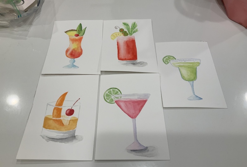
3. Sketching of the Cocktails Timelapse: Spend the next few
minutes sketching out the different cocktails that
we'll be painting today. As a reminder, these
line drawings will be available for you to
trace over just to make things easier if you just want to get to the painting part. But I'll show you kind of my process of
sketching them right now. Oh.
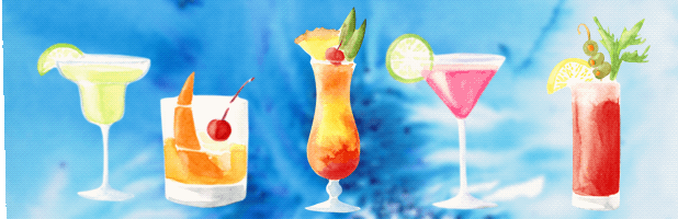
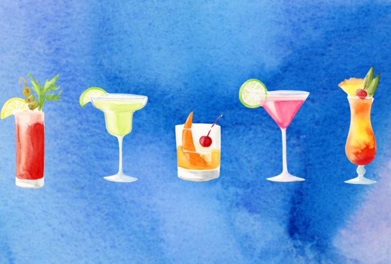
4. Old Fashioned Cocktail: First cocktail that we'll paint today is the old fashioned. So if you look at photos, reference photos of old
fashioned cocktails, you'll notice that they
often look kind of have like that gold shimmery color because of the bourbon
or the whiskey. So I'm going to be
using this kind of more yellowish orange
from my palette. So if you have if
you have an orange, maybe add a touch of yellow to it to kind of brighten
it up a little bit. So I'm just going
to kind of mix in. I have a new gambosan here and this kind of more
yellowy orange color. And I'm just kind of getting, like a nice mix and
adding a ton of water, so I have a good kind
of mix of colors here. And then I'll start. So I do want to add maybe
another droplet of water just so that the color is very light because we're
going to, you know, add more drop in more
color as we need, but definitely don't
want to start with a too dark of a value
of this color. So right now, I'm
just painting on dry. So dry paper, you know, just adding painting this
area of the cocktail. And I'm going
around the ice cube here too because I don't want to I'm going
to add some details, but right now I want to
kind of keep it intact. And also this orange slice. For it to stand out,
we're going to add a little bit more of like
a reddish orange to it. And let's see. So I'm using A Princeton number eight number six,
actually Snap brush. I like I mentioned before,
I like the Brussels. They're very much helpful in getting some of
these details painted. So for this portion of the cocktail where
you can see kind of like the top surface of it. We want at maybe diluted with water and just
kind of paint like this little area with
a much lighter version of this color just because
when you have that contrast, it looks really
nice because you'll notice in pictures this area
looks a little bit lighter, the tone of it or, like, It's not as saturated
as this part of the painting. Let's see. Now I'm going
to maybe just going to drop in a little bit more
orange in this area. Like this. For now, I'm going to let this dry. I'm going to tackle
the orange slice next. For that, I definitely want
a deeper darker orange. So you can mix in a touch of red maybe into the
mix you already had to have that nice
orangy rind color. So just going to
start painting this. And you'll see I'm going to skip this line
here because I want to make sure that it looks like this orange s or orange peel
is inside of the glass. So that's why I'm not
interrupting this shape. Then I might also do the same
here where you can see the. This is like the surface
line of the cocktail, just to reinforce that idea that this shape is inside of this glass and inside
of a beverage. That gives the viewer that
visual cue or understanding. Let's see, some of this orange might bleed into the glass, but I think it
looks really cool. It's adds to that water
colored cocktail effect. I could allow this air to dry completely and then
paint with this orange, but I really like the way this looks. I'm
going to keep it. Then I want to lift off a
little bit of a high light. My light source is coming
from the left hand side, and I'm cleaning off
my brush and then lifting off a little bit of
a high light on this side. All right. Next, I'm going
to tackle the cherry. So that, just pick any red
that you have in your palette. Any red will work here. And I also want to add a
little highlight on the cherry as well so that it matches
the rest of the shape. Make sure I got a clean
brush and then lift off There we go. And I might add another layer on top of this cherry just
to like reinforce it. But I'm going to
let it dry for now. Grab a little bit of
green to or actually, sorry, not green because this is one of those
maskino cherries. Well, actually, the fake ones, because the real maraschino
cherries are very dark, like a deep purple color, and they don't have stems. But I think these fake
ones look a lot more fun. So I'm just going to
keep it You know, work with with that
inspiration just because they look a little more fun
having that chary in there. All right. So next, I'm going to work
on I'm going to add a couple of shadows here
inside of the glass. So for that, I like
to use pines gray, but any gray or, like, a diluted black will work. So I'm just like adding a
little bit of water here. Make sure it's not super super
dark because I want it to be So if I'm just going to
test it out a little bit, that's a little too dark. I might even add more water to this little mix and
use that instead. So the way I approach it, like, I'll just, you know, since the light
source is hitting the object from this direction
from the left hand side, and there's going to be
a little bit more of a shadow on the opposite side. I'm just doing a couple
of quick brush strokes. And you can barely see them. You can add maybe drop
in a little bit more of that diluted version of your
of your gray or black color. And you know, we still want to make sure this side is a
little bit lighter in value. So that's why I'm not
covering the entire glass. This way, it looks
like, you know, adding a little bit of
gray here just gives the impression that there's like shadows in this glass portion. Since it's transparent,
we can ser see it, but it just gives that
impression of it. All right, Let's see. So by now, this area has dried. I'm going to go in with a
little bit more orange. Paint this add
another layer on top. If you notice that your
highlight disappears a little, you can always kind
of bring it back, just make sure to
clean off the brush. There we go. Then
I'm going to add a touch more of this
red to the cherry. There we go. And as far
as the ice cube goes, I definitely going to
use a ton of water. So let me actually My palette here is a little
messy, but it's okay. I can just wipe off a small ri. I don't need a lot
of space for this. So I'm just going to
dilute this orange with a lot of water so that
it's very light in in value. Again, so we can barely see it. But I'm going to use that
to kind of add a couple of little brush strokes kind of around the cherry
inside of the ice cube. Because essentially,
what I'm trying to portray here is like the
ice cube is reflecting. Since it's transparent, it's reflecting some of the beverage. And maybe even drop a
deeper origin here, but it's just intermingle. So very simple, just a
couple of brush strokes. And let's see. You can
outline the gloss. I would just do it
in the same kind of lighter gray value that
you did this part here. Maybe just ever so
lightly outlining this. And even, like, maybe
adding just a touch more on this side to kind
of show that there's, you know, this part is
a little bit darker. Then for like our
last few steps, I do want to punch up this
color here of the drink, so I'm going to
add another layer of the s lighter orange. Because I want to show
the contrast between the top layer or the
surface of the drink and what you see looking
through the glass. So just adding a touch
more And you know, since we added highlights here, we can also maybe lift off just a little bit on
the glass itself. So I'm just pressing down, lifting off so that it matches
the rest of the shape. Another cool thing
you could do here for the orange slice is add little tiny tiny dots to represent on the orange
skin or the rind, you can see those
little tiny particles, just like a bit of extra
flourish, if you will. D. And then finally, we
can add cast shadow. And that's one of my favorite
ways to kind of make this anything that you're sketching and to
pop off the page. So an easy way to do that
is with a clean brush, come in right underneath
of your shape. So my light source is
coming from this direction. That means the cast shadow
is going to kind of go off to the side
on the right here. So I'm painting with water now. First, just so that I have, really like the shadow, this color, the gray
that I'm adding, kind of, um you know, moves through this
area really easily. And right now it kind of looks similar to the
tone or the value. I'm sorry, the value
of this gray here. It is the same gray,
so I'm just going to add kind of darken it, add a little bit more paint. I'm just adding it
right underneath underneath this glass here. I'm going to clean off
my brush and I'm just going to soften soften this shadow a little
bit so that it looks a little bit more diffuse, more like like a natural shadow. You could absolutely, you know, maybe use a warmer
black to contrast. So this is a very cool gray. Pink's gray is a very cool,
has a lot of blue in it. But if I use a different, like, mix it in
with just a touch. So I have like this darker
brown and my palette and just mix it in a little
bit here to darken it up. So that will warm up my black. So It'll create a really
dramatic contrast right now that looks super dark. So if that happens, I want to show you
that you can easily, lift that off as if you're
lifting off a high light. Lift that excess. But you
notice that immediately, it just created such
a nice contrast between the gloss grays
and this cast shadow. And even if if you happen to have too wide of a line here, you can always soften it
with water and then grab a tissue paper and
lift that off, dab it off a little bit. So that way it looks more. It's it's using the object in the shadows cast to the side. All right. And
there you have it, your old fashioned cocktail with askino cherry. There we go.
5. Bloody Mary Cocktail: Our next cocktail is the
classic bloody Mary, and that's going to be
fairly straightforward. So I've got my, you know, I'm going to use lots of
red for this main part, and then we'll just
add some, like, celery for the green
for the celery, some olives, and a
lemon wedge here. So actually, for this cocktail, since we have a pretty large
area that we can work with, I'm going to use the
wet on wet techniques, so I'll add a
little bit of water first inside of this kind
of rectangular shape. And maybe not all the way
to the top just like, I'm going to leave a
little bit of space there. But let's see, I have a
nice glisten on my paper. That's a good sign of how you know it's got a good amount. And then let's see for the red. So I have a couple of reds here, and I already have some orange, so I'm going to
kind mix that in. So I get a ne kind tomato, juicy, orange, fiery
red, orange color. Since I tend to have my light sources from
the left hand side, purely because I'm a
left, it's easier for me. I am going to paint on the right hand side
so that this side is a lot darker in value than the other one because we're going to have a highlight there. Immediately, you see how the color is starting
to spread out. Let's see, I'm going to add a
little bit more paint here. So it creates that very
cool water colory effect. I'm going to I can help
these colors kind of travel to the rest of the shape, so pulling the color in here. I definitely want to
lift off and have my highlight kind of ready to go because we're using
red for the bloody Mary. I know, if you let it dry, you can still lift
off a highlight, but it's just going
to be a little bit harder because red is such a highly saturated
pigmented color that it makes it a little harder to lift off after it's completely dry. So just going to
clean off my brush, make sure, lift off nice
little highlight here. I might even see. Might even drop a
little bit more. More red in here. And a little bit
on the side here because I don't want
it to be completely. I still want to show some like the side of the
glass so you can see it. Here at the top, let's see, I'm just going to maybe the clean brush fill this in pull in a little
bit of the color, but it's very much lighter. It's going to look something
like this. All right. So now for our celery, I'm going to use
this like yellowish green that I have in here. You can always mix in
a little bit of yellow into your green to
kind of warm it up. So the celery leaves, they
have this kind of, like, very yellowish green color. And now I am painting on dry because this is a kind of
tighter area to control. So I don't want to necessarily have my
colors all bleed in. Let's see. I'm
going to use, like, some of these darker greens
here from my palette, just to kind of drop
them in, you know, add a few little
like, fold lines. That looks a little too dark. So maybe with the clean brush,
you can always kind of, like, s spread this out
blend it in a little bit. So just have fun with this. This doesn't have to be
like a super precise, you know, celery, leaf
or stock or whatever. As long as it looks
something like that. And let's see for the olives. The olives are kind of, like, have a yellowish. Let's see, like a warmer warmer, kind of more muted green. So one way looks like I already
have this type of green. One way you could do that is add, whatever green
that you have, if you add a touch of red, it'll make this, really
nice muted green color. So I'll just use
this for the olives. There we go. Maybe even a
drop in a little bit more of this other green that
I used on the celery. Just to give it more like an interesting look
so it's not just like one type of green. And then I'll use my yellow for the lemon For the pp, I'd just like to do these
tiny little brush marks. Just to represent the texture, not necessarily make it
look exactly like that, but I found that this is
a really fun easy way to add a bit of texture here. Let's see, for
this little stick, I'm going to use just
like a brown like, this is a yellow okra, but any light brown will work
here just to kind of show that these olives are on a
little wooden skewer stick. And I'm going to let this
area dry while it is dry, so I can add the little
red orange parts in here. I'm going to add just a few
little kind of shadows here. So again, I'm using
my paints gray and just adding a few kind
of quick brush strokes. Mostly on this side
because you know the side has a light
source hitting it, so then therefore the side is going to be a
little bit darker. And let's see, I'm
not going to be outlining this cocktail glass, but I do want to
add a cast shadow. So for that, like I
showed you before, you can kind of mix in. I do recommend to add a
little bit of water first right underneath where
you're going to drop your shadow because that will kind of
immediately soften it. So then I'm just in
some paints gray here. And cleaning off the
brush and again, softening this area so that the shadow looks more realistic and kind
of, like, diffused. And it will darken this
area right underneath the glass just so that it
has like that nice contrast, so it pops off the paper. There we go. And then one last thing, yes. So I definitely want
to add a little bit of orange into these olive shapes. Another thing that I like to do, after kind of I'm
done painting and I take a look at my
sketch or illustration. So I have a light source
hitting from this direction, and I have a couple
of highlights. I want to lift off Just
a few little highlights here where it makes sense on
a similar side as the gloss. Just a bit on the olives. Maybe a touch off of
this lemon wedge, even though it's going
to be really hard to see because yellow is such
a light value colored. Then maybe a couple of
areas on the leaves, mostly on the left hand
side. There we go.
6. Cosmopolitan Cocktail: Our next cocktail is the
cosmopolitan, so a cosmo. And it's one of my favorites
because it's pink, and I do love that color a lot. So one way that I wanted
to show you to the Cosmo, I like to mix in opera pink. So I got here a little
bit on my palette. And I'm going to
mix in just a touch of this more yellowish orange because then the
result is going to get us like that nice
cosmo pink color. So it's more of a warmer pink. And you can kind
of adjust til you get the pink that
you like the best. Of course, I encourage
you to experiment, and there's no right
or wrong way of mixing this as long
as it's somewhat, looks like a cosmo,
it's going to be fine. So I am going to paint on dry because this area
is fairly small, and I want to retain
control over my shape. I'm just going to add a
little bit of water here. Then fill in this shape. Remember my light source is coming from the right hand side. So therefore, most of
the color that I'm dropping is on the opposite
side, on the right side. And while it's still wet, I want to lift off a nice
little high light here. Here we go. I'm just going to follow the shape
of the glass. Then here at the top,
I'm just going to use, I have a damp brush and I'm just barely adding a little bit of that water off of the
brush into this area and it's pulling in just a bit of
the color. So not too much. Again, I want to have
that nice contrast between the beverage
of how you see it when you look at it and
the top surface of it. I do have here an accidental
little drop that I can use a tissue to
kind of lift off. There you go. All right. So
typically, you know, I've used paints gray
to paint my glasses, but I wanted to show you
a different approach. So just give you another option. If you have any kind of blue
or a purple in your palette, I can always, like,
lighten it up. I'm just adding tons of water
to this particular blue. Very, very light,
but it'll still work to represent the glass. Some of the shadows that
you see in the glass shape. Here, I'm just again, mostly painting on
the right hand side because I have a light
source coming from here, and I want to respect that. I'm just mostly painting
on the opposite side, adding some shadows here. Then with a clean damp
brush, you can come in, soften whatever line
that you painted here just so that it has a
smoother nicer transition. Then our lime for
the lime slice. I'm going to use this yellowy green color from my palette. Just going to paint
this little wedge or sorry, not a wedge. It's technically a slice. Circular shape, There we go. Then for the pulp, I might dilute this with a touch more water so that
it's not the same green, the same value of the green, just a little bit
lighter and add those little tiny specs
to showcase the pulp, the tture, the slice. Keeping it super simple. I actually might a
bit of a darker green just to go over this, add another layer of
color on top of this, so it pops off a
little bit more. And also, while this
is still drying, I want to lift off just a
little bit of highlight here. So that it matches
like the glass. Let's see. By now, this area has dried and
I do want to reinforce, maybe add to another
layer of this pink and maybe just barely outline
the top portion here, and then I'll so
soften this line, so it's not as pronounced. So basically, right now, it looks a little bit too light. I'm just going to
drop in a bit more of this diluted pink color so that, it goes along with
our beverage here, and then let's see
a dropping in more. Oops. More color here. I did go over the highlight, so I'm going to reinforce that. Sometimes it may
happen that as you're painting adding another
layer of color, you're almost lifting off a little bit of the
previous color. That usually is a sign that
you didn't let it dry enough, which clearly mine
wasn't totally dry, but it's okay because you can just keep adding and dropping in some color until you get the right consistency and the
look that you're going for. Right now, the glass
looks a little bit too, might use a darker blue and
just add a little bit more of a definition here just
so that you could see it a little better here. Again, I want to soften this. I don't want this
to be super like contrast Then last thing we can do is add a
little cast shadow. Again, we can soften
or add a little bit of water here right underneath of the glass of the base and then drop in a little bit of this panes gray or any type of
gray that you have or black. If you just dilute
it with water, you'll get a similar
consistency. I'm just softening
this line so that it again looks like a
diffused type of shadow. And compared to the other
previous cocktails that we did, you see that the difference it's such a nice little
contrast between this bluish color
that showcases, represents the glass
and then kind of like a different color
for our shadow. So makes it that
contrast is really nice. It makes it stand out
a little bit more. I like to add these shadows to anything that I'm painting. This is so simple
and just so fun. And really, like,
you get to choose which direction the light
source is coming from. I just usually by def, go off and add it to the right hand side just because it's a lot easier
for me that way.
7. Margarita Cocktail: Our next cocktail
is a margarita, and I wanted to show you, so, Margarita typically
has a very light, almost, like,
yellowish green color. So the way that I get
that combination is, I usually mix in my
lightest green that I have, or really any green
will work here as long as you dilute
it with a ton of water. And then maybe add
just a touch of yellow just to kind
of lighten it up, make it a little bit warmer. Again, tons of
water, little color, so you get that nice
light margarita look. I've got a pretty good mix
here. I'm happy with this. Now I'm going to start
painting this area first. The main base of the gloss. We would drop in a little
bit more color here on the right hand side, and then I am going to leave a b so I'm not going to paint
all the way to the edge. Because I want it to look like. So I'm adding like a
little curve here or a little oval so
that you can see the surface of the cocktail. Let's see clean off
my brush and pull in some of this color into
the rest of the glass, which automatically
makes this area lighter. It looks like there's
a high light on my shape and then
it's going to paint this top val very lightly. I'll definitely
add another layer of this mix here after
it completely dries. I'm going to let that dry first. Next, I'm going to do the lime. Is going to paint the wedge. And similarly to the mark, I feel like the lime on the
inside is a lot lighter, so I'm just going to use
the same mix to kind of add those little tiny specks to
show to represent the pulp. Just a few little guys, like, not too many. And then for the glass, since this is like
a margarita glass, it reminds me of like summer. Instead of a paint's gray, I wanted to use this more
kind of like brighter, lighter blue that I
have in my palette. Maybe a touch of of turquoise in here just so it has that
nice summer sky color. If you have any blue
that is similar to that, just add tons of water and
you can get a similar one. But really, any lighter
blue will work here. And especially because
the margarita contents, it's a warmer color and we're introducing
this blue for the glass. So the warm and the
cool complement or contrast each other nicely. You can outline the
gloss if you'd like. Then clean off the
brush and soften. Want to soften this brush stroke so that it looks has a
smoother transition. Again, my light source is coming from the left,
I'm lifting off. I've already pre lifted some color on the glass and
here on the stem as well. Need to reinforce that a little bit and even a tiny bit on
the line wedge as well. And let's see. I'm just going to go
back to my mix of this yellowish green color
and add another layer here. I am kind of
interrupting the flow, so leaving this part blank
just so that you can kind of see that there's
that fold in the glass. Totally optional. You can
paint right on top of it. I just thought it would look
ale cool doing it this way. Again, making sure my highlight, if I need to soften
any of the lines, I can with the clean brush. Then one last thing you
could do here is with a very diluted paints gray
like adding tons of water. I see. Again, I'm going to just
test it a little bit, make sure it's fairly light. But I'm going to use
this color to add tiny little specs or
little dots on the top of the glass to just
give the impression of the salt that
you see on the rim. That's not going to
be super visible, but if you just add a
few little tiny dots, it gives the impression
of the salt. Totally optional, but I thought it would be
a nice addition. Typically, you'll see salt
on the margarita glass.
8. Mai Tai Cocktail: Our last cocktail is the M ti, and it will have similar colors to
Tequila Sunrise as well. So if you get inspired by this, but don't want to necessarily sketch out this whole shape, you can absolutely turn that
into a Tequila Sunrise. Okay. So I like to do this one also with the
wet on wet technique. So I'm adding water, This is another one
of my favorites. Anytime that I have a large area that I can cover with color, it's super fun for me. So we'll be using this
yellowish orange mix as well as going to drop in, actually a little bit
of yellow as well. So we're going to
start with kind of just looking at some
reference photos of a Mt. Kind of like yellow
in the middle. I can also add a droplet of water to kind of
help spread it out. Then there's a little
bit of orange kind of around towards the
top and the bottom. Because we added a layer of
water creates this nice, playful mix of colors. You can also if you didn't add enough water, like I did here. I'm just dropping in a
few more droplets to help the colors intermingle
with each other. So I might just add, let's see, going to do a reddish orange here so that it has a much
more pronounced contrast. So I'm dropping it
towards the bottom. And even a touch of red too, H. Oh, that's really nice. And then here towards the top, I'm just going to do a
little bit more orange. And it's okay, like some
of your yellow disappears, you can always kind of, drop it paint a little bit more
paint in here to this area. But essentially, like, we don't want to necessarily blend it up. We just are dropping some
colors and let the water do the hard work of
mixing it all in. But I do want to lift off
a tiny bit of a highlight, just going to press
down with a clean brush and drag and lift and clean. I'm going to drag it again. This highlight might need to
be reinforced a couple of times just because this
area is still wet. It's got plenty of water
that is trying to move in into our highlight
area, but that's okay. We'll just keep
reinforcing this. A couple more
times. There we go. It's a good enough highlight. I'm happy with it.
Here at the top, I'm just going to
pull in some of the color to go towards
the top curve here. We have a pineapple slice here, so I'm just going
to use yellow to paint paint this little
triangular shape. The pineapple skin has
a brownish color to it. I'm just going to use a
little bit of yellow okra. But any brownish
color will work. A mix of what you've got you can add little tiny
spikes to represent that. Maybe I'm going to add a
touch of orange here as well. Just to give it some
texture and the impression of that pineapple slice. Then of course, we have
another cherry here, so that's super dark. I added way too too much color, which means that
the clean brush, I can just use that to cover
the rest of the shape. Again, I lifted or didn't paint where you see
this edge of the gloss, skip that area a
little bit just so that you can see that
the cherry is behind it. Then for the we also
have pineapple leaves. I'm just going to use a bit
of a darker green there. And now I'm going to clean
off my brush and just soften soften this line, so it's not super stark. I think I will let this part first before
I paint the stem of the cherry so that it doesn't blend in or
bleed into each other. And just going to drop
a little bit more of a darker green here on
the right hand side. Just to give it more dimension. Since the light source
is coming from this, the left side of the leaf
is going to be lighter. So basically adding little
highlights here as well. Let's see. I'm going to use the
same bluish mix. Adding tons of
water to dilute it, so it's very light to do
the glass portion here. Again, my light source is
coming from this direction. So most of my shadows and darker areas are going
to be on the right side. And I'm going to clean
off the brush and kind of pull in some of this color. I also have a little highlight
here as you can see since the area on the right
is much darker now. Let's see a few little details. Maybe add a touch more
red on the cherry, another layer so that it really
pops off the page. Okay. And see when you let
the water do its thing, you get these unexpected
type of color mixes, and I really love when
that happens because it's just it's probably my most favorite part
about watercolors. It's like the unexpected. You're still painting an object, but you're allowing it to
kind of using this technique, allowing it to do its thing. So it's a really fun way
to just play around. See last thing, just
going to add a little bit of red for the cherry, the stem. There we go. Here's
our little my tie.
9. Lemon Spritz Bonus Timelapse: I did. D. D. A. And
10. Final Project Homework: For your final project, I want to encourage you to
pick a glass shape and maybe, either painted as
the reference photo. By the way, Google has
so many reference photos of all kinds of cocktails. There's just endless
possibilities. Pick a glass shape
that you like the most and maybe painted
in a different color or paint a different
cocktail inside of the glass or pick one of
these that you like the best
 Volta Voloshin-Smith, Watercolor Illustrator and Artist