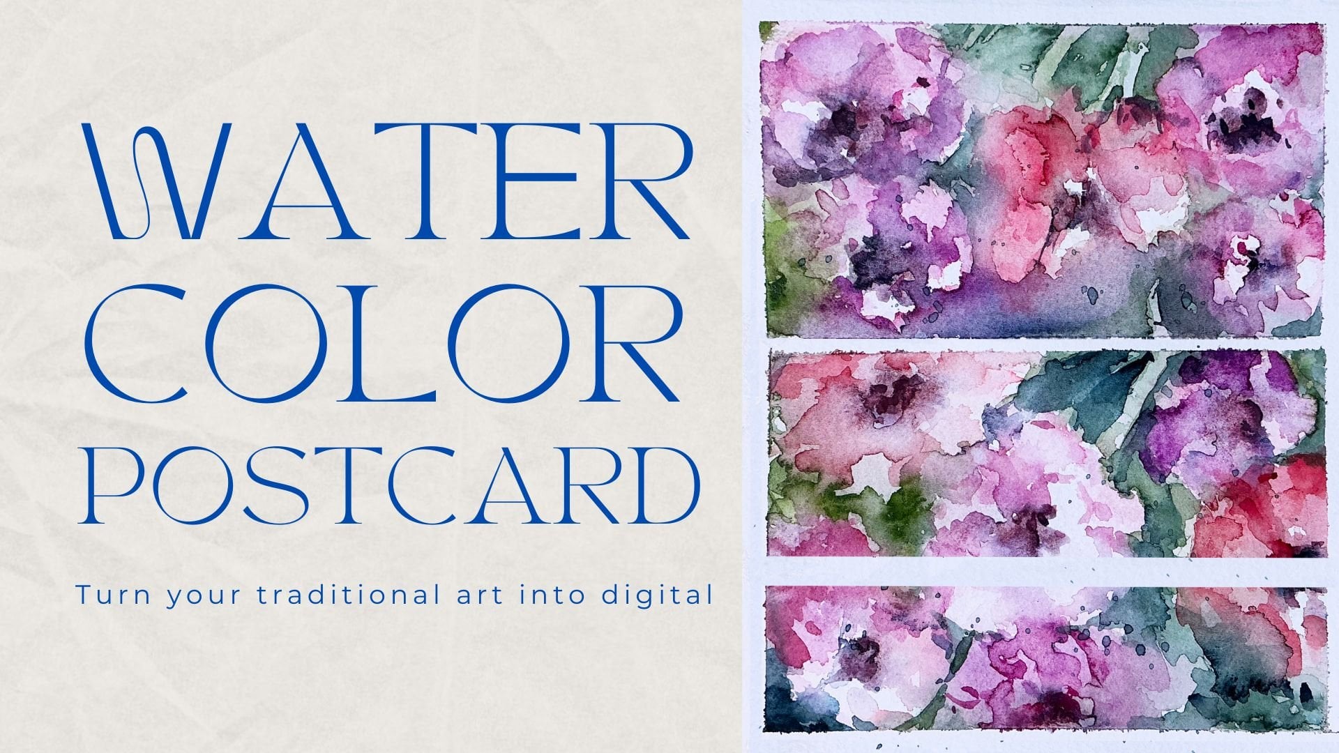
Transcripts
1. Introduction: Hello, my lovely artist. Welcome back to my class, and let's dive into
digital art and paint. Altogether, beautiful
flowers with gouache medium. Get ready to create different
floral frames, too. And the most important, we will learn how to create floral postcards in
fast and simple ways. My name is Inga. I'm here to show you the
digital watercolor is magical. And you can create this
magical world with all those cute characters and whimsical nature
with your own hands. That we will need procret and a little bit of inspiration. This topic is connected to
one of my previous classes about painting flowers in watercolor style and
creating floral frames. So this time, we will do
the same but with gosh. I hope you are ready. And in this class, I will start by telling
you where to find tools for the class and how to get ready for
painting process. I will show you the way how to draw from the
reference picture, and finally, we will move
to painting process. We have two practices about
painting flowers in gouache, and then we will jump into creating floral frames
and postcards part. And finally, our class
project will wait for us. By the end of the class, you will be able to
paint gouache flowers, create floral frames
and postcards easily. During the course, I will slowly move throughout my workflow, explaining every
step, and describing procreate features and
gouache painting techniques. So we will learn a lot today. So what exactly we will
learn, let me tell you. How to paint in Gua style
digitally in procreate, how to draw sketch from
reference picture, but we will not pay a lot of attention to the
sketching part today because the most
important is to learn how to create flowers
step by step, how to paint floral frames, how to use layers, clipping mask, blending modes, and how to create
postcard in easy way. What you will need
for this class. I will use Procreate with
IPad and Apple Pencil. You also can use Procreate or some other drawing pads or just regular paper
and gouache paints. About course
resources, as a bonus, I will share with you all the digital tools that
were mentioned in a class. It's PSD file with
textured paper, so we will not spend a lot of time on creating texture paper. Custom Bush said my two
phons color palette, my own pictures that I created. Feel free to use it. So
who is this class for? The class is great for
intermediate level and for advanced procreate users who are interested in postcards
and floral illustrations. And one more thing
that I want to mention your opinion and your feedback
are super important to me. So feel free to tell
me what do you think about that class in
discussion or review section. I will be glad apply to you. I can't wait to see what
you flow to projex section. So let's not wait, grab your iPad
with Apple Pencil, and let's paint together.
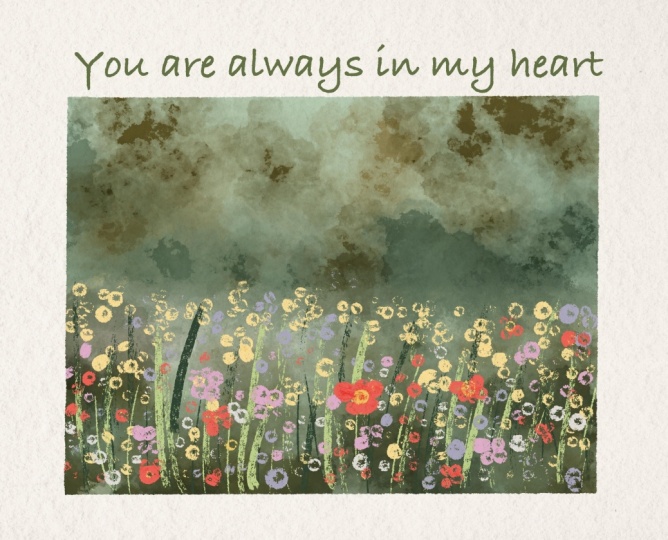
2. About Class Project : Now let's talk about
class project. Just follow a few steps, create a floral postcard
that will bring joy to you. Of course, don't forget to use the tip that
I gave you today, explore different
painting techniques, and choose the ones
that suit you most, and then create
beautiful artwork. It can be just a flower or frame or something
totally different. Anything that helps you to feel happy during the
painting process. This is the most
important thing. I will use procreate for this class with IPad
and Apple Pencil. You also can use them, or it can be some
other drawing pads or just regular paper and gouache
paints, whatever you want. All this class is
pretty easy and fun, and we will paint
a lot in gouache. So are you ready
to experiment with different paintings techniques
and learn some new tricks. Once again, you can choose completely different
topic and draw something you try experiment
and enjoy painting process.
3. Tools and Resources : In this class, we will
talk about resources and tools and where to find
and how to use them. It's pretty simple
just follow the steps, go to Projects and
Resources section, download freebies,
go to Files app, and then import all the
freebies into the Procreate. Let's talk about all of it
right now. Ding ding ding. Di di di dt, dt ditty. Hello, my lovely
Skillshare community. Of today's class will be pretty special because it will
be connected with one of my previous classes where
we were painting flowers in watercolor and we learn how to create a beautiful
floral frames. So I decided to do
similar class today, and we're going
to paint flowers, but this time in gouache. So and also we gonna do floral frames and
we'll make postcards. Same what we did in
my previous class related to the similar topic, where we also created
lovely postcard. I will share with you my font that you can use for
creating postcard, and I decided to make this
class slightly easier. We're going to draw
and draw a lot. Let's just split the
screen into two parts. So where to find
all the freebies. Go to Projects and
Resources section, and in a right corner under
the headline resources, you will find all my freebies. So go ahead and download them. You will find all
the freebies in Files app in Downloads folder. And guys, make sure that you open my class
through the browser. It can be Chrome or
Safari. Why browser? Because if you do that
through the Skillshare app, my freebies might
not be visible. And we're going to
have quash flower, brushset, quash flowers watches. This is a brushset,
and I decided not to overwhelm you with
the amount of brushes. So those are the brushes
that we basically going to use today all now
about the colors, it's called gouache flowers. It's here. You can
also drag and drop our brushset and
our color palette into the Procreate
from Files app. And then you have three dots. Let's just check it here. And then you need
to write set it as an active sets active. I already did it. So when you go to
the disc section, you'll see our
color palette here. Those are the colors that we're going to use today for creating flowers in din din din din make it I also prepared for you a couple of
reference pictures. You can use them all
or you can just use other references the
one that you like. It's totally up to you. Now one of the changes
that I made in this class, will not create paper. Like we will create, but it will be already
saved as a PSD format file. So you also need
to drag and drop it from our files app
into the procreate, like drag and drop and
leave it like that. And now it will be automatically imported
into the Procreate. La. And once you download
everything and you transfer it from Flesap
into the Procreate, we can just close Flesap
and here we have paper. I already adjusted it
to the proportions, blending layer modes, and
opacities that we need for the gouache painting class. I also prepared for you a
couple of practice layers. What are we going to do today? Let me tell you once again. During the first mini practice, I'll show you how to
create lovely wildflowers. Style will be very similar
to lose watercolor painting, but once again, the
brushes that we're going to use and effect
will be different. It will be gouache painting. And the other practice will
be devoted to the sunflowers. Second practice will
be more detailed, and then we will jump
into creating frames part where I'll show you different funny ways how
to create floral frames, how to create beautiful, lovely postcards and
don't use a lot of time. Our final project illustration will be an actual illustration. We're going to paint field. Probably it will be fur. Uh, with lovely
beautiful flowers, and then we will turn this illustration
into the postcard. So I hope you are
ready. You just saw all of the
freebies that we have. Now you know how to transfer
them into the Procreate, and I think we are ready to go.
4. Practice 1: Wild Flowers: It's time to do some practices. Those actions will help you
to understand the way how brushes work and what are the main differences
with watercolor art. Break the object into simple shapes and draw
details little by little, slowly adding volume
to your flower. So let's jump to the next class where I'll show you a
couple of practices. I decided to use
reference pictures, so I will go to the say got canvas and then
press reference. And now let's go and import the pictures that we're going to use for this part of practice. Okay, this is a
reference picture. Once again, it will not be precisely exactly the same one
that you see at reference, but I just want to have some general understanding of
how such flowers look like. And again, you might use
completely different colors, completely different
painting techniques. It's up to you. So I'm going to go and try to paint
everything in one layer. I'll go with Buron ink first. If you want, you can
go with HB pencil. If you don't want,
it's totally okay. HB pencil, but in this case, we're going to go and
duplicate one of the layers, and here I can just
write like sketch. And then I'll just want to show schematically
where my flowers would. Where I'm going to
place the like this. And here, we're going
to have some leaves, ding ding. That's it. Let's go to the Purani inker. And I want to paint stem. Go with this darker shade, and I just want to draw stems here and there
for the flowers. They shouldn't be too precise. If you don't want to,
it's totally okay. Maybe it's even too much. Okay, then I'll go ahead and I will grab this
beautiful green color. And then I want to go with
unpredictable ink brush. I'll create one molare the knee, and then I want to paint leaves. I'll increase the size. Like it? I'm pretty
fine with what we have. Then I'm going to go and
come back to my practice on. I actually can
merge it right now. So I merge together two layers. Now we are still staying
on the same layer. And now I just want to go and grab this beautiful
purple shade. I still have
unpredictable ink brush, and by controlling the pressure, you can just start adding
dots here and there. If you press harder,
you will have thicker color, bigger dot. So just keep that in mind. And then I'm going
to have some here. So I just look at this beautiful violet flowers and I just try to imitate maybe lower this has imitate
the same feeling. And it has some kind of shape of triangle or rump like that. So we also need to try to
imitate the same feeling, has the same feeling. Now slightly darker shade. And then likes it. And then I'm going to go with brighter color and
have the white dots. I think they can add some kind
of volume to our flowers. Mm hmm. So, I'm happy
with what we have. You see it's super simple, and we spend just a
couple of minutes of creating those beautiful
violet flowers. Then I want to go with
bright yellow color. Likes it. It doesn't need to be connected exactly to
the specific stem. And now pink colour, pretty bright pink colour. Maybe even lighter. Increase the size of
the brush slightly. And here, I just want
to add a couple of pink dots because it can help us to make our
illustration pretty vibrant. Like it? More
leaves if you want. Ran had this tiny
lovely practice that I hope can give you some general
understanding of what we should do in order to
create lovely wildflowers. So go ahead and practice, too, and now let's jump into
our second practice.
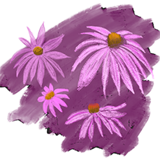
5. Practice 2: Sunflower: Okay, it's time for
the second practice we gonna paint this
lovely sunflower. I grab this brownish
color, Bug pencil. I am on sketch layer first. And now I just want to show schematically where
our sunflower will be. Thing ting ting ting. Like it. Then we're gonna
have some leaves. Thing. Here we're gonna
have some leaves. So the sunflower will be
pretty big, even bigger Lexus. M I will not have many leaves, but I want to make them bigger. Like that. Okay, this is a
sketch. I'm going to keep it. Now let's go to practice
two about this sketch. I'm going to go to multiply
blending layer modes. Now, even though I
am on another layer, when I paint, I still will
see the lines of my sketch. Same brush, Blue
unpredictable ink too. You also can go with blueberry, dry ink brush if
you would like to. It has a little bit
sharpi toothy edges, but again, it's up to you. I go with a pretty
bright yellow color. This one, and I will go with unpredictable into
brush, which is very, very in gouache style because it layers color
naturally like that. Why I placed this
bright yellow color in the middle Because as you
see, obviously, it's brown. I will use second layer, and with the second
layer, I'm going to layer brown color. But I will leave some gaps, and I want to see yellow color
coming through those gaps, not white color yellow. This brush is super
precious sensitive, so just control the
sensitivity of it. Ding, ding ding. If
you press lighter, you will have thinner edge. That's right what we need. A brighter yellow color. Because there is a lot
of color saturation. Like that. You shouldn't
be too precise, like I told you.
An orange color. I'm gonna go with
slightly lighter shade. I don't want to
make it too bright, so I will go with
slightly lighter shade. So I can play with some color
variations. Totally fine. Now, and you see we still have some of the shades
between the leaves. So I'm going to
show it here, too. And as a blending brush, you can use bortistic or
unpredictable ink brush, too. If it's unpredictable ink, it gives you the smudgy feeling, which is, like I said,
very gouache style, like, So I really like it. If you want to reach pretty
natural way, like L, you might use the same
brush as a blending brush and same for the
painting brush, too. I think it's fine for me. Bright color. You can go
ahead and paint on a top. Now, dark brown. It's kind of a little
bit too dark to my mind. Now orange color. So here we are not trying
to paint it perfectly. Our aim is to just give
you this beautiful wipe. If you have more
time, obviously, you can keep adding
more and more details. You can go with Burani ink, create one moyer above, and then go ahead with this
brown colour and paint, like, little by little,
those tiny shades. You can add more
dimension to every leaf. Just see what suits your
style and whether you just want to reach some
natural look from your art. Now grabs is once again run inker brush and
paint couple of dots. Go ahead with darker color. Paint a couple of dots here. Now, it might look
more natural now. Now, what are you going to do is merge together two layers, practice, and I will create
one more layer above. And then I will go with, let me think which
color would be better. Dark green color. I think it's good choice. I will go with Buran inker
and I'm going to paint stem. No, I want to make it thinner. Like that. You see, I like this sharpness coming through the paper and the paint. Very thick stem, like a strong
and powerful step. Mm hmm. Suitable. Here, you
might go ahead and grab another L and grab another
I'll go with brighter color, the same brush, but another
layer, what I want to say. I like that. Like that. Increase the size of the brush till
the middle size. I like that. Fill the gaps. You might leave some white spots where you might not leave them. It's up to your preferences. And now the last thing, we have tiny leaves
coming from a flower. Perfect. We don't need
our sketch anymore. I'm gonna just delete it, merge together our flour,
and then practice. Yeah. Tinting tinting.
Okay, let it be. We don't need reference
picture, too. Let's just turn it off. And that's how lovely flour. I like the way how it looks. I might change the
angle a little bit. I'll go to adjustments
liquefy size maybe till 60%. Maybe even more. And I
just want to see how well ding ding W to make
it curry. Like this. Like such curvy
leaves is my passion. So that's what we have now. That's what we had before. I think now it looks
way more better. Okay. That's it for our second
practice now, you know, how to pint sunflower
with more details. You see, you have
a lot of details. It looks very beautiful. And again, the more
time you have, the more shades you can
add it's up to you. You can do, like, some
shading here and there. You can make it more vibrant, or you can just
leave it like that. If you like everything. Same with the flowers, you can add a little bit more color
variations about the petals. You can make them. Yeah, look more coherent by adding similar
shades to all leaves, and it might look a little bit more harmonious to my mind. That's what I would do probably with a couple of petals because I really like coherence in art. Like that. Think Guymo
better, definitely. If you want if you want
to make it more testi, you also can add some kind of, let's just make it brighter, some kind of reflection of the color from the
petals to leaves. You also can do the
same with petals. Add a little bit of
green color there, too. I think it looks very vibrant, a little bit more
like one gook style, and I truly like it. So same you can do here, maybe slightly brighter green
color to make it look good. Ting ting. You see? It looks very, very
natural in this way. Famt's pretty much enough, and let me show you what you're gonna do next is let's just experiment and create some
beautiful floral frame thanks to gouache flowers.
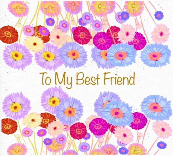
7. Creating Second Floral Frame: Now, floral frame two, they're going to use our
practice flower tube, this one. And I'll just show
you an easy way. Easy and beautiful way uniform. I want to make it
slightly smaller. And then let's go
with our lovely, pretty bright peach color, maybe even slightly
brighter rectangle. Mm hmm. And feel the area din din din. You see, I have my flower and my background on same
layer. It's totally fine. Okay, I decided to do it on the same layer because if you
paint on different layers, we're going to have pink
undertone with the leaves, and I don't want to have it. I want flower to stand
out comparing to background and then brighter
colour, Blue funny dots. And let's just do
it in din din din, maybe even a little bit darker. And also, why don't we write
the text pretty olive shade. And same. I'll add the text, and I will write to my best friend, friend,
friend, friend. To my best friend, write it
here, slightly darker shade. Because why not?
To my best friend. I'll make it bigger. I'll place it sober here. I'll add more text. Same. Thank you. Four. Always being. By my side. I'll add it style. I don't want to
have the same font. I'm gonna go with
clumsy imperfection. Clumsy imperfection. This one. Leading, make leading closer. Then this is the second
floral frame that we created. It also looks very cute. Now, let's jump
to the third one, and we're still gonna
use beautiful sunflower. But the next one will be a
little bit more advanced.
8. Creating Third and Forth Floral Frames: Okay, I merge together
all the layers. Now we have floral frame two, turn it up floral frame three. And here we're going to use our beautiful sunflower a lot. So let's just duplicate this
layer many, many times. And let me show
you what we'll do. Just flip horizontal,
flip vertical, and place it all
around. Exactly. As many sunflowers as possible. Think. One more here. And the last
one here, Bla, bla, bro. Okay, merge together,
duplicate it one more time, and now select one of the
layer and flip vertical like that and place
it underneath. Just cut this part. Let's go here and cut this part. Cut. Wow, it looks super beautiful. I like it so much. It's not what I was
planning to do, but it truly looks
very beautiful. If you do it this way. So I was planning to move
it a little bit up. And I already think
it's very beautiful. Put it up and down a little bit. And here you have beautiful, absolutely stunning frame, merge it together if
you want, of course. Just like S. And then you also can write
to my best friend. It's here. Thing
ting, to my friend. Very minimalistic
style postcard, but I think it looks
super beautiful. If you want, you can change the font to clumsy perfection. It's also super beautiful. Another thing is, let's
just go with funny dots. You can go with green color
or you can go orange one. You see this is wait a second. Place it above of our flowers. This is the first option, which I like personally. Now, orange is a little
bit more childish style. So it's up to you. You
might have the dots, you might not have
the dots like that. So this is one more frame, as you see, that's
not very hard to do. Another option. Let's just stick with the green
dots, turn it off. Where is my flower, this one. Flip vertical. I don't want
to cut it from this side. Maybe just tiny bit, like here. And I'll just go with
the lower part of the stems and I need to
move them slightly here. Just this merge together, select this area,
move it to this. So now this is very beautiful, complete composition, and I want to change the
words to another one. This Like that? This is the second way how we can create
beautiful postcard. Turned out we will have five postcard related
to our practices. Okay, if you are happy,
I'll show you another way how you can create
postcard within a few minutes.
9. Creating Fifth Floral Frame: Okay, warm away. What we can do if you
want to create beautiful, lovely postcard
within a few seconds. Let me show you. So
floral frame five. I'll go with this
bright yellow color, selection tool
rectangle, and I'm gonna go with this rectangle, fill it with a color. If you want, you can make it slightly lighter,
less saturated. Like. Then I will stick
with the same layer, and I'll go with let me find
unpredictable ink brush. And here, just see the
magic. Olive color. I like it so much. And I just want to go ahead to paint a couple
of dots here and there. You see, I go beyond the lines and it's totally fine for me. Then green color. Like I said, you can go with very dry ink. I'll go with this
brush if I want to add some kind of flowers, and I want here and
there, like that. Let's come back to
unpredictable ink to light green color. Press harder and you have this beautiful W not
watercolor gouache film. Okay, happy. Next, I will go with this
bright yellow color, same brush, lower size, and I want to add some
dots around the frame. I'm going to have the beautiful different maybe not too much. Pink light pink color. Okay. Done with pink color. Now bright red color. 1 second. Yeah,
bright red color. No, bright magenta. I think it's magenta
color. Duck here. So here and there, yellow color. Lent a little bit.
And that's it. With a frame. Like I said, just a couple of minutes and we have beautiful floral frame. I think this flower
doesn't look pretty. I'm gonna just erase it first
and then just blend it. Yeah, 'cause I'm going to
keep it as a frame and that flower is too
high. Like that. Now, let's just add some text to my best friend
here and this one. I'm going to use clumsy
imperfection with this text. Maxis. So I hope you're happy with all the
frames that we just created, and now it's time to jump
to our final project part.
10. Final Project: Gouache Landscape: We finish with all our
frames and postcards, it's time to move to
our final project. The way of painting here
will be slightly different from our practices because we will use a lot
of layers here. Different technique will require you to use different
brushes too, and shades will
look differently. I hope you are ready for
this creative process, and let's not wait any
longer and keep painting. And that's the final part. I already prepared text, but we won't use it for now. So if you're going to have
outline and for outline, I will use Bani inker brush. Let me think I'll go this dark with this dark green color. And now we need to
create an outline because I want to have
those like toothy edges. And one finger. And then we need to have
rectangle. Like that. Okay. Happy with my rectangle, happy with my tooth lines. Lexis. Okay. Try again. So now we're gonna paint
here in this area. Just make sure that
you filled all of the gaps, how to
make it lighter. Huge attrition, brightness,
brightness, less saturation. Maybe a little bit greenish. Okay. So we're going
to paint in this area, and we're going to use clipping mask mode and paint here layer. Okay, so let's duplicate
pain here layer a few times and set it as
a clipping mask. Clipping mask. That means
that you cannot go beyond the edges of this
light blue rectangle. That's the most important. And now I just want to
use colorful brush, and I want to paint
some background, beautiful background
to show the wood. By the way, I forgot to show
you the reference picture. This illustration. By the way, the same illustration
we were using for our previous frame. Okay, if you are happy
with everything, I want to separate as you see our picture into two dimensions. We have the background, which is dark and we have flowers that are in front of us. So in this case, let's
go with the rectangle. I'll just go and
select that area. And because we are in
clipping mask mode, we will not be able to
go beyond those lines, which is very convenient. Let's experiment and
add little by little. Colors. Okay, I'm happy
with what we have. I think it looks
absolutely beautiful. I'm going to keep it that way. Turn off the selection mode. Now I can keep painting, and I actually want to do the
same with the lower layer. So same layer. The same brush. I just want to add different color
variations here and there. So the color, the background color will
not be too dull. Tiny bit. That's it. And blending tool. Let's just blend this part. So now the line
is not too sharp. And for me, it looks very nice. I'm gonna keep it like that. Next, maybe I'll just want to make it less
similar to each other. I really like this
blending brush. So once again, I use Ben
predictable ink as a blender. Now let's come back and I
will go with Buranhe layer. Let's go to the
lower layer first. And we need to paint stems, green color and paint
stems everywhere. Everywhere. We're gonna do
it with different shades. It'll be like lighter,
darker because not everything would look good. Now, pretty bright green colour. I don't use too much of the blending layer modes
in this class, because, like I said, I want to show
you simple ways how you can create beautiful
gouache illustrations. I still keep looking at my art. I'll leave it for now. Let's go with pain here layer. Let's duplicate it again. Now it's time for the leaves. Blue unpredictable ink brush, and I just want to show the
lines also here and there. But this time, I'm
going to place leaves underneath
the are very thick, and I don't want to
cover our stems. Well, let's try to use less olive shades because olives mostly is
background color. And we also don't have
many leaves as you see. It's mostly it's salsa
stems everywhere. Mm hmm. Le it. I think it's fine for now. Now finally, let's
go to the flowers. And here we look at our
illustration and try to imitate the same way I
grab bright yellow color, the same way that you
see at our art that you see the background flowers
that are far far away, not in a focus. So we want also to spend
too much time painting. 'Cause the most important
flowers are in the center. It's very artistic
way of painting, and I have this
feeling like this is actually real, gosh, art. Like the way how we draw, it imitates a real
brush strokes. So what I'm going to
do is I will just take all the flowers with
different colors, and little by little, I
will start painting them. As the white flowers, we will
live till that because they will help us to add some kind
of refreshments to our art. Enough. I think it's too much. If we add more, just a little bit more and then
we need to stop it. Most of the yellow
flowers are really at the So I'm gonna leave
some flexes. Mm hmm. Okay. Then pin clovers,
bright pink color. And here we have slightly
larger size of the brush. Oh, maybe we can
just press harder. I don't want to have those
holes that our brush has. So for me, it's just easier
to tap it a few times. Try also to go to the
edges because if you just draw in a center
and avoid some parts, it might look not
really very natural. Mm hmm. Big pink flower here, I think, some here. Okay. Now, let me think what
if you go this red color, this pretty bright red color? I truly like this shade. Probably gonna have a lot of
reds everywhere. Red here. I think this red color is
very refreshing for our art. Okay, here, this red
is not too visible. Okay. There is also
another way how you can fasten your
painting process. If you really want to read
the result very fast. I'll show you a
little bit later. Gonna use some of the streaks. And I need a yellow
color in a center, maybe bright yellow of all flowers and same
with this pink shade. Like that. Okay, now
what about ilia color? Maybe slightly brighter. Sining. Because we have
to have this color a lot. Especially here, this area. It's very special.
Din din din din din. Double de pum pum, and
we have white color. We're gonna have white
flower in this area. White here. Nikola
is super cute. Okay, I think I do
like everything. We don't need our reference
picture. Let's turn it off. Now the magic tricks that
I was talking about. So what else we can do? Let's just merge
together our stems, playing here layers at
one and our floals. If you want to
have more florals, we can duplicate this layer
and then flip horizontal. And now, as you see, we
have so many flowers. And it looks very nice. It's a bottom layer, then go to blending
tool, book colorfully, and I just want to blend
those flowers a little bit. Because like I said, not
everything is in a focus. And by blending, you
make it look softer. And I think it has
very beautiful wipes. Additionally, you can go
to poor artistic brush. Create one more
layer in between. Go with multiply. And now you can add
some kind of volume like dimension to our art
blended with the same brush. And it just has very
beautiful feeling after that. Mm darker maybe dark
blue. Even like that. And blended to have
this beautiful volume. M Again, you can turn it on, turn it off depending what
style you might want to have. You also can play with
blending layer modes, make it more vibrant,
less vibrant. It's totally up to you. Make it as a highlighter. I will go always multiply. Maybe I'll lower that acid
until 60% slightly bit. And if you are happy
with all of the paints, you're going to
keep it this way, and you can create
one more layer, clip it, and add more flowers. Like here and there, but
just make it brighter. So the size of the paintings
will be slightly different. And I think it might add
better look to the art. Then again, happy
with everything, then you can adjust the size of your illustration.
Just make it like this. You can use free form tool and move it a little bit
to the edges like that. That was our final project, and I hope you learn a
lot of useful tricks, how to paint flowers
in gauge style, how to create beautiful
floral frames. And once again, this is our final postcard
that we created. Let me group it and rename. And about the frames, we have first floral frame, this one, a third one. This is one of my favorite. I think this is very, very beautiful floral frame. Now we're going to have for fun. And the last one super
cute, super small, super lovely, and final
project is this one. Congratulations. This is
the end of our class, and now you definitely
should be proud of yourself. You learned some useful things and create a beautiful painting. And in the future,
you can create more. So what we have learned
and why we did it, so now you know more about painting flowers in
gouache in brcrit. You know more about sketching
from the reference picture, and also you know how to
create flowers step by step, how to paint floral frames, too, and how to use layers, clipping mask and
blending modes. And the most important, how to create postcard
in fun and easy way. So why this class was useful, you might ask I think now you can experiment
with your style. You gain some inspiration
and creative ideas. And what's more important, you can create digital
art that is so similar to traditional
gouache medium. Guys, I will be glad to see all your artworks in project section and
give my own feedback. Also, I would really appreciate your opinion about this class. You always can leave a review in review
section, of course. And what's next? In my future class, we will keep
exploring digital art and keep adding magical
atmosphere to it. Winter wipes are waiting for us. So let's see each other
in next class. Bye bye.
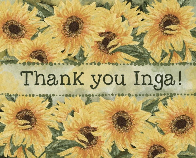
 Inga Yoon, Digital illustrator and teacher