Transcripts
1. Introduction: My name is Alex. I'm
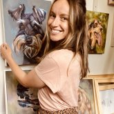
a pet portrait and animal artist specializing
in acrylic paints. I've painted hundreds of pet and animal
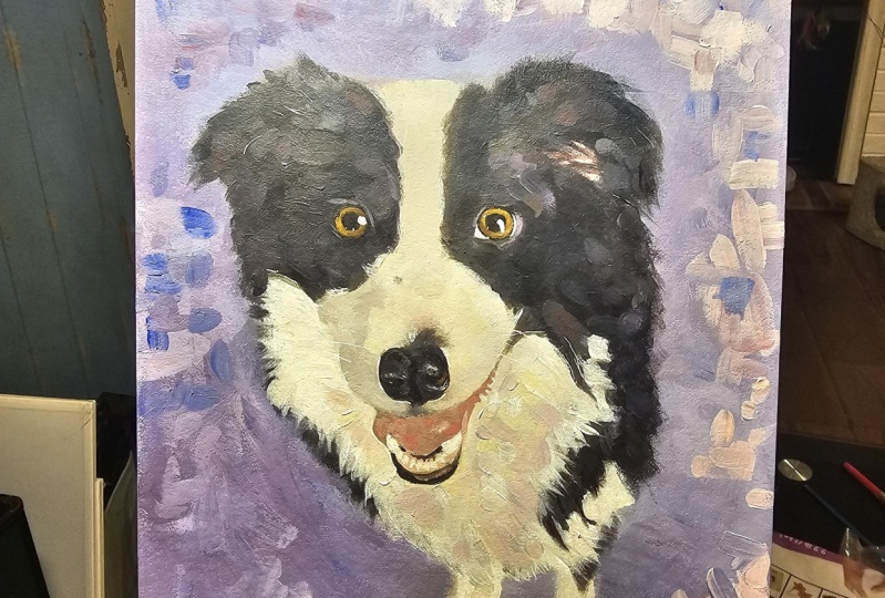
portraits in the past, from boxes, labradors, poodles, chihuahuas, and I've
even painted a rabbit. So in today's class, we're going to be learning how
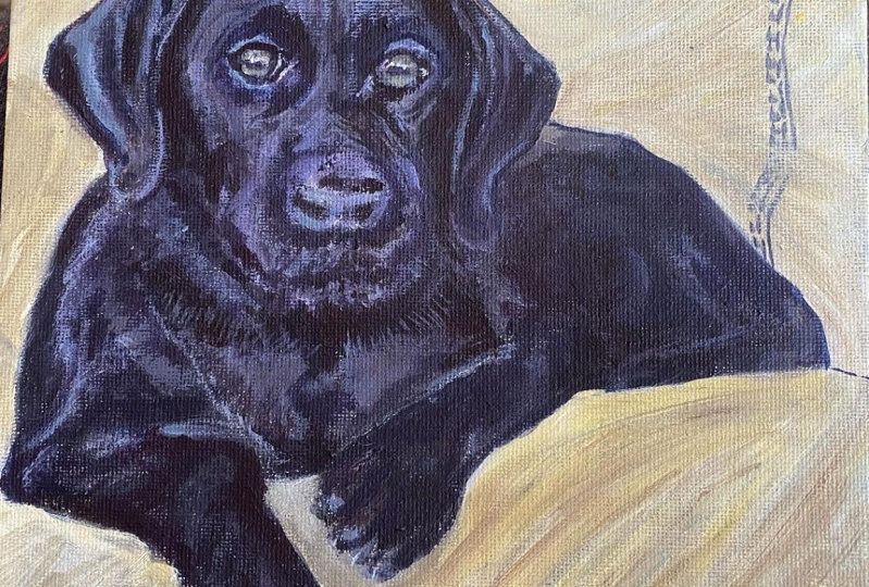
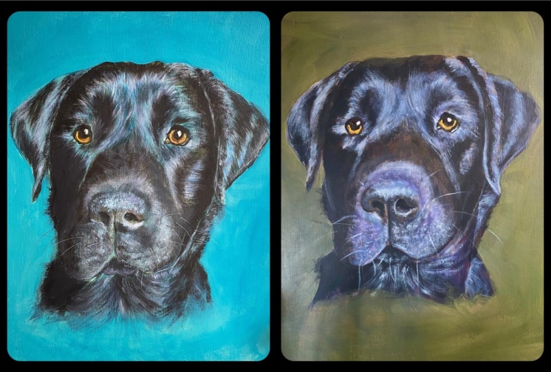
to paint a black labrador, and black dogs are
notoriously hard to paint. Hidden amongst all that fur. There are many different
colors other than black, and the trick to make
your black animals look realistic is to use warm and cool colors
throughout your painting. I'll be going over all the
materials that you need, how you can sketch out
your reference photo onto your painting service without the need for good
drawing skills, how to prepare your palette, and also to mix colors, blacks and grays that
are both warm and cool. I'll also be showing
you how you can use complimentary colors
on the color wheel to improve the look
of your painting. Feel free to grab a coffee and watch these
classes one by one. Alternatively, you
could grab a paintbrush and your paints and your palette
and paint along with me. It's entirely up to you.
So without further ado, let's talk about the materials you're going to need
for this tutorial.
2. Class Project: For the class project. I would
love it if you had to go at painting your own black
dog or black animal, You can use the reference photo that I'm going to be using of B. This is my brother's dog. You're free to use
him. I will link him down below in the
resources section. Alternatively, you could use your own reference photo that either you've taken
yourself or you could go off and find one on websites like
Unsplash or Pix Art. There's loads of photos on
there that are royalty free, so you're free to use them. Once you have finished
your paintings, please please share
a photo of them. You can upload them to
the class project section in the resources down below. I would love love,
love to see them. And I will give comments and feedback on every
single one that I see.
3. Materials: First up, I'm going
to run through all the materials you're going
to need for this tutorial. So I'll be using this
reference photo of OB. I've printed it off
onto A four paper, and as you'll see some grid
lines are drawn on top, this is just to help with the pencil sketch onto
your painting surface. So for this, you'll need
either pencil or a Bro. I used a Bro because it's easier to see the lines
on the reference image. And you're also going to
need a ruler and a rubber. When we get to the
painting stage, you're going to
need paint brushes. What I will say is
that you don't need the best or most expensive
ones to make a good painting. I still use cheaper
branded paint brushes in their work just as fine. As a general rule of thumb, if the paint brush is becoming misshapen very easily or the
bristles are falling out, it may be too far towards the
cheaper end of the scale, so you might want to invest
a little bit more money. I would suggest getting
one large, one small, and one medium sized, I love using flat brushes.
I'll show you an example. So I love using flat
brushes like this, but you could equally use
a round brush or a felber. It's entirely up to you and
your personal preference, what you might have
available already at home. So yeah, as long as
you have a large for blocking in large
areas of colors, a medium size, and then
a smaller one for doing fine details like the eyes and the whiskers, then
that's perfect. And next up, you're going
to need some paints. So I'm going to be
using acrylic paints, and I really love these
brands from Dela Rawi. So they're their cheaper
price point paints, the graduate series,
which is this one, and also the system
three series. So again, you don't need to buy the most expensive
paints at this point. Just buy ones that are
reasonably priced and ones from reputable brands like Dela Rawi or
Windsor Newton, they're going to do
a really good job. Next up, we have the
painting surface. I love using stretched
cotton canvas. And for this class, I'm going
to be using size 30 by 30. Obviously, you can
choose a different size depending on what reference photo you're going to be using. And if it suits a
different size canvas, then just go for that. But as long as you're applying the same principles
that I'm going to be teaching you when it
comes to your pencil sketch, then it will still
work just as good. Other alternatives
to stretched canvas can be paper or board. You can also pick
these up fairly inexpensively from
your local art shop. So again, it's just based on personal preference or what
you have already at home. And then a few
other things you're going to need are a water pot. Now, obviously, with
acrylic paints, the only thing that you
need to mix into it to make it kind of more
workable is water. So just bear in mind that you're going to need to be
changing your water fairly often because it will get brown and muddy
fairly quickly. You're also going to
need an old rag or some tissue just to wipe your paintbrush on to get
rid of the excess water. And the last thing is
a painting palette. So you're going
to need something to put your paints onto. I love using what's called
a stay wet palette. Other options are things like paper plates or maybe
a pane of glass. Something that works
really, really well is an old picture frame with
the glass still in it. You can just lay it down flat on your table and square the
paints out onto there, and it works really,
really nicely as a palette because you can move the paints around and mix them really well on the surface.
4. Your Pencil Sketch: When it comes to drawing out your reference photo onto
your painting surface, you don't necessarily
need to have the best drawing
skills in the world. We are going to use something
called the grid method. Grid method is an
art technique where an image is divided into a
grid of equal squares to help accurately sketch
proportions and placement by copying one square at a time onto a blank grid. But I will show you the grid that I've drawn on
OB's reference photo. So as you can see, I've drawn and numbered a grid up to 20, 20 wide and 20 high because
my canvas is square. So you want to do this
on your reference photo. If you don't have the
ability to print it out, there are online grid drawing
tools that you can use. Then want to draw a similar grid onto your painting surface. So, here is the grid drawn
onto my painting surface. So I've drawn the same number of squares across the top
and down the bottom. But because this
is 30 centimeters, I've had to increase
the sizes of my squares slightly
to 1.5 centimeters. Now, that is the key here. You have to have exactly the
same number of squares on your reference image and on your drawing surface.
Otherwise, it won't work. And then once you've got the grid drawn out on both
and you've numbered them, you can then go ahead
and start drawing your outline using the
corresponding squares, and it just makes
it so much easier. It does take a bit of
time, but it's definitely worth it because by the
end of the process, you will have peace of
mind that you've got a very accurate drawing
and it will just make the painting
process so much easier. Final thing I'm going to do with my pencil sketch is
just use a rubber. I use one of these
putty rubbers, and you just want to try
and rub out as much as possible any of the grid
lines that are still showing. Obviously, you're probably
not going to be able to get every single last
bit of pencil off. But yeah, as long as
you take the majority, and we're going to be painting
over all of this anyway, so it's not vitally important. And next up, I will show
you how we're going to prepare our palette
and mix our colors.
5. Preparing Your Palette: Okay, so I'm now going to
show you on here how I mix my blacks and my grays
to paint OB's portrait. So first up, I'll show you the colors that I'm
going to be using. I'll run through
these one by one. So the first one is
ultramarine blue. So I'll just squeeze,
a little bit out. Let's move that down
so you can see. So that's the first one. And then I am going to
be using yellow ochre. That's going to be my yellow. And the red that I've chosen
to use is cadmium red. And then I have this is kind of a brown with a
leaning towards orange, so it's a warm color. This one's called burnt umber. Then I also have
titanium white as usual. So a big doll that at the end. So I have turned my lights off, so there's just natural light
coming through the window, which may be why
it's not uniform across the palette but
it's much better to use natural light
because you can see when I mix up the colors, you can see the
hues a lot better. To mix them, I'm going to
use this palette knife. I've just got some tissue because I'll be wiping
off the paint when I mix the colors so they don't mix into each other
when they're not supposed to. The first black that
I'm going to mix, I'm going to use my
blue and my orange. My burnt umber is my orange and I've got my
ultramarine blue. I'm going to take them
in equal measures, wiping my palette
knife in between. I think I've got slightly more blue on then, but if
you start mixing, you can see what color
you need to add more of. That's actually
quite good, I think. As you can see, that's made
a very dark rich black. See if I can show you on
there. Keep mixing that. Now, if you wanted to
make that black warmer, you just add a touch more of the burnt umber and if you wanted to make
it slightly cooler, you're going to add a touch
more of the ultramarine blue. Now, to make my gray from this, I'll just take a small
amount just white my coat. Then you want to add some
of the titanium white. That might have been too much. Then mix those two together. As you can see, it's now
making a gray we've made this gray by not using
any black at all, it's a colorful gray. Okay. Again, if you wanted to make
that gray slightly cooler, just add a touch more of
the ultramarine blue, if you wanted to make
it a bit warmer, a bit of the burnt umber. White titanium white,
is a very cool color. It's actually cooler
than the blue, making this gray color
will cool it down too, just be mindful of that. Now the next black
that I'm going to mix, I'm going to use purple and yellow, two
complimentary colors. Now, I don't have purple
squeezed out onto my palette, so I'm going to
make a purple using ultramarine blue and red. As you can see, when I'm
mixing these colors, I'm using compares the
blue and orange mix, blue and orange are
complimentary colors. I'm now doing a purple, yellow mix and they are
both complimentary colors. Mit those in together. Again,
just judge with your eye if you need to add a bit
more of any color. I think that's
actually pretty good. That's made a very dark
rich purple color. Then into that, I'm going
to add some of my yellow, which is my yellow ochre. I just add that in. Maybe
a little touch more. As it very slowly. Because yellow ochre is not a transparent
color, it's opaque. It's going to slightly change
the color of the black. It's going to make it a bit
lighter. I think that's okay. That's my next black. It's
a very purply black color. Again, to make your gray, you want to add a
little bit of white. To make your gray cooler, just add a bit more of your
purple and to make it warmer, add a bit more of
your yellow ochre. Now, that's quite a
pray, quite a cool gray. So to warm that up, I'll just add slight touch
of the yellow ochre. As you can see, that
instantly just makes it a warmer color. Touch more. What's that? Yeah, that's nice warm gray. The third black
I'm going to mix. The two complimentary
colors that I haven't mixed yet is green and red. To make my green, I'm going
to use my blue and my yellow. Mix those two together. That's probably going
to be too much blue. Let's see. So as you can see, we still haven't used any black at all, so these are all very
colorful blacks, shall we say, a bit more
of the yellow going in. That's still blue,
still too blue, a bit more of the yellow oka. Go slightly over
into the light a bit more. Keep mixing. That is our green then into that we want to mix
complimentary of red. You don't want to add too much of these strong
colors in one go. You want to add it
slowly and then you can always put more
on if you need to. You can't take the
paint back out again, Okay, that's our third black. I don't know if that's
coming out very well. Might be a bit too red, but
if you do think it's too red, you can add a bit
more of your green, so your blue and your yellow. Then let's just turn
this into a gray. Mix in a bit of the, I do think that I need to add
a bit more yellow ochre, a bit more of my yellow. Is that a mix and a bit
more of the blue as well. That should make it
slightly more cooler because I just
added in my green. Green is a transitional color, so it can be cool
and it can be warm. You can get blue greens. Buy greens are
cooler, obviously, and you can get
more reddy greens, which would make them
warmer. That's much better. I know that in my
original black mix, I need to add a bit more of the green because when
I added white to it, it was coming up
noticeably redder in tone. So, I will just amend that slightly by adding some more of the
blue and the yellow. That's made a really
lovely green. Sorry, gray. You
can see that there. Even now I'm looking
back at this one and I feel like I could
add a little bit more of the orange into
that because that's looking like a very blue gray. There just by adding a tiny
bit of that burnt umber, it's just knocked it back a little bit of
its blue leaning. There. You could have a go at this before you
start your painting. It's a very basic palette. We've got our blue,
our yellow, our red, we've got an orangey
browny color and lots of titanium white. Just have a go at mixing up three different
types of black using your complimentary
colors and then adding a little bit of white into
this to get your grays.
6. Starting the Painting: To begin the painting, we're going to start off
with just one color, and that is your burnt umber. So we're going to use paint half water to make a
very watery consistency. I would like it to
thick watercolor, and then we're going to
take our medium brush and start the painting. Load your medium size brush up with some of that burnt
umber and water mix. Then we're basically going to follow the outline
of your pencil sketch. This is to be used as a guide for you as you progress further
into your painting. When you paint on
top of the pencil, you may lose some
of those lines. This is just a way of recording where the shapes
are and you also want to be looking for any
particularly dark areas in your reference image and also painting that in with that
burnt umber color as well. Any light areas, either just use a very watery wash of the burnt umber or leave
them as white for now. With this initial layer of
paint you're putting on, you might find it quite
difficult to spread it around. That is true in most cases of the initial layers
because the canvas is soaking up more of the paint. You'll probably find
that you'll be using a lot more water in
these first layers. So yeah, just keep the consistency of your
paint like watercolor, which means that you will
need to keep on adding more and more water into
your burnt amber paint, kind of following not just the outlines
of the pencil sketch, but I'm also paying attention to where the darkest areas
are in the reference photo. These could be dark areas because of a
particularly dark area of fur or it could be because
some of the dogs in shadow. So yeah, you really want to start thinking
at this point about the lightest and darkest areas and giving yourself clues for
later on in the painting. Setting down these
light and dark areas now so that when you come
to put color on top, giving yourself a head
start, basically. When I'm rubbing the
paint brush on like this, this is called
scumbling and it's just where I don't really
want there to be loads of dark paint and I also don't want
it to be too light. So around this nose area, it's kind of a
mixture of the two. So again, I'm giving
myself a head start there by kind of putting in a bit
of texture almost as well. Looking at OB's reference photo, I feel like the light is coming from this direction and
it's hitting this area. And then this part here to his right side is darker
and more in shadow. I think I'll exaggerate
that lighting slightly. You want to make sure
that or you want to try and You want to try and capture the light in your paintings
would just make it look a bit more realistic. You don't want everything
to be flat and lifeless. You want to capture that light. Have a look at your
reference image. Now if you're not painting OB, then just see where you think your light
source is coming from. And start thinking about which areas you're going to slightly exaggerate your
lights and your dogs. The really, really dark
area is this nostril. Nostrils mostly always the
darkest area of a dog. All dogs have black
nostrils or actually, I don't know if do all
dogs have black nostrils? I think all the dogs
that I've painted have had black nostrils. These bits here
around the eyes here and here are both
very dark as well. This one probably slightly
darker, I would say, then this area in
the middle between his eyes is fairly
light overall. But again, I might just
do a little bit of that scumbling texture because it's dark flex within the light. But overall, I would say
that shape was lighter. Move to my medium sized brush. I've got a slightly
larger brush now. I was finding that
one was a bit small. I think people when
they first start out painting are scared
of big brushes, but they're actually
a lot easier in these initial stages because they help you to not
paint in too much detail, you physically can't
paint small areas, therefore, it won't allow you
to paint in finer details. Yes, maybe start off this
part with a larger brush. Now this is an example of a brush that is probably
a little bit too cheap. I don't know if you can see, but they're splitting like
that when I paint. That's what I mean when I say
they're getting misshapen, that is making it a
bit difficult for me, but in these initial layers, it doesn't matter too much about the brush strokes because
I'm just as I said, getting in those
light and darks. But when I come onto
the next stage, I might switch paint brushes
because this one is just not doing it for
me at the moment. Let me just move the
camera down slightly. Simon's going to whack on
his chin and neck area. Again, this side here,
it's very, very dark. This side here is
very, very dark, so let's just put
in some dark color. Because we're painting in
very, very thin layers, it's going to dry very quickly. So if some areas have
dried a bit lighter, you can obviously
revisit them and just make them slightly darker because it's a black dog, most areas are going to be dark. You might find that you
want to cover everything in this burnt umber coolor but just add an extra layer if
it's a very, very dark area. So here, this is actually
quite light this bit here. I don't want to
touch that too much. Just add a little bit here. The darkest area
around his whiskers is this bit and then it's a
bit lighter on the edge here. And around the eyes, this bit grab my smaller brush again
and I'm going to do a bit more around the eye. Aye. This bit is very
dark. And this bit. It's looking a bit of
a mess at the moment, but trust the process, and eventually we'll work out. Right. I think I'm going
to leave it there. You want to wait for that to dry and then we're going to do a wash over the whole
surface of yellow ochre. So to put our yellow ochre
wash over the whole surface, we're going to use
our large brush. I've got this large flat brush, and we just want to make up
a watery yellow ochre mix. So yeah, we want to make up
a watery yellow ochre mix, just take a bit and then
grab a load of water. Your palate is probably
going to become very messy. I'm trying to keep it neat
and organized so I can show you in this lesson, but inevitably is going
to end up very messy. Okay, a bit more water. Right, I think that's
good to go now. Now, the reason why I love using this color for
my underpainting is that most of the time
because I'm painting animals, they are going to be slightly warmer than say if
you're painting a snowy landscape or something that's particularly
cold in undertone. So so this yellow acre is a very warm yellow
and it just sets the scene for the
rest of the painting. Also it's much harder to paint your values if you have a lot of white background showing
on your painting. Obviously, white is very light. So it's going to skew the way you paint values because you'll always have that lightest area. I basically want to
remove all of the white. And then it's just easier
to judge your values much better. Okay. There we go. If you wanted to, you could
do the edges as well. Obviously, that's
not necessary if you didn't want to paint
your edges. I normally do. But I'll save that
for the end, I think. Then you want to
leave that to dry. Again, it shouldn't take too long because it's
a very thin layer. Join me in my next lesson where we'll be adding
in some color.
7. Adding Your First Blacks: The first color that I'm taking here is my first
black that I mixed, which was the ultramarine
blue and the burnt umber. After studying my
reference photos, if you're not using OV, you might want to do
a little study of your reference image
first and just work out where your
different darks are, you're going to have cooler
darks and dark blacks. With OB's portrait, there's
quite a lot of cool color in the highlights around this
area and around here as well. Cool light equals warm shadows. I'm surmising that
because a lot of the lighter areas in this
photo are cooler in color, that the light is
cool, therefore, I'm going to make my shadow
areas a little bit warmer. I'm just going to use this
same color in the really, really dark areas
of his face, yeah, this ultramarine blue and burnt umber mix is
a very rich black, so it's very nice and dark. I'm going to go in first
with all my darkest areas. As I mentioned when we were running through how
to prepare your palette, if you wanted to make this
color slightly cooler, you can add a bit more
of the ultramarine blue. And if you wanted to
make it a bit warmer, you can add some more
of the burnt tumber. I'm just going to
alternate between the two now just painting those
darkest areas of black. Now this is going to be
the first of many layers. Well, not the first, it's
the second layer, isn't it? So it's going to be
one of many layers. Don't worry if you can still
see patches showing through underneath because eventually
we'll cover that up. So darker areas here running
through his muzzle area, suggest those for now. This area here on his
nose is very cool. I can even see some purply tones along the top ridge here. I might add a little bit more of the ultramarine
blue into my mix. Just to cool that down
slightly, as you can see, that's a cooler bluy black. Again, don't be too
precious about anything. This is still very early. So when I work on a painting, I don't focus on any
one area at a time. I work my way around. And yeah, there's no rhyme
or reason to it really. Just whatever catches my eye. And sometimes I do think I mean, a lot of artists do work
in small areas at a time, but I think there's a lot of
benefits to not doing that. Especially when you're
focusing on values quite a lot because if you're
just painting one area, it may skew your
values because you'll have a lighter area where you've not applied
that much paint. Yeah, I think it's
good to bring up the whole painting or bring
the whole of the surface up. At the same time, that
kind of makes sense. Again, this area here
is slightly bluer. Just noticed the Let me try and turn that
around a little bit. That's a bit better,
isn't it? The Sun was reflecting off then and it was hard to see. That's better. And as I'm adding more
and more paint on, because you're looking at
your reference photo so much, things start becoming
more and more clearer and because you are
studying it all the time. And I think my
warmest area is here, so I'm going to keep
that brownie black. Detail on the eye now. So the pupil is very dark and top of the
eye here as well. So some dark paint on there. Now, at this stage, don't worry if it looks
terrible like mine. So it can start looking like a five year old's
done it sometimes, but you got to
trust the process, as I say, and we just laying down the foundations
for the final painting. So we've still got a
long, long way to go. Now the lightest area of
the painting is here, this is going to be your
highest contrast area, it's going to be where
your darkest darks are and your lightest lights. I think that's going to
be in the pupil because the highlight is
very, very light. That's often the case
when you're painting dogs the eye area is your
highest contrast area. Which is good because
that's the area where the viewer's eye is
going to be drawn to. Because this area here
is very light and cool, I'm just going to do a wash of mainly ultramarine blue with
a touch of burnt umber. It's going to be
very, very blue. I'm now going to put a layer on background because this yellow is
just way too bright. I want to dull it
down a little bit, so I'm going to take
a bigger brush and I'm just going to make a fluy, greedy, kind of warm
color as always. Otherwise in most
of my paintings, I use that as a background. Yeah. Don't worry too much if your background
blends in like that. Sometimes that can be
quite a nice effect. Actually, that can bring me on nicely to talking
about your edges. You can have what's called
lost edges and hard edges. So hard edges are where
you've got an area of either very very dark
paint against the opposite. If it's an area of
very dark paint against an area or
very light paint and you make a hard
line like that. Then that's called a hard edge. Whereas if it's softer and
the values are more similar, then you've got what's
called a lost edge, and that's when you
can't see the edge as clearly as with a hard edge. It's not really looking very clear the way I'm
painting it now, but as we progress
onto the painting, it will become more and more
obvious what I mean by that. So just keep working around. Again, this is the first
layer on the background. So you want it to be or
second layer, should I say? So you want it to be quite thin and it's going to be patchy. Always is with acrylic paints. When you're working
in thin layers, it's just the kind of
look that happens. Maybe you can see that now
we've kind of knocked back that yellowy color
of the background, it's just kind of making values easier to see in the
dog what it will do anyway. Okay. Now with that background
color still on your brush, I'm just going to add a
little bit into the fur. It's good to harmonize
your painting like this. Bring in some of that
background color, and we are going
to paint over it, so it will just be little flex
that are showing through. As I said, can just helps
harmonize your painting and make it look a lot better. I'm just going to add it in where we've got those
lightest areas. So around here around the nose. I'm using a scumbling technique so you don't want to have
too much paint on the brush. And you can just rub it back and forth quickly
over the surface. Just kind of working it in. Ipse light areas around here. Quite a lot on the nose. Again, don't worry, if
you go over the nostril, we can take that back in later. A nice highlight
here on the neck. Round here. I'm gonna get a
little bit more in my brush. Down the ear here. Rub that in. And yeah, here. That's a lot. Between the eyes. This is a lovely nice little
white area here. That goes down down there. Then around the top, a
little bit more round top. We we go. I'm just gonna put a
bit more dark paint here on the neck. Kind of lost the paint bit here, so I just add in
a bit more black. Yes, so now I think
we're going to move on to using a different black. So I'm going to reach for
my purple and yellow, and I'm going to do some
of the cooler areas. Okay, so I want
to use this here. This is a bit cooler. Um, And here as well. So this area under his ear. I got to bring up. Dear. Now, I think I'm going to
introduce a little bit of white into this
because it is very dark.
8. Painting with Greys: The first gray that
I'm going to mix will be from my purple, yellow black. So I'm going to add a touch
of the titanium white, and it's looking slightly warm. I'm also going to add a bit
of the ultramarine blue, just to cool it down slightly. With that gray color
that I've mixed, I'm going to refer to my
reference photo and just add in some of the
lighter areas. Again, it's hard to explain why I'm
painting certain areas. And it literally is
because I'm just scanning the reference image and where something jumps
out with me that I want to add this color. I just kind of not really plunk it on because I am thinking about it still. But yeah, just kind of add it in when you
think it needs it. So you can see
there's still some of the brown showing through here, and you can straightway
see that that's just making it look warmer that area. And then here where
I'm adding some of that cooler purple and more of the ultramarine blue,
it's looking cooler. You also want to think
about your brush strokes in terms of getting texture. So OB's fur, it has
got texture to it. You can see a lot of
the individual hairs. Now, we don't necessarily want to paint each of these hairs, because that's not really
the look we're going for. But you want to suggest individual hairs in the
way that you add texture. One way to do this is to use
that scumbling technique. So what I'm doing
there, just kind of rubbing it back and forth and then your lines
won't be too neat, and you won't have too many
kind of straight edges, if you see what I mean. If you scumble all the brush, you'll be left with
fuzzy edges which can create the illusion of hair. OB's hair. So it's got
really nice sheen to it. So when we come to put even lighter
and lighter colors on, we can kind of create
that illusion, as well. So I usually work dark to light, but I don't like not
putting light colors down. Too late because, again, you want to put
some lighter areas down to be able to
judge your values. Once you put those down,
you can think, Oh, yeah, that's now made that
area look too light. So I want to add
some more dark in. So this bit running. I want to really put this in. So that's the light
bit growing up there. Okay, I'm gonna add even more yellow still coming out
very purple and some white. Yeah, this is a
very light mix now. So let's bring it down
to our lightest areas. Hope you can see my hand's
not in the way too much. Now, this is, I think,
getting too warm, so I'm going to add just a touch of ultramarine blue into it. Do a little bit more. Yellow okay, is a
very warm yellow, so it's made my overall
mix really warm, so I'm just adding some
of that ultramarine blue. That's better. Hopefully now you can kind
of see slowly but surely, see it coming together. Put that cooler mix. Here. Down here. I just added a lot more blue
and white into that mixture, and I'm gonna go find my
very, very light areas. Sometimes it's good to use your finger and
rub it like that, just to smudge over the surface. Not putting too much detail into these lights at the moment. I was just trying to get
a feel for the values, so I know that these areas
are going to be my lightest. I want this area here
and this area here. And then I think
although my area around the ear does have some
very light highlights, I don't want them
to be as light as these ones because again, this is where I want my
high contrast area to be. Right. I think I'm going
to do a little bit of work on the eyes now. I've now actually got a
very, very fine brush. I'm going to mix that eye color, so it's kind of ready orangy. A bit of orange and
a bit of brown. And again, don't be too
precise with the color at this stage because it
is the initial layers. Oops. That's definitely too red, but the eyes have got an
undertone of red in them. So as this Ops. Don't worry about that. As I'm painting on top of it, that red undertone
will shine through. I'm going to say that dark
purple mix for the pupils. Oh, so tacky. That is exactly what not to do. In fact, I think I'm just gonna leave it for 5 minutes
just to all dry it off. But instantly, even when I just put that first layer
into the eyes, it just makes them
pop, doesn't it? I love ring the eyes, and I don't I do them
fairly early on in the painting because they just do make such
a big difference. Right, yeah, I think
I'm gonna leave it there to dry out for 5 minutes. Now I'm just going to
do a bit more work on the nose area. The nostrils are going
to be very dark and I've mixed up some of my
orange blue mix for that. That's the bant umber, and the ultramarine blue. Yeah, just mix it until it gets to a very, very black color. I'm just finning in
those two nostrils. If you look around the
rim of the nostril, it's quite dark
there, but it kind of fades into a cooler gray. And then I'm just
going to kind of add that color in around here. Can you even see in this area, if we look on the
reference photo, I can see a bit of
green coming through. So I might even add a
bit of my yellow ochre in to make it a bit more
of a greeny, bluy color. Okay. And so here, I've already
added in some purple, and I can see that this
area here is lighter, so I'm going to make it's
kind of a bluey gray, so I'm going to add
a bit more white. Think of it a little bit more. I can also see that there's
a slight blue tinge as well, so I'm going to add a little
bit of the ultramarine blue. So make it. I'm not going to add any ren or anything to it. I'm going to leave it
as quite a cool blue. So here I'm just kind of adding in the mid
tones to the nose, working my way up to
the lightest areas, which will be across
this bit here, there's a very white
highlight right here. Dogs noses normally have very white areas on them
because of the texture. So they're very smooth
and they reflect light. Round about here is probably the lightest
part of the nose. I want my lightest highlight to be in the
reflection on the eye, so I'm not going to
use pure white because I want this area here around the eyes
to stand out the most. Just add a bit more of that
white colour under here. There's a bit on
this side as well. A bit on this side as well under this notrle coming
round like that. So I'm still not
being too precise. I'm just adding in any light and dark areas
that catch my eye. I need to darken
up this area here. And then through the
middle of the nose, there's always a dark line. And normally to one
side or the other, there's a highlight where
the light's hitting it. So on OB's portray, the white highlight is
to the left hand side. So I'll add this in,
and I need to darken up that line in a second. Now with that color
still on my brush, I can see above OB's
nose in this area, it's light, and I'm just
going to use that same color to to scumble a bit
over the surface. Then Your finger can be a very good
paintbrush as well. When you combine some of
the blended brush work with some of those kind
of blocky strokes, it adds a bit more kind of interest and movement
into the painting. So just putting that in on the
darkest areas of the nose. Do that under here. Referring
back to reference photo, so I actually forgot to put
in this dark area again. Just do that a little bit now. I. Just using that same color to add a bit down here
around the mouth. I quite often do that. If I've got a color left on my brush, I don't instantly wash
it out to mix a new one. I look in other areas of the
painting where I can use it. And that just kind of adds
to, as I was saying earlier, the harmonious nature of the painting if you're using kind of the same colors
in multiple areas. You don't always
want to be mixing new shades for every
color you put down. So this area here
is slightly warmer, so I'm just adding some of this burnt umber mix here
just to warm that up. And this immediately then falls into a cooler
area down here. I'm going to use a bit of my purple yellow
mix again, I think. I'll just mix more of that up. My yellow ochre, my red's gone where I've got
my red at the freezer, it is still frozen, so I'm just going
to add a little bit more a little bit
more cadmium red. Again, you mix your purple
by using red and blue. And just kind of you need
to eyeball it really. If it's looking too red, just
add a bit more of the blue. And then in order
to make it purple, I'm going to add sorry, in order to make my black, I'm going to add some
of the opposite, which is this yellow ochre. Add a bit of burnt armor as
well because it is an orange. It's a brown orange, and that just helps to mute the purple color a
little bit as well. That makes it look
nice and dark. I'm going to use that here. The kind of more deep that
area of paint becomes. So when you're
putting blacks down, don't just put one layer. You need minimum of two layers, and I would say kind of three
or four would be ideal. That color kind of runs down. It's che And Okay, water is refreshed and now just working on this
right ear a little bit. So again, I've made
these highlighted areas here very very purple, so I need to add a bit
more blue into that. Just darkened that area as well. This is actually
one of the darkest areas on the painting, so I'm going to add a few layers into this to make sure it's
really, really dark. This comes out a little bit
further here, the dark color. I'll just pull that across. Anything that does go
over the background is not too much to
worry about because you can always change those shapes with
the background color later on so I can cut in here
with that background color. Now I'm going to add some
more dark around here. I've got a blue
orange for this area. So for now, I'm
probably going into just paint quietly
for a little bit. So it's just about adding in your different
colorful blacks and grays by mixing in a
little bit of white. Yeah just keep working your way around the canvas and
hopefully over time, you'll see it developing and just looking better and
better as time goes on. I'm going to work
around these bits where the yellow of the canvas from
underneath is still shown. I'm going to work on those now. So you can watch me
paint for a little bit. I've just moved the camera. I'm going to work
on this area here. And some of the highlights
on the ear as well. Make that color a
white. Biv blue. And let's just put in the
light shapes above his eye. And then this area
directly adjacent to this dark area is fairly
light in colour for that. So I'm going to use
this bluy color, again, choosing somewhere else within the painting to use it. And this area between OB's
eyes needs a bit of work. That kind of, like,
kind of comes through there and into the
top of the eye. I'm using fairly light color
for the background now. So it's the same mix as before. Ultramarine blue, the yellow
ochre, titanium white. I've also added in a touch of the burnt umber just
to dull it down a bit. And I've made it quite light. So I'm again using that same
color on my brush and just working my way around
finding any light areas. So for example, around here. So the areas of OB's fur where
it's got that sheen on it. And I'm just using that
light background color to go over those areas. So again, just adding the
harmonious aspect to it by including the same color in OB's hair as in
the background. Anyways, let's get
back to the time laps.
9. Refining Your Painting: So if you've made it to
this point in the class, you should have
something similar to this if you're painting OB. At this point, I'm going to
start refining the painting. We've now got our areas of darks and lights
and our warm and cool, you want to just revisit those areas and make any
adjustments that you need to. Make sure that your
dark areas are dark enough and your light
areas are light enough. The majority of your painting
should be mid tones, and you should only have
one or two areas where you've got your lightest
lights and your darkest darks. Just go back and just check
those value relationships. And also, I'm going to
take a fine brush at this point and work on
some finer details. I'm going to return
to the eye area, just do a bit more work there. And also I'm going to start adding in a few hairs
here and there. You don't want to add
every single hair in. Firstly, you'll be here forever, and also it's not
really the kind of look we're going for with
this kind of painting. I'm going to add them in
areas of high contrast. So they normally stand out
around here where we've got a particularly
light area against a dark area and also
around the muzzle, you normally get a lot of
whiskers in this area. Be mindful of that at
this stage as well. If you have a lot of whiskers
on your reference photo, then maybe start
adding those in. I'm also going to
use some of this. It's a glazing medium by golden. If you don't have
any need to hand, then don't worry,
it's not essential. You could use water
in place of this. But if you are able to get some, I would highly recommend it. I love it. I use on mostly
all of my paintings so yeah, definitely recommend the
golden brand as well. Glazing is a technique where you apply thin
transparent layers onto the painting surface and it lets the layers
underneath show through, but it just alters the
color on top slightly. I'll show you how I use
that in a little bit. Also, I thought I was
finished with the background, but I definitely think it needs one more layer, so I
will do that as well, focusing on those areas of
soft and hard edges and also cutting in
any shapes where I need to also with
the background, think about adding a few
hair details in as well. You don't want a
solid line all the way around because
it is an animal, you're going to have bits of
fur and hair sticking out. Again, rather than adding
every single one of those in, just do a few here and there
to create that illusion. So I'm going to start now
using my finer brush and I'm going to take some
light paint mixture, so a bit of the
ultramarine blue, a bit of the white, and just tone it down with some of the
complimentary yellow. I'm going to make a very
light bluey gray mix. Okay, so I've got that
light gray color on my brush and I'm going to
start off around the eye area, making some kind of very
quick lines like that. Hopefully, the camera is
showing that, I think. I'm just going to go around not going to put all
of the hairs in. I'm just going to put a few in to just imply that
there are hairs there. Around the top of the eye, you can see this area here, there's some hairs
going that way. I'm going to put
those in. If you look at your reference image or look at the
reference image of OV, you're more likely to
see the hairs appearing where the light areas
meet the dark areas. I'm also going to put a few
whiskers in now as well. And so just kind of lightly
going over like that. So just very, very faintly. So just come back up
to the eye area again and just put some lighter paint around that bit of the eye. I do a few more hairs
going up here and this is quite a strong highlight
here above the eye. I'll put a few more hairs in. Okay. I'm now going
to put some of the glazing liquid onto my
palette, it's quite runny. You need a little bit like that. Now I'm just going
to do some glazing. The first glaze I'm going to do is going
to be a dark color. So I'm going to take some
of my ultramarine blue, some of my burnt umber and then put in a bit of the glazing medium.
It's transparent. Okay. And probably want to do about
half and half like that, and then I'll show
you on the canvas. I'm going to apply that glaze. In the areas that transition
between dark and light. Here, for example, as you'll
start to see as I put it on, it will make your dark areas
go a little bit darker and the light areas go a
tiny bit darker as well. I'm just doing it in those
transition areas just to make the lines a
little bit less harsh. Around there. I'm also going to put it in
any light areas where I think they're a
little bit too light. I don't want to completely
cover up those light areas, but I just want to tone
them down a little bit. I might do that to the
muzzle areas down here because I want the
lightest lights to be up here around the eyes. I'll just apply that down here. Soften those up a little bit. This bit here as well,
might be bit too light. Put a bit on the ear
there because I thought that area was a bit too
light. And again, here. Here. So I hope you can see the effect that this
glazing is having. It really is a great medium. If you're going to buy
any acrylic mediums, I would suggest this one. I mean, if you're only
going to ever buy one, then I would make it a glazing medium because it's
just so useful. Especially when you're
doing black dogs like OB because they quite often have a sheen on their fur and glazing just really helps you
to get that effect. I'm now just kind
of squinting at my painting and my
reference photo and I'm going back and forth
between the two and just adding in any
areas that need to be lighter or darker or change the values slightly and the warm and the
cool temperatures. Squinting can really help because it helps
you to block out detail and you just see
big areas and shapes. So it just helps you to find any places where you
need to tweak anything. S so I think I'm nearly
coming to the end now, and I mean, I could carry on adding layers,
adding more paint. And yeah, you can carry on for as long
as you want, really. It's all completely
dependent on how you feel. You want the painting
to look at the end. Do you want it to be a very kind of finished detailed painting? Or do you want it to be more
kind of loose and painterly? I was just going to add a
few little hairs in there, just sort of seen as
a bit of hair detail. Just needs a bit more. I can probably put another layer onto the background as well. Still a bit patchy here. A bit more bit ride down here. S.
10. Final Thoughts: Here's the point, I've
got to with my painting, I'm really happy with it. I feel like I've made
good progress now. I could continue
adding my layers and my final details and also
continue with that glazing, but I think I'm going
to leave it here. I'm quite happy with
the painterly look, but of course you
can carry on with yours and bring it up to
more of a finished style. I hope you've enjoyed
this class and you've got lots of tips and techniques
to put into practice. I would really,
really love to see any paintings that
you've created. Please post a photo
down below and I'll give feedback and
comments on every single one. Yeah, thank you so
much for joining me in this class and I hope
to see you in my next one.
 Alexandra Goddard, Pet Portrait and Animal Artist