Transcripts
1. Introduction: Painting a leaf may seem like a daunting task with
all those details, little veins textures especially
for beginner artists. But if you take it
one step at a time, then it's not so scary. Hi, I'm a, I'm an artist and
I'm based in Sicily, Italy. In this class, I will
take you step by step from color mixing and matching. And then I will
show you the first was the second wash,
the third wash. Finally, I will show you
how I add the details, how I paint the imperfections, if there are any in your leaf. By the end of the class, you will have not only your
very own leaf painting, but you will have learned useful skills that you can
apply to other projects. When you're painting
in watercolor, I have included for
you a tracing of the leaf in case you want
to follow me step by step, but by all means you can
paint your own leaf, just find one and do that. I have also included a PDF
guide where I show you step by step everything that
I go through in this class. You can download that and
print it and keep it. Okay. If you're ready,
let's get started.
2. Class Project: The project for this class is of course to paint
your very own leaf. Now you can download the tracing I've
provided for you and you can just follow me step by step if this is the first
time you paint a leaf, for example, or extra
brownie points. If you search for your
own leaf and paint that after you've washed
the class and had a look at the
techniques I use. I do have classes on specific
techniques for watercolor. Have a look at my profile. If you can brush up your techniques with the
other classes as well, then once you've
finished your leaf, don't forget to upload a
picture in the project section. Okay? I can't wait
to see your leaves. All right, let's carry on.
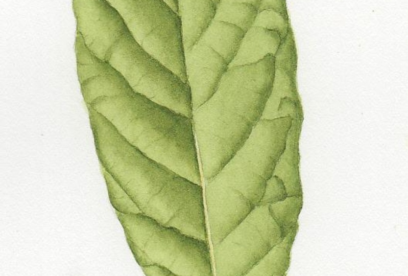
3. Color Match: Hi there. In this lesson, I will show you how I
approach painting a leaf. This is a medlar leaf, I'm pretty sure that's
the name of the tree. I start with mixing the colors. After having a look at
my color recipe book, I start mixing Windsor
blue, red shade. Then I add some
transparent yellow. I choose the red shade
instead of the green shade, because this is a dark green,
is not very brilliant. And also the transparent
yellow is a yellow. As an orange bias, it will tend to form
together with the blue, dark green, which is
a bit is brilliant. And that's what we
need at the moment. And even so, I still need
to mute it a little bit. I add a little touch
of quinaquidronmgenta. I mix this green. This is the local color, is the main color of the leaf. From this one, I will make
the other colors that I need, the lighter color
and the darker color for the darker
sides of the leaf. For the parts in the shade or
a should say in the shadow. I note down what colors I used, then I take some of the mix. This will be the lighter color. If we were painting in
oil, we would add white. But with water color, we
just add water and we make the lighter
shade of the color. I just, I add water to it. To make the darker color, I use a botanical
Gray as I call them. This one is made
with winter blue, green shade, quenquidmgenta
and lemon yellow. I make this gray because
it's more black. I will use this black in Dutaniamounts to make
the green darker. I'm not going to use red because sometimes
they tell you to use the opposite color in the color wheel to
make one color darker. But if you use red, you're going to end up making a brown. If you use one of these colors, this botanical grays, then
you will just make the green. But it won't essentially
change the fact that is green. I'm just making
this black color. As you can see, it is black. And then if you water it down, it becomes a gray. I will add that to the green. I take another part
from the main green. So make sure you
mix enough color and put it in another well, and then add a little
bit of the time, the gray or the black, that will make the darker green that you need
for the shadows. As you can see, you
have a dark green, but it's still a green. When you put it on top
of the previous green, it looks like it's
a shadow the main, the lighter gray and
the dark version.
4. First Wash: At this point with a very diluted version
of your main color, which I call the local color, I just apply a wash
all over the leaf. It would be just a flat wash
just to give it a color. If the leaf is shiny, sometimes you could add a pale wash of cerulean
blue for example. But in this case, I'm just
going to do a light wash of the green just to start
putting some pigment down. I will not do form or
any shaping just yet. I'm putting this green all over. Even on the veins in the mid rib and the veins
because when you add color, then the veins will
look very pale. If you have a pale vein, it's okay to add the color, this face wash on top of it. And I left a little
bit without color because there's a little
bit of brown in the leaf. This is something else I do. I always turn the page around whenever I can
because it's easier for me, at least, to work from the right to the edge of the leaf instead of
the other way around. Because that way it's more
difficult that I actually go over the edge of the leaf. You might not need to
do that, but if you do, don't be afraid of turning the page as many
times as you need to. So that's the first finished.
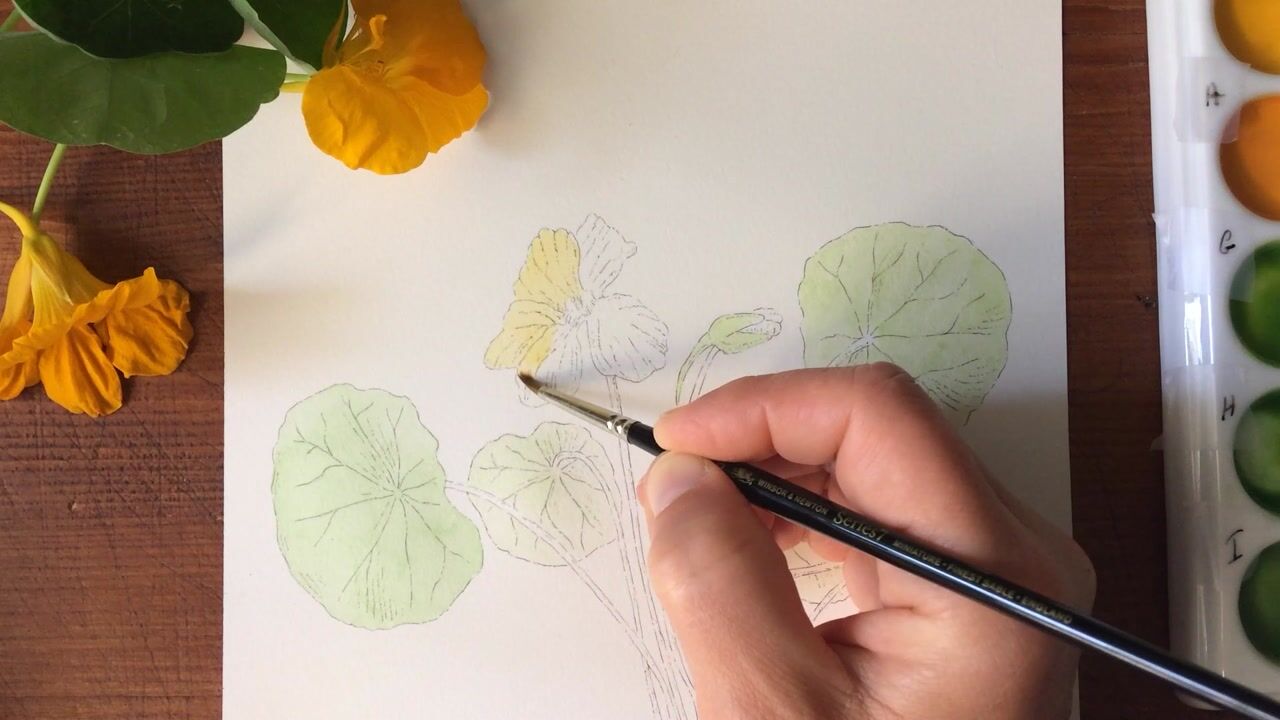
5. Second Wash Left Side: After the first wash, I will start working
in small sections. I wet one section, I still work, wet, wet. At this point, I add some clear water and
then I dropped the color. I start dropping the color
where there is the shadow, where the color is darker. And then I just diffuse
it with a brush. Just touch the paint slightly, just tease it towards the
light, but not completely. Then I just do this
for each section. Put a little bit of water first. Just make sure the paper is
not too wet and too dry. You will learn with the
practice when to drop the color and I have
a picture next to me. And I will follow basically
where the light in the darks and I drop the
cola where the dark. Then rinse the brush and
just see the paint towards the high light will make this soft transition
from the dark to the light. I leave the space because between one section
and the other because I don't
want the color to run into the other section,
which is still wet. In fact, the first section,
because it was still wet, I could still add a
little bit more color, try to work in sections that
are not touching each other. If you don't want the
color to just run into the next section next to it. This process I just repeat
for the entire leaf. I'm trying to show you here. As you can see the
shine there should be a little bit of seen shine, that's when you want
to drop the color. As you can see, I
have a color picture. The color is different
in the picture. Because when you
printed, of course, I'll never be able to print a color which is exactly
the same as the original. You will see a different type of green in there
in the picture, but that's just to
have your reference, you usually mix the color with your real
specimen in your hand. It doesn't matter if you
don't have the leaf anymore, but at least you have the color. And then I was saying I have the picture and I also have
a black and white picture. Because the black and
white picture really helps seeing where the
darkest places are, where the light is, where you need to add the dark, where you need to add the light, There's no distraction
from the color. It's a good idea, at least
I quite like to do that. Normally, I have a
black and white picture of the subject
that I'm painting. It's probably also a good
idea if you're not sure of the context of your painting. It's good to take a picture and then turn it into
black and white. And then it will
tell you straight away if you need to add more context in
your painting or if you have enough darks
and enough lights, just doing the same process, dropping the color
first, wet the page, then drop the color and just rinse the
brush a little bit. And with a damp brush, make sure you don't
have too much water on the brush when you go back, just tease the paint
a little bit so that it transitions smoothly
from the dark to the light. I have simplified this leaf. I'm not going to do all
the little tiny veins that you can see on it. You don't have to paint. You can if you want to,
but you don't have to paint every single little tiny vein that you
see in a leaf. I have simplified the
shape quite a bit. I also here made the video
a little bit faster. Not too much, but a little
bit faster because it's the same process
over and over again. But I was saying you can just represent the mid
rib and the main veins. The secondary veins, you
don't have to be lost in all of the little tiny
veins that cover the leaf. Because some of the leaves
are really difficult, they can become really
difficult if you want to paint every single tiny vein. I wanted everyone to be
able to do this leaf. I have simplified
it quite a bit. I've added some of
the veins at the end. You will see, but
not all of them. You can have your leaf at the end and you can
be proud of it. Just make sure when you're
doing this process. Now, not to paint
over the mid rib. If the mid rib should be lighter than when
you get close to it, try not to paint over it. You will leave this
little gap in between. There are of course ways to lift the paint
if you go over it. I think it happened to
me a little bit as well. But try not to paint
over it because it's easier to do
this way rather than trying the paint they
already put down. Sometimes, depending on
the type of paint you use, it might actually stain the paper so you won't be
able to lift it completely. As you can see, it's already
starting to take shape and already looks like a three dimensional leaf where there are some
darks and lights.
6. Second Wash Right Side: I'm just starting
on the other side because this section
on the left, they're still wet next to it. It's the same process.
On the right side, there is the light
that is hitting it. There would be less
dark basically only a little bit at the bottom, on the top of the vein, but it won't be as much
as the other side. You should always try to observe your leaf
even before starting. Take the leaf in
your hand and look at how the light hits it, where the darks form, and where the light hits, where the highlights are. Always observe it really
well Before you start. I didn't want to fast
forward too much, but if you want, feel free to fast
forward a little bit. But I wanted to show
you the process as I do it without cutting too much. And even if it's a
little bit faster, that's my entire process. No secrets here here, I'm just showing how I dip
the brush in the water. And when I say rinse the
brush, that's what I do. Just basically dip
it in the water, touch on the side of the jar, and then if you think
there's too much liquid, too much water, then just touch briefly on
the paper towel. But this will be
something that you will see with practice. And also it depends on
the brushes that you use. I was forgetting to say this. I'm using Winsor
and Newton brushes. I like to work with
the miniature brushes, but you can work with
the normal ones. With the seven, you have miniature and you have
just normal brushes. I think actually this one
is not the miniature, this is the number
one, series seven. But when it comes to
the smaller details, then I use the miniature ones. As you can see, if
you divide the leaf into sections is not
really that scary. You just concentrate
one section at the time and you just finish that section and move
to the next one. It's really not that bad, it's just a matter of
practicing a little bit. Mostly I think practicing the technique because
it's like driving. Once you know how to drive, if you can drive any car, they're all the same, so
you can paint anything. As long as you have a technique that you like
to use, this is mine. It doesn't mean that you will be happy to use the
same exact technique. You might just want to
do a weight on dry. For example, instead of
waiting the page first, you just use your color
straight on the dry page. I would advise you to experiment and try
different techniques. Do different leaves with different techniques and see
which one you like most. I think that's the only
way to really discover how you like to paint in here. I'm just going to
apply the paint on the very side of
the leaf because it's turning down a little bit, it's rounding at the edge, it will be a little
bit darker there. Exactly the same process. I wet the page and then apply the paint where
there is the shadow. And then soften it
with a damp brush. It's just a matter of softening the edges really all the time. Once you apply the paint, I always use light
washes and build the color by applying
more and more washes rather than going in straight
with a really dark color.
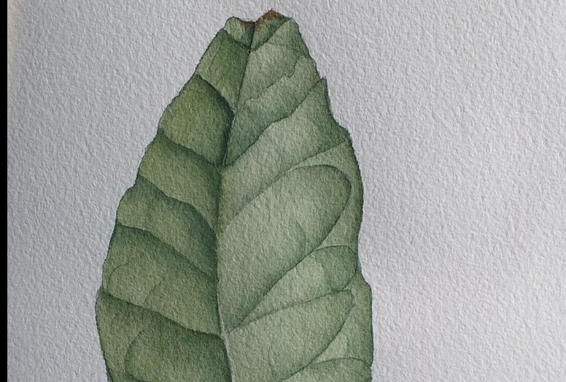
7. Third Wash Left Side: Now I'm just applying a
second layer, basically. As I was saying, I just darken the color by applying
more and more washes. It might seem a longer process, but it will give
you a differently, much better result than
just going in with a thick, dark paint. Because if the
paint is too dark, too thick, if you want to
apply another wash on top, you might actually
lift what you have, the paint that you have
already applied, that layer, and then this will
ruin your painting. The way I like to do it is just apply many different washes. But with color that is getting progressively darker and darker. That's what I'm doing now, is basically what I did before. But just with slightly
darker paint, instead of adding a
certain amount of water, I add a little bit less water or a bit more pigment is the
same well that I used before, but I just added a
little bit more pigment from my central well, the one with a local color. And I just repeat the process. This will strengthen the color and will make the
shadows a bit darker. The highlights where the light
hits will appear lighter. Just keep observing the leaf. Always refer to your
reference image or your subject if you
have it next to you. If you are painting a
leaf for the first time, probably is better
to have a picture because even if you have
the real one near you. But if you look at the picture, a list for me was like this. It you make the three D
leaf two basically image that you can follow
easier and less scary than having the
actual real object and trying to copy from there. And besides, you can do the black and white
picture as well, which helps here. I've made the video
again a little bit faster because again, I wanted to show you what to do, but you don't need
to watch it in real time because it's just basically the same
process repeated. You see here, have
another brush, this is a number two miniature. If you want this
technique that I do, you can use two brushes. Instead of rinsing your brush where you have the
color of the pigment, you can use another brush. And you use that, you put it in the
water, you tap it in. The paper towel is
only damp, wet. Just make sure it doesn't
have any water in it. And then you can use that to soften the edges
of the paint. As you can see, I'm
doing that now. I wanted to show you
this other option. Sometimes like I did here, I use one option,
then I use the other. It doesn't really
matter as long as you end up with the
result that you want. But I suppose the advantage of using two brushes is
that you don't have to rinse the brush
with your color. You keep one brush always with
the color as you see here. Sometimes I rinse the brush, sometimes I just
use the other one, but the end result is
basically the same. And sometimes I just use the other brush only
to wet the paper. And then I use my number
one brush as I was saying, experiment and see
what works for you.
8. Third Wash Right Side: If you notice, I always mix the color before I pick
it up with my brush, because sometimes
the pigments in the watercolor paint tend
to settle at the bottom. Not all paints do that, but quite a few will do that. They separate. So if you have a mix, you might get some colors to
this more than others. You might get a completely
different color. If you don't mix your paint
before picking it up, make this a habit. Always give it a
little mix before you actually put
the paint to paper. As you can see here,
the mid rib already looks quite light compared
to the rest of the leaf, but there is that greenwash
at the beginning that we did.
9. The Details: We can start with
some of the details, some of the main tertiary veins, the ones that you
can see a bit more on there on the right that you can see it
a little bit more. Also, I'm adding them
because I wanted to show you the
process in case you want to add more of
the smaller veins. But it's the same thing. I apply the paint and then I just soften the edges
with the dump brush. This is the technique
with the two brushes. And again, you might want to practice a little
bit this technique, but basically you apply the wet paint on the page,
on the dry painting. And then you just soften
the edges with the brush. Make sure you don't have to
moisture too much water on the other brush because
otherwise it would be pushing your paint away. The pigments will be
pushed by the water. It needs to be just
dump enough so you are able to soften the edges of your paint that
you have applied. Always look at your
reference photo or your object that you're
painting and then see where these extra darks are and see exactly look where the light falls and
when the dark falls. As you can see,
sometimes I pause for a few seconds just because
I'm looking at the picture. It doesn't have to
be exactly the same. I don't do photo realism. You might want to do
this if you want, but it doesn't really have
to be photo realistic. It is botanical painting
we're talking about. It should be as close as
possible if there are some specific things that are
just present in one plant. For example, if I
don't know hairs or something that is specific to that
particular type of plant, then you need to add those, but it doesn't have to
be photo realistic with every single little tiny vein
depicted in your painting. And even for botanical painting, if you want to do a
botanical illustration, where is scientific? That is for a
journal for example. Then in that case you
want to be as close as possible to the actual specimen. But if it's botanical
painting decoration for your own home, for example, or even to sale, then it doesn't have to include every single little detail. If you want to submit
your work, for example, to the SBA, a Botanical
Society, for an exhibition. In that case, you do need
to be very close as, as possible, as close as you
can to the actual plant. To the real plant with both the color and
the representation. If the veins go a certain way, if they do a certain pattern, then try to be as
close as possible. But botanical painting
is not only that, for decoration of your home. You can sell prints at
the end of the day. Those ones, they
don't have to be completely exact as a picture, They can be simplified like
I'm doing with this leaf. For example, probably
if I was to submit this leaf for an exhibition, a botanical art exhibition, I might have added more
details, of course. But because it is to show you my technique on
how to paint a leaf, then at the end of the day, you just basically use the same technique
to add more details. I didn't go into a huge
amount of details, but as you can see here, I'm adding the smaller veins. It's all a matter of
darks and lights. You don't need to leave
these little veins white. Some people think that they
have to leave them white. And then they make
these huge veins. And there's no need for that because as you can see,
I'm adding them now. And it is the suggestion
that there is a vein there because there is a shadow where the leaf is dipping
because of the vein, it forms a shadow and that's where it tells you
that there is a vein. I hope I'm making this clear because I'm not sure
it's clear to me, but I hope it makes sense
to you as well. So no need. Even the secondary veins, I didn't leave a white part there unless it is
actually really big. The secondary vein, you don't
need to leave a white space because once you add
the darks and lights, then you can tell exactly
where the veins are. Um, hopefully it's making sense, as you can see is always
the same technique. You just add the color and
then you soften the edges. You need to soften the edges towards where the shadow goes. There's something else,
hopefully I'm explaining. Well, look at subject, look at your picture and over, look which way the shadow falls. If you look at the leaf and
painting on the right side, the shadow is dissolving
towards the mid rip. There is a sharper edge on the other side and it is
soften towards the mid rib. I'm turning the leaf now. It might be a bit more
difficult to see, but you can post the image
and see what I mean.
10. Strengthening details: In here. I'm just strengthening
the darks even more. So I'm using the darker color. Just going over just where
the shadow is deeper. So close to the vein and
close to the mid rip. Again, I'm using both the brush with the paint and
the dump brush. I just make sure that I don't
paint over the mid rip. I soften the edges as well. Now it really makes those veins abdding a little bit of a
shadow on the left as well, on the edge of the left because it's also turning
a little bit downwards. So it forms a little bit
of a shadow there as well. I'm still using my
number two brush, miniature brush, to
soften the edges, but I'm using a smaller brush, I think now has switched
actually again to my number one. But it depends where you
are painting, which space. If it's a smaller
space, don't be afraid of changing and swapping your brushes around here. I'm just using
just a tiny amount of paint in the brush to
hint at the smaller veins. There won't be too pronounced. These veins, it's just
a tiny amount of paint. I do this little
tiny extra veins just to give a little
bit more texture to the leaf and show that there are a few more small veins all
over the surface of the leaf. They're so light, they
don't really need to be softened or anything. You can just leave
them as they are. Again, practice on a piece
of paper if you're not sure how to do this because
they need to be really light, a very light touch and very small amount of
pigment in your brush. You need a brush with
a very fine point. That's why I like the
winter Newton brushes because they can keep
a very fine point. So as you can see, the
leaf is been simplified, but still you have all the main forms and it has now the three
D effect of the leaf, of the original leaf in here. I've noticed that maybe that little part could do
with making it a bit darker. It's always good to keep checking in case you need
to add a bit more darks.
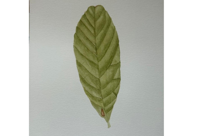
11. Imperfections: Now I'm doing the little
imperfections in the leaf. I've mixed a brown. I basically use the same colors, but if you use different
proportions of the red, blue, and yellow, you
will get a brown. You need to add a bit more
red and a bit more blue, and then add the yellow, you will get the brown. I have some classes on
color mixing where I show you how to the browns. So if you don't know
how to mix the brown, you can always use a mixed
brown and then change a little bit by adding
some yellow or some red. Just experiment and
see how it goes. I tend not to use the browns
as they are ready mixed. I always try to change
it because it makes for a more natural look. I basically applied a lighter
wash in the center and then a more thick version
of the paint on the side. And I am using a small brush, I use a stipling action
because that will give an appearance of texture. Just use a little stipling, it will make more texture. I'm applying a
very light wash of the brown in the leaf
as well in the petiole, and then just strengthening
a little bit of the midrib. But again, that's different
with different leaves. Then I will apply a
little bit of the brown on the top of the leaf as well. Because the brown
here is quite darker, it doesn't matter if there
is the green underneath. You can apply it
and it will still look like there is a little bit of the leaf is
starting to dry there. A little bit of an
imperfection there. So I hope you have
enjoyed this lesson, and I hope you will apply the newfound skills
and techniques and make your very own leave.
12. Bonus Color Mixing: I wanted to add this
little bonus lesson just to show you how I
mix the colors. In here, I'm mixing
Windsor blue red shade. Just take a little swatch. Then I add Queen Aqui magenta and transparent yellow. I mix the blue and the
yellow to make the green. And then I start adding the
magenta to make a deeper green and the saturate
the color because otherwise it's a bit too bright. I take a watch of that. What I do is I usually
add a little bit of water so I can see what the color looks like when it's ware down. Then here I'm adding a bit more yellow, transparent yellow, just to see what it looks like if it's got a
little bit more yellow. So sometimes you need
a lighter version for your lighter areas
that you're painting. Then here I'm making
a darkening mix. I mix winsor blue green
shade quinequidromgena. This makes violet. Then to this I add lemon yellow. My lemon yellow is
from Daniel Smith, but you can use winds or lemon. If you don't have the
lemon yellow yellow, which is cool yellow
as you can see, it starts to form the
dark, blackish gray. Sometimes you just have to
adjust the color a little bit because you don't want it
to be too blue or too red. As you can see here, I just added a little bit more
red, a little bit more blue. Just play with the colors a bit. It doesn't have to be
right the first time. Don't despair. Just keep
adding a little bit of your color and you will see
that you will get there. Then I just water it
down to see if it's actually gray or if it's got a tendency to either
the blue or the red. Usually you want something
as neutral as possible. I'm adding this card, a photo of this card, to your download, so you can download it and have
a look at it as well. Here I just write,
plus more water. What's going on then? Here I'm mixing brown. I'm using window
blue, green shade, Quena, gudromgena, and
transparent yellow. Again, these three colors, if you mix them in
different proportions, instead of getting black, you will get a brown. If you add a bit more red, which in this case
is the magenta, you can see that
you have a brown. If you vary the amount
of yellow that you add, you will have a
lighter brown as well. Then I mixed another
brown instead of the window blue green shade. I used the winds blue red shade just to
see the difference. When using a warm red, you get a warmer brown. I hope you found this
little less useful. As I mentioned, you will find this little card
on your downloads.
13. Final Thoughts: Congratulations on
completing the class. I hope you have found the useful and I hope
you have enjoyed it. The next step is
to keep painting. Of course, find some leaves,
keep practicing paint. Some green leaves, some
brown ones, some red ones. Just keep practicing because that's the only way to improve. Don't forget to post
pictures of your leaves in the project section so we can
all see your masterpieces. Also, don't forget to follow
me here on skill share, so you can be notified as
soon as I post a new class. If you want to keep in touch, you can follow me on social and I have put my links
somewhere down here. You can also check my
skillshare profile to see my other classes on watercolor painting
and other subjects to if you liked the class
and you found it useful, I would be very grateful
if you could leave a good review that would
really help the class. It would also help to
stay on skillshare so you can find it again and other people can find
it and benefit from it. Thanks again for
watching the class. I'll see you in my next class.
 Katia Galante, Botanical Artist and Illustrator