Transcripts
1. Preview: Hi, hello. In this tutorial,
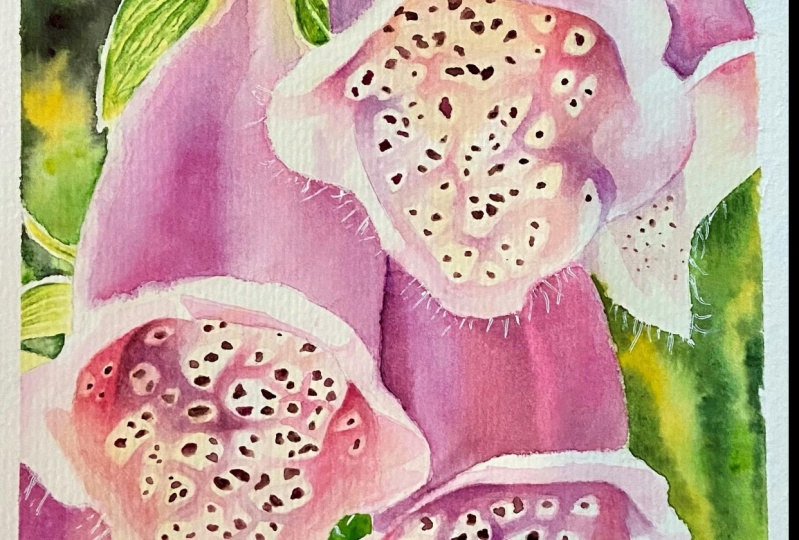
I'd like to show you how to paint this
beautiful facts glove. I wanted to paint this
flower for a very long time. They finally had an
opportunity to do it. I've taken some photos of these flowers in a botanical
garden in my city. And I picked one that I thought would work
well as a painting. There are two main things that I like about this painting. One is the contrast between the rich pink of the petals
and the green background. And the second one is that gorgeous pattern on the
inside part of the bells. This pattern is actually the main reason why I wanted
to paint this flower. It's a really nice
project, very relaxing. It requires a bit of patients. But look at the effect. I think it's beautiful.
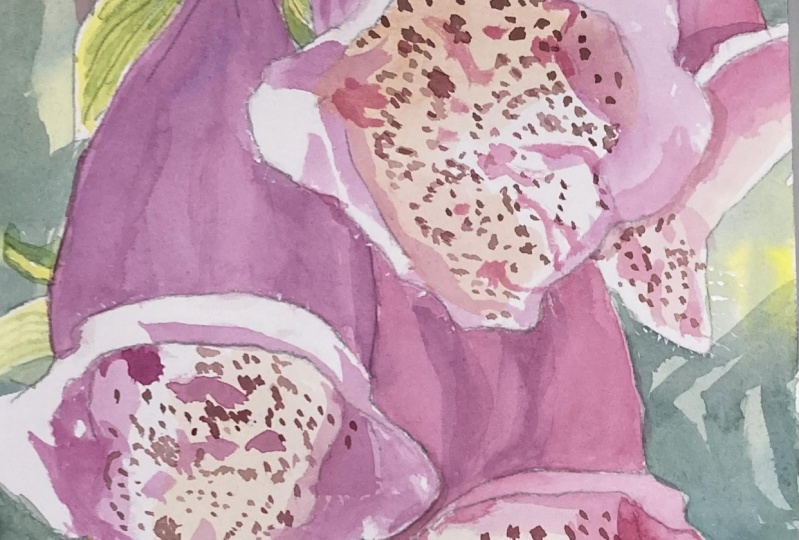
2. Background: Hello. In this tutorial, I'd like to show you how to
paint the fox glove. I would say that this is a medium difficult
painting due to that specific pattern
on the flowers. That pattern requires focus and a bit more precise painting. But I think that it looks really beautiful and it's
worth the effort. Bugs gloves are amazing flowers. They have great shapes and
they're colored is beautiful. They are tall and
they look elegant. I like to paint
close-up flowers. So I cropped one
of the photos I've taken in the local
botanical garden. In this painting, I
wanted to capture that beautiful pattern
inside the bells, but also petals and leaves
illuminated from behind. I hope you'll enjoy
this tutorial. Let's get started. Let's start by painting
the background. I think we'll start with
a size eight brush, but let's get the
colors ready first. We're going to need
transparent yellow as a base. Now, let's add Windsor
blue-green shade to that. Thanks to this, we'll get
a beautiful juicy green. Now, add a little bit of
quinacridone magenta to it to create a more
natural color. Once such a mixture is ready, I like to add the
colors that make up that mixture at the
edges of the petal. So on the one side
I'm adding yellow, and on the other side
I'm adding blue. Thanks to this while painting, I can shift the color
to yellow or blue at anytime depending on
the place I'm painting, Let's also prepare
a very dark green. This color consists of the same colors as before,
plus Payne's gray. Now with a brush number eight, apply a layer of water to the background area in
the upper left corner. We're going to paint wet on wet. I don't use masking fluid
because the background areas are not large here and the
flower shape is quite simple. I think we'll be able to paint the background without
any masking fluid. Rotate the image if you want to make it more comfortable and apply a layer of water evenly on the background area that
you're going to paint. Give the water a
minute to settle down. I hope you can see how evenly shiny the surface
of my paper is. I will now change the brush
to a smaller one, size six. That's because we're going to use a few different
shades of green. And we're going to paint
in very small areas. A large brush absorbs a
lot of paint and water. And it's good for a more
uniform in larger backgrounds. But in this case, we need a smaller size and
more control over the paint. Pick up that greenish
yellow on the brush. And using dabbing
motions of the brush, put the colors on the paper. Change the color along the way. Note that I'm using
dabbing motions of the brush instead of just
regular brush strokes. There is a difference between
these two brush techniques. The difference is in the way that the paint is
delivered to the paper. With dabbing motions,
the paint is released in a place
where the tip of the brush touches the surface of the paper and it spreads
out in that place. This way, more paint is
also released to the paper. On the other hand, when we
make a regular brush stroke, the paint is pulled across
the surface of the paper by the bristles and then it's released at the
end of the stroke. As we lift the brush
off the paper surface. If you pick up the
paint on the brush, but you feel that it's too
much or it's too diluted, touch the tip of the
bristles against a tissue or towel to
get rid of the x's, then you can be sure that
the paint on the brush is not more wet than the
surface of the paper. If that was the case, there would be a risk
of getting blooms. So apply the paint
to the entire area, go back to some places and apply more of the darker paint. The main thing to remember
is that you shouldn't force colors to mix with each
other using your brush. Just add paint and the colors
should mix by themselves. Tilted the painting in different directions to force
the paint to move a bit. The colors should create
smooth gradients. Here I've thought
that the darker area between the leaves
was the background. It wasn't until later that I realized that it was actually
a shadow on that leaf. But it's not that important. This is a minor element
of the overall painting. Your painting, to get the paint moving and
mingling on the paper. Remove the excess
water from the edges. As you can see, my background is not the same as in the photo. This is because the photo
is only inspiration. It tells me what
colors I can use, what shapes I can paint, but I don't have to reproduce
everything perfectly. After all, it's
just my painting. In the same way, paint the background in the
upper right corner. After applying a layer of water. Add your colors. This time, I'm adding even more Payne's gray
and quinacridone magenta to my dark green mix. Quinacridone magenta acts as
a neutralizing color here. It is a complementary
color of green. So green will be more
neutral and less saturated. When we add magenta. That's the color I want. Here. We could add a
little bit of blue, maybe cobalt blue to suggest
the sky in the background. But I'm only using green. I'm not applying any paint to the lower part of this area. I'm just using a
damp brush and I'm trying to tinge that part
with a bit of green. In the lower left area we have
a match vizier background. There are some leaves
and also a piece of stem that I honestly
didn't notice. If you want add that stem here, as you can see in my painting, the stem is missing. But again, if I hadn't
told you about it, would you have noticed
that? I don't think so. Maybe after looking
at it for awhile, flowers attract
attention enough that such less important elements
are not noticeable. I want to simplify
this background area. Here. I won't be painting
those leaves or the stem. Instead of just suggest colors and fill this area with
different shades of green. I'm also adding a bit of
quinacridone magenta to break that green scheme and suggest
some background flowers. We still have this
largest area to paint, painted just like other
areas. Wet on wet. So start by applying a layer of water and give it a half
minute to settle down. You can add any colors you want. It doesn't have to be green. You can add more pink
or maybe blue here. I'm following more or less
the colors from the photo. Applied, the lightest
colors first, and then add darker
and darker colors until you're satisfied
with the color saturation. Remember that the colors
become paler as they dry. So at this stage
they should be more saturated and darker
than you think. I want to paint the background
by applying one layer. But if you find that your
background is too pale after drying or the colors
are not intense enough. You can always apply
another layer of paint.
3. Leaves: We have the background ready, and now let's move on
to painting the leaves. I have a second
container of water here will be using
lighter colors. So we must have clean water. I'm using a brush size six. Start with yellow. Use transparent yellow with the addition of Winsor yellow. Paint, wet on dry and apply this color to the entire leaves, except for the edges. The edges of the
leaves are lead by the sun and we will
leave them white. I'm using a more Winsor
yellow because they think that the yellow
here should be cleaner. Besides now I see that I should have used a
more diluted mixture. My paint was too thick and
the color was too intense. If I were to paint this again, I would use a lighter, more diluted tone here. The green of the leaves gently
fades to the flower Bell. We won't be using
pink at this stage. So we have to leave a
forgotten edge here. I call it this way because
it's a place that we forget for a moment and we
will come back to it later. But we don't want to
see sharp edges here, so we're fading away that
color towards the bell. I'd also the same color to
this smaller leaves below. Just like before. Leave the edges and painted. Now I'm using a hairdryer to
dry the first layer quickly. Switch the brush
to a smaller one. I will now use a spotter
brush size two for details. I'm mixing Winsor yellow, transparent yellow,
and Winsor blue. Now comes the fun part. Paint, wet on dry. Put a light shade of green next to the lines
marked with a pencil. Leave thin and painted stripes, which will be the
veins of the leaves. Slowly apply successive layers
of a light green shade. It is a process of constant
adjustments of the tone. I'm starting with a light tone. Then I'm gradually making
more and more brushstrokes. As you can see, I'm using short brush strokes and a
very light shade of green. Subsequent layers darken
this green until I achieve the effect similar
to the one in the photo. The general idea here is that
we paint little fragments, little areas between the veins. We want to create veins by painting the negative
shapes between them. The veins have the color
of the previous layer. We are now feeling the
negative spaces between them. We don't have to try to get
a uniform smooth layer. Those leaves have
their irregularities. They are not perfectly smooth. So we may have some
different textures here. This painting can be simplified. Of course, we could apply only
one simple layer of green. It all depends on how many
details we want to paint. I want to paint these
leaves quite precisely and put as many details
as I can because it is an element of the
painting that is located close to the so-called
powerpoint or focal point. If we divide the painting
into three equal parts, vertically and
horizontally, the four places where the lines intersect
are called PowerPoints. The areas of the painting in those points usually
draw attention the most. In these places,
we usually place the most important
elements of the painting. This is where these
leaves fell out. So I want to spend a
little bit more time on them and paint
them in detail. These leaves are less important. I will not go into details here. I'm just going to run a few stripes of green
between the veins. I just want to suggest
that the nation, the last green thing
that we have to paint is the stem and a leaf on top. Use dark green here. Apply the color using the
wet on dry technique. Remembering to leave the edge
of this stem and painted. Now vary the color of the leaf. And brighter and
warmer greens close to the tip of the leaf and applied
dark green over the rest. When the paint is slightly
dry but still damp. Use a clean, damp
brush to lift out some paint and create subtle highlights here
and there and that. So we don't need to go
into more details here. In the next part, we'll
start painting the flowers.
4. Petals - Initial Layer: Now let's move on to
painting the flowers. We'll start from the outer
parts of the bells first, and then we'll paint the inside. Start by preparing
a lot of paint. We need two colors now. One of them is
quinacridone magenta, which is our main pink. The second pink is
Permanent Rose. Permanent Rose is a warmer
shade of pink than magenta. We will need both of them. Use a slightly larger brush. Now I'm using a size eight. We'll be painting wet on wet. So start by applying
a layer of water. We can start adding quinacridone
magenta right away. Closer to the left edge, the shade is later. There is also a distinct
highlight that we want to keep. So try to avoid
this bright area. Continue painting on
the second flower bell. First, apply a layer of
water and then add colors. This flower has a
slightly warmer shade. So add more permanent rows. Remember that color
perception is individual. Perhaps you don't
see a warmer shade here and you don't want
to add permanent rose. This is absolutely fine. In my eyes. Each flower on the right
side is a little bit warmer. Also, inside the bells, there are warmer areas. So I'm going to
use alternatively, magenta and permanent rose. Go to the next two flowers. We are painting both flowers
at a time because they touch each other and there is not
much difference between them. Therefore, at this
stage we can apply basic colors to all flowers. And in the next step, we will add shadows
and we'll make a clear distinction
between each flower. Here's start with the warmer
pink close to the leaves. Then apply a magenta
on the left flower and more permanent rose
on the one on the right. Finally paint the last
flower with the same colors, more magenta on the left and
permanent rose on the right. Our first layer is ready.
5. Petals - Final Layer: In this part, we will apply
a second layer of paint to the bells to deepen the
color and create shadows. Before I start
painting, however, I want to fix two things. I went over the
pencil lines with the paint and I want
to clean that up. I'm using my clean damp
scrubber brush to lift out the paint from the edge and from the highlight
on the left. Now we can move on to painting. We'll now need a darker shade of pink mix quinacridone
magenta with Payne's gray. This mixture gives a
very deep purple tone, which I think will
be perfect here. Start by applying a layer of
water to the first flower. We're painting with the
wet on wet technique. Start with pure
quinacridone magenta, and change the color
too deep purple, where you can see
the dark shadows. It is important that the brush strokes follow
the shape of the flower. So I'm not making
horizontal strokes now. I'm trying to apply
paint vertically, following the shape
of the flower. As long as the paint is shiny
and therefore still wet, we can add more paint
to deepen the color. Repeat the process
on another flower, adding more permanent rose, N2 more flowers. It's the same process here. Again, start by
applying a layer of water and then keep adding colors until you feared that the intensity and
tone are satisfying. Only need to intensify
colors on these bells. We need to add a darker
shade in the right places. The second layer of paint
increases the intensity of the color and makes the
pink look really saturated. Here we want to create a more apparent distinction
between the flowers. So use a darker purple
where the two flowers meet. Also use a thicker
consistency paint and more Payne's gray so that your
color is pretty dark. Cover the last
flower with magenta and add a dark shadow
on the right side.
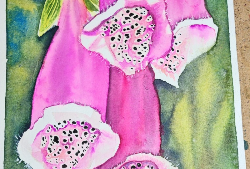
6. First Full Flower: We finally got to the most
exciting part of the tutorial. In this part, I'll show you how to paint the inside
of the bells. Let's start by preparing a
very light shade of orange. First. Use transparent yellow here and mix it with
permanent rose. My paint is very watered down. It basically looks
like tinge to water. Apply this color to the
inside of the bell. Not on the entire area, but only unselected fragments. We do this because there is
really no white color here. Note that compared to the brightest delete
areas on the petals, the inside of these
bells is very dark. By gently changing
this area with this warm shade will also help create a worm
glowing effect on this bell on the right. Already adding
quinacridone magenta. Now let this layer dry and
when everything is dry, we'll move on to the next step. Now we have a lot of
tedious work to do. I'll be using a spotter
brush size two. Pick up a very light diluted
shade of quinacridone, magenta and the brush. Our goal at this stage is
to build color gradually. Start with a very
light tone and then gradually add more and
more layers of paint. Paint with wet on dry technique. We now want to paint the
shadows that we see in this part of the
bell and then fill the entire area between the spots that form that
characteristic pattern. Notice that I drew the
darkest spots with a pencil. Now when you're applying
this pink color, tried to paint
around those spots, leaving an unpainted
border around each spot. There is a light border
around each dark spot. So we have to paint around them. Note that I'm using
a very light color. My paint is really watered down. First, only mark where
the pink should be, and then add more layers
to darken the color. It's a very slow process. And I don't know how about you, but for me, it's
really relaxing. It won't look good at first. But believe me, with time, as the pink gets
darker and darker, the bell will start to take shape and it will
look beautiful. Look carefully at the photo. Some places between the spots are darker, others are lighter. Some are more pink, others are more purple. Don't rush slowly in
really small steps, build these colors and shapes. The darkest shade of pink
is at the inner edge, on the right and on the left. There you can immediately
use a stronger color. If you need a darker shade. Use a mixture of quinacridone, magenta, and Payne's gray. Now change the color
to permanent rose and added near those
darkest places. I think this warmer shade of pink creates an amazing effect. It adds that warm
glow from the inside. Besides, the color is not too
uniform, it's not boring. We have quinacridone, magenta, permanent rose, but
also Payne's gray here. So all of those colors create a color palette that is
pleasing to the eyes. Continue applying
the colors slowly until you feel that the
town is dark enough. I came back to the same
places a dozen or so times, adding new layers of paint. Just take your time. Slowly. Add many thin layers of paint, and you will see that the
effect will be beautiful. Now I'm going to
speed up this video because I'm doing the
same thing all the time. Now that I think that this
color is dark enough, we can paint the darkest spots. For this, use, a mixture
of quinacridone, magenta, permanent rose, Payne's gray,
and transparent yellow. We're adding yellow to the mix because these spots
have a brownish hue. And we get such a brown shade when we add yellow to purple. So a mixture of pink and blue. Now try to paint these
pods very precisely. This is probably
the coolest stage because now the flower
is gaining character. Tried to vary the colors so that all the spots
are not the same. Let some of them be a
little bit brighter, some more pinkish, others
may be more brownish. This way the whole pattern
will look more interesting. After painting the
darkest spots, we can now judge whether
the inner part of the cup, the inner side of the bell
is dark enough or not. I decided to darken some places. So I put another layer on. Note that I'm trying
to slightly soften the pink color on the edges where it meets the white spot. I don't want a hard edge here. Those spots have
slightly blurred edges. Finally, the last
thing we need to do is to paint the shadows
on the curled petals. Start by applying a light
pink tongue and then add a darker shade where you see a darker tone in the photo. Unfortunately, I didn't
notice that a drop of water from the brush dripped onto the bell on the
right-hand side. When I noticed that water drop, it was too late and a lighter spot was left
after removing it. But of course we don't
worry about such things. I'm going to turn this into a real water
drop in a moment. I'm starting by painting an elongated shadow
under the water drop. Now I'm painting a core
shadow on the water drop itself with a
slightly darker shade of pink than the pedal. I'm leaving a lighter edge because there should
be a reflected light. I'm going to use white
gouache straight from the tube just a little
bit to add a highlight. I'm also adding white gouache in that reflected light area. And finally with a damp brush, I'm softening the edges and
the water drop is ready. There's one more
thing that I want to do with a clean,
damp scrubber brush. I'm gently softening sharp edges close to the
brightest highlights. This will allow us to obtain a stronger effect
of glowing light. And I think this
flower is ready. Now we can move on to
paint the next ones.
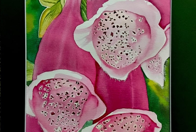
7. Finishing the Flowers: I don't really think
that I'll show you anything new in this part. We just need to paint two more flowers exactly the
same way as the first one. So let me just show you
a bit better version. And in the end, we will also add some white
hairs using white gouache. I'm drawing more dark spots
here first on this flower. Thanks to this, I will know which places to avoid when
applying the pink color. Again, slowly step-by-step. Apply a very thin
layers of paint. Each next layer will
darken the color and you can even change the color if you feel
that you need to. Now take a look how
this inside part of the flower changed after I
applied the right colors. As you can see, some
places are really dark. Some are purple. And that's where I used more
Payne's gray at the edges. I also added a little
bit of yellow, transparent yellow because this is the color that I
noticed in the photo. Now paint the dark spots. Use the same mixture of
pink, blue, and yellow. After painting the dark spots, add some more shadows to the curled petals and
the flower is ready. Repeat the same process
on the last flower. When the flowers are ready, we only have one
element left to paint. For this, we're going
to use white gouache. I'm squeezing a little bit of paint onto a piece of paper. Now with the tip of
the brush number four. And using that white gouache, add hairs around the
edges of the petals. I'm hardly using any water now. I dip the brush in the water, but I removed the x's by
rubbing it gently on a towel. We cannot dilute the gouache too much because it will
become transparent. And we want it to be opaque. If your hairs become
semi-transparent, when they dry, then it's a sign that you're
using too much water. And those hairs were the
last stage of the painting. Now all we have to do is to sign the painting
and it's finished. I hope you enjoyed this
tutorial and I will see your version of this
amazing flowers soon. Thank you very much for watching
and happy painting. Bye.
 Krzysztof Kowalski, Watercolor artist