Transcripts
1. Ornaments Introduction: Hello to you. I'm so excited
you're here today for this very fun and I hope
incredibly inspiring class. Today, you'll be
learning how to design a beautiful ceramic
heart ornament. These are perfect for
gifts, keepsakes, or just a lovely piece of art
to brighten up your space. Whether you're a beginner
or you might consider your skill set to be more
in the intermediate range, the techniques you'll learn
here today will help elevate your craft and invite an elegant touch
into your artistry. For several years now, I've been approached about my process painting on
ceramic surfaces, most especially ornaments,
although there has been a significant interest in other
decorative wares as well. Since 2018, I have had the
honor and privilege of creating over 3,500 ornaments
for private clients, retailers, and other
special events. Although this process has
served to create a livelihood, it has come to mean
so much more to me. In June of 2024, for the first time I sat down to create my very
first master class in which I invited students into my studio to learn
this joyous process. Provided in that course is an immersive comprehensive
experience in which I pull back the curtain and reveal every detail that has led to my success painting
on ornaments. I keep no trade
secrets for myself. It's everything I know
and that I've learned. The journey to get here today, it was neither
easy nor seamless. In truth, it was years of frustration and trial and error, costing both money
and lots of time. And being a mom of
two under three, I did not have a whole
lot of the latter. Oftentimes, I wanted
to give up and just throw in the
towel, but I didn't. I'm so glad because had I, I would have deprived myself
the opportunity to have created thousands of treasures for people all over the world, and I wouldn't be here sharing this joyous process with you. So with that said,
if you are here with interest and intrigue surrounding
painting on ornaments, you are absolutely
in the right place. Today's lesson will offer a sneak peek into my
immersive master class. And while some of
the supplies and education has been modified to protect the investment of my current master
class students, by the end of our time together, you will have learned
everything you need to know to create this
darling ornament. If during our time together, you should find that your
curiosity was further peaked, then I would love for you to consider joining me
for the master class, which was designed expressly for expediting the learning
process and shaving years of frustrating
trial and error off this process of this
beloved and timeless trade. We're painting on ornaments, but it's really so
much more than that. I'm going to show you
how you can paint on any three dimensional
surface using the same process taught
in the master class. I have students successfully painting on hand
painted candles. Something like this, creating custom tumblers for
high end clients, along with decorative wares to launch during
seasonal collections. But let's just take it
one step at a time. I'm so excited you're
here for this class, and so without further
ado, let's begin.
2. Discussing Supplies: Let's go ahead and run
through the supplies that we will need to
complete this project. The differences will be the ornament source
and the base coat. But we've found something that
is wonderful to work with. So I don't think
you're going to be disappointed there at all. Let's start with
our brushes here. I'm not going to be a
stickler with the brushes, only because we're not
using anything like, you know, a quill
or a dagger strip or any of those
specialty brushes. What I really need
you to have is a variety of small
fiilberts and small rounds. Nothing bigger than an eight. This is the velvet touch series, all of these in Burgundy, except for the little
small one here. This is the heritage round. Like I said, nothing bigger
than an eight Filbert, and then some sixes and fours, and then we have a size two
in the Mini detailer series, which is one of my
favorite brushes. And then we also have a number four in the Mini
detailer series. Again, this is a
brush actually that I just began using recently, and it is, by and large, one of my favorite brushes. It has such a nice, fine point to it, so I think you are going to truly
enjoy using it. We're going to be able to
get some nice slender lines, which is something
my students are consistently telling me
that they struggle with. So I will show you how we use this brush in order to do that. Um, additionally, you're going to need some
water and a palette, your ceramic bisqu ornaments. So the link that I've provided in the outline is going
to take you to Amazon. You shouldn't have any problems, those of you who are
in the United States, getting access to these. However, I know I have quite an international
student base. So if there are any issues,
please reach out to me. Really, any ceramic
Bisk is going to do. So there are tons of ceramic bisque manufacturers
located all over the world. A simple Google search will
yield several results. It'll just be a
matter of finding something that you
want to work with. These are a flat ornament. I mean, they're a tiny bit
three dimensional here. I would say no more
than a half an inch, but they're flat. This will be a little bit
easier to work with than my truly three dimensional
ornaments that are round and icicle and acorn shaped, and
then the hearts as well. Then we're also going to be
using our acryl gouache here. We're going to be
using some pale peach, ash green, shell pink,
lilac, and olive. Um, you're going to need some
scissors just to cut off any ribbon that has come
with your ornaments. Chances are that
it's not going to be a very high quality ribbon just because they are making
these items in bulk. So go ahead and
just snip that off. We're going to replace with, really just ribbon
of your choice. I don't give out my ribbon
manufacturer either, because then we have a bunch of ornaments that
have the same exact ribbon
3. Swatching The Design Paints: Okay, so you should have your 140 pound cold press paper or something comparable
out in front of you. Before we dive in, I am going to mention that because there is quite a fair amount of interest surrounding
ornament painting, I'm wagering there's going to be probably some new people here, welcome, and maybe
some that have not taken previous
classes of mine before, so I'm going to do
my very best not to assume that you know all
of the little tips and tricks that I've taught
students that have been following me for
years or who have taken my previous classes. However, if there are questions following the class
that I did not address or something
was not clear enough, you are always more
than welcome to use the skill share forum
discussion question area. I try and pop on there
every couple of days or so and answer questions, and that way I can help
clarify things for you. I don't want anyone
to be in the dark. Anyway, just that little
note before we begin, you can see here that I have beautifully mapped
out our palette here and then of course, took my palm and ran it
through my beautiful, uh, all of tone here
and my ash green. Anyway, we're going
to redo it anyway. I have a scratch
piece of paper here. Palette is something that is key and truly important
when painting, and it's not a step to
be skipped or missed. I think oftentimes
we're so excited to get to the actual painting
itself that we just say, Well, all these colors
look pretty together, it's going to be great
and that could be true. And you may even have a
palette already in mind, something pinned from Pintrs, but that is not
going to guarantee that it's going to
work on whatever surface it is that you're using, whether that be paper or
ceramic or glass or wood. And so whenever you are, you know, putting
together a design, do take the two to 5
minutes to, you know, get your colors out
and put them on the actual surface of what it is that you're
going to be painting. Obviously, we're
going to be painting a ceramic bisque ornament, and so it's going to look
a little bit different. But once we have our
colors mapped out here, we're going to mix
up a little bit of the base coat and we're going to make a little swatch here, and then you'll be able to see how these colors are
going to look together. All right. So if you
haven't already, go ahead and get out
your acrylic wash in all five colors
that we're using at this point and remove
the top of them. Now, there's going to
be a little bit of time here where
we make a stroke, and then we need to
rinse off our brush. I'm just going to time
lapse all of that, so you're not sitting
there waiting for me to thoroughly rinse my brush and
wipe all the excess color. But you do want to make
sure that if you're not using five separate brushes, you are rinsing your
brush thoroughly between, um, between applying a new color to the brush or else it is going to compromise the
integrity of the color and you won't know exactly what it
is that you're working with. Let's go ahead and pull out our palette here and let's just begin mapping
out our palette. This is shell pink. This is all of make sure to leave
a little bit of room in between each color so that
you have room to mix because we are going to be doing
pretty good amount of that. This is pale peach. This is
lilac, and this is ash green. Now, please note that if you
are not using a wet palette, acrylic gouache because it is acrylic paint and it's
not water based paint, such as watercolor and
straight guash will dry. You are working with a
limited amount of time here, which just adds
an extra layer of complexity to the
overall craft project. If you have a wet palette, the colors will stay
preserved quite a bit longer. I don't tend to work
with those very often, but you can put a wet paper
towel on the bottom of a tray and then you can dab the colors out and then they'll
stay moist for you. I'm working in pretty cold
conditions right now. I'm in my studio, and if you're joining me real
time, it's February. In fact, it's raining outside, so there's not a lot of
dry or heat in the air, and so I'm going to
just leave these as is, but that is a note
for the future. If you're working in
a hot environment or it's just particularly dry, a wet palette could
be extremely useful. Okay, so we'll push those
colors off to the side. Now, mixing your paint with water is going to be
the entire project. Paint to water ratio
decides everything, and it's something
that I expand upon thoroughly in the master class because in order to I mean, we obviously want to get to a point where we're
somewhat here. We're getting the
proper strokes. It's not too dry and
it's not over moistened. So in order to get to
that final result, we have to understand
how much water is necessary to add to the paint to get the
desired consistency, and we also need to be able
to observe our brush and know what we're looking for
before we apply the stroke. Okay, so we're going to go
over that a little bit in a condensed sort of format, and you'll be able to
see what it is that I'm doing and how that
applies to the paper. But again, when we
transfer this process onto ceramic bisqus a
different surface. However, that said, I tried to pick something
that was similar. You can see this is actually a smoother texture than
the watercolor paper. But this is porous
and so it soaks up. So it's really actually a very similar surface
that we're working with. Okay? All right,
so I'm going to be using my number six
brush or excuse me, my number eight brush just to swatch out all of
these colors here. A nice big brush so you can see how the colors
work together. All right. I am going to wet my brush here and wipe off the excess here and
wet it one more time, and then head in, you can see that it is fairly
moist and then I'm going to just keep applying the
paint until I have a fair amount of paint
on my brush as shown, and then I'm going to make a
nice generous stroke here. I'm going to rinse off and then we'll come back
and do that again. Dipping into the olive here, moistening it slightly,
adding a touch more water because it's not
quite diluted enough. You're also going to note that there is a shear factor
in these colors, not specific to this brand. It's just with all paints, there's different
compounds making up each color and
sometimes the color that's used or excuse me, the compound that's used to
create the color just has more of a shear quality
like this shell pink. I have to use more of the paint and less water in order
to get the stroke I want. With the olive, it's
much more rich. I need less water or excuse me, more water and less paint.
So it's the opposite. And this is something you really only learn by experience, just by practicing, exploring, understanding your paint
to water consistency. Instead here I'm showing you what to look
for on your brush. You don't want to
have it bubbled up so much that the paint is
just sitting on the brush, you want it to have a nice glazed layer for
this consistency. If we were to add a little
bit of water to it, make it more of a 50% paint, 50% water, it would
look like this. Then if we were to
do that, again, making it more of a 70 30,
That's pretty similar. I think I still have
too much paint. You can see that there is a little bit of a
difference here, but I have quite a bit of paint. We'll just map out this color. Then as we remove the paint,
we have less and less. This shows the gamut. This is pretty much just a
little bit of water and paint. This is adding about 20%
water and then 30% water, 40% water, 50%, 60 and onward. Consistency, as I've
already mentioned, and I do just want to
stress it is so important. We would never use these
consistencies when painting on ceramic s
because it's way too porous. We're really only ever going to use this is our
lightest consistency, and this will be our
heaviest consistency. Just doing the same thing
with our shell pink, rinse off most of my
olive here so I can be sure that I'm getting
a true shell pink. Adding a bit more water to it. And you really it's one of those things that
you kind of have to look closely to be able to see. It's not quite so opaque. And that's really what acrylic
paint is. It's opaque. It lacks the transparency that watercolor and gouache
have. All right. And then adding just a
touch more. There we go. Okay. I'm going to rinse off here and then I'm going
to pick up my peel peach. I would rather be over
thorough here than less so and just assume that you know all of
these things. Okay. So here is our ape peach. Then You can see I still had a little
bit of the gold here, so I'm going to take a moment to thoroughly rinse and then we'll come back and do the lilac. Okay. Adding a bit more water
here. Here's your brush. Nice opaque stroke. Now, if you were to
not add enough water, just to show you what
that would look like. It would look
something like this. You have these striations through the paint because
you don't have enough water, and that's what's
called a dry stroke, which when used properly can be a really
beautiful effect. But when we're painting
on the ornament, we want to make sure
that what's loaded is a proper consistency to meet the ceramic
bisqus specific needs. And adding a bit of water to it. And even more water
to it just so you can see blotting off. It can be used like
a straight guash, but it's just a bit more tricky because it dries a lot quicker. Then let me skip
that lilac here. Let me show you
that as well. Okay. There we have the design paints that we're
going to be using. Now we're going to mix up
the base cooat paint in the next module
here and you'll be able to see how all of these colors are going
to work together.
4. Swatching The Acrylic Paint: If you have not already, give
your paints a nice shake. The contents can
settle at the bottom, and then what you get on top is paint juice instead of the actual paint. Give
them a good shake. We're going to be using this
teal C and olive green. We're going to mix these two together to get a really pretty what myo color is actually
now that I'm seeing that. Go ahead and put a little
bit on your palette And then make sure that your
brush is thoroughly rinsed. You may even need to
change your water cup if things have gotten
a little bit muddy, but this is quite a dark color, so we shouldn't have
any issues there. All right, so we're
going to go ahead and mix these two
colors together. You're going to see
as we move through each module that the lead up to actually painting is
more important than the actual painting itself because we can learn
these techniques. Anyone that has the time and the inclination to get better at their skill can
get better at their skill. But if the foundation of the skill isn't
completely learned, it means that every
step from there on after is going
to be compromised. Because the foundation
wasn't learned. I always try and stress to
my students and not stress. I don't ever want my
students to be stressed. Emphasize the importance
of slowing down, taking the necessary time to really learning
how to mix, paint, how much water to
add because I mean, we really can't break
down these tiny metrics. It's a fingertip of water, a teaspoon, there
are things that are hard to put language to. You have to feel it with your brush and see
it on the palette. Let's continue mixing here. Do we have a nice
block of color. You can see this is going
to be such a fresh, beautiful spring design,
it could even be used. If you wanted to do easter
eggs later on down the road. This would be a
fun color to use. Okay. I'm put that
off to the side, and then what we're
going to do is just make a nice little square here so we can see how it's
all going to work together. I'm going to mix this
so that it's pretty opaque and there's not a lot of transparency happening. Okay. Just make sure
your brush doesn't have significant globs of
one color or the other, really rotate the
bristles back and forth. Okay. And then we're just going to
fill in with our color here. And we still see a little
bit of transparency, but this will give us
a pretty good idea. But All right. Okay, so we have
our teal base coat. Now, you can see that
this ash green is looking pretty close
to this color. So we're going to need to
lighten it with something. I'm probably going to
add another color. Actually, I know I'm going
to add another color. Now, what we could
do if you just wanted to stay with
these five colors, a little side note behind that. I know not everybody uses acrylic gouache and these tubes, while not overly expensive, they do cost about
$7, seven times $535. That might be a lot to
stretch someone's budget. I tried to keep it
to five colors. Um and colors that can overlap and be used and mix
to make different colors. But if this is something
you love and especially, of course, if you decide to
join me for the master class, then you're going
to need to make a certain investment in your
paints and in your brushes. But I'm going to probably
just use a white. Hopefully, everybody
has a white already, but it's just a great color to have then we'll lighten this so that it shows up more significantly on
our dark teal here. We don't want things to blend in so perfectly and just a little tip when I am
working on a design, I decide whether or not
I'm working light or I'm working dark because I've
noted that when I go medium, whether it be a light
base or a dark base, the designs just don't pop
the way that I want them to, the way I expect things to
be just vibrant and rich. And so if I'm using, let's say, just a really light mint green, that means I'm going
to paint dark. I'm not even going
to paint medium. I'm going to paint dark. There might be some
light aspects, but these are just
sort of extra on top the main flower
itself unless it's white, which looks great on everything is going to be of
a darker shade. Opposite for when
I'm painting dark, everything's going to be
a pretty light shade. So just a little um, understanding
behind the process. All right. Now we've seen how this is all going
to work together. We are going to practice
strokes on a separate piece of paper to just build
up the mechanics, and then we will apply the base cooat and begin
working on ornament. Please join me in
the next segment.
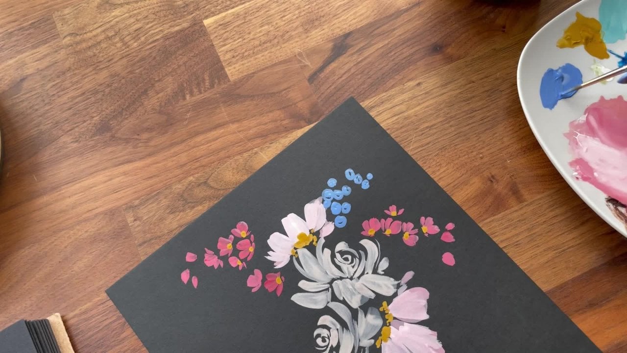
5. Practicing Pinwheel Flowers: You can see, I've practiced some design elements on
the piece of paper already just to get a feel for
how the paint is going to lay and color compatibility. What's going to be key
here is painting to size. When we paint on paper, I
think just naturally unless we are a miniature painter of
things, not many of us are, the tendency is to go big, so you can see here even
with the design elements, these are quite large when
we go to put them on, you know, our little heart here. So it's going to be very
important that we are scaling. Now, you can see here
this is quite big. This wouldn't even fit on there. We wouldn't even
get a whole one. But the flower I picked today is going to be compatible
to the size as well. We're going to be doing.
It's a wild flower. It's sort of stock
meets delphinium. But it's just a beautiful
cluster flower, which is the basic, um, the foundation of the
flowers that I teach in my book and then also in several of my
classes here on skill share. Then we're going to layer it to emphasize depth and
just play with color. And then we'll add beautiful gestural stems to it and add some
sweet little leaves, top it off with some details, and it all comes together
really beautifully. But I just want you
to keep in mind, and we'll do this together
here is we're going to sort of paint just to get the
feel for the brushes, feel for the paint,
and then we're going to work on specifically
painting small. That's why we're
going to be using a variety of our small brushes. Okay. All right, so go ahead and put your ornament
off to the sign. And also to preserve our paint, I'm just going to be using
one color at a time. You don't need to put all of
the paints on your palette. And if you haven't already, and there's been a pretty
good amount of time, go ahead and wash your
palette unless it's a wet palette
because those paints are not going to
be usable anymore. That's why we want to dab
just a little bit at a time. We don't want to ever just
squeeze out the paint. Again, just assuming
that not everyone has worked with acrylic
gouache and wanting to make this process just as stress free
as possible for you. Okay, I'm going to be using
my number four brush, which is just slightly bigger
than my mini detailer to start with the base
of the flower, our stock, which if you want to get inspiration
for this class, normally, I walk my students through an
inspirational segment. It's usually just
three to 5 minutes where we look at the flower, note the things that are most prominent special
that stand out to us, make notes of them,
and then bring that experience into the
actual design process. You can do that. But what
we're doing here today is pretty gestural because it needs to in order to make
sense on a small canvas. When we paint big, you know, we can do all sorts of
things, but small, um, we really need to be mindful about the strokes we
make or everything just looks like it was
mashed together. All right. So I'm going to begin with my lilac here as I did over here on the left and just put a small amount here
on my palette. And then using my number
four brush, again, we're going to wet
and you can see it pooling here and now we're going to draw out
a bit more paint in order to get that
proper consistency. If you need to prior to
making your strokes, go ahead and take your
brush and give it a little sample stroke here to make sure you're working
with the right consistency. It should look like this. And so we're going to
practice this cluster flower, which is comprised
of either five, four, three, or two petals. If we're doing an
open phase cluster, it's going to look like this. If we're missing a
petal, it's here. If we're doing a sort
of sideways flower, we have three petals there. Sometimes if I'm layering and loading up the
flour to give it bulk, then I'll do just kind of
a couple little strokes here to give it, like I said, more dimension
and just a bit more bulk. We'll run through all
of those together. Before I get started here, I just want to bring attention to the fact that this is
where most students struggle. It's with the consistency, and it's with knowing what
to look for on your brush. Sometimes the paint
is going to end up super chunky and sometimes
it's going to be way too thin. If you are in that boat, the paint if it's not looking
like what I'm doing here, please just know that you
are in really good company, especially if you are
beginning or even if you're an
intermediate student. This is hard. Painting on
any surface is difficult. But then when we take it next level to the ornament,
it's going to be hard. I'm hoping that by
starting on paper here, this will sort of bridge the
gap a little bit for you. But if acrylic gouache
is a new medium for you, you're going to have
to just take time, spend 30 minutes on a piece of paper really getting
used to consistency. So I just say that in
hopes of reassuring you. I don't want you to get
frustrated and overwhelmed. I know that feeling
when painting is supposed to be a source of joy and a source of
something good in your life. I never want my
classes to invoke um, any of those lesser
base feelings, but I also do know that we need to be challenged
in order to grow. Anyway, I usually put a little aramnologue
into each of my classes, so thank you for
that 45 seconds. Okay. Let's go ahead
and just practice our five petal flower
here taking a stroke. Can turn your paper
if you need to. Something to this effect. Go ahead and do
that again, making a five petal flower here. You also want to
play with the amount of white space in the center. You don't want five flowers
that look exactly like that. Even though they all
have five petals, they can look a
little bit different. We can start at a
different angle and do something
more like that where it looks as though
it's on its side. Now we have a four petal
cluster flower or excuse me. I keep saying cluster,
it's a penwheel flower. That's what I refer to
in my book Penhel and it makes for the cluster
of flowers on the stem. This is what I call
gestural form. We're not This one
quite frankly, is just a little bit too much like, hello, I'm a pinwheel. We want to strive for something a little bit more
loose when painting, and so that involves
loosening our grip on the brush and just sitting back and not being
so controlled, which can be difficult
for many of us. Okay. So we've done our
little four stroke here. Let's go ahead and practice
a few three strokes. You might need to load
your brush one more time. These you could layer behind
one of your five stroke. Then we can do a couple
two strokes as well. These are going to be, just what is peeking out from
behind other flowers. C even layer a couple there. Okay. So this should give you a pretty good
sense of that whole, you know, pinwheel flower shape. Now, what we're going to do is we're going to take a little
bit of our shell pink. And we're going to mix
this first with the lilac in order to get a color in
between these two colors. So just bring a little
bit into the center here. And then we need to add a
touch of water as well. Okay. You can see we have a nice little middle
ground color. And now we're going to layer
over not completely cover, but layer over the flowers
we've already made. Now the palette, this
color looks great, but on paper, it's
not quite working. Now when we move to paint on our block, it
may work better, but I'm actually going to add
a bit more shell pink and I did that in the first when
I was exploring over here. I wanted to show you
sometimes what works on the palette is not what's going to actually work on
what you're painting. There we go. Slightly lighter. And we're gonna make
those same strokes again. Nice little gestural flat
medium pressure strokes. They really are as simple as just applying a little bit of pressure to the paper and rotating your wrist
and the brush with it. Always feel free to take
as much time as you need to explore
different shapes. You can see we're building
up the depth here. Adding a bit more water. And now I'm going
to go full in to the pink to get one
more layer of color. Then as we build up a cluster, and this is more like a
square block of flowers, we're going to get to the top and we're going to need
some smaller petals. That's when we're
going to pick up our mini detailer brush
and our shell pink. Mine still has a bit
of the olive on it, excuse me a moment while I
rinse off all the color, and then I need a little
bit more of my shell. And this brush makes
the sweetest strokes. I can see here just
using the same concept. It really makes some
beautiful strokes. And you can go teeny, teeny, tiny, itty itty bitty. Or you can go pretty generous. Quite a variation between
those two, right? Now you see why it's one of my favorite brushes. All right. So as we near the top, we're going to begin to
make some smaller flowers. Ba the idea is that,
we're building on this. We have something that's bulky towards the bottom, middle, and then at the top, it
extends into a delicate tip. You can just
practice this shape, three petals, four petals, even five petals, if you like. Then as we get to the very top, we're going to just begin
to press the tip of the brush down to
create this shape, which is one of my
favorite shapes. This just acts as intimating towards there being some small
flowers, some small buds. Later on, we can
attach the stems, make a really slender line here to attach some of
these smaller elements. But it's just to note, okay, something's happening here
off to the side or not off to the side at the
exterior of the flower. It's not a full flower, it's a bud, it's anything. It's just gesturing. It's one of my favorite ways to
cap off a flower here. You get the idea. This would be such a pretty
surface pattern too, if you were to just spread out all of these
different shapes, layer them in different colors. Then you can see here
I did the same thing. I won't do that
here because it's just the same thing that
we did here in the yellow. This is going to
be the same stroke for the center of our flowers. If we want to add
a bit of olive to the center of these flowers
here, then we can do that. Get out the olive. Adding just a bit of water, and then we can give our flowers just a
bit of a push there. You don't have to do
it on all the flowers. You can be selective. Again, there's a little
bit too much space in between what's going on here. This is just I don't want you to try and form anything yet. That's when the perfectionistic
tendency starts to come in and we get all concerned about
how it's looking, and then our attention is drawn away from just learning
the mechanics. By practicing in this manner, we do ourselves a huge service by focusing on one part
of the process at a. Okay. So we have a few more
center details here, and it really just
brings a bit of clarity to the design because we are working
gesturally here. Okay, so that's going to be it. I say it because that's a lot. It seems very
simple because it's just repeating the same stroke, but it involves a ton
of wrist mobility. It involves proper paint
to water consistency, and it involves
knowing how to layer. So it looks very simple when, you know, you're
talking about, okay, this is step one, step
two, and step three. But as you combine
it all together, it gets exponentially
more complicated. So what you're doing
here in case no one has told you yet is
beautifully big work.
6. Practicing Leaves & Stems: Alright, go ahead and get out your ash green and put a little
bit on the palette here. And then, as I mentioned, we're gonna be adding
a bit of white to it. So let's go ahead and
just practice that now. Sometimes with this paint, too, you have to squeeze a couple
times because the paint will dry on the entrance
here to the tube. And so in order to get
a nice clean daub, you just have to
squeeze a couple times. This has way too
much sediment in it from how it was dried. Little things nobody
ever tells you. And then you end up painting
with it and you have all of these little
bumps in your paint. It's very overwhelming. And it just stops the
flow of the process, which is so important when
painting to just feel like it has a
seamlessness to it. I think overall, you know, when I was sharing with people about the master class
and what I was offering, in essence, it's a
streamlined process. If you've heard me speak about learning how to
paint on ornaments, you'll know that it
was very hard won. It took me years and
years to perfect the process and a lot
of broken ornaments. I won't name names, but maybe somebody threw a couple
of them as well. So it required me to continue coming back
to it again and again, trying new things,
you just refining the skills that I had
learned and, you know, developing new ones
and being able to put all of that um, you know, into one course and launch that as a whole and give
people years of information and
expertise and put that into 7 hours was it was really therapeutic for me because it really was
such a stilted process. If you know um, if you're an artist
and you've worked on something and you've
had to just put it down because you've
gotten to the point where you almost hate what you're doing, and then you
have to come back. And so it really was just a stop and start for so many years, and I'm so glad I stuck with it because it was worth
it and painting on, you know, ornaments
and really so many different decor items is one of my most favorite
things that I do. I probably do it at least
half the year, if not more. Paper has become sort
of the secondary canvas and medium for me these days. Okay, so we're going to be using our number four in
the mini detailer, and go ahead and dip that into your ash green and pick up a bit of the white and
mix that together. We may need to add
more white when it comes time to paint
on our ornament, but this will give us an
idea of how to blend, making sure we're rotating
the bristles back and forth to get a nice
clean application. Okay, so let's practice grazing
the paper because again, this is one of the things
that my students tell me they struggle with is their
strokes are really chunky. Again, because we're
painting small here, we have to keep in mind scale. But just to get a feel for how this brush
works on the paper, you can even use a
scratch piece of paper, if you don't want to mess up something that
you have going, we're going to take
the tip and we're just going to work our way
from top to bottom, but we're going to bring
a curve into the stroke. We'll start here at the top. And we have something
that's like that. Now, the lines that are really thin as we get
to the base here, those are very
difficult to achieve. Is it needs to be second
nature and familiarity. What ends up happening is
oftentimes people are going so slow that it ends up
looking like that. It really is just a
quick little swoop and it all comes together. But again, it has to be
practiced and reinforced. Just practice that slightly to the side making different
different thicknesses. You can try and go
as thin as you can. Because we're really going
to need those thin lines when we go to paint
on the ornament. And then practice
gathering them into, you know, an
assemblance of a stem. So we're just taking
our brush, our wrist, moving it back and forth to get the optimal angle and adding a bit of curvature to
give it that gestural feel. If we did that, adding to our little cluster here,
start somewhere around there. It doesn't have to
touch the flower. You can leave some
room here or you can draw it all the
way up to the top. And then adding a
bit of curvature. So sweet little leaves here. This really helps to give our design more of that
clarity I was talking about, and then we can
run a few strokes through the center as well. If you plan on adding little lines to these
tiny little dots, just be sure that you've
practiced getting that sense of that really
delicate tiny stroke, and then you can connect those. It looks really cute, but really quickly it
ends up like this. You can turn that
into something. I don't want you to
be scared to make an ugly stroke that is
the opposite of painting. I just want you to
be comfortable. If you were to make
a stroke like that, you could just add a little
bit of pressure and turn it into a leaf and then
add another leaf there. There's always ways to save it, and then if you wanted, you can add a little step. We've got a sense for how it's going to come
together here at the base, adding a bit of curvature, and then we can add some
thicker leaves too. Okay. Again, just practicing
that compound stroke here that'll give us a bit more depth and just get really familiar with how it all feels in your hand and
grazing the paper. Then once you're
comfortable with that, we're going to do
our smaller leaves, which were practiced over here. That's just a matter of taking your brush and moving it
horizontally and you're going to start with
light pressure and then build on the pressure to create a thicker
stroke as you finish. Tip and then you can round it off a
little bit if you like. But even just a one
stroke works really well. You can move your
paper as needed. Add a bit more water. Don't be afraid of
different leaf shapes. You can add little stems
to them if you like, but you don't have to because
they're just going to be poking out from
behind the stalk. There you go. There's
some small ones. Remember, this is our
scale, so this will work. But these are really nice too in order to get
something detailed. Practice little tiny leaves and then practice
some bigger ones. They're all needed practice
making some little lines. You could even take some leaves here and just make a cute
little shape with the leaves. It can be more surface
pattern than true to nature. Then you can bring those
in closer if you like, or you can let them
hang out there on the side for a more
gestural look. Either way is
beautiful. It's just going to be what you
gravitate towards. Then like I said, you
can finish the stroke here and you can
bring it all the way through when we see when we go to apply all of this onto
the ceramic ornament, we're going to want to bring things through to
a certain extent. So it's good to get familiar with making connections
between elements. So, you might want to do a
couple cluster or excuse me, pin well flowers and then take your brush and make a nice
stroke and then do a stroke with curvature and
then do a leaf stroke. Putting it all together. Don't be afraid to just play here. This is the time for
you to just figure out what you like and how
you want it to all lay out. Eventually, like I said,
we're going to try and mold it into
something more like this. But this is a really
good reference point and just allows you to
get really excited about the design aspect of this class in a friendly
laid back nature. As soon as our
brains tell us like, Okay, now it's real. Now we're really going for it. Then all of a sudden our
old tendencies come back, we get locked up, we get tight and anxious, and we lose that aspect of
just having fun and playing. So give yourself proper
time to do all of that. That way when you do
go for it for real, you feel ready and relaxed. All right, so that's
really going to wrap up our time here on
paper. We've done a lot. So once you're ready, once you've throughly
practiced and just feel like you're ready to
move into the next section, I invite you to join me as we apply the base coat
to our ornament.
7. Applying The Base Coat: I think you're going
to be amazed by how fast this part of
the process is. Now, of course, the more
we complicate the design, the more colors that we add, things take longer to mix the paint to clean
brushes in between. We're using somewhat of a
limited palette here, you know, and so it's not going
to be quite as time consuming as it is when I'm creating ornaments
for collection. But I think it's going to be laughable as opposed
to the 45 minutes we've spent building up to this moment that lasts
eight or 9 minutes. So it's just so interesting. I just reinforces what I've said about taking the time to
really learn the foundation. That way, when we
get to this point, it feels like we're
ready for it and we're not working out all the bugs
on the actual ornament. Now, that still happens
and that still may happen and order in bulk is the
link that I gave you, I think it's something
like 12 ornaments. So don't be afraid. It's like $17. You're allowed to work through $17 worth of stuff and it
all goes on the dumpster. That investment is completely worth your creativity
and exploration. Okay? You know, in
the master class, the ornament source I provide is very, very budget friendly. And I think that in itself is just a sigh of relief
because if you mess one up, you're like, Oh,
okay, no big deal. If anything, it's
the loss of time. For me, when I was learning
ornaments, I was a new mom. And so, you know, the time I would
spend it felt so wasteful when I didn't have anything beautiful to show
at the end of the day. I'm like, I didn't do anything. And, you know, I would just cry. But, you know, now, looking back, I realized that
that was such sacred time. Learning the journey, all of it is what brought
me here today. And it's, you know, what gave me my tenacity to
keep going forward when things don't work and allows me to share
that process with you. Okay, so if you haven't already, clear office space
on your palette, go ahead and give
your paints a shake. This is a different brush than
I use in the master class, but it will work beautifully. This is just a flat brush. This again, it's Princeton, and it is a three
fourths wash. Nice, thick amount of bristles here. You want something
that's going to cover a fair amount of surface area. And I believe I did neglect to mention in the beginning that you would need a drop cloth. I'm hoping as you
saw my setup here, you just instinctively
put something down. But if you haven't already, go ahead and grab a drop
cloth or a towel, anything that you're comfortable
getting nice and dirty. Okay, because this
is double sided, you want to make sure
you get enough paint. Here's what happens
if you don't. You have to mix another batch, and usually if you're
mixing colors, you're never able to get
it quite the right shape. So then you have to repaint the whole thing, which is fine. However, the more
layers you add, the more thick that paint looks. Um, also, there is something that I have
there's a process before we paint on ornaments that I
have my master class students that I'm not showing
here because it is an integral to the entire
process and it's something that when I discovered that
it was game changer for me. And so I'm wanting to
protect the investment of those who have come alongside
me in the master class. But again, I want this to be
a truly enjoyable experience for you and I don't think you're going to
have problems here. It's just just the ease in the master class is a
little bit more comprehensive. All right, so we're
going ahead and mixing your color together. So we have a nice
blue and we want to make sure I guess turquoise, we have enough paint
to paint both sides. You can see that I have a bit
of green here on my brush, so just really be sure we are mixing things
here very well. Nice little flat strokes
here to work out all of that extra color. And
then we can begin. Now, what I like
to keep on hand is a little hair dryer to just quickly run
over the ornament. However, because it's ceramic
bisque and very porous, you're really not going to see that it takes forever to dry. But when we work with
ornaments in the master class, it has a cap on it or
at least a tip and so you can put your finger and then work from
top to bottom. This one doesn't. I
just paint one side, and then I dry it and then
paint the other side, and then paint the sides. All right. There is something so gratifying about
laying down a base coat and just watching something go from stark white to
beautiful, vivid color. You want to make
sure that you're doing a nice smooth application. If you have any bugs, gunk, you can just take your finger, run it through,
and smooth it out. Okay, so there you
go. Nice even coat. And then we will you
can even move it past the bottom here and go
around the side a little bit, and then I'm going to go
ahead and dry this and then we'll come back
into the other side. Okay, let's go ahead and
repeat that process. Depending on how
thick your coat is, you may need to dry
it and then add another coat if you're
seeing a lot of the color, the white primed bisqu before
or excuse me, beneath. And just keep moving
your brush around. All right. So now let's go
ahead and do the sides. You just need a nice
little light coat here as you're working
around the perimeter. I like to get it all on, and then I can work
on smoothing it out. I hold it in the
middle in order to avoid touching wet
paint, but it happens. So once I have that, then I
just kind of rub a little, take a little bit of the paint, the excess, dry that
so I'm not getting super chunky marks around. But you will need to go
over it a few times, and you may need to dry
in between as well. And blending those Or
they will show up when you go to apply
your design paints. Okay, so you're going
to want to take a last and final look
at your ornament, make sure that there
are no white pockets because while you have the paint nice and wet on the palette, you want to be able
to get to those. I've had to mix up
paint after painting a design to fill in an area that either chipped or something happened to it, and
it is not easy. It's very time consuming. So best to really
closely observe now and then make those amendments and then wait till it's fully dry, and then we can begin
with the designing. Okay, I will see you in
the next segment where we begin to apply the
design to our basecat.
8. Painting The Pinwheel Flowers: Again, we're just
going to take one last look at our ornament to make sure everything
looks as expected. If there are a few white ish, patchy areas just where it's slightly less saturated,
not a big deal. We're going to cover
this whole thing up and it's going to look great. Now, there is a bit of a difference between what
is the back and the front, at least in this
variety of ornament. So if you are looking at
a different ornament, you're going to want
to just kind of see, is there an obvious
front or back. In this one, it's
not so obvious, but this is the back because
it's a bit more flat. This has a bit more of
a puffy surface to it. So it's really slight. But after staring at
these for so many years, I've come to discover that there is definitely a
front on this one. So I'm going to
paint it as shown. Also, you can do a double sided ornament when
I paint ornaments, um, not usually in my
Valentine's collection, but in my Christmas collection, for sure, I do a double sided, so you can do the same
design on the other side, and that really makes for
a nice comprehensive look. Alright, so really just going to be using the three brushes here. I like to have you guys
have a variety just in case one is not behaving the
way it's supposed to. That way you have a backup. But these are the three brushes that I'm going to be using here. Make sure your water is fresh
if you have not recently, um, refilled it with
some clean water, especially if it has
turquoise in it. You don't want to pick up any of that pigment when painting. Make sure your palette is
clean, free of dry paint. You don't want any of
those extra little bits of dry paint to get into
your fresh paint. All right. And then we're going to
begin with our lilac here. And then also our shell pink. We're going to be mixing
those two together. Remember to leave a little
bit of space in between. You would be surprised
how far you've seen me daub out three or
four times now. I'm nowhere near using and this is probably one
third of the way gone. Seems like we're using
a lot each time, but I've done the math, and this is a great
investment of paint. It lasts forever
even having to throw a little bit away
each time I use it. Okay, so I'm going to be
using my number four brush. And again, we're
going to be making those bigger clusters
here at the bottom. Doing those variety of pinwheel flowers
that I showed you, we're going to make
sure that we leave enough room for some
stemming here at the bottom, and to kind of go through all
the way to the top, okay? And we want to, you know, one thing that I talked to my ornament master
class students about is that we want to look at the shape of the ornament
that we're working with and design in accordance
to that shape. You know, basically, we
don't want to paint things that are just kind
of going diagonal, through the ornament
and off to the side where it looks like almost
like a mistake happened. We want to design in a way that just sort of fits the ornament. Not to say you cannot have
elements that go off the side, that's fine, but you want to be mindful about the moments
where you do that. And so it looks like it was an intentional part of your design. All right, so I'm going to
get into my lilac here, add a little bit of water, and then mix in my shell pink because again, we're
painting light. We're going to start here on the left and then work our way to the right so you can begin by making your sweet
little pinwheel flower and turning your ornament as needed to get the best angle. Blot off a little bit here
and continue building. A little bit of a different
consistency here. I'm going to just
go over that one more time and continue. I'm leaving some room
in between to layer. We also want to leave some
room along the sides to add a bit of the leaves
and the stem. Okay, now that I have that
bit of the formation here. I'm going to add just one
more bit more paint here. This brush, I think, is on
its last leg. I've used it. It was one of my
favorites and now the bristles are starting to separate and so when
I make a stroke, you can see in
between the bristles. But when you have a brush
that's just worked so well for so long and you just can't part,
it's like a child. I can't throw you away. But I think we're
just about there. Because it's just not performing the way that I need
it to. All right. Now we're going to switch
into our mini detailer, which is a fresher brush, and I think that's going
to liven things up here. Taking the time to
really mix the paint thoroughly at a touch of water. Then again, just
looking at my brush, making sure that
there's no globs and that I have just
a nice coat of paint. You can see how different
the strokes look there. They're nice and crisp, so we're just going
to cover that up. Filling in some of
the sparse area. And then we can begin making those sweet little
gestural markings as we near the top
and you can even extend them out to the
side as well if you like. I'm going to leave some room in here to move into
our next flower. That one I'm actually going
to do in the straight lilac. We want to have color
variation here. I've rinsed my brush
heading back in with my mini detailer. Then we'll begin again
right about here. Again, feel free to turn
that ornament as needed. Continuing to just
build the shape here, and then I'm going to leave
enough room so that I can make some sweet
little stems over here. I'm going to blot off. Then I'm going to get out my pale peach. Rinsing my brush in between, can see it's moving
along pretty quickly. I obviously work with this medium a lot, so
I'm going to go quicker. The steps might be a little
bit slower as you're working, but you can see that most of that time was
truly spent just learning how it all
works together. Most of the time is not
applying the strokes, but just getting the brush
ready to apply the strokes. I talk about it and
compare it to a face. You apply the foundation. I don't wear a foundation, but I hear that the foundation
is very important, before you put the concealer
on and then you do the bronzer and that's what shapes the face
and contours it, and then you put
on your blush and all of the other accessories. I'm a low maintenance girl. I hear. Same way with
ornaments. All right. Remember to be loose
with your shapes. They don't all need to
look exactly the same or have the same sort
of petal structure. Variety is beautiful. It Okay. I'm going to pause there. Actually, I'm going to do
one more here just so that it looks like we have a bit
of connection happening. Then I'm going to add a bit
of white to our palette. I'm going to rinse my brush and then add a bit of the white to the lilac for that second layer. It's still a little
too wet there, so I'll come back to that spot. And we'll finish here at the top with our
sweet little shape. We'll need a bit more water because the shapes not
coming out quite as smoothly. There we go. I We also want to make sure we leave some room for leaves and some overlapping. Then we're also going to mix
our lilac with the white, some more, freshen it up
if it needs a little bit. Then we'll bring it all
together with one more layer on our pale peach and add
those sweet little strokes. I'm going to add one
over here. Just for fun. Just take a moment and look at your ornament and
see how it's all shaping. If there feels like
there's something that's not really moving
in the right direction, you can continue
to build upon it. I want this running
into the ribbon here, so I'm just going to
add a little bit more. Or where the ribbon
is going to be. I like that there's a nice gap here for me to do some leaves. I like the symmetry of having these two stalks come
up to the side here, but I feel like maybe this area just needs
maybe one more, maybe one or two more flowers, just to give it a
little bit more depth, and then I can
come back to here. Yeah. That's better. You see how using these colors,
it's only three colors, but when we mix them together, we can create a lot
more and they look like three different
varieties of the same flower. Okay. I'm going to pause there for now because
I want to make sure that I'm leaving enough
room for stems and leaves. The segment is getting
a little bit long. I'm going to pause
here and we'll come back and we'll
finalize our design.
9. Painting the Leaves and Stems: For this next step, just like we did when we were
practicing on paper, I'm going to be
using my number for round from the mini
detailer series, and I already have my ash
grain here on the palette, so I'm just adding a
bit of water to it, and then I'm going to take some white and I'm going to mix that because I want something
lighter than what I have here. That color is just too close, and we're really not
going to get that pop with the leaves
that we want. Picking up more white and
drying out my pile here. Now, again, it's
going to be one of those times where you
look at your brush, make sure that it's
not overly loaded. You just want a nice
soft glistening but make sure that all
of the bristles are, in fact, covered in paint because you want
those thin strokes. Now, if you want to
practice that motion, just get it into move it from
brain to hand to surface, then you may want to do
that a couple of times on a scratch piece of paper
that can be useful. And then when you're
ready, you can head in. We're going to do alternating strokes where we use some
of those long stems, and then we use those one
stroke leaves as well. I'm going to start
at the top and then work my way to the bottom. And I'm just gonna kind of
let those leaves hang out. I'm going to bring a
leaf up through here. Give it a little
bit more curvature and you can see
we're really working to the shape of the ornament. If you want to make some
connections, you can. I'm going to opt to just
leave it as it is for now. Then again, just finding
those open spaces where I can make a
few connections, actually, go over here
too. That's always fun. Don't want to force
it, if you don't see any open spots, no big deal. Perhaps I forgot to add some
of my leaves over here too. Like I said, you
can have it running off the side, that's fine. You're just wanting to choose your moments when you do that. Again, you can go for
a surface pattern feel and not everything has
to completely line up. You can have things overlapping or not making all
of the connections. It's really entirely up to you. You can take a look
at your ornament here and just ask yourself if it needs anything else in
the way of stems and leaves. If it's too sparse in one area, you can add a little bit more. I'm pretty happy with the way
that this is looking now. I think the only thing I'm
going to add here is maybe just a leaf to kind of give a little bit more balance
and symmetry to the design, um, and then maybe one
more leaf over here. I'm really loving how this
is all coming together. I'm going to push this down here and then we'll pick
up a little bit of our green gold, live. Green gold is in watercolor. I'm used to teaching
watercolor classes. We're going to use our
mini detailer again, just make sure you're
wiping off excess paint and then add a little bit of
water to your palette. And then you're ready to add
those gold embellishments. As I mentioned before,
you do not need to add them to every single flower. You can be selective
if you like. I'm pretty happy with that. I'm rinse off my brush here. Adding just a few, but adding just a few embellishments here, some lines to give it
that gestural feel.
10. Sealing The Ornament: Okay, at this point, my ornament is fully dry. You want to be sure
yours is as well. Giving it at least four
or 5 hours to cure, even a full day would be best. I say this because the sealant
that we're going to use, it definitely gets the job done. The downside of, I would say the Mj podge is that it
does have a tendency, if not applied correctly to leave a tackiness
to the ornament. It also which I think
is a good thing, not the tackiness,
but this next part, is that it lifts a little
bit of the saturation out, so you can see on this side, it's just a little bit lighter where I haven't applied
the mach podge. Then on the corner here, you can see that it's
a little darker. It has a bit of a gloss, but it's mostly a matte finish. This is a really dry, no gloss, no luster whatsoever. This is going to be your mat, which is what I do recommend
in my master class. I don't like that full
gloss appearance. If you love that, then you can get this
in a gloss finish. But Again, I feel like the
mat offers just enough of a glossy surface so as not to just feel like it
has no sort of shen, but it is a really just
great middle ground. You're going to be using the
same brush that we use to apply the base coat
and you're going to squirt a little bit of
this out on your palette. Then the key here is going to be quick strokes
and even strokes. Making sure that
your brush is ready. That means just shaping
the bristles if there are any wonky bristles that are poking out in all sorts of areas and then just making
sure it's not super wet. And then you're
going to run your brush through the sealant, little bit of moisture here. And then we're actually
going to do the back first. And although, just a note
of reassurance here, even though it's showing up
white, it will dry clear. Okay. So for this, you're going to make
downward strokes just moving your way up and down horizontally,
excuse me, vertically. If it's pulling at all, you're
going to want to wipe off the excess paint on your drop cloth until you
have a fully even coat. Again, sealants out of a
tube are not my favorite, just because they require some extra care and multiple brushstrokes
with an aerosol, all you're doing
is standing back, making sure you're
spraying an even coat. There's really only
a few, you know, user guides that I
pass along with that, but other than that,
it's very simple and it is very comprehensive. It does the job well, and I've never had
any complaints over the years. All right. So just making sure
that your edges too have been um safely sealed
11. Adding The Ribbon: There you have it, your
beautiful sealed ornament. Things are still drying,
just a touch over here. But you can see there's just a slight little sheen
to the ornament, but it's mostly a
nice matte finish. We're going to go ahead
and add the ribbon now. Like I said before, you are
welcome to add any color, any texture of ribbon
that you like. I like to use this cotton and it has a bit of
a raw edge to it, which is fun, so I'm going
to pop that in here. To get the ribbon
through the hole, I have my very functional
paper clip that I have unrolled, and
it works great. I'm just going to
push it through. You want to make sure that
both sides are equal, and then you can do any
assortment of knot that you like. I like to do just
a simple knot in the middle and then pull it tight here so
that it looks like that. Then you can do a double
knot if you like. I'm just going to do the one and then we're going to
tie it one more time. It's such a pretty color. I love this sort of ash rose. I have a paint in
the acrylic wash that actually is very similar. And it's just such a it's a really pretty sort of neutral, but with a touch of a
beige rose beige rose. It's a tonguetwister.
Alright, then I'm just going to
kind of work it out so that the ends
are nice and straight. And there you have it.
Our beautiful ornament. U
12. Thank You!: Again, I want to
thank you so much for your time here
today for allowing me to teach you a process that is so near and dear to my heart. I hope you too enjoyed
your time and are inspired to continue exploring
this creative medium. And please don't forget
to upload your projects here on Skill Share and also
tag me on social media. I would love to
see your projects. All right, my friends, happy creating and
until next time.
 Cara Rosalie Olsen, Floral Designer + Watercolor Instructor