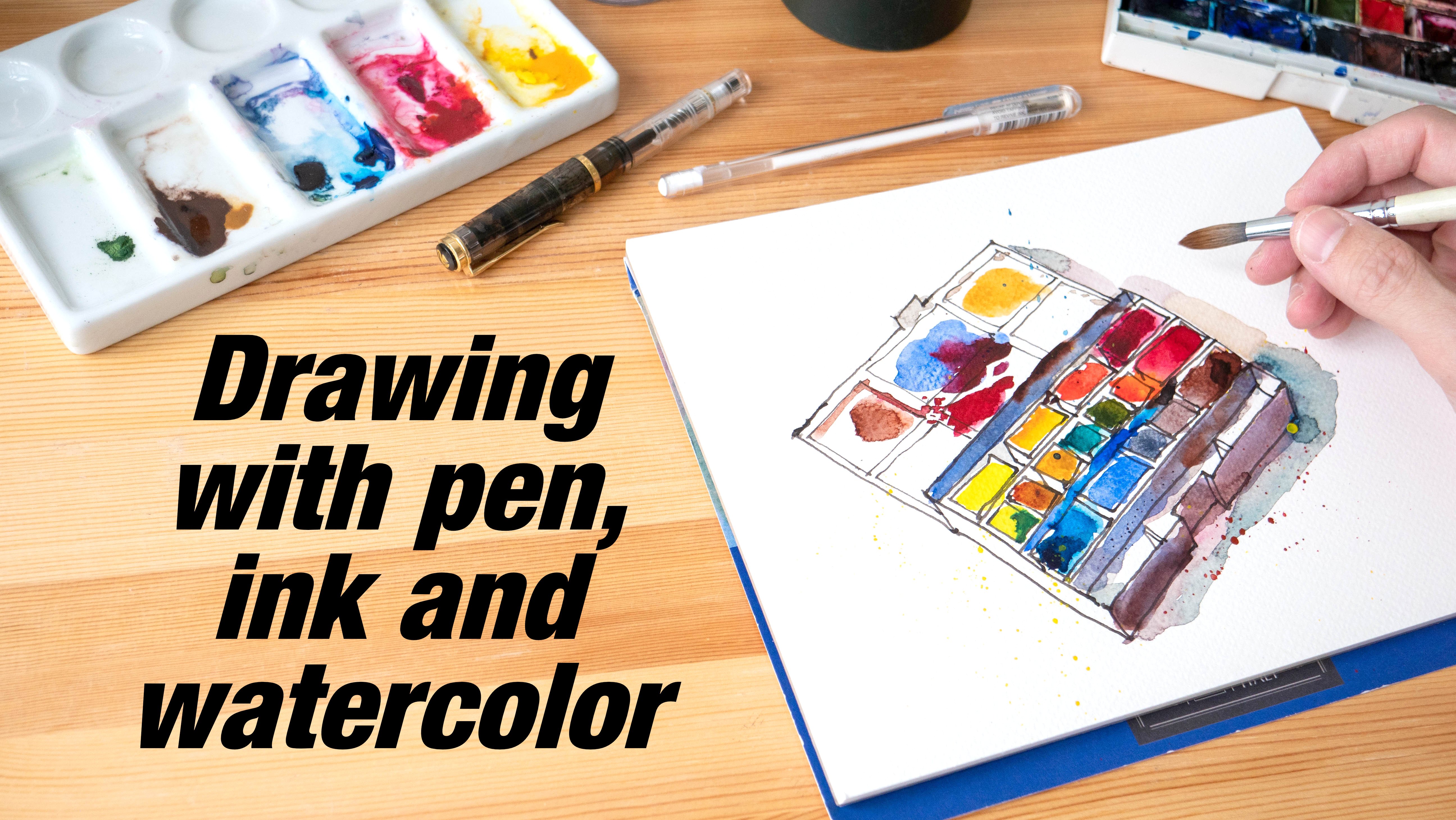
Transcripts
1. Intro: Hi, my name is T0 and welcome to the fourth sketch booking costs. In this course, I wanted to
share with you some tips and techniques on how you can make
your drawings look better. How you can give your
drawings more clarity so that when you show your
drawings to someone else, that person will be
able to tell you, is that the at-a-glance,
what you are drawing, we will be learning techniques
such as using silhouettes, negative shapes,
and foreshortening. And in the last lesson, I wanted to share a few
my approach to sketching. Before we start, I
want to remind you to leave a review at the
end of the course or they can help other
students discover this costs that start
with first lesson.
2. Drawing with Negative Shapes: In this lesson, I'm going to
teach you how to draw and paint using negative shapes. This lesson is going
to be split into two parts so that you can practice this on one day
and this on another day. For this lesson, I
have provided you with additional photos you can use for more practice
after the lesson. So this some of the photos. Let's take a look at the
main photo we will be using, which is this particular one. So what are positive
and negative shapes when it comes to drawing? Positive shapes are
created by the subject. So in this case we
are drawing a tree. The positive ships
will be created by the branches and
the tree trunk. And the negative
shapes are created by the space outside
of the positive shape. In this case, it
would be the shape of the sky that are trapped
between the branches. So when we draw this later, I want you to not think of
yourself as drawing a tree, but drawing the shapes, the negative shapes that
are around that tree. Instead of drawing the branches, I want you to draw
shapes that are trapped between the branches and
just ignore all the leaves. We're just going to draw the
branches and the tree trunk. Let's start by drawing the shape that I
showed you earlier. So that shape is going to take
up this space on the page. While you are drawing, really concentrate on
getting the shape right. Do not think of yourself as
drawing branches or tree. Just draw the shape
that you see, a shape within this trap shape. There are other shapes. So that's draws some of them. You can use your
artistic license to draw some of them and
live some of them out. I am not going to
draw everything because there are just
too many branches. So just draw the shapes within the shapes that
you have already drawn. At this stage. This doesn't look like anything. So that's Continue. I'm going to draw this
shape here that is created by left and
right branches. So days we'll go all the way up. And we have another shape
here that comes down. So while you are drawing, don't think of yourself as
destroying tree branches. You are drawing the shapes that are outside of the branches. And I'm not sure I can
see the details here. There seems to be another branch just decided this brunch. So I'm just going to draw again the shape
of this guy here. If you don't know what you are drawing by looking at
what you already have. It's alright, just
trust the process. So here I'm drawing the shape, disguise shape
between this orange here and not a shape here. This is actually write a good subject to draw
because even if you mess up, the tree will still
kinda looks like a tree. Okay, this is a branch
and now I want to draw the shape on this site. This guy here between this
branch and this branch. And here. When drawing, think of
herself as drawing lines. Getting to angles, right? Do not think of yourself as growing branches or whatever
subject you on Freud. This will really help improve your accuracy and really
focus on your subject. Okay, so now that we
have this shape here, I want to draw and
not a line here. So this is trapped shape here. There are some smaller branches. Let me just draw one here is shape that I'm drawing
within this shape. There are too many leaves, so we are just going
to ignore the leaves. We just want to
draw the branches. Now I want to draw
the ship here. So to ship go down, I mean that align
with go down here. And this shape we'll
come down here does lie is almost protocol
but Toyota slightly. Okay. Next I want to draw
the shape here. So I'm going to
put the line here. I'm going to start here
and draw a weed down. And draw this shape here. Which after I finished drawing is going to
look like a brunch. We have a trap shape here. So we have a triangle here, actually, this small
little triangle here. And let's draw this shape here. So we can have a
triangle, sorry, a line that goes
across and is shaped, that comes down and goes here. Notice here I am not
drawing branches, I'm drawing a shape. Next, I want to draw
the shape here. Make sure this space
is big enough. I was about to say this tree
brunch is a thick enough, but that's not a thing
of this as a tree. So we going to draw
this all the way up. The lies are not going to be completely straight
because this is nature. In nature, it's very rare to see completely
straight lines. When drawing. When you have this T-shapes, you can see this T
here and this t here. So these T-shapes will actually create this
illusion of depth. So he get foreground elements
over background elements. So that's continuing to draw this or seems to be a line here. That's draw the
traps shaped hair. And now the trap shaped
hair, a triangle. There are some branches behind, covered by the leaves. I want to draw them. So one branch actually
comes out here. I just realized my drawing
is not exactly accurate, but it's all right. As long as I get the general
shape to look right, it's going to look, alright. So this is the shape
within this shape. And we have this line
continues from here, k. Let's add some small
or thin lines here. This would be the
small branches. Next, let's move on
to the left side. So we have this shape here. Next I want to draw
the shape, that line, sorry, the line that separates the tree branch and
sky on the left. So this line would go down and come down at an angle
here and go to the left side. Next, let's draw
this shape here. Oh, that's quiet. This is a really fun exercise. Okay, I may have drawn this
front share to little b, cos. I realized that I have drawn
my whole tree a bit lower. But this line here aligns
to this branch here. So it looks, still
looks all right. It's just that my shape is
a bit off and it's okay. So I lost concentration. And now I'm drawing
this shape here. And that's draws on the shapes, some traps shapes here
within this beak shape. And we have this little
traps shaped here within this big trapped shape. Hey, seems like there is. Thick Brunch here. So let me just draw out
a small shape here. And that a small shape here. And add a one here. This is that trap shape here. And we can see this line
actually comes down here. And I notice I don't have enough space to
draw the truck shape here. So I'm going to use my
artistic license to introduce, automate that tree brunch
come up from this site, state and curious something
that looks unnatural. So we see a line that
goes beneath this branch. So if this line doesn't
continue out from here, it's going to look a bit weird. So what I wanna do
is to have this line continues out and come down, which seems like what
the photo is showing. So this is what we have. Even though we did not start
out by drawing a tree, we ended up with a tree. So that's a fun thing about
drawing with negative shapes. And also when you use
this technique to draw, you can draw more accurately. Because you may know
how a tree looks like, but you don't really
know how a tree looks. By looking from the bottom up. You will still have
memories of how branches or how a
tree trunk will look. But when you are using negative
shape drawing techniques, it's really going to help you. It's going to help you block out the memory of what you
have and draw what you see is data of what
you think you see. So he can introduce more
branches at each stage. Sketches actually, Dan, you can introduce more
branches if you want to. You can also add the leaves. I'm going to leave
the leaves up to you. I can still see some branches, so I will still continue to draw those
branches. All right. I can see this tree Brunch here. Mine was drawn a bit too
thin in the reference photo. It's actually Victor. Here. I may want to know. I'm I think I'm not going
to add any more details. If not, I'm going to use
seriously masters up. And then you take a look
at this shape here. So this shape here, this part here
should be smaller. Here you can see I've
drawn this shape to be. So while drawing this earlier,
I lost concentration. So when you're drawing, it's good to sometimes
slow down and really observe the shape
that you are drawing. I drew this probably because I was thinking of how a
tree will look like. But when you are drawing, you should really focus on
what you see in front of you. Really focus on observing
what you see in front of you. So we are done
with this drawing. You can go on to paint the
tree and add the leaves.
3. Painting with Negative Shapes: Next we are going to
get more exercise with negative shapes. And this time we are going to
paint the negative shapes. So this is the reference photo. We will be using nicks and
we will just be painting this guy the colors I'll
be using our fellow blue, green shade and
French Ultramarine. If you're using a
big sketch book, make sure you have enough
water in your mixing well, because we are going to paint
our rod, the beak shapes. We don't want to run out of
paint while we are painting. So here I'm just
adding more water to the well so that I can
add some a little blue. Don't add so much
phthalo blue at the start because THE a
little blue is very intense. You just need a bit
of failable and you can achieve very vibrant colors. This is ultramarine. And try not to mix the
colors completely because we want to see color variation, makes sure the brush you
are using has a sharp tip. So I'm going to
start by painting this little shape
here at the top. If you feel like your
blue is not blue enough, you can add more paint. So while painting, try to paint the shape as
accurately as possible. And once again, don't think of yourself as painting a tree. You are painting the shape
outside of the tree. So we have this
little shape here and neck shape looks like
some sort of triangle. And this side here shape
comes down at this angle. And dish. I mean just
extend issue but slightly. And it comes down at this angle. Make sure your brush, make sure you are
producing the shape, you're making the shift and you want if there are shot ages and make sure that
the edges are sharp enough. Okay, so now that
I have this shape, I'm going to draw the shape. That's what from left to right. So hot that my hand doesn't
run on that watercolor. So next I wanted to
draw this shape here. This shape is quite
far away from this shape because the tree bronchial tree trunk
here, it's quite thick. So when you are drawing, try to get the distance
or the proportion right? And this shape, we'll come
down at this angle like this. Next we have this shape
that goes like this. It goes down to laugh slightly. We'll use this to find
where we need to turn. So this turn is slower
than this point here. So that's painted them dish blue shape here
will be for being here. It's thin right here, lower than this triangle. And I write, I hope I'm right. Sometimes it's
difficult for me to paint and talk at the same time. I hope you know what I mean. Okay, so let's draw or
paint the shape in nave. The few hands spot any
mistakes that I make. That is fantastic because
if you are really, you can really see what's wrong. You can identify what's wrong. Here. I may have to use
too much water. Next, let's paint
the shape here. Your mind may tell you to paid something from your memory, but try to paint what
you see in front of you. And it's always, it's
alright to just stop. And Luke, we have a
little triangle here. And we have this shape here. This line will come
down at this and go, go to the lab. Comes up. Slightly to the left can
and then code down here. Okay, then we can fill
in the color here. So sometimes you
may want to draw the line first and then
viewing the color. It is easier that we actually, next we have is very
big ship at laughed. If you don't get this
right, it's okay. You can draw it as many times
as you need to practice. Okay. So here we have this shape. So I'm going to fast
forward this section because the process is the same. Just pin the ships that you see. While painting this, your
brain is not going to be able to process what you are seeing. And it's okay. Because that's actually what we want to do. Don't let your brain know
what you are painting. And you have to fight
the perched here. Draw when you think you see. All right, so these are the
shapes that I have painted. Next, we can pin the shadows or the branches and this sketch should come to life to
paint the shed dose. We using phthalo blue
mixed with a warm rate. So this is the shadow color. And make sure that
the sky is dry. Before you pin this. Otherwise, the colors,
the shadow will blend into the sky and it's
not going to look good. So just paint the shadow as you see pinned the shape of
the shadow as you see, don't paint a shadow. The pin, the shape
of the shadow. And I think of you as
painting the shadow, just paint, well, a gray shape. So the lysosome is
actually coming from lab. You see there are
two branches here. One is in front
and one is behind. By adding this shadow H here, you can separate
the two branches. Oops, I painted over this guy. Notice my shadows. They have hot h. If you want to, you can soften the
edge of the shadow. By adding water. Clean your brush and add more water to soften the
edge miniature house. So I've just clean my brush. And this is the clean brush. So you castes often each
year if you want to. If you have hot ages, shadows, sketch is going to
look pretty stylized. Okay, I realized that I have probably drawn this part here up into this part
here. Too thin. Yes. Okay. So let's continue. This part here. It's darker, goes away. When you are painting shadows, It's important to keep
the shadows consistent. That means when a person
is looking at your sketch, he or she will be
able to identify where the light source
is coming from. At-a-glance, make sure you
don't paint over the lit area, the areas that are
under the right. Oops. Oops. Yep. So that's the mistake
I made there. While the wash is still wet, you can quickly clean
up or fix your mistake. Otherwise, when this is dry, depending on the paint you use, you may not be able
to lift the color. Failed blue is a staining color. So what I mean by staining is the PMNs are so small that
they will go into the paper. And when the pigment
is in the paper, you wouldn't be able
to remove the pigment. As for ultra marine, It's not as stainings, so the pigments will
be on the paper. So when you have the
payments on the paper, you can still remove them. But when you have the
pigments in the paper, the pigments are not
going to come out. And we have this Brunch here, which is really dark,
it's almost black. So maybe later on I can
make small phthalo blue and a warm rate to make this
Brunch here really talk. Let's paint the
bottom of this orange here and a shadow side here. And this will go
up here like this. So now again slowly see
your sketch appearing, the tree appearing
in front of you. I can add a shadow ship here at who create the illusion that
the bronchi splitting here. You know what? Let's see if we can stop then some of the shadows
here because I think the shadows not having
to hunt, which looks better. So that's try and do that. And it seems like, Nope, phthalo blue is staining. So now when I apply
water over it, you don't want to
see the colors LAN, so you have to do that while
the wash is still wet. And the colors that you
use is important as well, which is why they sell so
many different colors. There are so many
different beliefs. So in this case, I'm
just going to keep this gouache as well
stylized sketch, we are hot shadows. If you take a look at
Japanese animation, you will see the shadows. The average shop, they
don't have soft edges like this because painting salt
ages is going to take time. And when it comes to
creating an animation, Japanese animation, they don't have the time to
paint soft shadows. They don't have the time
to make the shadows soft. Okay. So I may want to make some
of the shadow ages, dr. So let me just make some of the shadows darker
like this area here. Oh, there is a brunch here
which is kind of dark as well, and I do not pin earlier. So by adding this
additional wash here, you can create more depth. You can make this tree look
along three-dimensional. But my sketch here is
my t-score sketch. My painting here is
small star lives. Basically this lesson
is just to show you how you can paint
with negative shapes. And there are many
little shadow shapes on the tree because there are a lot of branches
casting shadows. That's why you see
lines like this. If you take a look
at this branch here, this line should go
down continuously. But my shape, my
blue shape here, doesn't look that right. So if you try to
correct this mistake by adding more blue here, you will see that
there is this H here. See that HDR that happens
because this part here is dry and you are adding
a second layer on top off, an area that is really dry. So that's why you
see that there. So let me just paint over
the first shape to try and make the H less obvious. So now we have a
line that looks like it's going down continuously. Same thing here. There's the shape that I
did not paint properly. And now when I paint over it, you can see that there. This is ultramarine, so it's not as thin in
competitive phthalo blue. So you can actually have
your brush run over the edge a few times to soften the edge to
make it disappear. But it's still there, but it's less obvious. In the photo, you can see many
branches that are so dark. They look like they are black. So that's paint some of
those black branches. I'm going to mix a phthalo
blue with a warm red. I make stemming
concentration to get that very dark, much darker color. So I'm going to test
it out here first. And it looks right to me. So that's have to
bronchi split error. And we have the branch here. I'm using a smaller brush to paint smaller
areas, essentially, for the main tree, I need to make sure
the shape is right for this smaller details. These are not as important, so I don't have to follow
what I see exactly. Just need to make sure that
branches out naturally. All right, so I'm going
to just stop right here. I can actually continue
to add all the branches, but I'm just going
to stop right here. So this is how you can draw and paint it using
negative shapes. This technique can be
combined and used with other drawing and
painting techniques to help improve your art and
your observation skills.
4. Using Silhouettes to Improve Clarity: This lesson, I wanted
to show you how you can use silhouettes to give
your drawing small clarity. So I'm going to draw the
outline of a subject and you can guess what I'm trying to
draw based on the outline. So this is just a
very quick sketch. Silhouettes are just shapes. You can think of
them as outlines. Some Guan does outline of
something of a subject. You may or may not be
able to catch just by looking at this outline. Now this is a technique that
when you are a beginner, you should think
about it constantly. And once you are more
experience with crowing, or this will be part
of your subconscious, you won't even think about it. I will show you what
I mean later on. Alright, so what do
you think this is? So let me give you some
more clues this time I'm going to draw this thing, this subtract from
the side view. So this is the side view. By the way, I will provide you with reference
photos that you can use later on for your practice. So in Grundy ship, I'm really trying to draw
what I see in front of me. Can you guess what this is? My drawing is actually
a bit of bird. Here. You can tell that it
may look like a horse. He may look like a house. So let me just show you
the reference for though. So this is the first
subject I drew. It's a Haas from the
front and we can tell is a h4s because
we can see the years, the eyes, the head, the body, the L6, and who's this is
a photo so it's able to capture all the details such as the light and shadow, the shading and harness
the horse is where ring. We are not able to
tell what color the house is because it's
a black and white photo. We can see this white pattern
on the front of the house. So we've a photograph, we have all this information. Next. This is the second photo I use. It's the same hospital
for my drawing. I drew it from the side. So this is the SipProfile
and it still has the years, the eyes, the body, the lakes and the hooves. But because of the side profile in mixed this object
more recognizable. Take a look at the
first SET where I drew. It's not easy to guess
what this animal is. It may look like a dog, but the size of the feed, such as that, it is not a dot. So when it comes to drawing, we do need to add all
those little details in, in order to let the
person who is looking at that drawing know exactly
what we are drawing. Because at a glance just
by looking at the outline, we are not able to
tell what this is, what this animal is. It's certainly an animal because
we can see it the lakes, but we don't exactly know
what animal this is. So now I'm adding all
these little details. And by adding all these
little details straight away, you will be able to
get more information to make a guess as to
what this animal is. And now it looks bit era. I can add some
hair here as well. So now it looks
more like a horse. But due to the silhouette, due to the shape. It's still not as clear. It looks like the Haas. So whenever I draw, I would try to look for
view that would clearly convey what I'm trying to draw. So if you take a look
at this second drawing, can see my shape. The shape that I have drawn. It doesn't look
really like a Haas, It looks like a pony. Shape of the head
here looks kind off. So just based on this shape, you can tell it it's
an animal definitely. But it doesn't look like a hospital's the shape
silhouette here. It's a bit off. So if you get your silhouette, if you, if your silhouette
is off, the ship is off, you can actually still sort of rescue your sketch by adding details to make what you
are drawing clearer. How adver, because the
silhouette is off. Adding all these details
may not matter as much because the main ship is also whatever you're drawing. It's maybe off, it's
going to be affected by your initial shape. So here I've drawn the legs, I've added the h2s. Let's draw the
harness at the top. So I can add all
these details here. And there are some blinders
site blindness for the horse. But the shape of the
head is kind of ofs. So it's I mean now we've all just did user
can tell it's a horse. I can even add the
hair of the house. So if all these details added, you can sort of guess
now that it's a hosp, but earlier on when you're
just sort of shape, it doesn't look like a Haas, It could be Donkey. So based on these two drawings, the SipProfile is better because it gives you more clarity instantly
straight away, you can tell it's an animal and it's definitely not a dog. It may look like a horse, but my drawing technique, it doesn't make this
look like a horse. But the thing is, at a glance instantly, you can tell this is an animal. Now when you are drawing, whatever you are drawing, if you have the option to choose the perspective view to see you add definitely
choose a silhouette back gives you instead clarity. This case, the side profile. So for example, if you are
drawing the Haas on location, definitely walk around the
halls to choose the best view, the best acetyl wed
to represent a loss. In this case, I'm actually
drawing the shape first and then filling
in the details. Sometimes I do that. Sometimes I will just start
for our maybe in this case, the hit here, just
trying get hit, right? And as I am drawing, I would fill in details. But the thing is, before you start drawing, you have to choose the view
and a silhouette to use. All right, so choosing
what view to use, what view to draw,
what composition. That is important before
you started growing. And when you draw, you can draw the shape, viewing the details, or you can draw, draw a small part and fill in the details and
continue drawing. Let me show you another
example and this time, once again, guess what
I'm trying to draw. Can you tell what this is? Based on this shape alone? It could be a hat, but it's actually not a hat. It's a teacup with the
handle upside thing. I drew the handle correctly. It looks like a year now. So this is a teacup, but this is the wrong shape
to use for drawing a teacup. You should be using this shape. We have a handle
is fairly obvious. If you draw something like
this with the oddest details, it's going to look like this. So this is obviously
clearer compared to this. This does not look
like a head at all. Same applies to drawing
maybe a tea pot. So when I draw a teapot, I draw it this way. Showing the site, sorry,
showing the SipProfile. Don't draw the tea
pot like this. And definitely don't
draw like this. From the back. It's not clear that
this is a teapot because we can't see the front. So these are actually
choices you can make. Like, which profile
should you throw? Sure, you draw the front. Should you draw the side? Choose the profile that
gives you instant clarity. Let's take a look at some of the earliest sketches
I have to look for some good and bad
examples of silhouette. So this is actually a very good example because even with the colors,
the light and shadow, the shading, the silhouette
is very clear that because we have all this very obvious
for a clear shapes. And even if you don't
have the details just by looking at the shapes, you will be able to tell what this drawing is even
when it's not completed. This is also a good silhouette. But here I have
overlapping lines to give you the impression
of depth of perspective. If you don't draw all
this overlapping lines, then it's not going to be
clear which branch is above. Branch. So here, in addition
to a silhouette, you must use the techniques of creating depth for this sketch. The C loop looks like this. It's an okay silhouette. This is good because we can
see the shape of the quotes very clearly the
closer hanging on the clothesline and
there are two line. This could have been
drawn like this. Let me show you a bad example. So once again, we have
the clothes hanging. But we can draw
another line behind. And we can hang all clothes. And now you can see the
shape is no longer clear. To rescue a sketch
that looks like this, we need to improve that clarity and we can improve the
clarity by using silhouettes, but we have chosen the
wrong silhouette here. So the other way we can improve
or rescue this drawing is to create contrast, create
recognizable shapes. Using contrast. You can create
contrast using colors, using perspective, using
silhouettes composition. So here it's slightly better, at least we can see you
one should hang here. You can use perspective to
create silhouettes and shapes. This has a good silhouette. We have this rectangular
shape at the bottom. We have all these
things coming out. And we have all these little
extension coming out at the end of all these things
that are coming out. And notice I did not clam or put all these
docs to gather. If all the stocks
were put together, then this shape will
be one whole ship, but these are actually
separate shapes. So we can tell that these are individual stocks just
based on that outline. So this is actually
quite good silhouette. Even without details, we will be able to recognize what
this drawing is all about. This is not a good ACSM bowl because the ship is not
really recognizable. Let me show you what I mean. Let me just redraw this based on the outline
that I have there. So this is their silhouette. So it's not that
clear what this is. So for this particular sketch, you really have to rely on
the DTUs and we have thin their shape to let
the viewer know what this sketch or
drawing is all about. This is a good example. Here. Because the ship is
very recognizable. We can see the swing and can
see people on the swing. So this is a very good
example of a silhouette. This is not that great. It's recognizable. You can see it's a person, but the ship itself, it's not that great. So this is the shape alleles. We can still see the lakes so we can tell that it's a person. This is, the general
shape is not very clear because the arms are folded
within this shape here. So it's not easy to tell what this is just by
looking at the outline. If you are using a
reference photo, try to choose a reference photo that shows you a clear
silhouette or shape. And this is a very good
example because we can see the arms extending
out from the body. So even if you draw this without any details
within the shape, you can tell instantly
that this is a person because of
the shape of the arms. The silhouette of this
sketch is not a bad. What really helps here is the silhouette of cables
that are hanging care. So let me draw a
really small version of this same sketch. Let me just draw a version
without the cables first. So it's not very clear just by looking at
it online what this is. However, once you
add k balls here, immediately, you get
more information. It kinda looks like a street and all these little
deduce that you. And later on, we'll just
make this sketch clearer. This is a good example
because we can see the, see the head of the statue
against the sky very clearly. I just realized I
can't draw houses. But for this sketch I-V, the buildings are much taller. For example, if the statute is in front of a very
tall building, then the silhouette will
be lost for this sketch. Does silhouette
would be the outline for this people here. It's not that clear. So we have to rely
on the details within the silhouette to give this sketch
more information. This is not bad. This is not bad. But again, we need to rely on the information we'd
be in their shapes. This is our right, this is not the best. So again, we need to
rely on the information, the details within the shapes. The shape here is much better
and it's more dynamic. Here you can see the
ship is very obvious because of the
watercolor wash on top. When you are drawing a building, definitely choose a silhouette. They can show off the
shape of the building. Now sometimes
silhouettes don't work. So for example, in this case, I was drawing that toys that
belonged to my daughter, that horses are in
this container. So the silhouette is
actually this container. And there are many small
individual items here. So if you look at
the outline here, it's not going to be
clear what I am actually drawing if there are no
details within the shape. This is an excellent
example of silhouettes. So we can use silhouettes
to design shapes. We can have a circular fish. This is a diamond shaped fish. We have a streamline fish. Suggests by the
different shapes we can tell we have different
species of fish here. And then we will
look at the colors. We can tell different
species of fish as well. It's very clear how a
fish looks from the side. So we draw a fish from the site. If you draw a fish
from the front, it may look like this. It's not very clear. This is a fish. If you draw this fish, maybe it's a puffer
fish from the front, it's going to look like this. So this front view, it doesn't look as recognizable compared to this side view. And this could be
a gurney as well. Because if we turn this on this side and draw a string here and it looks
like a balloon. This is also very good
example because we can clearly see the
shapes of the leaves. However, when we have all these leaves
overlapping each other, the ships are
combined together and it's not very clear
what this is. So in this case, we actually use different colors to separate
the different leaves. Is our sum still live drawing? When it comes to
drawing still live. Try to choose recognizable
silhouettes as well, such as this one. This one is great because
you can see it fine. You can see the leaves
and you can see some very big object here. The silhouette of a chair. This silhouette is
not that obvious, so you have to rely on the
details within the silhouette. More fish. Symbols and logos need
strong silhouettes. So all of these
utensils and kitchen where we're drawn from this side view that
Fred clearly shoes of the shape at all subjects. So at a glance you
can tell instantly what all these items are. So when you do dueling or
drawing from imagination, try to create
recognizable shapes. When you are drawing
with the help of reference photos or when you
are running from location, try to change your
viewpoint if you can. Choose a view that best represents the shape of the
subject that you are drawing. When it comes to drawing, you can choose what to include
and what not to include. And that is the brilliant thing about drawing versus
taking a photo. So if you have taken a photo
of these people at a cafe, you wouldn't be able
to see this person stretching out his arm to take some food and his other arm
is resting on the table. However, for this
particular sketch, actually chose not to draw
the outline for this. Um, so by not drawing that, I have created this very
interesting negative shape that invites you to think of
where that line can be. So when you are drawing and
you can make people think, you can make people
few in the blanks. That's great. That is
a fantastic drawing. So in this case,
you can see here, I did not draw the
silhouette of the person. I actually just drew some DTUs here to represent, showed us. And you can feel in their line the silhouette of the head, It's quite clear, but
the Senior of the body, it's not that obvious. Here. You can just view in your view in the blanks
with your own imagination. For beginners to
drawing or sketching, I highly recommend
you to think about silhouettes all the time. And soon without you knowing, you would get about silhouettes because it's going to be
part of your subconscious. So for the homework
of this lesson, I want you to look at all your sketches then you have drawn in
your sketchbook and see how you can improve
on them by changing the silhouette to make the
ships more recognizable.
5. Foreshortening: This is a two-part
lesson where I will show you how you can
get better at drawing. How you can make your
drawings look more accurate. How you can identify
mistakes and how you should think about drawing so that you can improve
and get better. For this two-part lesson, we will be drawing two
person laying on the grass with all their books and
shoes scattered all around. That's analyze their
reference photo we are using. This is a fantastic photo because we know how people look, but we don't know how they look when they are upside down. And in this case these two
are lying on the grass. So this photo will actually
force you to draw what you see rather than
what you think you see. And when I look at
unusual subjects, first thing I like to do is to take some measurements first. So I'm going to
measure the width of this person who is on the grass. This is the left edge and this is the right age
where my Tom is. The meet point is somewhere here to the right
side of this genes. And height is this, and the midpoint
is somewhere here. So the midpoint for this person, if you look at this as a rectangle is actually
somewhere around here. So this is going
to help you gauge the proportion when you draw
on later on on the pitch. And also with this person, we need to find out how the lines are
aligned to each other. For example, you can see this line here that
left edge of the genes. It's aligned to the
left of heat here. And we have the feet, which is almost aligned
to the hands here. And this feed is lower
compared to this feed here. And the hand here is
lower compared to the elbow or the shoulder here. And so we need to find out all
this different alignments. And later on when we draw, we should not be
drawing this line. We then on top of the head, if you look at it
vertically like this, for this exercise, I will
just be drawing this person. And you can draw this
person on your own using the same techniques
taught in this lesson. Just make sure while
you are drawing this, you have enough space
left to draw this. And this lady here, her legs are hired
and feet here, so the width is kind of similar. So when you're drawing, make sure that this person takes up maybe less than
half the page on the left so that you have enough space for her
on the right side. Don't be disappointed
if you cannot get your drawing to look
right the first time. Even for me prior to
recording this lesson, I have drawn this subject several times and I got
it wrong a few times. In fact, I'm going to show you guys what are some of
the mistakes here later. So while drawing this, I may also make mistakes. The most important thing
about improving is you have to identify or
mistakes so that you can correct them so
that you can improve. And this reference photo is fantastic because
it's very easy to see where you went wrong if your sketch
doesn't look right, let me find out
how much space to use for the person on the left. So the ELBO can be in the
middle of the pitch here. So we have measured,
we've a leader. So if we have the meet
point here, for example, and write H's here, then the left edge will be here. If we have the midpoint here, for example, this will not be enough space because
the lat age, PLP year. So that's why we need
to find the midpoint. So if we reduce the midpoint, then the left edge will be here. So Kp, so maybe I'll have this width for the person
on the left and height. The meet point is
somewhere here. So the high we have
the meet point here. Maybe you can place it
higher because there are some books and camera here. So maybe we can push
it a bit higher. So I'm going to place
the elbow here somewhere lower on the page
because the elbow is actually lower than
the mean point. I'm going to place
a little dot there to mock up the elbow. This elbow is actually
lower than that midpoint. The mid vertical line, remember, is to the
right side of the genes. So maybe we want to
draw the gene service. And the height of
the genes is about, let's just say it's
one unit and it's one unit for the genes
and their union. From the genes where
we reach the elbow. So we need to have maybe slightly more
than two units here. So let's draw the genes and pay attention to the
right vertical line. So make sure that the line
here is actually semicircle. And we have two genes. Ludus is one unit. Is this a vertical line? I'm actually not too sure because my reference
photo is tilted at an angle. I'm looking at it. Anyway, the lines here
should be curve like this. Next maybe we can
draw the glutes here. So this line will come
down at an angle. Now while drawing, your brain is going
to constantly fight you to decide how
to draw the lines, where to draw the lines, what angle to draw. Our focus really on
what you see drawn you. What do you see to own, draw what you think you see. So this line comes
down at this and go and this line crease that goes to the
left side that ends somewhere on the left
h of this genes here. So let's draw this. And we can draw the
crease here as well. Okay? And this crease here comes out to the right side
and goes down at an angle and goes
up, comes down. At this point, I
realized that I may have drawn my sketch a bit bigger than what I would lie
because ray extends to the right side of each
shirt that I placed. But doesn't matter because I know that I have a
tendency to draw beaker, then what I usually measure. So to compensate for that, I usually try to draw a smaller. All right, Next that's
maybe continue here. So sometimes I like to draw from 1 and then jump to
different areas to draw. Let's draw the lake. So this line and these
genes that come out here, it's actually horizontal. So let's draw a horizontal line. And it goes up, there is a curve. The end of the genes is actually lower
compared to this point. So maybe to make
it easier for me, I would just draw the end first. And when a police ID, maybe I should
draw this first K. And so I'm going to place
the and some where here, below this point here. And n of the genes has
to be, let me see. It looks right to me. So this is how it should look. And we have a little curve
here that goes down like this. And now, once I
have drawn the n, I can connect this
to this pot here. I find it easier to draw this way rather than to draw from here
continuously there. Again, if you can spot
any mistakes that I make, that is great because you
are really observing. Because sometimes I'll drawing, I can't, I can identify
the mistakes that I make. K. So we know that this is kind
of like a cylinder shapes. So we can add some trees,
some circular lines, some curves onto the genes to give the illusion that
this is a cylinder shape. Okay, For the feed here, the feed goes out to laughed. This line is almost horizontal, so we can draw this
horizontal Lee and we can draw some toes here, the other line here, the other each year
it's actually a curve. So here we can draw. Am I drawing it right? So next let's draw the hands. The left side of the hand is
somewhere below the feet. So I'm going to
draw on the shit, the end of the shoot first, which is P load this part. So this is a drawing process if you find it
tedious. Yes, it is. Because everything
that you draw, you have to measure with all the other things
that you have already drawn in
order to be accurate. So if you want a sketch
to look accurate, you have to always
be measuring and comparing with orderlies
that you have already drawn. The hen here will
curve up slightly. I'm not very good
at drawing hands, so I'm just going to
draw it really quickly. Sometimes when you
draw too slowly, your lines will appear
to look more steep. So sometimes I like to draw a bit quicker so that it aligns. Look more blues,
more like a sketch. Okay, next, let's
draw the crease here. These crease here we'll go
to the right side as stop right here beneath
this line here. And since I'm here, let's draw that feet down here. Okay? And it doesn't
look like a feat. It's okay. Okay, so that's moved
down to the shift. Again. This line this line
should be here, Okay, I think it
looks all right. The should and will go down slightly like this at an angle. We can draw the crease on the floors on
the shoot as well. Or if you are painting
this with watercolor, you can actually leave out all the lines here
and draw them, pin them with watercolor. I'm using a different pen here compared to the
fountain pen that I'm usually using because
we've found a penny. If you keep the pen tip
exposed all the time, the ink will dry because
I'm recording these videos. Sometimes I have to keep the pen tip exposed
while I'm talking. So that's why I switch to
using this roller ball pen. Okay. So this is where the
left edge of the hit is. The left HER to hit is
right below the lab. Each of these genes here. So let's draw that here. And the head actually comes
up to this line here. And a hey, we'll go down here to write hL
behavior code out here. So that's broader
here like this. And hair seems to
extend out a slightly. The hair seems to be coming
off from this area here. So we can draw the lines here. Try to follow the curves
that you see on the hair. And lions here actually
come out what this k, this is because it looks aright. This sketch looks
all right, so far. I can add some trees here. Okay, If fall the right side, That's have this
line that goes up. This is where the hand is. The hand is located
slightly up here. The bottom part of the hand is actually here and it looks like a horizontal line. So let's draw that worst
because it's easier. And this is the 2D line
and this is the shirt. And we have a line that
goes up like this. And at this point I realized
that maybe I should have extended this L poll here. So that's extended dare. And draw some crease, some force for the shit. So this is the sketch I have
so far and it's not too bad. I may have gotten some
of the angles are wrong, but the overall shape
of this person, I think it looks or right. And I can see some ink
blobs created by this pen, which I'm really little hike. So let's draw the shoe here, though shoe is lower
compared to this line here. So that's fraught issue here. K joined a shoe is so much
easier compared to the person. And we have another shoe there. The shoe, the left
shoe is behind a feet. So if you draw an issue here, it may make the feet
more difficult to see. But by drawing the shoe
behind the videos, you can also create this
overlapping element to create a sense of
oh, crime background. So I'm just going to draw
the shoe behind a feat. This is art, so you
can decide whether you should draw the shoe behind a feed or draw
it away from the feed. If you are taking a photo, obviously won't be
able to do that. So I'm going to add
some shoelaces to make it clear that this is a shoe. This, together with the
lady on the right side, are the most
challenging subjects to draw for this
particular scene. So once you have drawn them all, the other elements in this thin, like the books that falls on
the ground, on the grass. Those are relatively
easier to draw. So let's draw. What are some of the
items on a crown? We have a camera here. Oh, I actually drew LCD
screen on this camera, but it's not a modern camera. So you can see how my brain is telling
me to draw the LCD. But if you look closely, it's actually not
a modern camera is not a digital camera. So just plays all
this aliments at the correct position relative
to the person on the grass. I'm going to draw
this book here. First because this book is
on top of the file here, which is pleased at an end goal. And I can see the
thickness of this files. I want to add some thickness. I can also see a lot of paper crammed into this
file or folder. So let's draw those
loose sheets of paper, make sure the lines
do not attach, otherwise, you will
lose clarity here. This is a book. Maybe we'll want to
DTUs here under, oh, maybe make this
folder bit thicker. So I've just added more
items on the grass. We have sendall here, which I believe belongs to
the lady on the right side. So these are really fun to draw because they are
overlapping elements. Next, I want you to go on to draw this lady here
on the right side. And if you find it
challenging to draw her, my suggestion would be to use pencils to mock
out the shape, the size that you need. Macau the general
composition and the angles before
you draw with ink. Or if you want to
challenge yourself, then go straight with income. But be careful. Alright. Span a lot of time
observing what do you see and draw what you see, not what you think. You see.
6. How to Get Better at Drawing: Let me show you some of
the rough sketches I have made in preparation
for this lesson. We are going to look for the mistakes and see
what went wrong. I'm also going to give
you some tips on how you can get better at drawing. And now let's take a look at
some of the rough sketches I have made in preparation
for this lesson. And we will try to find a mystics and see
what went wrong. So I can see this angle here. It's quite similar
to this angle, but if you look at
the reference photo, the two angles
should be different. So this angle should
be like this. Instead of like this. I have this line that cuts
the shoulder dislocation up. There is actually
a minor mistake. The details with the chin are or can be considered
minor mistakes. But the exterior, I mean, if you get this angle wrong, then all the angles within
the ship will be wrong because you got the
exterior angle wrong. Let's see where the hand is. Okay. The Han is above the
hay here, so it's right. So I have to keep measuring
to see what is wrong here. But the main thing is
really this angle. Because if you take a look
at the reference photo, the person's seems to be
taking up this shape. Whereas my sketch
to possess taking up this shape which
is more vertical, also there is this error here. So I can see a few lines
that I have drawn. This little area here is
much smaller in the book, though I've drawn this
bigger and because there are so many
lines, it's confusing. The clarity is not there. So I've made three
sketches here. And this one looks
or right, I guess. Except for the hand. This hand is 2D that up. It's likely more than
what I would prefer. So I actually
preferred this sketch. Here. With this sketch, you can
see the shape of the person. It's slanted. So it looks more like reference photo compared
to what I have here, which is more vertical. The other thing to take
note is the proportion. So here I have one
unit for example. And here it's also one unit. If you take a look
at the full, though, their space taken up
by Daesh shirt is actually going to
see that two units relative to the one
unit of the genes. So here my proportion is off. But for some reason this
sketch still looks. All right. For this catch, the proportion
is slightly more accurate. So we have one unit
here and homos, two units here for the shoot, Let's look at the lady. So this is my first and try
and I got the Alix wrong. The licks should be
some thing like this. So this curve actually goes down to below the kneecap here, and this is where it picks are. So it should look
something like this. My curve here goes down to where the Jesus is like one
continuous curve. But there should be two curves, one and not a one here. And also my alignment is off. If you take a look at
the reference photo, the the feet here should
align to the kneecap. Here. Here you can see my kneecap, it's much lower, so
this should be longer. And in fact, I've drawn
this tie a bit too short for this second trying. I have drawn the
two curves here, but the lakes still
looks off slightly. And this line here should
be one continuous line. So I've drawn this like 123. So it looks off here. If you don't have
that continuous line, it looks really weird. The midpoint of this lady is actually somewhere
to the right side of the bracelet year. And this sketch looks more HSD. If you look at the
reference photo, you can see that
there are space taken up by the lady is
actually much wider. But here I've drawn
it more squash. So when you're drawing
this makes sure you draw. Get the correct
with the legs here look shorter because
I got the weave. Wrong. So if the wave is
actually much wider, tendon links will appear to be longer and will
look more accurate. But this here, the
12 or three lines, It's definitely
clearly a mystic. That's complete this sketch
by drawing the lady. At the same time, I
want to talk about how you can get
better at drawing. So before I draw this, I'm feeling a bit
apprehensive because I can get the Troy wrong, it may not look right. That's part of the
drawing process. You have to make mistakes
in order to improve. And sometimes you really
have to just jump right in. In the case for drawing, there is actually no
consequence to making mistakes, especially when you are
drawing casually just for fun, just for relaxing. So just jump straight
in and through all. Just drove, have Lee mind lines, angles where they going
just as much as possible. Focus on what you see. To get better. You have to put in
the time to practice. Drawing is very similar to
playing a musical instrument. You have to spend
the time to practice to get to know your 2s. And the more comfortable
you are with your 2s we felt techniques,
the more natural, the more relaxed you are, the better you will be
when it comes to drawing. Making a conscious
effort to identify your mistakes is a
great way to improve. You can definitely learn a lot
just by exploring drawing, just by practice on your own. You can learn faster when
you are learning from books or video tutorials such as the one that
you're watching now, you can learn even faster
if you look for mentors and get feedback from your
mentors because there is this one-to-one feedback. Your mentors can
help you identify your mistakes and will help. And by identifying
your mistakes, it can help you
learn much faster. So if you're just learning on your own drawing,
that's perfectly fine. You can learn at your own speed. But if you want to
learn it faster, you have to learn from books, lived from other artists, learn from your friends, lived from mentors,
limb from teachers. It really depends on how much you want to learn and how
fast you want to learn. Don't be afraid to
challenge yourself. In fact, you should always be challenging yourself when
it comes to drawing. If particular scene or subject
is challenging to draw, just go ahead and
draw it because there is no consequences. Again, sticks,
especially if you are just drawing in a sketch book. The worst thing that
can happen is just me. You would ways the page. It would have a lousy
drawing on your sketchbook. And you would have to start a new page or start on
a new piece of paper. But that's just part of
the learning process. Back to the analogy
of learning drawing, as if you are learning
a musical instrument. Once you have mastered
or less Nazi Muslim, once you have learn of
view drawing techniques, that you should
always be practicing. Those techniques often, just like you would with
a musical instrument. You have to be
practicing all the time. Otherwise you may be, you may turn rusty. K is this part here. It's a bit challenging because I may have drawn the wrong. So let me see how
I can fix this. And drawing is about
solving our problems. It's almost like fixing a jigsaw puzzle to get there,
it's very challenging. It stimulates your mind. And once you piece
all the pieces together, It's very satisfying. So that's draw the legs here. So earlier on I mentioned about the curves throwing
multiple lines. So this time I wanted to try
and draw this as a single. Smooth alliance. So we can give this
the lady or mov ty, From what I can
see in the photo, the kneecap shoot and some where here just to the left
side of the elbow here. So once again, this time I want to draw
the kneecap first. I want to draw the
H here first and then join it to the pens there. So that's Freud. If you are not sure, you can always draw slowly. There is no time limit. So now that I've drawn this, I wanted to draw a
smooth curve town. Okay? And here I wanted to draw
this line down here. So that ends here
at what this is, is these genes
That's draw it here. And turn slightly L here. Okay. My tie may be a bit thicker. What as shown in the photo. I'm now looking at
the negative shape, the ship taken up by the grass. And I realized maybe I have
drawn this shape here it off. So when it comes to
drawing the lake here, it's going to be challenging because I won't be able to
draw the negative shape here, accurate the as what
I've seen in the photos. So that's just draw that, just continue and see
what happens Here. It is. Let me try and get
the angle right. We have a toll here. To arch of the root is lying here and it
comes down slightly, goes up and comes
back here like this. Okay. Maybe I want to add TO I cannot see to toe
in the photo but I feel like I should
add it told there. Okay. So this feed, as you can see, it still looks off. Mostly because this
negative shape is off. So if you want to draw
this more accurately, the technique to use
would be to draw the negative shape here
instead of drawing the feet. So once you have drawn
the negative shape here, basically they're shipped
taken up by the grass. The feet will appear on its own. As I look at this
sketch from a far, this portion looks right. This part looks all right. So it's just that I drew
wrongly at the wrong angle. When you look at the
reference photo, you can see the feet and the body seems to be
taking up is ankle. But for my sketch, the shape is like this. So it's off. Currently deciding whether
to fix this mistake. This is a major her mystic compared to the one
that I made a leader. I'm wondering if I
should redraw this. Maybe I should, maybe I should, but I'm not too sure
I am undecided. So I decided to just go
for and see what happens. So that's just draw
the line here. And this is the kneecap. So now I have the left h. I know that this
is correct because the feed is aligned to
the top of the knee cap. And we have the kneecap
here very close to the toes here on the left
side and slightly lower. So we can draw the line here, and we draw this line here. And we can draw it. Sorry to the cough. And a line here. This look that der it looks weird because
there are too many lines. So let me just use my
whiteout to correct this. I can do this because
I have no intention of painting watercolor
over the sketch. If you wanted to
paint watercolor over this with the white up
current correction. It's not going to look
good with watercolor. Okay, let's erase this line. So that's why earlier I say if you find a
sketch challenging. You may want to use
pencils to mock out the general shape and
proportion first. And also, when you use pencils, you can identify potential
problematic areas. He goes through it with AIG, are you really have
to concentrate? If you lose concentration
while drawing, you are bound to make mistakes. Okay, So after I have used and
white out to correct this, we can see that the
feet now looks better. It still looks a bit off. So it looks off because this
line should be like this. It's just off that slide
by slide millimeter. So again, let me just
try and correct this. Depending on your work. I mean, if you are
doing client work, if you are creating art to sell than you need to be
even more careful. For me, I'm not too bothered by correcting mistakes
with white out here. It was certainly look much better with our
audit corrections. But I'm drawing in a sketchbook. I really don't mind doing this. However, if I'm drawing with the purpose of painting
watercolor over it, then yes, I need to be more careful and I would most likely use a pencil to draft out some
rough sketches first, seen as outer radii correcting the mistakes with whiteout. I also want to make
an adjustment here to misalign higher like this. Okay? Yeah, let's erase this line. That's the thing when it comes to working with sketchbook. Once you use ink, you can't erase it. If you are drawing
this digitally, you can undo as many
times as you need. After correcting the mistake, this sketch looks
so much better. It could look battery
if I actually have all this moved to
the right side. So this is again where
using pencil marks to go the shapes that
are proportion and a composition first
would really help. So now we have some
whitespace here. You can write some notes. If I'm painting this
with watercolor, and most of the time I would be painting the primary
colors that I use for mixing here on the site so that I can remember
the colors that I use, the more you draw, the better you will get. And it also helps to
Butte confidence. It's going to make your lines, your drawings look
more confident. And it's very important to
identify your mistakes, correct them so that
you can improve. For example, here
we have the leg. Eve didn't know that it's a mistake or I know
that is a mistake. I don't know what's
actually wrong, then I won't be able to
correct the mistake. So you have to know that
it's a mistake and you have to know how to
correct a mistake. Hopefully, with all the lessons
that I have taught you, you can now know what looks right and what
doesn't look that right, and why it looks good and why
it doesn't look that good. Even for me after drawing
for so many years, I still make mistakes. So your homework
for this lesson is to go look for complex scenes, challenging perspective scenes
or subjects where you are scared to draw for whatever
reason and go draw them.
7. Drawing portraits: In this lesson, we are
going to draw portraits. Portraits and human
for you guys is not easy when it
comes to drawing. We shouldn't draw some objects because they are easy to draw. We should also challenge
ourselves by throwing subjects that are difficult to draw so that we can improve. In this lesson, I'm
going to teach you some basic techniques
to drawing portraits. And we can also look at some
of the mistakes I have made. Let's look at the
reference photo we are using for this lesson. You can download the photo
from the Downloads section. I have also provided you with an additional full dose if
you want more practice. This is king Romania. I'm not sure which
king he is in the line of kings in Romania has. This photograph is said to
be taken between 19201925. And this is a wonderful
portrait because we can see the shapes to angles created
by the site profile. We all know how people
and faces look wild. Run this, your brain is going
to constantly tell you to draw the phase in a
way that you'll know. However, you shouldn't let your brain take over
when you're drawing, really focus on getting the
angle's getting the shapes, placing the features at
the correct location. Focus on observing what you see rather than what your
brain is telling you. While drawing this, your
brain is going to fight you constantly and it's
going to feel weird. My suggestion is to embrace
that red fueling because this is something
you are going to experience over and over again. This is pot off making art. I'm going to start by
placing my fingers on the pitch to mock out top and
bottom boundary of the hit. My index finger is
where the hair we would joined a forehead
and my atomic areas, the bottom often appear. When drawing.
Really try to focus on getting the angles right. And I'm placing the head
away from the edge of the pitch so that it's not going to look like the guy is
kissing the H off to pitch. So really focus on
getting the angles right. This line is, the forehead is not going to be
completely straight. The line is going to move
slightly to the right and then it's going to
move down slightly. Sometimes it may be
better to draw a Foster so that your brain doesn't
have time to think. Next, I'm going to
draw this nose here, or this line here will go up slightly
like this before it, before the angle changes
very slightly like this. The high Delta forehead is some moles the same as
the height often nose. So I'm excited to
notice slight taller, so we need to make sure to
notice it's slightly taller. My notes here seems to
be a bit too sharp. Our brains are
incredibly perceptive. So if you make a slight mistake, your brain will be able
to spot it straight away. Next weekend, draw
the most stretch the left edge of the
most statute we will not cross that
left h often nose. This is the bottom
of the most touch em we have to be at, at bottom. The BMT seems to have a total height compared
to the most touch, but same thing to be at shoot not cross that left
h of the nose. And the most Dutch. While drawing this,
it may be good to look at your
sketch from a far to get a sense of
whether or not you have maintained a
ship accurately. Next time he went to draw this line here that
comes down decrease. I can add some details here just to mark out
the general shape of the eye is
extremely challenging. While drawing the eye on, Let's not think about
us as pulling the eye. Let's draw the shape around I, let's focus on the
space around the eye. First thing I want
to do is maybe draw the little crease here. That's dots here. So we have discrete
sticks dots here. Yeah, that crease
dots are right here, nearer to the
eyelash maybe here. Versus small crease to
mock out the boundary. And the left edge of the eye will start somewhere
here as well. I will go up slightly the islet and we'll come
down like this. The left side of the
eyelid is going to be has less with competitive
right-sided dilate. And try to make sure you
get the angles right. When drawing the eyeball. And don't think about us drawing the eyeball and draw the
space around the eyeball, maybe draw the eye white. I'm drawing right here. I'm going to draw the bottom
eyelid with very thin lines. And maybe now I draw an eyeball. That's make this circular. Maybe place a line here, a really thin line. I think it looks all right. Maybe to space here
is a bit too wide. If you look at read
and nose is if you have this vertical
line that goes up. Yep. Okay. So dash should be
a little gap here, but my gap seems to
be a bit too white. So I'll brands I
incredibly perceptive, even if it's just off
by one millimeter, you will be able to detect
that so-called era. Let's draw the eye here. This eyebrow, I've
drawn it too high. If you are able to spot
the mistakes that I have made while drawing that is grid. It really means you
are observing with us. I have not great at
drawing portraits as well. The drawing techniques that you use for drawing portrait is the same drawing
techniques that you use to draw any ADA subject. Just that when it comes to
drawing portraits because our brains are so used to. I mean, we know exactly
how people should look. So even if the measurements, the angles, the distance, the proportion is off slightly. I'll brains will be
able to detect dose, those measurements,
those mistakes. Next, let's see what
I wanted to draw. I want to draw this hair here, which I have already
drawn slightly. When drawing the area
here, make sure to, I mean, we're enjoying a
hairy, I'll make sure to focus on the space here as well. For example, if I'm drawing
the hair at the top, I'm not just joined a hair, I'm also focus on the space that I'm creating here
for the forehead. This line, let me just play
some really small dots here. Just Tomoko Harris seems to
be where the hair line is. We need to focus on disk space. Here, you can see in
the photo there is this skin takes up the highlighted area
takes up this space here. That's where we want to make sure that
this shape is right. What do we have here? Let's draw the year. Do we have to shape now? Let me see if we have
to shape right now. I may want to push
the hair in for dinner or some wrinkles. So maybe I want to
draw the wrinkles. The wrinkles are all slightly wrinkles with
really thin lines. Next, let's roll an odd year. We have some hair here as well. The year, the top of the year will align to the right HLC, the eye here, this point here. So the top of the year should
not go beyond the I here. Let's draw the top. Let me just mark out the top
boundary of the year first. The bottom boundary of the
urea is somewhere here. Below the almost hear. Somebody had to meet point
with the most Dutch. Now that we have this, we can draw the year
joined a top to the bottom or bottom to the top. Sometimes I like to
draw the top and bottom first and then
join them to Kidder. Sometimes I will just draw the line as one continuous line. Oops, accidentally
joined this line to the right side of the year. There seems to be another crease beneath the lower eyelids. So that's what I wanted to
draw with a really thin line. It can definitely be quite intimidating to
start with a pen. You start with a pencil, Tomoko other general
shape and get a general propulsion
first as well. The color to white collar
rail Stott beneath the year and aligned to the bottom of the most touching the boost
up most arches here. The bottom of the year is here. So that's where
the color will be. The color beneath the eye here. So let's draw this curve. It's not a straight
line is a curve. This line here is longer
than the lion back. We have the Beagle color. This curve is like this. This curve is like this. Next, we can draw the head. The top of the head
seems to be here. And extreme right age of
the hit seems to be here. Now when drawing
sometimes I like to just use this movement to get the shape of the hair so that I can draw
a smooth line. I think that looks
all right, so far. Let's add some more details. Let's follow the
direction of the hair. Sometimes it's really better
to just draw off faster so that you get
sketchy, sketchy look. When drawing or sketch again, tried to look at it from afar
to see whether or not you have maintained
recognizable shape. Shapes are important. For example, because our brains are so
perspective, sorry, perceptive. You see your parents
or your friends across the street at
the grocery store. Even if you cannot CDF features, you will be able to
identify your friend just based on the shape of the head, the body posture, the way the light and shadow
is created on, Create a bite of features. You may not be able to see the phase or the
features I'm close, but you will be able to
identify your front. That is how perceptive
our brains are. Just a sketch that
I have so far. Maybe I want to add
more contrast to the darker areas to
create that contrast. I see more contrast here. The malpractice you get more comfortable you will be when it comes to drawing portraits. And the more practice you get, the more confident you will be, and the more confident you are, the better your
sketch will look. I feel like my hit is my hips should be wide or
definitely should be wider. I know what's wrong with this. Hit it shabby, wider. Texture here I can
see some shit here. You can ping this with
watercolor if you want. Bottom of the nose here,
It's kind of dark. So I wanted to draw them. The ray here, here. And here you can
see to shade with the cost of shadow,
it's difficult. It's not easy to differentiate
the hair from the shadow. Usually for four lines, we draw lines for anything that will
contribute to the form. But for traditional
pen and ink drawing, we can also use lines
to create shadows. This is what I have
and it doesn't it, it definitely looks
off slightly. If your sketch also
looks a bit off, you can always get more
practice and there is the right and wrong
way to practice. For example, if you wanted
to redraw this again, my suggestion would be
to crawl by focusing on the shape door and focus on the detail drawer as simply as you can
without any details. Let me just redraw
again and focus on the space between
the features. Make sure you get
the angles right. There was no need to
add features like DTUs, like the strands of hair. Just draw the shape of the B it. You can actually draw
something like this really quickly just
for practice purposes. This does not look right. Just 235 minutes spent. It's not like you've spent 2030 minutes to draw this
only to find out that, oh, it doesn't look right. And let me try and
draw this again, this time much smaller. You can also practice by just drawing really small portraits. When you draw a small portraits, there is no way for
you to add details. You can only draw the
important elements. You won't be able to
draw the details. Hash it here is off. And also, I've actually drawn this sketch
slow rural times. Now that I went on drawing, I'm actually joined
based on what I can remember from
my earlier sketches. And that can help me. But that can also hinder, hinder my drawing because
I may draw what I remember instead of what
I am actually looking at. Sometimes when you are drawing a quick sketches like this, they look more
appealing compared to drawing like really
detailed sketches. The hairline sticks like
this, we will happen. It's part of the
drawing process. As you can see, the
shape of the head. It's like this overshoot, which is not right. Mostly because this bit
here maybe it's too sharp. No, it's not. That is because I my
angle here is to slender. It should be like this. Let me show you all the
sketches that I have drawn in preparation for this lesson. This was the first
sketch that I drew, and I've also drawn a lot of
sketches just to practice, just to see where I've
made any mistakes. And that's the one
that you saw earlier. Here's another sketch that
I drew with this photo. The angle of the head is off and shape of the phase is off. If the shape of the face
is all phase incorrect, the features that you're within hace are going to
be off as well. This sketch was drawn, we have to help out
this reference photo and I kind of like this sketch. However, there are several
areas which look a bit off. For example, the
eye here, my eye, I've drawn it with this
line that curves like this. But if you take a look
at the reference photo, the curve is actually like this. Still, if you look at the photo, the neck seems to be slimmer compared to the neck
that I have here. For one I can see the neck line is to the
right side of the eye. Whereas here you can
see my neck line is to the left side, just directly beneath the eye, which is not right. It's this little changes or mistakes that will
affect a portrait. So the neck here can
look dinner if I place this line to the right
side and this line here, maybe I should place it to
the left side slightly. Once you're more comfortable
with drawing people, then you can add colors, disaster, pen and ink,
sketches with watercolor. These are people shopping
at, or vegetable market. That's my water slipping, which is two years old. Back then. If you wanted to
learn more about drawing human figures
and portraits, these are two books
I highly recommend. This is sketching people and Urban Skechers manual to drawing figures and faces
by Lynn Chapman. The title of this
book may differ depending on the publisher, but the artist and
authorise Lynn Chapman, This is draw people
every day by CagA light. There is a lot to learn when it comes to
drawing human, the gutters, and portraits that I am not able to cover in this
short lesson of mine. And it's very interesting
to checkout the stalls of different artists and see holiday approach drawing
people and faces. These two books
are books I highly recommend when it comes to drawing portraits
and human figures. And you don't need
to add colors, and you don't really need
to draw that much details. Estimate books will show you. You just need to get the
right shapes, please, the right features at
the right locations and your sketch
will look terrific.
8. My Approach to Sketching Pt1: This lesson, I wanted to share
a view of my approach to sketching while I sketch and
paint this in real time, reference photo is provider. Should you want to practice? By the way, the
building I'm drawing is Flinders Street railway station located in Melbourne, Australia. My approach to sketching, to creating art is very simple. Just enjoy the drawing process. Don't think too much
about the end result and definitely don't think too
much about the mistakes. If you enjoy the
drawing process, you will keep coming
back for wall. While drawing, just look at how the ink comes out of the pan. Look at how the
watercolor florals, even if there are ink
blobs just at Maya, how the ink blobs seem to
accidentally create themselves. If you'll look at your
sketch or your art and all you see are the mystics. Or you think as how you
are not improving as fast, then you are actually
attaching stress to your art. So each time you look
at your sketches, you are going to
remember the stress. And it's going to be a
very stressful experience. And if it's a stressful
experience than you probably won't be
sketching and fat much. However, if you really
enjoy your art, really enjoy the process, the creative process of
creating art, of sketching. Then you will be able to and joined a satisfaction of
making art for this sketch, I actually went
straight with ink. I didn't use pencils to mock out the composition or
the proportion. I guess if I use pencils, I can draw this beauty
being more accurately. But I went straight
with ink anyway because I just feel like
going with the flow today. I just feel like putting
my pen on paper. I have no idea how
this sketch is going to turn out and it's okay. Because I just wanted
to enjoy myself by creating a quick
sketch to date. No matter how this
looks in the end, I am still going
to enjoy myself. There is this analogy
that I always like to use to encourage students who
are learning to draw. And it's, this. Learning to draw is
verse similar to learning to play or a
musical instrument. When you are playing
a musical instrument, you are going to play the
wrong notes for several days, several weeks before you
can play and actual song. Even if you can play
an actual song, the song may not be
at this rhythm that you want because you
are not skilled enough, because you are not
confident enough. While you are learning how to play the musical instrument, you are not focus on the wrong notes that
you have played. You're actually
focusing on getting to play the right notes
at the right rhythm. You don't have time
to think about all the wrong notes
that you have played. That is the same approach you should use for
sketching as well. When you're sketching,
you should focus on learning how you can improve. Yes, You will make mistakes. Just don't repeat the mistakes. That's all you
don't have to think too much about the mistakes. You don't have to
spend so much time and thinking about a mystics. Sometimes while
drawing, I may focus on the accuracy on the likeness. But sometimes I would just focus on the impression
that I'm trying to create. If I'm actually a
sketching on location, I want to capture the feeling of me
sketching on location. I want to remember the weather, sights, and sounds
that experience. So in that case, the result isn't that important Because when
I look at my sketch, I will remember that
date and location, the time and a wetter where
I created the sketch. Not so much off the end result. If the end result looks
great, that's fantastic. If the end result doesn't
look great, It's alright. Don't sweat the small stuff
when you are sketching. Not all details matter. Because not all details matter. You don't have to
include all the details. If you really wanted to
have all the details, you can just take a
photograph in state. When I'm sketching the
things I think about WIP B, size and proportion. First, I have to make sure
that the main subject is able to fit onto the page. When I'm drawing, I'd want
to run out of space halfway. That really sucks because then I won't be able to fit
my drawing onto the page. Obviously, as you
get more practice, as you get more experience, you will develop this sense of awareness as to how
much space you need. You will also be more
competent with your skills. Again, this is very similar to playing a musical instrument. When you are more
comfortable with your tool, you will be able to perform better because you
understand the tools, you understand the techniques, and all this will
take time to develop. So if you are not
improving that fast, it's alright because everyone
learns at their own pace. Drawing is a skill and
it can be learned. As with any skill,
you have to keep practicing or else you
will lose your touch. I recommend you draw may
be once every few days. If you can draw every
day, that will be good. But the thing is we are
also busy nowadays. Sometimes it's not easy
to find time to draw. However, if you make a
small sketches each day, you can actually draw every day. Otherwise, just draw once every few days to
maintain your skills. Sketches coming
along quite nicely. Even though the lines
are very loose, very sketchy, straight
lines are wobbly. But this sketch looks good to me because it looks recognizable. I'm very sure that if I
am to show this sketch to someone who leaves in Melbourne near the
railway train station. He or she will be
able to tell at a glance what I'm drawing, even with the wobbly lines, with the perspective a bit off with what the lack of details. I didn't even draw many of the windows and I don't
have intention to draw all the windows because it's not necessary to
draw all the windows. Because not all
details are important. The important details here would be the shape
of the building, the physical form
of the building. Once you can create the
shape and a physical form, that building will
be recognizable, you can add some DTUs
are some of the key features to help
people identify, sketch the building, but you don't have to draw
everything with art. What you don't
include is sometimes more important than
what you include. A sketch like. This will take me around
him minutes to complete. How much time it takes me to complete a
sketch will depend on the complexity of
the sketch as in how much details I have to add, and also how difficult it
is to draw the subject. If the subject has very
challenging perspective, I actually need to think in advance how I should
approach the sketch. The drunk process is
actually quite fast. Sometimes I spend more
time on other things such as finding the right
reference photos to use. And if I'm on location, sometimes I will take too much
time just walking around. Look for the right composition, the right s2 draw. But once I have the
right scene to draw, the drawing salary is
actually quite fast for an A5 size sketchbooks such
as the one I'm using here. If I don't add a lot of
details to the sketch, I can complete a sketch
in under ten minutes. But usually if our
add more details, it would take me around 30 to 45 minutes just
bought pen and ink portion. And when I paint
with watercolor, that's going to take
me around 45 to one. Our painting is going
to take more time because you have to wait for the paint to dry before you can. Subsequently, with
my experience, you will usually know
how much time you will need to complete a sketch. How much time you take
to complete a sketch will sometimes determine
how your sketch will look. If you don't have
time to sketch, you're going to
sketch faster and your lines are going
to look looser. However, if you spend a lot
of time on your sketch, your sketch is probably
going to look more detail, but your lines can
sometimes appear steeper. This sketch, I took me just
under ten minutes to draw, and I'm very sure there are inaccurate sees mistakes
such as this area here. I didn't even draw
all the windows, but that doesn't matter. What matters is,
I really enjoyed drawing this and I like
how this sketch looks. You can have a sketched out, it looks really nice. The execution is perfect. But you may not like that
sketch that you have drawn. But you can have a very
loose and sketchy sketch that you would put on really
quickly and you love it. Ultimately really
depends on whether or not you enjoy creating art. The results sometimes just
doesn't matter that much.
9. My Approach to Sketching Pt2: In this lesson, I want to
share a view yourself, tips and techniques on how I use watercolor to paint my
pen and ink sketches. My first tip to you would be to use a limited color palette. Just use one yellow, one red, and one blue. When you use a limited
color palette, arisen much to think about
when it comes to color mixing. For example, if you
want to mix an orange, you can only use the one yellow and a one rate that you have. You can still create
a lot of variation. We have just two colors. For example, you can vary
the amount of pin you use, the amount of water you use, and when the wash is still wet, you can charge in and
that a color to create color blends or gradations
with two colors, you can still create
a good amount of variation by next
year for you would be to explore the
colors that you already have in
your color palette. Find out what are
your favorite colors. Try color mixing where those colors that you
already have your palate. Understand their limitations, what they can and cannot do. Don't buy too many colors. Just explore the colors
that you already have. For example, if you want
to mix a vibrant purple, you have to find a right
combination of red and blue to mix the vibrant purple. Not all reds and blues
will give you purple. For example, if you mix
phthalo blue with a warm red, you are going to get a color
that is almost similar. Her looking to black. That's the color that I used
to mix really dark colors. I don't use phthalo
blue and piracy rate or any other one rate
to mix up purple. So explore your colors and see what kind of color
mixtures you can get. You will be surprised
when you realize there are certain colors
that you cannot mix. That's the time
where you can buy a new color to mix the
colors that you can't mix. The yellow I have in this small palette is
Daniel Smith's azo yellow, which is a really
vibrant yellow. And red is transparent
power orange. You didn't know the
name of the painter suggest the color is orange. But it's actually
a very warm orange to the extent that
it looks like a red. So here you'll see me paint the buildings in the background, actually paint the
earlier building. We have cobalt blue deep
mixed with burnt sienna. Cobalt blue tape is
considered a warm blue. It's kind of like ultramarine, but the color is actually the, for lack of a
better description, deeper, the bluest deeper compared to how our
trauma renal looks. And it has this very
beautiful granulation that I really live. I like to use cobalt blue deep instead of French
ultramarine for this palette. However, the downside
of cobalt blue deep is you need to use a lot of paint allow of cobalt blue deep in order
to get the intensity. That's because cobalt blue deep is what I will consider
a little sorry, a color paint with
low tinting strength. So far paint we have
low tinting strength. You need more paint. Fatal blue, which is the other blue that I
have in this palette, is a paint with high
tinting strength. I just need to use a
tiny bit of phthalo blue and I can achieve
very intense blue. Then half pad off the theater blue that
you see in the palette. I can use that for
several months. But for that cobalt blue T, I have to review it. Very often. Cobalt blue deepest, not C, not a cheap color is actually one of the more
expensive colors. So if you need to
replace it regularly, it's going to drive hub, the cost and how much
money you have to spend. With watercolor, you
don't actually have to spend that much money, as I have suggested and
recommended earlier. If you use a limited
color palette, you don't have to buy
that many colors. You just have to buy big
15 ml tube soft paint and they can last you for a very long time
for this sketch. When I paint it blue, I had to make sure that
yellow paint is dry. If the yellow pin is
not dry and I paint the blue which is just
beside the yellow. The blue is going to blend into the yellow and it's not
going to look nice, it's going to look very untidy, is going to look like a mistake. So with watercolor,
you need patients. Sometimes you really do
need to wait for the paint to dry before you can
paint the second layer. Unless you are going
for wet on wet facts, then your wash should be wet. But if you want to
keep your paint, sorry your colors neat and tidy, then you should wait for
the initial wash to dry. If you take a look at
the reference photo, you can see the building is mostly yellow with
spots of rate. For my sketch, I painted the
whole building yellow with the intention to paint
right on top of the yellow. I do this because it's
easier compared to painting the building yellow while leaving areas of white. For me to paint, the rate. If I leave tiny areas of white
is going to be difficult to create those tiny areas of white to leave
those areas white. And also it's very
difficult to paint the red neatly in
those white areas. So far I have painted a yellow followed by the blue
and then the red. Right now, I'm painting
the darker areas. I'm painting the darker
areas using the mix of cobalt blue and burnt sienna. If I need the black
to be darker, I need to use phthalo blue. And sometimes I do
use phthalo blue. But I try not to use the pale
blue because the color is way too intensity is
not easy to control. Phthalo blue because it's just a really strong,
vibrant color. I did not draw the
windows with pen and ink because I have planned to paint the windows
with watercolor. I could have drawn the
windows with pen and ink. I could have drawn
rectangles and squares. But when I paint the windows
with their darker colors, the outline of the
window will disappear. So it would be better not to waste time to draw
the outlines for Windows. Having a watercolor
brush whereby sharp tip is crucial to painting details. If your brush has a blunt tip, it's very difficult
to pin details. It's very difficult to
paint in tiny areas. There are some banners
on train station. Instead of leaving white
space for the banners, I painted yellow over the
front of the building, and I use cobalt blue deep mixed with burnt sienna to paint
the banners in front. It's easier this way. This sketch is actually
almost complete. I wanted to add
some clots because the white sky seems to be wide, glaring against the beautiful
and vibrant Building. So I wanted to add some plots to make the sky last glaring. The sky was mixed
with our mix of cobalt blue and burnt sienna. Here I'm actually adding some
extra details with my pen. This details are
actually not necessary. And here I'm using this
yellow posca marker to add details to the main entrance
of the train station. And for this car, I want to add two dots to
create visual interest. I like to use my white gel
pen to add details as well. To paint something like this
with watercolor will be very difficult to have
the whitish show clearly, the background color
must be much darker. You can make almost
any subject look dimensional by painting
or adding shadows, photo shadows that you see here. It's actually mixed with cobalt
blue deep M burnt sienna. If you're using a limited
color palette, again, there's nothing much to think about when it
comes to mixing shadows. Just mix using the three colors
that you already a half. Shadows are often quite
dark or can be quite dark. So you may have to use
more paint than water. If you are not considered
with mixing share dose, you can always paint
or test your shadows. A little small area
of your sketch first before you use it to
paint like huge areas, like what I'm doing right now. I'm just going over the whole
sketch to add shadows to make certain areas pop
and move into the front. Before you paint shadows, make sure that the earlier
washers are completely dry. Otherwise, the colors,
the paint will blend and you are going
to get a messy look. Make sure the shadows and the light source are consistent. In this axon pole, the light source is coming
from the right side. There are some shadows on
building because they are cast shadows cast by the buildings on the right side
outside of the photo. Right now I'm just
adding finishing touches with my postcard mark GRS. Adding spots are re to suggest people on the
street or traffic lights. Spots of white to suggest
people, human figures. These are spots of
white to suggest lighting under the
part of the building. Lastly, since I have
some whitespace left on the right
side of the page, I'm just going to paint
some color swatches to help remind me of the
colors that I've used to paint this sketch. You should also write down
the names of the colors. This is the completed sketch, and I'm actually quite
pleased with it, quite pleased with
how this turned out. I also really liked the power cables that are
just hanging in the air. Here's a close-up
on the line, art, the granulation, paper
texture, the deed hills. I've got to say that I
really enjoyed drawing this and painting this,
this sketch book. So this is definitely
going to motivate me to paint even more. I hope you enjoyed this
sketch as much as I did.
10. End: We have come to the
end of this course. I hope you found a cause
helpful and informative. Let me give you a quick
recap on the techniques. So whenever you are drawing, you should always be thinking
about using silhouettes, foreshortening, and negative
shapes whenever possible. Because these techniques
will make your drawings look clearer and give your
drawings more clarity. The look and feel all
physical form and make your sketches look more
accurate with more practice or this techniques we will
go into your subconscious and you won't even need to
think about them anymore. In the next course, I
wanted to talk about things to happen outside
of the sketchbook. So join me in the next cost and before
you go and do live this cause a review so
that you can help other students
discover the costs. Thanks for following along. See you in the next course. Bye.
 Teoh Yi Chie, Sketcher, watercolour lover