Transcripts
1. Welcome: Hi, and welcome to this
skill share class. My name's Avraham Ni Brin professional photographer
for over ten years. In this class, I'm going to
show you how you can create your own dark and
moody photographs using Adobe light room. You'll learn how to transform
your ordinary shots into dramatic atmospheric images
that engage the viewer. We'll cover essential
techniques such as adjusting exposure and playing with
shadows and highlights, enhancing colors, and adding
texture to create depth. This class is geared
for beginners and experienced photographers
alike who are looking to refine their skills
and learn how to expose and edit dark
and moody photographs. After this class, you'll have an understanding of
how you can edit your photos to create stunning dark and
moody photographs. And the assignment is going
to be to choose some moody, dark photos of your
own and to edit them, as well and present them, and I'll be very happy to review and give my feedback on them. So let's dive in
and get started.
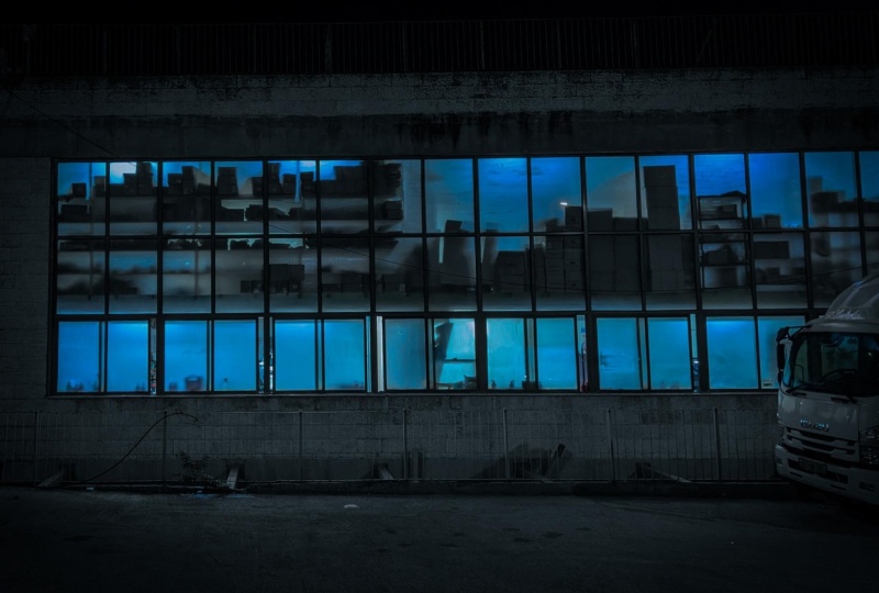
2. Overview: Our first picture is
this warehouse scene. Really moody, dark, mysterious. I love the shadowy silhouettes of those boxes and the windows. Like, it's really question of what do they make
there, you know? And the truck on that right
really adds the story. Maybe they're doing some secret loading in the
middle of the night, you know, some spy
movie. Who knows? Something like that. So it's got a very interesting
vibe going on here, and it's very
intriguing. I like it. It's a good image to start with. This next one is a hotel interior scene where we have the main light source coming from the outside, which creating these
long cast shadows, giving really spooky,
deserted feel. And also, you notice it's
shot from a low angle, so that makes the objects appear unusually large
and a little bit distorted and adds this
eerie feel of this scene. Last picture that we'll
be looking at and editing is this reflective
shot in this hotel. And honestly, I love doing reflective photography
where we're merging what's in
front of the camera, with what's behind the camera. It really engages the viewer to look at the scene
and understand how the overlaying of
the foreground and background come together and how each element
plays a part in it. This picture, in
particular, to me, is sort of like the merging of nature with man made objects. So we have the trees, we have the foliage here and these organic
leaves combined with the geometric shapes in the windows and the building surfaces
and on these chairs. So, to me, this is a statement
about man's striving and constant struggle to impose order on
the chaotic world. And it says a lot to me. I really like it. So we're
going to edit these pictures, and I'll show how
I edit them all using light room. So
let's get started.
3. Editing a Warehouse Photo: So without further
ado, let's get started on this first
one of our warehouse. So you'll notice that
on the far left edge, it tilts in a little bit, and that's the
barreling effect of taking a wide angle shot
that the picture here, the angle the lines are a little bit angle to
the left over here. And as we move to the right,
you'll notice that they're actually converging on
the right side like this. So because of the
angle of the shot, it's creating this
converging effect. I'd like to strain it out a
little bit so we can go into the adjustments here
Carpen straighten and hit Auto I think it's a little bit better
now that even though now it's more
angle on this side, but the street is a little
bit straighter, right? Before, it's angled up like this, a little bit more level. Let's go now into the section
where we adjust the tone. If we went through
and ask Lightroom to do its auto settings for us, and control is the shortcut. So we'll see that
it doesn't really get it right because it's exposing for what it thinks
is a normal picture, but this is really a
dark and moody picture. So it's going to bring up the colors a lot more than we need, and we
don't really want that. So we're going to
do it manually. So first thing I'm going to
do is I'm going to increase the contrast a
little bit to give a little bit more drama. And highlights, I like
to lower just to touch. You can see we bring a
little bit more back into the windows, right? So before the windows are a
little bit more blown out, here's giving a little more depth and quality
to the windows. Shadows, I'm going to bring
up just a little bit. Whites, usually I don't
touch it so much, but we'll just add
a little there, and then Blacks will bring down, and that's going to add in
a little bit more contrast. Okay? So we can see
the before and after. This is before,
undo it like this. So that's before.
And after, right? So we see as we've added
a little more in here. I want to pull down. This looks a little
bit desaturation on our buildings is a little
bit too yellowy for me. And that's probably
because of the lights. It's getting the light
from the street lamps, which are a little
bit more yellow. So we're going to
bring that down, but not using saturation. I'm going to pull it
down using the vibrant. Saturation pulls
down everything or increases or decreases the saturation of
the colors equally, and vibrance does it
that the colors are more saturated or affected more. So if I pull down the vibrant, it's going to affect these the colors of the
building much more than, like, the color of this truck. So let's see that.
If I pull it down, see, it's changing faster
the colors of the building. So I'm gonna bring it
down to around here, and I think that's really good. In a tone curve,
I'm going to make a little an S curve to
add a little more punch. So I bring up the lighter area just a bit and pull
this down a bit, and I can turn the
tone curve on and off. You see, it's very subtle, but all these changes they add up, right? So this is before. After. I'll bring down I think I'll bring down the vitamins just a
little bit more now. Here we are. Okay. And
then one other thing that I've enjoyed playing with a little bit is in the
color grading area. I'm not going to change
the color itself, but here I can target
the luminosity of the shadows, midtones,
and highlights. So here I'm going to pull down the shadow luminosity and bring just a little bit
down here like this. All right. I see before,
after with that. So we see the before
and the after, right? So I think this is has a lot I think this
picture is moody, but I think we've made it a lot more intriguing
and nice this way. So I'm very happy with this.
4. Editing a Dark Hotel Photo: This picture, as we said before, is our hotel interior. And first, it's not
exactly straight, as you can see the lines here. Everything here is
tilted to the right, so we're going to adjust that we can use our lines to adjust it. So that's okay,
first and foremost, we're fixing the
orientation of the picture. However, one thing also
that bothers me a lot is that you see this has taken it's very grainy
here, these areas. And we'll see if we can
fix it a little bit. And besides that, also, I'm not such a fan
of this exit sign. This exit sign is very
green stands out a lot, and it draws the eye too much for me, so I
want to reduce that. So let's start off by working on our contrast,
bring up a little bit. And reducing our highlights. Again, if I were to do
this the automatic way, it would be way
too bright again, so we're not even
gonna try, right? Shadows, bring the shells
down and our blacks down, and everything here is trying to minimize the noise
that's going over here. I'm also going to
increase the clarity to the touch and dehaze. Okay, I don't change anything
vibrance or saturation. Here, I think I'm going to pull down the shells a
little bit more. And then in the detail section, we can reduce the noise by going to our luminosity
slider and moving it up. How's that? I think it
helps a little bit. And then also going into our
color grading and pull down the shadows here. It's
pulled down a lot. So you see that? Well,
it's pretty cool. But I don't want
to go so extreme. One trick I learned for doing adjustments is you pull
it down until it's obvious to you and then
come back in a little bit. So if it was like this is really intense and looks decent. Now you can actually
pull back and not go as strong and it'll still have a similar
effect without being overpowering I have here. Is the original on this. Now one thing also, I
think in the shadow area, I can actually go here and make it a little bit more blue. I'll take this and remove it. Just a little bit. A see the before
and after that one. All right. Just make
it a little blue. So here we have
four and or after. Oh, yes, so now what
we also want to do, though was we want to
fix this exit sign. So for doing that, we're
going to do a local edit. I don't see the shortcut here, but if you go to tools
and then create a mask, we'll make a brush mask, which is the shortcut
K. So over here, so I'm just going to go here and reduce the size
a little bit by pressing the left bracket symbol and then click over here. And brush it on. If I press O, we'll see the overlay and you can see what's being affected. And now we're going to go to saturation and desaturate
it a little bit. So we're just going
to pull it back down here, it looks very good. So now it's at -40,
so I'll be a bit brim just to touch, right? So now -33 or 32, and it's the same decent effect. So so I'll hit K again to
lock that in one more time. Okay, we see through
four and after, right? So it's a little
bit more subtle. And that's what I think is a nice picture here,
a version of this. So here's before and after.
5. Editing a Reflection Photo: So let's go look at
our last picture, this reflection, which
what's the problem here? The color balance is way off. So let's go and ask Light
room to do that for us. Would auto white balance
is Control Shift? That makes it, I
think, much better. So it's before and after. So besides the color, one thing that is something
that we need to fix after we've touched up and gone to a basic level we want to be
is this area right here. I'm not sure what that is,
but it definitely detracts. So we're going to bring
that to Photoshop afterwards to fix it
because light room, while it does have some really
amazing tools for removal, it's not going to be I don't think it's
going to handle this, so we'll see what we can do
with Photoshop afterwards. But let's start with the
general tone of our photo. So here, let's see
if I do autumn one. If I try Auto control
you again, too bright. It doesn't understand what
we're trying to do here. So let us we'll make the exposure just
slightly higher a touch. That's a little too much
here and contrast also up, it's looking good at
37 but won't bring it down because that's
maybe a little too extreme. We can get away with
the same type of impact with not
as high contrast, with a little less contrast. Highlights we're
going to bring down. Let's Okay. Like this, shadows bring
it up just a little bit, Whites up a little bit,
and then they're Blacks. We're going to bring that down, and it's going to add a lot of adds to the effect
of the contrast. I think that's a
little bit too much for me, so let's put it back up. I'm trying to show
the intermingling of the nature and
man made objects. So I want them to
look like they're superimposed one
on the other one. Let's increase texture
just a little bit. They'll bring out maybe the
chairs and the objects here. And I think if we go down here, we can also add an S curve to bring up the
lights a little bit, and the shadows just deepen
just to touch, right? And the only thing here is maybe I want to take
out from our mid tones, remove the yellow a little bit by using its complementary
color, which is blue. So if I do that, you see that?
Let's go before and after. See, it's looking this area
here, how it's orange, and I adjust it and it pulls
out just enough, right? So it makes it a little
bit more neutral color. Okay, so all that
is really good. Um, now what we're
going to do is take this picture into Photoshop
to do this last correction. Here we are in Photoshop. So we're going to do
is first for safety, just make a duplicate copy. Control J, makes a new
copy of it, right? Just on top. And over
here, we're going to, um, take our healing brush,
make our brush larger. Okay and paint onto here
and see what it does. Wow, I have to say
that is phenomenal. We'll see before
and after on that. Before and after. Wow. Even puts in this nice little
reflection here, right? On the floor. That is
really phenomenal. Photoshop is amazing. Okay, now that we have this picture, so
we'll go export it. We'll save this one, and then we can compare
our three pictures and see what we like more.
6. Thank you!: Thank you for joining me
in this skill share class. I hope you learn some new
tips and tricks of how to use Adobe Light Room
and Photoshop to create dark moody photographs. And I would love to see
your photos as well. So please upload one or more of your photos to the projects
and resources section. I'll be happy to review
and comment on them. Thanks again for joining me. I look forward to seeing you
in other skill share class.
 Avraham Nacher, Artist & Photographer