Transcripts
1. 1 Intro: Hi there. I'm Kate. Um, Adele, And welcome to this new course how to paint water and soft pastels. We will be looking at different kinds of ripples at reflections, phone waves and how to portray that. What sand on the beach. You will see that even what sand has beautiful pinks and purples in it that you might have not noticed previously. We will be doing the friend small project that will help you when creating your beautiful landscapes or Seascapes. And I hope that you will learn a lot of new things from this class. Don't forget to post your work in the project section and do ask questions. If you have any, I will be very happy to answer them first. I would like to go through all the materials that we will be using. I will be using passed on that paper. This is the dark, almost black color and recite and different runs of soft pastels. And now we can start with the first lesson
2. Understanding water: What should we look for when drawing the sea? Well, water has three characteristics. One is its color. It will depend on the surroundings on the lighting and many other factors, and we will go through these in a bit. The next one is the density water and then we need to see if the water is in movement or if it's still mostly, this guy's going to be lighter than the water, and you will see this change when the sky is moody. When it's stormy weather or maybe during the night time, then the sky and the water will be a very similar value. The water often will be lighter towards the horizon and darker towards the viewer, as it would you reflecting the color of the sky. But there might be cases where it's completely the opposite, where the horizon, the water is darker and closer to the viewer. It's later. It all depends on the density of the water and the depth of the water. So if the water is shallow and is not very dark and doesn't have any mud particles in it where it's shallow, it's going to look later the color of the water depends on the shade of the water itself. Plus, if there is anything that shines through the water, so as it's a translucent medium, sometimes you might see sand shining through it, like at the beach. Or you can see brown mud shining from it if you're looking at the lake and that makes water even darker. The color of the water also depends on the depth the deeper, the more dense the water becomes and darker it gets also when drawing waves or foamy sea water, you should look for those air bubbles that are underneath the surface of the water, and they will create those lighter patches in the water itself. But we will look at an example where we will be working on the tutorials. How do we draw the ripples on the water? Well, it's very simple if you look at the shape of the ripples and we will go through that. But mostly the ripple has the tip and the surrounding, so the edges and the tip of the ripple. The tip of the ripple will be usually reflecting the sky as its face towards the sky and the edges will be reflecting. What's surrounding it might be the water itself. Or maybe some objects in the water, like water burns, a swan or maybe some lily pads and the edges will be reflecting the surroundings. Another thing to notice about the ripples is that no matter the shape off the ripples, if they are caused by the current or maybe by the wind still, we will see the ripples closer to us as more defined, and they will be larger in size, and the further they get away from us, they will get smaller in size and become less detailed. This is the aerial perspective that we will be talking about on drawing ripples. Another thing to know when drawing seafoam is that the waves have the crest that seems white. So the phone off the waves that seem white but in the shadows you need to pay close attention to it. It does get a very dark, even bluish, grayish blue color
3. Elliptical ripples: for the first texture. We will be using a selection of pastels here, from lights to darks. So I have the darkest blue going through gray or green or blues and then into the mid tone value. Then again, for degree of grey or blues, I'm going into the lights. This is also a let blue. And then, for those highlights, I'm going to be using like yellow. The first water texture that we will be doing is going to be the elliptical ripples. So you can observe these ripples on the water that has some current and they are quite large, the closer they are to us, and as further they move away. As we discussed, they will be less detailed and they will seem flatter. So I will start with the darks first and then pass on to the later values as I go along. So I have a very dark blue, and I'm going to be doing just a little area of the reference photo. You can choose any area you wish and then leaving spaces for those lights that will be adjusted to our darks. So looking at those shapes, those ellipses that I see in my reference photo and I'm adding a very dark blue first. So here we have another shape. So basically here, what you have to do is you need to copy what you see in your reference and then let's move lower here we will lead to more. So this is the area that I went toward quit. Next, I move on to the next value, and here I will start adding this lighter, bluish gray on the edges of my darks. So one important rule when working in pastels is you never mix lights and darks together as that way You are prone to create mud. So here are melting this lighter, bluish gray, and this is going to be one value that helps us move into the lighter value. So we're not gonna go into our lights immediately Here. I see also that there is a darker spot, but it's not as dark as our darkest values. I think so. And also here we have another darker spot and another gallops over here. Next we're moving into the next value on our values scale, and we're starting to add lighter colors, always looking at the our reference and trying to copy the movement of the water. So now I'm still blocking in my darkest areas with this color already weaken work even on the lighter areas. So in passing, I'm not leaving any spots here for the like yellows and let blues yet so we will be blending it into the paper so that we can layer more colors over the top. And here we have also select her blue happening and that further away it gets the less detail that's going to become. Now I have a cooler blue which I want to add in a couple of areas, not everywhere. So here I'm not looking that much, but my reference as I'm looking at my composition where I want those brighter areas to actually appear. So this is very close and value to this lighter blue that we used, like so and now I have a lighter, warmer blue, and this is kind of gray compared. It's not as intense and color as this mitt tone blue that we were using, and it's going to help me tell him down the brightness of my blues and at the same time still maintained the bluish color off the sea. If, for example, the sea on your reference or in life it's green. You would use green graze and greener colors. So here I see that beautiful lips that I want to portray here, and you can see that this dials it down. What we talk about brightness. But at the same time, the blue still shines through, and we have that beautiful sensation of this deep color off the blue in our water. Remember, we don't have to, but any hard edges, because on the water it's old smooth. The transitions are old smooth. Now that we have our leaders in, we can start and blend these colors slightly. I'm using different fingers for my darks and for my lights. So we unite these colors just a bit. And as we did that transitional color in between the lights and darks, it's not going to create that money appearance, so we don't have to have any hard edges here. Everything is fluid and soft, and another thing about painting the sea. Don't worry if you didn't get it exactly right. It's the seeds ever changing your not going toe, see the same exact ripple ornament on the sea So if you think that you've gone wrong somewhere, we're not doing a photo realistic drawing of the reference here. We're just trying to portray the ripples on the sea, so don't worry. So if you think that you went wrong somewhere and your ornament is not exactly the same as you see it in the reference you can always go with it and create your own ornament as long as it conveys the feeling off that particular ripple. So now I'm gonna go back into my lighter blues and here I'm going to add those later blues where I see that ripple kind of going folding around Easier years working with the side of my best tell not was the tip you will create more beautiful lines and also here we have that quite bright rim around this gallops here. So now we're already drawing up the ornament that we see okay, and now we can move on into our lightest values. So this is a grayish blue. It's a very light blue number to start adding it into those brightest polices. So not everywhere on Lee into the brightest areas which reflect the most light again, moving with the pastel on the side. If in places I think that it's too bright, you could always tone it down by rubbing your finger. Like so Here I'm adding it. And by rubbing I am toning the brightness down and no take annoyed Chrome's I have my latest yellow, so I see a lot of yellows and then brightest here. You and I'm going to add those highlights with this brightest yellow over the top to add a bit more color into my drawing. Same way here and in the back here, I'm going to rub it in gently. If I see that there are some hard edges can always smoothing them out. So I think ellipses and there we go. Our first water texture is all ready.
4. Ripples in perspective: for the second texture, we will take a look at ripples that get further away from us in perspective. So this is a fairly cold see. So with these ripples that are very moderate, let's say they're not very big. They're not waves waves, and we will use the perspective in this case to actually show that the sea is kind of moving away from us. So as we get further in distance, we will have smaller ripples. So again, I'm going to start with my darkest value first. And I'm going to map in those ripples that are on the foreground. So we have it. The sea, we have it back. Litan basically, and the ripples have their shadow side facing us. And on top we will see the rim of light happening. So this is the ripple that is closest to us. And as we get further away, it's going to become smaller and smaller in size, and here are moving. Pay attention to how a moving a moving in the direction off the ripples off the length of the ripples. And here already, I'm just touching my pastel onto the paper to create that ripple effect. So here somewhere. We will have also smaller ripples showing. Okay, Next, I'm gonna take my next value. Um, grayish blue and this into my darks so that my darks don't look so flat otherwise were risking to have very boring image. So some places the sea will be darker where these same ripples air casting their own shadow also so behind them. So under under the dark side off the ripple we will have some darkness, but overall, our C becomes is quite light. So the further away from us the sea is we have to see in the particular reference, the more saturated, the darker it's becoming. So you have to look at your particular reference at the particular moment during the day if you're working from life, how the sea or how any other water source looks compared to the of the sky and how it reflects light. So in this case, we have a lighter value closer to us because we see the flatter surface of these in between . These ripples reflecting the light sky and the further away it gets, the darker it becomes. So that's what I'm doing here. Next, I'm gonna go into my blues. This is my mitt tone value blue, and I'm going to add it in between these ripples so that we actually add some color until we're see. Otherwise, it's going to look to gray, so I'm adding it in between the repose here and the war, if it looks too bright so we can always tone it down with our grayish blues, it's okay now. We can gently unite the colors just a bit rubbing, just very likely. So in this case, the paper works to my advantage because it's quite dark and it really helps me of that color to the sea, this grayish color of the sea without putting too much pastel onto the paper. And here we have those dark riffles that are closer to us. So once again, the perspective that we're using here on the aerial perspective here helps us show that the ripples up front are larger and the further away they get from us, the smaller they become, the less detail they become. And we will portrayed here. Next, I'm going to my next value great blues, great! And here I'm already working in those areas between the reports between the different ripples so very lightly. This is a harder stick. This is, uh, Cokie, nor harder pastel stick. And when working on fast on that, it's very nice to add that little glaze of color just a bit so that we don't completely cover the area that we already worked a farm. But at the same time, we had a bit of a glaze of color. It's very similar to working in watercolor when you have a glaze of color, but in this case we're lightening things up instead of going from light to dark. And the further away I get, the less I make the pressure, and here I will even rub it in so that it disappears in places and blends together. It's so it conveys just the feeling of these smaller ripples happening, always working on the side with my pastel. Now we cannot the lightest values, and if you look closely at the reference here, it's light on Lee on the very tip of our ripple and then closer to us on those flatter surfaces. So this is a light grayish blue, and we're adding those tips tower ripples and the area in between the ripples that reflects the light color of the sky and the further away we get. Remember the last detail. So here I'm barely touching it. Just indicate that's some places there. They're still. It reflects the light of the sky. So maybe some places there are less ripples in that particular area is going to reflect more sky, so it's going to be later. Also, if in the ripple there are multiple speaks, which will be reflecting light, we cannot that as well. And next What we need to do is we need to add our yellows because we have a strong, highly sunlight. And if we imagine that the sun is shining somewhere over here, I'm going to add just a bit of those. Yellow is the closer we get to the light. So if the sun is shining from this side, I'm going to add those yellows closer on the outside of my ripples. Also in the distance, the sun is going to reflect off of the Walter. But here we will blend it in and have less contrast. So you can see we have a feel off sunshine shining from this side and we have the shadow parts on our ripples
5. Foam: So for this texture, we will be using a selection of colors again, going from lights to darks. And in this you can use either yellowish or greenish colors to actually at those latest highlights on the white foam. I have used the greenish color here. Then I have the light blue as from the two previous textures, a gray or blue, also to tone down the very bright accent and also a cooler gray or blue plus. I have the darks and also my bright blue that I used to actually move for the value scale. So this one goes in between here and these two darks, as one of them is warmer, the other one is cooler and this one is also darker, is going to add us. Allow us to at the sense of depth so the shadows inside the water will not look as flat. And then I'm also using compressed charcoal stick. You can also use a pastel stick to draw out the shapes so that I do not contaminate my lightest areas with the very dark pastel. The next texture that we will look at is the sea phone, so it's very interesting to draw the sea phone as it has these interesting patterns in it. And we will start again from darks, and we will move on towards our lights that we will layer over the top. So I'm gonna take my darkest blue. Actually, I'm going to start with a charcoal drawing. So this is a compressed charcoal stick, and I'm going to outline my dark areas. I'm gonna take just, uh, little area on my reference photo, so I just need to separate my darks from my whites. So I'm just drawing these abstract figures that I see. Yes. So here the idea is to start with our darks, but we're not going to be covering the lights in between them. So when we we need need Teoh overlay our lights that create those thinner markings over our darks, we will work over the top of our darks. But here we will try also to avoid those lightest areas that are in between those dark pattern those dark areas in the pattern so that we will have a cleaner color. Let's start. So I have my darkest blue and I'm looking at my right friends. So I have this corner of my eye reference photo that I chose. And as it moves closer to the part where the wave actually crashed, it's going to have the foam underneath the water that is going to make the water seem later . So I'm adding this first layer here and already is removing closer here. It's going to become lighter, so moving into the next color. So this is my grayish blue, and I'm adding it into my darks and into the transition where my darks will be transitioning into lights. So remember, pay close attention to your reference were the foam is underneath the surface of the water , it's going to create the later tone so matting my next mid tone value here. So I'm not moving through my colors, making huge leaps when it comes to the tone moving through the tone of the color. Otherwise, we're risking of having a muddy image, and next I have this cooler blue, which is going to be in the lightest areas where that phones actually shining through the water. Also, there's a bit here, okay, and I will tone it down a bit with my former blue. You can also use greens here if the water seems greenish so here it's kind of greenish We could've used also greens. So you can also at those greenish graze here. Okay, so now that we are at the stage, we can gently rob the pastel into the paper. But be careful, amusing again to the front fingers for the different tones not to go with my darks into my lights too much and the other way around not to contaminate my lights with the dark's. And here because we have a beautiful, colorful transition, it doesn't look flat. So always when you're transitioning between two values, always use something bright or something more intense color wise. Next we can start adding our lights. So I'm gonna be using this light blue and don't get scared if it looks too dark. So we will be still layering our colors on top. So now I just want to block in those lights and use elect pressure here. Don't saturate the truth of the people too much. Some using always very light pressure. Okay, just looking at the reference, and it's OK. A few call Pete identically can spend more time or as long as you convey that few of phone . You can also use your fantasy here. So, no, we're working on those thinner lines that appear in our phone ornament, and I'm adding it with my I liked our blue, some little foam bubbles putting here using the tip of my pastel. Now to at those thinner markings. We had a bit of light here, so it looks as a the foam is actually bubbling up. Okay, In some places, I'm letting these markings and rubbing them away so that they're not as intense. So maybe these bubbles are closer to the surface of the water, but they're still not surfacing and earned are not as bright. Okay, And now I'm going to use, uh, let yellow. You can also use, uh, white here or a light green. It's actually let's use a light green. I have a very light green. I'm going to. This is a bit too dark. Let's see this one. And I'm going to start adding those legs on top off my blues, so I don't need to cover my blues everywhere. I need to passed over the latest values with this green. But if you pay close attention, you will see that the blue is still shining through, and this way we're creating that phone that doesn't look as if drawing made on top of our wave. So we're having multiple colors of the same value, and it makes it more interesting and more pleasing to the eye. You can see that in many places there's this blue shining through some places where it's on Lee Green, and this is how you go about creating this kind of texture. We can even add some of those brighter, lighter blues in places. Keer Also someplace here. Maybe if you see that there it might show more depth also. Maybe WhatsApp addictive. This light blue here. So that on there we go. This is our next texture.
6. Reflections: So to create this beautiful reflection off trees reflecting in the water with ripples showing on top, we will be using these colors. So something as warm as this this kind of a PCI, very like peachy color. Then we will go through our blues to create the sky to this slightly cooler, grayish blue. Then we will go into these more sky blue, warmer blue colors. Plus we will be adding a bit of a brighter blue. So you can go here either warm either Cool how you prefer. Then I will be using for the greens. I will be using this warm color for the lightest tree here in front. And then I will be using these warm colors for the lights and then transitioning through this atone value into my darks. Plus, um, for the sketch. If you prefer doing a sketch up front of the using, all sold this compressed charcoal. In this next texture, we will be talking about reflections. So how do objects reflect from our Walter surface? In this reference, I have ah, beautiful landscape with a very still water source and trees reflecting in it. So how do we do that? The first thing that I need to do is I need to sketch up approximately. We're going to have my trees. There's going to be the water line on. I'm not going to be doing all the landscape here. What I want to show is the reflection of the trees. So here I have the division between my land and water over here, there's going to be the lightest area where there are grounds, says there's also another tree here that is lighter, and then we will have a tree line happening like so the same tree line will be reflecting in the water, so it's going to be a mirror image off our drawing here. So it's going to be a mirror image of our drawing here, reflecting in the water. So let's start by adding the sky and the trees. So for this guy, I'm using this rush blue. So once again, we're not doing a full landscape we're doing is we're just trying to learn how to portray those reflections you can eat the more set at a bit more saturated, lived sky blue. We're not gonna be doing any clouds or anything here, just a basic sky color and then even more saturated blue as it gets further while you're up . Now we Kimble in this If you're lacking Fastow, you can always add a subsequent layer. I like working in these very gentle but this very easy pressure. So gentle pressure so that I don't over saturate the tooth of the paper too much immediately. I can't go, and this also allows me to actually draw the texture off the trees over my sky. So this is going to be showing through in between the trees. So remember which colors you used for this guy, as we will be reflecting those colors in the color of the water, the further away from us, the Walter is in this reference, the lighter it becomes so closer choice is going to be darker. In this case, we will have the latest color reflecting closer to the horizon. So I'm going to do that now, while I have my colors and place again using the same colors. And if the water is in a different color, a kettle SoCal marina here, depending on the color of the water. So matting the sky colors that are reflecting. Plus, I will be adding some of those more intense blues as I see them in my water. And it's also reflecting the top of this guy, which we see further away from the horizon and it's blower. If it's too bright, you can always tone it down with this bluish great, we'll get the very pleasing color. So I'm blending everything again. You might need multiple layers of fast. I'll here to be able to cover Theo image so that the paper doesn't shine through perfectly fine down with bluish grade and this we were creating the water. So here, if it's too bright, always passed with my British blue on, it's going to take away that color intensity. Okay, so we've already established our Walter and Sky. Now what we need to do is we need to start adding the trees, and for that I'm going to start with my darkest value. I'm going to start adding those trees, the shadows where I see the shadows of the trees using the pastel on the side, and I'm using movements, vertical movements so that I am kind of implying that there are trees. They're here. Further away, there is a land mess with trees that are the bottoms of the trees are in the shadow. So here there is another tree. Okay. And again, you always have to put aside those pastels that you're using so that you can use them again in your reflection. Now I'm moving onto the next color, this brighter green. So the trees air quite warm, even though they're in the distance. I'm using these warm yellows. Want to portray those maybe kind of autumn dish feel here. Okay, Also, here we will have the tips of those trees lighter. And here I'm going to use my grey blue to slightly tone it down because they're further away. Okay, Next to go into our next while you and we're adding this next color into our trees, the colors here, you don't have to copy the colors that I'm using. Most importantly, that you learn how to portray that land mess in the distance. Had to treat those trees. Okay, maybe, but here, just in some places, like so also they're going to be brighter colors in our trees. I'm using this yellow green just to give some accents to the trees. Like so and then with this lighter color great at that warmer tree that here in the foreground and those grasses so to indicate the grass is what you can do is you can place your pastel and just seriously pull it up. That's going to suggest that movement of the grasses, Okay. And here we will need a bit of those shadows as well. I'm gonna use my They're green. They're gonna be shadows in between those patches of grass again with these tiny sweeping motions up and this tree, it's going to have some shadows in it as well. Just going to unite the two colors together. But maybe let's have another tree here in the foreground. Okay, so now we have our land mess, and I'm saying that here's some places were lacking those shadows. Maybe we can have more shadows so that our tree look more interesting. You can always go back to the color that you were working with and add more color when you're working on this kind of surface. Okay, so now we have our trees, our grasp. And now we need to create the reflection. How do you do that? It's very easy. So where I see the shadows First will lead that grass in the reflection here because we will have a glass grass reflecting first. So it's kind of a mirror image here, and I'm going to slightly blend the two before you start adding new layers on top. So here, for have too many shadows, can always go over with my lighter color That kind of take away the darkness of the shadows . Okay. And I'm also going to be using a bit of this brighter yellow to indicate those lights are areas and the grass that catch more light like so. So it kind of separates a bit and was on the street. Let's have a bit off lights on this tree as well. Okay, And now we need to start massing in those colors that we see in our trees. So if I have a shadow side of the street I'm gonna do is I'm going to Actos shadows where I see them in my drawing here and I'm moving. The movements that I'm doing is vertical straight down. So moving to the next Well, you and we'll so cool here. And but this darker color reflecting here Must we tone it down a bit. They would say where we did on top here. We tone it down a bit. Okay. Next we have those lighter colors as well in our trees and into the light like so. And then we have our later tree reflecting here as well. The attention that this tree, the one that's reflecting, is not as bright. So I'm gonna tone it down with the green. So now what we can do is but a clean finger can intensify this feel of reflection about pulling out. We're coming down, and at the same time, we're moving the water as it lays on the surface. So it's horizontal. And by doing that we're adding the feel of the Walter laying flat. So if there were more ripples on the water, how would we show that? So, for the ripples on the water we would do is we would apply Fowler ripples over the surface of the water over our reflection in these horizontal movements. And that way we would get unbelievable reflection. Plus some ripples the further away they get from us, remember, they become smaller. So even though we don't have them in this reference here, we can have some of those ripples showing, and this way we will create the sense of water actually laying flat on the surface.
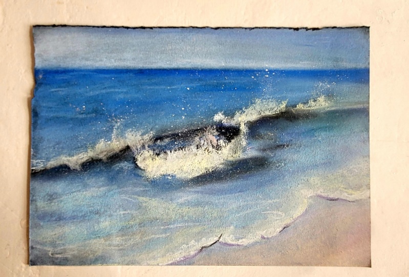
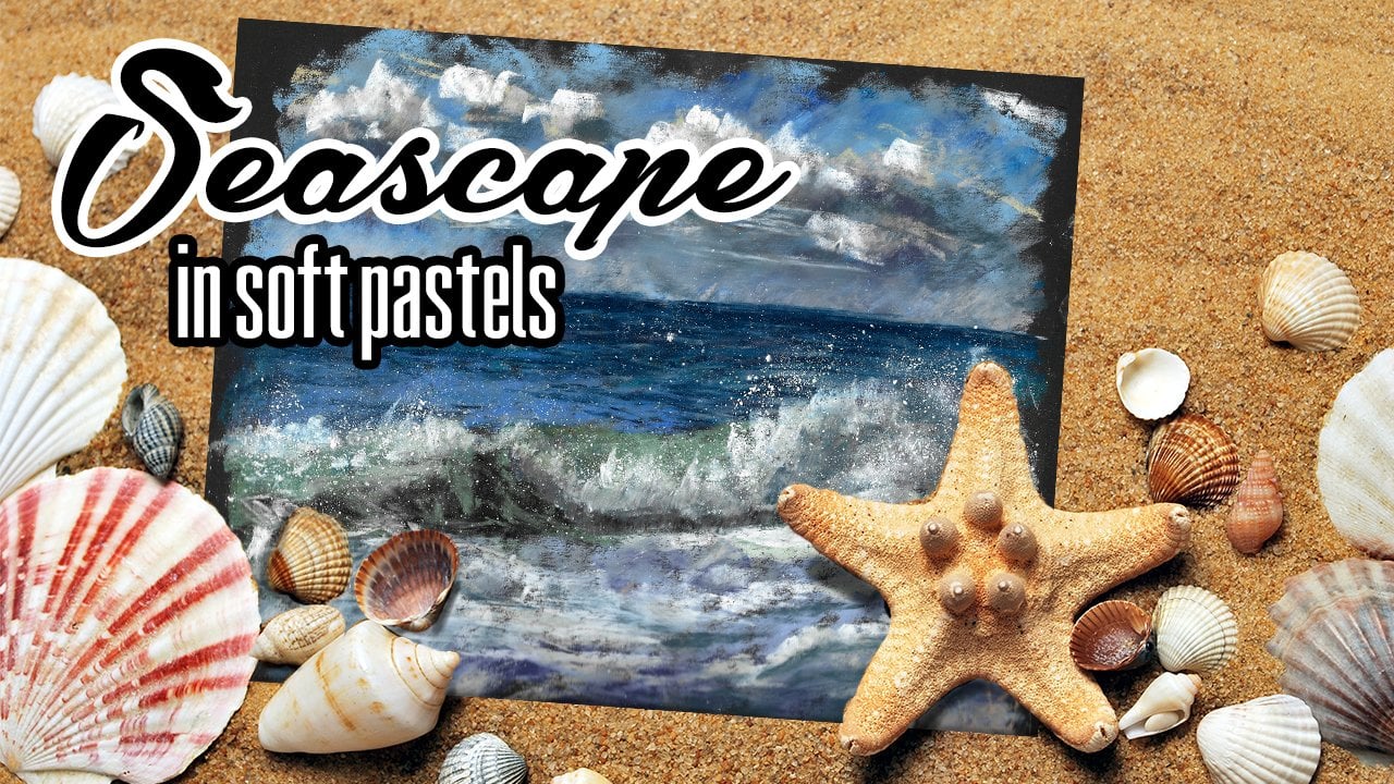
7. Wave & Splashes: I also wanted to talk about how do we portray, Um, a wave that's splashing these beautiful splashes? And for that I chose a reference where there are the beautiful texture of the wave in itself and it has the splashes. So how do we achieve that in past routes for easy? So the first thing that I want to do is I want to start with the latest area off the wave and when drawing waves. Very important to notice is that the light is actually shining through the great wave. The water is a very translucent medium, and it lets a lot of light through. So in the wave there's going to be always the light areas which let the light shine through . And it also is going to be casting a shadow on itself. So depending on the light source, so in this case, in this reference that I have, the light is shining from behind the wave. It kind of travels through the wave, highlighting those splashes, and the wave cast a shadow on itself. So let's start by batting the latest part of the wave. So they're gonna be drawing all the wave here this is a very light green. Next I'm gonna go through this beautiful emerald color and into blues. Don't worry if it looks too bright Well toned this down. I'm toning it down with the gray color that we were the same way we were using it there and here I have the sea laying flat. So already when I'm using the movement of my pastel behind the wave, there's no other way following it. So the seas link with flat so running those greens as well. So we're creating the ripples similares we did here and leave you with some later bullish gray. We're going, Teoh, tone it down. Plus, the sea gets a bit darker, further off working and this darker blue And again we're going to tone it down with our grayish blue. So we need a background for our waves for the splashes on our wave. And it has to be darker than this splash on our wave so that we can clearly see it. Okay, so this weekend blend because first of all, it's laying flat. And second of all, it's not in focus here, so we're more more focusing on this bright area on our weight. Here you see a bit of these screens also as a curves. So here, we can do now is we can gently blends these colors together with the idea that here the wave becomes darker because it's casting a shadow on itself and on the crest here, the light is shining through it. But as you see, I'm not going into white here, so led greens can use even some lighter greens in the areas. But for our whites on the crest of the way to really look white and brilliant, we will need Teoh have darker colors in this area where the light actually shining through here. With these movements, I'm indicating this curve of the wave. There's another year, you shining light here and here. I'm going to use my darker blue just a darkened Assyria up a bit just to indicate that shadow that's forming here wave itself like so and I'm gonna cover it over with this more intense blue and mix the two together. So we need to create the illusion of this wave curving. If it's too muddy, we can have more of this writer blue. Then we can go into all this detail in the wave. So we have those patterns forming. So some areas of the wave will have more water, and it's not going to reflect the light as much. The wave in these areas, some areas of the way, we'll have more light shining through, and they will be more translucent. So it's a very interesting work to be actually drawing these patterns on the wave inside the wave itself. So there are some areas that shine more light fruit, so creating just a bit just indicated it. Game off light and shadow on the wave and here where it curves, we can show them becoming flatter. But once again, we're not doing a weight wave can growing here. We're just trying to convey the feeling that this is a wave so that our foam spray actually looks like it's on the crest of the wave. So now we created this curve on Dhere. I would like to, uh, but of the starker green and even some of this darker blue, because he it kind of turns away. So the phone, when it turns away from light, it doesn't have white color at all. So mostly it's going to be grayish blue greyish green It's not going to be late and here we're going to bad just a bit of that lighter blue that we used for the sky in our previous drawing. Also just to at some of those lighter areas in the phone, even though it's in the shadow. Okay, so now that we have I were home Our wave prepared for the wave For the crest of the wave, I can start adding those brighter colors. So I'm gonna go fruit, uh, like yellow. What I'm doing is I'm adding this like yellow where I see my home and I'm moving the pastel in the direction. Where'd this phone is actually spraying? If it's spraying a lot a lot. So making the mark longer where the spring less. I'm making the mark shorter. Like so here I see this beautiful light shining through my wave. But I want to show. And now I can go into whites and layer them on Lee over the top off my yellows. I'm going to light enough some areas with the white here. So that's that we're wave curves in it so you can see that this white that I'm using is harder stick and it doesn't leave a lot of pastel on top here we will switch just after variety Pasto in a minute. So here there's going to be shadow off this phone everywhere that the phone was actually spraying up. Underneath there is the shadow area. I'm going to add this shadow area to my phone so that it looks three dimensional. That doesn't look flat. This is the grayish blue that I'm using. So the phone kind of curves and it has dimension to it. So it's not reflect surface like so okay. And now we can pass on to a softer wait. This is a shrinky white and here already you can see how much brighter it looks. I'm adding that phone and another thing that we can dio when creating the phone. We can take our pastel and scratch a bit of this past out onto the paper. This way we will create that spray and then we take a sheet of paper, have just a plain white sheet of paper here. If my daughter used to draw on and with itself or any other object, we rub it into the river and you will see that now that we take off the paper, we will have that spray of phone left on the paper and it's not going to fall off. But we can also work here a bit, then adding some depth to the wave. So something here you will be darker inside the wave itself. So our lights look brighter. I'm going to use this brighter marine to layer over the top of my shadows so that we had some color to those shadows in the water. So where the density is bigger, it's going to look more colorful. And then here I'm going to add those areas which are brighter, and that way we're gonna shaping our wave and adding some lights into our wave. Could these yellows also here to show that light shining through
8. Color of sand: Another thing that I wanted to talk about is the color off the sand. So if you look at your a friend's photo that is attached here, you will see that the color of the sand is purple. So in this particular reference photo, when we have the daylight on and the sand gets wet, it reflects the color of the sky and creates this beautiful, warm, violent color. So let's try to draw our seat and I'm going to. I had a bit of a line off the phone here, so just going with my white, that's going to be the brightest of that phone. And then here it goes further off. So here are not trying to show the foam Justin indication of the phone so that we understand what's happening starting this like blue. And then it goes into this more intense blue where the water gets deeper. This is just in indication of that, see, washing up on the beach, just covering the paper here and going back into my whites. Just add some more phone here. Maybe it's bubbling more like so the closer to us, the more bright it's going to be. The further away from us. It moves away, the less bright that's going to become, and maybe some of those shadows. So here I wanted to go and talk about the color of the CVA, drawing up the shapes. Um, the pattern of the foam is really interesting sometimes. So now what we need to do is we need to look at our reference and see that there's always a shadow forming under the phone. Even so, it's quite thin layer of foam that we have on our beach, and then it also reflects the white off the phone in the color off the wet sand. Plus, we have the wet sand that also is not the same color. So as the Walter on the sand reflects the light, we will have some areas darker some areas later. So let's start with our sand first, and I'm going to be using this pale pink to add that what sand color? So Bill Pink and then we will go also into more violent colors, where it reflects more sky. Plus, it's going to reflect a bit of that sky above that is going to be lighter. Here. We can rub it slightly just a bit. Don't take away all the texture and here the dark of the paper is actually working to our advantage. It's creating that shadow on the phone. So underneath the phone, so you can see it's already looks like a ziff. The foam has a shadow to it. If not, you can use our blue to actually add a bit of shadow to this foam, like so so that our phone doesn't look flat. So it has to have volume to it. And then we will need a bit of that phone reflecting here. So impressing with my harder pastel and we will see the reflection of the phone in the wet sand like so. Plus, there are some bubbles happening here. Can add what I work hard style, that texture. And then we will go into our warm sand. So for the warm sand chose discolor. And here we will have quite a, um, distinct veg which will have some of those blues reflecting in the sky from the judge. And we will had also another color, maybe to our sand. So it doesn't look that one interesting. And here we go. We have our beautiful wet sand on the beach. In there, we can also have some shadows reflecting in the sand that are going to be darker. So I'm gonna use another pink just darker and those darker areas. If it's too bright, I can tone it down with Violet, and it's still going to look darker. And at that later, blue to the area. Where is reflecting sky? More? No for some of those whites into the reflection. And there we go. We have our what's and which doesn't look yellow it all. It's more violet and pink, and we have the phone casting a shadow.
9. Seascape: Now it's time to put all our knowledge to practice and draw a little Seascape. So I have my reference photo here in front of me and you will find it also in your materials list. But now the first thing that I want to do is take my sketchbook and sketch out the composition that I want to have in my page. So I will be drawing a landscape view off my wave, and what I want to do is I want to decide how much space I will leave for the sky. So when very few sky, it's not the protagonist here, then I see this beautiful day agonal that runs through the image where the way it was going to be. And then here there's going to be the beach and a bit of that beach that is all dry over here. Next, I need to see the relationship totally, so I see that the sea is darkest on the horizon. Seau's darker than the sky, and the closer it gets toast. The later becomes. Then the wave itself is also dark. But this phone bit is going to be very light and value, So these are my biggest shapes in my drawing and then the color of the beach and the color of the water here is very similar. So this is my total sketch, and this will help me in creating that composition in drawing those colors according to value, I have my compressed charcoal or when willow charcoal, as in this case, this is willow charcoal. And now I can start sketching out my composition. I'm not going to go into detail into too much drawing here, because when you're covering the area with pastels immediately, you kind of cover all the drawing. So most importantly, the drawing is there to help you guide the composition. So I'm going to draw out the line of my horizon, and I'm actually going to use a sheet of paper so that my horizon line is all straight. And you can see I left very few, um, area for the sky because the sky is not the protagonist in this case. Then I have the wave going diagonally from one side of the paper to the other. Here I will have that phone bit happening on the wave will continue. No, here. I know that there's going to be some darker batches as the wave curves. And then we will have also the area off the wave that has this white foam happening here on the beach. And then here we will have a bit of that dry sand at the very corner. Now it's time to start adding color. I will start with the color of the sky and then pass on to the sea. So for this guy, I'm going to apply this beautiful grayish blue because towards the horizon this guy becomes paler and it's going to be a lot lighter than the color of our seat. So applying the sky here to give a bit more tone to it, I'm going toe just the bit of that grayish blue, just very few and blend it all in where there is not enough pastel. I'm adding the British blue again, so it's best to work in these layers enough to over saturate the tooth of the paper. So it's very important to work, likely another tip that I can give you when doings guy is to create a Grady int and make it lighter on one side and darker on the other. So in the photo reference you see here, When I was shooting this photo, I had the light on my left. So here I had the light on my left. So here I will have the sky appear lighter. And as it grows towards the right side of the paper, it's going to appear darker and here gently. I'm rubbing everything in. So is to create that beautiful, beautiful, radiant. So I don't want the too dark here, So I'm gonna add a bit more of this light blue. So it has to be just right just of a darker than the left side of our drawing. Okay, so now that we have the sky in place, we do not touch it anymore. We can start adding the color of the sea. So here we can use a trick is by taking a sheet of paper, it has to be quite thick. So I'm using this one because it's drawing paper and it's quite thick so that it stays but in place. And I'm going to add the past tell This is quite the bright blue on the edge here as I see my sky and see where the place where they meet. It's quite intense the color of the sea, the earth and I'm adding a bit of disgraced blue. Okay, so now I can rubbed us in And now to unite the sky and the sea, going to clean my hand and gently passed over the area where the sea and the sky meet. So this is gonna take away that if you have some crumbs of this brighter blue here, we can always at this lighter color towards the bottom, so you can always fix that. But here, we need to create that soft line on the horizon. It shouldn't be very sharp because of the aerial perspective. It should be far from us and it shouldn't seem sharp. Okay, so this is the furthest side of our Seascape, and it's quite intense and color as you see. Then I see that my C becomes slightly more green, so I'm gonna choose another tone. So we're gradually building to the lighter layers and I'm going to go greener, so still a blue, but with green in it. So here I'm adding first this transitional value off this greyish green. Okay, And now I need a lighter tone, but more off the greens in there and here already were coming up close to our wave. We're adding the later value. Now that we have our pastel in place, we can start blending, and the best way to blend water surfaces is using these horizontal movements this way were kind of laying the layer of pastel flat on the surface, making it seem as if it's lying flat and not standing upright because of being water. So here I'm betting it with more of this lighter, grayish blue. This has some greens in it, and I don't want to make this color intense because I needed pale enough so that my wave stands up out on this background. One more thing when fainting Seascapes is that you need to be sure that your horizon is completely horizontal. To do that, you can take a pencil and you can measure from the bottom of your page if your seal is at the same level. So basically it has to be horizontal. So that's the way you check for the horizons, Ledley tilting to one side or the other. Okay, now that we have this in place, I'm gonna go back to my darker blue, and I'm going to add some of those repose and blend them in because these ripples are further away and we are not that interested in them. There has to be a suggestion of something happening in the sea and the same thing I do with this lighter color, some suggestion of ripples and begin blending attend because we're not interested in the ripples. We can also add a bit of this sky color into our ripples in places just to kind of unite the sea and this guy together. Okay, remember no sharp lines on the background. Now it's time to work on our wave, so we know that we have darker spots. So I'm using the same greenish gray color in those darkest here. Yes. So I already made a map for myself when I was doing the compositional sketch. And to this I'm going to add a bit of this darker blue as well. You can draw a greener wave, but I would like to keep it more blue to see. So I'm adding the blues. So instead of this blue, you can add a darker greyish green. And also here I see that there is this darker area happening? And I'm going to take an even darker color for this. So this is a dark green, and I will add it into my wave into the darkest areas on my wave. So here we're gonna fold, and also here now we can blend it very gently. So we merged older colors together. Now our weight becomes later. So I'm gonna move into my lighter color here. So this is the later greener blue that I'm using with with this green mixed in and you can see already how much later that looks. So if I were to use only one color, it would look too dull, too simple here. We already have these areas that they're kind of highlighted that were delight actually manages to shine through. So we're going to show that and also here there's the lighter area. And here we're creeping in on that dark Syria again adding a bit of this green color. So we create transition banana boat of this sky color here as well and rumors this doesn't have to be to light because we will still be adding the phone. So when working with the sea, it's very nice to work on past moment because that way you can create all these beautiful blended transitions. So here I see that the sea, because just a bit lighter, the wave fold, and then over here we have, that's what sand. So I'm gonna pass with my sky blue here for now, rub it into the color of the paper and now we can pass on to our violets. So I have this pail violence here on the wet sand to which will be adding also some of those pinks. And also we will have some of those things and violence shine through in the areas where we have the water quite transparent. So it doesn't have to be even hear, hear the patch here the better. Because when the water recedes creates that foam, the kind of slips away. And this way we have these patches that are showing more through and some patches that are showing less. Now we need the color of the sand and for the cover of this and I'm going to be using something quite warm. And I think we can use this quite intense orange color mixed in with this pink. It's going to give me the color of the sand that I need. So it's going to unite the sand with the water. If I were to use only one color for the color of the sand, it would not look as the beach there. It would look like something basted onto the corner of our growing. So here we have quite a light air. You We can add a bit of this warm color inst into some areas where the see actually lets us see through. And if it's too bright, you can always use this book. So now we can start the planning more color to our we've so here I'm looking that I have these beautiful greens where the light actually reaches through the water. So I'm gonna add a bit off green over here and over here I need to Tarkin up my wave a bit that I create contrast with the background. So I'm using these grayish blues and greys greens, then a moving through the wave. And here I see these beautiful markings that can have allow the light to travel through the surface of the water and create the beautiful glow inside the water. not a lot. Just a bit, just to hint at the translucent to you of the Walter like, So next I'm going to darken up this area. Here was my darker greens. So here in the wave, there might be something at the bottom of the sea there or in the way there's some seaweed , maybe something darker or even the shadow cast by the wave itself. And here I see also some of that sand shining through. So I'm gonna add a bit of that. I think in there, too. No, to create the phone pattern on our wave. What we need to do is we need to start with the darkest values. Our foam is never going to be just white. So for that I'm going to use my light blue that we used for the sky to this grayish blue. And I'm adding it of the top here where the wave has a shadow where this phone has a shadow the same way I'm working over here and adding this light blue further away as well. And over here next we can move into lighter colors and this is a later yellow and here I'm going to add those movements up. So in the direction of how our wave actually sprays, I'm going to have these movements, like so also over here and on this side and then was the white. I will add on Lee the tips since some places to create the appearance of some of these bubbles catching more light and and some of them will be in the shadow like so here Is he more blue reflecting from the sky Actually use this. See blue over here and now we're going to draw in the shapes of the foam over here. So there's this area that I see lighter and again I'm going in with my yellows, Another line still looking at the bigger shapes first and here we can slightly rubber days as we will be adding the white over the top here, some of those bubbles forming here and then we have quite a light area over here. I'm going to take my white now and over the yellow and going toe blind my white so some places will be brighter. So here we need to act this year yet that I didn't at first so some areas will be brighter and some will be more subtle, but it's going to have a hard edge where the sand actually meets the phone. So this white mixed in together with the yellow is going to create the more interesting color. And in some places I am also rubbing it in so that it doesn't look all the same sober, varying texture here and here. I'm just drawing in the image that I see trying to copy some of those markings that I see on my reference. Okay, and now here, with the white only job, a bit of lights into the wave inside here and it's going to mix end together with the blues bend, going to greet a later color also here. So instead of using another color, we can add depth just by adding a bit of white and blending it in with the other colors. So here I want to intensify a bit, this darkness so that our phone looks even whiter and I'm going to have a bit of shadow to the foam here into this layer on their knees, going to unify. But this yellow and white since the burger blue as well, So the work only in one color, even if you don't see that particular color in your reference, sometimes it's more interesting to create a composition using very colors in your drawing, content this blue into the share their shadow areas off the wave not only the green but also symbolist. If it's too blue, you can then tone it down with the cream. And now for our trick, we can add some of that sea foam its prey onto here, and also we need to add a bit of shadow to our phone. So it has a shadow bet here just to unite it just a bit with our finger. So shouldn't have blown too hard make to crumble more off that point. So don't draw a straight line. Some place has lose it. Some places bad more, one adding this shadow area those So here, as it covers this wave, it has a shadow. And now we can do as I said, crumble a bit of our past out and create the illusion of that sea foam spraying up, going to take a sheet of paper and a pencil, and there we go, so you can see that the spray it's in here where we left it. So this is just a short little tutorial at how to create a very simple Seascape with soft pastels. Another thing that I'm noticing here is that I want to make this area just a bit lighter to make that wave look as if it's curry thing. No. So here. So I'm just using my grayish blue on the side and kind of uniting two layers like so. And here we go.
 Katia Kot, Children's Illustrator