Transcripts
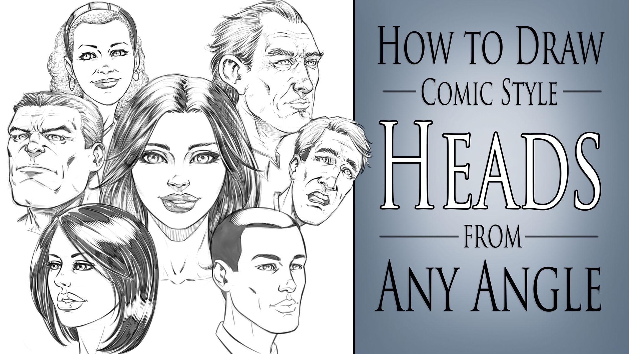
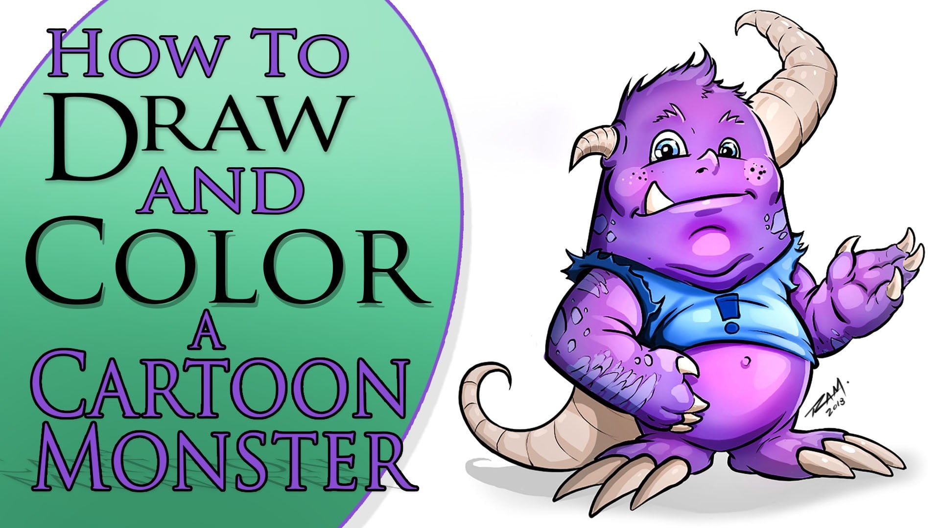
1. Introduction to this Class: Welcome back everyone. My name is Robert Martin. Hello and welcome to my class on how to draw comic style heads from any angle. In this class, we'll start off by drawing the skull. We'll also be talking about why it's very important to understand the underlying structure when drawing the human head. You'll then learn how to divide the head into one-thirds, which makes drawing the head and face area and perspective much easier. This is the method devised by Andrew Loomis. You'll then learn how to measure out the face and place all the features appropriately. Next we'll get into drawing the front and side view of the face. We'll also talk about ways to align the features and make adjustments to keep the faces looking like the same person. And now for the fun stuff, we now draw the head on an angle and then we addressed joining the head on the upward and downward tilt. I'll be honest, this part is a little more complex, but with some practice, it'll become easy. And you gotta remember it's very necessary if you want to tell a good story, your character has got to be able to look up or down. Next we get into developing some character types. We first start with a pretty face. We talk about issues of cemetery and how to create beauty in the face by using curved lines and proper proportions. Then next we're going to get into a non structure approach. So we're going to start off with very little structure and go right into drawing the face shape and then refining the character. This can be a great way to speed up the process and also become a little bit more creative with your output. Hello, then guide you through a few more examples so that you've got a nice variety of the characters that you can create in a nice understanding of how the different face shapes might come together. Then after all that hard work comes your project file. Take everything that you've learned here and implement it into three character concepts. Tried to use as much variety as possible, make them fun and interesting and be creative. I'd love to see what you come up with. And I thank you for taking this class. Keep drawing, keep having fun, and bye for now.
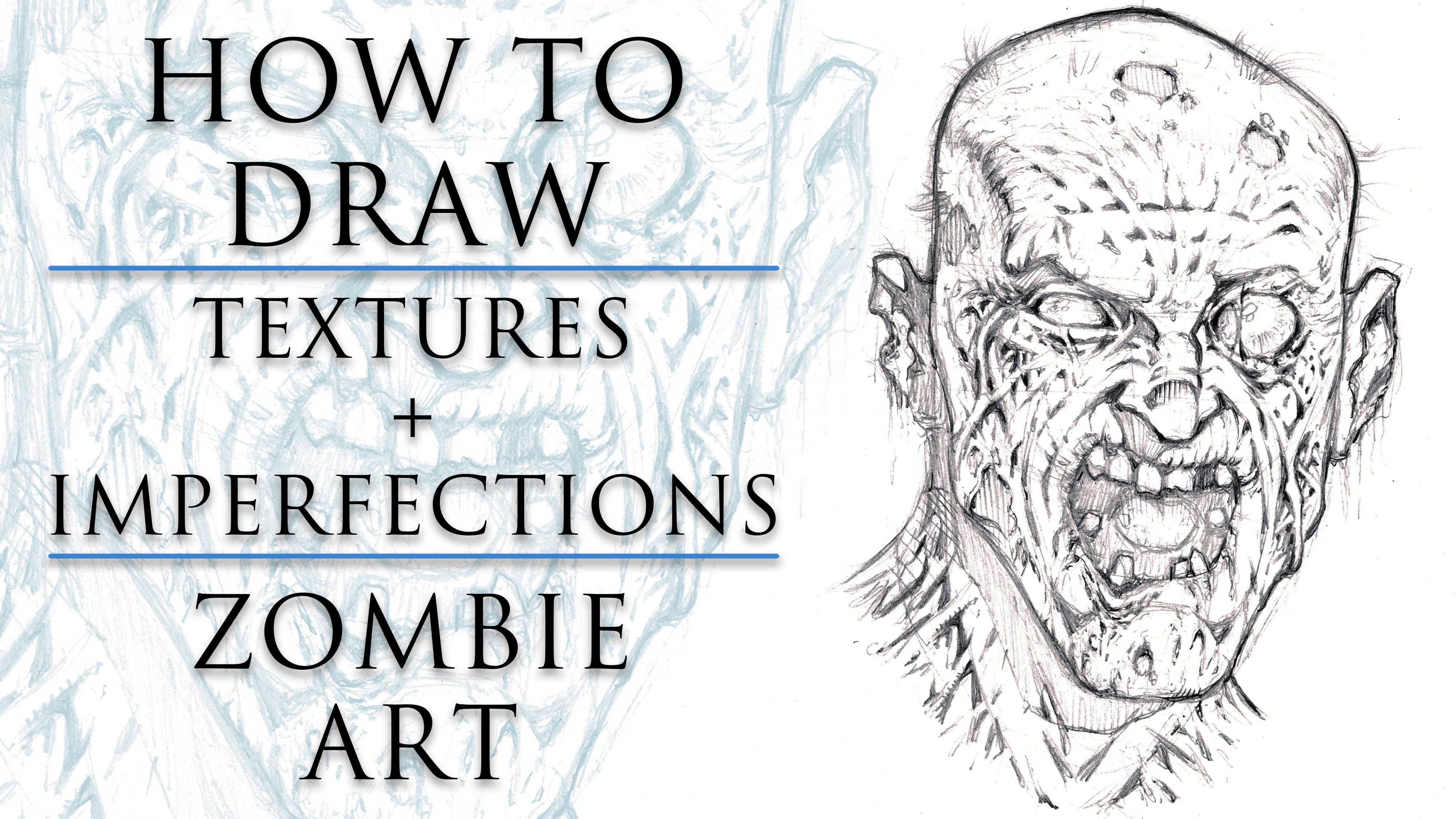
2. Studying the Cranium: All right, so in this lesson, we're gonna talk about doing studies of the cranium. So this is very important because I think what it does here, it forces you to realize the way things really look s when you're drawing the face of your character and we do these head representations, where do you have a pretty good understanding off the base information? That's there, uh, the underlying structure. So a lot of times when you're finding yourself kind of struggling to grow to that next level and get something toe look accurate, it can, because you're not studying enough. These types of studies air great for that. Now, you see, I did a little bit of base information as faras shaped placement, but not as much as I'm gonna teach you in the course about drawing heads. This is essentially just looking at pictures and then doing a representation of it doesn't have to be entirely accurate. So don't beat yourself up. If yours come out Ah, little bit differently. That's not really the the example of what this needs to be about. What this is about is that you're forcing yourself to look more deeply into the structure. And by creating studies like this, you're forcing yourself to realise things that you didn't realize. Like every time I draw one of these I learned something. I learned all I was drawing the cheekbone the wrong way. I didn't realize the ah in this particular skull, the way the pivot of the jaw eyes so close to the ear cavity, you know, whatever it is. But by doing these studies, you're gonna force yourself to learn a lot of times when artists don't feel themselves improving quickly enough or they feel stagnated in their process, they're leaving parts like this out. So again, it's not about drawing it entirely correct. And it's not about knowing all the terminology. I mean, that's nice. And if if you learn that, that's fantastic. Uh, that's not what this is about. This is about just visually trying to commit more this to memory and understanding it at a little bit deeper level than you currently dio and as you Philip, your sketchbooks. Doing that, I can almost promise you that the rest of your drawing head drugs will become better because you now understand how the underlying information look so when you go to draw your very, you know, stylized representation over top, it seems tohave a little bit better presence on the page. It seems to make more sense because you took the time to understand what was beneath the surface, and it always makes me think about the Renaissance artists. So whenever I study some of the old grades, you know, will there be Divinci, my clan's or whoever whoever you like, uh, you'll see in their studies. There's all these just really neat anatomical drawings and in skeletal structure studies, and they just got so into it. And obviously they're some of the best people to learn a poll inspiration from. So, uh, that's where it always makes me feel like I need to do more of this. And like I said, every time I do a few of these studies, especially when I take the time to make more detail like this and let me let me actually touch on that. The reason why I do that why I use a fine line approach used to be doing this cross hatching that I like to dio. I'm trying to pick up on a much of the the depth and the little intricacies that you might see in the skull. You'll even see it parts I do little texture and you know imperfections because I'm really trying to harness a feeling of what it might of been on here. How detailed and how much rigidness and texture and a lot of different definitions or whatever, but trying to really pick up a feeling, I guess of it. So that's really why use that tighter lined approach, because I feel like I could get into the nitty gritty of the details of it a bit more. But that's not to say that you can't do the same thing with painting, approach of watercolor approach anything. Really, if you're working digitally tried different brushes. I recommend that because I think that that helps you with not getting bored of your studies . And the main thing is that you just continually to create them, that you study from life that you study from whatever it is you feel that your needing to work on in your art style. So, for instance, if you feel that your characters will it be your faces of the bodies or anything you're drawing, have a bit of saw too much of a softness. I hear this a lot where people say my characters just feel like they don't have any structure. They don't have any foundation. They're just very kind of like limp and you know, they don't feel right. That's when you would probably need to go back and study the skeletal structure. And likewise, if you feel that your character is just too stiff and they just don't have a flow to him or , you know, um, and attractiveness that way, then you might need to study just the anatomy more or just the gesture more. Now, this sounds a little bit more like I'm talking about bodies, right? And in a sense, like I am. But that also does apply to the face. You know, if you said to really pay attention to you know, when we get into ah, expressions and things like that, you're gonna notice that there's just a lot of range of movement, even with the face. Even though the cranial match doesn't move, the job obviously pivots down as you can kind of see a little bit better by this illustration. Uh, that doesn't mean that there's still not a huge range of movements because of the anatomy, the eyes, the ears, so much expressiveness to the eyes, obviously, so we're going to get into that as well. But again, just keep that in mind. If you feel your stuff too structured working the anatomy more, fill it. It's too soft and, you know, maybe flimsy feeling on the page or something like that. Ah, toe organic. Maybe then you want to study your skeletal structure, and you want to maybe tighten up your lines and then also just always keep in mind that you know for, uh, structure and to get a more rigid field to anything you draw. Try to incorporate a little bit more angular lines to the work. It doesn't mean that every line has to be angular, but just incorporate some more angular lines into your construction of your line. Work vice versa. If you feel that your stuff's too rigid, use mawr wavy lines. Mawr curves more polls from the longer poles from the rest of from the elbow for the shoulder to get a nice, smooth flowing line. Works really great for hair, and we'll talk about that later on as Well, yes. So these studies air just fantastic. And that's why I want to share this with you. Because again, I always feel like when I take the time to do these and in a detailed fashion that I walk away with knowledge I didn't possess before. I definitely felt that way with these here. So I want to share that with the and hopefully that ah gives you some insight into how you can create your own studies. Just remember that it's not about drawing it to perfection. Eso I just want people to understand that. So if there's more novice artist that are watching this, don't think that you have tow compare to this type of work on. I'm sure there's people that are better drawing the skull watching. This is, Well, it's not about that. It's about learning, you know? Always remember that we're not racing against one another. We're racing against ourselves, you know, that's that's where the real journey and artist, I believe, is that we're all competing against ourselves and where we're at currently a zonas. You're making progressions each and every day. Then you're winning the race. In my opinion, if there is even our race to be considered. But but just basically, learn from it, so draw it in a way that feels comfortable to you. I won't say it. These studies are always relaxing because that depends on the subject of what you're studying, I think. But as long as you're gaining insight from and learning, I think that you'll feel accomplished at the end. And that's the main pursuit of this particular exercise. So long and lots of skull studies. So you come up with, and with that will now move on to the next lesson.
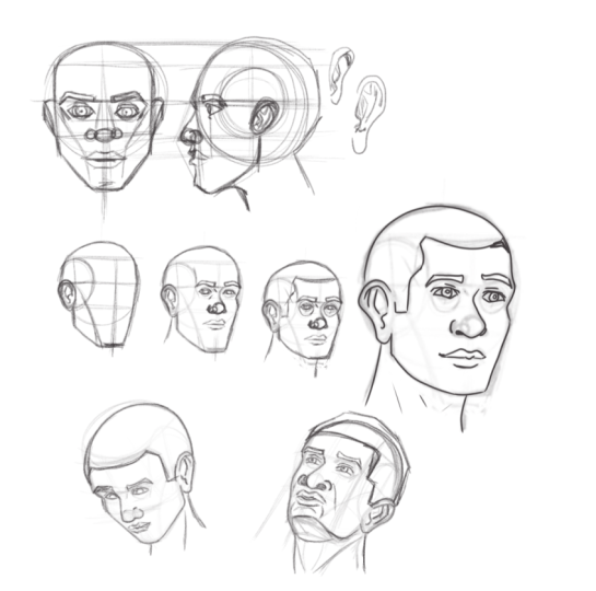
3. Dividing the Head Into Thirds: Okay, So now what I want to show you is how to divide the face in the head into three sections of the three main sections of the face that you should worry about replacement. So we want to do first is draw a circle, and it doesn't have to be perfect. I've yet to accomplish a perfect circle. But one day, and what we want to do first is slice off the sides because no head is completely round. I'm that I've met anyways. And this is probably about 16 of each side or something like that. I don't know the exact measurement. I don't think there is an exact measurement, because what you're gonna do is oftentimes shift this based on the type of character that you're gonna draw. So if you like to add a little bit more cartoon Field and you might shave off more of this area, um, or more round or, you know, whatever decision you make there. But the main thing is this that you're going to slice some of that off and that you're gonna define a line down the middle so vertically, and then you're gonna think about the distance The main thing is that these should be even and probably won't get a completely even version or even line going across. Always struggle with that. But this isn't about it being perfect. So just keep that in mind. This is about getting placement of this and there's gonna be lots of opportunity to refine the work as we go. So I never really worry about this being too overly Ah, correct. In that regard, it's more about the segmentation. So essentially, what you've got here now is you've got the top of this line of the ah circle. Here are oval off to the side. It'll be an oval when we view it from different angles. And then so this gives us our 1st 1/3 are 2nd 1/3 that we're gonna take this distance. We're gonna add that one more time. Now again, this is going to change based on the characters that you're designing. But this will give you your basic 1/3 of the face. Now, just so you're aware what this is, what were we should be looking at? This is your brow line. This would be the nose and then this would be the chin, and they were also going to divide this last part into thirds. So 12 and three, You know what this does? It gives us the top of the lip, the bottom of the lip. Can I Little dimple, the Chander, the the build up of the skin right there, whatever you wanna call it. But But essentially, that's that's the breakdown. We're gonna get more into the separation of the face. I really want you to just focus on the 1/3 so we're gonna do some examples of that right now, But this is the basis of it from afford ah, facing point. And then as you're toe, you know, softer races and we draw it, you'll see that we end up with more the head shape, doing something like this. We attached that jawline. And, you know, this is gonna change based on male female masculine, uh, scrawny, whatever, Whatever you're going for with your characters and the other thing to keep in mind before we get into some examples, I just want to show you that he really want to think about the head tapering like this as well. So that's kind of why we study the skull as well so that we don't get in the habit of just drawing these faces, you know, overly straight up and down from the from the cranium to the jawline, because there's almost always, if not always a bit of tape are there. So I just wanted to be aware of that. So now we're gonna do is we're gonna take the same example. And again, we're just focusing on that idea of thirds in the top line. So, you know, also gives you your ah, your hairline. Uh, And again, these are all gonna float around, but it gives you those 1/3 toe work with. So now let's go and implement this. Let's drop from various angles and talk about that. All right, So now what? This one, we're gonna take the same information. We're gonna do it again, but we're gonna tilt the head dropped a little bit bigger to for So we start with the circle again. So, you know, we know a sphere from any direction. It's a circle. So we put a circle there, even though we're thinking it's a sphere. And on the side of that, we're gonna put our oval. So just so you know, I'm already envisioning where the front of the faces. This is what I'm picturing right there. That's where the front of the face is gonna go. But what I want to think about first is dividing this oval off the side in quadrants so aligned what would be vertically and horizontally. But it's on an angle, of course. And then we bring this line over, and this gives us the center line that we're looking for. That was right here on this side. So now with that, we do it again. We need this line to come over. But one of the things I'd like to pay attention to right here is as the sign comes over, we need to think about a bit of a plane change right here. Okay, so I like to kind of draw that enroll light and bring that line up and then over same thing up and then over. And I could probably make the argument that the brow is a little bit further up before the plane change. So something like that and then a center line for the face. No, you know, you You might look at this and go. We've got more space here than you have over here. And the reason for that is because of foreshortening. So when you're doing this, you immediately have to think about four shortening. Always give yourself more space on the side. That's closest to the viewer. Closer to camera. We're gonna talk about that. Maura's we do up shots and down shots and things like that, but it has to be accounted for. So always keep for shortening in mine and perspective in mind, even when doing faces. Eso Now we had that last 1/3 right here. This is pretty much the same distance, so we'll just add the same distance here and then for the jaw. We had a little bit of a line down and then we start to bring that line over and connect toward our chin There. Now, this is gonna be very subjective to the type of character that we're doing. You know, male, female, masculine, not so masculine, you know, it's all these things were gonna shift based on those characters. There's also a relationship right here to the chin. So it's an important one to note. And then the ear is going to drop right in this lower back quadrant. Okay. Ah, And then as you bring the cranial mass back, it's generally from an angle like that's gonna go pat. You're going to see it past the year. It's a lot of people will struggle, you know, myself included it just depending upon what you're feeling that day, I guess. But struggle, figuring out the exact death that you're gonna get right here. But this base of information will get you kind of all the placement and the the three main areas you need to focus on. And we're gonna get into place in the features in those areas and also using the features to measure the distance from one another. That will really make it a lot easier to accomplish. But this is kind of the starting point. And you really want to practice this as much as possible to ah, get comfortable with it. So now what we're gonna do is we're gonna do a few more examples, uh, with various angles. Let's do that. All right. So now we're going to use this method and draw a few more at a variety of angles. and this exercise very important because what it does is it not only makes you quicker doing this, it allows you to see where you should shift certain components of it to ready for whatever type of character going to draw. So at first we're gonna draw these very boxy and very basic in a primitive way just so that we can really understand how to tilt it and get, you know, the variety to the head shapes that we're looking for. Eso things like up tells and extreme down angles become a lot trickier to do eso You want to really just focus on the basics here, just the separation of the three areas of the face the plane change and then drawn a simplified representation of the cranial mass and the placement of the year. And again, after this becomes just second nature and you've done enough of them, whether it be, you know, 10 2050 it may take your 100 whatever it takes to start filling that comfort zone, then you'll really be ready to start experimenting further. And with that, it will be stretching more proportions and trying things that are just a little bit less than what you would normally feel comfortable with. And that's really the whole process of art anyways is, you know, utilizing these different techniques to build comfort eso that you no longer worry so much about the base information and you start to experiment. You start to be more creative. You start to forget steps and just naturally jumped past them because you no longer feel the need. Teoh have them a Jew, so that's where exercise like these could be Very important. So with that that will complete this lesson. Let's move on to the next.
4. Guidelines of the Face: Okay, so now we're gonna implement that technique into afford facing shot. We're gonna do a few different ones so that you have lots of, ah, variations that you can accomplish. We're gonna also talk about creating distortions and, you know, kind of caricaturing the faces, things like that. But first we want to do is start with the structured approach and utilizes We're gonna draw Sphere, We're gonna put a line down the middle vertically, we're going to chop off the sides And remember, as I bring these in kind of dramas, these ovals here. But really, they gotta gotta come in a bit. We got to really eliminate some of that area. So even if we have to bring that out a bit further erases back so I can see a bit more effectively. It's like that. And so what we end up with is this more long gated, You know, just the sphere on the top, kind of in the sides chopped off. So we've got this line going across this way and across this way we divide that in half, and we add that same distance down to here, and it could just be approximate doesn't have to be exact. Because again, as you get more comfortable with this, you're gonna shift these around another one that just so you have ah, couple ideas Another one that I would do Is this just go half have and thirds. So it's essentially what? We're getting two over here. But this is a quick diagram. If you want to do more of a freestyle method where you just draw whatever head shape you're looking for, maybe you're doing ofher caricature style, things like that. So again, we're going to get into that more later. But I just want you to be aware that there's lots of ways to get there. There's no always always stressed that I never felt there's only one right way to do it. Eso no. What? This? We're gonna add that distance again here I typically visualized, but we'll go ahead and just segment this into I have to take this and segment it into ah, thirds we birth and that one more So we ultimately end up with, uh, you know, the same distance here and again. You see, I pretty much just visualized over here. And that's about words that the main thing here is that it's dropped down to represent Thea Jaw, the jaw line that you're gonna create, and then as you bring the chin over, it's gonna connect here. And then again, we get that representation. That's gonna be a little bit harder to see from this angle. But I'm still gonna draught in. So we've got that segment on the oval on the sides, and that relationship is still there from the center point. So over here it's a bit harder to see and that comes down to the chin just like that. You know, you could probably see that the representation I have here is a bit wide unless were drawn like a football player, military kind of figure, something somebody. It's wider and stature and pretty musk or something like that. Then ahead like this makes more sense. But this is where when we start to create these, you know, we really start to pay attention to our build up. So as you start to create and you get to the really the very beginning and you say, Well, I'm gonna bring these this shapes to the side, her ovals and pretty far, you know, accidentally each time I bring it out to say this area, I don't quite get the the head shape that I'm looking for. So that's where the exercises from the previous examples are so important. Because it's what teaches you how to move these around and get what you're after. And you're only going to get that by lots. Lots, variation. Likewise, you might say, Well, no, I do want to bring that that jawline down a bit further by comparison so that I get ah, more sloping or angular direction to the chin. So if I raise this one back, you see, just by changing that initial start up, you got a very different head shape now. So again, you want you want to play with these Ah, bit so that you can really figure out what works for you. I'm gonna do a bit of a cheat just because I do want this to be inside a little bit more. I'm just going to stretch us and we're do about right there. Hand that's going softer, races back. I am going toe also increase the size now. The other thing that's really important is when you're working with something that's forward facing like this is symmetry. So even early on, you want to get in the habit of flipping the work. Now, if you're working traditionally, this means the use of a mirror. Uh, you see right away, you probably could see it before. I always seem to miss cemetery. Excuse me when I'm doing something like this, so I have to make corrections. But I've also gotten pretty good As I work through it, too. Start flipping the work, spotting the in corrections and then editing them as I draw out the face. So we each have to figure out our own methods for that. But just keep in mind, flipping the work will allow you to see it first generally and then as faras correction methods. You know, there's a lot of things you can employ. You could use grid paper starting out. You could Ah, you know, if you're working digitally, you can just draw a grid over top. A lot of these programs have grids built in, and you can just draw a lot of ah lines, ruler out a lot of lines and use a lot of angles. So angles, triangles, things like that are generally gonna help you spot flaws. And then I'm gonna show you as we start to work in some of these forms. Emplacements of the features will show you how to kind of correct some of this. Okay, so there's the initial lines we started with, so we know that our our nose goes right about there. We know that we're gonna divide this last area into three like this, and we're going to divide, uh, the eyes into an equal thirds. So basically the width of the eyes equal to the width between the eyes, the weather, the nose is generally the width of the eyes and in the mouth with the mouth will go right up to the center of the pupils. So pretty easy to map out the placement. Once you've got this base information, we know that the eyes in the nose line up to the ears. We'll just put in these dis shapes and for, ah, you know, stronger male character. The neck is pretty wide. I'll just put a neck in here just so it's not entirely a floating face like that. And I'm also wanting to raise the cranium just a bit add a little bit more height on the cranium. Upper cranial Mass, I guess. And the other thing that I haven't really identified with is well, at this stage is there's not enough taper to the top to the bottom for you know, a more realistic depiction, I guess. So here's the part where it's like, OK, is it style? Do you want it to be this way because you're going for a certain character type? But I'll be honest and say that I don't really want that. So what I'm gonna do is just distort it. But again, you know, if you're talking traditionally, then it just means being more aware of this during the work up. And one of the techniques that I will generally employ when doing this is in the very beginning. If I want to make sure that I'm aware of this, I'll actually draw lines out to the side like this, and that will help me to just remember to keep it. I on that as I draw. So it's almost like using perspective lines for a building. All right, so now let's go and place the brow line. So again, the brow line for this particular character is gonna be right about here. Probably a little bit higher than most nominees. This kind of stretched out m just to kind of place this. And obviously you could play with the proportions of how this lines up So you could bring this spherical shape out more and in these little hooks off to the side. So play with lots of variation. In fact, that's that's probably my biggest tip for any of this is to really, always very up the way that you align all these little construction lines s so that you can really explore different character types. I know what this We know. That the bottom of the nose or maybe the point of the nose depends on the nose because sometimes the nationals come a pyre. Sometimes they're a bit lower. So we'll say the point of the nose comes out to about right there. We're going to put the top lip here. We've got the lines, the side, uh, to let us know how wide the mouth is gonna be. And the bottom of the lip will go over right about here. And then that little dimple over the chin right about there and just like that, we've got everything mapped out and ready to go will now continue on to the next lesson and continue to refine this. So let's move on.
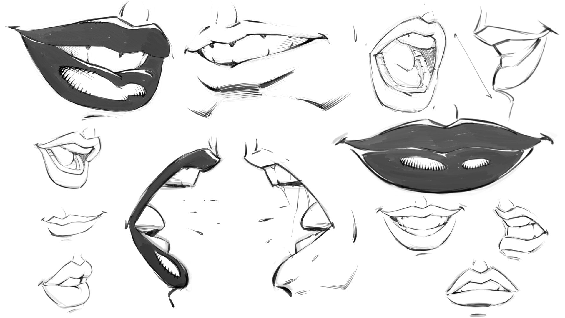
5. Additional Guidelines: All right. So we got a lot of the base information in place. Let's continue to detail this. So one of the things we need to dio I've got the eyes in place so we can draw and just a little bit of openings for eyes. Now there's other sections or other lessons on eyes. But for now, we're just gonna keep him very basic and focus a little bit more on the positioning. So that's already outlined for us right there. You just kind of a rounded nous at the bottom. I would say the quickest tip out give right here is just that the top of the eye on the bottom of the I is a different shape and that it points here. And a dip stone here, but actually gonna bring up this. I don't know if that's the nasal cavity, but get this little pocket of skin that comes up right there. Leave at your nasal or Sinus is Bring that right above there again. I don't want to get too much into detail in, but I do want explain some of it. Aziz, we progressed through here. Now, remember, we get this top section here that we defined earlier for the hairline. And I'm gonna bring that up just a little bit more. So again, I'm always kind of moving lines based on you know what it is I'm thinking that I want to see in my character design just gonna drop the hairline to my best to make it look somewhat identical on the other side, as I mentioned before, Not always my strong suit, but a little bit of ah, softer racing and redrawing. I'll be able to get it there. Okay, So now the other area of the eye that we want to illustrate is the iris, and this is also another 1/3 rule. So generally, the iris is about 1/3 the distance across the weather. The I. So from left to right. So again, it's really neat how there's a lot of these 1/3 measurements and I get this character looking a little upset, and then the pupil, obviously, right in the middle there as best you can get it, and we're gonna get into talking about expressions of the eyes and how to make a variety of looks and things like that. But generally, when you bring the pupil to the top of the I. It's gonna look like more of an angry or sleepy expression. So now that we've got much of that in place, we can take this in soft, erase the artwork back, and everything is pretty much there. As Faras placement goes, it's still very rigid looking, very stiff, lifeless but but essentially just very overly structured. Eso What ends up happening is you have to get through that and say, Okay, how do I live in this up a bit and you start adding in more character traits. So now we can kind of doom. Or of I said, drawing. It's all drawing, but I get a little bit more creative interpretation, get in here and use that initial line Work actually brought the brows a little too close together there. But use that Ah initial foundation now to not think about things like your placement as much you're able to focus a little bit more and just what is this character look like? Who am I trying to draw here? What's this? This guy's story kind of thing? Uh, you know, and then you start worrying a little bit more about things like line wage, you know, maybe not quite shadows yet, but a little bit of shadows in your line. Wait, but I just say stylization at this point, so I'm still moving things around, like I want to see these cheekbones look a bit more chiseled, but I also feel like they're too far apart. So the distance of the I could be very You gotta be careful with that. It's really easy to get that wrong, I guess in your character design, and I could see that happening here. Someone bring that in quite a bit. But again, I've got a lot of that information in place so that it's not really that hard to make these decisions now. It's fact it's a lot less effort. Way to get in here, detail. I. It's a bit The general will make Thea Top island darker just to convey a little bit of shadow there. And since the eyes around it, I generally will put more shadow on the inside, uh, edges. But basically the inside I and then I'll do a little bit of sheeting to the outside, but trying to keep in mind that this isn't his eyes aren't just flat slits in the face. It's really easy to make that mistake and get that kind of look, so we're gonna get more on the rendering. But I just want to run through this out a little bit so you can see where it's going. Drop shadow on the iris, things like that. Okay, And since we brought those cheekbones and we got also adjust to the cranium now we could say that the upper credo masses wider at the top. There's no nothing wrong with that. But it's got at least meet, got a tapering and meet appropriately to the cheekbones, so that might even be too wide. I don't know what Wait and see how it comes out here and the years just get a little bit of shape change in there, and I got to see much of the ears from this angle and keep in mind with each area of the body or the face. I should say that we're going to talk about their separate lessons on each, so this course isn't entirely linear. I mean, I recommend you take it that way, but if you do feel the need to jump ahead and watch. You know the lessons on ISA lessons on noses and brush up your skills. They're more than welcome to do so. So there's there's lessons on everything that you confined throughout. Yeah, so we just keep detail in. We keep adding it, getting in the look of the character that we're after. Okay, so hopefully you could see that by establishing those that base information, the placement of the features. It makes our job a lot easier to get in here now. Detailed the work and just kind of have fun with it. Okay, What's again? What's this character about? What are we trying to convey? What kind of look on That's it. That's that's really all. You have to dio, um, that that preliminary work makes your life a lot easier. And then obviously you check it by flipping it back and forth, and you see, there's some inconsistency there. The heads a little miss shaped right there. I would just take that, you know, some redraws from erases the other way that you can check it really well is to cut it right down the middle. If you're working off paper, same thing you fold paper and half or whatever, and it could be a neat kind of exercise just to see. But I do recommend just flipping the worker, checking in a mirror and then going back and forth and trying to make just small corrections, you know? So if you could just keep picking at it and get Thea, get the things to start lining up while and on. Remember that you don't have to make cement totally symmetrical faces because nobody's face is totally symmetrical. But it's it's a nice exercise to get as much of it is you can in place. All right, that will complete this lesson. Next, we're gonna take this face and dropped from a profile. Use this existing sketch and kind of 80 s and that. So let's head over to the next lesson.
6. Drawing the Male Profile: Okay, so now we're gonna draw the head and a side view or profile and notice have established a perfect square in this blue line and have also drawn lines from the existing marks that we've already created. So we can use this existing face to help us with this profile. Now, if you don't have the existing face, you're just gonna work off this box. But the one thing that we need to be aware of is that I did make some adjustments. You see, it was originally about right there. And if we're going to use that to find the other marks, we gotta kind of compensate for that. But I want to show you a couple ways, One of which is another way that I like to do. These is I'll draw a line in a marked top and bottom I'll mark center because it's always with the eyes were gonna line up or generally, Obviously, there's not an always to any face, and then halfway down to there is gonna be the nose, and then the last part gonna mark into thirds and it looks off. But that's because we established the top lip and that's actually where it would go right there. So this is another quick diagram that you can use obviously a lot less structure, but it does still work. So what we want to do here is if we were to start with that other instance that we used, we would start with a big circle with the oval in the middle. Or I should say, it would be a dish shaped from an angle like we did here before we cut the sides off. So we get that again. We've marked that both vertically and horizontally. And you see, it's pretty far off from what we're trying to mark. Because remember the this was the brow line. This was the I'm sorry. This is the brow line. That's the hairline. Eso This would actually be a lot lower down to here now. A couple of things could affect this, one of which is the overall scale of the shape itself. We could adjust it that way, which I do feel it would need to be larger based upon a profile. Anyways, eso we'd say something like that. You see, it's still not quite as high as it needs to be and Let's check the other mark. So if we went from, we've got the brow, we've got the I'm sorry, hairline. I keep saying that brow and then bottom of the nose. And then we would add that section and get to the chin, so that's about it there. But then there's that compensation of the added, Ah, height of the cranium are the upper cranial Mass, and I just feel that that was necessary for the type of character design that I wanted. Eso that's up to you in your depiction of whatever character going to do again. Remember that these are all kind of floating units of measurement, essentially, so it's It's all going to kind of balance toe whatever you're trying to accomplish with your character designed. So let's softer, racist down now. And let's go ahead and kind of place some of the features. So I'm gonna I'm gonna put the face on this side, pointing in this direction, and what I want to do is just kind of rough end. So we've got the the brow there, and let's go ahead and just draw in a larger head shape first and probably the easiest way to consider this area is that it's a pretty spherical object. In fact, it's probably gonna come back a little bit further. You gotta leave room for the facial features to come out and you're going to get, you know, a dip here from the ah Brow. And then as it comes back out, obviously gonna get the knows. We're just gonna do, like, a pyramid shaped or triangular shape for now. And then you're gonna get the mouth coming out. And then I like to draw just a little bit of it coming back like this so again to simplify at first just this large circle out in the back. Let's just go real simplified for now and then back here and remember, it doesn't meet to the center. It goes past it a little bit. And we know that the ear is in this back quadrant of this. Ah, separation. And we know that the eye lines up to the ear and the nose bottom of the nose lines up to the bottom of the year, and we'll just kind of attached the next shape. I like to draw the neck at an angle, not straight down. I wouldn't say that's a right or wrong, either because you do see some people have a very straight posture, but I think it looks a bit more natural. Teoh have an angular. I also think that it makes more sense it to a curved line here versus a straight line. So these are just little things, and that's a little bit more into the sculpting of it. So essentially, after you get this part, you can start cutting into the forms a bit and figure it out. I do like to place all the features first, so the top of the eye looks to be about right here. Now, one of the things that helps me to define where the eye goes is the mouth. So there's this relationship of the mouth. So let's just get a little bit of us end, just kind of ah, roughly constructed in there. And what happens is the mouth as it comes back. That's usually there's a slight angle from the nostril to the opening of the mouth like that, and then, from generally about straight up, you confined the position of the eye and a reason this is helpful. I see in a lot of art, and I remember having this problem, and I still do at times where I would bring the I too far forward. It's just almost a force of habit. In fact, I would say it could even go back a little bit further. And in the beginning stage of the sketch, it looks like it makes sense. But then as you start to render it more, uh, it looks it looks awkward by the end of it. So that's that's kind of the funny thing about drawing because it can be misleading based on what you're looking at in the beginning versus the end of the the illustration. Okay, so now for the brow again, I'm using the reference that we've already got here toe aid me in this process on the the cheekbone comes up point towards this above the ear. We can remember this from our skull study that it goes back like this and again, this is why the skull studies air so important. They remind you of the shape of the underlying structure, something like that. And we know from the illustration here and from the line that the hairline is going to start right about there. And now, as we start to work out, we're starting to meet more of the, uh, the points that we're trying to hit. You know, not only the points that we've defined from the first illustration, but the box itself. In areas like this, I'm just gonna visualize and look over at the the artwork and try to recreate it in the pupil on the iris. Okay, so hopefully you see and we got to get into the ear. And keep in mind that I'm gonna probably reiterate this once or twice in the course that you're welcome to look at the other lessons. If you need help constructing anything, So when it comes to a portion of the ear, if you're not seeing the shapes properly, jump over to the other lesson, watch that and then come back and things like that. So there's there's this Ah, there's a lot of separation in the various parts of this course and each one will kind of identify with how to draw the nose and mouth and things like that. So it may seem like we're skipping over steps, but you're welcome to jump over the other lessons Okay, so now we're gonna solve two races down and clean it up and try to see if it lines up to our initial sketch and we can make something that looks like, ah, the same character. Okay, so now it's softer races back, and this is where it really takes practice to get used to, like not tracing your old lines. Okay, so it's very easy to say, Well, I've got the information right here. I'll just go right over top of it. Uh, it's it's comfortable. It's easy to do that because it's right in front of your face. So what happens is, as you get more and more advanced in your own artwork, you'll really start to look past it and go well, you know, I see the shape here in front of me, but I mean, would look a lot better if the brow, instead of coming down like this, maybe came. I don't know, down just a little bit more than bumped out right here, you know, whatever. It could be something as minute is that and subtle is that. But I'll tell you a lot of times, subtlety is where your work really improves. okay, Notice. I got, like, this little bump here, so let's just had a little bit of that, because again, we're tryingto hopefully get it to look like this character over here. And I could probably use a little bit bigger brushes. I'm doing this. He's got a bit of a downturn nose and the nationals or about higher. So we gotta think about that as we come over here. So I want to bring that nose up a little bit, but the nostrils up a little higher. So basically, think of an angle like this. And again, those little reference lines can sometimes make a big difference. We'll get that in there. But, you know, a certain amount of this is just gonna be imaginative because, you know, obviously were drawn this character from the mind. And maybe it comes out looking like the other one. Hopefully, But it's that our mess, I guess. And sometimes you just got to do a few redraws to get it right. I see this jawline to needs toe be corrected, even bring the neck back a little more, and I'm gonna try to hint to areas and then have the line kind of disappear a little bit, so it's not. I think it's helpful to not trace everything every line, because you tend to get a a more rigid feeling to the work. And I also heard of the artist's referred to it as letting the letting the viewer kind of bridge the gaps seems to make for more interesting, uh, effect. We'll drop that nostril in there. Well, just do a basic representation. And for the lip, you're going to get a little bit of this Pocono side that little up point. But you're right there, and it meets that other line that's gonna come back on the male lips. I generally will not trace out the top lip nearly as much, probably soft to raise that bag just a little bit. You see, I kind of left it there, but it just again. It's a style choice, but also a character choice, depending upon the character you're trying to design and the look they have. Forgive me if I make any of this sound like these air rules because none of it's really rules. It's more guidelines I think would be the right interpretation of it, but it's there's just so much that can be shifted based upon style and decision making. There's just so many different people out there, right, so you can really stretch the imagination. And hopefully that's what you're gonna learn by these lessons. That's my goal anyways. All right, So now the I could be considered to be a bit of ah, pizza slice something I always see There must be hungry. But essentially with that, even it's it's ah, fictitious. Will representation. Obviously the I, even from the side, view the eyes a little bit more like like, this is slight curvature in there, and you even will see the tear duct from certain angles. But this is a more realistic representation. You start getting into this and you start putting in the edge of the I'm or the wrinkles in the I let all this and this isn't to really teach you how to do portrait. As much of it is to teach you all the units of measurement and kind of get the placement build confidence with that s I'm just gonna go with them or stylized representation. Get the little glare in the eye, drop shadow on the iris, something like that. You know, it's a little bit of hairline, A gamble. Can you use these line breaks? And what you can kind of do here is you kind of look at this and okay, if it's this far here, it's gonna be longer from a side view as it's going back. So the distance from here to here is gonna be longer over here, because of perspective. Ah, but the area where is angling here could probably be reasonable over there because of the angle. And you can map the height of that as well. So if you wanted to, you could draw a line over there that's gonna kind of tell you where to stop that line. Likewise, with this point here, it was kind of neat how perspective works, even with the head, the body, all that. It's I mean, works with everything, obviously. But we kind of take that for granted at times that there's really a lot of information right in front of us that can help us. It's why, if I'm ever struggling with a particular subject matter, I'll draw the most basic version first. Like maybe a profiles are generally the easiest for me to understand and get, ah idea. So I'll start there and then I work out. So that's more of a confidence builder. If you find yourself struggling with a particular thing, just go with whatever is easiest in that particular ah rendering. And then, ah, work out from there. So again, it's kind of giving yourself that little bit of confidence boost. And like anything else, practice is just going to give you an edge to whatever you're doing. So the more you draw these faces and do your exercises, the easier it will get. Like everything else. Okay, so now let's Ah, let's kind of check this So the nose lines up to the base. I think the Nationals a bit high in comparison, doesn't have the same look to this character over here so we could adjust that. Let's try one more attempt there. We can also get rid of some of these construction lines now. Maybe that will help us to see the work of it better. If we missed anything minds above the nose, I guess we could drop those in mark under the lip. But these side marks here, let's bring the nostril back a little bit more straight. If that helps, I think that's a bit better. Yeah, and again it's It's one of those things where you do this. Ah, five or 10 times. You're really nailed the character maybe less times in that only going to make it sound like it's that tough. But But it does require practice like anything else. But hopefully that gives you the units of measurement and allows you Teoh create your own studies in practice with that, So that will complete this lesson. Let's move on to the next.
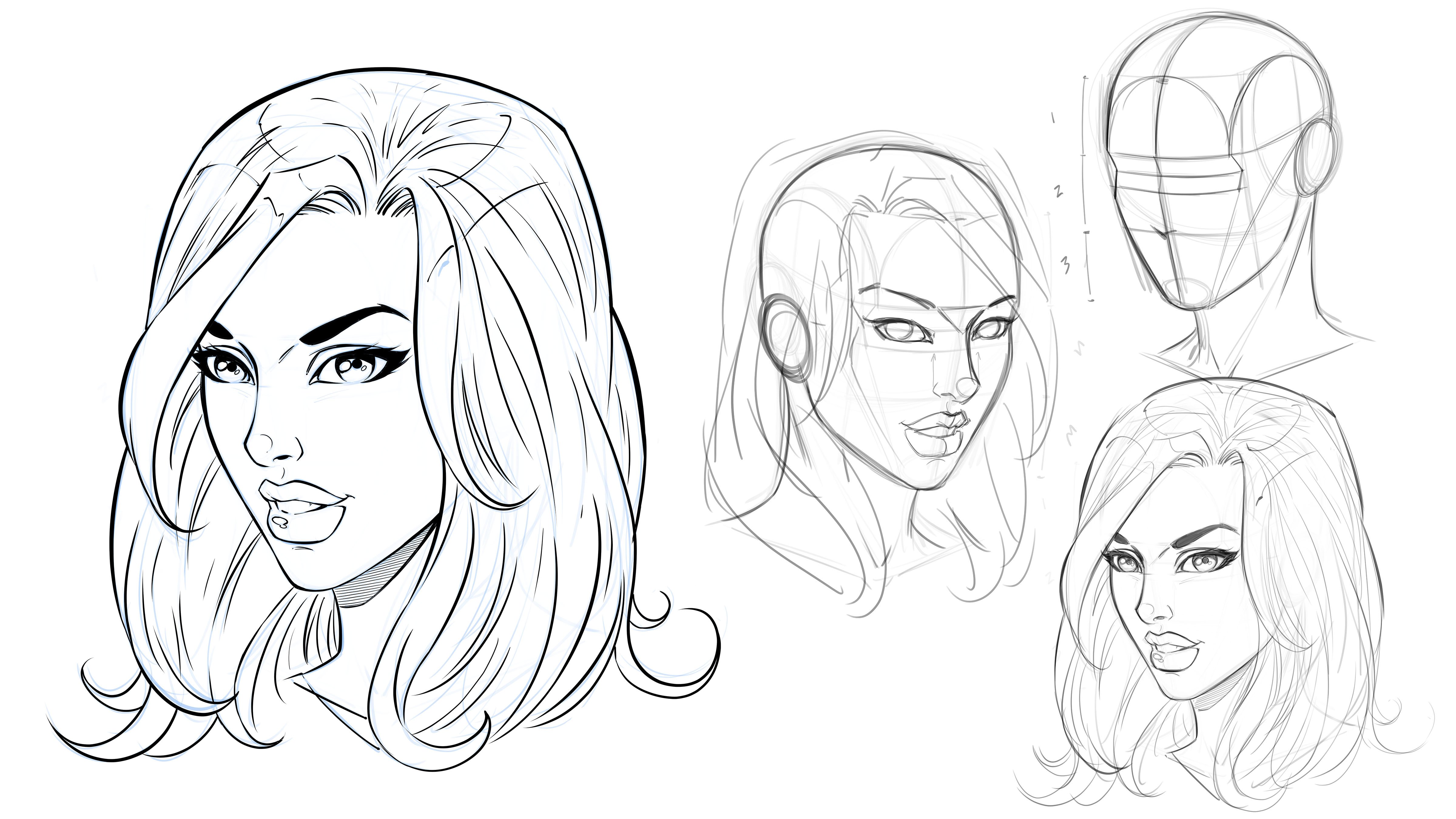
7. Female Face Front View: Okay, so now we're gonna draw the female face forward facing, and I want to start with some graph lines, just some basic lines, horizontally and vertically, just to help with symmetry. So if you ever find yourself struggling cemetery, this is a good place to start. Obviously, you can use up your working Traditionally use a light table in some graph paper works great . Or if you're working digitally, it's pretty easy to do here. So what want to do actually want to show you a bit of a hybrid of the two previous examples that I showed you? So basically, you'll get a nice variety to the way that you can do things. Eso if you like the other example, you could still use the method from the previous example. Ah, and combine it with this one, but or use it for just a female face. But essentially, what I want to show you is the other way where you just start with the circle or a sphere and to draw a line down and you define the overall length of the face. Now this is a little bit more of an interpretation because obviously you could put this line anywhere. But that's kind of the way faces work. Anyways, when you get to the more elongated faces, this line is gonna be lower. When you get to the more rounded faces, the slide is gonna come up. So you still want to think about the sides of the sphere being kind of chopped off or, you know, at least flattened out a bit. Nobody's head is completely round and something like that, and then you're gonna mark halfway down from this line again. This is an approximation. This is a floating measurement because some people's eyes are a bit higher up in their browse a bit higher up eso You're gonna have to play around with this for your own character design. In fact, I think I want to bring this up just a little bit more Bo Here, Let's try that and then we're gonna divide halfway down again, and then we're going to take this last area and we're gonna divide it into 1/3. So basically, the space in between is what you're looking for to be approximately the same. Probably bring this lying down a bit more and again we could divide this in the halfs and I would say even a little bit higher. But that's gonna be the hairline. So there's our units of measurement, and as we race this back, you know, we raced back, decides that we no longer need right there. And we saw after racist down, You've seen my lined Even my circle is a little bit off one side of the other, so let's see if I can correct that a little bit. First, bring that over just a little bit, trying not to grab the circle itself. So that's the other thing is when you're doing this, you're constantly trying to spot errors, you know, even in this beginning state, which it's not that big of a deal in the very beginning, because you got so much room to correct it as you illustrate. But obviously the things that you can head off like stop in the early onset of your design process are going to save you heartache later. So there there is a good ah method to that as well. But mainly, flipping the work early on is gonna help you a lot and then, you know, using some sort of graph like we've got here. You know, you can get really extreme with it and measure from one side of the other. If you are working digitally and even traditionally, you can just create half the artwork flipping over. You know, you really want to try all of the things at your disposal to get you know, the best artwork that you can. And then over time, you're gonna need less and less of those techniques as your your skills and your eye for this improves. Okay, so now we need to do we know our chins gonna go here. We need to connect us. But we need again drop it down a little bit on each side notice. I'm also trying to get that tape or in like, the previous example. I really want to make sure that upper cranial mass is wider. So I'm bringing that in intentionally, even at this stage. And I want to use a curvature line. But if I'm if I'm worried about cemetery and let me actually let me do that again. But let's go ahead and purposely use angular lines because again, this is where if you have a tough time with the symmetry this is things like this. They're gonna help. You know, you could get really into this and draw a cross sections and things, But then as you go to make this look more organic and realistic, you're going around this line. But you're gonna have that angular line to kind of hone your ah, bring your you're rounded line into perspective essentially because it's really easy to take curvature lines and lose sight of the way they're heading. Something about a smooth curve is just a little bit harder to see direction wise in a straight angle. We can soft Therese that back. Now we've got the smooth curvature of the jaw and we're gonna go in place the features now . So again, this is our brow line. We put a line across here and it's gonna be the brow line, or the eyes were going to make that distinction here in a second. As we get some of the other features in place, parents will place the nose right here. We'll just do a kind of a bottom shape of the nose just to get an idea for it. And then the top lip will go here again. Just a primitive shape. We use kind of that stretched out him for the top bottom lip, just kind of around it stressed out you are U shaped into that little temple or poker. You get right there from the chin. Okay, so now the distance from the nose, uh, generally is equal to the eye or also just the width of one eye. So you can you go with either or prefer to say, the width of one I is equal to and I because we may want to give her ah, bit smaller nose or something that for stylization. But generally you can also bring that distance down and find the sides and the nostrils and then likewise the mouth up and find the center of the eyes or general where the pupil is. So again, these are all just those those guides that we talked about for the years we're gonna have those come up to the my eyes and it's gonna be a dis shape in one way. I like to do the ears is kind of this tapered line that comes down meets to the bottom of the nose or maybe a little bit higher. I don't want to give her very large ears. But you know, when you use that as my reference point the bottom of the nose and then from the sides here I tend to think it looks better or looks more accurate if you get a little bit of the bottom of the ears showing as it curves around. So you know, just that little bit of transition and maybe a little bit of that connection point to the side of the head. It's like that. Okay, so now we've got the base information in place and, you know, you can see there's some things that need to be corrected. This jawline still a bit off so we could softer race that and again, you want to just continually try to clean this up you go and get it. Ah, close to correct as you can s so that when you do go to start rendering your character, the confidence is there. All the information is there, you're ready to go. And you don't have to think about structure anymore. You just think about the finish work. So the more that you can stage your work the better because it takes a little bit of the brain power out of the deal. You can just kind of be creative and enjoy what you're doing versus thinking about everything. Okay, we'll go in place the neck to generally the neck. Uh, you know, this is open to debate, obviously, but I'm gonna say right around the middle of the eyes for this particular character type. But obviously that's got a lot of variation as well. Just something like That's the head doesn't look like it's 40. We could also bring down this facade, draw a line a bit as well, so this is gonna vary a lot based on the character. Let's go ahead and try it. I'm always, always nudging lines around, always trying to find just the right design for a character. I think I might elected before the other way, so it's bringing that back, but I'm always experimenting. So now let's place the shape of the eyes and with the female eyes. I also like to draw a little a light line. I'll throw out a little bit darker than I normally do, so that you could see it real well. But I'll put this angular shape or line I should say into place so that as I draw the eye, I start toe, make sure to get that back of the eye up higher. I put a little point there for the I lives, just something I dio. And another trick, I think that helps with cemetery A little bit is to go from side to side. So I do this with eyes. I try to do with as much as possible when I'm aware of it. But I do think that it helps because if you draw the entire I, for instance, in every aspect of it the iris, the pupil then go over to the other side. I just think you have a lot more room for error unless you just don't struggle with that, in which case to whatever feels right. But and again, there's that rounded nous to the front of the I, and then that little dip that occurs as it goes into the teared up. Bring that back a little bit of the eyelid right there, and I feel like the eyes could be a bit larger, but I'll probably do a lot of filling with the eyelashes, so we'll go with this for now. And then we can get rid of that line because it obviously looks pretty strange at this point with lines one through the middle of rise and we give it to some of our construction lines since we won't need those now, okay? And then for the eyebrows, you know? Ah, lots of ways to accomplish Issa's. Well, I do like to think about it as a slight angle up, like this way that I like to place them. And then I kind of like I mentioned before. I don't do this is much on the female characters, but you could do the rounded shape and then a line over, if you need that, had it assistance with placement. But I will generally just draw heavier area like this and then have it been out to the sides. So again, have your area like this, then out to the sides. And then we get that little browned in right here from the brow meeting to the bridge of the nose. Okay, so that gives us our placement then. Obviously, we've got the hairline to think about. I'll just draw a shape of a hairline. We won't get into here right now because that will be in the other lessons. But we'll at least get the hairline in place like we did in the other character, so that will give us our overall placement of everything will now take this a step further and render out the details. So with that, let's move on to our next lesson.
8. Continuing on Drawing the Face: Okay, so now we want to do is make any final adjustments. And we got to remember, this is a mannequin, basically. So it's not perfection, and it's not, uh, Timmy kind of finality, right? So what we want to do is take advantage of every opportunity to correct anything. One thing that I see it's bothering me is I just feel like the eyes were too high up, so I'm gonna drop those down. I do got to be aware that if I drop the's down too much, and it also may be adjusted years, but I don't think it looks bad if the years go above the eyes just a little bit. But I feel like these eyes need to be lower. Gives more information to the top of the head, which I feel like needs a bit larger presence by comparison, Um, so essentially, that's just one of those things where you have to continually make these judgment calls. The other thing that I'm seeing is that I feel like the eye shape wants definitely different than the other from one side of other. Some of the maneuver that a little bit and as I get in here. I'm gonna try to make these shapes look a lot more organic feeling. I feel a lot more organic, I should say, and I'm still not entirely happy with the the jaw line, but I think that might be from the entire presence of the face. Don't need to be a little bit lower. So let's do this. I'm gonna take all this information here. I'm just gonna drop it down. It's like that Even the slight adjustments can make a huge difference. Differences as you progress through the work. And again, if you're working traditional, you're gonna soft to raise from redraw stop, but continually looking for ways to improve the base model and keep in mind a lot of his work can be reused. So if you take this and you get a face that you really like, say that, you know, use it, use it for any time. You need a ah, base model for a front on shop. So let's bring that over here, make a copy, and let's go and clean this up soon. I'm gonna softer, racist down and actually, let me flip that real quick to see what I can see. So Yeah, they're the jaw lines. A bit off eyes are a bit off once more wide open than the other. So I just like to make these observations another thing. If you if you are working digital, just show you just in case you are. Uh, if you are doing a straight on shot on, I shouldn't just say digitally if your work with paper, you're just going to, uh, you know, even cut the paper in half, make a copy. Flip it. What have you got to dio? You can even fold the paper in half and redraw, uh, to the other side. And then you know you'll need a light table to do that. But there's lots of ways to accomplish its obviously. But with digital, it's real easy. You can just take the one side, and actually, I want to make sure I picked the side I like the most. Yeah, I think it's probably that side. You know what? I'm gonna actually go with the other side to do that. This could be a neat exercise to kind of see you know what you like about your work? What you don't and what you're trying to correct. Drag this over. Let's flip it. You want to do this early in the stage of the drawing because it doesn't work. Eso wealth rendering. So that's okay, actually think I want to try the other side now, So this is just experimentation. You know, some some artists won't prefer this method, and I understand that, but I want to make this is well rounded for multitude artists. So if you don't, I particularly want to do this method. You could just skip ahead. But what it does is it just allows you to hopefully see the differences from one side to the other. You know, if you have problems with symmetry, things like this will expose it. And then you can at least correct it temporarily until you get better at ah, no longer needing this This helping hand. Okay, so there's the face perfectly symmetrical now. And let's go ahead and soft races back like that get rolled nice and light so we can come back in here and clean up the work. Oh, at in the eyes, things like that. So again, the eyes are 1/3 try to go toe, you know, and if not a little bit larger. I tend to make the female irises a bit larger, just for style. Choice. Sometimes the pupils is while depends on the particular look I'm going for and again that round over before it dips. And for the to your dog, her tear duct, I should say, a little bit of shadow you get from the inner part of the eye. What I'll do is I'll first give everything at once over so I don't get in the habit of detail ing one area too early on. So what? The knows I'll do keep in mind that in a lot of knows poses you're going to see the Nationals. I kind of I didn't do that in the previous one. I started do that there, Uh, but you do have to be aware that most knows ah views. The nationals are visible, but it's kind of a bad habit to get into to not draw them because it is easier. It's easier to just put a basic shape in there. No, that's your style. Then that's up to, you know, big. No harm, no foul kind of thing. But ah, I think that it can be a bit of a lazy option to just draw that basic shape in there. So I'm gonna bring that bottom lip rounded up. So I always want to extend that top lip out just a little bit more than the bottom lip, and we'll talk about that more in the lips section. Why, that is, or why I tend to do that. Okay, so there's that. I want to bring out these cheekbones. Now, even though I'm gonna go with just a basic line, I just want to make sure the cheekbones are more pronounced. You can do that with line way. You can even cut into the design a little bit like this. Whatever your preference there, I'm gonna just do it, lie in wait and then bring it in. Actually want to bring the the chin for the female, pretend to do a lot appointed, but a lot more narrow in the mail chin. So I think that's ah, pretty quick. Way to show male to female, then. Ah, the presence of the eyes being larger to the face. I think that helps smaller ears. Generally makes you gonna bring these down just a little bit like that. And another thing ah, that I just tend to use for the difference from male to female is just overall softer lines . So I think I've already mentioned that, and I'm probably going to reiterate that multiple times. So forgive me if it seems redundant. But it's probably one of the most significant things to show male or female, just a general softness to the work for a female on a bit more angular Brigid look for the male characters seems to be pretty pretty efficient for conveying that. And this is probably to the level of where I would say one more, um, level of refinement to call it clean lines, you know, obviously adding things like the hair style clothing choices, whatever it is. But but I would generally refine it one more time. Call that finish work. I'm gonna make that top eyelid a bit, or waited by comparison to the bottom, maybe a little bit more. Drop shadow onto the sides, and then I personally like to stylized the eyelashes so you can draw them individually or with the shape. I'm just going to use a shape here for simplicity, and you can also make the judgment of whether or not you want to show the bottom eyelid ridge from an angle like this. Ah, lot of times you are going to see the ridge. In any realistic depiction, you're almost always going to see the ridge, at least of one. I let if not both or sometimes both sometimes just want. It just depends on the angle, but but an interpretive drawing or stylized renditions like this and kind of just get away with filling it in and showing more the the clarity or the contrast. That's what I was looking for. Okay? And what's going to give us some pupils and then the drop shadow on the iris? So just remember for more alert looks that people is gonna be a little bit lower and then for more tired, less energetic looks or, you know, even ah kind of a sexy look or something like that. You can bring the pupil up to the under the top pilot a little bit and a glare off to one side. Generally, the glare is it meets the shadow, and sometimes it's actually encompassed by the shadow. So it's true great to just study eyes as much as possible and see all the difference is you see, this is just kind of a general way that I do I z sort of ah, kind of from memory things so that, you know, when I'm not looking at reference, I could still do what I gotta do. But uh huh You know, you always learn from studying eyes. I always recommend studying them as much as possible. And there we have it. So that's kind of ah, more rendered. Look to the ah female face. And now it will do. Is we like the previous section or previous lesson will move this over to the side and we'll do a a profile view. So with that, let's move on to the next lesson.
9. Side View of the Face: Okay, so now we've got the same box shape to start with have also added some reference signs and know someone was some more. So there's essentially reference lines from some smaller details, like obviously the hairline. But then the part it receives back Teoh, I did the top and bottom of the I top of the brow, you know, so on and so forth. So there's a few more than there was initially in the other male version. But we're going to now do the same technique where we've got the box to define the top and bottom of the head. So we can just kind of start out by roughing in the forms. And I'm actually going to draw pretty big circle here and try to take up more of the area because the head itself, with the features, does encompass or Philip, most of a ah squared off region. So that's what I want to make an example of. So we get this nice large circle in there. We're not gonna worry too much about this shape. We're gonna just jump right over to adding the the front facial plane eso essentially, if the brow is here and we know that nose is gonna come out and then it's going to taper backs. We're just gonna draw in these basic shapes and again with the guide that we have, you know, you could almost perceive right here that the brow comes out and dips in right about there somewhere in that area. So if that's the case that it's gonna dip in over here somewhere in that area. So then a kind of triangular shape for the nose, making sure that it, you know, the probably the outermost region of the nose is probably right there on the character. So if we're to come over this way, that needs to come out to about right there, whether or not it, it's more shallow of an angle. From this way, that's that's up to you in your ah depiction of whatever character you're trying to make. And then we just have to keep in mind that the top lip comes out here and again. We want to be aware of that slant that you get. So the top lip is generally out just a little bit more, not always, And then you get the bottom lip like this and sometimes again, not always, but it'll round back and connect to the chin like this. So you got a pretty good angle right there and then a rounded nous for the chan. Depending on the type of character you do, how rounded that is or how large how the chin is that's up to you. So now we've got also make some some idea changes about the nose. You know, how far does that round in? We know the brow is somewhere right around here. We'll just continue to kind of shape that and we know the head goes back. Probably tapers off. Uh, round over probably tapers off somewhere where that hairline is. So we'll go back like that and then as we get over here, we've gotta figure out where the head, you know, the back of the cranium kind of comes in and then connects to the neck. Usually comes on a little bit more noticeably on the female, and then it's swoops down with a kind of curved line Again, I like to draw them a little bit more curved and then up and down. So now we will do the divide of the the cranium in this way so we can kind of place the air . But we don't have to do this. I just wanna see if we can still line it up this way and that you're should fall some point here. Remember, it's got a bit of a tilt to it like this. It also is generally wider here and more narrow at the lobe. So you kind of do something like that. Eso We know that the I is gonna be the top of the I is gonna be right about here. We haven't does designated the positioning yet, So the here is actually a bit high, but we see here if we bring that line over. But it was high anyway. So really, that's where it's kind of tricky to use ah, variety of these measurement tools. But I want you to be armed with as many of them as possible because I just don't always feel like anyone Method will be suitable for every character. And that, coupled with the idea that as you get more and more confident with this, you're going to use parts of certain methods and kind of do away with others based upon your You know what you relate well to and what works. Well, for your style. I suppose so. Now, with the I, we know that the top of the I is here, okay? And we know that if we draw the mouth in with Thea relationship of the nose like this, there's that slant again that we talked about. We just kind of get a top lip in their better look a bit sad down turned mouth, but the shape of the bottom left and just gonna kind of sketch us in real quick. So we get that relationship there, and then we can go up from the mouth, generally pinpoint about where the eyes go a little bit further back. So I think I'm gonna extend the mouth back a bit further and then with the brow again when you start with a ah pretty hefty line and then around back. But the thing I like to think about here is that you have to perceive Okay, if the brow comes all the way over here, then get narrow. And I can't usually perceive that this is the area where the the plane change occurs in the face like this well, something like that, Really. It's kind of more like this, I guess. But essentially that. There's that plane change right there. And that's where the brow typically had to narrow as it recedes back. It's a good way to outline the face, but here we have to perceive that the thicker area is not more in the front or this side of the plane change. And then it tapers off, you know, So maybe you get a little bit more visibility of that taper than you do of the thicker area , the crowds hopefully illustrating for you again the hairline right here. We have done a couple lines, so we know that we can draw on an angle back to this line right here. And it's getting a little messy. So miss softer races back. Hopefully, you can discerned what I'm drawing here, and we get rid of some of these heftier construction lines that we no longer need. Okay, let's try that again. So again, the round over the prow right here, the nose in the way that it kind of, you know, maybe tips up depends on the character knows. I think that's about what the other ones doing trying Teoh picture. These characters look somewhat alike. Should be the same character, obviously. And the mouth we just have to kind of guess there on When we bring the jaw line up, we know that it drops down a bit here, that it's past center like he already is on. Then you know, the round over is totally up to you as faras again, the character type. So some characters have amore defined, distinct draw a line. Others is to more subtle, round over, others more narrow eso. There's just variations to everything, obviously. But what we do know is that it meets the chin right here and that there's gonna be a bit of , ah, visibility underneath the neck, even if it's slight. And as faras the neck itself. You could generally kind of draw line up to the front of I something like that, but again, that's going to depend on the position, the neck and lots of variables. But you want to always study as you're creating your your own work and as your should even do draw throughs of, you know, photography and maybe of even art styles just for studying sake and just draw through and see where things line up. That doesn't mean that that has to happen in the very next character you draw. But the more you pay attention to that generally the better ideas you'll get in a again kind of built confidence with what you're trying to Ah, to do here. So we'll show the top I lead like this bottom of the Ironman ever round up show a little bit of that bottom lead but will probably I go with stylized I so again, that salad brow and then haven't taper off and get thinner you know, perceiving some sort of like plain change something like like this here. So I'm just kind of imagining that shape as I'm illustrating the other other parts. We're just gonna give her ah, regular kind of shaved hair cut for now. So I'm gonna focus on a hairstyle because again that will be covered in other lessons. Was this tapers back again? We can kind of perceive where it is right here. Draw from that model about right there handbag. We'll get in some of the shapes of the year. Remember the sea and why what's recovered? Another lesson, but it's basically a C. And why shape that you see in the air here is always tricky. And then the I just stuff some like that and sometimes you get that other eyeless eye lash , you know, aside and just like that, we're starting to get the side view of the female face. So we can obviously keep soft racing this and you know we can give it of are really didn't need the grid pattern as much, if at all, for this. But you know, I always look at it like more sketch lines, whether it be grid patterns or just ah, the sketch of the work they're putting down. Always feel more more is better, you know, if you have to just lightly erase more of it off the page. But I try to keep his much of that information on the page for as long as possible, because I just feel that aids me in the process of figuring out what I want to see on the page. And then once I'm committed to the ideas that I've put down, I'll do one level, one more finish level of render work and kind of bring all those ideas together. But yeah, I would really recommend getting very comfortable with seeing through your your own sketch lines. I was trying to clean that up a little bit more. It still gets, um, bad spots in there. And I think the character, the one on the left looks toe, have more full lips. And obviously I haven't fully detailed the eyelashes like I did in the other side. So let's see if that makes a difference. Put these heavier, stylized eyes in there. Actually, people would be lower. I think the lips look a bit more full. One left. So this is where practicing again, making the to look identical for, you know, like the same person. You just gotta practice that get closer with each attempt and there we have it. So there is the front and side view of the female face, and let's move on to the next lesson.
10. Final Adjustments: Okay, we're back here for one moment. I actually want to show you how to edit this one more time. A couple things, right ear looks really unfinished with which bothers me. But also the nose just looks too long The bridge of the nose. And after studying it further, I can realize the and everything's higher. So just some mistakes made throughout the creation process. And I think the most important thing to know when doing this is that if you're constantly being aware of ways to improve upon the work, ah, and maneuvering things that you can hopefully spot things like this and and you fix the work without too much loss of time, So we can obviously just softer race for me draw. We tried just moving down the I also feel like the I. The eyes just don't look as defined because they do over here. So I'll try to add a little bit more. I think I lived like that. So again, shortening that height of the nose, I think helps we could also make the lips look more full. But I actually just want to fix this ear so some of the shapes look a bit confused in there and the ears there. Uh, it was pretty complex by themselves. There's just so much goes on there. It's like, Come back this way There's Ah, usually a line ridge that goes on like that. Another trick for the year we're gonna be getting into that and other lessons is Ah, lot of people will do it downwards thumb. So it's like a thumbs up. But pointing down so any of those little devices you can use to remember the shapes could be really, really helpful. Big time savers cool shadow on there. But a lot of times, whenever you're trying to get a likeness like this, it's very much just a process of reevaluating the work you know, it's also why it's important to bounce ideas off others in your you know whether or not you're working at a creative setting. Creative team are just friends and family. Sometimes we'll spot things that you're missing, but it's ah, there's a lot of tweaking when you're trying to do that. So one of the best exercises to just try to draw the same character on a variety of settings, angles and expressions and things like that and, uh, you know, you'll start to hone that skill. Okay, so hopefully that looks a little bit more like our original concept over here. I think that knows, could still be interpreted a bit differently as faras the shape. But I think that ah, that's close enough. And that gives you, uh, the way that I measure out of face and how I constructed. And that's the main purpose of this. So what? That will bring this to a close now and will now move on to the next lesson.
11. Face on an Angle: All right, So now, in this example, we're gonna draw another face, this time on an angle. So again, we're going to start with the basic circular shape or sphere. By time, we had the this shape to the side or oval. And now what we've got has the representation that this face is going to be on a slight angle. We're gonna try to keep it relatively straight. I see nothing is entirely straight with the face, but we'll put a slight up angle right there for a horizontal separation. Bring that line over and then again, bring these lines over again. Can kind of perceived that there's a bit of a plane change right through here. They were gonna take this distance, add it one more time to create our 1/3 of the face, and then we're going to place it this shape for the here somewhere, back here a little bit further back than the perfect quadrant. Anything, especially this angle, because what happens is the jaw. And we're just gonna kind of visualize this and added in the jaws just a little bit past this and ear generally connects right behind the jaw. Not really on top of it. So then, as we bring this Ford, we'll just kind of, I guess a little bit, but will also bring this relationship line from the center point down. This will help us visualize our chin, and this is gonna be a little bit more of a masculine face. So what will happen as this area here is gonna be wider? This area here from here will be a bit more square. So the more that you tend to bring this down and square it off, the more mask on the face will look likewise for more feminine approach. May want to bring this more rounded and a little bit more point to the chin. Okay, so now again, we can bring this line over kind of visualize where that other bottom part of the jawline might be. And I would say the trickiest part about this particular type of angle is how much to really condensed down this side of the face. And this is something you just have to experiment with because as the face tilt more, this side over here is gonna get a lot more constricted. So we're just going to start with something like this and probably bringing the side in a little bit more. And this is just representation at this point, so all of this could be maneuvered around as we draw through it. Let's bring this over here. That will be our starting point. Can we make a copy of this? And like anything else, I'm going to softer races down and kind of pick through what's here and we'll start placing the other features So again, Like I said, I'm gonna be very careful and keep adjusting this side over here. So I'm gonna establish a brow, a cheekbone and things like that. But I may bring that information inward more. The thing that I think is probably the best to get in early on at this stage is the nose, because one of the road easy things to do with the nose get in the habit of always drawn the knows something like Vest, for instance. We're just gonna draw a shape in there. And although there are potentially noses out that looks like that, it's generally not representational of what's more common? So what I like to do, Let's get in this separation again. Remember what I said about there being a lot of triangular shapes in the face. Likewise, that can be said here. You can also use that Ah, circle shape. We talked about 1/2 moon and then angles outward to kind of visualize the change of direction there from the brow. But you get a bit of a triangular shape here and then a triangular shaped here. But it's good to really bring this nose out. And I would say even over, overdo it a bit try, you know, try really playing around with the intensity of this shape, but make sure to really bring it out on an angle like this, because that's what you're going to see. And the more that had tilts, the more than knows is going to really kind of blocked the other feature, especially I. We've got to really pay attention to areas like the where the brow comes and connected to the bridge of the nose and comes down. You can start with a basic kind of pointed shape, but essentially that the point of the nose will come out and kind of do something like this , and then the nationals will flare back and they'll be a bit of a wedge shaped like that. So remember to start angular if you're still trying to figure out these forms and then kind of work from there, Uh, and, uh, it's usually a little bit easier, but triangular and organic. But I always find angular allows you to be a little bit more, uh, correct with your perspective that you're trying to establish. Okay, so with that, we're going to establish our remember, our bottom of our nose was this line, and we're going to divide this area into 1/3 like that. We're gonna put that top lip right about here again. I'll start this overly angular just to get it started just to get the base shape in place. But the bottom lip here, somewhere around about and that little temple of the chip. Okay. And remember that we can use the nose to kind of direct us to where the eyes are. We do have to perceive a little bit of fourth perspective on the other side of the nose here because the I is probably gonna be, if not touching, it's gonna be a little bit hidden by the bridge of the nose right here, and that's where generally I'll place the eyes and then I'll probably bring in the side of the space a bit more. So the distance between the eyes is equal to one. I again keeping perspective in mind as well, just getting a basic eye shape as we're typically a little bit more rounded on the top than the bottom. But that's gonna depend on the angle. You're looking at the face, so the more that you're looking up at the face, the bottom of the eyes will become more straight. And likewise. If you're looking down with the face, the bottom, the eyes will appear more rounded. But essentially just have to remember the eyes spherical behind the eyelids. So you want to cancel. Be aware that and kind of influencing that, letting that influence you as you draw that in member of the nasal our Sinuses, I guess again, there's that triangular shape that you can kind of use tow line those up. They're not always very evident in most you know, in some faces, but if you want that in your character, you're gonna just kind of draw those in in that particular angle There's also a bit of, ah, spherical or oval shape to the sides of the mouth, like pap. Okay, so we've got our air shape, which again we started just a basic disk. And remember that it's on a bit of an angle like this that generally a straight up and down kind of oval. It looks like a bit of a tilted, uh, kind of shape, and we're probably gonna add a little bit more upper cranial mass to this character. So we just kind of raised that up a bit. I think it's gonna Whitmore, uh, or natural on. And that gives us pretty much the placement of all the features. You know, we can worry about some of the plane changes of the phase, things like that. And then as far as the neck, the neck will come down. I like to draw it on a bit of an angle, so it's gonna come down like this behind the ear and somewhere in the middle of the face. This is a more masculine next. So obviously the the thinner the character, the more this will shift back, you know, a way back to probably back to here in a really skinny individual, but we'll go with a little bit more masculine approach like this. Okay, so that will give us our step two. Okay, that's couldn't move these over a little bit. And take this 2nd 1 make another copy. Okay, so this is pretty much there and ready to start rendering Andi still making adjustments. But, you know, just keep paying attention to the angles that you confined to make it a little bit more simplistic. Remember that the middle of the eyes will give you the sides of the mouth approximately like that. And obviously a lot of this could be moved around, so he's got a pretty big jawline and chin that could be adjusted. Now we still get the hairline to, ah, put in place. So just again. Start off. Kind of angular. Just figure out the basic shapes, have it taper and go around that year. And I still feel like I could still add a little bit of create. I'm definitely gonna add more with the hair as it's applied. But that's really again. Where I just wanted to be in the habit of realizing that a lot of this information is just reference at this point. Now, the more you get used to doing this memorial kind of jump right into what you're looking for quicker, obviously. But in the very beginning, this is all just to kind of rain. You're your style and rain your your perception in of the character that you're looking for and keep making adjustments in tweaks as you as you get through it. So the iris again is 1/3 across approximate of the I. I like that in the people and ah, trick for getting the pupil plays correctly because you can see that's that's quite a bit off right there. I'm actually start over with this and show you real quick and then we'll time lapse the next part. And I'll render this for you to show you the ah, the finish work that I'm going for eso now extra Let me go and zoom in here and show you what I'm talking about with the eyes. So again, you got to think of I very spirit Klay. When you're doing all of it, when you're doing the shape of the I, the eyelids, the bottom part of that, you know the bottom islands, even the wrinkles around it in the brow, everything. So one of the ways to kind of place the iris and even the pupils is the kind of draw a bit of this kind of cross section and again with kind of rounded lines, you can even ah, lot of artists will go as far as to draw the sphere right behind the islands to really help paint that visual guide. Ah, that these air not flat. But then, ft, do these cross sections you can generally place the pupil on. You could start with maybe a smaller dot to check, uh, center center value and then, uh, draw your your iris around that and this is always a tricky thing. And again, you have to think a little bit like this. Ah, this iris is now going to be more oval shape from this angle. Was your increased the size of the pupil? Just be aware that and generally as you render this soft erase and redraw, you can adjust this cause. You see, there's a little bit of distance difference from one side to the other, but it's just something that you just have to keep playing with. In fact, I think the iris on this side needs to come over about here. So again, this is where I'm just gonna just as I do the rendering. So there's there's the general starting points Got all the major placeholders for the face . Now go in time lapses and clean up this work and show you what we come up with. Okay, so now that we've got the base structure in place, we can start to soft, erase and redraw through this and try to make this look a bit more organic and give it some life notice to him creating these angled lines to align the main features. So things like the eyes, nose, mouth This really helps on an angled shot like this to make sure that everything is on the right tilt and that there's another feeling of symmetry to it. So you have to keep in mind that the structure will help you with things like symmetry, alignment, proportions. But you also have to take it to the next step, where you draw through it and you soften it up with organic lines. I think it's also very helpful to play around with those differences and try variations where you doom or was structure and then mawr with organic. And you really Matt the differences because there's times when your characters look a bit too stiff and lifeless, and that's generally because you're focusing a little bit too much on the structure, and of it on the organic lines will tend to soften it up. But then you've got to make sure not to obviously go too far in that direction, either. In the future, lessons will be covering more on the organic approach in a little bit less structure, so you get to see what I mean there. So try some variations of this that should give you what you need to get the angles and the features and place. Obviously try to develop different characters over the same mannequin typos and see what you come up with, and that will complete this lesson. So now let's move on to the next lesson and continue on
12. Downward Angle: Okay, so now in this lesson, we're gonna do a downward angle, and we're going to start again with the same kind of base set up a circle. We're going to immediately define how far down we want the had to be viewed at. So I'm gonna start with the kind of a brow line or eye line, and we're gonna put the oval over here. But then we're going to use that to kind of find our Segway air quadrants over here for the over, which will give us our air placement. He won't immediately defined center. It wasn't like this. Could be a bit of a tilt in a downward perspective. So this will now give us as we come over this way, we'll give us our hairline roundabout in that area in this bottom part of the oval will give us our approximation for our nose, and we're just gonna add this distance. But keep in mind almost like you could see here. It got a bit Ah, not as tall compared to here. Same thing here, So a bit more shallow again because of foreshortened. You kind of want to do that because if you were to make each one this length, you're gonna dip with too much information at the bottom and you're gonna have to pull the face back upward. I think so. Eso No, we'll do this now. This is gonna be a female pace. So I'm immediately going to go from the ah, larger cranium appear down to ah, more sloped pointed chin. So I'll just draw that line right there. And remember the relationship from this area down to the chin. And I'm gonna bring that and closer because again, I'm tryingto keep the jawline more feminine. And then we're gonna drop down here just a little bit. We could say probably half of that. Maybe a little more, but with around over. And I'm just gonna connect that to the chin there. So that's our initial start of it now. Another thing you might want to test. I know that in the previous examples, I kind of flipped the work after a little bit more structure, maybe, but just keep in mind that just flipping the work is just a really great habit to get into regardless. Ah, and you want to try to spot flaws is early in the process is you can, even though this is just a initial template to really work from. But you might notice things that you know are consistent within your work. Like maybe the brow is out too far. The alignment of the eyes to the nose and kind of like the previous example. We're going to use some lines going across this way. We're gonna line these like this, and this could be tricky to do so. If you're working digitally, One of the nice things that you can dio is create one line, another layer. However you want to do it if you're working traditionally, maybe another sheet of paper, but create a line going across. And because it's the downward perspective, I want to make sure the curve is a lot more evident when the previous example I just use straight lines. And the reason why I'm showing you different ways again is I want you to get in the habit of developing your own way of doing things you know, for whatever works best for you. So another way to do this is even just draw the curve off to the side and distorted into place. But let's just go with this. We're gonna curve this line first. He's the same curve and just pull it downward. So it's just really establishing that the face is going to have some kind of alignment on this plane. Actually, let's go ahead and go back here and actually established their 1/3 before we put that other that other line in place. So again, the bottom area after the nose And this here, this line can actually probably be brought down just a little bit. Me do that to about there, But again, this is going to shift as we fill in our features. Okay, so let's establish our 1/3 the mouth area. And again, generally, the top lip will rust on this line Here, bottom lip here, kind of temple, the chin again, This is gonna very but that's that's kind of the thought process there. And we don't really need, uh, lines for everyone. But I'll just bring down one more line, and when I will just go and put it there, it's not gonna hurt anything. And even one for the hairline appear Okay, so there's our marks for the face with the curvature that we want. And since this is still in the base sketch, I'm just gonna tone these bags so it obviously softer raising, get rid of the other lines that might interfere. First, I was, like, piss. Okay, so now we're going merges together, and that gives us our base structure to work with. So let's move this over some of it over here sometime, withstanding okay and again flipping back and forth so that you can spot things early on as possible and then now will start to play some of the other features and the main thing to think about when doing this. I like to start with no, especially on a downward shot like this, because it's very easy to not bring the nose out far enough, especially if you place the other features. You might start to constrict the nose or pull it inward or something like that. And whenever I do, studies always noticed that the nose comes out really close to the cheek from an angle like this. So I like to get that in early on. Also, the nose is gonna appear to have the nationals come back and go up a little bit, so you know, from a street on shot. Maybe that's not as evident. But again, we have to think about everything in perspective and that we're looking down on this character now. Eso likewise. When we get to the mouth, I'm just gonna place it kind of right about here. So again, that top lip coming out right here, that little triangular shape that we get right there in the middle of lip. But when I start to draw the mouth back, that's where these curves kind of help because I really want to keep in mind that the mouth is not going to be straight across. It's gonna be curved upward ever so slightly and sometimes not so slightly. Especially if this character is smiling. Then this mouth is really going to kind of go up on. That's I think that's the trickiest part to get right with these types of illustrations because we get so in the habit of refining artwork from a straight on perspective that as soon as we shifted to a different perspective or a different angle, everything kind of gets thrown out of the window a little bit, so you really have toe re practice all the things that you learn and just just learned to shape them differently. Basically. So a sui come over here and we start to place the eyes. Remember the distance between the eyes. You could still use the same units of measurement for general placement. But you have to also compensate, I think, for the fact that the eyes a recess into the eye sockets cavities so eso it's not gonna look like it comes straight up from the nostril. And we have to imagine where the nostrils over here because it's getting covered by the tip of the nose. Eso you just kind of have to recess it back in there a little bit more. I think so again, I'm use that curvature line to kind of balance things out and help me find the placement of the eyes. And I'm gonna go a little bit wider than the nostril because again, this is isn't always a hard roll, and this isn't necessarily where the natural is gonna be, either. Is this still placement? So gonna bring that. And I'm just going to define this by the top shape of the eyelid, kind of where it meets the brow you can keep in mind. There's always kind of this tilt that you get there. We'll get that in with light line again. I'm not really drawing the eye yet. I'm just kind of drawing where it meets the the skin of the brow. You know, what kind of looks like a nice, uh, hoping I lead at this point and I still feel like the I need to go back further in regard to placement here. So probably keep nudging that over in Whiting, the I. So it's It's a matter of proportion and placement at this point, but I'm trying my best to keep my eye on this. This line that we established for alignment. And so now, with e brow, the bra becomes tricky to because, especially on an angle like this, we're so used to draw on it, you know, like thick. And we have this nice extension over here, but from this side, it's gonna quickly dissipate or disappear because of the connection of the problem and our upper forehead, I guess. But so what's gonna happen here is always find myself having to bring in this area and connect really rather quickly to the side of the eye and bring the cheek out. And this. This is another kind of weird point I always wanted. Just draw a nice, rounded line for the cheek and it never looks right. It's actually and most realistic depictions that you're going to study. You're going to see that actually bends outward a little bit, then back, and it's so subtle, and it could be overdone rather quickly. So just be it. Be aware that it doesn't take some practice and maybe a couple of redraws in that area as well. And then it's never just a a matter of it, coming down and connecting here with the straight line and rounding over for a stylized depiction. That's probably fine, but there's just a couple subtle changes in the trajectory of the line as it comes down, meets the chin, This little hit a little bump right there, kind of two curves right there, really, at least, and then as it comes back here, I think it tends to get a little bit easier because it kind of just shoots back and has a nice, subtle curb. But again, this could be dependent on the character, their jawline is gonna be a lot of variation in there as well. Okay, so that gives us the start. The placement of everything we've tried to establish in the previous examples and now just kind of get a little bit of the shape of the I. I still haven't decided whether or not we're going to do more of a close eye, because what happens is if the character is looking straight, you're gonna catch more of the top island. So something like this and it's very easy from an angle like this, specially that more of a sultry look to just have the the top eyelid takeover get very little of the bottom eye opening. So I kind of figured that out as we go here and then also, as you come back to the top of the head here, you gotta really compensate for getting more visibility of the top cranial mass. It's not just gonna be the same as a straight on shot. It's gonna you're gonna get mawr perspective on the top of the head. So each one of these areas you just have to kind of analyze and shift. Based on the perspective. The year I'm just going to simplify into this shape kind of a ring inside of a ring there for the the initial start of it, and that why Shaped like we talk about in the air section, it's like them and we'll call this stage two of our structure will now move on to the next lesson and continue to refine this.
13. Additional Details: Okay, so it's bringing this over here to make a another coffee and bring in the middle, and I want to take this time to flip it again. So again, I really just want to stress that it's always great to keep flipping the work and spot heirs as you go. Eso now the alignment of the eyes already looks off. To me, the nose looks a bit too abrupt. Needs to come down more, maybe back up a little bit. Eso we'll do now is soft to raise this and try to correct some of that get rid of. I always think it's a good idea to the less you need any information, just get it out of there. It could become a distraction. So, you know, obviously the light sketch lines that you're no longer feeling the need for get those out of there. But you know anything that could be used. Make sure to keep it in there, so it's, ah, pretty common sense stuff there. But I think that's sometimes we leave too much on the page and could be distracting. Okay, so now I also want to start getting this hairline in place. Just gives me another way to kind of map out the face, and I'll start off with just the direction of the hairline. Just this basic shape that I dio and I also want to condense down some of this side of his face. So this is another tricky area where it's really easy to leave too much information right across here and not get the right perspective. So I want to bring that end, and that should hopefully help me to rain and the, uh, the look of the eye as well. Let's bring this down again. I want to bring this nose out a little bit more so as I add a bit more organic shapes and forms to it over taken. If this look a bit more natural, this is probably one of the only angles. You're not really going to see the nostril. The opening of the nostril. It's It's Ah, it's still gonna be evident with the curvature, obviously, but you're just not going to see it from a downward perspective like this. But I think that's probably Onley perspective. You won't see it in most cases. The nostrils pretty visible. All right, so the part here That's tricky, I think is getting the right round over for the bottom island. Now again, I still feel that we're gonna need to bring this top. I live over and it's got to be a bit of a a subtle bend curvature in there and they will have it meet the eyelash. So I'm just gonna kind of throw that in real quick. But we need to see the bottom round over and Ridge to the bottom island for it to really look like we're looking down on this character. So that would be a little bit more of the rendering. But I just want establish that a bit right now. So again, there's a subtlety in the the slant that you get from the tear doc to the back of the eye. It's obviously a lot more visible from a straight on shot. There is that curvature? No, on this side. One of the things that I noticed is whenever trying to get eyes to look right from side to side, the the curvature shift is going to be more dramatic toe one side, so it's more dramatic over here because we're getting less visibility of that. That overall with of the I. So that's where curves air So tricky to get right Because you have to compensate for perspective, Andi, I don't know. Maybe there's perfect units of measurement for that, But I always feel that something. You just have to get good at judging within your work. So all right, so is that bottom eyelid again? I'm trying to get that curvature from the top island that we're going to see. We're gonna get a bit of the ridge from the bottom. I all right, lead. We'll just start there and also notice I've got this curve of the top eyelid just to to even it makes more sense that it's going to shift downward here and curved more over here. That is gonna look more accurate and probably the same over here as well. So I just said as I go, so I just wanted to be aware. I do see that in the work, and that's something you want to be on the lookout for, because primarily the other good thing to think about what the I is that it's not really like this. So this is how we kind of get in the habit of drawing it from the start. I think it's gonna actually resemble more like this. There's a slant in the way that it ah kind of sinks into the face or whatever. When the broad comes up, I brought something like that. So it's good to be aware of the slant, and you have to kind of envision that over here, and that becomes pretty tricky to do. But if you're least aware of it, every time you re draw you, hopefully we'll get a bit closer and closer that representation. Eso again with the eyebrows they're gonna need to come up and kind of tipped backwards. But we need to be aware of that curve, and we saw that line in place to help us out there. Likewise, this part of the brow here, I still want to keep pulling that bag. So you see, I keep nudging those lines, but this Ah, this line here it's gonna really take on a pretty steep, inward curve and then come back out back around for the cheek. That looks a bit too extreme, but that's what I'm thinking is I'm trying to get that in place. Detail the mouth just a little bit more. And with this again, we want to really make sure that we get that evidence Ah, curvature of the mouth tucking back into the cheeks. So it's not just the street m shape any longer. And the other thing is this that I think the tricky part about this is being fully aware of how thin parts of the the fatty parts of lip or whatever we're gonna get, like the top lip is gonna appear very thin from this angle. And you're gonna get a nice, full, somewhat full shot of the bottom lip. So I could probably bring this top lip in a bit thinner. Unless, of course, the character just has a larger top lip. Then maybe this would be a bit more accurate. I was gonna bring that down with a little bit more, try to thin out that top lip, which, in case also makes it a little bit trickier to get that curvature just right going back into the face, I think. Okay, so now with that, since I kind of shifted those around Now the chin looks a bit to ah to full. So I'm gonna try to adjust that. I'm really hoping that you see that. Ah, a lot of this. This work is just a series of small adjustments. I think it's it pretty much has to be that way because of the fact that that there's so many different proportions that can occur within the face, that you just kind of have to keep shifting things on may be the better. You get in a more company to get. You need less of that kind of movement of the lines and things like that. But there's just a lot of sculpting. I always felt like sculpting. There's a lot of that going on whenever you're trying to construct the face. Look at that kind of y shape in there. A couple little shadows And I got a detail that you're too much, but same shapes just from a slightly different perspective. Want to get more that top here from this angle? And he was probably throwing some kind of next. We'll just bring the neck from the back of the year here. Downward. I like to use a kind of a curve to each side on a straight line like that. Okay, I'm gonna flip the work again, just to see if any, uh, I could spotting more flaws, mainly with the eyes at this point, but really throughout. So let's try it again. I almost feel like the ears too far back. So there's too much distance right here. And so I'm just gonna grab that and bring it forward a little bit. And I probably need toe, actually, probably need to bring all the information forward from back there. So let me do that and adjust the shifting lines here. Bring the neck a little bit more forward. All right, so we'll stop this lesson right here. Let's move on to the next lesson and continue to render out this face.
14. Final Details: Okay, so now what I want to do is go ahead and focus in on this a bit more s. So what I wanna do is get rid of these other examples, increase the size of this one, and we're gonna jump in here a little bit more detail. I just find it more difficult, Teoh, to work on this part from a distance and I'm gonna soft to race again. Excellent. Make another a copy of the work. The beauty of working digital tryto save intervals of the work. OK, so what I want to do here, I want to fix the shape of the eyes. The shape of the nose is closer. Comprise. Still be adjusted shape. The mouth is still a bit awkward. And I'm still not feeling as good as I could about the jaw line in the shape of that. But hopefully this gives you all the necessary units of measurement, which is really the focus of it. But I do want to you to see you know how to crack things as you spot the errors as well. So main thing is the eyes right here. So I always start with the thing that bothers me the most about the peace. And what I want to do is try to really focus on getting some sort of resemblance of symmetry from side to side. So what I try to do, there is just work on one side, then jump over to the other so that I can hopefully spot where the curves air going off and again, I have to envision the curves of this. I are gonna be more elongated in this eye, so it's gonna come over more abruptly shift more properly as it comes down. And that's really the trickiest thing. I think about getting eyes right in perspective. We're getting a look into the actual eye cavity or where the eyeball would be right here. So we got to get that that curve in that shadow that occurs and we're gonna get a bit of ah , bottom eyelid. We're gonna see some that ridge. And in my stylized representations, I normally don't draw the ridge that visible but in an extreme downward or upward shot. I think it helps to convey that you're looking into the, you know, into that area into that crease of the I. Now, if you're doing a realistic depiction. The eyelashes kind of do this, and they they rotate all the way around the eye. It's like they do something like that. That's not typically how I draw my eyelashes again. I go form or style eyes representation. Think they'll actually go back in the other direction. It was just really up to what? You, uh, what you're after with your look in your style. But I tend to draw them more is a shape, In which case we're going to cover some of this initial sketch. I might do occasional break or something just so it looks more like eyelashes. Somebody, Pam, this is more into the rendering. I just want to slowly give tips on rendering as we do more refinement on different examples of the faces here. So that you do get some knowledge on that process is well, so the bottom eyelids, you're gonna get more visibility, the eyelashes. So I tend to make from this angle, I make the bottom eyelashes the thicker shape. Some like that. And then as we get the on the nose, I'm decently happy with shape of the nose. I do feel like you're not going to get us much of the bottom of the knows that I have here . So I could bring this down, maybe further and make the the shape here bits thinner, smaller by comparison, and try to shift the natural a little bit as well. So as I shaved this, maybe I bring this line further down this kind of plain change line, you get less of that. Just so it looks again mawr that you're looking down at the nose. But you are still going to get a bit of shifting and playing change even from an angle like this, I think because the nose is just surrounded and has so many curves going on there, you know, I'm gonna try to fix the part of the lip. I just feel like it doesn't look like the lip is rounding over as much of it should a rounding into the faces much that should. I'm going to try to bring that out more, and I believe they're part of The reason for this is because I wanted to thin out that top lip. So again, with less overall spacing, it becomes a bit trickier to convey the intensity of the curve. You have to get that. It's just all about subtlety. Subtlety is probably the trickiest thing to get into the work, but it will make the obviously the largest difference in the work. As you progress, especially paces. Faces are all about, um, Siris of things, really. But subtlety is a pretty big one. Subtlety and curves and proportions can be huge at times. We're going to try to get a few different curves from this point, not just one quick sweeping line right there. If anything, you could probably use have to get past the chain curvature. You could probably use a bit of a sweeping line here, but I would say this is still another two curves, at least maybe get a little bit of that dimple the chin. But it's going appear to be right under the bottom lip. From this angle, I think, well, no, the crowds and it's been appear to can adjust quickly disappear. Yeah, from this angle that you get in the thicker brow here, thinker portion of the brow and then attend to taper it where I perceive the plane change of the the face. Something like that. So it's kind of, ah, imaginary line that I'm picturing as I do this in the hairline and I gotta get too much into the hair. I'll drawn some shapes of the hair, but you know, there's lessons on the hair that you can go check out, and hopefully that'll enlighten me on some some ways to draw hair. Remember, there's actually a bit of ah, curl inward before it gets to this little part of the ear lobe and then the curvature for the neck. And this I generally will just draw with sweeping line, but I like it's occurred in and back out, even if it's just very subtle. I thought I had my racer there. Okay, so no, that's that's got the main forms in place and, you know, some rendering, obviously. And then next, that would be like the placement of the iris, which obviously it's gonna be very subtle here as well. Eso you just have to play around this and and see how much of the white of the eyes you want to see you. Thank you very much. You're probably just gonna get the bottom of the IRS and maybe a little bit of the pupil. But it could be tricky with a shot like this, because if you whenever you see the pupil right up to the top eyelid, it's just gonna make the character look sleepy and lazy or whatever, not maybe not lazy but, uh, laid back. So what you have to do is be very, very careful about the placement here on, and it's just gonna be tough to get it, get the character, not look either sultry or tired. I guess you gotta get, like, just the right amount of shading in there, Tore. You barely see it. But I think it's still work because, you know, you're just aware that you're looking really down on a downward perspective to this face, so it makes sense that you're not going to see very much of it again. You wouldn't really want to perceive that round over that You get. And as you start to pick at and add more shading and things like that, you can you can really start to accentuate this look of of this downward angle. I was gonna fill in these brows and for the hair I'd like to draw in the hairline like you see here. But then I would just quickly draw into different kind of overlapping shapes. And I tend to start very loose with lines and flowing in, you know, just picturing kind of overlapping ribbons and a larger shape. So work from large to small, I think, always helps kind of process this kind of bit of the illustration. Because if you don't if you don't do that, it's really easy to get in this habit. It probably looks like I'm trying to draw every strand of hair, and I'm really not. I'm purposely taking large gaps, Uh, because I'm trying to perceive the bulk of the hair. That's why sometimes I'll jump right in and draw in a media shape just to kind of get that going, get that process going, and then I'll go back in and refined. So again, it's almost like a painter works large to small and, um, try to get some evidence of ah flowing kind of ribbon like feel a softness to the hair. Things like that. You can do these little flips at the end of parts of the hair, which always tend to make the hair look a bit more attractive. I think they're actually been referred to his beauty lines. I've heard that said by other artists. So it's just that little bit of curvature and obviously thinking of the way that hair can just kind of fold in and of itself, that side, That's probably the trickiest thing to get right. But again, this isn't going to be so much on the hair is the lesson will get too long. So hopefully that gives you some ideas on how to do the downward angle. Obviously, you can go a lot further into it, but that gets you started with the units of measurement and how to draw through that. I will now move on to the next lesson.
15. Upward Angle: Okay, so now in this lesson, we're going approach, the head tilted up. And this is by far in my opinion, the most tricky trickiest one to get right because there's so much going on that changes from what we're used to. First off, I just want to point out that when the jaw starts to go up, you're going to start to see more of this shape. And there's gonna be a point where the jaw line actually will come lower than the chin. So you have to start perceiving the jaw and the weight connects to the neck. Kind of like this on the block is simplest kind of form, and it's a bit complex because we're just not so used to drawing this particular area of the body. In this regard, some people make sure to practices, but I have noticed in a lot of artwork people will just kind of you only deal with that when they have to kind of think so. If I was just sketch it out from from memory, I'd probably start to do something like this. I would establish my 1/3 but I know I would almost start with largest part first if I wasn't constructing in a structured approach. So I just want to show you that real quick, and I could probably get there just by doing this, because I've done it so many times. So I'm eventually going to be able to construct it without taking the project. Been showing you. But there are those times when it just doesn't work anyways. And you have toe kind of go back to what you know, eh? So what I want to do is show you how to ah, structure again. We're going to start with the circle my birth. We're gonna make sure to put that disc of that slice off the sides pretty far over and pretty far up, and also pretty pretty small because what happens is we're trying to compensate for forced perspective. Kind of early on, it's kind of easy to make this circle, but too large. And then by the time you come over here and up across the face, you know, you got to remember, this is basically your brow line here. Okay. Something like this. So this becomes your nose line, and then if we add that 1/3 you see his top 1/3 is very shallow. That's what we want. And if we add that last 1/3 uh, this has to be larger, because again, we're thinking about perspective. So each one of these segments should probably get a bit larger for to be correct. But if this circle are oval, I should say isn't cut short enough, then we're not going to get the effect we're looking for where the the draw line maybe comes up. But if you're looking for the effect like we just kind of illustrated, then this chin is gonna be higher up in the jaw line. It's gonna come down like this. So if you notice that kind of makes this a floating line, there's a floating line. There's a you know this over leaving a floating shape. Eso It's really a matter off repetition, I guess, to really get comfortable with exactly where you think these based forms and shapes should go. But I think the most helpful thing when doing this is to really think of this plane of the face like this. So you again, you gotta always kind of think perspectively about the face, even though it's this rounded Siris of rounded organic forms. Ah, and then this plan of the face of the side of the head. So you'll see a lot of, ah, artists that learn to box in the face. And that's important as well, just because again it forces you or it's a little bit easier to perceive all this in perspective. But I hesitate to show you too much of that because I don't want you to get an overly boxy appearance to your face, you know? So what you want to do is quickly kind of use that to place things and then get it out of your minds. I in fact, I'll generally draw this and really light and not quickly erase it out because I feel like it hinders me from getting as organic of a look to the characters. And, um, after we're gonna talk about that more as we get into the non structured approaches, which is actually what I use more. But I wanted to first arm you with e Siris of techniques for the structured approaches. So now, as we get this in the place, I'm gonna just keep slowly working into this. I'm gonna first start off by drawing in with a little bit more clarity. The ah, the base shapes that we have here. So we'll just kind of get in here. Remember, we got to get that cranium to go past that year, even from, ah, position like this. As it comes down and meets the neck, we got to remember that the neck is very smooth, like it's too curved lines, especially for the female neck, which is what we're gonna go after here. So it's gotta be some nice fluid lines. Organic lions will just do that. I don't think there's really a whole lot of need to start overly structured with the neck, basically, like there is with the face, because what the Fisher You're basically trying to find these complex forms and make them relate to 11 another and keep a perspective in mind. The neck is just pretty much all organic, so I don't know. There's much need to. For instance, do cylinders and cylinder. You could if you've still finding you struggle with that. But I think that we can simply represent it with two curved lines like them. Also, it's probably good to note that the chin area the jaw. It doesn't meet like a sharp line like I have there. I'm just kind of establishing that for the start. On all of this is just a subtle series of subtle curvature. Is that connect on. That's really where your shading and you're rendering help to bring that out. But again, we'll start a bit overly, um, you know, angular and structured. Okay, so here's the placement of our brow. Here's the center line of the face and I'm gonna bring that over a little bit more and notice. I'm trying to put curves to these as well, because again, we're looking up at this face, so there's gonna be a lot of upward curves to everything. Want to start getting that in early on so that it shows through in our work. So that will be our first kind of stepping stone right there would make this bit smaller moving off to the side, and I always tried to render this out a bit further. I wouldn't skill this up. I also want to make sure to point out when doing this, that you really want to take note of certain things like the amount of distance that you get from, say, here to here. So this is another tricky area. Ah, and again, the more you can get placement of, you know, proportions, distance spacing. However, you want to look at all the different based forms it's gonna work into your character designed, the better. So you really want to pay attention to the subtleties that you see here and try to pick this apart and learn from it. And it's really work Drawn by comparison can help you because you can look over ago. OK, I do see the benefit of adding a bit more distance from it was lower chin air. You don't want to look too shallow, and obviously this is going to change based on characters. The other subtlety that you're going to see is the change in which the neck kind of flows into the lower jaw area. But for more defined, John Lines are probably going to get a bit more distance from here to here. So again, just something to take note of. There's lots of little things like that to worry about. Also, as you start to get over here and we start to figure out where we're gonna place the nose and things like that. It's probably also good to immediately think about the brow and maybe get those angular lines in Teoh, if nothing else, just to establish the plane change. So again we've kind of established it with the dish shaped. That's not enough. You want to get a good representation of how the browse coming out, how it might receive back downward, uh, and then come back forward or out or whatever. But, you know, you just want toe. Have an idea that so when you go to place your features over here, it becomes a little bit easier to read. I'm doing that sideline wrong there. Let's do this again. Let's bring that back and just bring it forward for more angular approach. But again, I just want to make sure that as I start to draw across here that I kind of have ah stopping point toe work from so again the browse here. So the eyes were gonna be kind of seated against this line. The nose is going to be established with they at first just a triangular shape, so I kind of do a triangle with a bit of, ah blunt at edge there and just have that come back and connect about to the center line. But then also a line going up to meet to the brow and the angular line upward for the nostril and again starting very angular, very blocky, almost looks, you know, just mechanical at this point. And with that center line, I'm just going to start with the top lip. Now, the thing to keep in mind with this is that the top lip is already kind of kind of rounded like this, right? So what happens is it's gonna be more rounded. It's going, really, even with a regular, like kinda like we talked about in the previous example. Even with a regular face, no expression included. At this point, you're going to get a nice round over. You also have to compensate for the curve that's occurring right here. So as you draw this other side, it needs to be this. I could be more elongated. The side needs to be more curved and end up, you know, in the same alignment across this way, but more abruptly. So instead of, for instance, one of things I used to do. And I think a lot of beginner artists who is They end up bringing the mouth way out like that and then wonder why it doesn't look right. So this is again kind of that forced perspective that you have to think about. You're gonna get more of a full view of the top lips, like probably make it even bigger than that. But you're going to get a very shallow view of the bottom lip. And remember, we're supposed to divide this into third, so forgive me there cause there's supposed to be three little dashes there. We could just do it over here seeking extra. It's a different layer now, so we do it on the other layer. But just remember, if you need that extra assistance, divide this into thirds and your top lip will go here and it looks compressed, but the nose goes up from here, so that makes sense there. So that's general placement again. We can bring the line from the nostril up, and we confined general placement for the I in the middle of I of the general placements going to the side of the mouth somewhere around the bottle to start. Very angular, very blocky. We're going to get some of the eye over here, but if you're going to see, it's gonna get blocked tremendously from the bridge of the nose and then LOL So we're gonna get this angle that steeps n word. So kind of like what we have over here and the cheek will come out. We will get this nice, smooth ground over that connects to the chin so still pretty crude in the way that it's constructed but should get us started. Eso Now let's move on to the next lesson and continue to refine this.
16. Additional Details: Okay, so now we're going to continue to refine this. You see, it's pretty blocky, pretty crude. In fact, the eyes are misaligned. I'm starting to notice that. But again, you want to get in the habit of seeing through this. This is just your units of measurement, your placeholders, things like that. Uh, and the better you get it seen through this, the more you're gonna get variety in your characters anyways. Eso. But again, you want to correct as many things as possible. Get rid of this box shape now, anything to anger that'll hold me back from seeing this is, ah, a bit more organic. And as far as the placement of the eyes, I think this I need to come up, actually. So the other thing that have to be aware of is that I keep this alignment going like this. So from there from there and then from here, and it almost looks correct there, but it's not. It's it's tilted down a bit too much. So let me and remember, I liked always get this bit of slant upward like this so I could even bring the line up to represent the cheek kind of coming up in the way a bit, so maybe that'll help as I start to render it out. But I also feel like the eye itself needs to come back to do that and maybe even just a touch larger. Because again, one side should be noticeably larger than the other, Please, in the fact that we're closer and more in view of this side. Okay, so now, as I start to draw through this a little bit more, I could start to add in a little bit more organic shapes. But I still have to think about things like, you know, placement of the nationals here. I know. Obviously, because we're looking up at this character, we're going to get a nice full view of the underneath of the nose, get a lot more of these shapes, and to show that, uh, we also need to get this lip looking a lot more organic are full, uh, mainly alive. It just looked really like a cardboard cutout or something. So we got to get away from that eso as we re draw each time, we want to use more curve curved lines and get rid of a wave Ah, wait. I'm sorry from some of these angular effects. Now, also, this bottom lip is going to really Kurt up, even though it probably from a straight on shot, looks to be a little bit straight across. We gotta compensate for the fact that we are looking up this character. Likewise, as the lip starts to come down and straight across, really, you know, again from, ah, strain on perspective, this would be a curve downward. But then we have to have this more abrupt curve over here to connect it. So this this is a tricky spot, really? And I will probably have to redraw that a couple times to get it to look somewhat accurate . But as long as you're aware of those things as you're drawing things like you know, the way that it would curve in the difference that you're going to get from that particular viewpoint, then you got a lot better chance to get some accuracy in your work. Uh, so the other thing is, as we get over here, same thing with the brow where I'll actually start with the other one. Let's start right here. And remember, there's a bit of an angle that you get. So the tear duck kind of comes up on an angle and we'll meet the brow. So as we come over here and we get towards that plane change and it tips off and gets thinner, so over here it needs to do the same thing, but a lot more abruptly. So it comes over and quickly hits that head to the face. And you probably don't even see that little tipping point because it's shifted across the face. Okay, so now again, try toe drawn, some of his eye really compensating for the fact that's getting covered by the bridge of the nose. And as we do the curve of the face, we really want toe. Bring this life a bit more cause you see, it's, you know, showing too much of that structure. And this is a tricky point right here, because what you're doing, you're actually drawing a couple curves together. Uh, so it starts off. It looks like you would just go, for instance. In fact, this it looks like he would just go like here, draw chin. They never come down and meet the neck, and it ends up looking just not right. Like there's just something to condensed about that or whatever. So you have to do is actually think about it like that. You're coming. The chin is more here. So you're gonna get and you can use it. Do this by starting at the lip. No, no, I'm noticing the lip needs to come over more. Uh, actually, let's do that first, honestly adjusting. Bring that over like this. And as we draw the bottom kind of, ah, area that typically gets covered by the bottom lip. But now you're going to see it is their right here of skin. That's where your china's. So we're gonna have to move some of this information down a little bit as we go, but so you can really get away with drawing that just what they downward kind of u shape. But then as you come over here, you have to perceive that this is really the jaw, some of the side of the chin, but not not really. It's really the jaw that you're seeing, so that comes over and it connects to the underneath, but it does it in such a subtle, smooth kind of curvature and This is probably one of the trickiest parts to get right. What? This part of the illustration. So it's all these subtle curves that you get and you just have to kind of draw them in. But not, um, not too hard edge to not too hard line because they're, ah, really soft, subtle transitions. So you have to learn to convey that if the first place it with line work. But then you have to convey that with your shading with your painting, whatever it is you're doing, what you're in result might be. But I think the trickiest part is to hint to these areas just right. So you see, this line is up too close, and it gives us overly plain or look to this bottom jaw line, so that's not what we want. We want to get away from that and part of what we have to do. There is get thespian sing, right, So we could probably say that all of this information needs to come down. So let's try that. I'm gonna leave the jaw line for placement. I'm gonna raise all this back, and I'm gonna start here again. I know that the chin needs ample room again. It's gonna look larger from this perspective as well, because were at the bottom of the face. So these areas that are more condensed like this, I need to have a pretty significant difference from what you would see proportionately to the chin down here. And I think even moving that line down is gonna help causes to ah, compressed to that bottom lip. We're gonna move that down because again, we're getting a nice full view of this skin that connects to the bottom of the mouth. And if we were to draw, you know, playing changes, maybe something like that, Probably something a little steeper, but you normally wouldn't see a line there just tryingto get you to see the the depth perception there. And then again, if we're to draw that line up the middle with some kind of curvature there, something like that, come down here, come out towards the chin again. You're not gonna get this line that I'm drawing all the way around, just kind of trying to place the shapes. And then as it comes back into here, I got to really play around with how much of this underneath you get, but it's gonna be very visible. Alright, let's try that. I think that'll work. But now I'm gonna soften everything up and try to draw through it. And, uh, just think of a lot of these lines like you want to lead the viewer, but you don't want to, um, don't want to hold the viewers hand for every aspect of the drug. Best way to put it you want to hence to certain area, especially as it pertains to the beauty of the face and in the female face. Because because of the fact that there's a lot less angular evidence there, so you don't want to overly illustrate that with a bunch of hard edge lines. That's why capturing the female faces so much more difficult, I think. Okay, so now what we're gonna dio is refined this a bit more so that will call this our next stage of this. And you see, we've got a lot of placement. We've been able to make it look a bit more organic than what we have over here or a lot more organic than that. But it's still not quite right. It's so not quite as soft as it could be. And there's some placement issues. I almost feel like the face needs to be a bit larger by comparison. But let's see if we can continue to ah, clean this up and so we come up with.
17. Final Details: Okay, so now I've already made a copy and flipped it again. Flipping the work always helps the spot errors. And I'm gonna just make some mental notes before I go into this for some redraws. So one of the things that still seems awkward to me, or just not as good as it could be, is the shape of the mouth. It just feels like it needs to come and more abruptly here. And I can get a little bit more curvature and again, organic kind of feel to that. Ah, the eyes I think I can salvage is by the time I put in the shadows to make him look more rounded. And then, you know, I put the heavy eyelashes to kind of trace him out, so we'll see. But there could be some proportion issues there. Maybe the eyes need to be a bit larger in comparison. Obviously, for style purposes, that could be the case. I also felt the mouth needs to be a bit larger, and then we're gonna try to soften up the look of the nose. So I think it's good to go into each revision not just simply drawing but trying to be is aware of what you're trying to accomplish in that drawing, then then making revisions. So let's go in softer races down. So each time trying to get more than information out of the way, that's no longer necessary. And, uh, in fact, I'll get rid of this edging line there. I also feel there needs to be a little bit mawr separation or transition, for instance, as it as a jaw comes up and meets the chin. Sometimes you'll notice that you get another slight little bend right there. So that's not always a continuous line, which can kind of give a more angular over the angular feel to that. So we'll try to get that in there. So you let me first increase the size of the mouth. I do feel that based on the placement of the I in the mouth, it means to be a little bit Marjorie. Maybe even a slight tilt there so constant nudging this work around trying to get ah, the most out of it that I can Yeah, let's see now on a really try, get these lips to look a bit more soft, but then also bring in this curve right here so that it ah kind of enhances the depth that we're trying to get from this angle. So again, I need to do the same thing with this line through a shift that looked at the mouth is receding back into the faces, the way I look at it, and then with this bottom lip it comes across, I need to adjust that as well. Because now that I've moved this line over, I would make sense that the bottom lip may need to be moved over as well. Maybe, maybe not. We'll see. Still kind of trying to figure out where that should be placed would say somewhere in there . Um but I think it's this part where shifts away from the viewer, it becomes tricky to capture, and it just looks a bit too straight even for a lip eso I might mess with that as I do the shading try to run to that a little bit more. Ah, and you always keep in mind that you get this line that you kind of bring out with the middle of the left separation there and a line that you get here. We generally make the lips look a bit more organic just by bringing those areas out. And I'm still trying to figure out exactly where I want this line and how to find. I want that to be something like that. Me going zoom in on this a bit more so with the eye again, the mouth, you know, And this is tough to kind of perceive because we got to go back on a on an angle and there's things blocking what we're looking at, but generally the middle of the eye. So that's probably about right. I do feel still feel the need to increase the size of the overall I So I'm gonna go and do that. In fact, I think I'm going to increase both. Uh, no. This could also be more my my perception of wanting to have ah bit more stylized interpretation to the work. So you have to really make your decisions accordingly when it comes to that. But I think it will look better if the eyes a little bit larger. And then what I want to do here is really good to get the effect that we're looking up into the eye. So you got to get some might drop shot on plays and likewise on the side. So the eyes very spherical, obviously, in the islands themselves or the only thing that give the oppression that there's anything straight, which there's really nothing trade about the I anyways. But any of the lines that you get come from the eyes, but you have to perceive the the spherical shape of the eye within that area. So that's where these drop shadows can help. And then again, I like to do ah, bit more of a fully rendered eyelash. So I'm gonna draw that in is ah, large shape. Look at that top eyelash in place. First, that's gonna connect to the existing information there, traces out the IRA Nice. And then the bottom. And I may leave just a little bit of a gap there. That's more of a style choice, because you're not really gonna see the bottom bridge of the eye of the eyelashes. Should say not from this angle anyways. And then generally, the way the the nose comes down in this area, the face it comes down and out like this, I don't know what we're gonna see that a whole lot and generally on a kind of, ah, beautiful phase. You don't see as much of that, but it depends on what you're after. And you could make the argument. In fact, you probably would in most cases or you wouldn't most cases see the ridge of the top eyelid . I'm not gonna put that in on this one, because again, I'm going for a more stylized approach. But for more realistic I you're definitely going to see that ridge of the top eyelid do something like that. And there's this angle that we get to the brow and start off picker for the brow and in taper off but thinner after aside there something like them, and we'll work on getting the nose and plays first just so I know how much of that I had a block from this angle, the nationals always appear to be kind of like these little being shapes. Obviously, nationals come in all shapes and sizes as well, so it's not a definitive thing that you can use, but generally it works, and this one national will get blocked by the lower ball was part of the nose. I believe that's called septum, But don't quote me on that. The other nostril notice amusing, lighter lines. I'm really trying to figure out the shapes before I commit to them and this kind of final sketch stage, that bit of connection point that you get for the lip and it meets up right to the bottom middle part of the nose. Okay, so now for this part of the I want to make sure that a good portion that I most problem majority because that tends to happen. And when you study these kind of up shots and photos, then you'll see it quite a bit. But stylized renditions. Ah mei, very obviously. But you can want to mix the two. You want to study your photos, see what it is that's kind of really occurring. Make mental notes of it. And then when you go to stylized Utkan, you know make changes to your heart's content. But at the same time, you want to be armed with the knowledge of what's really there first. So it's always this concept of learned the rules first, and then learn where you can bend them and sometimes break them as we come down here. This is again the trickiest part for me because it's this subtlety of the curve that you want to get, and I think it's all just a series of curves as it gets this point. But you see, even right here, I think I've left too much information. Are you know too much of, Ah, downward curve there. So I can't say I have to play with lines like this just to get something that I'm after or something that looks usable and, uh, if I just can't get it, That's when I go back to study, and my friends and I really beef up my knowledge of that particular area on. That just tends to happen. That's something that you just continually do. You're always self studying, are always relearning. Parts of the anatomy were never 100% on any given thing. It's just a continuation of education. It's just I just truly believe that that you're never you're never gonna be fully done learning as it pertains to the body. The more you're you're armed with that knowledge, the more you're not offended when you have to go back and re study a certain area because I think we we forget certain parts of the body till we get confident other areas on that holds true with the faces well, and had. And then we, uh we forget about other areas. We have to go back. Okay, so now we want to place the iris. And again, we've got that unit of measurement of 1/3 across the I, but then also have to compensate for the fact that the ah spherical look of the iris is going to be more of an oval. So whenever you get a non the right view of the I, you have to kind of squeeze in the, um, the iris, and you gotta shift that a bit. Also, you have to place the pupil a little bit further over away from, you know, So we're on this side of the face looking up, kind of like this like that. So we have to move that people over to the other side. So it's just one of those things where it just takes practice. And again, you're always gonna be trying to get that just right. But that's kind of how I see it to make it look a little bit more accurate. Now. Obviously, the distance is another big one. So I'm constantly checking like I feel like the white of the eye looks more appropriate over here, but it doesn't look right over here. Eso one of things we could do there. I think I've just made the people a little bit too small or not. The people, the iris and people a little bit too small, especially for a stylized representation. So I'm just gonna increase the size of that, See if that helps and, yeah, I feel like that helps now. Ah, is that so Entirely correct? I don't know. Could I keep nudging it with the line movement, increasing the eyelash? Things like that, of course. So it's again. It's not just drawing the iris. It's also paying attention to the whites of the eye. So let's try to recreate that over here again. We're going to get a lot more of this covered. In fact, probably entire iris will be covered. And then we just got to get the pupil somewhere in the right place. And you also have to be aware of We'll talk about this more in the eyes and probably even Maurin the expressions area. But ah, but you got to be very careful of the the amount of distance. So as soon as the shadow hits the pupil, it's going to give a different look as soon as the there's white below the ire above it are both. Then you change the expression entirely. So I was just being very aware of those tiny little choices that you make. Okay, so now I want to correct some of the issue that I see here with the placement of the ear looking from the I compared to the the distance here to the ear, I just feel too great. So what I like to do from an angle like this is actually measure from the center where the nose would be to the edge of the eye and approximately measure back to find where the place where there should be. That's just a general kind of guideline from an angle like this, and obviously that's going to shift as the face tilt away more. You're not gonna be able to use that, But I think from this what is kind of a 3/4 turn away or upward view that should work so I don't want to do is grab the ear in the jaw line because those, you know, we know that those to connect and move those over and it doesn't need to be as close is what I were doing to find. But somewhere in there I also think that the air could be just slightly bigger and even more tilted. So I just find that it's very important to constantly be tweaking the work to get the most out of it. And, you know, just it allows you to learn about your decisions a little bit more than if you just kind of always look for that perfect first decision. I'm constantly making small adjustments with work. Likewise, like what? This neck. I feel that it wouldn't come out so far this way so I can lightly soft race that line back , bringing this curvature that you're going to see here maybe a long gait and make the next just a little bit thinner. Just just that down. And even this area here kind of want to illustrate this a bit more, even though I want to fight the urge to put lines all throughout because what generally happens, the more you tend to illustrate like this, You're gonna give this overly rigid feel, uh, to the work. The segmentation tend to do that. So you want to fight that, especially with female faces, because or in this case, the neck, because it doesn't allow it to look as soft as it can. So hinting towards the shapes can be very effective for giving us soft, more appealing. Kind of look so many races back. But I will draw in lines like this to kind of test the work, test the shapes and the forms that I'm looking for, and then come back with the soft erase and redraw to, ah, further commit to those ideas. I don't want to get this nice slope that you get back here and notice that I'm trying not to connect these with much of an anger aligned at all and slope to the neck to remember these air best illustrated with curves, not straight lines, even though they can appear rather straight and just have a little bit of curvature to him . We're trying to air on the side of subtlety, as I had these other so that lines in it's that's about it now. Obviously, you just keep playing with these shapes and nudging lines around and getting closer and closer to what you consider perfection or you're finished result. But hopefully this gives you the base information to draw ahead and an upward angle tilt and will now move on to the next lesson.
18. Male Head Up Angle: Okay, so now we're gonna draw the male version of the up and angled away view from camera. So we're gonna start in much the same fashion. In fact, that's gonna be identical up until the point where we do the finish work. And there'll be a lot more angular lines to help it to look more masculine and obviously proportions and things like that, but about we're going to start with their circle. Are this shape off to the side? We want toe again. Bring this line up and then over. So we're already thinking about the plane change of the face and then a line down the middle again. Same thing over here. Bring it up and then over. So, you know, just remember to think of the face as a box shape with some perspective in mind. Oh, I try not to really draw that in there, but I am thinking of that as I start to define these. So again, we're trying to get that 1/3 of the face. The bottom jaw is going to be the largest mass of the 1/3. Because of the perspective that we're getting, we're also going to attach the jaw line here, and it's helpful of practice. These versions of the upshot where the chin is actually higher than the jawline. So it's Ah, obviously that's that's gonna be a very tilted head for that occur, but again helpful to try it in a variety of ways. Somewhere the the jaw is a little bit lower a lot lower on. Then somewhere it's actually raised enough where you actually start to get right under the john that the chin is higher in the jaw line where it meets the year. So that's were gonna go for here, actually, So I'm gonna further illustrate that. And again, I'm gonna start very angular to get this in the place, erase that initial line right there, and I'm gonna move some of these lines around. So again, I wanna make sure to establish the center of the face and in that place from the ear. But I'm also thinking about how the previous example the year was back too far. So I'm gonna bring that forward a bit more and also want to think about the relationship from the center line to the chin like this even perceived that on this side, even though it's going to be a lot more of a shallow representation over here because of the angle. And I would say the most important part to kind of get this in the place once you've gotten it this far is to place the nose. So what we're gonna dio is we're actually going to draw just the basic kind of representation of some of this. We really don't know that the bottom of the jaws gonna end appear yet, So we're just gonna kind of fill in the blanks a little bit, but not be too Ah too constrictive by our initial line work. So I feel it. This needs to go pretty far back so that we have a lot of representation, that bottom jaw. It's very easy to make this area right here too shallow. And I think early on it's better to kind of over exaggerate that one area so that you don't fall into the the habit of not leaving enough space. Where is that? Okay, so there's our construction lines again. I also want to think about the plane change of the face. So this whole area to me, maybe a little bit further and is the front of the face a lot to look at their? But that's Ah, it's kind of what I'm thinking. So now let's bring this over. There's a rough construction to get us started. Couldn't make a copy of this and keep elaborating. And again, Ah, it's always good to flip the work. So let's do that now. Okay, So areas that I want to pay attention to again I want to keep a close eye on the amount of distance that I get here from the bottom of the chin. I also want there to be a good relationship in placement from, uh, the way the face comes down and meets the cheekbone. So this is a little bit earlier for me to chisel that in there, but I want to think about that as I go into it. So I try to be very aware of these things before I get to them, because sometimes by the time you get to it, maybe not too late, but it may commit. You commit you to a certain idea of way of thinking. The very first landmark that I think is the most important with an upshot like this and a lot of times a lot of shots, but definitely helps here is immediately get that nose in the place again. It can be kind of a triangular or pyramid like shape. I do like to think about about it going slightly up. Obviously, the head is tilted back, so it's gonna go further up. But but it's not completely straight off. So if we're looking at it from the side that the nose wouldn't appear to be like that, it would appear to be a little bit more like this in most characters. Eso we'll get that in with the basic shape. We'll have it meet the eyebrows again. The the air will give us that placement of the browses. We continue over and we're going to start very angular. We're actually gonna leave a lot of the angular field to this particular character because of the you know, they were trying to do the male character there and then remember to divide this into thirds, but also keeping in mind the perspective and as we're put this top lip into plays with kind of that stretched out M shape, but in a ah perspective, you. We have to remember that this side is going team or condensed down than this side. So the side will appear to be longer. It will also appear we got to keep in mind this round over to the face that we're getting. So as we draw these in, it's okay to start pretty pretty flat and pretty angular. Find our shapes, But then we want toe. As we refine this, we want to really keep in mind that the faces brown did all the way across as well. So it's you appear with the eyes are they're not completely straight. You're gonna get a little bit of round over right there you need to be aware of. Remember, we can kind of trail up from the nostril and find the placement of the I somewhere in this area and the other eyes gonna get blocked by the bridge of the nose. And then, as we get to this part, want to start cutting into the form and bringing the, you know, paying attention to the planes of the face and cutting back some of this information. And that should help us to figure out the inconsistencies of the jaw line here which look a bit off at this point, we're going to try to fix that place the eye shape again. Want to keep that curve in mind? And also the top I is going to are the top pilot, I should say, is going appear to be very curved, more so than normal. And the bottom eyelid will appear to be very straight, if not curved in the opposite direction. Um, again, keeping an eye on this, his jawline and placement of the ear. And that gives us our base alignment of the features again, very crudely constructed. But it gets us started S and I will head over to the next lesson and continue to refine this.
19. Additional Details : Okay, so now let's go ahead and clean this up a little bit more just so we can see into the work and hopefully make sure that this is leading us in the right direction. So ah, lot of times these types of methods are very much, you know, construction method. And as you get more and more confident with either this method or working just without less of the construction, you'll pay attention to the way something is is going direction wise? That's what kind of I want to always say separates professional amateurs. We all make mistakes. Everybody does. But the difference from a professional to an amateur is a professional, knows how to fix those mistakes and keep moving forward. And sometimes that does mean kind of seeing the mistakes coming at you. Eso the direction that something might be heading. And that's kind of what I want to pay attention to here because as we start to refine this , if there's anything that we can stop, that will save us an abundant amount of time and get us to our end result quicker, that's always for the better. For instance, you could always continually to just continue to redraw and salvage of bad drawing. But it's whether or not you have that time in a project. Or, you know, if it's a personal project, a lot of times that means how long does the maybe the inspiration go or the want to really finish that project? And then, obviously, if it the professional project, something getting paid for whatever, then you need to figure out a way to get it done in a reasonable amount of time to be consistent with the deadline. Eso yes, so as we get this jawline, that's probably the biggest area that I'm focusing on right now. To try to correct eso, I generally will look for the biggest problem first because it's the most impactful to salvaging the work and making it look the greatest in the shortest amount of time. This is something you get in the habit of doing when working on deadlines, because oftentimes the clock may run out. So you start training yourself to look for the biggest problem first and clearing that up all right, so now let's raise some of this information over here and see if this works a little bit better. I still feel there's an awkwardness in the way that it connects amount of distance on almost this overly flat feeling to the jawline. What we'll do is kind of thrown some curves here and will even drop this down this way and curve inward. So I'll show you here in a second with him when I'm perceiving it that way and hopefully why I will fix it. So a lot of times the bring us over the bottom of the jaw, uh, can look like it's easily represented with a couple straight lines, and it's pretty far from the case. So as we study this further, you see it this whole bottom area that looks way too straight into angular eyes far from that in real life. In fact, all these shapes were kind of off. Uh, for making this look corrects. Let's draw back through this. Let's start by getting in the draw line, and I'm actually gonna give a downward curve to the chin now. And I'm also going to draw through this and try toe perceive some the rounded shapes that we might see in here. I was gonna bring this top lip up pretty close arms are bottom lip up pretty close so that what happens is we start to Seymour like this into the form. So a lot of times, whenever I'm struggling to find the shape that I'm looking for, I draw that the surrounding shapes like this I try to think about it is three dimensionally as possible, and that can usually help me find some kind of error. So now, as I bring this line down and back, gonna change the curvature of the jaw, try to make it look a bit more organic. And this is really where the areas that I think is going, uh, incorrectly. So I'm gonna do is bring this n come back. And I want to try to keep these with a little bit of curve because that angular approaches is making it look not allowing me to spot the flaws. I guess as well as I would like, Where is the neck at Stern Oklahoma Asteroid Going back, meeting behind the ear that here, remember, that year kind of has an angle like this. We're getting that into place, and then we see the back of the head before it kind of before. But as it meets the neck. It runs back like this. Okay, so it's starting to make a little bit more sense. I don't bring the the Adam's Apple back a little more so again, just continuing, nudging things. But if you get to an area like this where it's not making as much sense, remember, try to draw the next neighboring shape and see if you can use that as a placeholder. All right, so now it will dio is we'll continue to refine this and hopefully it'll it'll make even more sense now on Weaken even start to bring back some of those angular lines. If that's something we're looking for within the style and again, like I mentioned, I think it tends to make characters look more masculine. Uh, if there's more angular lines, but but it's a combination of that, like you definitely don't want a character that's Onley angular, and you don't want that one. That's Onley, curvature, zits, the nice balance between adding both effects together. Okay, so there's that Eso yeah, let's continue on and keep refining this
20. Final Details: all right, so now I have increased the size of it so we could see a bit better. And I'm going to softer race a lot of this information bag. So I felt there was enough construction lines and foundational information to go back over top and really commit to some ideas. Eso depended on how comfortable I am with a certain aspect of the drawing. I just erased back more so the better. I feel that it's already kind of Ah, giving me the information I need. I'll just race back everything I don't need. Get rid of a lot of these loose little construction lines. But keep in mind, I'm still trying to visualize the plane changes of the face, which would be something like this here. So I think it's important to That's probably a bit too chiselled on angular, but it's important to keep these in mind askew. Start there definitely important as you start to shade. But even as you refined the work, so there's definitely this plane that's on the front of the face, does more to the side of the face, and I was There is a lot of a little smaller adjustments that go in there, smaller planes. But that's kind of what I'm thinking about. And then now, as I get in here, I can, you know, mix up a little bit more of these lines or, you know, shifts and some things around both that in little hints of line. Wait. I think it's helpful to toe overlap, um, lines like you see me doing with the jaw there in front of the other part of the neck. All right, It's really easy to get in the habit to align every line and kind of trace everything with a permanent shape. But it tends to take away the local feeling of it being organic on, you know, obviously that something you would see in the face. So it's it's important to try toe to as many of these overlaps for anatomy as you can without obviously making them up. But, you know, finding the spots where they look accurate. Okay, so I want to get in here in detail the mouth, mainly because this is a tricky part. I feel to get right eso you need just the right amount of balance from the amount that you see of the top lip in the way that it condenses and rotates around the face. Remember when I talked about being aware of this curvature that occurs through the face like that? So you have to think about that as your detail in this work. Likewise, when you get this bottom lip in place, I always find this to be very tricky, to get just the right amount on also the right amount of curve over the side here. So as it start to search to recede in the space, figuring out exactly where it disappears and is no longer evident and then also messing around with the bottom lips kind of edge. So you're really looking under the mouth, so that could be very tricky to do. And obviously that's gonna shift like everything else with the character type that you're doing. But I do recommend playing around with a few of those little, uh, subtle difference is there to see what you can find. And the nose gets pretty complex from an angle like this. But I think to simplify it, get the nationals in with these kind of like being shapes governor aside being and then you know, you can kind of draw out from there. And this is something else where I tend to think that working angular early are with angles helps to kind of find all these little shapes. So sometimes draw with very kind of very angular as I work through this and then go back another time and soften it up. So I think that's something that helps me with a lot of different parts of my illustration work. And I just feel it's more of a building block approach. You know what? The eyes, the eyes could be tricky because again, we wanted really over accentuate any curve that we see looking up until I so want this, I'd have some real height on the curve. And likewise by comparison, we want that drop shadow in there so that you see a bit of ah, you know, smart recession into the I. Because I was very has some depth right there, especially where it meets into the teared up on both sides. Just it's more of a rounded shapes. When we try to draw through that, you're gonna get more that rounded. Look through there on then this bottom eyelid is going to appear to be flat or even upturned from a perspective like this. So I zehr very tricky to get right there also really easy to get wrong symmetrically, I tried to just remember that nothing's really symmetrical in the face anyways, but we are very quick to notice when something is skewed, especially as it pertains to the face because we're so used to looking at the face. So you just have to kind of softly work up to these forms and shapes and try to spot errors as you can and obviously remembering to flip the work. We also have to think about the iris and the pupil becoming a little more oval like from this angle. So I have to fight the urge to draw these in as fears or circles because the angle is going , Teoh. Make those look more over like just kind of start. They remember to get that drop shadow on the top of the iris. It's another way to quickly convey some depth in the island. Is the top portion of the island is going to get covered by the I from an angle like this. In fact, a lot of ah, you'll notice that a lot of male studies that the eyelids or less predominant anyways, generally than there in the female counterpart. So that, coupled with the fact that we're now looking up this character, you're almost going to see none of the eyelid and then with the eyebrow will just start angular, worked back to the plane change and then shift that same thing over here. Here, I think it's very tricky to get the right amount of distance under the eye. Eso You know, I probably even have it too tight to the eye right there, because again, we're looking up at this character. So we're going to see full view of this bottom area like that, so play around the distance there. But this could probably be nudged back even a bit more on then, like we mapped out before, with the distance from here to here, we could see that we could really pull that tear up a little bit more of who wanted Teoh. I don't think it's really too far back, but what I'll do is as I draw through it, I'll just kind of move the shapes forward a little bit more well, something like that, Okay? And we also want to remember to flip the work again now because, such as we start to detail the features. I think it's very important at that stage. Teoh keep checking, the work flipped. So let's check that again. And I feel like the national feels a bit off right there. But also I feel like the This I right here is a bit too high or, by comparison, the other one a bit too low. And since I do feel it's too tight to that eyebrow anyways, I'll just grab just the I see. If that'll correct it, bring that down a bit. And I think even just a tad larger again. Always trying to explore has many options. Since I'm already there, I think that's a bit better. Eso you have the eyes again are one of those things that, for me, is always tricky to find some kind of consistency or symmetry in even though again, there's nothing truly symmetrical about the face. But it's good to be aware of. And if anything, I think the eyes of the portion that you want to get the most correct eso if anything is actually correct. And in the the chin here, I want to bring some kind of idea up. So I feel like the distance through here isn't to really to great. It looks overly rounded, uh, again for that kind of ah fact that I like. I go for a little bit more of an angular feel, so I might just drop roll lightly, kind of play around some shapes in here, get rid of that middle line move. That's kind of you can appear a little bit too rounded, but just playing around with shapes and ideas. So drawing loosely through there and I might even give myself some more reference points, does it come down like this and try to visualize the way these shapes come up in the skin comes up. So I'm always drawing through its sketching through the work, trying to get the most out of it again, trying to pay attention to what, what angles you might see here. So, planes of the face a little bit of the light source in the eyes. Okay, It's something else I want to correct. Is this jaw line, So I want to raise this back just a bit too straight. So that's another area where, you know, I like to keep look more angular for males, but at the same time, there has to be a nice balance of curved lines to make the face feel organic. So I'm gonna try a bit more of a curve here and then maybe a little more angular, back to withdraw. But the other thing that I want to do is kind of pay attention to the amount of space that we have here. So I'm kind of perceiving that the chin comes out and then back down like this, but it it may be a little bit too much distance. In fact, they could probably even bring this line down. So again, this is just were nudging the lines around and really trying to look into the work a bit more again, flipping it back and forth to kind of refresh your eyes for what you're looking at. Generally, what happens here is that allows you to see miss takes a little bit more clearly because we get so used to looking at, uh, the same lines in the same construction that we've been trying to create, and then by flipping, and it makes you immediately look at it a little bit differently. So those artists that actually flip it generally horizontally. But have you been seeing artist do it vertically as well? Anything that kind of make you refocus and then obviously you can rotate the work as well, so that gives us our based construction of the male face. Ah, on an upward angle in a way will now be moving on to the next lesson. So let's press forward.
21. Changing Proportions: Okay, so now we're gonna talk about shifting the proportions. And one of the ways that we're gonna do that is when we start with our initial steps like we did before, we're gonna quickly make changes to the 1/3. So, for instance, with this particular character, I want a larger brow area. So I'm quickly going to raise that up before I even get started mapping my 1/3. I'm still gonna find the bottom of the nose based on the bottom of the circle here. So into that cross section here placed the ear, go a little bit larger with the years well, but as I bring it over here and I find the placement of the nose just kind of established, some kind of marking for that I want to also, you know, maybe shorten up, or at least, uh, you know, find the jaw line like this, but I guess it's pretty even in the middle. But I definitely want the top to be the tallest. So basically, we're getting kind of that elongated forehead that you see on some people, and from there we're gonna work out and established the brow line from like this. Do it with a couple quick angles and then see if we can get the rest of fallen will also give him a little bit of, ah, kind of a frown. So started the down turned mouth like this, even though it's it's kind of early to get that M. But, you know, sometimes you want to quickly place the expression before even get started. And and expressions could be a simple as kind of cartoon like representations. I think it helps to do that so that you're not immediately trying to render the expression you're just tryingto quickly get it in place as you do the initial build up. We live like this kind of wide open look to the eyes. Uh, you know the way to kind of influence that is. Show the full view of the iris, or at least some white on one side of the iris. So it shows that the eyes are more open and kind of taking an information more alert. Okay, so there's our basic rudimentary sketch of it, and, you know, as we get in hand with chisel away, the features will get in a lot more information. But I want to first make sure that I've got this larger brow area probably convinced on the chin a little bit more. You know, I shall bring the chin down. So what we're gonna do is, um or elongated phase some like that. So you see, very almost cartoon like it the stage That's all right, because what we're trying to do is just get a lot of the information that we're gonna need toe work from early on. So it's nothing that has to be too refined. You know, you start thinking about playing changes of the face, you know sometimes will help you to draw into it with a bit more confidence. Because, you see, the plane changes and that's really it's you see, a little bit less structure than before are against maybe the same structure, but we're moving the structure around a bit more than we did. So this will be our initial sketch. Has this town proft aside? Bring us a copy over here to work with? No, it was something like this being an angled shot. You really don't have to flip. It is much. I still do, though, because I want to always be in the habit of flipping the work and checking for spotting flaws, even though on an angled shot, more disproportionate character not as necessary, but it's still just about the habit. Basically, it's really easy to get out of habit with things, so you want to try to focus on staying, inhabit. So what we're gonna do now is just start to define more of the details of the face. We've got our structure in place. I want to think about you know what kind of knows, type this character have. You know, sometimes you could draw in a big circle for the bulb, is part of the nose and then work back from that. I like to mix in angles and organic, or are curvature shapes as much as possible. So I never feel like it's just one of the other. With characters that I designed. I felt they need a nice balance of both power to the side of the mount. There, we'll give them some very thin lips. Um, this is also where we start to think about some of the fatty parts of the face and the wrinkles and things like that. You start to get some of that end, and we're also gonna want to get some of the forehead wrinkles in place. So he's usually you can do kind of the from lines that come up the middle and in the wrinkles that go across the brow this way and wrinkles for the eyes that generally come down and back out like that. It's a lot of times whenever you're drawn wrinkles, you want to think about gravity because that's hopefully what causes them. That and just, you know they are. Skin becomes less and less elastic, and it, ah, it just doesn't retain the same forms. But, um, but it's it's good to think about gravity because its ultimate What's happened? Our skin sagging down from gravitational pull. Pretty creepy, but its weight is okay. So now the hairline is gonna be really far back. And the reason being is again. I want the largest mass of the face to be the top row, and you see, if kind of match that with the bottom, but the smaller 1/3 which would be this area, is a lot more condensed, and that's essentially how you're going to get a nice variety to your characters when you start to play around with these proportions. So I bring the hairline pretty far back and then back, forward and down. This is a really receding kind of hairline, and then I'll just give him very little hair up top. So something like that. All right, let's go ahead and softer races again. I'll make one more copy and we'll find this and then I'm gonna do some other versions of these types of studies. We're gonna use less than left structure and more and more distortion. I think that's another part that's very helpful to kind of explore with your own art style , because if you tend to do everything to overly structured, you'll see that your characters tend to be a little bit less creative on a little bit. Less variation within their designs and variation is so important. So you could tell a really great story with lots and lots of different characters. So this is something that I explore quite a bit within my own style, and I think it happened to naturally because as you get more and more confident withdrawing character concepts, you skip some steps like anything else, and this is one of the ways that you'll do that, or at least the more non structured approach where I'm basically just going to start with a circle for the head and then define a face shape. Now, when doing this, generally you're going to get a little bit more loose. Feel to the the symmetry, alignment. Things like that may skew a bit more, but again for more interesting faces. That's kind of okay, and it tends to look pretty neat Anyways. I think you know, once you get a confidence with it, you know faces are entirely symmetrical anyway, so it's Tok toh skew some areas, but like Blue was probably, Council said. We gotta learn the rules first and then break him like an artist. Something like that. Pretty slaughter in that quote, but you can look it up. It's a pretty neat one, say, as I start to do this just, uh, obviously, you know, thinking a little bit more about shadow and lie in wait. They start to run to this face out, try to pull out some of the details I like and see what I can come up with. And this wrinkles a tricky one. I have seen it come below the nose to the side edge of the nose. It's usually below those starts below, and it's actually a pocket skin that goes like this. I don't always draw. It is his, Ah details that and then you get another version it comes up for. Yes, this is kind of same, but comes up around like this. It's obviously a lot more evident with the age of the character. I try to think about the ages well, like this character on picture and being somewhere in like, mid forties, maybe, maybe 50 something like that. But I do try to think about that as I detail the character because that's gonna influence the amount of wrinkles I put in place. Uh, in the overall kind of look and feel of the the face itself expression, even it's getting a little drop shot on the sides of the eyes like that. This part of the eye recedes in drop shot on the iris for the mouth Here. I just want to very up the line way a little bit more shadow to the sides of the mouth. So you see that kind of pocketing of skin A little bit of shadow under that really thin bottom lip. You may get in these folds easy right there above the top lamp. I think I'm gonna change his hairstyle. Just he just looks a bit too boring. Want this character to look pretty interesting. So what I'm gonna do is give it a more unique hairstyle. Small flips her hair back here really thin, kind of overly. He told Nack as I get up to the hair here, I think I'm gonna do like, these flips a hair just on the side like this. So again, just kind of experimenting and maybe just a little bit of hair up top here, but not much. See, if it helps look a character at all, I'm also going toe over detail the eyebrows and make him a lot thicker. So thick eyebrows congenitally be a really quick wayto the character look more masculine and more interesting because you can have a lot of phone with the eyebrows. You can do like these little flips of hair that come off the side. I'm like that. It's just fun. And a lot of times with a character like this, the rendering can really do a lot for it. So I tend to, you know, weight to the very end. Orender if I can, because I'm still trying to figure out all the shapes of the face and get that right. But then once I get to the rendering, I can really bring out this design. So let me go and do that. So that basically shows you all the structure and all the way that I used to place the features of the face. Get it started. I'm gonna time lapse the next part, narrate over top and I'll render this and then we'll jump into some or character concept creations, so let's move forward.
22. Rendering of the Head: Okay, so now we're gonna go in soft to racist, down and redraw over top. And I always feel this is the fun part because all the heavy lifting, if there is a such thing in our has been done with laid down the foundation and we could just draw over top and kind of be a little bit more expressive and try to find little details in the work. So obviously also really doing here is adding more line way, little bits of shadow not much, but enough to kind of shape the forms a bit more and enhance some of the areas. And that's why cross hatching can be so much fun and so effective you'll see all. I had a lot of little lines and things like that, trying to further shade the work on. I might make little changes here and there, even at the stage, but pretty much most of it's already in place, and I know what I'm looking for at this point. But this can be a really fun approach, because when you tend to use less structure, it's a little bit more organic of a feeling process, and you're just basically letting ideas kind of flourish a bit more. So, you know, just keep in mind, though, that first lessons of this with all the structure is very important because it's gonna give you the confidence later. Do this and draw from the mind a bit more. So you see there I'm still flipping the work. I feel that's important, even though it's not as necessary on an angled shot like this. You will still see certain things when you flip the work. It's just the way it is. Ah, basically refreshes your eyes and allows you to see, uh, with a clean perspective, basically, because we get so used to looking at artwork, just that quick jolt of seeing it from a different angle or flipped or whatever can really help out. So now, in this part, you see him adding angles here and there in the face little triangular shapes. I'm doing that to map out the forms and check placement again. That's not always necessary, but I feel that it helps triangles in the face or just a great way to align stuff. Likewise, straight lines going across, but this being more of a tilted head, I felt that the triangle shapes were a little bit more effective and just detailing some of the hair and now the ear. But it basically with hair again, I'll just reiterate. I started a little bit too tight with lines here, but now, as I go back through and shade it, I'm trying to really beef up lines and space outlines. In fact, that's kind of what I do throughout the face entirely, because I feel if you leave all the lines, the same consistency and the same spacing from your shadows, that you'll get kind of this very flat look to what could be otherwise a pretty good looking piece of our so really play around that concept. I know it probably reiterated it a few times in this course, but I find it to be very helpful. So you're not just putting more defined lines in place. You're creating line wait that corresponds sometimes with shadow or just something that you want to come off the page a bit more, and they're using shapes of shadows or even smaller bits of ah shadows in certain areas, like the inside of the eyes, the pockets of the ears, even the spacing in the forms of the hair amusing, heavier line. Wait just to kind of shape that differently in and move certain areas outward and certain areas back so very effective to do that. And then, obviously the tiny little lines that you see me adding for shading that's kind of like cross hatching even when you don't cross over the line. Still, you know, kind of referred to his cross hatching, but it's just a shading technique. Teoh, uh, to make certain parts look a little bit more recessed on the character. So we're gonna do a few examples like this when the time lapse, some probably even a bit quicker because, you know, we're covering most of the information here, and we'll just keep talking about it. But essentially, I just want to show you how we can use these same techniques that you've already learned to create a multitude of characters and why trying to create that variety is so important and why it teaches you so much by comparison of your your illustrations and your character types, so that would bring this part to a close. Let's move on to the next lesson and explore some other faces
23. Pretty Face: Okay, so now we're gonna try to draw faces a little bit more, even doubt in symmetrical. So one of things that you want to really focus on when doing that is that the base structure is pretty clean. Uh, again, nothing needs to be perfect. But if you are going for the sense and feeling of beauty, then you want to have some nice clean curves and some nice evenness distributed from side to side. So in that case, symmetry. But again, no faces, perfectly symmetrical. So you shouldn't beat yourself up on it too much. Ah, and you know likewise. If you can't get it right the first couple of times, I will reiterate that you're basically you know, you just had to put more time in on that particular pose. So it just just working up in a progress kind of thing. But again, same rules apply. You see, I jumped right past the measurement. Really? But if I was to slow it down a bit and then find the brow line just would be a little bit high, I think for the broad line, but maybe close. It's gonna be a little bit of a downward tilted face. I might have a small curved down, and if I was to find the 1/3 I could say 12 and roughly three. But you see, it's a little bit off, but I was ableto really skip past that and just kind of find the shape that I was looking for by judging it based on the shape of the face. So that's another thing that once you get more confident, you'll probably start to draw just more of the shapes of the face than worrying too much about all your underlying structure. Again, I'll flip the work just toe check it cause it's always a bit slanted the way that I draw. So what I'll do here is just take. I actually just take a couple of guys just to kind of clean it up, and these don't even have to be perfectly aligned to any certain spot. I mean, the more symmetrical and even their from side to side, the better your rendition will come out. But I'm really looking at this for alignment as I draw through it. So just place a few of these here and there. We know the nose would be roughly down the bottom of the ear lobes. And we know what the mouth will be separated. The mouth area, the lower 1/3. We separated into thirds, so we kind of get away with something like that. We know where hairline is gonna be somewhere around here, so on and so forth. And you could really add as many of these as you need. Obviously, you're drawing traditional. You're just gonna draw these out Orphanage program. Almost all programs have some form of Guider rulers. Okay, so now, as I start to clean this up a little bit more and ah, you know, find the shapes that I want to see here and clean up. Hopefully the symmetry in the process. I'm really paying attention to the negative space that you see in areas like this. As much as I am the ah, where the line placement is, you can actually gauge a lot of things that way once you have some initial guides to work with. So you see, the line kind of shoots over the side here and I'm not gonna be too overly critical. A Sfar a symmetry goes. If I wanted its rushing out of front face area. I could just simply copy and paste many times. I need, uh, one area that I find that it does help with. That is the jawline and even the alignment of the eyes. But you gotta be careful not to do that too much because you want eventually, just strengthen your ability to spot the flaws. Eso If you flip your work and copy it, it kind of weakens you. But at the same time, if it's got to get done right and it's ah, it's holding you back, I really I really tell everybody to take advantage All the tools they have at their disposal the end of the day. It's just about making great art. And, you know, part of making great are, if you want to do it for a living, is getting out on time. So if it's if it's time Hendricks, you could just simply go to your selection tools. You could grab half of the phase, you know, pick whatever side you think looks a little bit better because there's not really no preference here at this point, because so what's in the beginning stage and then take the other copy of it we've now created flip it horizontally emerging together. So it's rather better to do this, or it's really easy to do this in the very beginning s so that you don't have too much work up. So this this is still a mannequin is the way I look at it. This character could become ultimately anybody. But now with that alignment a little bit better, I can drawn with more confidence. Now you may find yourself need to do that once or twice, based upon how detailed the character is, you know, like how advanced the the drawing might seem to you. And then you might need to check it again. This way, Another way to do it is just simply copy it like that, but then draw through it. So don't don't even use the copy except for another reference point. And I find that to be helpful as well, because it forces you to kind of retrace the steps that and see where you were skewed in your cemetery. Like my dad always kind of slant to one side. Eso I noticed that when I copied and I placed it over top and redraw through it But now that I have these guides here, the face should come out a little bit more evenly distributed. I just want to give this heavy top lip right here. And remember, you can start very light with the shapes as faras. You're not really trying to draw the lip entirely correct at this stage, you're just kind of getting in a basic primitive, uh, kind of look to it, you know? So just if you think of everything that you do almost like a relay race, you're you know you're passing off the relay, er, whatever it's called the baton or whatever, but you're passing that off to each stage of the work to yourself. But but you're not. What I think that does allows you to not think too heavily about getting things perfect on every into the way that you're going, because for some reason, that seems to stagnate me and my creative process. Eso if you're like me than the step by step approach will really help you. I just want to basically, you know, get it just close enough to the next stage. The other thing that's nice about thinking this way, eyes even back to the symmetry thing. If you notice I'm working on one eye and I'm going back to the other, if I find myself struggling, I could add another guide like that. Just make sure it doesn't snap to that guide. But yeah, I can. I can keep adding little guides here and there to kind of correct me. Um, because the eyes are always tricky, I think because there's so much curvature going on in the eyes and you're trying to get it even. But again, working back and forth can really be helpful to that process. And I feel like these eyes are too close together, basically based on the nationals to some of first bring the nostrils and a bit more make the ball was part of the nose, a little bit smaller and petite. And then I might bring these eyes outward just a little bit. Describe just the eyes and no gym over a bed like damn on. Another thing is, I think I've already mentioned is, but I'll say it again. It's subtlety is everything, especially trying to draw beauty. Obviously, for like more exotic women, you're going to see a large range of differences in variation and you know, the really big eyes and really voluptuous lips and things like that. But a big part of getting beauty kind of instilled in the drawing is is a cleansing, this total look and kind of a flow, you know, So, like, not a whole lot of angled lines, I would say, and that is much. Anyways, I always use some angled lines in my work, but I wouldn't think I would require as much for what I would consider pretty drawing or pretty face. So I'm gonna lean a lot more towards smooth curves and things of that nature. Okay, so now is the drawback Through us again tried to find the lines I'm looking for notice. I'm trying to keep one kind of unified curve going throughout the the head inside of the face, You know, some faces, The one might have a more defined cheekbone and may come in like this, but more often than not, you're going to do that with your shading because it seems like, you know, again, more often than not, that's always gonna look a bit strange on you. Gotta be careful, too. And you're trying to draw youth, especially youth and women, that you have a very set of soft lines and you're not over defining too many shapes in the face. Likewise, being sparingly with your wrinkles. If you want to immediately make the face of colder than you, just you chisel out some of the features and you apply more wrinkles, and you could take a face an agent instantly. By that, I think that's why some of the styles of art can kind of come across the wrong way because they will have a style that kind of lends Teoh being overly edgy. Or, you know, creating ridges within the work or whatever on that may work really well for the male character, especially for the villainous characters. But then when you get to the female characters and you need this sense of softness and beauty, uh, those same effects for detail and can get really in the way, I think so be very aware of that. So again, I worked back and forth just trying to get some kind of feeling off symmetry in here, and the eyes always feel to be the trickiest because there's these multiple rounded shapes you're looking for your trying to get the inside of the eyes just right. So it's very easy to get eyes wrong from side to side. Very easy said it much shift. This knows a little bit of makes you gonna bring it down just a little bit too. So I just feel like it's to, Ah, it's too high up mystery of the size that I'm trying to make the nostrils. No. So let me do this. Let me try again. We'll just move it down right after getting the basic shape, I feel like it's just too far up. The relationship I pay the most attention to right here is the nose to the top lip. They're actually pretty close together in most characters and only a races back a little bit more. You see, I just kind of keep playing with the shapes until I get what I'm looking for, moving lines around, trying different things and for the eyebrows ever to get that big shape in place. And I'll just draw over with a a little bit more style. Think that then kind of lines like that, and I'm gonna give her kind of some heavier I light lids should say, Pam, remember the irises roughly 1/3 and very dependent upon how you place it to the emotion and the mood you're gonna get. So in this case, I wanted to have a little bit of ah, kind of relaxed looks. All have the iris covered up, you know, good amount on the top and then just barely touching the bottom. So again, as long as you don't leave any white of the eyes at the the below the blow or above the iris General, you get a slightly more subdue to relax. Look, I've got this one side bigger than the other. I have needs even come over just a little bit. So keep playing with this. I'll probably do. Ah, one more redraw if I need to to get it right. Okay, so there's the eyes. I also want to set up the neck. I feel like it's a just a bit too thick, and it needs to appear longer. That's another way to kind of show beauty and a female character. Long, slender neck. You know, when I get back in here with the mouth, I want a chisel. It's out a bit more trying to fight the urge to put in too many angles. But there's certain parts of the mouth, like that little center area that I think looks a bit better angular and sometimes the way that you chisel out and point the the lips to the side. But again, this is all preference in style choice. So whatever you like to see in your characters, obviously, lips are very soft and rounded. So you're generally gonna want toe reside mawr towards curved lines to keep that that soft feeling to the work kind of this little pocket right there kind of dips over and shades in . Yes, that's what I tend to notice in a little bit of drop shadow inside the mouth and you notice I have to fix a few things since I did flip the work. So I'm just kind of moving things around and kind of readjusting the way it would, uh, the way it would look because it kind of pinched together from flipping it in the hairline . I think the hairline on women generally has the same rough shape, but it's it's less defined, so it's a little bit more subtle, and then, obviously we don't see it as much because most women wear a lot of, ah hair to cover it up. But it's ah, it's just a little bit more subtle on the the transitions in the mail hairline. In most cases, we'll just start like that just to get overall placement. Okay, so that will wrap up. This lesson will now move on to the next lesson where we continue to refine this, so let's move on.
24. Detailing the Pretty Face: Okay, so now it will do is continue to work on this. We're going to make a copy of this. You know, those kind of places over here. For now, I always like to reference the progress as we go. Okay, so now, you know, weaken throughout the, uh, pupils here and probably eat the people's about larger. Was there another one to get just, uh, just ever so right slightly off. May they seem to look strange. So and a quick cheap for that is, if you're using a digital software, you can generally just kind of barely He wouldn't move the tip of it and just kind of press . And you couldn't do this on a separate layers, so you can easily adjusted over. You can actually draw a little iris this way. But if you're working traditionally, it's good to just get in the habit of fixing it. And that just takes Ah, a few different redraws. All right, clear. On the one side, I want to also make sure that as I'm doing this, I'm getting a nice bit of drop shadow to the sides of the eyes, and then I'll get in here and add in some on my last was like I said before, I like toe convince him down into solid shapes. But whatever is your preference welcome to do so. My pap never seems drawn kind of these tapered lines and trying to make him look a little bit more interesting in the way that they break off and point out it was a bit too heavy right there. But like that, and then for the mouth General will put like a little dimple that you see on the sides here or something like that and for the nose, for this is more of a downward turn knows who have seen a little bit of the nationals. But not much just depends on the character. Most characters. It's gonna be a little bit more visible, so we could probably draw those to the side and lower the that's called the hood of the flap of the nostril. Weighing something like that, we would make sure that went around. So if you're trying to illustrate, you know, the more of a nose it's pointed straight on, you're going to see more of those nostrils. Just gonna draw the nice rotten do you draw the kind of a flap of the nostril around something like that. You didn't bend from the brow meeting the bridge of the nose, and that's really I try to stay away from too much detail again, the more you tend to render the female face the truth. Here it becomes. Do not take away some of the soft and feminine qualities of it. Um, you know, things like the lips you could, you know, say she has, like glare, lip gloss or glare going on, and you could render it toe look a bit speculator. And also it's if you're going to do that for your shade the lips at all. It's always good to pay attention. That top lip is on an angle, so for two dropped from the side, it's residing a little bit more like this. The bottom up comes out, there's actually like this, and so what happens is a lot less light is gonna hit that top lip, you know, like generally comes downward for most cases. Eso you just got to be aware of that, so when you go to shade it, you want to think about that, and I'll tend to just put like a little glare lines at the very top on the edge is kind of like that. Then I'll shade the rest in. But again, this is just a style, choice and preference. You know, just go for whatever feels right within your own style. But that's just the way I do it. Okay, so I wouldn't time lapse this next part we're just gonna give her a little bit of hair just so it's more of a finished illustration. I work in a couple of parts of it as we go here, have a little time lapse, that next part. So let's move on. And now that we got the base information in place, we could start to draw over top and refine this a bit more. So one of the things I'll do is obviously softer rates, much of possible see me doing there and then try to draw through with a little bit more clarity and actually kind of some quicker sweeping lines. So whenever you see the lines look a bit more raw for unfinished looking, generally you can fix that by I'm making quicker lines and more fluid passes, and I kind of see that I should have did that even a bit. Maurin this particular sketch because it still ends up with a bit more of original rough feel at the end. Eso just remember long, sweeping passes, especially for the things like the hair. Ah, the smoothness in the side of the face, the neck. A lot of the effects. They're gonna try to implement beauty for the female face the Sierra. I felt the need to redraw the eyes. Um, actually, in retrospect, I just want to be honest, I kind of feel like I shouldn't have done that at this point. But I want to leave that in here because I don't feel that it's appropriate to only show you every success I make in drawing. Ah, lot of it is rework. A lot of it is hitter myth, and you just have to test and retest. That's just part of getting better as an artist. So I purposely left that in there because the more I look at it as it renders out, I like the rendering. But I actually like the face to the top left, and I feel like I should have left elements of that in there versus every drop. But again, not everything that you do is going to be the greatest in its finality. But if you're able to look at your work objectively and you know study from it, you'll learn from and grow from it. So I always stress that your mistakes are almost as important, if not just as important as your success, because it really gauges you on what not to do. So RBS was that. Render this out. I'm trying to define light source on the hair, noticed with the hair that I use segments of shapes of shadows and gaps to show like not just hitting the top of the hair but up and through the sides, and will be covering Maurren and sections on here and things like that. But I just wanted see how you know, I think about the hairs. I draw that, and I also use negative drawing or race lines to show the separation and the little flips of hair that go in front. And as I render out these eyes, I just ah, that's probably part that I keep battling with them like I made the people's too big and I feel like it looks awkward. Ah, and then the model looks a bit awkward. So I redraw that and noticed two. I'm still using the alignment of the center of the eyes to find the sides of the mouth. So even at this stage, when you've got all this in place and you go back and say, Well, I just want to redraw a certain part of it All those alignments that we've learned thus far will help you to kind of, you know, rain that in in the place, Get that right into Ah, the perspective you're looking for and you see I softer rates from redraw quite a bit, but that's just kind of the nature of the game. It's Ah, sometimes things come out very smooth and very quick. I think we all have those days where we draw better, and then there's other times when it's a little bit of an uphill battle. But I'll be honest. I think that that's very really where you get your chops like you just fight through it. I'm not in frustration. Obviously, you want to really alleviate frustration and come back with a clear mind, but not just giving up and walking away from the peace. So there's a finish rendering on this particular piece and keep in mind you could take that basic sketch to the right, draw your own version over top and really experiment and try to create Ah, a few different versions of characters over the same illustration. That could be a really great exercise to help you hone your skill. So with that, let's move on to the next lesson.
25. Less Structure: So hopefully by now you've got a pretty good idea of how to draw the head and a variety of angles. Using very structured approach, We're now going to delve into using a little bit less structure and just kind of ah, basing it off shapes and using a little bit more of the experience to guide us to our next steps. So I'll just reiterate again. You basically use the structure to build confidence, get all the fundamentals in place, and then as you start to get more confidence with what you're doing and you draw lots and lots of faces using that, you're gonna essentially start to wean yourself off of the need for all that work up information. And what I mean by that is instead of now taking the sphere and dividing it, doing always additions to segments, we're still going to think about the 1/3 of the face and things like that. But what we're gonna do is immediately go to doing something a little bit more just shape or an ID. So we've kind of got this idea of where everything goes now because we've done so much of it and we can just kind of skip some steps and get a basic face shape in so something like this and what this meant that I feel you tend to recognize the perimeter, shapes more and said you still have a good from understanding now where everything lines up . It's not that hard to kind of still find things when you need it. So you may still say, Well, I know the brow and the bottom of the nose is roughly about the size of the year, So you could still kind of utilize that, go across the pace to figure out placement things like that. You know what? The ISA roughly halfway in the middle of the head, things like that. So what ends up happening here is you start to play around with and go Well, I really want to just experiment and come up with some pretty unique looking characters. I tend to think of this like caricaturing almost, but characterises kind of taken it into, Ah, you know, really extreme version of this. But I'll just kind of draw and start to envision what I want to see here and again. I can use whatever measurements I need to kind of place things. Um, but then I just kind of start drawn and based on what I've already studied with all the structured approach, I can generally find what I'm looking for. So you see, I did this line down the middle, and that's just told technique. I like to try, but I don't use it all the time. And then you draw out from there is going to like besides the lip and you got immediately think about the perspective again, that the one side of the lip is gonna be more shallow in distance than the other side and just kind of worked back and so on and so forth. So it's kind of neat how, after you have done so many faces, it's almost like connect the dots in your mind. You just start to see the shapes a little bit more stood to memorize. You know these little lines that could throw in for placement, and you don't need the work up much and because you tend to use less structure, these faces, in my opinion, or at least with the way that I utilize him in my style, tend to come out more expressive and a bit more lively, So I don't feel the need to leave in so many angles. And and I don't get this overly tense shape to the face because I'm not using too much structure. So I'm just gonna reiterate that I feel like structure in the beginning is very necessary to build confidence. And then after you get so good at what you're doing and you start to feel more at home on you remember the steps kind of from mom, you know, just more than the repetitious process and not so much you have to, you know, don't you know I have to think about it as much. Then you start to skip steps and you just start to draw. You know, there's a lot of artists you'll see after they get so good at it. They really just draw part of a face and they work through it by pieces, will draw nigh measure down to the nose and over, and and they can really just work out from any point because they've just drawn so many faces that becomes second nature. So this could be a fun Wait. Oh, do exercise. We're gonna do a few examples like this where, you know, I show a little less structure initial structure to the approach. You know, it could be a fun, fun way to do it. And you're still remembering all the techniques we've already talked about. The iris is 1/3 of the I The pupil For a more relaxed look is gonna be to the top of the I . There's gonna be a drop shadow, you know? So there's all these same rules that we've talked about, but we're now just getting to draw a little bit more from a relaxed standing. I still want to use things like flipping the work. In fact, you probably want to use that mawr, in my opinion, for the relaxed or less structured approach. Because since it is less structured, you're gonna have to correct a little bit more of your cemetery in your alignment and things like that. But some are too, certainly face as much. That seems to be particularly to certain artists. I know that everybody does deal with it some in some way, but some are just seemed to be very comfortable with fixing symmetry or spotting symmetry quicker than others. So that's just really up to what you're your particular bag of tricks or problems might be in your work. Yes, you see, you know, still same team rules, and we still say that this is roughly the 1/3 rule you know, with a little bit more extension to the nose to the chin, maybe could see, given this bigger chin on. And that's where I kind of like adding a little bit of cartoon or character like vibe to elements of the work. So maybe not entirely where everything is just this exaggerated, disproportionate kind of illustration, which could be fun as well, definitely for parties and then but also, like, just maybe just something just a little bit, you know, extra curve to the nose, a little bit larger, bulbous tip to the nose, whatever it is, mixing in some angles with some curves that little bit of animated kind of almost picture this character being a little bit more like that. TV animation, cartoon animation, whatever. Um, so yeah, so it's just having fun with it and just playing around with different concepts. So we'll go and take this. We'll find it a little bit more, and then we'll jump into some other renditions. But again, remember that you're just going Teoh kind of jump into more of a face shape than the overall buildup of structure that we've done in the previous lessons. All right, so now go and copy this and draw through it. And I didn't want to take the time to do this method with what I mentioned in a previous lesson about kind of a quick poll s Oh, this is nice because you can generally get, ah, smoother line. It also helps you get, like, a feeling of, I think, a little bit more of an animated field to the character. But just a a cleaner line by quickly pulling through it and you'll notice the line will kind of shop and disappear. That's just me hitting. Undo so that I can try it one more time to get ah, you know, just a clean line. So as you tend to sketch and you're pulling short little intervals, you can generally find lines a little bit easier. I think that way, like you can experiment more with sketch lines, but then want to get it to a certain level and you're ready to kind of commit toe the line . These quick polls air sweeping pulls the line can help you clean it up and, you know, just get a nice, smooth look to the line work, which I think is nice to do once in a while. So I'm purposely trying to show a few different variations in style throughout these these lectures on lessons because I just want people to walk away knowing that there's lots of different ways to approach everything in that you just need to experiment and find you know your style on what you think looks right and what you're really after. Eso just try lots of different things. And that's why you see me softer race I'll, you know, here I texture the hair a little bit, but I know I don't like the texture. Local. Me and I didn't like the light source being that far down on the side of the head, so you'll see I race that back and I feel it in more. So I'm just constant experimenting, constantly trying different things so that I can get the most out of whatever to them drawing. But essentially, that's the non structured approach on, you see, it still came out pretty clean. There's probably a little bit of issues of symmetry with the eyes, but ultimately it was still able to get to the end result that I wanted with a lot less buildup in structure and again that's gonna come naturally over time. So don't force it. Take your time. Really practiced, structured, approach on. Then when you feel ready, start to practice the non structured approach on. Just let it, you know, work itself out, find what works well for you and then delve deeper into that on. You never know. At some point you may switch over to the other techniques. It just kind of a thing that happens, I think organically in our own style and development, so just let it occur. But the main thing is, consistency with your practice will give you the best results so that I complete this lesson. Let's move on to the next
26. Final Examples: Okay, so now we're gonna do a few more examples, and this time we're gonna use a little bit less structure on most of these. So you see, here I just go right from a circle to the base shapes of the face, you know, blocking in shapes. And obviously, with a character like this, it helps use angles and squares. Because I wanted this kind of chiseled, muscular type character. Eso obviously the shapes that use they're gonna be very, you know, conducive. Ah, with whatever type of care to trying to create, or they should be conducive with that character. So, you know, for women, it's gonna be more like ovals and smooth lines and curvature, Czar, Not problem women. But if you're trying to convey that sense of softness and beauty and for muscular, rigid characters, more angles, more blocky shapes, this character can see immediately elongated the phase, given that very thin phase and then obviously coupled with the kind of shocked expression you know, kind of immediately gives a certain idea about the character eso You know, the nice thing about using this non structured approach again is that you get a very loose field to the characters and in turn, they generally feel a little bit more creative, a little bit more animated. It lends really well to expressiveness of the characters on. I think overall the processes quicker. But once you feel comfortable doing it now, for instance, with this one, I started to see that. Okay, this is gonna be a straight on shot. I want the girl looking off to the side, but her face is straight on. So with that, that tends to make me want to use a little bit more structure because I have to think about symmetry. And since symmetry isn't my strong suit, I immediately go to structure to help me kind of aid in that process. So going to definitely find times when each one of these methods works, Ah, little bit better in certain aspects of your work. So what? This one? I'm really trying to keep her face again. You know, smooth lines, rounded lines, rounded shapes overall, to give her a bit more of a feminine look and a bit more of a soft kind of friendly vibe. Eso It's really neat how the shapes within the design say a lot about the character and helped to convey a certain you know, mood or expression or idea. Now the real strength of this type of exercise is that you're trying to draw a variety of faces and draw by comparison. So you might use characters that have again elongated faces, squared off rounded faces and really try to vary up from one to the next. You know, elderly young on all the different variables you can think of, because what ends up happening is you force yourself or I don't even know if it's forceful . But you stretch your imagination and you really start to come up with more new and inventive ideas. This allows you to have more range so that you could tell a better story and have lots of character types that you can go to so you don't fall prey to drawing the same types of characters over and over again. So this could be a very eye opening experience, and I recommend that you do exercise like this quite a bit. I do. I'm quite often, and I always feel like I learned immensely from it, and ah, you can never have too many faces for your short telling, So it's just Ah, very important part, if not an integral part of what an artist needs to be able to dio. And for an exercise like this, I would really recommend trying to keep the sketches light and as loose as possible. I see there's some refinement there, but I didn't allow myself to go too far into it and spend an absorbing amount of time into each face. So, for instance, each one of these probably took me 8 to 10 minutes. And so I can do a study like this of 5 to 6 faces and get that done in under an hour. That's really the strength of this, so that you can take the time to keep developing your studies and then but not waste a huge amount of your day so they can get back to your other stuff, which is probably, you know, work that needs to be completed in a certain time frame. Ah, and you could see what this last face. I have felt the need to use a little bit more structure again. It's still not a structured as the previous license, but I did use more the Andrew Loomis method and structure it out the 1/3 of the face, mainly so that I could get again the feeling of symmetry and proportions into the face, even though I give you the larger lips and the eyes were kind of overly designed to look more sultry or I did the solid eyelashes. But it's mainly whenever I feel that need to get my structure or my I should say, my alignment, my proportion just right. I'm gonna fall back onto the idea of structure. But it's not to say that I couldn't complete this without that and still do a pretty decent job. I've done that before, but there's just those times when you feel like you might need that extra helping hand. And that's what those base out lessons that we've studied will help you to dio. So, no, that's all in place. I can start to refine this a bit, you know, figure out the hair shape, defined the light source and then fill in the rest well, pretty simplified approach to a hairstyle like this, and then just continue to soft erase and re drop, so these types of exercises can be very powerful. I recommend that you try some, try to create some of your own faces. I'd love to see what you come up with so that we could see how much you learned. And if you've got any questions, I'd love to hear your feedback s so that I can improve the quality of these lessons for everybody. And if you think there's something missing, we can add new lecture, our lesson to address that. So make sure to comment and let me know what you think. And, um, just practiced lots and lots of variations. And again, timers studies do some of that air intervals of five minutes, 10 minutes. Things like that really challenge yourself to to do as much as you can in a short amount of time on, not just get in the habit of always finishing every piece to finality. You know, sometimes you want experiment in the beginning sketching stage, and you really want toe just kind of explore certain levels of your work. So what? That that'll bring this lesson to a close. I hope you've enjoyed this course, and I thank you for taking it. Good luck with the art and I will talk to you soon.
 Robert Marzullo, Online instructor of Figure Drawing and Comic Art