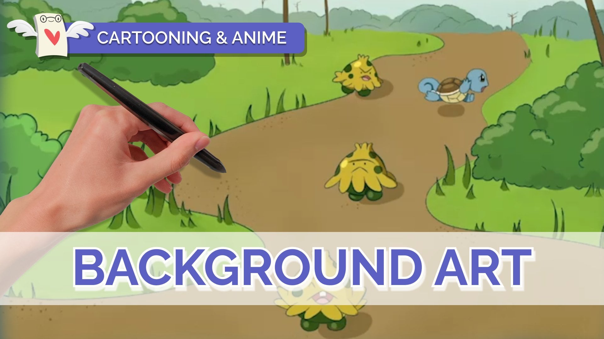
Transcripts
1. Introduction: Are you an animal lover
who wants to create portraits just as skillfully
as the characters you love. In class, you'll be
introduced to drawing a male anime portrait
step-by-step, and how to use a
limited color palette for a sophisticated look, you'll be taught how to apply
animator facial proportions and key traits that you can incorporate to elevate
your character. These lessons will help you feel confident drawing portraits in a classic animate
style and understand how limited color palette
can enhance your work. The next set of lessons, you'll be introduced to different heading angles that you can use in your drawing, the detailed drawing process, and how to go about choosing colors for an
animal, a portrait. And you can follow
along with me, draw your favorite character or create your own
character in your style. I'd love to see what
you create at the end. So please share your
artwork with our community. Have fun in class.
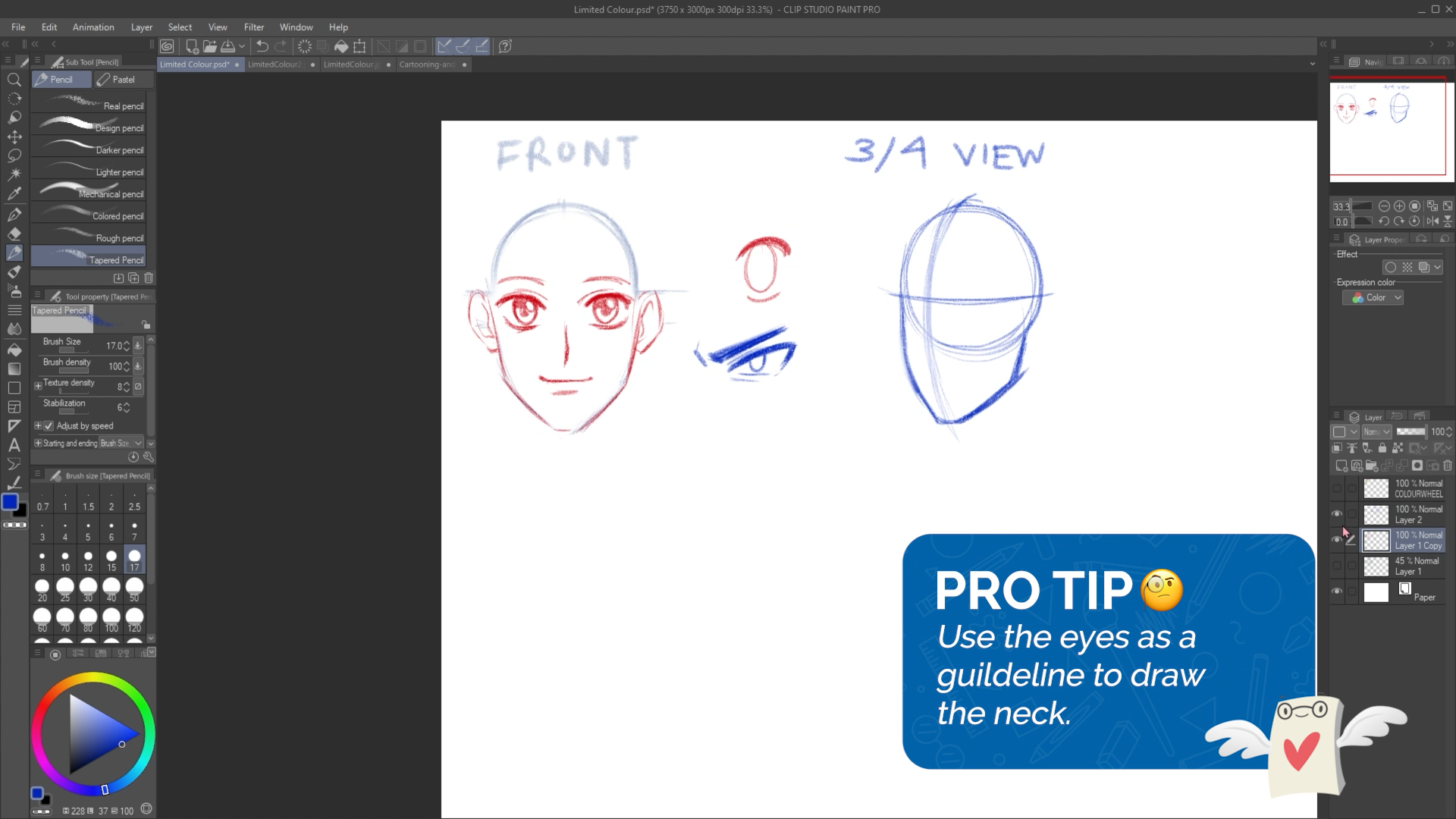
2. Understanding Head Angles: So how to draw a simple face? I'll show you guys how
to draw some guidelines. And since we're
drawing a portrait, a portrait is just a picture of a face or up to the shoulders, otherwise known as a bust
shot as well, or head shot. But headshot sounds a
little more video gaming. So yeah, we will be drawing a circle for the
guideline for the head. So if you would like to
use something to trace, feel free to like
to trace a circle. You can do that too. Like if you have a
cup or a small bowl. So for this project, remember, dropped big, drawn,
nice and big. So if you're working on a 8.5
by 11 page like this big. So let me show you guys some examples of limited
color portraits. So here's some limited color, just means you're
using limited colors. You're only using three
different colors. It's not like using a whole
wide range of skin tones, colours for the
clothing, et cetera, et cetera. Here's
another example. This one is also
cool with borer like animated characters,
more iconic characters. And we will talk more
about the color later, like some things
to look out for. But you can see again, limited
color palette and they're all mostly portraits
like this is a portrait. This is a portrait. I would count this as a
portrait as fault. This is a bit lower
than a portrait. These two and this one around
is more like a half body. These are all portraits.
So we're first going to learn how to draw
the face for those of you who are more advanced
and you want to do a more stylized pose like one of these, and
you're comfortable. Feel free to, I'm going to show you guys how to draw a face in the front view and a
three-quarter view as well. So this is not the good copy. This is just like warming up. However, if you already know how to draw a face
and the front view, you can start to come
up with your idea. I'm just starting with a circle. And then we're going to be using this technique called
the ball and shield. So you start with a
circle or a ball. What I would do next is
find the center line, the central line of the face. This is also mostly common
in like anime style heads, whether your character
is male or female, their head might be
longer or shorter, or also depending on
how old they are. So if your character is younger, their head wouldn't be so, so tall or so long. So at this point, I
can add in my shield. So the shield shape, if I draw it on the side, it looks like it
looks like this. So if I were to draw from the chin and then
connected down here, that's like that shield shape. And the center line helps
because it will allow you to see where the chin
stops like in the middle. And just a reminder guys, this is just the lesson portion where we're not starting
our good coffee just yet. Because I want to
show you guys two different ways on how to draw heads and then you can choose which one
you'd like to do. So one is a front view and then one will be a
three-quarter view. Then I want to go
over how to draw a three-quarter view because
it's a pretty popular, It's a very popular way to draw. And if you've never,
ever done it before, it can be a little tricky. So this is what I have so
far for our front view. So I have my circle. I have
this chin or shield shape. And the center line that allows me to keep my face
symmetrical looking. And then from here
I can start to draw in guidelines for the eyes. This can be drawn as just
straight lines, just like this. If you're ever confused on like, how tall should they be like the space between
these two lines. These simply represent like how tall the eyes
are going to be. So if you put them taller than your character will
have really tall eyes, but if you put them
closer together than your character will have
sharper, more squished eyes. And this is pretty much all
the guidelines that I need. I've seen many
tutorials where they draw like tons and tons of lines that we
don't really need. So at this point, we could
even add in some eyes. So I can use a, I'll use a different color so
you guys can see. So here I'm just
adding in some eyes. You can add any kinds
of ice that you'd like. By default, I tend to
draw in anime eyes, and I do that by adding
in the top limit first. So the top arch of the eye
and then the bottom arch. And then I can do the same
thing on the other side. Because the main
issue when drawing a front view is that
it's symmetrical. It has to look the same. Or A fairly the same
with animal eyes. It tends to be like
draw the top arch, draw the bottom arch,
then you draw the iris. So I would say if your eye has like step one, step
two, step three, if you do step one on this side, switch over to the
other side and then also do step one over there. Instead of drawing like
one complete perfect i. And then moving on
to the other side. Because usually when
people do that, they'll they'll run into the issue of I can't
draw the other eye. Right. So try and draw them
step-by-step back-and-forth. All I can recommend guys, is when you're doing this, make sure you're drawing
very lightly as well. Because all of these guidelines, we want to be able
to erase them. So just keep that in mind. The main reason why I'm
drawing them pretty dark is because so
you guys can see. But let me knock
back the opacity. Like yeah, I have
the eyes there. So when you're
drawing eyes, guys, just make sure that the
space between these two eyes is about one I like you could fit about
one eye in-between. And then I also
just recommended, try to make sure your
guidelines are nice and light because we want to get
rid of some of these, right? Because when you look at
a picture of a portrait, you don't see this bowl shape. It's just there to help
you build your drawing. Next, I can add in some
eyelids, eyebrows. Eyebrows simply follow
the shape of the eye. It doesn't have to be
anything super special. If you want to give
them more character. Stylized eyebrows are
just stylized eyebrows. Maybe they have like
this kind of knobby. Now be eyebrow or a
circle or really, really thick eyebrows, you're going to
have fun with them. Or knows, I can put
in just like that, a little arrow shape or
a little little dot. And then the mouth. So you can imagine the
space between here, the nose and then the chin. About in the middle. You can draw in a mouse. Again, the thing
with guidelines is that they're just
there to guide you. But if you look at your
drawing and your alike, the mouth can be a
little bit higher or a little bit lower
than make that change. You don't have to follow
like guidelines 100%. I think the mouse
could be higher. So I'm gonna move it up. Alright, for ears,
think of semi-circles. And then the
measurement for ears is about the nose to the eyebrow. Sometimes, again,
with guidelines, it's not a perfect measurement
if you ever find that you draw ears following that
guideline and you're like, oh, they're a little too big or they're a
little too small, you can adjust it. You could add a simple
like that nub on the ear. Then hello. I can do that on the other side. So I'm going to go over quickly how to do the three-quarter
view as well. Or actually, let me add in some highlights to
the eyes first. So if you are
drawing anime eyes, I like to put the
highlight first and then a shadow at the top and the pupil. And then I can do that.
So that is my front view. And let me show you
guys what it looks like if I get rid of
these guidelines. So this is why I say, make
sure your guidelines are nice and light so you can be able to erase them like this. And then once all my
guidelines are gone, I'm left with the face. So that is the front view. Let's go over how to draw
a three-quarter view. Just another reminder, this
isn't our good copy, right? This is us preparing
for our good coffee, going over stuff
that we may or may not know how to do.
Three-quarter view. Some of us may have done it, some of us may have not. I would start with
a circle again. So the main difference with
a three-quarter view and a front view is that
a front view can be viewed very flatly. So when we look at our
guidelines for the front view, they're all like straight lines. But for three-quarter view, you have to think in 3D
because it's not flat. A person's face is not flat. So what I would do here is pretend that you're
drawing a line that's wrapping
around the circle. So it's not like just flat down. It curves a bit. Again at this stage, try to draw very lightly. So I'm going to erase
my line a little bit. So it looks like it's lighter. And then from here you can
add in that chin shape, the cheek and the chin. And so here at this line, I can stop the shin about there
and then draw in the jaw. A three-quarter view is neither front view and
neither side view. It's like in-between. And then feel free to adjust
the height of the chin. The head that I drew
in is actually more like a very childish or, or cute, cute head. But if you were to make
this cheek with slimmer, it will make them
look a bit older. So it's up to you. That part of the design is up to you whatever character
you want to draw. And then next, I can draw in
the guidelines for the eyes, for the neck. Let
me do this front. You want sorry for
bouncing back and forth, but you can use these eyes as a guideline to see how
thick the next should be. So if I were to draw a line, and of course I
would erase this. So it's just a line and then it extends up
the bottom of it. So here this is
where we left off in the three-quarter view,
drawing the eyes. So same thing like
the front view. We just want to put
in the guidelines. And then the
guidelines will show how tall the eyes would be. The eyes. And then let me
work in a different color. I can add in the top arch here. And this is where it gets a little different with
three-quarter view eyes. Okay. So for this I that's
a bit further from us. It's thinner, but
it's the same height. So that's 11 thing that some beginner
artists who have never drawn a three-quarter view before might make
the mistake of. So sometimes they'll
make the height shrink so they'll draw
the eye really tiny. But in reality, you just
want it to be thinner, but the height doesn't change. It's the same as this. I. Then
I can draw the iris next. And the iris is also squished. I could draw them looking, looking at the viewer
and any highlights. And under shading in that eye. The nose is still fairly simple, but you can think of an arrow. You could do like a bigger
nose for some characters. And then the mouth. And again the eyebrows just
follow the shape of the eye. And the ear is a simple half circle shape that follows the
eyebrow to the nose. The neck is, you can think
of it as a cylinder. It has a cylinder. Try to imagine the
back of the head here. Like you're extending the line down For the back
of the neck there. And then about here
in this chin area, you can add in the
front of the neck. This looks like a bit more of a male character because
of the neck is thicker. And then from here to
draw on the shoulders, you could simply just
extend them like this. Since we're only drawing
like a portrait, we don't need to draw the rest of the chest or
anything like that. And then you can
draw their clothing, what kind of shirt
they're wearing, etc. A little bit of a line here because there's a neck muscle, not everyone likes to draw that. That's what I would
do to draw a neck. I would maybe fix
this a little bit. But yeah, so that is our
how to draw a front view, how to draw a
three-quarter view. And then let's start
our good coffee.
3. Sketching the Character: I want you to get
out your good paper or flip to a new
sketch book page. And then remember what I said. If you're working on
a 8.5 by 11 page, please make sure you're
using up your space. Well, let me show you
some examples again. Just as a refresher
of what you can do, different styles, portraits. I'll start with a
three-quarter view. So now I'm starting my good
copy and you guys should be, I'm going to very lightly
sketch out my circle. And then everyone's portrait can look a little
different because again, when we look at these examples, they're all different, right? They all have different
personality showing, so don't feel afraid to
get creative with it. So maybe I want his head a
little tilted the bottom. Then remember that shield shape. So first I draw in that
line, center line. Then I can sketch in the chin, the cheek, and then the chin. And remember at this stage
sketch very lightly. Here, I have his head
and you can notice it's a little more tilted downwards compared to this generic head. In my head I'm imagining like a character who's
tilting their head. Maybe he's wearing a
cool looking scarf, tattered scarf, not, not like a flawed scarf or something. Let me draw in his eyeliner. I find that's a little too big. I want a more cool-looking
character so I can make his eyeliner thinner so his eyes aren't
super, super thick. And then you can notice
that while I'm drawing, I'm also alternating between
my eraser tool and my pen. Sorry, am I because I want
to soften up these lines. I don't want them to
be too distracting. So next, I can
sketch in the eyes. Maybe I want, again, I did say I want a cooler
looking character. So maybe their eyes
can be sharper. These are just guidelines, but I'm allowed to
break the, like. I don't have to
follow them 100%. Maybe I find that the guidelines
are actually too big. I can adjust the eye so that
it's smaller and sharper. And then I can draw
the other eye here. It's just as long
as you follow up. Like if you make the
eye smaller here, it needs to be
smaller here as well. So you can notice I'm
using a lot of like sharp, sharp line because
usually sharper lines are associated with
cooler characters. And then for his eyebrows, I could make them
down like that. Well, the thing with cool characters is that
they're either really intense or they're
really like Carefree. I can, hi Iris. I want them looking
up a little bit. The pupil have a little
bit of a highlight. I find that with more cooler and unquote intense
characters there, their eyes are nice, shiny. I say cool, but I'm not really getting that cool vibe just yet. So at this point, makes sure that you are already
scratching your head. And if you're really, really, really stumped, then I would say follow what
I'm doing, right? So for the notes,
just like the snows, like an arrow knows there are many ways you can draw noses. You can make them longer. If you want a more older
looking character or yeah, usually an older
looking character. I like having a little bit
of the nostrils showing. As I go. I could erase my guidelines. So here you can notice I'm
erasing a bit here and there, and then it reveals the face. But so far this is my good copy. So I have the nose and then
maybe he can be frowning. I've also kind of making
up this character as I go. A little bit of a frown. It's not like a
extreme expression. Could be like a character
who's like, they seem cool. Usually cooler characters don't have a wide range of emotion. Could draw the bottom lip. Just like that. If it seems a little too low, I can extend it. Okay, that's it for the face. Next I can draw in an ear. So remember the
measurement for the ear is about the eyebrows to the notes. And then if it's too big or
too small, you can adjust it. And then there we go. I'm erasing a bit of these guidelines
that I have as I go. Just make sure it's
nice and clean. And then for the neck, I'm imagining a cylinder. So if I were to draw
through this drawing, this is what I
think about when I, when I see a neck, I think of the cylinder shape. I can erase whatever is here. If I drew, if I drew through
my drawing and then I can draw in the shoulders. I'm thinking that
his hair would be blowing like like like this one. Okay. So here I'm just adding
in his shoulders. I'm not too concerned
for my character or what his shoulders
look like because I want to add a scarf, like something
covering his neck. So if I draw in this
V-shaped just like this, and then you could
have like a cloak. I'm just adding these
arrow shapes around. And then he could have his
scarf in the background, kind of tattered in the
background and flying around. And that's what I imagined. And then once I
add in that scarf, since this is the kind of
character I want to draw, I can erase the parts of
the neck that are covered. And this is just a
random character. It's not like I'm drawing
someone, someone who exists. Maybe he has a
vest of some kind. That's what I have so far. The next I can add in his hair. I imagined his hair would be
flying in this direction. So a type one drawing hair. You can start with a hairline
first to figure out where their banks or Caroline
is for their hair grows. And then you can
draw hair there. So maybe his hair's
parted on the side. Then I can draw some hair
being pulled back here. So I'm starting
with all the hair that connects to the hairline. So like the fringe,
the bangs, et cetera. So I'm just drawing
a simple shape. Maybe triangles, something
like that for the bangs. I like to draw hair
at the front for. So if you were to think
of Heron sections, bangs would be
hair at the front. And then any hair on the side, like a lot of anime characters would have these sideburns. Here. I can erase some
guidelines for his head. So remember I said try to
think of the Heron parts. So the banks would be one. Any side here would be two. And then any hair at the
back would be three. So I'm just going to draw
around the shape of the head. I'm making up this
hair cell cycle is based off of what
I can think of. Any loose pieces
of hair over here. Don't be afraid to draw
over your drawing. Draw over parts of your drawing. There we go. It looks
a little plot here, so I'm going to add
some more volume. This is fine. He's got a really
big forehead though, so I'm going to add some
more hair over here. Oh, let me add in
that scarf that I said I wanted him to
have so he could have a part of his scarf
kinda just tattered in the background and some lines to show that it is tattered. But yeah. That's just so I
have something for the background. But okay. From here, what I
can do is change all of my colors to one color.
4. Colouring with a Limited Palette: We are at the coloring stage. So here we get to choose what kind of colors
we want to use. And since it is a
limited color palette, let me talk about colors
for a little bit. So one thing we can
notice when we look at these limited color palettes
is that most of them are either complimentary colors or analogous color combinations. Complimentary colors
are right opposite. They're right across from each
other on the color wheel, we have blue and orange, green and red, and
purple and yellow. So those are
complimentary colors. And then we have something
called Nala, guess. Analogous instead of opposite, it's like colors that are
right next to each other. So if you were to
look at these colors, these would be considered
as analogous colors. These would be considered as
analogous colors as well. You could also
expand the colors. So it doesn't have
to be just three. But if you look at
these, they all look pretty similar, right? You could divide the
color wheel so that one side is warmer and
one side is cooler. When you look at these
kinds of colors, you think of fire,
you think of autumn. Usually fire on them. And other things that remind
you of warmth or ******. And then colors like
these you think of, when you think of
ice, you think of winter, other cool things. So there is a very
quick lesson on color. So with that in mind,
I want you to think of a color palette. So let's try to limit it
to three or four colors. So you can use complimentary
or you can use analogous. It's up to you. And
just another example, just to show you guys
these picture examples, again, you can take notice of what kind
of colors they use. So this would be
considered as analogous. While these are more
complimentary because we see there's blue and
then there's orange. Same thing here.
Blues and oranges. So the colors that
I want to use, I want to use, let me
place my colors down. Here. I can start placing color. It's like I know if
you've never done a limited color palette before, it might be a little
weird to look at. I don't do a lot of
limited color palette. So even looking at
this, I'm like, wow, he is so boring. But I'm going to see
how it turns out first. I also have the luxury
of using digital art. I could undo and change
things all the time. But I'm going to see how this goes and then change
it as little as possible. That's his power. He
just turns orange. I'm not going to get
over it. Maybe I will like that's a little tool
because it looks more normal. It needs to look a
little abnormal. Even though I'm limiting
my color palette. I could also leave
some areas lighter. So like where the
light is hitting, that I had light
coming from this side. I could leave these areas lighter because even though
it's a limited color palette, we could still shade. There's still shading
and lighting involved. A little bit of
highlight for his cheek. I'm gonna move on to
my next color and let's see what can I
do with this teal? I'm imagining it can
be the entire scarf. Maybe I want it to
be the background. I think it would make more
sense if I use this teal as a background and then I can
make his hair teal as well. So I have a skin and then
his scarf can be reds, reds and oranges, while his hair and the background can
be more teal and green. And I'm just cleaning up
some lines with my eraser. And then I find that once
you have their colors, it makes that first color
you put down less intense. So I'm also going to make
his hair like a teal color. Again, if you're
curious what I'm doing, I'm just kind of doing a digital short cut where
I can select and fill. And I'm gonna get rid of
this color wheel for now. I think it wouldn't be
cool if I made the whites. It's like a very gray blue. I go even lighter than this because this is still
a little bit more. At the same time, I'm
still experimenting and seeing how, how's
it going to go. And then the rest of
everything I can make, orange. That's really orange. I'd like it to be a little
more red, actually. More muted red, red, orange. And then when I
have such a strong red next to this orange that
he has for a skin tone, it makes him look less or just because you have two
different colors side-by-side. And then I want to meet
the background more muted. It doesn't grab the
attention of the viewer as much of this area. Filling this in. And yes, I want him
to have orange eyes. I might make them more and
more red to matches jacket. And then there we go. And I'm just seeing
what else I can do. I can clean up any of these
lines that I still have. I tend to just sketch
and then clean up, clean up my sketch and
then color over it. So just like here with
the skin tone areas, what I can do is you can either
shade your drawing or if you have a method of putting lighter colors into your darker
colors, you can do that. Like since I'm
working digitally, I could put in lighter colors. But if you can't do that,
shade your drawing. So I would go in here, choose a darker red, and then I can start to
shade in destroying. It would also be cool if you try shading with the opposite color. So maybe put blue in here. It's like the idea of
that sounds pretty weird, but once you try it,
it sounds pretty cool. And I know I can do that
because I'm working digitally. If you if you can't
do that, no worries. Just use the darker color. So let me do that to stay fair. Just using a darker red. So I'm just shading
in some areas that will most definitely
have shadow like these clothing folds for his hair. I could shade it as well with this darker blue in a couple of areas just
like his hair turns. That's all I'm doing right now. I'm adding in any
finishing details or when I look at an
area, I asked myself, what can I do to make that area look better than what I would do from here is since
I have the time, I could go in and
darken up a few things, like thicken up some
lines. For anyone. It is curious about linewidth. It's simply the idea that some lines are
thicker than others. Areas like here in the neck, there would be a shadow cast it so I can make the lines
thicker over here. If I had a white pen or paint, I could add some
highlights to the hair. So I'm going to work in
a slightly lighter blue. And then I keep
these highlights as like thing up the letter H, It looks like the letter H. And that's a pretty simple way to draw and highlights
for the hair. I think that looks pretty cool. So again, letter H, Think of a letter H when you're
doing highlights. That's what I would
do for highlights. Then I'm just thinking about
what else can I add in? First things first, I want to outline these eyes
a little bit better, just so they stand out more. You can see how they were
pretty sketchy before, but after I go over
it a little bit more, it turns darker and
they stand out a bit. I want you to also have
some kind of background. If your character is just
floating on your page, you can draw them in a box, draw a border around them, and then you can color that in. So that's why I gave my character the scarf
in the background. So the background, we
can look a little. Interesting. Rather
than just one color. I want a little bit of
shading in his skin. So I'm going to take the color and then make
it darker obviously. But I could add in
some special effects, like maybe some stuff
blowing in the wind. This is more like a
digital art trick, is, I know you can't
do this on paper. It's not anything specific that I'm doing for
the background, but just to create
some interest, I'm just adding some that
cover the front of his body. Just looks like some
particles in the wind. And I'm going to leave
that on a separate layer so I can turn it on and off. I'm really just
cleaning off his hair. Just like to make his
eyebrows a little darker. It's a little bit of a personal preference
because I don't really like it when
eyebrows are super light. And then the last thing
I wanna do before we end the class for today is just
give him a bit of an outline. I'm just giving him a bit
of an outline so he stands out from the other colors. I'm just going to
add a little bit of a multiply layer to his eyes. Just so it looks like there's more of a shadow in his eyes. That's a tip for anyone who wants to make their eyes
look a little more detailed. Try adding a shadow. And yeah, I like how that looks. Just for a recap, we learned how to draw portraits in a front view
and a three-quarter view, as well as learn a little
bit about the color. We'll learn about complimentary colors
and analogous colors. And then we applied it to
a limited color portrait.
 Winged Canvas, Classes for Art Nerds