Transcripts
1. About This Class: Hi, and welcome to Sketchbook
Explorer H to draw Tree, where I share the art of drawing through natural Exploration. This class complements
my drawing foundations and natural explorer classes, which you can find in Nemo Cai
Studio and on skill share. In drawing foundations,
my most popular class, I provide a comprehensive
introduction on how to draw from lines and shapes
to color and values. In natural exxpler, I share a simple four step
practice to help rediscover a sense of creative well being
in your local nature. It's all about exploring, observing, reflecting,
and creating. Session brings together
these two classes through a new drawing demonstration based on my own
observations in nature. I share practical drawing skills along with an explanation on how I interpret them into
my own expression and style. By following along, you'll hone your drawing and
painting skills and also hopefully be
inspired to go on your own nature and
drawing explorations. In this session,
I'll be starting with one of my
favorite subjects to draw and also just favorite
things in general trees. I'll be visiting the LA
River in the neighborhood of Frogtown an unexpected area
that I'm very fond of. I'll be demonstrating
how to draw a tree based on a tree that
I observe while I'm there. I'll walk you through a step by step demonstration
of my process. I'll be using both digital
tools and Procreate, as well as traditional tools with watercolor and
drawing pencils. Choose your own adventure
or explore both. I've developed a process
to be more or less the same for both digital
and traditional mediums, so you'll be practicing the same fundamental skills whichever way that you choose. You can find my references, along with the specific
tools that I'm using listed in the
class resources. In all of my classes, I encourage learning with
an explorer's mindset. That means being
present, staying open, curious, kind to yourself, and embracing challenges
along the way. So that's something equally important to keep in mind here. I recommend first
following along with my process and then
taking those techniques and skills and applying it to your own real observations
and favorite trees to draw. It's a wonderful practice. So when you're ready,
let's go explore.
2. Explorer's Log: How I Found My Tree: First want to share a bit
about my exploration and how I came to observe and draw the tree that I'll be
demonstrating in this class. I hope that inspires
you to explore your own local nature and find your favorite
tree to draw. For this class, I chose to visit one of my favorite
neighborhoods in Los Angeles Frogtown which has a great bike path next to the LA River that
runs through it. Many people don't
even know that LA has a river, and I
don't blame them. Most of the river looks like a huge gutter instead of a river, but it used to be a real
natural river that got put into a concrete straitjacket after a series of devastating
floods in the 1930s. It's a really
bittersweet history that I learned while exploring. Even though the LA River is not as beautiful as it could be, there are parts that
reveal its potential, such as its stretch
along the Frogtown area. Makes me happy to see the
gradual river improvements that are taking place here, and I love seeing
all sorts of people engaging with the river
in a wide range of ways. It's a bit jarring to
see the contrast between the concrete pavement next to the river and then the
freeway running overhead, but it's also really
symbolic of LA. I can learn to see
what's beautiful about the situation instead of
focusing on what's unattractive. There's even wildlife
returning here, and the vegetation actually constantly changes
depending on when you come. I chose to do a quick
sketch while I was here, and it reminded me of
a quote to the artist, there is never anything
ugly in nature. I really believe this is true. That's one of the best
aspects of learning how to draw and see
like an artist. Once you understand
color, light, and values, it is
all so beautiful. There are so many things to discover along a path like this, and I enjoyed exploring
the adjacent parks and learning about our
river and water system. At the end, I decided my favorite part was still the
beautiful natural trees in the middle of the river thriving despite its concrete
surroundings. So that's what we'll
focus on drawing today.
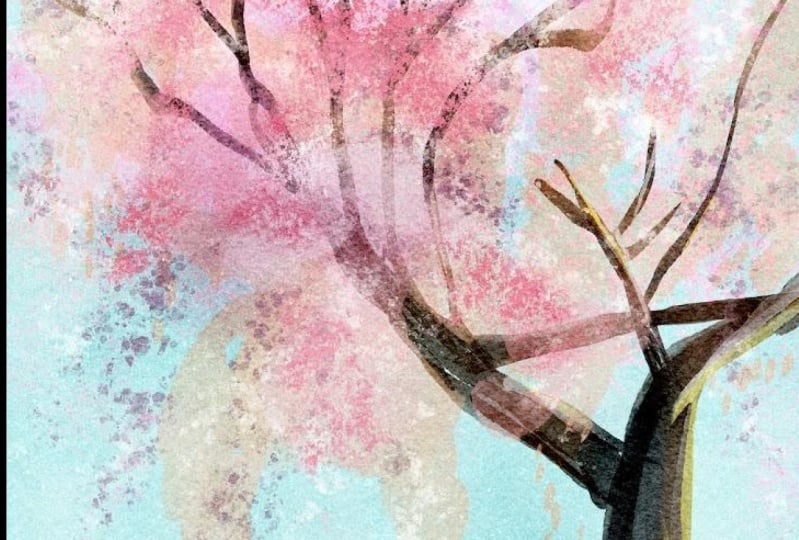
3. Digital Demo with Procreate: So, I have a photo here of the reference
picture of my tree, and I'm going to be
observing its overall shape. So you can think of it as
a sphere over a cylinder. It's leaning to the right, and we might exaggerate
that a little bit. And I'm also thinking about seeing these clusters of leaves and where it's a
little bit denser and where some sky is
peeking through. So those are the overall
things I have in mind before I jump in. So I have my paper
canvas set up here, and I'm going to start
with the pencil line. Now, sometimes I go
in straight with putting in shapes with
my watercolor brush, but for most people,
especially beginners, it's nice to start
with the pencil line to have some guidance. So let's do that together. We'll just start by
putting in the trunk line. So I'm looking at
my photo reference, keeping in all of
our observational drawing tools in mind, such as angles, proportions, negative space, and all the ways that the branches
connect together. We don't have to be perfect, especially on this sketch layer. Each pass, including this one, is a chance for us to
really look and observe the tree and make course corrections or
adjustments as we go. So we're constantly
looking at the photo. We're looking at our drawing, taking breaks to
step back and pause and consider whether it's communicating what
we wanted it to, or if there are some small changes that we
might want to make. You'll also notice that
I'm not putting in every single branch and every single leaf and
more thinking about what is the overall shape and gesture that speaks to
me and that I'm seeing. So even though the tree photo itself has many more
branches coming out, this is really the crux
of what I'm noticing. So I'm just going to put in a few thickening lines to communicate which
of the branches are a little bit thicker, which ones are thinner. And it's already getting
to a pretty good place. And you can see how fluid that can be once
you get your skills down, practicing your observational
drawing skills. Okay. So I think that's good enough for me in
terms of my line. This is just giving
me a good guidance on where I'm going to
want to put in my shapes. So now we can go on
to the next step. And this is the step I normally
start with myself now, but that's because
I've already had so much of this practice that I can see more or less this line in my mind when I look
at a blank cavas. So it doesn't mean
that I skip this step. It's more that I
can already see it, and it's in my muscle
and eye training skill. So it might not be obvious in a demo,
but it is in my mind. So let's start with
the medium value. I'm going to go
in here. And here you can think about
both the color or just work in terms of values. I'm kind of cutting
the middle where it's not exactly like
the color of the photo, but the brown is in line with the overall aesthetic and color scheme that I plan to use. So I'm just going to start
to lay in some color here, following my pencil line, but also adding a
little bit of gesture. And I really like this
watercolor brush because just by changing the pressure, I'm able to get a lot of
interesting textures that mimic the real look and feel
of a watercolor brush. And I like to have breaks in between the lines
because it gives it a more natural
and organic feel. You don't have to do this. You might want to have
a different style. That is just one example of how I like to
incorporate a realistic, yet more interpretive and
natural feeling into my work. Now I'm going to put in
this branch right here. And you'll notice I created
a jump between this line. I find that communicates
the gap nicely, even though that's not what we technically see in the photo. Adding a little bit
of a value here, starting to show that
cylindrical shape, thinking about the light source
coming in from the right, highlighting the right
side of the tree, and putting the left
side in the shadow. Okay, Sona, taking a step back, just assessing whether
it's overall feeling, how I wanted it to, and I feel
like it's on a good track. So now I can go in and
put in a second value, so I'm just going to
go in a shade darker. And I like to do these on
separate layers just in case I want to adjust
them later on. It makes it much more easy. But you find that that
takes you out of the flow, and I actually recommend just
working all on one layer. Because I work so
much digitally, one, it's almost second nature. And two, I use a lot of my illustrations that I create for many
different purposes, such as creating
print products or working them into classes
or turning them into books. And so being able
to make adjustments easily is important to my workflow, but it
might not be for you. As I'm putting in
this darker layer, I'm looking at the
photo and seeing what parts seem darker to me and which parts seem lighter and following that as
my value pattern. And again, I'm thinking
about the light source, and that can already give me most of the answers I need on determining where to
put the darker value. And that's definitely
a skill worth training because as long as your values
are pretty much correct, your drawing will be
way more convincing. Okay, so that's feeling
good as my second layer. Now I can go in and
put in some detailing, or I can work on the leaves. So I like to work on just the big shapes
first, as I mentioned, so before getting into
detail on the trunk, I want to start putting
in some of my canopy. And again, I'm looking
at the leaves, so not as individual leaves, but the overall shape
and the pattern that I'm seeing and where the
concentration is in my photo, but also looking at my
illustration and seeing what would feel nice and look good in terms of
drawing the viewer's eye. So I'm noticing a
big clump over here. So I want to put
that there. And then kind of follows in over here. I'm keeping my stylus down to get this
big cohesive shape. Every time you lift up and
then put the pencil back down, you get more of a
multiply effect, which is realistic and nice, but something that I want to work in later on in my process. So I just did that as a demo to show you
how it would look if I lifted my pencil versus
just keeping it all down. And I'm going to
start printing in just a couple more
suggestions of leaves, especially in areas
that I feel like would benefit from having some gaps. For example, that feels nice. And over here, maybe we
can put some leaves in. There's this little
bunch up here. And I would say that there is a big concentration in
this section in the photo, but that's somehow not
what my eyes drawn to. I'm feeling this pull towards
the bottom of the trunk. So I'm going to experiment with kind of just more
leaving that suggested. I do like the little spray
of leaves over here, so I'm going to put in a little bit of
suggestion of that. Here and maybe just
a few more in here. You don't want it to feel
uniform or too perfect. And so I do find myself just
trying something especially given that it's digital and then hitting undo as necessary. And that's a good
way to experiment with how much information
you really need. Okay, so I feel like that's in a good position just
for my first pass. Okay, I'm going to group my layers together so that
I can move it more easily, give myself a bit more space. And now I want to go in with
a second value on my tree. Let's go in with a darker
color, the same hue. And I'm going to think of
it as my sphere now, right? So if the light is coming in from the right side
towards the top, where the sun is, then the shadow is going to
be at the bottom left. And so that's what I'm thinking
about as I'm putting in my darker value, which
suggests shadow. And again, with this value, I'm also drawing the eye. So I want to think about
not making it perfect, perfectly spread out
everywhere, but more, where do I want to concentrate the value B contrast and that color is going to
draw the viewer's eye. That feels like a good amount
to work with right now. I'm going to see how it feels to me dark in this area just a little bit more.
Maybe unnecessary. Okay, so I already really have the base of the tree,
and I would say, if you were just sketching and creating quick drawings that you could even stop here because it's already communicating
what you want it to say. You can go in with one
more darker value, which I feel like is nice. I'm just going to go
in with this darker brown and start to put in what could be my
darkest dark on the trunk. Okay. And you see how
much that brings it out and how I'm using
it put sparingly. So I want to draw out some of these branches that are
peeking through the canopy. I want to emphasize maybe
some of the forks here, but I'm not just
creating a dark outline. And I think that's
really important for my style in creating a
more natural unlined look, but still using
the darker colors to get the benefits of
what a line drawing is, which is communicating
an object very clearly. So that's feeling good. Maybe I want to put a little
bit of a shadow here. We see how that feels. And let's do another
value on here. So we can go with
a darker yellow. And I really find that
two to four values is a very good sweet spot in terms of what you really need
to communicate something. Usually don't need
more than that. Three is a good middle
ground to aim for. Okay, so I'm just starting
to experiment again with a little bit of values. I actually find that
less is more here. So I'm going to maybe
try bringing that down from some more contras,
and that feels nice. Yeah, that also
feels nice. Okay. And now I'm going to
go on with some green. So the green is a great way to add some more depth
and some color, obviously, and make
you feel more dynamic. And you'll see when you observe nature and draw it
that it often has a blend of many different
colors that you don't see right away a lot of greens, a lot of browns, and a lot of
reds, oranges and yellows. So I really like this kind
of mossy green color. And you'll actually see that if you look at the color wheel, it's not even in
the green section. It's in this yellow and
orange section down here, but it feels like green, and that's the beauty
of color relativity. That's something that you
just need to practice, honing your eye to see. And as you experiment, you'll really amaze yourself in how much things look
like one cue or color. But when you mix your paints or try to get the right color
on your digital painting, it's different than
what you imagine. I find it to be one of
the most fun aspects of discovery in
drawing and painting. Kate, that's feeling
nice and interesting. Again, I don't want to
be too uniform about it, but I do like some
of this green color. That feels pretty nice. So I'm actually going to separate out the leaves from the grass I might want to adjust
it differently. And now let's bring in a
highlight color for the bottom. So again, you'll see
that's a yellow, and I'm just going
to work on top of this color right here. And that suggests some light. What I also really like
to do is bring in some of these green colors and
put them on top of my brown trunk areas. Even if when you
look at your photo, you're not seeing any
green, like I mentioned. A lot of it's very subtle. And if you just bring down that opacity or change
the adjustment layer, you'll find that it adds
a really nice dimension. So that's how it looks
with changing the opacity. You can also experiment
with changing the adjustment layer and seeing if any of those
feel good to you. Multiply is often interesting, and screen and overlay
are often interesting. So let's see how that looks. That does add a really
nice dimension to it. So I'm going to
keep it on multiply and maybe put in actually
just more green. I really like how that is interacting with the browns
that I put in earlier. And now let's go to
the top canopy and put in a little bit of
this yellow, as well. And here, at this point, I'm really starting
to look more at my drawing and less at
the photo reference. Of course, still going
with that back and forth, but it's almost become
the flip of how it was at the beginning where
I'm looking more at the photo than my drawing. And now I'm really
thinking about the feeling that I want
this tree to be giving. And one tip I have is actually, when you're working
with something like this and you're not
sure whether you want something to be more
or more minimal, you can always
create another layer to put in some of the
pieces that you're like, maybe that would look
good, but I'm not sure. So, for example,
I don't know how much of this lighter green
I really want in here. I do think it's very pretty, but I don't know if
it's gonna be too much. So let me just see
how that looks. I I turn that on and off. And
I do like how that looks. Maybe to create a little
bit of variation, what I can do is just
increase the brightness, and that creates a
really nice highlight. And now I actually think I
need a little bit of shadow, so I'm going to see how it looks if I multiply this layer. That's really interesting
and quite beautiful. Let me see if I
lower the opacity. That's definitely an option. Another thing I can do is
save it, go back to normal, and just try actually
pulling one of these darker colors by
using my eyedropper tool, which I have connected to my
shortcut of the touch tool and just try putting in some of the dark
areas more manually. Another more common way to use the eyedropper tool
is people have it connected to this
square right here. So all of that you can adjust in your settings by going to your preferences under settings and going to gesture controls. Okay, so I'm gonna go
back and just keep experimenting with
putting a little bit of darker colors here. I'm really liking how
some of this is turning out. That's feeling pretty good. Let me just compare
how that looks compared to the more
the multiplied one. In this case, actually, I don't really like this
multiplying look. I'm gonna experiment
with maybe making a little bit more saturated
and a little more green. Yes, that is looking good. So that is a good example of
why I like to keep things on separate layers so that I can experiment with it later. So that is feeling
really good to me. In fact, I want to experiment with putting some of that down here to create the shadow
shape for the tree, while also unifying it a
bit with the upper layer. That's feeling nice.
Maybe I needed to be a little a little lighter. Yes, that is feeling
really nice. Okay. I think it can also benefit by going
on the tree a bit. Let's try putting a
little bit on that tree. I tend to work
pretty zoomed out, which is why you kept seeing
this canvas like this. And that's just how I like to keep an eye
on the overall picture. But if you want to zoom in, you're more than welcome to, and you really get to
see all the fun textures that this brush can create. And I'm going to go in and put some in places that
I feel I could use a little bit of Oof.
Maybe too much. Maybe what I need is
actually a highlight color. So let me try that. I'm gonna go onto the tree area and actually try this
exact same color, but as a highlight, let's
see how that feels. That feels pretty nice. Okay, let's see how
that will be if we can just put a little
bit of highlight. It's very subtle, but it definitely adds
something up close. Okay. Now, I think we are ready for putting in some
texture details with our pencil.
So let's do that. So now, the second brush
that I like to use, and this is after many, many hours of trying many different brushes and
experimenting with my style. And so for your own purposes, I think it's fun to use what
has already been curated, but I definitely recommend exploring on your own, as well. Now, I'm going to
go in and start to put in some leaf
texture with my pencil. And with this step, I really recommend
trying to let loose, not looking too much at
your drawing reference. And going with the flow
and trying to embody the feeling you
have when you look at the object that you choose, the tree that you're drawing, and what feeling it's giving you so that you can communicate
it through your drawing. And that's what also just feels great as you're drawing it. So you'll see that I'm
not trying I'm trying actually to not overthink
where all these go. I can always erase
later if it's too much, but I am trying to avoid
making it too uniform. And I'm thinking about where the lighter areas might
show more detail. And where I can
just add a bit of subtle interest in
the darker areas. Yes, that's feeling
so nice to me. Like, the wind is
blowing the tree, and it's got that great green and I'm really
liking how that's feeling. And then I can go in with
really as many as I'd like, but I often believe
that less is more. So again, I'm thinking about
maybe about three values. So I just had a medium
value color with my green. I'm going to go in with
this really dark sienna, and that has a really
nice contrast already, and anchors my drawing. I'm going to put them
mostly in the shadow areas. I'm not like if I
put them out here, it's too it's too strong. So I'm really thinking about where I can just add a
little bit of interest. Without overpowering
my drawing. Okay. And now I'm starting
to just mix a little I'm just free flowing. But I can always cut and paste the parts that are going
on the trunk later on. And I'm just really
enjoying this process now. I'm gonna go for my third value, which is going to
this bright yellow. And I'm going to
put that basically the opposite approach
of my dark Siena, which is in the lighter areas. So I'm really putting it in organic fluid way in my lighter areas to give
those areas more interest. And I'm mixing it a little bit
with the green and putting a little bit in my darker areas because it has such
a nice contrast. I actually really like how it
looks in the darker areas. I'm gonna put in a
few more of those. That feels really nice. So that you can think of as
where the light is hitting certain leaves to give it
a really nice highlight. And now, one thing I
want to show you are two different ways to experiment with making it pop a little. So one is to change
the adjustment layer. So let's just go through those, and you can see
how nice it looks. I really love a lot of
these for highlights. So I do think that screen and color dodge are
both good options. Another way you can do
it is keep it at normal. And do a clipping mask. So I just created a new
layer, did a clipping mask. And now I'm going to choose
a highlight color manually. I'm just going to
highlight some of them. And what's great about
this is that I can adjust that color that I put down
and make it really custom. So that is feeling
very nice to me. In fact, I want to take that color and manually put in just a few
more leaves up here. That's feeling
really great. So I'm going to put that on my trunk, as well, and that's feeling
pretty finished to me. I'm putting these a little
bit of highlights all around. And the last thing
that we can do first, let's organize all
of our layers. So, I like to group bisection. This is also really handy
if you ever planned to move it into Procreate
dreams to animate. It's more last by element. And let's put trunk. Trink. Trunk. And I want to show you how that very first
pencil line that we started with
that's down here. We can turn it on and off, and you can see how you
really don't need it. So it's more just a guiding
post to begin with. But it also as a very subtle, nice element to it. So sometimes I keep it on,
sometimes I keep it off. The last thing I would like to personally add is
a little person. That's kind of my
signature thing. And I just think them as
a little tiny circle. And then a triangle body, and I can move him
a little over or her and just add a
little bit of hair, a little bit of shadow
to give it some volume. And I'll go into my pencil
and add a little head. Actually, usually,
I create it on a second layer in case
I want to adjust it, little hand and a little
bit of a darker value. I give this face a
tiny bit of highlight, Trety bit of cheek those little tiny details
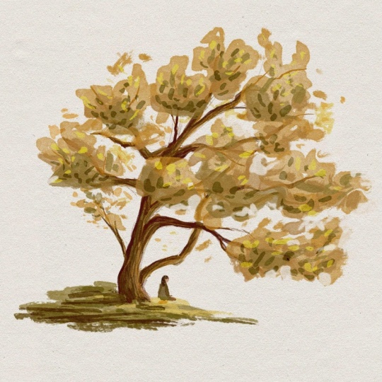
make a difference. Okay. And it's just go in and
one last unifying element, bringing some of that
green onto this person. That tails nice. Okay. And that is my tree. Okay, so just to
recap what we did, we started with this
pencil line to give us some guidance and practice our observational
drawing skills. I put in my initial middle layer of one value for the trunk
using the watercolor brush. I added a second value, a little bit darker,
and then a third. So with just three values, I've already communicated
quite clearly that it's a tree and where the light source is coming from. And this you could even count as a finished sketch already. Then I brought in the canopy. So again, starting
with a middle value using a more yellow brown color. Working in the second
layer of values, working in the third layer. And then I put in
some green color. I practiced using different or experimented with using
different adjustment layers, and I came up with this
level, which I really love. From there, I put in the ground with the
same green color. Then it was time for detailing. So on the canopy level, putting in a lighter color,
putting another highlight, and experimenting with
turning things on and off to see what
is really necessary, putting in three values
of different colors, of different hues of pencil, detailing for the leaves, trying to work in a
really organic method, putting in that highlight
on one of those layers. So really four values there. And then putting in just
a final little touch of those because I
liked that color so much and how it
was hitting the tree. On the trunk, I did
the same thing. I put in three more
values of detailing using that pencil
brush really gave me a nice effect of the trunk bark. And finally, I put
in a little person. So that is how I
like to draw trees. You can obviously adjust
and play with all of the different techniques
to really suit your style. I'm really happy with
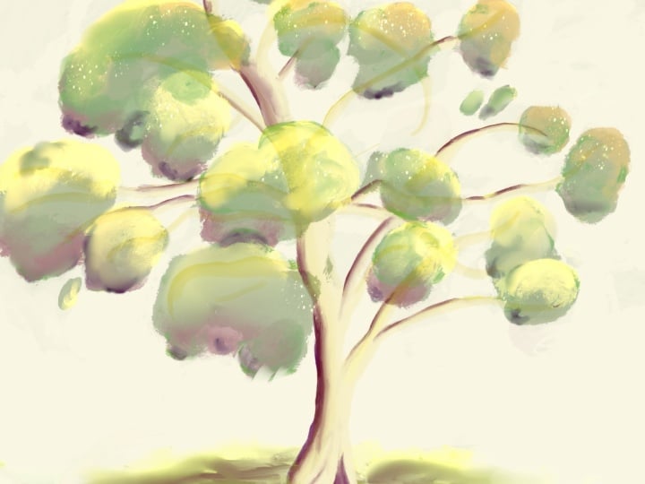
how this one turned out. Now I want to show you
just one more example of the exact same method where I took this photo of
a tree at my local museum. I really love this
overall shape. This time, instead
of thinking it as the sphere on top
of the cylinder, I think of the entire
tree as a cone, noticing the light
stars hitting in from the top left and the shadow coming in
from the bottom right. So that's just one more example of how I like to draw trees.
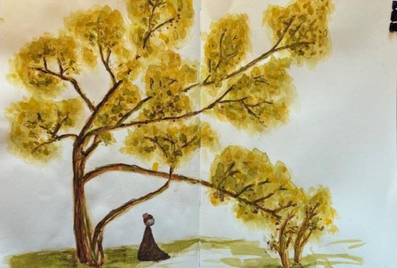
4. Traditional Demo with Watercolor & Pencil: Now I will demonstrate
the same tree using watercolors
and colored pencils. I'm using a simple Windsor
and Newton watercolor palette and Derwent drawing pencils. I'll list the exact colors I
use in the class resources, but you can follow along with
any similar earth tones. Here, the specific colors
are not important. It's more about
understanding the shapes and values. So
let's get started. I'm working in a travelers
company sketchbook, just the regular
one with MD paper, no special watercolor paper. And I'm going to
start putting in a rough pencil line using
this Derwent drawing pencil. Again, this process is to
lay in a foundation where to put in my paints and is great observational
drawing practice. You'll notice that I'm not
drawing every single detail, but putting in the
main branches, the trunk and getting a feel for the gesture and the
overall shape of the tree. This is also where I lay out
the composition on the page, making sure that I have
enough space for everything. I just putting in the
key elements that I want to focus on in
my painting process. Now, of course, if you want to do more of a drawing
than a painting, then you would put
in much more detail with your pencils or pens, depending on what
you're working with. But as a base layer
for painting, you can keep this very
simple and minimal. I'm just putting in a few
lines on the side here, debating whether
I want to include those two smaller trunks or
just focus on the main tree. I'm putting a bit of
groundwork in and putting in some very loose lines to indicate where the canopy
and the leaves will go. Again, I'm not placing
individual leaves at this point because that will come in during
the painting process. Here, I'm just focusing on the
overall shape and gesture. This is a good stopping
point for my pencil line. Now let's get into
the watercolor. So I'm using a very
basic brush set and a simple Windsor and
Newton watercolor palette. I'm going to mix just a simple
brownish yellow colour, using a mix of the yellow brown, green and white paint and starting in with
the trunk shape. I like to start with one of
my lighter medium values. I tend to work with about
three to five values. So I would say it's
right in the middle. This allows me to have room to add a highlight
and a shadow shape. So you'll see that
I'm loosely following along the pencil lines that
I had put down earlier. I'm trying to maintain
that feeling of gesture and overall shape. Each pass from the
pencil study to each layer of paint is
another opportunity for you to adjust your overall painting and practice
observational drawing and painting at each step. Now I've mixed a more greenish yellow color
for the ground layer. Um, and then mixing a more yellow hue for starting
to put in the top canopy. So I had started to go in with a darker value and decided to start a little bit lighter and put bigger
shapes in first. You'll see that I'm using just very combinations of the same base colors
in my palette. And just suggesting
whether I'm using more of the yellow green or more of the brown or
more of the yellow. This creates a nice harmony in the color palette
of my painting. I practice watercolor mostly for my own personal enjoyment. I don't really use it in
my actual finished work, but I also find that I learn
a lot from this process. There have been many
instances where I have accidentally
discovered a process or an effect or just a
look that I enjoy through the traditional
watercolor medium that I then incorporate or emulate
in my digital painting. It's also really nice that these round brushes give a
natural shape of leaves. So putting down
these leaves is both simple and very enjoyable. I just slightly alter
my brush angle to get different directions for
the different leaves. And I experiment with how many
leaves I want to include. You don't want to draw
every single leaf that you see unless that is your goal. But for my style, I really
need to pay attention to where I place the leaves and how much detail I want to focus
in certain areas. More detail tends to draw
the eyes to those areas, and they tend to
be in the places where the light is hitting. So you can use that as a
reference on where you want to put more detail and where
you want to put less detail. It's also a process
of experimentation. You see where your
style falls on the spectrum from minimal and graphic to more
realistic and detail. So I'm using a darker value, a more saturated hue to put in this next layer on top of the bigger lighter shape that
I had just put in earlier. And you can already see the
tree canopy coming together. I'm following the overall
value pattern and keeping an eye on where the
sky is peeking through. And again, it's following the overall feeling and
gesture of the tree, but not copying it exactly. I like to think of it as drawing my experience of the tree combined with the
spirit of the tree. The more you can think of
painting it as the actual tree, almost as if you are touching the tree as you are painting. More natural and I believe effective, your
painting will turn out. This is something
that I learned in a great book called The
Natural Way to draw, and I'll link that book in the class resources as I really opened my
eyes to thinking about drawing and
painting as developing a real connection with the object or the person or the place that
you're observing. So I like to take
a step back and look at my drawing every
now and then to see if it's heading in the right
direction and where I might want to stop and
what more it needs. So at this point, I'm adding in a darker value to my trunk. Bringing in more of
a deep brown color, observing the shadow shape
in my photoreference, and placing that loosely on top of my lighter
to middle values. And that is really starting
to define the tree. I also experiment
with adding some of the smaller branches
as tiny details. And again, it's a matter of
experimentation and making judgment calls on how many of the smaller details
you want to bring in. There really is a fine balance of giving enough to
make it interesting and to draw the
viewers' eyes around the drawing or just for
your own enjoyment. No one else needs to see this. And also not having too much
detail so that it feels too crowded or your eye
doesn't know where to go. It really depends on
your own personal taste. There are some really
beautiful technical drawings of very detailed trees. Whereas I personally like a more loose brush
stroke like style. Then I'm just mixing
a darker value, adding in some more detail, starting to merge the branches
and the canopy together. And I'm really
making this effect of not drawing a solid
line for the branches, instead leaving some
gaps in the line, which would be how
you experience a tree as it gets covered
by the leaves. It's also always nice to just
add a suggestion of things. So I'm using a very light touch. And you'll notice
that I actually haven't changed my
brush very much. I've used a larger
brush to put down some of the bigger shapes and a slightly smaller brush
to put in these details. You really don't need much. So here I experimented
with putting in more of those two little side trunks
that I mentioned earlier, but decided that it was taking away from the focus of my
painting without really adding something that I felt was important in my experience
and observation of the tree. So I just used a little bit of water on a paper
towel to remove that. So there is some
slight undo button when it comes to
traditional painting. I'm working into the
ground a second value. Bringing in a little
bit more of that green, and then adding it
into the canopy as well to create some harmony
and balance in my painting. I really enjoy this step because it's an aspect of
observation and painting that one helps you hone your
observation skills and helps you have a much deeper
appreciation of just how beautiful and
complex nature is. Not only does this approach of harmonizing your colors make your painting more beautiful. But when you really
look at nature, you'll realize that
something that looks as simple as a
tree that has maybe a green Kamet bee and a brown trunk actually has
so many colors within it, and to really
portray its essence, you'll need to use a
range of colors that you might not expect
upon first glance. So I'm just putting in
this darker green value towards the shadow
areas of the canopy. Being loose about it, but
also being observant of how the overall shape looks in my photo reference and how much of that I want to
bring into my painting. I do like this little spray of leaves on the
side of the tree, but just using a quick dab, I can make it recede into
the background a bit more. Now, to be honest, I could have stopped at multiple points
during this process. And with radial painting
or digital painting, too, a lot of it is an exercise
of how much is enough. Many artists have
that question of W is the right time to stop? And the answer that I like
the most that I've heard is when you feel that you have communicated
what you want to say. Sometimes that can mean
a half finished sketch, but the essence of what you
really care about is there. Other times, it needs to be a fully fleshed out,
fully illustrated, fully painted drawing to get to the feeling that you
really wanted to get to. In this case, since this is my playground and I'm
exploring in my sketchbook, I want to experiment with pushing it a little bit further
than I perhaps need to. But because I've
practiced so much, I also have a good
sense of how I wanted to look and about
where I need to stop. I tend to find that
it's usually within four to five values after I've harmonized the colors,
just a little bits, and added a bit of detail
on top of my drawing, but not going in too far into little tiny details
or too dark in value. At this point, I'm
asking myself, do I want an even
darker value to draw out more of the tree or to
create more definition? And I decided, yes,
I want to try that. This is an example of something where in
digital painting, I was started on a
different layer so that I can turn it on and off to see if it's something
that I want to keep. You'll see how with every
new value layer that I add, it defines the tree more and brings it more
into contrast, which depending on the look
that you're going for, could be the right approach
or it could be too much. In this particular instance, I think it could have
gone either way. I feel that it looks nice
with the darker value, and I'm happy with
how it turned out, but I also could have
stopped before this step. Without the darker value, to me, it just has a slightly
more dreamy feel. With each step, you're really
making judgment calls, and I feel like it's a great way to learn to get into the flow, to listen to yourself, to make judgment
calls in terms of how you would like to have it
look and what you see, and also to find that
balance of self expression versus keeping enough
realistic aspects of it so people understand
what they're looking at. Within that range, there's
so much room to play with, and that's what makes
it really enjoyable. 100 different artists
can draw the same tree, and each one will
turn out differently. And what's beautiful is
that their drawings say a lot more about them
than the tree itself. Now I'm going in with the
dark brown color onto the canopy to harmonize
the trunk with the overall tree and also
create more interest and dimension and contrast within the leaves
and the canopy. Now we are definitely getting
into the shadow shapes, and you can think of these as
the details on the leaves. And here I would definitely
use a lighter hand. At this point, we're
really getting into the finishing
touches of the tree. Most of this is optional, but there's so much
room to play with, and I encourage you
to experiment to see how much detail and how much contrast you
want in your painting. You'll see that in
this simple tree, there's a range of yellows, greens, browns, and oranges. Now, I just want to add in a very saturated yellow
to experiment with how that complements
the overall scheme and brings even more dimension
and depth to the canopy. I am thinking about that really bright highlight or yellow that I use in the digital
painting version. And this is an aspect
where digital painting has some capabilities that you can't really replicate
with watercolor, such as those bright neon
colors that come from the adjustment layer effects between the different layers. Still, each one has
their benefits, and there are aspects of
traditional watercolor that are very hard to replicate
in digital painting. So, the more you practice each, the more you'll realize
the strength of each one and use those
to your advantage. So I'm just going to
finish putting in the final tiny details
on the canopy. I find adding little
sprays here and there to be both enjoyable
for me to paint, and I like how it looks. It really is a process of exploration and
experimentation. Now I'm just putting in over all of my tree
to harmonize it a bit and adding it
to my ground layer, a bit of a shadow shape
with my brown color that immediately adds
another dimension and depth to the ground. I'm just putting in a bit of the green paint throughout
the tree as well. I also added a small figure in at the bottom to finish
off the painting. That is how I drew the tree.
5. Enjoy Drawing Trees!: Thank you so much for joining me in this sketchbook session. You can take these
techniques and apply it to almost any tree
that you encounter. I've also included a helpful
illustrated guide in the class resources that you
can reference at any time. I'd love to see any
sketchbook explorations and drawings of
trees that you do. So I hope you'll share them with me in student projects on skill share or in the community sharing
section in Memo hi Studio, and stay tuned for more
sessions of sketchbook Explore. You can follow my work
and receive updates at mimochi.com and follow
me on Instagram. Until next time, enjoy your drawing practice
and keep exploring.
 Mimi Chao, Owner & Illustrator | Mimochai