Transcripts
1. Introduction: To me, characters, they're just about storytelling and expression, and I think that's what we as humans love them most. We love stories and characters. While you might get caught up on how a character looks, I want to share that so much of it is actually about having them reflect maybe the personality or expressions inside of you, and that's what makes them really likable and authentic. Hi, my name is Mimi Chao, and I'm an author, illustrator based here in Los Angeles. I run my own illustration studio called Mimochai, and I focus on making picture books and stylized illustrations, and I've also done collaborations with Disney and Adobe and now Procreate, so you might have seen me through some of that work as well. Today, I'm going to be showing you a high-level overview of how I come up with characters. I grew up really loving to read and to make up characters, so it's a natural part of me, but I also want to share some of the design thinking that goes into it. I'm going to be showing you a live demo using Procreate on the iPad. I welcome you to follow along using that if you have it. But if you don't, it's not a problem. You can always follow along with pencil and paper just as easily since this class or workshop is definitely meant to be accessible to anyone, even if you've literally never drawn a character before. Also, Procreate has generously made an exclusive fresh pack for this workshop. We're going to make that available in the class resources to download, and I'll be demoing how I use it in my process. The main thing that I hope that you take away is the way to look at the world. I want inspiration to come from really anywhere to show that character design can be a fun and exciting thing, not something that's stressful. This way, when you go out into the world, you'll see that everything has inspiration in it, and everything can have meaning. Just to note, for those of you who are watching on Skillshare after the workshop, this was recorded live so I'm going to be interacting with the audience and answering questions. Let's get started.
2. Why We Love Characters: So hi everyone. My name is Tiffany and I work on Skillshare's community team. I'm the lucky one who gets to be the host for today's live class with one of our top teachers Mimi Chao. So Mimi, why don't you tell us a little bit about yourself, who you are? What you do? Maybe a little bit about why you're so excited to talk about character design specifically? So a little bit about me. For those of you who don't know me, I am an author, illustrator, I'm based here in Los Angeles. I have my own independent studio called Mimochai and I focus on making picture books and illustrations. Often, almost always featuring characters, and so that's a huge passion and love of mine. I used to be a lawyer actually before taking a huge transition to becoming an illustrator. So you can imagine how much I had to learn from other people along the way. I was self taught online mostly, read a lot of books, I took a couple of night classes, but very much how to benefit from the generosity of the knowledge of others. That's why I'm also really passionate about teaching on Skillshare and being able to learn with other people who are in the same shoes as I am. It's also is really exciting to do this with Procreate today, because I have been using Procreate for as long as I can remember now. It really changed my whole digital painting workflow, and now it's about 95 percent of my workflow, which is really amazing because you can take it anywhere and work from anywhere. It's really great. I always grew up loving to read. I just loved characters, stories in general, and that really permeates throughout my work. I think characters are just so interesting. They're all about expression and storytelling and at the end of the day I can guess humans, that's what we love, like we love stories and we love characters. But there's so many ways to go about characters, right? You can like write a book, you can make a movie, time in particular focused on my version of that, which is more for like simplify, stylized illustrations and do picture book storytelling. At least, in my experience, so much of the character design lessons that are out there are really focus on like the animation and gaming worlds, and there's a very specific style and approach to that, which is great. But sometimes it might be hard to go through all of that material to figure out what's relevant to you. I want to show you my approach, and what I always recommend is whenever someone's telling you something, or teaching you something, keep an open mind to everyone's advice and what they're telling you, but it's not necessarily always right for you. So pulling the parts that resonate with you and then leave the parts that don't kind of connect with you behind, and that's totally fine. Awesome. You've been working on a new project, right? Sort of utilizing all these skills for Mimochai. You want to tell us a little bit about that? Yes. Thank you for the prompt. So I have been working on a project for Mimochai that I call CAMP, which stands for a creativity and mindfulness practice. The motivation behind that is, after everything that we've been going through throughout this year, and me on my personal journey of displaying meditation and mindfulness to be so helpful, both in maintaining a personal balance but also in my work. I think it is such a important skill to have and for me to have to learn it so late in life, I was like, it would be so amazing if I had just learned this when I was younger, or at least I would have been exposed to the idea. At the same time I have a niece and nephew who are five and eight and there are obviously at home a lot this summer, I am needing to have some activities to fill up their time and so I was really inspired to teach them about that and that's how this Project CAMP was born. It's this idea to combine my storytelling ability with picture book making, and then make it fun for kids to learn what I consider very important life lessons. It was really exciting, I did very rough first like a minimal viable products and to see if it would work with them, and it was just so sweet because having to meditate on their own, and my brother sent me pictures of them and it's just like so inspiring. So I'm really excited to, create CAMP with that in mind, and of course there is a lot of fun characters stuff developed for that. Awesome. Well, thank you so much. Before we start drawing and designing those characters, if students want to follow along with you today, which I hope some are, what should they use or what do they need? Obviously, I'm going to be demonstrating on the iPad using Procreates digital painting. But the concepts that I'm going to be talking about, you can definitely translate in any medium. This is really about thinking about characters and personalities and storytelling, so you don't have to use digital painting. There are definitely going to be some things that I show you at the end with Procreate, that's going to make you have some digital painting envy because there's just so many functions that make life easier and just undo is magical. So if you have it great, but if you don't, don't even worry about it. You don't have to necessarily follow exactly what I'm drawing, it's more like the thought process and if you already have a character in mind that you want to work on, this is a great time of do it, and I would actually really love to see that. So it's up to you.
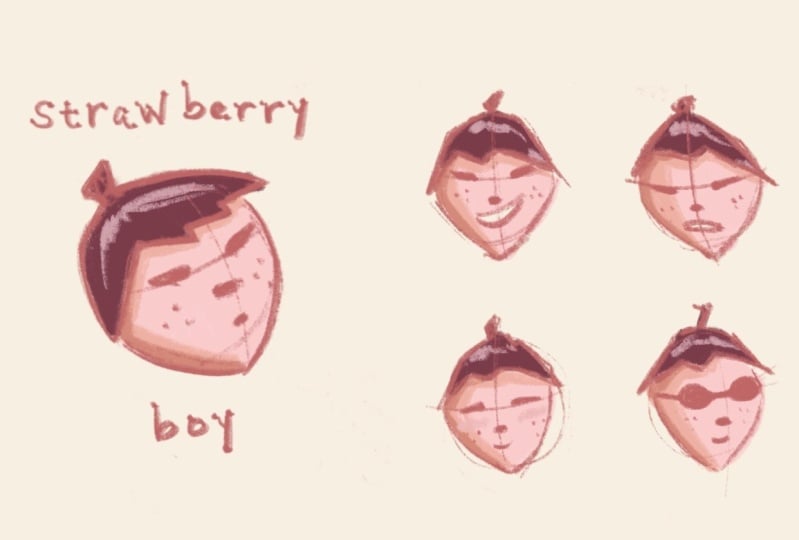
3. Mimi’s Character Designs: To start, I'd love to show you some of my different character drawings throughout the years. I wanted to take a step back and talk about the beginnings in my thought process since I started. I went through my Instagram and pulled up a bunch of archive photos to show you. One, to talk about the process and the progress, but also to show you some humble beginnings because I know for especially a lot of beginners, they might be intimidated by seeing very finished pieces and be like, "I don't know how to come up with that, I don't know how to get there," and they always compare their first drawing to someone's thousandth drawing which is just so unfair to you. What I want to do is tell you that character can actually come across in very simple and I would say crude in a nice way manner. Let's just jump in and I'll talk about more of what I mean. This was the very first I would say character drawing that I posted on Instagram. It wasn't in my mind a character design at the time, it was literally like me sitting at work, I was still at the law firm at the time, and just expressing myself. I still have this up and it still resonates with me because it's communicating a feeling that I genuinely felt at the time. Even though it's just some very rough simple lines, it's getting a feeling across and those are the things to me that really connect with people. Then continuing down that line, these are actually the first types of characters that I drew, I had not drawn for 15 years. I didn't really know very much about anything, but anyone can draw very simplistic figures or some good shapes. A doughnut is very nice because there are just two circles. Again, I didn't expect it to necessarily resonate with people but it did. This is the first thing that really caught on and again, it's just communicating something that I was going through at the time. The little details of the coffee cup on top of a bunch of binders, those are all real things that were happening to me. Other people like it because it resonates with them. The things that you're going through are the things that other people are going through and I think that's helpful to clear your mind so you don't have to focus so much on how do I make these perfect looking character. You really think about what is something that you want to express that you're going through or that you're seeing other people go through. Then moving on, this was the first time my current characters that I draw, the most often. The girl's name is Emme and the little being next to her is called Hamstarcat, her tiny gangster. This was really just again, like that bunny it just came out on this post-it as me trying to express a feeling of wanting to get through a certain period of my life, but just having to patiently wait for that time to pass, and then this little character came out on the side almost as the conscience or that voice in your head that's trying to cheer you up, rally you on. I think we all want that animal sidekick that has our back, all the time. So that's what was born out of it. Again, not necessarily thinking of, is the shape right, is this going to be good in this kind of scenario? It was really more an expression of something genuine, and I think that's why it's still sticks with me. Moving along, again, I still didn't have the skill set at the time, but just developing the characters came very naturally to me. Hamstarcat is just tiny cute thing, but has attitude and that's something that's reflected either a part of me that is more hidden or maybe more aspirational, but I really like it. Again, it wasn't necessarily like, let's design a character that definitely other people will love, but I find that if you like it, chances are that somebody else out there is going to like it too. That's what caught on and something that I still do till today. Another thing that I wanted to show you guys was I actually have a class on Skillshare about making chat stickers, and it ties in together with character design, because you have to think through a lot about the emotions that you're trying to convey, and when you're doing with the characters that you have, I think it's actually a really good exercise to come up with a sheet of expressions. If you're like, who would be saying what. Obviously, not each character would say the same thing in the same way and Hamstarcat is more irreverence. Come at me bro, a feeling where Emme is really sweet and emotional and Ao who is their little caring friend, is that empathetic side to me or maybe that caring friend that I want in my life. Each of these things that seem like distinctive characters on paper are actually different forms of an expression of myself and when I read about other character designers, it's a similar theme, even it's not necessarily you, you almost have to really embody that character to really get to the essence of it. I remember there was this documentary I was watching and that character animator for Ursula from Little Mermaid was this older man. But he was talking about how he gets into the zone. He was spinning around in his chair being like Ursula and I was like, I think that's the energy that you should channel as you're thinking about the types of characters that you want to bring to life.
4. Signs of a Strong Character: Next I'm going to go over some signs of a good illustrated character. So one is when you develop it to a point where you can cosplay them with other well-known characters. I pulled this one up is when Halloween is coming up. It's a good example of injecting some humor but also showing that they're stylized enough that you get that their dressed up as Star Wars and [inaudible] about doing that, but it's still them. Then another good sign is when you can recognize them as tiny silhouettes. This is a common lesson or a guideline especially in animation character design, where they say like your character should all be recognizable and distinguishable from each other, whether they are tiny or big, but especially like if they're black out silhouettes. That's why when you think about some of your favorite cartoon shows or animated shows, you'll often see that there's a pattern or there's usually like that tall, skinny character and a little short character and little fat character. As long as they're distinguishable or sometimes it's just their hairstyle. Maybe they're all the same size like the Power Puff Girls, but you can tell who's who if they're blacked out because of their hairstyles. So that's something to keep in mind as you're developing your different characters. That's something that I also continue to still use to this day. As I'm creating more updated graphics, I still use this concept of the little silhouettes. A great thing about having these characters and just having a few distinguishable traits about them is that even as your skill set starts to improve, you'll be able to maintain those characters. This is a more recent drawing that I did. Obviously, it's skillfully a lot better than what I was drawing a few years ago, but it's still the same characters. I like to say, I feel like my style has evolved or my skills have obviously evolved. But the sentiments that I'm trying to convey through my storytelling and my illustrations have more or less remained the same. That's something that doesn't just hurt me, it's like it's really encouraging because it's like you're really your own competition. right always say like don't compare yourself to others, but it's really nice to see your own progress. The better you get is just the you can see it as not like you're doing it for other people, but you're doing it for your characters and your storytelling. Because the more skills you have, the more powerful they can become, because you'll be able to utilize them in a better way. I create this little silhouette exercise for you guys. I didn't do this for my characters in particular. But since I was talking about it, I quickly sketched it out where you'd like you can just quickly identify who's who based on a black out silhouette. I think it's really funny as that really looks like nothing. It looks like a ticket maybe. But altogether, you understand what's going on. It's also that relative proportionality that is really key to when you're developing a group of characters.
5. Fully Developing Characters: Now that we have the idea of our character, let's talk about how to develop them a little bit more fully and start to put them into settings. One good exercise, like I mentioned before, was the [inaudible] stickers. A common exercise for character development is to create expressions sheets. What would this character do? How would they react to things when they get mad? How do they get mad? Emme keeps it inside and boils on the inside, and when she's happy, she's just really playful. Then, I also developed a older girl character for their world so that Emme has this older sister, almost like mother figure in her life. Again, this is representing parts of me or aspirational parts of me. But I also wanted to show some character development. Aresa is this very put together, almost seems like she's always, has everything perfect. I want to have this aspect of this back tattoo. There's a little bit more to her than meets the eye. How that all comes together is in this scene that I developed. Even though it's very subtle, the things that you make your character do, you tell about them. For example, here Aresa sitting very upright, proper, even the way that her hands are positioned on the box are very thoughtful and careful. She's very gently explaining something to Emme who's leaned over and slouching in a useful casual way, has a book open, which is in line with her character, but she's half paying attention, half listening to Aresa. It tells a little bit about everyone. Even Hamster cat who looks like he's just sitting there, it's very him. He'll just sit in the sun and look like he's dozing off and not really paying attention, but actually always with Emme and has her back, like how cats are. That's how it all comes together in a scene. I want to show you how that is a little more thought out for camp. With my past characters, it was really more comes out as an expression. I wasn't necessarily thinking about a particular format for them to be in. The camp is a little bit more focused in that sense because I know that what the purpose is, and I know that there's a particular audience that I want to address. For example, in this image, this is what I started off with when I was testing out camp with my niece and nephew. I thought maybe it'd be good to do faceless illustrations because then kids can try to project themselves onto it, so there's no distinct personality. But the more I thought about it, the more I'm like, "The stories that I like have characters," whether I was kid or even now. I learn best through a character versus someone telling me what to think or telling him what to feel. Though I want to stay true to that, and that's when I started to decide to design interesting actual characters for this storybook. Kids use an activity book to insert themselves into the story as well. These are their character camp code names, and what I like is that I developed two new characters. But really, Moonride could be Emme in disguise like this with her hair up, and then Argonaut is a boy character, which I obviously didn't have in my original character set. For this one I am thinking about how do I reach a wider audience. I don't want to have boys feel like they don't have someone that they can see themselves reflected in, so I did purposely choose a boy and a girl. I did think about being more diverse and inclusive. I think when I first started illustrating, because you usually tend to draw yourself or what you see, and so tend to draw two characters that look very similar. It was intentional to create more diversity and to think about how can I make this more widely applicable. Then, also more technical things like age range. I think when I was drawing kids, I have this book called Let's go explore. [inaudible] so I can show you guys. When I was drawing this, I tend to draw a little bit more toddlers. I like how they look. I think their body proportions are really cute. But for this particular case, when I draw them as cute characters, I like it. But I know interacting with my niece and nephew and kids around their age, they tend to like to look up, not necessarily down to toddler age. I was like, I need to make them more close to, if I'm trying to target 60 10-year-olds, maybe more like 9-12-year-old would be the right character age range. That's what I did with Moonride and Argonaut. Then, when it comes to putting them in a setting, this is few good examples of the things that I'm thinking about. Argonaut is the more reserved, thoughtful sweet character, and Moonride is more outspoken and buoyant and says what's on her mind. Even in this very calm and simple illustration, I think about that in terms of their pose. Whatever your character is doing says something about them. Argonaut is a little bit more curled up. He's compacted. It shows more of his introverted nature, whereas Argonaut is more open, relaxed, has one foot splayed out in the water to communicate her more open personality. Same thing in this drawing. Again, just looks like a simple little drawing. But I thought about what would they read like. Argonaut is sitting with the book and reading very properly, whereas Moonride is laying on her back and reading in a position that I think our parents told us was bad for our eyes. Again, very simple little things that may be a typical viewer is not going to necessarily notice. But those are the things that I think all character designers know about their own characters and inform how they're thinking about when they're designing. Then finally, I think once you start to establish character, you can use that to your advantage. Say, throughout this book I've established that Moonride's this more wild, outspoken character. But when you show them just demonstrating meditation, I think kids can be encouraged to see that she also is listening and following along, and that they tend to identify more with her that they can see themselves in this particular situation as well. That's a very high-level condensed version of all the things that I'm thinking about as I am developing and creating characters. Parts of it tend to be very organic, but this is also a way to really think about it thoughtfully.
6. Finding Character Inspiration: Let's get into the fun part and start to draw some characters. For those of you who don't already have a character in mind, I have a fun prompt for you so you can follow along and come up with a character together. The overall prompt is to free your mind and open up your eyes. What that means in practice is to just look around you and find some hops or some things that make you smile or make you happy or just interest you. I came up with this idea because I don't actually normally go through this exercise for character design. But now [inaudible] because it was really fun, is that we're actually about to move so you see some boxes behind me, that's why. Then in our [inaudible] backyard, I found this little [inaudible]. I'll show this screen and I'll show the screen. I found like these two little acorns and this leaf. It was just like laying on the ground like this. I just think they're so cute. I think acorns are so cute. Why are they wearing little hats? That's why I always say. Then in scale it's like this leaf could be a tree and so that's how I see the world. I think it's natural for me. I can have anthropomorphize a lot of things. But even if you don't do that, like once you start to get into this thinking habit, it's very much something that can be a good spark of imagination. How do I use these two acorns and a leaf to turn them into characters.
7. Starting to Sketch: Now let's get into drawing our character, and we can build that up using basic shapes. I have a row of fevs for Procreate brushes, so I just duplicate the pens and brushes I like and move them into a folder. There's one called shale brush, it is my absolute favorite. It comes by default with Procreate, and I can't replicate it in other digital paintings. It's definitely my favorite. It has this very nice texture. Then for those of you who are totally new to Procreate, I'm going to try to sprinkle in some beginner tips. But if there's anything that I gloss over and you don't understand, just feel free to ask. But here you can adjust the brush size, so this can get very big, and then you can also super small, and have very thin lines. With one brush, it can get very different lines and be able to use them for very different purposes. I'm just double finger tapping here to undo. Now, usually for sketching, keep it on the smaller end. Mimi. Yeah. You're real quick, sorry, just run through the brush and where to find it one more time. Oh, yes, so the particular brush that I like, if I remember correctly, I'm pretty sure, yeah, it was in calligraphy. If you've downloaded Procreate for the first time, your fingers are going to look quite like mine, so I think it's going to start around here. Under calligraphy, there is this one called shale brush, and so what you can do is swipe left, and then hit "Duplicate" if you want to move it into a thick base folder. To create a new folder, you just hit this "Plus" button. But just select it from here for purposes of this class, and go from there. Let's start to draw this acorn. I'm just adding to the knob on top because I personally like the acorns with the knobs on top. It's really a triangle shape, so one thing I like to tell people who are completely new to drawing is you think about everything in shapes. There's this triangle hats, and then if I wanted to be literal about it, then I would create this face, and then maybe add some eyes, and that could be a character. It could be a tall, lanky character, and that would be a certain particular personality, and maybe like this, but that's not the character that I want to create. In my mind, I think acorns are very cute. I'm imagining a really creature, like cuddly personality that I tend to imbue into my creature characters a lot, and so you can depart from your inspiration. To me, when I see these two acorns, I don't necessarily just see the acorn literal shape, I think of a cute little creature that has a hat on its head, that looks like an acorn. I want a cute and cuddly type of creature, and so that's really more like round shapes. I guess really quickly I should talk about, like when you think about your overall character shapes, round circles usually communicate safe, welcoming sweet characters. Then if you draw a big blocky, like robots or something, like very sturdy and strong characters, and then triangle, it could be like an active character, or this is a little distinguishing shape, and any is technically like a triangle if you think about it. But for this particular one, I want to think about it in terms of circles. I would just start drawing circles or round shapes, and I've drawn a lot of these guys, so it comes out. So don't worry if it's like, oh, this just seems like a few circles and suddenly it's a character. It really is just thinking about it in terms of shapes and practicing. You can start to refine it and just double tapping on the iPad or the Apple pencil to get to the eraser. One thing I like to do is actually have the eraser be on the same brush. You can use this to your advantage. Obviously, if you want straight eraser lines, you can use something that has more of a clean edge, and I'll show you what the difference is. I'm on technical pen right now, and when I erase, it's like a very clean line. What I like about using the same brush I'm drawing with as eraser is that it keeps that texture there. I tend to use mirroring once, but you don't necessarily have to. These are the overall shapes and then he has like a friend and they were like lying on the ground like this. In my mind, so they're sitting next to each other. I just hit this arrow toward here to move him aside. Then let's just draw his friend. His friend also has a triangle hat. Then same thing, like building up the body through circle shapes or just round shapes. Then foot right here, foot right here, and that's it. You can add the little arms if you want. That's the overall body language of these two characters, and then face is obviously where the character comes in and expression comes in. If you're just starting out, I would definitely learn anatomy. Even if you think you want to draw some very simple characters like Power Puff Girls, actually, Power Puff Girls, you still need to understand a lot of anatomy because when you're breaking the rules, you still need to make sure it makes sense from a human absorption logic point of view. So there are a lot of free resources online that you can learn really detailed anatomy about. The one that I learned from and I still really like is called Proko on YouTube. He has a channel, and he actually makes it fun to learn about body parts and anatomy. I remember when I first started drawing or illustrating, I just wanted to go straight into illustrating what I love. I think we all want to take that shortcut because it's the fun part. But when you realize that if you don't understand anatomy, you'll hit a point where you can only either copy other people's illustrations or you always need like a reference photo of someone posing to be able to draw that. When you learn anatomy, you'll be able to position people how you want in your own mind. I think that's really powerful, and you'll be able to start to stretch things, exaggerate things, and interpret things in very different ways. Even when you think about the modern illustration styles or like blobby people with huge bodies and tiny heads, that's still follows rules of anatomy. This is something that I learned the hard way, and I think that I highly encourage you to go learn about it yourself. For example, in anatomy, you would learn about facial positioning and where to put eyes. This is a very simplified version of that. But when you see other people put eyes on things, you're like, oh, that seems so easy. But that's because they understand where the eyes need to go and where mounts need to go, so some little eyes here. We can start to round out the cheek a little bit. I will come back and clean up more, but I want to move on to some of the background elements.
8. Adding Scene & Setting: So we have our characters. Now let's put them into a setting to create a little bit of a story. One great thing about digital painting is that it's very easy to move things around. So you can start sketching and creating characters, but say I want to put these guys into a scene, right? Right now, if I zoom out because it's not quite place where I want them to be. What I can do is just hit the arrow again and like move them around and then also you use this selection tool to specifically take out this guy, and then move this guy here and then lean him a little bit more towards here. So he's like leaning in to talk to his friend. Maybe I'm just going to lean in a little bit more too, and then a little small so I can make them bigger. So really quick on the Selection tool. So many different things that you can do, but the one I use the most is called free-form. So that means I can squash them, stretch them, bring them this way, just do what I want. Now the latest Procreate update gives you even more specific controls. So they added this, what helps you rotate it very in detail and then you can also hold onto corner and start to like stretch it like this. So that's very helpful to get your proportions right, especially if you're just starting out. Well it's like quick fixes from your sketch. So say like this guy, I want to make him a little fatter. I think that's cute. [inaudible] Okay. Now let's draw this leaf. So I would usually start this on a new layer just so it makes it easy for me to move it around in terms of doing composition. But first, let's talk about this leaf. Again, I love looking at these things in detail and whatever object it is that you have, you'll notice something that you didn't notice before. So the way that these leaves comes together and have these two little knobs. The way that the angle of the leaf is there's so much art to it actually and I think nature can be such a great source of inspiration and flow in line. I'm going to bring that into the drawing. So just really quickly, like these leaves are like diamond shapes more or less, right? So you can draw your diamond shape here, you can think about the angle of these leaves and then bring it down and there's like another leaf up here and diamond shape and then this one has the angle of leaf that goes this way. You can draw these two little balls if you want and then branch kind of comes down here, there's a leaf and then another leaf over here. Going all the way down it keeps going like this and that's kind of the overall leaf tree. You can obviously go in and detail it a little bit more and then some things are really up to you like how realistic or stylized about drawing you want to do. I think if you're just starting out, the simpler the better. But you know, if you're more experienced, you can also make a super realistic and render it out. For me, I can add a few more things here, like the leaf lines, I think that would be cute, same thing here. They're just rough placements. You'll clean it up later when you refine your sketch. But overall, that's looking good. You can start to exaggerate things too, if you want the leaf to be a little bit bigger, you can have a little bit more wave over here. So that is already looking like a tree. So you can again move this to be positioned in a way that arches over them. I want this to go even more over them like a branch, and then bring them down all over here. So when I'm compositing and seeing, it really depends on how you're doing it. Sometimes, I do a thumbnail sketch in a notebook and just have a very tiny version to make sure it's there. There's time I'm literally collaging it together and seeing what works. This is how this was originally design and so kind of recreating that process here with you guys. Then last I want to have a very simple scene in the back. So first, they can be sitting on a rock and a rock is two mount shapes, right? You can think of it maybe almost as like two mounts that look like that and then connecting them. Now a little bit bigger, here. Now I can bring this down, so it looks like the tree is coming out from behind the rock and then overall it's looking pretty good. I think I just want a sun in the sky, put this in the middle over here and I'm going to draw a sun. So here's another cool thing that you can do in Procreate. So it's kind of create a circle and that's an okay circle, but you want to create a perfect circle you can create a circle and then hold your finger onto the screen. So I'll do that again for those [inaudible]. It's quite an ugly circle actually. So here's a ugly circle and then you press on the screen and then it becomes a perfect circle. That's a very handy way to create perfect shapes and then I'll just create another one here, and that's it. So say you're here and then like, I want to create a second circle but I don't really know where I should go. Sometimes what I do is literally create this circle and move it around to see what looks best to me and I ended up thinking like, it looks the best right here. So overall, I like this composition because there's a flow going with the leaf. There's like the focus on the characters right here, and then it's balanced out with these two circles at the top. So this is where the sketch goes. I would continue to clean this up since we are running short on time, like a cooking show, I prepared in-between steps to show you a couple more things that I like to do with Procreate.
9. Adding Color: We have our drawing. Now, let's add some color to add some mood and personality. I prepared this line drawing version to quickly show you some coloring techniques that I do. I love just normal analogue coloring. I would see for these little guys, normally, I would like to actually go in and start coloring like this. Then one thing that's very handy to have is this reference tool that they added. If you go to this little tool gear to actions and then go to Canvas, then there's this thing here called reference. You turn that on, you get this little window, which is really great. I can get super in and start coloring in detail, and then you can see over here what's going on. Before, I have to keep zooming in and out and that breaks up your workflow so it's so much nicer to have this here. You can also do is bring in an image. Say I took a picture of these guys and then I want to bring in the image. You can go to Image and then Import the image and bring it there. Last thing there's this thing here called face, which I'm not demoing to you, and I haven't tried yet but I want to. Basically, put your face there and then draw here and then your drawing will go onto your face, which is really cool. You create touches for yourself. Anyway, back to what we are doing. That's obviously the classic way that you can color. Another way to speed up your process is they introduced this select and you go to color fill and have this on. You can actually start to color in with this tool. So going here, I'll just see really quickly what happens. You can do that, and then you can do it for everything. You can keep going too so you don't have to de-select this. This is a very nice tool to be able to quickly fill in spaces. You can use any other selection tools to do this, so say you want to create like very perfect circles, you can also have a colorful on and do that. Back here, like I say, I wanted to color in the sun, I apply normally just like color in the sun. You can also do that, and it's just a nice way to save some time and have another way to color. Some people prefer that way and I just think it's a nice new features they've added. I go in, fill in all of that. I would see that our overall goal in this part of the phase is to get the color palette cohesive. I'm not detailing in anything at this point. I would say when I first started to work on this drawing, these guys were brown and then I was like, "Oh, I like the cooler contrast with the oranges that I'm doing." I wanted this to obviously be have a fall color palette. In my mind, I already have the overall feeling that I want to do. But for those of you who are like, I have no idea what color palette I wanted to do, there's many other things that you can do. First of all, procreate comes with various color palette that you can use, but a cool feature that they added is that you can also go find a photo and then bring it in as a color palette. I went online and I found this photo of fall leaves on concrete background. That's actually very close to the color palette that I ended up using for, but I spent a lot of time so I come up with myself. A very quick way and a fun way to challenge yourself. You can just go through your photos and find a sunset that you love or a forest that really spoke to you and just bring that in and there will be a full color pallet ready for you. Ready to go. Going back to here, I would flush all of this out and then make sure that overall is looking cohesive. It can blobbish like this at first. The thing that I tend to do is go to hue saturation which is under adjustments. Go here, and then there's two options now. Traditionally, what I would do is going to layer and then just move this around and be like what color looks best with this, to be honest? Then this is how I end up with a lot of my color palettes. The end results, since we are running very short on time, is like this. This is my finished piece at the time. What I did was I went in, colored them all in. I start with very basic colors and then I go in and render. If you look really closely at these guys, even though they looked like one color from far away, they are at least four different shades of the same tone and that gives them their depth. Same thing with these little acorn hat. It look very simple, but actually like there's at least four different colors of this orangish beige color.
10. Polishing in Procreate: Now, let's have some fun with Procreate, and I'm going to show you how you can use a different digital tools to enhance your drawing. One thing I like to do to bring out the color composition and balance is to think about where I can reuse certain colors that are naturally there and places that might be a little bit more unexpected. For example, I took this top color and then using my shell brush. I'm sure most of you guys know this, but here is it, I drop a tool right here. You just click on that and you can go anywhere on your drawing to select that color. I just created this piece right here to balance that out. What's interesting is, another thing that I would highly recommend learning on top of anatomy is color theory. You'll learn that the same color, I'm sure you've seen those I tricks. It's the same color but next to different colors, look like totally different colors. Again, I might like that balance, but sometimes you need to adjust that particular color because now it's standing next to something else to create the same feeling. Even though I dropped that, used exact same color and put it there to get for me the visual balance I had to make it a little darker and a little bit more saturated. Then same thing with this rock. You can suddenly bring in that color by placing it on top of the rock as a texture or a color. For here, I added that color on top of the very light brush. Then what you can do is just double tap on that layer and then drag the capacity up and down. That looks like a little bit too much. But then when I bring it down, it's very subtle. But when you look at it, you probably wouldn't think she colored some orange onto that rock. But by just having that there, it creates a nice shadow and lighting effect, but also brings in some more of that color from the rest of the painting. Another thing I want to show you guys is the different modes that you can do in layers because I use it a lot for my coloring and the graphic composition layout. This leaf, if actually just look at it normally, looks like this. That's okay. But I like to use digital paint to your advantage and to play with the effects that you have. When you click on the little letter next to the drawing, you'll find all of these different modes. If you're familiar with Photoshop digital painting, like you'll be very familiar with this, but this is your first time in a digital painting app, it's going to seem very magical. Basically, it controls how your layers interact with each other. This one is basically saying this color from this layer is going to lighten the color below. Each one has a different functionality and you just need to use trial and error experiments. It's fine, you go through it and just see what it does to each layer. I really like this overlay setting. I went through all of them. I was like, I like how this looks. It creates a new color. It creates this interaction with the sun and I just like how that feels. You can see the possibilities of what to do with that type of power.
11. Using Pencil Brush Filters: Last but not least, I want to show you how to use the pencil brush filters. I have a couple of different ways that I use them, and just a reminder, you can download them in the class resources of this class. The pencil brushes are very cool. One thing that you can do is just use it as a typical brush. I have it here, and I think when you guys go to download, there'll be instructions on how to import it, but it's super easy, like you [inaudible] is like download it and it just opens up and procreate. But sound changes into like shimmering, winter and wonderland. So I can take this shimmer tool, and there's two ways that I will show you that you can use it. One is, obviously, you can just draw directly on top of it. But I don't normally like to do that because it's quite destructive, which means that if I later on changed my mind, I can't just quickly turn off that layer to get rid of it. What I'll do is I'll create a new layer and when you tap on that, you'll have all of these options on the side. One thing that I use quite often is this one called "clipping mask." What that does is, you can draw like anywhere on the screen, but the only part that will show up is a part that goes over the layer below, sound like you paper clipped it on top. To add some sparkle to it, let's take that, I got shiny, glittery color, and then go in here and then create some shimmer here on top. Again, like this little reference images helpful from when you do work really up-close, but still see what I'm doing from afar. Again, you can go through all of these different settings to see what creates the best effect for you. That's cute, and they look pretty glittery. You can do that on this guy as well. This is really quickly like gold person, shimmery stuff. Okay. These precious are actually designed to use it with their new filter function, so the way that would work is, I would actually normally duplicate this. This is how I would work. I have a version of it to revert to if I want to fix it later. Then on this new version, we can use two fingers to swipe, then when you swipe, it locks this layer, which means that you can't draw outside of it. You can only draw on top. What I like about that is like it's more or less creating that clipping layer effects, but In this particular instance, you need to do it on the direct layer because we're using now the adjustment modes. Like I showed you earlier, you come up with these two options, layer and pencil for hue saturation, brightness. I'm going to select pencil, and then going to the shimmer effect again. You go in here and just draw on top, and it's creating that adjustment layer just specifically on the drawing. It starts off at 30 percent just so you can see what you're doing. But obviously you can drag it around and then say you want like gold shimmer. Yes. Now I have gold shimmery party hats. Another way that you can do it. I would just play with all the ones that they have. Basically, they're all different types of effects. This one has like fireflies, which is very pretty. Then another thing that you can play with is obviously the brush size. Again, I've got bigger dots and not so much like little tiny dots everywhere. Just connect quickly, sprinkle that around, and you can also play with some variation, and create a drawing, that's more like that. Just with a few brushstrokes, it creates a lot more atmosphere and makes it feel more like a wintry wonderland, and I can again play with these mood settings to create a different feeling for all of that. Few more things, do we have some time? I really liked this dry sponge text effect and I will show you how I use it to create some rock texture. One thing that you can do is start with a low opacity and put that, that's coming across. But obviously, if you move up the [inaudible] would be darker. That's one way to do it. We can also just go into the layer and double-tap again and bring down the opacity, If you feel like you'd like the effect, but it's coming on a little bit too strong. I like how that's looking. Now ask you things are just more creative. I was playing with this one, and then I was like, Eric can you actually create this cool paper print effect? Maybe guys can see that, creates some like nice lines for you in the background. It feels like a nice actual prints material. This is a really quick demo of how you can use a different pencil brush filters. But obviously, there's so much more they can learn. But hopefully, that's a helpful starts to getting the most out of the brush-pack.
12. Q&A: Now we're going to open it up to questions from students and participants in the audience. There's a couple of questions actually that came in around this, especially around when you're getting started as a beginner in illustration. Would you recommend creating one or two characters and developing them really in depth and over time, like you did with Me & Co, or maybe when you're just getting started coming up with new and different characters a lot of the time? Yes. I personally, in general, I think when it comes to creativity, let your mind wander. I wouldn't try to restrict yourself to just one or two or feel like you have to hit it out of the park with this one that's going to last for years, I think that's a lot of pressure. For me it wasn't necessary. I'm not showing you a ton of stuff that I also drew that never went anywhere. I have a lot of different characters that come out and then go away and that's totally fine. I think, just like practice makes perfect, right? The more that you think about things, the more that you're going to be in that mindset. I think that's actually what's most important. You're going to be thinking about character, you're going to keep iterating, you're going to make them better and better. You'll start to see the world in a different way and I think that's what the most amazing thing about art and creativity is when you see the world through a creatives eyes, it's just everything becomes magical because everything can be inspiring, and I think that's one of the best parts of what we do. Another question, you're talking about the full persona behind your characters and how you think about them when you're drawing one particular scene, do you store all of these thoughts about your characters and the descriptions of their personalities, any here in particular? I don't by nature, I think with camp I wrote out a little description of this is [inaudible] looks like, this what [inaudible] like. Again, that's more intentional, I had a project in mind and that's a little bit new for me. For Emmy and hamster cat and the other characters, like I said, since it's a reflection of me, I don't really need to tell myself who am I? Oh, maybe I do. But it's not as formal of a practice as that is, and I think that, that goes to show it's really up to you. I think some of you out there, it's going to come so easily to you in terms of coming up with characters, maybe because you've watched a lot of cartoons, read a lot of books, watched movies, and you just love character. That's one end of things. There's also a totally equally legitimate side of where you're, "I'm not really sure what character I want to draw, but I know I want to express something through it, because I love it so much when I see other people do it." You are going to come up with your own version of character design and the prompt I'm going to show you is going to be a good starting point, but there's just going to be so many different things that inspire you once you start to see things through that lens. How do you approach your composition or tips for it? I know you gave us a little bit of a glimpse just then but one of our students were saying, "It's so hard to know when the composition is complete." What are your tips or tricks that you use when approaching composition? This is probably not the answer you want to hear, but to me it's a lot of practice and a lot of observation. Look at the composition of pictures that you like and think about what is it that's helping me appreciate this composition. Usually I would say some common things is that there is a focus of where to draw your eye. It's not a super busy illustration that's totally filled and you don't really know what to look at. Usually there's some white space or empty space, that you can think about just giving some breathing room to the eye, but also the eye knows not necessarily to look there. Then another thing is taking lessons from photography actually. Another exercise that I like to do is draw on top of photography. While it wasn't an intentional like, "Oh, this is going to be a composition lesson." It really helped me think about, I framed this landscape this way and I want to add this character here. Usually there's rules of thirds, if you don't know what that is in photography, when you split up an image into thirds, both vertically and horizontally. It's pleasing to the eye usually when you put something on where those lines intersect, on the bottom third or the top third. Those are some common composition techniques that you can follow, especially in the beginning, I would just look up photography guidelines and I see how they compose a photograph and start to design some of your illustrations around that. Once you get the hang of that, you can break those rules. There's a lot of great paintings that don't follow that rule, or they're perfectly symmetrical, or they're placed in a odd place. But they work, because the artist knows what they're doing and why they're breaking that particular rule. I think another source of inspiration is just any design elements, for now, when you think about this drawing that I'm doing here, it's very simple, there's the circles and the leaf, and then two little character that amount, and it works as a scene. Because I've done a lot of drawings that do the full landscape and all of the details. Now I really like the Japanese rock gardens or that sense of trimming away what's unnecessary, to just leave what's necessary. But it's not like I could just jump straight into this design style if I didn't understand how it would need to look when it's totally flushed out. I think that's the same of anything that has that minimal aesthetic. It's not that they could do it right away, like Pablo Picasso, I remember being surprised when I was young the first time I realized that he can paint amazing realistic landscapes. It was only after learning how to do that, that he was able to then interpret into the type of art that he's known for today. Those are just some places that you can look but I think those are helpful for beginners. There were a couple of questions about your canvas settings, do you have a preferred size, and then settings for your canvas? I tend to just use the default screen size. If you go here, screen size is the one that I use the most often, but you'll see that I have saved a bunch of ones that I use for my work. For example, I tend to print larger prints so I'll set bigger dpi's. Then I also have Instagram max, I figured out the Instagram max size for the poll ratio and then doubled it, I know that if I export it to my computer, I'll be able to have a print that has a high resolution as well. Then iPhone wallpapers, for those of you who are illustrators who want to create wallpapers to give out to people, that's a convenient one to have. Then there's some common print sizes, 11 x 17 and 8.5 x 11, in Instagram stories. All of these things you can Google and they'll give you the aspect ratios. Well, one last question from the audience, people are always so curious how you came upon your own personal style and process. I don't know if you'd be willing to share a little bit about what that looked like for you, developing not just your own personal style, but also your process for creating. Yeah. On the style side, I always say that just be interested in things and be aware. One reason why I think mindfulness and creativity go so hand-in-hand, is because mindfulness is all about being observant of what's going on in the present moment without judgment. That really applies to creativity because the more we open our eyes and just observe the world, there's really just so much that can inspire us. That's the same thing what happened to me, I am inspired by architecture and nature and graphic design, and of course other illustrators. The way that I develop my style is both a conscious effort, but also letting myself be me, I like cute things, but I also really like more modern, I guess you'll say mature design. How can I combine the two of those? I like to study other peoples, other drawings or illustrations or architecture design, what is it about this particular thing that is making me resonate with it, and how can I bring that into my art? It's a lot of thin trial and error and practice through many different types of things, not all of them work. Sometimes I definitely have those experiences, you're getting through a drawing, you're just like "I can't draw" or like, "This is not working." But you get past that and then the more that you keep developing and working on it, the more you yourself will come out of it and that's such an exciting part. In terms of the process, I would definitely watch, I love these kinds of workshops because you get to see how other artists work, and be like, "Oh that's an interesting tip." You work that into your process. As you start to combine different people's tips and also experiment yourself, you'll come up with your own process. For me, it was a combination, just enjoying playing with the different digital settings that you can do, but also doing a lot of sketch work in a traditional pencil on paper and trying to figure out, what is it about that sketch that is bringing in so much character that I love and how can I combine it with these cool effects that you can do on the digital tablet? That's awesome. Thank you so much for that encouragement and advice.
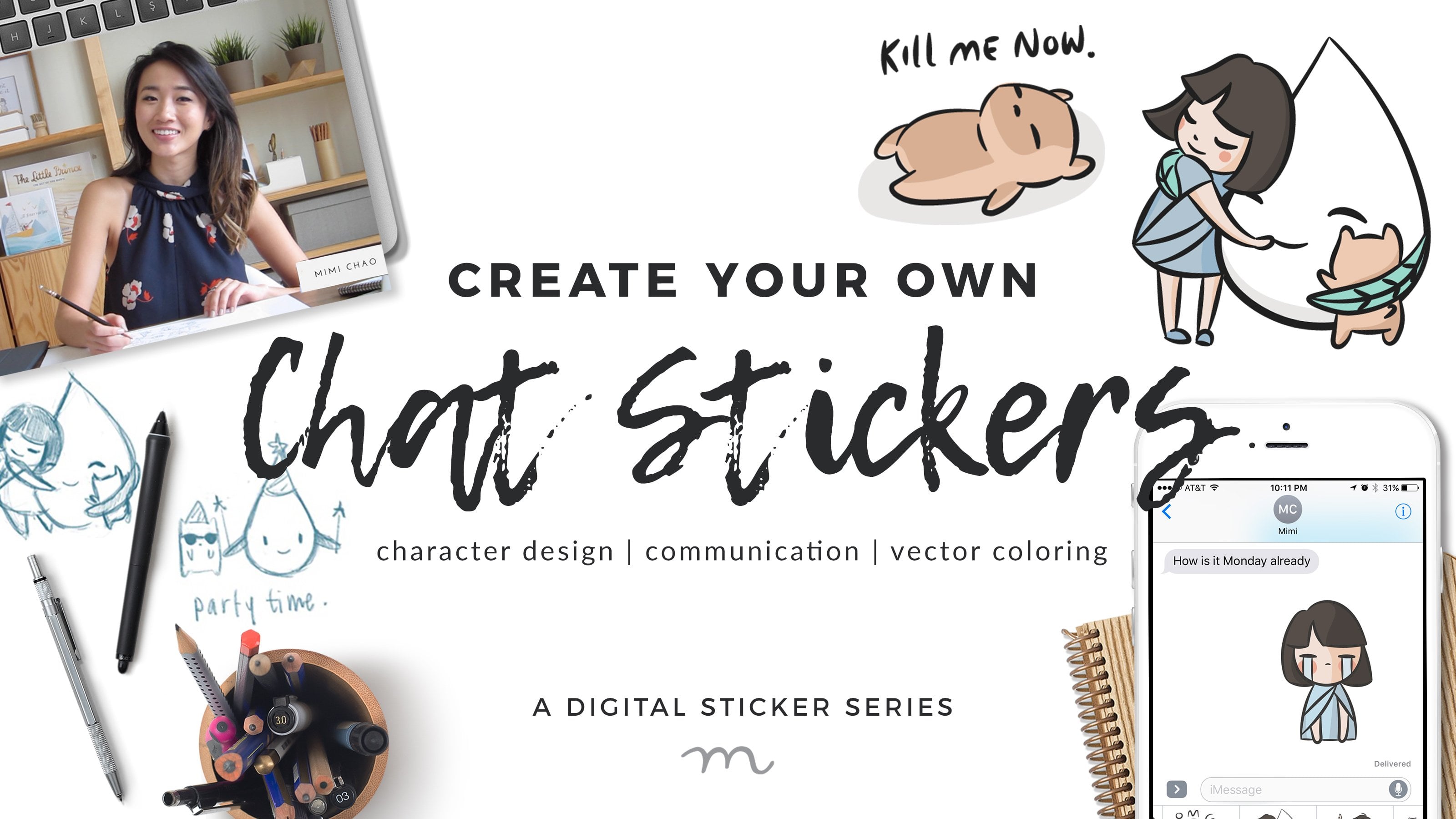
13. Final Thoughts: Thank you guys so much for joining this workshop. I hope that you found it inspiring and that you're going to go and create your characters. To me, the most important thing is to open up your mind and to feel yourself and be able to express what you have inside. I think that characters are such an important way of storytelling and you definitely have your own unique story to tell and the world needs to hear it. I can't wait to see the characters that you come up with, and remember, don't stress yourself out. Your characters are going to have personality because you have personality. I, and I'm sure everyone would love to see them, so please upload them in the projects tab of the class. If you enjoyed this class, I recommend a few other ones that I have on Skillshare. I would start with the chat stickers one actually, even though you might not want to make chat stickers, there is a great exercise in there in developing character expressions and thinking through that exercise. You can also take my very first class, which is about drawing and photography, because that helps you think about put a character into a setting. Then the last thing that I would do, or maybe the first, is the Intro to Digital Painting Class, because I go into a lot more depth that I wasn't able to get into this one hour about how to use the digital painting programs. If you want to learn more about champ and support and follow along and have a patreon for that as well. So it's patreon.com/phenotype. Thank you guys so much for joining me. It was so fun for me and I hope it was for you too. I look forward to seeing you guys around soon. Bye.
 Mimi Chao, Owner & Illustrator | Mimochai