Transcripts
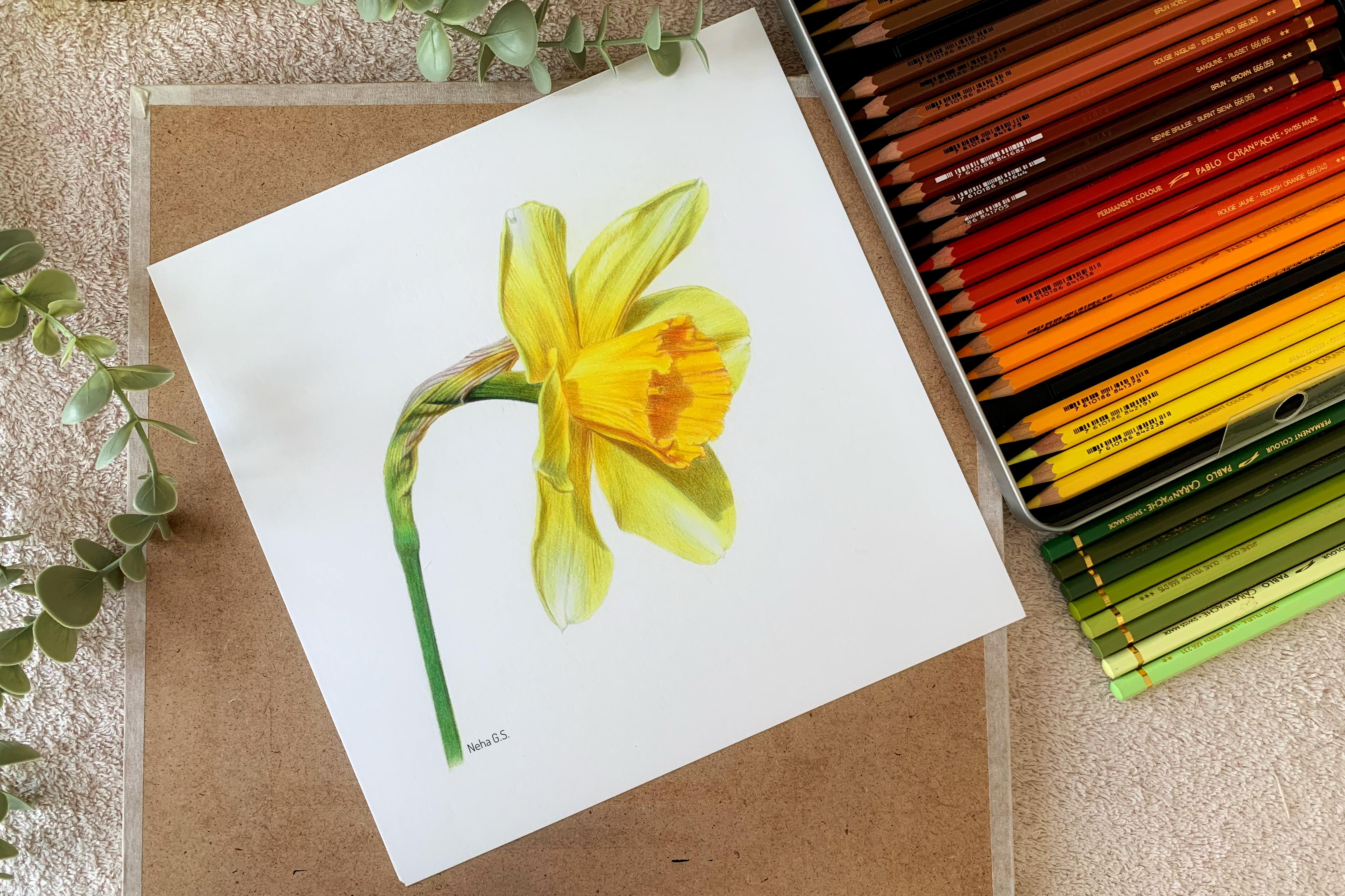
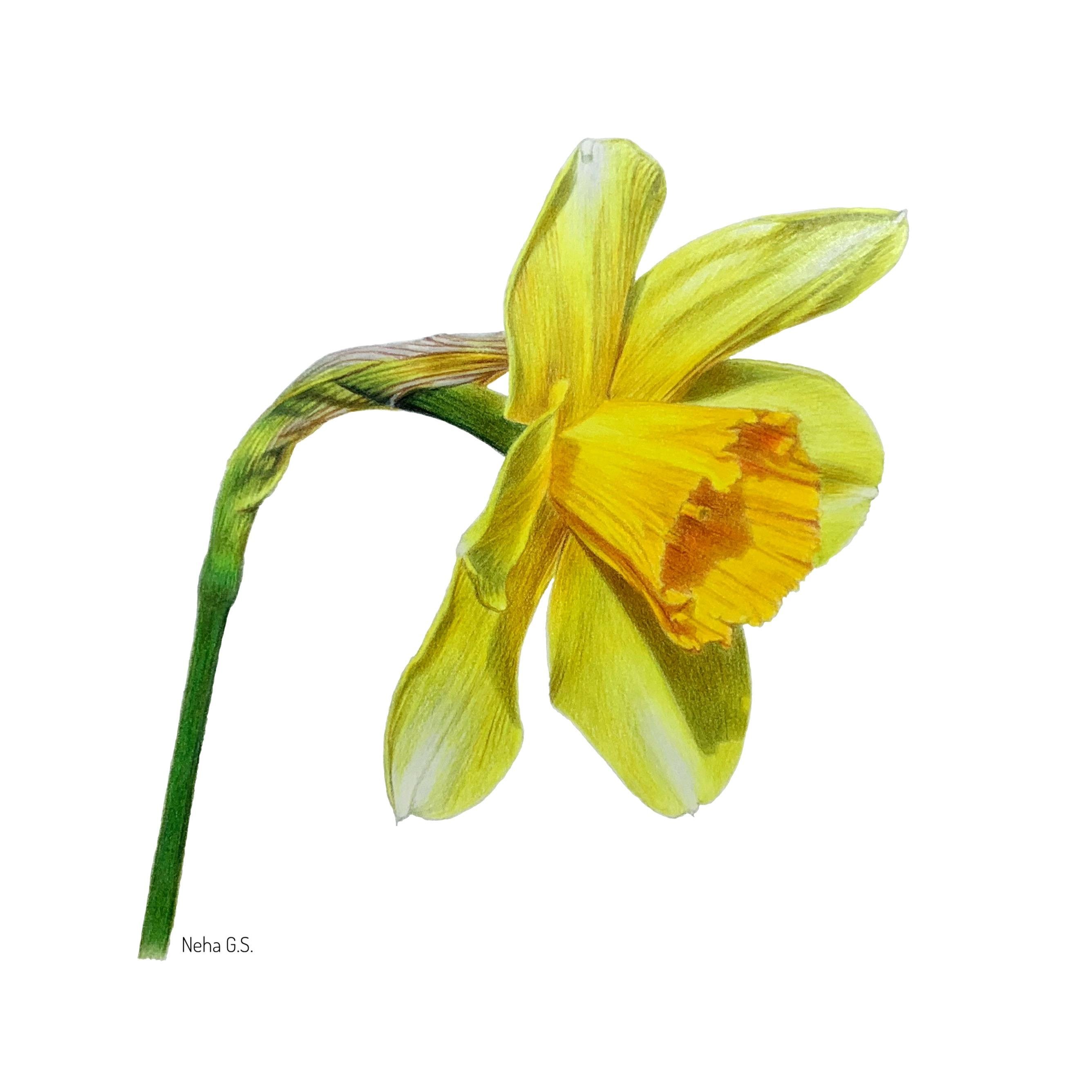
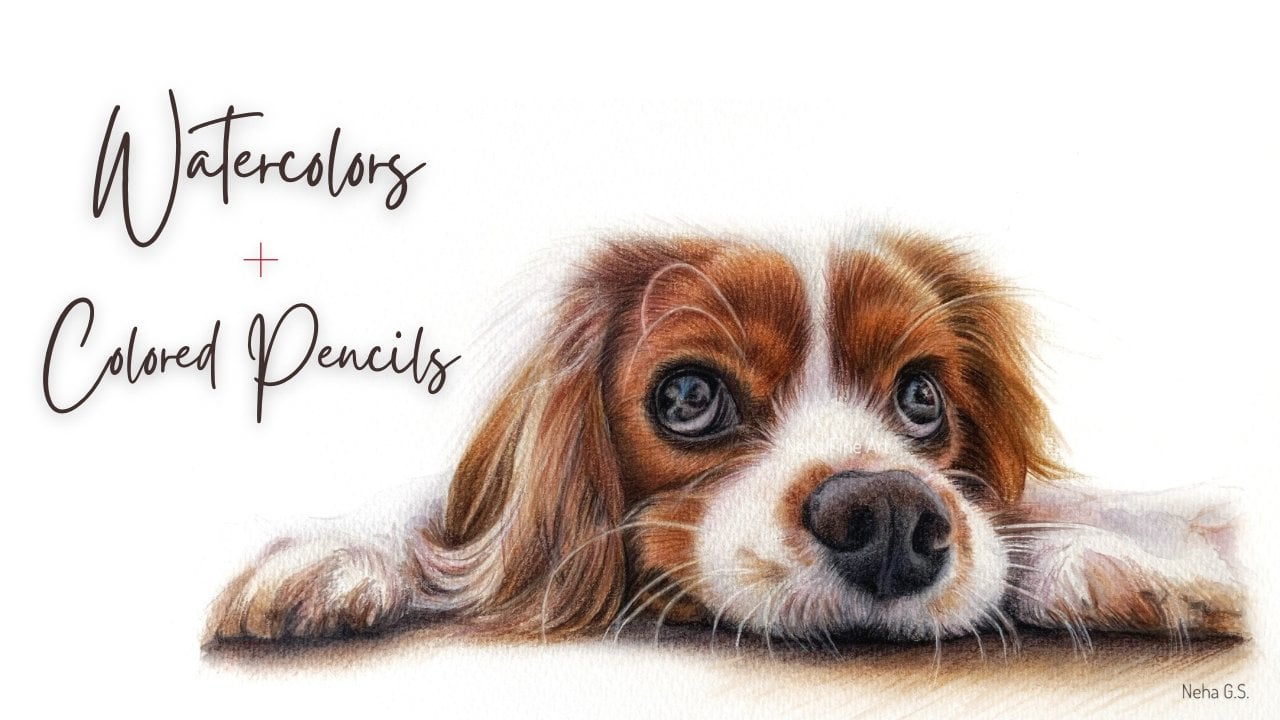
1. Introduction: Hello, everyone. Welcome
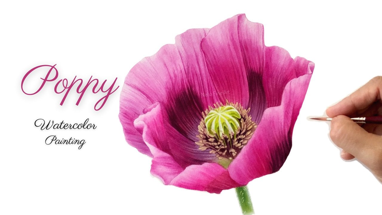
to a new video tutorial. And in this tutorial, we are going to render this beautiful daffodil
flower with colored pencils. I'll be showing
you how to achieve these vibrant hues and
which colors to use as its shadow colors so as
not to make it too brown or too orange or too
green, et cetera. As we all know that yellow is a very tricky subject because it has very limited value range, the lightest yellow and the darkest yellow
would not have a very wide value range. So which colors to use as the shadow colors
is very important. And then how I give
multiple layers to achieve these shadow colors without making it look flat and still
making it look three D, and yet the retaining all
the yellow use as well. I'll be also showing
you how to use some tools like battery
operated eraser and a slice tool to help
get some textures and also to retrieve some highlights if we
have missed out any. So these tools really
help help us out in our colored pencil journey and makes our life a
little bit easier. Layering is a major
part of this medium, and I don't use any blending
mediums or blending pencils. I just use lots of layers
of different use of different colors of
colored pencils to make the surface look very
smooth and painterly like. Colored pencil is a
very slow medium, so one has to have a lot of patience while working
with this medium. But the slowness of
the medium gives you a lot of control
over your strokes, and that is what,
according to me, makes this medium
so interesting. With colored
pencils, you will be able to achieve a
lot of details, which is so important if you're working
with hyper realism or realism as your subject. So I hope you do
give this tutorial a watch and do give it
a go if you like it. And I would love to
see your work over here or share it with
me on my social media. Thank you so much. Bye.
2. Materials: Hi. So let's go through all the materials that I'll
be using for this project. Like every other medium, even colored pencils has to be used on specific
type of paper. I generally prefer a Bristol
vellum paper from Strathmore or even a hot pressed paper from Fabriano artistico or arches. A smooth paper, but it has
to have a little bit of. So Bristol Vellum surface from Strathmore is a
beautiful surface to work with colored pencils. Now, for pencils,
I am going to use fiberssle polychromos
for this project, as well as some garndas
Pablos as well. These are the two
brands that I'll be using for this daffodil. Apart from that, I'll be
using a white prisma pencil, prisma color pencil, a
white luminous pencil, as they both are
opaque white pencils. And then I'll be using a
fabricse pencil eraser, a battery operated eraser, a slice tool cutter, from slice, which I have
not shown over here. And then I also would recommend making swatches of
your colored pencil brands, whatever brands you have, as this really
helps in selecting your colored pencils and knowing what colors
you have at a glance. So making a swatch chart
of your pencils is, according to me,
is very important. And this has really
helped me in picking out my colored pencils whenever
I'm starting a new project. In the next video, you will see how I select
colored pencils. So do give it a
watch. Thank you. Bye
3. How to select Colored Pencils- a tip video: Hi, guys. So a lot of my students
asked me this question that, how do I select colored pencils
for a particular drawing? How do I go about choosing what colors I need for
a particular drawing? So I thought let me put up a short video on this topic
because it's very important. And before we go into how to go about selecting
our colored pencils, I would like to tell you
more about colored pencils. What are the types
of colored pencils available in the market and how knowing about
your materials, knowing about your
tools gives you an extra advantage in
selecting your colors. So let's start. So first of all, there are three types of
colored pencils, oil based, wax based,
and water based. And I will go into
detail for each of them. So these are my polychromos. These are fibrocasle
polychromos. They are oil based pencils. They have a hard lead. They come to fine points. They are very good for details. They are transparent, so they
are very good for layering, but they take time to
cover larger areas. Then these are water
based pencils. These are from Carran
dash color supra soft. They get activated by water. They can be used in
its dry or wet form, and they are very
good for base colors. Prisma colors and
Durbin drawing. They both are wax based pencils. They are opaque, so they
are very good for blending. They don't come to a fine point, so they are not
good for details. And these are arndash
luminan pencils. They are a mixture of oil
and wax based pencils. These are artists
favorite colored pencils, and they are absolutely
good for everything, but they are a little
bit expensive. So these are the types
of colored pencils. And now let's move
on to swatches. So whenever I buy a new
set of colored pencils, I love to watch them to understand how they
lay down on the paper, how dark they go,
how smooth they are, and how opaque or
transparent they are. This is a very important step, and it will help you also in selecting your colored pencils
for a particular project. So now let's come
to the main topic, which is how I select colored pencils for
any particular project. So I'll show you
on this reference, which is going to be our next
colored pencil tutorial. So as it's a bird, I'll go for polychromos
and luminans pencils. So let's start with
the head region. So for any area, there are
light tones, mid tones, and dark tones,
and I will select pencils for each of
these tonal values. So I'll start with
dark tones first. And I can see a lot
of dark browns. So from my polychromos chart, I will select some browns. And I always like to combine some purples or blues with my browns to
make it more darker. So I'll be selecting
put mootem violet, then maybe burnt umber
or walnut brown. These are very dark browns. And then from the
luminance chart, maybe burn Ciena or CPA. You can remove as
many pencils as you want when you're selecting
your colored pencils, but not necessarily that you
have to use all of them. So now I'll take put
Motam violet first. This is my favorite color, which goes so well with browns. You must have watched
my sparrow tutorial. And now I'm just
going to swatch it on this scrap piece of paper. Again, the piece of paper on which you swatch
is also important. Don't do it on any
printer paper. And then I'll just match it against the reference picture. Now, this color requires a
little bit more dark and a little bit brown because I
can see some brown tones, so I'm taking walnut brown. You can even go for burnt umber. And I'll color it as
dark as possible. See, it's almost matching, and then to make it more darker, I like to use dark indigo. Now, this is how I layer
and use my pencils. But you can change your colors, try to make it more interesting. And of course, I'll be using black for the very
darkest tones, but I usually don't
just put black. I layer them with
purples, magentas, blues, because even black tones, they should have a very
interesting color tone to them. Okay? So our dark
tones are selected. You can even add some from your aluminum sheet if you
have aluminum pencils. So now let's go
to our next tone, which is the dark
mid tone color, which will be in between the
midtone and the dark tone. For that, I can see a lot
of reddish brown colors. So Burnt Sienna is a perfect
choice or maybe Indian red. So this is burnt sienna. I normally don't
do this so neat. This is just for the video
and see how well it matches. And now I can see
some orange tones. So I'll go for sanguine, a little bit muted orange, which will be base tone
for our dark mid tones, means for the burned Siena. Okay. So these two colors
go well with each other. And for all the darker strokes, you can just go for
any walnut brown. And for the lighter orange
areas that you can see, you can just use this sanguine pencil a little bit lighter. And I'll also be using some
orange pencils as well. Okay? This is the initial selection of colors, which is not final. I sometimes add or subtract
pencils from this. And now for our light tones, I am going to go for light
yellow cor, Naples yellow. I'm just going to remove
all these pencils, including green gold. So that is why swatching your color pencils
is very important. You will instantly know
which colors to go for. So I'm just watching out
all these very muted, greenish yellow kind of color. So these can go in a very light mid tones and
even the lighter tones. If you don't have a full set, you can just omit
one or two of them. It's not a big deal. And this is Naples
yellow Okay okay? But I still find a very bright yellow just under the where
the light is hitting. So maybe from my
brighter yellows, I'll select a light
cadmium yellow. So this can be a base for the very brightest
yellow parts. So this way we got all
of our tonal values, our light tones, mid
tones, and dark tones. You can always add more colors into each
of these tonal zones. For example, here
in the cheek area. I can see more of
a pinkish orange, so pinkish red, I'll
take Pompeu red. So like that, I
will be adding or subtracting some
colors here and there, but this is a good start. For any of your colored
pencil projects. So I hope this
video was helpful, and you will find selecting your colored pencils
more easy now. So see you in the next video bye
4. Petal 1.a: Hey, everyone, so let's begin. I have traced out the drawing onto my fair sheet of paper. I'm using a Bristol
vellum paper for this. And here, I'm just going over all the graphite lines
with my needed eraser. I'm just going to do this
petal by petal so that I don't lose the drawing
in the process. So make the line
drawing as light as possible as we are working
with very light colors. So I don't want any
graphite drawing pencil lines to get mixed up with my colored pencil tones. Now, I'm taking my white
prisma color pencil. This is a wax based pencil. You can take any wax
based pencil you have like Durbin
drawing or aluminums. And with this, I'm going to secure all the lightest
areas on this petal, all the highlighted sections
that you see on the petal, the white areas, especially. So with the very light pressure, I'll be coloring the areas which are white looking,
the brightest. You can even say the
highlights of this petal. And this is just
our first layer, so don't go in with
heavy pressure. Otherwise, we'll
not be able to do multiple layers on top of this. So this wax based layer will secure all our
lightest colors. So I'll just go on with my
white pencil in this area. Now the next light color I'll be taking is cadmium yellow lemon. This is from polychromos. And again, with a pointed pencil and with a very light pressure, I'll be going over
the entire petal, moving in the direction of the veins that you see this way, you will start creating a three D kind of effect
right from your first layer. So I'm ignoring the very brightest white
areas on the top. So I've just faded
away my yellow into the bright white areas. A I'm again, lightning this other pal. Don't want to make the graphite pent by going over with
the colored pencils. An accurate line drawing
is very important when you're working with the
realistic drawings. This way, I've filled
up the entire petal. Here, I'm again coming in with my pencil to further lighten
all the black pencil lines. Try to make them as
light as possible. So after securing all
our lightest areas. Now I'm coming in
with light olive. This is from Garnda Pablo, and I'll be going in I'll be coloring in all
the veins and the shadows, which is basically our
darkest tone on the petal. Keep your pencils pointed as we are going over
very thin lines. Just follow the
reference picture and follow the direction in
which the veins are going. Here, our line drawing
will really help us. And this color will
only go into the areas, which has a little bit of
this green tinge to it. I like to secure all
my darkest stones at this initial stage so that I don't lose
my pencil drawing. Because with multiple layers, we might just lose
the pencil drawing, and then we'll have to just eyeball all the details on it. Here again, I'm trying
to e of the vein. And it's a difficult
after we have gone over with colored pencils. Again, even if the lines
are looking very dark, don't go very dark at this stage and still keep your pencil
pressure very light. I will tell you when to increase the pressure
of your hand, which will be almost at the
end of the finished line. I can see this color
even in the shadow area. If you don't have
these exact colors, which I'm using, you can always
mix colors on the paper. Just go with whatever
green you have, and then mix it with a little
bit of yellow or gray, and you will get the
exact same color. So this is the shadow underneath
that fold of the petal. It is still very dark in
the reference picture, but we will not go very
dark at this stage. I'll be taking these veins into our brightest areas as well. These petals have too
much of texture in terms of wrinkles and in terms
of linear texture. So we'll try to incorporate all these in our
drawing as well. Keeping your pencil
lines light at this stage also ensures that
if we make any mistake, then you can easily
erase them off. In the The next color is green gold from polychromos. And with this color, now, I'll be giving more of a warmer tone to the veins
and the shadow region. Move in the direction
of the veins and the petal that you see on
the reference picture. This particular area
looks quite warm. See which veins need a
little bit of tones. H. Oh. Oh. So colored pencil is a very slow medium, but then you can give so many
details with the point of your pencil and because
of the slow process, you have full control
on your drawing, and it's a process
I really enjoy. So I'm taking this
light olive again for the very outer
part of this petal. Now, this is cadmium yellow
again from polychromos. All the pencil names and numbers and brands are mentioned
in the list of materials, which comes with this tutorial. So please remove all
those pencils if you have the same ones or else. I've also given alternatives
to the Pablo pencils. If you don't own pab colored
pencils and only polychrome, if you own only polychromos, then then you can just see
the alternatives as well. I feel polychromos is a very
good initial investment, if you are very serious
about this medium, because it's highly pigmented. It comes to a very fine point. They are oil based pencils, and they have a very good range
of mostly all the colors. So with this pencil,
cadmium yellow, I'm going over all the
deeper yellow colors. So this is our dark midtone. Because we have that
lemon yellow down, this will further brighten
up this can yellow. Now, with light rome yellow, I'm going to fill up the area. This is a mid tone color, and this will be a
nice transition color between this very deep yellow
and the lightest yellow. I use only layering technique
as my blending technique. I don't use any other
blending mediums like OMS or any blending pencils. So with every layer, I keep on blending the
layers below by using appropriate colors and by using appropriate hand
pressure as well. I'm still going with very
light pressure at this stage. I don't want to flatten out
the tooth of the paper. At the same time when we go with this pencil on the darker color, the darker color starts blending it blending out a little bit. So the more layers you apply, the more smoother, your
drawing will start looking. I'll start looking
like a painting than a colored pencil drawing.
5. Petal 1.b: So I've turned my board
and my reference picture, and I'm going in
with earth green now and we'll darken
all the greener areas. If you feel you have
made a very dark mark, you can just erase it off because we went in with
very light pressure. It will easily get erased off. Earth green is a beautiful
grayish green color, which will give which is very useful for
the shadow areas, especially on yellow subjects. Oh. After filling up all the
light tones and mid tones, you will realize that your darker tones needs
to be more darker. That's why I'm going
again with earth green. And I've just created a
shadow underneath the petal, which is a small bit of petal, which is falling
on the bigger one. And even this shadow needs
to be a little bit darker. Darken your darkest stones
in stages that way. Even if you make a mistake, you can easily erase them off or you can lighten them off. I'm also going to extend some of the vain lines into
the shadow region. Pay attention to all the folds
and wrinkles on the petal. Giving some hatching
lines on this area. Now, this is olive again from Pablo to further darken
this shadow region. With lighter subjects
like yellows and white yellow flowers
and white flowers. Be very cautious when you
are doing the darker tones. We don't want to lose the brightness of
the yellow colors. At the same time, we do have to give the shadows to give
it a three day look. So I like to work in stages slowly increasing the
depth of all the shadows. This is green gold
from polychromos. Again, green gold is
a beautiful color, just like yellow ochre. It gives a beautiful
muted shadow area for the yellow tones. So this is a good base for your orange light orange tones. Otherwise, it'll
look too orange. If you just use orange on
all your darker mid tones, the flower will start
looking to orange. I'm going over the
earth green as well just to mute down
that color as well. 's This is just cadmium yellow from polychromos. And I'm going over the green
gold that we have done. So this way, we are pushing
that color into the paper, thus blending it and
smoothing it out. And this is cadmium
yellow lemon. The first color
that we had used, using that as the petal, the Outermost part of the petal. I'm taking light olive, just to give sort of an outline. Otherwise, it will get lost, that edge will get lost, and I will not be
able to see much. So just a very faint
kind of outline, a broken outline so that it
doesn't look like an outline. And now with white, I'm going to further lighten
it and also smoothen it out. This is light gray from Pablo. And as you can see on
the reference picture, the white highlights are
not completely white. I just giving a light
base of light gray. And also going into these
areas to create a little bit of shadow as that
petal is bending. And now with white luminans, I'm going to further lighten it. At the same time, I'm
just going to burnish it. Burnishing is
nothing but blending your layers by using a little bit hard pressure
to make it smooth. With light olive, I'm again
going over this area because the more lighter colors
like white and gray we use our darker and
our darker midtones, they tend to become a
little bit lighter. So always keep on checking
your tonal values. I'm still using very
light pressure. This is light yellow glaze, and again, I'm going over
all the yellow areas. Even outside here. Dark *** yellow to give a
little bit of oranges stones. And this is green gold. Again, light yellow glace. Go over the veins with
your lighter color, we also push the veines
further into the petal and make it look a
part of that petal. This is light gray again. I just creating a shadow
around that white area, and this is earth green, just want to darken the shadow. This is light gray from Pablo. This gray will give a nice silver kind
of shimmery look to the yellow petal. Earth green. And then green gold. Um yellow. And then with white, just going to give
some highlight. This will show the
very shiny parts of the flower of the petal. And this is dark yellow. There is a little
bit of orangish reflected light in
the shadow over here. I'm also taking chromium green
opaque to further darken this shadow and even a ayer. So see how many layers
we have given with different colors to create
that darker shadow. Working in layers will help your drawing
look very realistic, and with more layers, your drawing starts
becoming more smoother. And I'm taking olive
yellow here from Pablo. This will again give a nice
shine to the yellow region. Try to use as many
colors you have. Try to mix colors on the paper. Don't shy away from mixing
or using more colors. With every layer, every
pencil, I'm applying. I'm smoothing out all the layers which we have done below. Again, I'm taking white. Do. Cat being yellow. We are in the final
stages of this petal. This is green gold. Just giving my final adjustments
in the tonal values. And just assessing all the
tonal values over here, the dark tones, the mid
tones, the light tones. With this, we finish
our first pedal. I'll see you in the next one.
6. Petal 2.a: So let's begin with
pedal number two. So again, I'm going over
all the graphite lines with my needed eraser
to make them light. Next, we are going to take the
prisma color white pencil, and I will apply this
pencil whenever I see all the very brightest white
areas, the shiny areas. And I'm using very
light pressure again. Going in the direction of
the veins of that petal. This habit is always
very helpful. There's a nice highlight here on the end of this
petal as well. Next, cadmium yellow lemon, and we'll fill up almost the entire petal
with this color. I will be going
over all the areas, except for the very
white grayish areas. So these two areas, I'm leaving a
little bit lighter. You can always come
back on it later on. But at this stage,
I like to leave things a little
bit more lighter. Now, I'm taking light
olive and we'll start going over all the
veins and the shadows, especially which are
more green in color. Okay. Following the direction of those lines as seen in
the reference picture. Let your line and guide you as to where you have
to apply which color. With color pencil medium, you have to mix
colors on the paper. You will never find the perfect color in any
of the sets that you own. So a little bit of
color theory knowledge is always very helpful. So if you want a
very muted green and you have only
brighter greens, then you use some gray with it. If you don't have
lighter greens, then just mix some
yellow with your greens. So that way, some knowledge
of color theory will be really helpful while selecting your colors and while
layering the colors as well. So in many areas,
you will see that I am giving a base layer
of this light olive, and then on top of it, I do go over with green gold, which is much warmer yellow. But both of them mixed
together gives me a beautiful, muted kind of olive yellow, dark olive yellow color. So try to experiment mixing
your colored pencils in your sketch book before going
into your final drawing, especially for projects that
you're working on your own. With a lot of practice
and experience, you will be able to gauge
these colors more better. So a good amount of practice
is always a benefit. So this color will also go
into this shadow region. But the top of this
shadow is more warmer, so I'm taking green gold. And even the left
part of these veins, the petal has more of tones, which is getting reflected from the center of the
daffodil flower. A sharp pointed pencil. I'm able to do all
these details. So this color will go into all the areas where
I see some warmth that to the shadow. I'm taking cadmium yellow. From polychromos. And there is a nice warm yellow, deep yellow reflected here. I'm just going to erase
of this pencil line. Leaving some areas for our lemon yellow also
to be seen from below. The advantage of
using colored pencil, especially polychromos, is
that they are oil based, and they are pretty transparent. So you will see all the
layers that you have done. You'll be able to see
all those colors. Now, this is light
olive from Pablo. And this color will go into
more of more lemon areas, which is on the further
end of the petal. More cooler yellows,
you can say. Knowing the temperature of the colors is also very helpful. I'm leaving a gap of
that white pencil layer, not completely covering it. Pay attention to all the
folds of the petals, the direction of the veins, the texture of the texture and the direction of all the lines that are seen on the petal. As those details will contribute to the
realism of the drawing. I'm taking earth green
from polychromos, and I'll be making all
these greener areas a little bit more darker. Making a very crisp edge, especially where the
petal is folding up. Where I see a very
soft shadow area, I just go in circular motion. Taking light olive again. This is earth green. I want to darken some of
the veins here. The more time you spend
on a particular area, the more details you will see, the more colors you
will start seeing. So invest a good amount of time in studying
your reference. S. Keep on sharpening your pencils in between and
keep on rolling your pencil, don't work in just
one direction. Otherwise, you will
be just coloring on the surface of the paper and you will not be able to
reach the tooth of the paper. So I'm switching between
earth green and light olive. Wherever I feel, this area
could get a little bit darker. I'm coming in with earth green. I The next color I'm taking is brown cur from Pablo to darken this shadow area beneath our previous petal. Try to make your
shadows as dark as it is seen on the reference picture and your bright lighter areas as light and bright.
This is dew. The range of tonal values and the contrast seen in your drawing will really make your drawing pop
up from the page. So don't be scared
of going too dark. Do it in stages
if you're scared, keep on reviewing
your drawing from a distance and slowly, but just go and make your
drawings look better. Now, this is Oca from Pablo. This color is a little bit
darker than our green gold. Green gold again. This is khaki green. This color is a little bit
darker than our light olive. Try to use whatever color
pencils you have and try to mi some colors into it. Olivia. Light chrome yellow
from polychroms. This color will cover up
almost the top of the petal. Light or live again. I'm taking silver
gray to color in all these lighter gray areas. Y. You can leave it
white if you want. You can just go over it
with your white pencil, but I just like this silvery
effect which it is giving. This is a light, a bit
der than the silver gray. Just to darken up some of
the shadow regions. O. Giving a crisp edge to
the top of the petal. Now this is a very dark
olive green color. Just to some of these
shadow regions. And even the shadow
underneath this fold, especially the line where it
is touching the inner line, and even here, Oh
7. Petal 2.b: So Let's continue. I have turned my board and the
reference picture. From time to time, especially
in the last final stages. I like to change the position of my drawing and look at it from a very
different perspective. This allows me to see all
those tonal value changes, which I'm not able to see always from looking at it
from one angle. This is a very good habit. Especially if you're working on a drawing for a long
period of time. This has really helped me, and I always do this in all
my drawings and paintings. It gives you a fresh
approach to your drawing. So just put your drawing upside down and even
your reference picture, and you will be amazed
to see how much of more improvements you can make to that particular drawing. So this is khaki green
that I'm using from Pablo. And now with olive yellow, I'll be blending these darker
colors into the paper. So this will also
smoothen out and it'll smoothen out the grains that colored pencils
leave on the paper, just making it look very
smooth painting like drawing. Cadmium yellow, for
the top portion for the inner portion
of the petal. And this is dark
cadmium yellow to further deepen all the
deeper yellow colors. This is light olive again. Cadmium yellow lemon
from polychromos. Smoking out all
the lighter bits. In your final stage, you can use a little bit
of hard pressure. Now I'm going in
with white pencil, and I'm using a little
bit more pressure to further brighten up the
center of this petal, and I'm also
burnishing this petal, especially the lighter areas. And now I'm taking earth green yellowish
from polychromos. This is olive from Pablo. Further darkening this
line, the shadow line. And with olive yellow, I'm just going to color the
folded part of the petal, which is much more lighter. And with this, we finished
this petal as well.
8. Petal 3: Similarly, let's start
with the third petal, the one which is peaking
behind from behind. Again, here, I'm
doing my usual thing. I went over all the graphite
lines with my needed eraser. And I'll again start with my white prisma color pencil and go over the brightest areas. So the reason I'm going
with a white pencil on all these areas which are looking white and
more lighter than the rest is if I make a mistake, if I go over it
with other colors, and I can easily erase
it off or scrape it off. So the next color is our
cadmium yellow lemon, and this color, we'll be going over almost the entire petal. The procedure is the
same for all the petals. Again, I'm seeing
which areas to leave. Not going with yellow
on all the areas. We'll be leaving all the
brightest white areas. This color will also go
under the shadow region. This will just brighten
up the shadow as well. Next color is olive yellow. This petal is more of a greenish petal because of all
the leaves surrounding it. It's getting a n green glow from the from its surroundings. I Oliive yellow from Pablo. Taking light live now
for our shadow area. Everything everything There is a line over here, which is a little bit away
from the edge of the petal. I think the petal is a
little bit folded from here. And then I'm giving
the outermost line. I'm still using light olive. Let's take just olive now. This is olive from Pablo. The shadow is on
the top section. Yes This is earth green
yellowish from polychromos. This will just brighten
up those greens. I'm taking earth green. Keep your edges always
very crisp and clear, taking light olive again and we'll start
working on this area. Is going to erase off this part. Taking O olive yellow now silver gray for our brightest areas. And then light gray
to further darken. Now, with white, I'm
just going to smoothen out this shadow region. I'll go in the
opposite direction, and I'll go with a bit of hard pressure again say medium pressure and
taking green gold. Just give this a
little bit warm color. Light yellow glaze
from polychromos. And light olive from Pablo. There is some green on the edges of the
petals that I can see. The petal of the petals of this flower has a
lot of texture. It's not a very smooth petal. Try to create that kind of
texture with a lot of lines. This is khaki green from Pablo. Again, our light grow yellow to brighten up the yellow yellow
area of this petal. Dark cadmium yellow. Just some warmth on the
top part of the shadow. And again, green gold. This is earth green. Now I'm taking my slice
tool slice knife. You can even take
an exacto knife. And I can see a
highlight over here, a white line, which is just
below that darker line, which I forgot to leave, so we can just scrape it out. Do it very gently. And then on top of that, I'll go in with my sharp
luminous white pencil. I'll also go into all
these lighter areas thus burnishing the petal,
smoothing everything out. You can even move in
opposite direction. And with this, we
finish this petal. So see you in the
next video. Bye.
9. Petal 4: So Let's start painting
this tiny petal over here. Lightening the sketch
with my needed eraser. Taking my prisma
color white pencil and securing all
the white areas. This color, I mean, this white pencil will go into all the reflected
light areas. I'm taking light grom yellow
for this twisted petal. And mum yellow lemon for
the base of this petal. The process becomes much
simpler after the first petal. The first petal is where
I experiment with colors, with techniques, with what
colors to layer on each other. And then the rest of
the drawing becomes a very relaxing process.
You can even do. Sometimes I just if it's a
very complicated flower, I just practice
one of the petal, the most difficult
one in my sketchbook. So that way, I establish what colors will go
on top of each other, the sequence of the
colors, basically. So that's also a very
good habit to cultivate. This color is going
on the entire petal. Taking light olive now, and we'll start doing all the veins and all
the shadow areas. This will go as a base.
Still light olive. Leaving a little bit gap
on the left hand side for the thickness of the petal. Again, move in the direction of all the vines and the lines that you see on the petal in
the reference picture. As you can see, I'm going
with very light pressure. It's very dark on the
reference picture, but I'll be going very
gradually in stages, mixing different kinds of shades for this shadow as it also
has a bit of reflected light. Again, the thickness of this bottom part of the
petal is quite dark. And I'm mimicing the
texture which I can see. Leaving some gaps in
between each lines. Leaving a little bit of
reflected light over there. Now this is green gold
from polychrom I'll start giving some tones to the light
olive that we have done. S. This area is going inside the
fold of the petal. And there is a little
bit of warm even here. The reflected light is coming from the orange
parts of the center. This is dark cadmium yellow. Now, the right hand side of
this petal is quite orange. Just observe how the strokes are moving in what direction? And this is cadmium yellow, a little bit lighter
than the previous color. And with this color, we will be transitioning the darker color into
the lighter color. Cadmium yellow is
also a warm color. So just apply wherever you
see the warmth on the petal. Sometimes I go in opposite
direction just to blend the layers below
to smoothen it out. But I'm still using
very light pressure. Keep all the edges of each
petal very crisp and clear. This is dark chrome yellow. I just want to increase the
orange part of this petal. The reason I'm going very slowly in stages to
darken any color, especially for this
yellow flower is because yellow is a
very light color. I can get easily contaminated
with different colors. If I make it too orange, then it will become
an orange daffodil. If I make it too green, then it will become
a green color. So With your yellow tones, you have to be very careful, especially when
you're working with shadow areas with
the darker colors. Work in stages, use different
tones wherever you see. And that way, your yellows
will still look fresh. At the same time, you have given the darker
shadows as well. So this is olive black from
Pablo to further darken my green tones. Olivia ello. So this will smoothen out all the vines and lines
that we have drawn. Olive again. Still want to
make this area a little bit, but I'm going very
cautiously, as I said before. T earth green from polychroms. The defining this edge. Still darkening the area which
is going inside the petal. This is light gray, Gray will further push the shadow areas
down into the paper. Khaki green from Pablo. Leaving the reflected light
areas is very important. Taking light olive again. I'm just going to
fill up the space. This is green gold. Light yellow. I
want to brighten up this section. Silver gray. And then cadmium yellow
lemon from polychromos. This is green gold again. I'm just going to
define the edge and increase the shadow on the petal below so that
this petal stands out. And with cadmium yellow. Now, light chrome yellow, I'm just going to
color that area again. Olive. Again, I'm darkening
the darker areas. Colored pencil, it
is a slow medium, and you have to have a lot of patience developing
your drawing. But it is so
satisfying in the end, you have so much of control on your colors and your strokes. So I think I enjoy
the slow process of this medium and gives me
the results that I want. This is occur from Pablo.
10. Finishing details on Petals 1,2 &3: In this part, I'm going to
work a little bit more on the other petals that we have already done,
the surrounding ones. What happens is once
you do one petal, and you will suddenly
realize the petal that you have already done needs to
have a little bit more color, maybe more shadows,
maybe more darker, because initially when
we did that first petal, we were just comparing it with the rest of
the white paper. So that time we felt that
this tone is correct. But as soon as we do
the surrounding petals, then we always should check the tonal values of the
previously done petals as well. Because now we are comparing
it with each other. So this is a good practice. Don't just leave
that petal thinking, Okay, I have finished
the first petal, and I'm not going
to go back on it. Always keep on comparing the tonal values of the
previously done petal as well, because after all, it's
just one same flower. So I'm giving a
little bit more color now because as soon as I
did this fourth petal, which is quite dark compared
to the other three, I realized that I need to work a little bit more on
the previously done ones. So I'm increasing the shadow This is green gold
from polychromos. If I miss saying any
of the pencil names, then just pause the
video because I'm showing which pencil
I'm using in the video. This is Ok from Pablo. Little bit of changes
here and there will really make a good
difference on your drawing. This is light olive from Pablou. Taking occur again. Compared to the shadow
on the third petal, this area is looking
very light now, so I'm going in with
more darker colors. This brown oc from Pablo. Keep on coming back to
your drawing, maybe twist. I mean, maybe just turn
your drawing around, as I said previously
in the video, keep it upside down and then keep on checking
your tonal values because tonal values is the
most important thing when it comes to
realistic artwork. More than colors, your
values have to be so to make that flower or bird or any subject look
more and realistic. This is olive. And now I feel like darkening this
shadow area a little bit. Taking occur and just giving some color to
this area as well. Light olive from Pablo. This will give a
very rounded kind of effect on the petal. We'll be working more on this smaller petal
later in the video. This is not done. This is
earth green from polychromos? And now with white. I'm just going to lighten some of the areas and blend
some of the areas. I'm just using a little bit
hard pressure over here. Don't want to burnish
the whole area at this moment because I'm going
to come back on this petal. So I'll see you in the
next video then. Bye. O
11. Petal 5.a: Let's move on to the next petal. Lightening the sketch. Going over with my white
prisma color pencil in all the white areas, the brightest highlights, giving a very light
coat of this color. Taking olive yellow, and
this color will go as a base for the entire petal as this petal is of
a greener shade. It's getting more
reflected light from the leaves surrounding it. But I'm still following
all the direction lines, and my pencil is moving
in the same direction as I see the different lines and
the texture on the petal. This is olive yellow from Pablo. I'm going to leave the area, which is more lighter
than this greener area. Also in the shadow areas. Taking cadmium yellow to give some warmth to the
top of the petal, which is getting
the reflected light from the center of the flower. Green gold from polychroms. With this, I will be
coloring the shadow area. Giving a crisp edge
to the center. Observe your reference
picture closely. I'm still following
the direction of the lines of the
texture on the petal, even in the shadow region. Here, I'm going in
a diagonal fashion. Khaki green from Pablo. I'll go over the green gold
to give it some color. Carefully define the
shape of the shadow. The shadows is what it's making this flower
very interesting. This is light olive. Now I'm switching to a
little lighter color. As it's going towards right, it's receiving more light, and the shadow is
becoming more brighter. Whenever you're selecting
any reference picture for lighter flowers, like yellow flowers
or white flowers, select reference
pictures, which has interesting play of
shadows on them. Those will really make very beautiful drawings
and paintings. This is just a
small tip from me. If you select a
picture which in which the white flower or
the yellow flower is in a very diffused soft light, then showing that rendering on a white paper will
become very difficult, and it will not look
interesting enough as well. So I'm just filling
up this area. And now with light I
mean, olive yellow, I'm going to fill up
all those white gaps that you can see in
between these two colors, and this will blend the
light olive into the paper. It'll make it more smoother. Again, if you want
to blend something, just take a lighter color. In some cases, even
white will work. And then with a
pointed sharp pencil, that is very important
because that will go into these fine
crevices of the paper, just making it smooth. I'm also going in this area. This will also help in blending
the darker two colors. Taking khaki green from Pablo. And here on the left hand side, there are some folds
on this petal, so just going to
give those details. And here, I'm giving some lines. If you look closely, you can see some
lighter green veils. And at the same color, I'm just going to darken
some of the shadow region. This is olive from Pablo, and again, I'm going to
darken the shadow further. Ss colored pencil is
a transparent medium. I like to layer all the
very brighter colors underneath my darker colors. This way, the brighter colors
will definitely show up a bit and just brighten up
even your darkest shadows. Go in small circles and to
just tighten up that area. And I'm holding the pencil also nearby to the
point of the pencil. This way, your
strokes are tighter. Oh
12. Petal 5.b: Let's continue.
This is Brown ker. I'm going to darken the top part of this shadow a
little bit more. But you'll definitely
be able to see all the greens that
we have added below. So whenever you're
selecting colors, just try to see the colors just not the
superficial ones, you know, but what other colors you can see in that particular
reference picture in that particular area, and the more colors you make, the more beautiful result
you're going to get. This is green gold
from polychromos. Light grow yellow. I just want to brighten up
this part over here, and then the rest of
the petal as well. This is light olive. For that light
yellow to stand out, I'm just going to make
the surrounding b. I'm giving more layers to
smoothen out this part. So going in opposite direction, this is earth green
yellowish from polychromos. Light olive again. This is cadmium yellow lemon
from polychroms. Using this pencil to fill up all the whiter grainy surface
that you were able to see. So I'm just going in
opposite direction as well, in circular motion, just to fill up and smoothen out all the colors
that we have applied. Light chrome yellow a Dark Cadmum yellow
from polychromos. Little bit in the shadow also. Shadow is also a
part of that petals. Don't treat it differently. Cadmum yellow again. So many yellows, and each yellow will
shine out in the end. Light grow yellow. As
you go further down, it's not that warm yellow, it's becoming more
and more cooler. Cadmium yellow lemon again. So this will be a good
transition color between your white areas and
your warm yellow colors. Going to brighten up the shadow, also, especially on
the bottom most area. Light gray from Pablo, we'll start working
on the center area. Using very light pressure. And I'm going to define the edge This gray will also go into this shadow region on the left. I'm taking white and
further brightening the area and also blending the surrounding
areas into the white areas, just making it a transition,
a nice gradient. This will also smoothen out, burnish all the colors. Burnishing is always
done at the very last where you go over with your
lightest color pencil. In this case, it is white. It's not always white. And then just going in with
a little bit hard pressure, this will blend all the
layers underneath it. But then this has to be done in your very final layers
because then on top of this, you will not be able
to go with more layers as you have now flattened
out the tooth of the paper. So always do your burnishing
when you feel that, okay, I'm not going to go more with my layers on this one. So that is the time you do your burnishing or
your final blending. Light chrome yellow. And now after you
have burnished, then the next layer has to be super super
soft and very light. You cannot press the
pencil now, otherwise, you'll start removing disturbing the layers below, especially
after burnishing. I'm taking olive.
I want to darken some of these
shadow areas again. And especially after you have used white and
burnished the area, some of your darker colors might get a little bit lighter, so you can still go on them
with your darker pencils, but just use it very gently. Light yellow. Cu yellow. Cu yellow lemon Oliive yellow. Giving a final
glazing of colors. And with this we finish
pedal number five. I'll see you in the next video. My
13. Petal 6: So let's move on to petal
number six of our final petal. And this one will require
a little bit of work. Here I'm again lightening the graphite drawing
with a needed eraser. Taking prismacolor white and preserving all the lightest
areas on this petal. By now, I'm sure you
know the method, the technique that I'm
following on this drawing. So I'm only going with
this white pencil in the most bright
whitest highlights. This will also go
as a background for the petal which is folded, a little bit under the
brightest yellows as well. You can always cover it
with your yellow pencil, but it's better to
give a little bit white if you are
planning to go light. Now, this is olive
yellow from Pablo. And I'll start with the
darkest shadow areas and all the darker veins. This color can also go as a base as the yellow on this petal looks
very greenish yellow. Again, I'm moving
in the direction of the veins of the petal. Next is light chrome yellow to brighten up our greenish
yellow olive yellow. I'm also applying in
the shadow region. Let that shadow area also get some beautiful reflected light. I'm working on the
top of the petal, where it is mostly
in the shadow. So try to look for the
lightest color that you can see in the shadow area as well
and then apply that first. So I'm taking
Cadmium yellow lemon for the very cool yellows. Every layer of pencil
is contributing to the final colors and the
final outcome on the petals. So don't think that
we're just covering a particular color with
another pencil, so it's waste. This is khaki green from Pablo. And now I'll start working
on all the darker areas. I'm working in with very soft rendering using circular motion
or just hatching, but all the lines are
very close to each other. This is earth green
yellowish from polychrom And now green gold to
warm up that color. The green gold will also go in all our warmer shadow areas. Giving a crisp edge
to the petal above. Taking again. Establishing the
shape of the shadow. Again, I'm moving with very soft touch with
very light touch. Try to drag the veins into
the shadow area as well. It should just not stop
in the brightest areas. This is olive from Pablo, and I'm going to darken
this right hand side. And even the left
hanside shadow area. This is cadmium yellow lemon. For the more brighter
left inside area, taking light olive from Pablo. Just giving a thin outline so that it just doesn't get
lost on the white paper. And then, I'm just going to
brighten it furthermore. If your shadows are important, then your highlights
are equally important, so keep them as light as
you can as you see on the reference picture
and the shadows as dark as you see on
the reference picture. And now with green gold, just going to warm up
this shadow region. This is olive again, going to darken the shadow
area under that center, the deep inside of the petal. Admin Mellow, I'm just going
to use some warmer tones. Cam yellow lemon. And with this color, I'm just going over our
lighter areas again. So this will just soften
all the layers below. It will just start
blending them out, smoothing out the layers. So go in with your
sharp pointed pencil. Earth green from polychromos. I keep on coming
back to this petal. I still haven't finished
the petal number four. I will be doing more
work on this because it has beautiful reflected lights and shadows in a very
interesting way. And I am still not satisfied. So I will be working more
on that smallest petal. Green gold. This darkening of the veins now
because we went over all the darker areas with
our cadmium yellow lemon. So you need to
darken the darker, the darker veins again. Occur from Pablo And this is earth green. The more shadow you
create over here, the more lifted your
petal number four and your center will look. Taking light gray now for our very light parts on
the center of the petal. And the silver gray
for the lightest days. And then white luminans white. Blend these 2 grays together. Aluminum pencils are a mix of
oil and wax based pencils, so they are not very waxy. At the same time,
they are opaque, more opaque than
polychrom white. That's why I really
love using aluminums, especially to blend and
burnish the final layers. So we'll leave this petal
for now and we'll come back to it when we're doing
the surrounding area. No.
14. Finishing details on Petals 4 & 5: So as I told you, I'll
be coming back on this petal number four
to work more on it. So here I am with my
battery operated eraser. This has a very fine point. And I have further point made that pencil like point by
going over a sandpaper block. So I'm just removing
some of the highlights, which I feel that I had just accidentally covered
them with my pencil. This is the advantage of
giving your first light bas, your white pencil, and
your light yellows. That way, you're
easily able to erase them off at whatever stage. This eraser is a
very helpful tool in your colored pencil kit and go for a thin point battery as. And this is a pencil
eraser from Faber Castle. And again, in the same way, and just removing some
of the highlights, erasing some of the highlights,
bringing them back, just trying to create
a nice contrast between the lights
and the shadows. D. Ticking light yellow glaze and I will go over the areas that
we have erased of. This will just smoothen
out the erased off area. Even this reflected light area, basically all the erased areas, Earth green, Observing the reference picture closely a little bit
tricky area over here. Again, I want to make this
area a little bit more darker, which is going inside
the fold of the petal. Light yellow glaze
again. Green gold. Yeah. Dark cadmium yellow
from polychromos. This need a little
bit more of orange. This is light chrome yellow. Taking brown ocher. I just want to increase the shadow area just
below this petal so that this petal number four will
just pop up from the page. And with light
yellow glaze and is going to blend that color
into the background. This is dark cau yellow again. Occur. So I'm working on petal number
six now from this angle. And this is light
yellow glaze again. I'll just erase this mistake. Whenever you're going into a very white area
with your eraser, just e to it that your
eraser is very clean. I'm going to work
a little bit on this petal number five as well. Taking occur. Light olive. Earth green. Mostly, I do all these very final adjustments at the end of the drawing where I have finished up with all the
components of the drawing. I might still come
back to each and every petal after the stem and the center of
the flower is done. So your drawing is just not
complete till you decide. So with this, we
finish all the petals. Now we will move on
to the center of the flow to see you in
the next part. Bye.
15. Center- Part 1: So let's start working on
the center of this flower. I'm just going to lightly dab my needed eraser on
all the pencil lines. And for this now,
we're not going to use the white
pencil as the base. We'll directly start with the
lightest color that I see. This is Cadmium yellow
lemon from polychromos. So this will give a very
nice bright yellow base. Always start with some bright
colors as your undertones. This will really brighten
up all the layers that we do above this layer. So search for the brightest and the lightest color in that particular area
and start with that. Again, I'm moving
in the direction of all the veins that are seen
on the reference picture. Keeping a very light
hand pressure. And I'm ignoring the
shadow areas for now. This going over all
the brightest areas. I'm covering up that the
topmost shadow area. Next color will be light chrome yellow
from polychromos again, and this color will further
deepen our yellows. Let's take light yellow ocur
from polychrom now I will be jumping on to the shadow areas since
our light is covered. You Once we get our
darker tones in, then we can easily gauge how much dark
our midtone should go. So that is why I freeze my light layers
and then directly jump to the darkest layer. That way, I know how much dark or light I should
go for the mid layers. This is my technique that I use, and it has really worked well. The center has a lot of details, so this is going to
be a very long video. That's why I have divided
it into three parts. Take frequent breaks between your drawing sessions,
and that way, you will always be fresh, and you will not finish your drawing just for
the sake of finishing it. That really ruins your drawing. Believe me. I have done that. So what I do is I just work on multiple drawings
so that it keeps me fresh and not get
bored very easily. So this yellow occur base will be good for
our orangey tones. It will not make the
orange very bright. It will just mute them down as they are in
the shadow areas, and they're not
very bright orange. So carefully observe your
reference picture and observe all the frills and
how the shadows are moving, how the lines are going
in which directions. Sometimes it does get confusing with all these very
small, friendly details. Rotate your pencil in between so that you don't lose the
point of your pencil. So for that, I'm just going
to show you a small hack. You don't need to sharpen
every time your pencil. You can just take
a sandpaper block, and this way you can get
your pencil point back without sharpening your
precious colored pencils. This color will also
go on the veins. And here, I have just
increased my speed a bit. It's a very tedious work,
and I'm going very, very slowly because it's so easy to get confused where you are
in the reference picture. You can pause the video
anytime and catch up with the video. I M Now, I'm just going to fill up this shadow area with the same
light yellow occur pencil. You can go in circular
motion or just with very close lines,
very close to each other. Even this shadow area, I'm just going to
fill up with this yellow occur as the base
light yellow occur. This shadow has a lot
of light passing th. I is going to keep it
very light at this stage. Okay, way back to normal speed, and this is dark grom yellow. And we'll be giving some orange
tones to our shadow area. Okay. I'm taking sanguine. This is again from polychromos. It's a beautiful,
muted orange color. This will further darken
up our shadow areas without making it to
orange or to brown. Selection of colors for your yellow flowers
is very important, as I told you in the previous
videos that you can easily contaminate yellow
tones by making it more green or more
brown or more orange. Green gold from polychromos. Again, I'm just muting down
that sanguine which we have done. Sanguine again. I. And now I'll take cadmium
yellow to fill up the base. I'm also going over
the shadow area, so this will incorporate all
those colors into the base, and in the process, it also blends them. This is a little bit yellow, so I'm using it in all the
areas that I see which are than the lighter
yellows that we have done. If you can identify the
temperature of the color, then it'll be very easy for
you to select your colors. Dark cadmium yellow, a little bit than
your previous color. I'm taking brown cher. Just want to crisp that edge between the
center and the petal. If I make this a little
bit more darker, the center will come forward. Sanguine. That that made me.
16. Center- Part 2: Now I'm taking terracotta
from polychromos. This is again a very muted
brownish orange kind of color. Only going into areas
that are darker. Next, I'm taking olive. This is to increase the
shadow behind on the petal. Giving a crisp edge
back to terracotta. I'm also giving this for the petal behind. Green gold. This is light olive. Skating that greenish light from the petal which
is overlapping. Light grom yellow
again to just blend off and further brighten
our lightest areas. For blending, just use your lightest pencil
that you have used in that particular area and use it with a little
bit of hand pressure, and all the layers
will start to blend. And in that process, if you find that
your darker tones have gone a little bit lighter, then just give a touch up
on your darker tones as well. This is green gold. D admi Malone. And am alone. Terracotta. And I'm giving this color to this
shadow as well. This is dark yellow for a
little bit of orange tone. And then admi Mellow,
as you can see, I'm leaving this shadow area a little bit more transparent. This is light olive. Both these brands of pencils are oil based and they
are transparent, so which really helps in the technique that I use
in the layering technique. And flowers and petals. They are transparent subjects. So this really helps. Taking green gold again. So whenever you want to
show something transparent, don't give very
firm edges to that, keep it more of a soft
blended thing like a blurry line between the shadow and the
rest of the area. Now, this is dark
cadmium orange. And here I can see a very bright reflected
light in the shadow area, a very bright orange. I'm just going to
introduce this color. This is from polychromos again. So I'm just using this
color wherever I see that vibrancy in the orange. Terracotta again. I'm going to go over this orange just
to mute it down a bit. Let's take *** yellow. Now I'm going to
fill up the base of this side of
the inside part of the center and also give
one more layer to the top Also going over the darker
colors to blend them out? This will fill up all
those white grains of the paper that you see. We can always come back and darken the darker
tones, furthermore, but this will help in blending
out your darker areas. Dark grow yellow to further darken some of the
areas over here. Again, I'm going over
the shadow area. L et's take green gold. That can me alone. Then C be me alone. Oh. Observe the light falling on each
part of the center. And you will notice there are so many tonal changes
from one part to another. And the more tonal changes you notice and the
more tones you gave, the more beautiful
and interesting your drawing it will look
realistic as well. It will make it look
more interesting. Back to dark Cadmum yellow. Areas which are a little bit
lighter leave them light. Keep on comparing constantly
with the neighboring parts, how light or how
dark, should it go? With a lot of practice
and experience, you will immediately notice all these subtle
changes in the tone. I'm back to terracota. And I'm further darkening all the veins and the
wrinkles, the folds. Try to give as many
details as you can because realistic drawing
is all about details. The more details you give more realistic it
starts looking, and according to me, it also
looks very interesting. When people notice all
these small details, we actually help
the viewers notice these details on a simple
subject, whatever we do. So I'm giving one more
layer of terracotta on this light yellow ocher
layer that we had done. Go. Now I'm taking orange glaze. This is a little bit
lighter color than the dark *** orange
that we used before. Um This is khaki green from Pablo. Light grown yellow.
I'm just going to blend the edges of
this shadow area with the background so that it
looks a part of the flower. This is dark cadmium yellow. Again, I'm using them
on the darker toons to further blend those
colors and to fill up all those white lighter
spaces. Light chrome yellow. Sometimes just
giving another layer with the same pencil is enough. This is *** yellow. You don't need to always
change your pencil. H. Including the shadows as well. Dark yellow. So with this now I'm going to give a little bit
of darker tones. Like yellow again. So this will blend the cadmium yellow back into the background. There are blender pencils available that you
can even use those. This is again, dark
cadmium yellow. Dark chrome yellow. These
are all from polychroms. All the yellows that
I've used are from polychrom It has a
beautiful range of yellows. Green gold. The bing yellow again. O. Keep your hand pressure light. If you work so many layers with a little bit hard pressure, then you will get
some wax blooms. This is dark chrome yellow. And the color, then the top layers will be just floating on the
surface of the paper, and you will not get a
very nice blended look. So till the final drawing stage, keep your hand
pressure very light. I cannot emphasize this
enough and pointed pencils. O. Green gold again. And now I'll work on the centerpiece. This light chrome yellow. And cadmium yellow. And for the edges, I'm taking dark Cadmium yellow.
17. Center- Part 3: So I've turned my
board and let's do some finishing work
on the center. I'm using Brown Ochre Here now. I I will be tackling all the very darkest tones that I see in the shadow region. Whenever you are in
the finishing stage, start with your
darkest tones first, and then you move backwards. This is sanguine. As we have layered so
many lighter yellows on all these darker tones, our darker tones have
definitely lightened up a bit. So it's very important to get your values correct over here. This is terracotta. And then green gold. And again, as I told
you previously, also, the moment you turn
your bow to A and look at your subject
from a different angle, then you definitely will see
some areas of improvement. This is dark *** yellow. Keep on doing this
from time to time. I still da caring me alone. Sorry, that was
dark rome yellow. This is dark awe yellow. Just pause the video and check for the name
of the pencil. If I miss out on telling
the name or if I mostly, I will not see anything wrong, but sometimes it's difficult. And of cose, the list of
names with numbers and brands are in your list
of materials document. L grow me alone. So this is our finishing
stage. At this stage. I just look at the whole center, the center as a whole and
check all the tonal values basically on the whole
area that we have done and not individual like the shadows here and
the light parts there. One more technique that
will help is just keep your drawing at a distance and then observe,
and immediately, you will find where you have to give more darker tones or where you have to
lighten some of the parts. Sometimes, working on a particular piece
for a very long time, your eyes just get to
all the total changes. So it's always better
to give a good break to your eyes and just come back to your drawing
with fresh eyes. Dark rome yellow again. Cadmium yellow. You can even go in
opposite directions because after so many layers, your paper gets saturated and your pencil point might not
reach the depth of the paper. So go in opposite direction, do cross still maintaining
the light pressure of hand. This is bring gold. Now, last but not least, we'll come in with a white aluminum pencil and
just brighten up all the brightest areas and thus blend some of
the lighter areas. Now, I'll not be going with this pencil in the darker areas. So with this, we finish the
center of the flower as well.
18. Stem- Part 1: Hey, everyone. So let's finish the final component
of this drawing, which is our stem. And this stem is so interesting. All the wrinkles and the
folds and the colors on the stem is what attracted
me in the first place. So I'm very excited
to render this stem. So let's start. So I'll
start with dark indigo. This is from polychromos, and I'll start directly with the darkest shadow seen on
the top part of the stem. The stem is highly detailed, so I have divided it
into three parts. Indigo is a great color
to darken up your greens. Instead of reaching
directly for a black color, even if you see black color
on the reference picture, always try to give some
blues and violets, if possible, in
your darkest tones, and then it up with black. This will create a very
interesting black color, and the shadow will also
look very interesting. Next color is
permanent green olive. This is again from polychromos. I'm going over the dark indigo to incorporate that color
into the green stem. Using very light pressure, and I'm going in circles, sometimes just in hatching
lines next to each other. Whatever suits you. So this is our dark midtone. Give a nice crisp
edge to your petals. I'll only go up to here with this color and for
the light color, now this is may green
from polychromos. I'll go a little bit over the permanent green olive color. This way, you will not be
creating bands of color. We are going to make
this into a n gradient. And I'm going over
our darker color as well to fill up all
those white spaces. Now, I'm taking black from polychrom and I'm going to
darken this shadow further. And this is pine green, very bluish kind of green. This is also from
polychrom this, I'm going to create some vertical lines that I
see on the reference picture. Um, And this is earth green yellowish
from polychromos. This is going to be
a mit green tone. And again, this color will
go on the entire stem, except for the very lightest
left hand side of the stem. So this color is going to blend your light and
your dark green. And I'm coming back with permanent green olive to
darken the dark tones again. This is dark indigo. I always like to layer
the black with blues, or in this case, it's blue because we
have a green stem. This way, even the black
color will get a nice color. This is may green again. And now with green gold, I'm going to color some of the reflected
light from the petals, which is falling on the stem, which is making it look
a little bit warmer, especially on the
top of the stem. Oh. Now, I'm taking the put mootem. Again, this is from polychromos, and we'll start building up our that papery kind of
papery kind of stem. So I'll start with
the darkest color. This is a beautiful,
violet brown color, and with very sharp
pointed pencil, but with very light pressure. I'm just going to draw all these lines first,
all these veins. So carefully follow
your reference picture to see where all these
lines are there, where the direction
of these lines, the thickness of these lines. Everything is important. I know it's very
confusing sometimes. So just take your time. Next is earth green
yellow age from polychrom Oh Some of the veins are green in color. The reason I'm giving the veins first is also because I don't
want to lose the drawing. The multiple layers
will not be able to see a pencil drawing below. So it's always better
to freeze your line drawing with these
pencil colors. Taking chrome oxide, very
dark green from polychrom And I'll start working on
the very shadowy areas. And again, as I said, though they look black, but don't start with
the black first, try to give some color, try to see some color into
your shadow areas as well. Taking green opaque again, a polychromo color, and all these colors
have a different. This is more of a
brownish green color. A lot of fine details. But as I told you previously, and as I tell in every tutorial, details is what makes the
drawing looks realistic, and we are doing
realistic drawings. Enjoy the details. Very intricate work. Take your time, go slow, take frequent breaks, can
pause the video anyt Oh I'm taking care that
all those lines are matching when I'm
taking them down. So just see to it because it's a continuous line,
continuous veins. And I will give this
color wherever I can see this muted brownish
kind of green. Next is green gold
from polychromos. Again, this side is
getting a warm light. This is olive yellow
now from Pablo. I'm going over the
green gold color to mix it in the background. And this will also give a nice shine to that
part of the stem. And I'm coloring over the
veins so that the veins get pushed into the paper and they don't look superficial. So they will just look
part of the drawing. And we can always darken them
again if they become light. No, this is light yellow glaze. This I will use to
brighten some of the top part of this membrane. I don't know what it is called. I'll call it as a membrane. Oh. Going over all the
colors to blend them in and also to brighten them up. Next, I'm taking white, and I can see some areas have
a nice highlight on them. Earth green yellowish
again from polychromos, going to make this
bottom portion a little bit more darker. Earth green. Now, I'm taking light bage from Pablo. This is more like a
very warm gray color. And very lightly, I'm going over this area even on the veins. Even on this side, a little bit more darker
just under that petal. Taking brown ochre
again from Pablo. I'm going to increase the tone on these darker sections
on these darker veins. I And I will take olive again from Pablo and darken the
green veins on this side. Just giving some color to
the golden area as well. Now with white, just
going to lighten some of the very
highlighted parts.
19. Stem- Part 2: Let's continue. I'm going over with white pencil in
all these lighter areas. It'll just give a
nice highlight and nice shine to these gray parts. This is earth green
from polychromos. Since this part is turning
the other way round, I'm going to give a little
bit more gray tones on the extreme left hand side. Carefully observe your
reference picture because it's very very minute details. This is khaki green from Pablo. I'm going over the dark area, and giving it some color. Oli of yellow now for the
lightest green color. Earth green yellowish from polychrom I'm still going to
make this area a little bit. And earth green again. Earth green yellowish. This is olive from Pablo, and brown curve
again from Pablo. Here on the right hand side, I can see more of brown
tones, more of areas. K fore giving a very dark
tone to these shadow regions, I want to give all these colors. Now I come in with dark intego to further darken
this shadow region. And on top of this, I'll be taking black. I want to crisp out
this edge as well. A crisp line chromium green opaque from poly, another dark green color. Just dragging those veins from
top to see the direction, how it is turning. Initially, just give
a very light line. So even if you make a mistake, it's it's easy to
erase them off. And now this is green gold from polychrom L light yellow glaze, Oh, earth green. And with white again, I'm just going to give some highlights,
soften that region. This white pencil is from arms. And this is again
from polychrom here, I'm darkening all these veins. White again. This is light page again from Pablo. I'll take caputmotum
again from polychromos. Give more finer details. This is May Green
from polychromos. Again, capumtum. Earth green yellowish
from polychrom This is a very tricky area, and I don't want to
make any mistakes. I'm going very slow, trying to understand
the reference picture, trying to understand the
lights and the shadows. And again, I'm taking light
bag from Pablo to give some gray tones on the
edge of this stem. Now I'm taking olive from Pablo. So I've made a
mistake over here. Very confusing and you can just get lost sometimes
in so small details. But as I told you, if you
just gave very light lines, then you can easily
ae off your mistake. So there is one more
fold which I had missed. And if you do miss one or two details,
it's completely fine. Your stem will still
look beautiful. So don't get too much
hung up on details. I love doing details, so I don't like
to miss anything, but even with me,
sometimes it happens. This is brown Ochre from Pablo. Now I'm taking light
olive from Pablo. Still light olive. This is olive from Pablo. Always start with the
darkest tone first so that way you will know how much
dark your midtone should go, midtone and your light tones. This is brown ker from Pablo, and here I have rotated my drawing board
and the reference picture. No. This is earth green
yellowish from polychromos. I'm drawing all the
darker veins first and then going over them
with the lighter color. When you're not sure, just
give very light lines, and then you can darken it. Once you freeze all your
veins and all your lines. Once you're sure about them, then you can just darken them. This is olive from Pablo. And I'm taking light
yellow glaze now. This is the brightest
color that I can see here on the left hand side. Light olive again. This is still light
olive from Pablo. Green now. Now, I'm taking my battery operated. I'm just going to lift off some highlights that I feel
have gone a little bit. A This is pencil eraser. And now with may green, I'm just going to
color that area. And with green gold. This is putt again
from polychromos. I'm taking chromium
green opaque. Hey. This is earth green yellowish. Now, light bage and then white pencil to
brighten up some of the areas.
20. Stem- Part 3: I've again turned the bore
to draw in this stem. And this is permanent green
olive from polychromos. Taking earth green now. Here, you have a nice
grayish green color, and even it just bulges
out a little bit. Then I'll start with
the shadow region, which is just below
that bulge area. And both sides of the stem, since they are turning, it's a round cylindrical object. I'm just giving this
grayish green color on both the edges of the stem. This way, it will just give you a feeling of three
D rounded look. And I'm going in again with
permanent green olive. And this is may green now
for the lighter green color. So first, apply all the tones, and then with a lighter color, you just go over every color and then just blend them off. Leaving that gap
which is lighter, continuing with permanent
green olive from polychrom I'm giving vertical
strokes here. You can go with a
circular motion, rounded motion or hatching. Just see to it that you don't
see any visible texture. It should look very
smooth filling. The whole stem, I'm going to cover it with
permanent green olive. Keep your edges nice and crisp. This is earth green yellowish. Your first 23 layers are
going to look very grainy, but don't worry
with more layers. You subject is going to look
more and more smoother. You drawing is going to look
more and more smoother. So have patients and with
very light pressure, and in circular motion, keep on filling up those white
spots with lighter colors. This is olive yellow. With this light color
and just filling up all the lighter spaces, I've again turned
my drawing board. And now with a white pencil, I'm just going to lighten up the lighter grayish green areas on this bulge of the stem. Also over here. This is chromoxide
green from polychromos. And I'm going to
start building up the darkest shadows on the stem. Try to give a very straight
line as much as you can. This is permanent green olive. Earth green again. This is dark indigo
that I'm using to darken the shadow
underneath that bulge. Earth green again. And
the more layers you do, the more tighter your hand gets, not hard pressure, but
with very small strokes. And now for giving
this blue color, I'm using this light
coup turquoise from poly Just to give it a nice
tinge of turquoise color. It'll not look very bright because we have already given layers of earth
green below that. I'm taking leaf green, which is a very
bright green now for the top section of this bulge. This is again from polychromos. See how it has just
brightened up that stem. I'll continue this color in the bottom part
of the stem as well. This is earth green
that I'm using for the edges of the stem. So I'm going on
tightening the layers to make them look smooth,
very well blended. This is leaf green. This light olive from Pablo. Oxide green from poly, And this is brown
ker from Dabloo. Earth green yellowish
from polychromos. And this isoxide green, the darker green.
Brown occur again. We are almost on
the finish line, so bear with me, have some more patience. Earth green, yellowish. And now I'm taking white. So I'll take my battery operated eraser again
and see this is how I make this into a fine point just by going over
a sandpaper block. And here, I'm just going
to start lifting off the highlights on this section. It's a very useful tool to have in your
colored pencil kit. It really makes
your life so easy. So with this, I'm
just going to lift off some of the highlights. And on all the erased areas, I will go over with my
white aluminum pencil. And with this, we
finished our stem.
21. Final finishing touches: So let's give some final touches before we call this done. So as soon as I did the very
darkest tone on the stem, I just realize that the darkest shadow on the center of the flower is looking
a little bit lighter. And as our eyes keep on
comparing the tonal values, The moment we do something darker surrounding
the lighter areas, then you might need to go a little bit darker on
your lighter areas. I hope you get what I'm saying. So this is put mootem
from polychromos, and I just feel that I need to darken some of my shadow areas. So I took a good break
after finishing the stem, and then with fresh eyes, I came over and I could instantly
make out the difference that I really need to make
some very minute adjustments, but this will really make a lot of difference
to your drawing. So a little bit here
and there, not much. You just have to
spend, I think another five or 10 minutes maximum. But this will really
elevate your drawing. And with this, we
finish this tutorial. I hope you enjoyed watching it, and do give it a try. It's a beautiful flower. And I would love to see your
drawings if you attempted. So see you till my next
tutorial then. Bye.
 Neha Subramaniam, Neha Fine Art