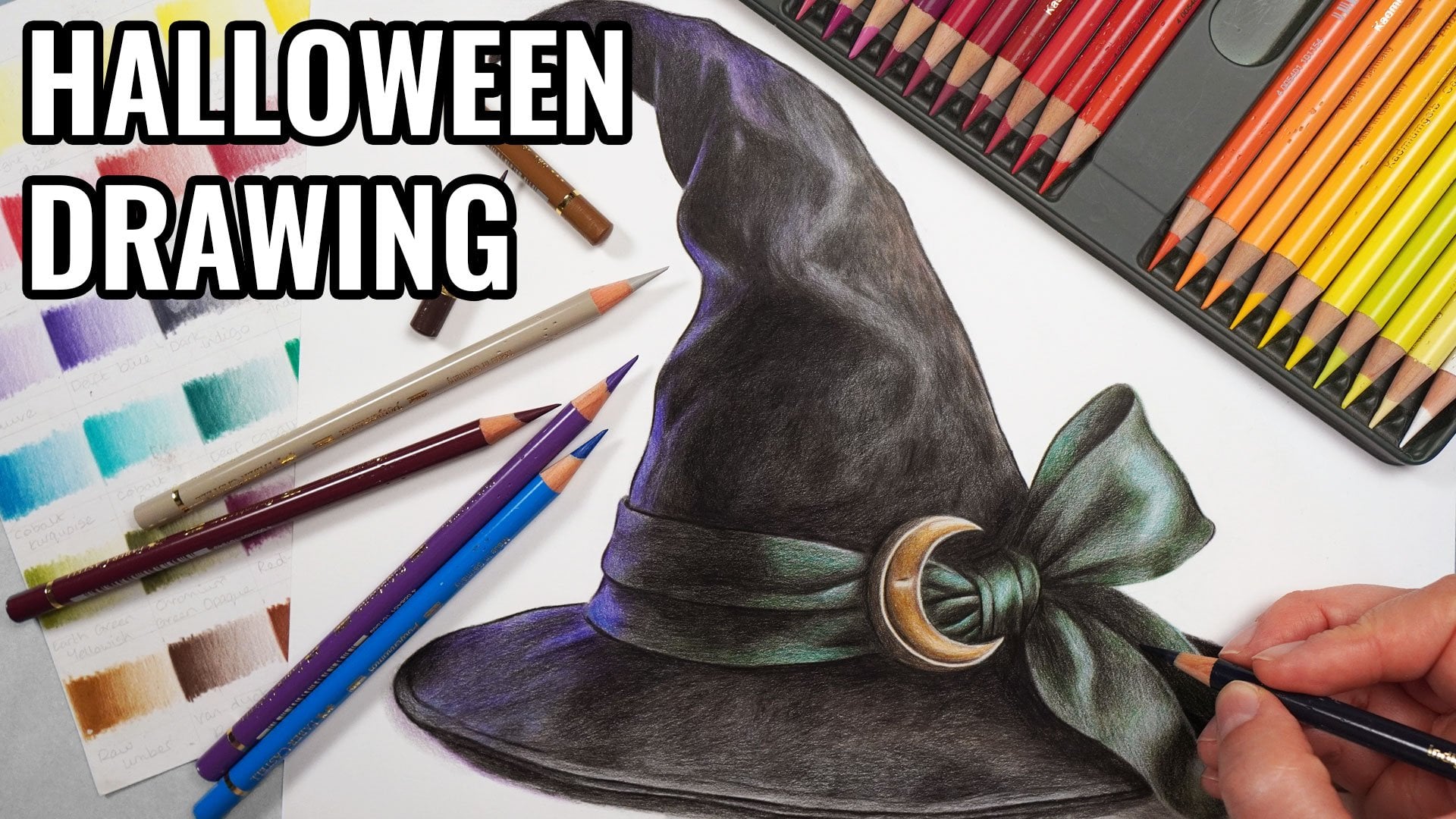
Transcripts
1. Introduction: I absolutely love creating
seasonal drawings, and what feels more Christmasy
than a Christmas tree. Now, drawing a Christmas
tree can feel like a very big and
overwhelming task, particularly when a
lot of Christmas trees have so many baubles
and decorations. I want to show you
today that actually, if you break the drawing
down into smaller steps, it's not as tricky
as you might expect. My name's Gemma Chambers, and I've been making online
art tutorials since 2020. I've helped tens of thousands of people improve their art
on my YouTube channel. But today I want to go
into a lot more detail. I want to talk you
through the step by step process to draw
this Christmas tree. Now, I will show you all of the materials that you'll
need to create this tree, and I'll talk you through
how to create this sketch. Then we can start
working our way through the process step by
step. Let's get started.
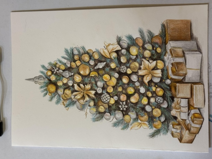
2. Class Project - Drawing a Christmas Tree: Before the class
project, we will be drawing this Christmas tree. Now, I've picked
this Christmas tree for a couple of reasons. Firstly, it is a really
interesting Christmas tree with a huge amount of detail. So although it's going
to be challenging, it will create a finished
drawing with a real wow factor. I've also selected it because it's got really good contrast. It's a Christmas tree
with good lighting. We've got a good amount
of lights, starks, and midtones, which is going to set the drawing
up for success. Finally, I think the tree
is from a good angle. We're kind of looking
at the tree head on. I find that drawings don't
look as good if you're drawing a tree looking
down on it, for example. Now, we'll show you
everything that you'll need to create this tree, including how to
create this sketch. But if you don't want to
create your own sketch, you can always work for a mine which is in the class resources. Don't forget when you
finish your drawing to upload it to the
class projects, I would love to see
what you've done. Next up, let's talk about the
materials that you'll need.
3. The Materials You'll Need for Drawing with Colored Pencils: Let's talk about
the materials that you'll need to draw this tree. And the most obvious
material you'll need is a set of
colored pencils. Now, I'm drawing this tree with polychromos colored pencils and using pencils from
the set of 60, but you don't need to use the exact same
pencils that I am. Generally speaking,
I think if you're working from at
least a set of 36, that should be enough pencils to select the colors
accurately for the tree. Now, what is more important than the pencils is the paper. We're going to need to build up a lot of the pencil
to create this tree. To do that, we're
going to need to draw on the right kind of paper. So you don't want
to be drawing on sketch paper or printer paper, it's not going to be
possible to build the pencil up correctly
on that kind of paper. I recommend using something
called Bristol Board paper, particularly a smooth
Bristol Board. That is a nice thick
paper that's going to be able to take all of
these layers of pencil. Next up, you'll need
a pencil sharpener. It doesn't need to
be anything fancy, just something that creates a really nice and sharp
point with the pencils. If you're creating
your own sketch, you will need a graphite
pencil ruler and an eraser. Next material you'll need is actually not something
you can buy. It's something you're
going to need to make. This is a set of color swatches. So for every set of
pencils that I own, I make a set of swatches. What I do is I go
with every color from as light as I can to as dark as I can, and
then I label it. And what this does
is show me what that pencil actually
looks like on the paper, particularly the type of
paper I'm going to draw on. It stops me guessing what
that color will look like. I'm not relying on the barrel of the pencil or the lead this way. Final material that you'll
need for this drawing is some way of looking
at a reference photo. So for every drawing
that I create, I always work from a reference. I find this is the best way to create a really nice,
realistic drawing. We need some way to
look at that reference. Now, I like drawing
from my iPad. I particularly like that I can zoom in to see all
of the details. But you don't need an iPad. You can always print out
the reference photo. So those are all the
materials you'll need. Let's create our sketch.
4. Creating the Sketch Outlines: Creating a sketch for your drawing is such
an important process. We're going to heavily
rely on this sketch, particularly with this
tree because there are so many baubles
and ornaments, if we can get them all mapped
out clearly in the sketch, it's going to make
life ten times easier when it comes to putting
the color on the paper. Now, to create my
sketch outlines, I like using something
called the grid method. This is where I draw a grid on my drawing paper and
on my reference photo, and I just draw what's in each individual this helps me to get everything laid
out correctly and stops me from making
various assumptions. Now, when it's a
more complicated reference photo like this, I tend to work with
smaller grid lines, the same as if I
was drawing a face. If it was a simpler drawing, I could be working
with larger grids. Once I've mapped in
all of the shapes, I then want to erase those grid lines and I'm
left with my sketch. Do bear in mind that when I'm
creating sketch outlines, I work really, really lightly. I'm pressing harder here because I want you to be able to
see it on the camera. But you actually
want these lines to be so light you can
barely see them. That's going to make raising the grid a lot easier and also stop the graphite pencil from showing through the
colored pencil at the end. So that's the sketch completed. Let's now take a look
at the reference photo.
5. Studying the Reference Photo: Before I start any drawing, I always like to take a minute to have a look at
the reference photo. It helps me look for the most
obvious things I'm going to need to bear in mind throughout the drawing and kind
of prepares me. So let's do that now and you'll see a bit more what I mean. So I think it's
going to be easiest if we start off by
looking at the tree, and then we'll look at
the presents afterwards. There is so much going
on with this tree. And actually, there's not a huge amount of actual
tree we can see. There's the odd ends of
branches here and there, but on the most part, there is just a lot of baubles
and decorations. I think that's a
big part of what makes this tree look
so interesting, as well as all of the
light within the tree. So looking at the baubles, there's a mixture of
different baubles. We've got some kind of
browny gold baubles, some more standard gold baubles. We've also got some
baubles that are more on the silver
side, like here. So we're going to need to
bear in mind that there's a huge variety of
different color, texture, size baubles throughout the tree and general decorations and try and build up all of those different
decorations as we go. I'm also noticing how much light there is within the tree. So when you look in between
some of the branches, it's really bright and lit up, more so than maybe
you might expect. We've got some areas of kind
of earthy yellow, I guess, some areas that are much
more bright orange, like around here or around here, and some very light yellows on all of the little
fairy lights. And there is just so much going on that we're going
to need to build up. Down the bottom of the tree, it's very similar, again, although I think it is more
obvious down the bottom that there's also
different light on different areas of the tree. So there's more light
on the left hand side. This is generally better lit, whereas the right side is a
little bit more in shadow. And you can particularly
see this from looking at the branches. These are much deeper
branches here, and they're much
lighter and better lit and almost kind
of a greeny gray, maybe with a hint
of blue, as well, kind of a turquoise
gray on this side. Looking at the
present underneath, these are all reasonably
simple, I would say. I will note that
the wrapping paper, there is a huge
amount of detail. We've got huge amounts
of detail on all of the little stars on some
of this wrapping paper. We've got some patterned
shapes on here, and we've got various
stripes and trees. I don't think it's going to be worth trying to draw
in any of this. I don't really think it's
going to be possible. And it's not going to be visible when viewed from a normal
distance at the end. So I'm just going
to need to block in the overall shapes and colors
of all of these presents. Looking past the
patterns and looking at the overall underlying colors is often easiest when
doing something like this. If you squint and then you're not seeing
all of that detail. That's what I'm going
to want to draw in. It's different drawing all
of the detail on the tree because this is the kind
of feature of the drawing. But the presents are
just nice around the bottom where I don't feel like I need to add
in all of that detail. It's a very complicated
reference photo, and we're going to
have to spend a lot of time building up all
of these details. It's definitely going to be easiest to break this down into sections and work
one section and one area at a time.
Let's start drawing.
6. Mark in the Baubles: The easiest way to approach
drawing this tree is going to be to break it down into
small manageable sections. So what I'm going
to do to start with is only focus on the tree itself and kind of take an overview of what
we're looking at here. The goal by the end of this
first chapter is to just have really only the
baubles roughly marked in, and it's just a
way for me to get my bearings and work out
what's going to go where. So what I want to do is look for the lightest color that I can see in each section
of the drawing. And the lightest color that
I can see within the tree, I would say is a very,
very light yellow. I'm mostly looking at all of the yellow on the fairy
lights along here, as well as the odd patch of yellow on the baubles, as well. This is very light around
here and around here. So what I want to do is use the lightest yellow that
I've got in my set, so this is the cream pencil. And I'm going to
start at the top of the tree and work my way down just marking in anywhere where I can see a bit of
a hint of yellow. So where all of these lighter
patches are First up, you can see how light my
sketch lines are here. I have got all of these
baubles roughly mapped in, but they're very light
lines I'm working from. I can use those light baubles as a bit of a guide on where I think this yellow needs to go. So I'm kind of looking at the reference photo
and trying to follow the baubles as I
work my way down and fill in all of the
little light patches. So I want to be adding in
dots where those fairy lights are and adding in the light
yellow places on the Buble. Now, there's a few things to be thinking about here
as I'm doing this. First up, I don't want
to be pressing really, really hard with the pencil. We're going to need to build
up an awful lot of color and an awful lot of
shapes within the tree. So I don't want to press
really hard with the pencil, and then I'm not able to
build up all of that color. Now, usually, I would
hold the pencil further back to help me press lightly. In this situation, I
actually need to be extremely accurate about
where this pencil's going, so I can't hold it further back. I need to hold it closer to the tip than I usually
would at this point, just so I can really have control over where
this is going. Note that I am still not
pressing full force. I still want to press lightly. It is, however, still
very important for me to work with a nice
and sharp pencil. It's going to be
much easier to put down that pencil lightly and to really control where it's going if I'm working
with a light pencil. Now, I'm also putting
this color over any area that is going
to be a brighter color. I've got some quite vibrant yellow around here and
around here and around here. I'm still going to put this
pencil in those areas. I'm just beginning to get my bearings on where
this yellow is going to go, and we can always
go over it with a brighter yellow
in a short while. Now, this is extremely difficult to see where
I'm putting this. I actually think
it's in many ways, clearer on camera than
it is in real life, just to give you a bit of
an idea that I can't see this extremely
clearly on my paper. I can see it a bit better from certain angles where the light is reflecting off the paper. But the goal here
is to put something down on those lighter
areas and just start looking at what's on this reference and where everything's going
to need to go. As I've said a few times, there is so much,
so much detail, so many different
areas that needs building up on this
tree that it's good for us to get our bearings and work out where
everything's going to go before we start getting anywhere near the darker color. See, I'm just gradually working my way from the
top to the bottom, filling in these odd
little bits of yellow. If I realize that I have
missed an area and I think actually I
should be adding a bit of yellow
somewhere higher up, I will still go
back and do that. Just generally speaking, I'm
trying to work my way down. I think it always helps to work in quite a methodical way. I think because there's so
many baubles on this tree, it's easier to get your bearings if you do work from
the top to the bottom. You can kind of work
out which baubles, which are a bit easier than if you're just randomly
dotting around. Remember we don't need
to get this perfect. Partly, it's an
extremely light pencil, but also it's the first color. So we just want to be
putting something down, and it's going to get
much easier as we work through and towards
the darker colors. So once I'm happy
with the yellow, once I'm happy that
I think I've got something everywhere
where the yellow will be, I can then start gradually working my way towards
the darker colours, looking at the next lightest
color that I need to be ad. Going to move on
now to use a very, very light warm gray. So I've got 2 grays in my set. I've got warm gray
and cool gray. Generally speaking,
when I draw gold items, I tend to put a base of
warm gray underneath. I find that that's generally
the best place to start. And then when I'm
drawing silver, I tend to put a
base of the cold. What I'm going to do is now work my way from the
top to the bottom, again down the tree with the
warm gray and fill this in over the top of any bauble that has that warmer, more gold tone. And this is quite quickly
going to make it a bit easier already to see
what needs to go where. Now, I don't necessarily
think that the warm gray is the perfect match for
the gold baubles, but I think it is the best
that I've got in my set. And once we built up a lot of other colors
over, the top of it, we'll be able to tweak
this color and adjust it, and it will end up
looking a lot closer. Note where I've got baubles, where I've added in the yellow. I do want to lightly go over that yellow just to
kind of blend out the edges. I don't want to have really
harsh edges to the yellow. So I'm starting at the top
and working my way down, and you'll see that most
of these baubles have more of a gold tone to them. So we need to add
that warm gray. We've got the odd area that is the cool gray like
this ornament here, this little star ornament here. And then we've got this here, for example, and
down the most part, I want to be going over
these baubles with the warm gray and just marking in really
where they're going. Literally, the only goal
of this first chapter is to firstly get something down on the paper and as I said, just get my bearings on what's
going to need to go where. I don't want to
spend ages adding lots of detail in at this point, I just want to work out where these baubles are going so
that when I start wanting to add some of the detail in between these baubles and
generally on the baubles, it's going to be so much easier. I think it's important to know how I'm putting the pencil down. So I'm always working in circular motions to try and put the pencil down as
smoothly as possible. As I said before, I want
to be working lightly. I also want to be working
smoothly so that I can build any texture easily
over the top of a section. I don't want to be
scribbling with the pencil and end up
with really harsh lines. See, generally speaking, I draw in the outline
of the Buble, and then I use circular
motions to fill it in. So again, you can
see me going around the outline of the borble just working out
where it needs to go, and then I can use
circular motions to fill in the center. I can't stress enough. It
doesn't need to be perfect. I also think it's important
to note that I am heavily reliant here
on my sketch lines. And all of the effort that I took to build up the sketch is absolutely crucial now that we're building up all
of these baubles. There's not only
baubles on the tree. There is a few
other decorations. There's this sort of flower. I think it's the same as this as well that I need
to be adding in. And again, I want to
use that warm gray. You can see a lot
of warm gray around the edges of these
leaves, I think. So you can see me building up this gray where that
flower is towards the side there before
I can then move on and go back over some
more of the baubles. So you can see some of
the sketch lines here, and you can see that
in some areas I have completely missed baubles. That is because they are that more silvery color
rather than the gold, which I'm focusing on initially. Obviously not looking amazing, but I do already think this is looking a little bit
less overwhelming. As I start to add in some
of these baubles and I start to just get my bearings on where everything's going, it gradually gets a lot easier. So let's now move on to
the very light cold gray, and I'm starting off by
filling in that ornament that I mentioned at the top,
that silvery ornament. Just following this shape
that I've got from my sketch, I can always tweak
this shape as I go. As I said, I just want to
get something down for now, and then I'm going
to once again work my way from the
top to the bottom, filling in any of those
more silvery baubles, and they're much easier
now to find because all of the gold baubles
have been roughly marked. Once again, I'm working in secular motions to
fill these and to try and get the pencil down
as smoothly as possible. And once again, I'm working with a really nice and sharp pencil. Now, this color, as I
say, is reasonably quick. There's not a huge amount
of these silvery baubles. The tree is primarily
more of a gold color. So once I'm happy
with this color, I once again wants
to be comparing my drawing to the reference
photo and thinking about the next darkest
color that I want to not so much at this point, focusing on the branches of the trees or any of the
areas between the boblls. I'm just going to focus
on the main colors, the main boblls really for now, because they are how
I'm getting my bearings so that I can think
about adding in all of those other
details later. It's all about just
trying to make the process less overwhelming,
is what I would say. If you try and add in
loads of details in the tree from off or
even from this point, it's just going to
feel like a lot. Going to use a more
orangy yellow now. This is the dark cadmium yellow. And I'm going to
put this anywhere that still needs that
kind of yellowy tone, but it's not a
really light yellow. So we already filled in a lot of the yellow with
the cream pencil, which is the lightest
yellow in my set. I now want to fill in a lot
of the more vibrant yellows. So when I mentioned when we
were drawing this before, a lot of these colors, I feel are actually much
more vibrant than the cream. Looking at the yellow
that we've got here, this isn't so much
of a cream yellow. It is a more vibrant yellow that I think better
matches this yellow, the same of the yellow
around here and around here around the edge of
this Buble, for example. So I want to once again be starting at the top and
working my way down, going over these yellow
patches to brighten them up. Now, I'm not going over
every single yellow patch. There are some yellow patches
that need to stay lighter. I'm particularly
thinking of where those fairy lights are. But there's also a lot of extra vibrancy
that can be added. Wouldn't say that there's a huge amount that needs to be added. It's also worth noting
with this color that a little bit I do
feel goes a long way. I want to be brightening it up. But I don't need to be
spending ages going over the same area over and over again to add a
really bright color. A little bit is looking
quite bright straight away. And I think it looks
a little bit peculiar adding this yellow just
over the top of that gray. But as I always say, if
I can see the color, then I am going to add it. And I'm happy with the yellow. Let's move on to the last color that I'll be using
in this chapter, and this is to really
start tweaking and refining those baubles
a little bit better. This is the raw umber pencil. If we look at the gold baubles, a lot of them have
some very dark shading that actually, I would say, in the darker areas matches this kind of orangy
brown that is raw umber. Are a lot of areas that need to be much darker than
this, as well. But for now, this is, again, a great opportunity
for me to start marking in those lighter
and darker areas. So I'm once again going to start at the top and work my way down. And on every single one
of these gold baubles, I'm going to use
this pencil to mark in any area that needs to
be mid tone or darker. So, generally speaking,
I would say that that is around the
edges of a Buble, and it generally speaking, tends to be lighter
in the middle. I am looking at each
Buble individually. Once again, it's
important to be pressing lightly and to be working
with a sharp pencil. And you'll see that I'm
going over the whole bauble with the circular
motions once again. Once I filled in
the first bauble, I can then move
on to the second, once again, go
around the outline, maybe slightly refine the
shape if I feel it needs it, if I think it's not
looking quite right, and then use circular motions to shade and blend in that line. Now, if you work one
bauble at a time, just focusing on
adding in the lights and darks of that
specific bauble, it will gradually end up
coming together to look right. And again, it doesn't feel as overwhelming because we're
just working one at a time. There are some baubles
where I need to build up a bit
more of the color, so you can see me again, marking the edge of this bauble going to need to build
up quite a lot of color because this bauble has a real strong raw umber
tone to it, I would say. And generally speaking, it
will need to be a lot darker. We will add a darker brown
over the top of this a bit later as we're adding in
all of the details as well. And then I can move
on to the next Bub. Literally going to
work my way from the top to the bottom looking at any warble that I think needs to have some
of this raw umber. Now, I am trying
to make sure that I mark in every bauble that has this tone because there's
such a huge number of warbles and I'm working
on the tree as a whole, which is quite a large area, really, or quite a
lot of detail to it. There's a chance that maybe I will miss one, but that's okay. We're going to build up all of the detail starting
in the next chapter. For now, and I can't
stress this enough, we are literally just trying to work out roughly what is going. You'll see that it feels a little bit random on where
these baubles are going, but that is because I'm
following the reference photo and following where these
baubles need to be built up. I'll go through this
reasonably quickly because it is
literally a case of looking at the
bauble that you're currently working on
filling in around the edge, looking at the gray
that we've already marked in and just adding to it, adding some extra
shading where needed. Once again, going around
the edge and adding in a little bit of circular
motions to smooth it out. So by the end of
this first chapter, what you should have is all
of the Bubles marked in. We've got our bearings on
roughly what needs to go where, and then we're going to be able to build up all of the detail, but working in smaller sections. I don't want to be working
on the tree as a whole when working in
such small details. But that is it for this chapter.
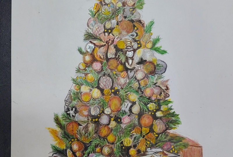
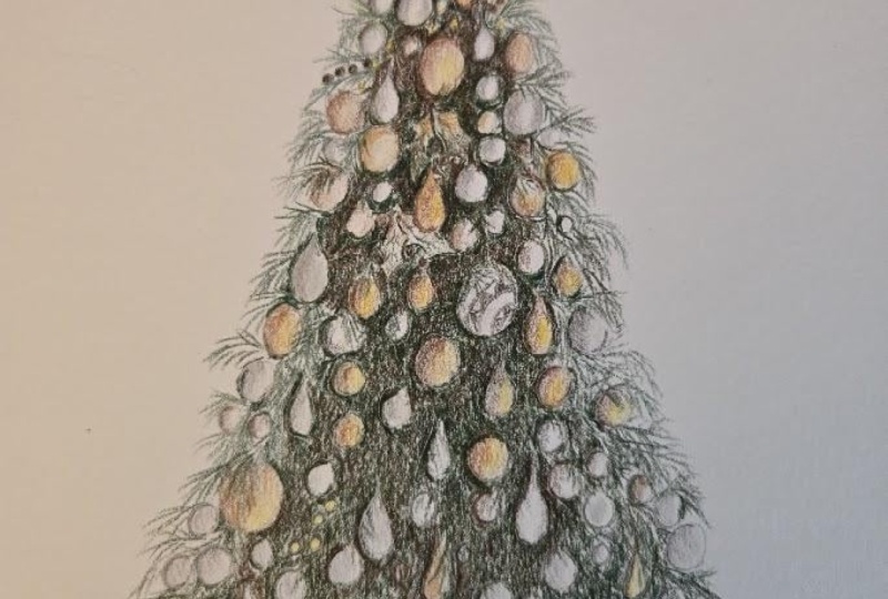
7. Build up the Detail on the top of the Tree: Now that we've got the
baubles roughly marked out, let's start thinking about
adding in some detail and generally getting everything mapped out a lot clearer. So at this point,
I'm going to start out marking in all
of the branches. Now, if we look at the branches, you'll see that it's made up of a couple of different colors, and it's also got
a lot of texture. So looking at this
branch at the top, it's not all just green
like you would imagine. This tree has quite a lot of
kind of gray color to it. It's not a properly green tree. And you can see this cold gray, particularly around the
edges of the branches. You can see it on
all of the branches. Also note the texture here is made up of a series of
needles, so little lines. I want to do is start
mapping in all of these branches and
building up that texture. So I'm using a very cold gray, the same cold gray that I
used in the last chapter, and I'm gently brushing my
pencil against the paper in the direction of each of these branches to
create these flicks. So you can see I'm
working with a really nice and sharp
pencil here and just making flicks in the direction of the needles on the branch. This is a really good color to start marking in these branches. It's a really nice
and light color. It means that if something looks a little bit
not quite right, if something's going in
the wrong direction, it will be very easy to correct because it's
such a light color. And what I can do here is use the baubles that
I've already added in to get a gauge on where all of these
branches need to go. I can look at where the
branches are going in relation to these baubles. It just makes it a
bit easier for me to work out the layout. So the whole goal of this chapter is to get
everything marked out. I'm not trying to make
the colors perfect. I don't expect things
to look as vibrant as I need it to be or have
just perfect color. What I want to do is get
everything marked out nice and clearly and get
all of that detail mapped in so that I know
what is going where. And then in the
following chapters, I can be adding to all of the color when I know
really clearly what's going. I'll note in this chapter, I'm once again starting at the top of the tree and
working my way down, and I'm only dealing with
the top half of the tree. So this is such a big
and complicated drawing that if we try and add in all of these details for the full tree, I think it's going to
feel too difficult. It's going to feel too
hard to get our bearings, and it's just so much
to be filling in. If I just to start with, focus on the top of the tree, then once I've done this, I can then focus on the
bottom of the tree, and it just feels like a
less overwhelming process working in smaller sections. Let's just have a
look at some of the branches that I
can see on the tree. So I want to be working
with this top section. This is kind of the
top half of the tree. And you can start to see all of these branches
quite clearly. So we've got some where you can only see the
end of the branch, and I want to be looking at the direction of
the needles here. It's kind of all coming out
from this central point. I've got this branch here
where the needles are going in this kind of
direction and the other side. It always feels
easiest, I think, when the branches are
coming out from the edge, and we want to be making flicks going in this kind of direction. Can see how many branches there are all coming
through here. There are some areas
like here where you can still see
that branch texture, but it's not green. It's more of a kind
of yellow color. I'm not going to worry too
much about this area for now. I want to focus on the kind of greeny gray areas rather
than little areas like this. That's what we can add
in in a short while. This is a reasonably
time consuming process just this little section here, but I do want to be literally working from
the top to the bottom, looking at where
all the branches are in relation
to the bar balls, looking at the directions
of those needles, and making flicks following
those directions. And already, I think
it looks much easier. It looks a bit less overwhelming once we've got these
branches in as well, because we can start to see
as I say, what's going where. I think throughout
this whole process, if you look at the whole thing, like it's just a
series of shapes. So we've got the
shapes and the texture of the branches and the
shapes of all of the baubles, and we just look at where
the lights and darks are. That makes the whole
thing feel much easier, rather than trying to
draw a Christmas tree, just drawing shapes, and
it will all come together. The most important thing
with these branches, and we'll be going
over this with another color in a
second is for it to be a really sharp pencil
and for the pencil to be really gently brushing
against the paper. Hopefully you can
get an idea here looking at the size of my pencil on how small of a section
I'm working with here. It's really only maybe
10 centimeters tall. So it's quite a small
section of the tree, but it takes a lot of time to
map all of this out and is so important and just feels less overwhelming working
with a smaller area. So let's now move on to
the next color and add a bit more brightness
into these branches. So I want to be
adding in a green to add more depth
to these branches. This is the deep cobalt green. This is actually it is a green, but it's more of a bluey green. Say within the branches, there's a few colors that we
need to be adding. There's the gray that
we've already added. There is this kind
of bluy green, and a bit later, we're
going to need to add in a darker green, as well. There's some areas that have very deep shadows
on these branches, which we will also
need to build up. So this is a much
simpler process now that we've filled
in those gray areas. I still want to be making really nice and light
flicks with a sharp pencil. I'm now on the most
part just needing to go over all of the branches I've already marked
in with the gray. So I can see quite clearly
where all of these need to go and I can see the
direction of the needles. So all of the time that I took making sure that I
got all of these branches in the right place with the gray now makes this pencil
so much easier. And you can see I'm not needing
to build up a huge amount of this pencil on each
one of these branches. I just need to add
a few light flicks to add a little bit of color. And as I say, we will build
this up a lot more as we work through all of the colors and later on as we add to
these details further. I'm once again
working my way down from the top of the tree
down to the bottom. I think it's another step
that's going to make the rest of the drawing feel so much easier
because again, it is all about
getting our bearings, working out what
needs to go where, and gradually adding
in that detail. You'll see as a general rule, I like to work from
the lighter colors towards the darker
colors because I think that's the
most forgiving way to build up the pencil. By marking in all of the branches with that
light gray first, for example, I said, it just makes it much more forgiving if we put something
in the wrong place. But it's going to be the
same with the whole drawing. We're starting off with
the lighter colors. This green is more like
a light to mid tone, but I want to gradually, by the end of this section, work to the much
darker colors and have everything clearly mapped in with this tree on
the top section. We then in the next chapter, we need to do exactly
the same for the bottom. Now that I'm happy
with the branches, I want to work
through the baubles, one bauble at a time and think about building up
some of the detail. So I'm literally going to start at the top and work my way down each of the silver baubles. So starting off with
this bauble at the top, I'm not going to worry
too much about all of the patterned details you
can see within the holes. What I want to do is
draw in this line down the middle and generally make this side a bit
darker than this. Always important to
remember that we're working with some
really fine details. You can see how small the
area that I'm drawing in here is because of the size
of my pencil and my hand. I don't need to spend absolutely
ages adding in teeny, tiny details that aren't going to show
through in the end, like the holes on that Buble. I think would be
really tricky to add, and I just don't think you're going to be able to see it when looking at the drawing from
a normal viewing distance. I want to draw in
the general shape of this decoration here. I had already mapped this in, but it just wasn't a very
clear or symmetrical shape. I don't need to, again, add in every teeny, tiny detail. I don't need to add
in really clearly all of these lines
going up this, but I do want to make
sure that I've got the general shape right. So you can see I'm
really taking my time to draw in the
outline of the shape, trying to get this as
accurate as possible. You can see it's roughly
marked in already, but I think I can make it
much better and much clearer. Can't stress enough how important it is when
doing this to be working with a sharp pencil because look at how much detail I'm
needing to add in here, I really need to know that
where I'm putting the pencil, it's going where I expect it to, which isn't possible
with a blunt pencil. So I'm going to add a few
subtle lines on here. I don't want to add
tons of detail. As I say, you just won't
be able to see it later. I also want to add a little
bit of gentle shading, particularly around the edge
to try and start giving this a slight curved look and also blend out the very
sharp edge I've added. But that's really all I need
to be doing and just working one bauble or one decoration at a time feels far
less overwhelming than trying to think
about drawing everything. We literally just
want to try and get that one decoration
looking a bit better. Let's have a look at
this silver bauble here next to this, which you can see, I
have already marked in, but we haven't really got a
huge amount of detail here. So I want to be drawing in
this little bauble here. This has a silver tone to it, and I want to be adding in a
few of these darker grooves. And then I can start focusing
on refining the star shape. So the star is not
looking perfect at all. But once again, when I made
it a little bit clearer, we can keep refining that as we work down through
the darker colors. Now as I move on to this bauble here, which is this bauble, bit more it's kind of a mixture
between silver and gold, I would say, but it's a bit
more on the silver side. So I'm going to add
some of the gray around the top right and
underneath here, but I want to leave this
edge here much lighter. Before then, I can work my way further down the tree
to the next bauble, and I'm just looking
at the shapes I can see on this bauble. Now, again, I can't
stress enough how you don't expect this
to be looking amazing. I think a lot of the shapes
that I'm adding in here, like the little
Christmas tree ornament, all look a bit peculiar. They're certainly not looking very realistic. But that's okay. I literally just want to be getting a bit more of an
idea of these shapes. And as we refine this
further with darker colors, it will all become much
better and much clearer. Feel like, particularly with highly detailed
drawings like this, you have to go through a very
long ugly duckling phase before it starts
coming together. But this section will start coming together by the
end of this chapter. So I can move on to
this bauble here where we've got some
quite clear lines. So this bauble here
is very silver, and it's got these kind of dark pink lines
running through it. So for now, you'll see
that I have just marked on where those lines are going
to go with this pencil, and we can always add in
that color a bit later. Start filling in some other
ornaments down the bottom. And you'll see,
generally speaking, I like filling in
the outline and then adding any shading I
need to into the middle. And that outline will get lost a bit later as we build the
other darker colors around it. But it's just really helpful. It's much easier to
mark that in first. And then I can start marking
in this sort of a box, I guess, here, this kind of
box. I don't know what it is. Here, I want to mark that in, but I'm not going to
worry about these little details on the front. I'm pretty much getting
to the bottom of the section that I'm working
on right now with this gray. What I now want to do is similar to what I did
with this pencil, but with the gold ball balls. So let's start off by going
back to the raw umber pencil, and there's a little flower
along the edge here that actually I don't really feel I have marked in at
all at this point. So this flower here, I don't have this mapped in. It's got these three
balls along the top, and then we can see all
of the petal shapes. It's generally very light, but there are a few darker
lines running through it. So I want to be adding in
those darker lines and then adding some very light
shading with this color. Actually, with this same color, I'm going to mark
in the shapes of the flower on the
center here as well. I have a few of the
shapes marked in, but they're not looking
very clear at the moment, so I just want to refine
them a little bit better. I'm looking at this flower here, and I'm just trying to mark in, particularly all of the
shadows that I can see around the edges of the
petals of this the most part, what's making this
flower stand out is the darker areas
that's surrounding it. So it will come
together much better when I start adding
those darker areas in, but it is a very
light colored flower, so I don't need to add
a huge amount of color. I would say that
making the color perfect on areas like that
flower or the baubles, I would say making
the color perfect on that flower or on the gold baubles isn't
the goal of this chapter. I just want to get things mostly mapped out in the
right place and ideally get in the contrast looking reasonably just going to switch back to the gray
from a second ago. I've just realized there's
a bauble here that I haven't marked in that needs
to be that more gray color. So don't be afraid to go back to a old color if there's an area that you
realize that you've missed. There's so many baubles and
shapes to be adding here. It would make sense that
we wouldn't necessarily be able to make them all
perfect first time around. I want to focus on the gold baubles and
really think about adding in some detail and shading like we
did with the gray. So this time I'm using
the burn ochre pencil. This is kind of
an orangey brown. And I'm going to start at
the top and work my way down refining the shapes of
all of these gold baubles. So some of them, I think,
maybe look a little bit too big or maybe slightly
in the wrong place. I can use this pencil to
just change the shape. You can see that I've done
that with this bauble. And I can also
adjust this babel, make it a little bit
bigger until I feel like it's looking more
accurate to the reference. Are some areas where I
need to add a few of these flicking motions like
we did for the branches. You remember earlier, I talked about how
some of the branches are lit up by the
lights underneath. I need to add that same texture, but it can't be the green. It needs to be more of
an earthy kind of color. So this color is
perfect for adding in those lighter areas. And then I'm just going
to work my way from the top down looking at
each individual borble. So on this borble
here, for example, it's just to the left and below this
Christmas tree shape, and you can see that we've
got a lot of that kind of orangy brown around
the left hand side. Why I'm adding in this color, particularly around the left, but also adding a little
bit of kind of shape to that bauble before then
moving on to the next Buble. And this is a bauble
that I can see behind this bauble that I don't
currently have marked in. And I'm just going
to work my way from the top down
looking at each individual bauble and adding in the shading as I
think it needs it. Now, I still can't stress enough that it doesn't look
very good at this point. It is all going to come
together in a second when we start adding
in the darker color. It is the contrast in all drawings that really gives it the pop
and the wow factor. You want to build up the
color to be vibrant, but honestly, it is the contrast that decides whether
it's a nice drawing or. I feel like the gold
and the silver baubles, at this point, are
looking much better. They certainly are very
clear on where they are. And I think, generally speaking, we've got a good idea of what the shapes are
supposed to look like. What I now want to do is
use a very dark pencil, a very dark brown to
start finally filling in and adjusting all of these shapes and
adding in the shadows. So this is the
walnut brown pencil. This is a very dark brown. I am able to use this pencil to work one
section at a time and really see using all of
the borblls and everything I've already got marked in where this pencil
needs to be going. Now, this is an extremely time consuming part
of this drawing, and this is the only
color now we're going to use for the rest
of this chapter. To give you a bit of an
idea from filling in this brown on just the top half of this tree took me an hour. So I can start off by filling in this section above this
little ornament near the top. So this area here just to the right and
above this ornament. You'll see here that
there's some cables, I assume running through here. They're kind of
making an A shape. So I want to mark in these lines and then I
can shade around them. I'm not going to worry too much about every single detail, like all of these little
branches I can see in here, because again, I don't
think that you'll be able to see that from a
normal viewing distance. I do want to make
sure that I'm working around these fairy
lights, though. You can see me drawing in the outlines of
these fairy lights, and then I can shade
up until that point. I think it's very
important throughout this process to
always be bearing in mind what you'll be able to realistically see by the end. We're working with
such small details here that it is worth
putting in some of them, but I don't think it
would be possible to put in every single one, and you're honestly not
going to be able to see it. Also always think it's
worth bearing in mind that although we are drawing
from a reference photo, when the drawing is finished, the people who are
looking at your drawing aren't also comparing it
to the reference photo. So we don't need to
make it perfect. We don't need to add in
every single detail. It's all about working out
what makes sense to add. So I'm adding a very
small amount of details on this little bauble up here that we
talked about earlier. But I'm not trying to
make it exactly the same as that reference because I don't think it
would be worth it. Work my way from the top down
going over the branches, adding a little bit of darker color with flicking
motions into the middle, and adding shading
on the baubles, where I want those to
look a little bit darker. So on some areas of the barbuls there is
some very deep shading, particularly on generally
the gold baubles. I want to be building up some of this color on any
of those shadows or generally working
around the edges of the baubles if it has a
particularly deep shadow. Just want to be working through here one little
section at a time, rather than looking at
the drawing as a whole. I still don't think
what we need to do here will need to be perfect. You'll see a bit later when I pull the camera back out
because the camera is very, very zoomed in at this point. I think it looks so much better in real life than
what it looks like on camera at this point because we're so close and
we're so zoomed in. Later, when we look at the drawing from a
normal distance, it's going to look much better and be much
easier to work from. I also think it's
worth noting that I think this is the hardest
part of the whole drawing. Adding in all of these details is difficult and time consuming, but it is the backbone and it is the key to this whole
Christmas tree. The most part, a lot of
the white space between the barbuls and the branches needs to be shaded
in with this brown. There are some areas
where in time, we will want to
make them a little bit darker, but for now, this brown is just
a really good color to be getting bearings and working out
what's going where. And generally working around and toning down all of
those lighter areas. Where I'm working around
the edge of these branches, I often find it helpful to
either work in a mixture of circular motions to
just smoothly and lightly go over the
green that we've added, or I can add flicking motions going over the
top of those green areas, add a little bit
of extra darkness. As I say, I will add a
lot more of this later. I show you what I see in
this section, for example, I'm looking at this area here, and I just want to try and draw what I can see in
this little section. So there's a lot of very dark shading around the
edge of the flower. There's also a lot of kind
of dark flicks, I would say, from the branches that you
can see in between a lot of the branches here
and a little bit of darkness around the edge
of this borbor hit. So you can see me
building up some of these little
flicking motions and adding to some of that texture before I can move on
to the next section. Think throughout all of this, the most important
thing to bear in mind is that I am not trying
to make it perfect. So many people spend ages trying to get it exactly the
same as the reference photo, but realistically,
you're never going to get it completely perfect. We just want it to be a
reasonably good likeness. You can see, though, how adding this brown over the top
of what we've already got here does make a huge difference and really brings the
whole thing together. Hopefully, this shows how it all meets together
by the end and how, even though just a
short while ago, filling in all of those baubles, it looked a little bit
odd, but that's okay. So I've gone over
all of these shapes, and I'm generally happy with
what I've got here for now. I do think it needs a
lot more color adding to it and generally
a lot more texture, but all of those
shapes are mapped in, and I have a really good idea of what's going where
before I move on. In some areas that are darker, I want to be adding more
shading with this pencil. So right now, I would
say that I've gone over the whole thing
with the walnut brown. Or kind of the same darkness. It's all just lightly
with the pencil. If I now at this point, start building up more of the
brown in the darker areas. So like around
here, around here, here, here, down here, all of those much darker areas. So just building up
more of the pencil, it's going to make
it much easier to visualize and build on as we work through later
on in the drawing. By the end of this chapter, you should now have the whole of the top of the tree
reasonably clearly marked in. In the next chapter, we need to do exactly the same thing, but to the bottom
half of the tree. And then we'll have the whole
thing clearly marked out, and we can start focusing on the presents and generally
building up the color. But that is the end
of this chapter.
8. Build up the Detail on the Bottom of the Tree: I want to do the
exact same thing as I did on the top of the tree now
to the bottom of the tree. I'm going to be working
through the same steps, except this time, I'm going to be working through
a larger area. So the top of the tree, because it's tapered, it is smaller. The bottom half of the tree is probably about twice the size, so it is going to
take much longer. But it's exactly the same thing. So I'm starting off here with
the lighter gray pencil. I'm just working my
way around again, adding flicking motions for
anywhere with the branches. So I want to be looking
at the direction of where all of the branches are pointing or
more importantly, where the needles are pointing, and I want to be
making light flicks going in the direction
of those needles. It's quite a few areas where we're looking at
the end of the branch. So the needles are sort
of pointing all around. And then there's
some areas where the branches are
more like in lines, so I want to be making flicks in the direction
of those lines. As I say, it's exactly the
same as what I did before. And you can see all of
the individual branches and where they're coming
through against the Bubles. So once again, it's helpful
that I have marked in all of these baubles already
because it kind of gives me a frame
of reference. I can work out
where the branches need to go based on the
placement of the Buble. See that I am really taking my time over building
up these branches, working out where
they need to go. And then in a second, when we move on to
that same green we used in the top of the tree, it will be much easier to
go over the top of this because all of the branches
will already be marked out. I'll already have the direction that it needs to go in
already mapped out. I've worked my way
down to the bottom. I want to start at the top again with that same
kind of bluy green. So this is the same
color that I used before the dark cobalt green. And you can see I'm just making some really light flicks over where I've built up that gray to gradually map
in these branches. So you'll see that I
am going through this reasonably quickly now simply because it is the
exact same process as what we did on
the top of the tree. And it is quite a long and
time consuming process, but it is very much
a case of just doing the same things
over and over again. It's well worth practicing before going into all
of these branches, making these really light flip. Hopefully, you can see how nice and lightly
I'm pressing here. I'm just really gently brushing the pencil
against the paper, particularly with a sharp pencil so that it looks
nice and subtle. I think it looks quite
bright at the moment, and that's just because we haven't got the dark
brown around it. Once the dark brown is added
in like we did before, this will all get
a lot more muted. It won't look as bright green
as it does at the moment. Once I'm happy with the green and all of the branches
are marked in, I can then start working my way, adding some extra
details on the baubles. So I'm starting off with
the very dark cold gray, and I'm filling in this
little ornament at the top, this little ornament here. So I'm noticing that it's got a darker shadow on
the right hand side, and it's generally
lighter on the left. So you can see me
adding that in with that slightly darker
line on the right, and then I can start
working my way over all of the silvery baubles. So I'm starting off with
this bauble up the top here. Just going around the edge, I think slightly maybe
slightly in the wrong place. So I'm just going to make
it a little bit shorter, and it looks a little
bit odd at the moment, but when we add the
brown over the top, I'll be able to hide that line. I just think it needs
to be a bit shorter. And then I'm going to mark
on the lines from the bobo. This is the same as the
bauble that I had higher up. So I can just lightly add in these lines going
across the Buble. Moving on to adding in some
of the other barbells. So generally speaking, I like
to fill in around the edge, and then I can add
some light shading. Generally speaking, they've got a light patch on them on the left hand side that I
just need to work around. I think it's once again, important to remember that I don't expect it to
look amazing here. It all looks a little bit kind
of scribbly and scratchy, and that is in part because
I am zoomed in so close. But also, I just
think it's a little bit tricky to see what it's going to
look like at the end, particularly when it hasn't got that contrast that
we will be adding. I'm adding some gray onto This bulble that I think
is kind of a mixture between silver and gray before filling in this shape here. So there's this ornament down the left hand side that I
very roughly marked in, but it's not very
clear at the moment. I particularly want
to be looking at all of the different
shapes made up in this. So it's got this kind
of bulb shape here. It's got a pointy
shape at the bottom, and then it's got a few
bands along the middle. Actually, I think,
a bit too fiddly to add in all of those
bands towards the middle. So I'm going to make a shape
that's roughly the same, but not exactly the same, just because I
think that looks a bit better and a bit tidier. I'm drawing such small items here that I can't
expect to get them all 100% perfectly the same as what I can see on the reference photo,
but that's okay. Now, you'll see that I've
drawn in the outline, and now I'm adding
some general shading before moving on to
the next silver Bb. All of this is just
gradually building the underlying
shapes that's going to make life easier when we
start adding in that brown. It's kind of the framework that we need to
be building from. So from here, let's move
on to the raw umber. This is the kind
of orangy brown, where I generally speaking, am using this pencil to
add in those gold tones. I'm just working along
here one bauble at a time, filling in some of
this raw umber. Some of the boblls
I do need to add in a little bit of extra shading, a little bit of extra shapes. And particularly looking at
these couple of baubles here, there's kind of a
pointy shape here and a circular bauble with
really bright yellow in it. Let's fill in those shapes
and then keep going. And I think here, even as I start shading in all
of these barbuls, they all look a little bit
they're not perfectly shaped, and in part, again, it's because I am zoomed in really close. You can really see how
small this drawing is next to my hand. Also because we don't
have that darker outline, they just all look a
little bit funny in shape, but it will all come together. So I'm just adding a little
bit of extra shading, particularly around the
more shadowed sides. And I do think the
shadowed side changes depending on the bauble. It's not always the same. So I can go over some of the petals on the
left hand side, as well along here, make this a little bit clearer, as well as going
over some of the flower shape down
the bottom here. And then at this point,
I would say that a lot of these shapes are
now clearly marked in, and I want to for the
rest of this chapter, be focusing on building
up the dark brown again. Once again going back
to the walnut brown, and I want to work my way
around each of these boblls filling in either the
dark areas if there's some dark shading that
needs to be added or adding flicking
motions going from the edge of the dark shading into the green
branches, for example. See, I'm really taking my
time working around here. It's exactly the same as they
did on the top of the tree. I'm looking at the areas
surrounding the baubles. I'm adding either
flicking motions if I need to be building up some
of the branch texture. Or if there's just an area of shadow that needs
to be blocked in, I can add kind of nice smooth, circular motions to try and make the area as
smooth as possible. It gradually starts
coming together to build up and look more
like a Christmas tree. So this is a good opportunity
for me to slightly correct the shapes of any bore boards if I think that they're not
looking quite right, if they're not
looking round enough, for example, I can go back
over them and just tweak that. And generally build
up a bit more texture on the branches. Still think it's looking a little bit peculiar
at this point, but honestly, on the most part, it's because we are
zoomed in so much, but also there's a lot of colors that we still will
need to build up. Once again, as I said before, the main purpose of
this whole section or both this chapter
and the last one is to just work out where
all the boblls are going, where all of the
branches are going, and just try and get my bearings on what's
going to go where. Then once that's done and everything's mapped in
really nice and clearly, we can then start
focusing a lot more on the color and making
it all look richer. But that is really all
there is to this chapter. It is a process of looking
at the reference photo, looking at what's
surrounding each area. So here, for example, we're looking at this area, so I can see I've got
this Buble marked in and this Buble with this
other one right next to it. And here there's
just a huge area. Maybe there's some areas that look a bit
darker than others, but that's not going to
show on the finished piece. So this whole area here, I'm just going to block
in with the dark brown, but making some flicks going
into the branch next to it so that I don't have a really harsh line around the outside. So you can see me mapping in
the edge of the whole area, the whole blocked in dark area. Also note that I am adding
little circles where there's some fairy lights that
I'm going to want to keep. I've added some small circles that I'm going to work around. But then I know that this
whole area here now, I can just block in. And you can see me
trying to do that as smoothly as possible
with circular motions. Now, it's also worth
bearing in mind with this that I'm still
not pressing hard. I want to be pressing nice
and lightly because we're still going to need to build a lot of color over the top of. Once I'm happy
with that section, I can move on to
the next section. You can see again,
I've marked in where those fairy
lights are going to be, and then I'm just
working around them. And they look a little bit
peculiar at this point, but that's because
we will need to build a lot of color on them. So once I've gone the
whole way over the tree, I've got everything marked in. What I now want to do before I move on is focus like we did in the last chapter on
going back over and adding in some more of the
brown on the darker area. Here, for example, there
is a very dark patch. I want to be building up a
lot more of this brown over that area before moving on to the next area that I see
needs to be a lot darker. Now, I find it easiest to see these areas,
generally speaking, if you're struggling by squinting when looking
at the reference photo. That will help you see
the dark patches clearer. But I would say that here looks particularly dark,
here, here, here. This patch here that we just
spoke about around here, there's all of these
particularly dark areas. And those are all areas where I'm just adding
more of the color. I'm not necessarily pressing really hard to build
up some of this color, but I'm just going over the area more times to build
up more of the brown. Again, I still think
that this looks a bit peculiar because we are
zoomed in so close, but I think it makes a lot more sense now if
you take a step back. What we have at this point is a full Christmas
tree marked in. We still need to add the
presents at the bottom. But we've already marked in a big framework
of a tree that we can just focus on brightening everything up and adding a
lot more color and detail. But that is it for
this next section.
9. Build up the Detail on the Presents: So now we've got the
full tree marked out. Let's take a look at marking in the presence
at the bottom. I want to start
off by looking for the lightest color once again that I can
see in each area. So the lightest colors
that I can see within the presents are generally
on the white ribbons, the white ribbons and
the white present. The lightest color on here, actually, I wouldn't
say is white. I'm looking at this sort
of color around here, this sort of color around
here, around here. I actually think
this color is much more of a very light gray. So I'm going to use
my lightest cold gray to go over all of
these white areas. Once again want to
focus on pressing really nice and lightly
as I'm doing this. Generally speaking, to
help me press lightly, I would hold the pencil further back to stop me being
able to press too hard. But in this instance, because I'm dealing
with some quite small, kind of fiddly presents, I don't want to be
holding the pencil far back because I want to be quite accurate about
where it's going. So I'm holding it
closer to the tip, although not right at the tip. Want to go over
anywhere that's white. So you'll notice that I've gone over present with
quite a lot of detail. This present here has all of these stripes on
the wrapping paper. And actually, I've
talked about it before. A lot of these presents
have a lot of detail, like the stars on this present, the geometric shapes
on this present, the Christmas trees over here. Don't want to try
and draw in any of those patterned wrapping
papers, though. It's not going to be possible
to get it looking accurate. There's no way I'm
going to make it look as good as the
reference photo. So for the stripy
wrapping paper, I'm not going to draw
the stripes either. I'm just going to draw
it as a white present. I'm going to try and look beyond the stripes to draw the white. So all presents, I'll be
drawing as plain presents. Let's go over this present
at the bottom here. Now, just like I was saying when we were drawing the
bulk of the Christmas tree, I want to focus on trying to get this color down as
smoothly as possible. So you'll see that,
generally speaking, I am, as I said,
pressing lightly, but also working in kind of
circular or oval motions to try and get this to go
down as smoothly as I can. And I also want to be making sure I'm always working
with a sharp pencil. So I want to frequently
sharpen it if it's getting. Now I filled in all
of those gray areas. What I now want
to do is look for the lightest color I can
see in the next area. So for the vast majority
of the presents, they're kind of gold color. It's gold wrapping paper. Now, just like when we
were drawing the Buble, what I want to do is use the
raw umber pencil as my gold. Very, very lightly to
mark in these presents. Essentially, what I
want to do is use this pencil to mark
in all of the shapes. This is once again a
case of me trying to get my bearings and working
out what's going where. So I find it easiest,
generally speaking, to use the pencil to map in the outline shape of an area and then work in circular motions to shade in that patch once
I've marked in the edges. So again, here you
can see me drawing in the outline of this
area of the present. Once I'm clear on where I want to be shading with this color, so I've drawn in the edges
of the ribbon, for example, I will then be able to shade in the area and
block in that color. So let's take a look
at this first present. So I'm drawing this present
here to begin with. Now, I'm noticing that there's a very light band going
across here and across here. The present is much darker
on the right hand edge here. It's got some of
that very bright yellow from the
reflections of the lights. So I need to add
that in a bit later. And it's also generally
darker along the top, particularly for now, noticing
this light band, though. You'll see that I am avoiding that light band and just shading in the rest of
the present for now. Now, I'm building up a
little bit more pencil on the right hand
side to make it a bit darker and then adding much lighter pencil over those
light bands, for example. But I just want to
stress that I'm not expecting it to look
finished at this point. I'm literally just wanting to work out what's going to go wet, and then we can start
moving on to darker colors towards the
end of this section. So I can start moving on to
the present underneath here. And then this present
has a light corner, and it's quite light
around here as well. But it's all pretty much
the same kind of color, the same gold throughout, except for this little
reflection here from the ribbon. Again, we need to try
and look past all of these Christmas
trees and look at the color that is
underneath these. Can draw in some of the areas
that will need to be a bit darker on this corner and then add some light
shading on there. I just want to be working out where everything's
going to go. So in many ways, I
think it makes it a bit easier that so many
of these presents are gold in color because it
means that we're just using this one pencil to map in a lot of the different
shapes and colors. So let's go over
this gold ribbon. Here, this is that striped present that we're drawing
as a white present, but it does have a gold ribbon. But it's a very light gold, so I want to be
just filling this in so very, very lightly. You can see me once again adding in the outline
of the shape, so working out where
I want this to go, and then I can add some nice and light shading when
I have done that. So there are, again, some
lighter areas on this ribbon. It's generally lighter
in a band down here. This section's lighter
and lighter here, and then it's darker towards the middle of
this bit of the ribbon. And I would say a
mid tone on here. Again, throughout all
of this, it is so important to keep
a sharp pencil. We're still filling in
a lot of fiddly stuff. We're still working in
a really small area. So I want to make sure
that I can be very accurate with the pencil or
it's not going to look right. I'm just going to keep
working my way on working one present at a time, still mapping out the outlines and the edges before
then shading. So let's have a look at the
presents a bit more generally and see where the main lights and darks are needing to go. But you can see quite quickly, these presents on
the left hand side are looking like presents. They're not dark
enough in some areas. They haven't got a huge
amount of detail or contrast, but certainly the outlines
of the presents are there. So looking between
these two presents, we've got a very
deep shadow that we're going to need to
add in in a minute. But generally speaking,
it's lighter on this side, and there's a lot of that
orangy yellow on this side. Darker on this side,
quite a similar color here to what is here. The presents, I think,
are much simpler. They're darker on the top and
lighter on the front edge. And generally speaking, they again have that light
band along here. And then on this present, we're going to need
to work around a lot of these light areas. I'm going to want
to be able to build the orange up on these parts. But again, it's darker
on the left hand edge, lighter on the front, just
like the previous presents. These ones only have
a very small amount of gold on the ribbon, because we're not
going to draw in all of this geometric shape. There's no way that
we're going to make it look as good as this. And then this gold present on the right hand side
is really quite dark. So we're going to need to
build up a decent amount of that raw umber here. So drawing in these presents, I would say is reasonably
time consuming on this step. But as I say, once
we've done this, we now have the presence
pretty well marked in. So I would now say that I've got the lightest area marked in in each section
of the presence. What I now want to do is start gradually working my way
towards the darker colors. So what I want to do
first is start filling in some of the darker
shadows on the ribbons. So to do this, I'm
still going to use cold gray like we used
for the first color, but this is a slightly
darker cold gray. And what I want to be doing
here is filling in all of the more mid tone
or darker sections. So let's look at this
first area of ribbon. And here, it's all generally
pretty light, I would say. There's not a huge
amount we need to add, but I can see a darker area at the bottom of this
piece of ribbon. It's darker up the top with
a lighter band in between. There's a bit of a shadow
down this left hand side, and then on the
top of the present with this bow, I guess, here, there are a lot of folds that we're going
to need to draw in. Just anywhere that isn't
a very light color, we need to be adding some
of the darker cold gray. So you can see me just
very lightly trying to follow all of those
gray shapes here. I'm happy with the bow
on that first section. Let's move on to some of the
white presents along here. So, for example,
this present here, the present with the stripes, I want to be looking past those stripes for any area that does need to
be a bit darker. So, generally speaking, just
like the other presents, it's darker along the top. So let's just add a small
amount of the gray along here. Before then moving on to this
next present you can see how much darker the ribbon is here versus on the front side. So I need to build up with a quite sharp line
really along here, quite a bit of
color here as well, with a lighter band here. And I want to add a
reasonable amount of the gray all along here. When you compare this
part of ribbon here, you can see how much
darker this one is. So it's only really a
little bit here and there, but it does add those details, I would say, onto the
ribbons and just makes them look so much better
so quickly, really. Let's focus now on this ribbons bow and look at adding in
those darker areas along here. You'll see, honestly,
I'm not building up a lot of this pencil at all, but it does make
a huge difference to the look of these bows. And then I can
move on to some of the white presents
down the bottom. So on this present here, looking past all of those
geometric shapes, it's generally darker
on the side of the present and darker on the left side on the front here. And as usual, it is also
darker along the top. So the presents still
look very washed out, but they're certainly
starting to look better. Before I carry on
with the presents, let's just take a minute to tidy up the area at the
bottom of the tree. So where we filled in the
bottom half of the tree, I didn't go all the way down to the very bottom
because I didn't want to start filling in anything to do with the
present at that point. I do now want to fill in any
areas down the bottom here that should be here
and generally bring the tree all the way
down to the present. So I just need to work through the same process
that I already have, but it's obviously a
much smaller area. So I'm starting off
with this light gray in exactly the same way as I always have making
little flicks anywhere where I can see there's a
branch then I want to go over those areas with the same green that I used before that
dark cobalt green, the kind of bluey green. Making these little
flicks again, so I'm still focusing on
building up that texture, making flicks going in the direction of the
needles on the branch. And then, generally speaking,
because there aren't really any borblls down the bottom
half of the tree here, what we're now going
to need to do is build up all of
the walnut browns. So we'll do that in a second. Let's keep working through from the lighter colors towards the darker colors
on the present, and then we'll come back to
these branches in a minute. But at least I've got the
branch areas marked in now. So now looking for the
next lightest color, I'm particularly noticing
all of this very bright yellow all around here this
is where it's most prominent, but around here as well on the top of this present on
the top of this present. So I'm going to use
this very bright, yellowy orange that
I used earlier on the bulk of the tree to really brighten up
some of these areas. Now, I always think with
bright colors like this, a little bit goes a long way. So you'll see I'm just adding a little bit of this pencil, nice and lightly,
and it's really brightening up those
parts of the present. Do think for every
color that I add, it makes the next color
that's missing more obvious. So now that I've added in all
of these yellow sections, I want to keep working
towards those darker colors, and I now think it's obvious
that the next color I need to add is kind of a
darker, reddish brown. I don't want to go straight
to the walnut brown. See it kind of reddish brown, particularly around
here, I would say, around this edge as well, and generally all around the top of a lot
of these packages. So I'm going to use the
burnt sienna to just start building up some
of those darker places. So going along that left hand edge of the
present on the left, and then I'm going to work
my way round adding this in anywhere where I can see
a little bit of this color. Now, you can still see
how lightly I'm pressing. I'm really not wanting
to press lightly. I do think that by the
end of this section, the presents will look a little bit washed
out, but that's okay. Main object of
this whole chapter is to just marking where
everything's going. Up until now, all I've wanted to do is get my bearings
on what's going where. I don't expect any of it to be looking amazing at this point. So, as I mentioned,
I want to be going around the edge of
this present here, for example, building up a
nice line around this edge. And then I want to be building
up a reasonable amount of this color on
this present here. You can see I'm just focusing on building up on the darker areas, nice and lightly to gradually
build up the shade. Before I can then move on to the darkest pencil I'll
be using in this section. This is the walnut
brown once again, and I want to be using this
on all of the darkest areas. So first up, it's
worth noting that along the bottom of every
one of these presents, there is a really
nice and crisp line. And I want to be using
this color to work around the branches at the bottom of the tree and really
finish this off as well. This is exactly the
same as the process that I used on the
previous two chapters, adding flicking motions
around the edges of some of the branches and then blocking in generally the other areas. And then we end up with
a nice solid tree that is ending where
the presents are. And once I'm happy with
where the tree meets, the presence, I can then start working on the presence again. So as I mentioned, this area needs to be really very dark. We need to have a
really crisp line around the edges of some
of these other presents. So just doing a mixture of
adding shading on the edges of the presence and adding that nice crisp line
along the bottom. By the end of this chapter, what we should have
is some nicely, clearly mapped out
presents that, as I said, do look a
little bit washed out, but we'll be able to build up the vibrancy a lot in
the next few chapters. But at least I know
what needs to go where. So let's just add a few
more tweaks on the top, add a little bit more shading
along here, for example. And then that is it
for this section.
10. Begin Brightening the Colours: Now that I've got the whole tree really thoroughly mapped out, I've really clearly marked in where everything needs to be. I can now start
brightening up all of the colors and start looking
at the tree as a whole. So I want to be looking at the
drawing and thinking about the most obvious color that I think is
missing at this point. So the first thing
that I'm noticing when comparing the drawing to the reference photo is that the green branches don't
look bright enough. That I've added in some more
of the gold and the silver, as well as the darker areas
around all of the branches, I just think the green
looks way too muted. So what I'm doing is using this reasonably dark
green to go back over all of these areas in exactly the same way that I did before to brighten them up. So you'll see, I'm starting from the top and working my way down, and I'm once again adding those flicking motions onto
each of these branches. So I'm just brushing my
pencil against the paper, looking at the
direction of each of these branches and once again, building up more color over the top of what
I've already got. This is made far easier because all of these
branches are already so clearly marked in with even all of these
flicking motions. So I can also see
the direction that I need to mark in all
of these needles. I literally just need to
go over each of them, adding some more green. And you can see by comparing the top of the tree to
the bottom of the tree what a massive difference
this is making just adding these flicking motions
over the top of the tree. It's looking much
nicer and much richer. And what we're going
to be doing in this chapter is just
building up these colors. For every color that I add in, I think it makes the next color that's missing more obvious. So once I've added in this
green, we can have a look, compare the drawing to
the reference photo again and see what next
color needs adding. What now looks
obvious is missing. So this is literally it
for this first section. I'm making these
flicking motions. I'm trying not to go over any baubles these needles
aren't going over anyway. But some bobles there are
needles going over the top, so I can add flicking motions over the top of
this borble here, for example, where the branches. I just want to be careful
to not go over areas, particularly if the needles
are behind the boblls. Now, once again, in
exactly the same way as when we built up all of these flicking motions
before want to be not only lightly brushing my
pencil against the paper, but I also want
to make sure that my pencil is really
nice and sharp. I'm going to have a
lot more control over where the pencil's going
with a sharp pencil, and also I will make
some much nicer, finer flicks, which
is really important for drawing in all
of these needles. So I'm just going to fill
in a little bit up here. I've realized that I missed
a couple of branches. So do take a minute to
step back occasionally. Just look, it's very easy to miss a branch because
there's so many. And then I'm going
to keep on filling in these green branches
down the bottom. Once I've added in all
of the flicking motions over all of the branches with
this green, as I mentioned, I can now take a minute
to step back from the drawing and think about the next most obvious color
that I need to be adding. So I now think that these
green branches do look much, much better, but I still don't think they're
looking bold enough. They're not looking
green enough. Maybe they even look a
little bit too bright green. You're going to move
to still a dark green, but this is a slightly more
kind of earthy dark green. And I'm going to use this to block in the green
areas a lot more. So rather than using
flicking motions now, you'll see that I'm now using very light pressure and
working in circular motions. And I'm going to start
at the bottom of the tree now and work
my way up instead. So what I want to do is
generally make all of these green branches a little
bit darker to start with, but also smooth them
out a little bit. You can see that adding circular motions and adding some shading over the
top of these branches, it's not removing all of the texture that
I've been adding in. What it's doing is adjusting
that color and generally removing any of the lighter white spots
around the branches. I just think that the branches are way too light at the moment. What I'm trying to do is get these branches to
be closer in color to my reference photo so that I'll be able
to start building up some other colors around. I'm just starting at the bottom, working in circular motions, building up a little bit of this color over each
of the branches. Again, being careful to avoid
the edges of the boblls. I don't want to put loads of green over the top
of those boblls. Around the edge here, I'm just being really, really light, maybe adding a few
flicking motions because on this branch it is at the very edge of the tree, but I don't need to add a lot. I can start moving on to
some higher branches. But when the branches are
towards the middle of the tree, I can be adding a lot more
just general light shading. You can see on this branch
I'm filling in here, it's just so light,
particularly around the edges. And the goal is to
just generally make the branch darker so that it's
not standing out as much. And that is literally all I'm doing working my way
back up the tree. So you can already see from the bottom half that the
green is looking much better, it's looking much richer. I want to keep working
my way up to make it look less light green
and more of a rich green. This tree is such a long process because there are
so many details. There are so many
branches that we need to be adding in here and
also so many baubles. But I think the key is
to just take your time, build it up bit by bit, working one branch at a time, and it will all come together. Let's finish off
building up some of this green towards the top. And once I've done this,
I can start, once again, thinking about the next
most obvious color that's missing from here. So now that the green is all
nice and clearly marked in, what I'm now noticing
is that the baubles, in many cases, look a
little bit too muted. They look a bit too light. So let's start adding
to the baubles next and really start
brightening these up. So I'm going to focus initially
here on the gold baubles, and I'm starting off with
the burnt sienna pencil. So this is a kind
of reddish brown. I really can see
a lot in some of the more shadowed
areas on the borble, so I can see this kind of reddish brown around
the bottom here. There's a lot on the
side of this borble. But generally in a
lot of the shadows have this kind of
reddish tone to them. So let's work from the top
down again on the tree, looking at each individual
borble and seeing if there's any area on each borble that needs to be more of
a reddish brown. Maybe it needs a
little bit more shadow that has a slight red tone. Also, I could need
to build it up on an area that generally
needs to be darker, maybe even darker
than this pencil. But I'll start off
with this color before adding more shading
to the boblls. So remember, I only
need to be going over the gold colored boblls. So these are all pretty nicely
marked out because of all of the marking that we did
in the first few chapters. So I'm just working through these bore Bles one at a time. This is made so much
easier because of everything that I've already
marked in this bauble, for example, look at how
all of the shading is focused around this kind of central area and
particularly on the right. And then there's some
lighter dots here and here. There's also a lot of this similar brown color on
the marks on this boble. I do have these lines marked in already,
but not this dark. I'm also seeing some of
the reddish brown around here and around the
folds of this flower, all in the shadows around here. So it's marking the lines on this bauble over the
top of the lines. I've already got mapped in. Once again, I can't
stress how important it is to be doing this
with a sharp pencil. I can start working my way
down and filling in some of the red areas on each of
these lower down boar balls. So hopefully, you
can start to see how I am looking at each
of these ornaments, how I'm seeing this kind of reddish brown and filling it in. Once again, I want to be
filling it in lightly, and I want to be working in circular motions to try and make this as smooth as possible. And honestly, I
think the main key is to just work slowly. This isn't something that's going to be able to be rushed. You want to take your time to be looking at each of these shapes, marketing gradually so that
throughout the process, we can be getting our bearings
on what's going where and where this shading
is going to need adding. I work my way down to
the bottom, once again, I think I can start to
see how this has adjusted the tree and the next color
that I need to add from here. And we're just working
through here one color at a time in exactly the same
way that I usually would. But this feels a bit
longer and a bit more fiddly because there's
so much detail. Now, before I move on, I'm
also going to add some of this same color to the
presents down the bottom. The presents are nicely
and clearly marked in, but I don't think that they have enough contrast
to them at the moment. I need to build up some more
of these darker colors so that the presents
stand out a bit better and match the
tree a bit better. Once again, I want to be
looking at the presence, thinking about if there's
any area that needs to be made darker or made
more of a reddish brown. So on the presence, you can
see this reddish brown, particularly around the edges in a lot of the
general darker areas, but also it looks
quite red around here around here and on the
end of the presence. So in most of the shadowed
areas and up here as well. And I think quite quickly, we've got much more contrast on these present areas
down the bottom. From here, once again,
I want to compare my drawing to the reference
photo and once again, think about the
most obvious color that's missing from here. And actually, I want to
start thinking about adding in a lighter color now. Now, if you look at some of the baubles here, some of them, to me, look like they have
a kind of pink tone to. You can see it particularly
strongly on this borble here, for example, around the
edge here, around here. It's really got this kind
of earthy pink tone to it. And actually, when
you start looking, you'll see it's on a
lot of the baubles. So I'm going to use the
coral pencil now to go over. It's mostly the gold
baubles and add a little hint of this
warmer kind of pink color. Can see how just adding a small amount of this
color over the top of the bauble working in
circular motions and generally smoothing out a
little bit what we've got here, it's just warming
everything up and making the shadows look
a little bit less harsh. So I'm just working my way
down the baubles, once again, one by one to smooth out any
areas that look too harsh on the baubles and add this into any bauble that looks like it's got some
of the pink tone. Actually, you'll see
once the pink is added, it doesn't look as bright pink as maybe you would
imagine it does. It's just adding a certain
amount of warmth and extra smoothness to the
baubles on the now, so far on this chapter, I've particularly focused on brightening up the gold baubles. Let's think about focusing a bit more on the silver baubles. Now, let's just add
a little bit of pink on the presence down the
bottom anywhere where, again, I can see this pink tone. Generally speaking, that is
once again in the shadows. You can see a lot of pink on
the ribbon on the edge here. And around here, there's
reflections on the tree. This looks very pink. And on the top here
and around here, it's mostly reflections
from the tree, I would say. Let's now start
building up some of the detail on the
silver baubles, and I'm going to move on
to my darker cold gray here to really build up the shading on all
of these baubles. So once again, I want to
work one bauble at a time, I want to compare the bauble to what I can see in
the reference photo and add in any areas of shading where the bauble
needs to be darker. For example, on
this first Buble, I feel like there is darker shading under the bottom
of this first section. And you can see
the stripes maybe a little bit more clearly than
what I have at the moment. So I can just add to this, particularly thinking
about adding shading generally around
the edge of this ornament. And then I can move
on to the next Buble. Add in any extra shading
I need to on this. Generally speaking, it is
around the edges of the bobles. Generally speaking, they're
lighter towards the middle. So looking at this bauble here, for example, that is this boble. It's got all of
these zigzag lines because of the shape
and texture of the bob. It's generally darker towards the top and lighter
towards the bottom. So you can see me going over the top of this
borbll adding in, maybe not exactly
the same shape, but I am trying to
make it pretty close. And then I can start moving onto this tree along
here, for example. And as I've said, it is
all very time consuming, but look at how much better the barbuls and the general tree on the top section looks where we've
worked over that area. We just need to keep building up all of
the colors and shapes repeatedly until we end up with a tree that looks
real and accurate. I think this really shows
how important it was to take our time on building
up all of the shapes of the Bubles so that we
are now at this point, able to follow pretty
closely which Buble is which so that I can look at where those
shadows need to go. In order for this to look
realistic, at the end, getting all of the
shadows right on each of these individual Bubles is going to be the best
way to do this. Once again, also fill in some of this gray on the presence
down the bottom. So I'm particularly looking
at the ribbon down here. So the ribbon isn't
so much silver. I would say it's
more like a white, but you can see all of the
shadows are this gray color. So I want to just go over
all of these shadows again on all of particularly
the white sections, so the white presents
and the white ribbon. All of these shapes marked
in nice and clearly. So let's go over this
ribbon here as well, for example, really
increase the shading. So this is very similar to
what I have already done. In fact, a lot of this section is very similar to what
we've already done. We just need to be adding in more and really refining
the shapes that are here. And again, I can't stress
throughout all this. It's going to work best if you have a nice
and sharp pencil. Even on areas like this
where I'm building up a nice light layer of the
pencil on the present, it's going to go down
in a much smoother and more consistent
way with this pencil. Let's now, once again, take
a look at our drawing, compare it to the
reference photo, and think about the
most obvious color that's missing from here. I'm particularly
noticing the kind of bright yellowy orange areas. We did add this color in right towards
the very beginning. I'm looking at this bright
yellow here. It's around here. It's really around a lot of
areas around here as well, for example, around here. Although it was added in before, I think it's looking
way too muted now, I've built up so many other
colors that any yellow that was already here
kind of looks a bit lost. So let's build up some more
of this color, once again, working from the top down, looking at one bauble at a time. And it looks so much
brighter and more vibrant from just adding in
this small amount of pencil. You'll see I'm really not needing to build
up a huge amount to add in that nice and
bright yellow here. So as I work my way
down the bottom, and this isn't a particularly
time consuming part, I'm just going over here each of these ornaments
reasonably quickly. Also just want to
add a small amount on the presents down the bottom. On the ends of some
of the presents, you can see quite
bright reflection from all of the lights
on the tree above. I just want to build
up a little bit of this color to brighten that up. And then before I move
on, I'm just going to switch back to this dark gray. There's just a bauble here
that's looking way too light. I don't feel like
I've added enough of the extra darker
shading on here. So let's just adjust that. You can always switch back to another color and
go back to an area. I'm going to do this on
a couple of baubles. At this point, I
feel like the tree is looking much
better, much brighter. Now that I've built up a lot
of these colors, though, I do feel I've lost
a lot of contrast, but we can start
building that up and adding that in the next section. But that is it for this section.
11. Build up the Contrast: In this chapter, let's mostly focus on improving the contrast. Now that in the last
section I've built up, all of the colors made
everything a lot brighter. The contrast isn't
looking quite right. It all looks a bit
more kind of mid tone. Now, before I start
focusing on that, let's just go back
to this gray pencil. I'm just going to adjust any
area that looks too light. Just go over this area here, for example, which is
a very bright white. You can see we do want to leave this area, mostly bright white. It's this gap in the tree, but I do want to add extra
shading around here, which is all part
of this ornament, which has just made that
hole a little bit smaller. Let's also just a
few of the colors before we move on to
building up the contrast. So I'm going to use this
quite bright yellow to go over all of the smaller patches
of light over the tree. You can see over the
tree, I have left a lot of these light patches. These are the patches
from the fairy lights, mostly blank. I'm looking at all of
these little light dots. Now, I maybe haven't got
every single one marked in, but you can see where
I've left these gaps. I'm just going to
use this yellow to go over the top of them, brighten them up a little
bit, and smooth them out. These are the only
little tweaks that I want to make color wise
in this whole chapter. For the whole rest
of this section, I'm actually going to
use the black pencil, and I want to use this
in a very similar way to the dark brown
that I used earlier on to really improve
the contrast and add all of the details back in that maybe look
a little bit lost. So in the way that
I normally would, let's start at the top of the
tree and work my way down. And I'm going to be
using this pencil in a few different ways. So first, you can
see around the edge of the branch up the top here. I want to be adding flicks with this pencil into the branch to just slightly improve the
edge of the branch here. I also want to be refining around the edge of this
ornament up the top and going around the
edge of there's I think these are cables up the
top of the tree here. And I'm just working on one
little section at a time in exactly the same way as I did
before in the last section. Starting off going around
these shapes at the top, looking for any area
that needs to be darker. So I'm looking at all of these dark shapes in
between these cables. I want to make this
little gap here darker, this little gap,
this little gap, and make sure that the edges of these branches do have
lines going into them, so we get that sort of textured edge of the branch so you can see all
of the needle. I'm going to work down here
one section at a time looking at where all of the shapes
and shading needs to be. Now, once again, this is a
very time consuming process. But by the end of this chapter, we will nearly be
finished with the tree. It will certainly be much clearer where
everything needs to be. So you can see at
the bottom here, I just want to add some
light flicks going up through the branch to
make that a bit darker, make the contrast a bit darker. I'll do the same with these
other branch I also want to start going around
this ornament on here. I don't need to add too much shading onto the
ornaments themselves. I am adding a little bit. But actually, in
the next chapter, we can add any final
areas of shading to the baubles themselves,
if we need it. So I'm only worrying about the absolute darkest areas
on those baubles. Let's work around this
little bauble here, and you can see how lightly I'm building up the pencil here. I'm really not needing
to build up a lot. I very much think that
less is more here. I'm working around some of these baubles in this area here, and I'm seeing how dark it
is around the top here, around here and around here, as well as in this little
gap all around this light. You can see just adding
really quite a small amount of the black is really defining
these shapes much better. If you compare this
top little section to the bottom of the tree, it looks so much richer and all of the bobles are
standing out so much better. It looks a lot less muted. So I'm working on a new section, now looking at where the
darker areas are again, sometimes when I add
in a new section, I will realize
that I need to add some more shading to area
I've already been over. But that's fine. It's
very much a case of gradually building
up the pencil. And there is a certain amount, I think, of flitting
between areas. Sometimes it becomes
clearer that I need to add more shading in one area
when I filled in another. You can see how I'm using all of the different pencil motions
that I've already filled in. I'm starting off by generally
filling in the darker shapes around the edge of this bauble and around this section, but then I might need to add in some flicking motions like here, for example, and on this branch. I just need to flip
between flicking motions and circular motions depending
on what the section needs. Add more flicking
motions along here where there's this branch that
needs to be darker, then I need to shade around
the edge of this barbel, and that's making this
barbel stand out. You can see I'm just going
from one area to another, gradually building up
some of the black. Now, once again, the
most important thing here is to be working
with a sharp pencil. We're still adding in
just so many details, and it's so important to be able to have good control over
where this pencil is going. So to give you a little
bit of an idea on how slowly I'm building up the
pencil in this chapter. This section took me
about an hour and a half, so I'm certainly not
rushing going through. Do think it is much easier than previous chapters because it's so easy to see where
the baubles are. Again, they've been marked in so thoroughly in
the last chapters. I can really see where all
the branches need to be. And now it's just a case
of following where I am on the reference
photo versus where I am on the tree and
just looking at where the lights and darks are that I need to be adding in. So you can see around the
edge of some of the branches. Here I'm adding flicking motions going into
those branches to try and create a nice
and soft edge on again, just gradually adding
to this bit by bit as I see more
that needs adding. So it may seem quite long and complicated
to add all of this in. But I think if you just
focus on one area at a time, one little section at a time, it's maybe simpler than
it would seem at first. So I am going through
this reasonably quickly, but it is exactly
the same process the whole way down the tree. It is, as I say, quite
a long process, though, because we have to be so thorough on each
little section of. Is also taking
longer the further down the tree we get simply
because the tree is wider. There's more baubles, there are more branches that
need adding in. So as we head down the bottom, I'm really needing to add a lot of detail into this section. I've got all of the
branches down here, but they look a little bit
I want to say washed out because they're so similar to
the dark brown around here. So I just really
want to focus on adding these flicking
motions with the black pencil to mark and edge these
areas a bit better. Just a case of blocking in the dark color with
circular motions and then making flicking motions around the edge of the branch to
gradually build that up. Now, you'll see that
my black pencil here is quite a little pencil. I am using a pencil extender here to make the whole
process more comfortable. Also, I think it's just quite tricky working with
such a small pencil. Let's also not forget to
add some black around the bottom where the branches
are meeting the presents, because I do think that
it's quite a dark section, particularly down the
bottom, and that's where the presents are really
going to stand out. So actually, I think
in this section, the tree has really transformed. It looks much more crisp and
it has a lot more contrast. All of the barbells are standing out a lot more as
are the branches. So I'd say, at this
point, we're actually pretty close to the
end of the drawing. In the next section, we
can brighten up the colors one more time and add
in any final details. Hopefully, that's shown
what a massive difference and how important contrast is to really be making all of these shapes that
we've been building up stand out a lot more. But that is it for this section.
12. Add in the Final Details: Now let's finish
off this drawing and add in the final details. And I'm actually going
to start by adding to the contrast on the
presence at the bottom. In the last section,
we focused on adding contrast to
the tree itself. But I think that the presence
down the bottom would also benefit from some
contrast here, too. So I'm going to
work along here in exactly the same way
as I did on the tree, looking at each present
and thinking about if it needs to have more shading added to it if it needs
to be made darker. So I'm starting off by looking
at the left hand side, and I'm genuinely going to
work my way towards the right. I want to add in a little bit of black on the present on
the right hand side here, as well as this line
along the bottom. There's also quite a lot of dark shapes under
here and around here. And then all around
this section, these lines along here as well. So I'm just going to take
my time and build up a bit more of the black
along these presents. Mostly working in light
circular motions, just to add a subtle
amount of shading. On the most part, I don't
want to be pressing hard and building up
absolutely tons of shading. I just on the most part, want to be making things
a little bit darker. Go over the ribbon along here, add to this area. Generally speaking,
if I can build up some of the black
around the ribbons, maybe some of the darker
areas of the ribbons, it's just going to
end up giving all of the knots and bows
a lot more shape. But again, this is
all made a lot easier because all of these shapes
are already marked in. I just want to build on them and just try and get the lights
and darks in the right area. So let's go all along the bottom of the present
and over this ribbon here as well before going over the edges of these presents
along here, as I mentioned. The presents are
much simpler than the rest of the
tree in comparison. Because we don't
have that same level of different textures, everything is much smoother. Let's go over this part of this present where it needs
to be a lot darker and generally smooth out the shading on the top of this
gap between presents. And then I just need
to add a little bit over this right hand side
on this present here. And now I've added in the black, I can think about the next color that I need to be adding. So still focusing on
the presents here. I actually want to brighten up the gold sections
a bit better. I'm moving on to the
raw umber pencil, and I'm going to focus on
improving the mid tone areas. So generally brightening
up those mid tones, so the lighter areas
stand out a bit better. And you can see just
adding a little bit of extra of this color to
all of the presents here, it's brightening them up a lot, and it's making
them look more gold rather than a very
faded kind of gold. It makes them look
a brighter gold. So I'm particularly building up this color around the
edge of the present where the dark areas for the black is meeting the
rest of the present. Just adding a bit more shading
over all of these areas. Now, once again,
remember, we need to be building this up
nice and lightly. So I'm working in
circular motions to try and make it as
smooth as possible. Now I want to once again, think about the
most obvious color that's missing from here. So now I want to again, improve some of the baubles. So I'm going to use the
walnut brown pencil. What I want to be doing is adding to the shading
a little bit more. So I increased the contrast
on the whole of the tree, but I didn't add too much of the black to
the baubles themselves. That's because for the most
part, I think it would look quite harsh because the
black would be too dark. Earlier, we did add in some of the burnt sienna,
that reddish brown. So on this barbel, I'm filling in here we did add some
of that sienna brown, but I think that the
area needs to be darker. I just want to build up some of the walnut brown over the
darker areas on this bauble, and I'm going to do
the same on all of the baubles to as I say, increase the contrast
on these areas. You can see it's
reasonably subtle. It's not making a
huge difference, but I do think it's again, the baubles stand out
a little bit better. So I'm just working
through these once again, one boble at a time. I'm not necessarily
putting the brown on every single bouble or every
single gold borble, but I am adding it
onto quite a few, particularly some of the
larger ones like this one. Going to keep working
my way down the tree, adding in more of this brown. You can see on this bauble
here, generally speaking, the shadows need to
be around the edges, and it's lighter
towards the middle. So I can follow
what I've already got marked in to build
that up a bit more. And the more baubles
that I add to here, the more I think
it makes it easier to see where else it needs it. So just a lot of
these larger baubles are all pretty mid tone, I would say, at
the moment, and I generally want
them to be darker. Particularly when one bauble
is meeting against another, we do need to have a
much darker shadow I think that is helping the baubles kind of blend a bit better into where
the branches are, and it's all looking like
it makes a lot more sense. So this is actually
the last color that I'm going to
use in this drawing. I think once the
contrast is right, I'm happy with the
color at this point. We've spent a lot of time
building up all of the colors, particularly the golds
and the silvers. I feel like it looks like it matches the reference
photo well at this point. So let's also build the
brown over the presents down the bottom I added in the black in all of
the darkest areas. Because this brown
is that bit lighter, I can add the brown into the darker mid tone
areas instead. So going over the end
of the present again, but also going a little bit over the top of
the present here, for example, and smoothing out the dark bottom edge where one present is
meeting another as well. I can also go over
the black where I put that at the
beginning of this chapter, and it kind of turns that black into more like a
very dark brown. And again, it looks less harsh. Just going over the areas and gradually building up this
contrast a little bit more. I do think a small amount is making a massive difference,
as I've said before. So I can finish off
this drawing by just focusing on the
presents at the bottom and filling in this walnut
brown in any extra areas. I still generally
find it helpful to work from the left
towards the right, and I can work over
one present at a time. Last thing that
I'm going to do on this drawing is just add a very light and subtle shadow, particularly over on this
right hand side here. I don't want to
add a huge amount, but it's going to
look more natural if there is a very
light shadow here. You can see I'm still pressing very lightly working
in circular motions, just gradually building up
a little bit of shading. But then that is it. I hope
you've enjoyed this tutorial, and I look forward to
seeing you in the next.
13. Summary: That is the end of the drawing. Now, I hope that you
can see that even with a really complicated drawing
like this Christmas tree, if you break it down
into smaller sections, it's not as overwhelming
as it otherwise would be. Now, if you've
enjoyed this class, please do leave a review, and don't forget to upload your drawings into
the class projects. Merry Christmas, guys, and
I'll see you in the next.
 Gemma Chambers, Pencil Artist