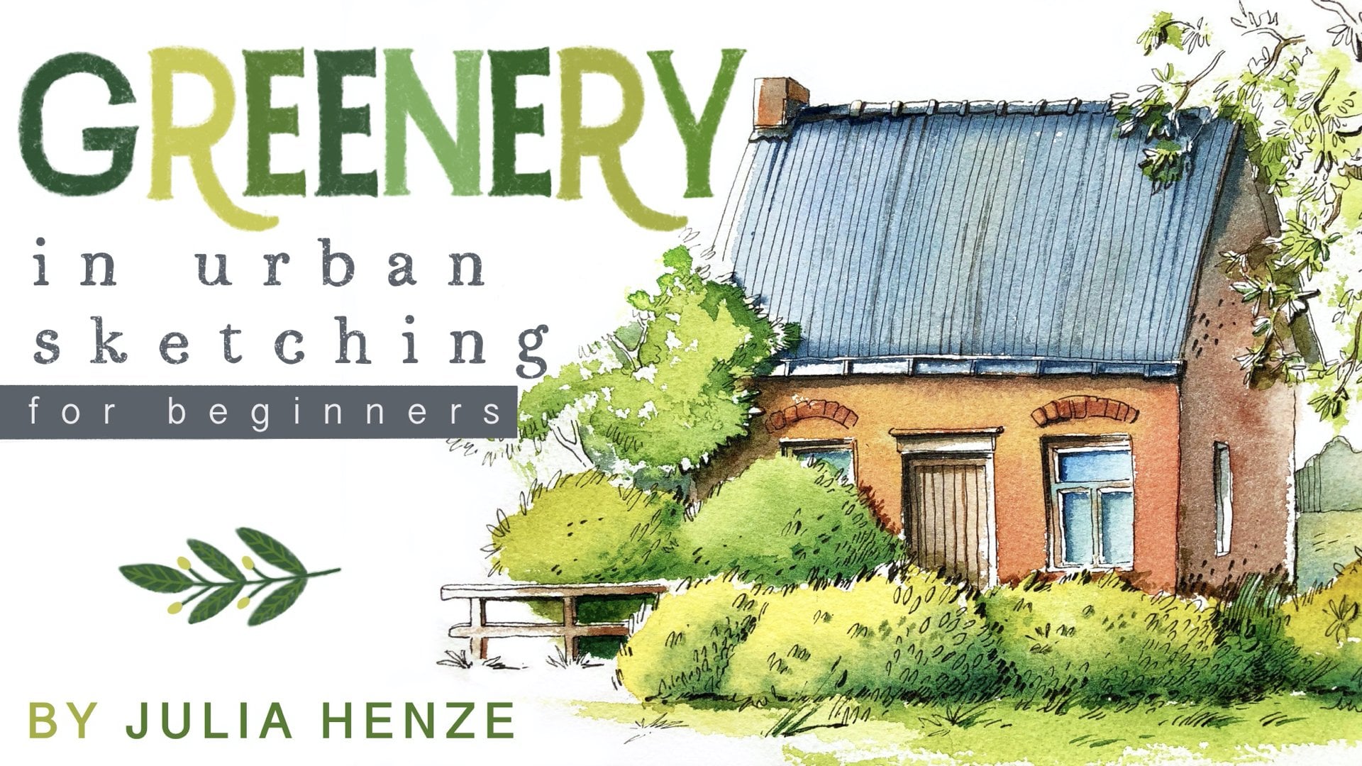
Transcripts
1. Intro: Hi, I'm Juli Henze, an artist and urban sketcher
based in the Netherlands. I am a top teacher Jon
Skillshare and the founder of Brave brochure Studio
and membership for amateur artist
and Urban sketchers. My classes, my YouTube videos, and my blog all serve the same goal to help amateur
artists like you be happy. Help you make room for it
in your life and develop a consistent practice routine
so you can grow and thrive. I also want to help you
to connect with like minded people and give you the tools to develop
your own unique style. Thank you for stopping
by to wash my class. Let me tell you a
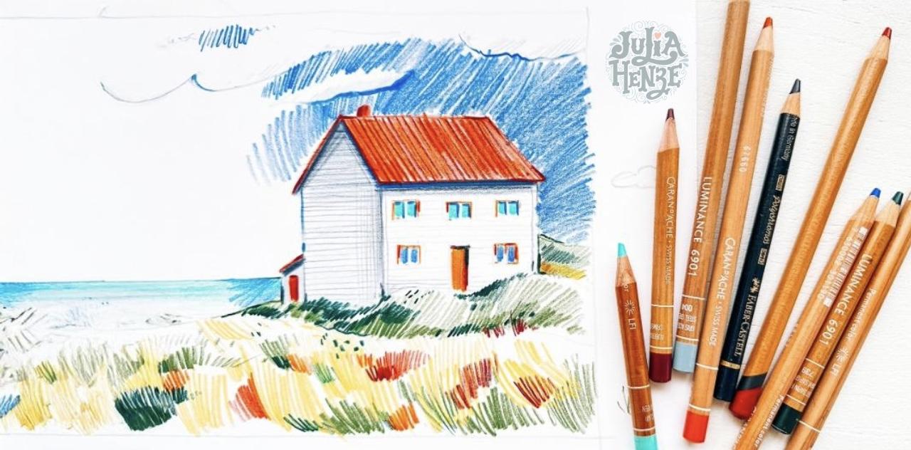
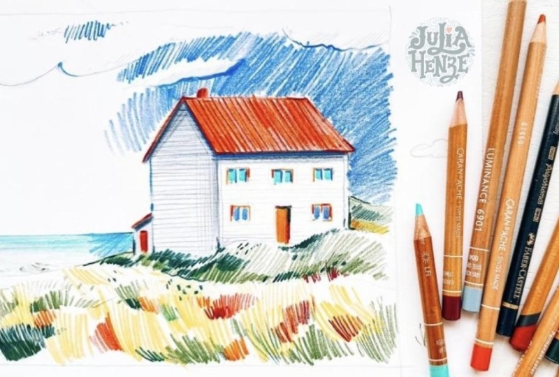
few words about it. In this lesson, we'll create a beautiful and
expressive landscape sketch using colored pencils. We'll focus on simplifying
complex scenes and making bold color choices to give you artwork a lively
and dynamic view. Using this reference image, I'll guide you step by step
as we build this sketch. Here's what you will
learn how to create depth and texturing landscapes
using colored pencils, tips for simplifying your composition and
working efficiently. Techniques for using color to create atmosphere
and expression. Finally, how to use the line weight and pressure to bring vibrancy
to your sketch. This class is perfect
for anyone who loves sketching and wants to explore colored
pencils as a medium. Whether you are new to this or looking to refine your
sketching techniques, this class will provide
you with tools and confidence to create your
own expressive landscapes. The materials that you will need are actually quite simple. You will need some
colored pencils. I think yellow will
be a nice color to have a warm yellow orange, a dark shade of orange, maybe orange, red color, a dark brown color. I wouldn't suggest to
use a black color for this sketch or actually for pretty much any
of your sketches. I would suggest using a
color like dark indigo or a very very dark
bluish grayish color, maybe a dark green color, a light green color. And a darker green shade. If you have turquoise, it will also be
very nice to use it for this sketch a blue color, a middle blue color, and a light gray color. I don't think we
will need an eraser, but I just have it
here for the case that maybe I want to repair
some of my mistakes. Further we will need some
drawing paper, smoother, thicker paper will
work best for that. If you are not sure if your paper is suitable
for colored pencils, I would suggest trying it out
before you start sketching. If you're curious
about colored pencils, whether it's finding
the right pencils or building your color palette, check out my blog and YouTube channel for more
resources and tips. I'll put the link in
the description below. Now let's dive in and bring this beautiful
landscape to life.
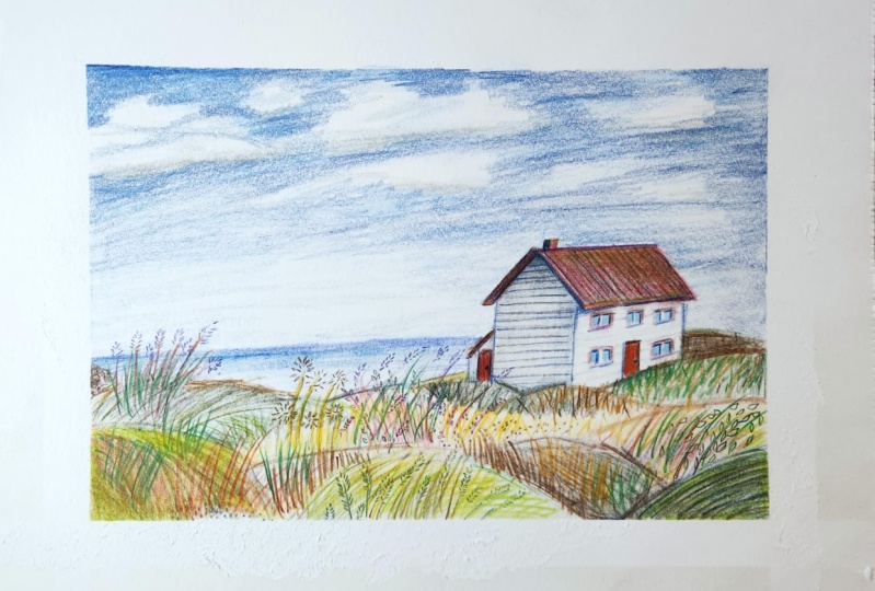
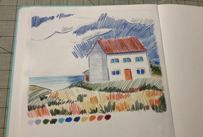
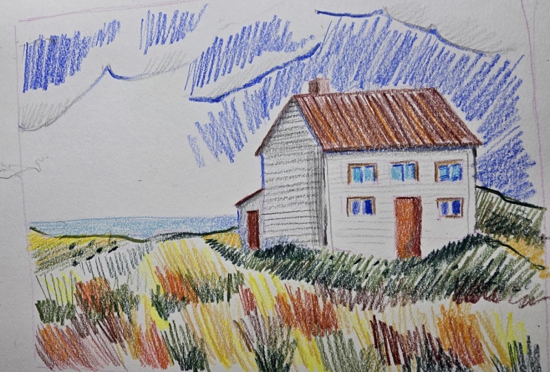
2. Step 1: Making a sketch with a light pencil: Okay, I start with a frame. And first of all,
before we begin, I want to say that it's important not to make
this sketch very big. So I have here about a
four format, I think, but I will make my
sketch a little bit smaller than that because
the bigger the sketch, the more difficult it is
to make it beautiful. Also, a very small sketch
wouldn't work probably. But trying to keep it
like this format, okay? Let's start. So first of all, I will draw a frame. This way, I can define
my composition and also know where the
borders will be. It's easier to draw them. And let's draw it like this. I use my pink to draw more straight line and also a good tip when you want
to draw a straight line, look at the edge
of your paper and try to draw the line
along the edge. Okay? So now we have the frame. Let's start with sketching
this composition. I usually start with a
horizon line because it's easier for me to draw
the rest of my sketch. It's not in the middle here, but a little bit lower, you can see that
it's somewhere here. And now we can draw the house. The house is here. It doesn't really matter if your proportions are
not perfectly right. The most important thing is that your house is recognizable, and I think that it will be recognizable
anyway, actually, set's throw it that big we have this rig them on one side. And kind of rectangle
on the other side. Of course, we have
here some greenery, but it doesn't really
matter for this moment, it will be more important
a little bit later. The thing that is
important now is that we draw it a little
bit in perspective. We have some perspective here. It's not very prominent, so we can't really see
that it's perspective. But when we see a
house like this, it's important to
understand that this corner will always
be a little bit or sometimes much higher than this corner because
it's further from us. We don't want to talk too much about
perspective roofs here. It's just this very small tip to understand that this side of the roof will always
be lower than this side of the roof and in this case, it's
just a little bit. Now we have this house and it's very easy to
draw, as you can see. Let's draw the windows. And as you can see, I used my light gray colored
pencil instead of graphite pencil because it
will be much easier for me to create a beautiful sketch. If you use a graphite pencil, your sketch will look a
little bit messy, I think. Here we have a door. As you can see, I don't really keep the proportions right. Maybe I can make the
windows a little bit. A little bit narrower. But it doesn't really
matter for this house. It's more about the impression. I don't think it's
very, important if the windows are
the right shape. It's not actually. Here we have the chimney and
here we have this Grenoy. I don't draw the line exactly
as I see it in the picture, I just create a suggestion
pretty much the same as I see, but don't worry about
the exact shape. Maybe this side is a
little bit higher. Here, you can see
that this side, I think it's a hell. It's much higher
than the son line. We can draw it higher. I think it's a nice detail,
not very important, but it's quite
interesting maybe. And let's make this side, this very small part here,
a little bit higher. Draw it a little bit
higher because otherwise, these two lines will
be on the same. They will meet each other here, and I don't think
it's beautiful, so let's make it a
little bit higher. And then we draw this line here and I think that would be pretty much what
we see in the reference. Now we've made initial sketch
with our great pencil. We can go over to the
next stage coloring.
3. Step 2: Coloring the house: Okay, I will start coloring
with my gray pencil. I see that this part of
the house is a little bit darker than this part because the light
comes from this side. This side is in the shadow, and let's define the shape of this part first, like this. And then we can color it. Try to color it in
the same direction. So not like this and this, but And it's quite important that you press on your
pencil hard enough that you have enough color, so not too pale, but
at the same time, don't press too hard
because if you do that, then your sketch will
look messy, I think. So there should be a balance. And if you are not
sure how to do that, then you can practice first
with it with your pencil and then it will be easier for you to
create a sketch. Here we also have a shadow. You can see that there is
a shadow in the reference. This small house is
also in the shadow, of course, and I just
color it at once. Don't pay too much attention to the colors that I see here. Now we can use orange
color for the door. And I see that your
around the windows will also have red or orange color, it's not very important. It's a bright color. And if you use orange here, it would work
perfectly, I think. Now we have colored these parts. Let's use a dark darker shade
of orange for this door. Because it's in the shadow, it has a darker shade. Also for this part, we can use a darker shade, maybe even darker I have here, a dark brown color, it would work even better. We also have shadow on the door, on the wall, and we can
also add it to our sketch. Film, we can color the roof. Before I start doing that, I will define the right
shape of my roof. Like this. And now it's easier
for me to color it. I will color it in
this direction. Press not too hard, but also not too soft. And on this side, we also
we can also draw a line. We can't really see
this color here, but I think it would work
better if we add it. Let's call it the chimney. On this side, it will be
lighter and on this side, it will be darker
because of the shadow. Also we will have
some shadow here. And I think if we add
some color to this site, it would create more contrast and more beauty maybe
also here a little bit. This is my darkest thread
color brown color. And now I see that my roof should actually be
a little bit lower because it hangs over the wall. So I prune it a little bit. Let's add some color
to the windows, and I like to use turquoise
color for the windows. So if you don't have turquoise, you can also use a blue color, but don't use gray. I think gray is a
very boring color. Of course, they are dark gray, but it's just not the
color that we want to use that much
in our sketches. It makes our sketches boring. So I would suggest using
bright colors even if you don't see something like
that in the reference. And also here, I add darker shade of blue or
turquoises actually also blue to my windows to create a little bit more interest and we just always have
shadows in the windows. Also here, let's add, I don't want to make
them all the same, so I use on the blue color here. Okay, as you can see, this house has some
wooden planks on it, so we can add some lines here to make it look a
little bit more interesting. Just parallel lines. Don't worry that much about perspective or
anything like that. We just draw parallel lines to create this suggestion
of wooden planks, I think. That makes it look a little
bit more interesting. Here on the roof, we have also some shadow. Shadows are very
important for sketches. If you don't add shadows
to your sketches, then your sketches look
quite boring usually. So don't forget to do that. Okay, maybe it's a good idea also to add some
planks to this side, but I don't want to make them as dark as the planks
on the shadow side, so they will be much lighter, and I use my lightest
gray color for that. I think something like this
would work really great. There will be also a shadow
under the roof here. And I have already
added some shadow, but I think it should be much darker to create more tension, more contrast in the sketch. Otherwise, it would be
a very boring sketch. Okay. Let's now add some textures to the
roof of the house, and I also just draw some lines. It shouldn't be too complicated. I mean, Sometimes textures are very difficult
to understand, to see also here. I don't know what pattern
it exactly is on the roof, but if you throw
something like this, just some lines, it usually
works for any sketch. For any house, unless the pattern on the
roof is very special and it's very important to show it in your sketch
exactly as it is. Okay, I think our
house is done so far. We will go back to it to add a little bit more
details later, I think. But for now, let's keep it like this and go
over to the next stage. We will add some textures
in the foreground, grass and all the greenery that we see here and also
the water and the sky.
4. Step 3: Coloring the surroundings: Okay, so I think it's a good idea to start
with the water. It's not very difficult to draw. It's just a line here and I
will use my turquoisF that. If you don't have turquois, just use a blue color. It's a very nice blue sea. As you can see, it's darker in the background and light
in the foreground. We press less hard
in the foreground and harder in the background. Now, let's tow this part. Just color it like this. And for the greenery
in the foreground, I would suggest creating
different parts. Here, for example, we
can use the green color. You can see that this part
is greener than this part. Let's use our colored pencil to add this greenery and to
add textures to your sketch. It's always nice to rotate your pencil use
different pressure, press harder and
softer depending on the darkness for
shadows, for example, when we have shadows here, I always press harder to
our pencil than this part, for example, it's slighter, so we don't need to use
that much pressure, but we can add a little bit more interest here with just a little bit
more pressure than here. Here it's really dark. I would even use a darker
colts. My dark green. And let's use it here as well. Maybe a few dots here, but not many just to
create more interest. Okay. Also maybe some
darkness here, not too much. It's important to
create expression in your sketch because
otherwise it looks boring. So we add different shades of greens like light
green and dark green, yellow is also a very
nice color to add. We can add it in the foreground
because as you can see, the foreground is much lighter, no, it's not yellow, particularly, but we can use yellow and mix it
with other colors. To create more interest. And also here, I use quite expressive strokes to create a suggestion of
grass in the foreground. Throw them in
different directions. Let's add some
yellow here as well. Maybe keep some parts
uncolored or here, for example, we can add a lighter press
lighter on our pencil. So also, this part
will be lighter. Let's make this a separate part. As you can see, it looks
like there is a kind of hail and we can color it in a
different direction than this crest because it's this way we can separate
our planes from each other, maybe add a little bit of
yellow in the background. Just create kind of a
little bit sunny look and here out press a little
bit harder on my pencil. Maybe add some strokes like this here to create
a suggestion of cress. Don't throw cress like this. It's boring. I try to
use different strokes. Maybe something like this, press harder and softer to create this expression
more interesting look. Maybe some grass here. In the foreground, it's not
what we see in the reference, but this is something that can help us to create a more
interesting sketch. We artists, we can
change a lot of things. I see that this part is a
little bit more brownish, or we can use a color like
this is my strawberry color, color that I use very
often in my sketches. And also here, we can use
it in different directions, maybe add some orange. I don't know. I think it would look quite interesting if we do maybe here or And let's add more of this
strawberry color here. Add more expression, more
interest to our sketch. Yes, darker with a green
color here and there. And maybe a darker
shade of green would also work well here. Add a few longer lines. Maybe add some dots
here and there. And connect these parts a little bit to create a
more cohesive look. So I don't want all the graspy
all the different parts. Okay. So this way we create a very nice suggestion of a field in the foreground
and at the same time, it's not exactly what we
see in the reference. It's expressive, it's
beautiful, it's colorful, but not too detailed, and that's what we want
to see in our sketch. We now have the foreground, the house, the sea or the lake, I don't know what it exactly is. Now we can go over to adding more shadows and details
and finish our sketch.
5. Coloring the sky and adding details: Okay, so now let's
do the sky first. In the sky, we have some clouds. And for the clouds, we actually also need a
very expressive look. If you draw your clouds
like I don't know, like this, it would look just childish
and not expressive. For the clouds, I would say, try to draw something like this. You look at the reference, you maybe even follow
the what you see, the clouds that you
see, but not exactly. Just try to relax
your wrist and add the nice lines to your sketch. This will be our sky or at
least the clouds in the sky. Now let's add some
shadows to the clouds. Not too dark. It's important
to use a light gray color. And maybe here are some. We don't really see this shadow in the reference,
but it's there. Believe me, it's there. And now we can add
some blue to the sky, but not we don't color the
whole sky with the blue color. We always try to keep
some space uncolord. It's important especially for a colored pencil sketch because if you color
the whole sketch, it will look quite boring. Let's start somewhere here. Again, I use quite
expressive lines for that. Don't press too hard, but also not too soft. It's important to to
make it colorful, your whole sketch actually. For that, you need to press
quite hard on pencil. At the same time, if you
tend to press too hard, Try to depress softer, it depends on what you do. So let's add a little bit
more color on this side. And I think it actually
looks quite nice already. What I also like to do is to add some color to the clouds. Like this, a line, it's important that
you press harder and softer on your pencil
when you draw, something like this, otherwise, your lines will be very
rigid and not beautiful. So that's good, I think. I would also add some color, some blue color to the shadowed
parts because it makes your sketch more
cohesive on one hand and also more expressive on
the other hand, like this. So the shadows are a little
bit bluish, usually. So it's a good idea to use blue blue color
for your shadows. Also here, I think we will have some We can add
some dark color to. Water. And as a finishing touch, I would like to add some elegant lines with more
and less pressure here. Maybe a darker green
here and there. Maybe, I don't know, some dots for the textures
in the background. And I also want to make this part a
little bit darker. A little bit darker also here. To emphasize this shadow
a little bit more, we can add a few lines like this. Let's add some shadow
here under the roof. Maybe make this one
a little bit bigger. I see here a line.
Let's add that. And I think I would
add some shadow here. This part is more in the shadow. So some pictures. Maybe a darker shadow here. And the last thing that
I want to do is to make this roof look a little
bit more orange. I think it looks
a bit boring now, so we can add another layer and make it look a little bit. Maybe your roof is
already orange. Don't worry about that,
but we can sometimes add a little bit more color on top of the color that we
already have in the sketch.
6. Outro: Thank you so much for
joining me in this class. I hope you enjoyed exploring
color pencils and learning how to create vibrant and
expressive landscape sketches. Remember, the more you practice, the more confident and
creative you'll become. If you'd like to keep learning and dive deeper into sketching, I invite you to explore
Brave Broch studio, my online membership for amateur artists and
normal sketchers. It's a wonderful
community where you can access more in
depth tutorials, connect with like minded artist and continue growing
your skills. Don't forget to check
out my blog and YouTube channel for more tips, resources, and inspiration. I love to see your sketches. Share them in the project
section so we can all celebrate your progress and don't forget to leave a review. It's very important for me
to know what you think about the class and how I can make your learning
experience even better. See you in the next class,
have the sketching. Bye bye.
 Julia Henze, Artist | Teacher | Urban Sketching Lover